
1. Warm Paper + Cream Wash Background Board
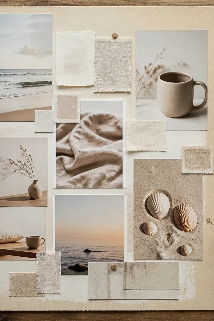
This is the easiest route to a soft look because the background does the smoothing for you. Cream paper absorbs light, so your photos don’t get harsh highlights, and warm tones blend without turning orange-red. Build it like a “set” instead of a scrapbook: one main background, then photos grouped by theme. It’s great for goals that feel cozy — home, routines, comfort, self-care — and it photographs cleanly even in imperfect lighting. Skill level is beginner — you’re mostly cutting and spacing, not crafting complicated parts.
Start with heavyweight craft paper or cardstock in cream or oat (A4 or 12x12). Add a very light paint wash behind each photo group using watered-down acrylic or diluted coffee for a faint tint; let it dry flat. Then frame photos with tan or off-white washi tape strips and keep margins at least 1 inch between clusters. Finally, add small labels in a single font style, either typed or handwritten in a thin pen, aligned to the same left edge.
Pro tipDo a quick test photo on your phone before you glue — if the background reflects, swap to matte paper.
AvoidAvoid mixing glossy magazine cutouts into a matte background.
2. 3-Column Grid With Rounded Photo Corners
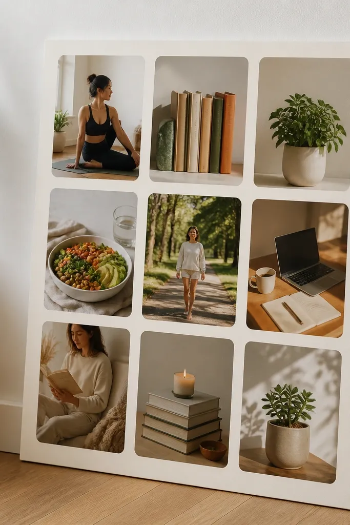
A 3-column grid makes your board look designed, not random. Soft boards need rhythm, and a grid gives it without making the layout feel stiff. Rounded corners are a small change that makes everything feel friendlier and less sharp. This style is perfect when you have lots of photos but you want them to look cohesive. It also helps you keep spacing consistent, which is usually what ruins “aesthetic” boards. Time is about 1-2 hours depending on how many photos you print.
Cut your base board into three equal vertical sections with light pencil guides (or use a cutting mat grid). Print photos slightly smaller than the column width so you get a 1/2 to 3/4 inch breathing gap. Round the corners using a corner punch or scissors — aim for the same radius on every photo. Place photos in a consistent order left-to-right, top-to-bottom, then tape or glue using double-sided tape for a clean edge.
Pro tipUse the same paper size for every photo crop; mismatched aspect ratios look chaotic on a grid.
AvoidAvoid stacking photos at random angles on a grid.
3. Torn Paper Layering With Matte Glue Edges
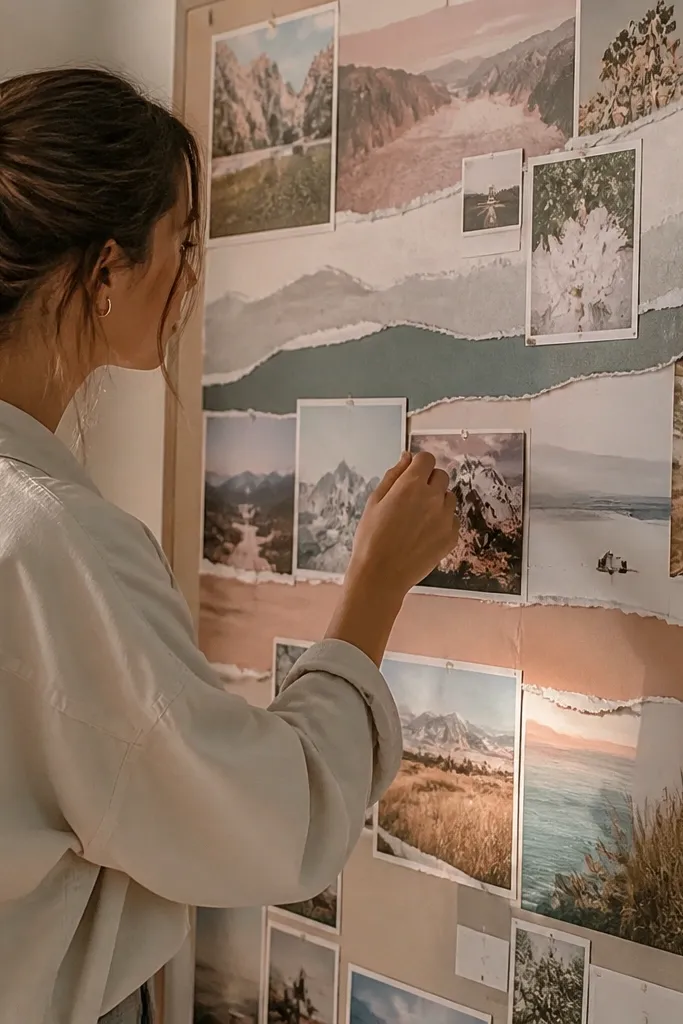
Torn paper edges create gentle transitions between elements, which is why this looks soft instead of scrapbooky. When you layer photos on torn strips, you hide the “hard cut” feeling that makes boards look harsh. Use this for themes like travel mood, calm productivity, or a slow lifestyle vibe. The look is photogenic because the texture catches light in a subtle way. It’s also forgiving: if your photo edges are slightly uneven, the torn paper makes it look intentional. This takes about 60-90 minutes.
Tear thin strips of matte cardstock (cream, blush, or dusty rose) and test the width so it frames the photo without covering key details. Place the photo down first, then layer torn strips around it like a soft border. Use a matte glue stick or double-sided tape only along the back edges so you don’t get shiny spots. Finish by adding a second torn strip across the bottom for a “caption shelf” effect.
Pro tipTear in one direction for cleaner edges — stop and restart too often and it looks choppy.
AvoidAvoid glossy medium or wet glue that leaves shine on photos.
4. Fabric Swatch Borders for a Soft Home Board
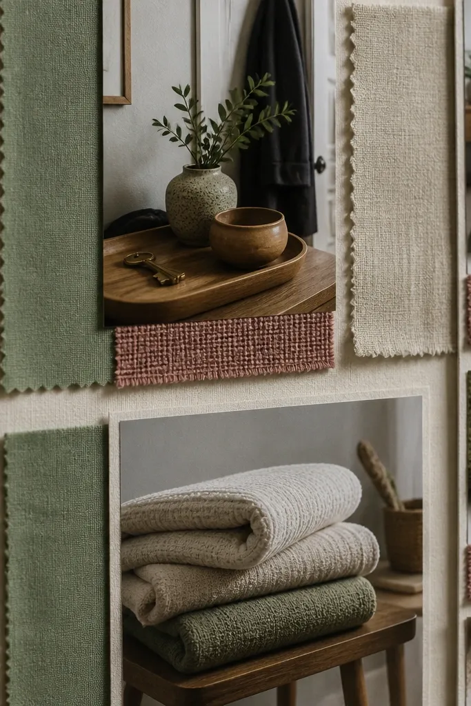
Fabric swatches add texture and softness fast. They also make the board feel intentional because they link the images to real materials. If your board is about home styling, routines, or comfort, this gives you an easy aesthetic anchor. Use small pieces — you’re not upholstering the board, just hinting at the vibe. The texture reads well in photos and makes the board look calmer than tape-only borders. Skill level is easy, and you can finish in under two hours.
Pick one fabric family: linen, cotton muslin, or a soft knit. Cut swatches into 1 to 2 inch strips and press them flat under a book for 10 minutes. Glue or tape swatches along the edges of photo clusters, not across the center of images. Add thin paper labels on top of the fabric strips using a pen with a fine tip for a neat, soft look.
Use a fabric you can’t fray easily; fraying edges can look messy unless you intentionally distress them.
Avoid mixing heavy velvet with thin paper textures on the same board.
5. Watercolor Wash Blocks Behind Each Theme
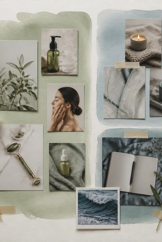
Watercolor wash blocks make your photos feel like they sit inside the same atmosphere. This fixes the biggest visual issue: photos that look like they were pasted from different worlds. Choose two pastel shades max — for example, sage green and dusty blue. Then place each theme cluster on its own wash rectangle. It looks dreamy without going full artsy-crazy, and it photographs beautifully because the color sits behind everything. Plan 1-2 hours for drying time.
Tape off rectangles on your base board with painter’s tape, leaving clean edges. Paint watered-down watercolor (or acrylic ink) in soft gradients, staying within the same two colors across the board. Let it dry completely before removing tape so edges stay crisp. Once dry, place photos on top and add small matte label cards so the text doesn’t fight the wash.
Pro tipKeep the wash light — if it’s too dark, your photos lose clarity and the board stops feeling soft.
AvoidAvoid using bright saturated paint like neon pink behind pale photos.
6. Monochrome Board With One Accent Color
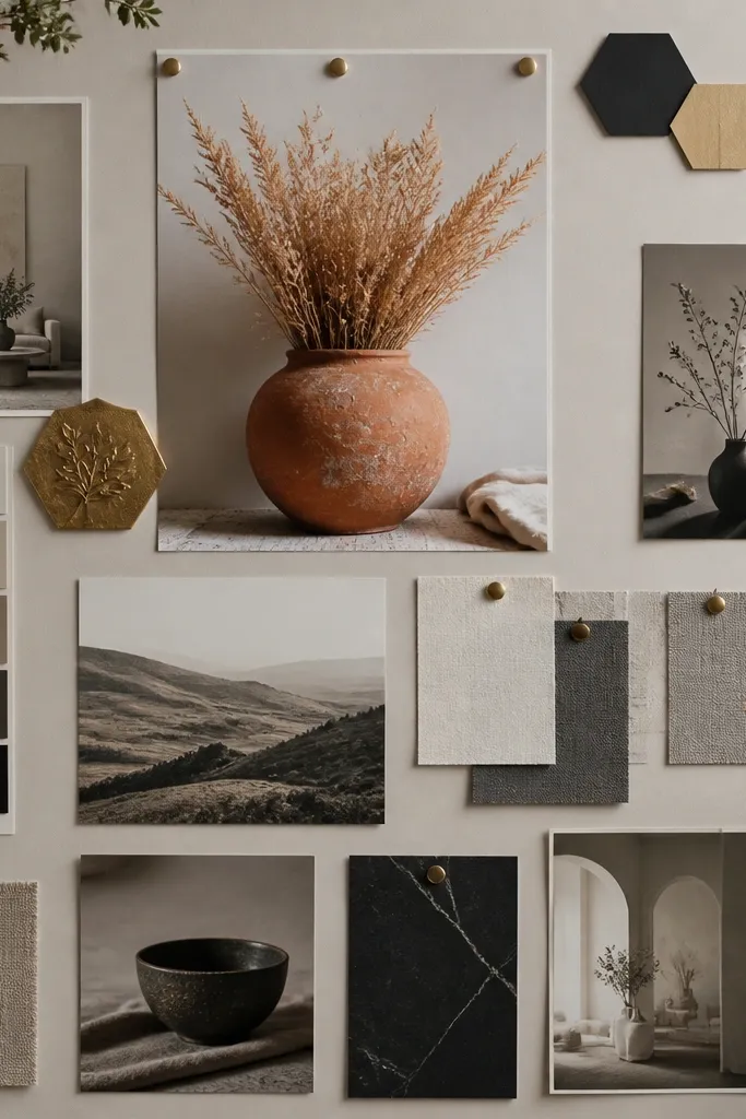
A monochrome vision board instantly looks grown-up and calm because it removes color noise. Pick one accent color — like terracotta, sage, or muted gold — and use it for borders, icons, and text. Your photos can still be varied, but the board stays unified because every element shares the same base palette. This is perfect if your goal is “soft but intentional” and you don’t want your board to look like a mood board explosion. It takes about an hour if you already have printed photos.
Choose a grayscale base: print photos in black-and-white or grayscale, or use photo editing to desaturate. Add your accent color only to tape strips, label paper, and small icons (one color, repeated). Arrange photos in 2-3 clusters and keep spacing consistent with 1 inch margins. Use one font style for all text, and keep the accent color limited to small areas so it stays visually gentle.
Pro tipUse colored pencil for accent labels instead of marker — it looks softer on paper.
AvoidAvoid multiple accent colors. Two accents turn into clutter fast.
7. Soft Shadow Frames Using Paper Mats
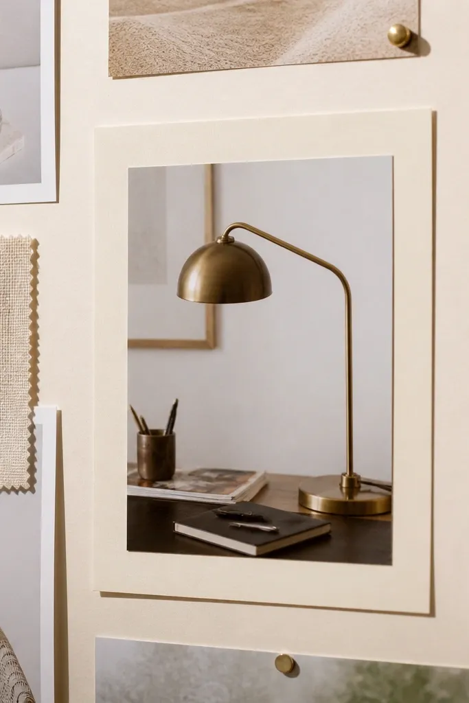
Paper mats create a built-in “frame” that makes every photo look like it belongs together. The soft gap between mat and photo reads as intentional layering, not glue-bloat. This style is great when you have different print sizes or slightly different photo tones. It also helps with the soft look because the mat color smooths contrast. You’ll spend most of your time cutting mats, but the result looks clean and high-end. Skill level is intermediate only because of consistent cutting.
Cut paper mats from a single color cardstock, using the same border width for every photo (try 1/2 inch). Trim photos so they fit inside the mat opening with a consistent overlap or inset. Mount photos onto the mat with double-sided tape, then glue the mat to the board. Leave a tiny shadow gap by not pressing the mat flat at the edges — use thin tape strips under the mat corners.
Use a metal ruler and a craft knife for straight mat cuts; uneven mats kill the soft look.
Avoid gluing photos directly onto the board when they have different brightness levels.
8. Rounded Sticker Labels + Consistent Typography
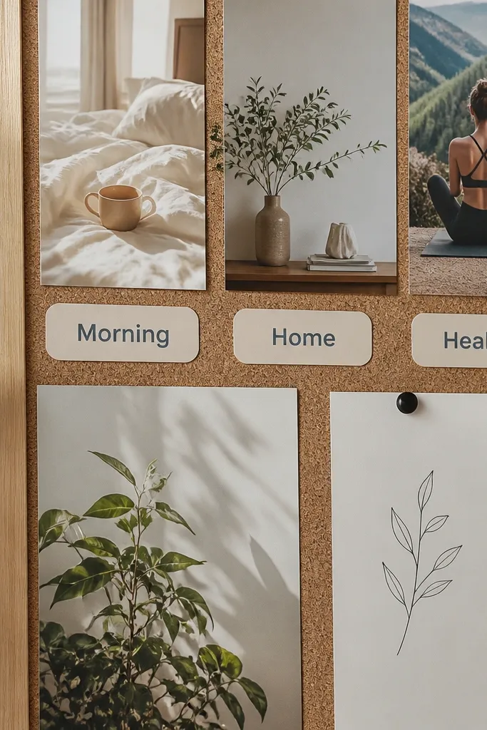
Typography is where vision boards go from pretty to messy. Rounded labels keep text friendly and soft, and consistent typography keeps the board from feeling like a random pile of quotes. Use this when you want the board to look aesthetically intentional even if your photos aren’t perfect. The label system also helps you group ideas without adding extra images. This is a practical style for people who like structure but don’t want a rigid grid. Time is 45-75 minutes.
Create label cards from thick cardstock and round the corners using a punch. Pick one pen or marker thickness (for example, a 0.5 mm black gel pen) and keep every label the same font style. Place labels only on top of or next to photo clusters — not floating randomly. Add a single light divider line (one thin washi strip) between clusters so the text doesn’t collide with the images.
Pro tipWrite the label text small and short. Long sentences make the board feel harsh and busy.
AvoidAvoid mixing three handwriting styles and two font types on the same board.
9. Polaroid-Style Stack With One Shared Backing Color
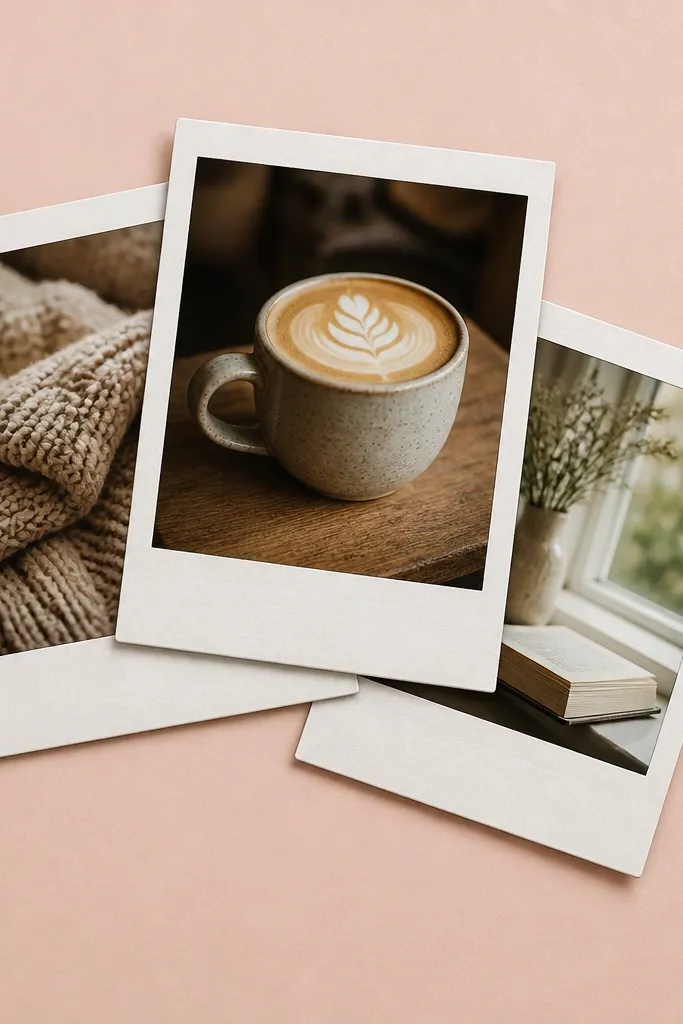
Polaroid-style stacks look soft when the backing color is consistent. The trick is to avoid the messy “pile” look by keeping the photo sizes and spacing controlled. This style works for gratitude, memories, gentle goals, or a “weekend calm” theme. It’s also very photogenic because the stacked edges create depth. Skill level is beginner because you’re using templates and tape, not precision cutting. Expect 1-2 hours for arranging and gluing.
Choose one cardstock color for the Polaroid backing, like warm white or light gray. Print or trim photos to a consistent size, then cut matching backing rectangles with a 1 inch white border. Stack 3-5 photos per cluster, slightly offset, and keep the tilt within 3-5 degrees. Secure with small tape corners so the edges look clean and the stack holds flat.
Pro tipUse matte clear tape on top of edges so the stack looks neat in photos.
AvoidAvoid mixing different photo aspect ratios inside one stack.
10. Soft Corner Tape Frames With Micro-Spacing
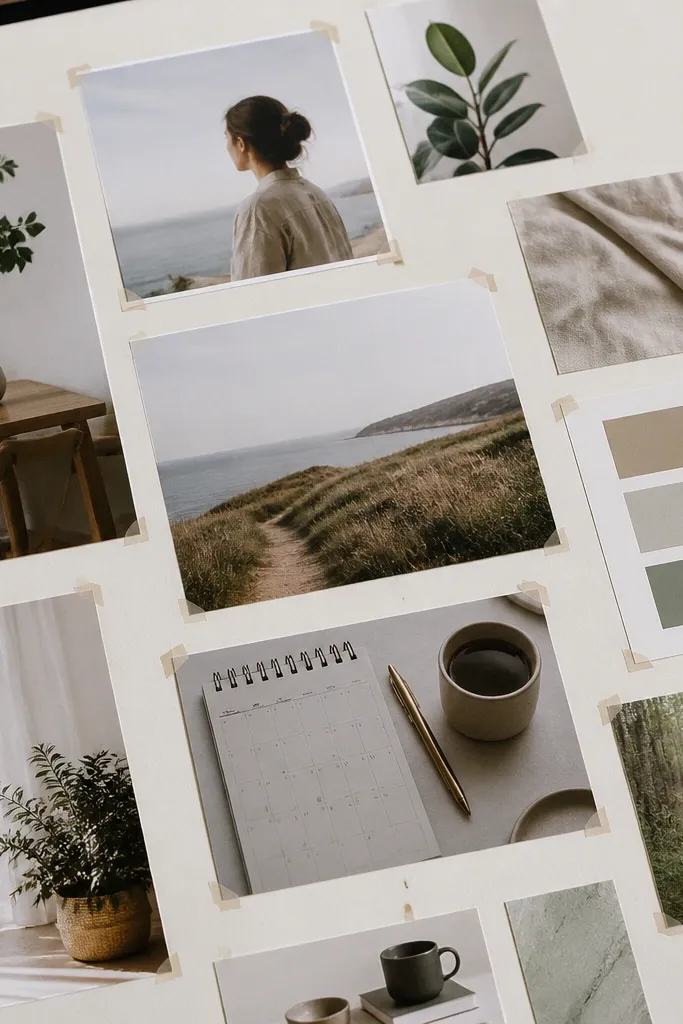
Corner tape frames keep your board airy. Instead of covering large parts of the photo with tape, you secure it with small pieces at the corners, which preserves softness and reduces visual clutter. This looks great when you want lots of pictures but still want the board to feel calm. It also helps if you’re changing photos later because the layout isn’t permanently covered. This is a low-effort style with a high payoff for aesthetics. Time is 30-60 minutes.
Cut your base board into sections or just mark a light grid with pencil. Place each photo with a consistent gap — about 1/2 inch between images. Use small strips of washi tape at each photo corner only, pressing firmly but without wrinkling. Add one small caption card per cluster so the board has structure without heavy text blocks.
Pro tipPress tape with a flat tool like a bone folder so it sticks without bubbles.
AvoidAvoid full tape borders around every photo. It makes the board look busy.
11. Pastel Icon Map Key With Matching Color Dots
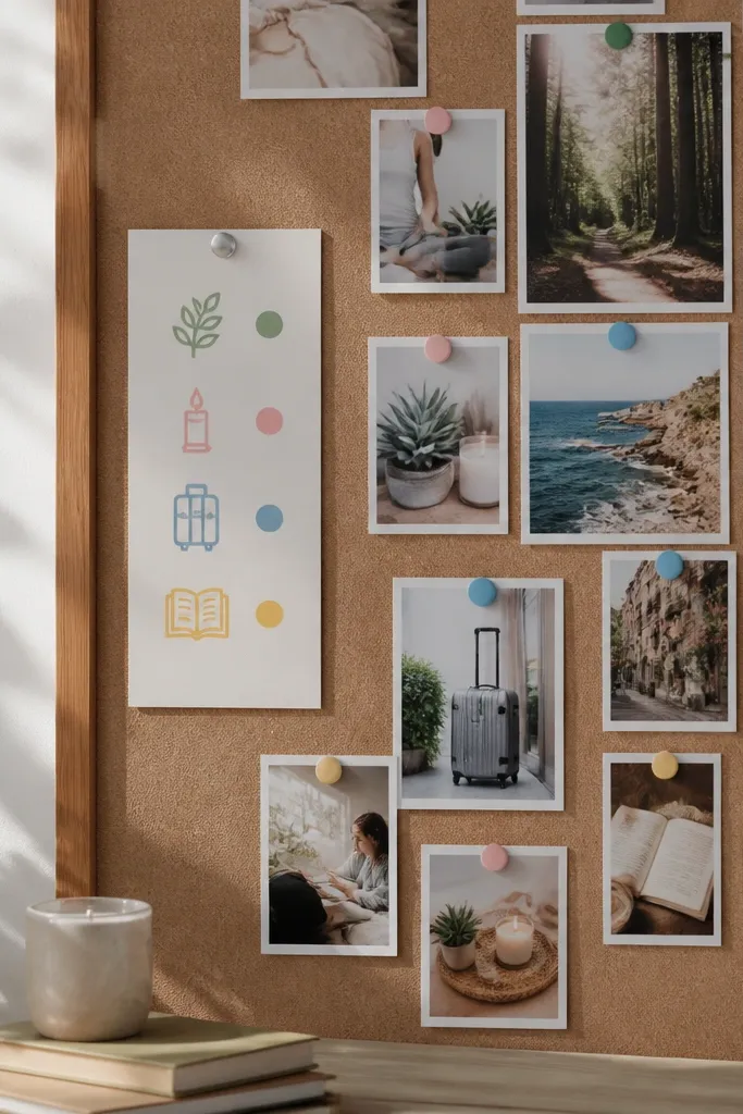
This is a smart aesthetic trick: make your board readable like a map. Use small pastel icons (leaf, book, candle, suitcase) and match them to dot colors that appear elsewhere on the board. The photos stay the main focus, and the icon key quietly organizes the themes. It’s perfect for a board with many categories because it avoids the “too many labels” problem. This style photographs well because icons add clean shapes without covering big areas. Time is about an hour if you print icons or draw them neatly.
Pick 4 categories max and assign one pastel dot color to each category. Place icons near the edge of each photo cluster and add a small dot next to the icon. Print or draw icons at consistent size (around 1/2 inch). Use the same dot color in your label cards or tape strips so the board stays unified.
Keep icon outlines thin. Thick icons look harsh against soft photos.
Avoid more than 5 categories. The icon key stops feeling soft and starts feeling busy.
12. Layered Quote Cards With One Light Divider
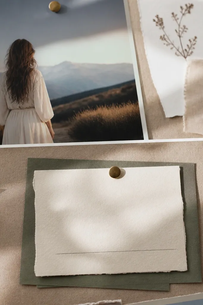
Quote cards can look elegant on a soft board when they’re treated like design elements, not text blocks. Layering a thin quote card under a photo adds depth without clutter, and a single divider line keeps the text from floating randomly. This style works well for personal growth goals, routines, and calm affirmations. It also helps because quotes are usually the first thing that makes boards feel busy. You’ll spend time trimming cards, but the layout will look polished. Skill level beginner to intermediate.
Cut quote cards from light cardstock, using one size for all quotes (for example, 3x5 inches). Place each quote card slightly under a photo cluster, centered, with 1/4 to 1/2 inch visible edge. Add one thin washi divider line between quote sections, not between every card. Write quotes in one font style using a fine pen, and keep line breaks consistent across the board.
Pro tipUse short quotes. If it wraps to 4 lines, it’s too much for a soft aesthetic.
AvoidAvoid placing multiple quote cards in different font colors on one board.
13. Half-Matte, Half-Glaze Photo Treatment Look
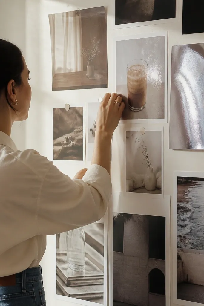
You can fake a soft, editorial look by controlling shine. The goal is to keep most of your board matte so it reads calm, while using a small “glaze” effect on a few standout photos. That contrast is what makes the board look intentional, not flat. This works best when your photos have a clear subject — a cup, a book, a calm room corner, a pastel outfit. Skill level is intermediate because you’re editing or applying overlays. Time is about 1-2 hours depending on how you prepare images.
Pick 3-5 photos to get the glaze look and keep the rest fully matte. If you print, use matte photo paper for everything, then add a thin clear gel medium only to the glazed photos after printing — keep it to the subject area. Let it dry flat under something weighty so it doesn’t warp. On the board, place glazed photos in the center or at the top, and surround them with matte photos and light paper mats.
Pro tipTest the gel medium on one scrap print first. Too much shine kills the soft effect.
AvoidAvoid glazing every photo. The board turns into glare.
14. Soft Braided Paper Ribbon Dividers
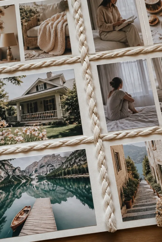
Braided paper ribbons add a handmade softness that still looks neat. They act like dividers without the harshness of thick borders. Use this when you want separate themes but you hate the look of heavy lines. It’s also a great way to introduce texture without adding more photos. This style fits best for boards focused on comfort, learning, and gentle lifestyle goals. Skill level beginner to intermediate — braiding paper strips is simple once you keep strip widths consistent.
Cut 1/4 inch strips from two coordinating matte papers, like oat and blush. Braid 6-10 inches of ribbon, then flatten it under a book for 10 minutes. Glue the ribbon vertically or horizontally as a divider between photo clusters, leaving at least 1 inch of clear space around it. Finish by framing each side with smaller corner tape frames so the ribbon looks like part of the layout, not an afterthought.
Use the same paper thickness for both colors so the braid stays even.
Avoid thick scrapbook paper ribbons. They look bulky on a soft board.
15. Dusty Rose Washi Web Background
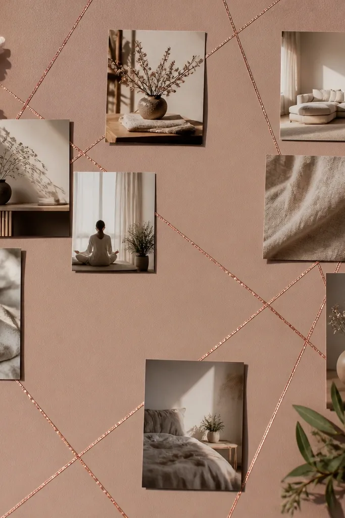
A washi web background adds motion without covering everything. The trick is to keep it airy: use thin tape lines and leave lots of open base color. Dusty rose works because it’s low-contrast and blends with neutral photos. This style is photogenic because the tape creates small lines that catch light gently. It’s best when your photos are mostly light-toned or neutral — if your images are dark and busy, the tape web can make the board feel crowded. Time is 60-90 minutes.
Start with a neutral base board in cream or pale gray. Plan where your photo clusters will go, then lay washi tape lines in a loose web pattern behind those areas. Keep tape lines at least 2 inches away from the edges of each photo cluster so photos stay readable. Once the web is done, place photos on top and secure with corner tape, then add small label cards to balance the negative space.
Pro tipUse one washi pattern only. Mixing multiple prints turns the web into noise.
AvoidAvoid covering the entire board with tape. Leave a lot of plain base showing.
16. Soft Ombre Paper Strip Timeline
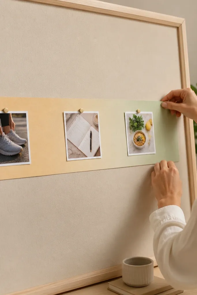
A timeline layout gives your board a story, and story reads soft when the colors fade gently. Use an ombre strip as a visual spine, then place small photos along it at equal intervals. This works well for goals tied to time: routines, fitness steps, learning milestones, or moving plans. It also solves the “my board feels random” problem because the timeline gives order. Skill level beginner — you’re cutting strips and placing photos. Time is about 1-2 hours.
Create an ombre paper strip by painting or coloring a long strip in 3-5 shades of one palette (like cream to blush). Cut the strip to about 6-10 inches long and glue it down horizontally or vertically in the center. Mark 4-6 equal photo points along the strip with pencil. Mount one small photo at each point using a small paper mat so every photo sits at the same height and distance from the strip.
Keep the ombre subtle. If the fade is too strong, it looks like a poster, not a soft mood board.
Avoid uneven spacing. The timeline looks sloppy when photo points drift.
17. Minimal Checklist Cards With One Photo Per Section
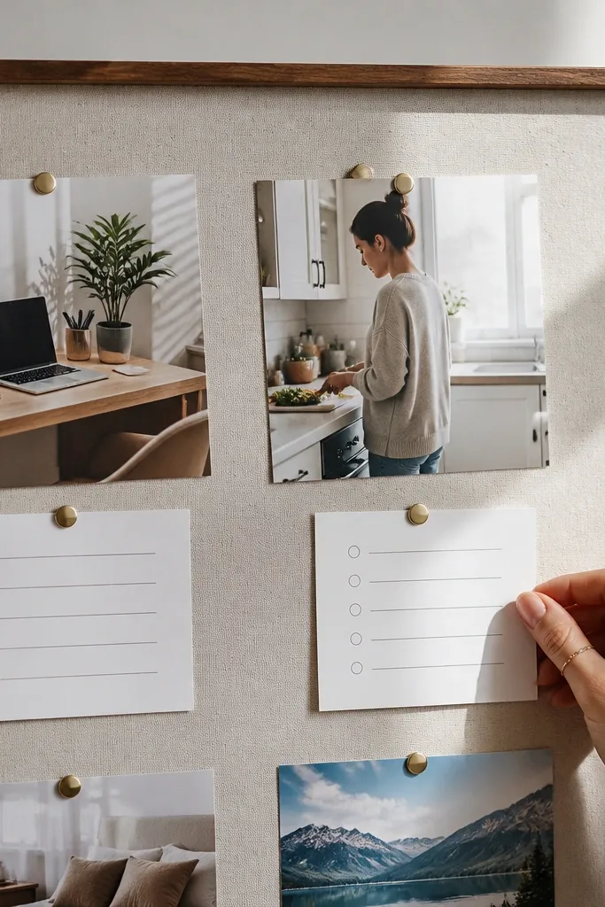
This style keeps your board breathable by limiting each section to one photo and one simple checklist. Soft boards often fail because there are too many images fighting for attention. With one photo per section, your visuals stay calm, and the checklist adds structure without clutter. This is ideal for routine goals like reading, stretching, meal planning, or habit trackers. It also looks great because checkboxes are clean shapes that contrast gently with photos. Skill level beginner and fast — 45-75 minutes.
Divide your base board into 4-6 sections with light pencil lines. In each section, place one photo centered on top, then add a checklist card below it. Write 3 small checklist items per card using a fine pen, leaving space between lines. Keep the card colors consistent (use one neutral cardstock color and one accent dot color).
Use very short checklist phrases. Long lines turn into a paragraph block that kills the soft look.
Avoid adding multiple photos inside one section. That’s how it starts looking messy.
18. Soft Floral Corner Collage With Negative Space
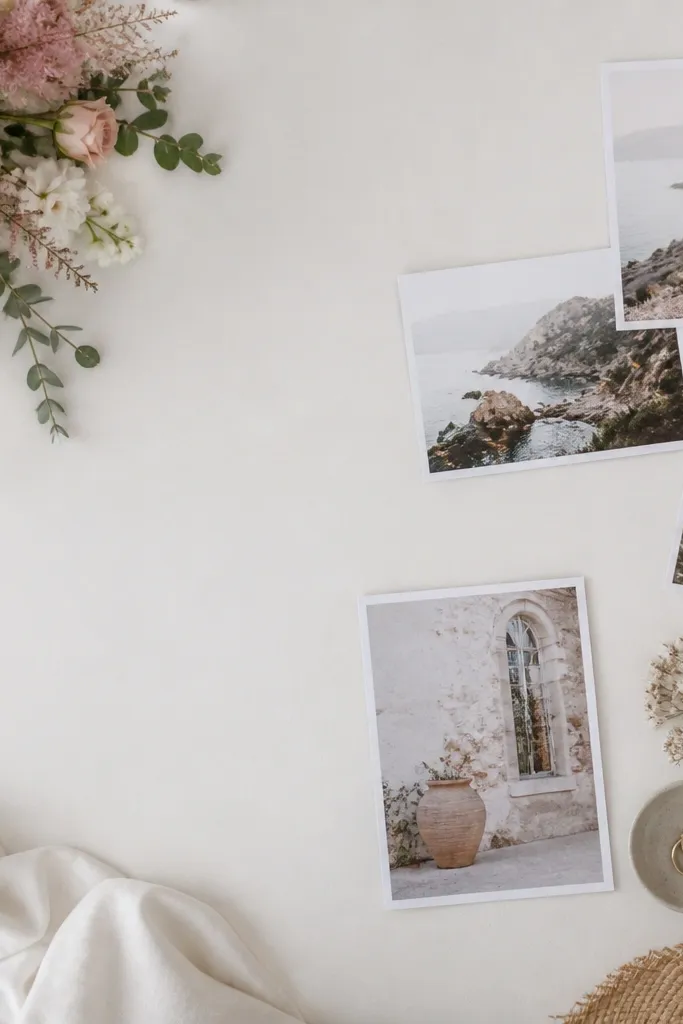
Floral corners are a classic way to make a board feel soft, but they only work when you keep them small. Put florals in one corner or along one edge so they act like framing, not confetti. Pair them with muted photos so the board stays cohesive. This is perfect if your photos are mostly neutrals and you want a gentle “feminine” feel without overdoing it. Time is 45-90 minutes depending on cutout detail. The result looks intentional because the floral element has a job.
Choose muted floral cutouts from matte paper or scrapbook sheets; avoid glossy flower pages. Tear or cut them into small clusters and place them in only one corner of the board. Add a thin layer of washi tape behind the floral cluster edges to keep them flat. Then build the rest of the board with simple photo clusters and consistent spacing — leave at least 2 inches of blank area around the floral corner.
If the flowers are too loud, reduce their impact by using only 60-70% of the cutout and leaving part of the page behind.
Avoid scattering floral pieces across the whole board.
19. Color-Matched Tape Hinges for Swappable Photos
A swappable board can still look soft if the hinges are consistent and hidden. Use color-matched tape hinges so the edges look intentional instead of taped-on. This is great if you change photos with seasons or moods, because you won’t tear paper every time. The softness comes from keeping the hinge method uniform across the board. It also looks clean in photos because you’re not seeing messy glue residue. Skill level beginner.
Cut small strips of washi or thin matte tape in one color palette that matches your background. Attach tape to the back of each photo on two opposite sides, leaving a small hinge gap so the photo can lift. Press the photo onto the board in a fixed position, then reinforce the edges lightly with a second tape strip if needed. Keep every photo’s border style identical so the board reads cohesive even when photos change.
Use tape that releases cleanly. Cheap tape can pull paper fibers and ruin the soft look.
Avoid mixing hinge tape colors with no plan — random tape colors create visual noise.
20. Cloudy Glass Effect Circles With Gel Pen Highlights
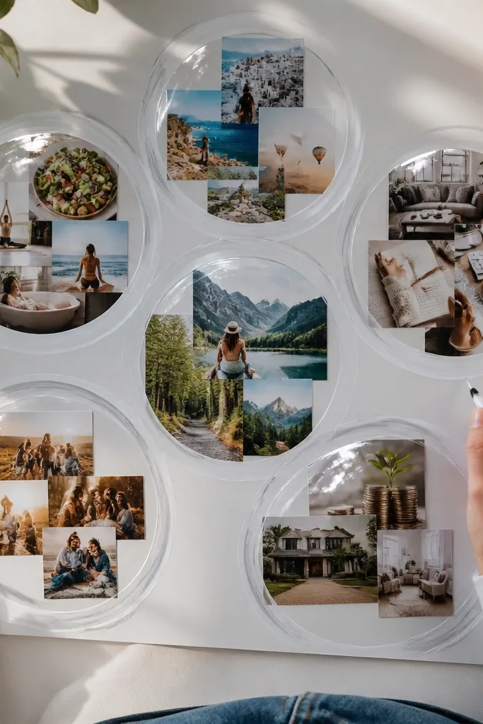
This one gives you that soft, airy “glass” feeling without making your board look busy. The circles group your Vision Board Ideas into gentle sections, so the whole layout reads calm instead of cluttered. You paint cloudy, milky edges that blur the boundary between photos and background, which is the fastest way to get a softer look. It also hides small photo imperfections, like uneven trims or slightly mismatched tones. This is beginner-friendly — the trick is using the right paint consistency and letting each layer dry before you add the highlight lines. It looks great for a bedroom mood board, a self-care corner, or any board where you want calm focus instead of sharp contrast.
Start with a matte base board in cream or warm white card stock. Cut 5-7 circles from tracing paper using a circle template or a compass — aim for 4 inches for the main circles and 2.5 inches for the smaller ones, then lightly sketch where each circle sits. Mix white acrylic paint with a little water until it flows like tinted milk, then brush just the outer 1/3 of each circle so the center stays more translucent. Let dry fully, then tack the circles down with tiny dots of removable glue so you keep that soft floating feel. Add thin gel pen highlights where light would hit — 2-3 short lines per circle — and finish by layering your photos underneath the circles with tape hinges so you can swap images later.
Pro tipUse tracing paper for the overlays because it takes paint smoothly and stays translucent. Test your acrylic mix on scrap first — if it turns opaque, add more water before painting the circles.
AvoidDon’t flood the tracing paper with paint — opaque circles kill the cloudy glass softness.



