
1. Cream Paper + Espresso Frame Window Page
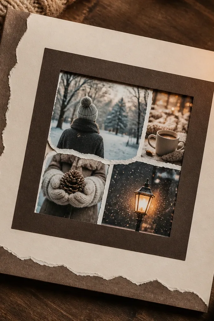
Cut a 12 x 12 inch (or 8 x 8 inch) cream cardstock page base. From espresso cardstock, cut a rectangular window frame with a 1 inch border, then glue it slightly off-center toward the top third. Tear two 3/4 inch strips from patterned paper and glue them along the left and bottom edges, overlapping the frame lightly. Add a small photo or ephemera behind the window opening, then seal the torn strips with a thin layer of matte medium.
This layout gives you cozy depth without clutter. The cream base makes everything feel soft, and the espresso frame creates a warm “photo window” effect even if you’re using small scraps instead of full photos. Torn edge strips on the left and bottom add texture that catches light gently. It’s a great choice for winter memories, book journaling, or any page where you want calm focus.
AvoidDon’t use glossy glue or shiny tape on the torn strips — it shows glare in daylight photos.
Pro tipUse a craft knife and metal ruler for the frame edges so the window looks crisp against the torn texture.
2. Brown-Gold Washi Zigzag Flow Border
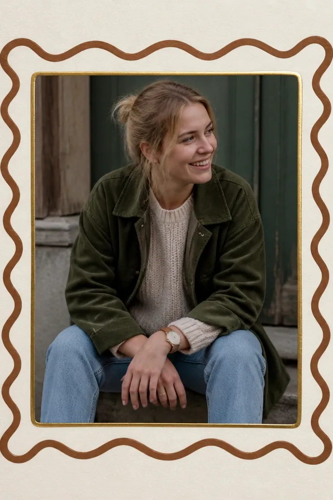
Start with oatmeal cardstock. Apply a zigzag washi strip around the border, leaving a 1/2 inch margin so it doesn’t hit the page edges in photos. Add a second washi line inside the border using a thin brown strip, then place a gold washi dot or short line near the top third. Glue your photo flat in the center, then add a single label strip under it using torn paper for the bottom edge.
This one looks “dreamy” because the border moves your eye without taking over the page. A brown zigzag washi line gives rhythm, while a thin gold accent adds warm light. It works especially well for minimal layouts where your photo is the star. If your scrapbooks usually look too empty, this border adds structure without adding lots of elements.
AvoidDon’t stack three different patterned papers under the border — the zigzag already does the visual work.
Pro tipPress washi down with a burnishing tool (or the back of a spoon) so it doesn’t lift and catch light unevenly.
3. Fabric Scrap Quilt Corner Layout
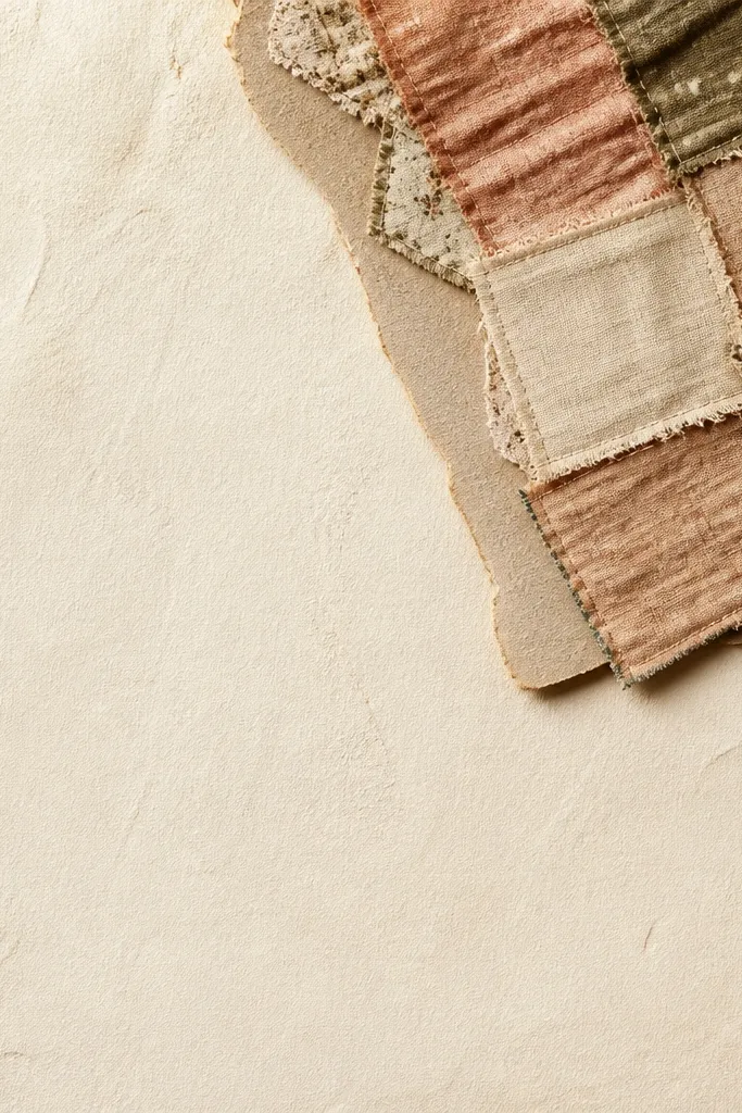
Fabric scraps instantly make a scrapbook look cozy because they bring real texture, not just printed texture. This layout places a small “quilt corner” in one upper corner, keeping the rest clean for photos. Use muted fabric tones like dusty rose, oatmeal, and faded olive so it matches warm paper. It’s also forgiving: you can use mismatched scraps as long as the colors stay in the same palette.
Cut a 1.5 inch square fabric patch and trim it into 4 smaller rectangles so you can stagger seams. Back the fabric with thin fusible web (or a scrap of thin interfacing) if you want it to stay flat. Glue the quilt corner into the top right using a fabric-safe adhesive or matte medium mixed with a tiny bit of water. Add a paper “stitch” border by drawing dashed lines with a fine black pen around the fabric edge.
If fabric frays, dab the cut edges with a tiny amount of clear fabric glue before attaching.
Don’t use slippery satin fabric — it wrinkles and looks messy under close-up photos.
4. Torn-Matte Collage Background With One Photo
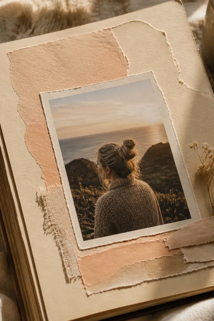
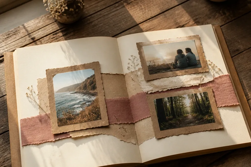
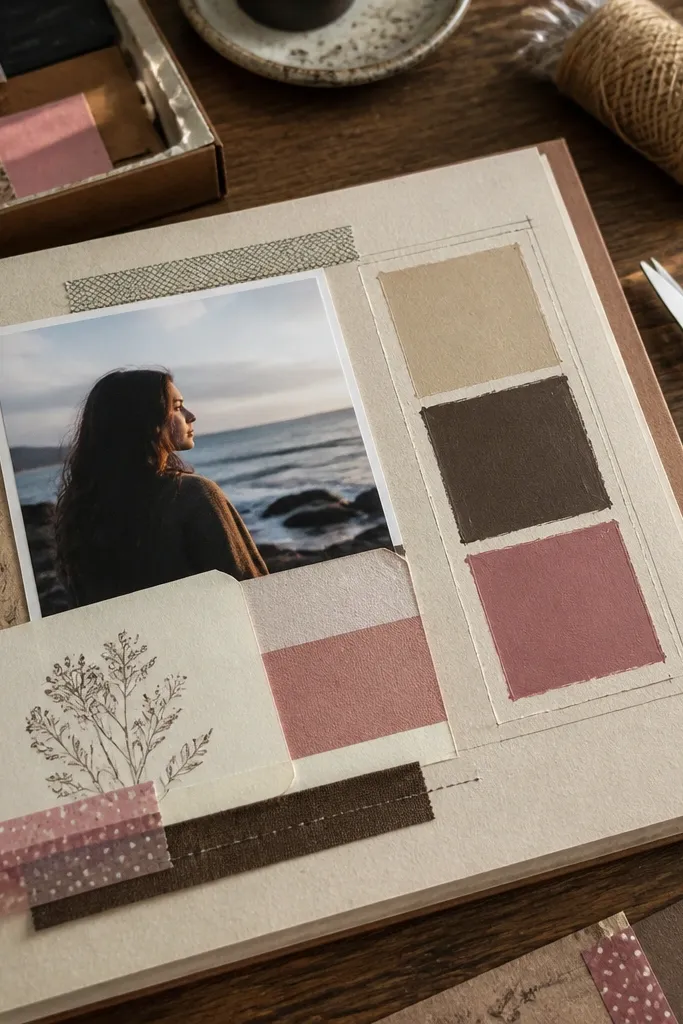
Tear 5-7 pieces of paper in shades of cream, tan, and dusty rose, varying widths from 1/2 inch to 1 inch. Glue them to the page base with matte medium, overlapping edges so no white paper backing shows. Leave a clean rectangle area in the center for your photo, then trim around the torn layers so the photo sits flush. Mount your photo on a thin cardstock mat and glue it on top.
This is the fastest way to get a dreamy look because the background does the heavy lifting. Torn paper layers create soft depth, and matte finishes keep everything looking warm instead of shiny. You only need one main photo or focal card, so the page stays clean. This works for travel receipts, journaling cards, or a single portrait where you want the memory to feel cozy and grounded.
AvoidDon’t cover the whole page with dense layers. Leave breathing space so the photo reads clearly.
Pro tipTear, don’t cut, the topmost layer — it’s the layer that creates the dreamy edge.
5. Pressed Leaf + Graph Paper Night Sky Page
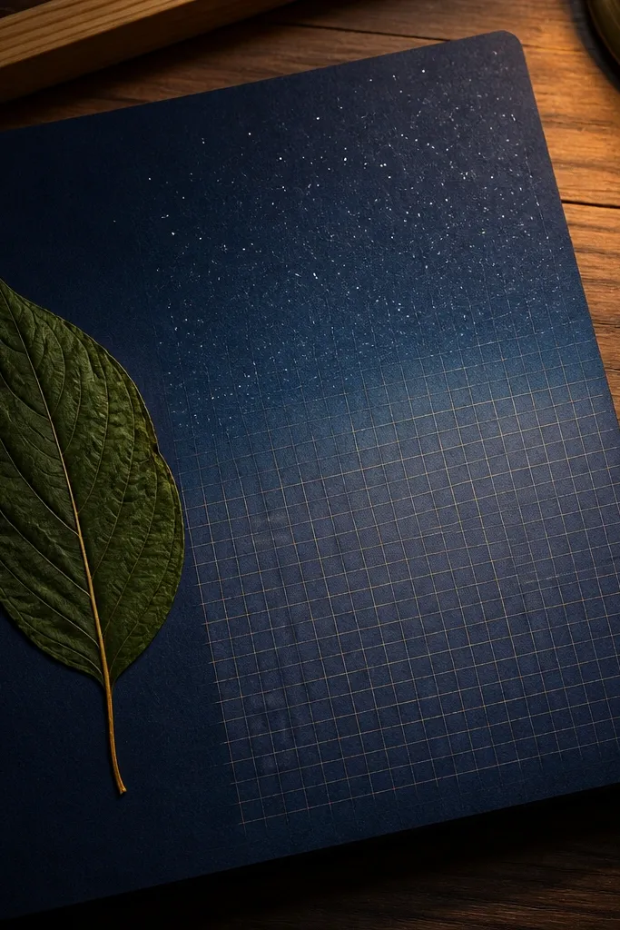
Use muted navy cardstock as the base. Cut a graph paper square (about 4 x 4 inches) and glue it slightly off-center, then tear a thin strip of cream paper to frame one edge. Place a pressed leaf in the top left corner and glue it down with a strong archival glue. Add three small dots of white gel pen along the graph lines, then journal on a narrow cream strip.
This layout feels cozy because it mixes a natural element (pressed leaf) with a structured one (graph paper). The navy base reads like evening, while the graph lines add a gentle, dreamy “night sky” grid. It’s perfect for nature walks, seasonal journals, or any page that needs one calm, tactile focal point. Keep the leaf small and centered so it looks intentional, not cluttered.
AvoidDon’t use thick craft foam under the leaf — it looks bulky and breaks the calm look.
Pro tipSeal the leaf with a thin matte medium layer so it doesn’t discolor and stays flat.
6. Oatmeal Matting With Rounded Photo Corners
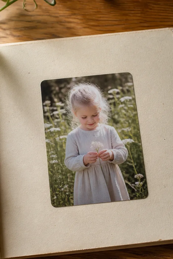
Cut an oatmeal mat 1/2 inch larger than your photo on all sides. Use a corner rounder punch on the photo itself and also on the mat corners if you want it extra consistent. Create a caption strip from torn-edge cream paper and glue it under the photo. Add a thin line of brown pen between the mat and caption for a tidy finish.
Rounded photo corners are a small change that makes the whole page feel softer. Pair that with oatmeal matting and you get a cozy, picture-book look that photographs well. This layout keeps everything clean, so it’s great for people who want “dreamy” without tons of texture. It also works well when your ephemera is already busy and you need calmer borders.
AvoidDon’t over-round the mat corners — keep it subtle so the page still feels structured.
Pro tipUse a matte photo adhesive or double-sided tape runner — glossy adhesives can show through light paper.
7. Brown Paper Bag Accordion Pocket Page
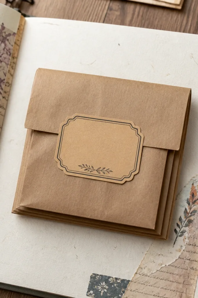
This one is cozy because it looks like something you’d pull out of a desk drawer. The accordion pocket gives you hidden space for journaling cards, ticket stubs, or small photos, and it’s visually interesting even when closed. Use kraft paper and warm labels so it feels handmade. It’s also practical: you get storage without bulky envelopes.
Cut a 6 x 6 inch square of kraft cardstock for the pocket base. Fold three 1 1/2 inch sections to create an accordion strip, then glue the ends to the pocket base so it opens upward. Attach the pocket to the left side of an 8 x 8 page using a strong tape runner along the back. Add a small paper tag on the pocket front and journal on the tag with a fine-tip pen.
Burnish every fold hard so the accordion stays smooth and doesn’t snag on the page.
Don’t glue the accordion folds flat to the page — it ruins the pull-out action.
8. Dusty Rose Paper Doily Frame
A doily frame makes a page feel instantly cozy because it brings lace-like softness without needing real lace. The dusty rose tone keeps it warm and gentle. This layout works for single photos, small prints, or a polaroid-style cutout. It also photographs well because the frame creates a clear “halo” around your focal item.
Cut a 12 x 12 (or 8 x 8) base from dusty rose cardstock. Create a doily effect by layering two paper circles: cut a circle, then cut small V notches around the edge to mimic lace. Glue the doily ring centered on the page, then add your photo beneath it so it looks tucked into the ring. Finish with a narrow caption strip in cream paper using torn edges.
Use matte white paper for the doily ring so it contrasts softly against dusty rose.
Don’t add extra stickers inside the frame — the doily edge already gives the charm.
9. Vintage Receipt Strip Timeline
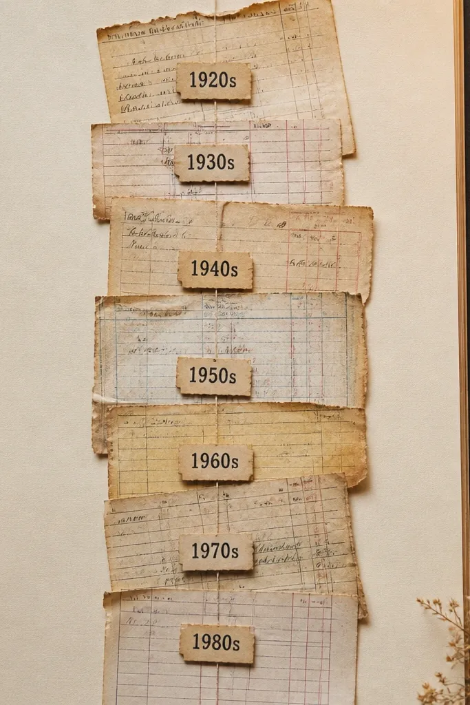
Cut 5 receipt strips, each about 1 inch wide and 4-6 inches long. Glue them vertically in a line, leaving 1/8 inch gaps so the paper edges show. Add tiny date labels next to each strip using a black gel pen and cream label tape. Place one small photo at the bottom and glue it over the last strip to anchor the layout.
This looks cozy because it turns everyday paper into a story with structure. Receipt strips are naturally textured and slightly imperfect, which reads handcrafted. A vertical timeline also keeps the page organized, so it doesn’t feel chaotic. Use this for a weeknight meal log, a self-care routine, or a small trip day you want to remember.
AvoidDon’t cover receipts with glossy lamination — it kills the cozy, paper texture.
Pro tipIf receipts curl, flatten them under a heavy book for a few hours before gluing.
10. Matte Gel Medium Watercolor Wash Background
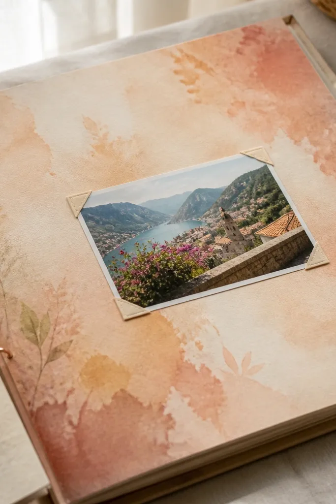
A watercolor wash gives you that dreamy, soft transition where nothing looks too sharp. Use matte gel medium over the wash to lock it in and reduce shine. This is a great choice when your photos are colorful and you need a calm background. Keep the wash in warm tones like warm beige, peach, and pale terracotta so it reads cozy, not bright.
Paint a light watercolor wash on watercolor paper, then let it dry fully. Tear the watercolor sheet into a shape that fits your base, or trim it to 1/4 inch smaller than the page. Glue it to the cardstock base with matte gel medium. Add 2-3 torn flecks of cream patterned paper in the corners and journal on a small strip.
Use a fan brush or sponge to apply the wash so edges stay soft and cloud-like.
Don’t use watery paints directly on cardstock — it warps and makes the page look uneven.
11. Twine + Kraft Tag Corner Cluster
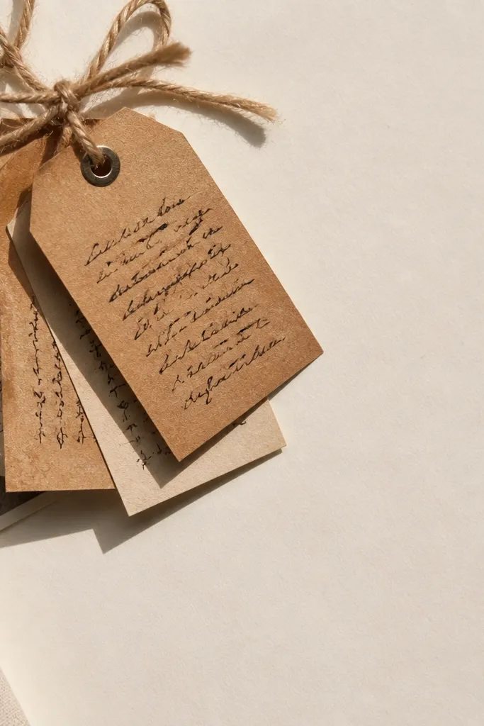
Cut two kraft tags: one 2 x 3 inches and one 1.5 x 2.5 inches. Punch a hole near the top of each tag, then tie them together with 8-10 inches of brown twine. Glue the tag cluster to the top right corner of a cream base using a small strip of tape on the back. Add a small photo behind the tags and let the twine sit slightly lifted for dimension.
Tags tied with twine look cozy because they’re tactile and slightly rustic. This layout makes a corner cluster, which keeps the page airy while still feeling full. Use kraft tags with handwritten notes and add one small photo peeking behind the tags. It’s a clean way to add personality without covering your photo.
AvoidDon’t tie twine too tight — it puckers the tag and looks messy.
Pro tipUse waxed twine if you want the fibers to look tidy and hold their shape.
12. Book Page + Sepia Photo Strip
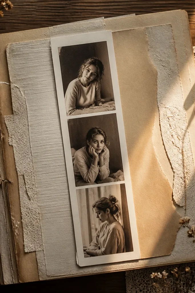
Tear book pages into two large strips and glue them to a cream page base, leaving the center open. Add a narrow photo strip across the middle using 2-3 small photos or one long strip. Mount the photos on thin cardstock to prevent wrinkling and glue the strip flat. Write a short caption under the photos on a torn-edge cream label.
Book pages instantly read cozy because the texture feels old and human. Pair that with sepia tones and you get a warm, dreamy vibe that doesn’t need extra embellishments. This layout works for journaling about a chapter, a reading month, or any memory you want to feel literary. Keep the photo strip narrow so the text texture stays the background star.
AvoidDon’t cover the book text completely — you need some readable texture showing.
Pro tipUse a soft brown pen for journaling so it matches the sepia photos instead of black ink.
13. Mini Polaroid Stack With Rounded Labels
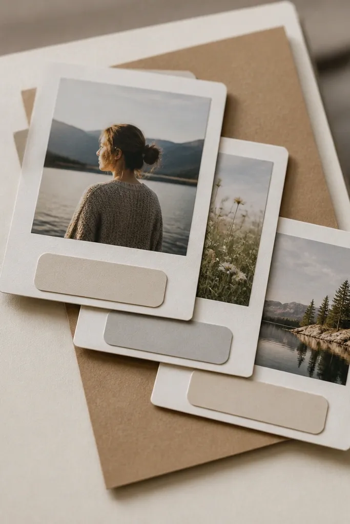
Print or cut three small photos in a consistent size, then trim each to polaroid proportions: a photo area with a 1/2 inch white border. Round the corners using a corner punch. Layer the three polaroids slightly overlapping, with the tallest one in the center. Add two label strips: one above the stack and one below, both made from cream paper with torn edges.
A mini polaroid stack feels cozy because it looks like a little memory cluster you’d keep on a shelf. Rounded labels soften the edges and make the whole page look friendly. This layout is photogenic because the overlapping photos create depth, and the label strips create clear visual rhythm. It works for birthdays, weekend plans, or daily gratitude notes.
AvoidDon’t stack all three perfectly centered — shift them so the overlap feels handmade.
Pro tipUse foam tape only under the bottom polaroid for a gentle lift without making the page too thick.
14. Terracotta Circle Cut-Out Confetti
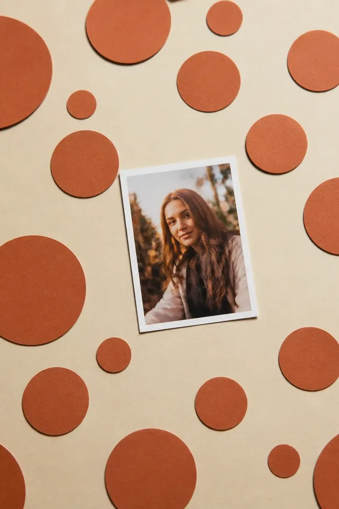
Circles look dreamy because they create soft movement, especially when they’re cut clean and placed loosely. Terracotta circles add warmth, while a cream base keeps the page calm. This layout works when you want a single photo to pop but still want texture. It also hides small imperfections in cut papers because the circles frame the page.
Use cream cardstock as your base. Punch 30-40 circles from terracotta cardstock and lay them out around your photo placement as a dry test. Glue the circles lightly, varying sizes from 1/4 inch to 1/2 inch so the scatter feels natural. Add one larger circle behind the photo as a subtle halo, then journal on a narrow strip at the bottom.
Glue only the edges of a few circles so they look like confetti instead of flat stickers.
Don’t glue every circle fully — flat confetti looks crowded quickly.
15. Olive Washi Vertical Strips With Soft Corners
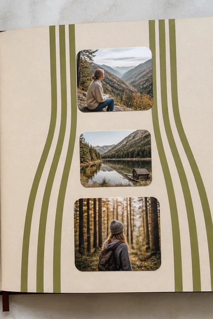
Vertical washi strips give cozy structure and a gentle “curtain” feel. Olive works especially well because it’s warm and grounded, not icy. This layout is good for pages with longer captions because the strips guide the eye downward. It also keeps your page from looking empty without adding clutter.
Start with oatmeal cardstock and plan three vertical strip positions. Apply olive washi in 1/4 inch widths from near the top third to just above the bottom third. Round the corners of your main photo and place it centered between two strips. Add a caption strip below the photo using torn-edge cream paper, then draw two small dots with a dark brown pen next to the caption for balance.
Use a ruler to keep strip spacing consistent so the page looks intentional in photos.
Don’t let washi overlap the photo too much — it should frame, not cover.
16. Salt-Texture Paste Stars Background
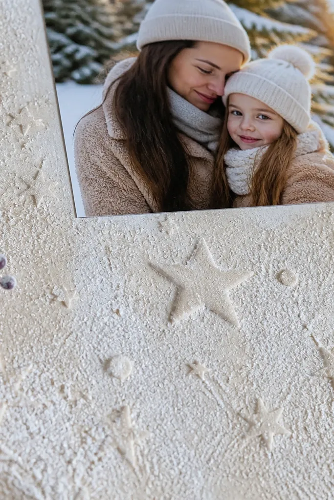
Mix texture paste with a small amount of matte medium for smoother spread. Spread a thin layer on a cream base where you want the star field, then press star confetti or cut stars into the paste. Sprinkle a pinch of coarse salt lightly over the top and let it dry completely. Brush off excess salt, then glue your photo on top of the dried texture using matte glue.
Texture paste plus salt makes a snowy, cozy surface that reads dreamy in close photos. The star shapes add a subtle theme without needing lots of stickers. This is the kind of page that looks like it belongs in winter journals or holiday memory books. It also works when you want a neutral background that won’t clash with colorful photos.
AvoidDon’t over-salt — heavy salt chunks look gritty instead of dreamy.
Pro tipLet the paste cure overnight before adding photos so it doesn’t crack or smear.
17. Tea Stain Edges With Black Pen Lettering
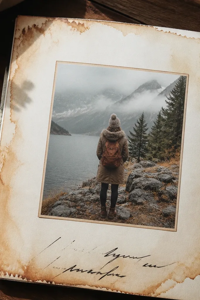
Tea-stained edges look cozy because they soften the paper and add a handmade, old-letter vibe. Pair that with black pen lettering and you get contrast that photographs clearly. This layout is great for journaling pages with a title and a single photo. Keep the center clean so the stained edges do the work.
Brew strong black tea, then dip only the edges of cream cardstock and blot with a paper towel. Dry completely with a hair dryer on low heat. Cut a small window for your photo and glue it in the center. Write a short title in black pen on a cream label strip, using neat uppercase or a simple script style.
Seal the stained edges with a thin coat of matte medium so they don’t rub off.
Don’t tea-stain the whole page if you want clean photo contrast.
18. Layered Border Stickers From Scraps
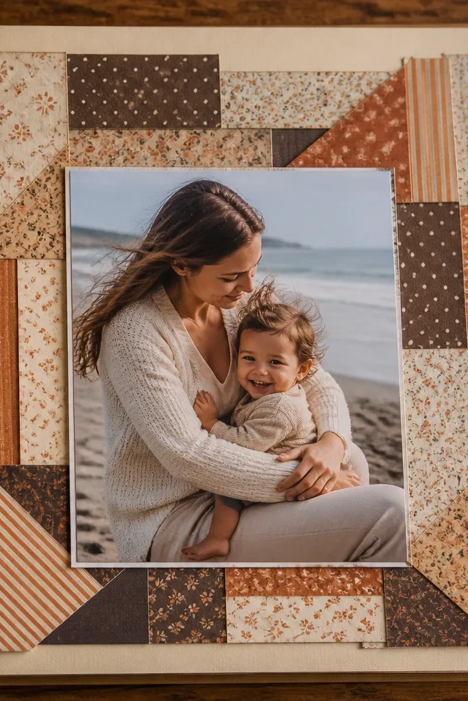
Instead of buying sticker packs, make your own border from scraps. This gives you a custom look that still reads cozy and cohesive. The layered border creates a frame effect around your photo or journaling, and it hides uneven cuts from other projects. It’s ideal for using up odd sizes of patterned paper that don’t fit anywhere else.
Cut a 2 inch strip of scrap cardstock to match your page width. Layer smaller torn pieces of patterned paper across the strip, alternating light and warm tones. Glue the layered strip along the page bottom or top as a border. Add a photo centered beneath the border and journal on a small label strip.
Use matte tape runner on the border strip so it stays flat and doesn’t lift at the edges.
Don’t make the border too thick — it will dominate the page in photos.
19. Waffle-Knit Look Background With Embossing Folder
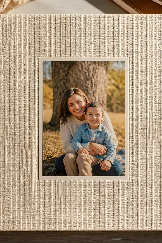
Run cream cardstock through an embossing folder that creates a waffle or knit pattern. Dust lightly with a warm brown ink pad using a sponge so the texture darkens in the grooves. Glue the embossed sheet to a blank base if you want extra sturdiness. Place your photo in the center and add a caption strip below it.
Embossing folders can fake fabric texture in a way that looks cozy and modern. A waffle-knit texture on cream cardstock gives you that warm, tactile feel without adding bulk. This layout is perfect when you want a clean page with just one photo and a neat caption. The texture shows best in raking light, so it photographs beautifully.
AvoidDon’t skip the ink step — embossed texture alone looks flat in photos.
Pro tipUse a matte ink pad, not pigment that rubs off, so the texture stays consistent.
20. Soft Ombre Wash Band With Torn Top Edge
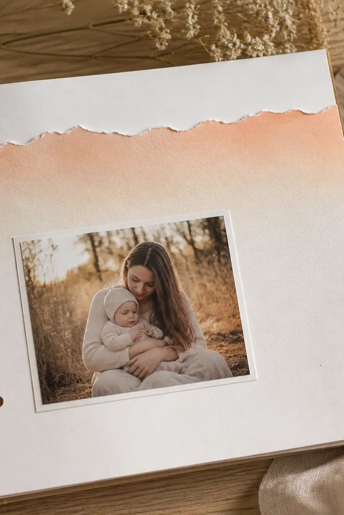
Blend watercolor or distress ink from peach to cream on a small strip of watercolor paper (about 3 inches tall). Tear the top edge so it looks irregular and soft. Glue the ombre strip across the upper third of your page base. Add your photo below the band and write a short caption on a narrow cream strip.
An ombre band makes the page feel dreamy because it creates gentle color movement. Keep it subtle and warm, like pale peach fading into cream, then add a torn top edge for texture. This layout works for pages with a single focal photo and a short journaling line. It’s also a good way to blend paper scraps that don’t match perfectly.
AvoidDon’t make the ombre too dark. Dark-to-light gradients can look dramatic instead of cozy.
Pro tipMist the blended strip lightly with water before it dries if you want a smoother ombre transition.
21. Brown Paper Layered Banner Titles
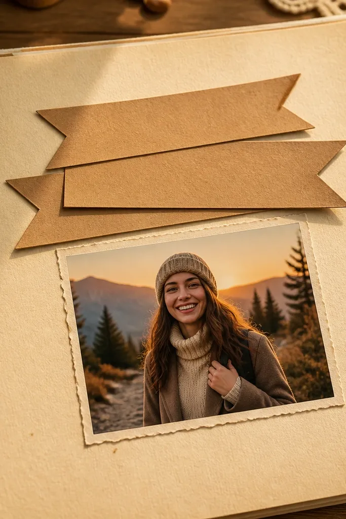
Layered banner titles look cozy because they feel handmade and give your page a clear focal point. Brown paper tones add warmth, and the banner shape frames your journaling without needing fancy typography. This layout is great for “month in review” pages, gratitude lists, or any scrapbook entry where you want the title to be the star. Keep the banner small enough that the photo still gets attention.
Cut a main banner from kraft paper about 4 inches wide and 1 inch tall. Cut a second banner from cream patterned paper slightly larger, then glue it behind the kraft banner for a layered edge. Place the banner across the top third and journal the title on the kraft layer using a thick black marker. Add a photo centered below and finish with two tiny torn paper tabs on the banner sides.
Use a straightedge and cut clean banner edges, then tear only the small side tabs for that cozy softness.
Don’t use three colors on the banner. Two layers max reads cohesive.
22. Mini Scrapbook Envelope With Side Tab
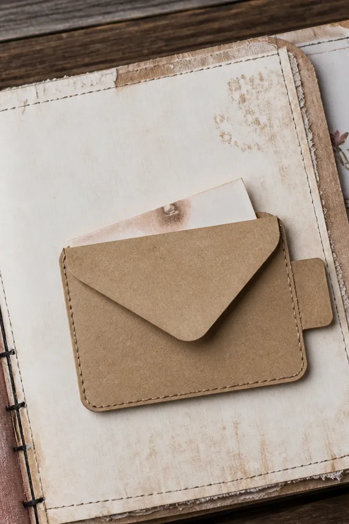
Cut an envelope from 6 x 6 inch kraft cardstock: fold a 1 inch flap on one side and a 1 inch flap on the bottom. Fold and crease sharply, then glue the side seams with matte glue. Add a side tab by gluing a 1 x 2 inch kraft strip to the envelope’s left edge. Attach the envelope to your page base with glue only on the back and two sides so it opens.
Envelopes make scrapbooks feel cozy because they add storage and a “hidden note” vibe. This mini envelope sits on the page like a little keepsake without making the layout bulky. Use warm neutral paper and a side tab so it looks like a real stationery piece. It’s perfect for holding a folded letter, a tiny photo, or a journaling card.
AvoidDon’t glue the front flap down — it kills the point of a pocket.
Pro tipReinforce the envelope flap with a strip of washi tape on the inside so it doesn’t tear with repeated opening.
23. Corduroy-Style Paper Strips With Stitch Lines
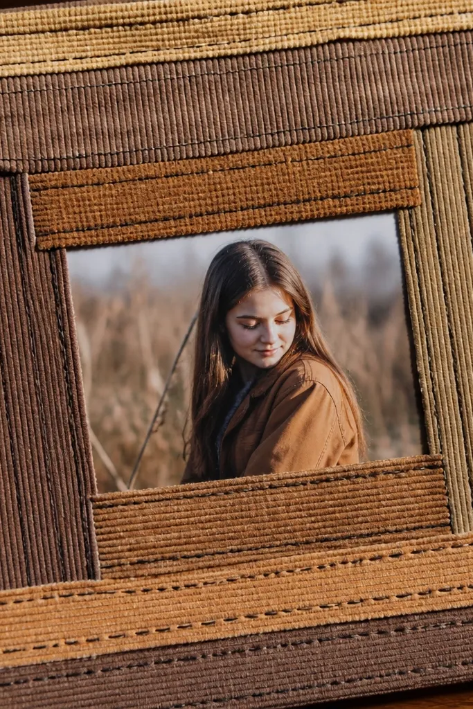
Cut 10-12 paper strips about 1/4 inch wide from warm brown patterned paper and plain tan cardstock. Arrange them vertically across a 4 x 6 inch rectangle area, alternating colors for rhythm. Glue the strip panel to the page base, then draw simple dashed stitch lines along the left and right edges using a black gel pen. Add your photo on top or beside the strip panel and journal on a small label strip.
This layout mimics corduroy texture using paper strips and hand-drawn stitch lines. It looks cozy because it has repeated ridges and warm fabric energy, without needing fabric. Use tan, camel, and muted brown tones so it stays warm. It’s a strong choice for pages that need structure around a photo, like family updates or monthly trackers.
AvoidDon’t use shiny paper for the strips — it makes the texture look plastic.
Pro tipUse a fine liner pen for stitch marks so the lines stay crisp and don’t smudge.
24. Soft Gray + Warm White Candle Jar Collage
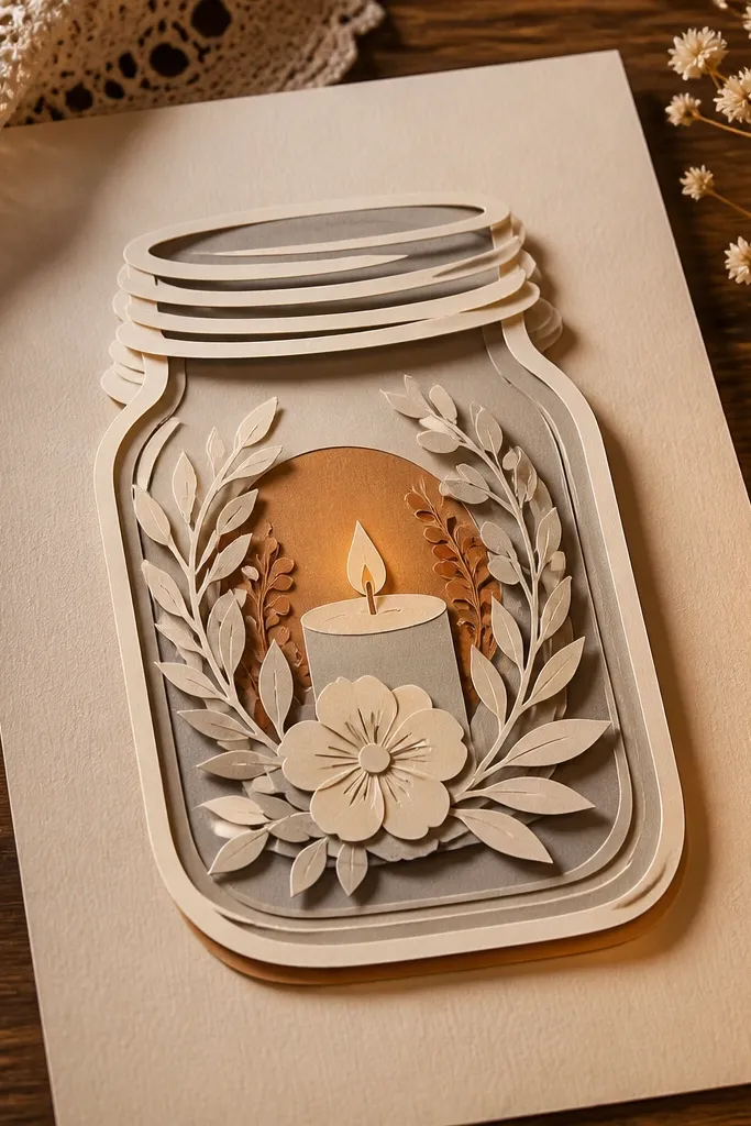
Cut a candle jar shape from warm white cardstock and glue it slightly raised using foam tape or thick tape under the bottom half. Create a background using soft gray cardstock and add torn paper strips behind the jar for glow-like texture. Add a small amber-toned paper circle inside the jar area to mimic flame light. Finish with a journaling strip below the jar and add one thin line of brown pen to separate sections.
Candle-jar shapes instantly read cozy because they suggest warm light and slow evenings. This layout uses layered paper around a jar cutout so it looks dimensional. Keep the palette warm white, soft gray, and a small accent like amber or terracotta. It works great for winter self-care, cozy nights in, or any page where you want a calm mood.
AvoidDon’t add too many flame details — one amber circle is enough for the cozy look.
Pro tipUse matte cardstock for the jar so it doesn’t reflect light and wash out in photos.
25. Tea Cup Outline With Layered Cut Paper Steam
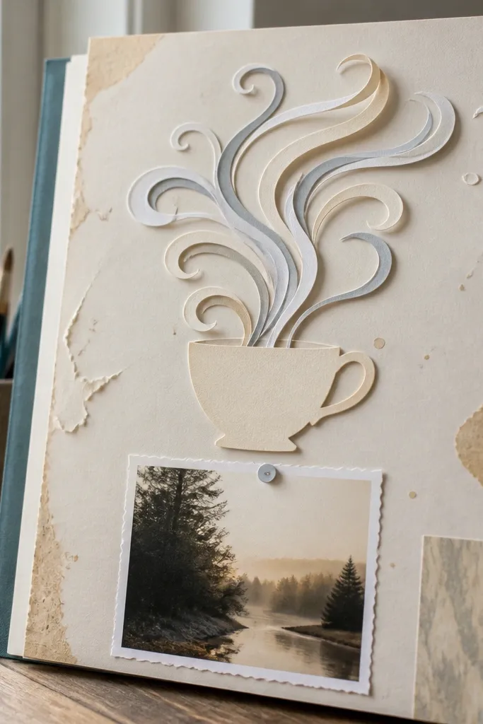
Cut a simple tea cup outline from warm brown cardstock and glue it in the top third. Cut 5-7 thin steam strips from cream and pale beige paper, then curl them slightly by wrapping around a pencil before gluing. Layer the steam strips above the cup so they fan out. Place a small photo below and add a caption strip using torn edges.
Steam lines make a page feel alive and cozy because they create motion without messy backgrounds. Layered cut paper steam gives a soft 3D effect that looks dreamy in daylight. This layout is great for journaling about mornings, reading time, or anything that feels slow and warm. Keep the photo small and place it under the cup so the steam becomes the focal energy.
AvoidDon’t place the cup in the center. The steam reads better when it rises from the top third.
Pro tipCurl steam strips lightly. Too much curl looks like confetti instead of steam.
26. Seasonal Ticket Stub + Date Label Strip
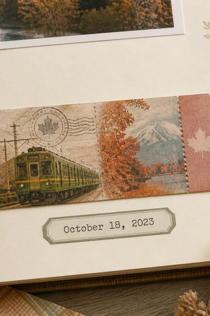
Create a 1.5 inch wide pocket by gluing two strips of cardstock on the sides of a ticket stub, leaving the top open. Mount the pocket in the center of your page base on a slight angle. Cut three small label strips from cream paper and write one date line on each using a black pen. Glue the labels above the ticket pocket like a stacked header.
Ticket stubs look cozy when you treat them like art, not clutter. This layout turns one ticket (or a similar ephemera strip) into a centered anchor with tidy date labels. The warm palette keeps the page soft, and the date strip adds structure. It’s a good choice for event memories, museum trips, or any single-day moment you want to remember.
AvoidDon’t crumple the ticket. Stick to flat ephemera for a clean, dreamy look.
Pro tipUse acid-free tape for the pocket so the ticket doesn’t discolor over time.
27. Kraft Paper + White Gel Pen Star Map Page
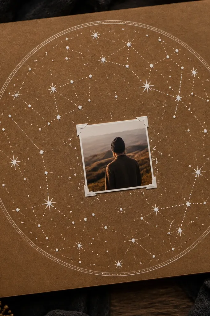
Use kraft cardstock as the base. Draw a circle in the center with a pencil, then glue a slightly smaller cream circle inside as the map area. Add small dots around the cream circle with a white gel pen, varying sizes for a realistic star feel. Place a photo cutout at the bottom of the circle and journal on a narrow strip across one side.
Kraft paper is naturally cozy, and white gel pen stars look like warm night sky details. This layout uses a circular “map” area so the composition feels intentional. It’s photogenic because the contrast is clear: dark kraft background, bright white marks, and one small photo. Great for evening walks, stargazing memories, or any page where you want calm atmosphere.
AvoidDon’t use black pen for the stars. White reads cozy and dreamy against kraft.
Pro tipLet gel pen dry fully before moving the page. It smears easily if you rush.
28. Soft Green Botanical Corner With Layered Labels
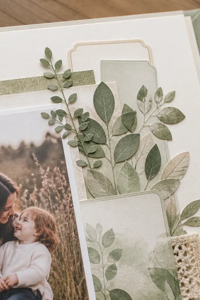
Cut a soft green cardstock base or use it as a corner overlay panel. Create a corner cluster by gluing 2-3 botanical paper cutouts (leaf shapes) in the top left. Add two label strips: one wider label behind the other, both in cream paper with torn edges. Glue your photo to the right side, leaving space for the labels to breathe.
A botanical corner makes a scrapbook feel cozy because it brings gentle life to the page. Keep it subtle by using soft green and cream, not bright neon greens. Layered labels add warmth and organization, like a small note wall. This works best for journaling pages where you want the text to feel supported by decor rather than competing with it.
AvoidDon’t scatter botanicals across the whole page — focus them in one corner for the cozy look.
Pro tipUse matte glue under botanical cutouts so edges don’t lift and catch light.
29. Warm Neutral Gradient Spine With Date Stamps
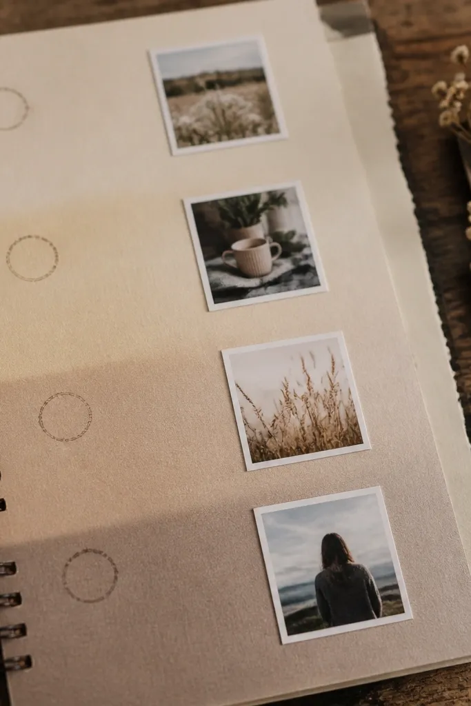
Blend three warm tones (cream, beige, light tan) into a 1.5 inch wide vertical strip on watercolor paper. Trim it to fit the left side of your page base as a spine. Glue the spine down, then stamp or write dates in a small repeating pattern along the strip. Add two small photos on the right side and journal in a narrow line under each photo.
A gradient spine gives you a dreamy vertical anchor, and date stamps make it feel like a real diary. This layout is good for monthly pages because it creates a consistent place for dates. The warm neutrals keep the page cozy, while the spine keeps everything aligned. It also works well when you want multiple small photos without chaos.
AvoidDon’t put the spine too close to the edge. Leave at least 1/4 inch margin.
Pro tipUse a stamping ink that dries matte so the dates don’t shine under photos.
30. Cream Paper Photo Corners With Pressed Dried Lavender + Gold Thread
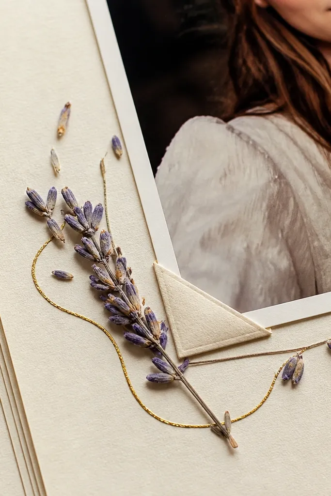
This page looks dreamy because the lavender adds soft texture and tiny color flecks, while the gold thread gives you a warm, twinkly highlight that reads like “cozy” in photos. You get a gentle, botanical frame without covering the whole page in busy patterns. It fixes the usual problem with scrapbook embellishments — loose petals and messy glue — by trapping the plant pieces under thin paper corners. The build is beginner-friendly and fast if you keep the layout simple: one main photo, one cluster of lavender, and a few thread stitches. It suits calm, neutral collections (cream, oatmeal, warm gray) and it looks especially good for bedroom memory pages, self-care logs, and gift albums.
Cut a cream base page at 8.5 x 11 inches, then trim a photo mat to 5 x 7 inches. On the mat, mark four corner positions 1 inch in from each edge, and cut small V-notches at the corners so you can slide plant pieces under cleanly. Lightly mist dried lavender with a hair spray haze from a distance (or use a tiny dab of matte gel medium on the back of a sprig) so it stays put when you handle it.,Place the photo centered on the mat. Tuck 2-3 lavender sprigs into the V-notches at opposite corners, then press them flat with a scrap of paper for 10 seconds so they adhere. Thread a needle with gold thread or fine gold embroidery floss and stitch 6-8 short “curves” from corner to corner — keep stitches under 1 inch long so they look delicate, not heavy.
Use matte gel medium only where the plant touches paper, then let it dry fully before you stitch — wet glue makes thread look muddy in photos.
Don’t wet-douse the lavender; damp buds turn dark and look heavy instead of airy.



