
1. Coffee-Stained Script Board With Black Frames
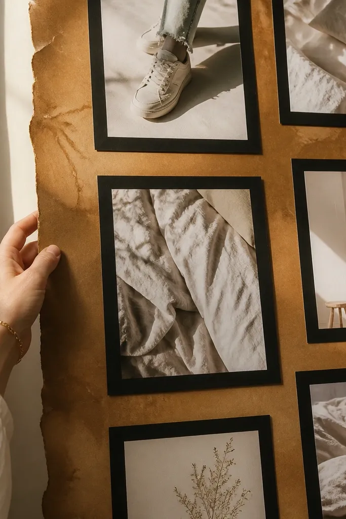
This look is clean, warm, and easy to photograph because the background has one consistent tone. Coffee-stained paper gives you that soft, vintage warmth without the board turning into a brown blob. The black frames add sharp contrast so your images pop, especially if you use light-colored photos (white sneakers, pale linen, bright kitchen counters). It’s great for goals like routines, learning, or “daily habits” because the board reads like a set of labeled panels, not a random collage.
Start by brewing strong coffee, then brush it onto thick paper or cardboard in thin passes. Let it dry fully, then lightly press it under a heavy book so it doesn’t curl. Cut photo mats from black cardstock and leave a 1 cm border around each picture. Add one short handwritten line under each framed photo using a fine-tip black pen.
Seal the whole background with a matte spray so the coffee stain won’t rub off when you handle it.
Don’t soak the paper until it turns blotchy — thin, even coats look intentional.
2. Denim + Tan Cutout Board Using Fabric Borders
Fabric borders make a vision board look “designed” even if you’re using magazine cutouts. Denim plus tan reads modern and photo-friendly because the blue anchors the composition while the tan keeps it warm. Use it for style goals, fitness routines, or any goal where outfits and daily choices matter. The texture catches light from the side, so your board looks dimensional in pictures instead of flat and paper-only.
Pro tipUse a ruler and cut denim strips straight — crooked borders are what makes this look messy.
Cut strips of denim (or a denim-like thrifted shirt) to form a border around a stiff backing board. Glue the denim down with a flexible fabric glue, then trim the edges clean with sharp scissors. Place your photos on tan cardstock mats, then stack them inside the denim frame using small glue dots at the corners. Finish with a thin tan ribbon across the top as a label strip.
AvoidAvoid heavy liquid glue that soaks the fabric and leaves dark tide marks.
3. Paint-Chip Mood Board With Mini Swatch Cards
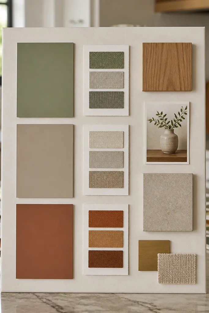
This board is for people who want their goals to feel like a color story, not a list. Paint chips are already consistent in finish and tone, so your board looks cohesive even with different photo sources. It works well for home projects, creative goals, and “make my space feel like X” goals. The mini swatch cards also help you commit because you can match future purchases to the board’s exact colors.
Pro tipChoose one “dark” chip, one “light” chip, and the rest mid-tones — it keeps the board balanced.
Pick 6-10 paint chip colors from the same brand family, then cut each chip into 2 cm squares. Back each square with white cardstock so the color looks crisp and doesn’t bleed. Arrange your photos in a grid with consistent spacing, then place swatch squares in the gaps like a color legend. Seal swatches and photos with a matte clear coat spray for uniform glare in photos.
AvoidDon’t use random paint colors from different brands and finishes — the sheen mismatch ruins the look.
4. Magazine-Only Goal Panels With Consistent Crop Lines
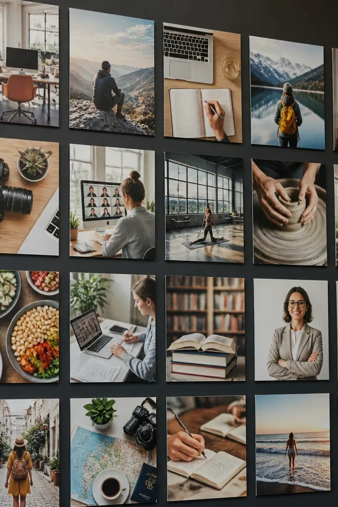
If you want the board to look high-end without prints, this is the move. Magazine-only panels look cohesive when every image follows the same crop style, like a clean rectangle grid. It’s especially good for career goals, learning goals, and lifestyle changes because you can build a “theme wall” from one source magazine. The look is photogenic because the typography and image edges create structure instead of visual clutter.
Choose one magazine issue and only cut images from that issue for color consistency. Use a paper trimmer to crop every cutout to the same height (example: 12 cm tall rectangles). Arrange them in 3 rows, leaving 2 cm gaps, then glue to stiff backing in a straight grid. Add thin labels cut from leftover magazine text strips under one photo per row.
Keep the crop width consistent too, even if images start different shapes.
Skip mixed sources — mixing magazines from different eras makes the board look random fast.
5. Wallpaper Strips Board With Layered Photo Mats
Wallpaper scraps create instant polish. The pattern gives you depth, and the board photographs better because the background has texture without needing extra decoration. This look works for goals tied to rooms, organizing, and creative projects because the photos sit inside “designed” frames. Layered photo mats also make the images feel curated and intentional, even if you’re using thrifted prints or phone screenshots.
Pro tipUse one wallpaper pattern only; two competing patterns makes photos look chaotic.
Cut wallpaper scraps into 3-5 vertical strips and glue them onto a stiff board, overlapping by 5 mm where needed. Let it set flat under a book. Cut photo mats from cream cardstock, then stack a second mat layer underneath each photo for a 6-8 mm shadow border. Add mini goal tags using cardstock strips and a black gel pen.
AvoidDon’t use wallpaper that sheds — dusty paper fibers show up in photos and get on your hands.
6. Thrifted Frame Collage Board With Glass-Style Look
Frames turn a vision board into something you actually want to hang. This look is photogenic because each image sits inside a crisp border with consistent edges. It also fixes a common problem: loose photos curl and look sloppy over time. Use this for goal sets where you want “mini goals” to be visible daily — workouts, meals, study targets, or weekly plans.
Pro tipPaint frames with matte spray, not gloss — gloss creates glare in photos.
Grab 6-10 small frames from a thrift store (or remove glass and backing from one larger frame). Clean them and paint them matte white or matte black if needed. Mount each frame to a backing board with wood glue and small brackets so it sits flat. Print or cut your pictures to fit, then insert them behind each frame’s backing paper.
AvoidAvoid frames with thick warped edges; they make the whole board look uneven.
7. Polaroid-Style Border Board With Washi Tape Corners
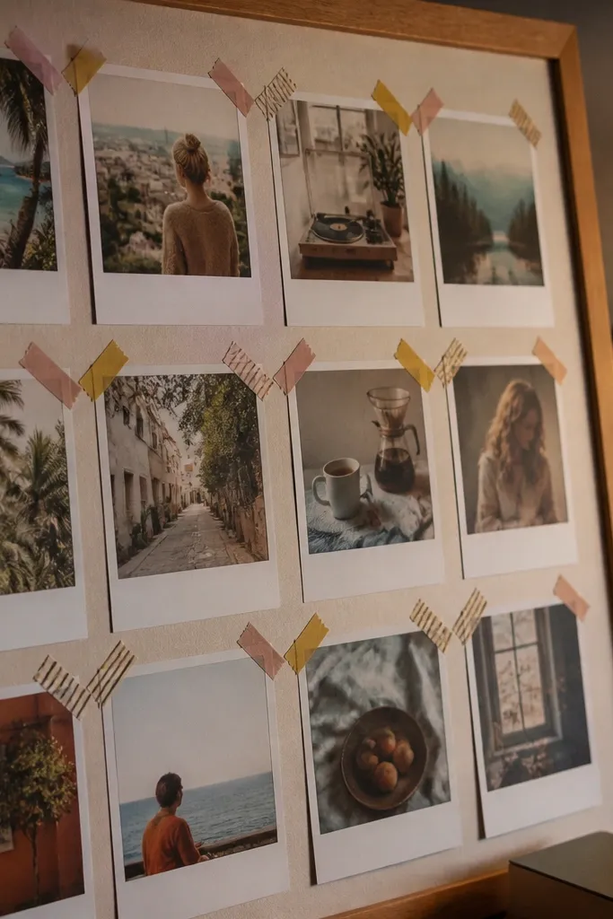
This one is for people who want “cute and usable” without turning into a scrapbook mess. Polaroid-style borders look consistent in photos, and washi tape corners add charm while keeping placement controlled. It’s a great format for travel goals, self-care goals, and “one-week focus” plans because you can swap photos in and out easily. The look is clean because everything shares the same margin size.
Print or cut photos to fit a 10 cm x 7 cm inner image area, then add a 1.5-2 cm white border around each photo. Make a light background from off-white cardstock or a matte board. Use washi tape at the four corners only, pressing down lightly so you can change images later. Add one date or short label line under each photo using a black marker.
Stick to one washi tape pattern so the corners don’t start competing.
Don’t tape across the center of the photo — it ruins the clean photo look.
8. Kraft Paper Grid Board With Red Stitching Lines
Kraft paper makes everything look warm and grounded, and the red stitching lines add a planner vibe. This board is photogenic because the grid gives clean structure while the red thread creates movement across the page. Use it for goals that need sequencing: “learn this then do that,” or “finish first draft then submit.” It’s also great for decluttering goals because you can connect each photo to a category label.
Cover a board with kraft paper and tape the edges on the back. Mark a grid with a ruler so your photos sit in consistent squares (for example, 10 cm squares with 2 cm spacing). Glue photos down, then use a needle to poke small holes along the grid lines where you want the red thread to travel. Thread red embroidery floss through the holes and pull tight, then tie the ends on the back with tape.
Use a single continuous thread path for each theme so it reads like a route.
Avoid loose thread — slack lines look messy instead of intentional.
9. Fabric Ribbon Banner Board for Weekly Goals
If your problem is that your board doesn’t get checked, this format fixes that by turning goals into a visible weekly strip. A fabric ribbon banner creates a focal line across the board, and it’s easy to photograph because the banner anchors the composition. It works well for habit goals, meal planning, and self-improvement routines. Photos look better when they’re grouped under the banner by week, not scattered across the whole board.
Cut a long strip of fabric ribbon (or thrifted ribbon) and glue it horizontally across the top third of your backing board. Create 4-6 small label cards underneath for Week 1-Week 4 using cardstock and a fine black pen. Print or cut photos to match each week’s theme and glue them in a neat column per week. Finish by adding tiny fabric scraps under each photo as separators, like tabs.
Pick ribbon with a matte finish so it doesn’t glare under phone flash.
Don’t crowd the banner with too many photos — keep one week column to 2-3 images.
10. Notebook Paper Cutout Board With Black Tape Hinges
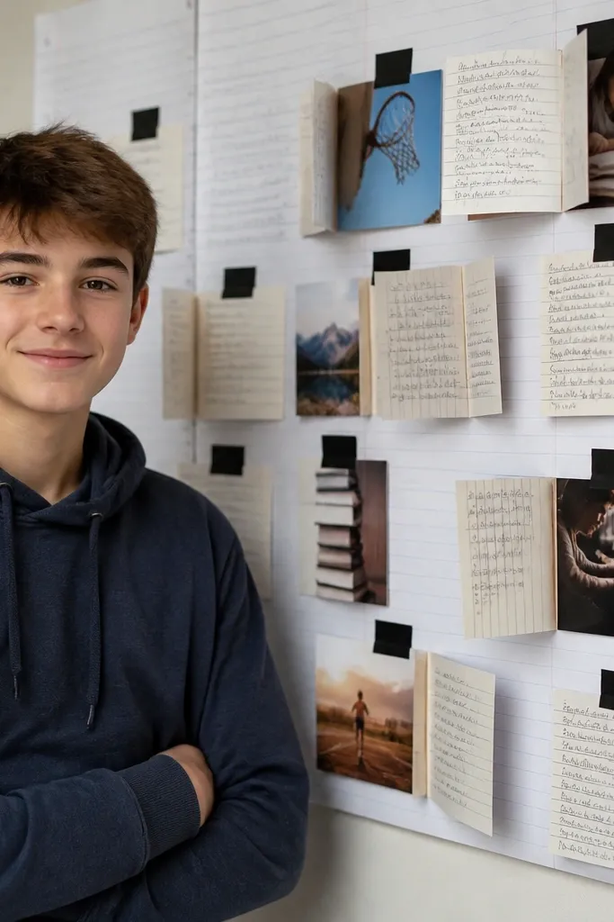
This board looks like a tidy project wall, not a craft pile. Notebook paper gives you faint lines that add structure, and black tape hinges create a “display” feel. It’s ideal for learning goals because you can attach study notes, bookmark photos, and progress screenshots in a way that looks organized. The hinge effect also makes photos easier to swap without tearing the paper.
Cover your backing board with notebook paper (or paper from a thrifted ledger) and tape the edges on the back. Cut photos to a consistent size, then place them where you want them. Apply short pieces of black washi tape or matte masking tape on the top edge like hinges, then fold tape over the back to hold the photo. Add one small “topic” label card under each hinged photo.
Use matte tape, not glossy — glossy tape reflects light and makes the board look cheap in photos.
Skip wet glue — paper ripples and the board stops looking crisp.
11. Book Page + Gold Outline Board for Career Goals
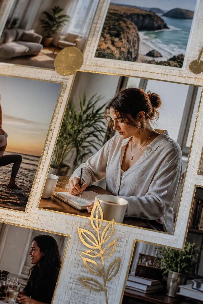
This look is moody and clean because book pages give a consistent off-white base, then gold line work adds polish. It’s perfect for career goals because you can build panels around job titles, skill icons, and training steps. The gold outlines make the photos feel like they’re part of one system, and it photographs well because the gold line stays sharp instead of spreading like paint. Keep it focused and you’ll avoid the “old book collage” vibe that can get messy.
Pro tipStick to one gold pen thickness so all outlines look uniform.
Tear book pages into medium rectangles and glue them to a board in overlapping layers, then press under a book to flatten. Cut your photos into consistent sizes and glue them on top. Use a metallic gold paint pen or gold marker to outline key elements on each photo or around each photo border with a 3-5 mm gap. Add small icon stickers (like a laptop, pen, or graduation cap) only if they match the gold theme.
AvoidDon’t outline everything — too many gold lines makes it look busy.
12. Recycled Cardboard Arch Board With Center Photo Focus
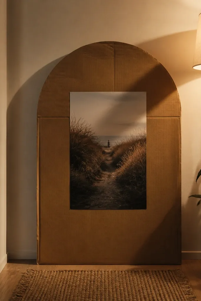
This is a strong, modern look built from cheap material: recycled cardboard. The arch shape forces attention to the center photo, which is where your main goal picture should live. It’s photogenic because the cardboard edge creates a crisp silhouette and shadow, especially with a lamp or window light. Use it for one big goal (move, launch, finish a project) plus two supporting goals on the sides.
Cut a large arch shape from thick cardboard and sand the edges lightly so it doesn’t look rough. Paint the cardboard matte white or matte black, then let it dry fully. Mount the arch to a backing board and place one large center photo inside, sized to leave a 2-3 cm border. Add two smaller photos on either side at the same vertical level, then glue a short label line under each.
Use a craft knife with a new blade — cardboard edges look cleaner when the blade is sharp.
Avoid flimsy corrugated cardboard — it warps and the arch won’t photograph straight.
13. Clear Pocket Sleeve Board for Swappable Goals

A clear pocket sleeve board looks sleek and it stays organized. You get that gallery feel because the photos sit behind clear plastic, so corners don’t curl and the board stays flat. This is the best format when your goals change every month, like fitness phases, reading lists, or seasonal home projects. The look is also practical: label tabs and consistent pocket sizes make the board easy to photograph without glare.
Pro tipChoose pockets with minimal texture on the clear plastic — heavy texture creates weird reflections.
Buy a pack of clear document sleeves or pocket sheets that fit standard paper sizes. Mount the pocket sheet to a board with double-sided tape along the edges. Insert printed photos or cutouts into pockets, then label each pocket with a small cardstock tab. Use a matte backing color behind the pockets (black or cream) so your photos read clearly.
AvoidDon’t use shiny photo paper behind clear plastic; it can glare under overhead light.
14. Handmade Paper Strip Collage With Clean Negative Space
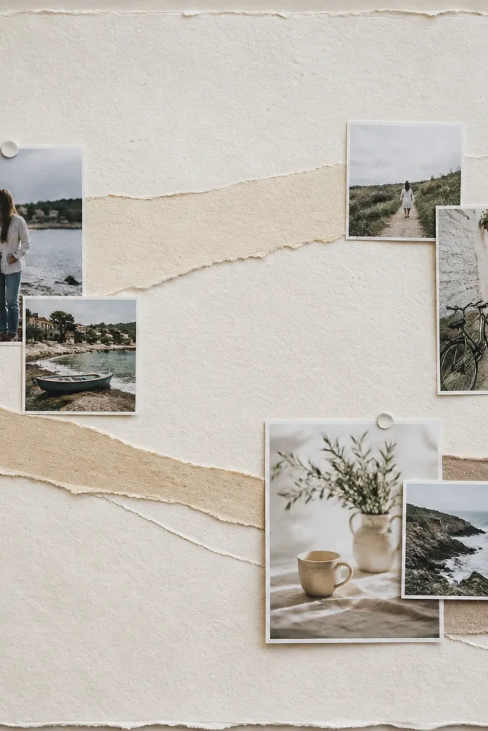
This look gets its beauty from the negative space. Handmade paper strips add texture, but leaving big blank areas keeps the board calm and high-end looking. It’s great for goals that need breathing room: creative practice, mindfulness, or “slow down and focus.” Photos stay readable because they’re not fighting a busy background. If you like modern design, this is the board style that looks good even with only 9-12 images.
Cut handmade paper strips into 1-2 cm widths and glue them to the backing only in one corner or around a central area. Leave at least 8 cm of clean negative space around your main photo. Add your goal photo in the center with a stiff cardstock mat for crisp edges. Finish by adding one thin handwritten title line in the blank area using a pencil first, then a pen.
Use fewer strips than you think — texture is strongest when it’s concentrated.
Avoid covering the entire board — full-coverage collages read cluttered in photos.
15. Upcycled Tin Photo Clips Goal Board
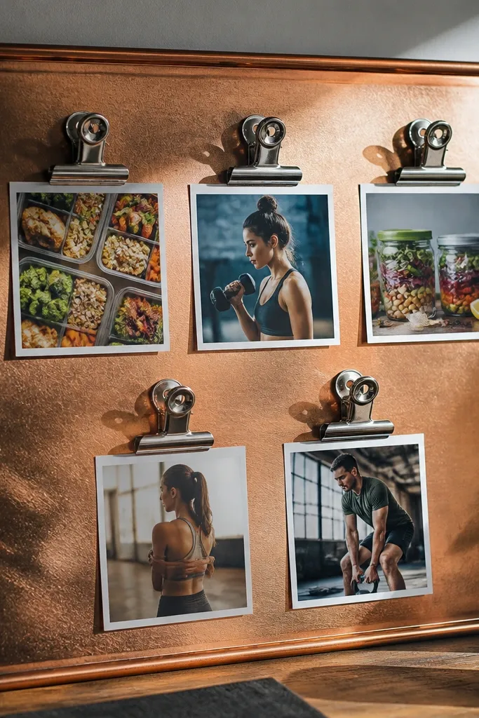
Metal clips plus a warm backing makes this feel like a mini mood wall. It’s photogenic because the clips create highlights and shadows, and you can arrange photos in a staggered layout without losing alignment. This format works well for goals that need reminders you can change weekly, like meal prep, workout schedule, or budgeting. The look also hides imperfect trims because the clip covers the photo edge neatly.
Cut a backing board from thrifted wood panel or stiff cardboard and paint it matte. Attach a thin strip of wood or cardboard along one edge where you’ll mount the clips. Use 10-15 small metal binder clips or upcycled tin clips and space them evenly. Clip photos into place, then add small label cards clipped underneath each photo.
Keep clip color consistent (all silver or all black) so the highlights don’t compete.
Don’t clip heavy glossy prints; they curl and catch glare.



