
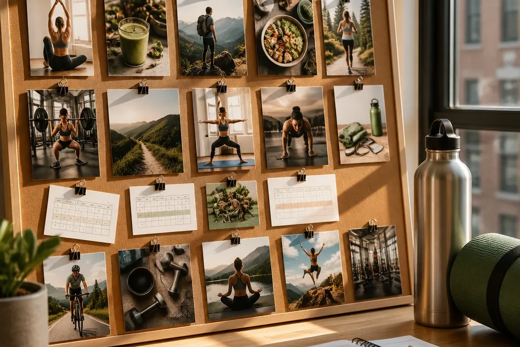

1. Matte Photo Grid With Color-Block Workout Days
This layout looks clean because it treats your vision like a design project, not a scrapbook. The color blocks separate training days at a glance, so your brain knows what you’re doing before you even open your calendar. Use it when you need structure: gym days, home workouts, and rest days all get a visual lane. The board stays aesthetic because the photos are cropped to similar aspect ratios, and the background is matte instead of glossy. It’s also easy to update weekly without ripping everything apart.
Start by choosing one background color (cream or charcoal) and cut a grid of 3x4 or 4x4 squares from matte cardstock. Print six to twelve fitness photos in matching crop sizes, then add color-block headers using solid craft paper tabs in your chosen palette. Mount photos with a thin glue stick or photo corners, then write workout-day labels in the same font style across the board. Finish by adding a small legend in the bottom corner that matches the colors to days (for example, teal = strength, amber = cardio, gray = rest).
Pro tipIf you want it to look expensive, round the corners of the photo squares slightly with a corner punch.
AvoidDon’t mix glossy and matte prints; the glare makes the whole board look messy fast.
2. Hydration + Protein Checklist Board With Mini Icons
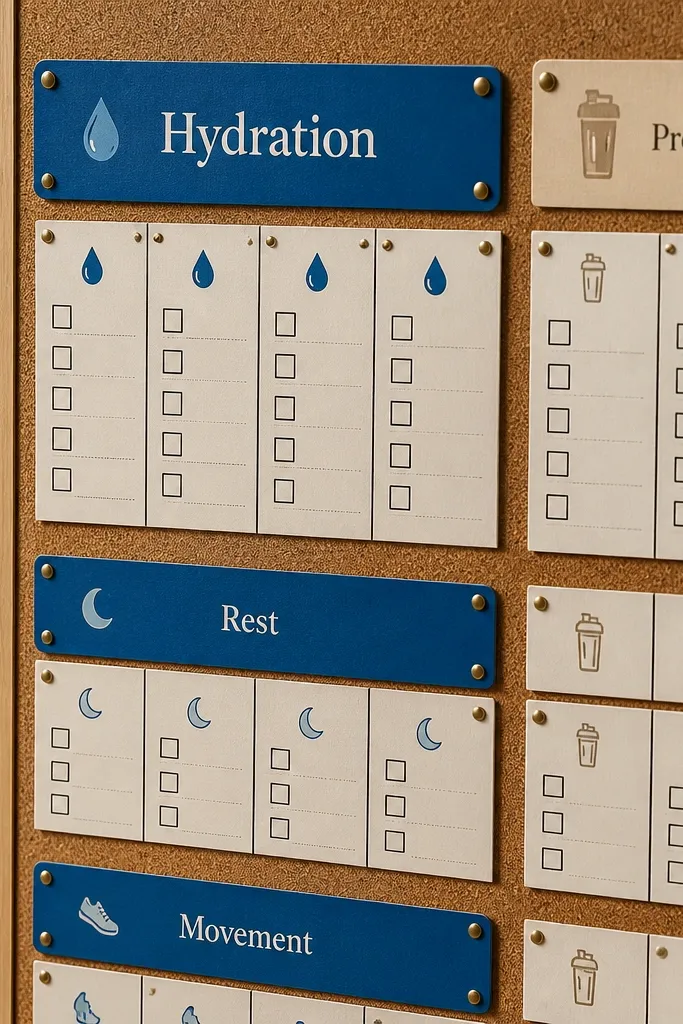
This one is for the fitness goal that keeps slipping because your nutrition falls apart first. The board stays good-looking because it uses a consistent grid and tiny icon accents instead of long paragraphs of text. You’re turning “drink more water” into a visual ritual you can check off at a glance. Add protein targets and meal anchors so your board connects workouts to actual intake. It’s great for kitchens, home offices, and gym lockers where you’ll see it multiple times daily.
Cut a sheet of poster board into a clean rectangle and draw two columns: Hydration and Protein. Create checkboxes with a ruler (10-14 small boxes works well) and add icons you print from your own files or simple line icons (water drop, dumbbell, chicken, tofu). Print a small weekly target strip at the bottom and glue it over a piece of clear contact paper so you can swap it out with dry-erase marker. Mount the whole thing in a frame or laminate it with self-adhesive clear film for durability.
Pro tipUse a dry-erase marker on the laminated area so you can update daily without smearing the photos.
AvoidDon’t cram numbers everywhere; keep targets to one tidy strip so it stays readable.
3. Rep Target Sticker Wall for Strength Days
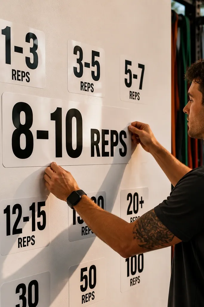
If your problem is starting strong and then fading, a rep target board is the push you can see. It looks great because stickers, printed labels, and a simple background create a “system” vibe — clean, intentional, and easy to scan. You’re not just imagining a stronger body; you’re rehearsing the session you want to complete. This works especially well for lifting goals because it turns training into visible steps. Put it where you plan workouts — near your dumbbells, in your laundry room, or on the back of your closet door.
Pick a black or deep navy base board and cover it with a thin layer of matte adhesive paper for a smooth surface. Print three to five exercise cards (for example, squat pattern, hinge pattern, push, pull, core) and mount them in a vertical stack. Create rep-range labels as stickers or cut vinyl-style rectangles from colored paper, then place them beside each exercise card. Add a small “today’s target” box at the top with a dry-erase label so you can swap numbers without redoing the board.
Use consistent label sizes (same width, different heights) so your board looks designed, not randomly stuck.
Avoid handwriting everything in different styles; one font style makes the whole board look calmer.
4. Gym Outfit Fabric Swatch Board With Texture Labels
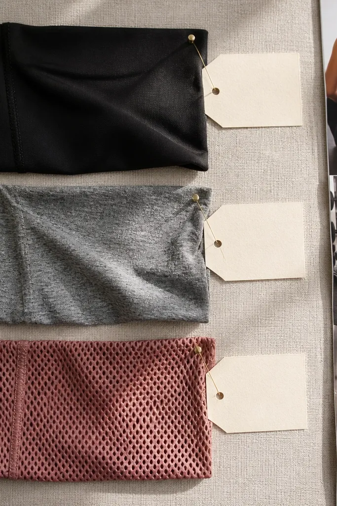
This is a mood board that actually drives action because it ties your goal to the clothes you wear when you train. It looks good because fabric textures are visually interesting, and the labels keep it organized. Add swatches from leggings, a sports bra, or a breathable tee you already own, and pair them with photos of the same color family. This is ideal for people who delay workouts because they don’t feel ready or comfortable. Seeing your “gym uniform” in one place reduces friction.
Cut fabric swatches into 2x3 inch rectangles and press them flat between books for a day. Mount swatches using fabric-safe glue or double-sided tape, then add small label cards with the outfit purpose (for example, “sweat-friendly,” “no-roll waist,” “easy layers”). Choose a background that matches one dominant color in your wardrobe (warm beige, cool gray, or cream). Finish by adding a small pocket or envelope on the side for a clean hair tie or mini deodorant so the board feels practical.
Pro tipMatch swatch edges with a neat zigzag or straight trim so it looks intentional instead of frayed.
AvoidDon’t use fabrics that shed or pill; they look cheap fast on a wall.
5. Cardio Route Map Board With Distance Markers
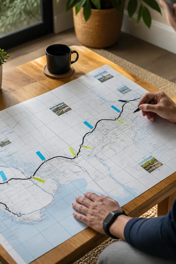
This turns cardio from a vague intention into a plan you can follow. It looks standout because maps have natural lines, and distance markers create a clear visual path. You can tailor it to walking, running, or cycling by using route screenshots and overlaying your own distance notes. This works for people who get bored or nervous starting outdoors because the route becomes familiar and safe. Put it near your keys or entryway so you review it before you leave.
Print a map screenshot of two routes you like (short and longer) and crop them so the scale is visible. Add distance markers by cutting small colored paper tabs and writing the mile or kilometer number on each. Mount the routes on a cork board or foam board, then overlay a thin strip of clear contact paper if you want a washable surface. Add a small “start here” arrow and a check box list for pre-walk cues (water, shoes, music).
Pro tipUse one marker color for each route so you don’t mix distances when you’re tired.
AvoidDon’t pick routes with complicated turns if you’re building consistency; the board should reduce decision load.
6. Morning Routine Photo Strip for Consistency
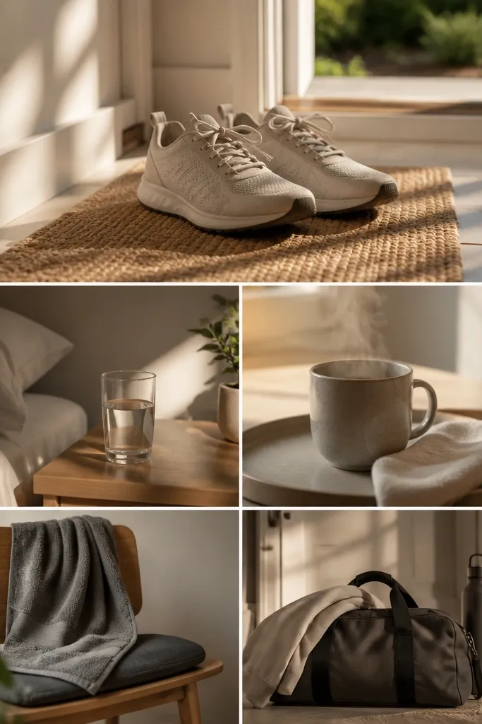
When motivation fades, routines win. This board is beautiful because it uses a vertical strip of photos that read like a story, from shoes to water to workout. It’s perfect for people who miss workouts because mornings are chaotic. Keep the photos realistic and uniform in tone by printing on matte paper and using one frame style. The board becomes a visual checklist you can follow without thinking.
Choose five to seven routine photos (shoes, water bottle, towel, dumbbells, stretch mat, workout clothes). Print them in the same width, then mount them in a straight column with consistent spacing. Add a tiny label under each image with one action word (Put on shoes, Fill bottle, Start timer). Finish by creating a small “time window” box at the bottom with a realistic start time and a checkbox for “done.”
Pro tipUse the same background color behind each photo by trimming them to similar edges so the strip looks designed.
AvoidDon’t include clutter in the photos; it makes the routine feel messy too.
7. Recovery Corner Board With Sleep + Stretch Prompts
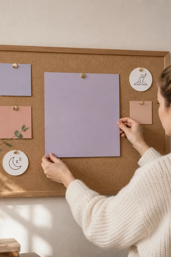
This is for the fitness goal that stalls because recovery gets ignored. It looks calming because it uses soft colors and lots of negative space, then adds small, clear prompts for sleep and stretching. You’ll get better training results when rest is visible, not hidden. This board also helps if you’re stuck in the cycle of training hard, feeling sore, then skipping. Put it by your bed, on your nightstand wall, or inside a bedroom closet door.
Pick a soothing palette like sage, soft gray, and cream and use a linen-texture scrapbook paper as the base. Print two sets of cards: sleep cues (wind-down, lights low, no late scrolling) and stretch cues (hip opener, calf stretch, breathing). Mount the cards in two columns with a small divider line between them. Add one weekly swap pocket using a small envelope so you can switch in a different recovery theme each week.
Pro tipUse short prompts that fit on one line; the board should be readable the second you wake up.
AvoidDon’t overload it with workout images; this one needs to feel like recovery, not more training.
8. Meal Prep System Board With Containers and Labels
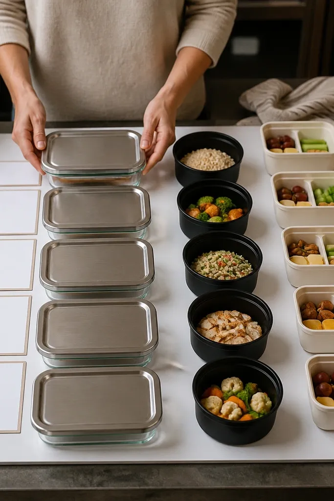
This makes nutrition look organized, not stressful. The board stays photogenic because container shots create consistent shapes, and label cards add structure. It’s ideal if your fitness plan breaks because you forget what to eat or you shop randomly. Pair your workout goals with a meal system: breakfast anchor, lunch template, snack rule, dinner flexibility. Seeing the system on a board helps you execute even when you’re tired.
Gather photos of your actual containers or print generic container photos with the same color vibe as your kitchen. Create four meal cards and label them with macros or simple targets (example: “30g protein,” “high-fiber carbs”). Add a weekly schedule strip with days of the week and checkboxes for “prep” and “pack.” Mount everything on a corkboard or foam board and cover the meal cards with clear contact paper so sauce splashes don’t ruin it.
Pro tipPrint labels in one typeface and keep the font size consistent for a clean, magazine-like look.
AvoidAvoid using tiny text blocks; you want a glanceable system, not a nutrition textbook.
9. Habit Streak Calendar With Color-Coded Tiles
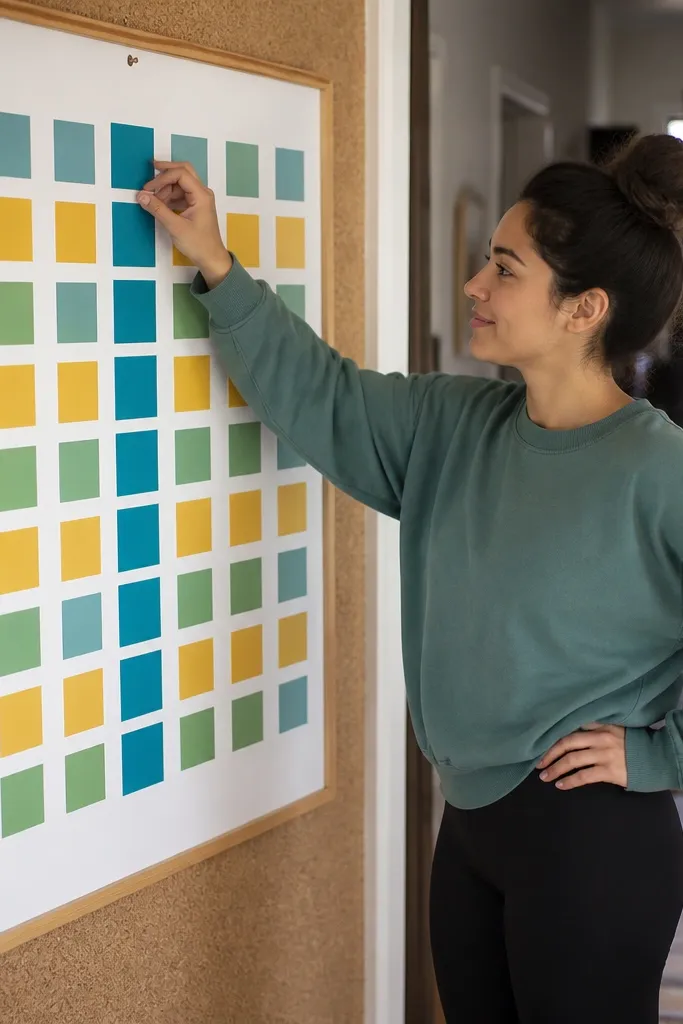
A streak calendar turns fitness goals into visible momentum. It looks great because color-coded tiles create a grid pattern that’s satisfying to look at. This setup works for consistency goals like “work out 4 days a week” or “walk 20 minutes daily.” It also helps you track habits that support training, like hydration and protein. Put it somewhere you see each morning so you update it fast and keep the streak alive.
Draw a 4-week calendar grid on thick paper or foam board with 7 columns and 4 rows, leaving space for weekday headers. Cut small square tiles from colored cardstock and write one habit per tile color (for example, green = workout, blue = walk, yellow = stretch). Create a blank tile for “rest day” so you don’t feel guilty when you need it. Mount the grid and store tiles in a small pocket so you can update daily.
Choose just 2-3 tile colors; more colors make the board look chaotic.
Don’t track ten habits at once; the board loses clarity and you stop using it.
10. Before-and-After Style Board With Progress Proof Cards
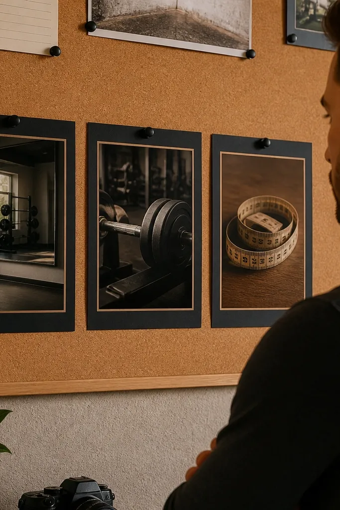
If you hate the pressure of “before/after photos,” this gives you proof without turning it into a cringe comparison wall. The look is photogenic because it uses clean typography and “proof cards” for measurable progress like weights, reps, and measurements. You can keep it classy by using a consistent border and a simple two-tone palette. This board helps you stay motivated when the scale stalls. It also works well for people who want to track body changes without making the board feel harsh.
Make a two-column layout: left is “Baseline” and right is “Now.” Create proof cards by printing simple metric templates (date, exercise, number, note) and leave a few blank spaces for future entries. Add a small photo strip at the top with consistent lighting and cropping. Mount the board in a frame, then use a sticker label system to swap out cards as you progress.
Pro tipUse numbers that you can influence weekly, like reps at a set weight, not vague “energy” scores.
AvoidAvoid adding random quotes; keep the focus on proof cards so it stays grounded.
11. Zine-Style Cutout Collage With One Dominant Theme Color
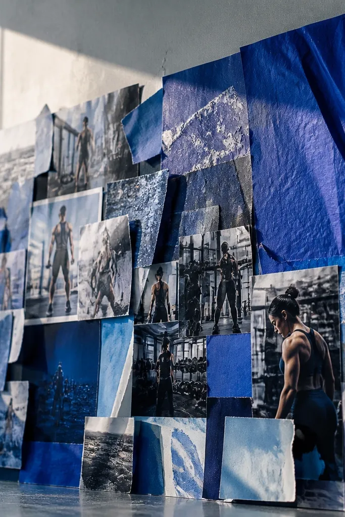
This is the aesthetic option for people who want their fitness board to feel like art. The trick is controlling chaos with one dominant theme color — everything else supports that palette. You’ll get a high-visual-impact look because cutouts create texture, and the collage edges add energy. It’s great when you collect magazine clippings but they never look cohesive in a scrapbook. The board becomes a motivating wall piece that still communicates your goals.
Pick a theme color (terracotta, cobalt, forest green) and choose only images that include that color. Cut out shapes from magazines, then arrange them on a base board with a big blank area for breathing room. Use a glue stick for paper edges and reinforce larger cutouts with small strips of washi tape on the back. Add one clean headline label at the top and three action tags around the edges like “lift,” “move,” “recover,” each in the same font style.
Pro tipPlan your layout with paper scraps first; it prevents over-gluing and keeps it looking intentional.
AvoidDon’t use clippings with wildly different print quality; the board ends up looking patchy.
12. Shoe and Gear Still Life Board With Real Objects
This one feels grounded because it uses real objects, not just photos. It looks good because you create a still-life composition: shoes or gear in a neat cluster, then photos and labels around it. It’s a strong choice if you procrastinate because your gear is scattered. Seeing your key items in one “start here” spot removes the mental step of getting ready. Great for entryways, beside your workout mat, or inside a closet where you choose outfits.
Choose one base board and cover it with a smooth matte surface so objects sit flat. Add a small shelf-like area using a thin foam strip to create a level platform, then mount one or two small gear items like a resistance band, a lifting strap, or a mini timer. Surround the objects with printed photos of your workouts and a simple label list of what to grab. Seal the board with clear contact paper if you’re using lightweight items that might snag dust.
Pro tipKeep objects small and limited to 2-3 items; too many things turns it into clutter.
AvoidDon’t attach gear directly to paper without a backing; it loosens as the board flexes.
13. Phone Wallpaper Vision Stack With Swipeable Fitness Cues
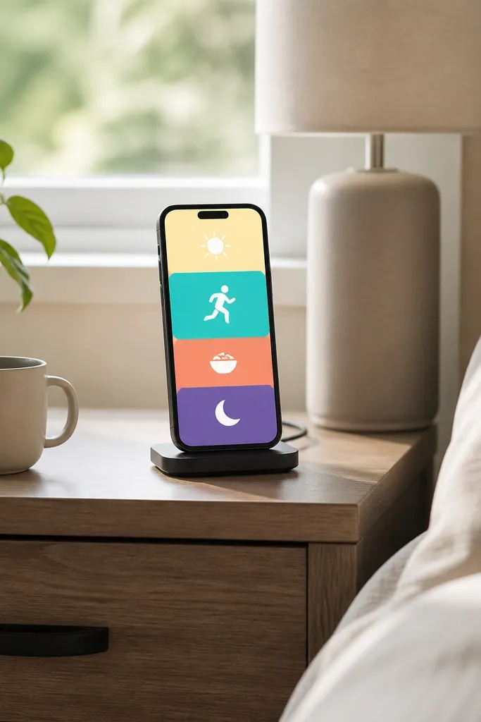
A phone vision board is for people who live in their camera roll and forget to look at wall boards. This looks clean because it’s designed as a stack of minimal wallpapers with one cue per screen. You get multiple “micro-motivations” that match your day: morning, workout, meal time, and bedtime recovery. It keeps the goal in your pocket and reduces the chance you’ll ignore it. This works especially well for busy schedules and small spaces.
Design four simple wallpapers using a design app: Morning cue (shoes + time), Workout cue (exercise list), Nutrition cue (protein target), Recovery cue (sleep prompt). Use one font family and a single color accent so it reads instantly. Export each design at the correct phone resolution and save them to a dedicated album. Set them as a rotating sequence using your wallpaper rotation option or manually change them at set times.
Put the cue text in the top third of the screen; it stays visible even with notification bars.
Don’t cram multiple goals on one screen; one action per wallpaper keeps it effective.
14. Corkboard With Clear Pocket Trackers for Weekly Updates
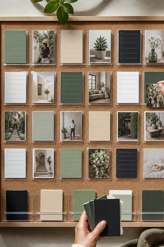
This is the most practical “good-looking” setup because it stays tidy while you update it. The clear pockets look sleek, and the cork texture adds a warm, handmade feel. You can slide in new weekly cards without tearing up your layout. It’s ideal if your goals evolve, like switching from beginner strength to hypertrophy or adjusting cardio days. The board stays photogenic because everything is in pockets — no loose papers flapping around.
Cut a corkboard to your preferred size and mount it to a frame or mount board. Add clear plastic document pockets in a neat column for workout cards and a second column for nutrition cards. Print weekly cards with consistent formatting and use a ruler to keep text aligned. Add a small header strip at the top with your theme color, then attach a tiny clothespin row for quick notes like “bring water bottle.”
Use two pocket sizes only. Too many sizes make the board look like a craft bin exploded.
Don’t let cards hang unevenly; if pockets are misaligned, the whole board looks sloppy.
15. Timer-to-Goal Countdown Board With Sticky Notes
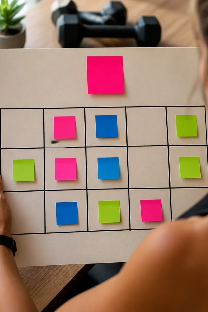
This board fixes the exact problem that kills motivation — you forget what to do before the timer starts. It turns your workout into a visible countdown with one tiny action per sticky note, so you always know the next move without thinking. The look is clean and bold: a numbered grid, thick marker lines, and color-coded note blocks that photograph well in your gym corner. It also gives you momentum because the board makes the start feel automatic. This is beginner-friendly, takes about an hour, and works great on a desk wall, inside a closet door, or next to your treadmill so you see it before you leave the house.
Cut a 16 x 20 inch backing from foam board or thick poster board and paint it matte white so marker lines stay crisp. Draw a 5 x 4 grid (5 columns by 4 rows) with a ruler, leaving a 1 inch margin on all sides, then write big timer numbers in each cell using a black paint marker (45, 40, 35, down to 20 — adjust to your usual session length). Add a color strip at the top: 4 rectangles in your workout colors, one for Warm-up, Main set, Finisher, and Cooldown, and match each sticky note color to its stage. Use 3 x 3 inch sticky notes for steps that fit in one line, like “2 min easy pace” or “10 squats slow,” then place them in the cells in order. Finish by sealing the board with matte spray (light coats) and add two small rare-earth magnets behind the sticky notes or on the board corners if you want them to swap fast.
Use a matte white base and a black paint marker. Glossy boards smear and sticky notes curl at the edges after a few weeks.
Avoid tiny handwriting. If you need to squint from 6 feet away, it will fail the moment you’re tired.



