
1. Oxblood Love Moodboard on Linen Backing
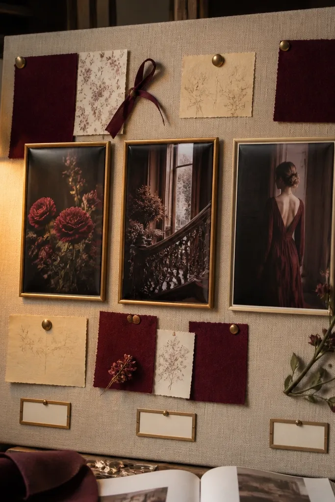
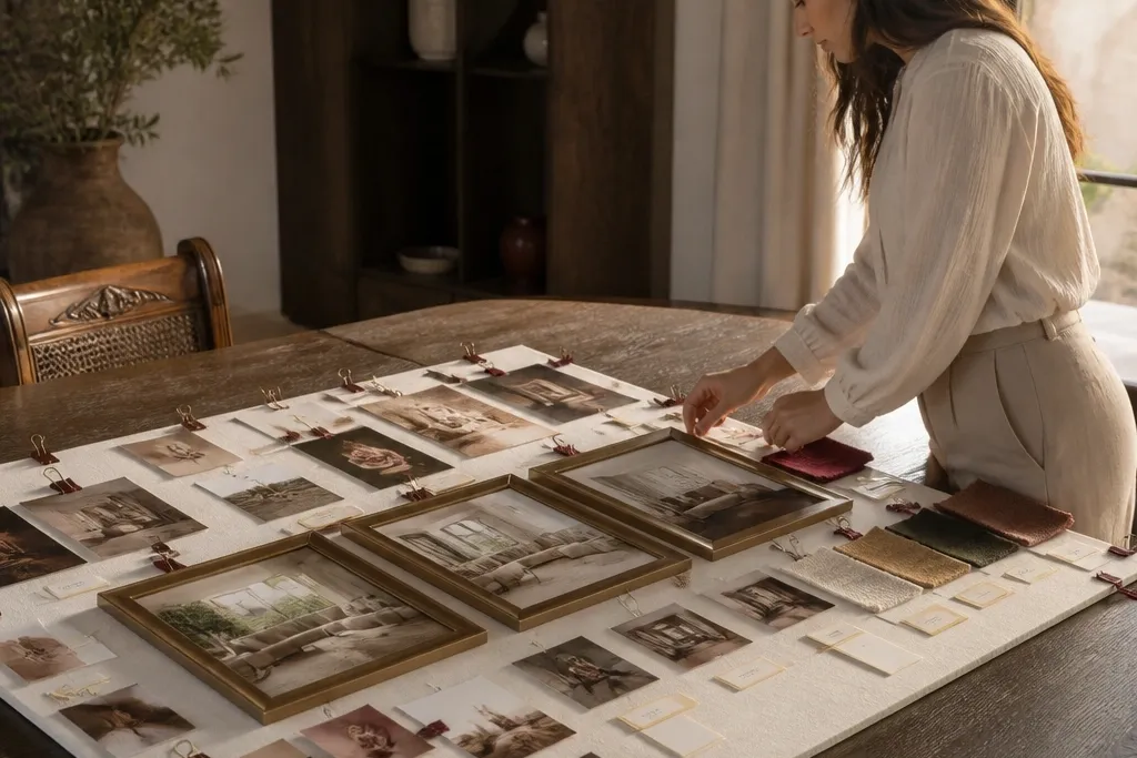
This board looks expensive because linen has a natural weave that photographs like luxury. Oxblood gives you depth without screaming red, so the mood stays romantic but controlled. Use 3 framed anchors for your main love themes, then scatter small fabric swatches as “texture anchors” around them. Add tiny gold-ink labels with one-line intentions like “Sunday mornings” or “slow dates” so the board reads like a plan. It’s best for people who want a calmer, more deliberate love vibe than a glittery board.
Start with a backing board covered in linen fabric (staple or spray adhesive, then trim edges clean). Print or cut three anchor photos in a consistent size and mat them on cream cardstock. Lay everything dry first, then glue anchors down and place fabric swatches last so you can adjust spacing. Finish by writing labels on small strips of gold foil paper or metallic cardstock and glue them under the anchors with even spacing.
Use matte photo paper for the anchors so the linen texture stays the star, not reflections.
Don’t mix shiny fabrics and glossy photos — it turns the board into a craft collage.
2. Porcelain + Charcoal Relationship Blueprint Board
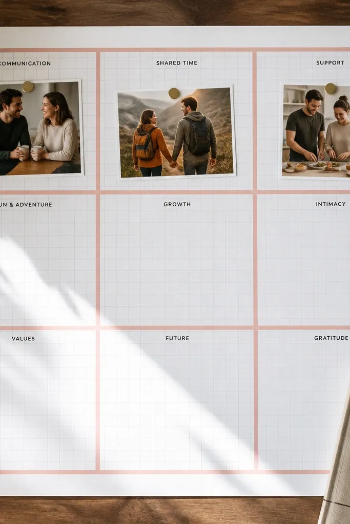
A blueprint-style board makes love feel structured, not chaotic. The charcoal grid lines create an “order” look that photographs beautifully and keeps the board readable. Porcelain and soft rose accents signal warmth without turning the board into a Valentine theme. Put your relationship goals into visual categories: communication, time together, home life, and boundaries. This works well when you know what you want, but you need a clear system to keep it on track.
Cover a board with porcelain paper, then draw thin charcoal grid lines using a ruler and a fine-tip marker. Add printed checklists or mini “systems cards” (communication, dates, boundaries) as rectangular blocks. Place one larger rose-accent photo in the center, then surround it with smaller blocks for each category. Seal the final layout with a light layer of matte clear spray over the paper areas only, keeping labels crisp.
Pro tipPrint your text blocks in one font family and keep font weight consistent so it looks designed.
AvoidAvoid decorative fonts for the labels — they make it look like a scrapbook.
3. Soft Rose Ticket Stub Date Board
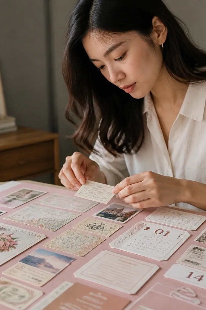
Ticket stub boards look high-end because they feel curated and time-specific. The key is using real-looking ephemera in a consistent style: ticket shapes, map snippets, and date cards. Soft rose cardstock keeps the palette romantic, while the repetition of “date artifacts” makes the whole board feel intentional. This board is perfect for people who want love that looks like experiences, not just feelings. It also helps you plan because each artifact can represent a future outing or a date theme.
Choose a blush backing and cut your “ticket” pieces from heavier paper (120-200 gsm) so they hold shape. Print or hand-draw date text onto small labels and glue them to the tickets. Arrange one vertical “date timeline” down the center with photos at the top and midpoints. Add tiny map scrap corners around the tickets, then seal the paper edges with a thin glue stick for clean borders.
Use a paper punch for ticket notches so the edges look uniform in photos.
Don’t mix random paper weights — thin receipts crease and ruin the polished look.
4. Gold Foil Boundary Card Board
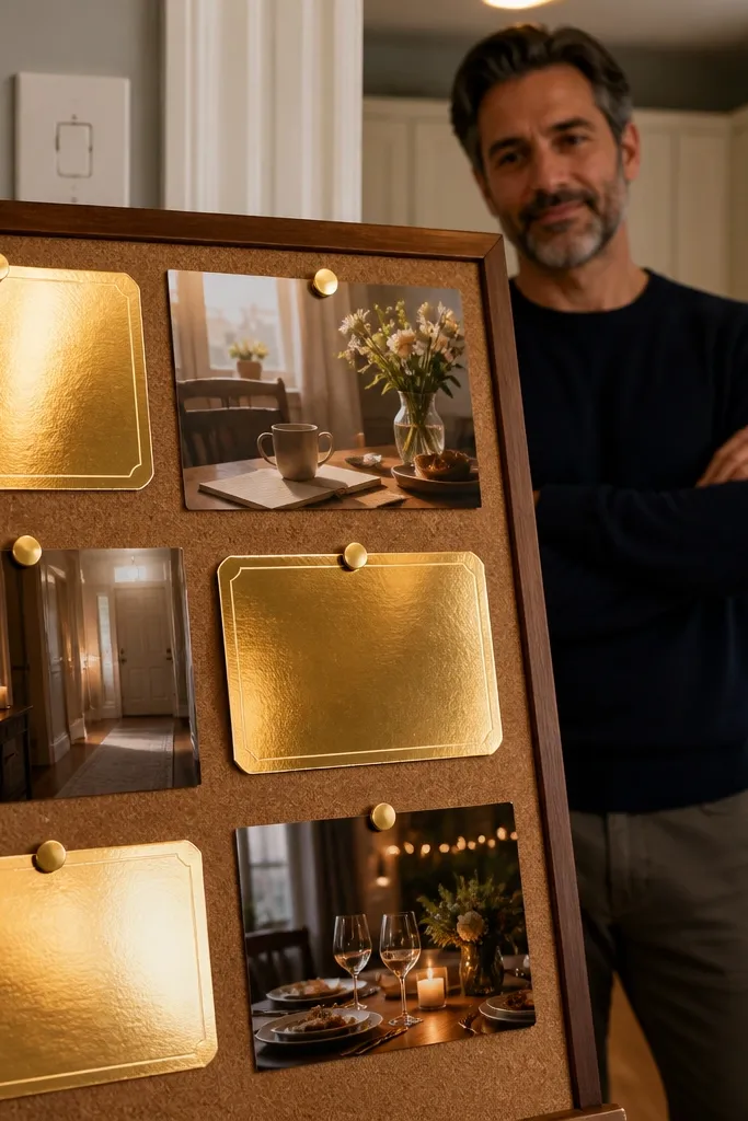
This is a love vision board for people who want standards, not wishful thinking. Gold foil boundary cards make the message feel classy and firm, not harsh. Keep the photos soft and domestic: a quiet kitchen, a morning table, a cozy hallway. Then add boundary cards that are short and visual, like “No disappearing” or “Plans made with both people.” It shifts mindset because you’re literally training your eye to notice what you accept.
Cover the board in cream cardstock and cut gold foil card rectangles using a craft knife and a metal ruler. Write one boundary per card in black ink, spaced with wide margins for a luxury look. Place three calm photos in a row near the top, then cluster the gold cards beneath with consistent gaps. Finish by adding one small “agreement” card in the bottom corner with a single sentence goal.
Pro tipUse a ruler even for handwriting — straight baselines make it look expensive.
AvoidAvoid long paragraphs on the cards; they look messy and unreadable in photos.
5. Marble Contact Paper Photo Mat Board
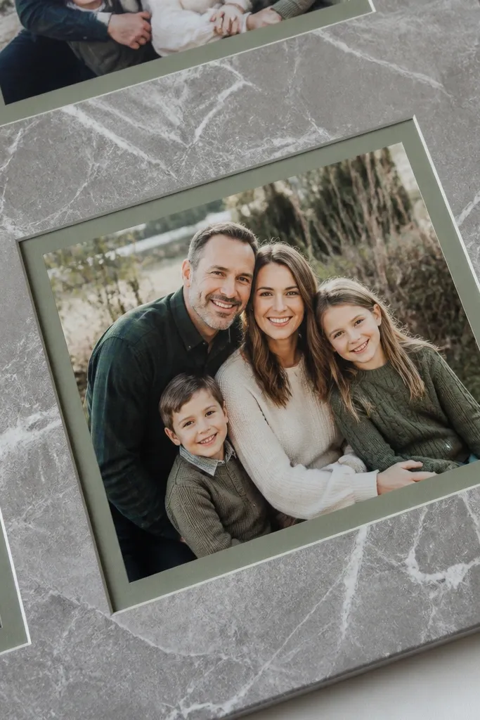
Marble contact paper turns basic photos into “gallery-ready” mats. You get a designer vibe without buying a bunch of frames, and it photographs cleanly because the pattern reads as one cohesive surface. Sage accents keep it soft and romantic, while the marble gives you that high-end polish. This board works great if you like minimal layouts but still want the love theme to feel luxe. It also helps your photos stand out so your board doesn’t blur into background clutter.
Cut marble-pattern contact paper strips into frame shapes and apply them to a white backing board. Leave a window opening for each photo, then mount photos with double-sided tape. Arrange three large marble mats in a triangle layout for balance. Add small sage paper cutouts (leaves, thin lines, or simple circles) between frames to connect the palette.
Pro tipPress contact paper with a plastic scraper so bubbles don’t show up in close photos.
AvoidDon’t place marble mats too close together; narrow gaps make the pattern fight.
6. Vintage Envelope Collage Love Board
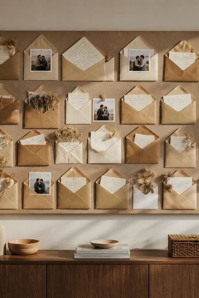
Envelope collages look collectible because they’re functional paper objects, not just images. Kraft brown and off-white give you that warm, lived-in romance, while the envelope shapes create strong visual structure. Use envelope flaps as pockets for tiny notes, like “what I want to feel” or “how I handle conflict.” The board shifts mindset because it turns love goals into “messages” you can revisit. This suits people who like cozy aesthetics and want a tactile, story-driven layout.
Cover your backing with a neutral paper or fabric and cut envelope shapes from brown kraft paper. Glue envelopes in layers, then insert small photo strips or printed mini-cards into pocket openings. Add soft rose labels using a fine pen and glue them under each envelope. Finish by tying two thin ribbon pieces across the middle like bookmarks.
Pro tipMake your labels consistent width — even 1-2 mm differences show up in photos.
AvoidDon’t overfill pockets; too many layers make the board look bulky and messy.
7. Charcoal Acrylic Instagram-Style Grid Board
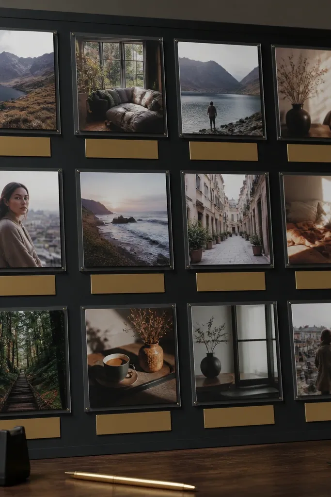
This one is for the clean, modern love vibe. A charcoal grid gives you structure, and glossy photo squares add that “high-end social feed” look. Muted gold captions make the text feel intentional without reading like a quote board. Use this when you know you want a lifestyle (dates, dinners, home details) and you want your vision to look consistent. It shifts mindset by making your goals visually repeatable, like a daily feed.
Create a charcoal backing and mark a grid with a ruler so each photo square aligns. Print photos in one aspect ratio (like 4x5) and mount them with double-sided tape. Add short gold captions under select squares, keeping them to 2-4 words. Seal the board edges with clear tape so corners stay sharp and clean.
Use the same paper finish for all photos so the shine level matches across the grid.
Don’t mix different photo sizes; the mismatch kills the expensive grid effect.
8. Sea Glass Lace Board with One Deep Teal Anchor
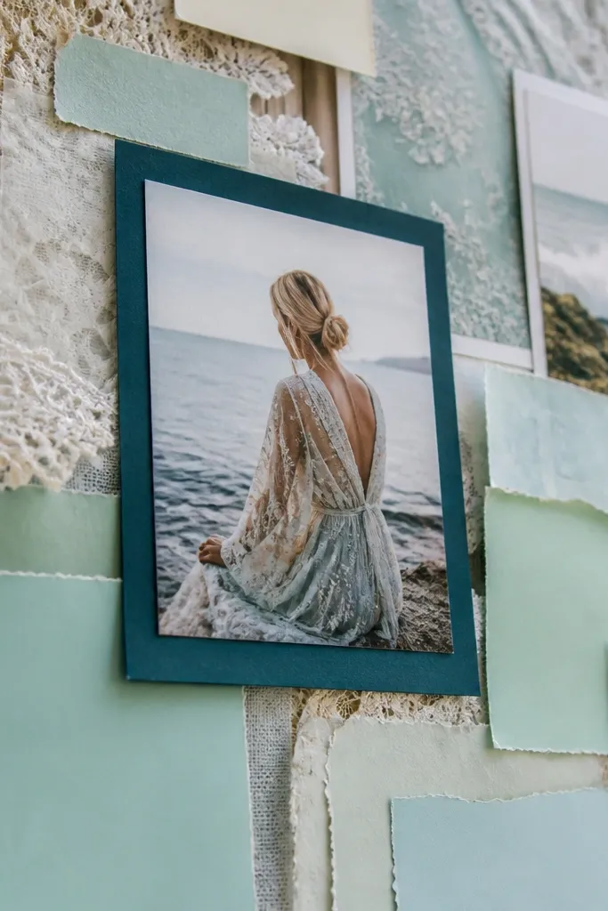
Lace plus sea-glass tones reads romantic and high-end because the texture is soft but controlled. Keep your palette to light mint, pale aqua, and one deep teal anchor so the board doesn’t look like a craft project. The center anchor photo is your “love north star,” while the lace overlay makes the rest feel airy. This is ideal for people who want a gentle, feminine mood and a board that feels calm rather than loud. It also works well in bedrooms or reading corners.
Lay lace fabric over a light aqua backing and secure it at the edges with spray adhesive. Cut a window for the center anchor photo and mount it on a matte backing so it doesn’t compete with lace. Add two or three smaller sea-glass images around the center, each with a thin border of white paper. Finish by placing a deep teal label card under the center photo and glue tiny shell-like paper cutouts near corners.
Pro tipTrim lace edges with sharp scissors and keep them aligned — uneven lace looks sloppy in photos.
AvoidAvoid too many lace layers; one overlay is enough.
9. Macaron Color Love Board with Layered Paper Cutouts
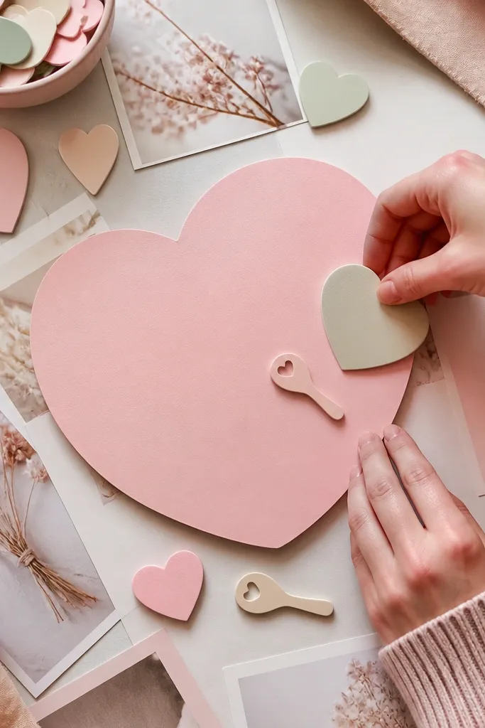
Macaron palettes can look cheap, but layered paper cutouts make them look designed. The trick is to use matte photos and thick paper cutouts so the board has depth. Keep the heart theme subtle — use small icons and one or two larger shapes, not a full pattern. This board shifts mindset by making your love goals feel playful and safe, which helps you stay open to good opportunities. It’s a good fit for people rebuilding confidence after a rough stretch.
Pick 3-4 pastel colors and cut layered shapes (circles, scallops, small hearts) from 160-220 gsm paper. Mount a few matte photos on the board, then glue cutouts on top with foam dots for depth. Use one larger “love” word graphic made from layered paper strips in the center. Add tiny printed captions in black ink so the board still reads crisp.
Pro tipUse foam dots only on the top layer; too many layers flatten the depth effect.
AvoidDon’t add glitter. It looks messy on camera and sheds everywhere.
10. Black-and-White Minimal Date Night Board
Minimal boards look high-end because they leave space. Black-and-white photos make the love theme feel timeless, and one red rose accent gives you that romantic hit without clutter. Put 4 anchors only: two date vibes, one home vibe, one “how we talk” visual. This board shifts mindset by reducing decision fatigue — you’re not staring at 40 things, you’re focusing on 4 repeat signals. It’s especially good if your current board feels like noise.
Use a white backing and print photos in black-and-white. Choose one accent color (red) and add a single red element like a rose print card or red sticker in one corner. Arrange anchors with consistent margins and align edges using a ruler. Add one short label under each anchor, then seal the board with matte spray to keep everything looking uniform.
Keep your margins wide — luxury minimalism is mostly spacing.
Don’t use too many fonts. One simple font for labels is enough.
11. Rose Quartz Crystal Frame Vision Board
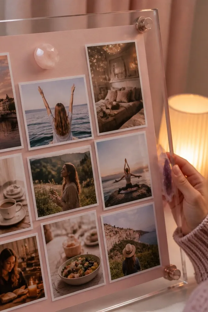
This board looks premium because it mixes clear and soft tones. A clear acrylic frame or a plastic document sleeve over part of the board gives you that “collector” feel. Use rose quartz colored paper behind photo cards so everything glows gently. Keep the crystal theme to one or two visual elements so it stays classy. This shifts mindset by making your love goals feel protected and “kept,” not thrown together.
Pick a soft pink backing and cut photo cards with consistent borders. Place a clear acrylic frame or plastic sleeve across the top third of the board and insert your center photo behind it. Add two small rose quartz paper textures around the frame, like crumpled tissue or textured cardstock strips. Secure everything with double-sided tape and trim edges so the frame looks clean.
Pro tipWipe acrylic with a microfiber cloth before mounting so fingerprints don’t show.
AvoidAvoid stacking too many transparent layers; glare makes it look cloudy.
12. Map Coordinates Love Board with Pinned Corners
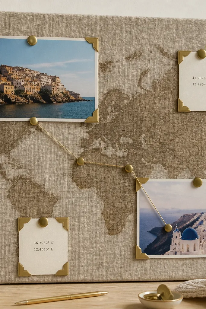
Coordinates make love feel specific, which is what mindset needs. When you attach numbers to places you want to share — a city, a beach, a neighborhood — your brain stops treating the goal like a fantasy. Use muted gold lines to connect points, and pin-corner photo mounts for a high-end “travel journal” look. This board is great for people who want their love to include movement, trips, and shared exploration.
Print a simple map background or use torn map paper and glue it to a neutral backing board. Add coordinate labels in muted gold cardstock and draw thin gold lines between points with a ruler. Mount photos using pinned corners made from small brads or push pins through cardstock mats. Finish by adding one larger “next destination” card in the center and keep the rest clean around it.
Pro tipUse the same label size for every coordinate so the board reads organized.
AvoidDon’t use busy map textures everywhere; keep map background simple so photos stay readable.
13. Fabric Swatch Love Board with Color-Blocking
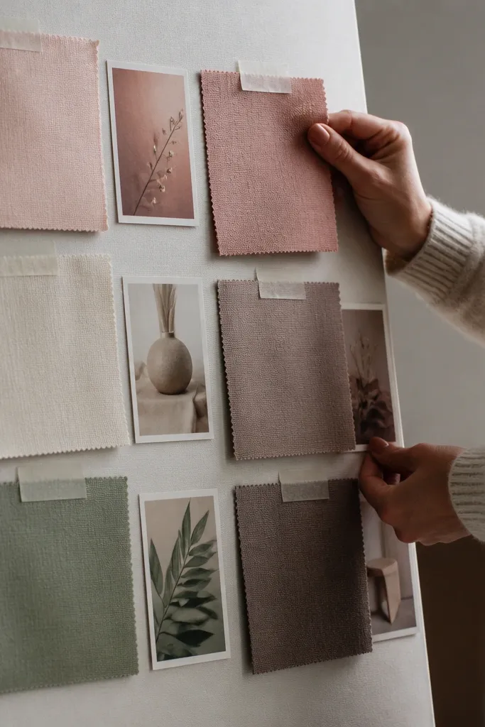
Color-blocking plus fabric swatches looks designer because it’s tactile and structured. You’re basically building a palette you can touch, and that turns your love vision into a sensory cue. Use 5-7 swatches in your chosen range, then place small photo chips that match each fabric tone. This board shifts mindset by making “how it feels” as real as “who it is.” It’s ideal for bedrooms, closets, and spaces where you want calm daily reminders.
Cut fabric swatches into identical rectangles and pin or glue them to a board in clean blocks. Add thin white paper borders between blocks so the palette stays crisp. Print small matching photo chips and mount each one near its closest swatch. Finish by writing one intention per swatch in a small label strip under the fabric.
Pre-wash fabric and let it dry flat so swatches don’t warp after you mount them.
Avoid fuzzy fabrics mixed with stiff ones in the same block; the texture mismatch looks chaotic.
14. Old Frame Glass Photo Board
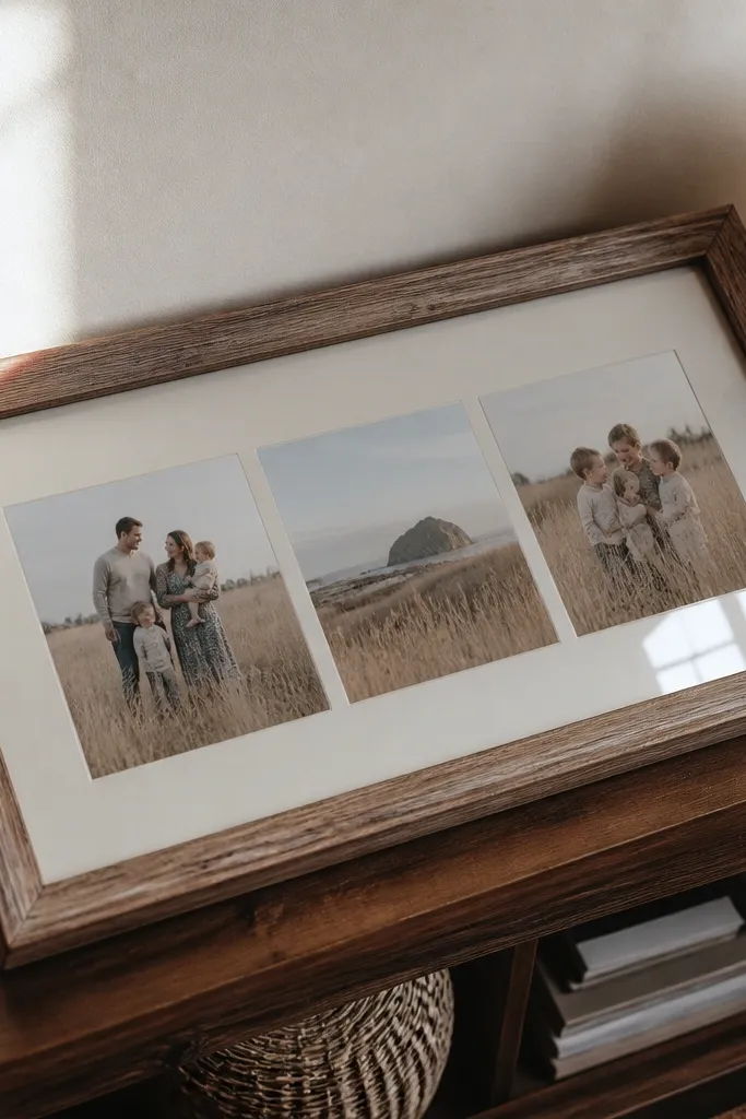
Using an old frame’s glass makes your board feel like a display piece instead of a craft. Glass creates a subtle protective layer and makes photos look crisp and intentional. Choose a neutral mat paper and keep the photo count low so it looks like an art gallery. This is a strong choice if you want your love vision displayed in a hallway or living room. It shifts mindset because you treat your goals like something worth showing, not something hidden away.
Remove the backing from an old frame and cut a mat from thick paper. Arrange photos on the mat, then secure them with photo corners or small strips of tape. Add one or two paper text cards under photos for clarity, then place everything back into the frame. Clean the glass with microfiber cloth before sealing the frame back on.
Use photo corners, not glue, so you can swap images without damaging the mat.
Don’t overcrowd the frame; glass glare makes dense boards look messy.
15. Matte Black Acrylic Letters Love Board
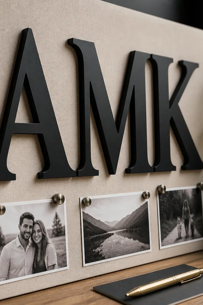
Letter boards look high-end when the typography is the main visual. Matte black acrylic letters or thick sticker letters make the message feel designed and modern. Pair them with small photos and one gold pen detail per section so it stays clean. This board shifts mindset by making your love intention readable from across the room. It suits people who want a direct message: the relationship type, the feeling, and the standard.
Pick a cream or off-white backing and mark where the big letters will go. Arrange your photos in two rows around the letters, keeping each photo the same border thickness. Add gold pen lines or small gold dots to connect photos to the main message. Finish by sealing the board edges and checking alignment with a straightedge.
Pro tipUse letter spacing that matches your printer settings so the typography looks consistent.
AvoidAvoid cheap thin stickers; they curl and look uneven under light.
16. Sage Green Home Routine Board with Sticky Notes
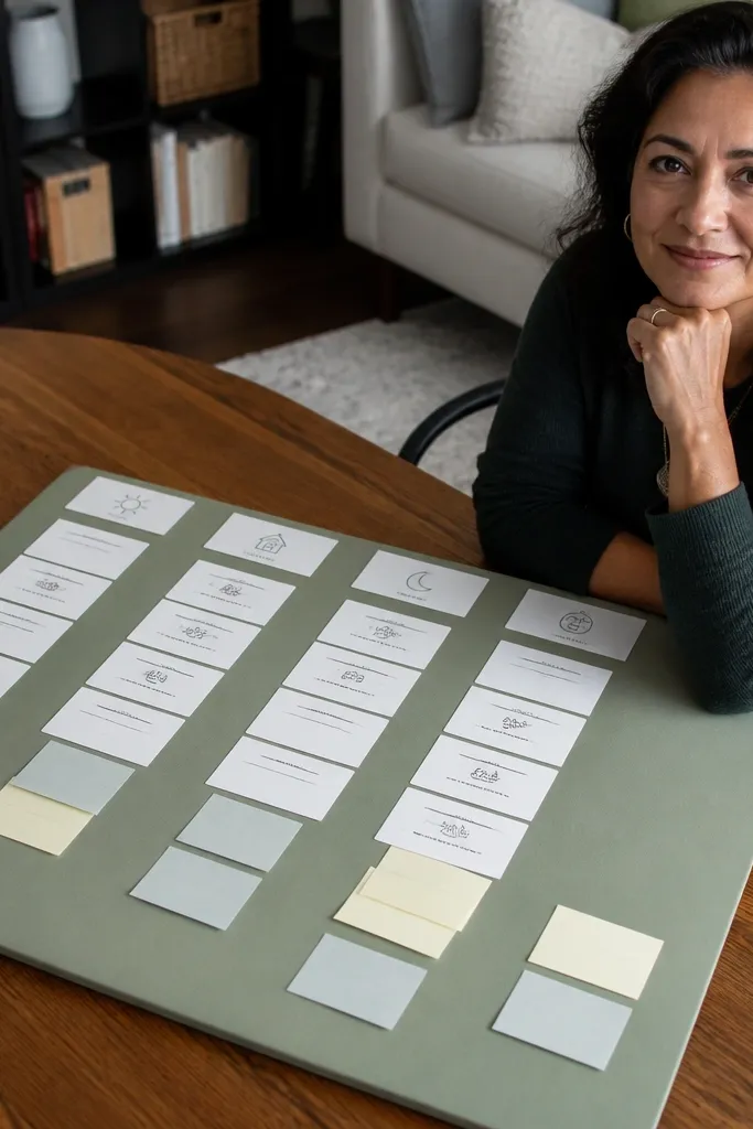
Home routine is love in action, and sage green makes it feel calm. This board focuses on everyday behaviors: morning calm, shared chores, evening reset, and communication check-ins. It looks high-end because the typed cards are neat and the sticky notes are used like accent blocks, not random scribbles. This shifts mindset by training you to show up consistently, not just chase big romantic moments.
Choose a sage backing and print routine cards in one font, two sizes max. Mount three home photos across the top, then place routine cards underneath as a tidy list. Add small sticky notes only at key points, like “Plan tomorrow” or “Ask 1 question.” Seal the board with matte spray on the paper areas; keep sticky notes dry so they don’t lift.
Pro tipUse a consistent card width so the board reads like a designed menu.
AvoidDon’t turn it into a diary wall. Keep notes short and formatted.
17. Brown Boot Leather Look Board with Faux Leather Backing
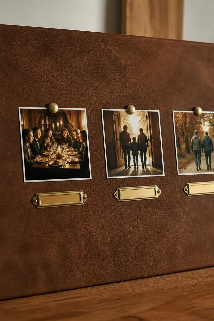
Leather-look backing makes love boards feel grounded and grown. Brown tones feel intentional, and brass-tone labels add warmth without glitter. Keep the photos minimal and classier: a dinner table, a doorway, a shared walk. This board shifts mindset by making your love standard feel solid. It’s best for people who want a stable, mature energy and prefer fewer, stronger visuals.
Cover the backing board with faux leather using contact cement or spray adhesive, then trim the edges clean. Print photos with white borders and mount them with double-sided tape for a flat finish. Add brass-tone labels under each photo and write one short intention per label. Finish by placing a thin leather strip across the center like a divider and align everything to it.
Pro tipUse a craft knife with a fresh blade for clean leather edges.
AvoidAvoid glossy leather in huge areas; heavy shine can reflect light and blur your photos.
18. Deep Teal Candlelight Board with Warm Photo Edges
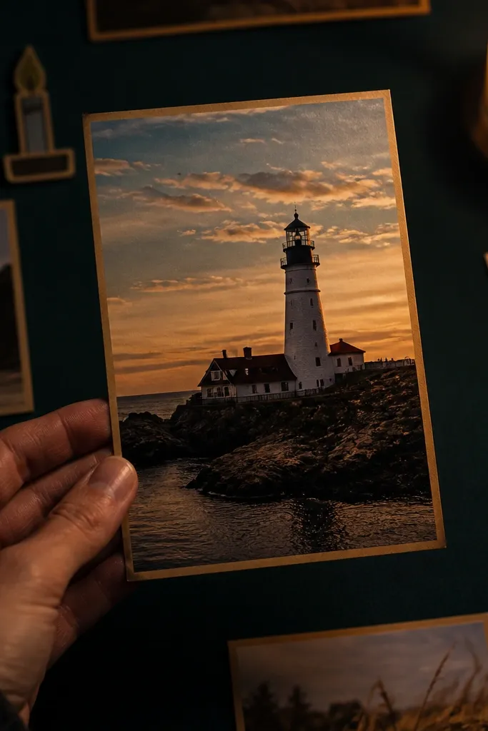
Candlelight vibes look high-end because they blend color temperature — warm edges, cool background. Deep teal makes the board feel moody and romantic, while warm photo edges keep it inviting. Add small candle-themed paper cutouts or matchbook shapes for a subtle theme that still looks clean. This board shifts mindset by setting a “slow intimacy” tone you can return to daily. It works well for evening self-care routines and bedroom displays.
Paint or cover a backing board in deep teal paper or cardstock. Print warm-toned photos and add a thin warm border using colored paper frames. Place one larger candle-themed anchor in the center and surround it with smaller photos in a semicircle. Add tiny labels in cream cardstock and glue them with consistent spacing.
Use matte finish photos so the warm tone doesn’t glare against teal.
Don’t use bright neon accents; teal plus neon looks costume-like.
19. Cream Lace + Newspaper Love Board
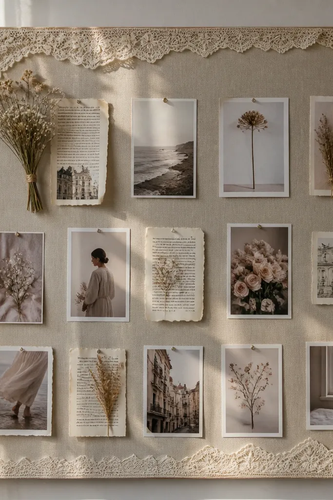
This board mixes softness and grit, and that contrast reads stylish. Cream lace calms the look, while small newspaper clippings add a “real life” feel. Use only a few clippings so it stays curated, not chaotic. Photos should be small and evenly spaced in a grid so the board photographs like a magazine layout. This shifts mindset by grounding your love goals in everyday language and realism.
Cover the board with cream paper and apply lace as a top layer over the upper third. Tear newspaper clippings into rectangles and glue them under the lace in a neat row. Mount small photos on top of or beside the clippings with consistent borders. Add one central title card made from cream cardstock and black ink, then leave lots of whitespace around it.
Pro tipUse black-and-white clippings for consistency with the cream and lace palette.
AvoidAvoid full-page newspaper blocks; too much text turns it into clutter.
20. Silver Foil Cutlery Icon Love Board
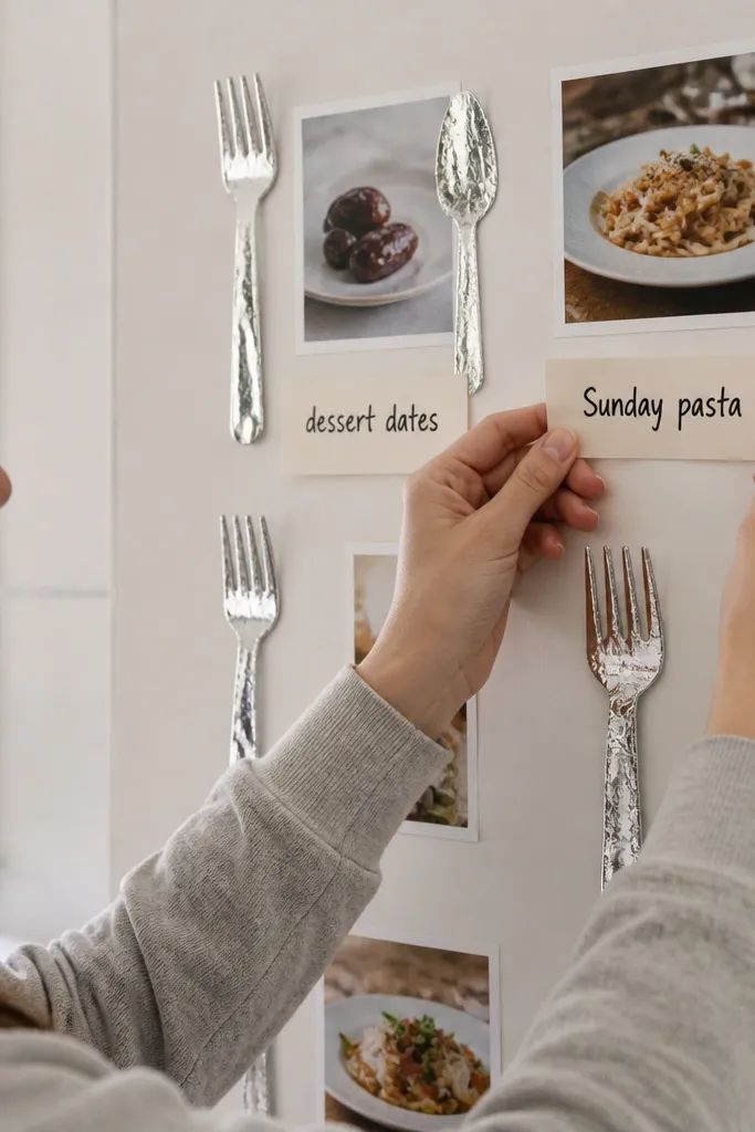
If your love vision feels too abstract, make it about shared meals and rituals. Silver foil cutlery icons look chic and modern, and they photograph cleanly against a white or off-white backing. Pair icons with date photos and short labels like “dessert dates” or “Sunday pasta.” This board shifts mindset because it turns “romance” into repeatable habits you can actually plan. It suits people who want practical, relationship-building time.
Start with a white backing board and print your date photos with a consistent border. Cut or buy silver foil icon shapes (fork, spoon, small plate) and place them as accents near each photo. Write a short label under each icon in blush or light grey ink. Finish by sealing the board with matte spray, keeping the foil icons dry and flat.
Use one icon type per section. Mixing too many icons makes it look like a sticker sheet.
Don’t use thick glitter stickers — they catch light and look cheap.
21. Neutral Photo Strip Gallery Wall Board

Photo strips give you that gallery wall look without needing real frames. When all strips are the same width and spacing, the board reads high-end instantly. Keep the photos neutral and warm, and add handwritten labels in black ink for a personal, intentional feel. This shifts mindset by creating consistency: your eye knows where to look, and your brain keeps repeating the same love themes. It’s ideal for people who want a clean aesthetic but still want their board to feel like theirs.
Print photos in a single size and cut them into strips with identical borders. Lay them out on a neutral backing board with equal spacing using painter’s tape to measure gaps. Glue the strips down in a balanced grid or staggered pattern like a mini gallery. Add small labels below selected strips and write them with a steady hand or a label maker in black.
Pro tipUse painter’s tape to test spacing before gluing. It’s the easiest way to keep it looking designed.
AvoidAvoid mixing portrait and landscape strips in the same section without a clear plan.
22. Soft Gold Leaf Quote Card Board for Love Standards
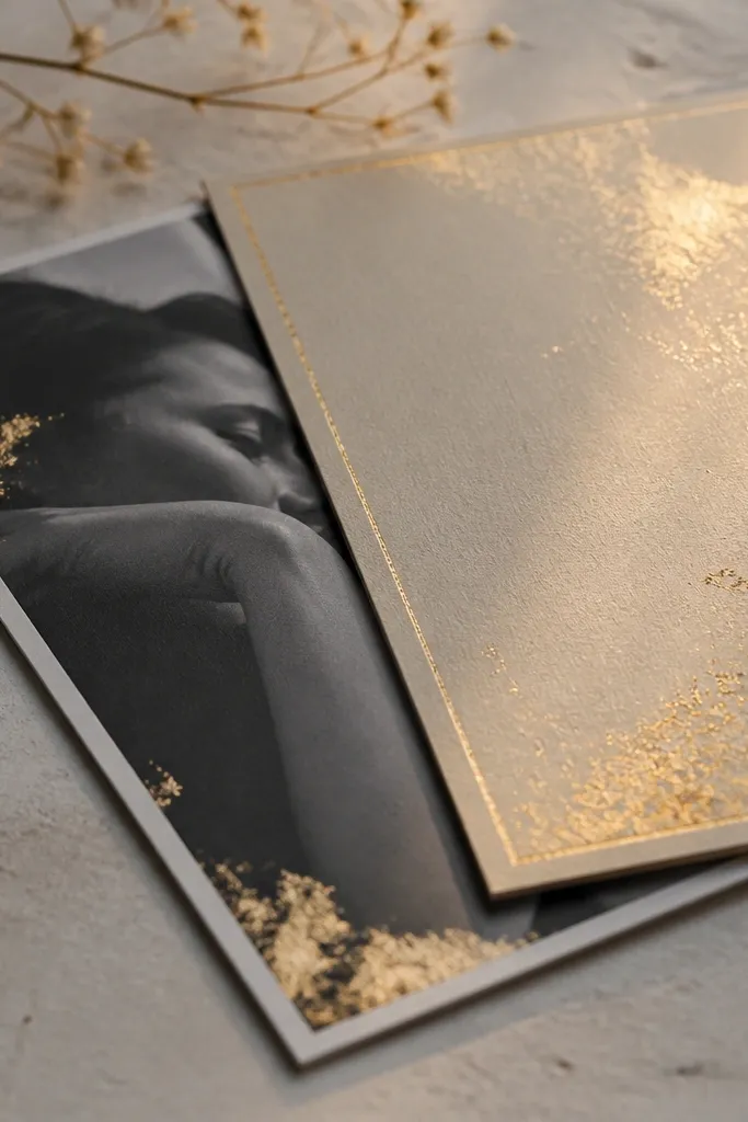
Gold leaf cards look luxe because they catch light in a controlled way. Keep the text short and standards-focused: “Honesty in real time,” “Plans with follow-through,” “Kind communication.” Use black-and-white photos to keep the gold from overpowering the page. This board shifts mindset by making your standards visible and repeatable, which reduces settling. It’s best for people who want a clear “no” list as much as a “yes” list.
Create a cream backing and cut card shapes from thick paper. Apply gold leaf to the cards using craft adhesive, then brush off excess gently. Print or handwrite one line per card in black ink, keeping the alignment centered. Place 3 black-and-white photos around the cards and glue everything down with even spacing.
Gold leaf looks best with matte photos and matte paper. Avoid glossy everything.
Don’t cover the whole board in gold leaf; feature cards only.
23. Pastel Sky Gradient Board with One Bold Photo
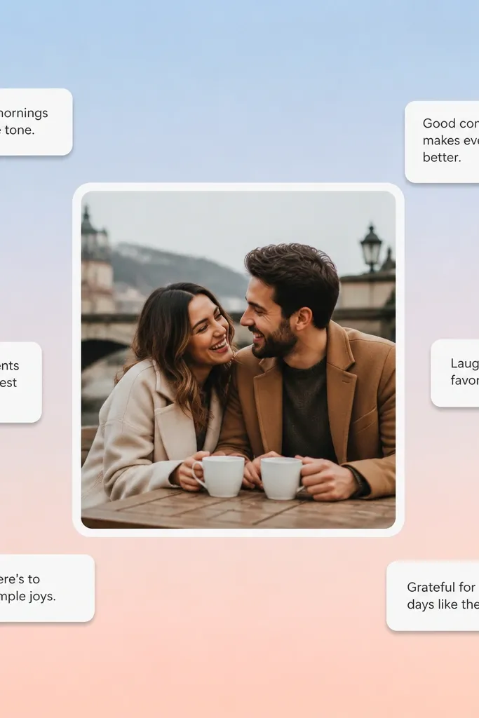
This board is all about contrast: a soft gradient background and one bold photo that anchors the whole message. The gradient gives you a calm, romantic backdrop, while the single strong image creates focus. Add small white label cards with one sentence each, like “I choose consistency” or “Love feels safe.” This shifts mindset because your brain has one primary visual target instead of a dozen competing goals. It’s ideal if you get overwhelmed by busy boards.
Create a gradient background using sponge blending with three pastel colors, then let it dry fully. Place one larger photo in the center with a white border mat. Arrange 4 small label cards around the photo in a clean cross pattern. Glue everything down and add one thin gold line under the center photo for cohesion.
Pro tipUse a hairdryer on low to speed drying between gradient layers.
AvoidAvoid multiple bold photos; the board loses its focal clarity.
24. Monochrome Stone Texture Board with Cut-Paper Shadows
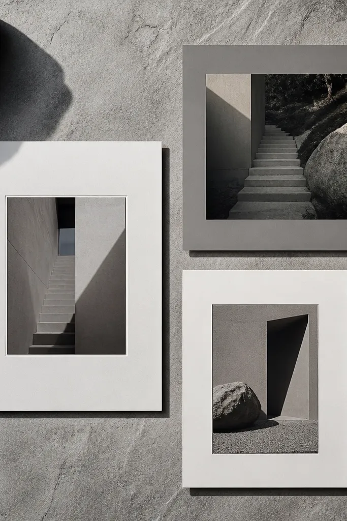
Stone texture makes the board feel architectural, which is a high-end look without being flashy. Monochrome keeps it modern, and cut-paper shadows add depth that reads well on camera. Use 2-3 photos only, each with a slightly different border thickness, so they feel like curated pieces. This shifts mindset by giving your love goals a “built” feeling — like you’re constructing a life, not chasing a mood. It suits minimalist lovers who still want texture.
Cover the backing with a stone-texture paper or paint a faux stone look using a stippling sponge. Cut paper layers in black and grey and glue them with foam tape to create shadow depth. Place two larger photos and one small photo, each framed with a consistent border style. Finish by adding a single vertical label column with short intentions.
Foam tape thickness matters — use the same thickness everywhere for a uniform high-end look.
Avoid random cut shapes; keep edges clean and consistent.
25. Sculpted Paper Rose Corner Board
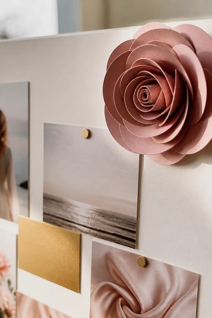
A sculpted paper rose is photogenic because it creates real dimension, not just flat prints. Keep the rose in one corner and let the rest of the board stay minimal. That restraint is what makes it feel high-end instead of handmade-cute. Pair it with a few crisp photos that match the rose tone, plus one small gold label. This shifts mindset by adding a gentle “romance” signal without turning your board into a themed decoration.
Start with a neutral backing board and plan your layout so the rose sits in the top corner. Make the rose from layered paper petals (thick paper, 200-250 gsm) and glue layers starting from the smallest petal. Place the rose last, after photos and labels are glued down, so you can adjust spacing. Add two small matching accents like a circle label or thin ribbon strip near the rose.
Pro tipUse a bone folder to curl petals so the edges look smooth, not crumpled.
AvoidAvoid placing the rose at the center; it can overpower everything.



