
1. Velvet-Feel Cover with Leatherette Spine Wrap
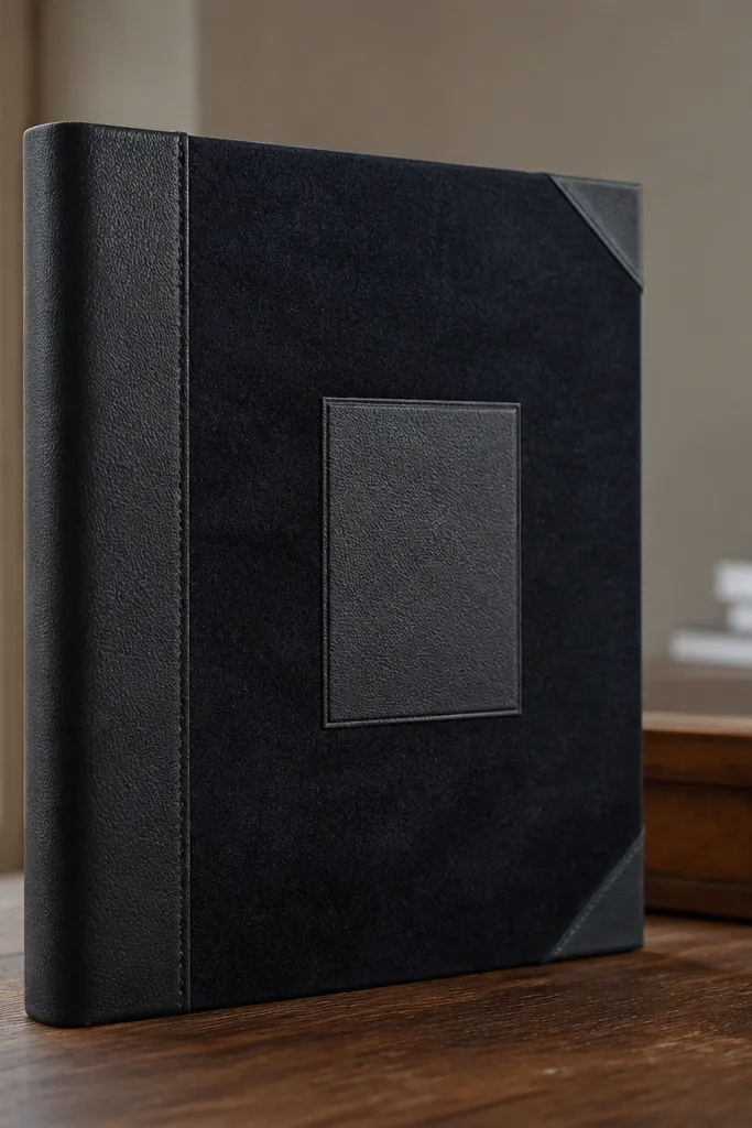
Cut a cover base from chipboard or thick binder board to your scrapbook size, then cover it with your soft-touch fabric using a thin, even adhesive layer. Wrap the fabric around the edges and trim the corners with small diagonal snips so it lays flat. For the spine, cut a strip of leatherette (about 20-25 mm wide) and wrap it so it sits neatly over the board seam; press it with a bone folder along the fold. Finish the front with a single centered paper label panel (matte cardstock) and two small corner pieces made from gold-foil paper or foil-look scrapbook paper, glued only at the corners so the panel stays smooth.
This design looks expensive because the texture reads first. A dark, soft-touch fabric (or fabric-look paper) gives that velvet feel, while a leatherette spine wrap adds structure and a crisp line where the cover turns. The trick is keeping the front flat: one centered label panel and a couple of matching corner accents, not a scatter of embellishments. It’s a great choice for travel journals and recipe scrapbooks because the spine detail adds polish even when the front is mostly simple.
AvoidDon’t glue fabric all the way to the spine fold thickly; it creates a ridge that looks cheap when the book opens.
Pro tipUse a brayer or a clean foam roller to press fabric down evenly — it reduces bubbles that show up in photos.
2. Window Frame Front with Layered Matting
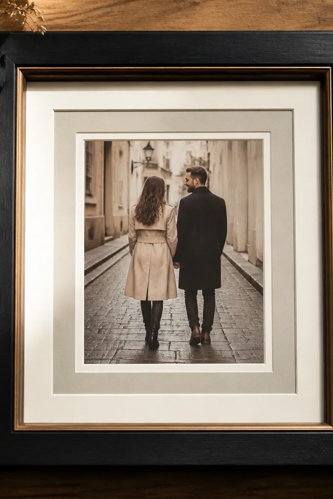
Make your base cover, then cut a rectangle opening in the front panel only if you’re using a clear insert; otherwise, keep it flat and build a frame on top. Cut three nested rectangles from cardstock: one for the outer frame, one for the mat, and one for the photo/collage layer. Glue the outer frame down first, then add the mat layer with a small offset so it shows evenly, and finally place the artwork inside. Finish with a thin border accent strip (about 3-5 mm wide) along the bottom edge of the frame to ground it visually.
This one reads high-end because it mimics gallery framing. A window frame creates depth, and layered matting keeps the focal art from looking stuck on top. The front stays clean, but the edges look crafted because each mat layer is a different thickness and color. It’s perfect when you have a favorite printed photo or a collage you want to spotlight without covering it in stickers.
AvoidAvoid using only one mat layer; the depth effect needs at least three layers to look premium.
Pro tipMeasure offsets with a ruler and keep the mat reveal even on all sides — uneven frames scream “craft store.”
3. Marble-Effect Paper with Foil Accent Bands
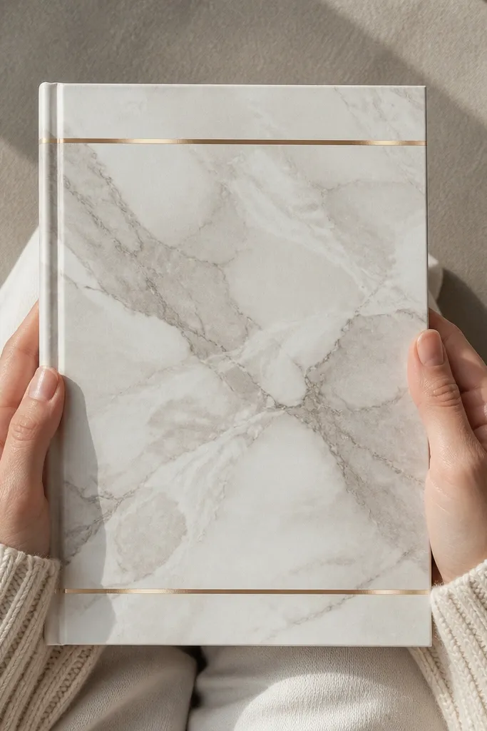
Marble-effect designs look high-end because they have natural-looking complexity without needing heavy decoration. The cover reads styled when you pair a marble-like base with restrained foil accents — thin bands, not big foil blocks. Keep the front layout simple so the pattern doesn’t fight your photos. This is a strong option for minimal themes like baby milestones, wellness logs, or clean aesthetic planners.
Cover the front and back of your board with marble-effect paper (or marbling-ink paper) trimmed 5-8 mm smaller than the board so edges don’t peel. Apply one vertical foil accent band using gold foil scrapbook tape or thin foil paper strip, then add a second horizontal band at mid-height. Place your title label on the top-left quadrant inside the band “grid” area so it feels intentional. Seal everything with a matte craft sealer on the marble areas, keeping foil strips dry and clean so they don’t smear.
Use foil tape that’s narrow (2-4 mm). Wider foil looks flashy instead of refined.
Don’t cover the entire front with foil; it kills the marble depth and makes the cover look costume-y.
4. Upcycled Denim Patches with Clean Stitch Lines
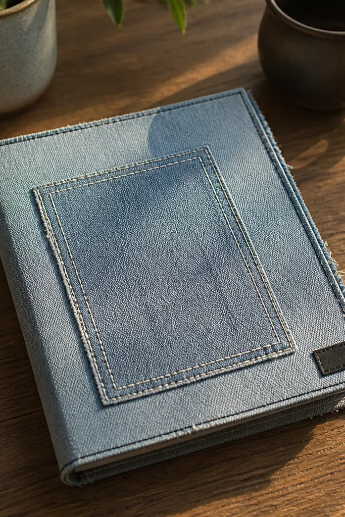
Cut a denim patch from upcycled jeans, then trim it to a centered front size (roughly 120-150 mm wide depending on your cover). Back it with a thin fusible interfacing so it stays flat. Glue the patch onto the cover base, then add faux stitching by drawing straight lines with a fabric marker or using a thin black paint pen at 3-5 mm intervals. Add a fabric label strip at the bottom of the patch (use leftover denim or a cotton scrap), and seal the marker lines with a light fabric-safe clear coat.
Denim patchwork looks high-end when it’s controlled. The key is choosing one patch shape (like a centered rectangle or shield), then adding clean “stitch lines” around it so the cover looks like a designed product. Denim is also great for hiding small imperfections from cut paper edges because the texture forgives. This style fits everyday memory books, concert journals, and anything that needs a lived-in look without looking messy.
AvoidSkip mixed patch shapes; too many patch sizes on one cover makes it look like leftover fabric, not a designed panel.
Pro tipBefore gluing, press denim flat under a heavy book for 30 minutes — it prevents bubbling later.
5. Pressed Flower Botanical Cover with Black Gesso Base
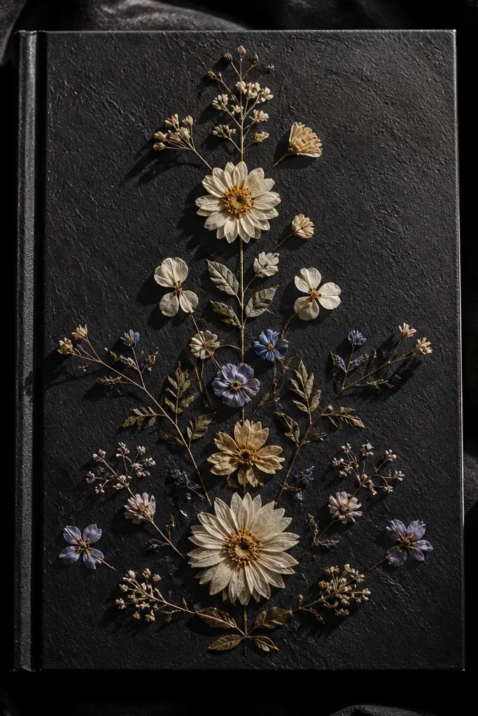
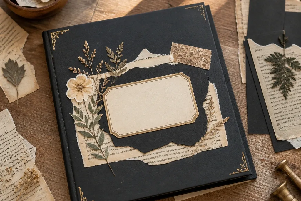
Prime your cover board with black gesso or black acrylic paint so the color stays deep and even. Arrange pressed flowers in a centered cluster, then lightly tack them with gel medium or a thin archival glue using a small brush. Once dry, add a translucent layer of clear gel medium over the flowers to protect them and deepen the color. Finish by framing the cluster with a thin strip of matte cardstock (10-15 mm wide) so the composition has a border that looks intentional.
A black base makes pressed flowers look dramatic and expensive. The dark background turns delicate petals into high-contrast art, and the pressed texture reads crisp instead of faded. This design is photogenic because the flowers cast tiny shadows and the composition can be symmetrical. It works best for small, clean clusters rather than large scattered sprigs, especially if you want a premium, gallery-like look.
AvoidDon’t skip sealing; pressed flowers fade and lift if they’re only glued at the edges.
Pro tipUse tweezers and work from the center outward; it keeps the cluster balanced and avoids crooked stems.
6. Monochrome Collage Cover with Cut-Paper Shadow Borders

Pick one color family and gather scraps that vary in tone (cream, greige, charcoal). Cut a main collage panel from thick cardstock, then layer torn or cut shapes on top with 1-3 mm offsets. Add a shadow border by placing a thin strip behind the main panel in a darker tone; glue the strip first, then place the panel so it overlaps and reveals the border evenly. Seal the whole front with a matte spray sealer from 20-30 cm away in light coats to avoid warping.
This is the “high-end” look that comes from restraint and layering. A monochrome collage lets you use interesting scraps — torn paper, printed textures, book page bits — without the mess of mixed colors. The shadow border is what makes it feel designed: you create a slight offset so layers cast a visual edge. It’s ideal when you want texture variety but still want the cover to look clean in photos.
AvoidAvoid glossy scraps mixed with matte ones unless you want intentional shine; random gloss looks uneven.
Pro tipKeep the collage to one area of the cover; don’t spread it to the corners or it stops reading premium.
7. Gold Foil Title Plate on Textured Kraft
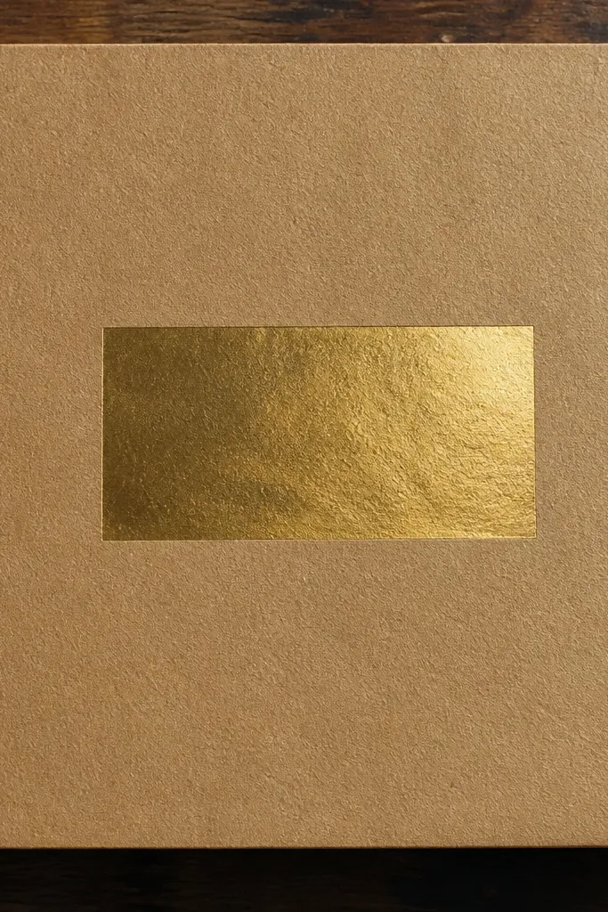
Textured kraft paper is a cheat code for premium-looking covers. It has a natural grain that photographs well, and it gives you a warm base that makes gold accents look intentional. A gold title plate — even if it’s a simple rectangle — instantly turns the front into a “book cover” rather than a craft page. Keep the rest minimal so the typography area looks crisp.
Cover the board with kraft paper or heavy kraft cardstock, then burnish the surface gently with a clean cloth so it looks smooth but still textured. Cut a title plate rectangle from gold foil cardstock or gold foil paper backed with thin adhesive sheet; keep it centered and about 70-90 mm wide. Glue the plate down, then add a small secondary line beneath it using matte black cardstock letters or a printed label. Finish by adding a single thin border line around the edge of the front using a black fine-tip marker and a ruler.
Use a ruler and tape to keep your border line straight; crooked lines are the fastest way to lose the high-end look.
Don’t add multiple gold elements; one title plate is enough to keep it classy.
8. Accordion Pocket Front for Hidden Keepsakes
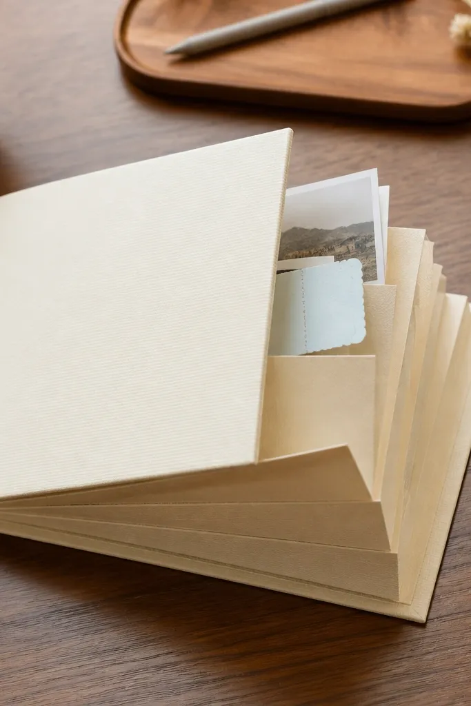
Cut a pocket panel from medium-weight cardstock and score it into 3-4 accordion folds (each fold about 20-25 mm wide). Attach the accordion to the inside of the front cover so it expands downward or upward depending on your preference; glue only the spine-side edges so it can move. Add a top flap or label strip on the outside front to conceal the pocket opening and keep it neat. Finish with a centered title label and a simple closure like a fabric tie loop placed at the side so it doesn’t cover the pocket.
A built-in pocket makes a cover feel custom and interactive, which reads high-end in real use and in photos. The accordion shape creates layered depth while staying flat when closed. It also solves a common problem: where to put ticket stubs, small photos, or tiny notes without cluttering the pages. This design works best for event scrapbooks and travel logs where you keep lots of small physical pieces.
AvoidDon’t use flimsy paper for the accordion; it collapses and looks cheap fast.
Pro tipTest-fold the accordion before gluing so the folds align with the cover’s opening and don’t pinch.
9. Fabric-Wrapped Spine with Contrast Binding Tape
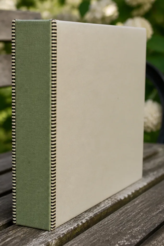
Cover the front and back boards with paper, leaving the spine area ready for wrapping. Cut a fabric strip wide enough to wrap around the spine and fold onto the inside by 10-15 mm. Glue the fabric to the spine, then press the fold line using a bone folder so it stays crisp. Add contrast binding tape along the outer spine edges (the lines where the cover turns) and trim any excess with a craft knife after the adhesive sets.
This look is all about the spine, because the spine is what makes a scrapbook feel like a real book. Wrap the spine in fabric, then add contrast binding tape along the edges so the seams look finished and sharp. The front can be simple, but the spine does the heavy lifting visually. It’s perfect for larger cover sizes where the spine is noticeable and you want the whole thing to look cohesive.
AvoidDon’t wrap fabric too tight; tension creates wrinkles that ruin the clean spine line.
Pro tipChoose binding tape with a matte finish; shiny tape reflects light and can look messy on camera.
10. Stencil Spray Background with Cutout Title Frame
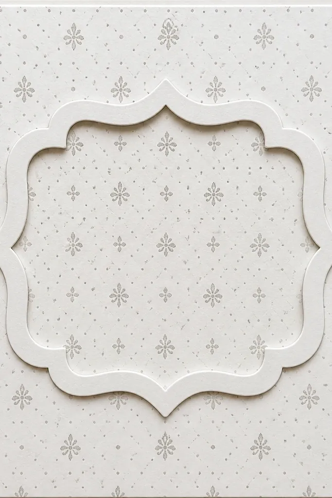
Mask your cover front with painter’s tape around the edges and place a stencil where you want the pattern. Spray with diluted acrylic ink or craft spray at a low height (about 25-30 cm) in 2-3 light passes. Let it dry, then cut a title frame from thick cardstock — a rectangle with an inner opening. Glue the frame down so the background pattern shows inside the cutout, then add your title piece behind the opening or inside the frame using black cardstock for contrast.
Stencil spray backgrounds look high-end because they add pattern without clutter. The key is controlled coverage: small motifs, light-to-mid opacity, and a clean title frame on top. A cutout title frame gives you a crisp typography area while still letting the background pattern show through. This works well when your scrapbook theme is modern, minimal, or event-based where you want a graphic cover.
AvoidAvoid placing the stencil pattern too close to the edges; it makes the cover feel cramped.
Pro tipKeep spray passes light. One heavy pass bleeds through stencil edges and looks sloppy.
11. Photo Transfer Look with Matte Lamination Panels
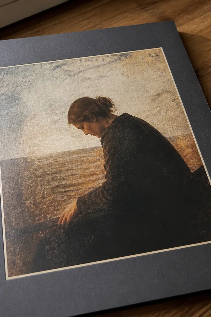
Prep your cover with a smooth base and cover the front with matte cardstock first so the surface is even. Transfer your chosen image using a photo transfer medium according to the product instructions, then let it cure fully. Cut a border frame from matte cardstock (or use a thin laminated border sheet) and glue it around the transferred image leaving a 5-8 mm reveal. Finally, add a title strip at the bottom of the frame using a contrasting color and seal the whole border area with a matte sealer to keep it uniform.
A photo transfer style panel instantly raises the perceived quality because it looks like printed art, not pasted paper. Pair it with matte lamination panels or matte cardstock borders so the surface catches light softly. The result is crisp and clean, which is exactly what “high-end” covers do in photos: they look flat, intentional, and finished. Use this when you have a specific image you want to anchor the cover.
AvoidDon’t put glossy tape or glossy medium over the transfer; it creates uneven shine that looks cheap.
Pro tipDo a test transfer on a scrap of the same cardstock — the paper thickness affects how crisp the image stays.
12. Geometric Thread-Texture Lines on Paper Base
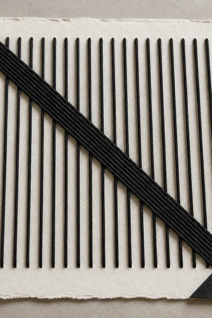
Thread textures look expensive when they’re laid with strict geometry. The cover reads like design because the lines are straight, evenly spaced, and anchored by a clean base. Use a minimal color palette — black thread on cream paper, or tan thread on charcoal paper — and keep the pattern to one or two shapes like triangles or a centered grid. This is a great pick for graduation scrapbooks and milestone collections where you want a graphic, structured look.
Cover your board with a smooth cardstock base, then mark a geometric layout lightly with a pencil and ruler (keep lines 15-20 mm apart). Punch small holes along the marked lines using an awl or a needle in a consistent spacing (about 5-7 mm). Thread through the holes from the back, pull tight, and tie off on the back cover with a small dab of glue. Glue a matte label plate on the front so the thread lines frame it, and seal the edges of the label with a thin clear coat so it doesn’t lift.
Tie off knots on the back in the same spot each time so the front stays perfectly flat.
Don’t let thread slack; slack lines look messy and destroy the high-end geometry.
13. Layered Paper Ruffle Strip with Soft Color Gradients
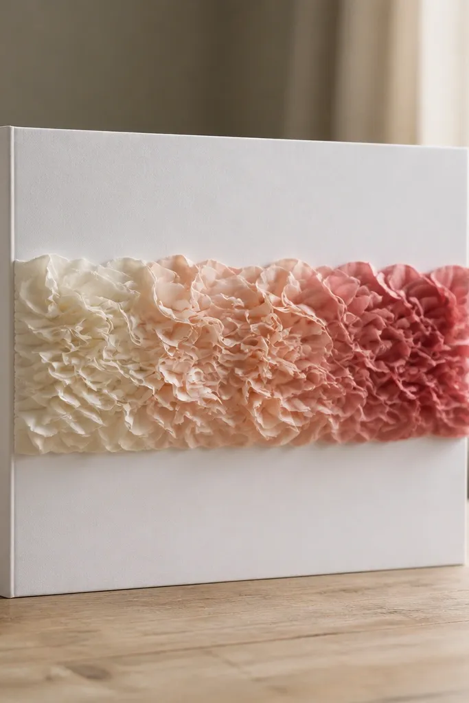
Cut strips of cardstock in 3 widths (for example 25 mm, 20 mm, 15 mm) and 3 lengths that match your cover width minus margins. Score each strip lightly along the center and gently curl the paper using your fingers so it forms a soft ruffle. Glue the widest strip first as the base band, then layer the narrower strips on top with slight offsets so the ruffle edge looks dimensional. Add a small centered title label above the ruffle and keep the rest of the front blank for a clean, styled look.
Ruffle strips look luxe because they create a sense of motion and volume without heavy craft materials. The high-end part is the color gradient and the tight placement: one horizontal ruffle band across the front, not a full messy overlay. Choose two to three shades that blend (cream to blush to dusty rose) and keep the background calm. This style is especially good for baby books, wedding memory albums, and seasonal scrapbooks.
AvoidAvoid stacking too many ruffle layers; more than three strips makes it bulky and uneven.
Pro tipUse double-sided tape on the back of ruffle strips — it holds without soaking the cardstock and warping it.
14. Monogrammed Fabric Tie Closure with Side Tab
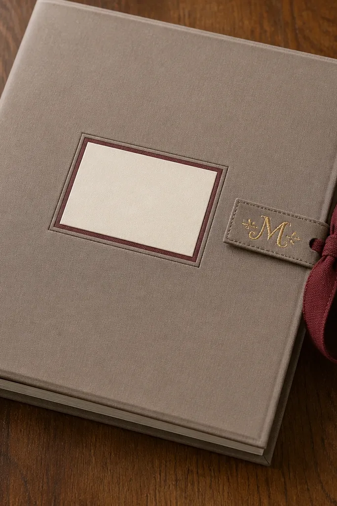
Cover the front and back boards with your base paper, then cut a side tab from thick cardstock (about 60-80 mm tall) and wrap it in coordinating fabric. Glue the tab onto the inside edge of the cover so it aligns with your closure position. Create a fabric tie strip from ribbon or cotton tape (about 250-300 mm long) and attach one end behind the tab so it lies flat when closed. On the outside, add a monogram using vinyl letters or a pre-cut chipboard letter painted matte black, then seal with matte varnish for an even finish.
Closures are where homemade covers start looking amateur. A fabric tie with a side tab looks intentional and keeps the front smooth, which reads more premium in photos than elastic bands. The monogram side tab gives you a designer touch without extra clutter. This is a smart choice for covers that already have a busy front collage because the closure adds style while keeping the front area clean.
AvoidDon’t attach tie ends directly to thin paper; reinforce with a fabric-backed patch behind the tab.
Pro tipThread the tie through a fabric loop or small stitch channel so it doesn’t twist and snag the cover edge.
15. Chalkboard-Style Cover with White Ink Typography Blocks
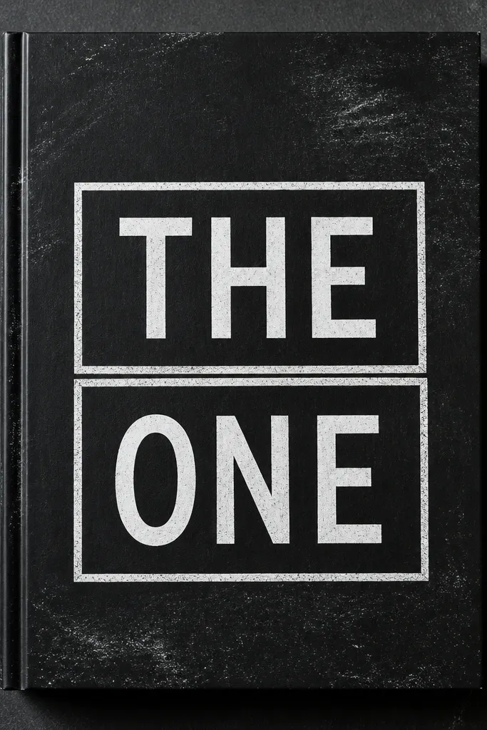
A chalkboard-style cover looks high-end because it’s graphic and legible. White typography blocks pop hard against black, and you can add small textured details without turning it into a sticker mess. This cover works when you want a clean, modern aesthetic and you’re okay with a bold single-color background. It also hides fingerprints better than lighter finishes.
Paint the cover board with chalkboard paint or black acrylic designed for matte finish, then let it cure fully. Once dry, create a border using painter’s tape and apply white paint pen or opaque acrylic for clean lines. Add your typography blocks using stencils: make 2-3 large letter areas or a single title rectangle plus a smaller subtitle. Seal the typography with a matte clear coat so white stays opaque and doesn’t smear when you handle the cover.
Use a stencil for the letters. Freehand typography usually comes out uneven and looks homemade.
Don’t use glossy black paint; shine makes the whole cover look cheap under light.



