
1. Denim + Leatherette Graduation Tab Page
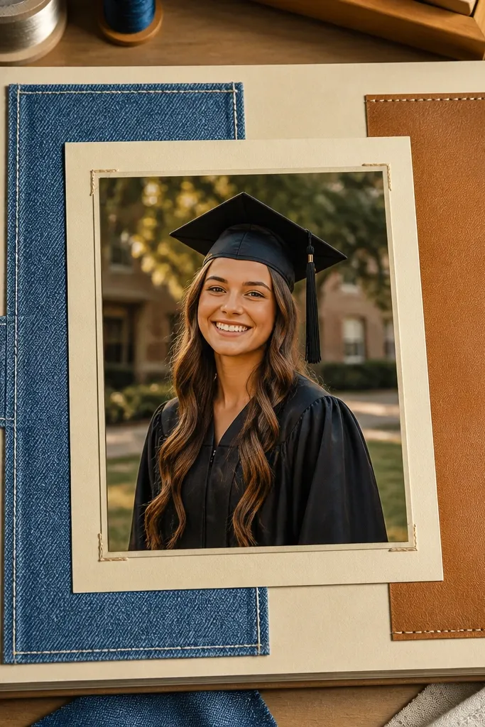
Cut a 2-inch-wide denim strip and a 2-inch-wide leatherette strip, both longer than the page so you can fold the ends under. Use a 5x7-inch photo mat in cream cardstock, then place a thin layer of double-sided tape along the back of the denim strip to tack it behind the photo area. Mount the photo, then glue the leatherette label across the top edge with a slim line of glue so it doesn’t warp. Finish by punching two small holes through the label and threading 8-10 inches of waxed cord for a neat tie-down look.
This page looks high-end because denim gives depth while faux leatherette adds a clean, warm contrast. The trick is using the fabric as a functional tab — something you’d actually reach for — instead of scattered scraps. Mount one hero photo on a cream mat, then place a denim strip behind it like a backdrop. Add a brown leatherette label with the senior’s name and year, and keep the journaling in one tight block so the page reads instantly. It suits graduation themes, sports seniors, and anyone whose style leans casual and grounded.
AvoidDon’t use thick craft glue directly on fabric — it leaves bumps that show through the mat.
Pro tipPress denim under heavy books for 20-30 minutes before cutting so edges stay sharp in photos.
2. Vintage Book Page Photo Window with Faux Film Frame
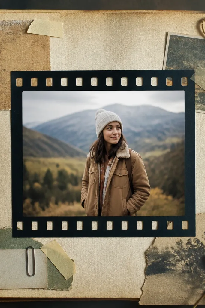
Pick a book with thin pages, then tear a 6x8-inch background sheet so the edges stay organic. Cut a window in a 7x9-inch piece of matte cardstock, leaving a 1/2-inch border. Create the film strip by measuring 1-inch-wide “frames” around the photo and drawing small tick marks with a black fine-liner; keep the spacing even. Mount the book page behind the window with double-sided tape, then glue the film frame border on top. Finally, add a small date caption at the bottom right using a typewriter-style font or neat block handwriting.
This idea makes photos feel like a curated print because it combines a soft, aged background with a crisp frame. Old book pages add that subtle paper texture that reads “collected,” not random. The faux film frame is what pushes it into high-end scrapbook territory: it’s graphic, consistent, and instantly recognizable. Put one square or slightly rectangular photo in the center, then build the film border around it using printed or hand-drawn frames. It’s best for seniors who want a documentary vibe, plus anyone who has a lot of candid photos they want to make look intentional.
AvoidAvoid glossy adhesives on aged paper — they can look shiny and cheap under camera flash.
Pro tipUse matte cardstock for the film border so it doesn’t reflect light and wash out in photos.
3. Pressed Flower Corner with Clear Acetate Overlay
Press a small flower between parchment paper and heavy books for at least 2-3 days, then trim it to fit a 1.5x1.5-inch corner. Cut a 2x2-inch square of clear acetate and round the corners with scissors. Tape the flower to the page first, then place the acetate over it using double-sided tape around the edges only. Add a cream cardstock label strip next to the corner with the flower name and a short line of journaling. Seal the label with a thin layer of matte medium if you want extra durability.
Pressed botanicals look delicate, but the high-end version is the placement and the finish. Instead of covering the whole page, tuck one small pressed flower into a corner so the texture reads like a detail in a museum label. Clear acetate over the corner keeps the paper from getting scuffed and adds a clean glassy highlight. Use a neutral background and let the flower be the star. This works beautifully for seniors who have artsy themes, garden clubs, or just a softer aesthetic.
AvoidDon’t glue the flower directly under glossy glue — it can discolor and wrinkle the pressed piece.
Pro tipRound acetate corners — sharp edges catch light and look messy in close-up photos.
4. Museum Label Layout with Heat-Embossed Nameplate
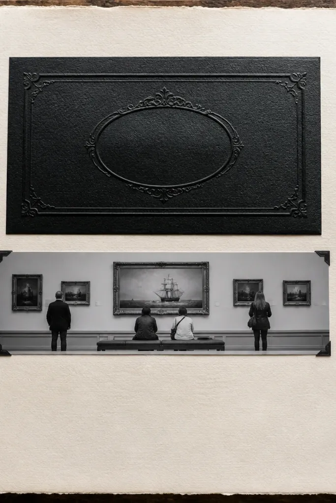
Use a white or cream page base, then cut a photo strip 10x3 inches and mount it with double-sided tape. For the nameplate, cut a 3.5x1-inch rectangle from heavyweight cardstock, then apply embossing ink and sprinkle embossing powder. Heat emboss until it turns glossy and raised, then let it cool. Add a thin black line under the nameplate with a ruler and fine-liner. Finish by writing a short museum-style caption: 1 sentence about the photo and 1 line for a date or location.
This layout screams “designed” because it copies the hierarchy of museum signage: title, subject, date. Heat embossing gives you that raised, high-contrast look without needing fancy printing. Put the senior’s photo as a horizontal strip, then add a nameplate that stands out in the top third. Keep the rest clean: one small journaling block and one thin line separator. It’s perfect for seniors who want something classy and minimal, especially if their photos are already strong.
AvoidSkip glitter embossing — it reads messy and hides the raised detail in photos.
Pro tipUse a ruler for the line separators; straight lines make the whole page look expensive.
5. Upcycled Ticket Stub Collage with Faux Shadow Boxes
Collect 10-20 small ticket-like pieces, then trim them into a 5x7-inch collage area. Mount the collage on the page with a thin glue roller, then let it dry flat. Cut two matching photo mats, each with the same border size, and mount photos using foam tape strips so each photo lifts evenly. Add a thin gray border behind the photos by tracing the mat shape onto gray cardstock and gluing it slightly offset. Finish with a date caption in a small rectangle at the bottom.
Ticket stubs and event scraps add instant narrative, but most people glue them flat and the page looks cluttered. The high-end version is a shadow-box effect: raised photo layers with a controlled grid. Use a mix of ticket stubs, small receipts, and event passes as your background texture, then mount photos on top with consistent spacing. The gray shadow lines or layered mats create depth that reads well in close-up. This works for seniors with lots of activities — concerts, tournaments, theatre, travel, or community events.
AvoidDon’t mix random font sizes for captions — one clean size keeps the collage from looking chaotic.
Pro tipKeep foam tape widths consistent (use 1/16-inch or 1/8-inch) so the page depth looks intentional.
6. Silk-Screen Style Stencil Background with Photo Centerpiece
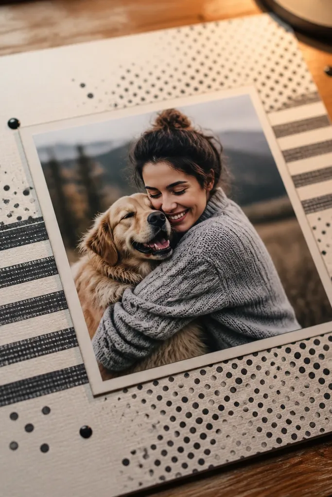
Tape a stencil to a 8.5x11-inch sheet of thick cardstock, then use a sponge dauber to apply acrylic paint in one color. Work in thin passes so the paint doesn’t pool; let it dry completely before removing the stencil. Cut a 4x6-inch photo mat in white, and mount the photo centered with double-sided tape. Add a black label strip 1 inch tall across the bottom of the mat, then write the caption in white gel pen. Optional: add small sticker-like star dots near the corners for alignment.
You can get a screen-printed look without a screen press. A stencil background gives graphic texture that looks modern and expensive, especially when you keep the color limited and the photo placement centered. Use one stencil pattern — like dots, stripes, or a geometric grid — then apply paint lightly so it looks like ink, not wallpaper. The photo centerpiece stays clean, and your journaling becomes the only “soft” element. This suits seniors who want a contemporary album page with a bold, clean aesthetic.
AvoidDon’t over-saturate the stencil; thick paint makes the cardstock warp and looks cheap on camera.
Pro tipUse painter’s tape to hold the stencil — it prevents paint bleed and keeps edges crisp.
7. Torn Wallpaper Texture Page with Metallic Thread Lines
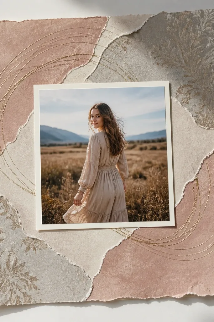
Wallpaper scraps are a cheat code for high-end texture. Tear small sections instead of cutting — the irregular edges catch light differently and feel curated. Then add metallic thread lines to guide the eye toward the photo. This combo looks designer because it merges soft texture with a crisp, linear detail. Put the hero photo in the center, surround it with torn wallpaper pieces, and let the metallic thread create a subtle “path.” It works for seniors who want a fashion/editorial vibe without going full glitter.
Find a wallpaper remnant in a neutral or subtle pattern, then tear pieces to fit around a 4x6-inch photo area. Lay the wallpaper pieces on the page first, then mark their placement lightly. Glue down with a thin layer of matte medium or glue roller, smoothing each piece to prevent bubbles. Thread lines: punch two rows of tiny holes around the photo area at even spacing, then weave gold embroidery thread in a simple grid or diagonal. Tie knots on the back and trim ends after securing.
Punch holes before gluing wallpaper so the page stays stable and you don’t tear the texture.
Avoid heavy metallic paint — thread looks cleaner and doesn’t flake.
8. Monogram Cutout with Colored Paper Backing
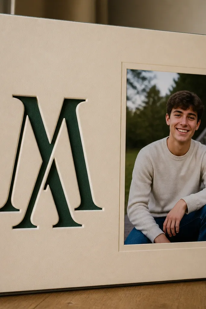
Choose a cardstock letter size that fills the top third of the page, then cut the monogram using a cutting machine or a sharp craft knife. Cut a second rectangle of colored paper slightly larger than the monogram outline so it peeks through the cut edges. Glue the colored backing to the page first, then mount the monogram cutout on top with double-sided tape. Place the photo below the monogram, aligned center, and add a small journaling strip to the side. Seal the edges with a thin matte spray if you want extra durability.
A single monogram instantly makes a page feel premium because it creates a strong focal point. The trick is the colored paper backing behind the cutout, which gives depth without clutter. Keep the monogram big — about 4-5 inches tall — and place it behind or beside your photo. Use one accent color that matches the senior’s outfits or school colors. This is one of the cleanest ways to turn basic photos into high-end scrapbook pages.
AvoidDon’t use too many accent colors; the monogram loses impact when the page turns multicolor.
Pro tipUse a craft knife with a fresh blade — clean cut edges are the whole look.
9. Gold-Stamped Recipe Card Memory Page
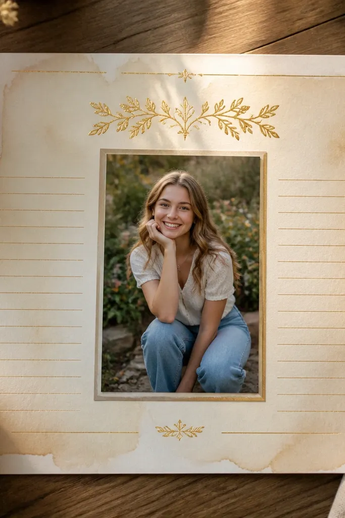
Recipe cards are inherently scrapbook-friendly because they have built-in structure: title, short notes, and a clean grid. For high-end senior scrapbook ideas, make the heading look stamped and use a “menu” style for journaling. Add a subtle coffee-stained background for warmth, then mount the senior’s photo in the center like a plated dish. This works for seniors who love family meals, cooking, or any tradition they can describe in a short story.
Cut a 4x6 recipe card shape from thick cardstock and coffee-stain it lightly with brewed black tea or instant coffee on a sponge. Let it dry, then wipe off excess so it doesn’t get muddy. Use embossing powder or a gold leaf pen to stamp a heading like “Graduation Notes” or the senior’s nickname. Mount the photo on a smaller cream mat and place it in the center of the recipe card. Write 3 short lines: a memory, a person, and a future plan, using a small, consistent handwriting size.
Use black fine-liner for the writing so it stays crisp against the stained paper.
Avoid soaking the cardstock; too much stain bleeds and looks uneven.
10. Contact Sheet Grid with Numbered Photo Captions
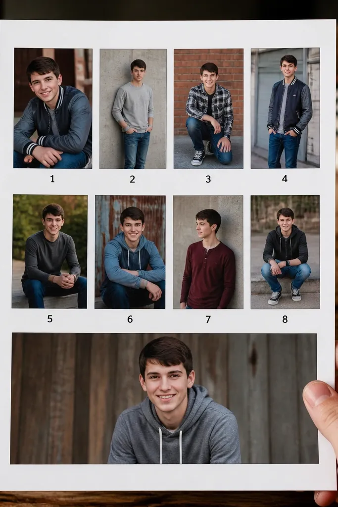
Contact sheets look expensive because they feel like film editing — every photo has a place. This page uses a grid and numbered captions to keep everything readable. Use 6-9 small photos, each with the same border, then add a neat column of captions. The high-end look comes from spacing: even margins and consistent photo sizes. It’s perfect for seniors with lots of moments from one event or sports season who want a clean way to show variety without a messy collage.
Choose 6 or 9 photos and crop them into 2x2-inch squares (or 2x3 rectangles if you prefer). Cut a grid base from cream cardstock with 1/8-inch spacing between photo slots. Mount each photo with double-sided tape, then add numbers in a small font or handwritten style below each photo. Create a caption strip at the side with matching numbers and write one short phrase per photo. Finish by adding a thin border line around the whole grid.
Use a paper cutter for the grid; hand-cut edges show in a tight layout.
Don’t mix horizontal and vertical photos in the same grid — pick one orientation for a cleaner look.
11. Acrylic Paint Drip Frame with Clean Labeling
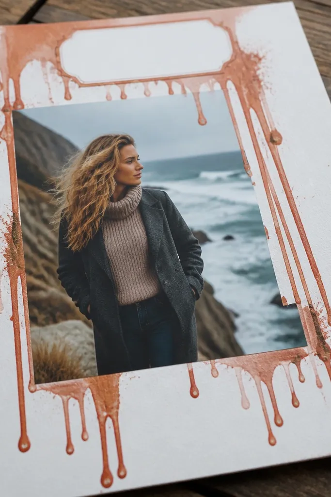
Drip frames can look messy, but controlled drips look like modern art. The high-end version is a restrained drip border around a photo window, with clean label typography and lots of white space. Pick one paint color and one neutral, then let the drips frame rather than cover. This makes a strong, photogenic contrast — especially with black-and-white photos or bold graduation shots. It suits seniors who like streetwear, art classes, or any style that mixes clean and chaotic.
Mask a 5x7-inch photo area on a white cardstock page using painter’s tape, leaving a 1/2-inch border around it. Apply acrylic paint along the border, then tilt the page slightly so drips form downward in a controlled line. Use a fine brush to stop drips at the edges so they don’t crawl under the tape. After the paint dries fully, remove the tape and mount the photo on a cream mat. Add a label strip at the bottom with the senior’s name and year using a black marker.
Do a test drip on scrap first; the first run tells you exactly how far the paint will travel.
Don’t add extra stickers over the drips — the frame is the artwork.
12. Macrame-Style Twine Corner + Raised Photo Tabs
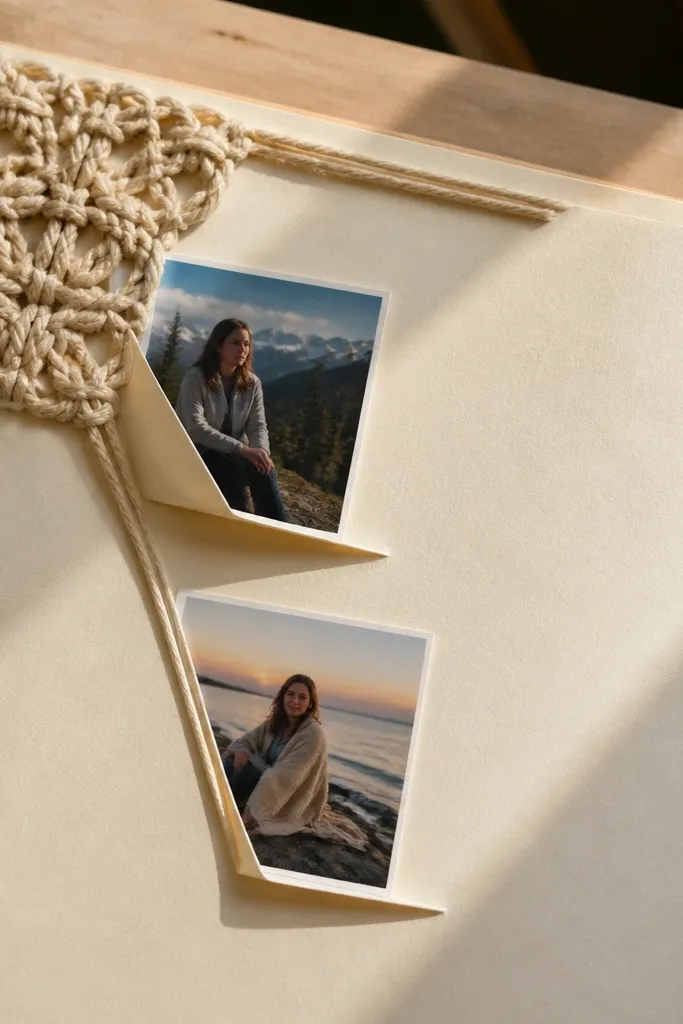
Twine corners look expensive when they’re tight and symmetrical. This page uses a macrame-inspired knot cluster in one corner and raised photo tabs that repeat the same spacing. The rest of the page stays minimal, so the texture feels intentional. It’s a great option for seniors with a cozy, handmade aesthetic or anyone who has lots of smaller photos they want to display neatly. The knots create a tactile detail that photographs well from the side.
Cut 6 strands of twine about 10 inches each. Tie them into a small knot cluster by folding strands in half, then looping them through a small ring or by tying a tight knot at the base and braiding lightly. Glue or tape the knot cluster to the corner of the page on top of a small cardstock backing. For raised photo tabs, cut two 3x5-inch photo mats and add foam tape strips behind the top edge only, so the photos lift like tabs. Add a journaling rectangle opposite the twine corner to balance the layout.
Keep knot thickness consistent by trimming strands to the same length before tying.
Don’t let the twine fray at the base; trim ends cleanly and seal with a tiny touch of clear glue.
13. Scrapbook Page with Heat-Embossed Stars and Foil Accent
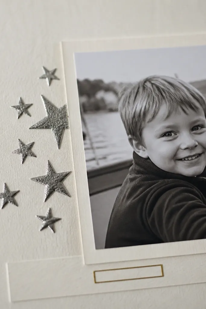
Embossing + foil makes a scrapbook page photograph like printed stationery. This idea uses a star cluster heat-embossed behind the photo, then a small foil label for the caption. Keep the star cluster small and placed behind the photo edges, not covering the whole page. That restraint is what makes it look high-end instead of craft-store. Great for sports awards, honor roll, or any senior photo that already feels celebratory.
Stamp or freehand-apply embossing ink to a 3x4-inch area behind where the photo will sit. Sprinkle embossing powder (matte gold or silver looks best) and heat until glossy and raised. After cooling, add a photo mat with a 1/4-inch border and mount the photo centered. Cut a tiny label strip from metallic foil cardstock, then write the caption on it with a fine white gel pen or paint pen. Seal the foil label with a matte seal only on the paper portion so it doesn’t dull the embossed area.
Use matte gold embossing for warmth; silver embossing can look harsh next to skin tones.
Avoid using heavy glitter powder — it flattens under heat and looks rough.
14. Layered Photo Steps with Cardstock Stair Edges
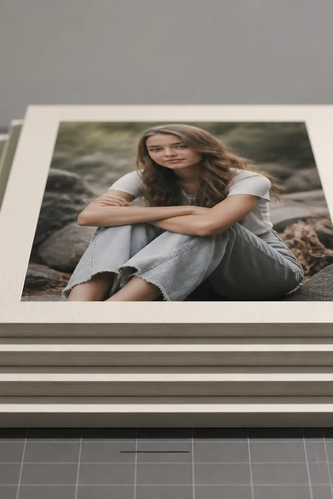
This is a simple 3D effect that looks expensive because the edges are crisp. You build a “stair” of cardstock layers behind the photo so it feels like a display shelf. The page stays clean, with one hero photo and one short caption. It’s a great choice when you have one perfect senior picture and you want it to feel like it belongs in a frame. It works in almost any theme: graduation, sports, arts, or casual lifestyle.
Cut three identical photo mats from cardstock, each 1/8-inch larger than the last. Mount the smallest mat to the page with double-sided tape. Add foam tape under the second mat and align it so the bottom edge shows as a step, then do the same with the largest mat. Place the photo on the smallest mat and secure with tape around the edges. Add a caption strip at the bottom with a thin line border and write the date and one sentence.
Measure every mat with a ruler, not eyeballing; the stairs only look premium when the steps are even.
Don’t use thick layers that bow the page; three thin mats look clean, bulky ones don’t.
15. School Color Paint Swatch Timeline Strip
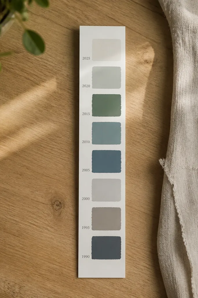
A timeline strip is one of the cleanest ways to show growth without turning the page into a poster. You use paint swatches in the senior’s school colors and label them with years or milestones. The high-end look is in the spacing and the matte finish: swatches that look like printed color blocks. Put the most important photo next to the timeline so the eye moves naturally from color to memory. This works best for seniors who have a few big milestones — varsity, clubs, awards, or travel — and want a tidy, photogenic page.
Choose two school colors and mix acrylic paint to a smooth consistency. On thick white cardstock, paint 5-1/2 inch-long swatches with even height, leaving 1/4-inch gaps. Let them dry, then use a black fine-liner to write year labels under each swatch. Mount a 4x6 photo on the right side with a 1/4-inch border and keep journaling to a single short paragraph below the photo. Finish by adding a thin black line that connects the first swatch to the photo for a guided layout.
Add a tiny drop of matte medium to each paint color for less glare in photos.
Skip metallic paints for timeline blocks; they reflect light and ruin the clean color-block look.
16. Film Negative Strip with Photo Highlights

This one looks like a real photography artifact. A film negative strip border adds instant credibility and a strong graphic rhythm, while photo highlights inside keep it personal. The high-end effect comes from the contrast: deep blacks, clean white borders, and one tight caption. Use black-and-white photos or color photos with a muted filter so the negative strip doesn’t fight the images. It’s perfect for seniors who love photography, theatre, or any setting where light and angles mattered.
Cut a 1/2-inch-wide black cardstock strip and draw or print small rectangle frames along it, spacing them evenly. Use a ruler to keep the frame spacing consistent, then add tiny “sprocket” dots along the sides. Mount the negative strip around the edges of a 5x7-inch photo mat, leaving the center open for the photo. Add one small photo in the center and a caption on the bottom right. If you want extra realism, add a thin gray line next to the strip to mimic the edge of real film.
Use a matte black cardstock so the strip stays readable, not shiny.
Don’t add too many photos inside the negative frame; one hero image looks premium.
17. Fabric Ribbon Spine Bookmark Page
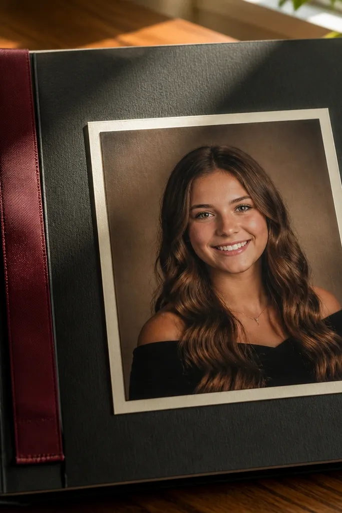
Cut a fabric ribbon strip about 1 inch wide and 8-9 inches long. Sew a simple straight stitch along both edges using contrasting thread, or use fabric glue lightly and then press under a book while it dries. Cut a 5x7-inch page insert and mount the photo on a cream mat. Attach the ribbon to the bottom edge of the mat with a folded-back tab of cardstock so it doesn’t pull loose. Add a small label near the ribbon base with the senior’s name and year.
This page wins because it adds a functional element — a bookmark — that makes the album feel interactive and high-end. Fabric ribbon looks better than paper ribbon because it has weight and a soft edge. You mount one photo and then attach the ribbon so it peeks out from the page like a keepsake. Keep the ribbon color consistent with the album palette, and use stitching or a faux stitched line for detail. This suits seniors who want something they can actually use after graduation, not just look at.
AvoidDon’t glue ribbon directly to the photo — heat and pressure from handling can loosen it.
Pro tipFold the ribbon ends into the cardstock tab before attaching so fraying never shows.
18. Monochrome Photo + Patterned Paper Bands
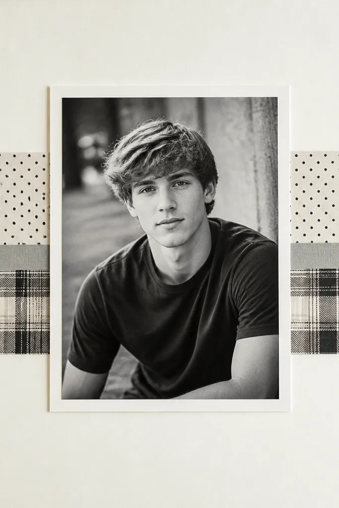
Monochrome photos plus patterned bands look like editorial spreads. The page stays sophisticated because the photo is calm and the patterns are contained to narrow strips. Choose one pattern — polka dots, subtle plaid, or tiny floral — and use it for two horizontal bands. Add a thin solid strip between bands in your accent color. This makes the layout feel designed without needing 20 different decorations. It’s a strong choice when you have a senior portrait that already has good composition.
Pick one patterned paper and cut two strips, each 3/4-inch tall, sized to the width of your page minus 1/2 inch. Cut a photo mat for a 4x6 photo and mount the monochrome photo centered. Add the first patterned strip near the top third and the second near the bottom third, leaving a 1/4-inch gap between strips and the photo mat. Use a solid cardstock strip in your accent color as a separator between the patterned bands. Add a single caption line under the photo with a consistent font size.
Keep band width the same on every page — repeat the measurement for album consistency.
Avoid mixing two patterned papers on the same page; it turns into scrapbook clutter fast.
19. Handwritten Letter Foldout with Fabric Hinges
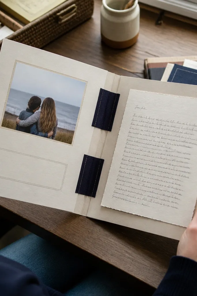
Foldouts add drama and make the album feel like a real artifact. The high-end version uses fabric hinges so opening and closing stays smooth and the hinge looks intentional, not taped. The front shows a clean photo and a short title, while the inside holds a handwritten letter or advice. For seniors, this is perfect for “What I learned” or a message from a parent. It photographs well because the front looks minimal and the inside feels like a surprise.
Cut a 8.5x11-inch sheet and score it so it folds into a booklet insert (about 4.25 inches wide). Cut a fabric hinge strip 1/2 inch wide and 4-5 inches long, then glue it to the inside fold line so it acts like a flexible spine. On the front panel, mount a 4x6 photo on a mat and add a title strip. On the inside panels, write a letter using black gel pen, then glue the paper to the panels with a thin glue roller. Reinforce the outer edges with a strip of thin cardstock if you expect frequent opening.
Use a fabric hinge strip from an old shirt or denim — it already has the right drape and durability.
Don’t use thick ribbon hinges; they add bulk and the foldout won’t lie flat.
20. 3D Shadow Box Graduation Photo Tree with Layered Leaves
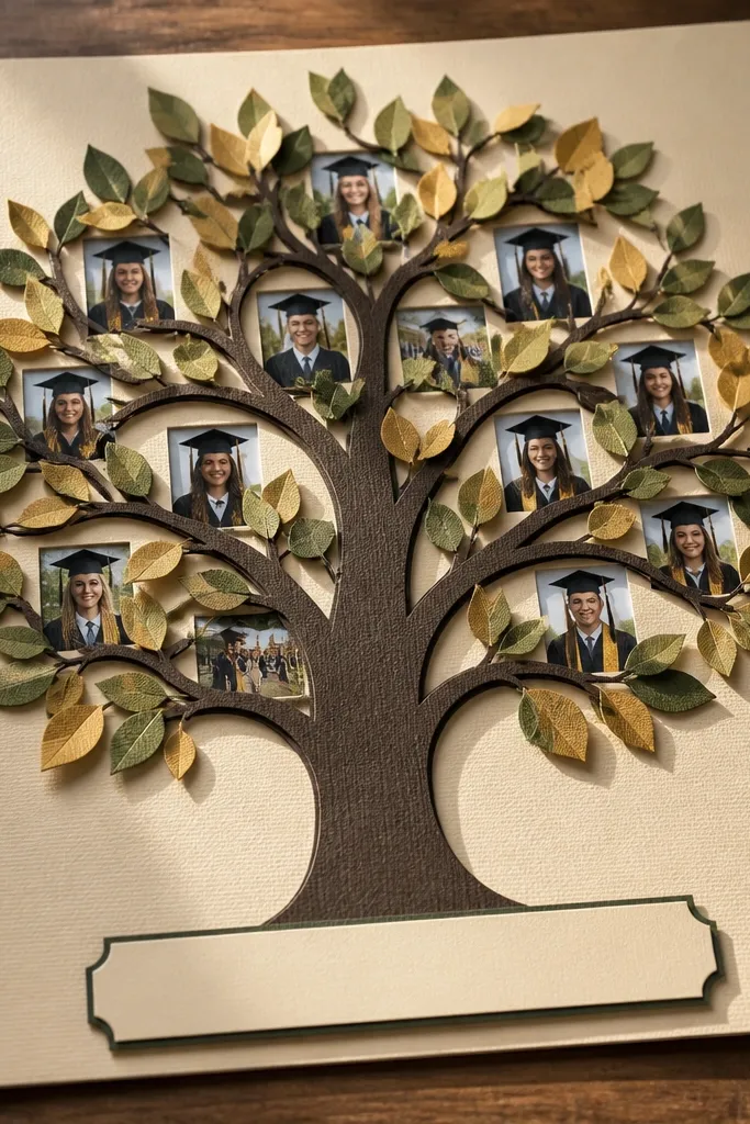
This one looks high-end because it has real depth. You get a tree silhouette made from layered cardstock, then you tuck small graduation photos into the “branches” so the page reads like a display, not a flat scrapbook. The raised leaf layer catches light and makes the whole layout feel dimensional even when it’s just paper. It also solves a common problem with senior books — photos can look scattered — because this design forces everything into one clean shape. It takes a weekend pace and a bit of careful cutting, but the materials are cheap and the result photographs beautifully.
Cut a 12 x 12 inch base from heavyweight cardstock (300 gsm or thicker). On top, trace a tree trunk and branching silhouette onto 65 lb cardstock and cut it out; repeat the silhouette a second time so you can stack it for depth. Glue the top silhouette to the base trunk with 1/4 inch foam tape under only the trunk/major branches, leaving the smaller twigs flat so it doesn’t get too bulky.,Make the leaf layer: cut 40-60 leaf shapes from two colors of cardstock that match the school colors, using a leaf punch or template. Lightly curl each leaf with your fingers so they sit forward, then glue them in clusters along the branches. For photos, print 3x4 inch (or 2.5x3.5 inch) mini photos, then trim each to fit behind a branch opening; mount them on thin foam strips so they sit slightly proud of the tree.,Frame it like a shadow box: use a 1/2 inch deep picture frame or build your own frame from 1/2 inch thick chipboard strips. Mount the finished tree panel inside so it sits about 1/4 inch back from the front glass/acrylic (or from the frame opening if you skip glass). Finish by adding a small caption strip under the tree, using a matte black or dark brown pen for clean readability.
Use a metal ruler and a fresh craft blade for the silhouette cuts — clean edges make the 3D layers look expensive.
Don’t glue every leaf flat; you need a mix of forward-curled leaves and slightly raised clusters to get that gallery-style depth.



