
1. Foil-Label Mood Board on Black Cork
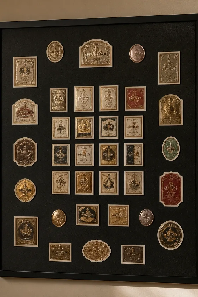
Start with a black cork board so every lighter piece pops. Use thrifted packaging labels with foil or embossed text, then back them with cream or off-white paper so the edges look crisp instead of messy. Arrange labels in a tight grid only in the center, then taper density outward with single items spaced further apart. Finish with thin strips of brown leather or faux leather tape to draw “routes” between goals — it looks styled, not random. This works in apartments and bedrooms because the black base makes everything look intentional, even when your plans are personal and varied.
Cut your cork panel to size if needed, then wipe it with a dry microfiber cloth so dust doesn’t block adhesion. Cut label pieces into clean rectangles and triangles, then test placement before gluing. Glue labels with a matte glue stick or a thin layer of gel medium, pressing lightly to flatten edges. Add leather tape lines using a ruler for straight runs, then let everything cure flat under a book for 30 minutes.
Use a small metal ruler and a craft knife for straight label edges; it makes the whole board look “designed.”
Don’t cover the whole cork — leave negative space around the center.
2. Book-Page Botanical Board with Pressed-Leaf Frames
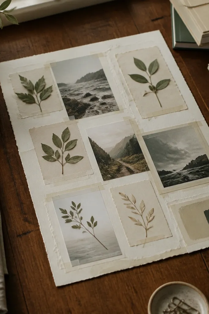
This board is high-end because it looks like an art print, not a scrapbook. Use pages from old books with deckled edges and a muted ink tone, then frame small pressed leaves using thin strips of clear tape or archival tape inside simple rectangles. The botanical pieces add texture and subtle color, while the book paper provides a consistent background. Keep the palette tight: sage green, warm cream, and ink black. Put the densest cluster near the top third so the board feels like a composed poster.
Choose a book with pages that have a natural off-white tone, then tear or cut strips to create a layered background. Press leaves between paper for 2-5 days if they’re fresh, or use already-dried leaves. Arrange leaf “frames” by placing tape borders first, then sliding the leaf inside and securing the edges. Seal the whole background with a light matte spray from 12 inches away to reduce shine.
If your leaves look too bright, tint the paper behind them with a very light tea-wash for a softer match.
Don’t use glossy magazine paper for the base; it fights the botanical texture.
3. Fabric-Scrap Color Block Board with Fringed Edges
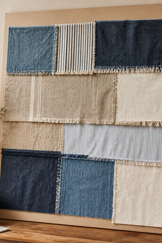
Cut a canvas or heavy cardstock backing and lightly iron or steam fabric scraps flat. Sew or glue fabric blocks in 2-3 main color columns, using a ruler to keep edges straight. Add fringe by cutting a 0.5-1 inch strip from one fabric and trimming it into a neat edge before attaching at the seam. Finish by tacking a single ribbon or bias tape line to connect two color blocks.
Fabric makes a board look expensive because you get real texture. Build a color-block layout using scraps with visible weave — denim, linen, cotton shirting, or even a sturdy scarf. Cut blocks into consistent widths, then add a thin fringe trim where two fabrics meet for a tailored look. Keep the backing neutral like natural canvas or cream poster board so the fabrics sit forward visually. This is perfect for a reading nook or a hallway wall where the board will catch light and look good from across the room.
AvoidDon’t mix jersey knits — they curl and make the board look sloppy.
Pro tipUse a fabric glue made for textiles or a hot glue gun on the backing only; glue on the fabric surface can stain.
4. Shadowbox Stationery Board with 3D Receipts and Tickets
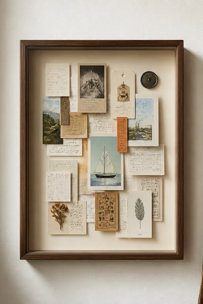
Pick a small frame with a deep backing so pieces can stand off the surface. Cut a cream background card and glue ephemera in the back layer first. Build depth by mounting front pieces on foam tape strips (about 1/8 inch thick) and keeping the tallest layer centered. Seal the background edges with matte tape and hang using a level so the shadowbox looks straight.
A shadowbox vision board instantly reads high-end because it has depth. Use layered paper ephemera like old tickets, receipts, appointment cards, and packaging inserts, then mount them on different depths so they cast gentle shadows. The key is spacing: leave 1/4-1/2 inch gaps between layers so it doesn’t turn into a flat collage. Add a simple title strip at the bottom using clean typography from a book or packaging. This works best for desk corners and entry tables where you want a styled object, not just a wall collage.
AvoidDon’t crowd the box — if layers touch, it reads cheap instead of curated.
Pro tipKeep foam tape thickness consistent across the board so the shadows look intentional, not lumpy.
5. Matte Photo Tape Grid Board with Minimal Cutouts
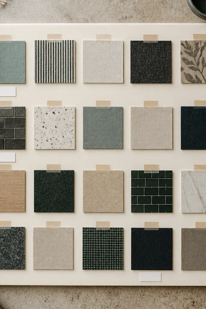
Mark a grid lightly with a pencil: for example, 4 columns by 3 rows in the center area. Cut your hero images and text shapes with a craft knife for clean edges. Apply matte photo tape strips on the back and across the top edges so the front looks flat. Add 1-2 small label cutouts beneath the grid items and step back to check alignment.
This is the clean, designer look: fewer pieces, aligned edges, and tape that you can actually see. Use matte photo tape to hold cutouts — it adds a styled “studio” feel and prevents wavy paper edges. Build a strict grid on a cream board, then place only 12-18 hero cutouts that match your anchor palette. Add tiny labels in the same font style by cutting them from packaging typography or using a simple label maker. The board stays photogenic because everything is aligned and there’s plenty of breathing room.
AvoidDon’t use shiny clear tape; it creates glare in photos.
Pro tipUse a single tape width (like 1/2 inch) across the whole board for a consistent high-end look.
6. Leather-Trim Goal Board on Kraft Paper Backing
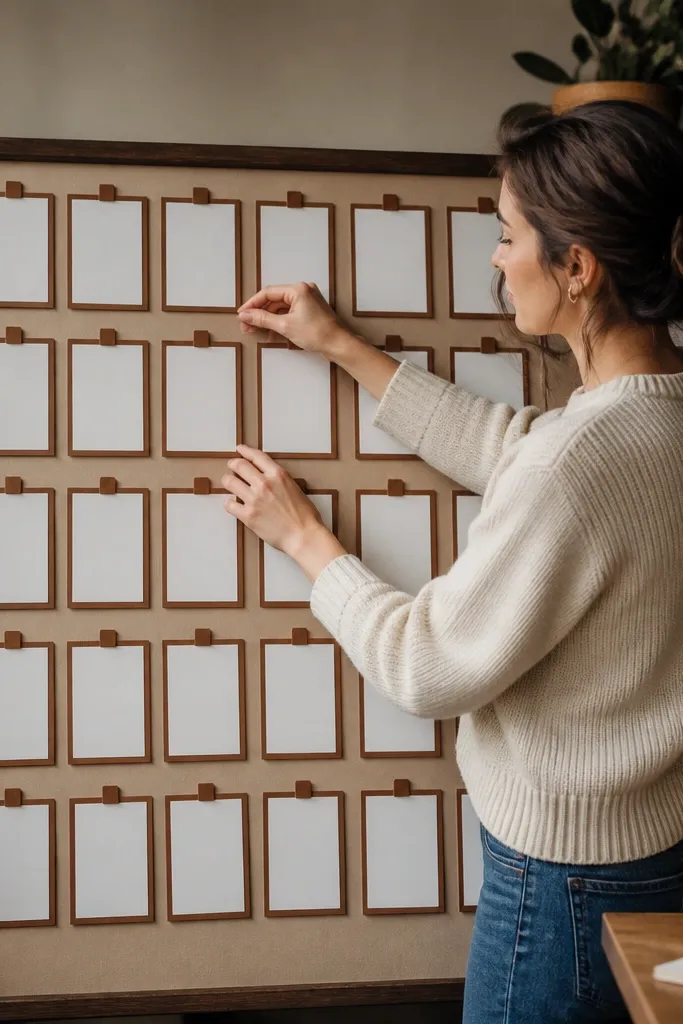
Cut a kraft backing panel and tear the top edge slightly for a natural finish. Cut goal cards from thick paper or book pages and glue them down. Frame each card by gluing leather strips around the edges, leaving a small kraft border visible. Add one leather route line using a straightedge to connect two cards.
Kraft paper plus leather trim looks expensive because it’s naturally layered and warm. Make the board feel like a product packaging layout: use kraft as the background, then frame each goal card with thin strips of faux leather or real leather. Keep goal cards small and consistent — think 3x5 inch rectangles — and place them in a staggered arrangement. Add one “route” line made from leather strip connecting related goals. This is perfect for a workspace because it looks calm, not busy, and the warm tones hide minor imperfections in DIY cutting.
AvoidDon’t use thin tissue paper cards; they buckle against kraft and look cheap.
Pro tipIf your faux leather frays, seal the cut edge with a tiny dab of fabric glue.
7. Upcycled Denim Patchwork Board with Contrast Stitch Lines
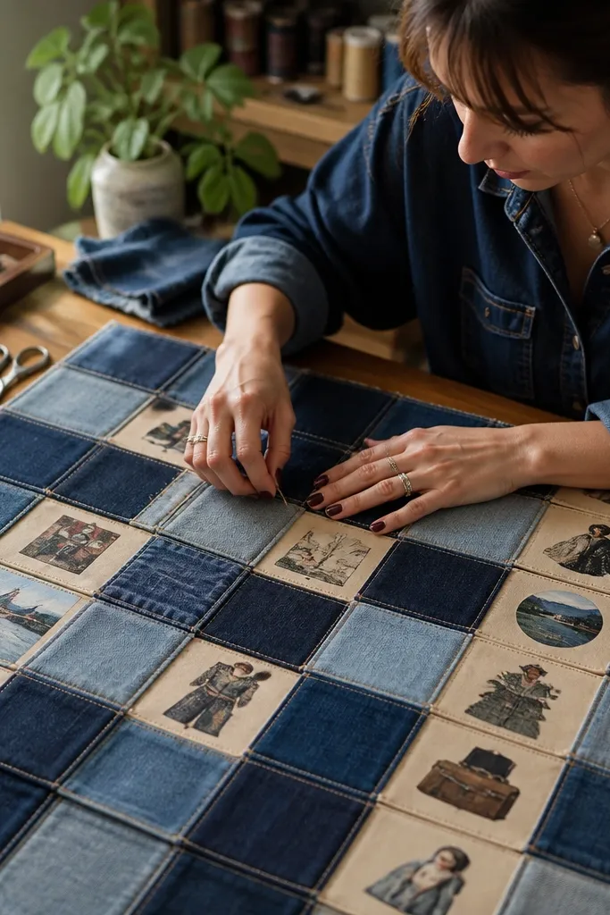
Denim patchwork reads high-end because it has built-in structure and visible stitching. Use multiple denim scraps in 2-3 shades of blue, then add cream or tan paper inserts for your vision statements. Keep the layout in blocks like a quilt — a few large rectangles beats lots of tiny pieces. Add contrast stitch lines using fabric marker or iron-on thread accents so the board looks tailored. This board is great for a home office or a teen room where you want a strong, stylish visual.
Cut denim rectangles into a consistent grid size, like 6x8 inch and 4x6 inch pieces. Glue denim to a backing board with fabric glue, then press under a heavy book for 20 minutes. Add paper inserts by trimming them to fit the denim openings and gluing only the edges. Draw straight stitch-like lines with a fabric marker using a ruler for spacing.
Wash and dry denim scraps before you cut; shrinkage makes finished edges lift later.
Don’t mix denim weights too wildly — thick and thin panels buckle differently.
8. Vintage Postage + Map Coordinates Board
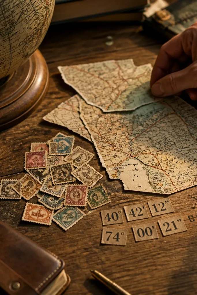
Back your board with cream or light tan paper. Tear map scraps into irregular shapes and glue them where you want the “background.” Cut stamps or label stamps into singles and mount them on top using matte glue stick. Add coordinate numbers using cut-out digits and glue them lightly so they don’t look pasted thick.
This one looks like travel editorial styling. Use vintage postage stamps (or print-stamped packaging labels) and pair them with torn map scraps that show roads or coastlines. Add coordinate-style text by cutting numbers from old planners or packaging typography, then place them near the map fragments. The board feels cohesive because the stamps and maps share an old-paper look. Put the stamps in a diagonal line and keep maps behind them for depth. It’s a great fit for anyone building a future plan around travel, moves, or life changes.
AvoidDon’t cover every inch with stamps; diagonal negative space makes it feel curated.
Pro tipUse the same digit size for every coordinate label so it reads like a designed system.
9. Gallery-Style Frame Board with Matting from Old Posters
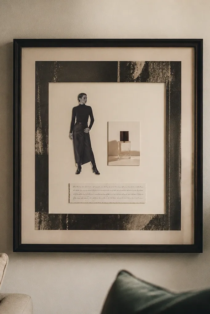
If you want the most “high-end wall art” look, use a frame and matting. Build your board on a thick backing, then use matting cut from an old poster or foam board so you get a clean border around everything. Arrange only a few hero pieces — like one fashion silhouette cutout, one product photo, and one handwritten-style quote cut from packaging. The matting makes the pieces look like they belong in a gallery, not on a cork board. This is ideal for living rooms and hallways where you want your vision board to look like decor.
Choose a frame with a removable back and a mat board that can be cut to size. Cut a mat opening with a craft knife so the center area is consistent. Glue your pieces onto the backing, then place them behind the mat opening in a tight arrangement. Seal edges with a matte tape strip and place the board under weight to flatten before inserting into the frame.
Use thick paper for the hero pieces so they don’t bow under the mat.
Don’t skip the mat — without it, frames look like random collages inside glass.
10. Monochrome Ink Board with Black Paper and White Labels
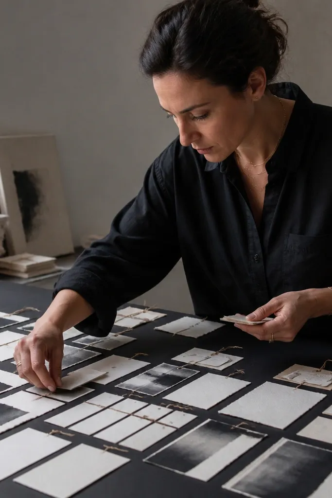
Cut black paper to the board size and wipe it clean so dust doesn’t show. Create label pieces from white packaging or cut white-on-clear label sheets and back them with a solid white card. Arrange typography in 2-3 aligned lines and glue down with matte glue stick. Add one thin border line using a white gel pen or label strip.
Monochrome boards look expensive because your eye doesn’t have to sort through color chaos. Use black paper as the base, then build with white labels, cream book paper, and ink typography. Add texture with torn edges and slightly uneven cuts, but keep the layout strict: rows or columns only. This is a strong choice for goals like discipline, study, fitness, or design where you want a clean mental focus. It also photographs well because the contrast is high and consistent.
AvoidDon’t use gray paper — it dulls the contrast and makes the board feel washed out.
Pro tipUse a white gel pen to add tiny ticks or arrows; micro details make it look designed.
11. Gold Leaf Tape Line Board on Cream Canvas
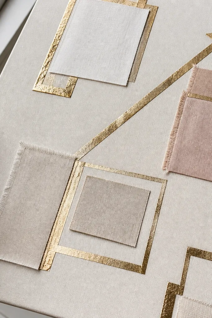
Stretch or mount cream canvas onto a board so it stays flat. Plan your geometry with pencil: two rectangles and one diagonal arrow is enough. Apply gold leaf tape using a straightedge and press firmly along the edges. Glue fabric swatches beneath tape corners and add a single title strip at the bottom.
Gold leaf tape turns a simple collage into something that reads luxury. Start with a cream canvas backing, then add gold tape lines in clean geometric shapes: corners, rectangles, and one diagonal arrow. Place small fabric swatches under the tape lines so the gold feels like it’s “framing” your materials. Add one or two photo prints from thrifted frames, but keep them small so the tape lines stay the star. This looks incredible in warm daylight because the tape catches light without looking shiny like plastic.
AvoidDon’t cover large areas with gold; thin lines look high-end, heavy coverage looks costume-like.
Pro tipPress tape with a dry spoon or burnishing tool to lock down edges and reduce lift.
12. Recipe Card and Spice Packaging Board
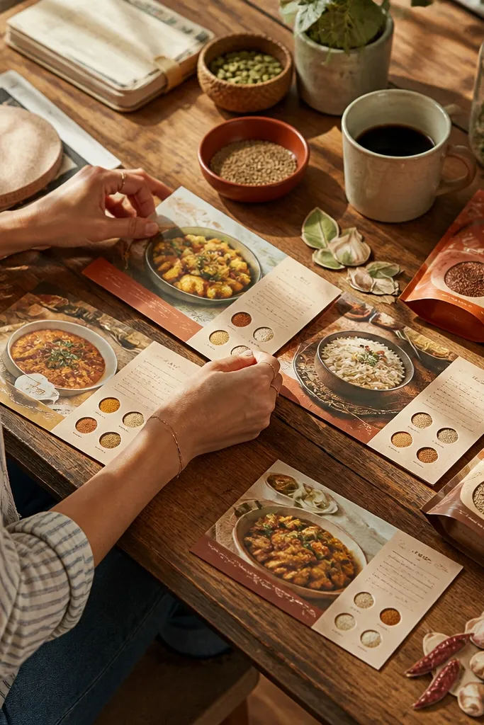
Sort your recipe cards by color and cut them to consistent sizes, like 3x5 or 4x6 inch. Tear spice packaging into strips and test a layout on the table before gluing. Glue recipe cards down first, then layer spice fragments behind or beside them using matte glue. Finish with a thin burlap ribbon line that connects your top two goals.
This board is high-end because it looks like a styled cookbook page. Use recipe cards (or thrifted recipe pages) as the hero blocks and surround them with spice packaging fragments that have strong typography and color. Keep everything in warm tones: terracotta, caramel, cinnamon brown, and cream. Add a few small “ingredient” swatches — like a strip of burlap or a tiny bit of textured paper — so the board feels tactile. It’s a great fit for kitchens, dining areas, or anyone building a life around cooking, hosting, and home rituals.
AvoidDon’t use glossy candy wrappers; they look plasticky next to paper.
Pro tipUse a ruler for card placement; crooked recipe cards make it look like a school project.
13. Hanging Ribbon Ladder Vision Board
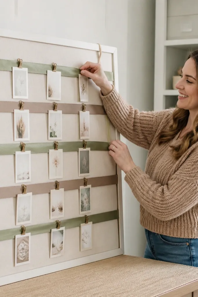
This makes your vision board interactive and photogenic. Build a ribbon ladder on a simple board or fabric backing, then clip printed cards onto ribbons using mini binder clips. The high-end look comes from consistent spacing and matching ribbon widths, not from fancy decoration. Choose 2 ribbon colors maximum — like black and cream, or deep olive and tan. The cards should be consistent sizes so the board reads like a design display. Great for dorms, studios, and anyone who likes changing goals without re-gluing everything.
Mount a backing board and mark three horizontal anchor points using a pencil grid. Cut ribbon strips in matching widths and lengths, then tie them between anchor points like a ladder. Attach small binder clips to the ribbon and use card sleeves or cardstock cards to slide in. Hang the finished board with a level so the ladder looks straight.
Use cardstock 110-130 lb for cards; it clips cleanly and holds shape.
Don’t mix ribbon widths — uneven widths make the ladder look homemade.
14. Polaroid-Style Frame Board with Washi Edge Borders
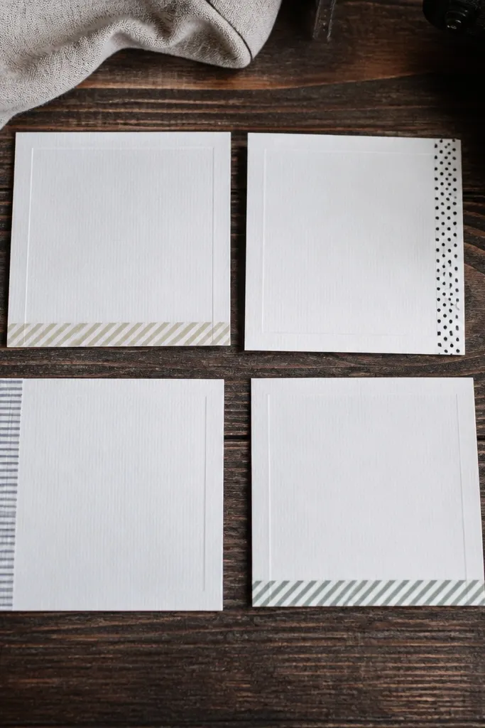
Cut white cardstock mats for each image panel, like 3.5x4.5 inch mats with a 0.5 inch border. Glue images onto the mats and add washi tape on one side only. Arrange panels in a slightly staggered line but keep the top edges aligned. Seal the whole board with a light matte finish spray so tape edges don’t lift over time.
Polaroid-style framing looks good because it adds a standardized border around each piece. Create “photo” panels from thick paper, then add a muted washi tape border along one edge only. Keep the tape pattern subtle: small dots, thin stripes, or solid-toned washi. This board is best when you want a cohesive aesthetic without making everything identical. It’s also forgiving if your prints aren’t perfectly aligned, because the faux polaroid mat hides minor mistakes. Put it in a bedroom or creative studio where soft, nostalgic visuals fit the vibe.
AvoidDon’t stack tape on top of tape; it wrinkles and looks sloppy.
Pro tipUse the same washi tape width across every panel for a consistent high-end rhythm.
15. Marbled Paper Offcut Board with Framed Quotes
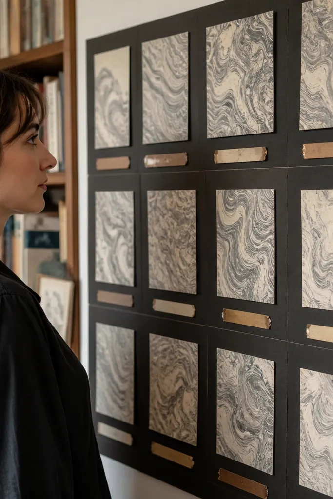
Cut your marbled paper into consistent sizes, like 2.5x3.5 inch rectangles. Cut dark frames slightly larger than each marbled piece and glue marbled paper inside. Arrange framed cards in a grid on a cream backing, then add quote strips beneath each frame. Finish by sealing lightly and trimming any overhang for a neat edge.
Marbled paper offcuts create the expensive look because they already have movement. Use marbled paper from craft stores or handmade-style paper you’ve repurposed from packaging inserts. Frame each marbled piece with thin strips of black or dark brown paper so it reads like a collectible card. Add quote strips cut from old book text or packaging instructions, then place one quote per framed card. This board works for study goals because the structure is clean and the marbling adds visual energy without chaos.
AvoidDon’t use too many different marbling patterns — pick 2-3 and repeat them.
Pro tipUse a craft knife and cutting mat; marbled paper tears if you use scissors.
16. Thrifted Frame + Fabric Pocket Board for Swaps
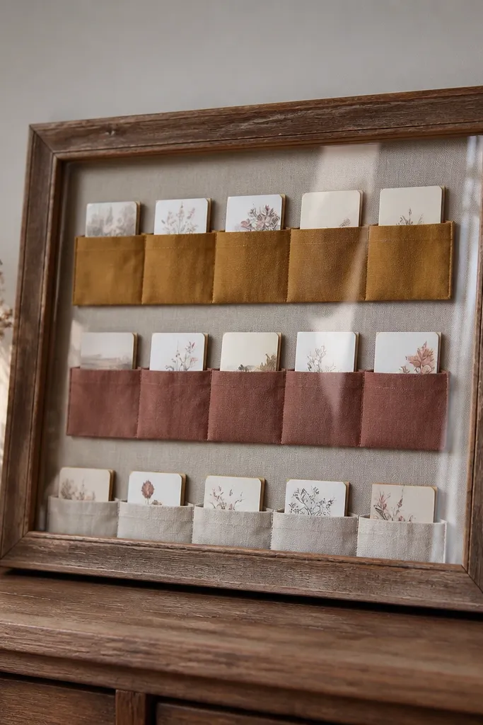
Remove the backing from a frame and measure the inner opening. Cut a backing panel from thick cardstock or foam board and mark pocket rectangles with a ruler. Sew or glue fabric pockets to the backing, leaving the top open, then slide in cards. Insert the pocket board into the frame and secure the back so everything stays flat.
Fabric pockets make your vision board look intentional and organized. Use a thrifted frame with removable backing, then sew or glue fabric pockets onto a backing panel in a clean row. Each pocket holds a card or small print, so you can swap goals as your priorities change. The high-end look comes from consistent pocket sizing and a matching fabric selection, like linen-cotton blends in a neutral tone. This is ideal if you’re building a rotating plan for routines, monthly goals, or seasonal projects.
AvoidDon’t make pockets too deep; deep pockets hide cards and look bulky.
Pro tipUse Velcro dots on the cards if you want them to stay put when the frame is moved.
17. Cork + Pushpin Typography Board with Numbered Paths
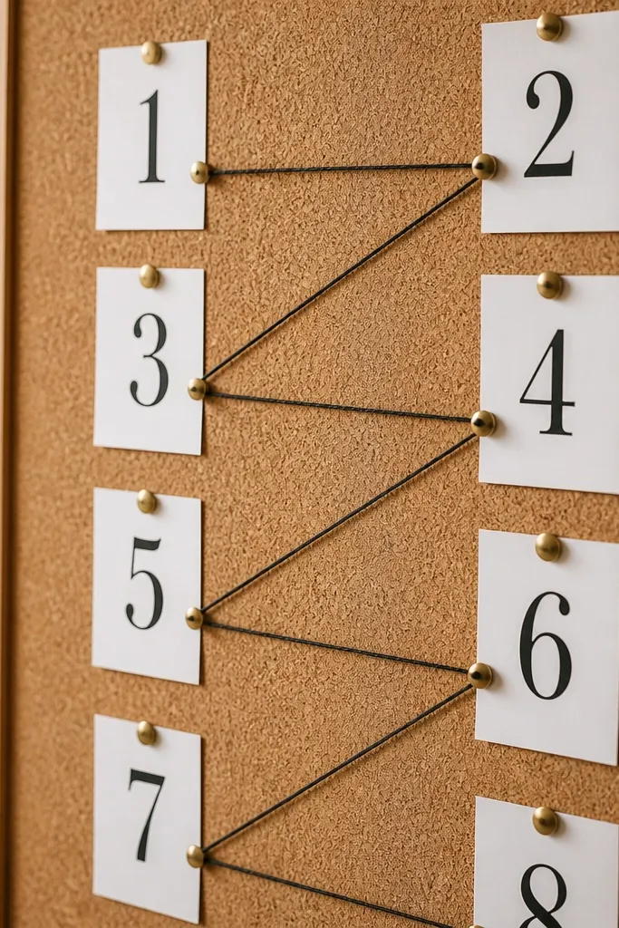
Clean your cork and cut typography cards from thick paper so they hold flat. Pin cards with pushpins in aligned rows, keeping spacing consistent. Wrap thin thread between pins following a path and tape thread ends to the back. Add numbers by cutting digits from packaging or using a label maker and pinning them next to steps.
Cork and pushpins instantly read vintage-design, and you can make it look modern with typography. Use printed or cut typography cards in one font style, then pin them neatly in two columns. Add numbered “paths” using thin black thread or twine between pushpins so your goals feel like a sequence. This board is visually striking because the pin heads create a pattern and the thread adds structure. It’s great for planning phases — like learning steps, project timelines, or habit progress.
AvoidDon’t scatter pins randomly — align them or the board looks messy.
Pro tipUse black thread so it reads graphic; colored thread makes it look like a craft fair project.
18. Clear Acrylic Sticker Board with Layered Label Text
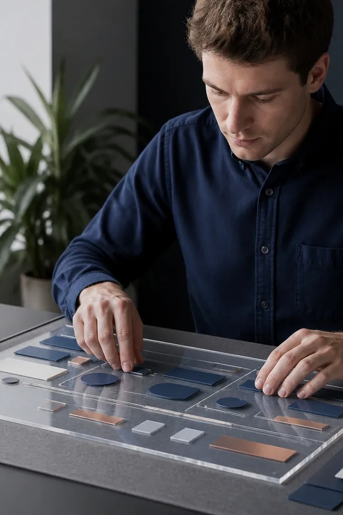
Place acrylic on a flat surface and plan your layout with paper cutouts first. Apply removable label stickers or thin label tape strips to build layered text blocks. Add small photo cutouts under the acrylic using double-sided tape corners. Seal the final arrangement by adding a thin strip border around edges to keep pieces from shifting.
This one gives a glossy, high-end studio look without needing expensive print materials. Use a clear acrylic sheet or a clear binder cover as the base, then layer label text and small cutouts underneath or on top with removable sticker adhesive. The transparent base makes the typography feel airy and modern, while the layered labels create depth. Keep the palette restrained: white, black, and one accent color like muted terracotta. It looks great in bright rooms because the light passes through the layers.
AvoidDon’t crowd the acrylic — too many layers make it look cloudy.
Pro tipUse removable adhesive for the labels so you can rework the layout without residue.
19. Washi Tape Corner Frames with Single Center Hero
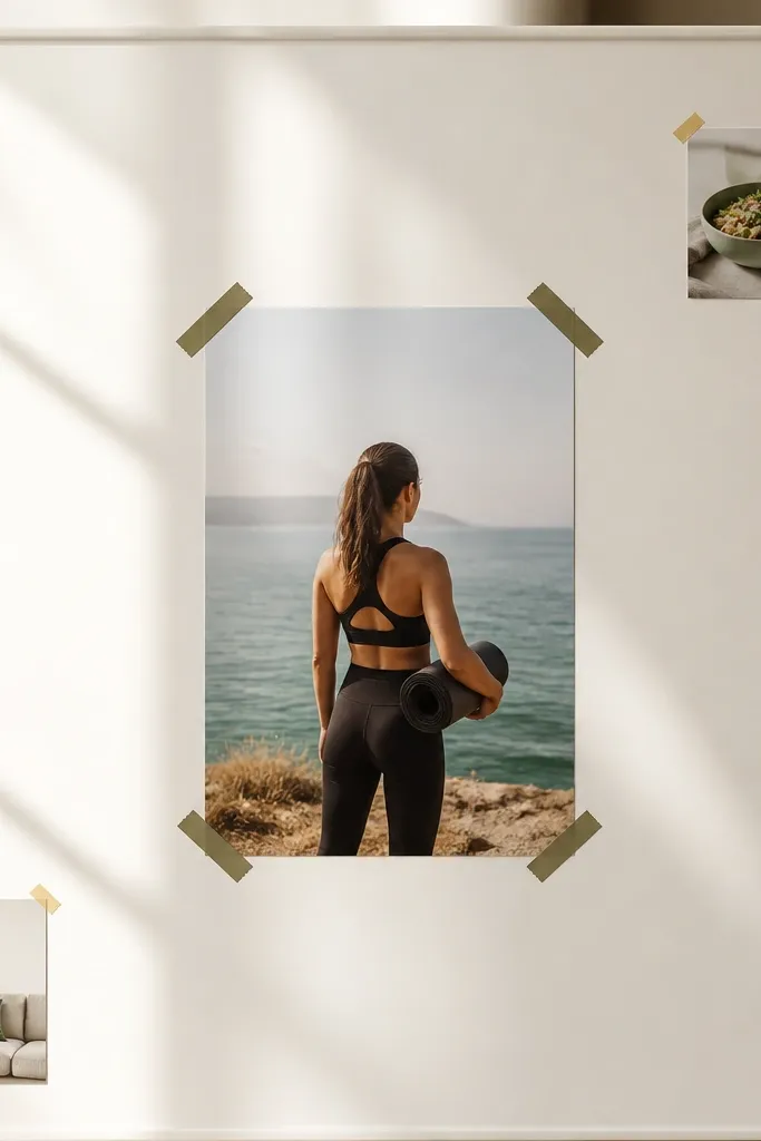
Start with a matte cream board and choose your hero card size, like 5x7 inches. Place washi tape corner frames around the hero card — two corners only on each side. Add two smaller cards and anchor them with minimal tape strips. Finish by drawing a thin line or arrow with a marker that matches your tape color.
This is a clean, fashion-magazine style board: one hero image, framed by corner tape. Pick a single central goal card that’s your main visual, then surround it with corner frames made from washi tape. Add a couple of small supporting cards in the bottom left and top right corners, but keep them tiny. The board looks high-end because the negative space is doing most of the work. It’s also easy to photograph because everything centers and nothing competes for attention.
AvoidDon’t use more than 3 supporting pieces; the center hero needs to breathe.
Pro tipStick to one washi tape design across the whole board so it reads like a set.
20. Textile Journal Cover Board with Zipper Pocket Closure
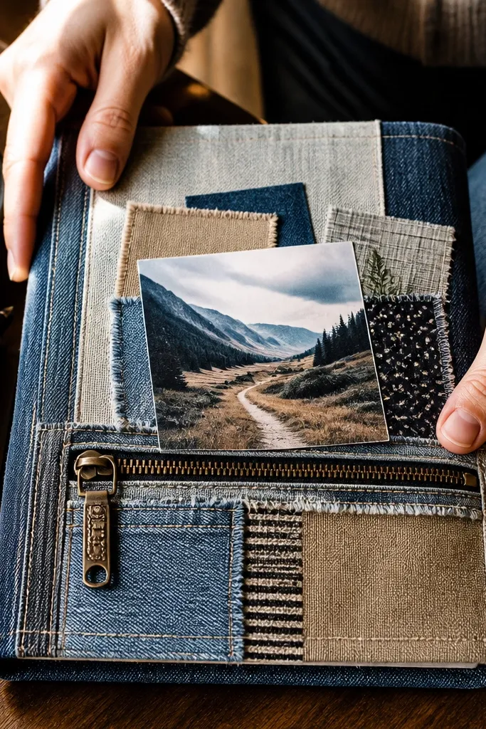
This board looks like a designer notebook because it has a zipper pocket. Use a fabric cover backing like canvas or denim and attach a zipper pocket panel where you can store extra cards or printouts. Inside the front, create a small collage using fabric scraps and one printed hero card. The zipper pocket adds function and makes the piece feel finished, not flat. It’s a great option if you want to keep inspiration cards organized and hidden until you need them.
Cut a fabric cover panel slightly larger than your board and fold edges over to hide raw seams. Sew or glue a zipper pocket panel onto the front, centering it. Add your collage elements inside the pocket area or just above it using fabric-safe glue. Secure the backing with a firm board so it stays flat on a shelf.
Use a zipper that’s already attached to a pocket lining so you don’t fight alignment.
Don’t glue zipper teeth to fabric; it will pucker and snag.
21. Natural Branch + Twine Pin Board for Outdoor Vibes
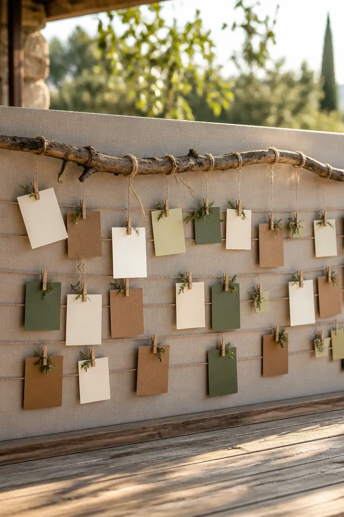
Mount a cleaned, dry branch using small screws or strong craft adhesive on the back of a backing board. Tie twine in two or three straight lines across the branch using equal spacing. Pin cards with small pushpins so the paper stays flat, then add tiny fabric tags at one end of each twine line. Finish by trimming any twine ends and securing knots with a dab of glue.
A branch-and-twine board looks high-end when it’s restrained. Mount a slender, straight branch horizontally on a backing board, then use twine lines as subtle “rails” for pinned cards. Choose paper colors that match nature: cream, kraft, and muted greens. The branch provides a sculptural frame, so even a minimal collage reads styled. This works well for plant corners, entryways, and anyone who wants their vision board to feel grounded and calm.
AvoidDon’t add too many twine lines — three rails are enough for a luxury look.
Pro tipSand the branch lightly so it doesn’t snag paper edges.
22. Matte Paint Swatch Board with Color Ladder Labels
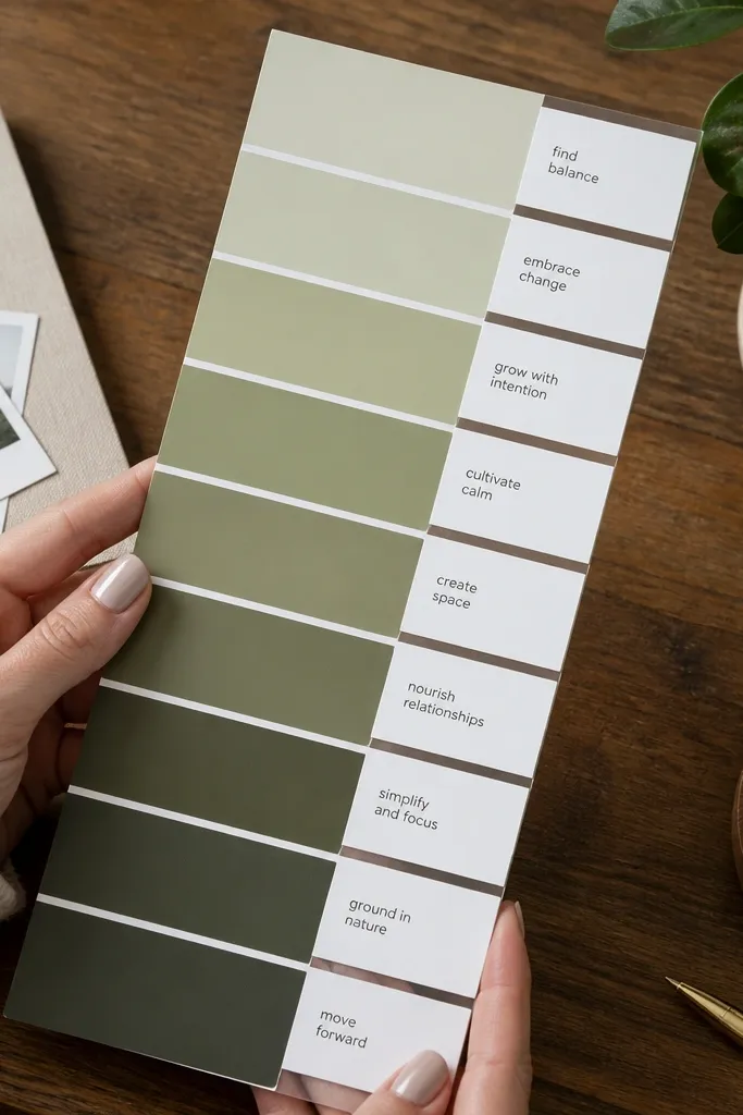
Paint swatches are already designed, and that’s why this board looks expensive. Build a color ladder using 8-12 swatches in the same hue family but different lightness, then label each swatch with a short goal phrase. Use matte swatches or thrifted paint sample cards, then mount them on a board with clean spacing. Add one photo or small cutout at the top only — like a house shape or a minimal interior image. This is ideal for anyone who loves color planning for rooms, routines, or personal style goals.
Collect matte paint sample cards or cut swatches from leftover sample sheets. Arrange them in a light-to-dark ladder and mark spacing with a ruler. Glue swatches down with a thin matte adhesive so edges stay flat. Add labels using a label maker or cut typography and place labels under each swatch.
Keep label text short — 2-4 words — so the swatches stay the focus.
Don’t use glossy swatches; they reflect light and look cheap next to matte paper.
23. Blackboard Paint Vision Board on Smooth Wood Slats with Chalk-Icon Borders
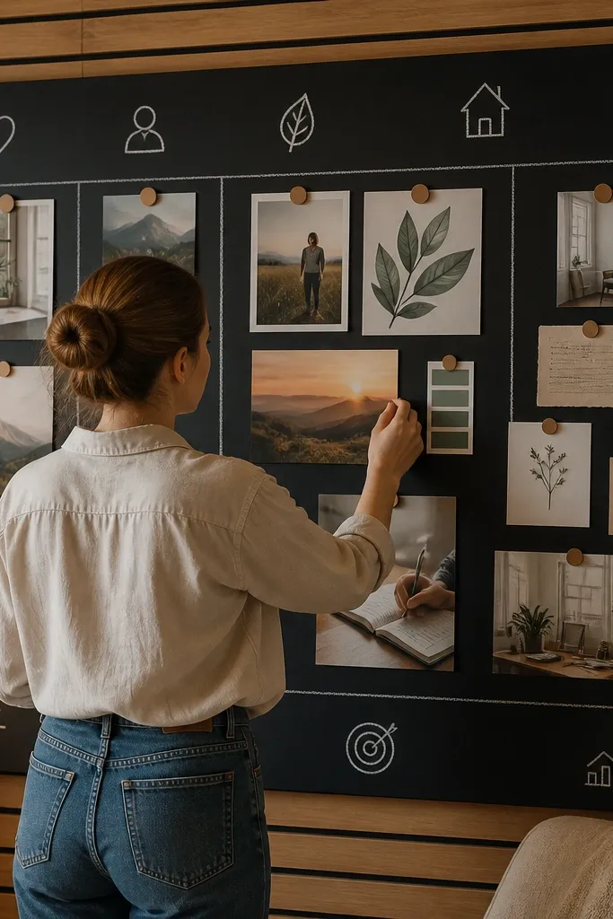
Cut 5-7 smooth wood slats into equal lengths, aiming for 10-12 in wide and 24-30 in tall total board size. Sand edges to remove splinters, then wipe with a tack cloth and paint with black chalkboard paint in 2 thin coats; let it cure per the can, usually 24-48 hours. Arrange slats with 1/4 in gaps, then glue and clamp them to a backing board (thin plywood or hardboard) so the gaps stay even. Seal the finished surface with one light coat of chalkboard sealer if the paint requires it, then add a border of chalk icons using a stencil set (stars, arrows, hearts) so the layout looks intentional. Finish by mounting small magnets on the backing or directly to the slats, then attach printed cards and photos with magnetic strips.
This one looks high-end because the black surface is clean and graphic, and the wood slats give it that gallery spacing you see in expensive studio walls. You get a vision board that you can actually update without ruining anything, since chalk erases and magnets hold paper items flat. The contrast is strong — matte black, crisp white chalk, and small metal magnets — so it photographs well from straight-on and from a slight angle. It takes basic DIY skills and about 2 hours of build time, plus drying. This fits a bedroom wall, a home office, or a hallway where you want something functional, not precious.
AvoidDon’t thicken the paint coats — brush marks show up under indoor light and ruin the sleek look.
Pro tipBefore you write your final layout, “prime” the chalkboard by rubbing chalk over the whole surface and wiping it off — it makes lines look cleaner.
24. Pressed Flower Contact Paper Board with Clear Resin-Edge Frame
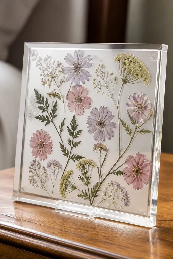
Press flowers first using heavy books for 5-10 days so they dry flat; choose thin blooms like baby’s breath, pansies, or fern fronds for the cleanest look. Trim a panel of smooth craft board to 8x10 in or 11x14 in and wipe it with rubbing alcohol to remove dust. Cut clear self-adhesive film slightly larger than the panel, peel the backing halfway, and lay it down slowly so you don’t trap bubbles. Arrange pressed flowers on the board, then fully apply the film over them, using a plastic scraper card to push out air from the center outward. For the frame, mix a small batch of clear resin or use a clear epoxy “gloss border” technique along the edges only, then cure flat; keep resin on the border so it doesn’t cloud over flowers.
This gives you that floating-botanical look without the mess of full casting, and it photographs like a boutique product label. The secret is the clear top layer — contact paper or clear self-adhesive film — which locks pressed flowers in place and keeps them flat. A resin-edge or glossy clear-coat frame makes the border catch light, so the whole board looks finished instead of DIY. It’s best for goals you want to feel soft and grounded: wellness routines, self-care habits, or seasonal inspiration. Skill level is beginner, with most time spent waiting for the seal to cure.
AvoidDon’t use wet or not-fully-dried flowers — they discolor under clear film and turn brown fast.
Pro tipUse tweezers and a tiny dot of removable adhesive putty under each flower — it holds placement without soaking paper.
25. Matte Acrylic Photo Panel with Heat-Set Iron-On Labels and Minimal Tacks
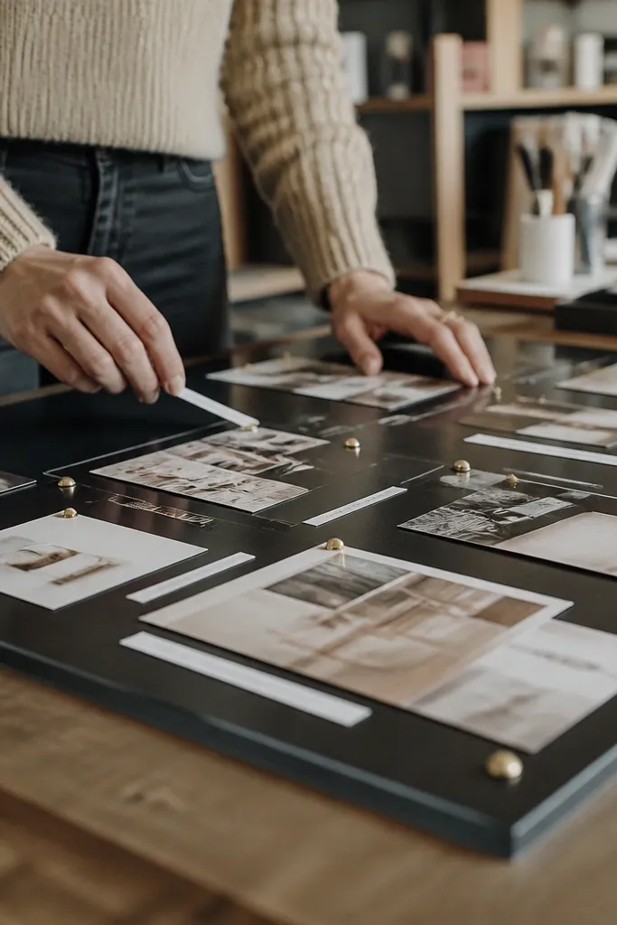
Buy a matte finish acrylic sheet cut to 12x16 in or 11x14 in, then clean it with microfiber and isopropyl alcohol. Print your photo set and label text on plain paper, then cut label strips from iron-on vinyl sized to 1-1.5 in width. Position photos on the acrylic and mark tack locations; use tiny brass tacks or thumbtacks through pre-drilled holes in the acrylic corners only, not through the photo area. Apply iron-on vinyl labels using a heat press or iron-on with parchment paper: press 8-12 seconds, lift, then press again for another 8 seconds for a strong bond. Finish by adding a thin border of acrylic stand-offs or wall-mount hardware so the panel hangs flat and level.
This is the clean, high-end “editorial” look: matte acrylic keeps glare down, and iron-on label strips make your vision board feel designed instead of pasted. You get a sturdy surface that doesn’t warp like foam board, and the labels look crisp because heat-activated vinyl adheres tightly. The minimal tack points keep photos and notes aligned without bulky clips, so it stays photogenic. This suits a small wall, dorm room, or office nook where you want a sharp visual system that still feels personal. Build time is about 1-2 hours plus a short cooling/press time.
AvoidDon’t press vinyl directly onto the acrylic without parchment — it can leave streaks and shiny patches.
Pro tipDo a test press on a scrap vinyl first — matte acrylic can make heat settings tricky, and a quick test prevents peeling or silvering.



