
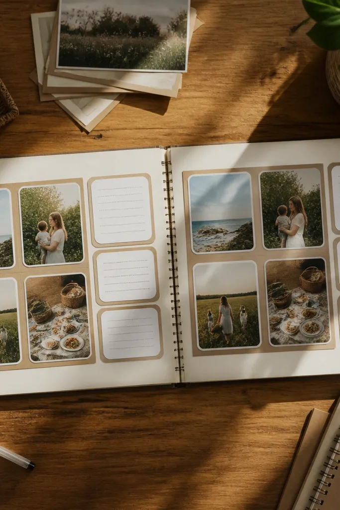
1. Two-Photo Grid with a Center Caption Strip
First, cut your base cardstock and two photo mats to the same size, leaving a 1/8-1/4 inch border between photo and mat. Place both photos in a left-right grid, then measure the gap between them so it stays even. Next, cut a caption strip from a patterned scrap about 3/4 to 1 inch tall, write in short lines, and center it under the seam between photos. Finally, add a thin matte adhesive to the back edges and press for 10-15 seconds so corners don’t lift.
This layout is a cheat code for low-maintenance scrapbook layout ideas because it gives you a built-in structure. You split the page into two equal photo panels, then add one caption strip in the middle so your eye lands on text without extra embellishing. It looks styled because the photos share the same width and the caption strip uses consistent height. Use it for vacations, family days, or any set where you want “story order” without a lot of journaling.
AvoidDon’t stack multiple caption blocks; one strip keeps the look clean.
Pro tipUse a single journaling pen for the whole page set so the handwriting style looks consistent.
2. Hero Photo with a Side-Stacked Scrap Frame
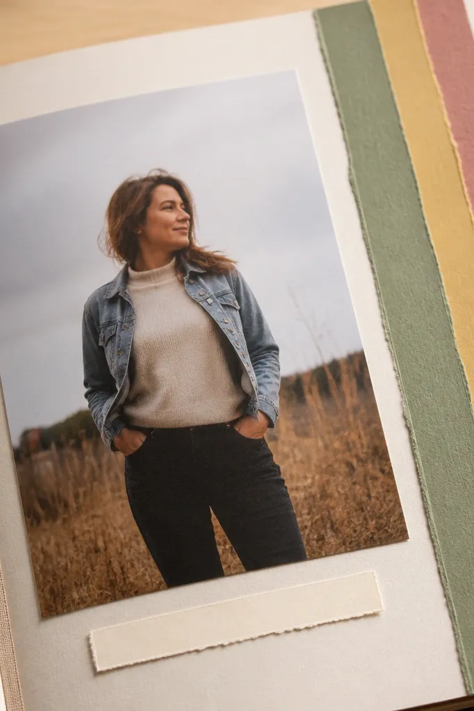
Start by choosing one photo and matting it with cardstock that’s 1/2 inch bigger on all sides. Place it slightly left of center so you have a right margin for the frame. Then cut 3-5 paper strips in different patterns, keeping them the same width (try 1 inch) and trimming them so they line up at the bottom. Layer them as a frame along the right side, glue the strips first, then glue the photo on top or beside them depending on your spacing preference.
A hero photo layout is the fastest way to make a scrapbook page look intentional. You let one photo do the heavy lifting, then frame it with a vertical stack of paper strips so the page still feels crafted. This is photogenic because the layered edge creates a strong vertical line that reads well in overhead shots. It works great for portraits, food photos, and scenic shots where you want focus, not clutter.
AvoidSkip foam tape on the strips if you want a flatter, easier-to-press page.
Pro tipKeep strip widths identical and vary only the pattern; that’s what makes it look designed.
3. Top Strip Photo Banner with Three Small Notes
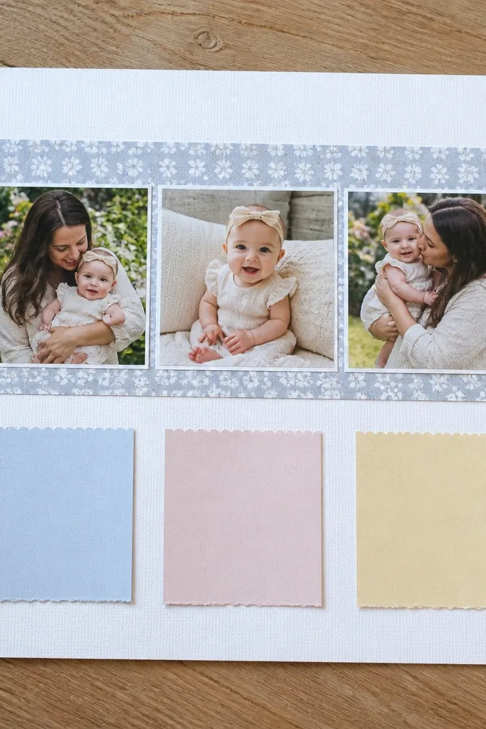
First, cut a long banner mat about 10-11 inches wide and 2-2.5 inches tall, then place 3 small photos inside it with equal gaps. Next, cut three narrow note cards from scraps, each about 2.5 inches wide and 1.5 inches tall, and line them up in a row under the banner. Write one sentence per note, then glue the note cards down. Finish by adding a thin border line behind the banner using a black or dark-gray pen so the top strip reads as one unit.
This layout gives you movement without complexity. A photo banner at the top sets the visual rhythm, while three small notes below keep the page informative without turning into a writing project. It’s low-maintenance because you only place one row of photos and keep the rest simple. This look is great for events with multiple quick moments — birthdays, school days, or weekend outings.
AvoidDon’t make the notes different shapes; consistent rectangles keep it tidy.
Pro tipUse the same photo orientation across the banner; even if the photos differ, the row should look consistent.
4. Diagonal Photo Sweep with Corner Journaling
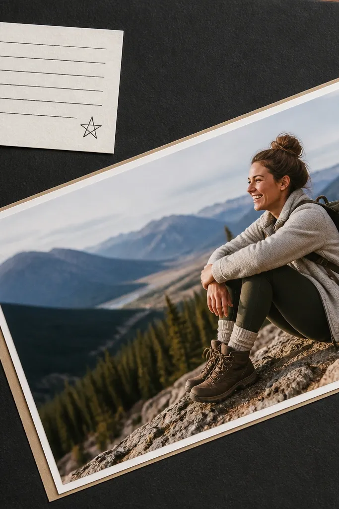
Start by trimming your photo so it fits a diagonal placement, leaving about 1 inch of space on one corner. Tape it in place temporarily, then use a pencil to mark where it lands. Cut a small journaling mat for one corner, about 3.5 x 2.5 inches, and write a short caption. Glue the photo first, then glue the journaling block last so you can fine-tune spacing around the diagonal edge.
Diagonal layouts look styled fast because the angle breaks the “grid boredom.” You place one main photo diagonally and add journaling in a corner so the page stays balanced even with minimal embellishments. This is a great pick when you have one standout photo and want the page to feel dynamic without extra pieces. It also photographs well because the diagonal line creates a strong composition.
AvoidDon’t rotate multiple photos; one diagonal hero photo is what keeps this low-maintenance.
Pro tipUse a dark mat under the photo if your background paper is busy; it keeps the diagonal photo readable.
5. Pocket-Style Side Panel with One Photo
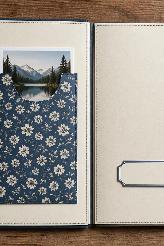
First, cut a side panel strip from cardstock about 3.5-4 inches wide and full page height minus a small margin. Fold the strip to create a pocket opening, leaving a 1 inch top flap unglued. Glue only the bottom and sides so the pocket holds the photo. Slide a matted photo into the pocket, then add a small label strip across the top flap using glue dots.
This layout looks clever and clean because it adds structure without adding clutter. You build a simple pocket on the side so the photo is “held” rather than glued, and you can swap or hide extra notes later. It’s low-maintenance because you’re making one functional component instead of multiple layers. Use it for ticket stubs, receipts, or one photo you want to keep removable.
AvoidDon’t glue the top flap — that defeats the whole pocket idea.
Pro tipScore the fold line with a bone folder so the pocket edge stays crisp.
6. Staggered Mat Frames in a Single Row
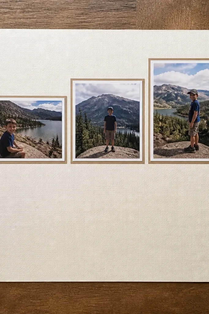
Start by cutting three photo mats to the same width and height, like 3.5 x 4.5 inches. Place the first mat level, then lift the second mat up by about 1/4 inch and the third by about 1/2 inch so the stagger is visible. Glue the mats down, then glue photos inside using small dots at the corners. Leave the rest of the page empty or add one journaling line on the bottom using a narrow strip.
If you like the look of gallery walls, this is the scrapbook version that stays low-maintenance. You use three small photos, each with a mat, and stagger their heights slightly so the row looks intentional. The blank space below keeps the page from feeling busy, and the repeated mat size makes scraps look coordinated. It works for sets of three moments: arrival, activity, and the final photo.
AvoidSkip tiny embellishments between frames; the stagger already creates interest.
Pro tipUse the same patterned paper for all three mats or the same solid cardstock — inconsistency is what makes it look messy.
7. Layered Corner Cutout with Center Photo
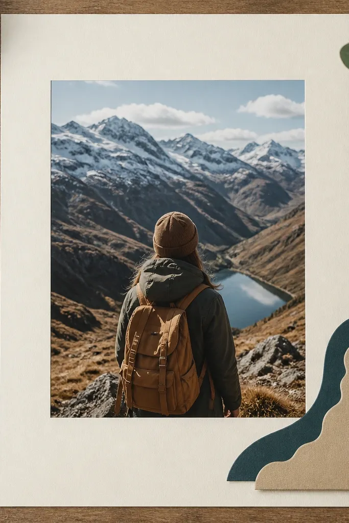
This layout is clean but still has personality. You keep the center photo dominant, then add a layered corner cutout that frames the page like a badge. It’s low-maintenance because the action happens in one corner, not across the whole page. This works best when your photos are the focus and you want journaling that doesn’t compete.
First, choose one center photo and mat it to about 4x6 inches or 5x7 depending on your page size. Cut two to four corner pieces from scraps: one solid shape and one patterned shape, each slightly smaller than the one behind it. Stack them in the top-left corner with the pattern on top, then glue the stack. Finally, glue the center photo and add a short caption under it using a thin strip of matching paper.
Use a corner punch or a simple triangle template so your stacked shapes look sharp, not hand-cut lumpy.
Don’t add corner pieces on all four corners — keep it to one to stay tidy.
8. Film Strip Layout Using Scrap Strips as Frames
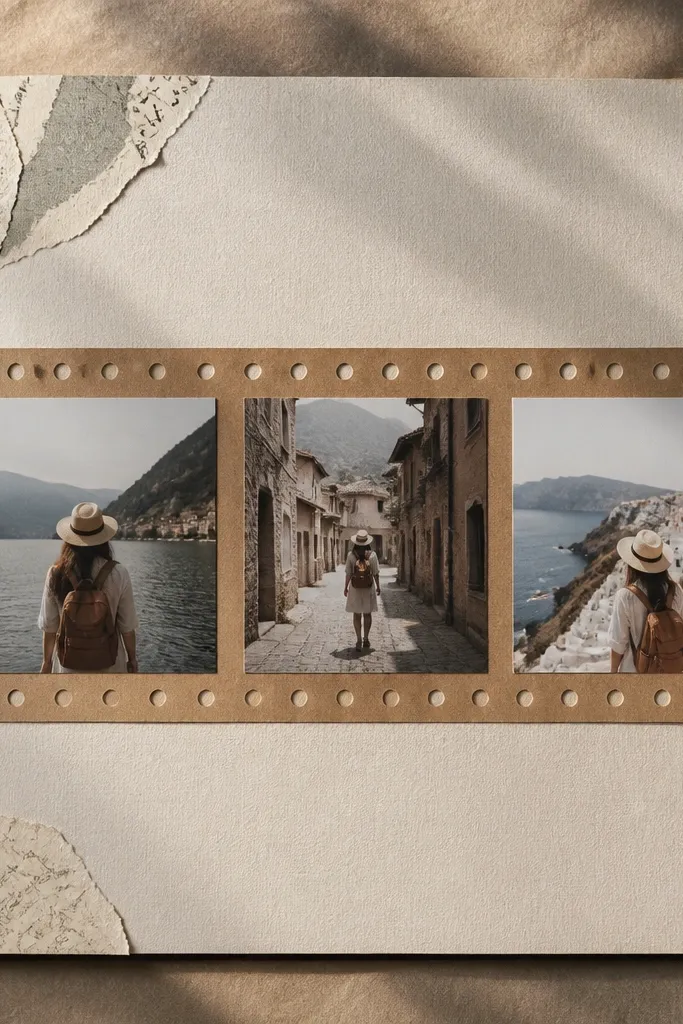
Start by cutting a long strip from cardstock around 10-11 inches wide and 1.5-2 inches tall. Cut 4-6 photo windows inside the strip using a trimmer, keeping equal spacing between windows. Add small circle details using a 1/8 inch punch or a hand-drawn dot pattern at consistent intervals. Glue photos into the windows, then add a caption at the right end on a narrow paper tag.
Film strip layouts are photogenic because they create a clear line of story. You mimic the look with scrap strips as frames, keeping everything aligned, which makes it low-maintenance compared to random photo placement. Add small “hole” circles to sell the effect without complicated tools. This is great for travel days, event timelines, or any sequence where you want order.
AvoidDon’t use too many patterns — one patterned strip sells the film look.
Pro tipKeep your photo windows the same width; that’s what makes the film strip read instantly.
9. Washi Tape Border with One Stitched-Look Block
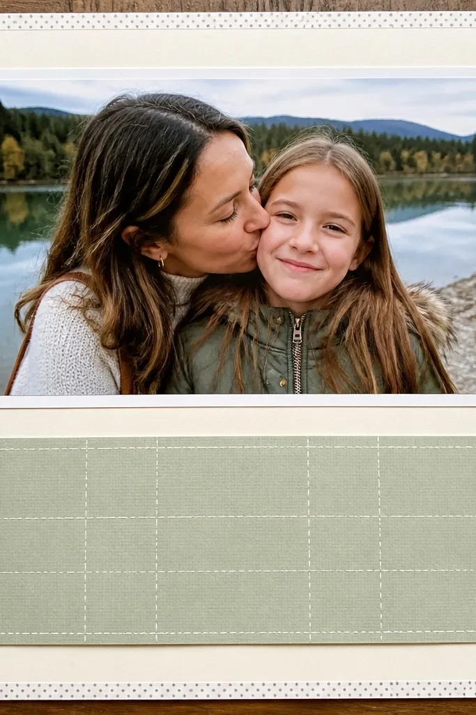
Washi tape borders are the fastest way to make a page look finished. You apply a thin border around the photo area, then add one stitched-look block for journaling so your page has texture without heavy embellishments. It’s low-maintenance because washi tape is forgiving and you can adjust placement while it’s still tacky. This layout is great for clean, modern pages where you want the focus to stay on photos and writing.
First, decide your photo mat size and leave a consistent margin around the photo area. Apply washi tape along the top and sides first, then trim the ends with a craft knife for crisp edges. Cut one journaling block from solid cardstock, about 4x2 inches, and use a white gel pen to draw a simple stitched border around it. Write your caption, glue the block, then press everything flat with a book for 10 minutes.
Use low-tack washi for the border so it won’t pull up your base paper when you adjust.
Don’t cover the whole page in tape; a thin border looks intentional.
10. Mat-and-Label Stack Under a Photo
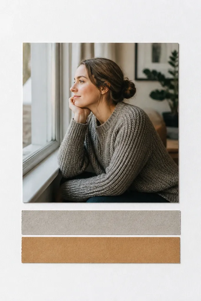
Start by matting your photo with cardstock that leaves a 1/4 inch border. Place the photo slightly above center so you have room for labels below. Cut two label strips from scraps, keeping the same width, like 4.5 inches wide and 1 inch tall, and vary only the paper pattern. Glue the bottom label first, then glue the second label on top with a slight offset (about 1/8 inch) so it reads as a stack.
This is one of the most reliable low-maintenance scrapbook layout ideas because it adds structure under the photo where your eye naturally goes next. You place one main photo, then stack two label strips with different textures or colors. It looks good because the labels repeat the same width and align their left edges. Use it for single-photo pages: a concert, a family portrait, or a “day in one shot” moment.
AvoidSkip long paragraphs; two short lines per label looks clean.
Pro tipWrite the date on the top label and the short memory on the bottom label — it keeps the page scannable.
11. Overlapping Sticker Cutouts for a Clean Cluster
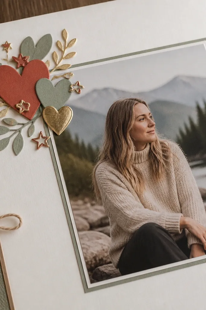
First, pick a corner for the cluster and mat your main photo so it sits close but not touching the corner. Arrange 5-8 cutouts dry first, overlapping them so edges don’t crowd — keep the cluster within a 3x3 inch area. Use glue dots for the flatter pieces and a tiny bit of craft glue for any heavier pieces. When the cluster looks right, glue it down, then add a thin journaling line next to the photo using a matching scrap strip.
A clustered cutout corner keeps your page playful without turning into a craft mess. You use a small set of themed scrapbook cutouts (hearts, stars, leaves, icons) and overlap them neatly so they look like one designed element. The photo stays big and calm, so the page reads clean. This is ideal when you have a strong photo and you just want a little story flavor.
AvoidDon’t use cutouts with wildly different styles on the same page; it kills cohesion.
Pro tipChoose cutouts with consistent line thickness or color tone so they look like a set.
12. Bookmark-Style Journaling Strip on the Side
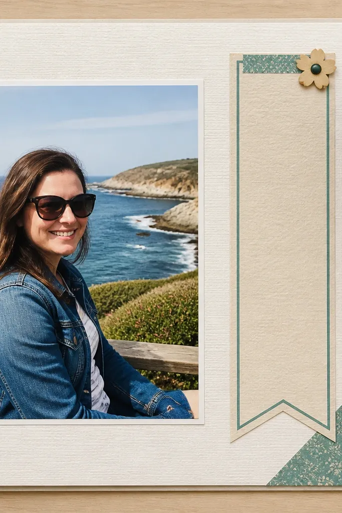
Bookmark journaling looks smart and keeps writing minimal. You place a narrow vertical strip beside the photo and write a short “what happened” caption, then finish with a simple notch at the bottom like a bookmark. It’s low-maintenance because it replaces multiple text blocks with one clean piece. Use it for pages where you want the photo to lead and the journaling to be quick to read.
Start with one main photo and mat it so it sits on a clean background. Cut a journaling strip from cardstock, about 2 inches wide and full photo height or slightly taller. Shape the bottom into a shallow V notch, then write 2-4 short lines using a fine-tip pen. Glue the strip along the side of the photo, keeping a consistent gap of about 1/4 inch so it looks intentional.
Use a ruler to keep the notch centered; off-center notches scream “handmade” in a bad way.
Don’t make the strip wider than the caption needs; narrow is what keeps it classy.
13. Stitched Border Frame Around a Photo Mat
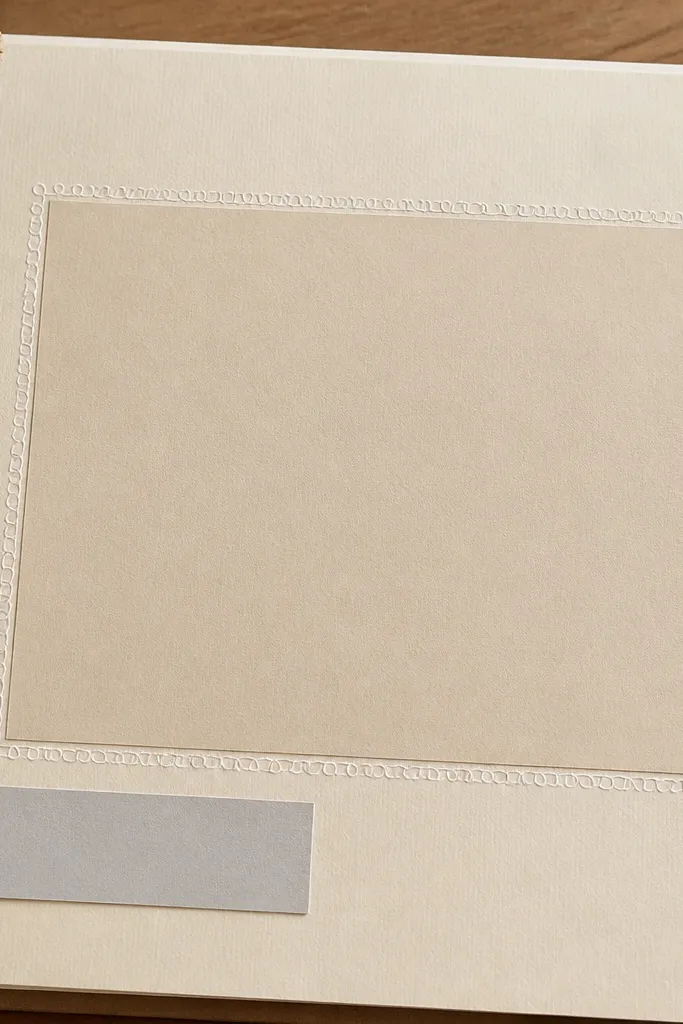
This layout makes a simple photo page look finished because the border does the work. You draw a stitched frame around the photo mat using a pen or white gel pen, then add just one small caption. It’s low-maintenance because you’re creating a single repeated pattern instead of multiple embellishments. This is great for plain backgrounds and for photos that need a little extra definition.
First, mat your photo with cardstock and leave a consistent 1/4 inch border. Lightly mark the border path with a pencil so the stitched line stays even. Use a fine-tip black pen or a colored marker to draw short “stitch” dashes around the mat. Finish by adding one caption strip at the bottom using a contrasting scrap paper, then glue everything with matte adhesive for a flat lay.
Make 20-30 tiny stitch marks first on scrap paper, then copy the spacing — it keeps the border from looking wobbly.
Don’t draw the border directly on textured paper; it makes the stitches uneven.
14. Accordion Scrap Strip Timeline
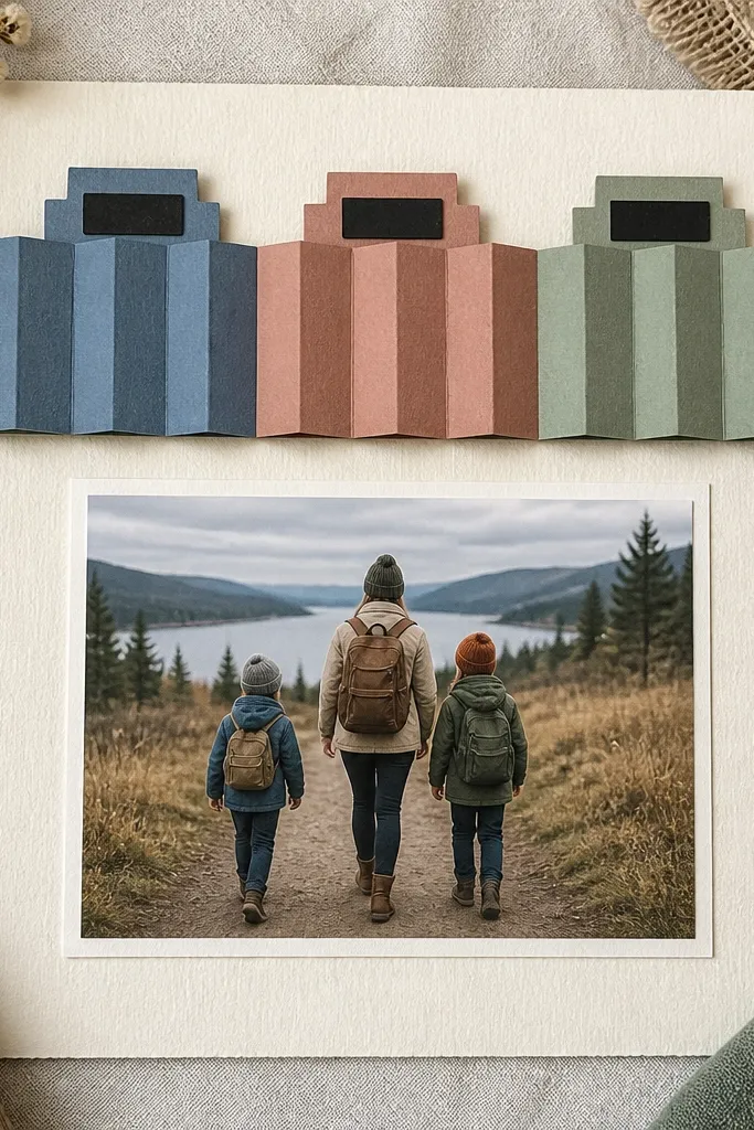
Cut a cardstock strip about 10 inches long and 2 inches tall. Score it every 2 inches so you get 4 sections, then fold accordion-style. Cut small tabs by trimming one end corners or by leaving each section slightly longer, then write one short phrase per section. Glue the accordion strip next to your main photo, anchoring the middle section first so the strip sits straight.
Accordion strips add motion and organization without complicated tools. You fold a strip of cardstock into small sections, then use the tabs as three labeled moments, like “morning,” “afternoon,” “night.” It looks clever in photos because the tabs create a layered, dimensional edge. It’s low-maintenance because you’re building one strip and repeating the fold pattern.
AvoidDon’t use thick patterned cardstock for the accordion — it makes folding and gluing harder.
Pro tipUse a bone folder and press each fold flat so the strip doesn’t look bulky.
15. Corner Photo with Full-Width Caption Banner
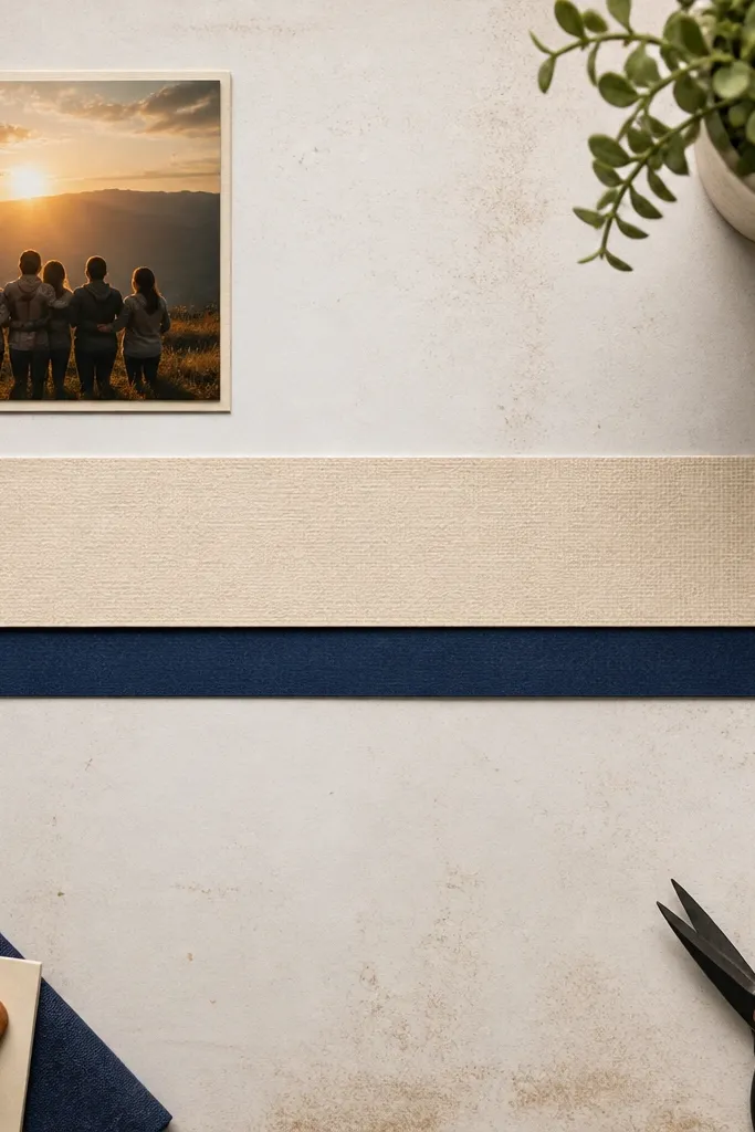
Start by placing one small matted photo in the top-left corner, leaving about 1 inch margins on the top and left. Cut a wide banner from patterned scrap about 11 inches long and 2 inches tall, then trim the ends straight or slightly angled. Position the banner across the middle or lower third, then write your caption in 2-4 short lines. Glue the banner last so you can adjust overlap with the photo corners.
This layout is dramatic without being hard. You place one small photo in a corner, then run a full-width banner across the page for journaling or a title. The banner creates a strong horizontal line, which looks great in overhead photos and makes the page feel designed even with minimal embellishments. It’s a good choice for pages that need a clear message: year summaries, event titles, or “this is what we did” pages.
AvoidDon’t choose a busy patterned paper for the banner if your pen ink is light.
Pro tipChoose a banner paper with one dominant color so your handwriting stays readable.
16. Book Page Background with Cutout Photo Frame
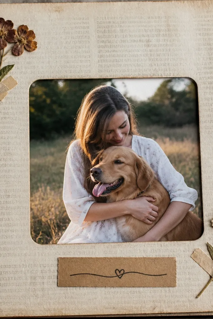
Using a book-page background instantly makes a scrapbook page look artsy and intentional. You keep the layout simple: one photo framed by a cutout shape, plus a short caption. The printed text background adds texture without needing extra stickers. This works especially well for vintage-style photos, handwritten journaling, and monochrome color palettes.
Start with a background sheet that has readable printed text, then trim it to fit your base page. Cut a photo frame window from cardstock, like a rectangle with rounded corners, and glue the frame over the book page. Place your photo behind the window so it shows through cleanly, then glue the photo edges to the backing. Add a small caption strip under the frame using solid cardstock so the writing stands out.
Seal book-page backgrounds with a light layer of matte medium if they smear or feel fragile.
Don’t pick a background with extremely dark blocks of text; it competes with your photo.
17. Pressed-Leaf Look Using Tissue Paper Layers
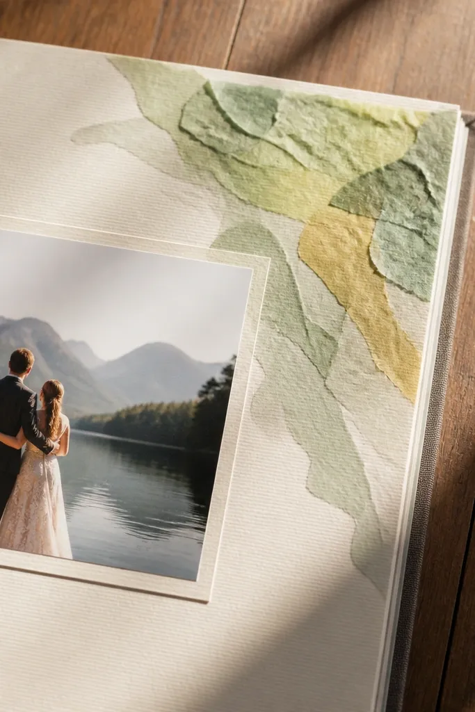
Cut tissue paper into 4-6 leaf shapes, varying sizes slightly, and stack them so the lightest layer is on top. Lightly crumple one tissue layer and flatten it again so the veins look natural, then glue the stack using a thin dot of craft glue on the center. Place the leaf cluster in a corner, then mat your photo with a solid background so the tissue texture shows. Finish with one small journaling line on a narrow strip so the page stays low-maintenance.
This gives you an organic, aesthetic texture without real pressed leaves. You layer tissue paper into a leaf-like shape near a corner, then place your photo as the main anchor. It looks good because tissue creates soft edges and subtle color variation, which reads as “intentional texture” in photos. Use it when you want nature vibes but don’t want the mess or fragility of real botanicals.
AvoidDon’t drown the tissue in glue — it turns stiff and dark.
Pro tipUse white or light-colored tissue for the top layer; it makes the leaf edge glow.
18. Punch-Cut Confetti Border Around One Photo
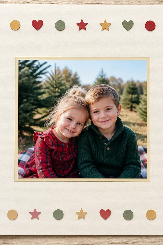
A punch-cut confetti border makes a page look festive while staying controlled. You keep the photo centered, then place small punched shapes around the edges like a frame — it’s decorative but still structured. This works because the border is consistent in size and spacing, so it looks designed instead of random. It’s a solid pick for celebrations, holidays, and group photos.
Punch small circles or stars from scrap paper in 2-3 coordinating colors. Plan a border by dry-fitting around the photo mat — keep shapes about 1/4 inch apart. Glue the shapes along the border path, starting at one corner and working around so your spacing stays even. Add a single caption strip at the bottom and press the page flat after the glue sets.
Do the border first, then glue the photo — you’ll avoid awkward gaps under the photo mat.
Don’t mix too many punch sizes; one punch size reads cleaner.
19. Layered Tag Bookend with One Photo Strip
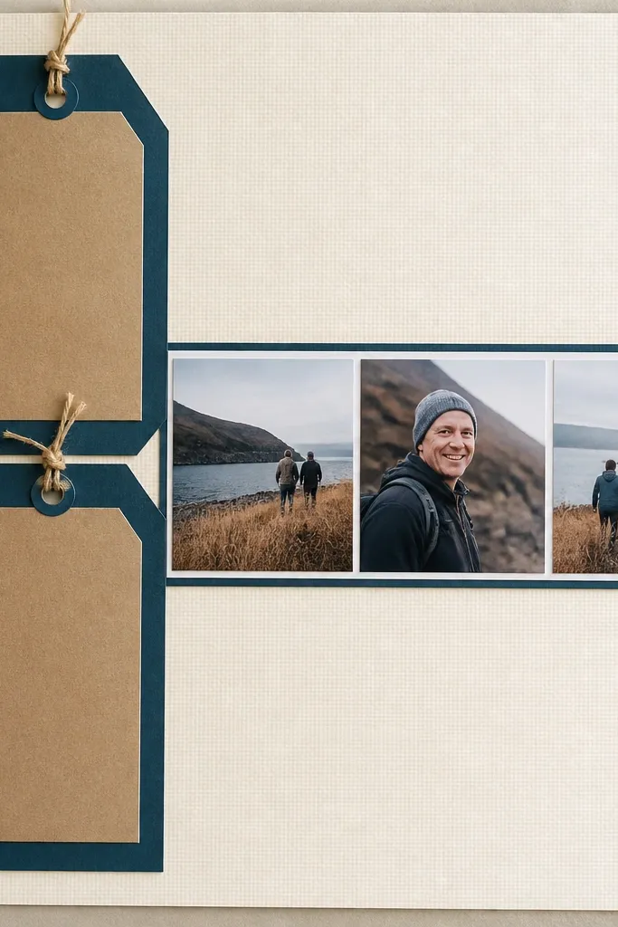
Start by cutting two tag shapes from cardstock, each about 2.5 inches wide, and glue them stacked with a slight offset. Place the tag stack on the left side, then cut a narrow photo strip mat about 3-4 inches tall that runs across the page. Glue the photo strip into the mat, then glue the mat so it lines up with the tag edges. Add a small journaling label to the top tag using a contrasting scrap strip.
This layout looks modern because it uses a strong vertical element and a slim photo strip. You stack two tags on one side like bookends, then run a narrow strip of photos or one photo in a horizontal band. It’s low-maintenance because the tag stack is quick to build and the rest is straight lines. Great for milestones, school years, and “progress” pages where you want a clear theme.
AvoidDon’t place the photo strip too high or too low; center it so the tag stack doesn’t feel cramped.
Pro tipMake the tag widths match the photo strip mat height edge so the page feels aligned.
20. Gridless Centering with One Big Photo and Two Accents
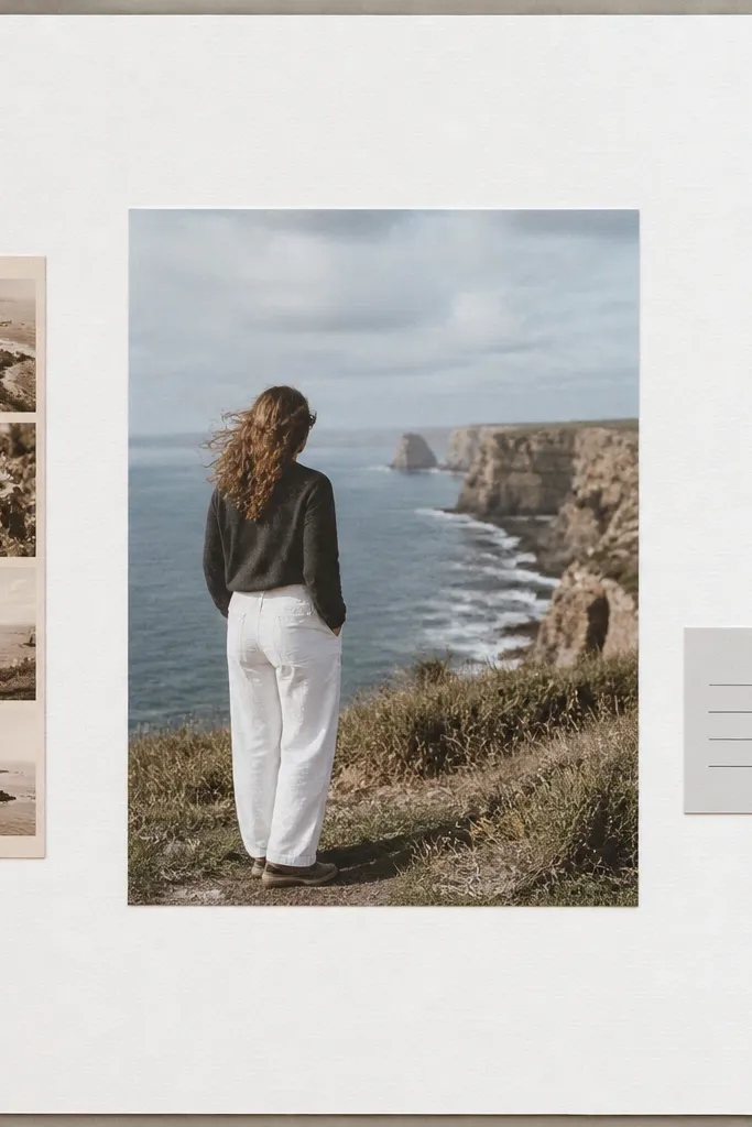
First, center your big photo on the page and mat it with a solid cardstock border. Cut one narrow accent strip from patterned paper, about 1 inch wide, and place it along the left side of the photo. Then cut a tiny label, about 2.5 x 1 inch, place it on the right side near the bottom, and write a date or short word. Glue the strips and label, then add one small finishing mark like a single dot or underline with a pen.
This is the “looks intentional, stays simple” option. You center one big photo, then add exactly two accents — a narrow strip on one side and a tiny label on the other. It avoids the chaos that comes from many pieces while still looking balanced in photos. Choose this when you want a clean page that doesn’t scream “layout” but still reads as designed.
AvoidDon’t add a third accent; two keeps the composition calm.
Pro tipKeep the two accents at different vertical positions so the page doesn’t look like a symmetrical template.



