
1. Hero Photo + Thin Caption Strip
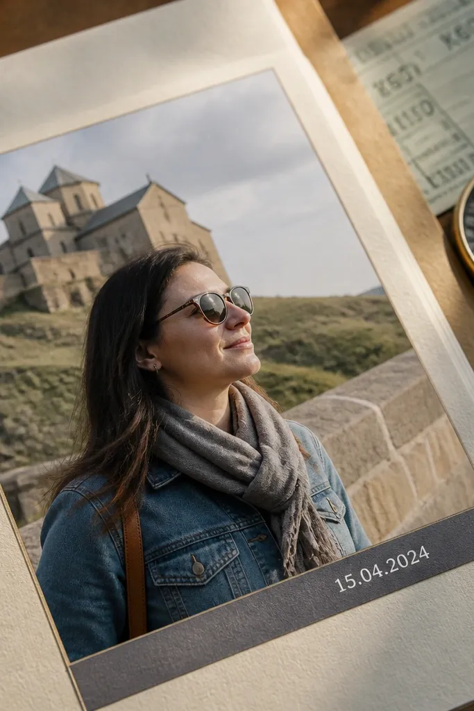
This layout makes your photos do the heavy lifting. You place one image large enough to read at a glance, then add a thin caption strip that holds the date or a one-line note. It looks modern because the caption has a clean edge and limited height, so the page doesn’t sprawl. Use it for travel shots, portraits, or any photo with strong light — the page stays airy while still feeling finished. Skill level is beginner-friendly and it usually takes 25-40 minutes per page once you pick your font and spacing.
Start with a square or portrait photo and scale it to fill the center area, leaving consistent margins on all sides. Add a horizontal rectangle under the photo that’s 35-55 px tall and spans most of the image width, leaving a small border of background showing on both ends. Type your caption using a condensed sans font at 18-24 px, then add a thin divider line at the top of the strip if you want extra structure. Export at the same canvas size every time so your caption strip keeps the same visual weight from page to page.
Pro tipUse a semi-opaque strip (like 85-90% opacity) so the photo still feels present behind the caption.
AvoidDon’t stack multiple caption lines in the strip — keep it one short line so it stays sleek.
2. 3-Photo Vertical Grid with One Big Date Tag
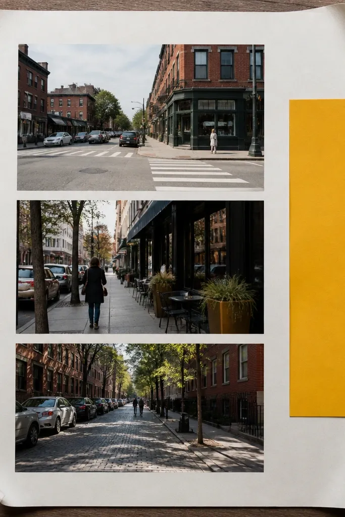
This is the “I have a few moments from one place” layout. Three photos in a vertical grid keeps the page readable, and a single large date tag adds structure without turning into scrap chaos. The aesthetic comes from consistent photo widths and a bold date element that feels like a label on a file folder. It’s great for day-by-day journaling, restaurant visits, or a sequence of the same event. It takes about 30-50 minutes because you’re aligning multiple frames and tuning the label placement.
Create three photo frames stacked vertically with equal heights and 18-28 px gaps between them. Keep the frames the same width and align their left edges to a grid line so the stack looks intentional. Add one date tag at the right side of the top photo — a rounded rectangle or a notched label — sized around 140-190 px wide and 50-70 px tall. Type the date in all caps, then add a small journaling line under the tag if you have room, using a smaller font size by 2-4 points.
Match the tag color to a single dominant photo tone (like brick red, slate blue, or forest green).
Avoid mixing different photo crops in the same grid — choose one crop style (centered or rule-of-thirds) and stick to it.
3. Diagonal Tape Borders
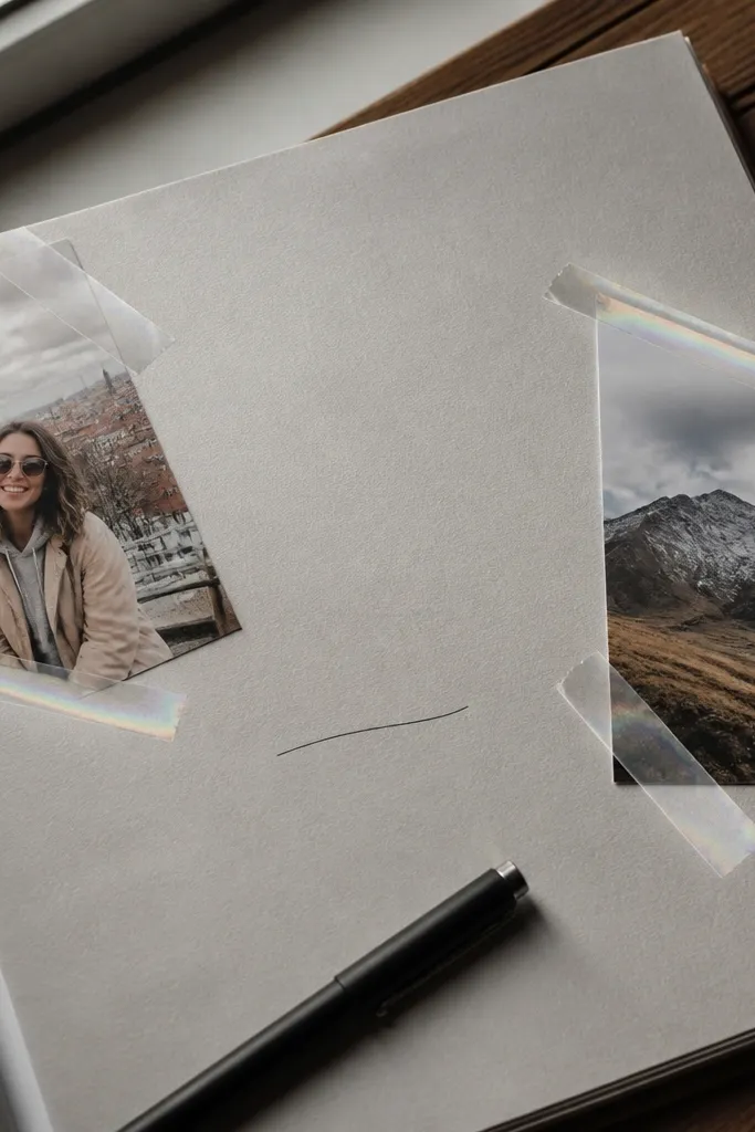
Diagonal tape borders give you that handmade, modern scrapbook feel without clutter. You frame your photos with two or four tape strips that sit at angles, then keep the center clean for journaling. This look is photogenic because the tape creates motion and depth — it breaks the flat page without adding too many elements. It works best when you have one main photo plus one smaller photo, or a photo block with a single caption. Expect 20-35 minutes because you’re mostly placing tape layers and aligning them to the corners.
Choose one main photo and one supporting photo, then place them in a simple left-right arrangement with 20-30 px spacing. Add tape strips at two corners: top-left and bottom-right are the easiest for balance. Each tape strip should be a slightly rotated rectangle (about -18 to -25 degrees) with a subtle shadow and a tiny folded edge effect if your app supports it. Finish by adding a journaling card near the supporting photo, keeping it aligned to the page grid so the tape doesn’t pull everything off.
Pro tipUse two tape colors max (cream and charcoal) so the border feels intentional, not decorative-for-decorative’s sake.
AvoidDon’t cover more than 15-20% of your photo area with tape, or the image loses clarity.
4. No-Photo Journaling Cards with Photo Backing
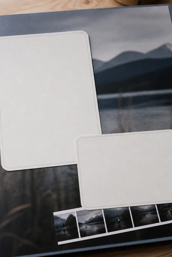
This is for when your photos aren’t the star, but the story is. Instead of forcing images into every corner, you use a blurred or darkened photo as the background and place crisp journaling cards on top. The modern look comes from contrast: readable text over a softened image, plus strict spacing around each card. It’s perfect for travel reflections, family updates, or any page where you want the writing to lead. Skill level is easy to intermediate, and it takes 35-60 minutes to get the blur, text contrast, and card spacing right.
Place one full-page background photo, then blur it lightly (enough to remove sharp details but keep colors). Darken it with a semi-transparent overlay (around 20-30%) so white or light text stays readable. Add 2-3 journaling cards stacked vertically, each with consistent padding and the same corner radius. Put your title at the top as a bold line, then type body text in a smaller size with line spacing set slightly wider than default.
Pro tipIf your app has it, use a “multiply” or “overlay” blend mode on the dark layer; it keeps the colors richer than plain opacity.
AvoidAvoid pure black text on blurred backgrounds — you need contrast control or the text looks muddy.
5. Polaroid Stack with Offset Shadows
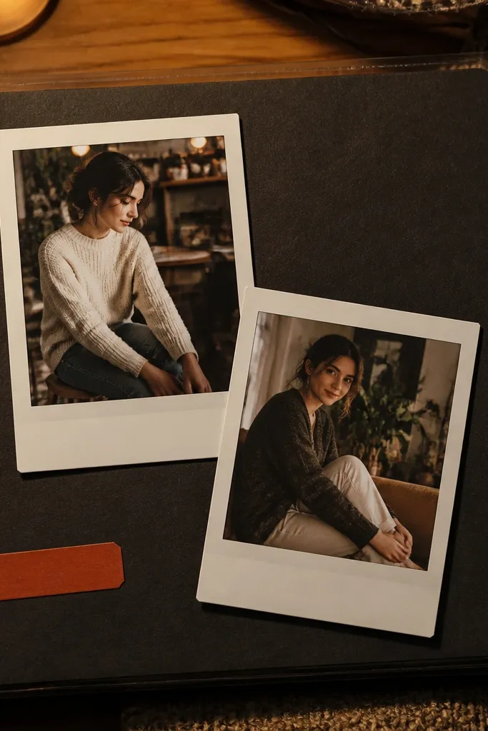
Polaroid stacks still look modern when you keep them tight and limit the number. Overlap two or three frames, but keep the edges aligned to a grid so it doesn’t turn into a messy pile. Add a subtle shadow that shifts slightly, and you get depth without heavy visual noise. This works best for indoor moments, birthdays, or any set where the photos feel casual and personal. It’s a quick build — 25-45 minutes — because the frames are the main work.
Select two or three photos and crop them into a consistent aspect ratio, like 4:3, so the stack looks cohesive. Place the bottom polaroid first, then offset the next one by 30-60 px to the side and rotate it by 1-3 degrees. Keep the “photo window” sizes consistent and only vary the spacing between frames, not the frame widths. Add a small caption line on each polaroid’s white border, then keep typography minimal: one short label per frame.
Pro tipUse a shadow blur around 18-28 px with low opacity so it looks like paper on a desk, not a sticker.
AvoidSkip adding long captions on every polaroid — too much text breaks the modern clean look.
6. Magazine Cutout Strips
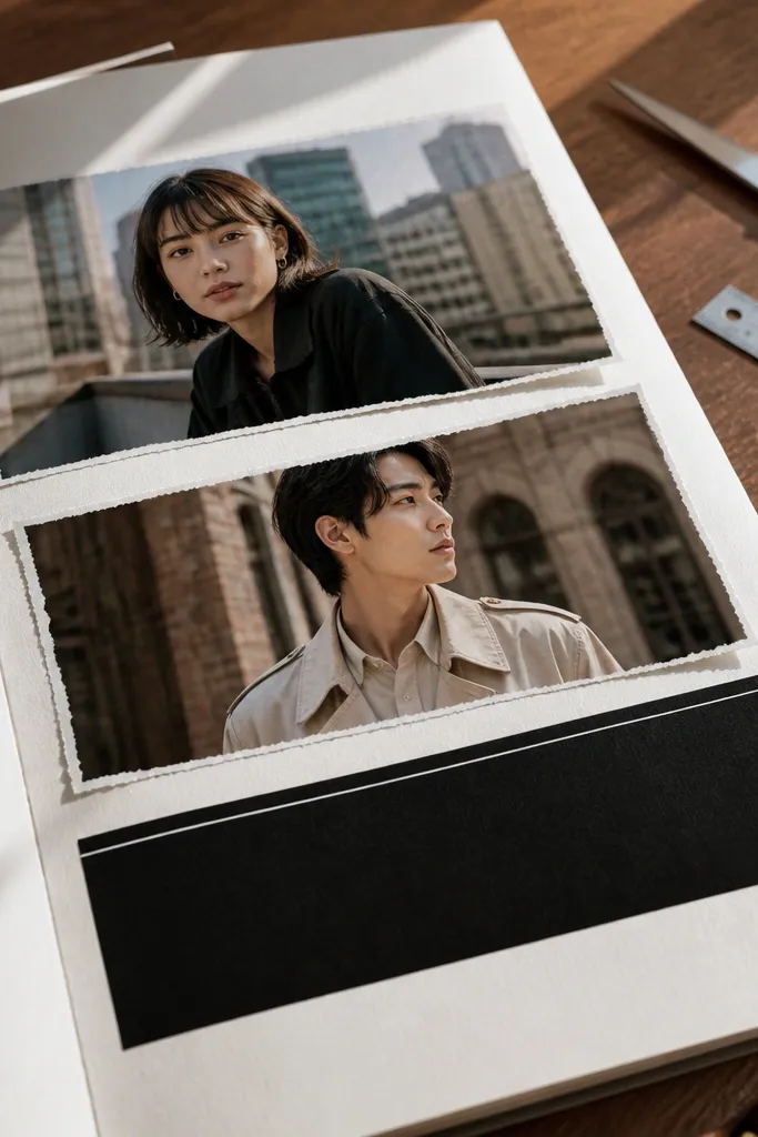
If you want edgy and photogenic, cutout strips are the move. You place two photo strips at slight angles, add torn or deckled edges, and then anchor the page with a clean title block. This layout reads like a magazine spread but still feels like scrapbooking because of the texture edges. It works best with photos that have strong shapes — buildings, signage, street scenes, or bold portraits. Plan 40-70 minutes because you’ll tune the edge effect and align the title so it feels balanced.
Crop two photos into narrow strips, aiming for a width-to-height ratio like 3:4 or 4:5 depending on your canvas. Apply a torn-edge or deckled-edge effect to the strips, then rotate them by 4-7 degrees in opposite directions. Add a title block at the top or bottom using a solid rectangle behind the text, sized so it spans about 60-70% of the page width. Finish by adding one journaling line in a label near the strip with the most negative space.
Pro tipUse one font weight for titles and one for body text; magazine layouts look best when typography stays consistent.
AvoidDon’t add more than two photo strips or you’ll lose the clean magazine rhythm.
7. Circle Photo Frames with Centered Title
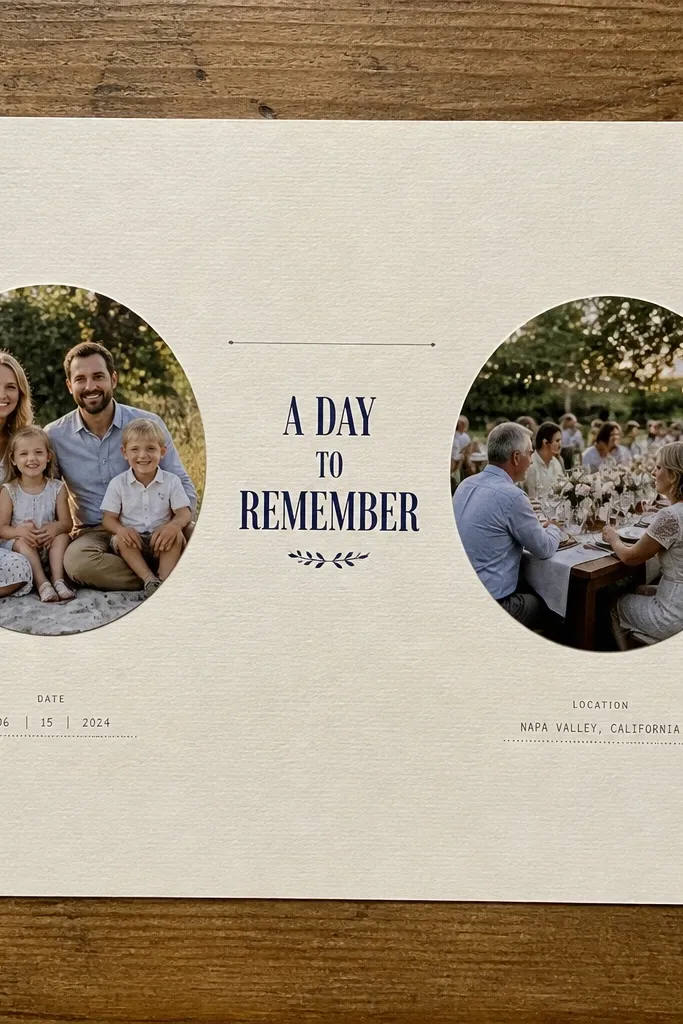
Circles make pages feel modern because they break the rectangle habit. Use two circle crops and keep the rest of the page structured with a centered title and thin dividers. This look is especially good for hobbies, events, and family pages where you want the photos to feel like “highlights.” It’s also very readable on small screens because the eye catches the circles quickly. It usually takes 30-55 minutes, mostly for sizing and matching the circle diameters.
Crop your photos to a square first, then apply a circular mask to each. Choose one diameter for both circles, like 220-280 px depending on canvas size, and place them symmetrically with 25-40 px spacing between. Add a centered title above the circles in a bold sans font, then place a thin horizontal line under the title to create a visual pause. Add one short journaling sentence below the circles, aligned to center with a line width that doesn’t run edge-to-edge.
Pick a background color that’s one shade lighter than your darkest photo tone so the circles pop without harsh contrast.
Avoid mixing circle and rectangle photo masks on the same page — it looks busy fast.
8. Checkerboard Background with Minimal Labels
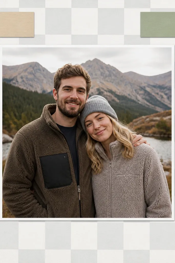
A checkerboard background adds texture and movement while staying modern when it’s subtle. You keep the pattern low-contrast and then place one hero photo plus two small label boxes for date and location. This gives you that clean “designed” look without needing lots of stickers. It’s great for themed pages like weekly routines, class days, or project progress. Build time is 25-45 minutes because the pattern and label placement are the main tasks.
Create a background pattern with small squares, around 18-26 px each, using two near-neutral colors (like warm gray and cream). Keep the contrast low so it doesn’t fight the photo. Place one hero photo in the center, sized to fill about 55-65% of the page height. Add two labels: one near the top-left corner of the photo and one near the bottom-right, each in a rounded rectangle with a thin border.
Pro tipReduce pattern opacity to 60-75% if your app allows it; it keeps the page airy.
AvoidSkip loud colors in the checkerboard — loud patterns make your page look like a craft project, not a scrapbook layout.
9. Staggered Photo Blocks with Consistent Padding
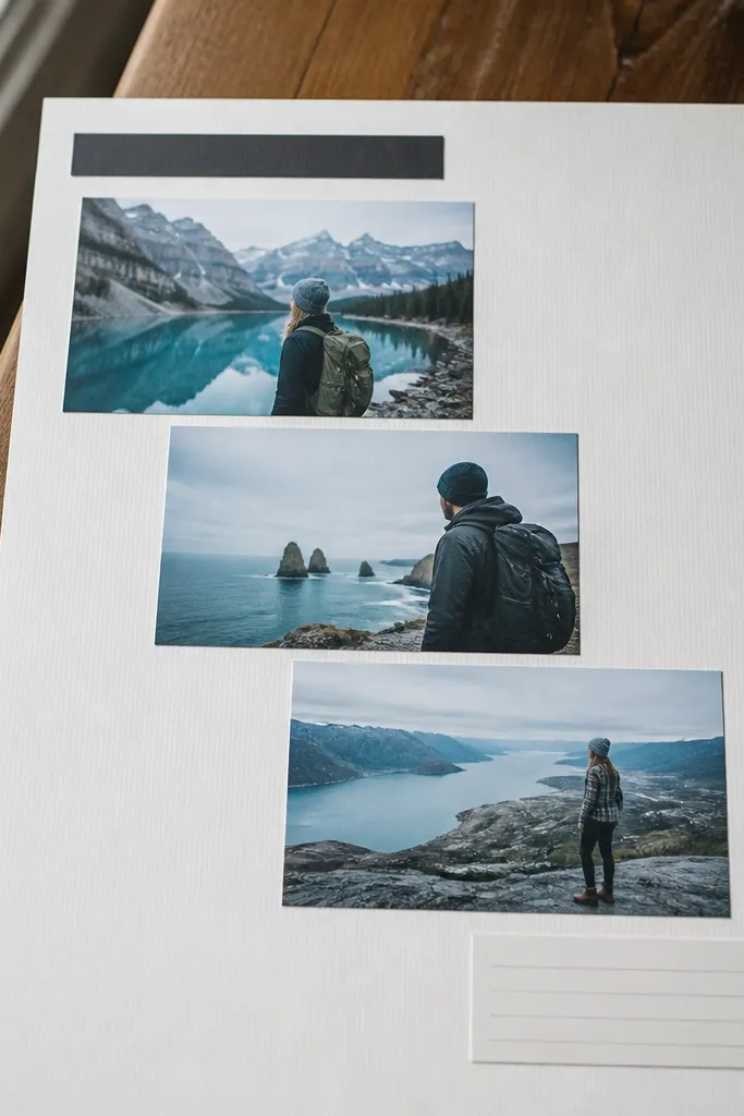
Staggered blocks look modern when the padding is consistent. You stack three photos in a stepped arrangement, then add a title that aligns to the same left edge as the first block. This works well for sets where you want variety but still need order. The aesthetic comes from the repeated rectangles and the disciplined spacing, not from extra decoration. It’s great for events with multiple angles, like a birthday day or a concert set. Expect 35-60 minutes for alignment and spacing.
Pick three photos and crop them to match widths, then create three rounded rectangles as frames with the same corner radius. Place the first frame at left, the second slightly lower by about 40-70 px, and the third slightly higher by about 30-60 px so the stack steps. Keep the gaps between frames consistent at 18-28 px. Add a title block above, aligned to the left edge of the top frame, then place one journaling line under the stack.
Pro tipUse a single border color for all frames (like charcoal at 10-20% opacity) so the page looks cohesive.
AvoidDon’t change frame sizes across the page — if the rectangles vary randomly, the modern look disappears.
10. Grid-Driven Scrapbook Map Page
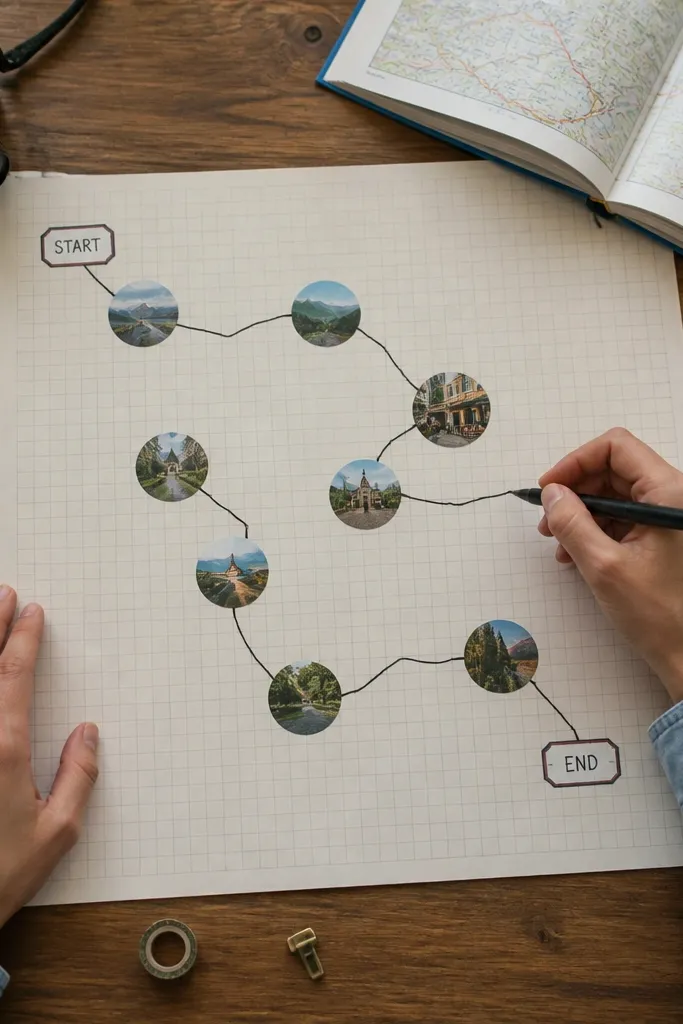
This idea turns a photo set into a story you can follow with your eyes. You place small “photo dots” on a faint grid, then draw a thin route line that connects them in sequence. Add a start label and an end label, and you get a modern map vibe without needing an actual map image. It’s perfect for road trips, walking tours, and day itineraries. Skill level is intermediate because you’re placing and connecting elements, but it’s still buildable in under 90 minutes.
Start with a faint grid background, using lines at low opacity and spacing around 40-60 px. Place 4-6 small circular photo crops across the grid, spaced so the route has room to travel. Draw a thin line (2-4 px) that connects the circles in order, and add small arrowheads or dots at each stop if your app supports it. Add two labels: “Start” near the first circle and the date or “Finish” near the last circle, then keep all text in one font family for a clean look.
Pro tipUse a line color picked from the photos, like muted teal or warm red, and keep it consistent across the page.
AvoidAvoid placing stops too close together — cramped dots make the line look tangled.
11. Stamp Outline Date + Handwritten-Style Text
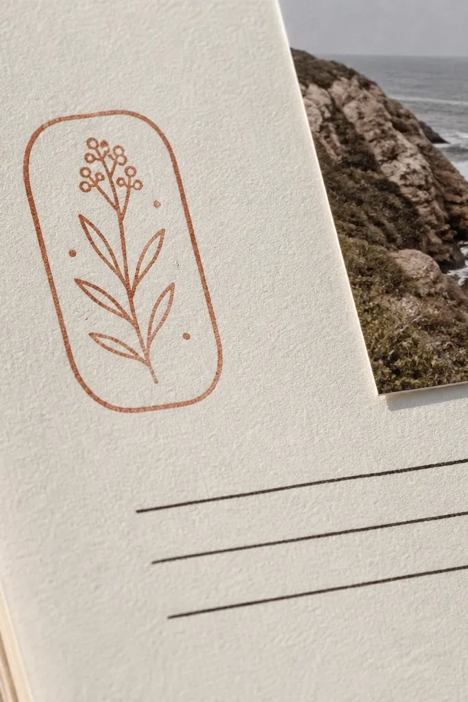
This is a modern scrapbook trick: mix one bold stamp mark with clean minimal text. The stamp outline gives you texture and “paper” energy, while the rest of the layout stays controlled. It’s best when you have one photo or even a simple background color and you want a page that looks finished without being crowded. Use it for weekly check-ins, holiday notes, and small moments that deserve a neat record. Plan 20-40 minutes because typography and placement do most of the work.
Pick a light background color (cream, soft gray, or pale blue). Add a circular stamp outline near the top-left or top-center, sized around 140-200 px wide, and type the date in the center using a condensed sans font at 18-26 px. Add 1-3 journaling lines below in a handwritten-style font at 20-26 px, keeping line length around 40-60% of the page width. Finish with one thin divider line under the journaling block so the spacing feels intentional.
Pro tipKeep stamp opacity around 70-85% so it looks printed, not stamped in ink that’s too dark.
AvoidDon’t use handwritten-style text for the title and body both — mix one clean font for structure.
12. Color-Block Title Banner with Photo Corner Overlay
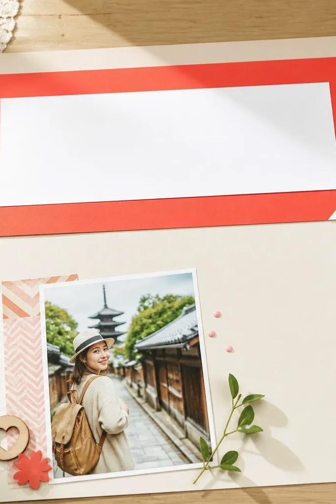
Color-block banners make pages look instantly modern because they create a strong top hierarchy. You put the title on a solid rectangle, then place a photo that peeks from the corner like a layered graphic. This is photogenic because the banner gives contrast and the photo corner adds depth. It suits pages with one main photo and a clear theme, like “Weekend Market” or “First Day Back.” Build time is 25-50 minutes because you’re sizing the banner and getting the corner overlap right.
Choose a title banner color from your photos and make a rectangle that spans about 70-85% of the page width, positioned with 60-80 px outer margins. Type the title in all caps or small caps using a bold sans font, centered vertically in the banner. Place your main photo below the banner, then overlay a second copy of the same photo or a smaller cropped version in the bottom-right corner rotated slightly (2-4 degrees). Add a single journaling line under the main photo, aligned to the left edge of the banner.
Pro tipUse the banner color again in a thin line under the journaling text so the page feels tied together.
AvoidAvoid multi-colored banners — one color block looks designed, three looks accidental.
13. Layered Divider Lines and Micro Labels
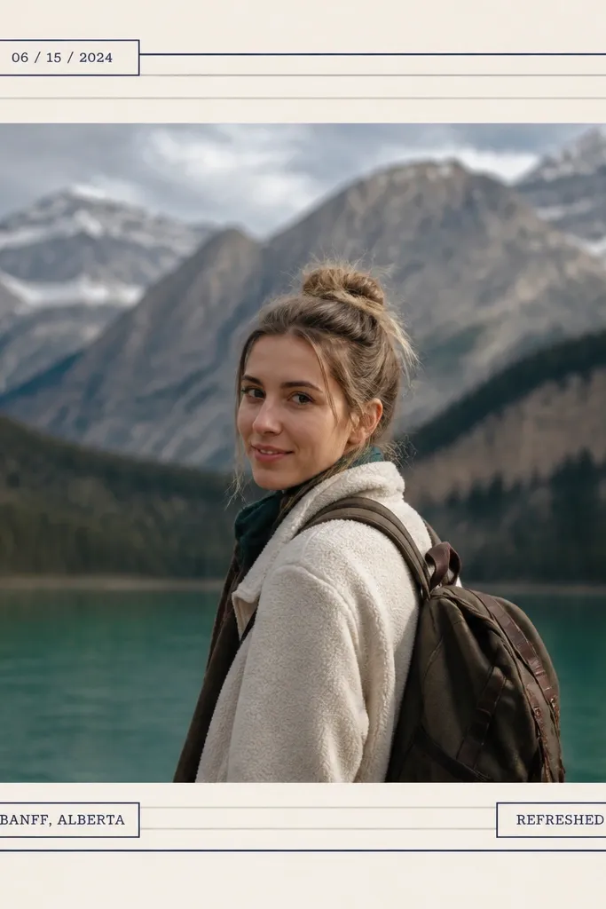
This look is clean, modern, and surprisingly effective when you want structure without heavy decoration. You use layered divider lines (thin strokes stacked with spacing) and micro labels for date, location, or mood. Put one photo in the center, then build the rest as text blocks separated by those dividers. It’s great for minimalist scrapbooks, especially if you like typography more than stickers. It takes 30-55 minutes, mostly for spacing and making the dividers look intentional.
Place one hero photo centered with consistent outer margins. Add a title at the top-left above the photo, then draw two thin divider lines under the title using the same color as the title text. Create micro labels as small rounded rectangles, around 90-130 px wide and 28-40 px tall, and place them on the left and right sides of the photo area. Add one short journaling paragraph beneath the photo, and separate it from the rest using one more layered divider line.
Keep label text short: date, city, or a single-word mood. Longer text makes micro labels stop looking micro.
Don’t add too many divider lines — two or three total keeps it modern.
14. Scrapbook Timeline Strip with Numbers
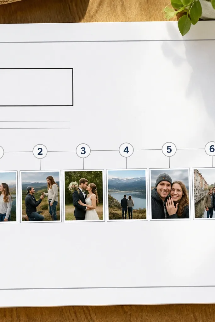
A timeline strip turns a set of photos into a sequence without clutter. You lay out small thumbnails in a row, add numbered markers, and anchor the page with a date heading. The modern look comes from the consistent thumbnail sizes and the clean spacing along the strip. It’s ideal for events that happen in steps: morning coffee, ceremony, dinner, late-night walk. This one takes 40-75 minutes because you’re balancing a row of small images and keeping the numbering aligned.
Choose 4-6 photos and crop them into small square thumbnails, like 90-120 px each depending on your canvas. Create a horizontal strip area across the page with 60-80 px side margins and enough vertical space for numbers. Place the thumbnails in order with 18-28 px gaps, then add numbered circles above or beside each thumbnail using a consistent diameter. Add a date heading on the left side of the strip and one short journaling note under the strip, aligned to the strip’s left edge.
Use one accent color for the number circles and keep the strip background neutral so the sequence pops.
Avoid mixing thumbnail crops (wide vs square) — the row looks sloppy fast.
15. Monochrome Photo Frame with Accent Dot
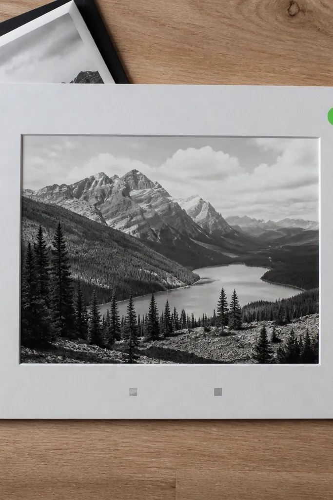
Monochrome photos make modern scrapbook pages look sharp because they remove color noise and let your layout design stand out. Add one colored accent dot label for date or theme, and you get a clean focal point without turning the page into a rainbow. This works best when your photo set has mixed colors or busy backgrounds. The result is consistent and photogenic on both phone and desktop because contrast stays predictable. Build time is 20-45 minutes since it’s mostly a filter plus careful placement.
Convert your main photo to black-and-white and slightly increase contrast so details stay visible. Place it inside a rectangular frame with a thin border (charcoal or white) and a corner radius of 10-18 px. Add one accent dot near a corner of the frame, sized about 10-16 px, then place a small label next to it with the date or theme. Keep the rest of the page blank or near-blank with one title line and one short journaling sentence.
Pro tipChoose the dot color from a small element in the photo, like a red sign or blue shirt, so it looks intentional.
AvoidDon’t add multiple colored accents — one dot keeps the modern restraint.



