
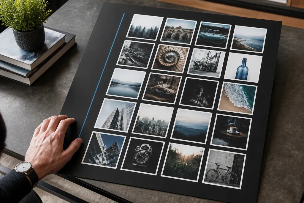
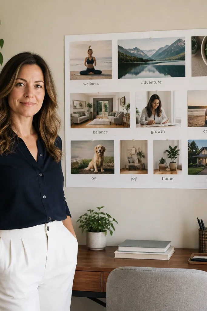
1. Cork Board With Fabric Ribbon Grid
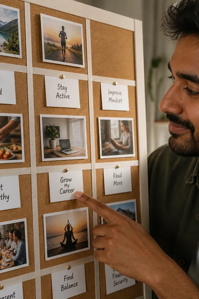
This is the modern vision board look when you want clean structure but still want to move pieces around. Cork gives you that slightly textured, warm background, and fabric ribbon creates straight, intentional lines that make everything feel organized. Use small photo prints and short goal labels so the board reads at a glance. It’s also great for people who revise goals often because pins let you swap without tearing paper. The finished look is airy, because the ribbon grid keeps clutter from piling up.
Pro tipUse one ribbon width only, like 1 inch, so the grid stays consistent in photos.
Start with a cork board panel (about 12x18 inches) and clean it so dust doesn’t show under glue or tape. Cut cotton or linen ribbon into equal lengths to form either a two-column or three-by-three grid, then attach with a thin line of hot glue or spray adhesive on the ribbon back. Pin your photos inside each grid cell and add short labels using small label stickers or strips of cardstock. Finish by sealing the edges of the board frame with clear matte spray so it looks crisp and holds up.
AvoidDon’t use multiple ribbon widths or you’ll lose the modern grid effect.
2. Framed Matte Collage With One-Tone Photo Cutouts
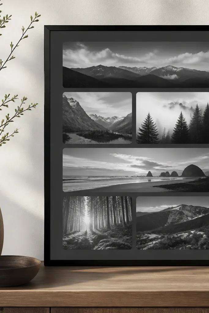
A framed matte collage looks polished because the matte border controls the chaos. If you pick one photo tone (all warm, all cool, or all black-and-white), the board stops looking like random inspiration and starts looking like a design piece. Cut photos into consistent shapes — rectangles with rounded corners or circles — and keep text minimal. This is ideal for a living room wall, hallway, or anywhere you don’t want the board to look like craft clutter. It also photographs well because the frame gives a clean boundary.
Pick a frame with a matte insert (8x10 or 11x14 works well). Lightly sand the matte insert and wipe it clean, then plan your layout on paper first so you don’t over-commit. Cut your photos into the same shape and size set, then glue with matte medium or a thin double-sided adhesive sheet. Add one small title strip in the same font style for consistency, then press everything flat under a book for an hour.
Choose one paper color for the matte backing — cream or soft gray — so your photos don’t fight the background.
Don’t mix glossy photo prints with matte paper cutouts; the shine makes the layout look messy.
3. Neon Accent Vision Board On Kraft Paper
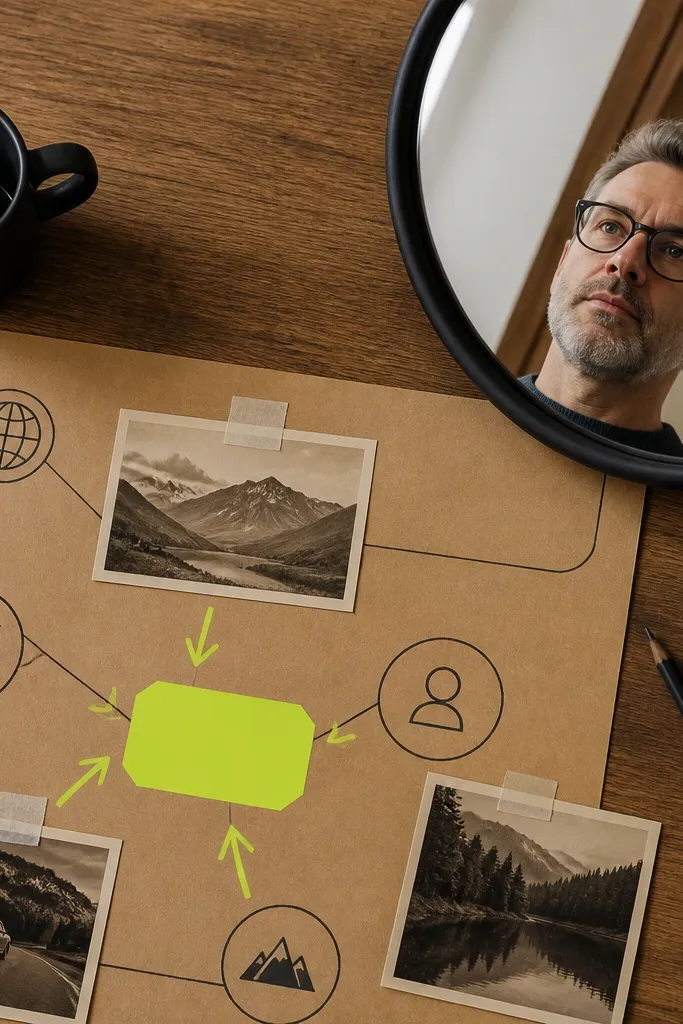
Kraft paper keeps the vibe grounded, and a single neon accent color makes the board feel modern and bold. The trick is restraint: one neon color (like electric lime or hot pink) used for lines, labels, and a few stickers only. Everything else stays muted — black ink, white space, and warm photos. This style is great if you want your board to pop in a bedroom or office without looking childish. It also creates high contrast that looks great on camera.
Pro tipKeep neon items under 15% of the total surface area so the board stays modern.
Cut a kraft paper sheet to your board size and tape the edges down to keep it flat. Use a black fine-liner to draw a simple grid or three main sections, then add neon label stickers or neon tape for headings. Arrange photo clusters in those sections and glue with matte medium so the paper doesn’t warp. Finish by adding a neon “hero” line — a single thick underline under your main goal — then spray a light matte seal over everything.
AvoidAvoid using more than one neon shade; two or three colors make it look chaotic fast.
4. Upcycled Book Page Blueprint Board
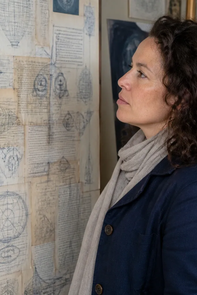
This board looks modern because it uses a real texture — old book pages — and pairs it with graphic, blueprint-style lines. The aesthetic is clean and a little technical, so it works well for goals tied to skills, study, fitness, or creative projects. Use monochrome labels and thin line drawings so the page stays readable. It’s also a smart repurpose project: you get visual interest without buying textured paper. The result is a board that looks intentional, not random collage.
Choose a flat backing like a piece of cardboard covered with book pages (or a page turned into a collage background). Tear or cut book pages into a patchwork base, then seal the surface with matte Mod Podge diluted 1:1 with water. Use a ruler to draw thin blueprint lines with a black gel pen, then add small goal labels on off-white paper strips. Glue photo cutouts sparingly, and let the blueprint lines lead the eye to the center.
Seal in thin coats. Thick coats make book text bleed and blur the look.
Don’t cover the entire page with photos; blueprint lines need breathing room.
5. Fabric Swatch Mood Board With Goal Pins
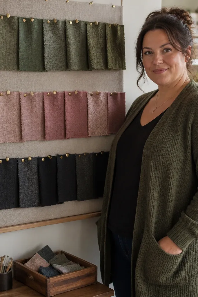
If you love aesthetic goals and want a board that feels grown-up, this fabric-first layout is it. Fabric swatches bring texture and color depth without needing dozens of photos. Pair each swatch row with one handwritten goal tag using a consistent style, like small uppercase block letters. This works especially well for fashion, home style, and identity-focused goals. It’s also a great choice if you struggle to find the “right” photos because fabric does the heavy lifting visually.
Pro tipUse one fabric type for the “hero row,” like linen, and keep the rest mixed — that contrast looks intentional.
Cut fabric scraps into uniform rectangles, like 2x3 inches, and iron them flat if they’re wrinkled. Stretch them onto a backing board (cork, felt, or foam board) and pin or glue the edges so the center stays smooth. Add goal tags next to each swatch using cardstock strips and a single marker color. Arrange swatches in a gradient order (light to dark or warm to cool) so the board feels designed. Finish by sealing any paper tags with a matte spray so the ink doesn’t smudge.
AvoidAvoid pinning fabric too loosely; puckers photograph as wrinkles and ruin the clean look.
6. Polaroid-Style Grid With Washi Tape Borders
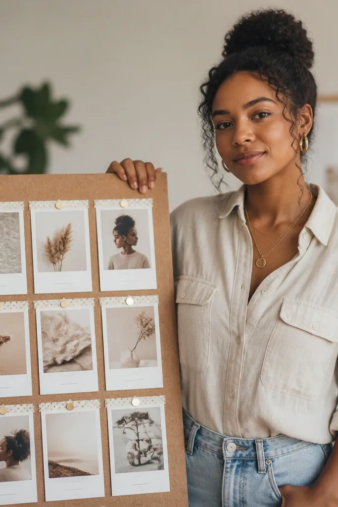
This is the modern version of the classic photo board: a tight grid, consistent margins, and tape borders that look deliberate. It works because every photo has the same “frame,” so your eye doesn’t get lost. Choose one washi tape pattern that matches your vibe, then use it only as a thin border and label underline. Add tiny text captions under each photo — one line only. It’s great for travel goals, weekly routines, and “what I want to feel” themes. The board reads clean even with lots of small images.
Pro tipUse pencil marks for layout, then erase before sealing so you don’t lock in sketch lines.
Print photos in a consistent size, like 2x3 inches, and cut white mat cards slightly larger, about 2.5x3.5 inches. Create a grid layout on a backing board and lightly mark the positions with pencil. Tape the mat card edges with washi tape, then glue photos centered inside each mat. Add one caption line with a black gel pen and underline it with washi tape. Seal the whole thing with a matte spray if your tape is paper-based and you want durability.
AvoidDon’t overlap photos in a random collage; the modern look needs consistent spacing.
7. Mirror-Edge Vision Board Using Acrylic Photo Clips
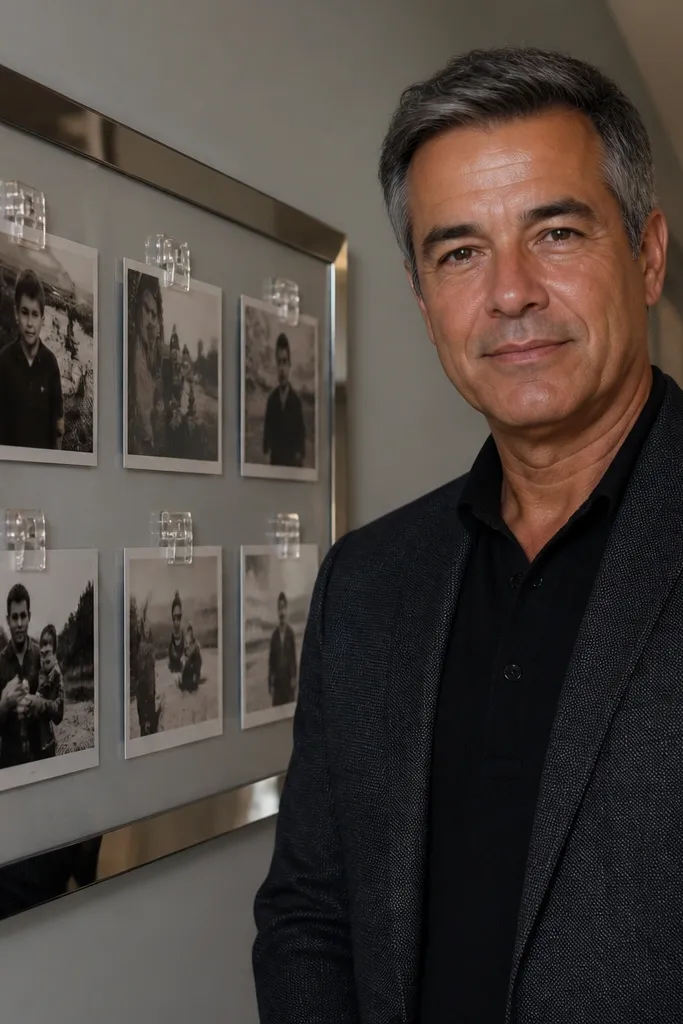
A clip-based board looks modern because it has hardware lines and a clean, gallery feel. It’s also super usable: you can swap photos fast without peeling tape or re-gluing paper. Pair it with a simple backing color like white, black, or warm gray for contrast. Use photos with similar exposure so the board looks cohesive. This layout is perfect for goals that change frequently — seasonal plans, learning milestones, or habit trackers you update monthly.
Start with a backing board, like 12x16 inches of foam board or thin plywood painted matte. Mount a row of acrylic photo clips in a straight grid using small screws or adhesive mounts. Clip photos in consistent sizes, like 4x6 prints cut to the same aspect ratio, and keep empty space between clips. Add handwritten goal strips and clip them in the same row as the photos so the board looks intentional. Wipe the backing before mounting so dust doesn’t show through the clips.
Keep clip spacing consistent — measure from center to center so the grid stays straight.
Avoid shiny backing finishes; reflections make the board look messy on photos.
8. Layered Paper Cutout Skyline With Sticky-Note Goals
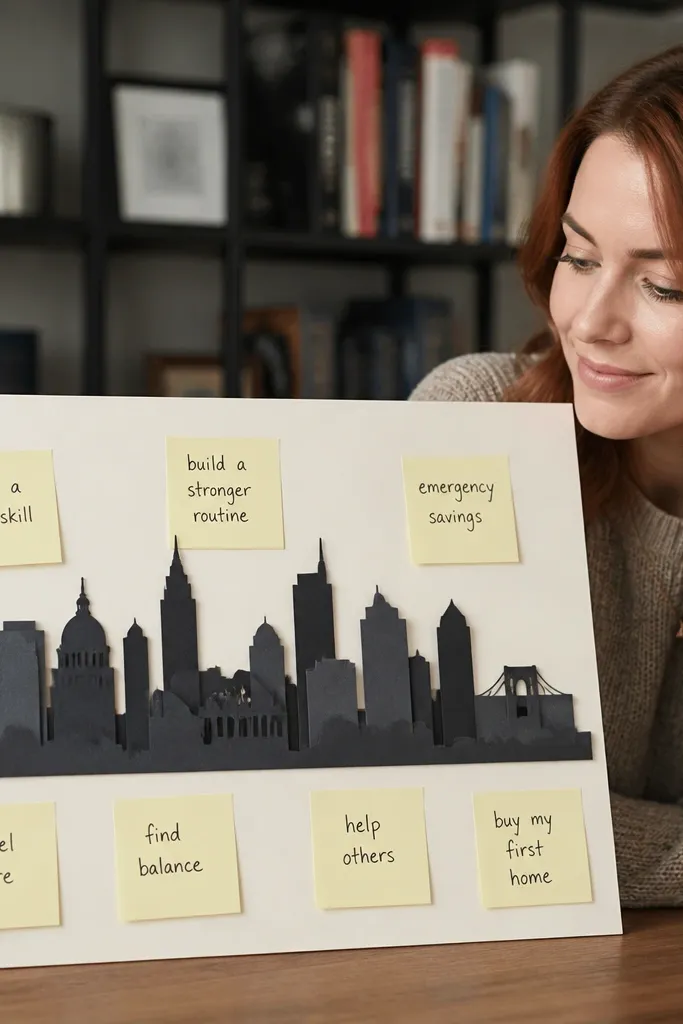
Layered paper cutouts create depth, and depth is what makes a vision board feel modern instead of flat. A skyline silhouette gives you an automatic focal point, then sticky notes add real-world function. Keep the sticky notes to one color (like pale yellow or white) and write short goals with a single pen color. This is great for people who want their board to feel active — weekly prompts, daily intentions, or project steps. It also looks great in photos because shadows from layers add dimension.
Cut a base skyline silhouette from thick paper or cardboard, then create 2-3 layered versions in slightly different sizes. Glue layers from back to front so the front layer sits slightly higher and casts visible shadow. Mount the skyline onto a backing sheet and leave a clean margin around it. Add sticky notes in a neat arc or grid around the skyline, using one sticky note size so the arrangement looks planned. Fix sticky notes temporarily with a tiny strip of tape at the bottom edge so they don’t curl.
Use matte paper for the layers. Gloss paper makes shadows look harsh and uneven.
Don’t write paragraphs on sticky notes; the modern look needs short, readable lines.
9. Magazine-Only Black And White Board With One Red Word
This board style is sharp because it uses one strict palette: black and white magazine clippings plus one red word. That one red element becomes your hero, and everything else supports it with contrast. It’s ideal if you want a minimalist, modern vibe without losing personality. Use headlines, typography, and photo cutouts from magazines, but keep them monochrome. The board looks cohesive because the palette does the work for you.
Pro tipCut with a craft knife on a cutting mat for crisp edges; scissors make the collage look fuzzy.
Pick a backing board and cover it with a thin layer of magazine clippings, then seal with matte Mod Podge to reduce shine. Add your main photo or typography cutouts in black and white, keeping edges clean and straight where possible. Choose one word to write in red marker (like “FOCUS” or “GROWTH”) and place it big and centered. Add smaller black-and-white labels around it using the same handwriting style or a single font sticker set. Let everything dry flat under a book for at least an hour before moving.
AvoidDon’t add extra red accents; one red word is what keeps it modern.
10. Shadow Box Vision Board With Mini Objects
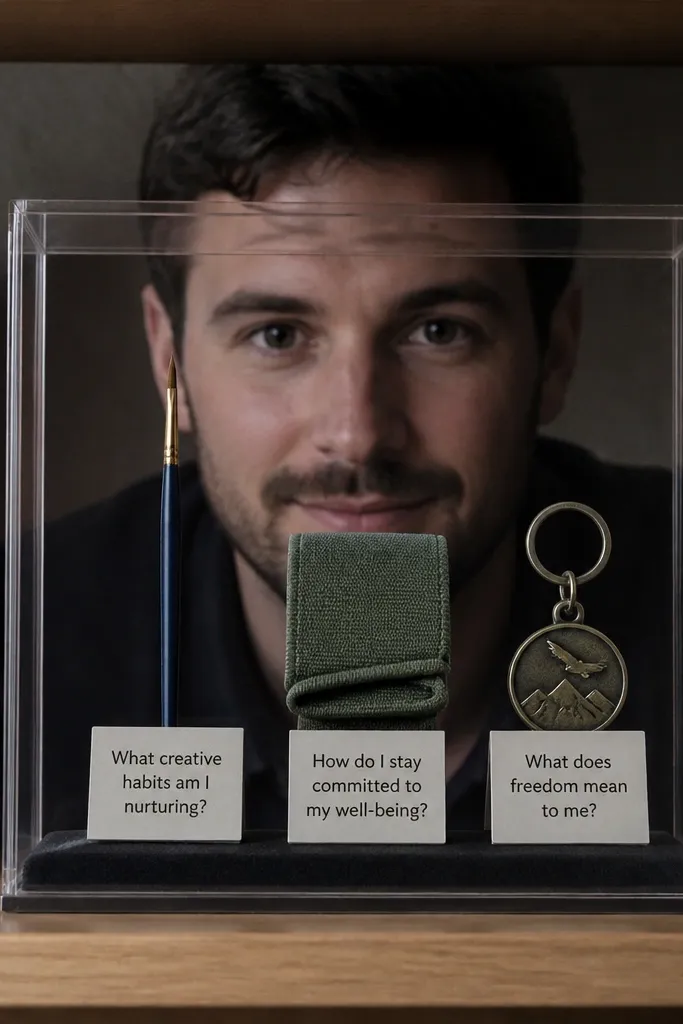
A shadow box makes a vision board feel real because it holds objects, not just paper. That 3D space creates a modern gallery look, and it’s incredibly photogenic. Use mini items that represent your goals — a tiny paintbrush, a folded workout band, a keychain that symbolizes freedom. Add small cards with one sentence max, placed so they’re readable through the glass. This works best for desk spaces, shelves, and entryways where you want something that looks curated but personal.
Pro tipUse museum putty or clear adhesive dots for objects that you might want to swap later.
Choose a small shadow box with glass, like 8x10, and wipe the inside so dust doesn’t show. Plan a layout: one main object centered, two supporting objects on the sides, and one handwritten card at the bottom third. Secure objects with hot glue dots or double-sided adhesive squares so they don’t shift. Add a background paper or fabric layer inside the shadow box, keeping it solid or lightly textured. Seal any paper cards with matte spray so ink doesn’t smear from humidity.
AvoidDon’t overcrowd the box; modern shadow boxes need negative space.
11. Gold Foil Lettering On Black Velvet Backing
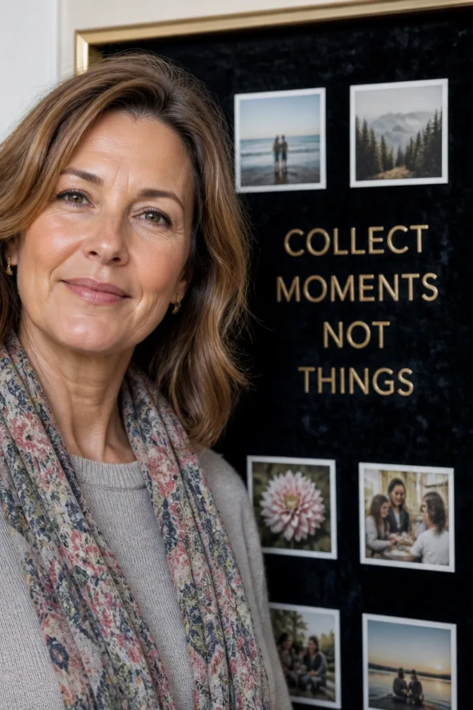
Velvet backing makes your vision board look expensive without much work. The texture absorbs light, so photos and letters pop without glare. Gold foil lettering adds a clean, high-contrast modern feel, especially when you keep the layout minimal. Use small photo squares and one main phrase — not a wall of quotes. This style fits goals about confidence, creative identity, and personal style. It also photographs beautifully because the background hides imperfections and softens edges.
Cut black velvet fabric to fit a backing board and stretch it tight, then staple or glue the edges on the back. Apply gold foil letters using adhesive vinyl or foil transfer sheets, keeping letter spacing consistent. Place photo squares in a simple two-column grid, gluing the corners with fabric-safe adhesive. Add one short handwritten goal card and keep it aligned with the foil text. Let adhesive cure fully before touching the surface.
Use a ruler and masking tape to align your photo grid before you glue anything.
Don’t use thick layers of glue on velvet; it creates bumps that show through in photos.
12. Matte Adhesive Vinyl Shapes With Photo Strips
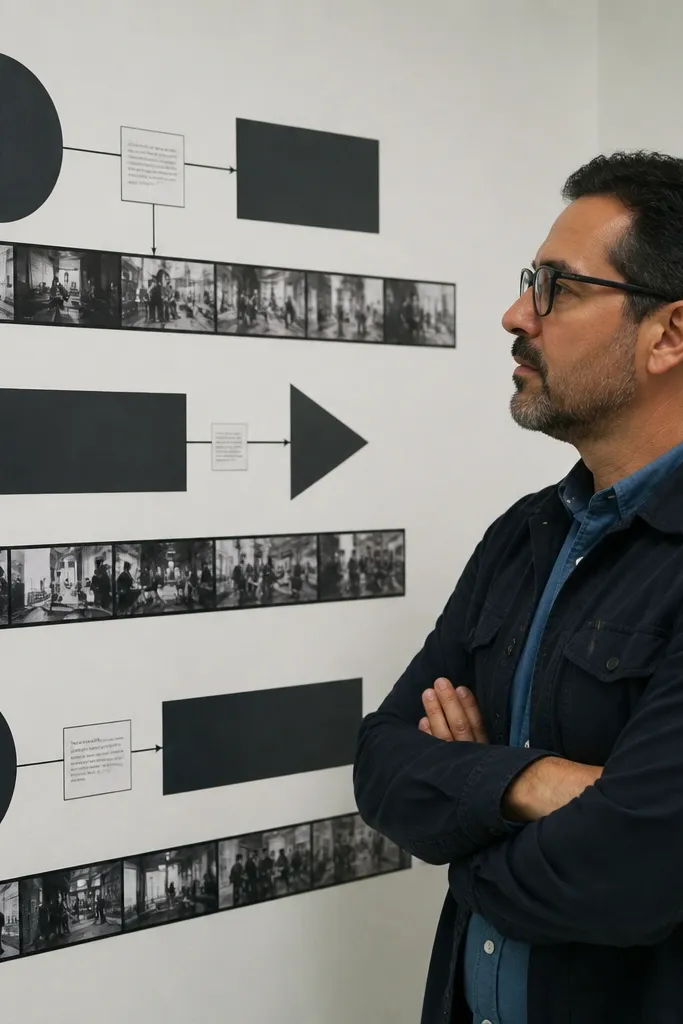
This idea looks modern because it uses graphic shapes like circles, arrows, and rectangles made from matte vinyl. Vinyl gives crisp edges and a clean border, and the photos become “bands” instead of scattered pieces. It’s a great choice for people who want a design-forward board but don’t want heavy crafting. Keep the palette to two colors plus photos. The result reads like a poster, not a craft project.
Pro tipCut vinyl shapes slightly larger than you think, then trim for perfect alignment.
Buy matte adhesive vinyl in two colors (like off-white and charcoal) and cut shapes with a craft knife. Place shapes on a clean backing board first — circles for anchors, arrows for direction. Add photo strips by printing photos and trimming them into narrow bands, then glue or tape the strips under the vinyl edges so the vinyl frames them. Add one small text label near the main arrow using a consistent font sticker or printed label. Seal lightly with matte spray only if your vinyl allows it; test a corner first.
AvoidAvoid glossy vinyl; shiny vinyl catches light and makes the board look cheap on camera.
13. Grid Binder Pages With Clear Pocket Overlays
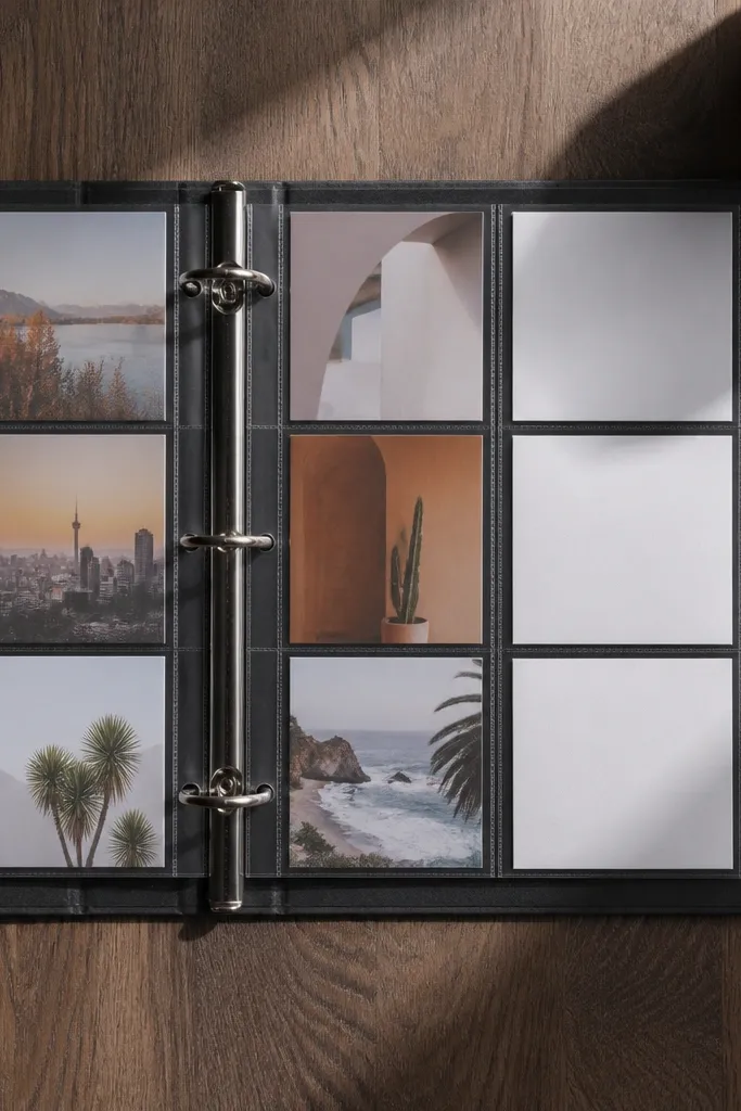
A binder format is one of the cleanest modern looks because every page has the same template. Clear plastic pockets act like frames for photos and keep everything flat, so your board stays neat even after swapping. Use a simple grid template on each page: two columns for photos and one column for text prompts. This is perfect if you want to revisit goals weekly and update visuals without redoing the whole board. It also makes your “vision” feel practical.
Create binder pages from cardstock cut to fit your binder size, then draw a light grid using a ruler. Add clear plastic pockets and place printed photos inside, trimming photos to match the grid cell size. For text, use small printed goal cards and slide them behind the pocket so they don’t curl. Build each page around a theme, like Health, Work, Home, or Creative. Store extra photos in labeled envelopes so you can swap quickly.
Use the same paper thickness for every page so pages don’t warp and look uneven.
Don’t stack loose paper without pockets; it bunches and the layout loses the modern neatness.
14. Takeout Box Shadow Collage With Tape Hinges
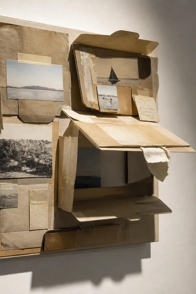
This is a clever upcycling board that looks sculptural. Stacking cardboard pieces gives you built-in depth, and tape hinges let you lift layers or swap elements without re-gluing. The look is modern because the structure is visible and intentional, not hidden craft scraps. Use it for goals that feel like a process: learning steps, project phases, or habit routines. It’s also great if you want something different from a flat collage.
Flatten takeout boxes and cut them into 2-3 depth layers, like 1/2-inch steps. Tape hinges with strong packing tape along one edge so layers can fold or lift; attach to a backing board. Glue your printed photos onto the top layer and add small handwritten cards on the middle layer. Keep the layout centered and use one consistent font style for labels. Finish by sealing the visible cardboard with matte medium so the surface looks clean and not dusty.
Score cardboard edges with a craft knife before folding so the hinge line stays sharp.
Don’t leave raw cardboard edges; they look messy next to sealed layers.
15. Wood Slat Vision Board With Mini Clothespins
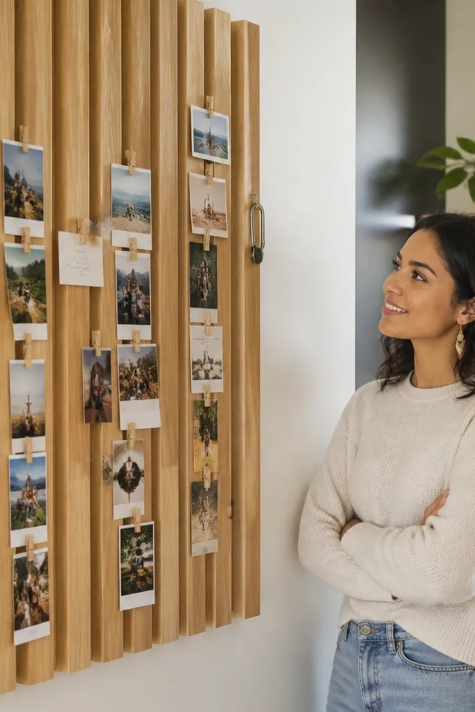
Wood slats plus mini clothespins is a modern, airy look because the board has vertical rhythm. Clothespins create consistent spacing and keep paper from peeling, so the board stays neat. This works well in kitchens, home offices, and entryways where you want a daily-looking reminder. Use thin photo strips and small cards so the board doesn’t bulk up. The natural wood tone also pairs nicely with neutral color palettes.
Pro tipUse white or clear clothespins instead of bright colors to keep it modern.
Cut or buy thin wood slats and mount them vertically on a backing board, spacing them about 1.5 to 2 inches apart. Attach a top rail or use two horizontal supports so clothespins sit evenly. Print photos and cut cards to fit between slats, then clip them in place. Add one larger “hero” card centered on the middle slat. Sand any rough wood edges and wipe clean before mounting so it looks tidy.
AvoidAvoid too many different card sizes; uniform cards make the grid look intentional.
16. Liquid Watercolor Wash Background With Photo Anchors
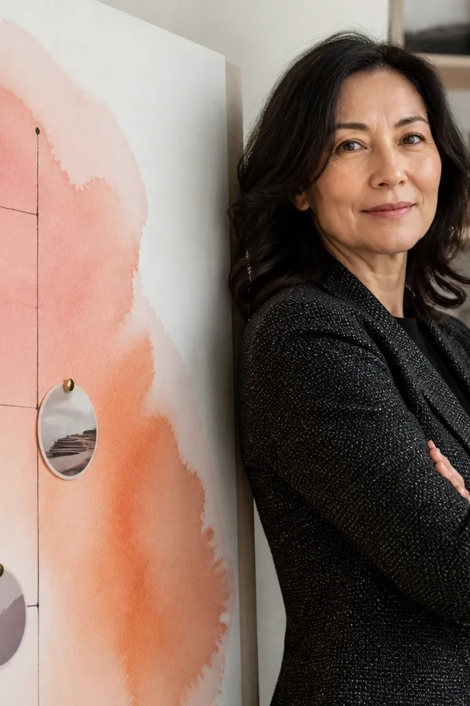
A watercolor wash background makes a vision board feel modern because color is soft but intentional. The trick is to keep the wash to one direction and one palette, then place photo anchors like “buttons” that ground the softness. Use black ink for text so it stays readable against the wash. This style works for creative goals, calm routines, and identity themes. It’s also forgiving: the wash hides small imperfections better than plain paper.
Use watercolor paper or thick cardstock and tape it down so it doesn’t buckle. Mix one palette of colors and apply a light wash in two layers, letting it dry between coats. When dry, use a ruler to place photo anchors — small rectangles — in a simple grid or diagonal line. Glue photos with matte medium and add short goal text in black with a fine liner. Seal with a matte spray once everything is fully dry.
Let the wash leave margins. White space is what makes the board look modern.
Don’t add heavy paint texture across the whole page; it makes photos look buried.
17. Laminated Photo Strip Timeline For Monthly Goals
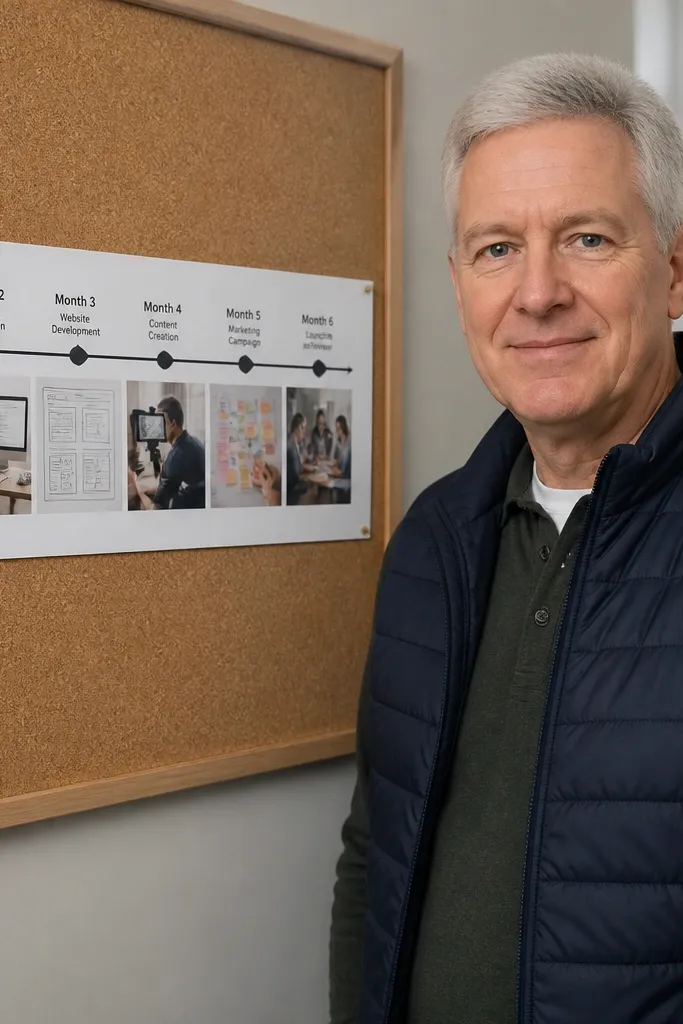
A laminated photo strip timeline looks modern because it’s structured and readable. It turns “vision” into a monthly sequence, and arrows show progress without needing long explanations. This is perfect if you want to track goals without building a full planner. The laminated surface also makes the board durable and wipe-clean, so it stays crisp. Use a consistent set of photo strips and short month labels to keep the design clean.
Print a set of photos and trim them into narrow strips, like 1.5x4 inches. Arrange strips in a horizontal or vertical timeline on a backing board, leaving equal spacing. Laminate the strip set or mount each strip under clear adhesive laminate sheets for a smooth finish. Add month labels using a printed font or sticker labels, then draw arrows with a thin marker. Seal any paper edges and wipe-clean the surface before adding extra notes.
Use eraseable markers on laminated boards so you can update goal notes monthly.
Don’t mix random clipart dates with photos; keep labels typographic and consistent.
18. Monogram Sticker Border With Photo Centerpiece

This layout looks modern because it frames everything with a single border system. A monogram sticker border creates a graphic edge, while one central photo acts as the hero. Keep the rest minimal: a short headline and a few tiny icons or labels around the center. It’s great for personal style goals, room refresh plans, or identity-focused intentions. The border makes the board feel designed even if you only use a handful of elements.
Pro tipUse a matte backing for monogram borders. Gloss makes stickers look like decals stuck on top.
Choose a backing color like white, cream, or matte black. Apply a monogram sticker border around the edges, keeping the pattern aligned and evenly spaced. Add one main photo centered and sized to about one-third of the board area. Place 3-5 small goal labels around the photo using the same sticker set or a single handwriting style. Seal lightly if needed, and keep the border edges flat so the pattern stays crisp.
AvoidAvoid adding full-bleed photos that reach the border; it breaks the clean frame effect.
19. Painted Tile Vision Board With Photo Squares
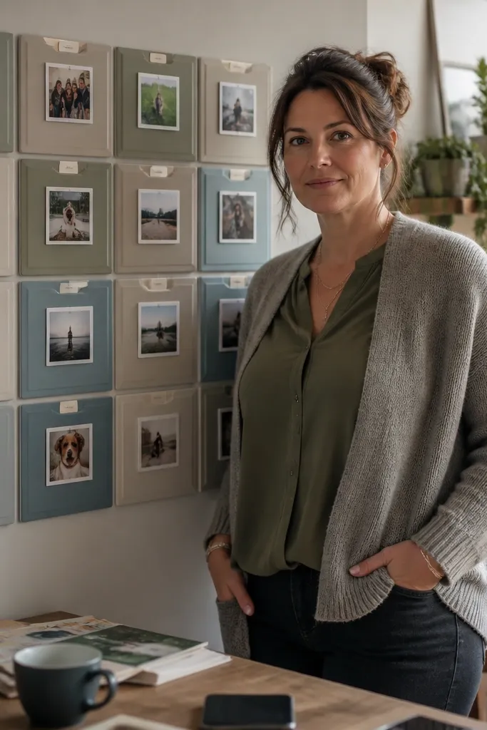
Painted tiles make a vision board feel modern because each tile is its own clean block. The grid becomes physical, and that structure keeps your layout consistent. Use photo squares on top of painted tiles and add short labels on the tile face or on small cards slipped behind. This style looks great in home offices and craft spaces because it feels like a real wall piece, not paper. It’s also surprisingly easy if you use small craft tiles and a simple mounting board.
Buy small craft tiles and paint them with matte acrylic in a limited palette, like two neutrals plus one accent. Let paint cure fully, then attach tiles to a backing board using strong adhesive or tile glue. Place photo squares on top of each tile with matte Mod Podge and press flat. Add a label per tile using a fine-tip paint marker or permanent marker on cardstock. Seal the finished tile surface with a matte clear coat so it looks uniform.
Keep all photo squares the same size even if the photos differ — crop them to match.
Don’t use too many tile colors; three paint shades max keeps it modern.
20. Monochrome Photo Booth Strip With Thin Caption Lines
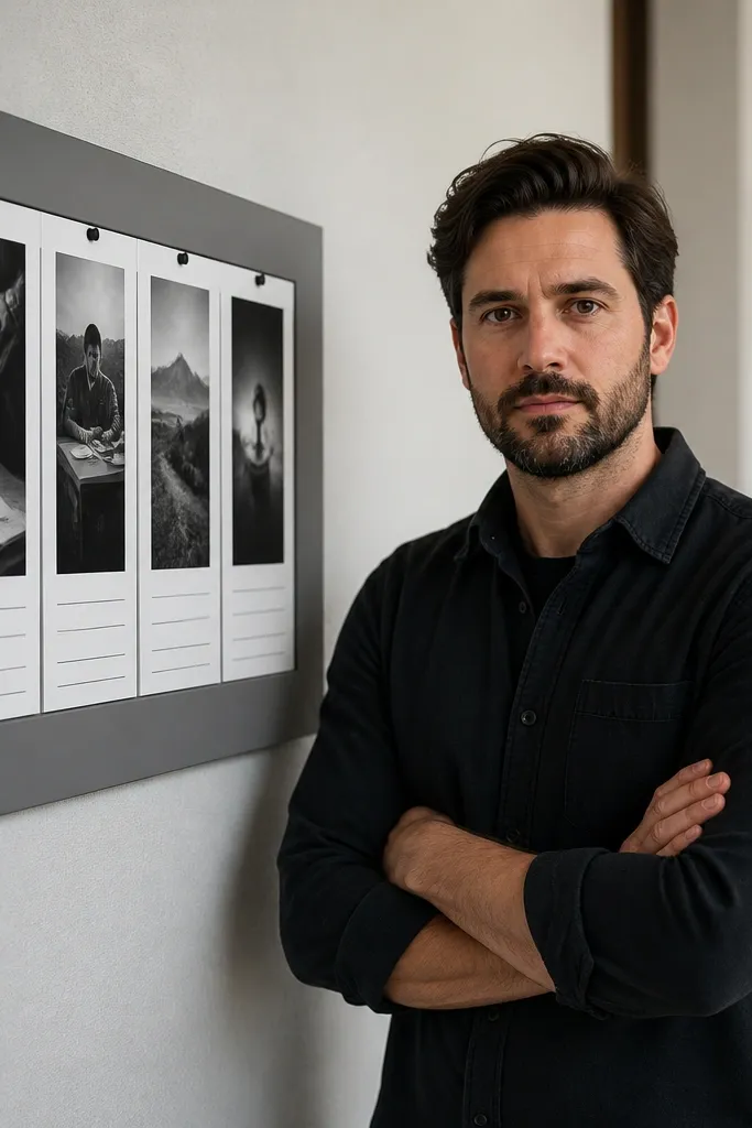
This is a clean, modern look that relies on repetition. A photo booth strip style — narrow vertical photos in a row — creates rhythm, and thin caption lines keep it minimal. Use monochrome photos so the board doesn’t compete with itself. Add one short line per photo: a habit, a skill, or a value. This works for routine goals and learning goals because it reads like a sequence. The narrow format is also easy to fit in small spaces.
Pro tipAlign captions with the center of each photo strip for a calmer look.
Print photos in a consistent monochrome set and trim into narrow strips, like 1.5x3 inches. Mount the strips on a backing sheet with equal spacing and tape edges for a straight line. Add thin caption lines beneath each strip using a ruler and a fine liner pen. Keep captions short — one line — and use the same sentence structure across the board. Finish by sealing the paper surface lightly so the ink stays crisp.
AvoidAvoid mixing font sizes on captions; one size keeps the modern feel.



