
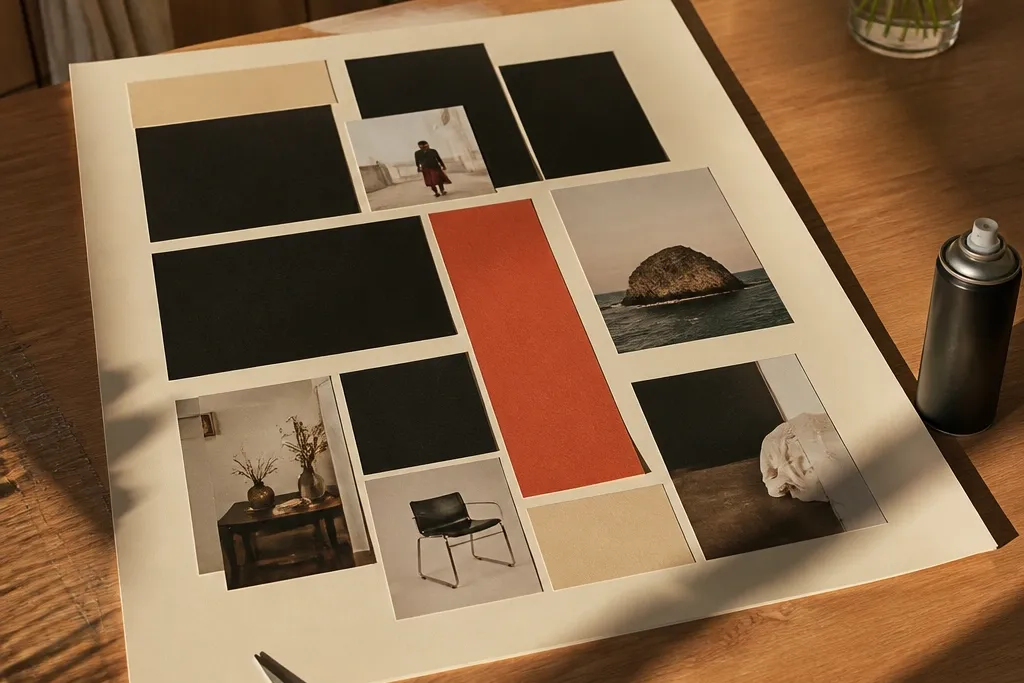
1. Cream + Black Magazine Grid with One Rust Accent
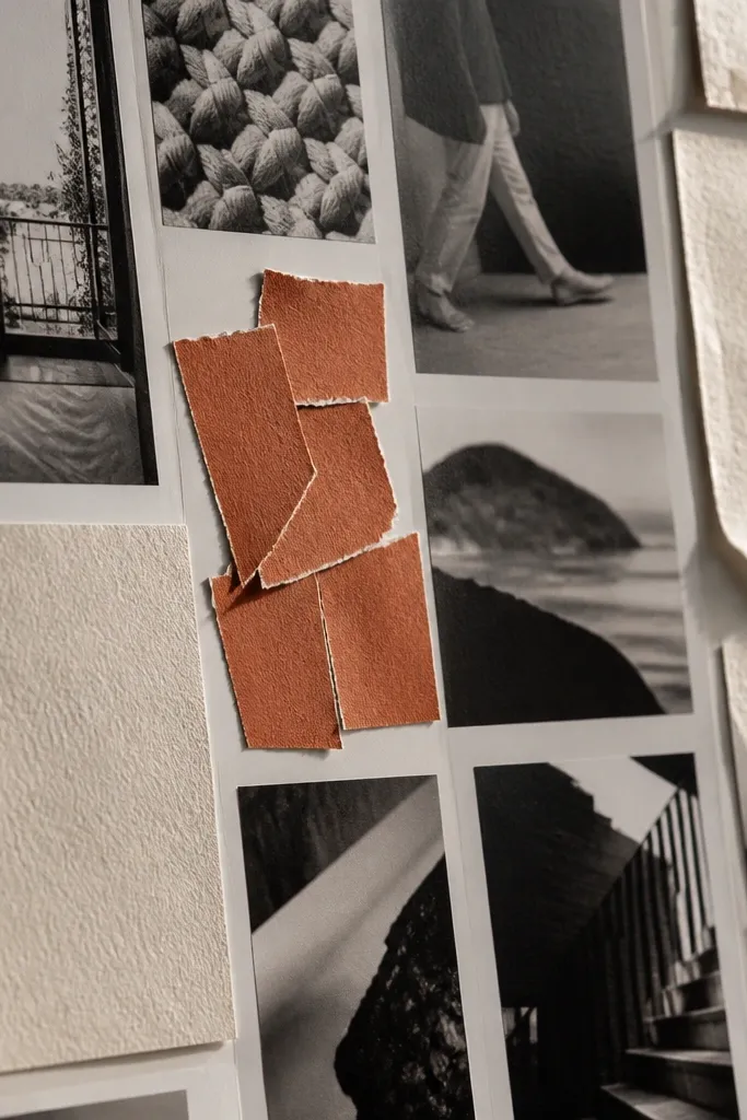
This is the fastest way to make a vision board look intentional because the layout does the heavy lifting. Start with a cream or off-white backing and cut black-and-cream magazine images into consistent rectangles. Add a single rust accent where you want your brain to land — like a word strip or a small cluster of rust-toned photos. It reads clean in photos because the grid creates even spacing and the eye always knows where to rest.
First, pick a backing size (8x10 inches or A4) and cover it with cream paper or cardstock. Then cut 18-24 image pieces from magazines so they match in width; aim for 2-3 different heights max. Finally, arrange them in a grid with uniform gaps, and add one rust accent label using rust paper, a rust marker, or a rust tape strip.
Pro tipUse a paper trimmer for the edges — straight cuts make the grid look expensive.
AvoidAvoid mixing in random colors across the whole page; keep rust to one small zone.
2. Fabric Scrap Collage with a Tight Black Tape Frame
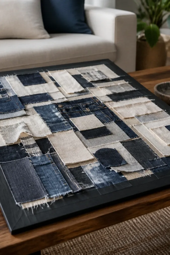
Fabric scraps make your board look tactile and high-end because cloth texture shows up even when the images are simple. Use small swatches or cut pieces from old shirts, curtains, or bedsheets — the board becomes visually interesting without needing fancy prints. A black tape frame makes the whole thing look like a framed piece, not a craft project. This is great for goals around comfort, home vibes, or personal style because the material itself carries the mood.
Start by choosing a backing board (foam board or thick cardstock) and measure a border area. Then cut fabric scraps into rectangles and small squares, and glue them down in a layered pattern leaving tiny gaps for texture. Finally, apply black washi tape or painter’s tape around the edges to create a clean frame and press firmly at the corners.
Pro tipIf fabric frays, run the cut edges through fabric glue or a quick dab of white glue and let it dry flat.
AvoidDon’t use slippery stretchy knit scraps without sealing — they lift and ruin the crisp look.
3. Book Page Background with Gold Foil Word Cutouts
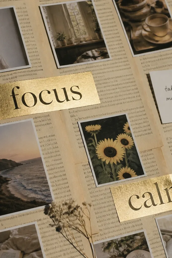
This style looks artsy without being chaotic. The book page background gives you instant texture and depth, and gold foil word cutouts act like a headline so your board reads fast. It’s ideal for goals you want to feel like a mantra — habits, intentions, or themes like “calm,” “movement,” or “focus.” The contrast between aged paper and metallic lettering makes photos pop.
First, tear book pages into large pieces and glue them to the backing, then trim the edges so it stays square. Next, cut word shapes from gold foil paper or gold vinyl and layer them with foam tape for a raised look. Finally, add 3-5 small photo clips or icons under the words so the page has both message and imagery.
Pro tipSeal the book paper with a thin coat of matte Mod Podge so it won’t smear when you add foil.
AvoidSkip full-page photos on top of book text; the page gets busy and the words lose impact.
4. Polaroid-Style Photo Strips from Old Prints
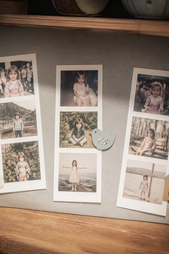
If your vision board needs to look cute and instantly readable, this polaroid strip layout does it. You’re turning existing prints, screenshots, or printed photos into consistent “cards” with white borders and slight overlaps. It feels personal and aesthetic because the spacing is controlled and the borders unify everything. This is perfect for travel, relationship goals, or daily-life transformations where you want your photos to be the star.
First, print or gather 6-10 photos and cut them into small rectangles (about 2x3 inches). Then create white borders by cutting paper frames around each photo (add 1/2 inch around the edges). Finally, arrange them in staggered rows, glue the bottom corners only for a subtle overlap effect, and add a single title strip at the top.
Pro tipUse a corner punch on the border paper for a cleaner polaroid look.
AvoidDon’t vary border sizes; uneven frames make it feel accidental.
5. Canvas Tote Vision Board on a Zip Pouch Backing
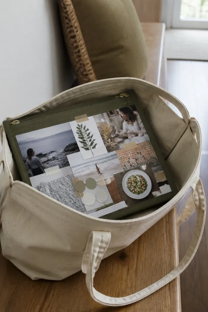
This one is underrated because it’s portable and looks styled. You’re building the vision board on a sturdy fabric surface (or a zip pouch backing) so it holds shape and you can move it around without damaging paper edges. Layer cutouts with fabric tape and thick glue so everything stays flat. The look is clean and “personal project” instead of flat paper on a wall.
Start with a canvas tote, a small canvas panel, or a zip pouch insert backing that lays flat. Then attach a background layer using fabric glue or double-sided tape, and add photo cutouts with fabric tape for crisp edges. Finally, add a zipper pull charm or ribbon at one corner so the board has a visible, styled detail.
Use a foam roller or press tool over fabric tape seams so edges don’t lift.
Skip thin glue on fabric — it soaks and makes wrinkles.
6. Stenciled Intentions with Washi Tape Arrows
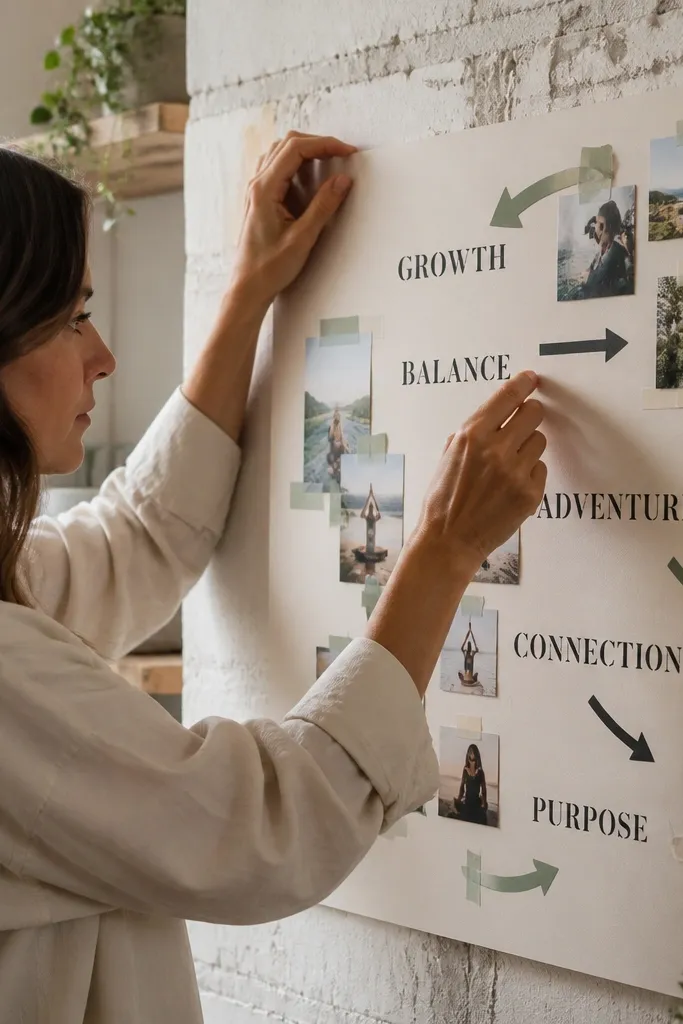
Text-forward vision boards look sharp when they’re built like a plan. Stenciled intentions give you crisp letter shapes, and washi tape arrows create direction so your eye follows in a clean order. This style is great if your goals are specific and you want each photo to “mean” something. It’s photogenic because the arrows and stencil text create strong graphic lines.
First, choose a stencil set (single words work best) and stencil 3-5 intentions onto a light background. Then place one photo under each intention and frame it with a thin washi tape strip. Finally, add arrows made from short tape segments pointing from the word down to the photo and press all tape edges flat.
Pro tipStencil with a sponge brush, not a paintbrush — you get sharper edges and less bleeding.
AvoidDon’t overcrowd with too many arrows; one arrow per photo is enough.
7. Cardboard Shadowbox Look with Layers and Spacers
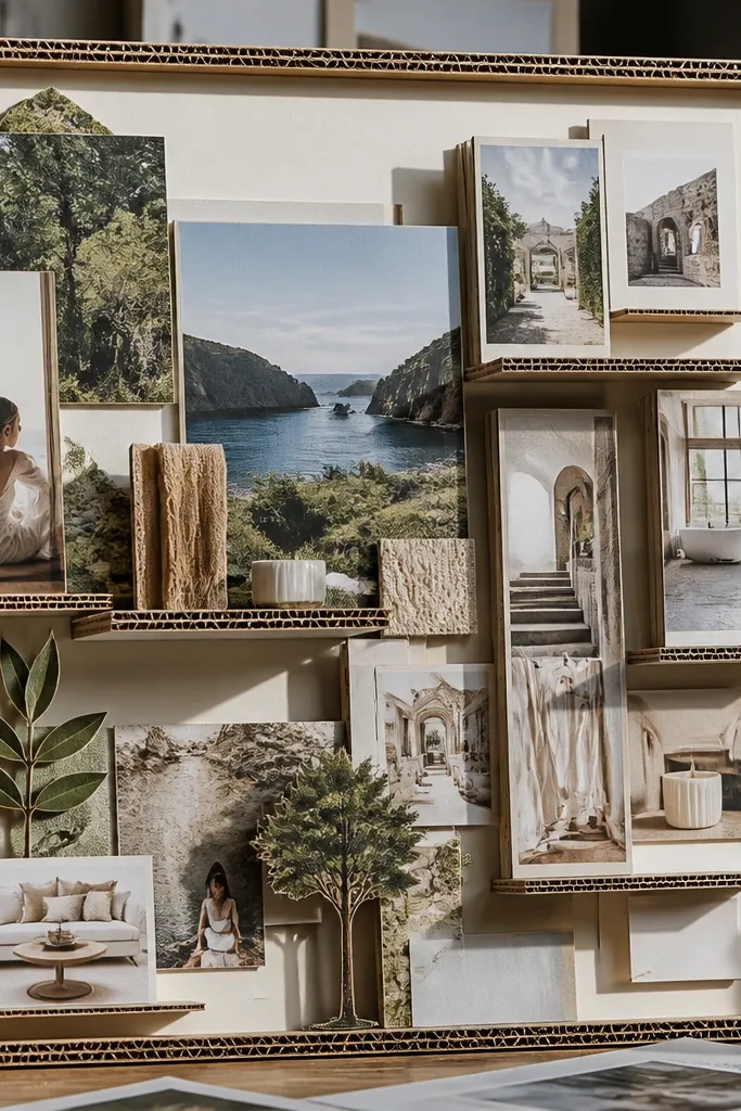
Depth makes a vision board look expensive in photos. This version uses cardboard layers and spacers so photos sit at different heights instead of all being flat. It’s a great upcycling project because you can use packaging cardboard, cereal boxes, and old folder stock. The end result reads like a shadowbox — clean, sculptural, and easy to rearrange.
First, cut a base panel from sturdy cardboard and glue a second layer on top to create a frame edge (about 1 inch wide). Then cut photo cutouts and mount them using foam tape squares or cardboard spacers so each piece sits at a different height. Finally, add small label tags and seal the surface with matte spray to stop paper curling.
Paint the cardboard edges black or dark brown so the layers look intentional.
Avoid using flimsy paper spacers — they collapse and flatten the depth.
8. Monochrome Stickers + Handwritten Captions
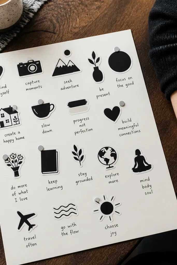
This is minimal but still looks styled because the system is consistent. Stick to one palette (black, cream, and maybe one muted gray) and add handwritten captions in the same pen every time. Icons and stickers are photogenic because they’re graphic, and handwriting adds personality without clutter. This setup works well when your goals are habits and you want the board to feel practical, not collage-heavy.
First, choose a light background and plan a simple grid with 8-12 icon spots. Then paste monochrome stickers or cut vinyl shapes into each spot and write a short caption beneath (2-4 words). Finally, add a thin line under each caption using a ruler and black marker to keep everything aligned.
Use a 0.5mm black pen for captions so the strokes stay crisp in photos.
Skip rainbow stickers; too many colors makes it look like random decoration.
9. Grocery Bag Paper Panels with Color-Blocked Tape

Brown paper is a cheat code for aesthetics because it has a warm texture and instantly looks cohesive. Color-blocked tape adds clean pops that feel modern, and small photo squares keep the board from getting too “crafty.” This is a quick upcycle option for people who want something warm, earthy, and photogenic without buying supplies. It’s especially good for lifestyle goals — home, routines, and daily aesthetics.
First, flatten grocery bags and cut them into panels sized to your board (for example, three vertical panels). Then tape color blocks with tape strips (pick 2 tape colors max) and glue small photo squares into the taped areas. Finally, add a title word in marker across the top panel and press everything down so the tape edges look sharp.
Use a bone folder or the edge of a hardcover book to flatten brown paper before gluing.
Don’t leave bag wrinkles — they show up in every photo.
10. Old Calendar Page Timeline with Date Tickets
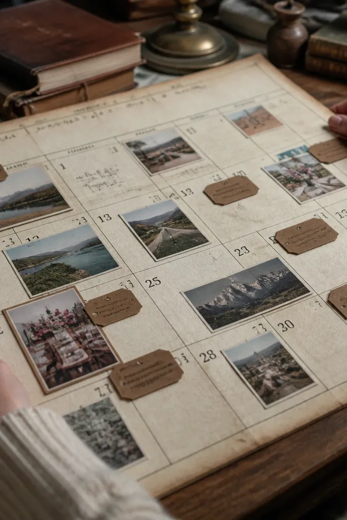
If your goals feel scattered, a timeline layout creates structure and makes the board look like a planned project. Old calendar pages provide printed lines and date blocks, which gives you instant graphic design. Add small “ticket” tags for milestones and place photos next to the month markers. This is a great approach for seasonal goals like fitness ramps, wedding planning, or study sprints.
First, remove one month page from an old wall calendar and mount it onto a backing board so it lies flat. Then cut small ticket shapes from cardstock and write one milestone per ticket. Finally, glue the tickets near the relevant month blocks and attach 3-4 small photos as anchors.
Pro tipSeal the calendar paper with matte spray so ink doesn’t transfer when you handle it.
AvoidAvoid covering the printed dates completely; the timeline is what makes it look designed.
11. Scrapbook Border Sticker Run with Center Photo Focus

This board looks polished because it frames one main photo like a poster. Border stickers (or cut-out border paper strips) give you a finished edge, while the center stays uncluttered. It’s a strong option if you want a single goal to be the star, like a move, a career pivot, or a personal makeover. The photo focus is photogenic because your camera has a clear subject.
First, choose a background cardstock color and place one main photo in the center. Then add border stickers or trim paper strips along all four edges, keeping the border thickness consistent. Finally, add 2-3 tiny supporting images or labels near the corners so the center remains the hero.
Use a ruler to align the border strips; even a small misalignment shows up fast.
Don’t add extra cutouts on top of the border; keep border edges clean.
12. Torn Paper Layers with One Clean Photo Oval
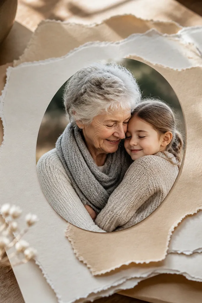
Torn paper looks soft and artistic, but you still need structure. This idea uses torn layers as the background texture and then one clean oval photo for clarity. The torn edges make the board feel handmade, while the oval photo keeps it modern and easy to read in pictures. It’s perfect for grounding goals like self-care, creativity, or slow mornings where the vibe matters.
First, tear layered paper strips in 2-3 tones and glue them to the background with slight overlap. Then cut an oval frame from cardstock and glue it over the torn background, leaving only the oval area visible. Finally, place one photo inside the oval and add a short handwritten phrase under it.
Pro tipTear by pulling slowly — fast tearing makes jagged edges that look messy in photos.
AvoidSkip multiple ovals; one oval keeps the composition calm.
13. Adhesive Vinyl Labels with Photo Corners
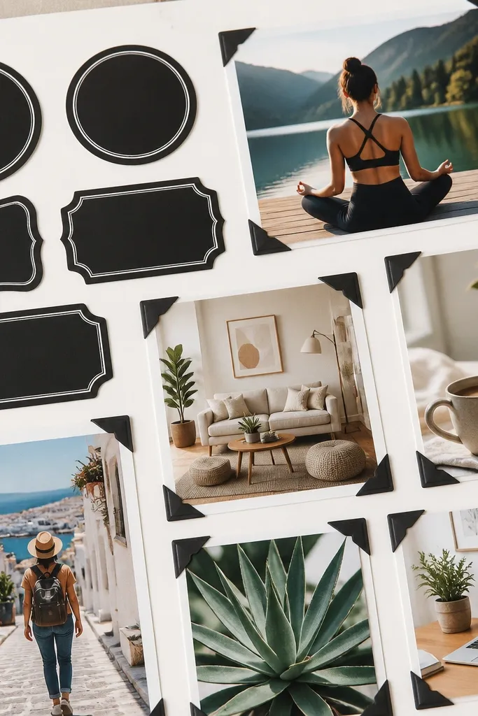
This style is crisp, modern, and easy to update. Vinyl labels make your board look like a designed product sheet, and photo corners keep the images from feeling glued down and heavy. It’s a great choice for people who change their goals monthly — you can swap images without tearing paper. The look is photogenic because labels create sharp lines and the corners add visual rhythm.
First, cut small vinyl label tabs (or print label text on sticker paper) and place them along one side or top in a consistent size. Then mount photos with photo-corner pieces or small adhesive squares at each corner. Finally, add a thin underline or divider line between label groups using a ruler and marker.
Pro tipWipe the backing with a dry cloth before applying vinyl so it sticks cleanly.
AvoidDon’t use low-quality vinyl; it peels at the edges and ruins the crisp look.
14. Washed Denim Pocket Board with Mini Goal Cards
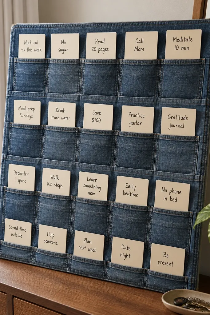
Denim pockets instantly make a vision board feel like a functional organizer, not a flat craft. The pocket grid creates structure, and mini goal cards let you swap ideas without rebuilding the whole thing. This is perfect for goals you want to review daily, like workout plans, study goals, or household routines. Photographically, denim texture and pocket seams give you depth and a strong look even with simple cards.
First, cut a denim panel from an old pair of jeans and stitch or glue pocket sections onto a backing board. Then cut mini cards (about 3x4 inches) and write one goal per card, using thick marker for readability. Finally, place small photos inside the pocket cards or tuck them behind the cards for a layered look.
If you don’t want to stitch, use fabric glue and clamp with binder clips until dry.
Don’t skip trimming the pocket edges; bulky seams show up and look sloppy.
15. Matte Spray-Sealed Collage with Clean Margins
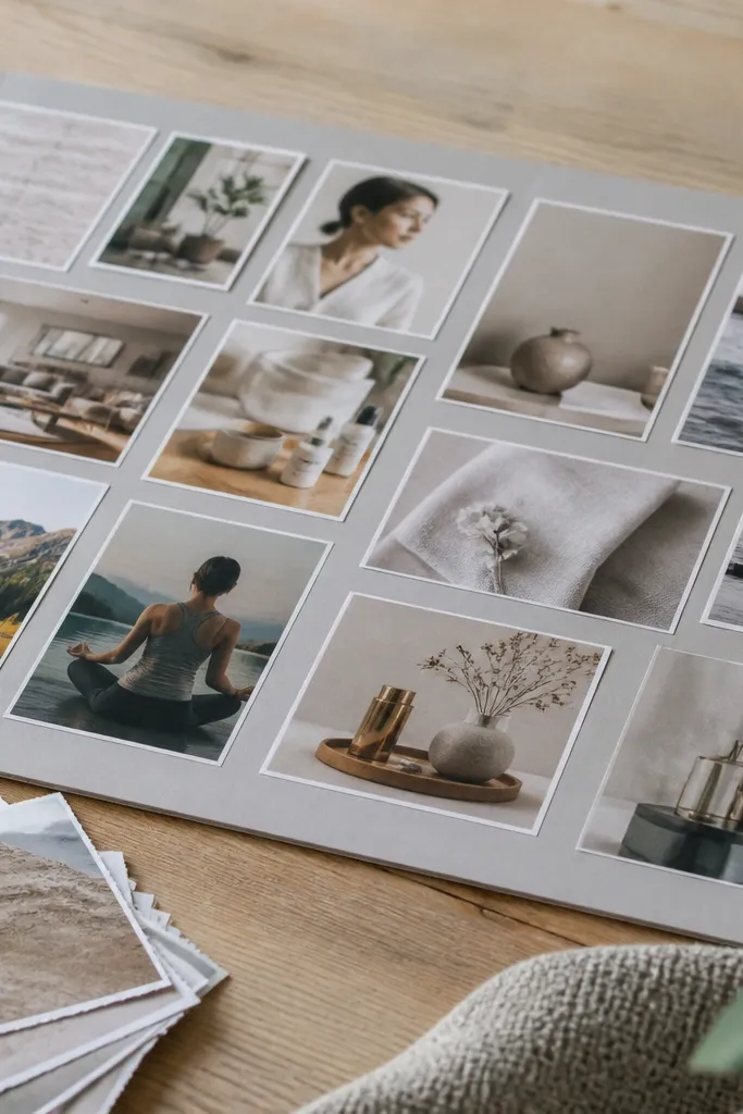
This is the “make it look finished” version, and it matters more than people think. Clean margins make the board feel intentional, and a matte seal keeps paper from curling, which ruins photos with glare and uneven edges. You get the freedom of a collage without the usual messy look. This works for any theme because the finishing method is the style.
First, set a margin rule: pick one frame size and keep at least 3/4 inch empty around the edges. Then build your collage in the center with paper cutouts and photos, overlapping lightly but keeping edges aligned. Finally, spray a matte seal in thin coats from 12 inches away, letting it dry flat between coats.
Do a test spray on scrap paper first so you can match the sheen you want.
Don’t oversaturate with spray; wet paper warps and the margins start to buckle.



