
1. Museum-Label Page with Clear Tape Frame
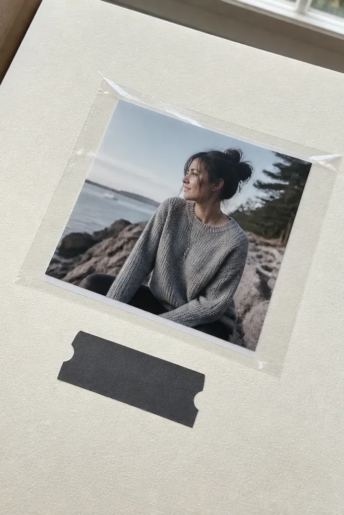
This layout looks like a gallery wall because it treats your photo like an exhibit. You frame the image with a crisp rectangle made from clear tape (or clear tape-like film) so the edges look intentional, even with a simple print. Add a small “label” strip under the photo using a narrow cardstock tab — it gives the eye a place to rest instead of scanning the whole page. It’s renter-friendly because nothing needs to be glued permanently to the binder or cover; everything can be placed and removed with tape and photo corners. Skill level is easy, and you can finish one page in about an hour.
Start by cutting a cream or light gray background sheet to 12x12, then choose one photo and mat it with a thin border of cardstock (about 1/4 inch). Place the photo centered and secure it with two photo corners at the top corners. Cut a rectangle of clear tape film slightly larger than the photo edges, smooth it down over the photo border, and press the corners so the frame stays square. Add a label strip by cutting a 1x4 inch cardstock piece, then glue or tape it under the frame and write the date and one short line using a fine-tip pen.
Use a metal ruler for straight label edges and wipe your tape surface with a dry microfiber cloth before placing it.
Don’t cover the photo itself with opaque tape — you want a frame, not a haze.
2. Washi Tape Grid with One Big Photo Anchor
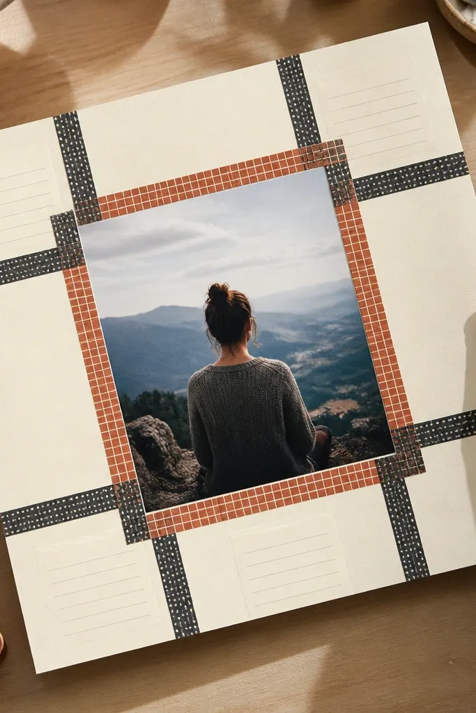
This is the cleanest way to use patterned tape without turning the page into a cluttered craft project. The grid gives you structure, and the single large photo keeps it from looking busy. Stick tape in straight lines around a central photo window, then add tiny journaling blocks only in the tape’s negative spaces. The look is bold and photogenic because the grid creates strong geometry under flash and overhead light. It’s also forgiving — if you move tape, you can peel and reapply cleanly.
Begin with a solid background cardstock in white, black, or a muted beige. Measure and mark a central square or rectangle for the photo window, leaving about 1 inch margins on all sides. Apply washi tape strips to form a grid around that window, keeping each strip width consistent (about 1/2 inch works well). Place the photo using photo corners, then add two small journaling tabs cut from coordinating cardstock and secure them with glue dots.
Pro tipPick one tape color family (warm or cool) so the grid reads cohesive.
AvoidAvoid stacking tape into thick layers — thick tape creates shadows and makes the photo look uneven.
3. Vellum Overlays with Stamped Corner Marks
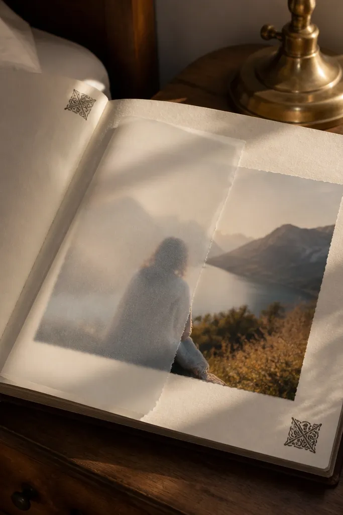
Vellum turns regular photos into layered, soft-edged art. You place a semi-transparent vellum piece over part of the photo, then add stamped corner marks so the page looks designed, not slapped together. The translucency is what makes this renter-friendly layout look “high effort” even when it’s fast — it adds depth without heavy bulk. It also stays protected in a sheet protector. This is great for travel, family events, and any page where you want a calm, airy look.
Cut a vellum rectangle slightly wider than your photo and decide where it will overlap — a diagonal or top-third overlay looks best. Secure the photo first with photo corners, then lay the vellum on top and tack it down with small glue dots only on the vellum edges. Stamp corner marks on the vellum using a pigment ink pad meant for stamping (test on a scrap first). Finish by adding a thin journaling strip on the background cardstock underneath the vellum overlap so the text stays readable.
Pro tipLet pigment ink dry fully before you slide the page into a protector to avoid smearing.
AvoidDon’t use heavy glue on vellum — it leaves shiny spots that catch light.
4. Fabric Scrap Borders with Iron-On Stabilizer
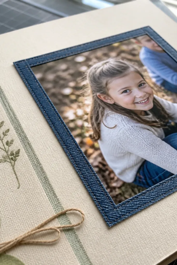
A fabric border makes a scrapbook page feel tactile and intentional, and it reads beautifully in photos. The trick is controlling fraying and bulk, which is why you stabilize the fabric first. Use small fabric scraps — denim, linen, or even a strip from an old shirt — then create a neat border around a photo mat. This design works especially well for memories tied to home, family, or cozy routines. It’s slightly more work than paper-only layouts, but still beginner-friendly if you keep the border narrow.
Cut fabric into a border strip about 3/4 inch wide and long enough to go around your page edges. Iron lightweight fusible web or iron-on stabilizer to the back of the fabric strip, then trim the edges so they’re straight. Glue or tape the fabric border to the background cardstock using fabric glue or a thin line of glue (keep it off the photo area). Add your photo in the center with photo corners, then top it with a thin cardstock mat to hide any fabric texture bumps under the photo.
Use a narrow border (under 1 inch). Wide fabric borders make page protectors bulge.
Avoid stretchy knit scraps unless you stabilize them — unstabilized fabric warps your page.
5. Monochrome Photo Strip with Hand-Cut Caption Tabs
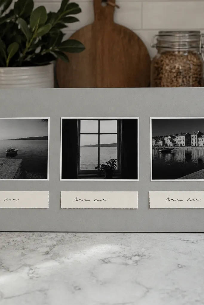
Monochrome photo strips look sharp because they reduce visual noise and make the page feel curated. You lay three to five photos in a horizontal strip, then add caption tabs like little labels under each one. Keep the tabs consistent in size and font style so the whole page reads cohesive. This setup is perfect for sequences — a day out, a concert, a birthday build-up — and it stays photogenic because the strip creates a clear eye path. It’s also easy to update later since you can swap one photo without rebuilding the whole page.
Choose a single color theme for the photos (black-and-white or one muted tint) and print them at matching sizes. Cut a background sheet in a solid neutral (cream or charcoal). Mount the photos in a strip across the page with a consistent gap (about 1/4 inch) using photo corners. Create caption tabs by cutting small rectangles (about 1/2x2 inches), rounding one end if you want, then attach each tab under a photo with glue dots and write one short line per tab.
Use the same pen for every caption tab so the typography looks intentional.
Don’t add journaling everywhere — keep text only on the caption tabs.
6. Scrapbook Skyline with Die-Cut Windows
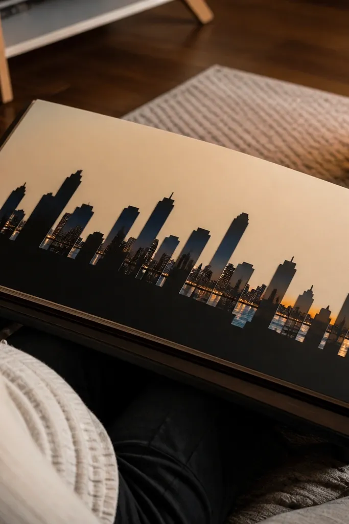
This layout turns your photo into a backdrop. A skyline silhouette with “window” cutouts makes the page look like a city poster, and the photo shows through the windows so you get color without messy layering. It’s stunning because the silhouette creates a strong graphic shape that pops in photos. Use it for street scenes, family trips, or any memory where the location matters. Skill level is medium only because you’ll need a die-cut machine or pre-made sticker-style silhouettes, but the assembly is straightforward.
Start with a background cardstock in a dark color like black, navy, or charcoal. Cut or apply a skyline silhouette that fits your page width, leaving room for a title area at the top. Place your photo behind the skyline window area so it shows through, then secure the photo using photo corners or tape at the edges where the silhouette covers it. If you have a die-cut machine, cut thin foam backing for the skyline and adhere it so the silhouette has a slight lift.
Pro tipAdd one small “street sign” label near the bottom using a narrow cardstock strip for extra realism.
AvoidAvoid busy patterned backgrounds — the silhouette needs contrast.
7. Layered Paper Arches with Photo in the Negative Space
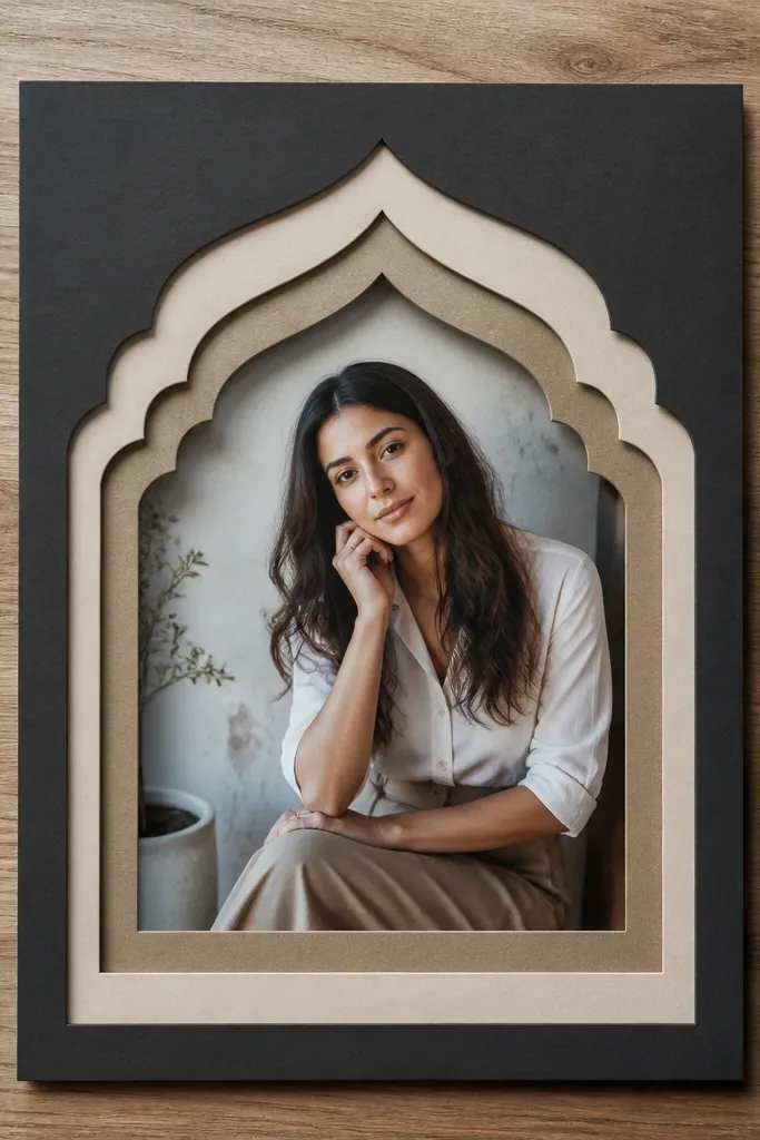
Arches look fancy because they create a frame inside a frame. You cut stacked arch shapes from cardstock and leave the center open so your photo sits in the negative space. The result is a sculptural border that reads clearly on camera and doesn’t require bulky 3D embellishments. This works great for portraits, graduation photos, and any image with a subject centered. It’s renter-friendly because it stays flat under a protector if you keep the foam lift thin.
Cut three arch frames from cardstock in coordinating colors, each slightly larger than the one inside it. Place the smallest arch on top of the photo area to find the center, then use the arch as a guide to position your photo. Mount the photo first with photo corners, then layer the arch shapes around it using thin double-sided tape on the flat edges. Add a small title strip at the top of the arches by cutting a 1 inch tall rectangle and attaching it with glue dots.
Pro tipKeep the arch thickness consistent by using one template and tracing it twice for each layer.
AvoidDon’t use thick chipboard under the arches — it makes page protectors bulge.
8. Accordion Mini-Book Pocket on One Page
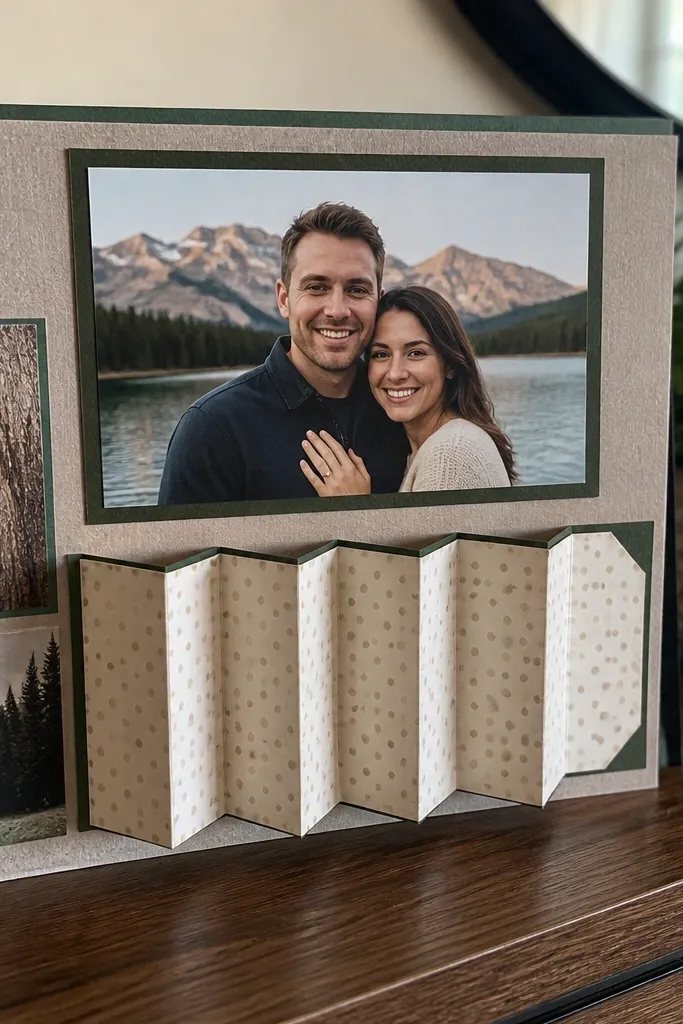
A pocket with an accordion mini-book adds movement and makes your page feel like an interactive display. It’s stunning because the viewer sees the main photo, then notices the hidden panels. This is perfect for renters because it’s compact and you can store extra notes or smaller photos inside without adding loose inserts. The look stays organized and photogenic because the accordion folds neatly into a pocket. Plan for a little more time, but the build is still very doable.
Cut a pocket base from cardstock about 4 inches wide and 6 inches tall, then fold the top edge down by 1/2 inch to create a sturdy opening. Build the accordion by cutting 6-8 narrow panels (around 1 inch wide each) from patterned paper, then folding them accordion-style. Glue or tape the accordion’s bottom edge to the pocket interior so it opens upward, then add a small photo panel on the first accordion flap. Decorate the pocket front with a main photo and a title strip, then secure the pocket to your background page using glue at the sides and bottom only.
Pro tipUse a bone folder for crisp accordion folds so the panels look clean under light.
AvoidAvoid bulky embellishments inside the pocket — they’ll snag when you open the accordion.
9. Starburst Cutout Title with Sticker Letters
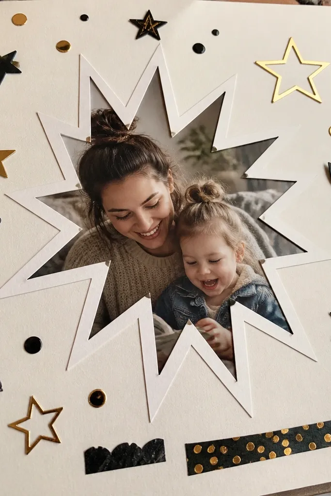
Starburst titles are one of the fastest ways to make scrapbook pages look graphic and fun. You cut a starburst shape and place it over part of the page, then mount your photo behind it so the burst acts like a spotlight. Add sticker letters or cut-out letters for a clean, readable title. It’s photogenic because the starburst creates a single focal point and adds color without covering the whole page. This design works for birthdays, concerts, and any page where you want the title to pop.
Choose a background cardstock and pick a starburst color that contrasts strongly (hot pink over cream, or teal over beige). Cut a starburst shape from cardstock and cut a smaller inner opening if you want to show a photo through. Place your photo first, then position the starburst on top and trace the opening location. Use photo corners for the photo edges and secure the starburst with thin double-sided tape around the perimeter. Finish with sticker letters on the starburst, keeping the letter height around 3/4 inch for readability.
Pro tipUse one font style for the whole page — mixing sticker fonts makes it look accidental.
AvoidDon’t cram tiny journaling around the starburst; let it be the headline.
10. Clean Corner Photo Mats with Tiny Quote Strips
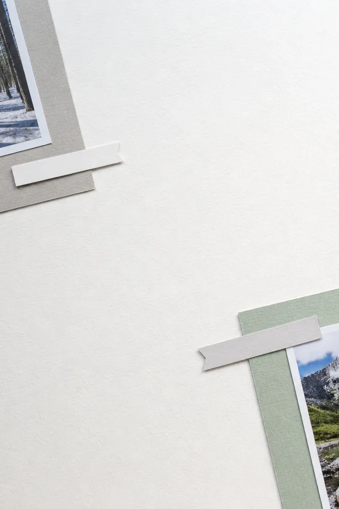
Negative space is what makes this style look modern. Instead of covering the page, you place photos in the corners with small mats, then tuck in tiny quote strips that act like captions. The look is airy, and it photographs well because the page has breathing room and contrast. This is renter-friendly because you can reuse the same template style across multiple pages with different photos. It also works well for messy collections of prints — you can keep everything tidy without adding many embellishments.
Start with a solid background sheet in white, beige, or soft gray. Cut two photo mats from cardstock about 1/2 inch larger than each photo. Mount one photo in the top-left and one in the bottom-right using photo corners so the corners are crisp. Cut quote strips about 1 inch wide and 3 inches long, then attach them near each photo using washi tape so they can be removed later. Write the date or a short phrase in a fine pen, keeping the text short enough to fit on one line.
Pro tipUse consistent margins from the page edges (about 1 inch) so the layout stays uniform across your album.
AvoidAvoid adding full-page patterns behind photos — it kills the negative-space effect.
11. Color-Blocked Background with Overlapping Photo Edges
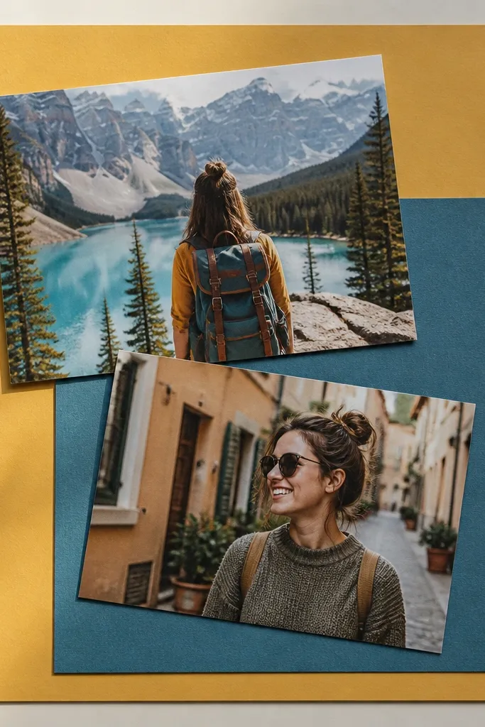
Color blocking makes scrapbook pages look graphic and intentional. You cut 2-3 solid rectangles of paper and stack them like a modern poster, then let photos overlap those blocks for a layered look. The edges are straight and clean, which reads well even in low light. This design is great when you have photos with strong colors because the blocks act like a controlled frame. It’s also renter-friendly because it uses paper and tape only — no messy glues.
Cut your background sheet into a base color, then add two paper blocks on top by measuring 3-4 inch tall sections or equal thirds. Use a ruler to keep edges straight, and apply double-sided tape along the back of each block. Place your photos so they overlap the block seams, not the center of the page, and secure with photo corners. Add one thin title strip across the top block, then write in a small font with a gel pen.
Pro tipChoose two main colors and one neutral. Too many colors makes the blocks look chaotic.
AvoidDon’t rotate photos randomly — keep one photo straight and one slightly tilted (like 5-8 degrees).
12. Polaroid-Style Photo Frames from Scrap Cardstock
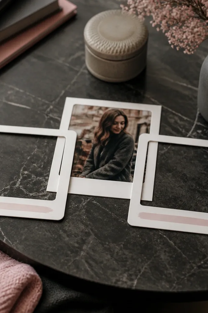
Polaroid-style frames always look photogenic because they add a thick white mat around the image. Make them from scrap cardstock so each frame matches your page palette, and add a handwritten date on the bottom edge. This style is renter-friendly because it’s flat, binder-friendly, and easy to swap when you reprint photos. It works for sets of 2-6 photos on one page and looks best when you keep the frames aligned in a tidy grid. The result feels nostalgic without needing actual Polaroid film.
Cut cardstock rectangles about 1 inch wider than each photo on all sides to create a mat. Leave extra space at the bottom for the date (about 3/4 inch tall). Mount each photo inside its frame with photo corners at the photo’s corners. Arrange the frames in a grid or staggered pattern, then secure each frame to the background with thin double-sided tape on the back edges only. Add the date with a fine pen and a consistent format like 2026-07-21.
Pro tipUse the same mat color for every frame on the page to keep it cohesive.
AvoidAvoid thick foam behind every frame — it adds too much bulk under protectors.
13. Thrifted Map Paper with Transparent Route Lines
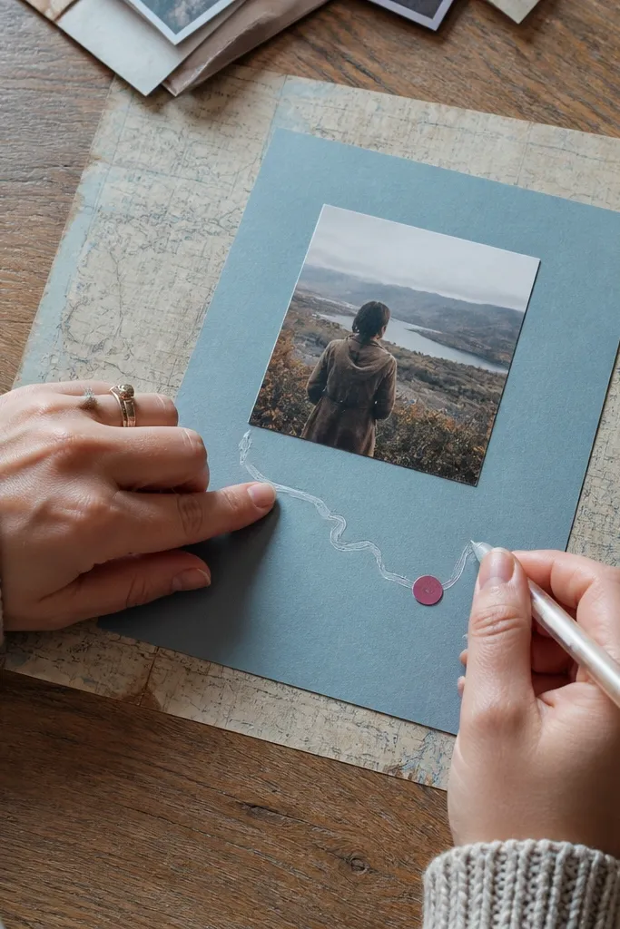
Map paper instantly adds story and texture, and it looks great on camera when you keep the design clean. Put your photo on a solid cardstock patch over the map, then draw a route line using a translucent medium like clear gel pen or thin clear tape strips. Add a tiny “stop” marker near key points using cut-out circles or sticker dots. This layout is perfect for trips, weekend drives, and any memory where the location matters. It stays renter-friendly because you’re using paper, not permanent materials.
Cover a 12x12 sheet with a map print or thrifted atlas page trimmed to size. Cut a solid cardstock patch (about 7x5 inches) for your photo and mount the photo on it with photo corners. Place the patch over the map, then trace a simple route line across the map using a clear gel pen or tape strips — keep the line thin so it doesn’t overpower the photo. Add two or three stop markers by punching small circles from colored paper and attaching them with glue dots. Finish with a small title strip at the top in a contrasting color.
Pro tipChoose map sections with minimal text density behind the photo patch for easier readability.
AvoidDon’t cover the entire page with route lines — two or three lines look intentional, ten lines look messy.
14. Bold Border Tape Frame Around a Photo Trio
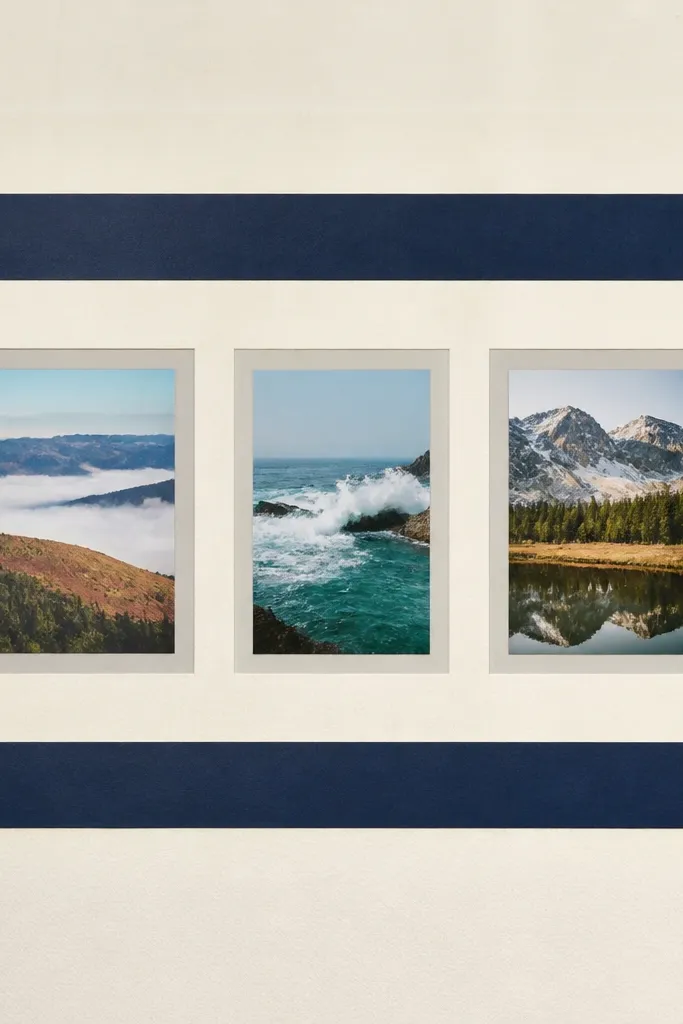
A thick tape border makes a simple page look styled because it creates a hard edge like a picture frame. For this layout, you arrange three photos in a row inside the border, each with the same mat color. The border is where the design energy lives, so you keep everything else calmer. It’s renter-friendly because tape can be replaced if you change your mind, and it’s easy to keep pages flat under protectors. This is one of the most reliable “stunning with minimal effort” setups.
Choose a solid background cardstock and decide your border thickness (about 1/2 inch looks best). Apply washi tape strips around the page edges, layering them slightly so the border is even, then trim the ends cleanly with a craft knife and ruler. Mount three photos side by side in the center using photo corners, leaving consistent gaps. Add a small date strip below the trio using a narrow cardstock rectangle, then secure it with glue dots.
Use the same tape width for every side or the border will look lopsided on camera.
Avoid using a border and heavy embellishments at the same time — let the border do the work.
15. Half-and-Half Page with Fabric Hinges
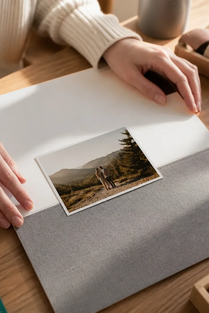
This layout looks artsy because it combines two surfaces and adds a visual hinge. You split the page into a paper half and a fabric half, then place a photo near the seam so the viewer’s eye lands exactly where the materials change. The fabric hinge idea is renter-friendly because it’s attached to the page itself, not walls or furniture, and it stays inside the binder. It’s a good option when you have a single standout photo that deserves a dramatic treatment. Time is about 2 hours for one page if you’re cutting and trimming carefully.
Cut your background page in half visually and choose a fabric strip for one half, about 6 inches wide if your page is 12x12. Stabilize the fabric with iron-on interfacing so it doesn’t stretch, then glue or tape it to the cardstock background along the back edges. Place your photo so it crosses the seam slightly (over both sides), then secure photo corners at the edges where the fabric is stable. Add a thin paper strip along the seam to hide stitching lines or raw edges, and write a short caption under the photo.
Trim fabric edges with pinking shears only if you want a deliberate pattern — otherwise use straight edges and clean finishing.
Don’t skip stabilizer — stretchy fabric makes the page look warped in a protector.
16. Layered Sticker Numbers with Date Wheel Style

A date-wheel look turns a scrapbook page into a mini poster. Use layered sticker numbers or cut-out numbers from cardstock, then arrange them in a circle around a central photo. Add small tick marks with a fine pen to complete the clock-like feel. This is stunning because the numbers give instant structure and the photo becomes the center of attention. It’s renter-friendly since all elements are removable and flat when placed in a sheet protector. Great for anniversaries, birthdays, and “day count” memories.
Pick one central photo and mount it with photo corners on a solid background. Cut a circular ring from cardstock (about 5-6 inches wide) or trace a circle and cut an inner opening so the photo shows through. Arrange sticker numbers around the ring or cut numbers from cardstock and attach with glue dots. Add tick marks with a ruler and pen, then place a small title strip under the circle. Keep the color palette to two main colors plus one neutral so the numbers stay readable.
Pro tipUse a compass or a tracing tool for the circle so it looks intentional rather than wobbly.
AvoidAvoid tiny numbers — they blur in sheet protectors and look messy.
17. Accordion Page Turn with Photo Hinges
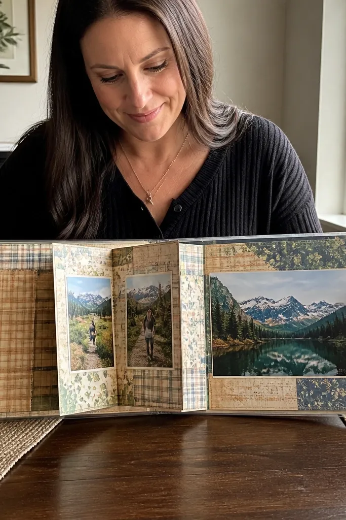
This is the layout you use when you want the scrapbook to feel interactive without adding loose pieces. The accordion page turn lets you show two or three moments in one spot, and it photographs well because the folded panels create layered shadows. Build it so the page still slides into a binder protector — that means thin folds and controlled bulk. It’s renter-friendly because there’s no wall impact and no heavy adhesives. Skill level is medium, but the technique is repeatable once you get the first fold right.
Cut your accordion panels from patterned cardstock or paper strips about 8 inches tall and 1 inch wide per fold line. Fold on a score line using a scoring tool or the back of a butter knife for crisp bends. Attach the accordion to a background page by gluing/taping only the outer edges, leaving the accordion free to open. Mount one photo on every other panel using photo corners. Add a small title on the outermost panel so you see it when the page is closed.
Pro tipTest the fold width using a scrap first — binder protectors vary in thickness and spacing.
AvoidDon’t glue photos flat across the fold line — they’ll crack or lift when you open the page.
18. Monogram Cutout with Photo Backer

Monograms look clean and high-end when you use a big letter and let the photo do the color work. You cut or buy a thick monogram, place it over a photo backer, and keep the rest of the page simple. The result is photogenic because the letter shape frames the image like a sign. It’s renter-friendly because it’s flat, binder-safe, and you can swap photos anytime. This works especially well for last names, first initials, and event pages where you want one clear focal shape.
Choose a monogram letter size about 7-8 inches tall and cut it from thick cardstock (or use a pre-cut letter). Mount a photo backer behind where the letter will sit, then secure the photo to the background using photo corners. Position the letter over the photo backer and attach it around the perimeter with thin double-sided tape. Add a small date strip or tiny subtitle beneath the letter, then write it with a fine pen. Keep background paper solid so the letter reads clearly.
Pro tipIf your monogram has thin inner details, back it with a second thin cardstock layer to prevent bending.
AvoidAvoid busy patterned background paper — the letter loses contrast.
19. Hand-Drawn Doodle Frame with Inked Edges
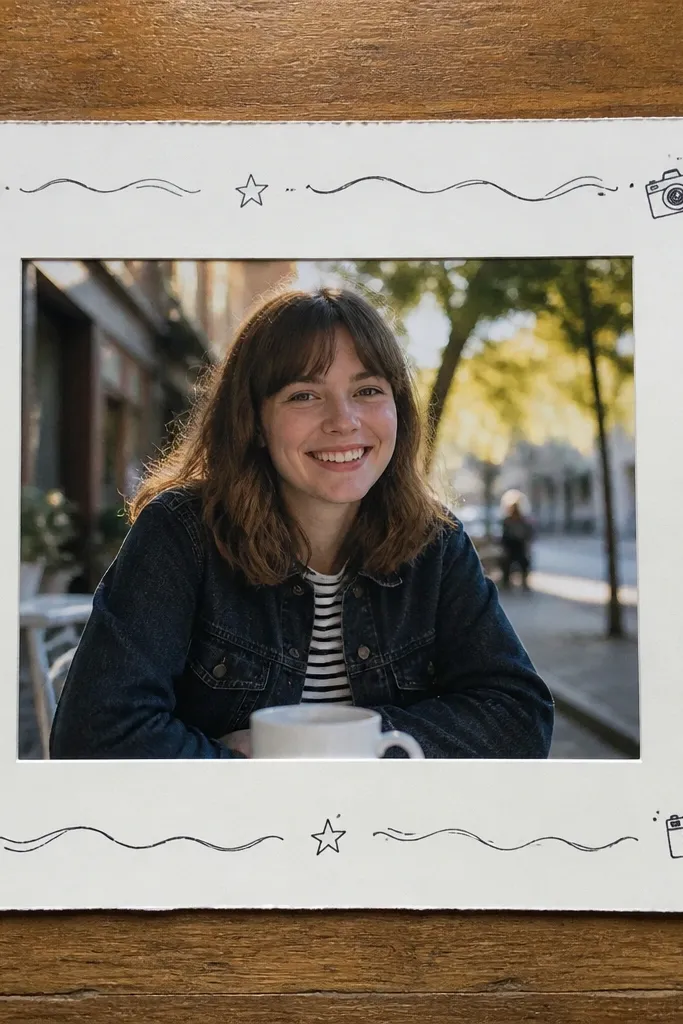
A hand-drawn doodle frame makes a page feel personal and styled without needing expensive embellishments. You draw a border around a photo using black fine-liner pens, then add a few small icons that match the memory (stars, hearts, tiny camera shapes, waves). The look is photogenic because the ink lines create crisp contrast against light paper. It’s renter-friendly because it’s paper-only and doesn’t require permanent tools or messy glue. Skill level is easy if you keep the doodles simple and consistent.
Start with a light background sheet like white or ivory. Place your photo in the center and lightly trace its outline on the paper with a pencil so you know where to draw. Use a fine-liner pen to draw a loose border around the photo, keeping the corners rounded or consistent. Add 3-5 small doodle icons in the negative space, then write a date line in a small block of text near the bottom. Once ink dries, protect the page in a sheet protector.
Use one pen thickness for the border and a thinner pen for icons so the page has visual hierarchy.
Don’t outline the entire page edge with heavy marker — it looks harsh in binder lighting.
20. Punch-Cut Confetti Borders on Solid Paper
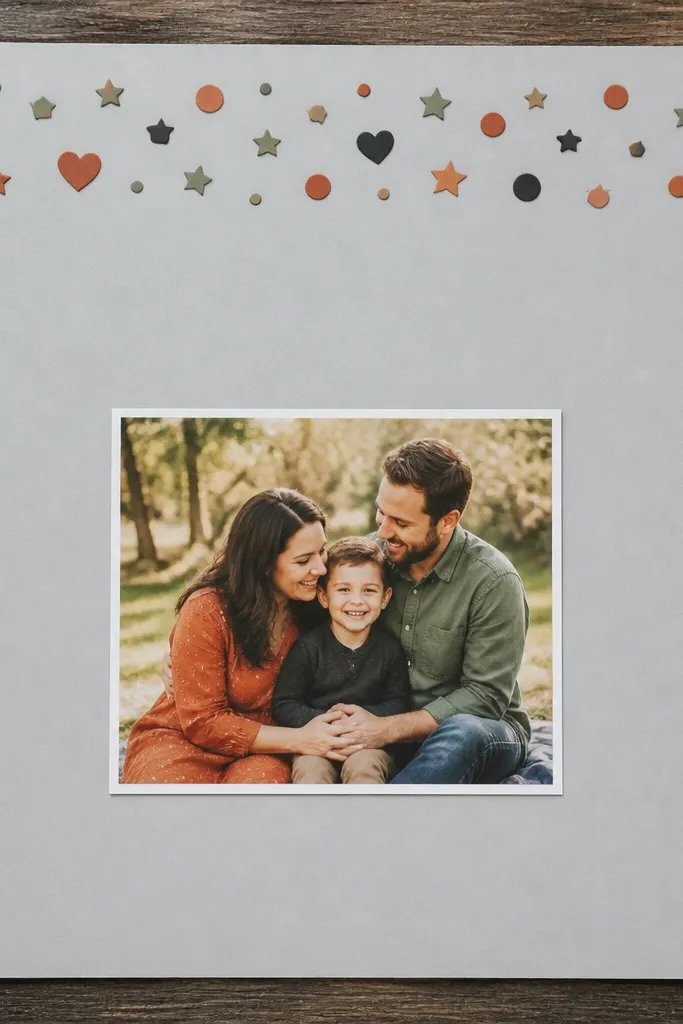
Punch-cut confetti borders look fun and polished when you keep them to one edge. You punch tiny shapes from coordinating cardstock, then line them along the top or side of the page to create a decorative strip. The photo stays clean and centered, so the confetti doesn’t overwhelm. This design is renter-friendly because it uses small paper pieces that don’t require any permanent installation. It’s also perfect for using up scraps and making your page feel intentional rather than random.
Choose a solid background cardstock in a neutral tone. Punch a bunch of small shapes (circles, stars, or hearts) from scrap cardstock in 3 colors that match your photos. Arrange the shapes into a strip along one edge of the page, then attach with tiny glue dots. Place your photo in the center and secure with photo corners. Add a small title strip opposite the confetti edge so the layout feels balanced.
Sort your punched pieces by size before gluing so your border looks even.
Avoid scattering confetti all over — one edge looks designed; full-page confetti looks chaotic.



