
1. Center-Window Board with Layered Mat Border
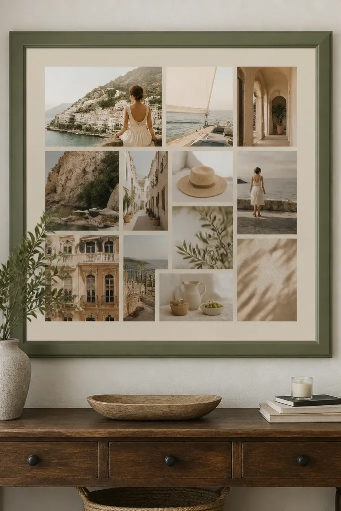
This layout looks clean because it creates one obvious landing spot for the eye. The layered mat border makes even messy magazine images feel curated, since the border acts like a “gallery frame.” Choose a single dominant color for the mat and keep the window mostly one theme — travel, fitness, or study. It’s fast because you’re building one focal area instead of balancing everything across the whole board. This works in bedrooms, study corners, and anywhere you want a calm, organized look.
Start by drawing a centered square or rectangle on foam board using a pencil and ruler. Cut a second mat layer from cardstock, leaving a 1/4-inch border on all sides, then glue the mat down first. Trim your main images to fit the inner window, then add a thin border around each image using a contrasting strip of paper. Finish by placing a few smaller image scraps around the window edges so the board feels intentional, not empty.
Use a craft knife and a metal ruler for straight cuts; crooked edges are the fastest way to make collages look amateur.
Don’t scatter tiny images everywhere — keep them clustered near the center so the board stays readable.
2. Diagonal Mood Sweep with Tape-Edge Clean Lines
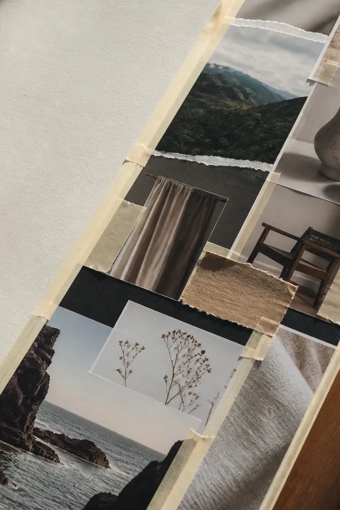
A diagonal sweep gives motion, so your board feels energetic even when you use mostly flat paper. Tape-edge borders keep upcycled scraps from looking ragged and stop glue from soaking into paper fibers. This is a strong choice if your images don’t match perfectly in size — diagonals hide mismatched edges by giving everything a shared direction. It also photographs well because the diagonal line creates natural depth. Put this style on a desk wall or above a dresser where you’ll see it daily.
Cut a long strip of background paper and glue it across the board at a 30-45 degree angle. Lay your main images along that diagonal like a runway, leaving small gaps for borders. Apply double-sided tape behind each image edge, then press firmly so the border looks sharp and even. Add one accent color strip (like a red or teal band) that runs parallel to the diagonal to tie it together.
Pro tipBefore gluing, dry-lay everything and adjust until your diagonal line reads as one continuous path.
AvoidDon’t use thick glue on tape-edged pieces; it can create bumps that catch light.
3. Grid Layout with 1-Inch Photo Frames
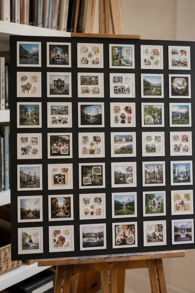
A grid is the easiest way to make a collage look “designed” without fancy skills. Repeating a single frame size makes the whole board feel like a set, not a mix of leftovers. This style is perfect when you have lots of small cutouts (stickers, magazine thumbnails, ticket stubs) because the grid organizes them. It also reduces the guesswork of where things go, which is where most messy collages happen. Hang it in a hallway or near your work setup where you want quick visual scanning.
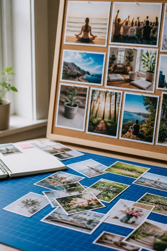
Measure your board and pick a grid spacing that works visually, like 1-inch frames with 1/4-inch gaps. Draw the grid lightly with pencil so you have placement lines. Cut images so each one fits its frame area, then glue them inside the grid boxes. Add thin strips of border paper between frames to unify mismatched image types.
Pro tipUse a single border color for every cell; color repetition hides uneven trim quality.
AvoidDon’t cram — leave the gaps. Gaps are what make the grid look intentional.
4. Monochrome Base with One Accent Color Sticker Pop
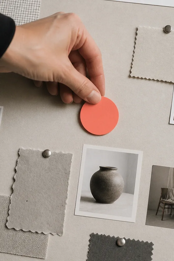
Monochrome boards look expensive because they control chaos. When you use one accent color (like mustard, cobalt, or coral), the board suddenly has hierarchy — your eye knows what matters. This works especially well with upcycling because you might have lots of similar-toned packaging, but one bright label can carry the whole look. Keep the accent tied to your goal theme so it feels purposeful, not random. This style fits anyone who wants a clean, modern aesthetic.
Cover the board with a monochrome base paper, like off-white, gray, or black. Select one accent color source and cut shapes only from that color family (labels, small photos, magazine text highlights). Place the accent pieces in three spots maximum: one big focal, one mid-size, one tiny detail. Fill the rest with monochrome images and texture scraps, then finish by adding a thin border around the accent focal to make it pop.
Pick one accent color and stick to it — even a second “almost same” color can dilute the effect.
Don’t add multiple bright colors just because you have them.
5. Magazine Cutout Collage with Double-Border Frames
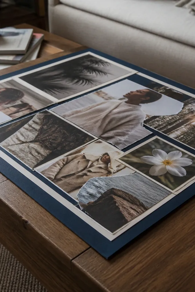
Magazine pages can look dull or grainy, but double borders fix that by giving images a crisp stage. The outer border provides contrast, and the inner border prevents the cutout edges from blending into the background. This makes even low-resolution print look cleaner and more intentional. It also protects your collage from looking flat by creating visual layers. Great for a “creative goals” board where you want lots of personality without looking messy.
Choose a background color first, then cut a set of identical outer border strips. For each image, add an inner mat strip that’s slightly smaller, leaving a consistent gap. Glue the inner mat to the image, then glue the whole framed piece to the board. Repeat frame spacing across the board so your eye reads structure before details.
Pro tipUse a paper cutter for the border strips to keep thickness consistent across frames.
AvoidDon’t cut images too close to the subject; a small margin makes borders look sharp.
6. Fabric Patch Blocks with Seam-Style Edges
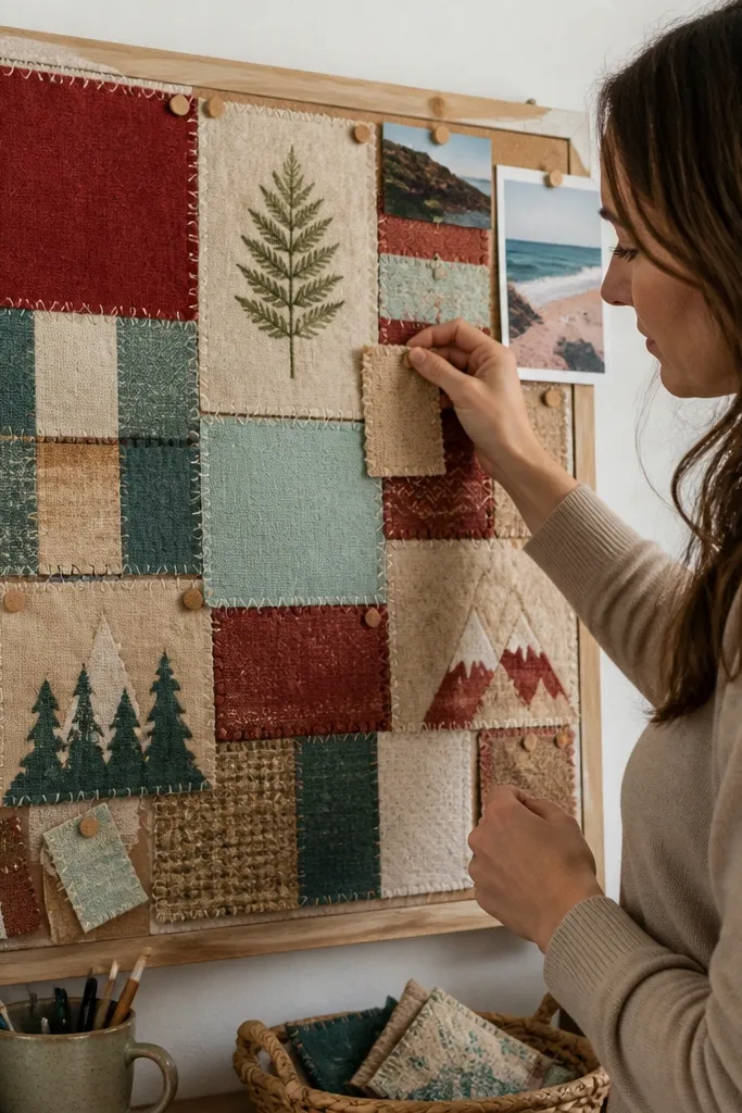
Fabric patches look tactile and high-end, especially when you treat them like quilt blocks. The seam-style edge adds structure, so your collage still reads clearly even with soft, irregular materials. This is ideal for upcycling shirts, old tea towels, or leftover fabric swatches. It also helps if you want your vision board to feel cozy instead of paper-only. Put it in a bedroom or reading nook where texture matters.
Cut fabric into simple rectangles or squares and iron them flat if they’re wrinkled. Back each fabric piece with a thin layer of paper or fusible interfacing so edges don’t fray too much. Create seam lines by placing thin strips of cardstock between blocks, then glue the blocks down. Finish by adding one or two printed images on top of the fabric blocks to anchor the theme.
Pro tipIf you’re using fraying fabric, fold raw edges under and glue them before placement.
AvoidDon’t use stretchy knit fabric unless you can stabilize it with backing.
7. Packaging Label Collage with Clean Cut-Out Typography
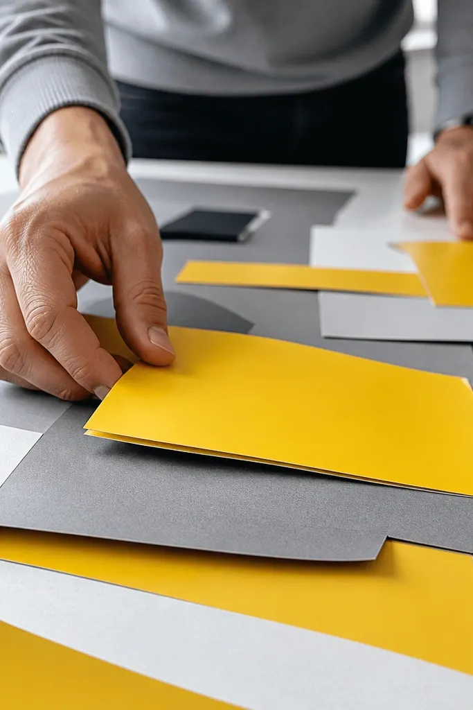
Packaging labels are already designed — you’re borrowing their typography and color system. The trick is to cut them cleanly and stack them like graphic design, not random scraps. This style looks bold and modern because text and logos create instant visual hierarchy. It’s also a speed win: you can cut one label into multiple shapes and reuse the color. Best for goal boards tied to habits, routines, or brand-like themes.
Pick a background that won’t compete, like solid cream or deep navy. Cut labels into consistent shapes: circles, rectangles, or rounded tags that match your layout rhythm. Layer typography pieces so the largest text sits near your focal area and smaller pieces trail around it. Glue with a thin layer so labels don’t curl, then outline the biggest label with a thin border strip for crisp edges.
Pro tipUse a craft knife for logos and a hole punch for circles; it makes the edges look intentional.
AvoidDon’t glue glossy packaging directly — rough it up lightly with fine sandpaper first.
8. Photo Corner Mounts with Shadow Depth
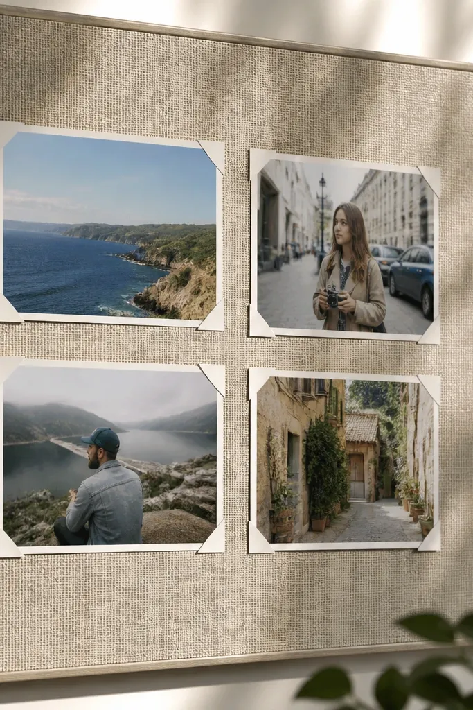
Corner mounting creates a gallery feel without needing special hardware. It also gives you built-in depth, because the center of the image floats slightly off the background. This makes your board look more layered and less like a flat collage. It’s great when you want to use a few strong images and keep everything else minimal. Use it in a small frame or on a corkboard for a clean, modern display.
Cut your images to a consistent size set, like 3x3 inch squares. Place small strips of double-sided tape at each corner, not the full back. Add shadow depth by cutting a slightly larger shape from darker paper and gluing it behind the image. Press down and adjust spacing so the corners line up neatly across the board.
Keep all photo corners the same distance from the image edge so shadows look consistent.
Don’t mount every image corner at random distances; it makes the board look sloppy.
9. Stenciled Quote Bands with Cut-Paper Letters
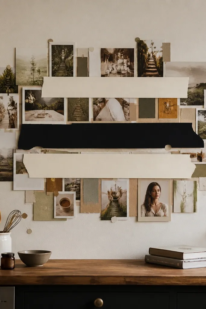
Vision boards look better when you add readable text, but you need typography discipline. Quote bands do that — they create a rhythm across the board and make it feel like a designed poster. Cut-paper letters look crisp when the background is solid and the letter shapes are consistent. This style is perfect if your goal needs clarity, like “save money” or “learn guitar.” It also helps you remember what each image is for because the text stays visible.
Choose one font style by cutting letters from a single paper type, like thick black cardstock. Make a band strip across the board, like 1.5 inches tall, then glue it down first. Arrange your letters on the strip and trace placement with pencil before gluing. Add one small image at each end of the quote band to balance the composition.
Use a letter stencil or print-and-trace method so your letter heights match across the whole phrase.
Don’t use multiple font styles — it turns the board into a random quote wall.
10. Watercolor Wash Background with Hard-Edge Photo Overlays
A watercolor wash gives softness without losing structure. The trick is pairing it with hard-edged photos — crisp image edges contrast beautifully with the blurred wash. This style makes your collage feel airy and photogenic, especially when you use two wash colors max. It also hides small imperfections in paper cuts because the background is already textured. Great for travel, wellness, and creative goals.
Paint a wash on thick paper or foam board using diluted acrylic or watercolor, keeping the edges controlled with clean brush strokes. Let it dry fully so the surface doesn’t pill when you glue. Place your photos on top in a grid or diagonal arrangement, then glue them down with matte gel medium. Add one thin border line around the main photo cluster using a marker or strip of paper so everything stays sharp.
Test your glue on a scrap of the same paper — some watercolor papers resist glue unless sealed.
Don’t rush drying; wet paint makes images slide and edges look warped.
11. Sequin and Foil Accent Pieces in Only Two Sizes
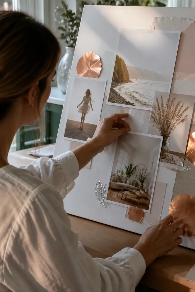
Shiny accents make a vision board look like a designed craft piece, not a paper project. The look works because you limit the sparkle to two sizes — small points for texture and a few larger foil shapes for focal emphasis. Keep accents near your main images so the shimmer reinforces the theme. This is also camera-friendly since light catches the foil and sequins in predictable spots. Use it on boards meant for motivation and daily visibility.
Choose one foil material (foil paper, foil stickers, or metallic craft paper) and one sparkle texture (sequins or glitter glue). Cut foil into consistent shapes like small circles and thin rectangles. Glue using a strong craft glue and place sequins only along the edges of your main photo cluster. Keep counts low — three to five accent clusters across the board look better than scattered sparkle.
Pro tipPress sequins flat with a piece of wax paper on top so they don’t snag or rise.
AvoidDon’t cover the whole board in glitter; it turns into visual noise fast.
12. Corkboard Pin-Look Collage Using Picture Corners
You get the “pinned ideas” look without needing an actual cork wall. This style is great when you want frequent updates, because corner mounts are easier to remove later. It also gives your board a lived-in, organized feel since pieces appear anchored rather than glued everywhere. Use it if you like changing your vision board with seasons or new goals. It’s ideal for a home office or workspace where you want quick rearranging.
Use a corkboard sheet or thick felt as the base so the texture reads like a pin board. Cut images and place them using picture-corner stickers or small foam tabs at the corners. Add a few string lines or paper clips made from wire craft supplies to reinforce the pinned look. Finish by adding one label strip with typed text to make it feel like a real wall grid.
If you’re using felt, press the corners firmly so the adhesive grabs without lifting later.
Don’t glue full sheets down if you want flexibility; corner mounting is the whole point.
13. Upcycled Map Strips with Frayed Edge Styling
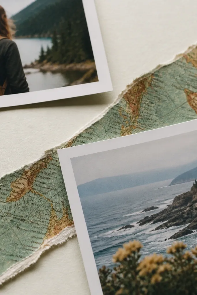
Map paper looks instantly thematic for travel, curiosity, and “new routes” goals. The frayed edge styling adds character, but it still looks intentional when you control the layout. Use map strips as bands or borders, not as the entire background, so text and photos stay readable. This style looks great under natural light because paper fibers catch texture. It’s a strong choice for a travel board that still feels grown-up, not kids-craft.
Tear map paper into strips with uneven edges for the right kind of fray, then glue only along the middle to avoid lifting corners. Create a border band around your main image cluster using map strips laid in one direction. Add one clean photo on top so the frayed texture stays a supporting actor. Seal the board with matte spray after everything dries to prevent paper fibers from shedding.
Pro tipTear direction matters — keep tears consistent so the fray looks like design, not accident.
AvoidDon’t use too many torn edges at once; one texture zone is enough.
14. Layered Sticker Collage with One Background Color Block
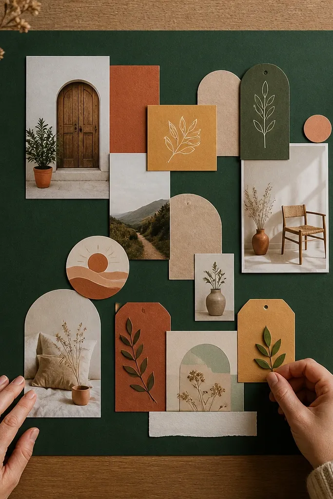
Sticker-heavy boards look best when you give them one calm background block. It lets the stickers feel like graphic elements instead of random pieces stuck to paper. Choose a background color that matches your sticker palette, like warm sand for earthy stickers or deep green for plant goals. This approach is fast because stickers already have clean edges and ready shapes. It’s great if you want an aesthetic board without cutting tons of images.
Cover the board with a neutral background, then cut a single large color block panel in a chosen accent color. Glue the panel down and keep its edges crisp using a straight cut. Add stickers in layers, placing the biggest ones first, then filling gaps with smaller stickers. Use a thin border strip around the color block so the sticker area looks framed.
Press stickers with a burnishing tool or a clean spoon so edges stay flat.
Don’t let stickers touch every edge of the board; keep margins so the frame reads.
15. Film-Strip Timeline Layout for Habit Goals
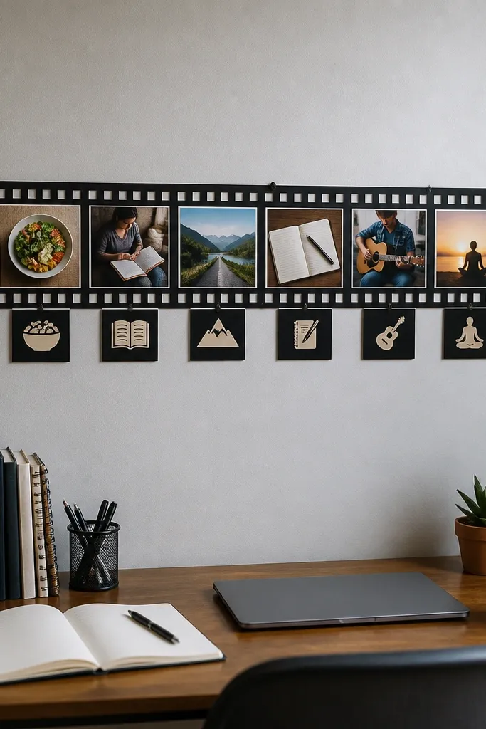
A film-strip layout turns a vision board into a timeline, which is perfect for habits and progress goals. It looks cohesive because each “frame” is the same shape and spacing. You can use tiny images, receipts, or habit symbols to fill the frames. This style photographs well because the strip creates a strong line across the board. Use it for goals like workouts, reading, or learning where you want a sense of sequence.
Create a horizontal film strip band by drawing or cutting a long rectangle and dividing it into equal frames, like 1x2 inch rectangles with 1/4-inch gaps. Cut small images to fit each frame, then glue them in order. Add one larger “hero” image above the strip for the final look. Finish with small label blocks at the start and end of the strip using cardstock for clean readability.
Pro tipKeep all frame edges the same thickness by using one paper strip width for each divider.
AvoidDon’t mix random frame sizes; the timeline look depends on repetition.
16. Torn Paper Collage with Solid Photo Anchors
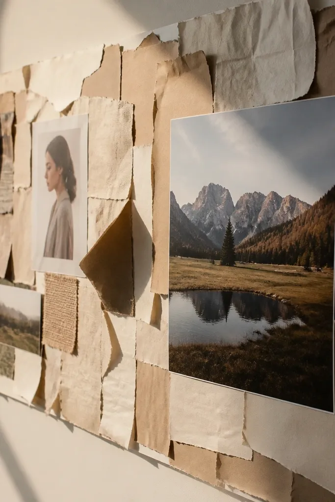
Torn paper is forgiving and gives a soft, layered look, but it can turn chaotic fast. The fix is using solid photo anchors — one or two bold image blocks with crisp edges that keep the composition grounded. Choose torn paper in two tones that match your photos, like cream and tan or teal and navy. This style feels artsy and still tidy because the anchors control the layout. It’s good for creative goals and personal style boards.
Tear background paper into irregular shapes and arrange them first as a patchwork behind where your main photos will go. Glue the torn pieces lightly so they stay flat and don’t wrinkle. Add your photo anchors next — large, clean cutouts with a simple border strip. Fill the remaining gaps with small torn bits only near the anchors so everything ties together.
Pro tipTear edges with dry hands and avoid over-tugging; too much tearing makes paper look ragged instead of textured.
AvoidDon’t put torn paper on top of your main photos; it weakens the anchor.
17. Monochrome Photo Cutouts with Light Grey Typography
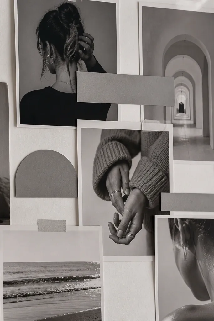
This style looks clean because it limits color to neutrals and uses typography as a quiet guide. Monochrome photos hide mismatched print quality and keep your board looking cohesive. Light grey text blocks add structure without screaming for attention, so the images stay the star. It’s ideal for study, career goals, and any board that needs to feel calm. Hang it where you want focus, not clutter.
Convert your image set to monochrome conceptually by choosing black-and-white photos or grey-toned magazine cuts. Glue a few large photo blocks first, then add smaller photos around them. Cut text strips in light grey cardstock and place them as labels under or beside images. Use a ruler to keep text strips aligned, then add one thin dark border around the entire collage area.
Keep label text short — one phrase per strip — so the board stays readable at a glance.
Don’t add heavy black text everywhere; it makes the board look like you’re yelling.
18. Shadow-Box Style Board Using Foam Tabs
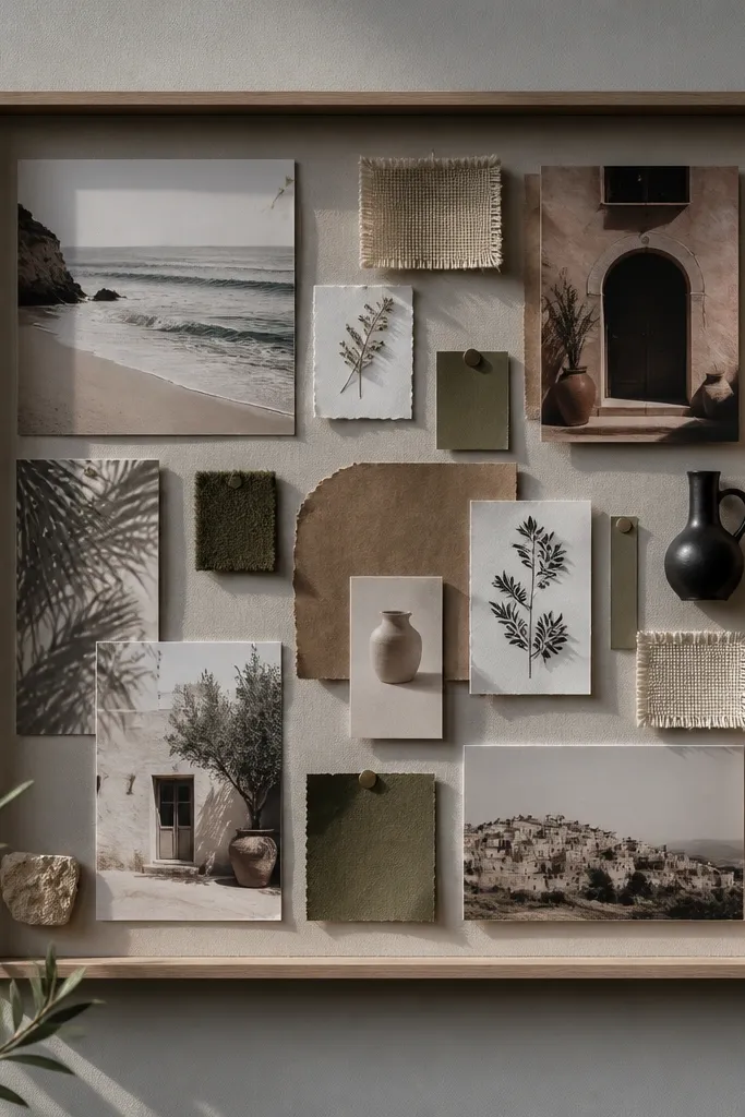
Raised layers make your vision board look dimensional, which is the fastest way to upgrade the aesthetic. Foam tabs create consistent lift, so your collage looks like a shadow box instead of a flat craft. This style is perfect if you have mixed materials like paper cutouts, fabric scraps, and small objects. It also helps if you want each element to catch light without messy glue buildup. Put it on a shelf or wall where you can see the depth from an angle.
Cut a set of base shapes from cardstock that match your layout (circles or rectangles work well). Glue the base shapes down flat, then plan which elements get raised. Attach foam tabs to the back of photos or fabric pieces and place them on top of the flat bases. Add one top layer like a label or small icon in the highest lift zone so your focal point feels intentional.
Use foam tabs only on the focal elements; too many raised layers make the board uneven and harder to frame.
Don’t stack thick materials directly under foam tabs; it can warp and lift unevenly.
19. Color-Block Background with Oversized Silhouette Shapes
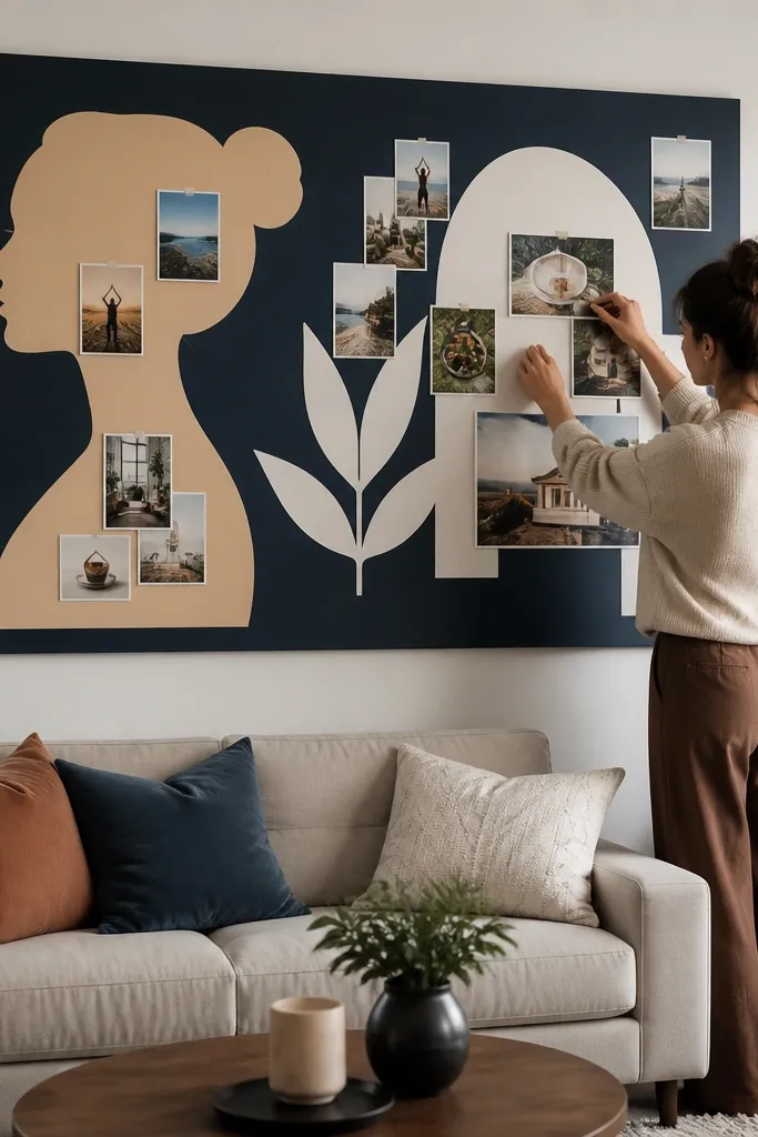
Oversized silhouettes make your board look modern because they simplify complicated images into bold shapes. Color-block backgrounds give instant structure, and silhouettes keep the collage from looking cluttered. This style works when your cutouts are busy (crowd photos, detailed landscapes) because silhouettes reduce detail and make the board cleaner. It’s also fast: cut two or three big shapes and let them do the heavy lifting. Great for fitness, style, and “becoming” goals.
Cover the board with two or three large color blocks, like a top band and side panel, using straight edges. Choose silhouettes by tracing around a subject photo and cutting the outline from colored paper. Glue the oversized silhouettes first, then place smaller supporting images inside or near the silhouette edges. Finish by adding a thin border line around the whole color-block area so the shape boundaries look crisp.
Pro tipMake silhouettes slightly larger than you think; big shapes read better from across the room.
AvoidDon’t add lots of small cutouts before the big silhouettes are placed.
20. Crisp Tape Hinges for Removable Updates
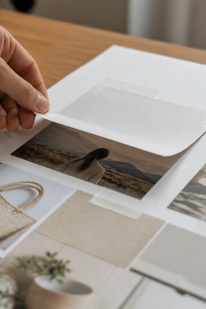
This is the smartest aesthetic trick when you know you’ll change your board later. Tape hinges let you swap images without tearing paper, and the hinged look adds a neat, graphic element. It’s also visually interesting because the lifted flap creates a line of shadow. Use it for seasonal goals, learning plans, or habit upgrades. The board stays photo-ready because the hinge edges are consistent and clean.
Cut a flap area on your base board by drawing a rectangle and lightly scoring the fold line with a craft knife. Place a strip of clear tape along the fold so it acts like a hinge, then glue your image to the flap only. Add a background card behind the flap so the board looks solid when the flap is down. Repeat for one or two key images, then seal the surrounding area with matte medium to protect edges.
Pro tipUse clear tape sparingly and press it down hard with a ruler edge so it doesn’t lift.
AvoidDon’t hinge every piece; one or two updates keep the look intentional.



