
1. Kraft Heart Window With Photo Strip
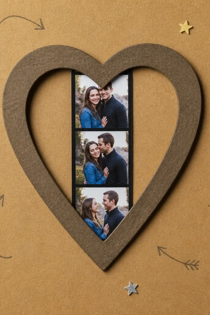
This page looks sweet because the heart window gives you a clear focal point and keeps the photos from blending into the background. Use kraft cardstock for the base so everything reads warm, then layer a cut heart frame with darker ink around the edges. The photo strip stays readable because it’s narrow and centered, and it feels “kept” instead of pasted. It’s a great fit for anniversary photos, proposal pics, or any couple shots where you want one main moment to pop.
Start by cutting a heart window from a kraft cardstock page using a heart die or template. Back the heart opening with a strip of patterned paper and place your photo strip behind the opening so it shows through cleanly. Add a second, slightly larger heart frame on top, then ink the edges of both hearts with a brown or sepia ink pad. Finish by journaling on a small tag tucked under the top heart layer.
Pro tipInk the cut edges right after you die-cut — it hides small rough spots and makes the layers look finished.
AvoidSkip glossy photo paper behind the heart window; it reflects light and flattens the warm kraft look.
2. Ticket Stub Love Story Layout
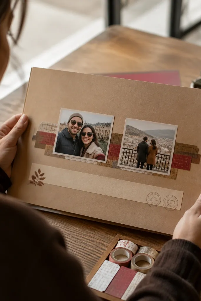
This layout screams “sweet day out” because ticket stubs naturally suggest a timeline. You get instant theme cohesion when every element looks like it came from the same place: tickets, date blocks, and small stamps. Put two photos on the same horizontal line so they feel like companions, then add a journaling strip that reads like a boarding pass. It’s perfect for concerts, museum visits, road trips, or any date-night memory you want to feel organized.
Cut 3-5 ticket shapes from old cereal boxes or kraft packaging, then fold the top edges slightly to mimic a perforated stub. Use a black gel pen to write a date and a short caption on each stub. Layer two photos on the page, then place the ticket stubs above and between them like a stack. Add a final journaling strip at the bottom using a torn edge strip of patterned paper.
Use a perforation effect by lightly scoring with a butter knife along the ticket edges before you ink-dip.
Don’t use random fonts for journaling; stick to one handwriting style or one printed font so the tickets look consistent.
3. Fabric Bow Corner With Mini Polaroids
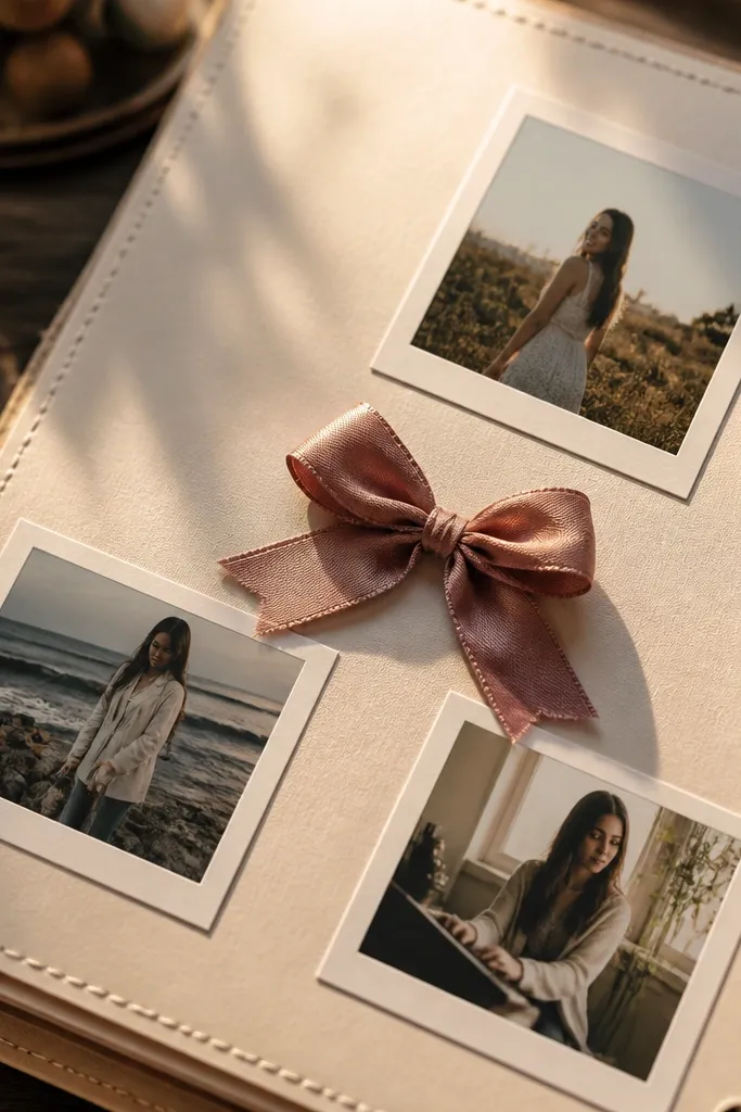
A fabric bow corner makes a scrapbook page look handmade in a good way. It’s photogenic because the 3D texture catches light, and it frames the photos without covering them. Place three mini polaroid-style photos in a triangle and let the bow sit in the negative space. This works beautifully for birthdays, bridal showers, or any “soft and sweet” couple theme where you want cozy over sporty.
Cut a cream cardstock base and add a thin strip of patterned paper along one edge. Make your fabric bow by folding a scrap into loops, pinching the center with a thin thread, and hot-gluing the knot to a small cardstock backing. Trim mini photo mats from cardstock, then tape or glue photos onto the mats. Arrange the three photos in a triangle and glue the bow into the top corner so it overlaps the patterned strip slightly.
Back the fabric bow with a piece of felt so it doesn’t fray and stays flat on the page.
Avoid thick glue blobs under the photos; they create bumps that show through when you press the page flat.
4. Moon Phase Couple Page
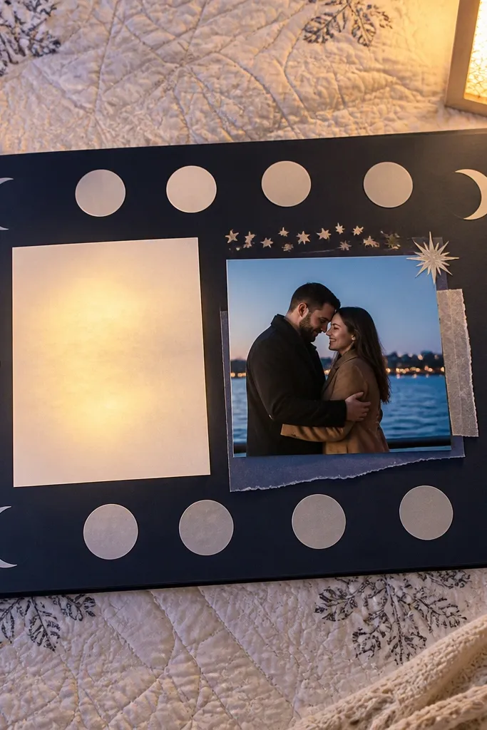
This layout is sweet because it feels romantic without using generic hearts everywhere. Moon phases look intentional and repeat well, so you can build a theme with just paper shapes and a few star accents. Use a dark navy base for contrast, then add pale moons and a soft glow journaling block. Put one couple photo on the left and one on the right, leaving a gap between them for the moon sequence so the page reads clean.
Cut a navy cardstock base and stencil or die-cut 6-8 moon phases using cream or light gray paper. Layer moons from biggest to smallest across the center gap, then sprinkle tiny punched stars around the top. Mat your two photos on cream paper and mount them on either side. Add journaling on a small rectangle strip and tack it under one moon so it looks like it’s part of the sequence.
Use a white gel pen for star highlights — it pops on dark paper and looks hand-drawn.
Don’t go with neon inks on navy; the page looks messy instead of sweet.
5. Book Page Love Letter With Folded Flap
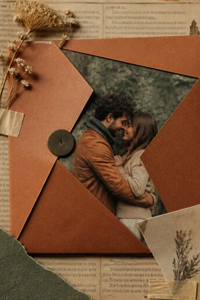
Book pages add instant texture and make the page feel thoughtful. The folded flap creates a sweet reveal — your photo is hidden until the flap opens, which makes the page interactive. This is a good choice when you want to journal with actual writing, because the printed book text background makes your handwriting stand out. It suits anniversaries, long-distance updates, and “we grew together” stories where you want quiet romance.
Tear a sheet of old book page paper to fit your base and glue it down with a thin, even layer. Create a flap by folding a rectangle of cardstock from the page’s top edge, then cover it with a small piece of patterned paper. Under the flap, mount a photo on a slightly smaller mat so it peeks out when closed. Add a journaling card on the inside of the flap and ink the edges of the torn book paper for a clean finish.
Use a glue stick first, then a light layer of matte medium on top — it keeps book paper from wrinkling.
Skip heavy wet glue on book paper; it warps and makes the page look tired.
6. Confetti Heart Border Using Punch-Outs
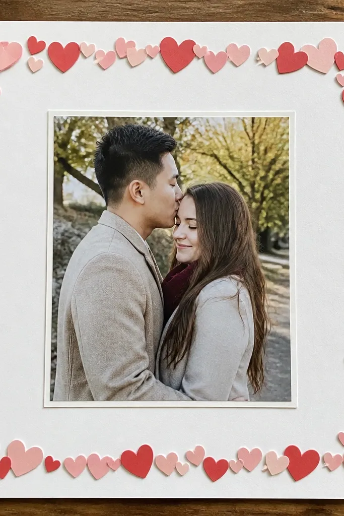
A confetti heart border is sweet because it frames the couple without stealing attention from the photos. The trick is to keep hearts small and consistent, then repeat them in a tidy rhythm around the border. Center one larger photo, mat it with a clean white or cream frame, and let the border do the theme work. It’s great for engagement photos, first-dance memories, or any page where you want the couple to be the hero.
Punch or die-cut 60-120 tiny hearts from scrap paper in two coordinated colors. Ink-dip the edges of the hearts with a matching shade to unify them. Arrange hearts along the page border with a tiny gap so the border looks intentional, then glue in rows. Mat and place your central photo, then add a short journaling line under it in a single color pen.
Lay hearts out dry on the page first and adjust spacing before gluing — that’s what keeps it neat.
Don’t mix too many paper patterns; confetti borders look sweet when the hearts are the only repeating pattern.
7. Vintage Matchbox Keepsake Pocket
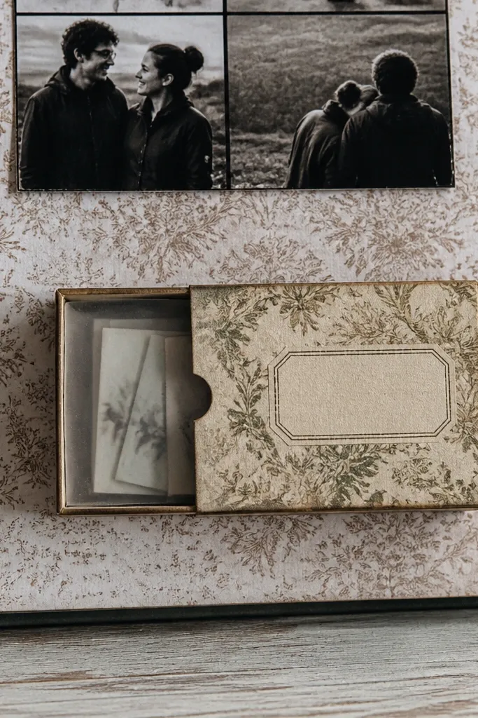
This is a sweet page idea because it turns your memories into a physical keepsake. A matchbox-style pocket holds tiny notes, a photo strip, or ticket stubs, and the box format makes the theme feel cohesive. Use a vintage print box or upcycle a small packaging box, then cover it with patterned paper and a label. This layout is great for “things we wrote to each other” moments and for couples who like cards and letters.
Build a matchbox pocket by cutting cardstock into an outer sleeve and an inner tray, sized to hold your notes. Cover the outer sleeve with patterned paper and add a small label like a date or “letters.” Glue the pocket to the scrapbook page so the tray slides out cleanly. Add a photo strip behind the pocket or beside it, then journal on a small tag attached to the tray.
Test the tray fit before gluing by sliding it in and out 10 times — too tight looks bad fast.
Don’t glue the pocket corners too thickly; thick glue makes the tray stick and ruins the pull-out look.
8. Rainbow Ribbon Steps Layout
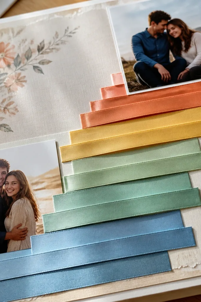
This layout feels sweet because ribbon makes everything look soft and gift-like. The “steps” arrangement creates movement — your eyes move up the page, then back down to the photos. Choose a rainbow that matches your couple colors, not the full spectrum, and keep the ribbon widths consistent. It works well for wedding days, pride celebrations, or any theme where you want joy without clutter.
Cut 5-7 strips of ribbon or fabric into equal widths, then stack them in ascending heights like steps from bottom left to top right. Glue the first strip, then layer the next strip so each step edge is visible. Mat two photos and place them near the bottom step so they anchor the layout. Add a journaling card on the right side and tie a small knot with leftover ribbon at the top step.
Heat-seal ribbon ends with a lighter carefully so fibers don’t fray on the edges.
Avoid mixing ribbon textures like satin and burlap on the same page; it looks mismatched unless you repeat one texture elsewhere.
9. Polka Dot Envelope Side Pocket
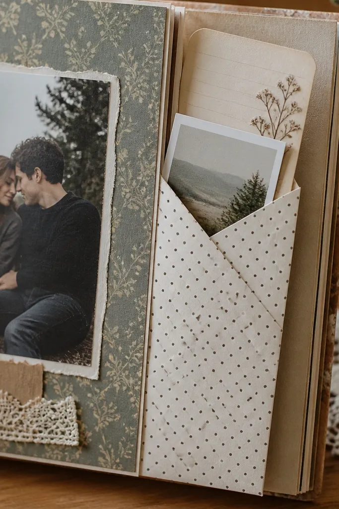
Side pockets look sweet because they create a hidden spot for a second story. The envelope shape is instantly readable, and polka dots add playful romance without turning into babyish decor. Put one photo on the main page and tuck a second folded photo or mini journaling into the envelope. This layout fits engagement, travel diaries, and any couple scrapbook where you want more than one memory per page.
Create an envelope pocket by cutting a rectangle of patterned cardstock, folding the sides toward the center, then folding the bottom flap up. Glue the back flap to the scrapbook page and leave the top open. Add a small label strip across the envelope front and ink the edges. Mount one main photo on the page, then tuck a folded photo mat or note card inside the envelope.
Use a bone folder on the envelope folds so the pocket edges look crisp even with upcycled paper.
Don’t make the envelope too tall; if it covers half the page, it overwhelms the couple photos.
10. Scrapbook Map Route With Thread Line
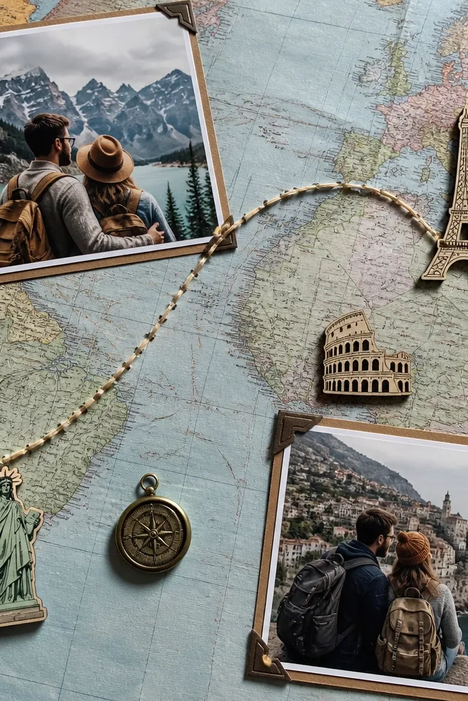
A map route looks sweet because it tells a story you can follow. Thread across a map adds texture and makes the page feel handmade, not flat like typical travel layouts. Connect two couple photos with a curved thread line so the route becomes the theme anchor. This is ideal for long-distance love, road trips, or any relationship timeline that has “from here to there” moments.
Print or upcycle a map-like background using old atlas pages or brown paper with printed map graphics. Place two photos on opposite sides of the page and mark two points where they connect. Punch tiny holes at the points and along a curved path, then stitch a thread line using a simple running stitch. Finish by adding a small journaling label near the thread start and ink-dipping the map edges for cohesion.
Choose one thread color and stick to it — red, cream, or dark brown all look clean on map paper.
Skip thick yarn; it looks bulky and hides the photo edges instead of framing them.
11. Stamped Kiss Mark Border
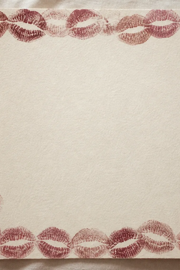
A stamped kiss mark border is sweet because it adds a playful romance cue while still feeling designed. It works best when the stamp is subtle and repeated in a consistent ring, leaving the center clean for your couple photo. Use one color ink and one paper tone so it doesn’t look like random stamping. This layout fits dating memories, anniversaries, and pages where your journaling is short and punchy.
Pick a cardstock base in cream or light gray and stamp a repeating border around the edges using a lip or heart-lip stamp. Ink the stamp on a small ink pad, then lightly press — you want crisp marks without heavy blobs. Center a matted couple photo and add a small journaling tag at the bottom. Seal the page with a thin matte spray if you used ink that smears.
Practice on scrap paper until the stamp pressure matches; one too-hard press makes the border look messy.
Avoid multi-colored stamp ink; one ink color keeps the border sweet instead of chaotic.
12. Layered Heart Frame With Photo Behind Glassy Plastic
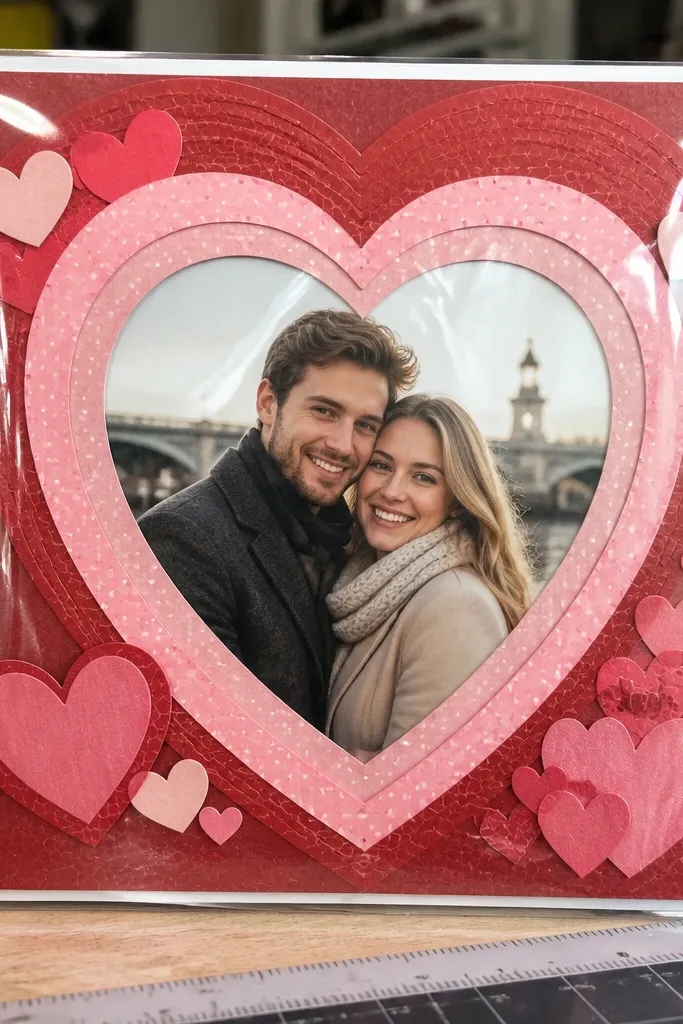
This one looks expensive because the glossy plastic creates a glassy highlight over the photo. The layered heart frame keeps it sweet, and the shine makes it pop under phone cameras. Use a clear packaging sheet like from a sticker pack or a clear plastic insert, then back it with your photo so it looks like a little keepsake window. This layout suits proposal photos, holiday cards, and any page where you want the center to feel like a gift.
Cut a heart-shaped window from a cardstock layer and mount it on your scrapbook base. Trim a clear plastic piece slightly larger than the heart window and tape it behind the opening, then place your photo behind the plastic. Add a second layered heart frame on top to hide the edges of the plastic. Finish by adding a small handwritten journaling strip on the base layer, under the window.
Rough up the plastic lightly with fine sandpaper before taping so adhesive sticks better.
Don’t use thick plastic; it warps and creates bubbles that ruin the “glass” look.
13. Scalloped Lace Doily Strip With Date Tag
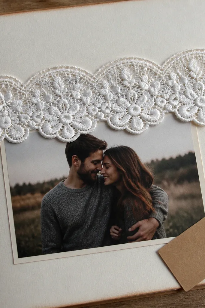
A scalloped lace strip reads romantic fast, and it’s photogenic because it creates a soft edge line across the page. Pair it with a single couple photo so the lace doesn’t compete with everything else. The date tag keeps the theme sweet and readable, turning the layout into a memory you can scan later. This works well for wedding-related pages, anniversaries, and “the day we said yes” stories.
Cut a scalloped strip from lace fabric or lace paper and glue it across the page horizontally. Place a matted couple photo above or below the lace strip, leaving a clean space for text. Make a date tag by cutting a small rectangle of cardstock, rounding the corners, and punching a hole for string. Thread the tag onto a thin twine loop and glue or tape the loop to the lace strip so it hangs slightly.
If you use lace fabric, seal the raw edges with fabric glue on the back side so it stays tidy.
Avoid gluing lace directly under a photo; the texture can show through and warp the photo edges.
14. Starry Night Sky With Photo Cutout Window
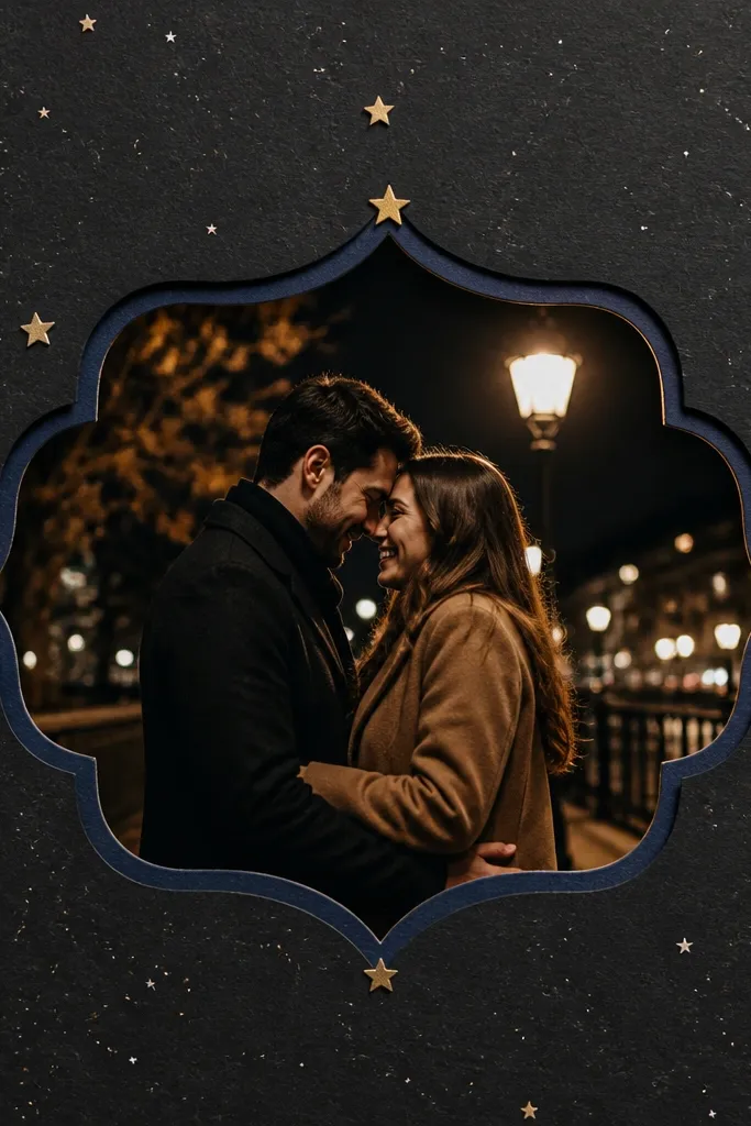
This page is sweet because it feels like a shared moment under the same sky. Star speckles give you depth, while a cutout window makes the couple photo look framed and intentional. Use black or deep charcoal cardstock for the sky, then add tiny gold or white star accents so it photographs well. It’s a strong choice for late-night dates, stargazing memories, and pages where you want a romantic mood without hearts everywhere.
Create the sky background by sprinkling white paint or using a stencil for stars on black cardstock. Cut a window shape (circle, scallop, or rounded rectangle) for your couple photo and mat the photo on a lighter paper. Glue the photo mat behind the window so it shows through cleanly. Add a thin border around the window with glitter glue or a gold gel pen, then journal on a strip of torn kraft paper at the bottom.
Use a stiff brush for speckles; it makes tiny dots instead of big paint blobs.
Skip heavy glitter across the whole page; it sheds and makes the center look dirty.
15. Pressed Flower Love Potion Vial Page
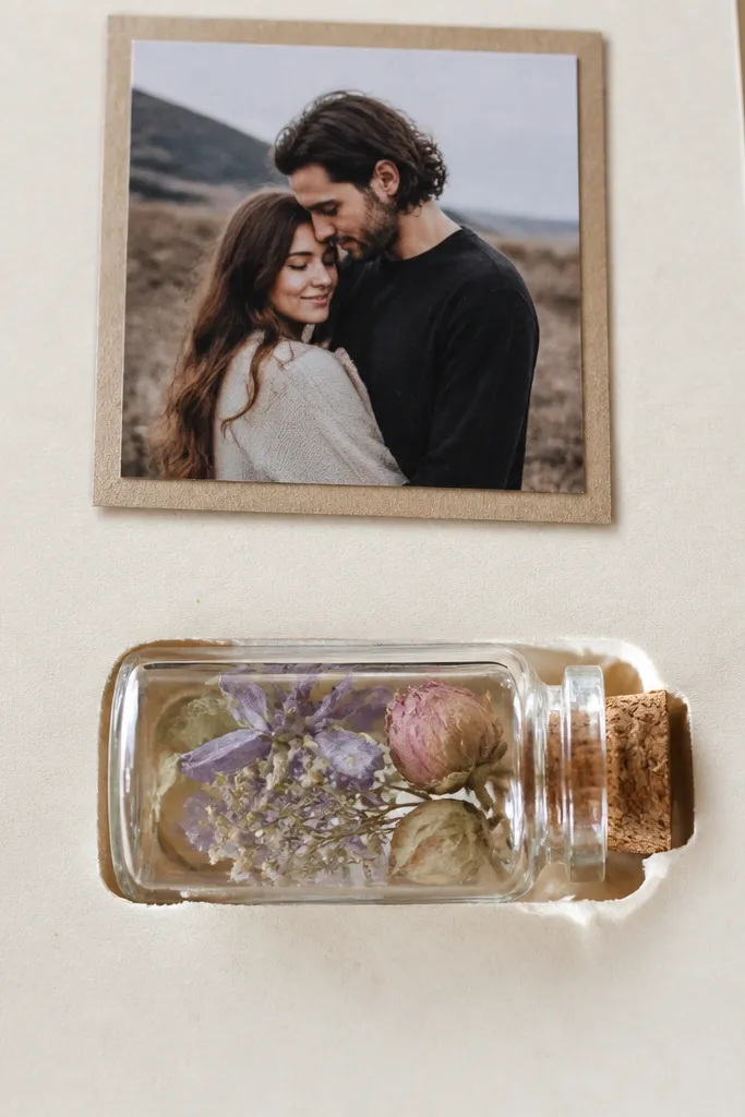
This page turns your scrapbook into something you can hold up to the light. A clear mini vial pocket makes the whole layout feel sweet and a little magical, without needing fancy art skills. Pressed flowers inside read like a love letter in glass — you get texture, color, and a real “how did you do that?” detail in one spot. It works great if you have a few flat blooms, dried herbs, or even a couple of petals from a bouquet. Skill level is beginner-friendly because the most important part is just careful cutting and sealing, not drawing. Plan about 45-75 minutes for one page, plus drying time for the flowers if you’re starting from fresh.
Cut a 6 x 9 inch cardstock base (kraft or soft cream looks best) and place it on a cutting mat. Make a vial window by tracing a 2 inch wide circle onto clear acetate and cutting it out, then use a 1/2 inch wide strip of double-sided tape to create a pocket boundary around the circle. Layer pressed flowers inside the acetate circle so they sit centered, then add a tiny rolled note (about 1 inch long) behind them so it shows through. Seal the pocket by pressing the acetate firmly to the base with a second ring of tape, then top it with a narrow strip of washi tape to hide any uneven edges. Finish with a handwritten title strip under the vial window using a 1/2 inch wide piece of patterned paper.
Spray a light mist of hairspray on pressed petals before sealing so they don’t shed into the pocket later.
Don’t use thick, glossy craft glue on the acetate — it clouds the window and makes the flowers look dull.



