
1. Terracotta Portion Plate Collage
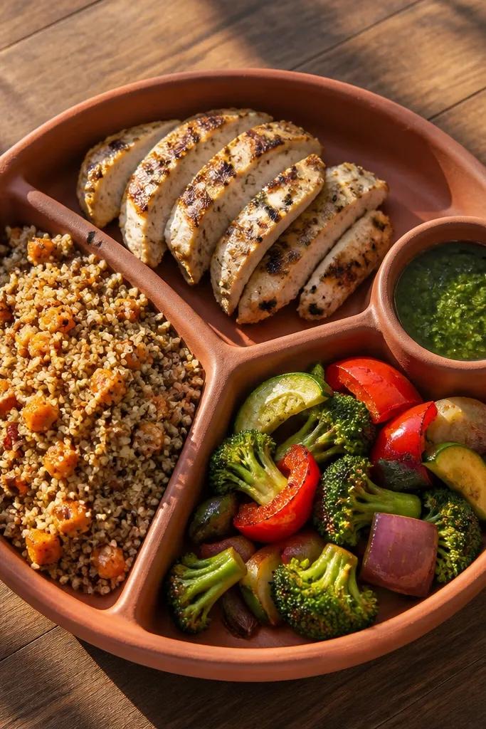
This idea makes “eat better” concrete by turning portions into a visual target you can follow without math. Use a plate shape as the base and divide it into clear sections for protein, high-fiber carbs, and vegetables, then add a tiny sauce or seasoning cue. The terracotta palette looks warm and photo-friendly, and it makes the board feel like a meal plan instead of a poster. It works best for anyone who wants structure at dinner time and struggles with guessing portions. Skill level is easy, and it takes about 1-2 hours because you’re cutting shapes, not building anything complicated.
Start by tracing a plate onto cardstock and cutting it out, then split it into three sections with a ruler so the lines are straight. Print or draw food-group icons that match the colors you want, then glue them into each section using a glue stick to keep edges clean. Add a small label under the plate like “Half plate veg” and finish by layering the plate onto a background sheet with a thin border of paper. Coat only the labels with a light spray adhesive if you want extra staying power, then let it dry flat.
Use a white gel pen to outline each section — it makes the collage pop in photos and in daylight.
Don’t use too many food icons; three sections read faster and look cleaner.
2. Blackout Sleep Timeline Door Hanger
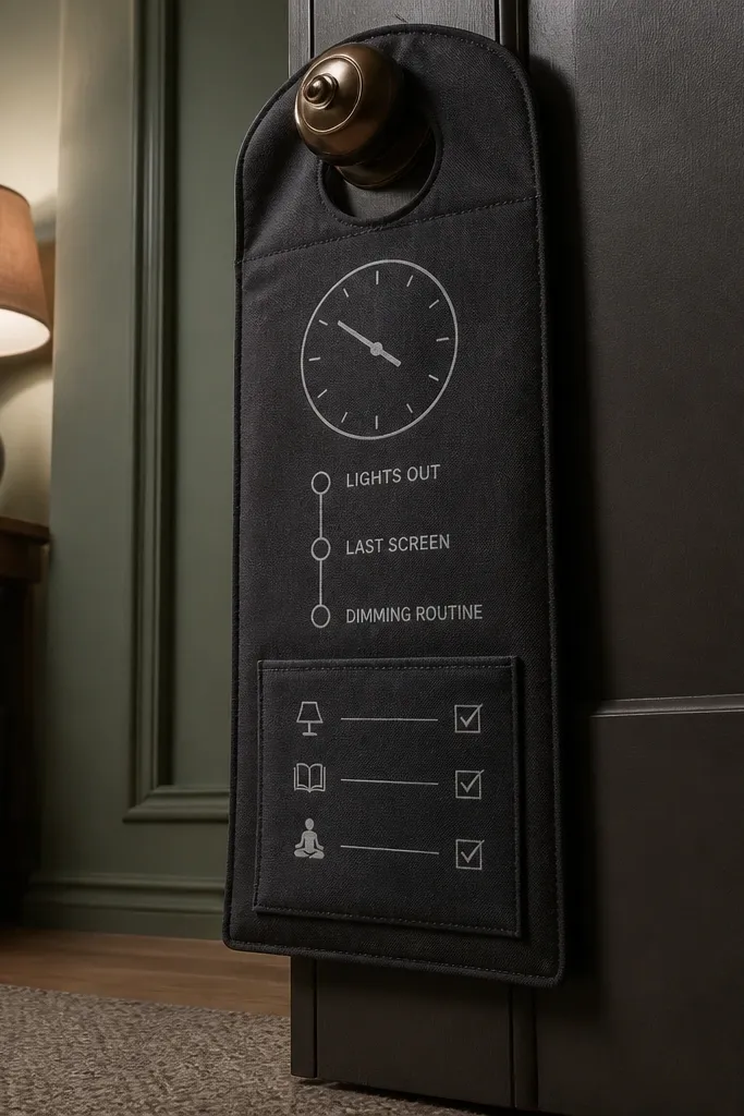
Sleep goals stick when the board reminds you of timing, not just bedtime. This project looks sleek because it uses dark fabric and a simple clock graphic, so it visually signals “night mode.” Add a short timeline from “lights out” back to “last screen” and “dimming routine,” then include a tiny checklist you can tick daily. It’s ideal for people who over-scroll at night or keep pushing bedtime later. The build is straightforward: fabric, paper, and a pocket for a small note make it feel interactive without getting messy.
Cut a door-hanger panel from sturdy cardstock and cover it with black or charcoal fabric using spray adhesive. Print a minimalist clock face and place it at the top, then draw a backward timeline with three points and short labels. Add a small paper pocket at the bottom using two glue tabs so you can slip in a “tomorrow bedtime” card. Punch two holes at the top corners and thread string or ribbon so it hangs straight.
Use a matte finish fabric or felt; glossy fabric catches glare and ruins the clean look.
Skip long paragraphs — three timing points is all you need.
3. Hydration Glass Jar Label Board
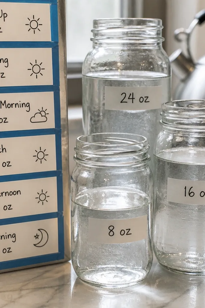
Hydration becomes easier when you track it visually without carrying a measuring bottle everywhere. This board idea uses jar-like labels with exact amounts, so you know what “enough” looks like by the end of the day. Blue tape frames keep it crisp, and the label style makes it look like something you’d buy, not DIY scraps. It suits anyone who drinks water inconsistently or forgets until late afternoon. You’ll need basic printing and cutting, and you can finish it in about 60-90 minutes.
Print label templates on white sticker paper or cardstock cut into small rectangles, then write amounts like “8am: 1 cup,” “noon: 2 cups,” and “3pm: 2 cups.” Arrange the labels around a simple jar outline drawn on a light background, leaving even spacing so it looks intentional. Use blue washi tape to create a thin border and add a small drop icon at the corner. Glue everything down with a glue stick, then press under a book for 10 minutes so it stays flat.
Choose one blue shade for all labels and tape so the board looks cohesive.
Don’t mix water icons from different styles; stick to one simple drop shape.
4. Sage Stress Reset Photo Strips
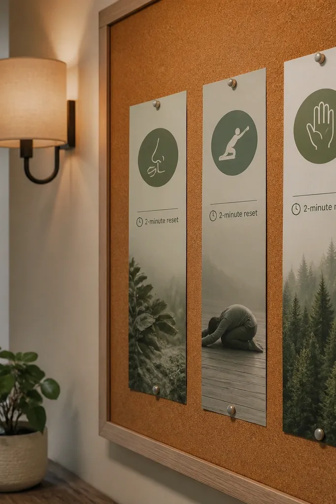
Stress goals work better when you show the reset steps like a mini routine card. This looks good because it uses narrow photo-style strips in sage tones, with clean icons for breathing, stretching, and grounding. Add a small “2-minute reset” instruction line so it’s clear this is quick and doable. It’s best for people who feel overwhelmed in the afternoon and need a non-negotiable pause. Skill level is easy and the time is short since you’re assembling strips, not building complex layouts.
Cut multiple rectangles from sage cardstock in two widths (for example 2x6 inches and 1.5x6 inches). Print or draw one icon per strip and add one line under each icon, like “Inhale 4, exhale 6” or “Shoulder roll x10.” Arrange the strips in a staggered line and glue them onto a cream backing sheet. Finish with a small title label at the top and a thin outline around the whole strip cluster.
Use a consistent icon color (dark green or charcoal) so the strips look like one set.
Avoid stuffing six steps on one strip; keep each strip to one action.
5. Cream and Charcoal Workout Route Map
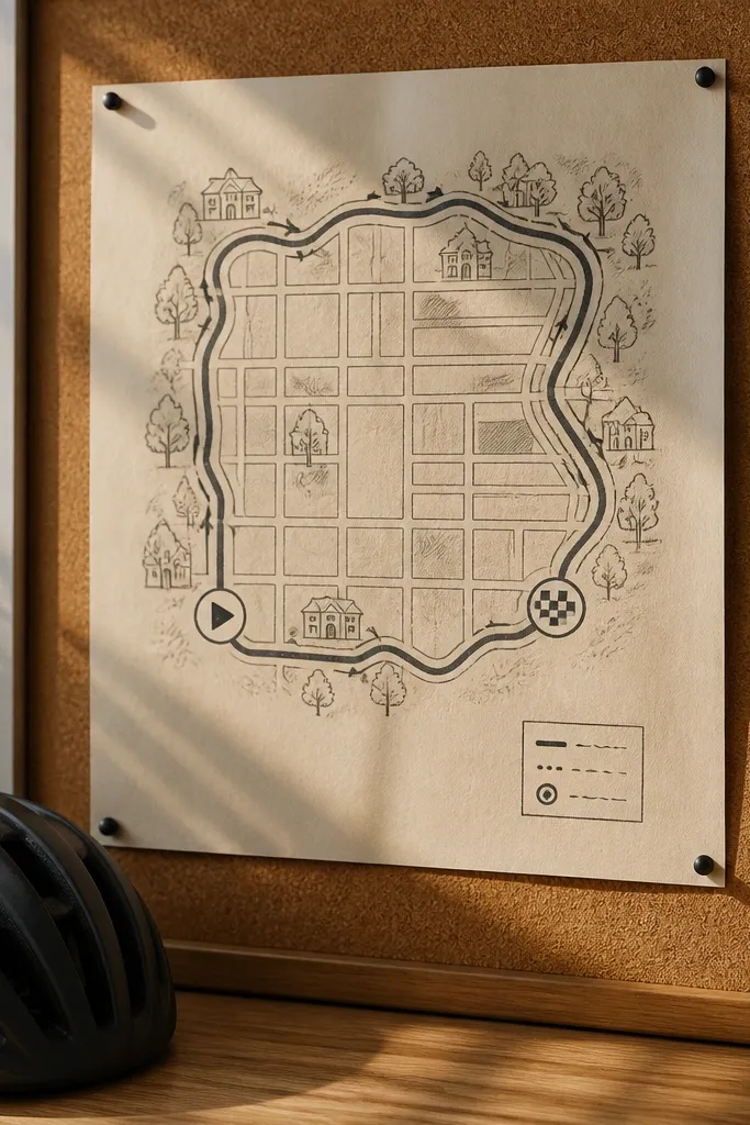
Movement gets easier when it feels like a plan you can repeat. A route map turns workouts into a destination, even if the destination is “around the block.” This design looks sharp with cream paper, charcoal linework, and tiny start/finish icons, so it photographs like a clean travel map. It’s ideal for anyone who freezes when choosing what to do and needs a default. Make it for walking, cycling, or a simple strength circuit that you can repeat.
Draw a simple loop on cream cardstock using a ruler and a black fine-tip marker, then mark a start icon and 3 waypoint icons. Next to each waypoint, add a one-line instruction card: “1 minute brisk walk,” “10 bodyweight squats,” “stretch calves.” Glue small paper tabs over the instructions so they look layered and tactile. Frame the map with a charcoal strip border to keep the composition tidy.
Use a straight ruler for the route lines — crooked lines make it look messy fast.
Don’t add too many waypoints; three is enough for a repeatable workout map.
6. Upcycled Calendar Habit Tiles
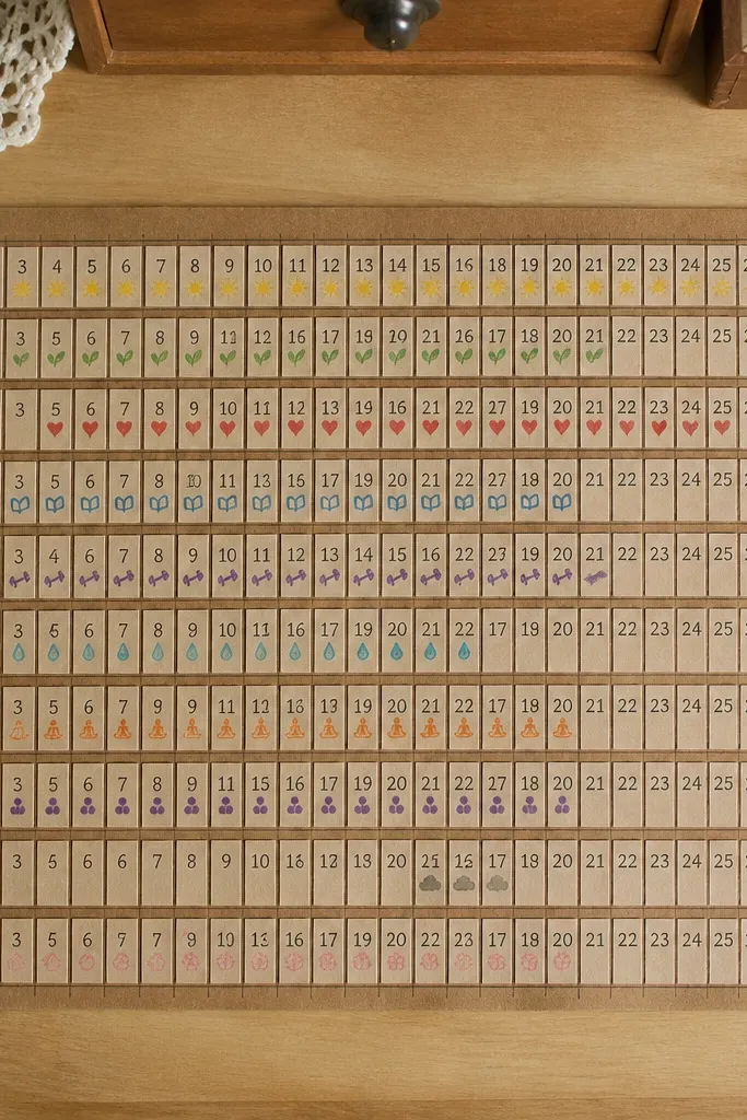
If you want a fresh start, you need a way to mark progress without turning it into a chore. Calendar tiles look great because they bring real dates and grid structure to your board, plus you can make them from old calendar pages. Use a strict grid layout so it looks crisp and intentional in photos. This works for tracking habits like steps, meals, water, and a bedtime target. It’s also a good option when you want something you can update weekly without remaking the entire board.
Cut old calendar pages into equal squares, like 2x2 inches, and punch a tiny checkbox box in the corner of each tile. Print or write habit names on matching colored strips and glue each strip to the top of a tile row. Arrange tiles into a 4x5 grid on a backing sheet, leaving a margin for a title label. Seal the surface with a light matte clear coat spray if the paper is thin, then press flat under a book.
Pick one checkbox style and repeat it on every tile; consistency makes the grid look expensive.
Don’t use mixed paper sizes; uneven tiles ruin the clean look.
7. Cork Pinboard Meal Prep Prompts
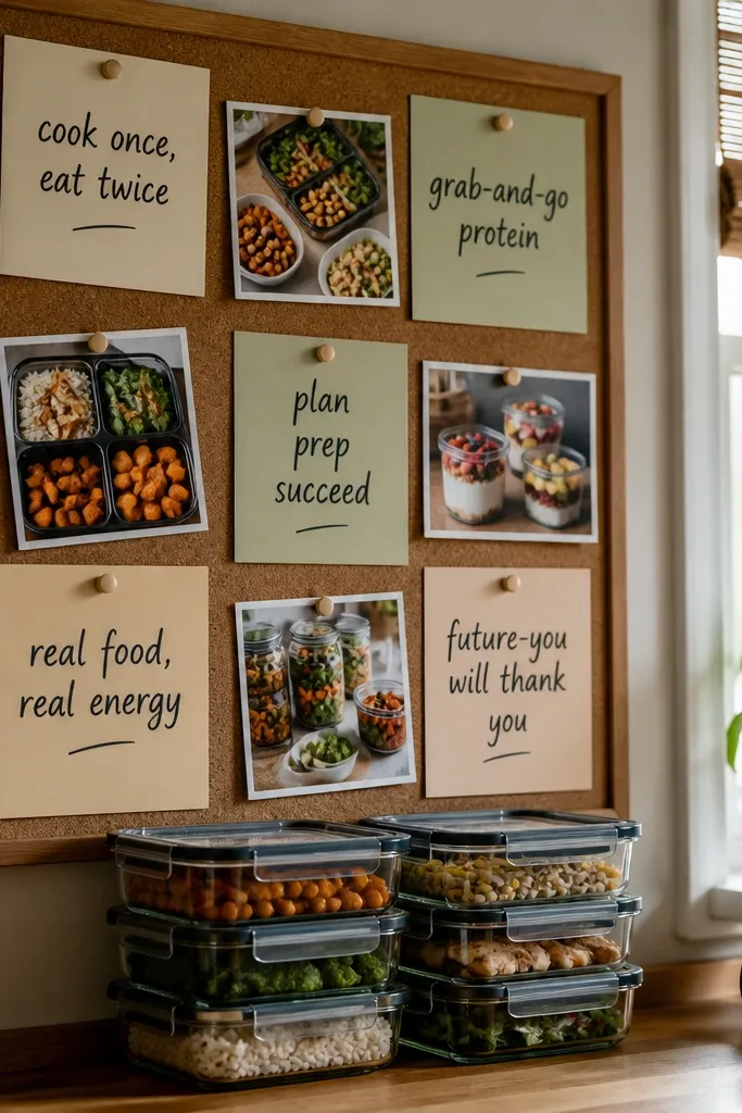
Cut or buy a small cork panel and mount it to a backing board with hot glue or strong adhesive. Create 8-10 small recipe prompt cards (3x4 inches) and punch a hole in each card so you can pin them. Arrange them in a grid and add two larger cards for “breakfast” and “snack” so the layout stays balanced. Finish by adding a small label banner at the top and making sure pins are evenly spaced.
A cork pinboard turns your board into a working tool. Pin meal prep prompts like “cook once, eat twice” or “grab-and-go protein” so you see them when you’re deciding what to eat. Cork looks warm and textured, and it photographs well because it adds depth without clutter. This idea is best for people who want structure for weekdays and forget what they planned. Time is moderate because you’re arranging cards and spacing pins, but it’s still a weekend project.
AvoidSkip random pin placement; keep a grid so it reads fast.
Pro tipUse copper or brass push pins for a cleaner look than mismatched colors.
8. Fabric Scraps Movement Bar Graph
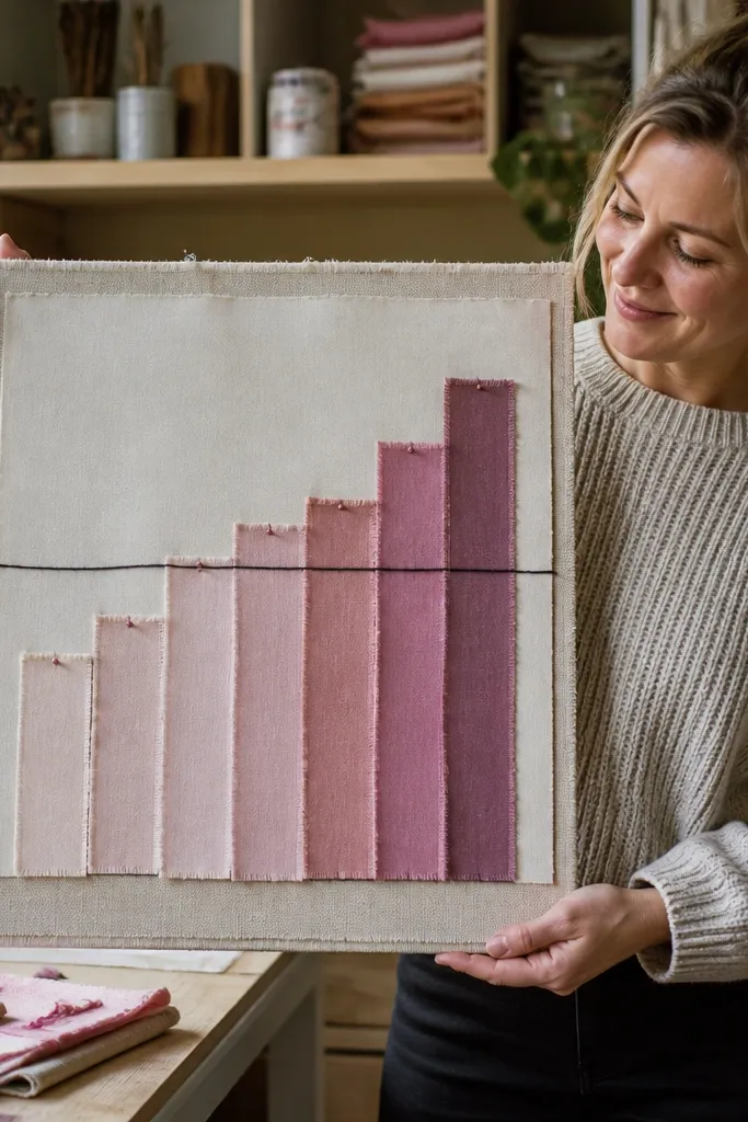
Cut fabric strips in five lengths that match your weekly targets, like 20 minutes, 30 minutes, 40 minutes, 50 minutes, and 60 minutes. Glue each strip onto a backing board in a row and draw a simple axis line with a ruler. Add a label for each bar and a thin marker line for the target. Use fabric glue for better hold, then press under a flat weight until dry.
This is a visual trick for people who respond to progress bars. A fabric bar graph turns weekly movement goals into something you can see from across the room, and the texture makes it feel tactile and high-end. Use one color family for the bars and add a clear “target” line so you know what you’re aiming for. It’s best for anyone who wants to build consistency and needs a weekly check-in. The project is easy: cut strips, glue them, and label the bars.
AvoidDon’t pick too many fabric patterns; solids or subtle textures look best.
Pro tipPre-wash fabric scraps so shrinkage doesn’t warp your layout later.
9. Bathroom Tidy Mirror Routine Card
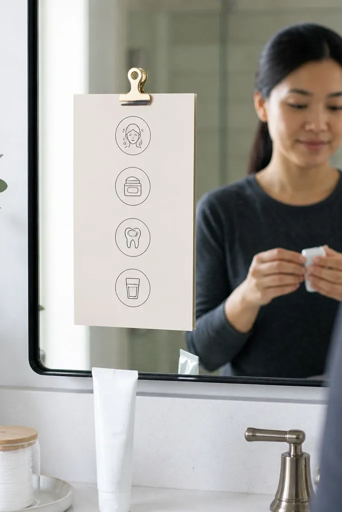
Print four icon steps on a strip, then cut it into one clean card sized to fit your mirror area (like 4x7 inches). Add a border using colored paper tape and laminate the card if your bathroom gets humid. Attach with removable mounting strips so you can swap it out weekly. If you want extra function, add a tiny corner pocket to hold a pen or a sticky note.
Your health habits often start with self-care routines, and this one makes them visible at the right moment. The mirror routine card is photogenic because it’s clean, icon-based, and designed to sit at eye level. Put 4 steps on it: wash, moisturize, floss, and a quick “water sip” cue. It’s ideal for people who want a fresh start with small daily wins that build momentum. It takes about an hour because you’re printing, cutting, and attaching with reusable adhesive.
AvoidAvoid tiny text; if it’s hard to read in the mirror, it won’t get used.
Pro tipLaminate your card — it stays crisp and readable even after steamy showers.
10. Workout Socks Banner Upcycle
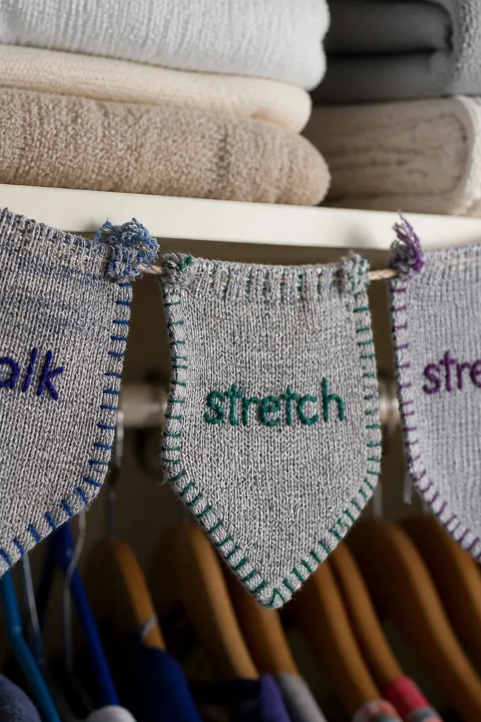
Cut sock cuffs into consistent lengths and trim stray threads with small scissors. Sew or glue the cuffs onto a backing ribbon in a straight line, leaving equal spacing between each one. Add printed word labels on matching cardstock squares and glue them centered on each cuff. Finish by tying the banner ends to a string and hanging it near your workout shoes or laundry basket.
This one is for the aesthetic crowd who also wants a practical reminder. Use the cuffs of old socks to make a mini banner with movement words like “walk,” “stretch,” and “strength.” The fabric edge looks charming, and the banner format keeps it from feeling like a bland poster. It’s best for someone who wants motivation without scrolling on an app. Skill level is easy, and you can make it in 60-90 minutes.
AvoidDon’t mix cuff sizes wildly; uniform lengths make it look intentional.
Pro tipUse hot glue sparingly; a thin glue line keeps the fabric from stiffening too much.
11. Protein Snack Grab Map
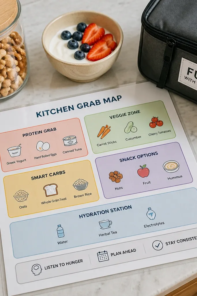
Draw a basic kitchen layout on paper with three zones: fridge, pantry, and “bag/desk.” Create label cards for 6 snacks like Greek yogurt, nuts, tuna packets, and protein bars, then glue them into each zone with matching color tabs. Add a tiny “grab first” arrow icon pointing to the top shelf or front spot. Mount the diagram on cardstock and add a strip border so edges look finished.
This idea turns “healthy snacking” into a decision map. Instead of pinning generic food photos, label zones in your kitchen so you know where your go-to options live. The look is strong because it’s a simple zone diagram with clean labels and a limited color palette, so it’s readable and photogenic. It’s great for anyone who snacks while standing around the kitchen and wants fewer random choices. Time is moderate because you’ll measure and place label cards neatly.
AvoidDon’t list 20 snack options; six is enough to reduce decision fatigue.
Pro tipPut the “grab first” arrow on the front-most zone — it guides behavior instantly.
12. Morning Light Routine Color Blocks
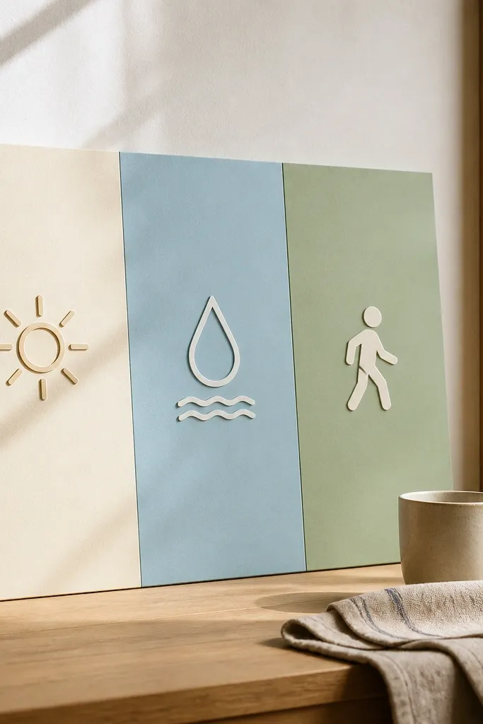
Morning routines fail when they’re buried in notes. Color blocks fix that by making the sequence obvious, in the order your brain needs it. Use a grid with three blocks: light exposure, water, and a short movement cue, each with a simple icon. This is visually striking because it looks like modern design, not a handwritten checklist. It’s perfect for a fresh start because it sets your day’s tone in the first 10 minutes. The build is quick and clean — mostly paper cutting and glue.
Choose three bold colors and cut three equal rectangles, like 4x3 inches each, from cardstock. Print or draw one icon per block and add a short label like “10 min light,” “1 glass water,” and “2 minutes move.” Arrange the blocks in a vertical sequence and glue them onto a cream backing sheet. Finish with a small title label at the top and a thin black line frame around the whole design.
Use matte cardstock so the colors photograph without glare.
Skip gradients and busy patterns; solid blocks keep it readable.
13. Herbal Tea Calm Station Menu
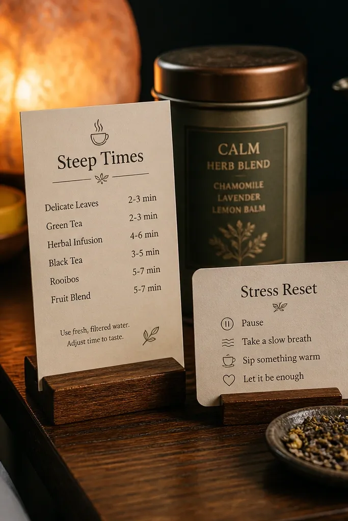
Pick 3 teas and write steep times on separate cards, like “Chamomile 5-7 min,” “Ginger 5 min,” and “Peppermint 3-5 min.” Cut the cards into a consistent size and add a small title like “Calm Menu” at the top. Add a thin border using colored paper tape and glue tiny tea label scraps under each menu item. Mount the card on your board or hang it near your mug area with removable adhesive.
This turns winding down into an easy choice. A menu-style tea card looks cozy and clean, with steep times written large and readable, plus a simple steam icon. Pair it with stress reset cues so your evening routine has a default path. This is best for people who want less late-night snacking and more calm before bed. The project is simple: make a few menu cards, attach them near where you keep tea, and tie it to your sleep goal. It’s fast enough to do alongside the rest of your board.
AvoidDon’t include teas you won’t drink; the board only helps if it matches your real routine.
Pro tipWrite steep times in big numbers; it’s the detail you’ll actually use.
14. Step Count Shadow Box Icons
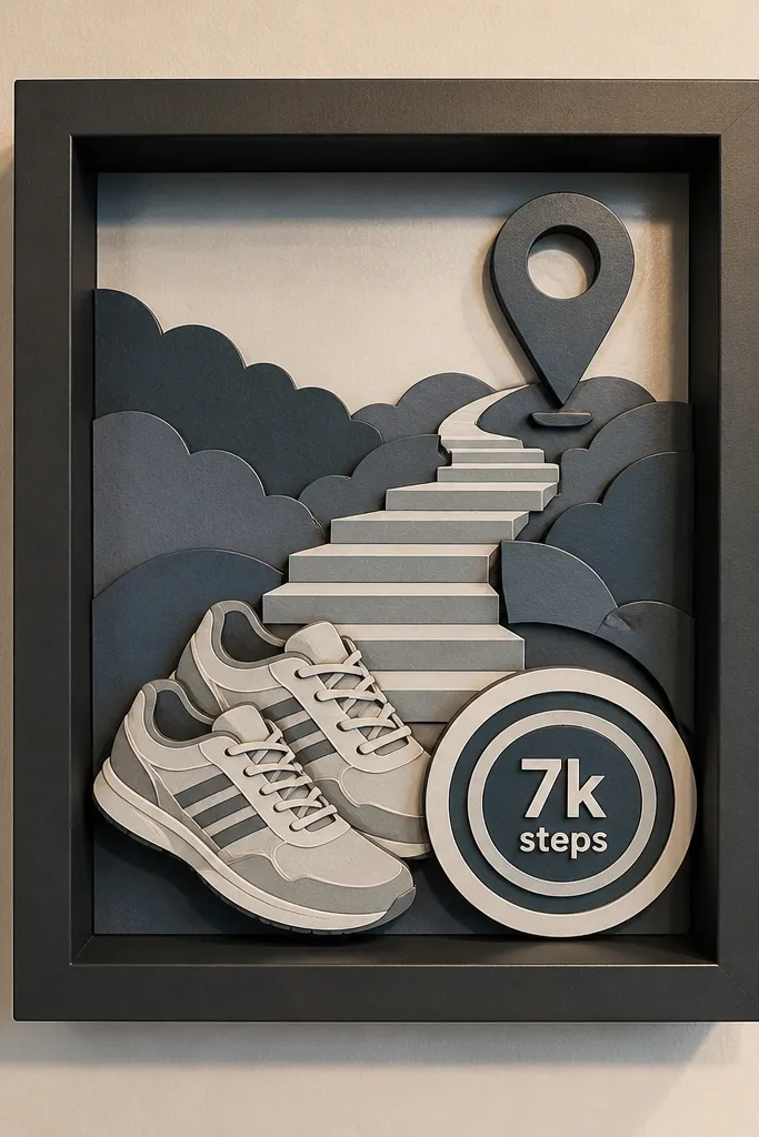
Cut a backing panel and place it in a small frame or shadow box. Layer 5-7 paper icons by gluing them onto thin foam tape so they sit at different depths. Write the step target on a small label and place it near the top center. Secure the whole layout, then add a clear cover if your frame is open so dust doesn’t collect on layers.
A shadow box makes your goals feel physical. Use layered paper icons for shoes, stairs, and a location pin, then add a target marker like “7k steps.” The depth from layering is what makes it look good — it creates shadows and dimension that flat posters can’t. This is best for anyone who needs a daily goal that’s concrete and easy to glance at. Skill level is moderate because you’ll measure and layer, but it’s still a weekend build. It also pairs well with a walking route map.
AvoidDon’t crowd the box; leave breathing space so the icons stay readable.
Pro tipUse foam tape thickness consistently so all layers cast neat, even shadows.
15. Mindful Eating Slow Bites Timer Card
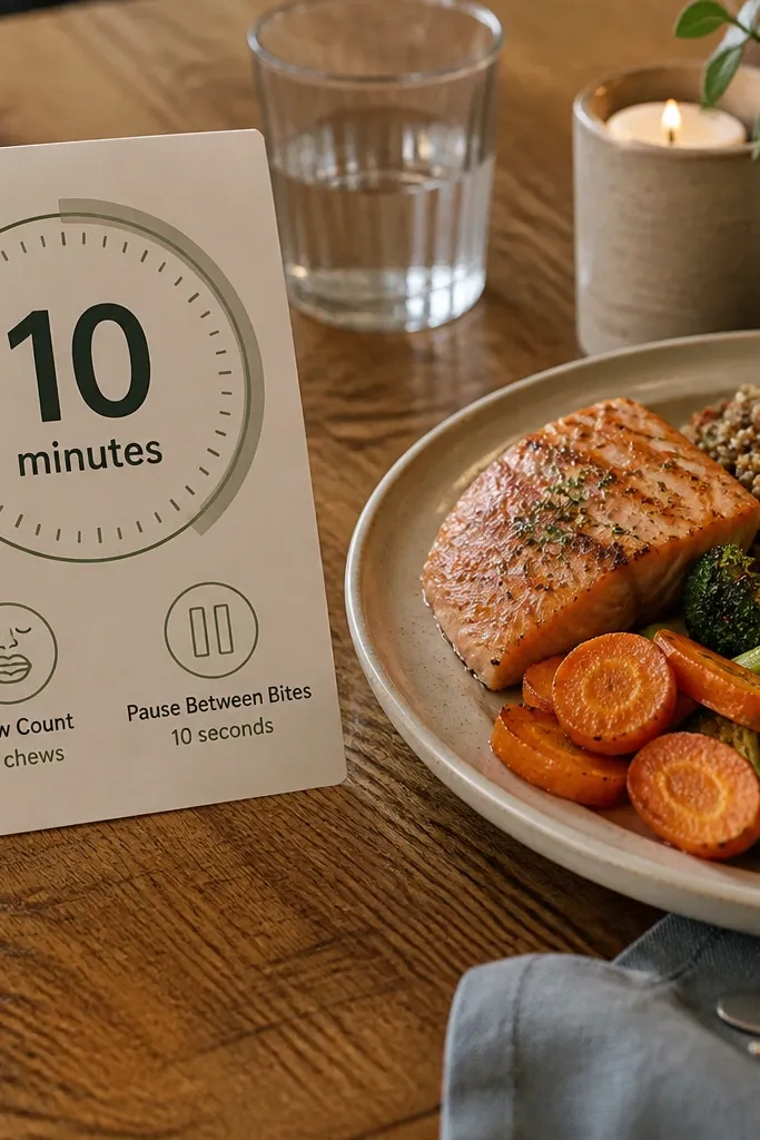
Mindful eating needs a cue that slows you down, not another photo of food. This timer card makes the idea measurable by giving you a simple “10 minutes” anchor and a tiny set of prompts like “chew count” and “pause between bites.” It looks clean because it uses one big circle and a limited set of icons. It’s best for people who eat quickly and want a practical method to slow down without overthinking. Time is short — print, cut, glue, and mount.
Print a large circle timer graphic or draw one with a compass on cardstock, then add a big “10 MIN” label in the center. Add two or three small icon prompts around the circle and glue them in place. Laminate the card so it wipes clean, then attach a small dry-erase dot for you to mark the start time. Mount it near your dining spot or pin it to the vision board with a clip.
Choose a circle color that matches your board palette; the timer becomes a visual anchor.
Don’t add too many prompts; two reminders is enough to change behavior.
16. Repurposed Frame Monthly Health Theme Stripe
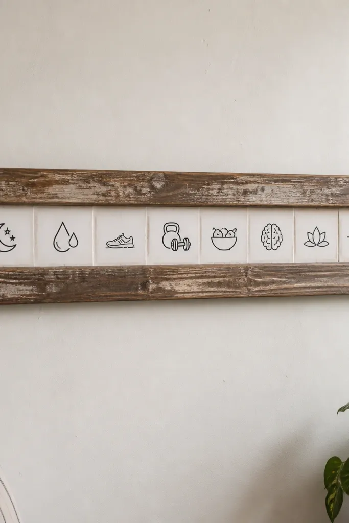
Clean the frame and remove old glass if needed so the stripe sits flat. Cut a wide strip of cardstock to fit the frame opening and add a title label for the month at the top. Glue 4-6 small icons onto the stripe in one line and outline them with a thin marker for crispness. Insert the stripe back into the frame and seal with tape or a backing board so it stays secure.
If you’re doing a fresh start, you need a rotating structure so motivation doesn’t fade. This project uses an old frame and a single horizontal stripe filled with icons for your monthly focus, like “sleep + hydration” or “strength + protein.” The look is polished because the frame edges finish the board and the stripe keeps the design minimal. It suits anyone who gets bored and wants a simple way to update without remaking everything. Skill level is easy: clean, add, and swap the stripe each month.
AvoidDon’t fill the frame with multiple sections; one stripe reads as intentional.
Pro tipUse removable mounting putty so you can swap the stripe without damaging the frame.
17. Spoon and Plate Kitchen Balance Chart
Draw or print a row of three plate icons labeled breakfast, lunch, dinner, then add two spoon icons for snacks. Write one rule per icon in short phrases, like “protein at breakfast,” “veg at lunch,” and “fiber at dinner.” Cut colored backing squares behind each icon so they pop against the main background. Glue everything onto a backing sheet and add a thin border to finish the edges.
This idea makes meal balance feel simple by mapping your day into categories. Use plate icons for meals and spoon icons for snacks, then label each with a rule like “protein first” or “fiber at lunch.” It’s visually striking because it uses repeating icons and a strict layout, so it looks like a designer chart. It’s best for people who want structure but don’t want complicated tracking apps. You can build it with printouts and a ruler, and it takes about 1-2 hours depending on how many rules you include.
AvoidDon’t write long explanations on the chart; it turns into clutter fast.
Pro tipKeep each rule under five words; short rules look cleaner and stick better.
18. Side-by-Side Rest and Reset Cards
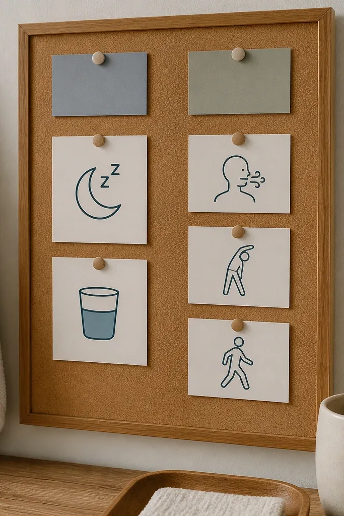
This is a clean way to handle both recovery and stress in one place. Make a two-column layout where “Rest” includes sleep and hydration cues, and “Reset” includes breathing, stretching, and a quick walk. The symmetry is what makes it photogenic — two columns with matching icons look intentional. It’s great for people who want a plan for low-energy days without giving up. The build is simple: cut card panels, add icons, and mount them on your board using clips or tape so you can revise.
Cut two vertical card panels from thick cardstock and label the top of each column with big text. Create a set of three mini icons for rest and three for reset, then glue them into each column with a small line of text under each icon. Mount the panels side by side on your vision board, leaving a consistent gap between them. Seal with matte laminate if you want wipe-clean durability.
Use the same icon size in both columns; mismatched icons make it look sloppy.
Don’t mix fonts; one simple font style keeps the design crisp.
19. Brown Boots Walking Shoe Care Reminder
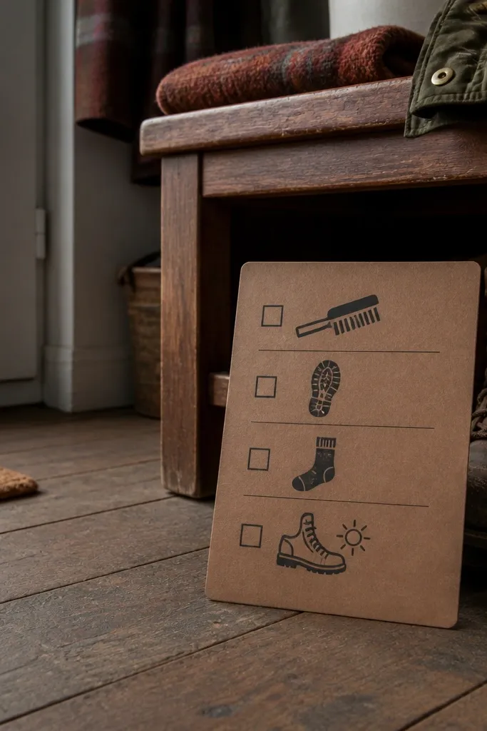
Create a card sized for your board, like 5x7 inches, and draw or print three icons: brush, laces, and socks. Write a simple weekly schedule in a small grid, like “Mon: check laces, Wed: brush, Sat: wash socks.” Add a small title at the top and outline the grid with a ruler for clean lines. Laminate the card and attach with a clip so you can swap it if your schedule changes.
Movement plans fall apart when your gear is uncomfortable. This shoe-care reminder looks surprisingly aesthetic because it ties a practical schedule to a clean, graphic card with icons. Add a weekly cue for brushing, checking soles, and washing socks, plus a “before walk” note. It’s perfect for people who say they’ll walk more but hate how their shoes feel. Skill level is easy and the time is short since you’re making a single reminder card that photographs well on your board.
AvoidSkip vague notes like “take care” — put a day and a task.
Pro tipUse a dark ink pen for icons and labels; it stays readable after lamination.
20. Blue Tinted Salt-Scrub Self-Care Checklist Jar
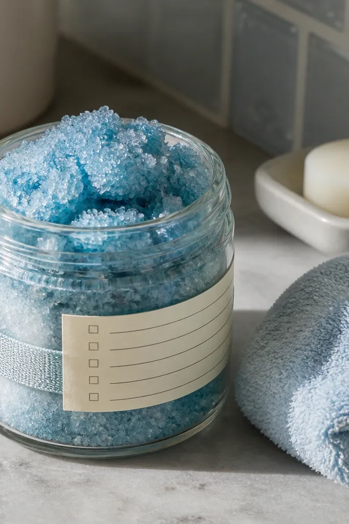
This is a health vision board idea for people who want their “fresh start” to feel physical. You put small self-care actions on cards, then pull one each day like a tiny ritual. The jar looks clean and intentional on a bathroom counter because the blue tint matches the calm, reset vibe and the salt-scrub label reads like a plan. It fixes the common problem where vision boards stay pretty but never get used. This build is also fast — plan on 45-60 minutes — and it suits anyone who likes low-effort habits in a visible place, especially in small bathrooms or shared spaces.
Pick a clear glass jar 6-8 inches tall with a wide mouth, then choose a blue tint approach: either blue glass paint or waterproof blue spray paint used lightly on the outside. Cut checklist cards from thick cream cardstock, 3x5 inches, and write 10-14 actions that fit your routine like “10-minute stretch,” “rinse face after workout,” “prep tomorrow’s water bottle,” and “write one line in a gratitude notebook.” Print or hand-letter a label sized to the jar’s front — aim for 3 inches wide — and add a simple salt-scrub icon (a small bowl or swirl) so it looks cohesive. Fold each card in thirds, stack them, then top with a small cardboard divider so the next card pulls out cleanly. Seal the jar lid with a thin strip of clear tape on the rim if you’re using it in a humid bathroom, then keep the label and paint dry before handling.
Use a paper punch to add a tiny semicircle pull tab to each folded card so you can grab it with wet hands without tearing.
Don’t pack the jar too tight — if cards don’t slide easily, you’ll stop using it after a few days.



