
1. 24-Hour Pause Board in a Black Frame
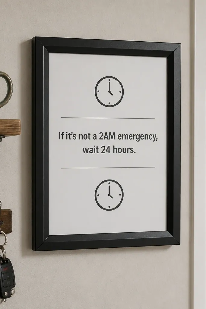
This board is made for the moment you’re about to buy something and your mood is doing the deciding. The look is strict and calming: matte black frame, white paper, and small clock icons so your eye lands on one instruction. Use it to train a repeatable habit — pause first, decide second — by making that phrase the largest element on the board. The board also photographs well because the layout has clear spacing and consistent colors, not a busy collage. It suits a kitchen wall, a hallway hook area, or any spot near where you check your phone before shopping.
Start with a black frame that opens flat, ideally 8x10 or 11x14. Cut matte white cardstock to fit behind the glass (or directly behind the frame if it’s open), then write “WAIT 24 HOURS” in a clean font using a paint marker or thick pen. Layer in small torn-paper strips that look like receipts, add a few clock icons, and tape everything down with washi tape so it stays neat. Finish by sealing the paper edges with a thin layer of glue stick only on corners, then close the frame.
Pro tipUse a sheet of clear contact paper on the back of your cutouts if you tend to bump the board — it keeps corners from lifting.
AvoidDon’t cram the board with more than one instruction phrase — it turns into background noise.
2. Sinking Funds Shadow Box with Mini Jars
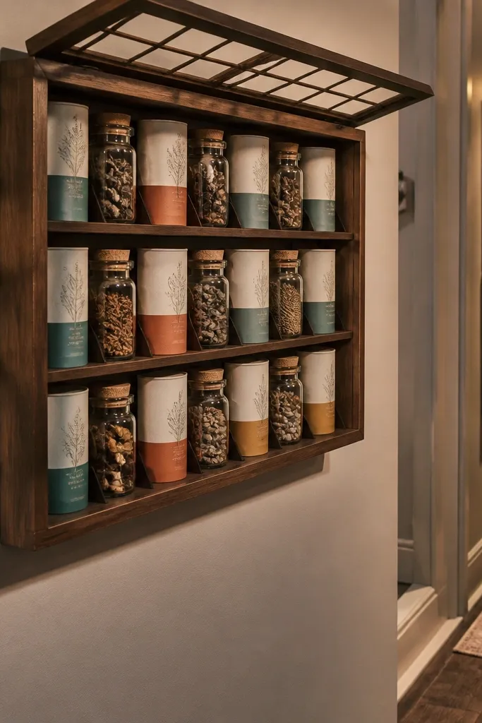
A sinking-funds board makes money feel physical, which is what helps people stop treating savings like an abstract number. The aesthetic is clean and satisfying: a shadow box with faux mini jars made from small containers or painted cardstock tubes. Each jar has a label and a color band so you can spot the category instantly. This is a strong choice if your issue is “my savings gets eaten” because you’re visualizing buckets, not one pool. It looks best on a bookshelf, desk corner, or entryway where you’ll see it during weekly planning.
Buy or repurpose a small shadow box frame around 10x12 inches. Create jar shapes from cardboard tubes or small empty jars, then paint them with matte acrylic in 3-5 matching colors. Cut label strips, glue them on, and add a tiny “goal” line under each label like “$120/mo” using a ruler for straight text. Place the jars on the shadow box backing, then secure with hot glue dots or double-sided mounting tape. Seal the background with matte Mod Podge if you used glossy materials.
Pick one label style and stick to it: same font, same size, same alignment — that’s what keeps it looking intentional.
Skip glitter or glossy paper on the background; glare ruins the jar look.
3. Debt-to-Savings Flip Chart Collage
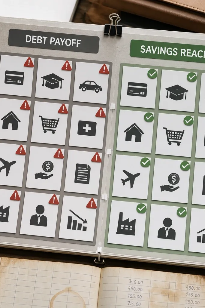
If you’re stuck because you don’t see progress, this board fixes that with a visible “before vs after” structure. The look uses a flip chart concept: one side shows “debt payoff,” the other shows “savings reached,” with the same visual style so it feels like a transformation. It’s photogenic because the chart grid gives structure and the colors stay consistent across sections. This idea is best if you need motivation that updates, not a static inspirational quote. It also works well for a small wall print because you can keep it in one tight size.
Cut two panels from cardstock to the same size and hinge them with a strip of fabric tape along one edge. On one panel, draw a simple bar grid with labels like “payment” and “interest,” then on the other panel, repeat the grid with savings categories. Add a “flip date” label near the hinge so you know when to switch sides. Cover both panels with matte clear tape or a thin Mod Podge layer so the ink doesn’t smear. Mount the hinged piece to a corkboard or frame backing with push pins.
Pro tipUse a gel pen for the grid lines — it stays dark and doesn’t skip like cheap ballpoint pens.
AvoidDon’t use tiny font for the goal; if you can’t read it from 6 feet away, it won’t motivate.
4. Receipt Garden with Leaf Budget Tracking
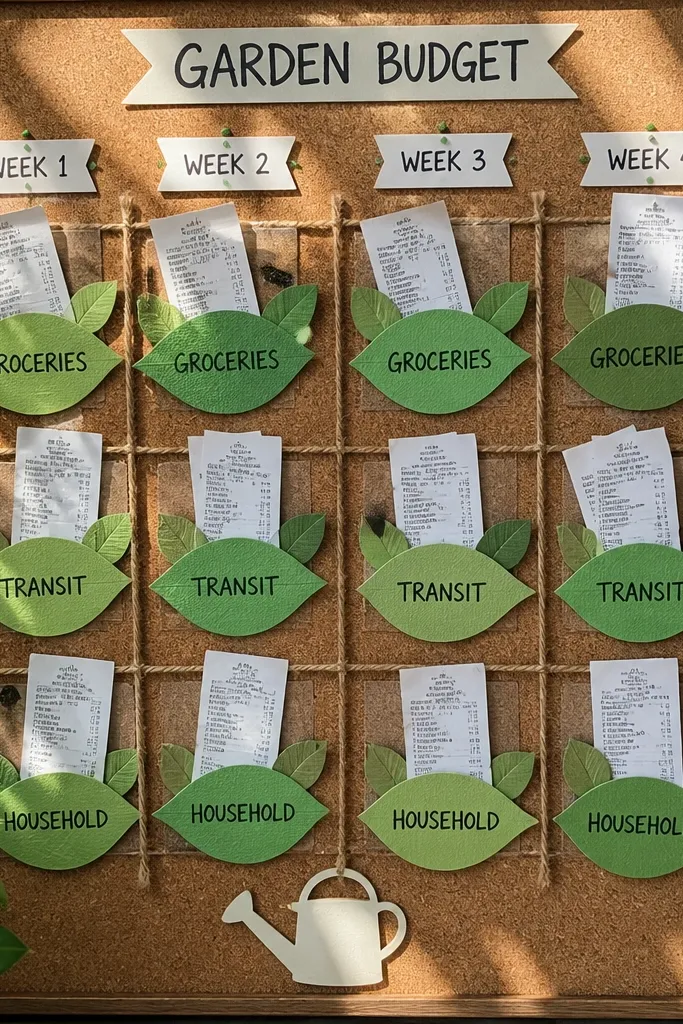
This is the board for people who need to stop “mystery spending.” The aesthetic turns receipts into a garden so the money story looks alive instead of depressing. You get a weekly layout with leaf clusters labeled by category, like groceries, transit, and household. It looks good because leaf shapes create rhythm and the paper textures show through even when the colors are muted. Put it in a spot where you can update it after you do your weekly check-in. It’s especially effective for renters who don’t track bills deeply but still want control.
Collect clean receipts and flatten them under a heavy book for a day. Trace and cut leaf shapes from receipt strips, then back them with thin matte paper so they don’t look see-through. On a corkboard or foam board, draw a simple weekly grid and glue leaves into each category area using a glue stick. Add a small legend with color dots for each category. Spray a light matte fixative over the whole board once everything is dry to reduce smudging.
Cut leaves with a paper trimmer so the edges look crisp and the board looks more polished.
Don’t include long, full receipts that curl; cut shapes so everything stays flat.
5. Budget Barcodes Wall Using Scan-Like Strips
If you like tech visuals but hate financial spreadsheets, this board gives you a coded, barcode-like look that still tracks money. Each “strip” represents a category, and the label tells you the action: cap, save, or reduce. The design is photogenic because the repeated vertical lines make a clean pattern, and the labels can be in one tidy color. This is best for people who want to glance and make a decision without reading a paragraph. Hang it where you plan meals or check your bank balance.
Use a matte corkboard or foam board and draw vertical barcode strips with a ruler. Assign each strip a category and write the label in consistent placement under each strip. Color in the bars using markers that match your system — for example, green for save, blue for spend cap. Add a small “goal line” across the board with a contrasting marker so you see the target quickly. Finish by sealing the board with a thin matte spray to keep marker ink from smearing.
Pro tipMake the labels larger than you think. If it’s tight, it looks cool but it won’t help in real life.
AvoidDon’t mix too many marker colors; 3-4 is the sweet spot for a clean barcode pattern.
6. Savings Goal Mason Jar Collage with Color Bands
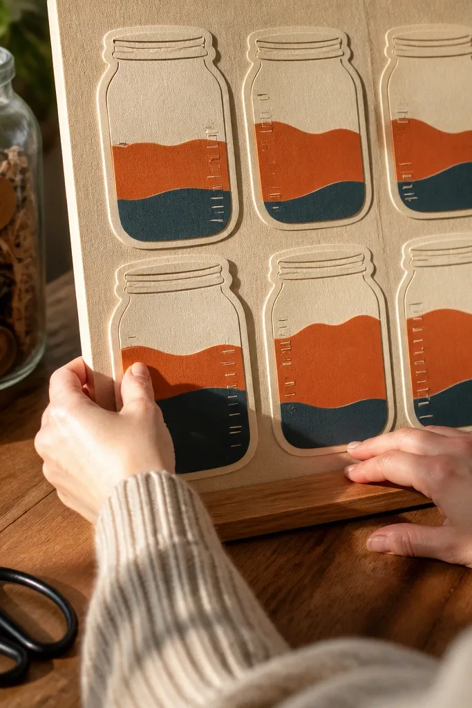
This board is built for long-term savings because it turns milestones into a visual stack. The look is warm and structured: mason jar shapes, color bands for each step, and a clean “fill line” that makes progress obvious. It’s photogenic because the jar outlines create strong silhouettes, and the color bands add a candy-like pop without looking messy. This works well for goals like an emergency fund or a big purchase plan where you need patience. Place it near where you keep your mail or where you sit to plan your week.
Cut mason jar outlines from thick cardstock or trace them onto foam board, then glue them onto a backing sheet. Create 4-6 colored bands for your milestones and place each band slightly lower than the last to show filling. Write the milestone amounts on small label tags and glue or tape them to the jar front. Add a “current” band with a different shade so you know where you stand. Mount the whole thing in a simple frame with matte backing to reduce glare.
Use painter’s tape to space the bands evenly. It keeps the jar fill line straight and neat.
Skip metallic ink. It looks flashy up close but photographs poorly under common indoor lighting.
7. No-Impulse-Buys Moodboard with One-Color Photo Receipts
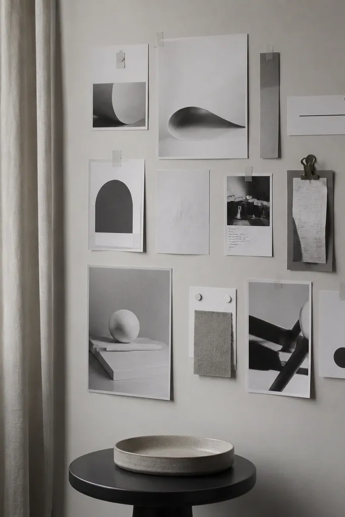
This is an aesthetic money board for people who buy when they’re tired, bored, or scrolling. The design uses one color palette so it feels calm and intentional instead of chaotic. You’ll include monochrome magazine cutouts or printables that match your “I’m choosing later” vibe, plus a single rule strip that stays readable. The board is photogenic because monochrome layouts look clean in photos and on Pinterest. It suits a bedroom wall, desk area, or inside a closet door where you see it before shopping online.
Choose one base color — black-and-white, cream-and-tan, or muted navy. Print or cut images that match the palette and stick to 10-15 pieces total so the page stays breathable. Add a rule strip at the top with “NO IMPULSE BUYS” in big letters using a marker or sticker letters. Back your cutouts with matching cardstock so edges don’t look rough. Seal with a matte finish spray and mount on a corkboard or framed foam board.
Pro tipKeep your image count low. A smaller set of consistent images looks more expensive than 40 random cutouts.
8. Weekly Meal Plan Budget Map with Pantry Icons
Food spending wrecks savings for a lot of households, and this board makes the fix visual. The look is a map-like weekly grid with pantry icons and budget amounts in each block. It’s photogenic because grids read clearly in photos, and icons add personality without making it cluttered. This works best when you need a plan that reduces last-minute takeout. Put it on the fridge, or mount it on a small board next to where you keep grocery lists.
Draw a 7-column grid on matte cardstock using a ruler, then label days across the top. Create icon stickers or cutouts for pantry staples like rice, beans, eggs, and frozen veggies. Assign each day a budget number and a meal tag like “stir-fry” or “taco bowl” using a consistent label style. Add a small section at the bottom called “leftovers” so food doesn’t get wasted. Laminate for wipe-clean use or place it in a frame with acrylic cover.
Write meal names in pencil first, then trace over with a fine liner once you commit for the week.
Don’t use bright neon markers for every line; it makes the grid hard to read.
9. Savings Thermometer with Printable Fill Levels
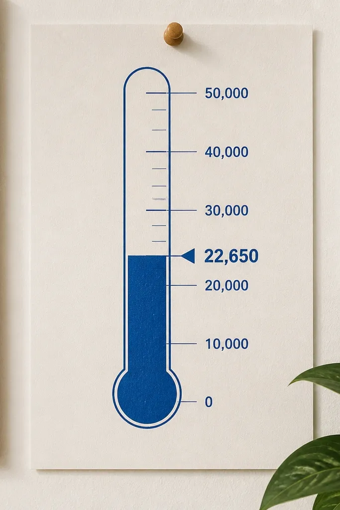
A thermometer layout is one of the clearest ways to show progress without turning your wall into a spreadsheet. The visual is simple: a vertical meter, milestone labels, and a bold “current fill” marker. This board is photogenic because the composition is centered and high-contrast, so you get that satisfying before-and-after feeling when you update it. It fits people who save for a single goal and need constant reminders to keep going. Hang it somewhere you see daily, like by a desk or coffee station.
Find or draw a thermometer meter shape on matte poster board, then print or hand-letter milestone amounts beside it. Cut a small rectangle “fill” piece from colored cardstock and align it to cover the current section of the meter. Use a removable adhesive strip so you can swap the fill piece each month. Add a short phrase under the meter like “MOVE THE FILL” in small caps. Frame with a matte cover to keep glare down.
Use colored cardstock for the fill so it looks opaque and clean in photos.
Don’t make the meter thin. A narrow meter looks cute but it’s harder to update accurately.
10. Skill Swaps Board with "Buy Less" Coupons
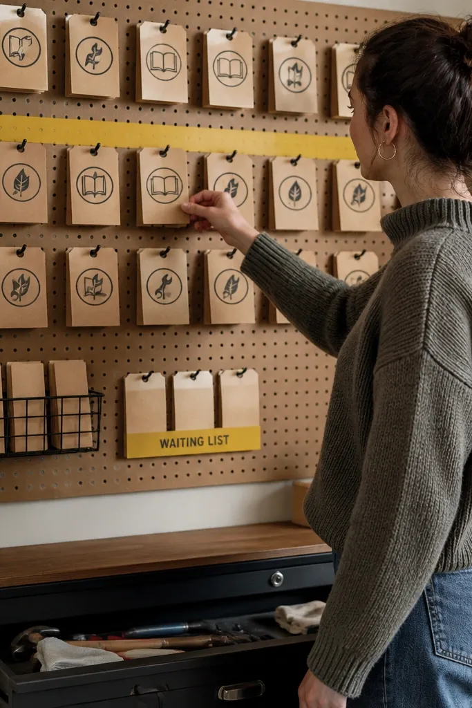
This board targets spending by replacing purchases with trades, repairs, and borrowing. The aesthetic is coupon-like and structured, with stamp-style icons and neat card rows. It’s photogenic because repeated card shapes look tidy and graphic, not like a random collage. This idea is best if your savings leak is “I buy new because it’s easy.” The board gives you a list of actions you can do instead of shopping. Put it near your entryway or next to your to-do list so it gets used.
Create 12-18 small cards from cardstock, each one sized the same — for example 2.5x3.5 inches. Write one action per card like “borrow a tool,” “repair before replacing,” “trade with a neighbor,” and “secondhand first,” then add a simple icon. Arrange the cards in a grid on a corkboard or frame backing and secure with washi tape hinges so cards can move. Add one larger header card at the top with “BUY LESS” in bold letters. Seal the header only if you used marker ink that smears.
Use a hole punch and ribbon for one card at the top so you can flip the current priority for the week.
Skip long text blocks on cards. One action fits, extra sentences clutter the look.
11. Emergency Fund Lockbox Board with Key and Coin Motifs
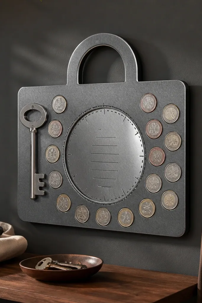
For people who struggle with saving because the money feels reachable, this board makes it feel locked away. The look is centered on a lockbox shape, with coin motifs and a key graphic that points your attention to the emergency fund goal. It’s photogenic because the theme has a clear focal point and the metallic look comes from matte paper textures, not glitter. This works for one clear goal, like building a $500 or $1,000 starter buffer. Mount it where you do your bill check so it reminds you before you re-route money.
Cut a lockbox silhouette from thick cardstock and mount it in the center of your backing board. Create a ring of coin circles around it using a punch or traced bottle caps, then label each coin with a small amount milestone. Add a key shape on one side using paper cutouts and glue it so it overlaps the background. Write the emergency target in big numbers above the lockbox and keep it to one line. Frame it with a matte finish cover or laminate the backing to handle frequent touching.
Pro tipUse textured paper for the coins, like linen cardstock. It reads more realistic and photos cleaner than smooth paper.
12. Budget Check Calendar with Sticky Note Windows
A money board fails when it never gets updated. This calendar design forces consistency without needing a spreadsheet. The look is a monthly grid with “windows” where you place sticky notes for each week’s check-in, plus a tiny star icon for the action you completed. It’s photogenic because calendars are naturally orderly, and the sticky notes add color blocks without clutter. This is best for people saving on a schedule, like payday-based budgeting. Put it in a high-traffic place so the check-in becomes automatic.
Draw a monthly calendar grid on matte poster board, leaving blank squares for sticky notes. Add a small legend in the corner with the categories you review weekly, like bills, groceries, and fun money. Cut a thin border frame from construction paper so the calendar has a finished edge. Place removable label stickers in the weekly squares, then write your weekly check-in tasks on the sticky notes. Secure the board in a frame so it stays flat and the sticky notes don’t curl.
Pro tipUse painter’s tape to mark where sticky notes go so you can reposition without tearing the board.
AvoidDon’t overdecorate. Keep icons minimal so the grid remains readable.
13. Secondhand First Board with Color-Coded Thrift Tags
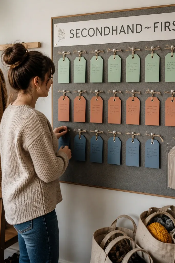
If your spending problem is “I don’t know what to buy, so I buy,” this board changes the decision path. It’s built around secondhand first and uses thrift-tag style cards to guide what you look for. The aesthetic is playful but structured: color-coded tag cards, a clean header strip, and a small “waiting list” area for items you’re not allowed to buy new. This board is photogenic because tags create a graphic pattern and the layout stays organized. It suits closets, craft rooms, and anyone who wants to stop impulse shopping online.
Make 3 color groups of tag cards for categories like clothes, home items, and tools, using cardstock in matching colors. Write a short rule on each tag, like “check condition,” “measure first,” and “compare price,” then add a simple stamp icon. Create a waiting list section on the board with 5 blank tag slots for items you want but won’t buy immediately. Mount the tags with small binder clips or washi tape tabs so they can move. Put a printed checklist card in a clear pocket at the bottom for quick reference.
Use a label maker for the category names. Consistent typography makes the whole board look put together.
14. Money Rules Poster with Fabric Tape Borders
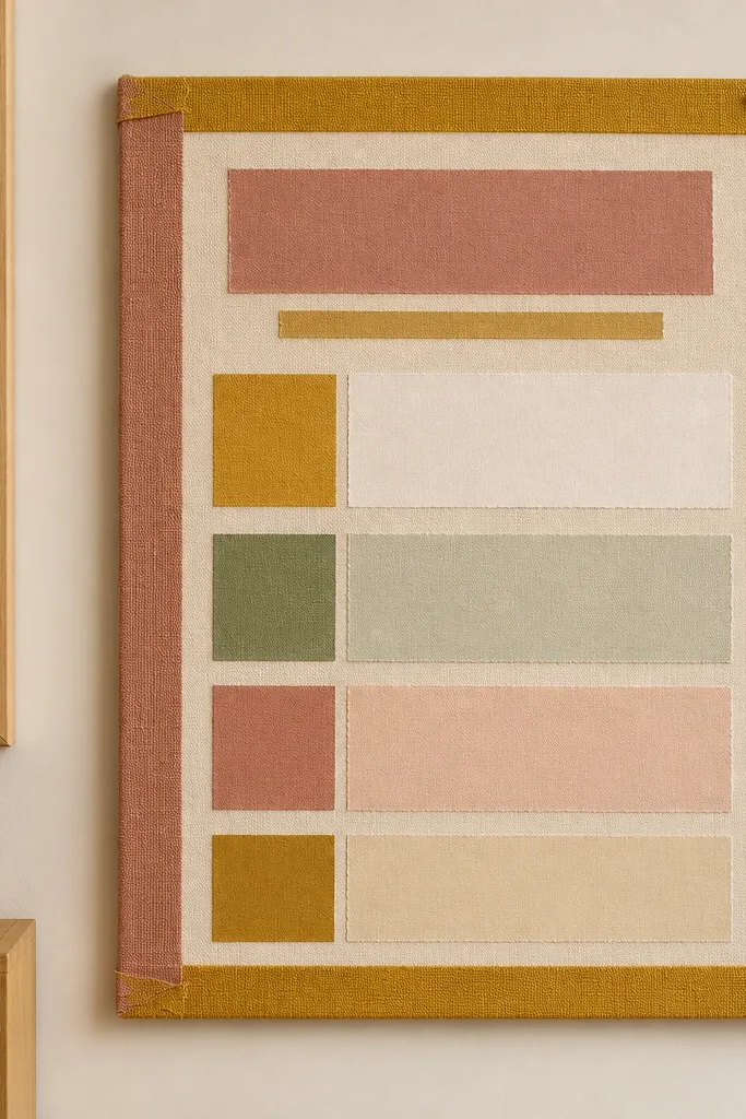
This is the board for clarity when you’re overwhelmed. Instead of tons of images, it uses a strong border and a few sharp rules that you can read in one glance. The look is soft and tactile: fabric tape borders, layered paper panels, and big short phrases like “spend from plan” and “no card for fun.” It’s photogenic because borders frame the text and create a clean composition. This works when you need a decision filter, not more motivation. Put it where you see your wallet or where you pay bills.
Cut a poster-size backing from foam board or thick cardstock. Apply fabric tape strips along the edges to create a border, then leave a large central space for rules. Write 4-6 money rules in big text using a brush pen, one per line, and keep each rule under 4 words. Add small icon dots under each rule to tie the style together. Layer a thin strip of patterned paper behind the rules for contrast, then mount in a frame.
Pro tipChoose one pen type for all rules. Mixing pens looks messy even if the words are good.
AvoidDon’t turn it into a paragraph wall. Keep it to short lines you can read fast.
15. Savings Sprint Board with Countdown Cards
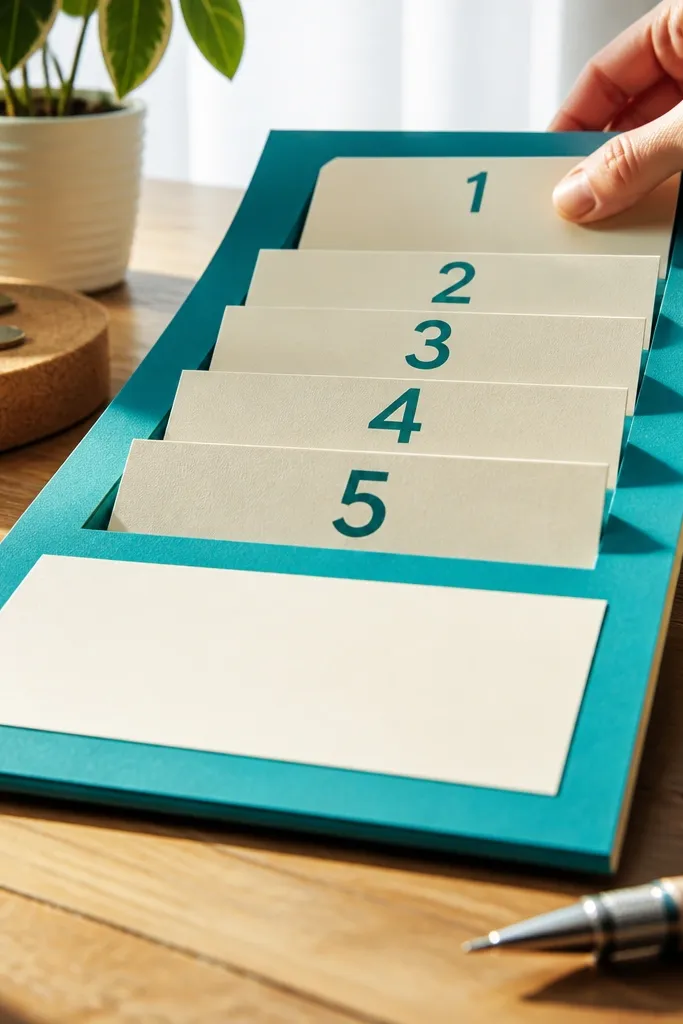
This board is for people who save in bursts and then slide back. A sprint format gives your brain a finish line, and that’s what makes action feel urgent without panic. The look uses countdown cards that you flip or slide forward, plus a central headline in bold type. It photographs well because the cards create depth and the central element stays consistent. This is best when you have a defined period, like 21 days to stop takeout or 30 days to save a specific amount. Hang it where you can flip cards daily, like on a fridge or desk wall.
Decide your sprint length — 21 or 30 days — then cut that many small cards from cardstock, each with a day number. Create a base board with a row of card slots and a “today” marker spot in the middle. Write the sprint goal on a central header card using large text. Slide cards into place and secure with small binder clips or Velcro dots so you can move them without tearing. Add one action phrase under the header like “CHECK SPENDING FIRST” to keep the sprint focused.
Pro tipUse Velcro dots instead of tape for daily movement. Tape tears paper and the board starts looking worn fast.
AvoidSkip complicated rules. One sprint goal keeps the board clean and effective.



