
1. Matte Black Cork Grid with Fabric Swatches
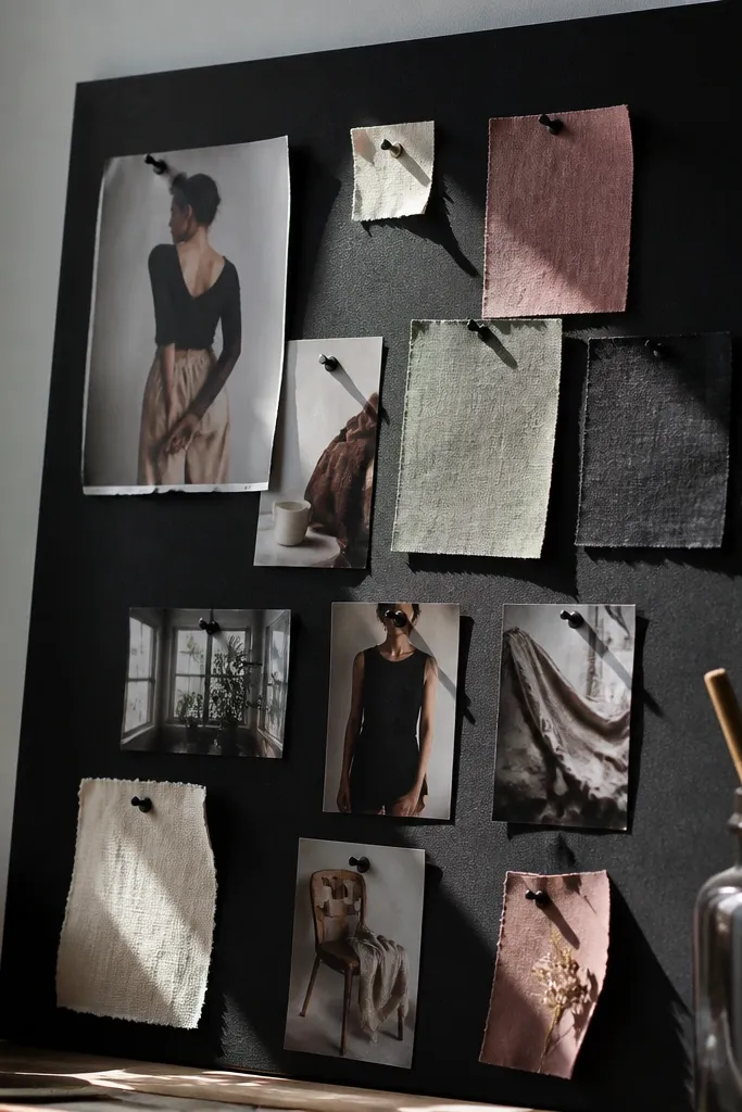
This is the cleanest look for budget Vision Board Inspo Ideas because it turns random clippings into a structured collage. The matte black background makes paper, photos, and fabric look sharper, even if the images are from thrifted magazines. Use pushpins for everything so you can rearrange sections without wrecking your board. Each fabric swatch adds texture and helps your vision feel real, not just printed. This style is best for someone who likes order, wants their board to look good in photos, and plans to update it every month.
Start by covering or painting your cork board matte black, then let it dry fully. Draw a light grid with pencil (for example, two columns by three rows) and pin a “hero” photo in each cell. Cut fabric scraps into uniform rectangles, pin them beside matching photos, then add small labels on torn paper strips for clarity. Finish by sealing the edges of any loose paper with a thin line of glue so pins don’t peel it up.
Use binder clips to hold swatches in place while glue dries so your corners don’t curl.
Don’t mix glossy and matte backgrounds — it makes the whole board look patchy in one photo.
2. Paint Chip Rainbow Timeline Board
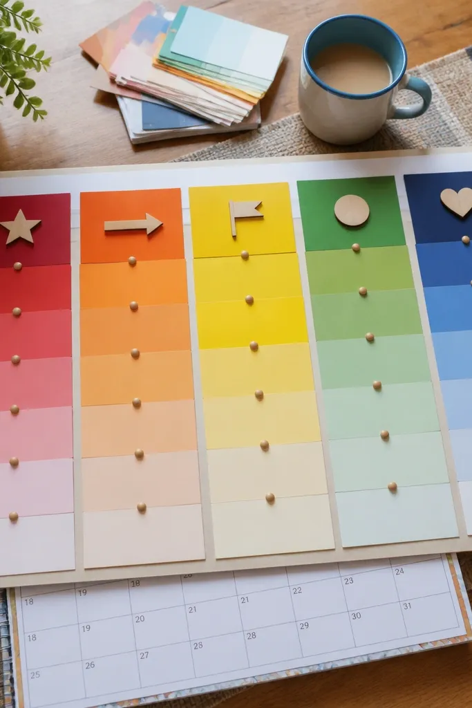
A timeline layout makes your vision feel like progress, not a random wish list. Paint chips are cheap, thick, and photogenic — they read clearly from a distance, which matters for aesthetic boards. Build it so each color section matches a stage like “start,” “practice,” “finish,” or “week 1,” “week 2.” This works especially well for home projects, outfit goals, and seasonal refresh plans. It’s also one of the easiest ways to keep your palette consistent without overthinking.
Gather paint chips (hardware stores or leftover samples) and cut them into equal widths, like 2-inch strips. On a white foam board, mark three or four horizontal bands with pencil. Glue the strips in order across each band, then add one small printed photo at the start of each band for direction. Seal the whole surface with clear contact paper if you want the edges to stay crisp.
Pick one anchor color and build the rest as a gradient around it so the board looks intentional.
Skip tiny, mismatched chip sizes — uneven strips make the timeline look sloppy.
3. Book Page + Coffee Stain Moodboard Corners
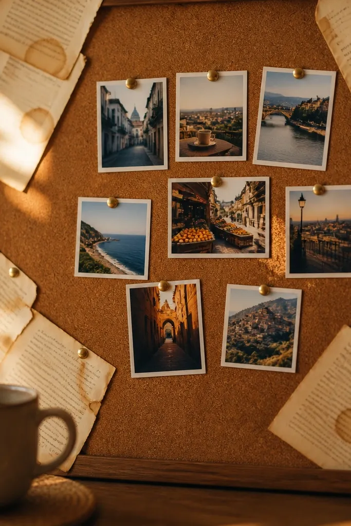
This look gives you that cozy, aged-paper vibe without spending on specialty paper. Coffee-stained book pages create texture and tone, while the center stays clean so your photos still pop. It’s a great fit for readers who want their vision to feel warm and personal rather than sleek and modern. The stained corners frame the collage, which makes the whole board look designed. You also get a practical benefit: stained paper hides small glue marks and cut edges.
Tear book pages into corner shapes, then brew a strong cup of coffee and cool it. Dip the paper lightly, blot with a towel, and lay flat to dry completely. Place the stained corners on a neutral base like kraft cardstock, then glue them down with a thin layer of glue stick. Build your center collage with printed photos and magazine clippings, then add a few small typed labels on plain scraps.
Pro tipUse a craft knife to trim only the straight edges of your center paper so the corners stay organic but the focal area stays sharp.
AvoidDon’t soak paper — it warps and makes your board look uneven.
4. Upcycled Cardboard Photo Frames Layout
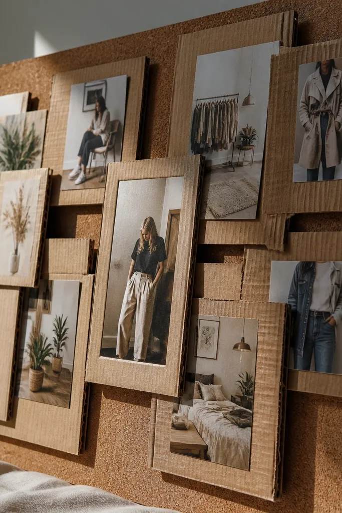
Cardboard frames make your vision board feel like a mini gallery and they’re nearly free. The frames also solve a common problem: cheap prints look flat unless they have a border and depth. This layout is photogenic because the shadows from raised frames add dimension. It’s ideal for outfit inspo, room decor, and any plan where you want specific images to look “placed,” not pasted. Skill level is beginner-friendly, and the whole build stays lightweight.
Cut cardboard strips into frame pieces and create inner openings sized to your photos (for example, 4x6 openings). Glue the corners to form frames, then wrap the outside with thrifted wrapping paper or craft paper for a consistent look. Mount photos inside frames with glue stick or double-sided tape. Arrange the frames in a grid on a foam board base, then add small texture pieces like lace scraps or ribbon beneath one or two frames.
Pro tipScore cardboard before folding so the corners stay crisp and don’t bulge.
AvoidDon’t use thin paper borders — they collapse and make the frames look cheap.
5. Transparent Tape Collage with Clear Contact Overlay
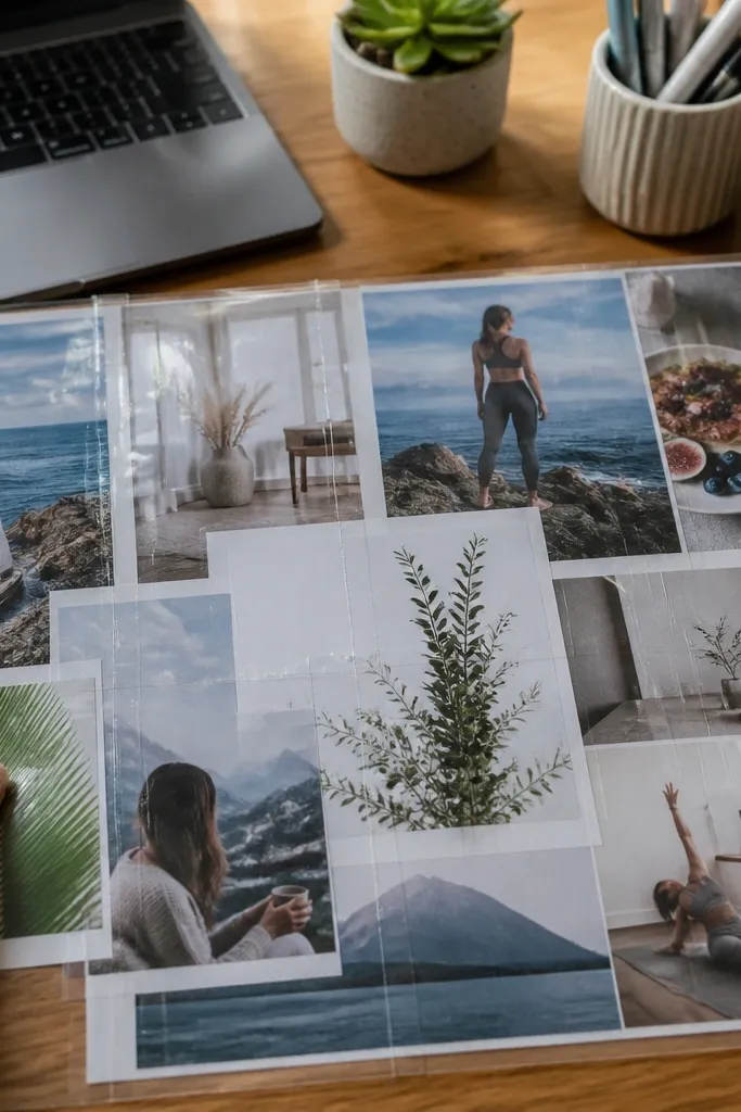
This is a clean, modern look that reads like “designed” even when you’re using thrifted scraps. Transparent tape creates visible structure lines, and a clear contact paper overlay makes the board look polished and protected. It also helps your board stay flat, which matters if you’re layering uneven magazine paper. Use this when you want a contemporary aesthetic — lots of white space, bold photo cutouts, and crisp edges. It’s also great for people who change their mind and want to rearrange things without tearing the base.
Cover your base with a sheet of clear contact paper, sticky side up, or apply contact paper after layout if your base is already sealed. Place cut photos and paper pieces, then press transparent tape strips across edges to hold them. Trim any overhang with scissors so everything sits flush. Finish by sealing the entire surface with one more layer of clear contact paper, smoothing bubbles with a plastic credit card.
Use a craft blade for clean cuts — scissors leave fringes that show under glossy overlay.
Skip matte photos under glossy overlay — they show glare and reduce readability.
6. Ribbon and Button Habit Board
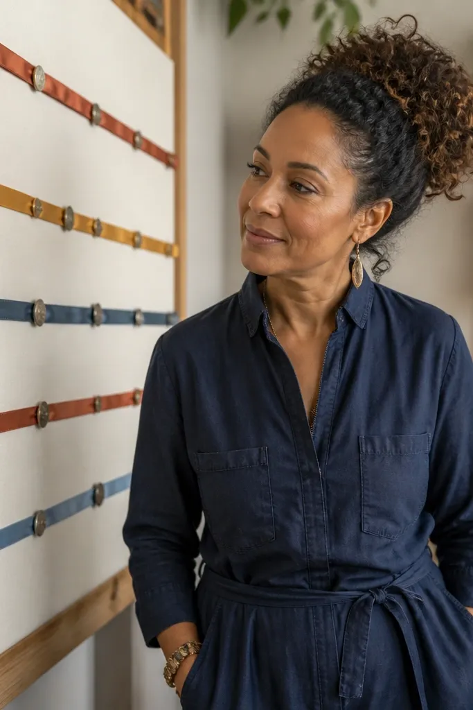
If your vision board never changes because it feels too static, this one fixes that. Ribbon strips give you a tactile “track” and buttons act like movable markers for habits. You’re building a board that invites interaction, not just viewing. It looks adorable in photos because the ribbon adds color and the buttons add tiny pops of shape. This layout works best for routines like reading, stretching, meal prep, or weekly chores.
Cut ribbon into equal lengths, like 6-8 inches, and pin or glue them in rows on a cork or foam base. Add a small label under each ribbon with a clear habit name. Glue buttons at the ends or attach them with tiny brads so they can move. Print one small icon for each habit (book, shoe, bowl) and place it near the ribbon so it’s easy to scan.
Choose ribbon widths that match your labels — 1/2 inch ribbon looks best with small text.
Don’t overcrowd the rows — leave space so each button marker is easy to see.
7. Washi Tape Frame + Lace Trim Edges
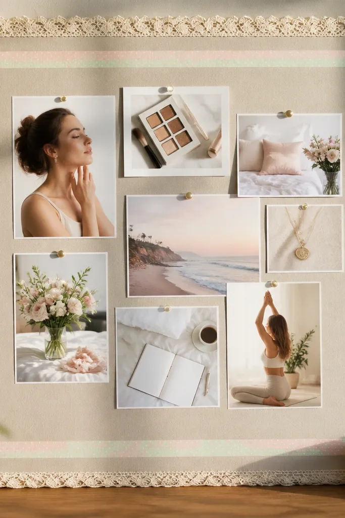
This one is pure photogenic charm, and it’s budget-friendly because washi tape and lace scraps are easy to collect. The trick is using the lace only on the border and keeping the center clean. That makes your photos and text crisp instead of turning into a cluttered craft mess. Use this for a “soft life” vibe, beauty goals, or calm home inspiration. It also hides small edge mistakes because the lace covers the rough perimeter.
Apply washi tape to create a border frame on your base, using straight lines for the top and bottom and thinner strips on the sides. Glue lace trim along the outer edge of the frame, then press down firmly. Place three to five hero photos inside the frame, spaced evenly. Add small cut paper tags next to each photo, and seal the tags with a tiny dab of glue so they don’t lift.
Use one washi tape pattern for the whole border so the board looks intentional.
Don’t add lace inside the grid — it makes the center harder to read.
8. Thrifted Magazine Cutout Collage with Color Blocking
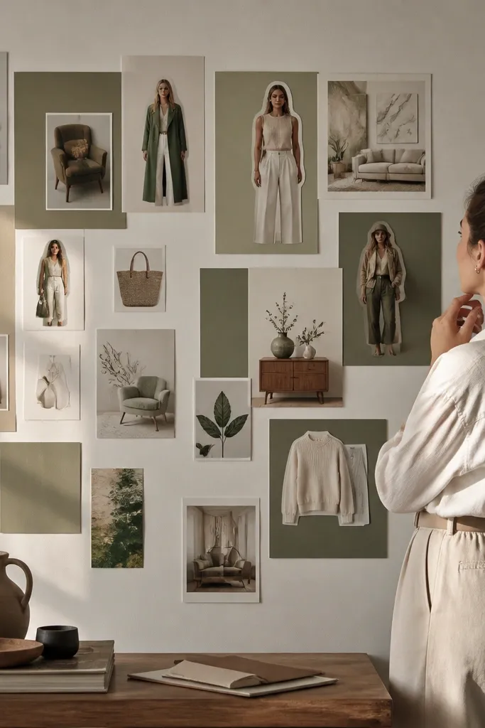
This layout makes magazine clippings look like fashion editorials instead of random pages. Color blocking is the difference — you place clippings on solid rectangles, so the background doesn’t fight the images. The board looks cohesive even when your cutouts come from different magazines. It’s ideal for outfit goals, hair and makeup inspiration, and “home style” boards. The build is fast, and the result looks high-effort.
Cut cardstock rectangles in 3 colors you want to repeat, like cream, black, and one accent color. Glue the rectangles onto a neutral base in a grid or stacked columns. Cut your magazine photos into clean shapes and layer them slightly over the cardstock blocks. Add one line of text on small strips of paper for each section, then seal the whole board with matte clear spray if your paper feels fragile.
Cut faces and hands cleanly — those are the parts people visually connect with from a distance.
Don’t cover the entire board — leave enough negative space for the color blocks to do their job.
9. Cord Board with Mini Pegs for Moving Pieces
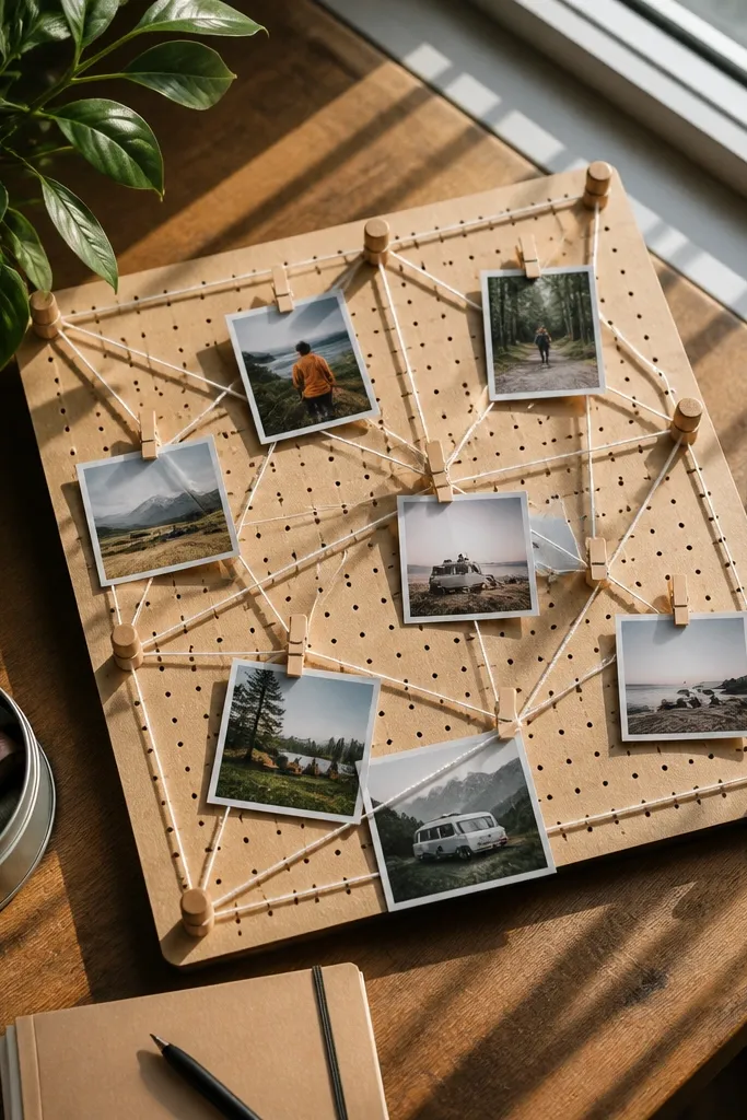
A cord board turns your vision into something you can rearrange in seconds. The grid of string creates structure, and mini pegs let you swap photos without tearing paper. This is a strong choice if you like updating your vision board weekly or you have multiple themes. It also photographs well because the lines lead the eye and the pegs create uniform vertical rhythm. You get both function and aesthetics without spending on fancy frames.
Stretch twine or thin cord across a cork board in a grid and tie knots at the corners, then add small hooks if needed. Use tiny wooden clothespins or mini binder clips as your “pegs.” Print or cut small photos and attach them to the pegs with clips. Add a few fabric scraps as accent pieces, then label each row with a small paper tag tied to the cord.
Use the same peg color across the board so the visual noise stays low.
Skip thick cord — it hides your photos and makes the grid look bulky.
10. Contact Paper Marble Swirl Backdrop + Photo Stickers
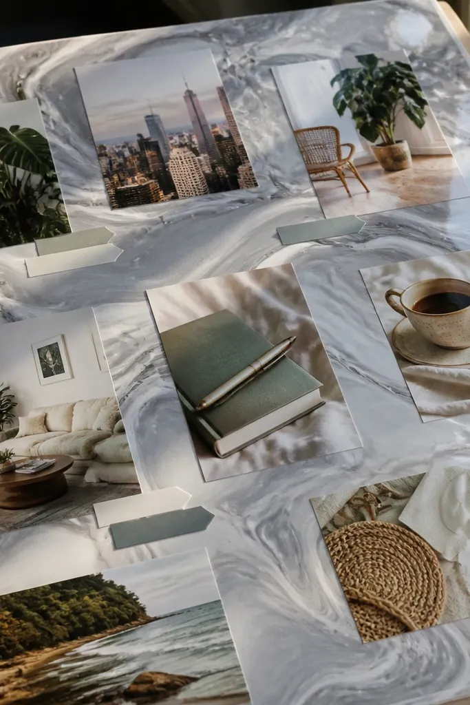
A marble swirl backdrop makes even cheap printouts look elevated. You build the “expensive” look using clear contact paper and a few drops of paint or nail polish. Then you stick your photos and labels on top so the board looks like a cohesive design panel. This is best for modern goals — skincare routines, minimal home styling, or clean aesthetic outfit inspiration. It’s also beginner-friendly because the background does most of the heavy lifting.
Lay clear contact paper flat and create swirl patterns using acrylic paint or diluted craft paint, then swirl with a toothpick. Let it set a few minutes so the colors don’t smear when you move it. Stick the contact paper onto a foam board base, smoothing bubbles. Add photo cutouts with double-sided tape so they sit flat, then top each label with a small strip of clear tape for durability.
Add one metallic element like silver tape or a thin foil strip so photos pop without clutter.
Don’t use too many colors — marble backdrops get busy fast in photos.
11. Washed Denim Patchwork Vision Board
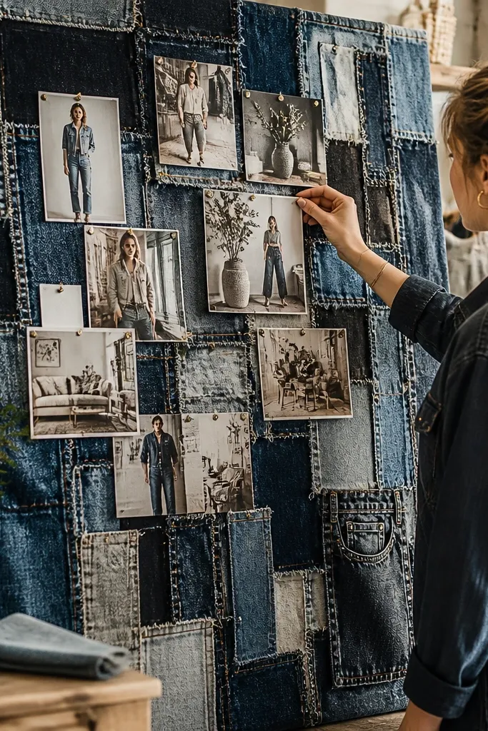
Denim scraps give you texture you can’t fake with paper, and they look great on camera. Patchwork also solves the problem of uneven materials — each scrap has a purpose and a shape. This board is ideal for style goals, casual home decor, or anyone who wants a grounded, wearable vibe. Pin or glue small photos directly onto the fabric patches so the whole board reads as one surface. It’s sturdy too, so you can handle it while updating.
Cut denim scraps into rectangles and squares, then arrange them on a board base like a puzzle. Glue denim down with fabric glue or a strong craft adhesive, pressing edges firmly. Once the surface is dry, pin or glue small photos onto specific patches. Add finishing details like stitched-look thread lines using thin embroidery floss and a needle, then seal any loose paper edges with a dab of glue.
Use one denim wash tone for the background patches and reserve lighter pieces for the focal photos.
Don’t cover the entire board with tiny scraps — big patches photograph better.
12. Thrifted Frame Insert Board with Fabric Back
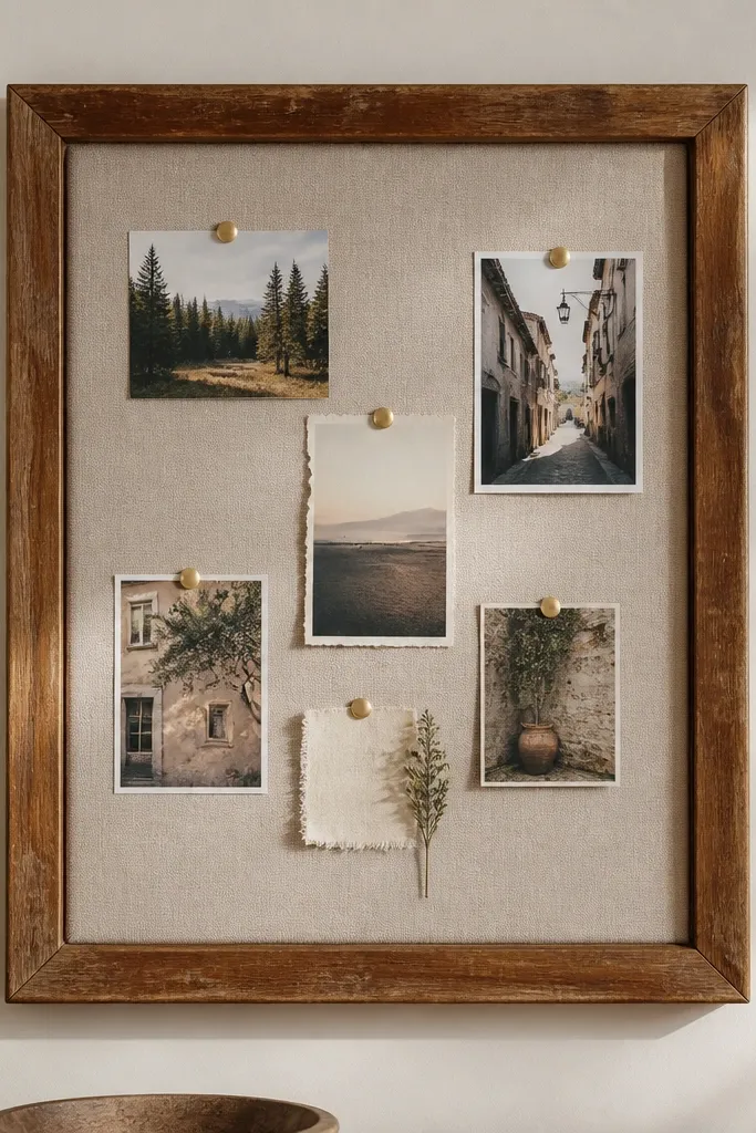
Frames make any vision board look intentional, and a fabric back makes it feel softer than cork. This setup is great if you want your board to live on a wall instead of a desk, because it looks like decor. The frame also keeps everything contained, so you don’t need perfect edges on every piece. Use it for room inspiration, color palettes, and aesthetic “mood” themes. It’s also a smart way to reuse something you already own or find at a thrift store.
Remove the backing from a thrifted frame and replace it with a fabric piece cut to fit. Stretch and staple the fabric on the back side, or glue it if the frame is shallow. Add a layer of thin batting if you want a softer, padded look. Insert photos using pins or glue dots on top of the fabric, then replace the frame backing and hang.
Pro tipChoose fabric with a subtle pattern, like small dots or a twill — plain fabric shows glue lines more easily.
AvoidDon’t use flimsy paper photos directly — mount them on cardstock first so they don’t sag.
13. Receipt Color Code Board with Tiny Swatches
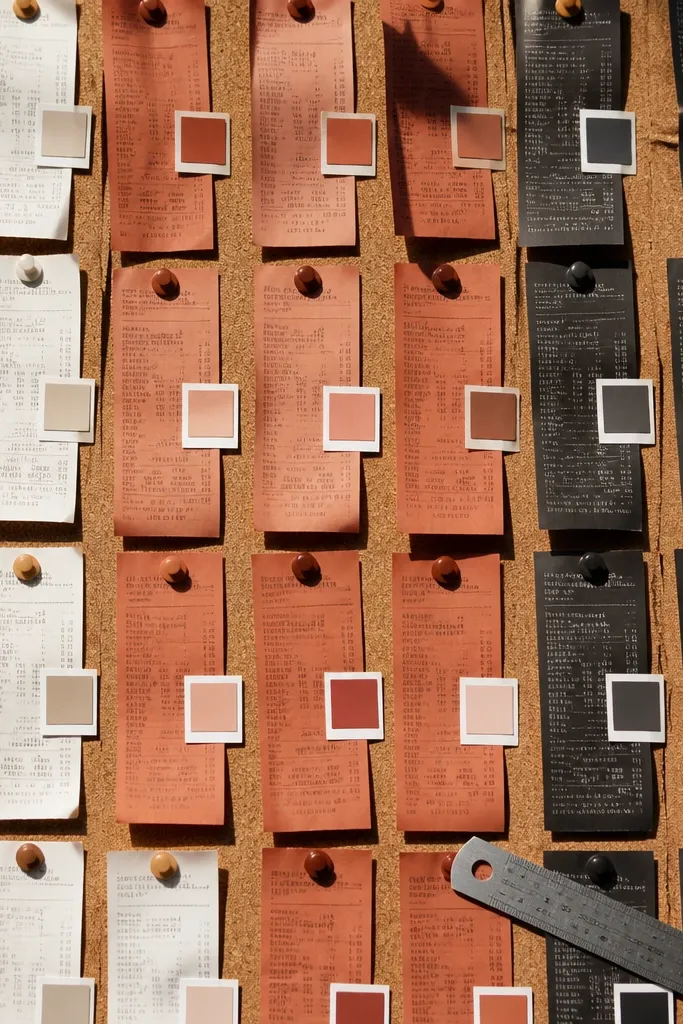
Receipts are weirdly good for aesthetic boards because they already have color blocks, dates, and printed typography. This idea uses that printed structure to build a budget-friendly “color coding” system for your vision. Add tiny swatches next to each receipt strip so you’re not guessing later. It’s perfect for home projects, organizing a capsule wardrobe palette, or planning a color theme for a room refresh. The result looks like design notes, not a school craft.
Cut receipts into strips and flatten them under a heavy book for an hour if they curl. Glue strips onto a base in rows, leaving small gaps. Next to each strip, glue a tiny fabric or paper swatch that matches the color direction you want. Add one short label under each row like “bathroom calm” or “spring neutrals,” then cover the whole board with clear contact paper to prevent smudging.
Use fabric swatches from old clothes — denim, knits, and cotton hold color better than thin paper.
Skip wet glue on receipts — it makes the ink bleed.
14. Laminated Photo Strip Timeline with Pocket Tabs
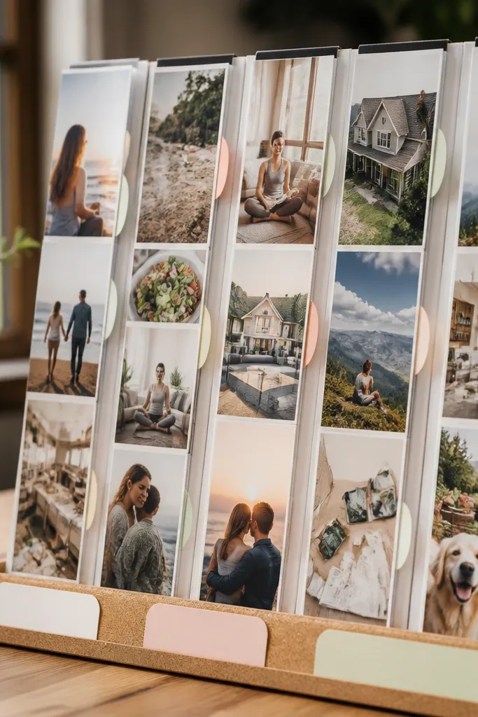
This layout keeps your board interactive and clean, which is why it looks so good. Laminating creates crisp edges and protects your photos from fingerprints and glue residue. Pocket tabs let you swap in new photos without peeling anything up. You get a clear “progress” feel, and the board stays organized even as you update it. It’s great for goals like learning, fitness, home renovations, or any plan where you want visible steps.
Print or cut photos into matching sizes, like 3x5 inches, and laminate them with clear sheets. Create a timeline on a base using pencil lines and a simple arrow direction. Add small pocket tabs by cutting thin cardstock and covering them with clear contact paper, then glue or tape pockets to the base. Slide new photo inserts into the pockets as your plan changes, then add a short caption label under each position on the timeline.
Pro tipUse a ruler for spacing so the timeline looks straight in photos.
AvoidDon’t glue laminated edges directly without roughening — it can peel off later.
15. Shadow Box Vision Board with Layered Paper Depth
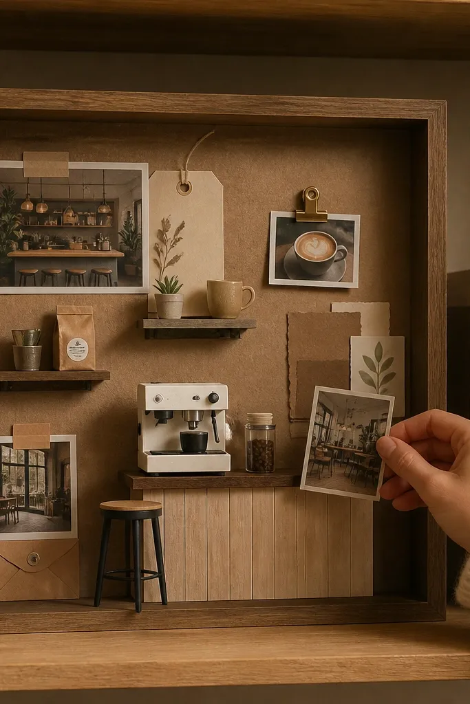
A shadow box makes your board look like a display, not a flat collage. Layering gives you real depth, and depth is what makes images look expensive. Use this for specific themes like “dream coffee bar,” “nightstand aesthetic,” or “capsule wardrobe picks.” It’s also one of the best ways to use upcycled materials that are too bulky for normal gluing, like thick cardboard, magazine back covers, and foam scraps. Expect a little more cutting, but the look is worth it.
Grab a shallow shadow box frame or build a simple one from a foam board base with raised cardboard walls. Cut backing paper in a neutral color and glue it down. Layer cutouts on foam tape so they sit at different distances, then add photos at the center focal point. Finish by sealing loose edges with glue and checking for sharp points before closing the frame.
Pro tipUse foam tape strips instead of glue for most layers — it keeps edges clean and adds consistent spacing.
AvoidDon’t stack too many layers — 3 depth levels usually looks best.
16. Photo + Film Negative Style Strip Board
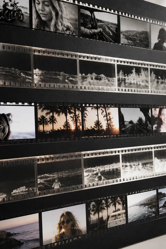
This one is graphic and fun, and it’s one of the easiest ways to make a board look intentional. Film-negative style strips create a repeated pattern, which makes the whole board read as one design. It’s great for people who want a clean, modern aesthetic without complicated painting. Use it for travel memories, outfit inspiration, or “daily moments” goals. The repeating strip layout also hides imperfect cutting because the pattern does the visual work.
Cut photos into narrow strips, like 1.5x4 inches, and mount them on black cardstock. Arrange strips in rows on a matte base, leaving consistent gaps like a photo strip. Add small circle labels or tiny date stamps using scraps of paper. Seal everything with matte clear spray so the black cardstock doesn’t scuff.
Pro tipUse one black shade for all photo mounts so the contrast stays consistent.
AvoidDon’t use mixed aspect ratios — it breaks the film-strip rhythm.
17. Kraft Paper + Twine Mason Jar Labels Theme
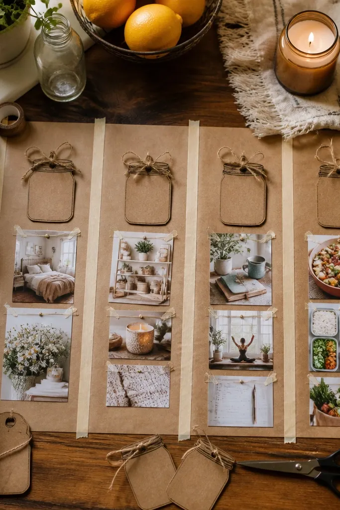
Kraft paper instantly makes budget materials look warmer and more “designed.” Mason-jar style labels add structure and a cute, organized vibe, and twine ties make it photogenic from above. This layout works for meal planning, self-care routines, and home organization themes. It’s also great for people who like a cozy aesthetic but still want clarity. The best part is that labels make your board readable, even from a distance.
Cut kraft paper rectangles for label backings and write your short text on them with a fine-tip pen. Add twine loops at the top of each label backing and tie them to the board with small adhesive hooks. Place photos underneath or beside labels, then add one small texture element like a scrap of burlap or lace. Seal the paper labels with a thin clear tape border so pen doesn’t smear.
Use black or dark brown pen — lighter ink disappears on kraft in photos.
Don’t use long sentences — jar labels look better with short phrases.
18. Vinyl Scrap Lettering with Stencil Cutouts
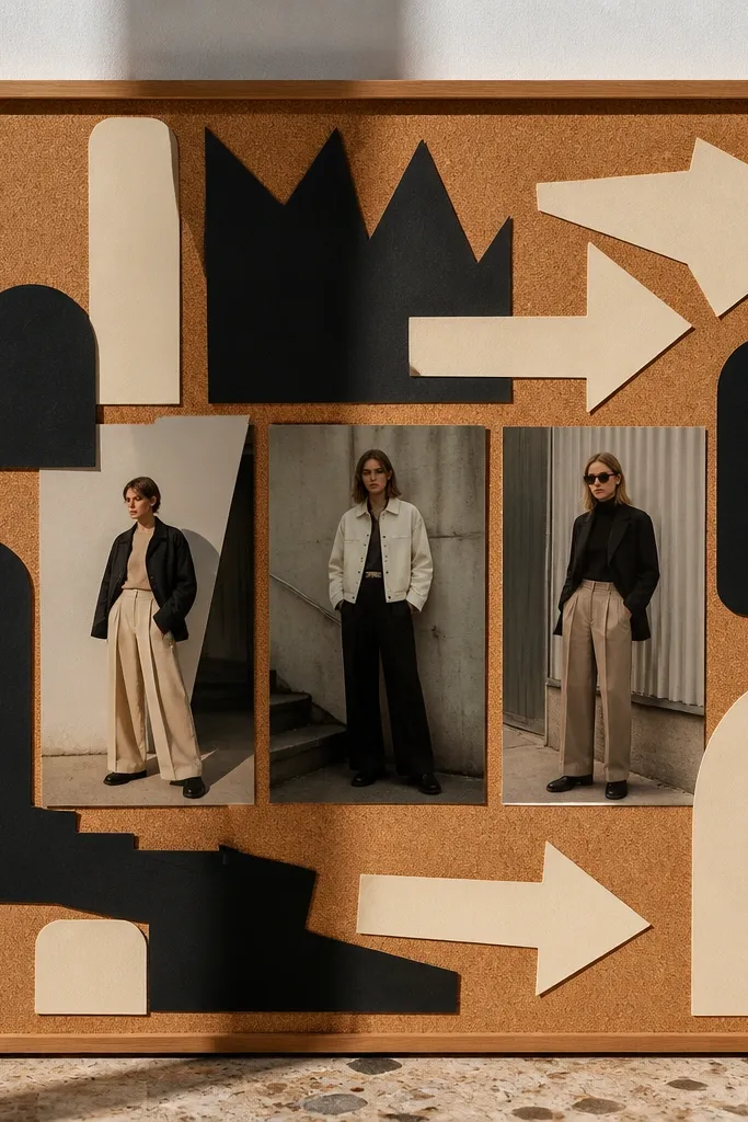
Bold lettering makes a vision board look like a design poster, not a craft sheet. Vinyl scraps are durable and look clean, and stencil cutouts add graphic shape without needing fancy drawing. Pair your text with only a few hero photos so the board stays photogenic. This is ideal for goals that need clarity like “WALK 10K,” “READ 20,” or “COZY KITCHEN.” The result is crisp, high-contrast, and easy to update.
Create stencil shapes on cardstock, then trace them onto vinyl scraps and cut with a craft knife. Lay the vinyl pieces onto a clean base and press firmly so edges stick. Add one hero photo per section, then place vinyl lettering above it using a consistent font size. Seal the vinyl edges with a tiny strip of clear tape if you want extra durability.
Use a single stencil style, like circles or triangles, so the graphic language stays consistent.
Skip tiny letters — they peel or become unreadable in photos.
19. Layered Tissue Paper Ombre Panels
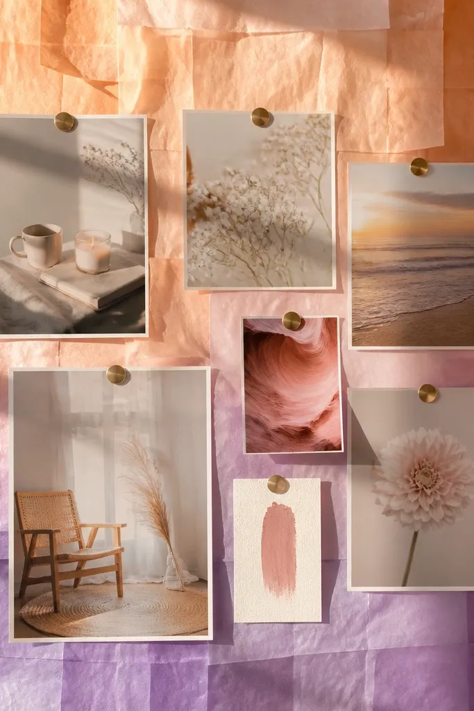
Tissue paper ombre panels create a soft, dreamy background that makes photos feel brighter without spending on expensive print materials. It’s a smart way to add color when your clippings are mostly neutral. You also get a unique texture that catches light in a way flat paper can’t. This layout works well for self-care boards, skincare inspiration, and light, airy home goals. It’s slightly more time than taping clippings, but the look is worth it.
Tear tissue paper into wide strips and choose 3-4 colors that fade into each other. Layer strips on a base in rows, starting with the darkest at one side and blending toward the lightest. Glue only the edges so the center stays airy and doesn’t wrinkle. Place photos on top using double-sided tape, then add small text tags in a contrasting color like black.
Use a hair dryer on low heat to flatten tissue quickly — keep it at a distance to avoid scorching.
Don’t glue the whole surface — it kills the airy effect.
20. Upcycled Map Coordinates Theme Board
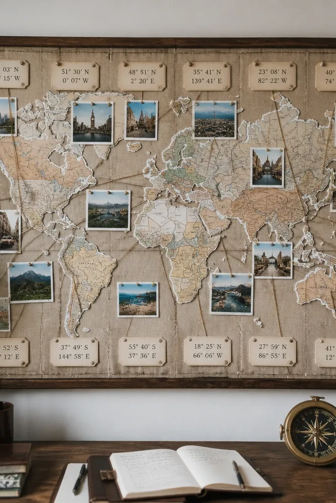
Maps give your vision board a built-in story and a crisp graphic background. This idea uses torn map pieces as texture and adds coordinate-style labels so the board looks like a travel plan or a “home base” mood board. It’s photogenic because maps have natural lines and typography, and those details look good behind simple photos. Use this for destination goals, nostalgia themes, or “move-in-ready” home plans. The materials are cheap, and you get a distinct aesthetic that doesn’t look like everyone else’s.
Tear map pages into large irregular shapes and glue them onto a neutral base, leaving a few clean areas for photos. Add coordinate labels by printing or hand-writing something short like “40.7 -74.0” style on small paper scraps. Place a hero photo in each map section and tape the edges so they lie flat. Seal the board with matte clear contact paper to protect the paper from handling.
Pro tipChoose one map style — avoid mixing subway maps with topographic maps on the same board.
AvoidSkip too much text — let the map print do the visual work.



