
1. Cereal-Box Chipboard Cover with Window Spine
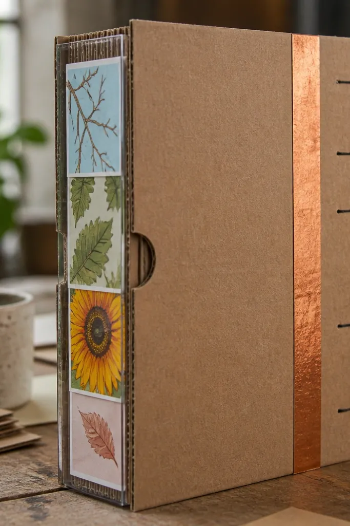
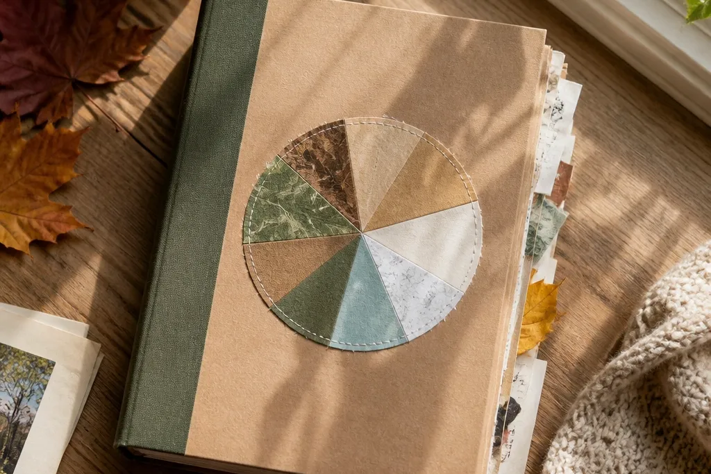
This is the easiest way to make a scrapbook journal look “designed” even when you’re using scraps. The chipboard gives you crisp edges and a solid surface for photos and journaling, while the window spine lets you rotate seasonal labels without rebuilding the whole cover. Use kraft for the base and add one accent strip color so the journal stays consistent year-round. It photographs cleanly because the cover has structure — no sagging paper corners or floppy fabric.
Pro tipSand the chipboard edges with a fine sanding block so paper doesn’t peel at the corners.
Cut two pieces of cereal-box chipboard to 8.5x11 inches for the front and back. Cover both pieces with heavy paper or fabric using PVA glue, then wrap the edges neatly on the back side. For the spine, cut a strip of clear plastic packaging (like a CD sleeve) slightly taller than your pages and glue it to the center, then add a folded label tab inside the window. Finish by punching holes at the same positions as your inner pages so the cover locks into the binder rings or stitching plan.
AvoidDon’t use thin craft foam for the cover; it bows and ruins the crisp look.
2. Tea-Dyed Timeline Strip Pages
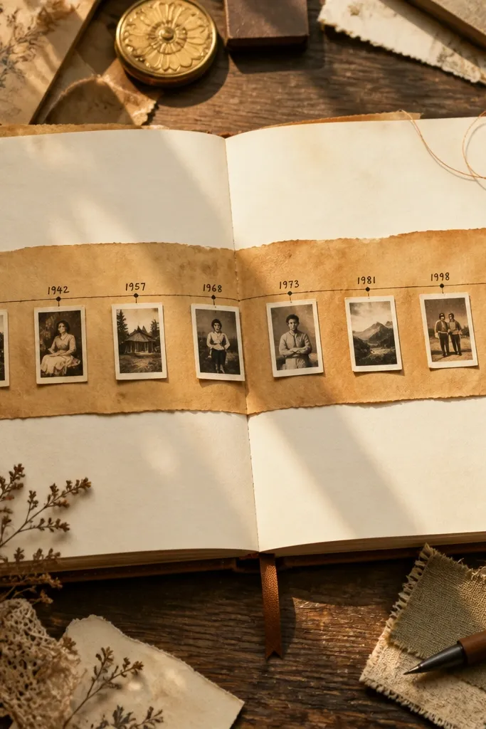
A timeline strip makes year-round scrapbook journal ideas feel organized, not random. The tea-dyed tone gives you a steady warm background that works whether your photos are winter whites or summer brights. Add small photo mats along the strip so each page holds a story even if you only have one or two pictures. The look is cohesive because the background stays the same, while the content changes.
Brew strong black tea and let it cool, then sponge it onto cardstock in light passes until you get a uniform sepia layer. Dry flat under a book so it doesn’t curl. Cut a long strip of coordinating paper (about 2 inches tall) and glue it across the center, then mark date boxes with a ruler and fine pen. Add two or three photo mats (2x3 or 1.5x2.5) on top of the strip so they align neatly on the grid.
Use a gel pen for headings so the ink stays dark on tea-dyed paper.
Skip over-wetting; puddles dry into blotchy spots that look messy on camera.
3. Fabric-Scrap Corner "Photo Anchors"
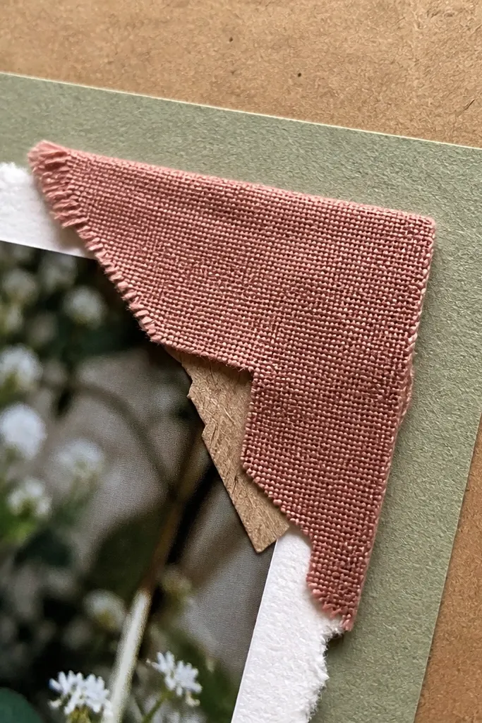
Corners are underrated. Fabric scraps tucked into photo corners act like anchors, giving your pages texture without covering the photo. This style works year-round because fabric reads the same in any season — it’s the color accent that changes. It’s also forgiving: even if your scrapbook paper edges aren’t perfect, the fabric corners hide the unevenness. Photos look more “framed” and intentional.
Pro tipPress everything under a heavy book for 30 minutes so fabric edges stay flat.
Cut your base page from 8.5x11 cardstock and trim a photo mat to 4x6 for a standard look. Cut four fabric squares about 1.25 inches wide and rough-cut them so the edges are slightly irregular. Glue fabric squares into each corner of the photo mat area, then place the photo mat on top with a thin adhesive layer so it doesn’t warp. Finish by stitching around the fabric corners with embroidery thread or a simple faux-stitch using a white gel pen.
AvoidDon’t use hot glue — it creates lumps that show in photos.
4. Receipt and Ticket "Layered Ledger" Layout
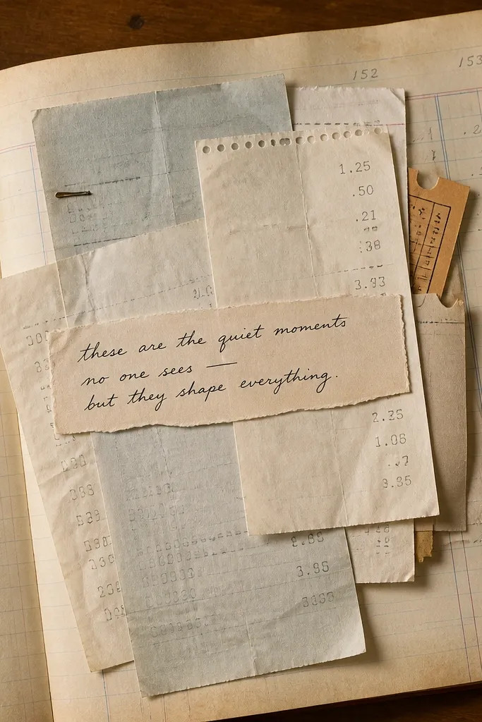
This layout turns everyday paper into a clean, story-heavy page. The layered ledger look is photogenic because it has depth: receipts overlap, ticket stubs peek out, and journaling sits on top like captions. It’s great for year-round scrapbook journal ideas because you’ll always have paper — even when you travel only once a year. Keep the fonts and ink style consistent and the page reads cohesive.
Pro tipUse a brown archival ink pen for captions; it stays readable on tan paper.
Choose a base page and cut a main photo mat to 3.5x5 inches. Collect receipts or ticket stubs and trim them to different widths, then overlap them in a staircase pattern under the photo mat. Glue the bottom layer first, then add the next piece at a slight angle so edges stay visible. Write short captions on thin strips of scrap paper (about 0.75 inches tall) and tuck them into the overlap lines for a ledger feel.
AvoidDon’t glue every layer flat — leave at least one edge unglued so the overlap looks dimensional.
5. Black Gesso + White Gel Pen "Winter Grid" Pages
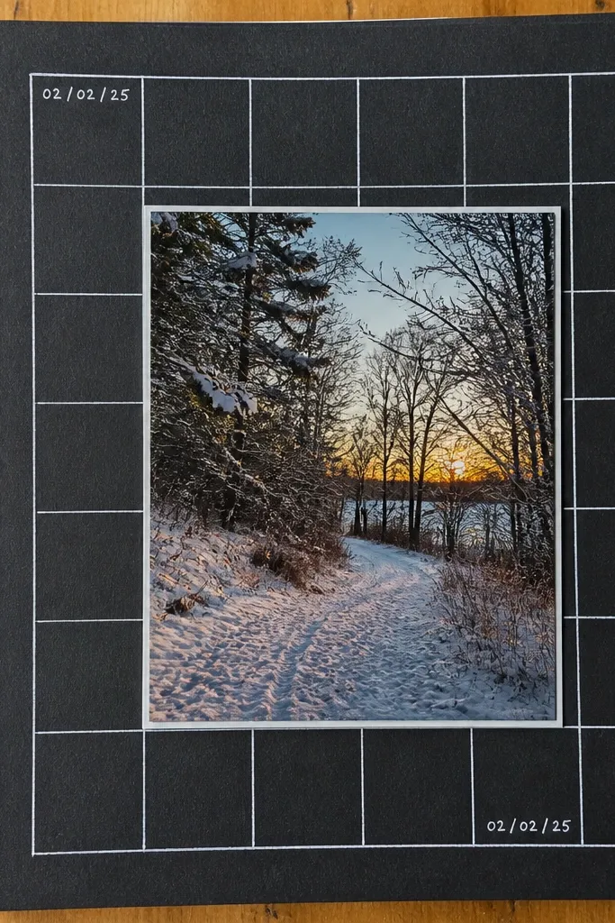
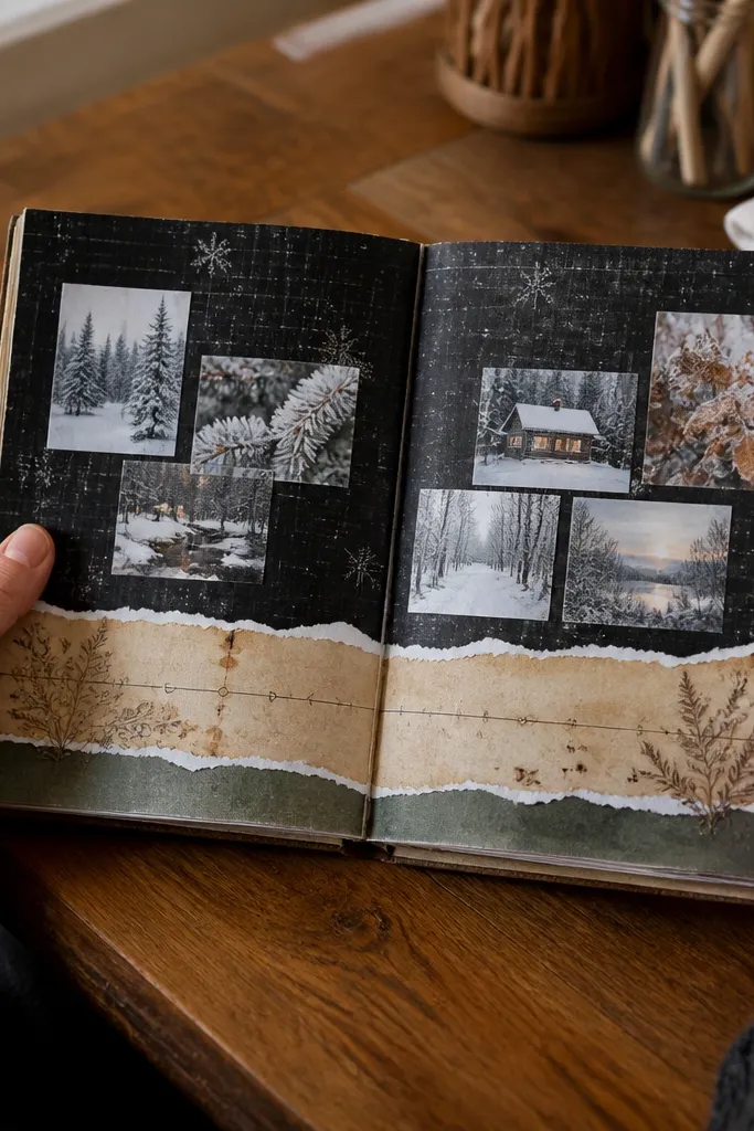
This one is dramatic and consistent. A black background makes any photo pop, and white gel pen grid lines keep the layout structured across the year. Even when your photos are colorful, the grid keeps everything from looking chaotic. It’s the best option when you want your journal pages to look like a designed art piece rather than a scrapbook collage.
Cover a page with black gesso using a sponge brush, then let it dry fully. Draw a grid with a ruler: 1-inch squares or a 1.25-inch rhythm for photos and notes. Cut photo squares to match the grid and mount them with foam dots so they lift slightly. Add white gel pen labels in the margins and a small date stamp using a scrapbooking stamp or a hand-drawn date box.
Use a metal ruler and press lightly; gel pen lines look crisp without denting the paper.
Don’t skip drying — wet gesso smears gel pen when you touch it.
6. Kraft Paper Wrap "Spine Pocket" for Monthly Notes
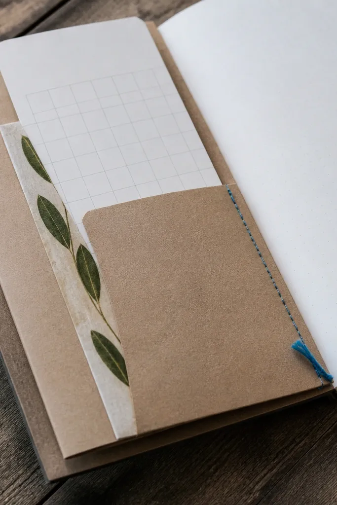
A spine pocket is practical and photogenic. It lets you tuck in monthly notes, pressed leaves, or a small photo strip, and it stays visible from the side view when you flip pages. Year-round scrapbook journal ideas benefit from this because your “content” can vary — sometimes you have a lot, sometimes you have one paragraph. The kraft tone keeps the look warm and steady.
Pro tipBurnish the fold with a spoon handle so the pocket edges stay sharp.
Cut kraft paper strips to the height of your page and fold them to form a pocket about 1.5 inches deep. Glue the pocket to the inside edge of the page, leaving the top open. Add a reinforcement strip on the fold line using thin paper tape or extra glue so the pocket doesn’t tear. Decorate the outside with a single printed word label (like “JAN” or “MARCH”) so the journal reads organized even with minimal decoration.
AvoidDon’t make the pocket too deep; bulky inserts warp the page and show on camera.
7. Sticker-Only Layout with One Rule: Tear-Edge Borders
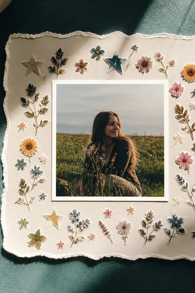
If you rely on stickers, you need a boundary system or the page turns into random clutter. Tear-edge borders give stickers a handmade feel and stop them from looking like they were slapped down. This style is year-round because the tear border is the constant, while the stickers change with seasons. Keep the composition tight: one main photo, one sticker cluster, one caption strip.
Pick one sticker theme pack and choose one photo to center your page. Tear a frame border from patterned paper or scrap paper, making each side slightly different so it looks natural. Glue the torn border first, then place stickers inside the frame and lightly arrange before committing to glue. Add a caption strip using a scrap of plain paper and write one sentence with a fine pen.
Press stickers down with a bone folder so edges don’t lift later.
Don’t use three different border styles on the same page — it breaks the “intentional” look.
8. Pressed Leaf + Clear Tape "Specimen" Page
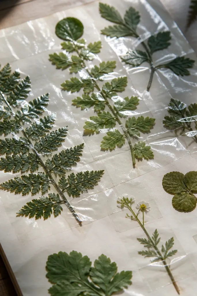
A specimen page looks like a mini exhibit, and it photographs beautifully because of the clear layer. Pressed leaves work best in fall and spring, but you can still use the same format year-round with small flowers from any season or even decorative herbs. The clear tape layer protects the paper and gives a glossy highlight that pops in daylight. It’s also a strong “memory” page when you want to keep objects flat.
Press leaves between book pages for 1-2 weeks so they lie flat. Tear a small rectangle of cardstock as the specimen base, then glue it where you want the display. Place the leaf carefully and cover it with a clean clear tape sheet (use wide clear tape and overlap edges). Seal the tape edges with a thin line of glue around the perimeter so it doesn’t lift.
Trim tape with a craft knife and a ruler for straight edges.
Don’t skip pressing time; wrinkled leaves look messy under the clear layer.
9. Fabric Bow Header for Any Month
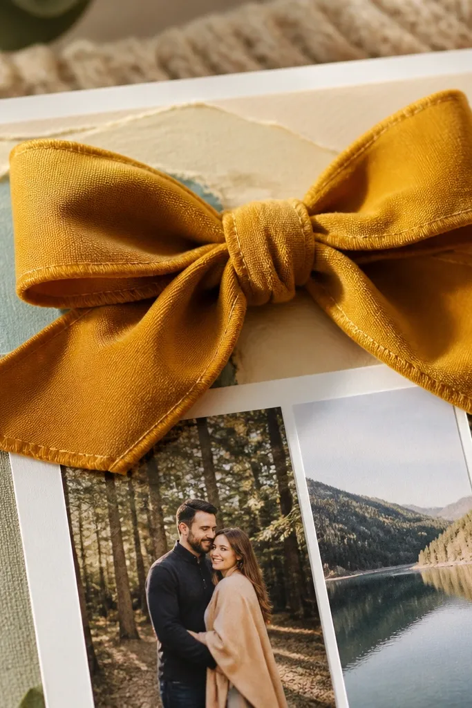
A bow header makes scrapbook pages feel “finished” without needing a full theme. Keep the bow in the same spot every month so your journal reads consistent, and change only the fabric color or pattern. This works year-round because bows are season-agnostic — they read as a style element. Photos frame nicely underneath, and the header gives you a clear visual anchor for the layout.
Pro tipUse cotton or linen scraps; they hold shape better than stretchy knits.
Cut a fabric strip about 10 inches long and 1 inch wide, then fold it into a loop to form the bow shape. Use a needle and thread to stitch a small gathering at the center or glue it lightly and secure with thread. Glue the bow to the top center of your page, then add a title label below it (month name or a short theme). Add one photo mat directly under the label so the composition stays balanced.
AvoidDon’t pick a bow size that blocks the first line of journaling; keep it under 2 inches tall.
10. Magazine Cutout "Headline + Photo" Double Stack
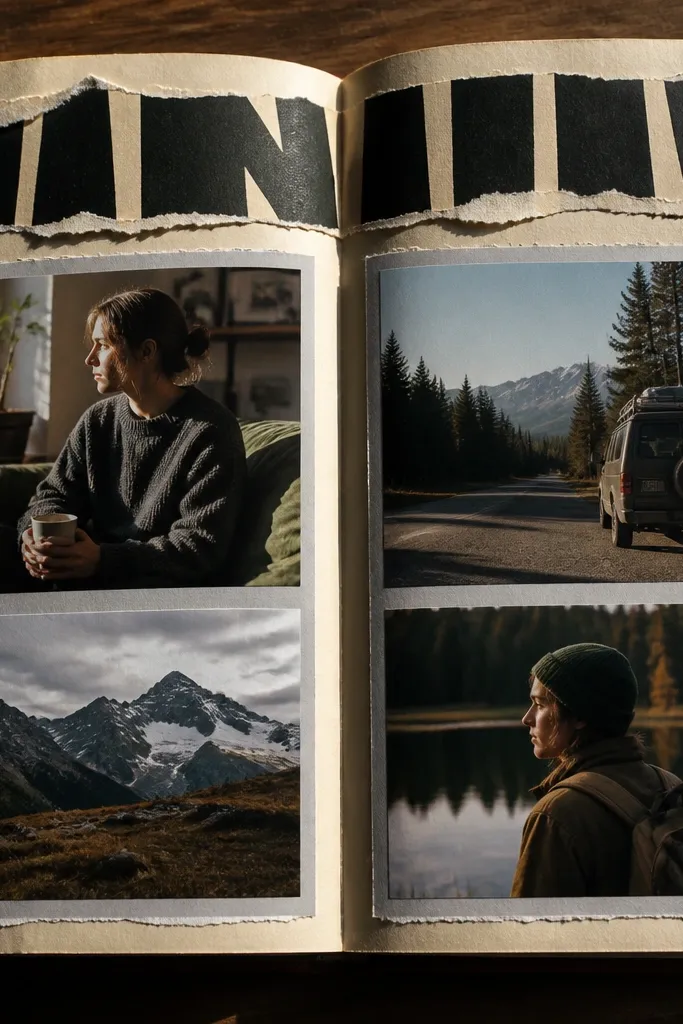
This is a strong, graphic look that makes your journal feel like a mini magazine issue. The headline cutout gives you instant typography, while the photo stack keeps it personal. It’s a great year-round system because you can cut headlines from any issue and match the color palette to your photos. The torn edges add texture and keep it from looking too perfect.
Find a magazine page with bold text and cut a headline strip about 3 inches wide. Tear the edges of the strip so it looks handmade, then glue it across the top third of your scrapbook page. Place a 4x6 photo mat underneath and overlap a second smaller scrap strip behind it for depth. Write a short caption in a single line using a pen that matches your headline color tone.
Choose headlines with black, navy, or one clear accent color so the page stays readable.
Don’t cover the photo with too many cutouts; one headline strip is enough.
11. Washi Tape "Corner Map" Layout
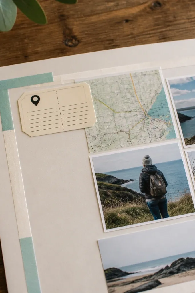
Washi tape corners give you a clean frame and a playful, travel-y look. This layout is photogenic because the corners create a graphic border that doesn’t hide the photo. It works year-round because you can swap tape colors by season while keeping the same corner structure. Add a small “location” label and a date and the page becomes readable even at a glance.
Pro tipUse tape with matte finish for a softer look; shiny tape can glare in photos.
Cut a base page and position your main photo mat center. Apply four short pieces of washi tape in the corners, leaving a small gap between tape and photo edge. Layer one thin strip diagonally across one corner to create a map feel, then add a tiny label using scrap paper. Finish by drawing a simple line arrow with a black pen pointing toward the label.
AvoidDon’t use wide tape all over; corners only look intentional.
12. Paint Pour Background with One Photo Cutout
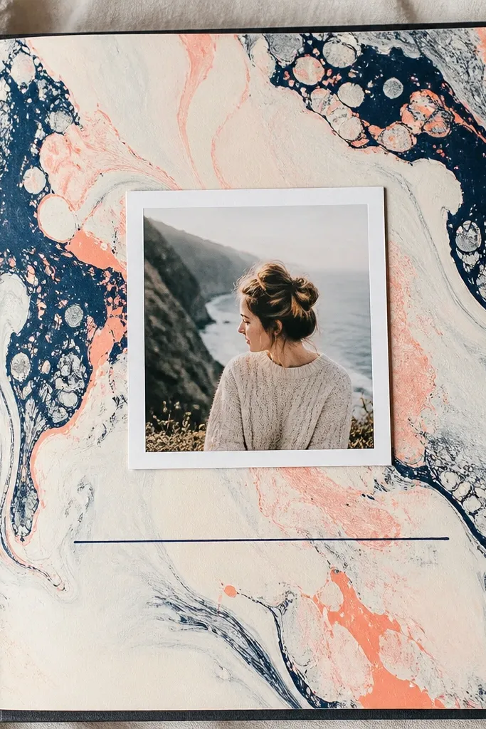
When you want year-round scrapbook journal ideas to look artsy, this is the page. A paint pour background gives you a unique texture that still stays consistent across repeats if you stick to a limited palette. The trick is restraint: one photo cutout, one journaling line, and a lot of negative space. It looks dreamy because the background is soft and the photo sits on top like a focal point.
Protect your workspace and mix acrylic paint with a splash of water so it flows. Pour or swipe onto watercolor paper, then tilt the paper to spread color into a smooth wash. Let it dry completely, then cut a photo window using a craft knife or scissors. Glue the photo window and add one thin journaling strip at the bottom with a ruler for straight placement.
Use two main colors plus one accent. Too many colors makes the photo disappear.
Don’t seal the page with glossy Mod Podge; it creates glare under daylight.
13. Scrap Fabric Pocket Page for Photo Strips
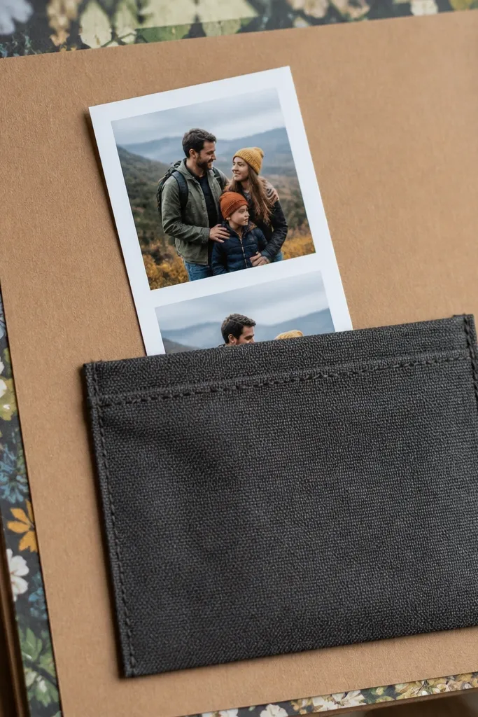
A fabric pocket turns a journal page into something you can interact with. The photo strip slides in and out, so you can rearrange order when you reprint or switch which photo you want front-and-center. This format stays good all year because pockets are structural — they don’t depend on the season. The fabric also softens the page and makes it look cozy in photos.
Pro tipCut pocket fabric with a little extra length so it doesn’t snag when you slide photos.
Cut a rectangle of fabric about 6x7 inches and fold the top edge down 0.75 inch to create a pocket opening. Stitch or glue the pocket sides onto an 8.5x11 base page, then reinforce the fold line with extra glue or a row of stitching. Trim a photo strip to fit the pocket opening and add a small label tab on the outside. Finish with a thin border of plain paper so the fabric pocket doesn’t overpower the page.
AvoidDon’t use slippery satin; it shifts and makes the photo hard to slide.
14. Antique-Gold Brads on Layered Tag Tabs

Tag tabs with brads look sharp and intentional, and they add a little bit of “hardware” texture that reads well on camera. You can use the same layout every month: one tag for the month name, one for a short theme, one for a tiny photo. Year-round scrapbook journal ideas benefit from this because the brad style stays consistent and the content swaps out easily. It also makes pages feel like they open and move.
Cut three tag shapes from cardstock about 2x3.5 inches each. Layer them by gluing a patterned scrap behind one tag and a plain scrap behind another, then punch a hole through all layers at the top center. Insert antique-gold brads through the holes and spread the backs on the page. Add a photo mat behind the bottom tag so it peeks out from under the hardware.
Use a single brad finish across the whole journal so the metal tone stays consistent.
Don’t punch holes without marking placement; misaligned brads make the whole page look off.
15. Origami Corner Folds for Hidden Journaling
Hidden journaling keeps your scrapbook pages interesting even when you don’t have many photos. The corner fold is photogenic because it creates a crisp diagonal shape and a little shadow depth. It’s year-round because it works for any theme: winter notes, summer lists, or a quick weekly recap. Keep the same paper tone and you’ll get consistency across months.
Pro tipUse a contrasting paper for the inside flap so the hidden note feels like a surprise.
Cut a page from cardstock and score a 3-inch square corner line. Fold a triangle flap using a bone folder so the crease stays sharp. Glue only the edges that hold the flap — leave the opening edge free so it lifts. Write a short journal note on a small rectangle and tuck it inside, then add a small sticker or stamped date near the corner for a clean look.
AvoidDon’t overfill the flap; bulky notes make the corner pop up and tear.
16. Watercolor Wash Background with Stamped Dates
This layout makes your journal feel airy and consistent. The watercolor wash gives a gentle background that works with any photo color, and a repeated date stamp pattern creates rhythm across the page. Year-round scrapbook journal ideas need this kind of repeated structure because it keeps pages from looking like random one-offs. The stamp also gives you a quick way to label months without handwriting everything.
Pro tipUse archival ink for stamping; regular ink smears when watercolor paper is still slightly damp.
Paint a loose watercolor wash on thick paper, using one base color and one light accent. Dry flat under weight. Stamp the same date format in a line near the bottom or around the edges using archival ink so it doesn’t bleed. Add one photo mat and a journaling strip, then lightly outline the stamp line with a fine pen for clarity.
AvoidDon’t stamp too close to wet areas; edges will blur.
17. Photo Strip Envelope Made from Packaging
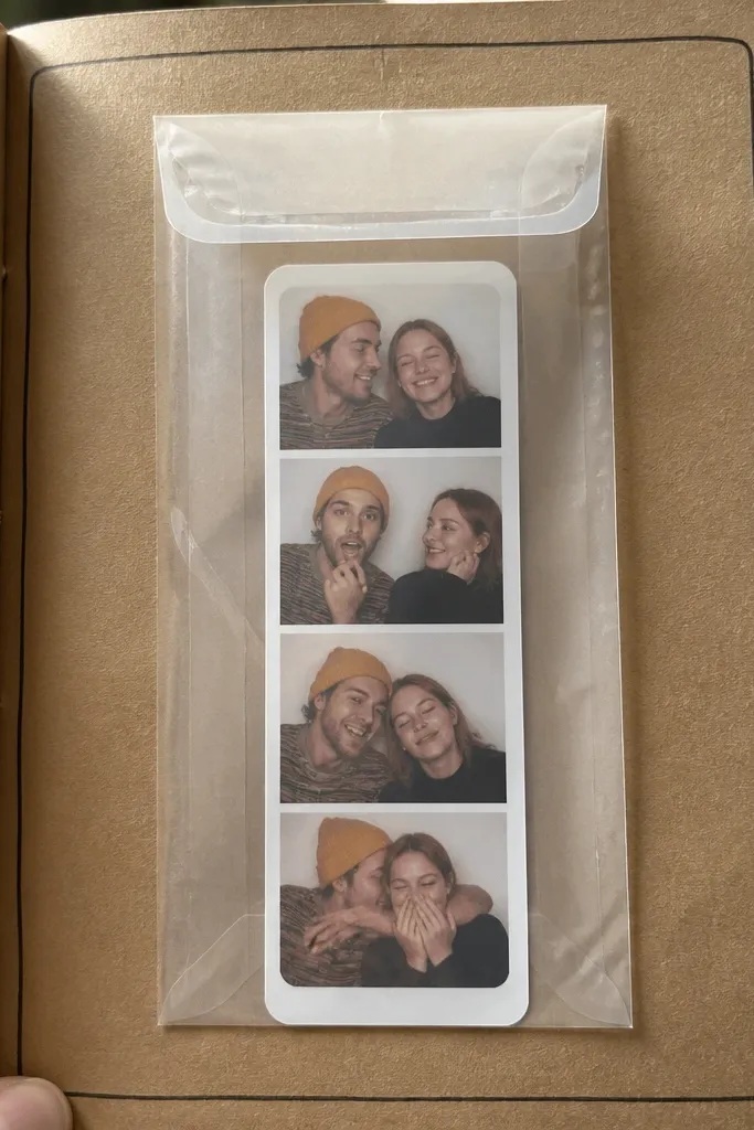
A packaging envelope is a clever way to tuck a photo strip while keeping the page sleek. Clear or semi-clear packaging makes the envelope look modern, and the photo strip stays protected. This is strong for year-round scrapbook journal ideas because it turns small photo sets into a consistent “section” you can repeat monthly. It also gives you a place for journaling notes without gluing everything directly on the page.
Pro tipRound the envelope corners with scissors so it doesn’t catch on page sleeves.
Find a flat packaging piece with a clean edge and cut it into an envelope sleeve. Fold side flaps inward and glue only the edges, leaving the top open. Glue the envelope to your scrapbook page with a thin line of adhesive along the back and bottom. Insert a photo strip (like 1x4 or 2x3) and add a label tab at the top using scrap paper.
AvoidDon’t use packaging with sticky residue; it can stain paper over time.
18. Thread-Wrapped Mason Jar Label Title
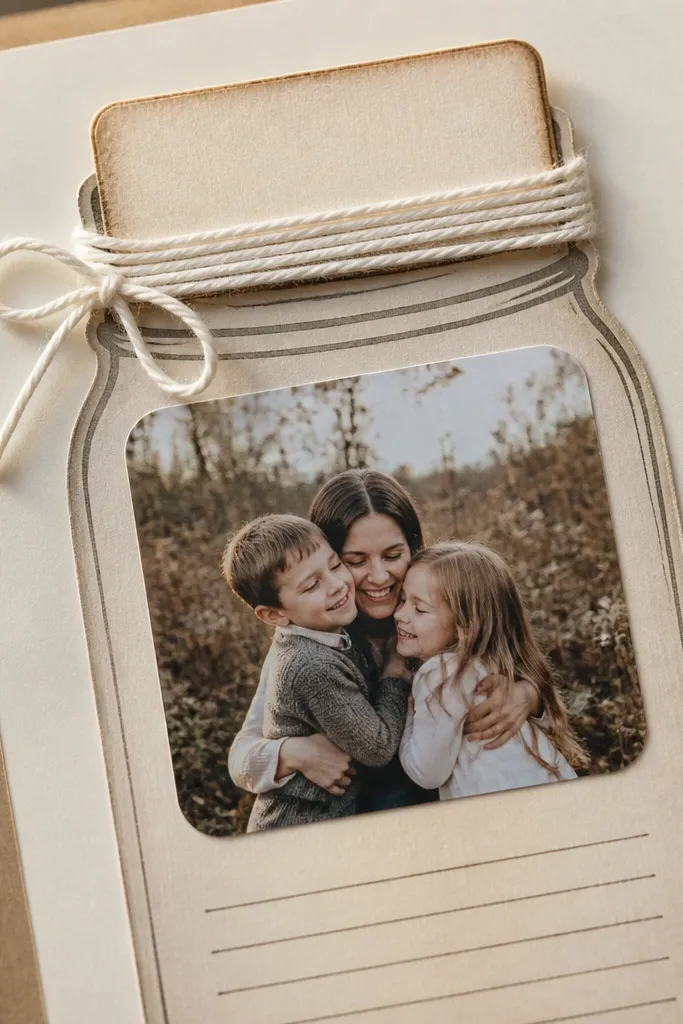
Thread-wrapped titles look handmade and they add dimension without being bulky. The label sits at the top like a sign, and the thread creates a soft shadow that looks great in daylight. This format works year-round because it’s a style element, not a seasonal theme. Pair it with a single photo and short journaling for a page that reads clean and calm.
Cut a label from cardstock (about 2.5x4 inches) and punch a small hole or mark a starting point near the top. Wrap twine or embroidery thread around the label tightly, gluing the start and end. Glue the finished label to the top center of your page. Add one photo mat under it and write a short line of journaling to the side with a ruler for alignment.
Use a matte glue like PVA so thread doesn’t shine in photos.
Don’t wrap too loosely; gaps make the label look unfinished.
19. Cardstock Stacking "Shadow Photo" Frame
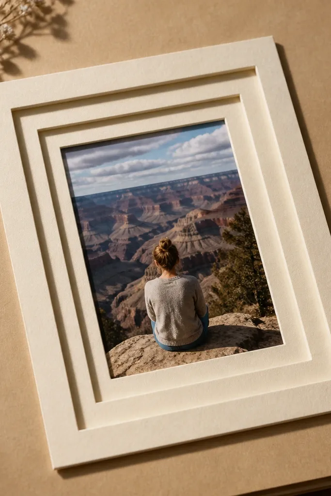
Layered cardstock frames give your photos a clean, gallery look. The key is the shadow effect: each layer is slightly offset, so the photo looks lifted from the page. This is perfect for year-round scrapbook journal ideas because you can keep the same frame dimensions and just swap photo content and colors. It also hides messy edges from trimming photos.
Pro tipMark offsets with a pencil tick so your layers line up every time.
Cut your base photo mat and two additional frame layers from cardstock, each 1/8 inch larger than the previous. Offset the top layer slightly to the right or bottom so you see the “shadow” edge. Glue layers in order: largest to smallest, leaving the inner window clear for the photo. Mount the photo on the top layer with foam dots for extra lift, then add a small journaling strip below.
AvoidDon’t use thick, uneven foam; it can warp under glue and tear paper.
20. Painted Paper Tabs with Month Labels
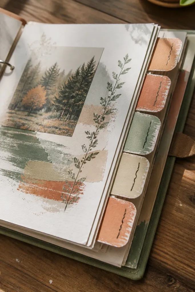
Side tabs make your journal easy to flip and they look stylish in a binder. The tabs are also a visual anchor, which is exactly what year-round scrapbook journal ideas need when you keep switching themes. Use a restrained color palette and paint the tabs in small batches so the texture stays consistent. Each page still feels individual, but the system keeps it cohesive.
Pro tipUse a ruler to keep tab placement identical so the journal looks tidy when flipped.
Cut tab strips from cardstock about 1.5 inches wide and 4 inches tall. Paint only the front edge and part of the back so the color looks layered. When dry, fold or crease the tabs so they attach along the page margin. Write month names on each tab with a fine pen, then glue tabs to the left margin of your page or binder section so they line up across the journal.
AvoidDon’t paint the whole tab — full coverage makes it too heavy and can peel.
21. Scrapbook Map Coordinates with Thread Lines
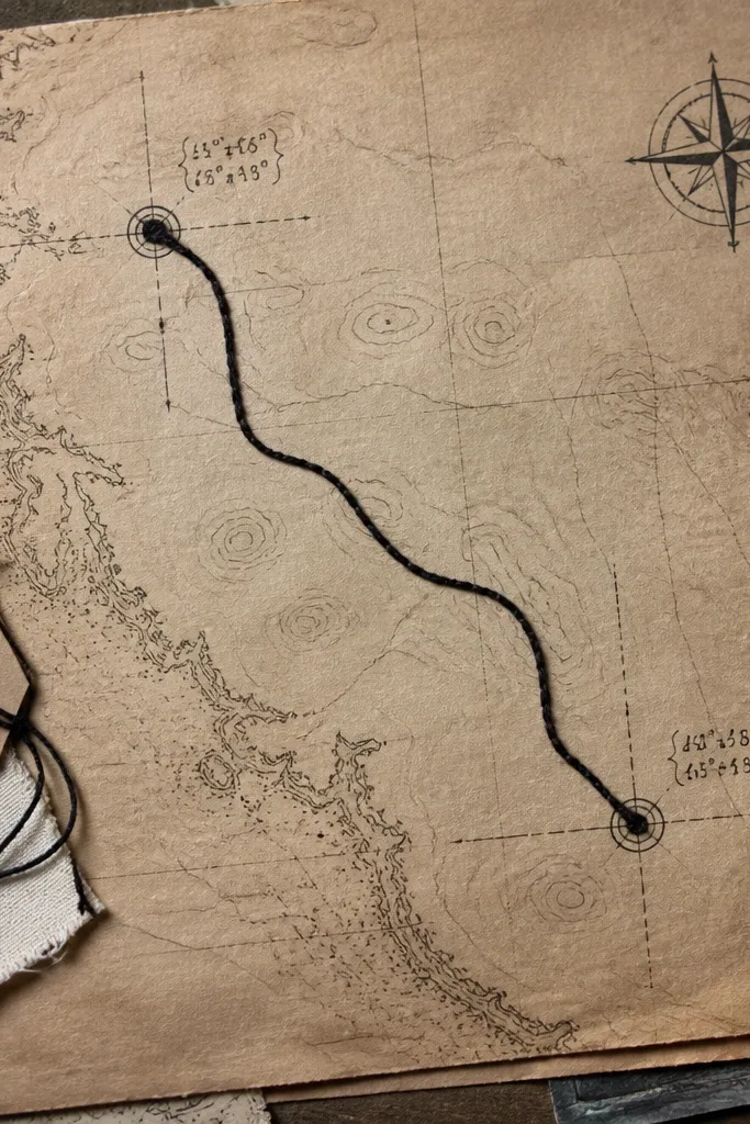
Thread lines turn a flat page into a drawn map. Write coordinates or simple location names, then stitch or glue thread from point to point to create a “route” over the page. This works year-round because maps don’t belong to one season — they’re content-flexible. The texture of thread and the clean handwriting give a dreamy, organized look.
Pro tipIf you glue thread, use narrow glue dots every inch so it stays taut.
Cut two small circles or tags to mark your “start” and “finish” locations. Write the coordinates or place names inside the tags with a pen. Place your main photo under the route area, then tack thread lines between the tags using a needle and thread or glue dots along a straight path. Add a small date caption at the end of the route so the page reads like a travel note.
AvoidDon’t let thread sag; slack lines look sloppy and blur in photos.
22. Gel Pen Doodle Weather Icons Around Photos
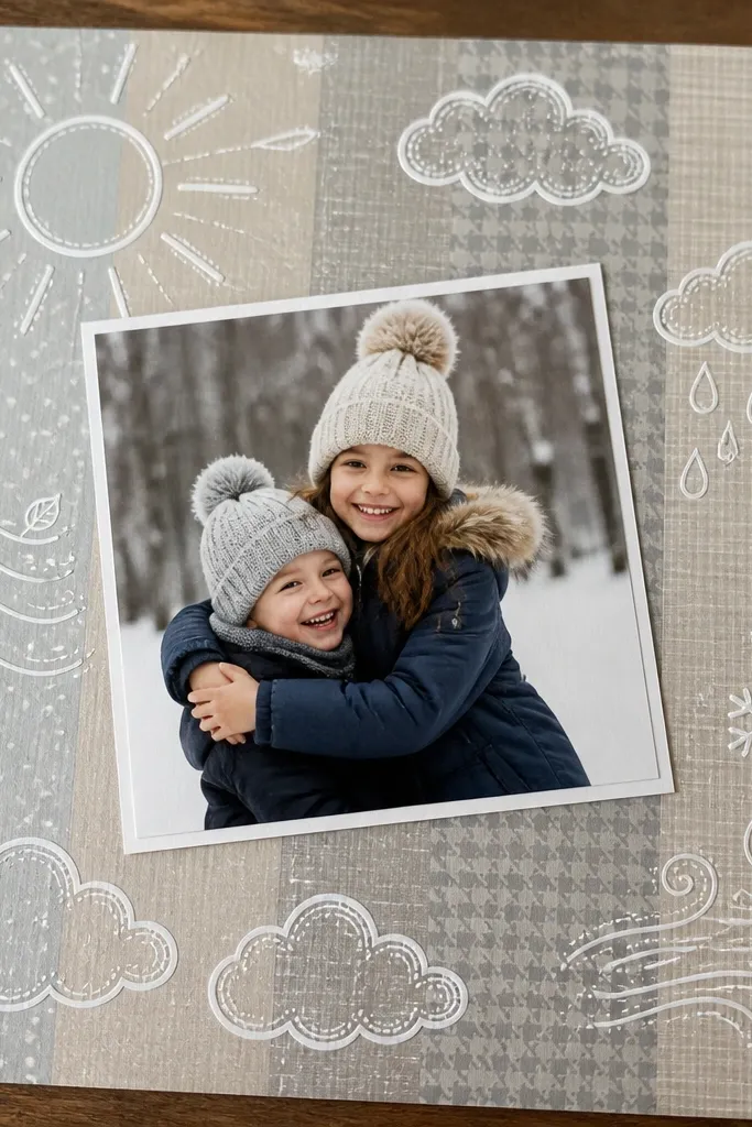
Weather icons are a simple way to build a year-round theme without forcing your photos into one style. White gel pen doodles around the photo frame create a playful border that still looks clean. Keep the icon set consistent: sun, cloud, rain, snow, wind swirl. It’s photogenic because the white lines stand out on darker paper or patterned backgrounds.
Pro tipTest gel pen on scrap first; some surfaces need a few seconds to stop skipping.
Choose a base page color (navy, charcoal, or deep green works best) and glue your photo mat in the center. Draw a simple rectangle frame in thin pen lines around the photo. Add four weather icons in the corners or along the sides, keeping the same size. Write one short weather note in a small strip beneath the photo, using the same pen thickness for consistency.
AvoidDon’t use thick marker doodles; they overpower the photo.
23. Monochrome Photo Mat with One Color Wash Border
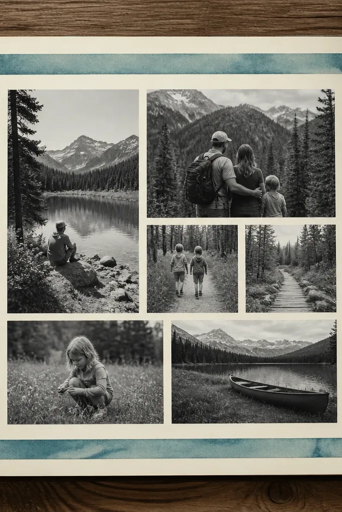
This is the easiest way to make pages look dreamy and cohesive when your photos vary wildly. Use monochrome or near-monochrome photos, then add one color wash border that matches your journal’s 3-color system. The border is your repeating element for year-round scrapbook journal ideas — it visually ties everything together. It also keeps the page elegant without adding more clutter.
Print or choose a black-and-white photo and crop it so the subject fills the frame. Add a watercolor wash border around the page edges using your chosen accent color, keeping it thin. Glue the photo mat slightly off-center to the left for a casual editorial look. Add journaling in a single line under the photo and keep the text color consistent with your wash color.
Use a fine brush for the border so the wash stays controlled and doesn’t bleed into the photo.
Don’t add multiple accent colors; it breaks the monochrome harmony.
24. Layered Paper Snowflake Cutouts for Any Season
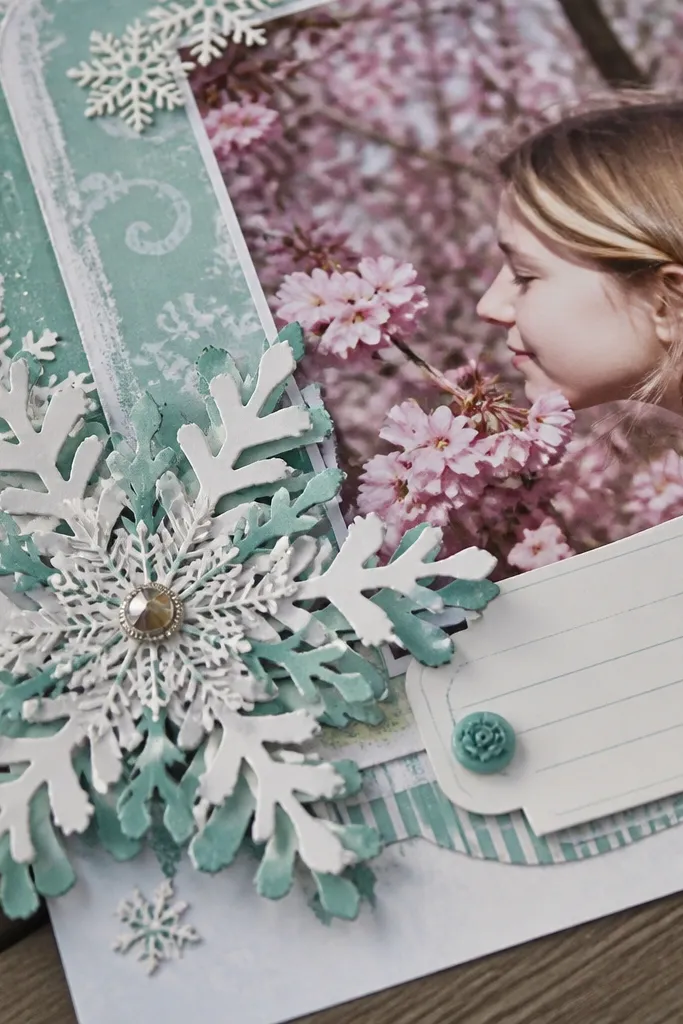
Snowflake cutouts sound seasonal, but the format works all year when you treat it like a graphic element. Layered paper shapes create a soft 3D effect that looks dreamy even with spring or summer photos. Swap the colors instead of the structure: use teal and white for calm pages, or rust and cream for warm pages. The cutouts give you a consistent “frame” that stays photogenic across months.
Pro tipUse foam tape just under the top layer of the snowflake for a subtle lift.
Cut a snowflake shape from cardstock using a template or stencil, then cut two smaller versions from different scrap papers. Glue the smallest snowflake on top of the medium one, then glue that stack onto the corners or behind the photo area. Add a light outline around the snowflake using a pen so it reads clearly against busy backgrounds. Place your photo mat centered and add a small caption strip beneath.
AvoidDon’t overload the page with too many cutouts; one focal cluster is enough.
25. Gel Plate Print Background with Hand-Cut Frames
Printmaking backgrounds look dreamy because they have movement and texture you can’t get from plain paper. Gel plate prints give you repeatable results if you keep your shapes and colors consistent. Combine the print background with a hand-cut photo window so your page has both softness and structure. This is a strong year-round option because the background is the art, and photos tell the month story.
Pro tipKeep two gel plate color combos for the whole journal so your pages match even months apart.
Create a gel plate print background on thick paper using acrylic paint and simple textures like bubble wrap or lace. Pull the print and let it dry flat overnight. Cut a rectangle window frame from another scrap paper and place it over the print area, tracing where you want the opening. Cut out the window, glue the frame in place, then mount a photo behind the opening. Finish with a small date label in the corner of the frame.
AvoidDon’t use watery paint; it tears paper and gives uneven, muddy prints.
26. Map-Grid Page with Tiny Polaroid-Style Prints
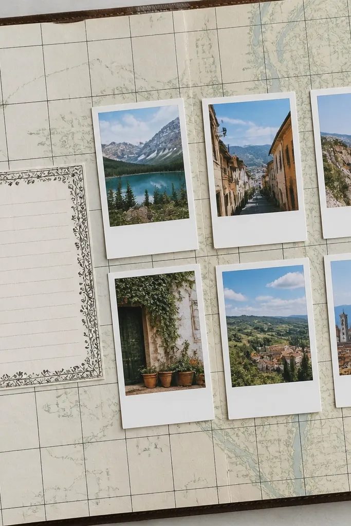
A map-grid page makes small photos look intentional instead of scattered. This layout is photogenic because the grid creates order, and the polaroid-style cards add a classic scrapbook feel. It works year-round because you can use any small photo set — weekend walks, kitchen moments, or event shots. Keep the card size consistent so the page reads clean.
Pro tipUse a matte photo paper finish so the cards don’t glare.
Draw a simple grid on cardstock using a ruler, spacing lines about 1 inch apart. Cut three or four “polaroid” cards from paper — each card should be slightly larger than your photo. Glue the photos to the center of each card and add a thin strip of plain paper at the bottom for captions. Place the cards on the grid and add one coordinate label or location word near the top.
AvoidDon’t place cards without grid alignment; it looks accidental.
27. Scrapbook Page Made from Old Calendar Pages
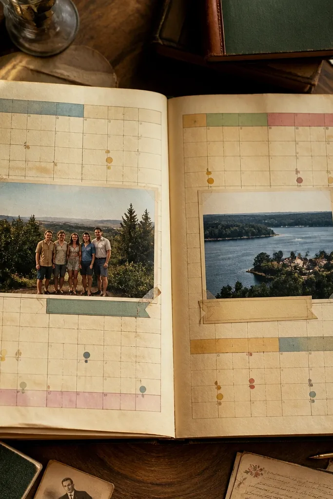
Old calendar pages are pure year-round scrapbook journal fuel. The printed dates and grids give you instant structure, and you only need to add photos and a short caption. This look is dreamy because it has a built-in pattern — it reads like a designed background, not plain paper. It also keeps months consistent since the calendar grid stays the same.
Pro tipSeal the calendar paper with a light layer of matte medium to reduce smudging.
Cut a calendar page section that includes a clean week grid and a few date boxes. Trim it to fit your scrapbook page size and glue it down as the base. Place your main photo over one section of the grid, then add a journaling strip that covers or complements a date box. Finish by tearing a small accent strip from another calendar month page and tucking it under the photo edge.
AvoidDon’t glue wet calendar paper; ink can transfer and stain your photos.
28. Ribbon-Tied Bookmark Page Insert
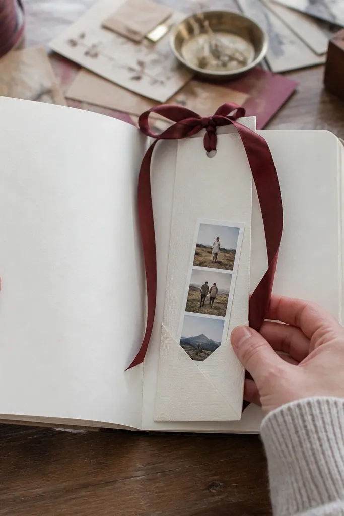
This is a practical page insert that still looks pretty. A ribbon-tied bookmark gives you a visible “motion” element — it catches light and makes the page feel curated. It works year-round because you can keep the bookmark format and swap ribbon colors by season. Add one photo strip on the pocket and you get a clean, centered layout that photographs well.
Cut a page pocket from cardstock and glue it to the inside of a journal page or binder sleeve. Attach a ribbon strip to the top edge of the insert so it hangs out neatly when the page is closed. Add a small photo mat on the front of the pocket using foam dots for lift. Tie a simple bow at the top so the ribbon stays in place during page flips.
Use grosgrain ribbon for crisp folds; satin frays and looks messy.
29. Punch-Out Star Confetti Border
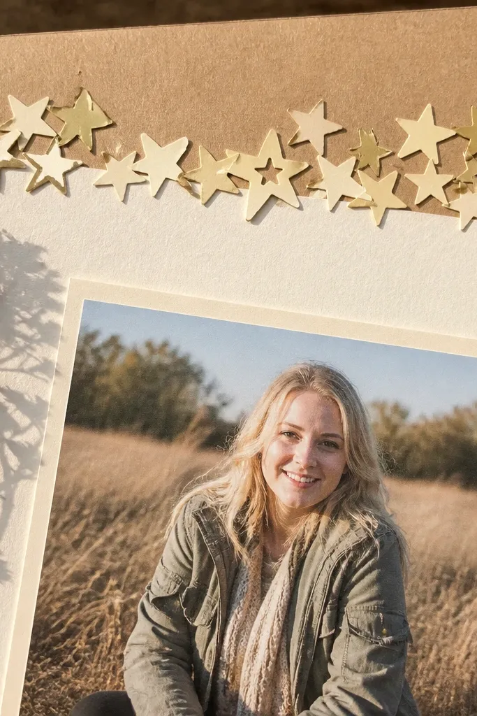
A star confetti border is a quick way to make pages dreamy without covering the subject. Punch-out shapes create a playful, light-catching edge that makes the photo look brighter. Year-round scrapbook journal ideas benefit because you can keep the border structure while changing the star colors by month. It’s also easy to scale: one page can use 20 stars, another can use 60 for a fuller look.
Punch stars from scrap paper in two colors plus one neutral. Glue a thin strip of double-sided tape or glue along the edge of your photo mat area. Press stars into the adhesive in a loose pattern, then add a single caption strip at the bottom. Keep journaling minimal so the confetti border stays the main visual element.
Mix matte paper with one slightly textured paper so the stars show depth.
Don’t use glossy metallic paper for all stars; it can glare and look harsh.
30. Corner-to-Center Vellum Overlay with Labels
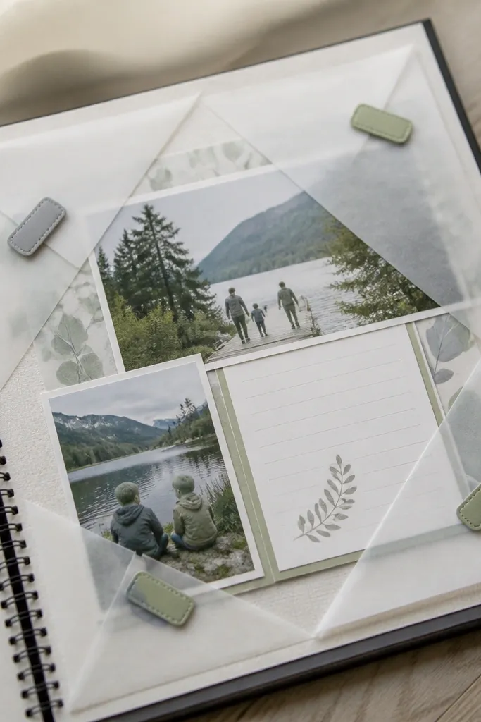
Vellum overlays give you that dreamy, light-layer look. You can place vellum over the page partially, so the photo and journaling show through with soft contrast. This is great for year-round scrapbook journal ideas because vellum works with any season and any color palette. Add small labels on top of the vellum for a clean “editorial” vibe.
Pro tipUse a fine tip permanent pen on vellum so ink doesn’t smear.
Cut a piece of vellum slightly larger than your photo mat area. Place it diagonally or from corner to center and tape it temporarily to mark placement. Glue only the edges (not the center) so it stays airy and doesn’t wrinkle. Add labels using thin cardstock strips and attach them through the vellum with tiny dots of glue so they sit flat.
AvoidDon’t glue the entire vellum sheet down; it kills the soft, floating look.



