

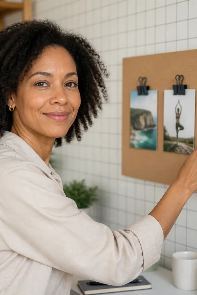
1. Cream Grid Wallpaper With Warm Brass Lines
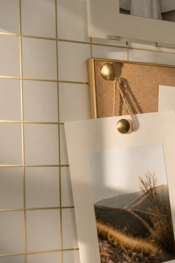
A cream grid wallpaper gives you structure without stealing attention. The thin lines help your photos line up neatly, and the warm gold tone makes everything feel polished even if you use casual cutouts. This is a strong pick for year-round vision boards because it works with both soft, cozy themes and sharper, goal-focused layouts. You get that “designer wall” look while still keeping your text readable.
Start by measuring your board area and cut the wallpaper with a 1/2-inch overlap on all sides. If you’re using a flat cork or foam board, press the paper down from the center outward, smoothing with a plastic ruler so you don’t trap air. Trim edges with a sharp utility knife and metal straightedge, then finish by sealing the borders with clear tape or a thin strip of matching washi. Add a brass-toned frame or tape border so the grid gold looks intentional, not random.
Use a craft knife with a fresh blade — dull blades tear wallpaper edges and make corners look frayed.
Don’t choose a grid with thick black lines; it makes the board feel like a spreadsheet.
2. Botanical Line Art in Sage and Oat
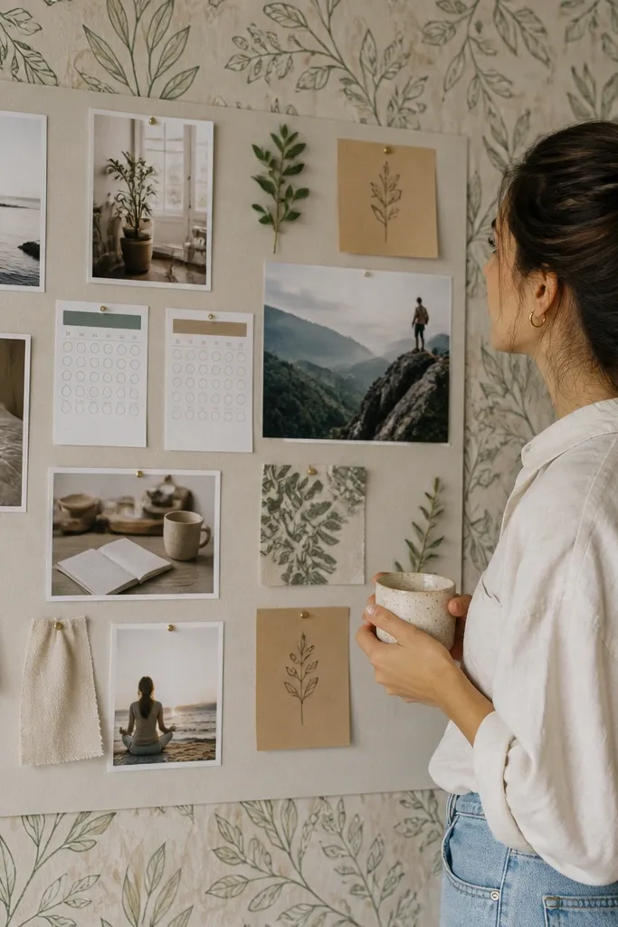
Botanical line art in sage and oat stays pretty through every season because it’s subtle, not tropical. The thin drawings add movement, but the muted palette keeps the board calm. This works especially well if your goals are a mix of lifestyle, health, and creative projects, because the wallpaper supports “soft focus” themes without turning into a theme park. It also looks great with handwritten labels and simple photo strips.
Pro tipPair it with off-white sticky notes and deep brown labels for a clean, readable contrast.
Choose wallpaper with line drawings (not big filled silhouettes) and a matte finish so it doesn’t glare under lamp light. Cut it to your board size, then mount it with peel-and-stick backing or poster adhesive on a rigid surface. After it’s smooth, add your photos in small clusters instead of one giant collage so the botanical lines peek through. Finish with a thin oat border tape and use black or deep brown ink for text.
AvoidSkip wallpaper with glossy leaves; it catches glare and makes your board harder to photograph.
3. Terracotta Paper With Tiny Speckle Texture
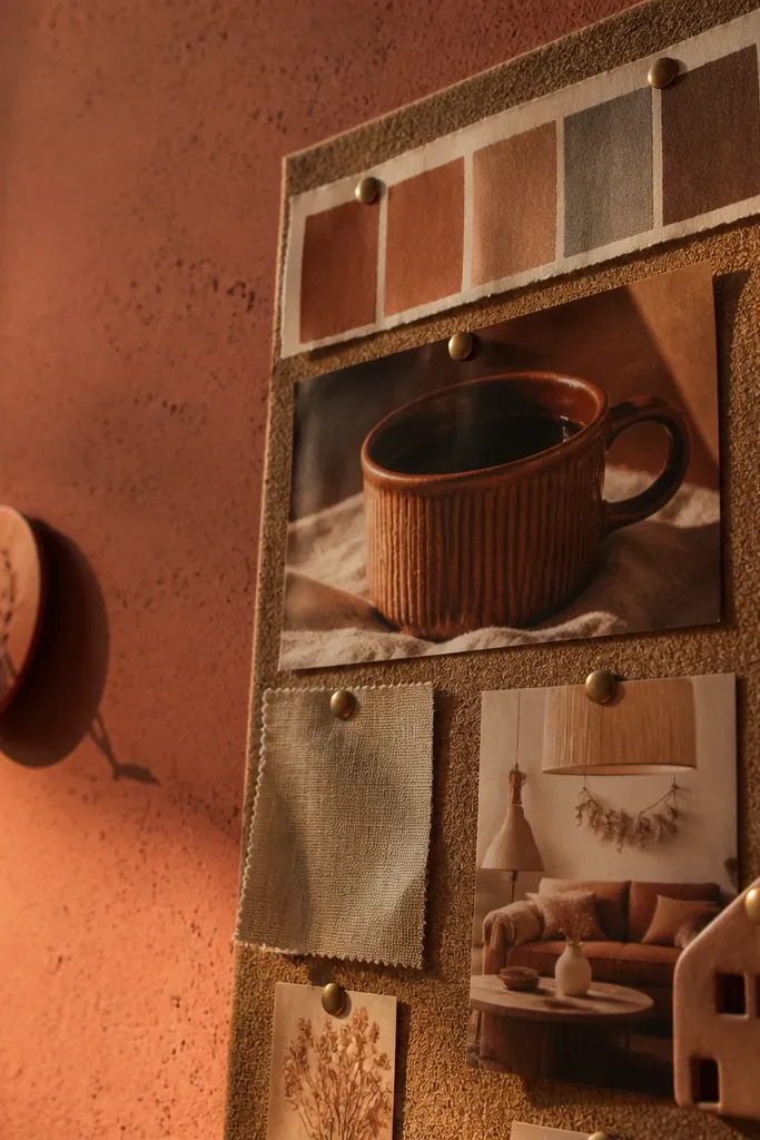
Terracotta speckle wallpaper looks warm and grounded, and it doesn’t feel seasonal because the texture reads like natural clay. The small dots hide minor imperfections and cover small bubbles that happen during DIY mounting. This is a great choice if you want your vision board to feel earthy, grounded, and “homey” while still looking stylish. It also pairs beautifully with gold, cream, and muted olive accents.
Pro tipIf you’re using a bulletin board, cover the tack holes with matching paper tape before mounting wallpaper.
Pick a matte terracotta wallpaper and test it on a scrap board piece to see how it lies flat. Mount to a rigid backing using spray adhesive in light passes or peel-and-stick backing if you’re on a wall. Smooth from the center with a plastic tool, then trim with a straightedge. Add a cream paper mat around your main photo area so the terracotta feels framed, not exposed.
AvoidDon’t use glossy terracotta; it makes the board look sweaty and cheap under indoor lighting.
4. Soft Marble Veins in Light Gray and Cream
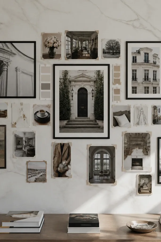
Marble-look wallpaper makes a vision board feel elevated without needing complicated design. The key is to choose soft veining, not bold black-and-white stone, so it stays calm year-round. Cream and light gray are neutral enough to match any photo color, and the subtle texture makes your cutouts look crisp. This is a strong choice for boards that mix goals and practical lists because it gives you a clean, organized backdrop.
Buy peel-and-stick marble wallpaper with a matte or satin finish to reduce glare. Cut panels to fit your board, then align the veining across seams before you press fully. Press slowly, using a smoothing tool to avoid wrinkles at panel edges. Seal the perimeter with clear tape on the back side or a thin decorative border so the seams don’t lift.
Align seams by matching the largest vein curve, not the smallest specks. It looks intentional in photos.
Avoid high-contrast marble with thick black veins; it competes with your photos.
5. Navy Micro-Pattern for a Clean, Focused Board
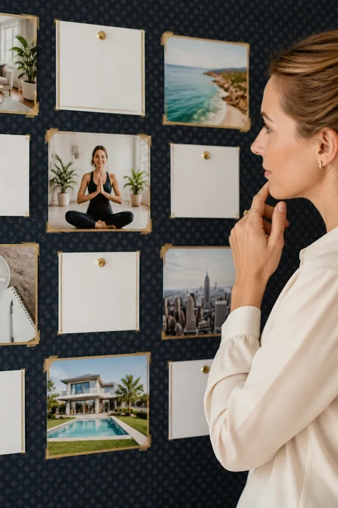
A deep navy micro-pattern is a power move when you want your vision board to feel focused and modern. The pattern is small enough that it doesn’t fight your layout, but the dark base makes white labels, cream photos, and gold accents pop. This is ideal for goal boards that include measurable targets, schedules, and daily habits because it gives strong contrast without looking cluttered. It also hides smudges better than light wallpaper.
Pro tipUse white label tape for your headers; it looks sharper than loose paper cutouts on dark backgrounds.
Choose navy wallpaper with a micro pattern like tiny dots or thin lines, then mount it to a board with peel-and-stick or spray adhesive. Use a ruler to place your main photo grid or focal strip so everything stays straight against the dark background. Add text in white gel pen or black ink with a cream label. Finish with a narrow frame in black or brushed metal to keep the look cohesive.
AvoidDon’t pick a navy wallpaper with large flowers; it reads heavy and seasonal.
6. Pastel Ombre Strips in Blush, Peach, and Cream
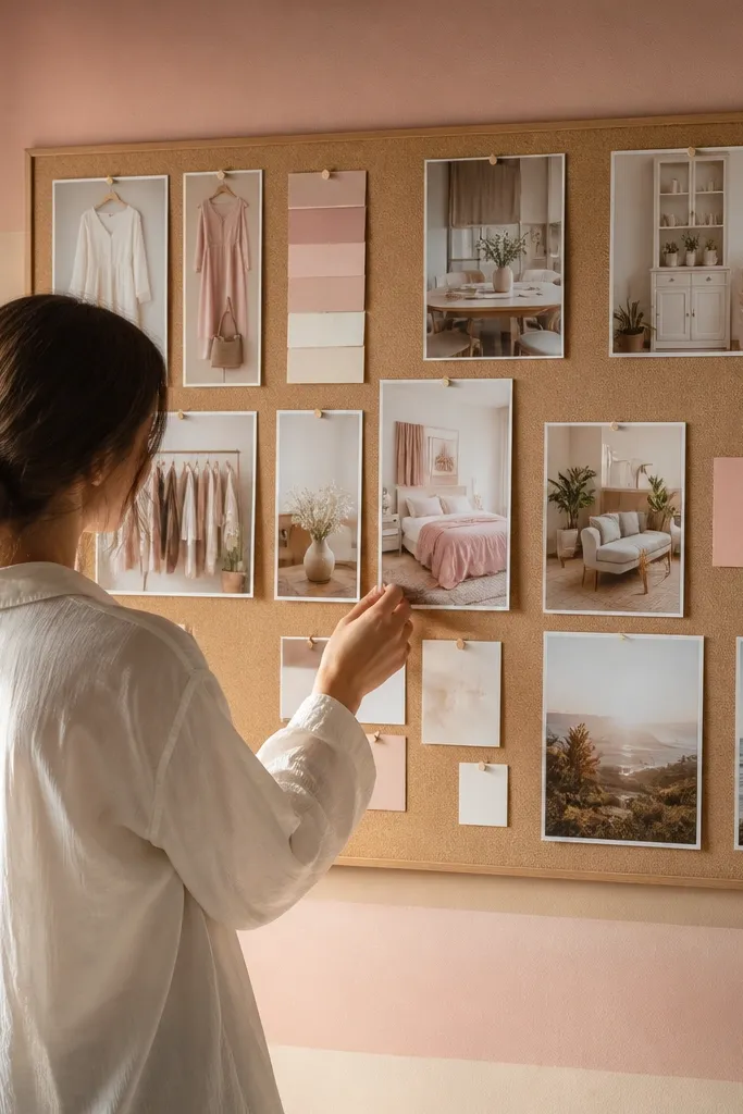
Ombre strips make a vision board feel soft and romantic without turning it into a kid’s poster. The trick is choosing a gentle fade and keeping the palette warm and light, not neon. This backdrop works great for aesthetic goals like wardrobe refreshes, home updates, and creative projects because it looks pretty even when you don’t add a lot of photos. It also makes your board feel “alive” in photos because the gradient catches light.
Pro tipUse matte cardstock for your labels so the ombre doesn’t look glossy next to shiny paper.
Pick wallpaper with horizontal ombre bands so you can treat it like a canvas. Mount it to a board, then cut a clean rectangle window area where you’ll place your main collage. Keep the collage smaller than you think; let the ombre show around it. Add thin dividers with cream washi tape to separate sections like “Now,” “Next,” and “Later.”
AvoidSkip ombre with harsh color jumps; they make the board feel messy fast.
7. Warm Linen Look Wallpaper With Subtle Crosshatch
Linen-look wallpaper gives you that “fabric wall” vibe without the hassle of actual cloth. The subtle crosshatch adds texture that photographs well, and the neutral warmth keeps your board flexible for any theme. This is a great choice when you want a calm backdrop for both minimalist boards and busy collage boards. It also makes your typography look more intentional because paper cutouts don’t look like they’re floating on a flat surface.
Choose a linen-look wallpaper with a matte finish and a consistent weave pattern. Mount to a rigid board using spray adhesive or peel-and-stick, then smooth out any edges with a brayer or plastic tool. Trim carefully along the board edges with a straightedge. Add a thin linen-toned border tape and use deep charcoal ink for writing so it stays readable.
If your board has dents or seams, fill them first. Linen texture shows every bump in side lighting.
Don’t use bright white linen wallpaper; it makes the board look sterile.
8. Sunset Gradient Wallpaper in Soft Sunset Peach
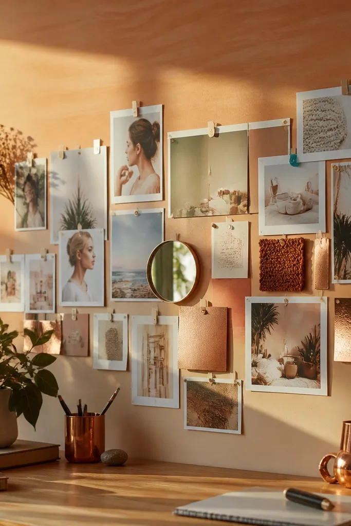
A soft sunset gradient is a gorgeous year-round pick because it feels optimistic without being loud. The color range is warm, so it matches skin tones in photos and it makes your board look cohesive even when your pictures are mixed. Use it when you want a board that feels like “future energy” rather than strict planning. It’s especially good for travel goals, mood projects, and personal routines.
Pro tipPlace white or light labels on the darker side of the gradient; it stays legible without extra outlines.
Pick a wallpaper where the gradient stays within peach, apricot, and cream tones. Mount it to your board and keep your main collage slightly off-center so the gradient feels like it’s flowing. Add a photo strip across the lighter part of the gradient for readability. Finish with a frame in light wood or a warm cream border to keep the palette consistent.
AvoidAvoid dark sunset gradients with heavy reds; they overpower lighter photos.
9. Black-and-White Botanical With One Red Accent Strip
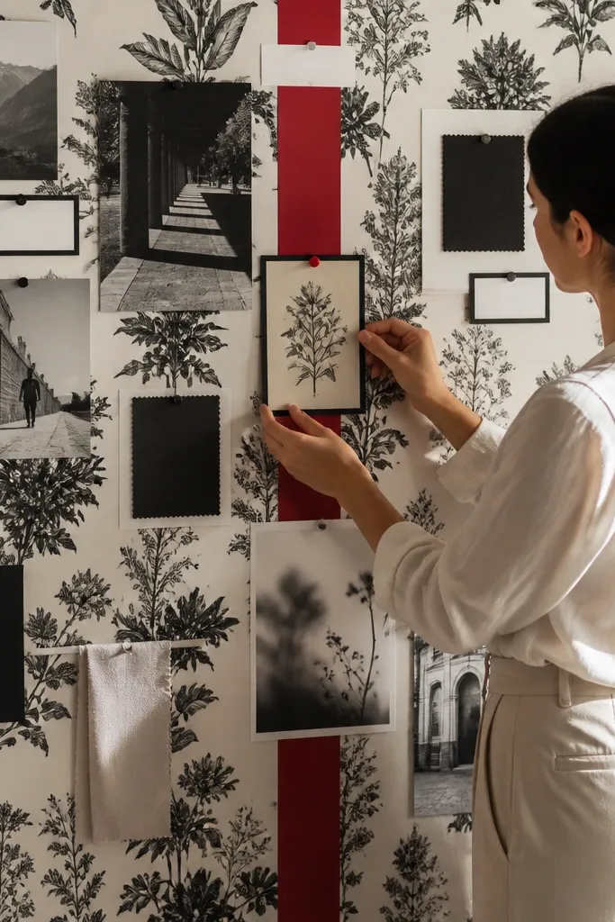
This is for people who want contrast and drama, but still want the board to look designed. The black-and-white botanical pattern gives you movement and depth, while the single red accent stripe gives you a controlled pop. That red is perfect for highlighting one theme on your board, like a goal category or a single “top priority” photo. It stays good-looking year-round because the palette is restrained and the red stays intentional.
Choose wallpaper where red appears in a limited band or small controlled elements, not scattered everywhere. Mount the wallpaper first, then set your priority section over the red stripe area. Use black frames or thin black tape to anchor photos and text. If you add stickers, limit them to cream and black so the red remains the only strong color.
Use one red ink pen or one red washi tape — using multiple reds makes the board feel chaotic.
Don’t add a second strong color like teal; it breaks the palette.
10. Forest Green Watercolor Wash With Cream Margin
Forest green watercolor wash gives you a moody, aesthetic vibe that still works all year. The key is adding a cream margin so your photos don’t get swallowed by darkness. This looks great with warm-toned photos, gold frames, and handwritten captions. It also helps if your vision board includes “slow goals” like reading lists, creative practice, or home comfort projects because the watercolor texture feels calming instead of busy.
Use wallpaper that has a watercolor splash effect, then cut it so you keep a consistent cream edge around the board. Mount it to a rigid surface carefully, pressing only after you align the watercolor placement. Add your main collage inside the cream margin area first, then build secondary sections around it. Use gold or warm brown pens for captions so the text looks cohesive against the green.
Photograph under daylight once — if the watercolor glare is bad, switch to matte labels and avoid glossy photo paper.
Don’t cover the entire board with photos; let the watercolor breathe.
11. Muted Checkerboard in Oat and Light Clay

A muted checkerboard is graphic and fun, but you keep it year-round by choosing soft, low-contrast colors. Oat and light clay create a cozy, vintage look that works with both minimal and collage layouts. This wallpaper is great for vision boards that need clear sections because the pattern naturally divides space. It also looks sharp in photos because the geometry adds a clean edge to your composition.
Pro tipStick with one font style for headings. Geometry wallpaper hates mixed typography.
Choose a checkerboard where squares are small, around 1-2 inches equivalent, and colors are close to each other. Mount to a cork board or foam board and keep it flat with firm pressure. Use thin border tape to outline photo blocks so they sit like tiles. Add handwritten headings in dark brown and use cream cardstock cutouts for photos so the checkerboard stays the star.
AvoidAvoid big high-contrast checks; they make the board feel like a kitchen backsplash.
12. Geometric Lines in Gray and Cornflower Blue
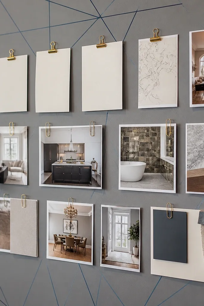
Geometric line wallpaper looks modern and clean, and the cornflower blue accent keeps it from feeling cold. This is a good pick when you want your vision board to look crisp and organized, like a wall planner with style. The line work gives you visual rhythm, so your photos and text feel aligned even if you change the content later. It’s also friendly for techy goals, study plans, and skill-building targets.
Pick wallpaper with thin lines and limited blue so your board doesn’t look busy. Mount it, then plan a simple grid for your inserts: one top row for priorities, one middle row for photos, one bottom row for habits. Use gray washi tape to create section borders that match the wallpaper lines. Add blue accents only with one type of item, like blue sticky tabs or blue pen headers.
Use a ruler to keep your photo edges straight. Line wallpaper makes crooked corners obvious.
Don’t add too many sticker shapes; keep inserts rectangular or you’ll fight the geometry.
13. Soft Gold Foil Dots on Champagne Beige

Foil dot wallpaper is the easiest way to make a vision board look “expensive” in photos. The dots are small, so it still reads as a calm background, not a disco wall. Champagne beige works with nearly any photo palette, and the gold ties into frames, binder clips, and metallic pens. This one is perfect if you want your board to feel celebratory, like a place for wins, reminders, and future plans.
Pro tipIf you use sticky notes, go with cream or ivory so the gold dots stay the sparkle.
Choose foil dot wallpaper with a matte base so the foil doesn’t glare under lighting. Mount to a board or wall using peel-and-stick, smoothing slowly to prevent wrinkles. Add your main collage in the center and keep surrounding areas mostly open so the dots show. Use gold binder clips to attach photos or printouts for a layered look that photographs well.
AvoidAvoid oversized foil patterns; they look tacky and age fast.
14. Pastel Clouds on Powder Blue With White Space
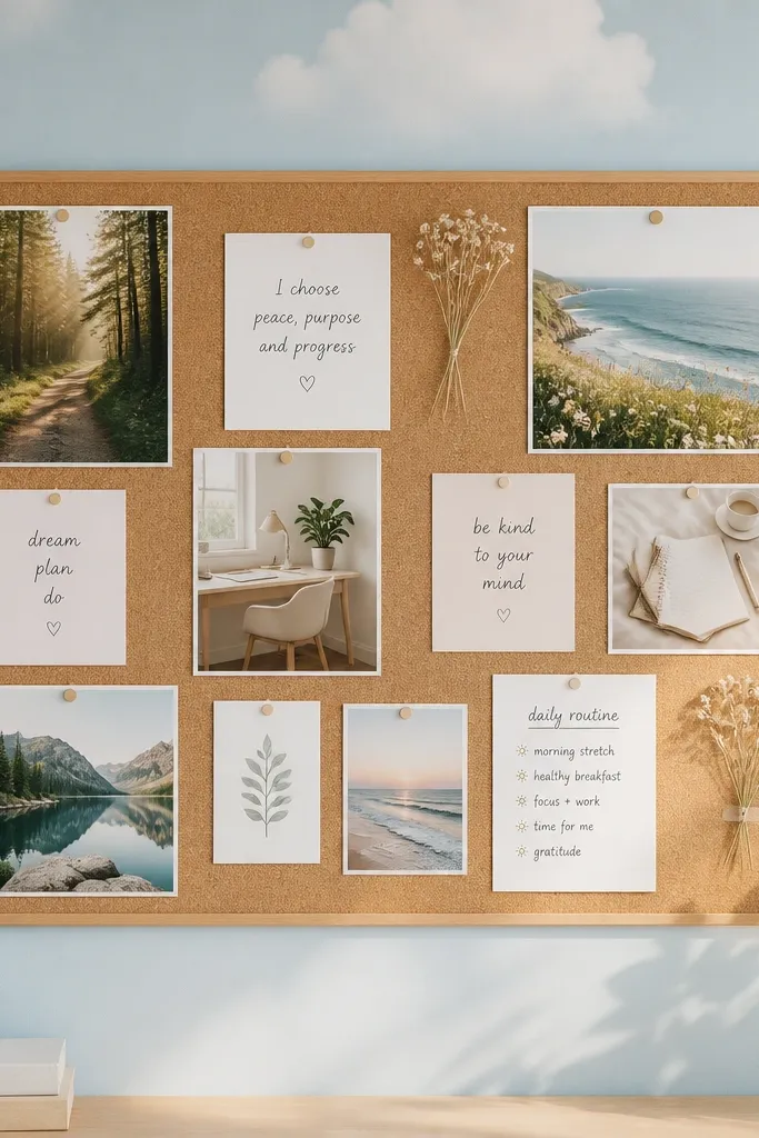
Cloud wallpaper is cute, but the grown-up version is about spacing. Powder blue with lots of breathing room keeps your board airy and readable, and it works year-round because the palette is light and calm. This is ideal for dream boards with softer goals: comfort routines, creative ideas, and gentle milestones. When your board has lots of white space, you can change photos and text without it feeling cluttered.
Pick wallpaper with large areas of background and clouds that don’t cover the whole surface. Mount it and then design around the blank areas by placing photos in the clear sky zones. Use navy or charcoal ink for text so it stands out against powder blue. Add thin white frames or tape borders to separate sections and keep the layout crisp.
Use matte photos or slightly textured print paper; it reduces glare on blue backgrounds.
Skip dense cloud wallpaper where every inch has shapes; it kills readability.
15. Warm Walnut Woodgrain Wallpaper
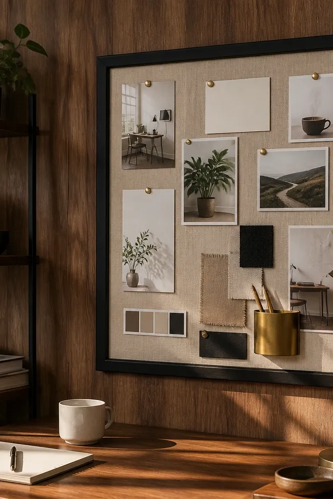
Woodgrain wallpaper makes a vision board feel grounded and intentional, especially when you want a “home office” vibe. Medium walnut tones pair well with black, cream, and brass hardware, so your board looks cohesive even with mixed photos. It also adds depth, so even a simple layout looks styled. This pick is great for boards on doors, cabinet sides, or desk-adjacent walls where you want the background to look like furniture.
Pro tipIf your surface has dents, fill and sand first. Woodgrain shows every shadow line.
Choose woodgrain wallpaper with a consistent plank direction so seams don’t look random. Mount to a door panel or board, then align the grain with the longest edge for a clean look. Add a simple framed grid using black or brass corner trims so it looks like wall decor. Use cream cardstock for labels and keep your photos mostly landscape to match the wood’s direction.
AvoidDon’t use very red mahogany woodgrain; it can clash with warm skin tones in photos.
16. Soft Retro Polka Dots in Blush and Oat
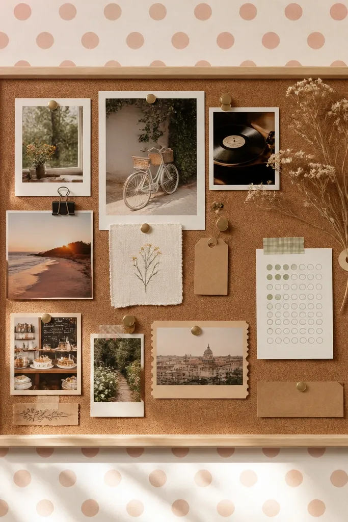
Polka dots can look childish, but blush-and-oat dots feel retro and grown-up when the dots are medium size and spaced evenly. This wallpaper works year-round because it’s gentle and light, and your board content adds the “seasonal” change. It’s great for vision boards that include playful items like ticket stubs, recipe goals, or hobby reminders. The dots also make it easy to place labels without them looking lost.
Pick polka dots with a matte background and dots that aren’t too dense. Mount to a board and plan a simple layout with two or three main clusters, leaving dot space around them. Use a thin border tape in oat or cream to frame your photo area. Add your typography in dark brown so it feels warm rather than harsh.
Keep your photo corners consistent — use one corner rounder setting for all prints.
Don’t layer lots of colorful stickers on top; the dots already provide pattern.
17. Monochrome Stripe Wallpaper With Thin Silver Lines
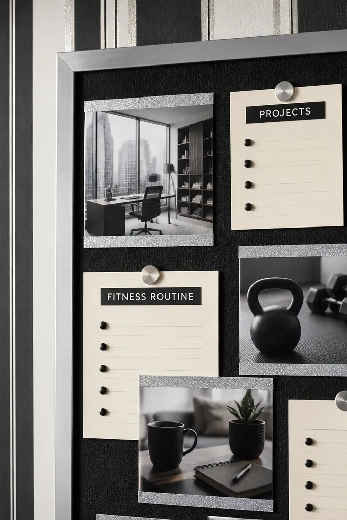
Thin monochrome stripes give you instant polish, and the silver lines add just enough shine for a gorgeous photo. This is the pick for people who want a modern, graphic vision board that still feels easy to update. It works well for goals that need organization — projects, study plans, fitness routines — because stripes guide the eye and keep your layout aligned. Use it with black frames and crisp white labels for a high-contrast look.
Pro tipIf your wallpaper has a seam, hide it behind a frame edge or a cluster of photos so it disappears.
Choose vertical stripes so your board looks taller and more intentional. Mount it carefully, then place your main collage in the center band so it looks balanced. Add a black frame border and use silver-toned clips or paper fasteners sparingly. Seal the edges with clear tape so the striped paper doesn’t lift over time.
AvoidDon’t use thick stripes; they make the board look like packaging.
18. Muted Floral Wallpaper With One Neutral Ground
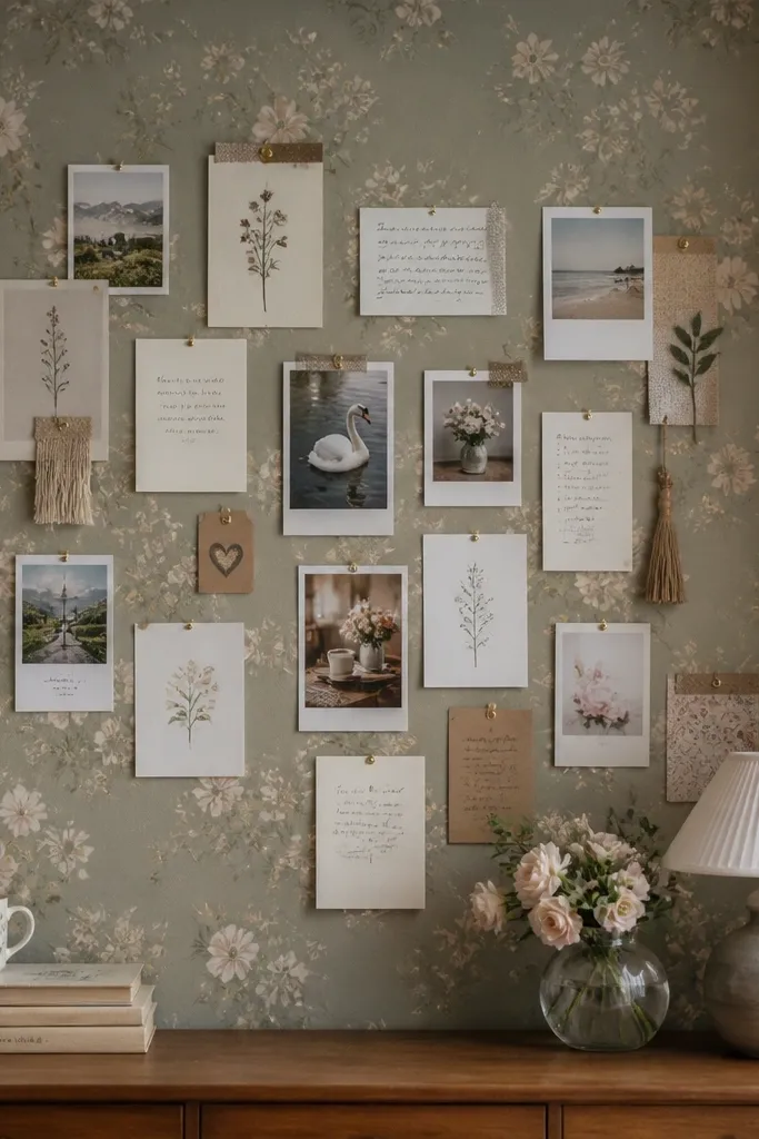
Muted floral is gorgeous when the flowers are soft and the background is neutral enough to calm the whole board. This pick is good for year-round themes because it looks like “everyday beauty” instead of a holiday decoration. It’s especially effective if you want to include lots of small cards, quotes, or mini goals. The floral background gives visual texture while staying compatible with many photo colors.
Pick floral wallpaper where the flowers don’t take up the entire surface and the background is beige, oat, or cream. Mount it to a board and add a simple white or cream mat around your main collage area. Use dark ink for labels and keep your card sizes consistent so the floral doesn’t feel crowded. Finish with a thin wood frame to warm up the neutral ground.
Use fewer, bigger photo prints instead of lots of tiny ones; floral backgrounds punish clutter.
Avoid bright, multicolor bouquets; they turn the board into a busy poster.
19. Minimalist Sheet Music Wallpaper in Warm Gray
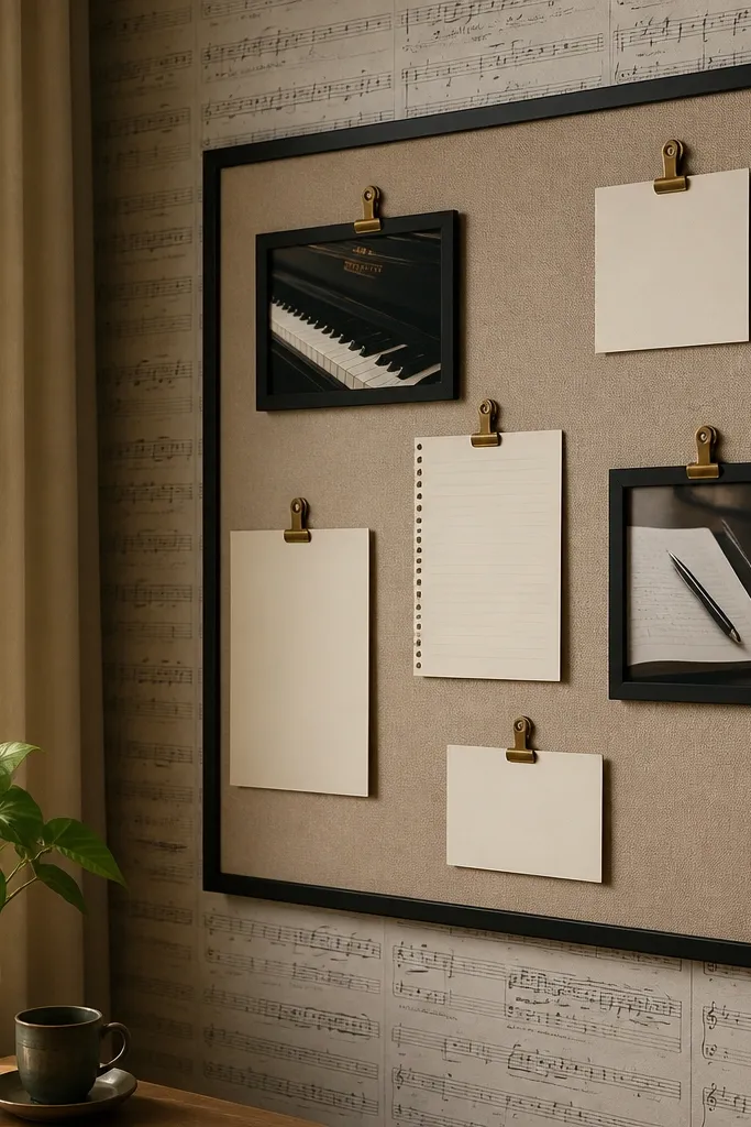
Sheet music wallpaper looks artsy and grown-up when it’s faint and warm gray, not stark black. It’s a clever backdrop for creative goals because it adds pattern without taking over the space. This works well if your vision board includes music practice, writing routines, performance goals, or creative hobbies. The best part is how it photographs: your photos and captions stay crisp against the subtle notation.
Choose wallpaper where the notes are light and readable only at close distance. Mount to a board, then place your most important photo near the cleanest section of the wallpaper where lines are less dense. Use simple black labels and keep your font small. Add a thin cream border tape so the sheet music doesn’t touch your inserts.
Use a matte clear spray on the finished board if it will be handled; it helps prevent smudging from ink and fingerprints.
Skip heavy black sheet music; it makes the board look like a wall of text.
20. Monochrome Terrarium Illustration Wallpaper
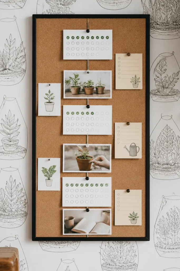
Terrarium illustrations give you a clean, botanical vibe without the chaos of full floral patterns. A monochrome version stays year-round because it’s consistent and restrained, like a sketchbook page. This is a great choice for vision boards that include growth themes: habit tracking, plant care goals, learning milestones, and slow routines. It also looks good with neutral photo palettes and simple label cards.
Choose wallpaper with line drawings only and a light neutral base like cream or warm white. Mount to your board and then build your collage around the illustration clusters so the drawings frame your photos. Use black or deep brown ink for captions and keep your photo edges straight. Add one small accent color through stickers or washi tape, like muted olive, so the terrarium theme feels intentional.
Cut your labels into consistent shapes, like rounded rectangles, so they look like part of the wallpaper layout.
Don’t add bright neon accents; terrarium line art reads best with muted colors.



