1 Classic Cartoon Berry
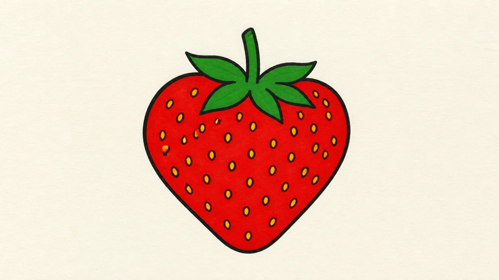
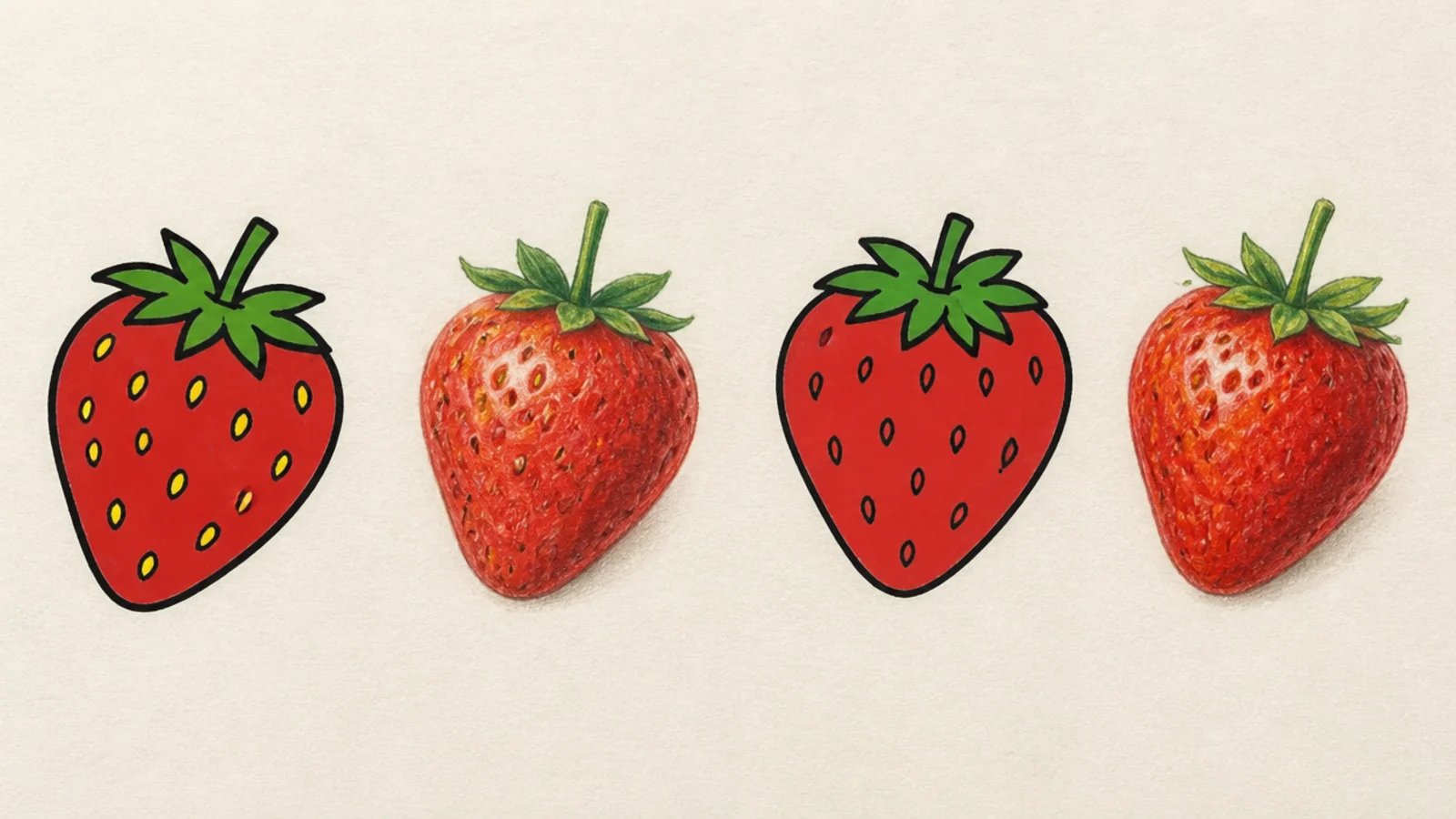
Cartoon wins. Draw a strong heart outline, fill it flat red, add a green cap and a neat scatter of dot seeds. Keep it clean and simple.
The friendly baseline cartoon strawberry with a bold outline and flat red. This is cartoon’s home turf — clean, instant, and cheerful.
AvoidDon’t add gradients; flat color is the cartoon look.
Pro tipUse one confident line weight for the whole outline so it looks graphic.
2 Realistic Single Berry
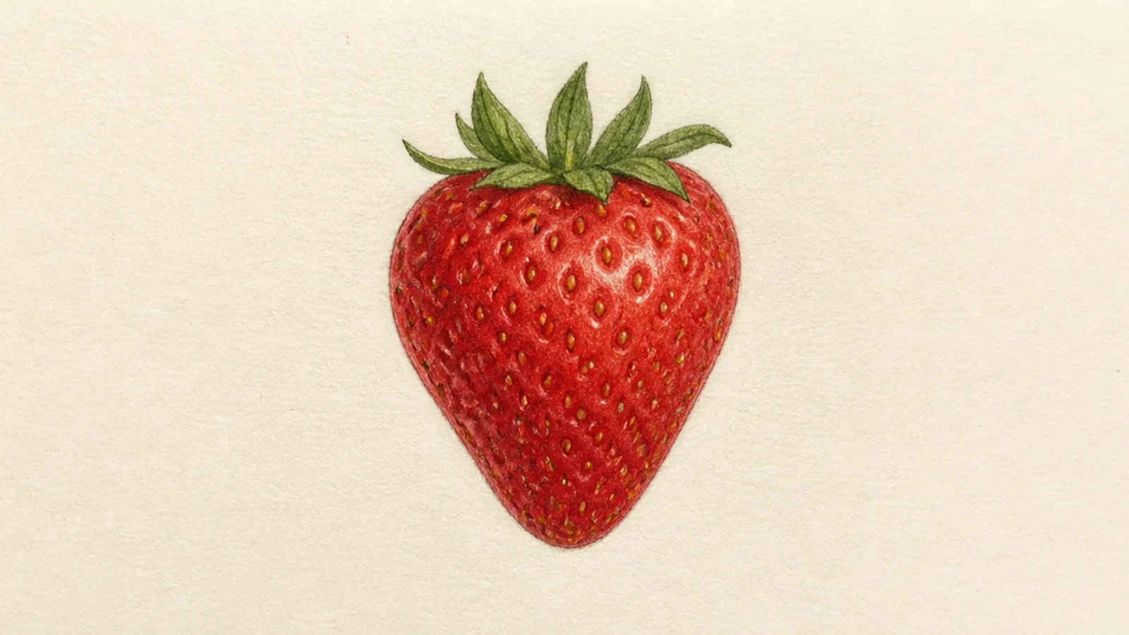
Realistic wins. Build the red from light to dark, sink each seed in a tiny shadowed pit, and add one bright highlight. Keep the outline barely there.
One berry rendered with soft form and sunken seeds. Realistic wins for the lifelike roundness and glossy surface.
AvoidDon’t outline the edge boldly; let value define the form.
Pro tipLayer the red gradually and save the highlight for last.
3 Kawaii Face Berry
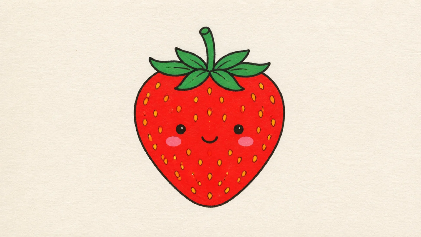
Cartoon wins. Draw the simple berry, then add low dot eyes, blush, and a tiny smile. Keep everything flat and friendly.
A berry with a sweet little face. Cartoon wins easily — a face only works on the clean, flat cartoon style.
AvoidDon’t shade the face; flat cartoon features read cutest.
Pro tipSet the eyes low and wide for maximum cuteness.
4 Botanical Study Berry
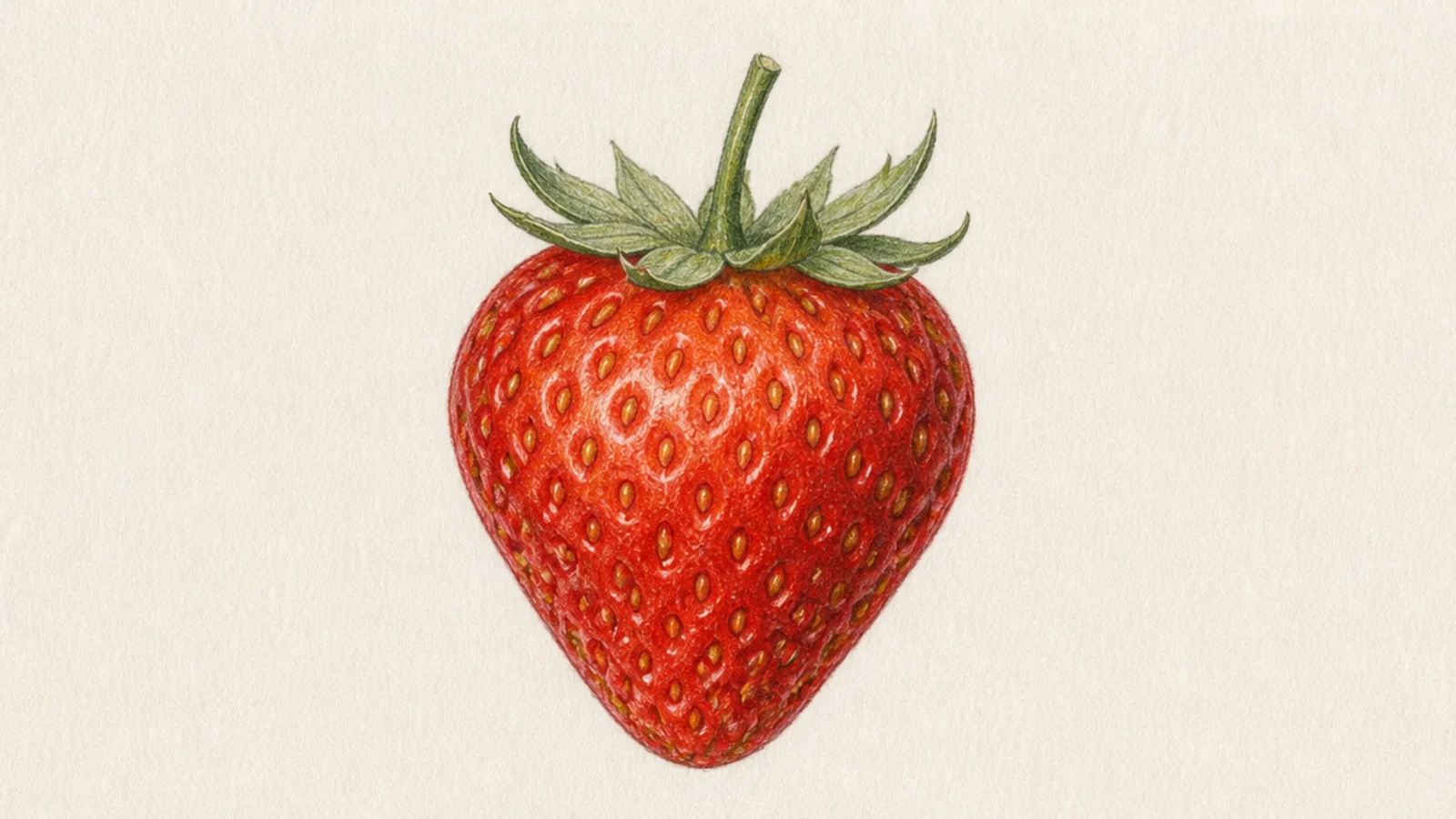
A field-guide berry with every seed and vein rendered. Realistic wins for the precise, observed detail.
Realistic wins. Render the seed pits, the calyx veins, and subtle surface bumps with careful shading and layered color.
Study a real berry photo for the exact seed spacing and pit shadows.
Don’t simplify the seeds to dots; the pits are the realism.
5 Sticker Berry
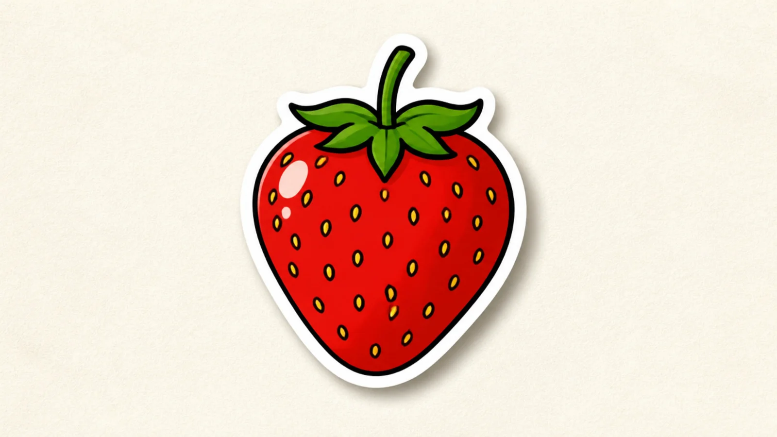
Cartoon wins. Draw a bold flat berry, then trace a thick even white border around the whole shape and add a soft drop shadow.
A berry made to be a sticker with a thick white outline. Cartoon wins — bold flat shapes cut cleanly into stickers.
AvoidDon’t use soft shading; sticker art needs crisp flat shapes.
Pro tipKeep the white border even all the way around for a clean sticker.
6 Glossy Realistic Berry
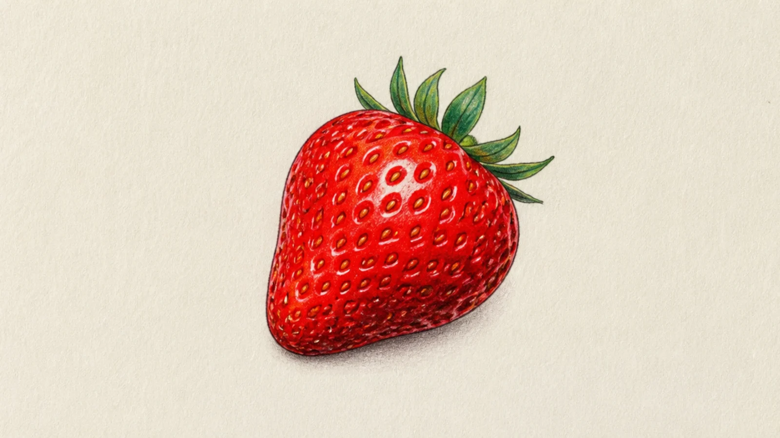
Realistic wins. Build deep red shadows, then place a sharp bright highlight and a softer secondary sheen for a wet look.
A berry with a wet, glossy shine. Realistic wins for the believable reflective surface.
AvoidDon’t scatter many highlights; one strong shine reads as gloss.
Pro tipKeep the main highlight small and bright for a glossy, wet surface.
7 Chibi Character Berry
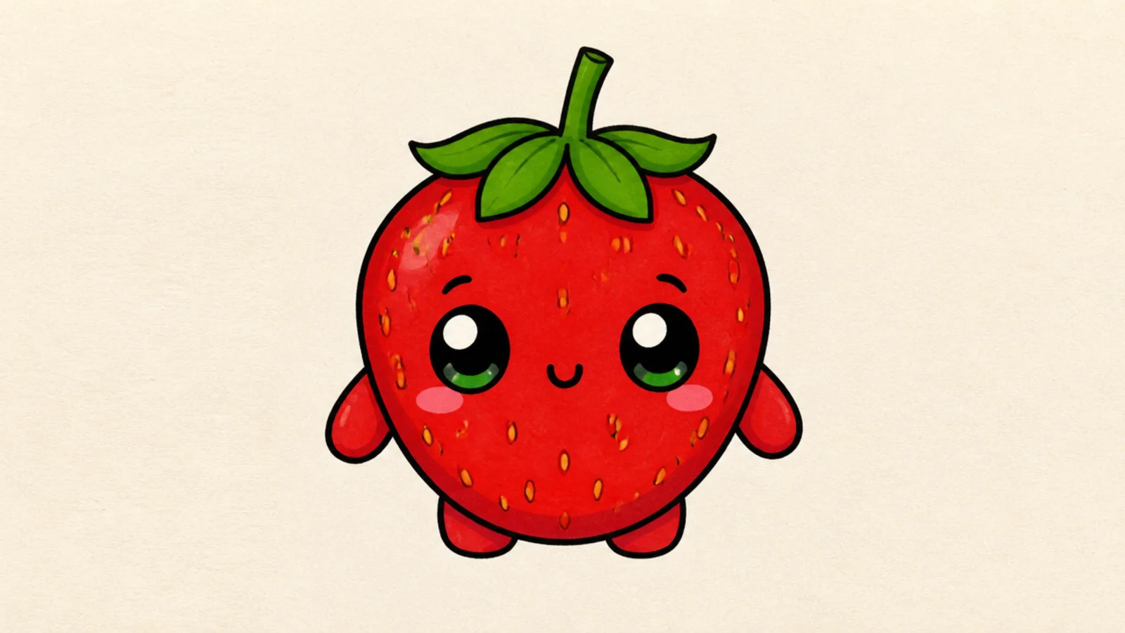
A full berry character with big eyes and little arms. Cartoon wins — characters live in the cartoon style.
Cartoon wins. Draw a plump berry body, big glossy eyes, a tiny mouth, and stubby arms and legs. Keep the color flat and bright.
Give the eyes two white highlights so they sparkle.
Don’t render the body realistically; the flat style suits characters.
8 Still Life Berry
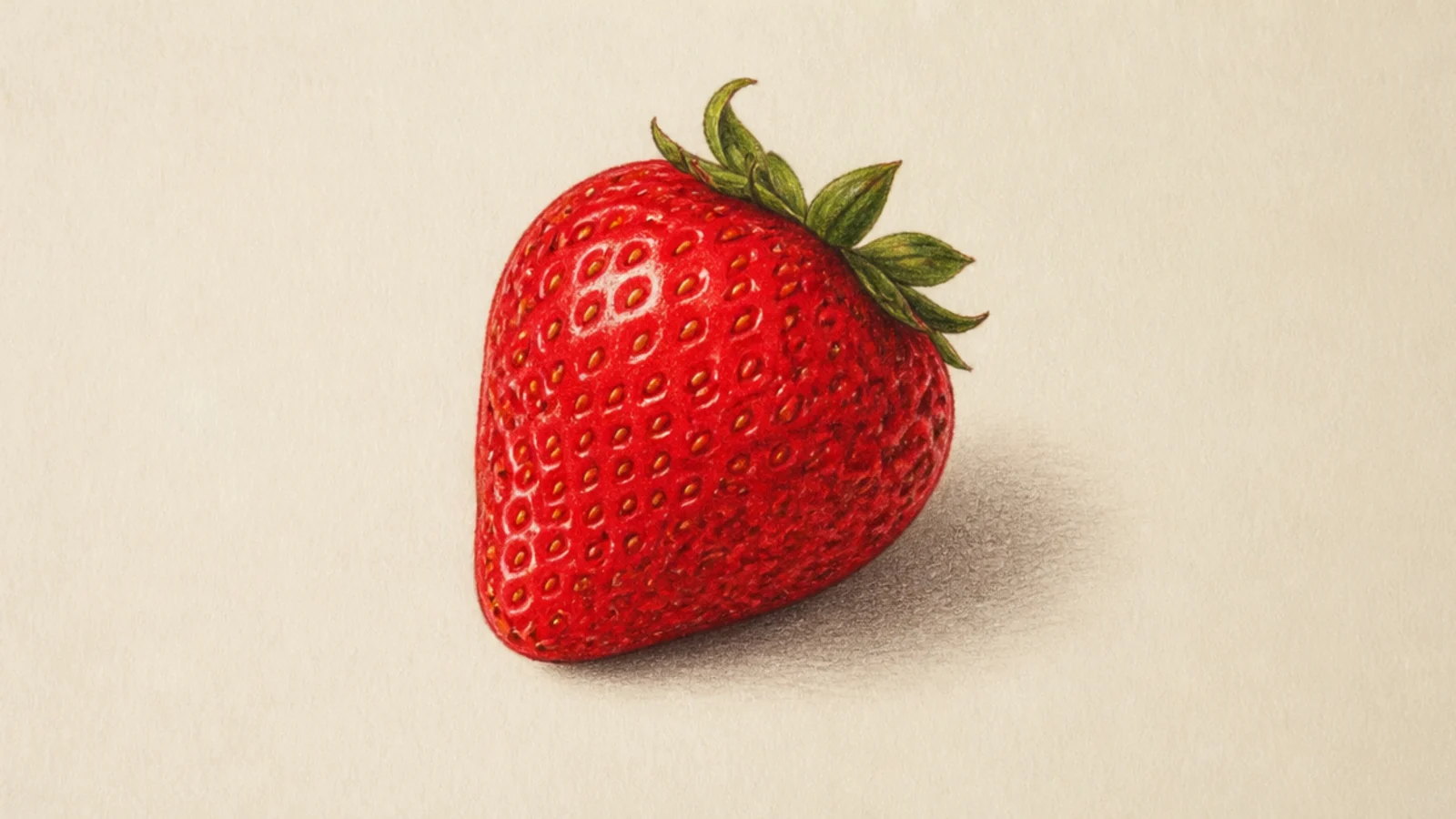
Realistic wins. Shade the berry with a clear light direction and add a soft cast shadow anchoring it to the surface.
A berry sitting on a surface with a soft cast shadow. Realistic wins for the grounded, observed lighting.
AvoidDon’t skip the cast shadow; it grounds the realistic berry.
Pro tipMatch the cast shadow’s direction to the highlight on the berry.
9 Bold Outline Slice
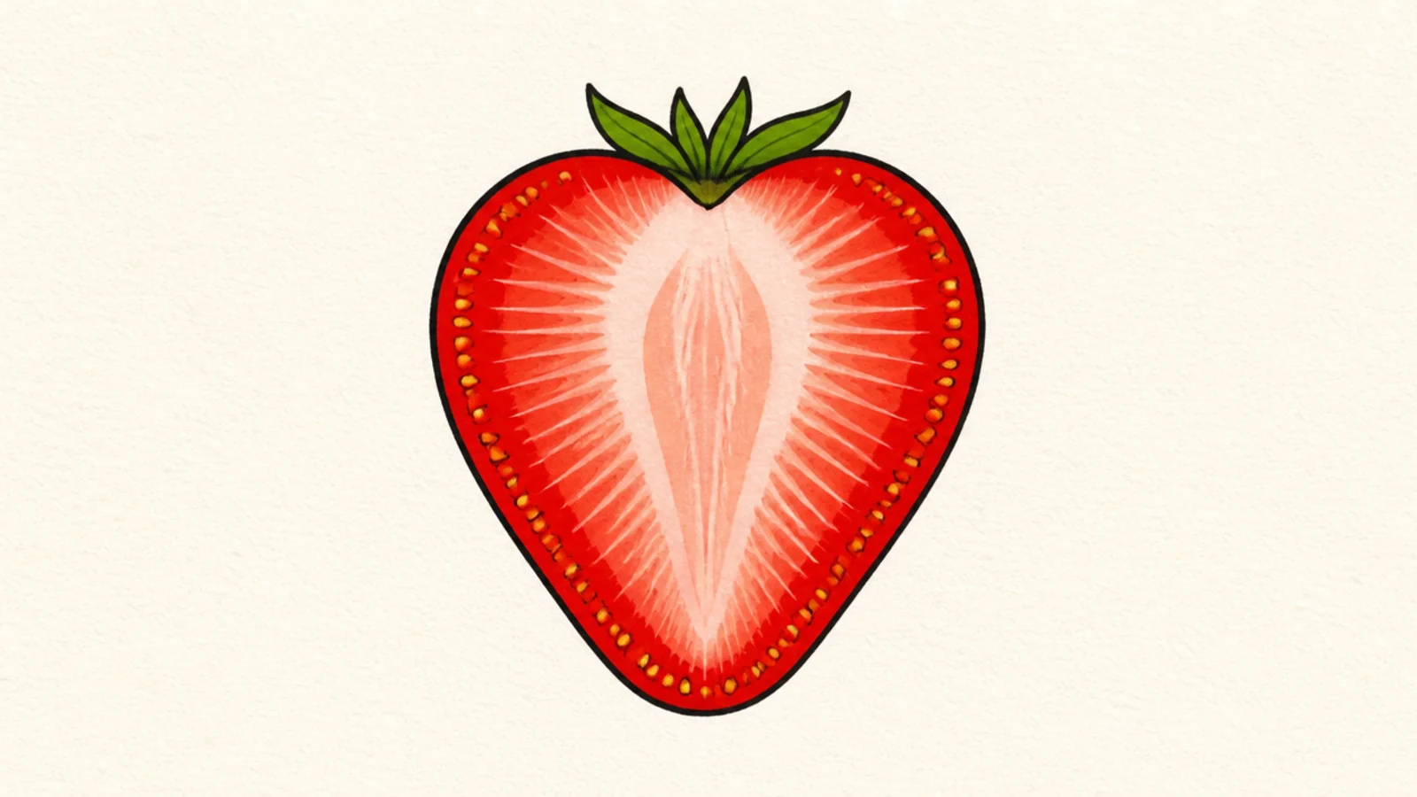
Cartoon wins. Outline the slice boldly, fill the rind red and the center pale, and add simple radiating lines and dot seeds.
A cross-section slice drawn graphically. Cartoon wins — the flat radiating pattern reads clean and bright.
AvoidDon’t blend the inside; flat zones look best in cartoon.
Pro tipKeep the inner lines even and the colors flat for a graphic slice.
10 Realistic Slice
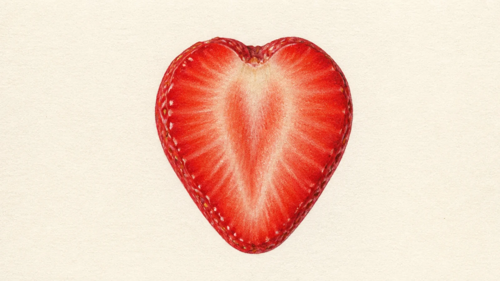
Realistic wins. Shade the pale core softly, deepen the red rind, and add tiny highlights so the cut surface looks juicy and moist.
A cut slice with juicy, translucent shading. Realistic wins for the soft, wet interior.
AvoidDon’t harden the inner edges; soft transitions look wet.
Pro tipFade the center from pale to red gradually for a juicy look.
11 Pop Art Berry
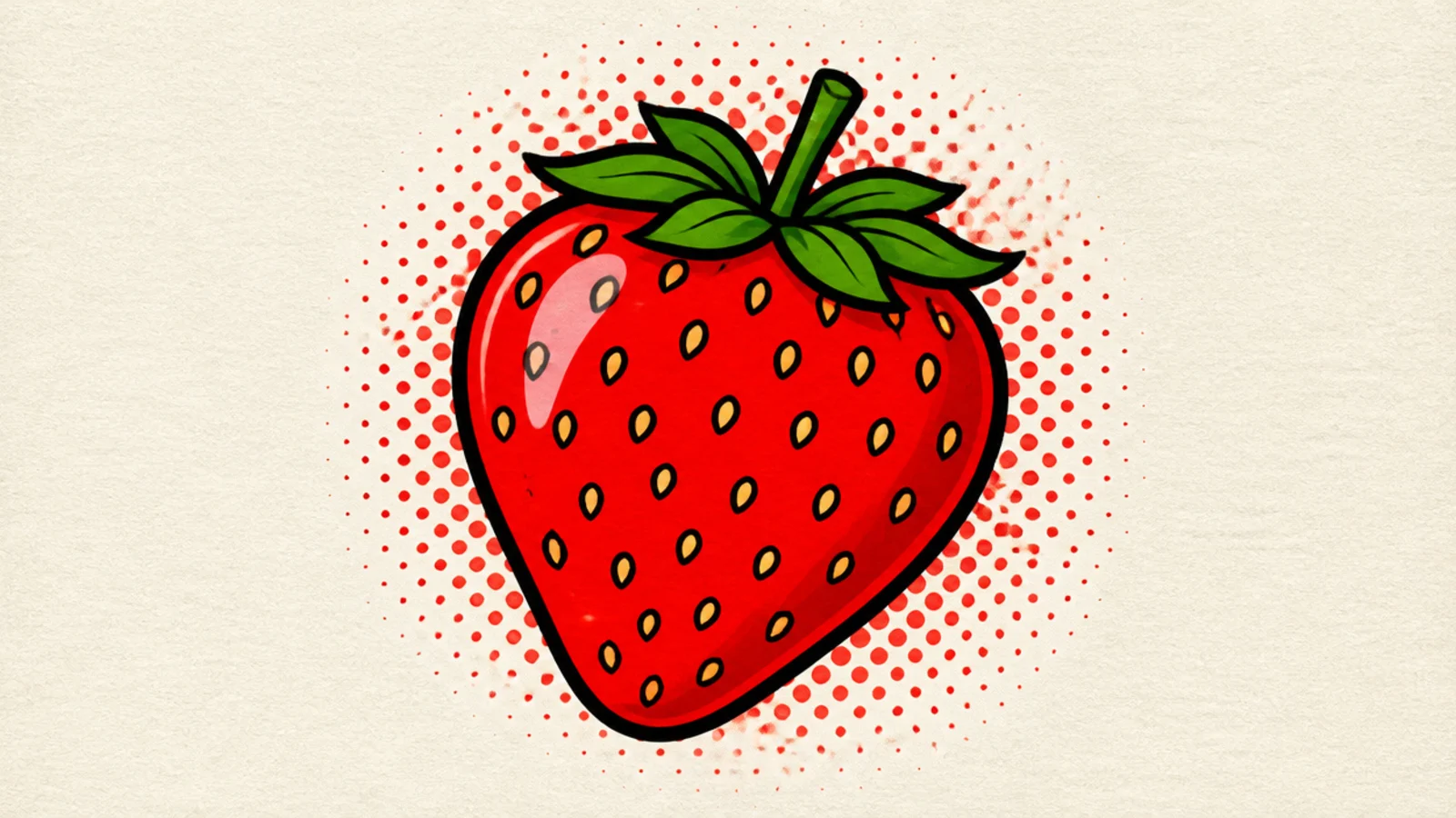
Cartoon wins. Use bold outlines and a few saturated flat colors, maybe with a halftone dot background. Keep zero gradients.
A punchy pop-art berry in bold blocks of color. Cartoon wins for the graphic, high-impact flatness.
AvoidDon’t add shading; pop art stays flat and graphic.
Pro tipLimit to two or three flat colors for a strong pop-art hit.
12 Soft Realistic Berry
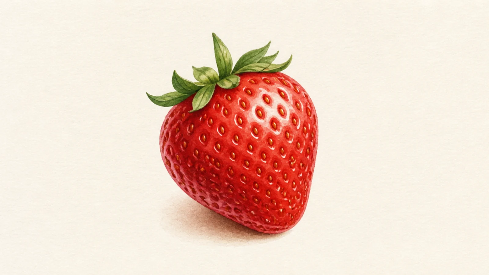
Realistic wins. Layer light washes of red, letting them build depth, and keep the seeds as soft pitted marks rather than hard dots.
A berry built from gentle layered color for a lifelike softness. Realistic wins for the smooth, believable surface.
AvoidDon’t outline; soft layered color defines a realistic berry.
Pro tipBuild color in thin layers so the reds blend smoothly.
13 Cartoon Berry Pattern
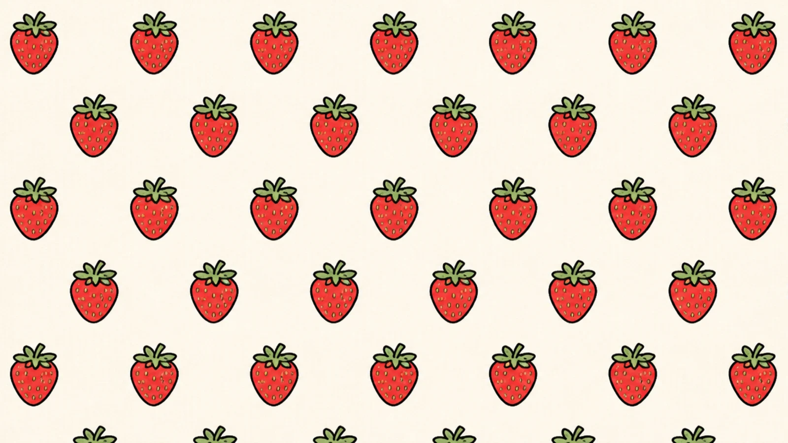
Cartoon wins. Draw one simple flat berry and repeat it in a grid with small dots or leaves filling the gaps. Keep it flat and even.
A repeating tile of little berries for fabric or paper. Cartoon wins — flat repeatable shapes make the best patterns.
AvoidDon’t shade each berry; flat shapes repeat cleanly.
Pro tipKeep every berry identical so the pattern tiles seamlessly.
14 Dramatic Realistic Berry
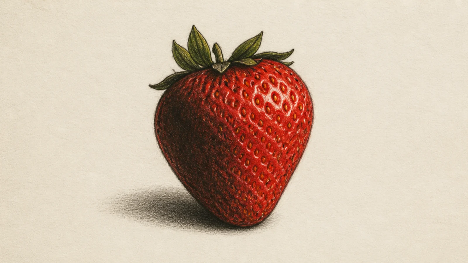
Realistic wins. Push one side into deep shadow and the lit side to bright red with a sharp highlight for high-contrast drama.
A berry lit dramatically with deep shadows. Realistic wins for the full value range and mood.
AvoidDon’t stay mid-tone; the value range creates the drama.
Pro tipExaggerate the shadow side for a moody, dramatic feel.
15 Cartoon Berry With a Bite
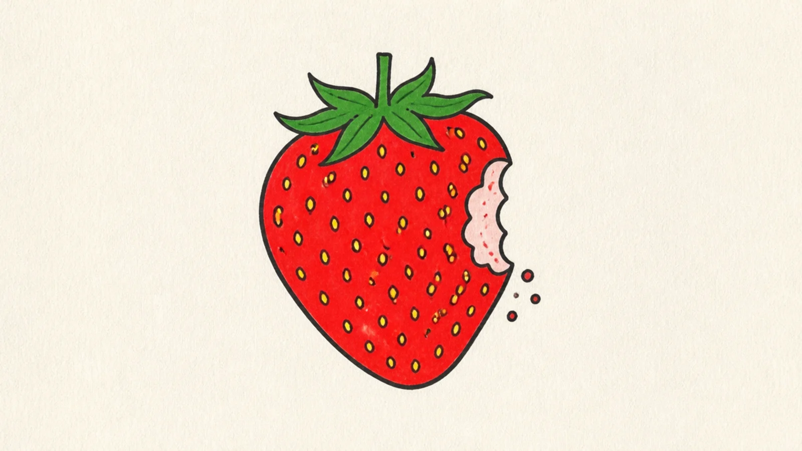
Cartoon wins. Draw the berry, then take a scalloped bite from one side and show a flat pale interior. Add a couple of crumb dots.
A playful berry with a cartoon bite mark. Cartoon wins — the simple flat bite reads instantly and fun.
AvoidDon’t shade the bite deeply; a flat pale zone suits cartoon.
Pro tipMake the bite edge scalloped like little tooth marks for a fun look.
16 Realistic Berry Cluster
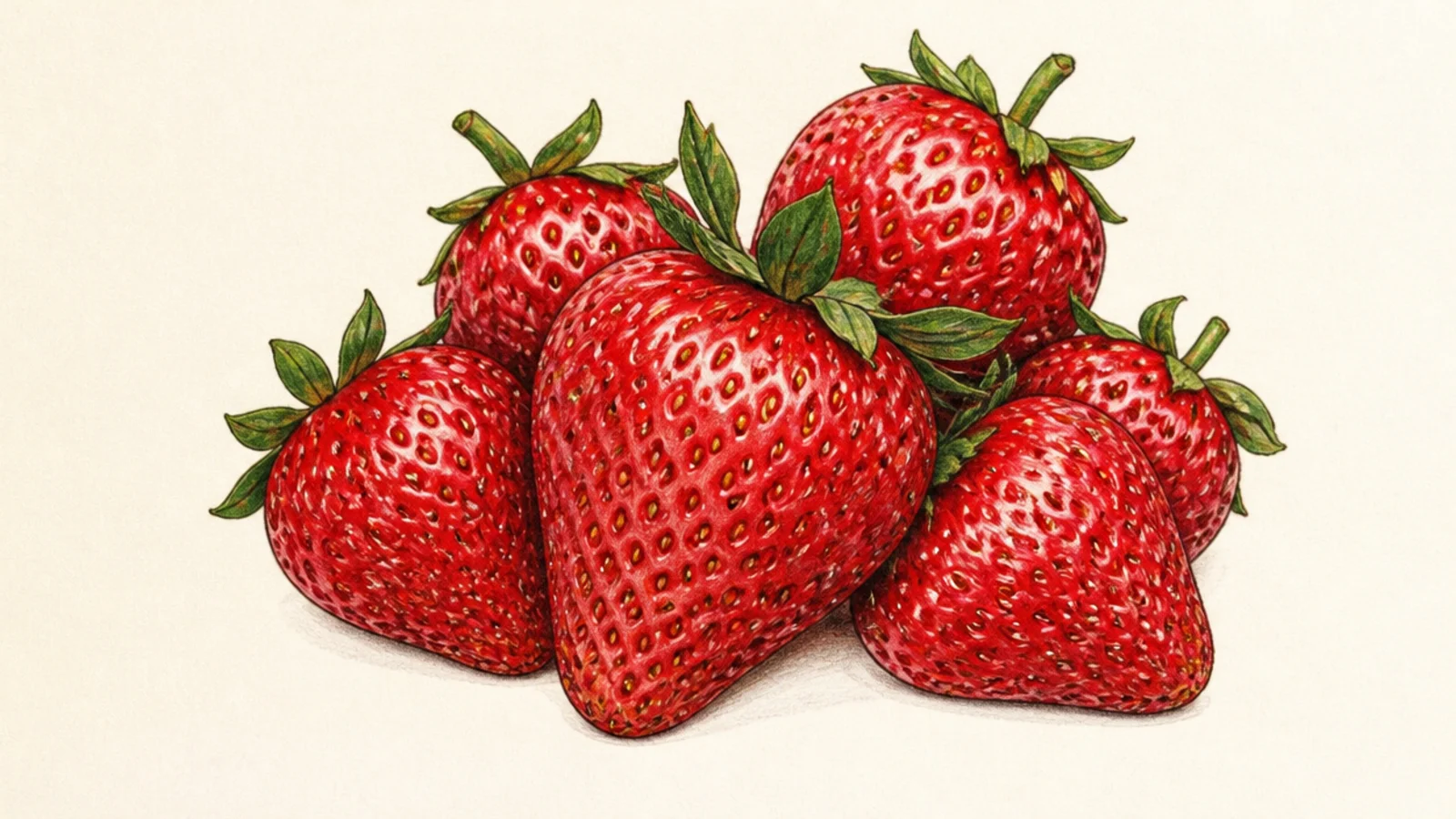
Realistic wins. Overlap several berries and shade the crevices between them dark so the cluster reads with real depth.
A cluster of berries overlapping with shadows between them. Realistic wins for the depth of the grouped forms.
AvoidDon’t light every berry the same; vary them for depth.
Pro tipDarken where the berries overlap to push them apart in space.
17 Cartoon Berry Mascot
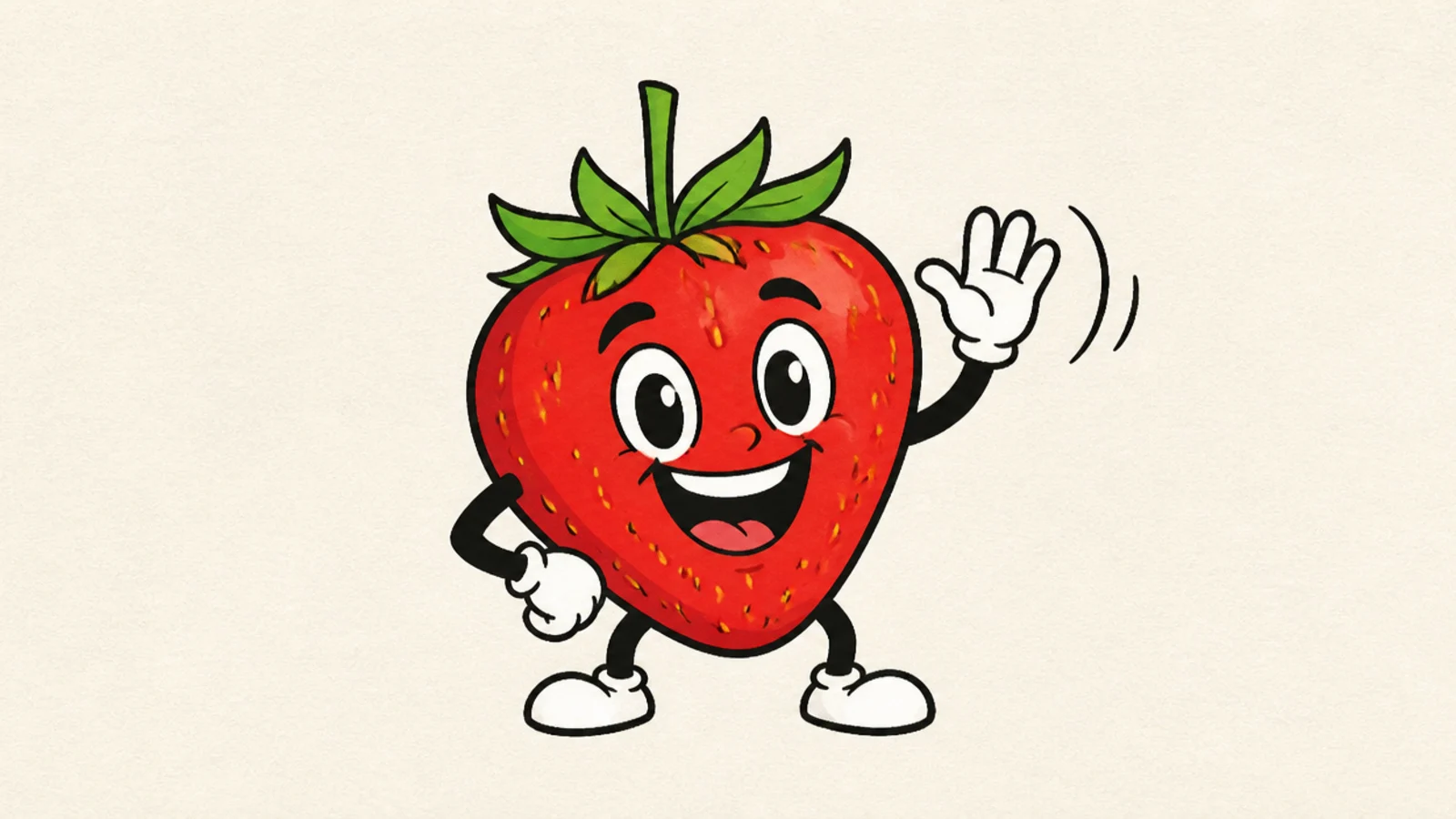
Cartoon wins. Draw a berry body with a big expression, one arm waving, and flat bright color. Add motion lines for energy.
A waving berry mascot with lots of personality. Cartoon wins — expressive mascots need the flat, bold style.
AvoidDon’t render it realistically; mascots need cartoon clarity.
Pro tipExaggerate the expression and pose for a lively mascot.
18 Realistic Half Berry
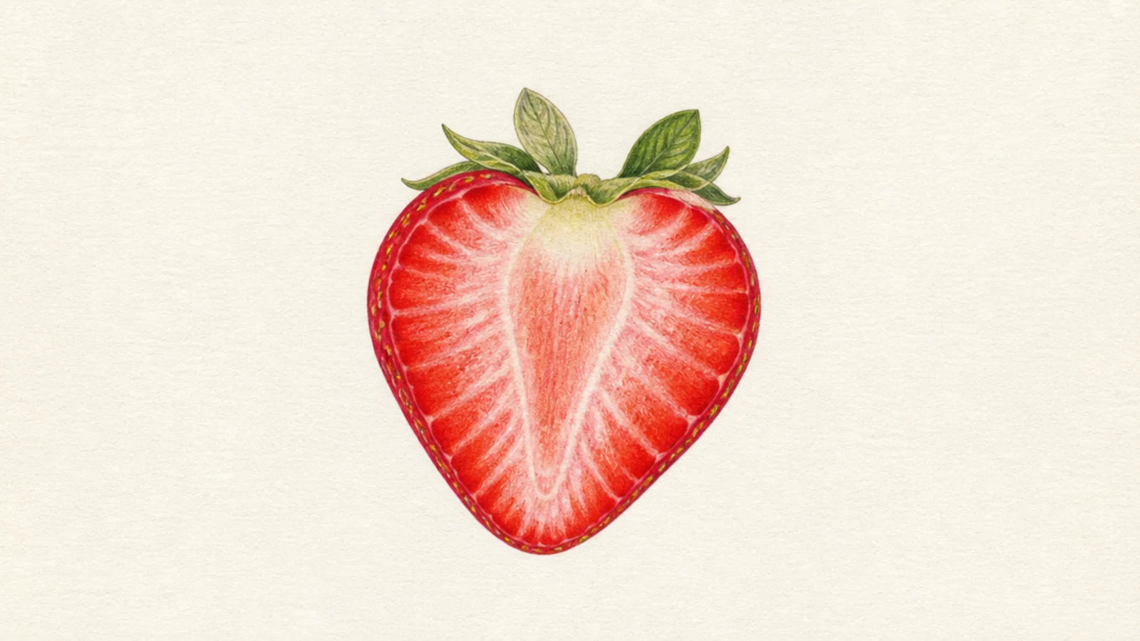
Realistic wins. Shade the pale core with soft radiating streaks, deepen the outer red, and add tiny highlights for juiciness.
A halved berry with a soft, juicy interior. Realistic wins for the moist, translucent cut face.
AvoidDon’t flatten the inside; soft shading makes it look juicy.
Pro tipKeep the core lightest in the center and redden toward the skin.
19 Semi-Realistic Blend
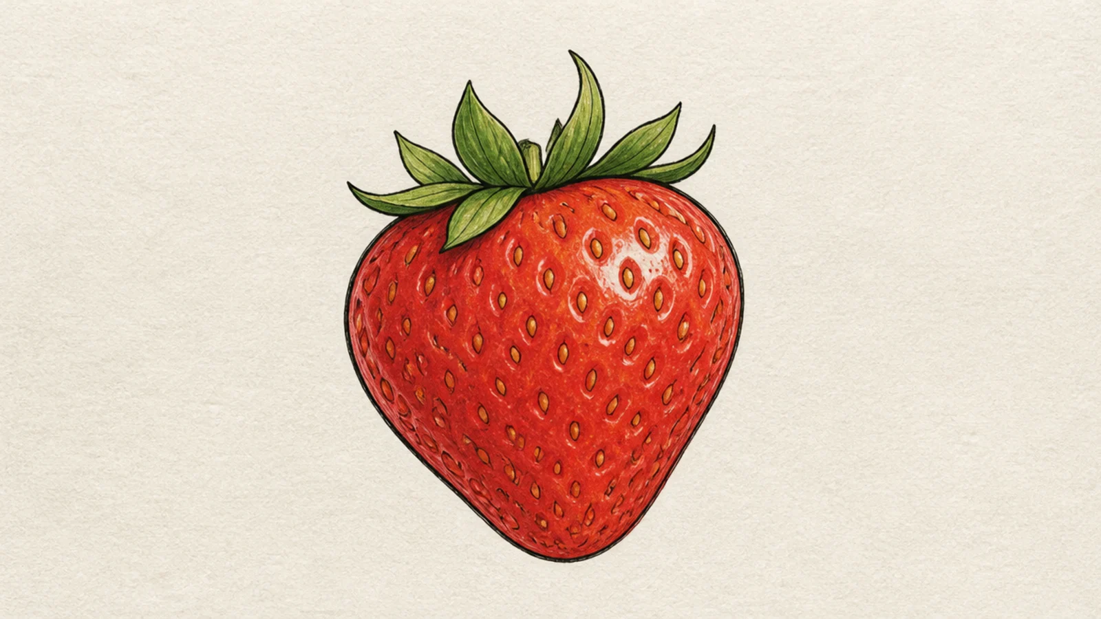
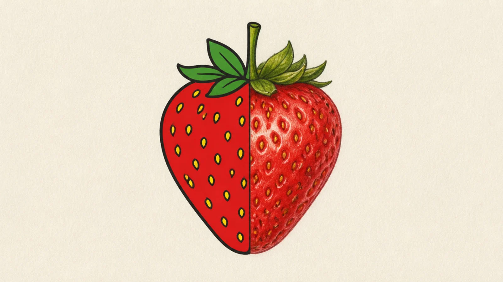
Both win together. Build the berry with a clean cartoon outline, then add soft shading and pitted seeds for a semi-realistic finish.
The best of both — clean construction with light realistic shading. This blend beats either pure style for many uses.
AvoidDon’t fully commit to flat or fully rendered; balance the two.
Pro tipKeep a light outline but let shading do the form work.
20 Your Signature Style
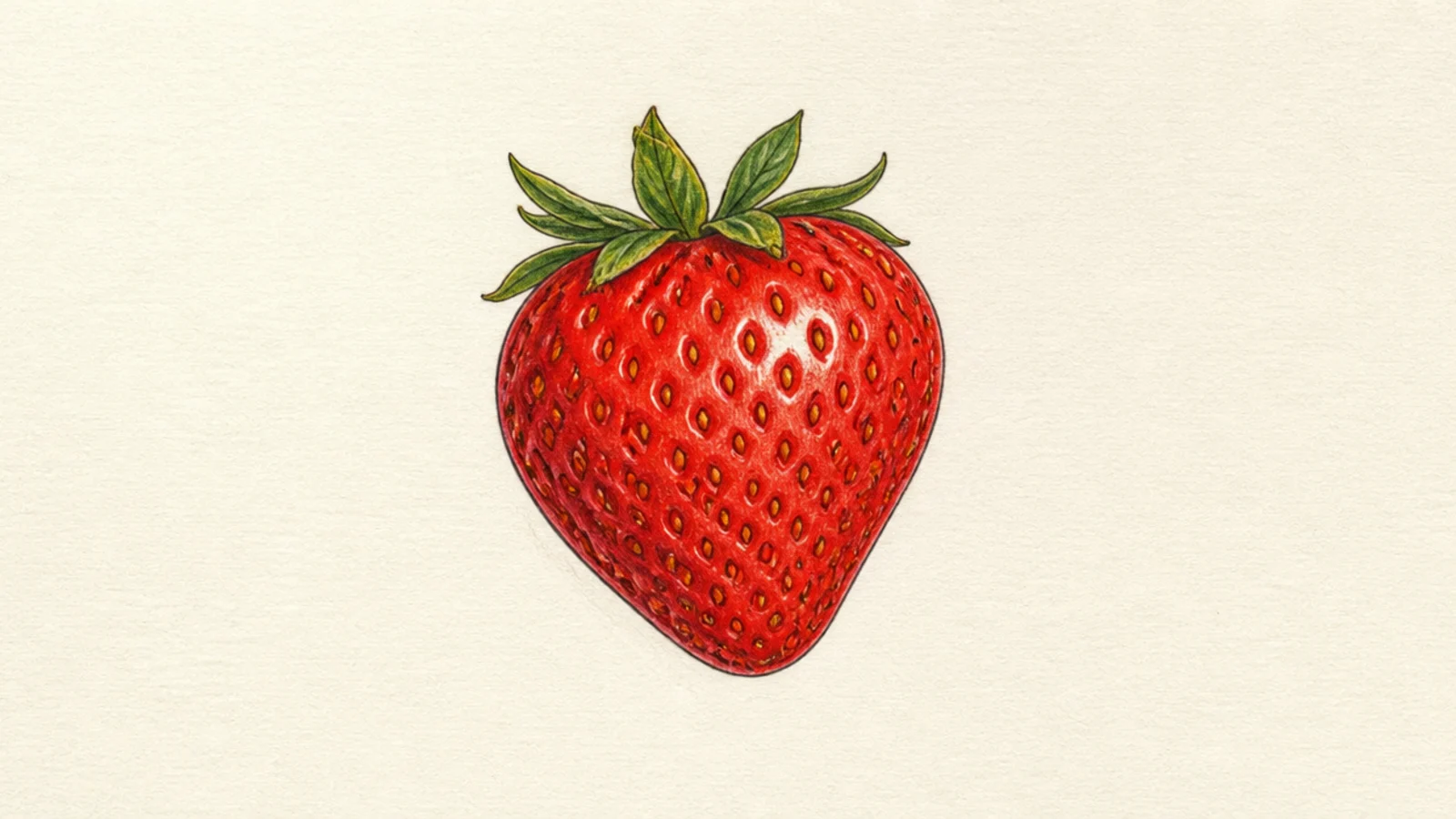
You choose. Pick the style that fits your goal — fun, realism, or a mix — and commit to it fully for a cohesive drawing.
Your own berry in whichever style — cartoon, realistic, or a blend — matched the looks you loved most. Choosing your style on purpose is the real lesson.
AvoidDon’t switch styles halfway; choose with intent.
Pro tipDecide the purpose first, then pick the style that serves it.