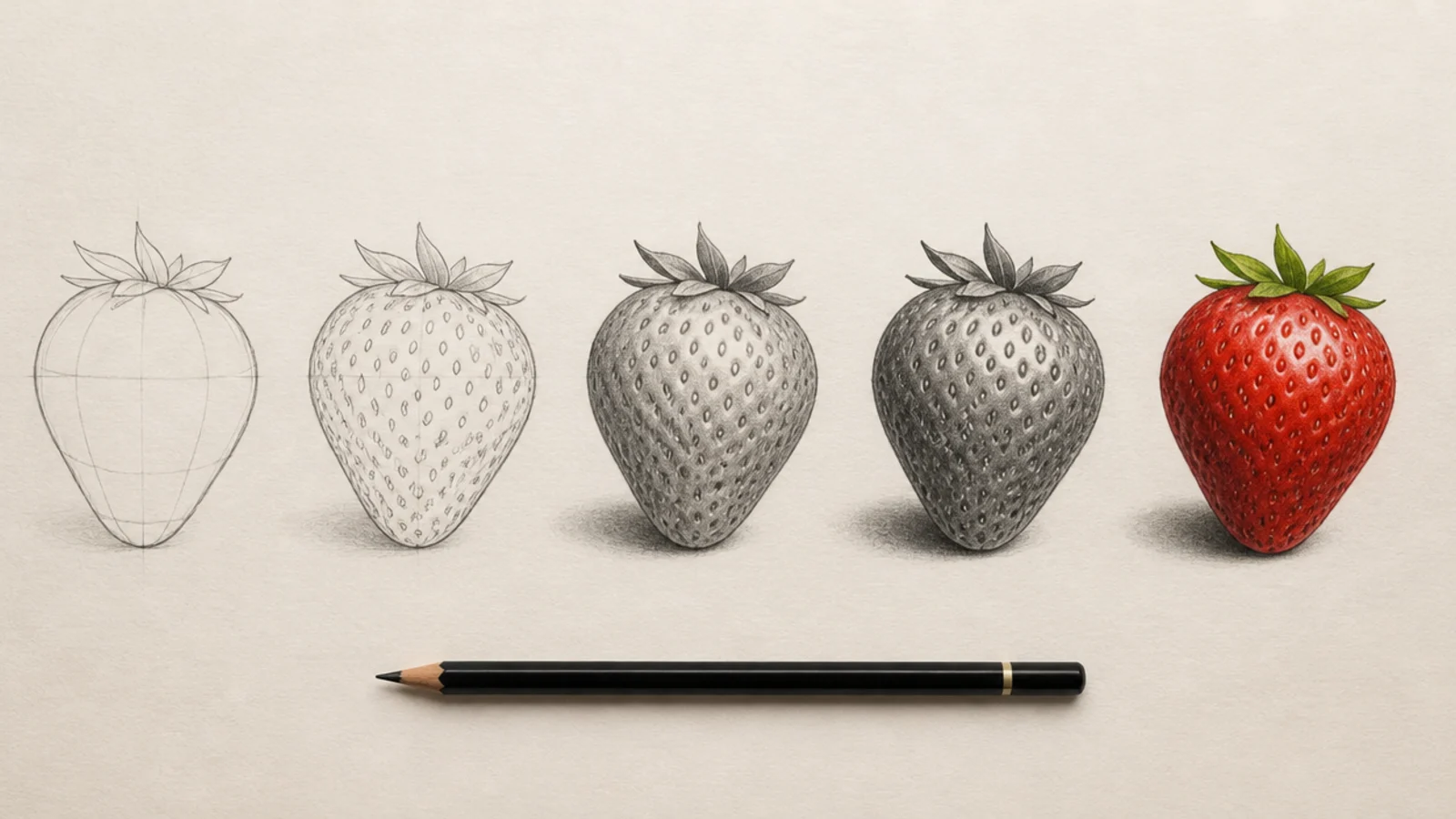
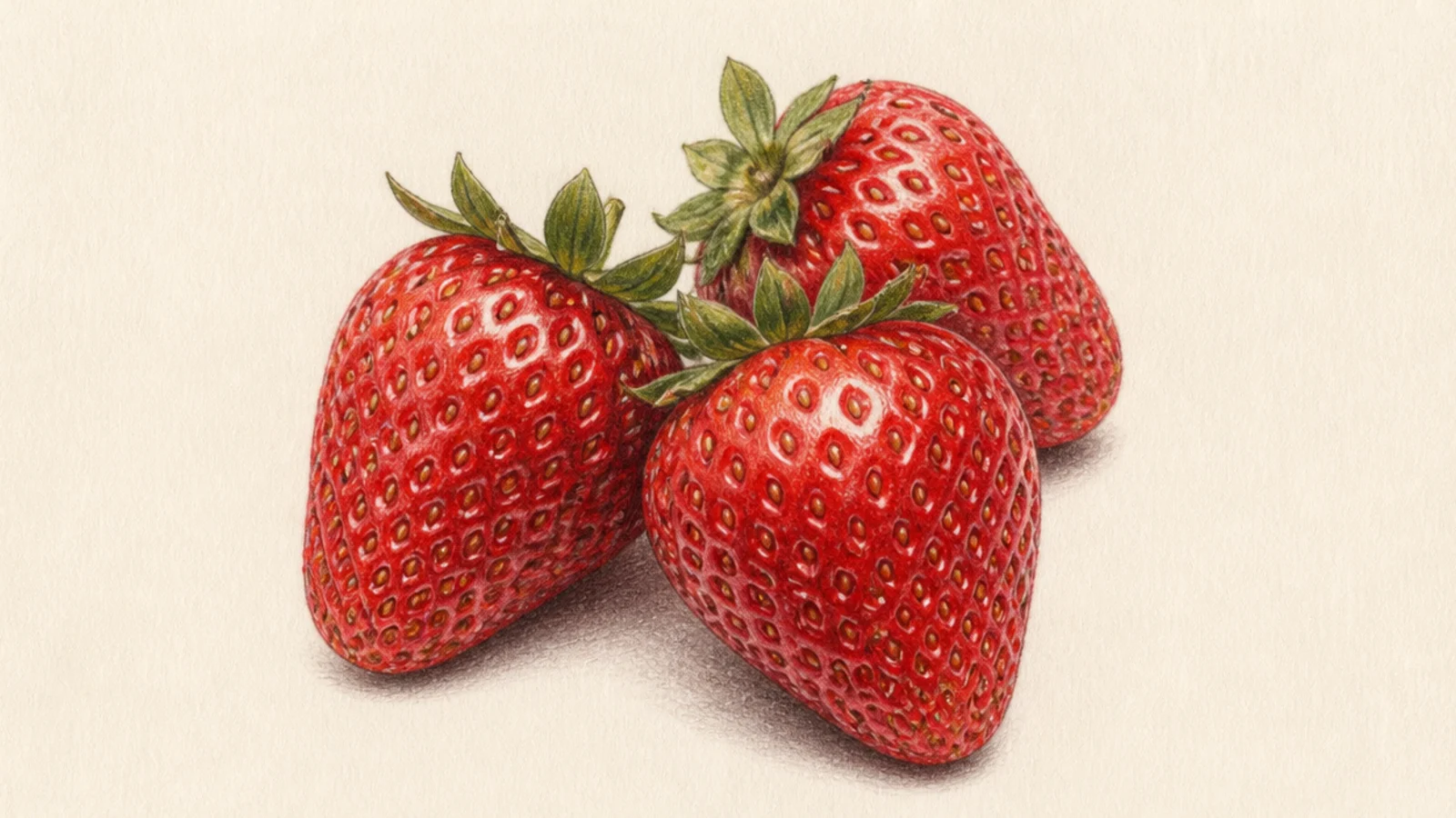
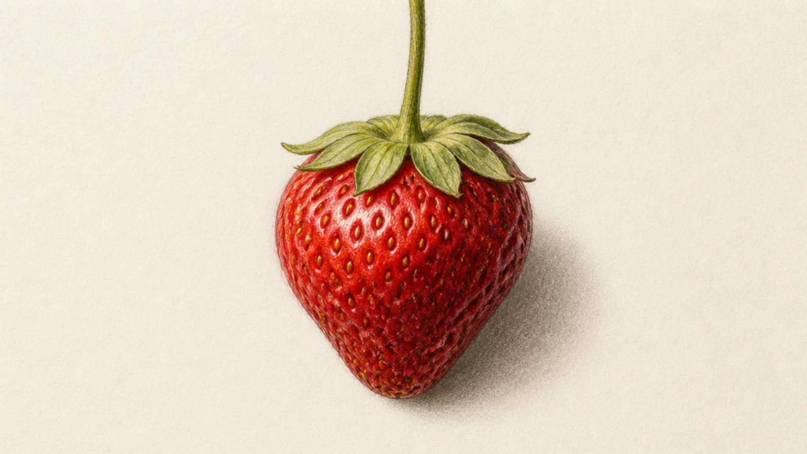
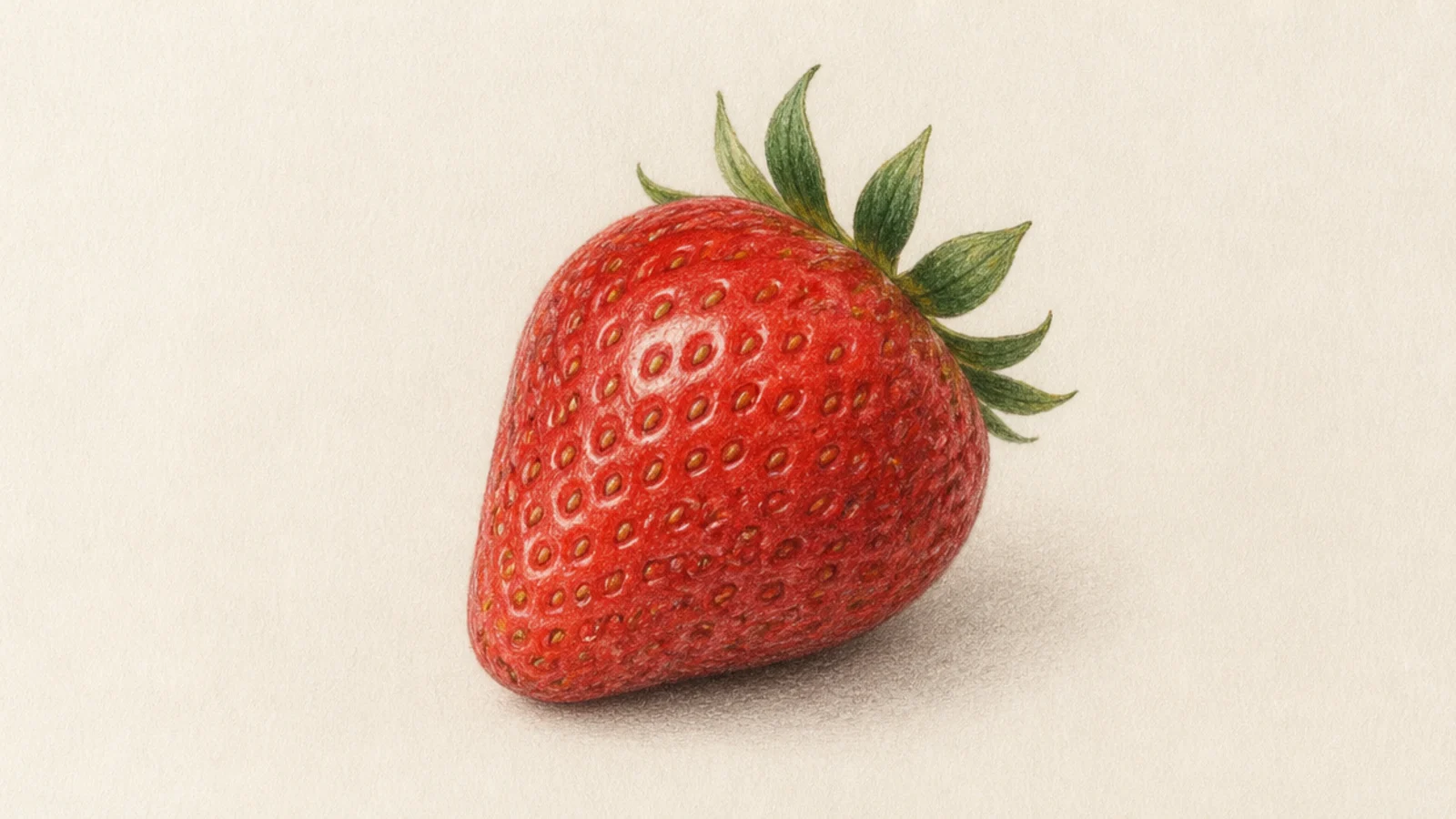
A realistic strawberry drawing looks impressive but comes down to a simple order — get the shape, place the seeds in little pits, then build the red from light to dark and finish with a bright highlight. Work in that sequence and the berry turns round, glossy, and convincingly real. This guide walks you through 5 easy steps that work in pencil, colored pencil, or paint, plus a few bonus variations to try once you have the basic berry down. Follow the steps once as written, then make it yours.
The single most important idea in realistic drawing is that form comes from value, not outline. Instead of a hard line around the berry, you build its roundness with a gradient — light where the light hits, dark where it turns away. This strawberry method is built around that principle, so each step adds value in the right place to make the fruit look three-dimensional.
The second key is the seeds. On a real strawberry the seeds sit in shallow pits, so each seed has a tiny shadow on one side and the skin bulges slightly around it. Drawing seeds as flat dots on top is the number one thing that makes a berry look fake, so we place them in pits from the start and let the shading wrap around them.
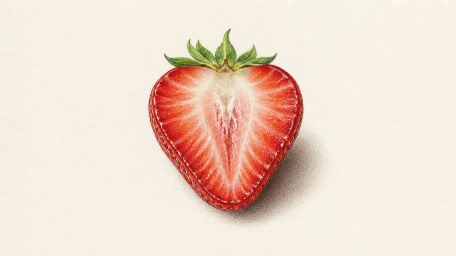
These five steps take you from a blank page to a lifelike berry, and the bonus variations after show how to adapt the method for a half strawberry, a glossy studio look, and more. Keep a real strawberry or a photo nearby for reference, work light to dark, and save your brightest highlight for the very end.
Step by step
Sketch the shape and light guides. Lightly pencil the berry’s outline — a rounded shape wider at the top and tapering to a soft point, tilted a little for a natural look. Add the leaf cap at the top. Then decide where your light comes from and lightly mark the brightest spot and the shadow side. Keep every line faint; this is just a map, and you want to be able to erase it as the shading takes over.
Map the seed pits. Across the surface, lightly draw the seeds as small ovals, following the curve of the berry so they wrap around the form and space out toward the sides. Around each seed, suggest a shallow pit rather than a flat dot. Curve the rows of seeds with the surface — closer together near the edges, more spread in the center — so they already describe the roundness before you add any value.
Lay the first light value. Establish the base red or, in graphite, the first mid-grey. Cover the whole berry except the brightest highlight with a light, even layer, leaving the highlight area untouched paper. Keep this pass light — you are just setting the lightest tone the berry will hold. Skipping this base and jumping to dark shadows is what flattens a berry, so build up from light.
Build the shading light to dark. Now develop the form. Deepen the red or graphite on the shadow side and along the bottom, keeping the top near the highlight lightest, and blend the gradient so it stays smooth. Shade a soft shadow on the far side of each seed pit and let the skin bulge catch light on the near side. Layer gradually — several light passes read smoother and more real than one heavy one.
Add highlights and the cast shadow. Finish by lifting or adding the brightest highlight with an eraser or a white pen, keeping it small and sharp for a wet, glossy look, plus a few tiny shines on the seed bulges. Deepen the darkest shadow at the base and under the leaf cap, then add a soft cast shadow on the surface beneath the berry to ground it. That final light-and-dark contrast is what makes the strawberry pop off the page.
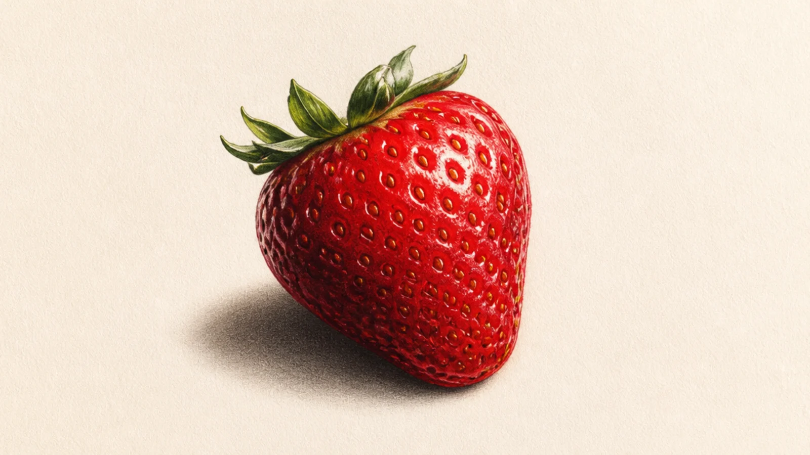
The same berry with dramatic studio lighting for a wet, glossy look. Pushing the highlight and shadow further adds punch. It looks product-shot polished.
Follow the steps but exaggerate the contrast — a very bright sharp highlight and a very deep shadow — and add a soft secondary sheen for a wet surface.
Keep the main highlight tiny and bright for a glossy, wet shine.
Don’t scatter many highlights; one strong shine reads as gloss.
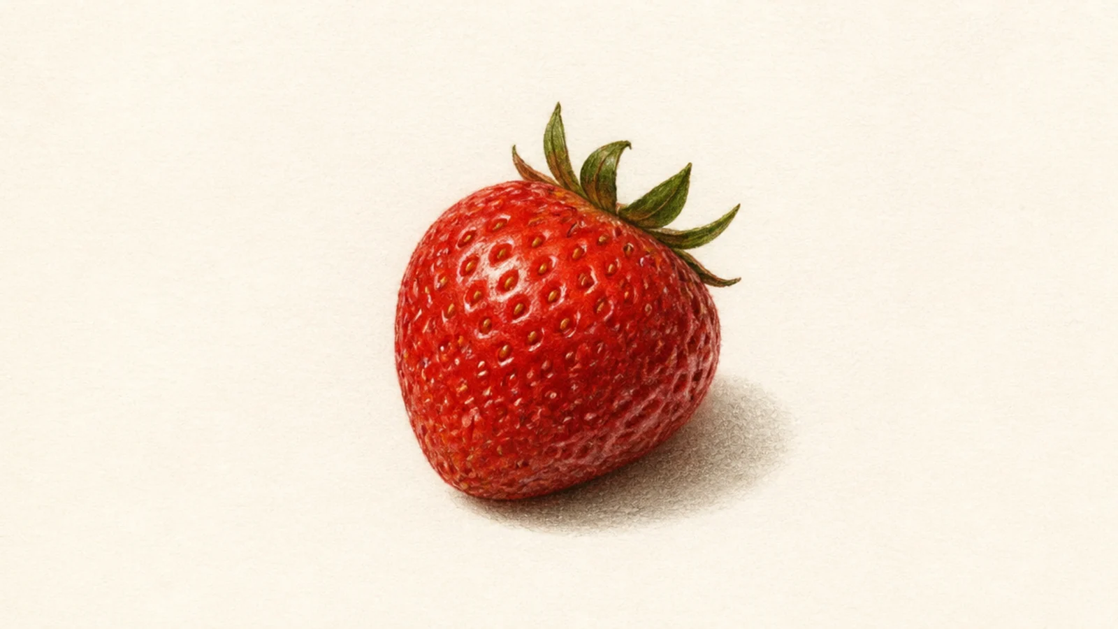
The method in colored pencil, layering reds for rich, realistic color. Building color in layers teaches smooth blending. It looks vibrant and lifelike.
Pro tipLayer light reds first and save the darkest red for the deepest shadow.
Use the five steps with light, mid, and dark red pencils, layering from light to dark and burnishing the gradient smooth, with a white pencil highlight to finish.
AvoidDon’t press hard early; light layers build a smoother gradient.
Quick answers
How do you draw a realistic strawberry step by step?
Start with a light shape, then map the seeds as small dips across the surface. Build the red from light to dark following one light direction, shade a soft shadow around each seed pit, and finish with a bright highlight and a cast shadow. Working shape, seeds, then value in that order is what makes a realistic strawberry drawing look round and lifelike.
How do I draw strawberry seeds so they look real?
Draw each seed as a small oval sitting inside a shallow pit, with a soft shadow on the side away from the light and a tiny bulge of skin catching light on the near side. The seeds should look pressed into the surface, not stuck on top. That pit-and-shadow detail is the biggest key to realism.
What makes a strawberry drawing look three-dimensional?
A smooth gradient of red from a light, highlighted top to a dark, shadowed bottom, plus consistent shadows around the seeds and a cast shadow under the berry. Avoiding a heavy outline also helps, because in real fruit the edge is defined by value change, not a drawn line. Value is what creates the roundness.
Do I need color to draw a realistic strawberry?
No. A graphite drawing that nails the value range — bright highlights, mid greys, and deep shadows — reads as a completely convincing realistic strawberry. Color adds appeal, but the realism comes from the shading and the seed pits, so mastering it in pencil first makes your colored versions much stronger.