1 Soft Glow Single Bloom
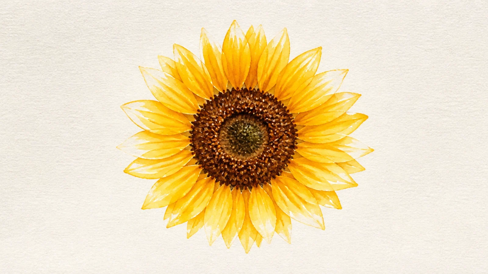
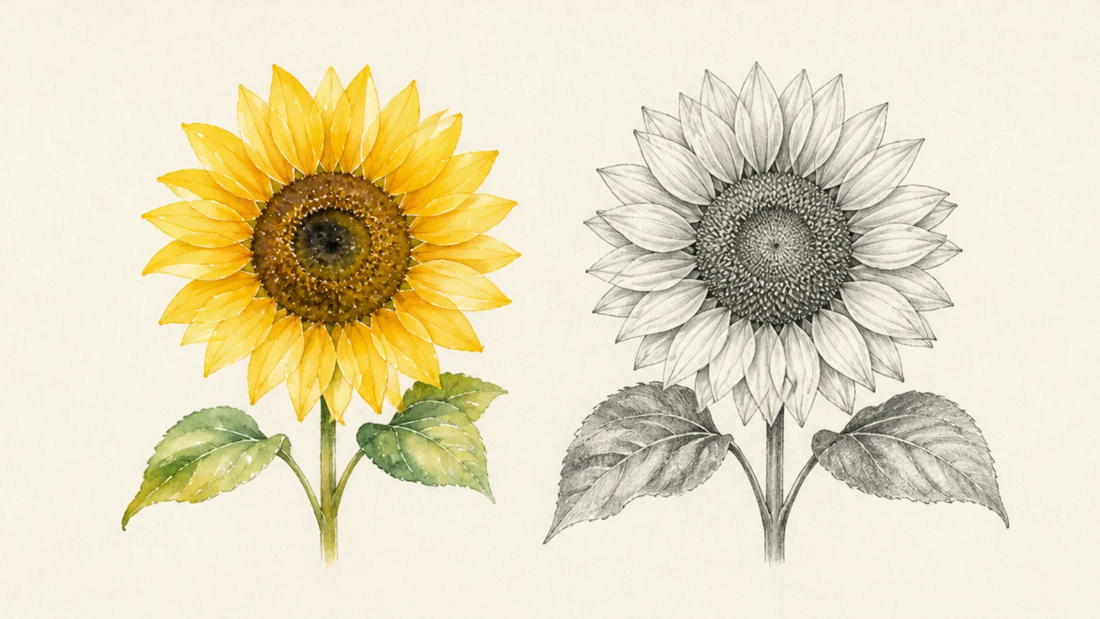
One bloom where glowing, backlit petals are the goal. This is watercolor’s home turf — the transparent glow is impossible to match in graphite.
Pro tipLeave the paper white where light hits; that untouched white is the glow.
Watercolor wins. Wet each petal and drop in warm yellow, leaving white paper at the tips for glow. Let colors bleed softly at the base.
AvoidDon’t paint every petal solid; the reserved whites make it luminous.
2 Botanical Detail Study
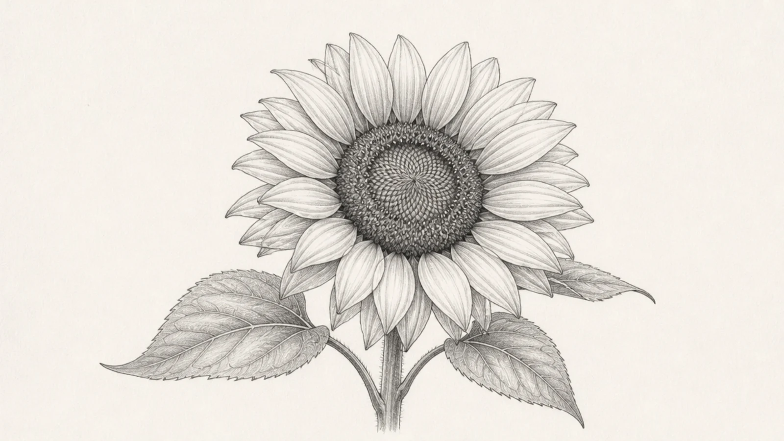
A field-guide study with every seed and vein rendered. Pencil wins for the fine, controlled precision this needs.
Pro tipUse a sharp hard pencil for the finest seed and vein detail.
Pencil wins. Render the seed spiral, petal creases, and leaf veins with sharp graphite marks and full value control.
AvoidDon’t attempt this wet; watercolor blurs the fine detail.
3 Loose Expressive Bloom
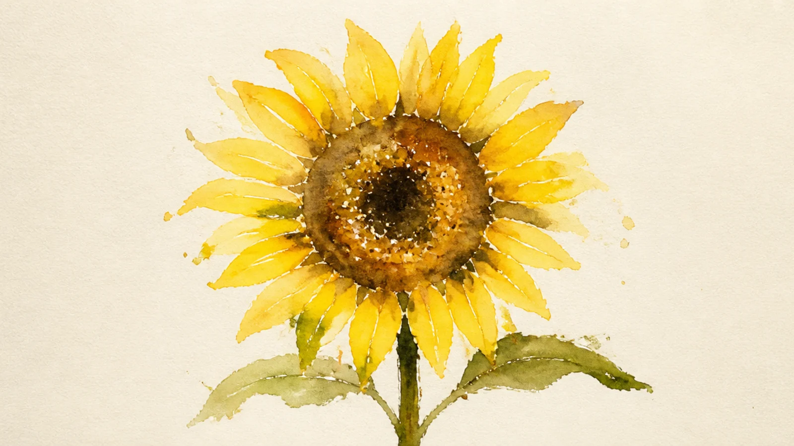
A fast, loose bloom where blooms of color bleed and mingle. Watercolor’s spontaneity gives an energy pencil can’t.
Watercolor wins. Work wet-on-wet, letting yellows and browns bleed. Embrace the happy accidents at the edges.
Let colors mingle wet; don’t fight the bleeds, use them.
Don’t overwork it; looseness is the whole appeal.
4 High-Contrast Portrait
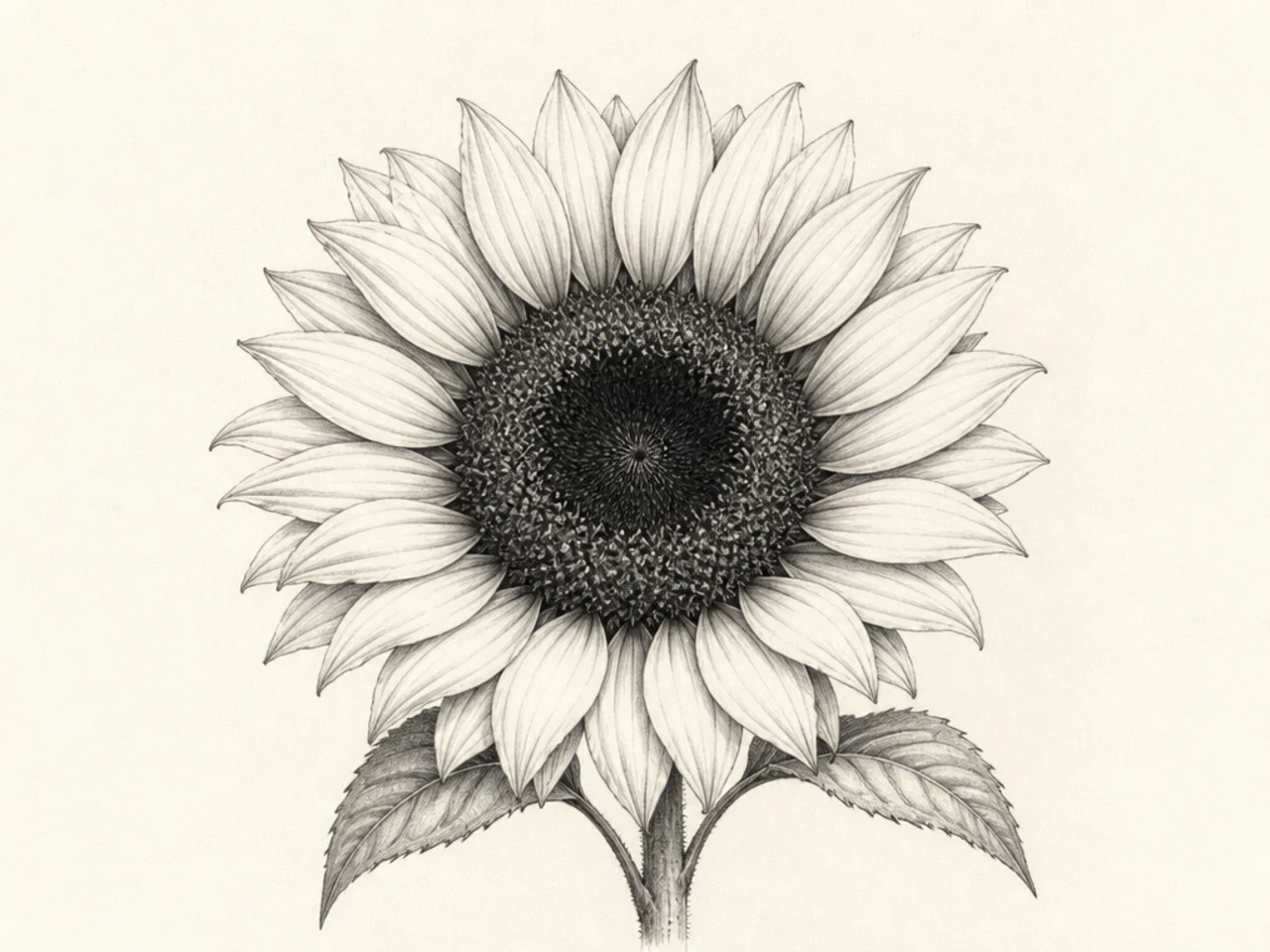
A dramatic bloom with near-black shadows and bright highlights. Pencil’s full white-to-black value range wins for punch.
Pro tipExaggerate the darkest darks; contrast is the drama.
Pencil wins. Push the center and overlaps very dark with a soft pencil, leaving petal tips near white for maximum contrast.
AvoidDon’t stay mid-grey; the value range is the effect.
5 Sunny Field Impression
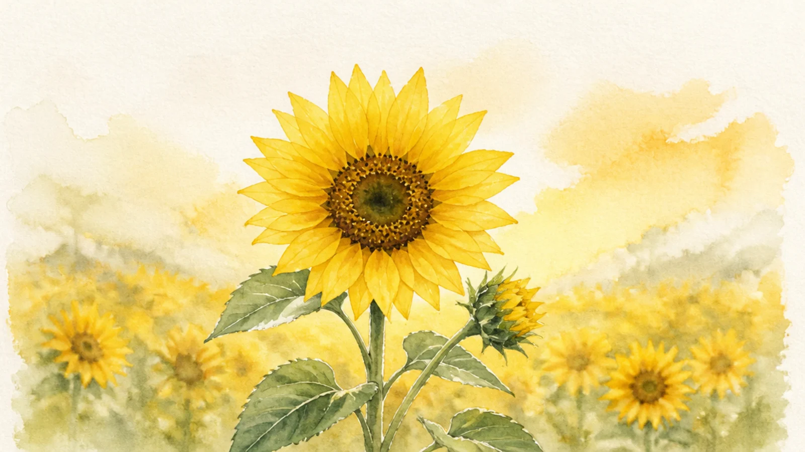
A dreamy field of blurred blooms melting into a warm sky. Watercolor’s soft washes win for atmosphere.
Pro tipBlur the distant flowers and sharpen only the nearest.
Watercolor wins. Wash the sky and field wet, dab blooms that blur, and keep only a few front flowers crisp.
AvoidDon’t outline every bloom; blur creates the impression.
6 Seed Head Macro
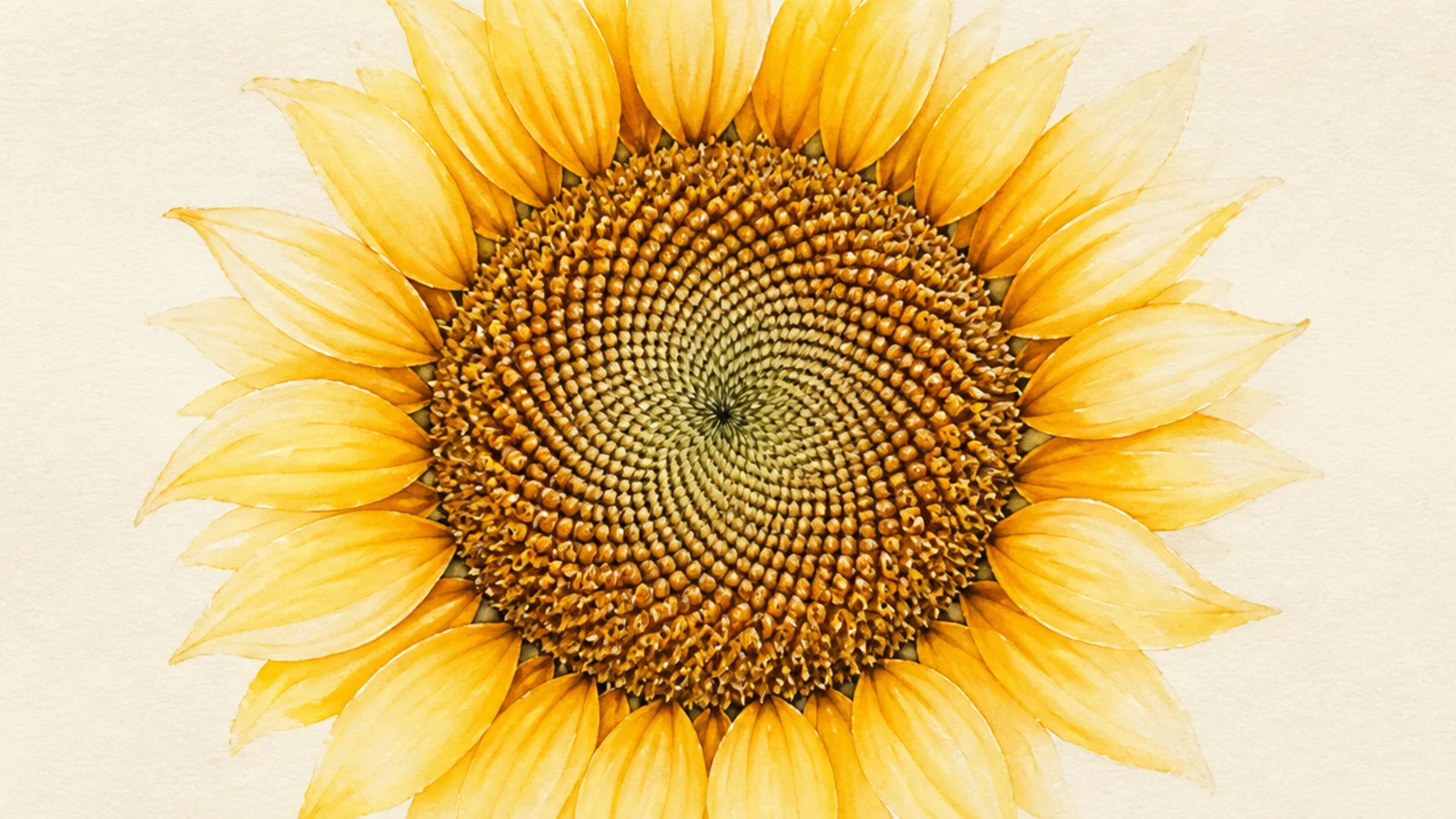
An extreme close-up of the spiral seed pattern. Pencil wins for the crisp, intricate texture.
Pencil wins. Draw the interlocking seed spirals sharply and dome the disc with careful shading.
Follow both spiral directions of the real seed packing.
Don’t blur it wet; the pattern needs sharp edges.
7 Pastel Aesthetic Bloom
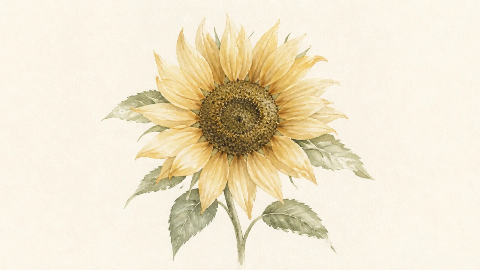
A gentle, muted bloom in soft aesthetic tones. Watercolor wins for the delicate, washed color.
Pro tipDilute the pigment heavily for that soft pastel wash.
Watercolor wins. Use diluted, muted washes — soft ochre, sage, dusty petals — for a calm aesthetic mood.
AvoidDon’t use full-strength color; the softness is the point.
8 Curling Petal Realism
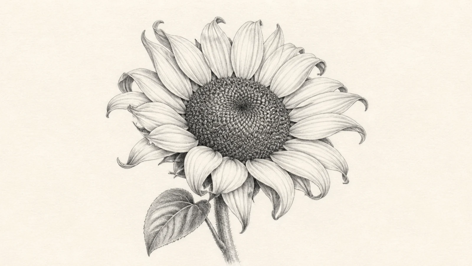
Petals that curl and fold with convincing form. Pencil wins for the controlled shading that describes each fold.
Pro tipShade the hidden underside of each curl darkest.
Pencil wins. Shade the undersides of curls dark and the top surfaces light, sculpting each fold with value.
AvoidDon’t flatten the folds; value carves the curl.
9 Rainbow Wash Fun
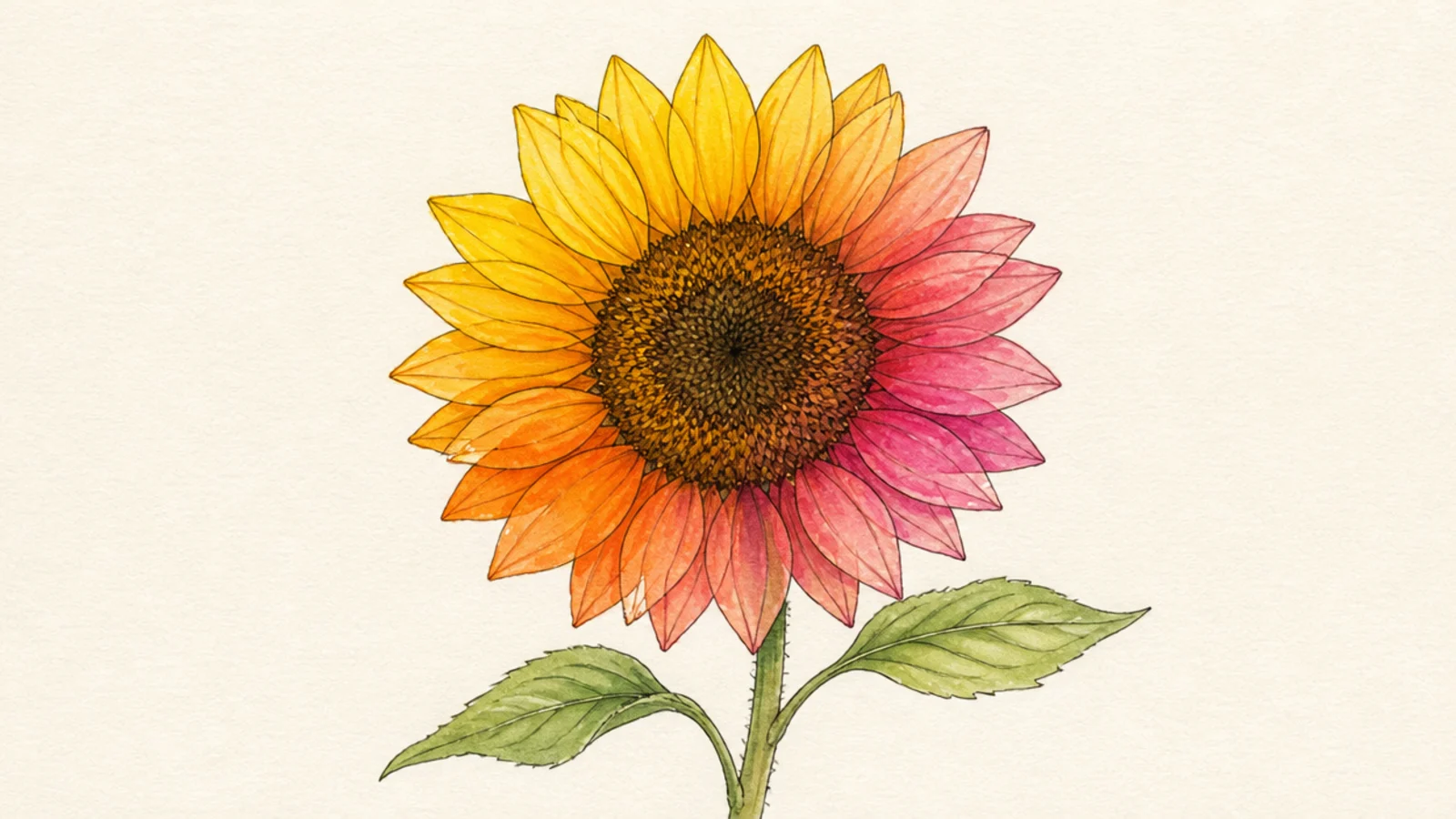
A playful bloom where petals shift through warm colors. Watercolor wins for effortless color blending.
Pro tipBlend the colors while the paper is still wet for smooth shifts.
Watercolor wins. Blend yellow into orange into pink across the petals while wet for a smooth rainbow shift.
AvoidDon’t let it dry between colors; blend wet-on-wet.
10 Quick Line Sketch
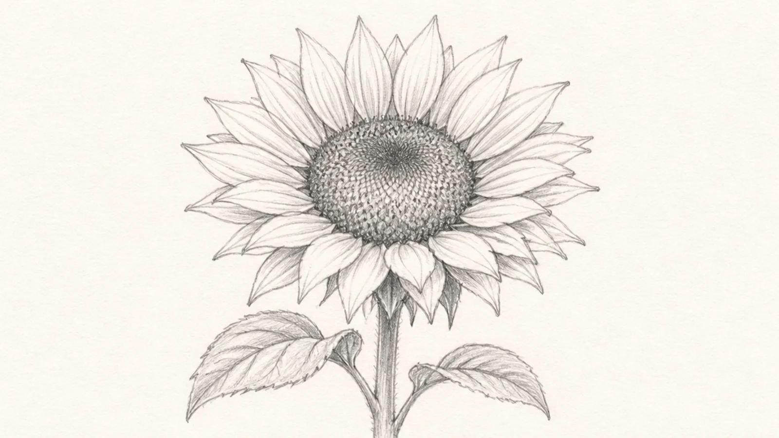
A fast, confident line capture with no color. Pencil wins for immediacy — no water, no drying, just draw.
Pro tipDraw fast from the shoulder for lively, loose lines.
Pencil wins. Sketch the whole bloom in quick confident lines with a little gesture shading.
AvoidDon’t fuss; the speed is the charm.
11 Glowing Sunset Bloom
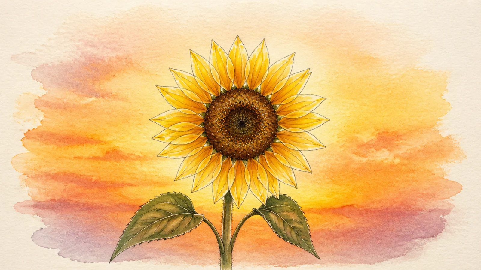
A bloom lit by a warm sunset glow behind it. Watercolor wins for the luminous, colored light.
Pro tipGraduate the sky wash from warm to cool for a real sunset.
Watercolor wins. Wash a warm gradient sky and let it glow around the flower, reserving bright edges on the petals.
AvoidDon’t paint the glow flat; graduate it for luminosity.
12 Monochrome Drama
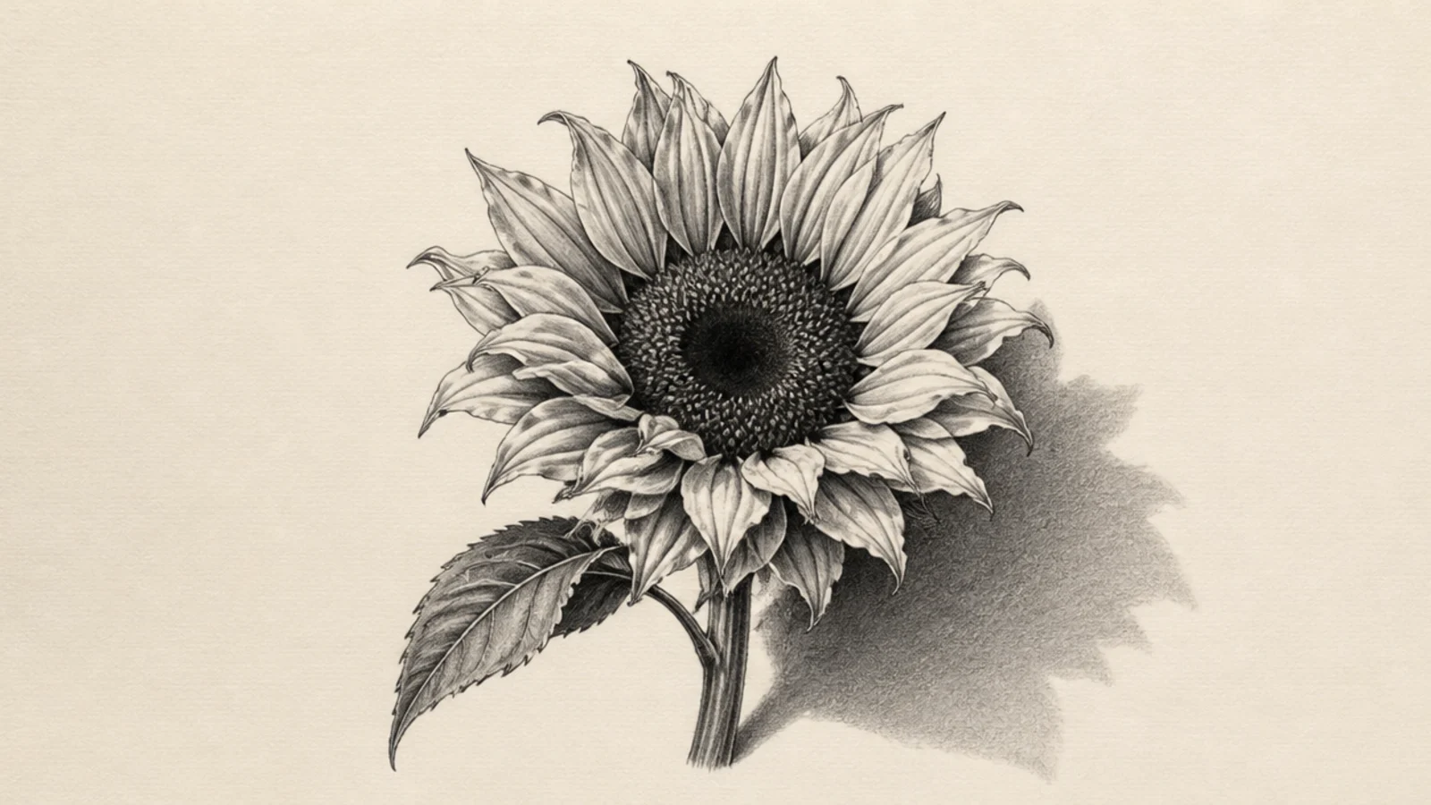
A moody single bloom in pure graphite tones. Pencil wins for the rich, controlled monochrome depth.
Pencil wins. Build deep values with soft pencils, a very dark center, and a strong cast shadow for drama.
Save the darkest darks for the very end for impact.
Don’t keep it light; the depth is the drama.
13 Mixed Media Bloom
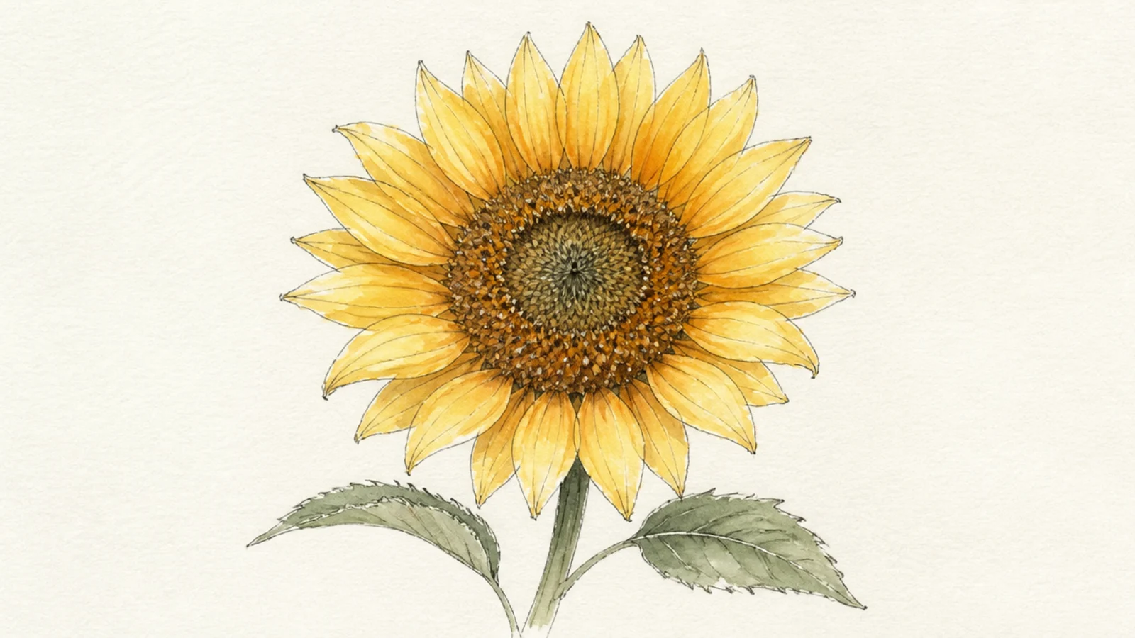
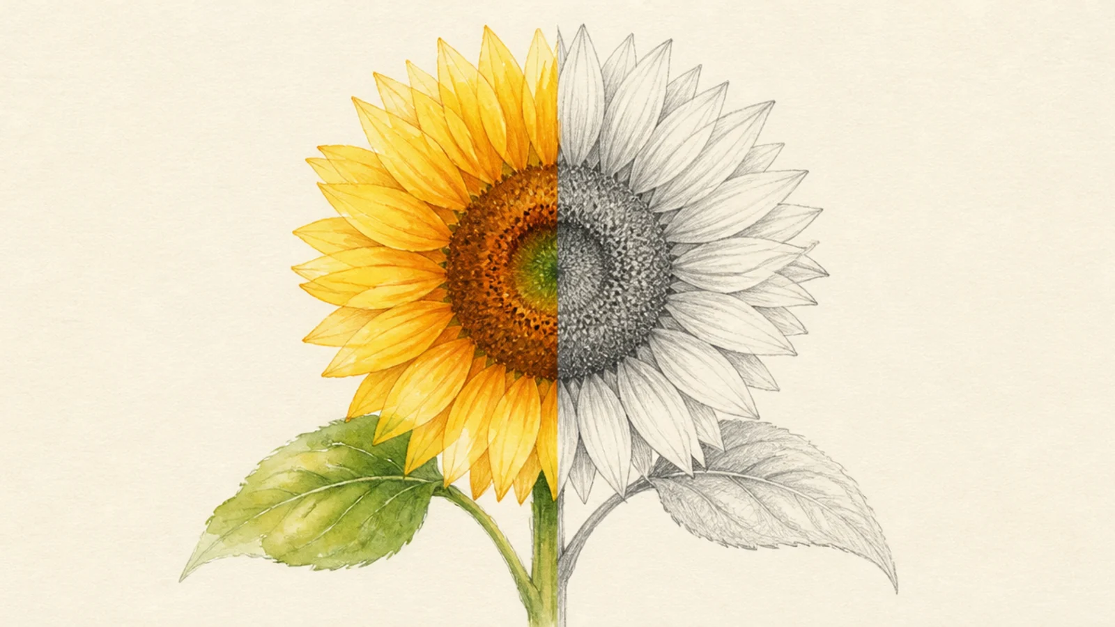
The best of both — a glowing wash finished with crisp pencil detail. This combined approach beats either medium alone for many sunflowers.
Both win together. Lay a soft watercolor wash, let it dry fully, then add crisp petal edges and seed texture in pencil or ink on top.
Let the wash dry completely before adding pencil, or it smears.
Don’t detail on wet paper; wait for a bone-dry wash.
14 Greeting Card Bloom
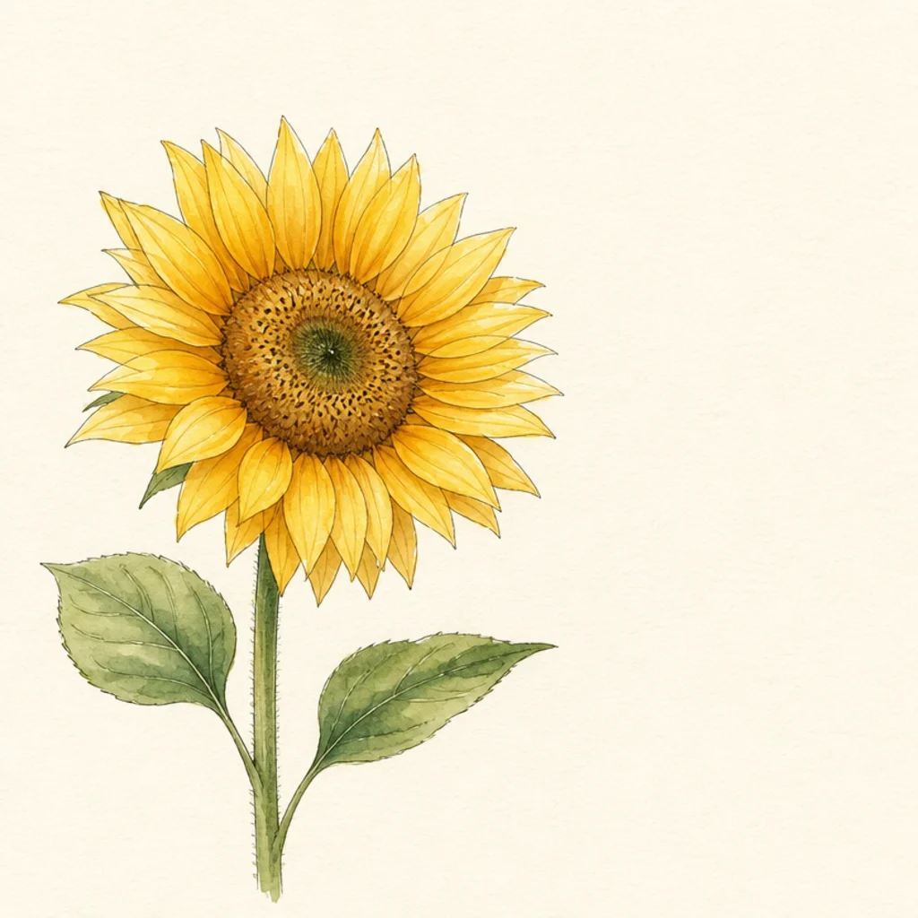
A bright, cheerful bloom meant to be printed on a card. Watercolor wins for the warm, inviting color that reproduces beautifully.
Watercolor wins. Keep the color bright and friendly, leave clean white space for a message, and add a simple ink outline if you like.
Leave clear white space beside the bloom for a greeting.
Don’t fill the whole card; leave room for the message.
15 Your Signature Approach
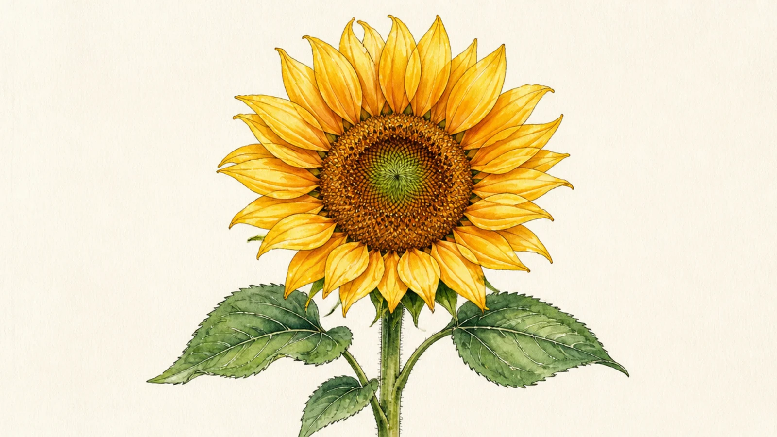
Your own sunflower using whichever medium — or combination — matched the looks you loved most. Choosing your tool on purpose is the real lesson.
Pro tipDecide the mood first, then pick the medium that serves it.
You choose. Pick the medium that fits your goal — glow, detail, speed, or a mix — and commit to it fully for a cohesive piece.
AvoidDon’t switch mediums halfway on a whim; choose with intent.