
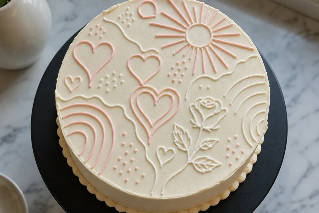

1. Single-Line Tiny Heart Garland
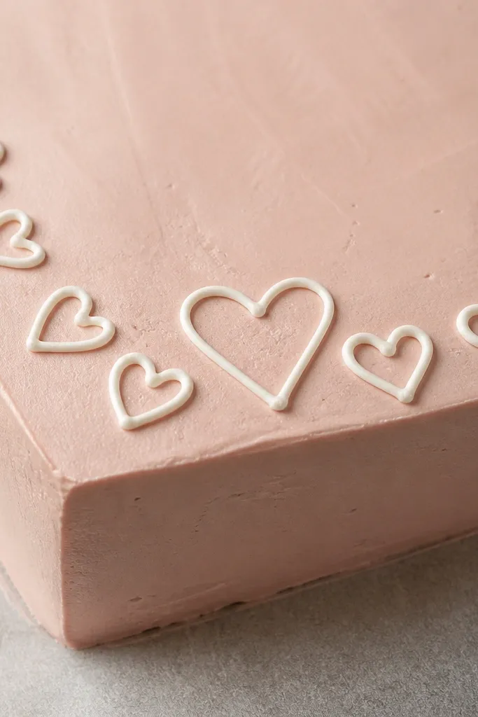
Start by smoothing the top frosting flat and marking a center guideline lightly with a toothpick. Pipe a thin outline heart pattern across the top edge, keeping each heart about 2-2.5 cm wide. Finish by adding one larger center heart and a few tiny dots between hearts for balance. Let it set for 10-15 minutes before moving the cake so the lines stay crisp.
This one looks clean because it uses only outline hearts with no heavy filling. The spacing matters: hearts should sit like punctuation, not clustered like a sticker sheet. Use a thin piping tip so every heart has a sharp point and a smooth curve, then add one slightly larger heart in the center to guide the eye. It’s photogenic on any cake color because the line work is the whole design. Skill level is beginner — you’re repeating a simple shape with consistent spacing.
AvoidDon’t fill the hearts fully — thick fill makes the drawing look muddy.
Pro tipIf your frosting is too stiff and skips, warm the piping bag between your palms for 5 seconds.
2. Buttercream Sunburst Rays with Center Dot
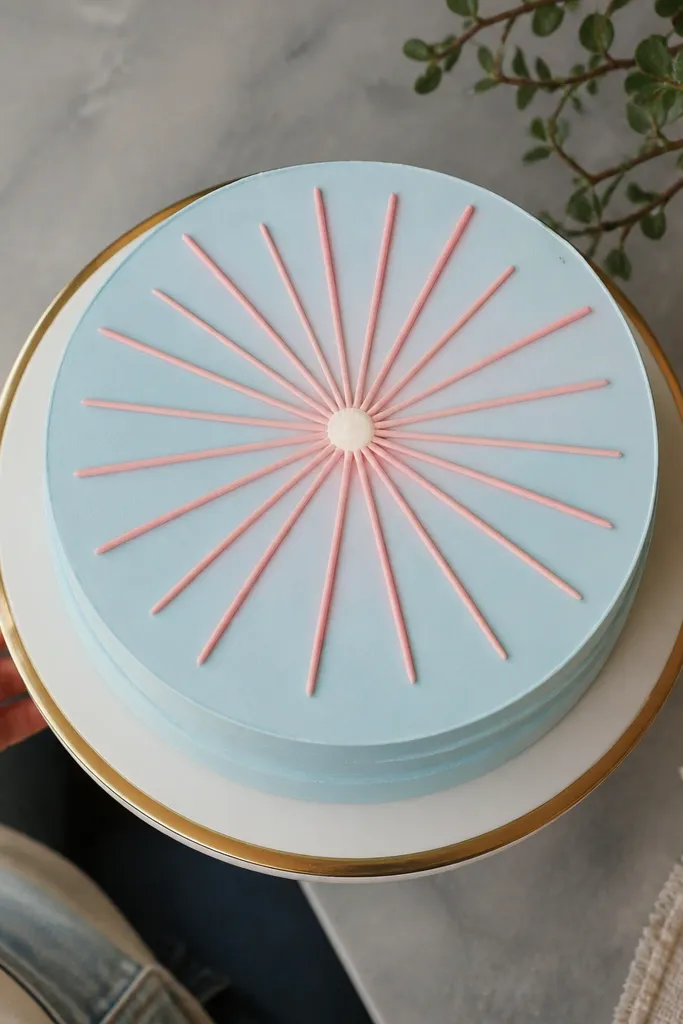
Sunburst drawings look “designed” because they create movement with simple geometry. Keep the rays short and evenly spaced so the pattern reads as intentional, not scribbly. A small center dot gives you an anchor, which makes the whole top look finished. This looks especially good on pastel cakes (powder blue, blush pink, pale yellow) because the contrast is soft but clear. It’s quick: you can do the whole thing in under 20 minutes once your frosting is the right consistency.
Spread a smooth top layer and lightly draw a circle guide with a toothpick. Pipe thin rays from the circle outward using a #2 tip, aiming for equal lengths around 3-4 cm. Place a small dot in the center with the same tip, then gently tap the dot with a clean spoon handle to perfect the shape. Chill 10 minutes to firm the rays before slicing.
Use a parchment circle as a guide under the parchment paper so your rays stay centered.
Don’t make the rays too long — long rays sag and blur at the tips.
3. Minimal Bow Outline on a Frosted Plate
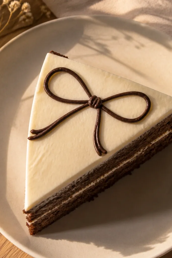
A minimal bow reads upscale because it’s all line and symmetry. Outline-only details keep it modern, and the bow shape frames the center. To make it aesthetic, the ribbon loops must be proportional — wide loops and a narrow knot make it look like a real gift bow. This design works for birthdays, thank-yous, and “just because” cakes because it’s gender-neutral and clean. It takes about 15-25 minutes depending on how steady your hand is.
Smooth the top and place a faint center mark. Pipe the two outer loops as smooth teardrop outlines, then add the inner loop lines and the knot rectangle in the center. Add small “crease” lines inside each loop using the same tip, keeping them short. Let it set 10 minutes so the outlines don’t smear when you transport the cake.
If your lines wobble, pause after each loop and squeeze less — tiny breaks read like intentional stitching.
Don’t over-detail the knot — 2-3 lines are enough.
4. Crescent Moon with Sparkle Trio
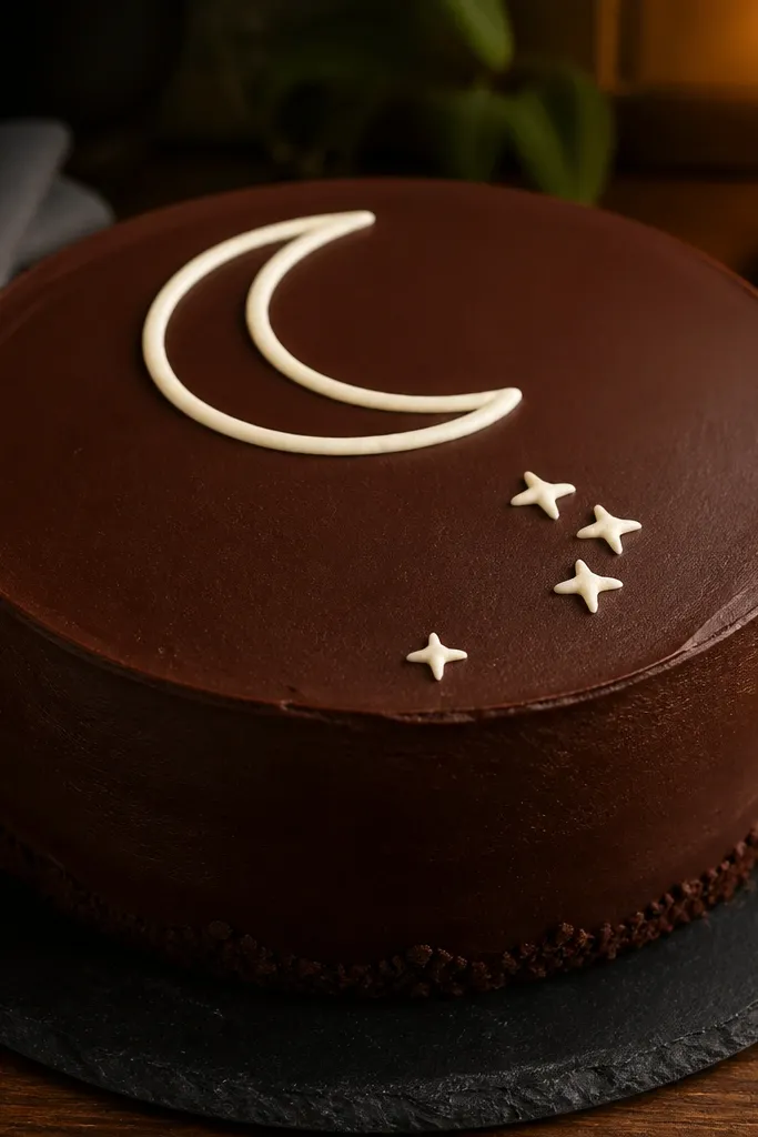
This is a classic drawing, but it looks fresh when you keep it graphic. The crescent should be thick enough to read, then the sparkles should be smaller and placed like a diagonal cluster. Add one “star point” dot under the crescent for extra balance. It photographs well in low light backgrounds because the line work creates a crisp silhouette. Great for kids' cakes and night-theme parties.
Pipe a crescent outline using a #3 tip so the curve is bold, then fill only the crescent interior with a thin pass (optional). Add three sparkles as simple four-point star shapes, each about 1-1.5 cm wide. Finish with one tiny dot under the crescent and let everything set before adding any extra decorations around the edges.
Use a toothpick to nudge sparkle points into sharp corners before the frosting sets.
Skip random extra stars — too many sparkles make it look cluttered.
5. Arched Frame with Tiny Dots Border
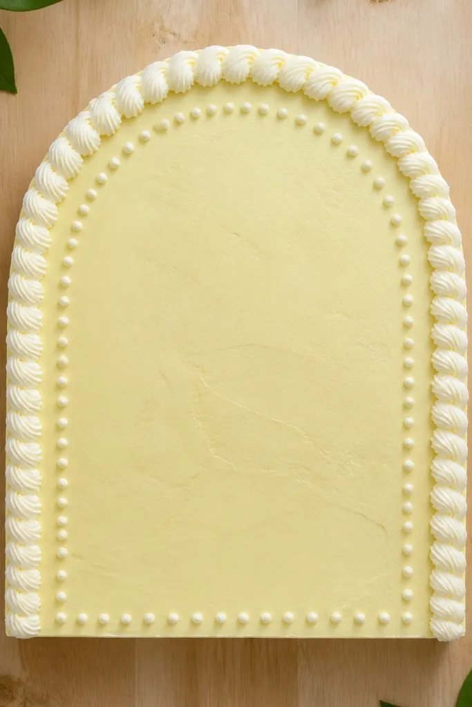
Smooth the top and pipe an arched outline frame across the center, leaving equal space on both sides. Then pipe a ring of tiny dots around the arch — about 0.5-0.7 cm apart. Add one simple drawing inside the frame, like a small heart, leaf, or star, using a thinner tip. Chill for 10 minutes to set the dots so they don’t smear.
Framing is the secret to “aesthetic” cake drawings, and this one uses an arched border plus a dot halo. The arch shape makes the top look like a finished poster, and the dots add a soft texture without turning into confetti. Keep dots uniform in size so the design looks intentional. This is a strong choice if you’re still learning steady piping because your border hides minor imperfections. It suits small cakes, tall cakes, and even single-tier cupcakes.
AvoidDon’t make the arch too tall — a tall arch crowds the center.
Pro tipFor dot consistency, squeeze at a steady pressure and lift straight up.
6. Feather Quill Lines with Dot Highlights
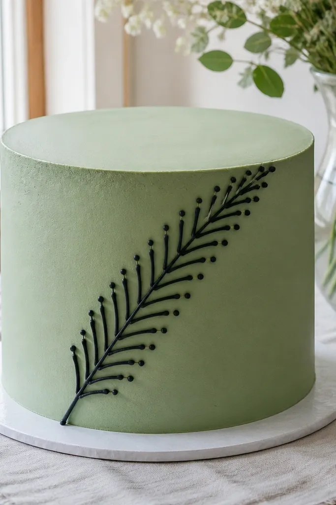
A feather drawing looks artsy but it’s really just repeated “V” lines. Keep the quill shaft as a single clean curve, then add evenly spaced feather barbs on both sides. Dot highlights make it pop and keep the design from looking flat. This works best on smooth buttercream tops because the line work has a matte base. It’s also a good practice piece for learning consistent spacing.
Pipe a curved quill shaft first using a #2 tip, then draw a central line down the feather. Add barbs as small angled “V” shapes on both sides, keeping them the same length from top to bottom. Finish with a few tiny dots along the quill edge for highlight points. Let set 10-15 minutes so the barbs keep crisp edges.
Sketch the feather outline lightly with a toothpick before piping to keep symmetry.
Don’t press too hard on the bag — thick barbs lose the feather look.
7. Half-Flower Line Art with Soft Petal Fill
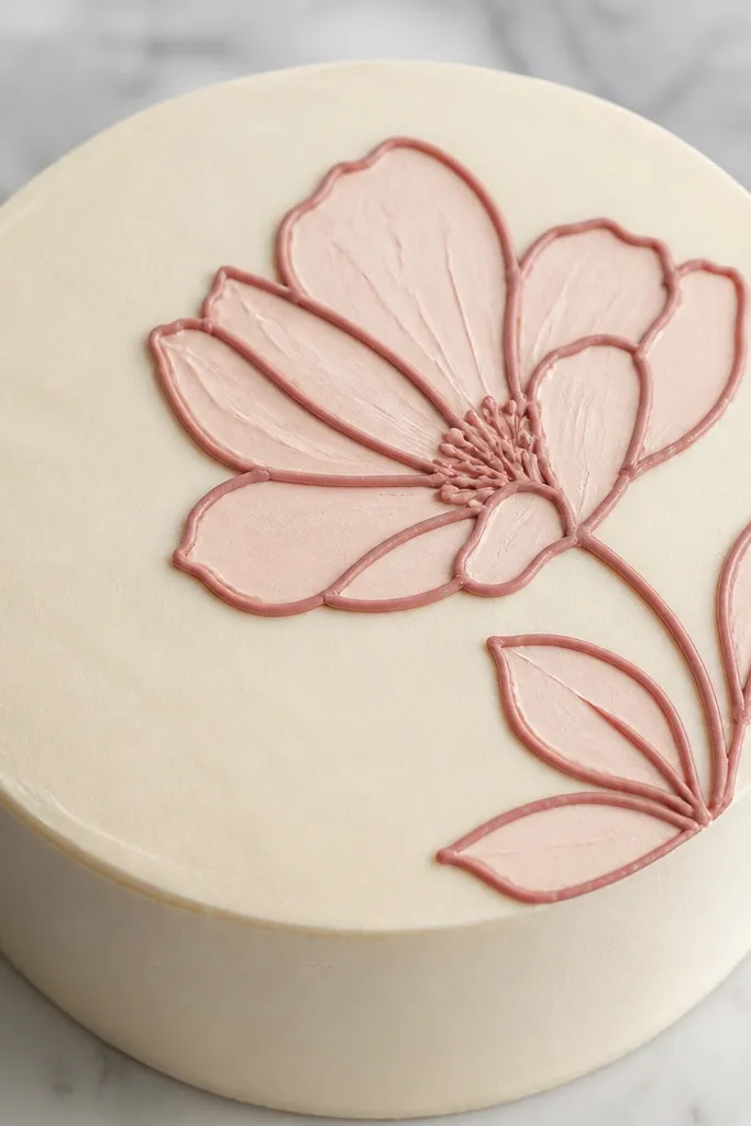
Start with a smooth top and place the flower slightly above center so it has room to “bloom.” Pipe petal outlines as teardrops, then fill each petal lightly with a thin zigzag or small circular strokes. Add a simple center swirl dot cluster in the middle using a thicker tip for contrast. Let it dry or set until the fill looks matte, then chill 10 minutes.
Half-flowers look modern because they break symmetry in a controlled way. Outline the petals with thin lines, then add soft fill only inside the petal shapes — keep the fill light so the outline still shows. A single flower angled slightly toward one side makes the cake feel styled without being busy. This is great for romantic birthdays and spring themes. It takes 25-35 minutes if you fill carefully.
AvoidDon’t outline and then fully flood — flooded fill hides the line art.
Pro tipUse a slightly thinned frosting for the petal fill so it doesn’t blob.
8. Geometric Triangle Stack with Micro Lines
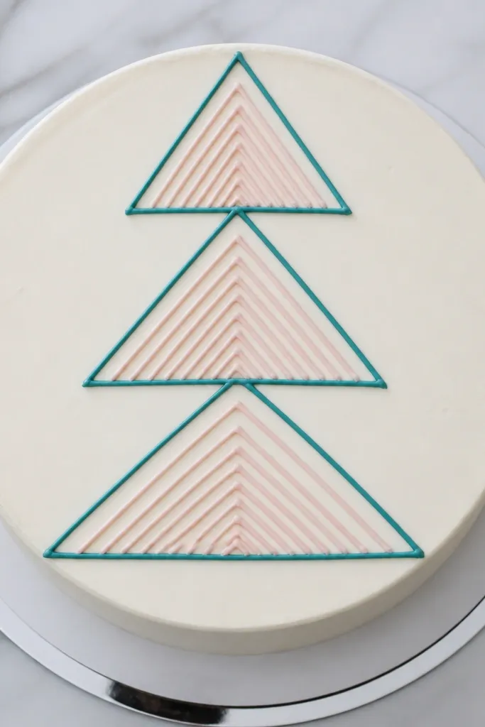
Pipe the bottom triangle outline first, then align the second triangle directly above it and the third in the center. Keep triangle edges straight by guiding your wrist and lifting the tip cleanly at corners. Add micro lines inside each triangle as short parallel strokes, keeping them consistent length. Finish with a small dot at the center intersection and let set 10-15 minutes.
Geometry looks aesthetic because it’s crisp and structured. This design uses a triangle stack with micro line details so it reads as pattern, not random shapes. Choose a two-color approach: one for the triangle outline and one for inner micro lines. It photographs cleanly on cakes with a smooth top because the lines stay sharp. Great for birthdays with modern themes and for anyone who wants something that looks “designed” without being hard.
AvoidDon’t change triangle sizes — the pattern falls apart.
Pro tipUse a straightedge under the parchment (even a ruler) to eyeball triangle height.
9. Chocolate Drip with White Doodle Edge
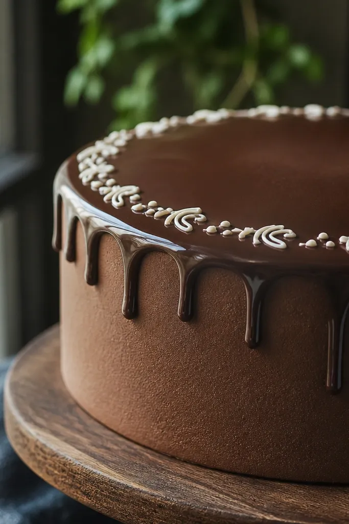
Create a chocolate drip around the edge and let it set until it holds shape. Then pipe a thin doodle border just inside the drip line, keeping the spacing even. Use a #2 tip for squiggles and tiny marks, then add 3-5 micro hearts or dots to finish the edge. Chill 10 minutes so the doodles don’t smear.
This is one of the easiest ways to make a cake look styled: use a drip for structure, then add a delicate doodle border. The doodle edge makes the design look intentional and gives you a “hand-drawn” finish. Keep the doodles small — think squiggles, tiny hearts, or short leaf marks — so it stays airy. Works well with ganache drips or thicker chocolate glaze. Skill level is beginner and the whole thing looks impressive in photos.
AvoidDon’t make the doodles large — big doodles fight the drip.
Pro tipIf your drip is too glossy, wait 5-10 minutes longer before piping the white edge.
10. Monogram in Script Inside a Circle
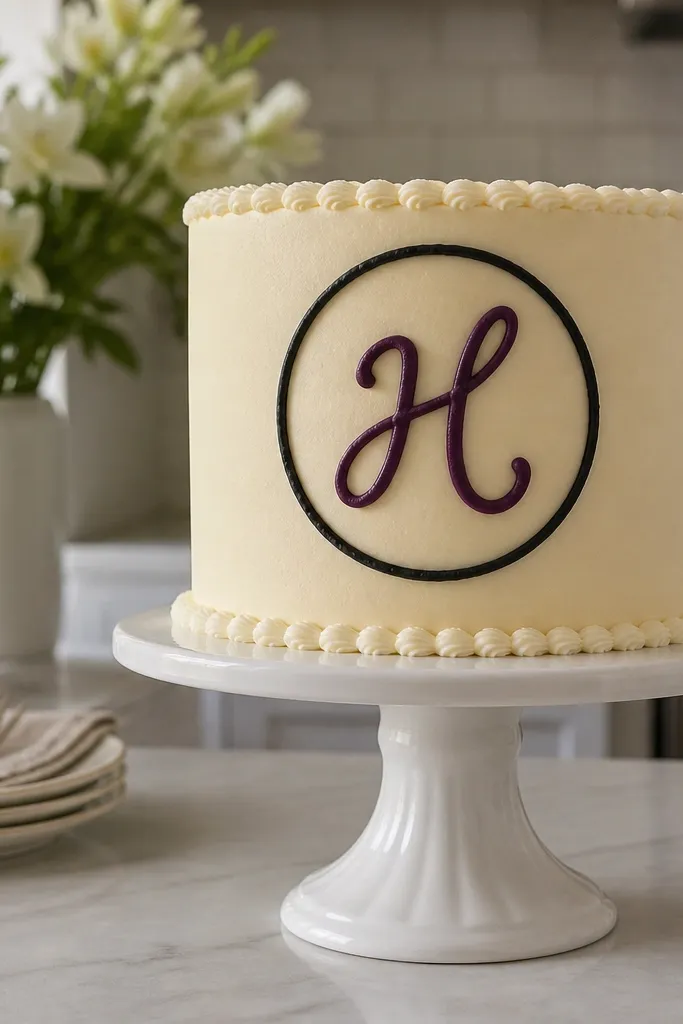
Pipe a thin circle around the center first using a #3 tip. Then pipe the monogram letter in cursive inside the circle with a #2 tip, keeping the loops centered and even. Add one small underline flourish or a dot at the end of a stroke. Let set 10-15 minutes, then check spacing before you add any extra toppings.
Monograms look aesthetic because they look personal and graphic at the same time. The circle frame keeps the letter clean and makes it readable from a distance. Use a single cursive letter, not a full name, unless you have strong piping control. Choose a thin tip for the letter and a slightly thicker outline for the circle so both elements separate. This is perfect for weddings, anniversaries, and classy birthdays.
AvoidDon’t use a thick tip for the script — it turns into blobs.
Pro tipPractice the letter on parchment first so you match your stroke thickness on the cake.
11. Rainbow Outline Stripes with No Fill
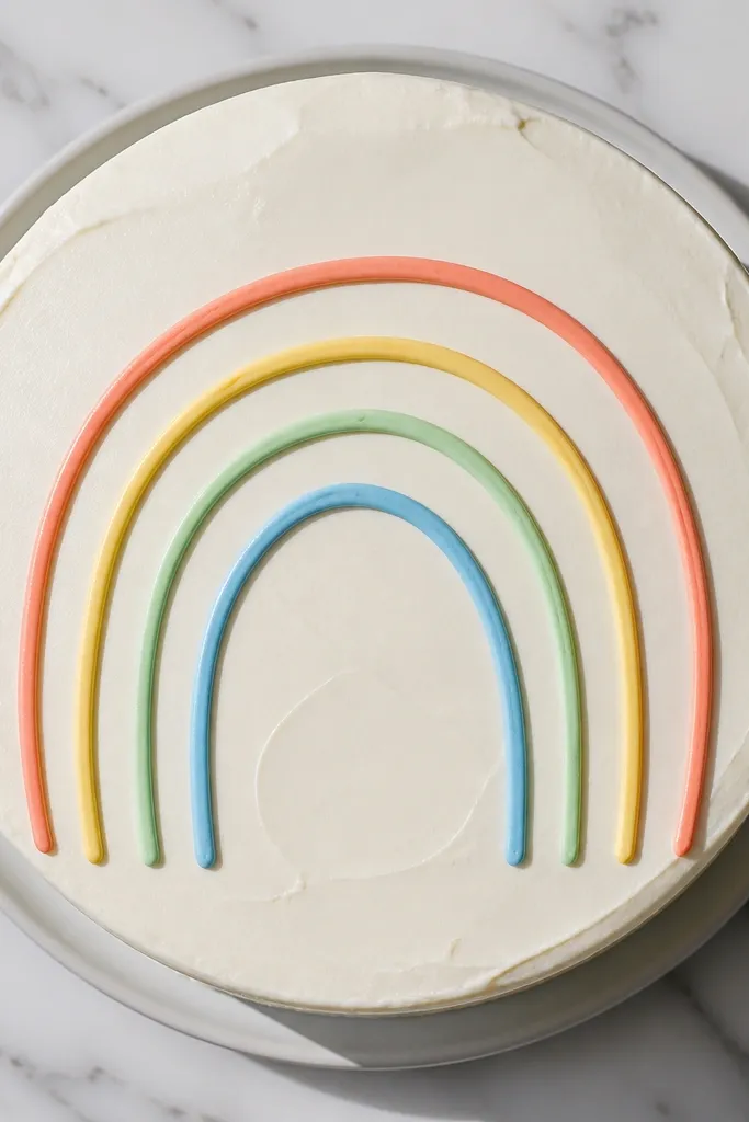
Smooth the top and decide where the rainbow sits — slightly above center looks best. Pipe 3-5 curved stripes using different colors as outlines only, keeping the gap between stripes consistent. Add small end caps at both ends to make the stripes look like they belong together. Let the outlines set 10 minutes before adding any sparkly sugar.
Outline-only rainbow stripes look airy and modern. Instead of filling every stripe, you draw them as parallel curved outlines so the cake color shows through. This keeps the design light and photogenic, especially on white frosting. Choose 3-5 stripes maximum so it stays clean. It’s a great option when you want color without messy blending.
AvoidDon’t fill the stripes — filled stripes look heavier than you expect.
Pro tipIf colors bleed, wait for each stripe to crust 2-3 minutes before the next one.
12. Tiny Butterflies with One Dot Wing Highlight
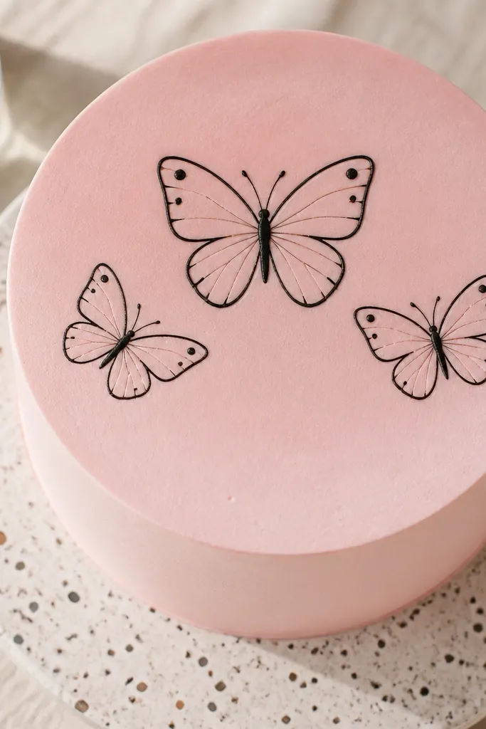
Pipe the main butterfly body as a short vertical line with two small antenna dots. Draw each wing as a simple teardrop outline, then add one dot near the outer edge of each wing. Repeat for two smaller butterflies, placing them lower and to the side. Chill 10 minutes so the dots stay raised, not smeared.
Butterflies feel delicate when the wing details are minimal. This design uses thin outlines for the wings and one dot highlight per wing so the butterfly looks dimensional without heavy shading. Place one butterfly in the center and two smaller ones off to the side for a balanced triangle layout. It’s perfect for spring parties and baby showers. You can do it in 30-40 minutes if you pipe slowly.
AvoidDon’t add extra patterns inside the wings — it turns childish and busy.
Pro tipKeep wing outlines symmetrical by stopping your wrist at the same angle each time.
13. Minimal Leaf Branch with Three Bends
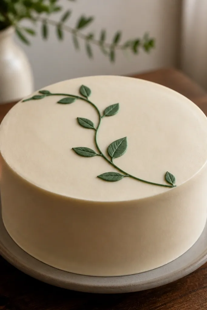
Pipe a curved stem line across the top center using a #2 tip. Add leaf pairs as small ovals with a center line, placing them about 2-3 cm apart along the stem. At the ends, add slightly smaller leaves to taper the branch. Finish with a few tiny dot buds near one bend and let set 10-15 minutes.
A minimal leaf branch looks sophisticated because it’s just a few repeated shapes. Use a main curved stem, then attach leaf pairs along it with consistent spacing. Keep the leaves slightly different sizes — one bigger leaf near the center and smaller ones at the tips — for natural movement. This design works on cakes with smooth tops and suits neutral color palettes. It reads well even when your frosting is matte.
AvoidDon’t make leaves identical size — the branch looks fake.
Pro tipUse the same pressure for both sides of each leaf so the pair looks mirrored.
14. Wavy Stripes with Micro Stars
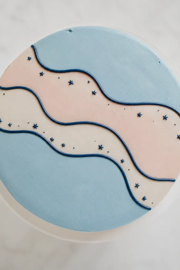
Wavy stripes look fun, but they can look messy if you overdo the pattern. The trick here is to keep the wavy stripes smooth and consistent in thickness, then add micro stars as tiny accents. Use 2-3 stripe colors max and one outline color for the stars. This design is photogenic because the stars create sparkle spots that stand out even from a distance. It’s beginner-friendly and works for all ages.
Mark a center line on the cake top and pipe 2-3 wavy stripes parallel to each other, each about 1 cm wide. Add micro stars as small four-point or five-point shapes between the stripes. Keep star size under 0.8 cm so they don’t dominate the stripes. Chill 10 minutes so the waves stay crisp before you add any toppings.
Pipe the stars after the stripes crust so your star outlines don’t melt into the waves.
Don’t add too many stars — a handful is enough.
15. Single-Line Butterfly Border Around the Top
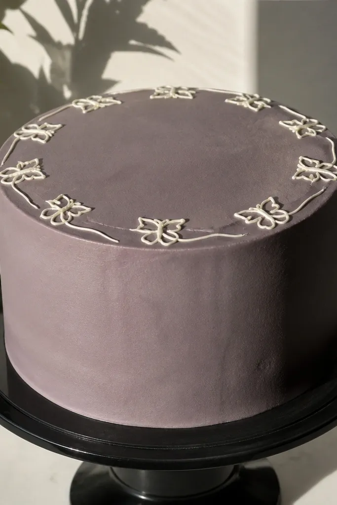
A ring border makes the whole cake look finished. This butterfly border uses single-line wings, so it stays airy and doesn’t crowd the top. Place butterflies evenly around the edge, leaving small gaps so the frosting shows through. It’s great for cakes that need a “frame” because you might add a topper later. It also hides minor imperfections in your top surface because the border draws attention outward.
Smooth the top and pipe a thin guideline ring about 1.5 cm from the rim. Pipe butterfly outlines along the ring: body line, two wing teardrops, then a small antenna dot. Keep each butterfly about 3-4 cm across and match the angle as you rotate around the cake. Let set 15 minutes before stacking or transporting.
Use a turntable and pipe while slowly rotating — your butterflies will match angles better.
Don’t crowd butterflies — tight spacing makes the ring look like scribbles.
16. Bubble Letters with Outline Only
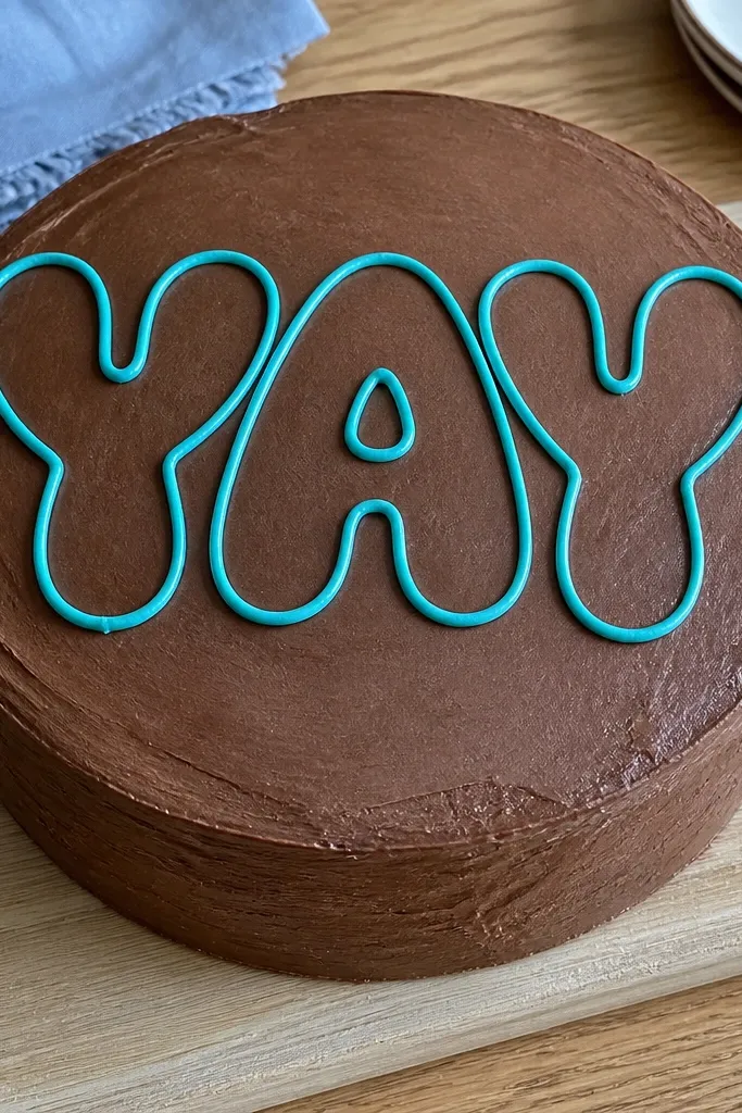
Bubble letters look playful and aesthetic when they’re outline-only and evenly inflated. Pick one word or short phrase, like “WOW” or “HAPPY,” and keep the letters large so they read in photos. Outline-only keeps the letters from looking heavy, and it lets the cake color act like fill. Choose a contrasting color for the outline so it pops against your base frosting. This works best on smooth, level tops.
Plan your word layout on parchment by measuring the cake top width. Pipe thick-ish outlines for each bubble letter using a #3 tip, keeping the stroke consistent. Do not fill inside; instead, add a few tiny inner highlights as short lines to keep the bubble shape believable. Chill 10 minutes so the outlines firm up before you add small sprinkles.
If you struggle with straight letter edges, use a parchment template and pipe freehand around it.
Avoid skinny bubble letters — they look like normal script.
17. Botanical Sprig in Dark Green with White Veins
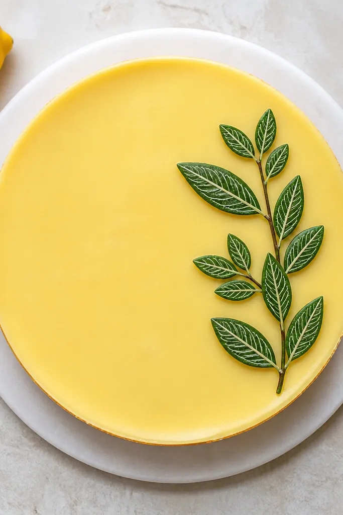
This is a “grown-up” drawing that still looks DIY. The sprig uses dark green outlines for the leaf shapes, then white vein lines make it look detailed without clutter. Keep the sprig to one side of the cake top so it feels like a deliberate garnish. It’s gorgeous on vanilla, chocolate, and lemon cakes because the green-white contrast is clear. Plan 30-45 minutes for careful veins.
Pipe a main stem curve in dark green using a #2 tip. Add leaf shapes as ovals with a center vein line, then switch to white frosting for the vein detail. Add 3-5 leaves total, tapering sizes toward the tip. Let set 15 minutes, then lightly dust with edible shimmer if you want extra photo pop.
Thin white frosting slightly so the veins look like hairlines, not thick stripes.
Don’t add veins to every leaf if you’re rushed — keep it to 3-4 for clean balance.
18. Tiny Face Line Art with Blush Dot Cheeks
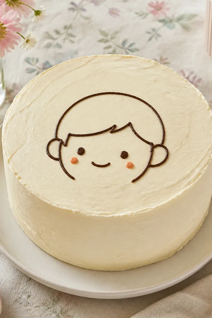
Mark a small face guide on the top surface with a toothpick. Pipe the head outline as a soft circle or rounded oval, then add two dot eyes and a curved line smile. Add two blush dots below the eyes and one tiny hair swoop at the top. Let set 10 minutes before adding any surrounding decorations.
Cute faces look aesthetic when they’re minimal and proportioned. Use a thin outline for the head and eyes, then add a simple curved smile. Blush cheeks are just two small dots, not a wide blush smear. This design is perfect for kids' birthdays and casual themes, and it’s also great for cake pops to match the same style. It takes 10-20 minutes.
AvoidDon’t add thick eyebrows — they make the face look angry.
Pro tipKeep cheeks close to the eyes — far cheeks make the face look cartoonish.
19. Single Rose Outline with Spiral Center
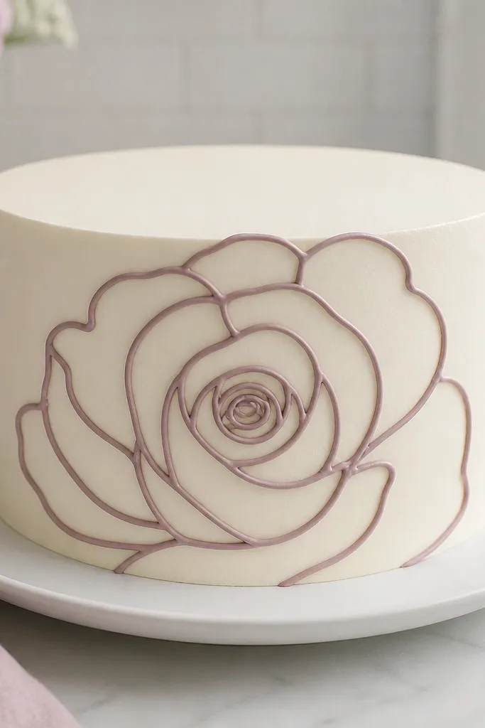
Pipe a spiral center first, using a #2 tip to draw tight loops in the middle. Then add outer petals as teardrop outlines radiating around the spiral, keeping each petal about 2-3 cm long. Add one leaf on the side with a simple oval outline and a center line. Chill 15 minutes so the spiral holds shape.
A single rose outline is one of the best “looks expensive” drawings because it’s just enough detail. Outline the petals with smooth curves, then draw a tight spiral center that gives it depth. Keep petals semi-open so you can still see the cake color through the design. This works beautifully on white or pale pastel backgrounds because the red or pink outline stands out. It’s a solid intermediate piece — the petals need steady spacing.
AvoidDon’t close all petals — closed roses look like blobs.
Pro tipUse a slightly softer frosting for petal outlines so they flow into clean curves.
20. Arching Doodle Clouds with Raindrop Lines
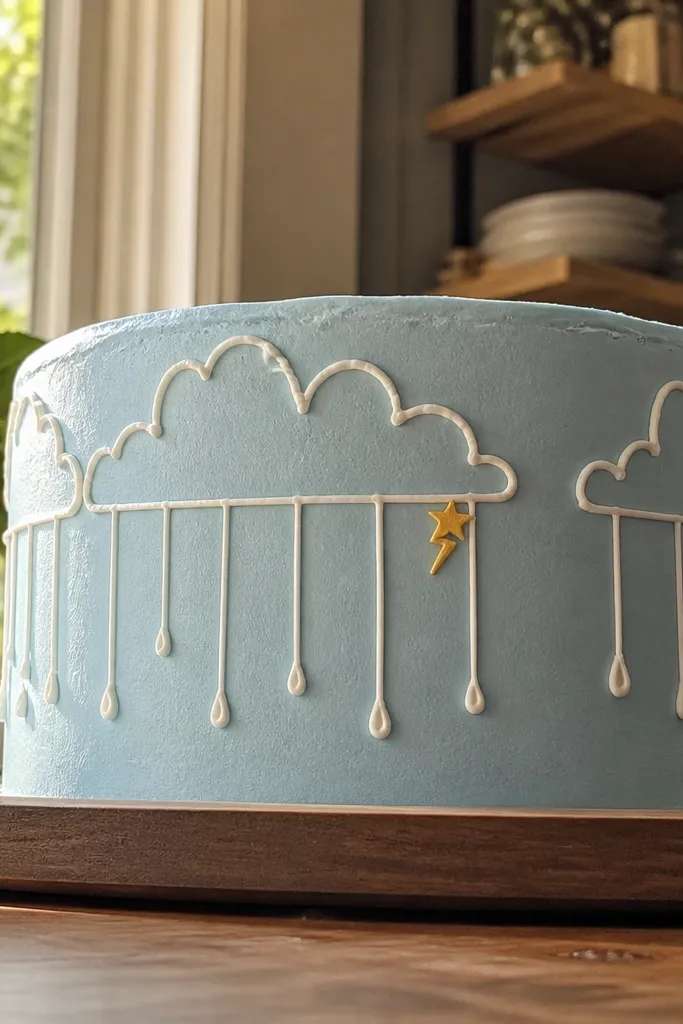
Cloud-and-rain drawings look playful and cinematic when the clouds are outlined and the raindrops are straight. Keep the clouds arched across the top, then pipe a few straight raindrop lines beneath with a consistent length. Add one tiny lightning bolt or star dot for whimsy. This design is extremely photogenic because it creates a clear top-to-bottom story in one glance. It’s beginner-friendly and quick.
Pipe an arched cloud outline across the top using a #2 tip, then add puffy bumps along the top edge. Draw 6-8 straight raindrop lines beneath the lowest part of the cloud, spacing them evenly. Finish with a small dot cluster under the drops to create a “splash” base line. Let set 10 minutes so drops don’t curve.
If your raindrops bend, pipe them over a slightly thicker base frosting so they hold straight.
Don’t make raindrops too long — they drag and smear.
21. Checkerboard Mini Squares with One Accent Color
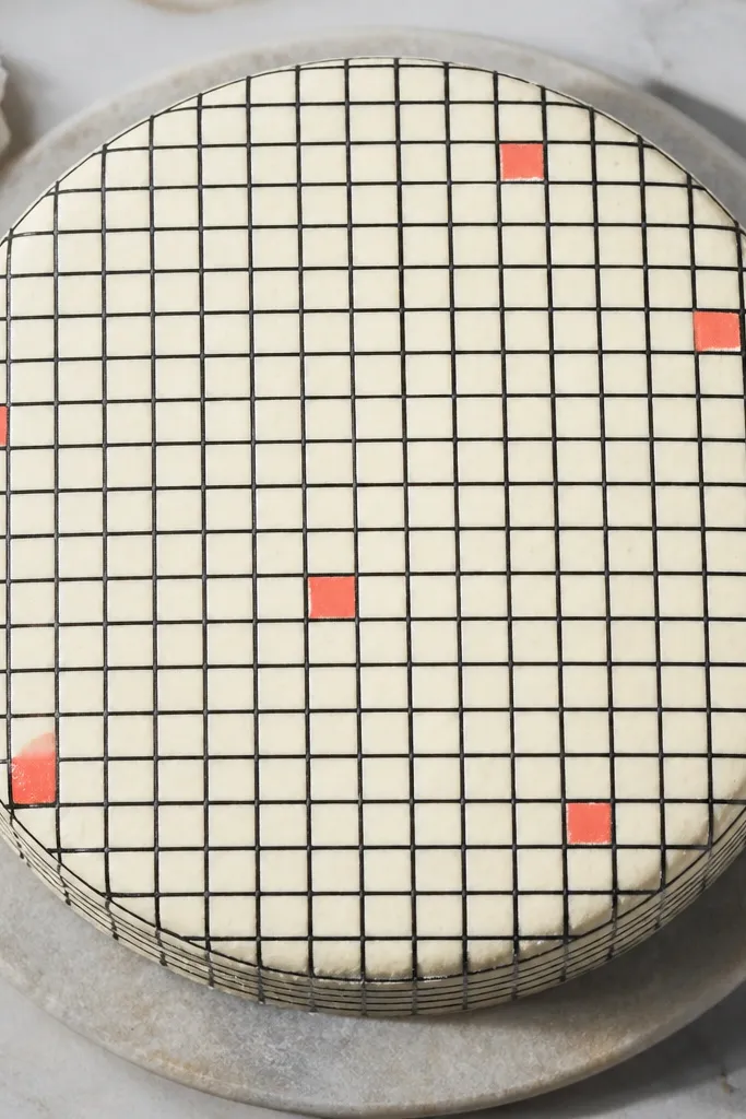
Checkerboard drawings look aesthetic because they’re structured and easy to read. The trick is to keep squares small and consistent, then use one accent color for a few squares only. That one accent makes the whole pattern feel intentional instead of flat. Choose 2 colors total — your base outline color and the accent. This design works on both buttercream and fondant tops because it looks like printed pattern.
Smooth the top and mark a grid lightly with a toothpick, aiming for squares around 1.5 cm. Pipe the outline of the first row squares, then alternate filling with the base color. Switch to the accent color for only 6-10 squares scattered in a balanced pattern. Chill 15 minutes to set the lines before adding borders or sprinkles.
Use a piping tip with a fine opening so the square edges look crisp, not thick.
Don’t use more than one accent color — it stops looking like a planned graphic.
22. Wave Border Around the Cake Top Edge
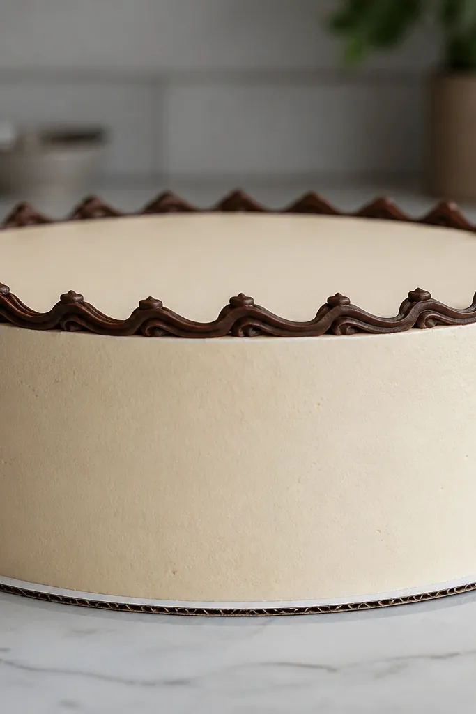
A wave border is a fast way to make a plain cake look finished. It’s also one of the easiest “aesthetic drawing” styles because it hides surface unevenness while still looking deliberate. Keep the waves uniform and about 1 cm tall. Add a tiny dot at each wave peak if you want a more playful look, but you can skip it. This suits birthdays, anniversaries, and any theme where you want clean decoration without a big topper.
Pipe a thin guideline ring about 1.5 cm from the rim. Pipe continuous waves along the ring using a #2 tip, lifting cleanly between peaks so the wave tips stay sharp. Optional: add dots at each peak or every other peak for rhythm. Chill 10-15 minutes so the border firms up.
Try a shorter piping stroke and rotate the cake rather than moving your wrist too much.
Don’t make waves too tight — tight waves look like messy loops.
23. Tiny Monochrome Stars on a Soft Gradient Base
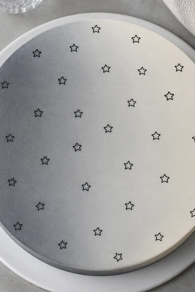
This idea looks aesthetic because it separates the base color from the drawing. Use a very subtle gradient on the top with one color family, then scatter tiny star outlines in a darker shade. The stars should be small and consistent, like 0.7-1 cm wide. Monochrome stars look clean and premium compared with full colorful confetti. It’s a great choice when you want the cake to feel calm but still styled.
Smooth the top and create a gentle gradient by blending two frosting shades lightly with a spatula. Pipe tiny star outlines using a #2 tip, scattering them across the center and slightly toward one side. Keep star count around 15-25 so it looks intentional, not crowded. Let set 10 minutes before adding any edible shimmer.
Scatter stars in a loose triangle cluster rather than evenly — it looks more natural.
Avoid big stars — they overwhelm the gradient.
24. Outline Cactus with Two Tiny Flowers
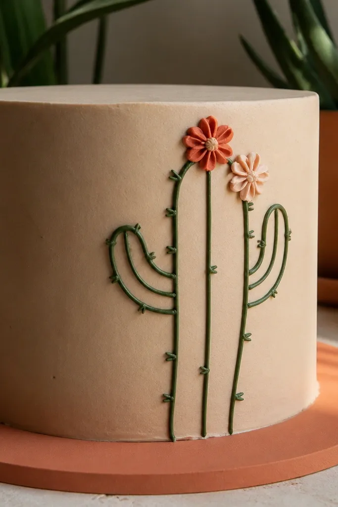
Cactus drawings are photogenic because they’re simple shapes with a few sharp details. Outline the cactus body with a clean center line, add two arms, then dot in small spines using tiny dashes. Two small flowers keep it cute and not too busy. This works for desert themes, summer birthdays, and even simple neutral cakes. It takes about 20-30 minutes once you have the cactus proportions right.
Pipe the cactus body as a vertical outline with rounded edges, then add a center line down the middle. Add two arms as simple curved outlines on either side, keeping them smaller than the body. Add spines as tiny short dashes along the edges and pipe two small flower outlines at the top. Let set 12-15 minutes before chilling.
Use a toothpick to place spines one by one for cleaner spacing.
Don’t over-spine — too many dashes turn into texture noise.
25. Ribbon Script Banner with Tail Ends
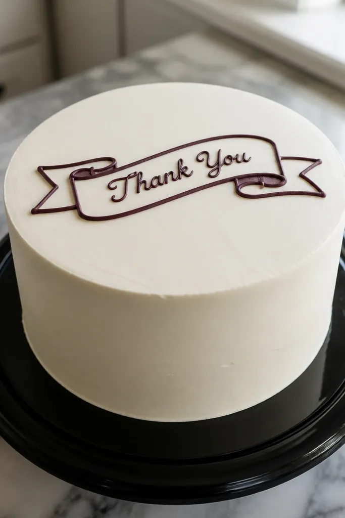
Pipe the ribbon outline first as a rectangle with rounded corners across the center. Add curled tail ends on both sides by piping two small arcs that loop back. Write the short script word inside using a #2 tip, then add one underline line to ground the letters. Let set 10-15 minutes before adding any extra sprinkles around the banner.
Banner script looks aesthetic when it’s framed like a ribbon, not floating text. This design uses a ribbon outline with curled tail ends, then a short word in script inside. Keep the word short — 3-5 letters — so it stays legible. The curled tails add motion and make the cake look styled even if the rest is simple. It works for birthdays, anniversaries, and graduation cakes.
AvoidDon’t choose a long phrase — it gets cramped fast.
Pro tipWrite the first letter block on parchment so you match your stroke speed on the cake.
26. Marble-Look Lines with White Vein Dots
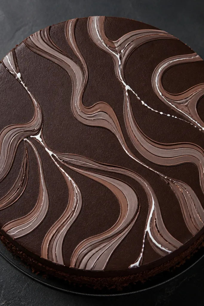
Marble-look drawings look premium because they mimic stone movement with thin, controlled swirls. You don’t need real marble colors — just two tones plus white vein accents. Keep the veins thin and add dot breaks where the vein “chips,” which makes it look realistic. This style photographs well on dark cakes and on white cakes with gray or black veins. It’s intermediate because the swirls need smooth continuity.
Spread a smooth base frosting in one tone and lightly blend in the second tone so it creates faint streaks. Pipe thin swirl lines on top using a darker shade, keeping them flowing in one direction. Add white vein lines as thin strokes and place a few small white dots along the veins for texture breaks. Chill 15 minutes so the marble lines set cleanly.
Use a slightly thicker white frosting for veins so dots don’t melt into swirls.
Don’t over-blend the base — marble lines need contrast to show.
27. Single-Line Starburst with Dot Core
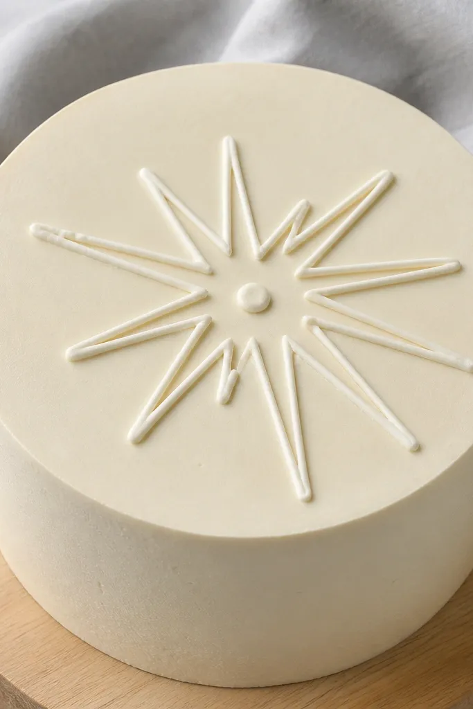
Pipe a small dot core in the center using a #3 tip. Then draw 12-16 thin rays radiating outward using a #2 tip, aiming for equal length and consistent angles. Stop rays at the same distance so the starburst edge looks circular. Let set 10-15 minutes, then add a small border ring if you want extra structure.
Starbursts look like confetti but they’re cleaner when they’re single-line rays. Outline only, keep rays evenly spaced, and put a dot core in the center to finish the shape. This design works great as a centerpiece on simple cakes because it draws the eye immediately. It’s also easy to scale — make it small for cupcakes or bigger for a tall cake. You’ll spend most of your time on ray spacing, not drawing complexity.
AvoidDon’t make rays thick — thick rays look like a scribble fan.
Pro tipCount rays as you pipe so you don’t end up with uneven gaps.
28. Tiny Sketched Leaves Around a Center Circle
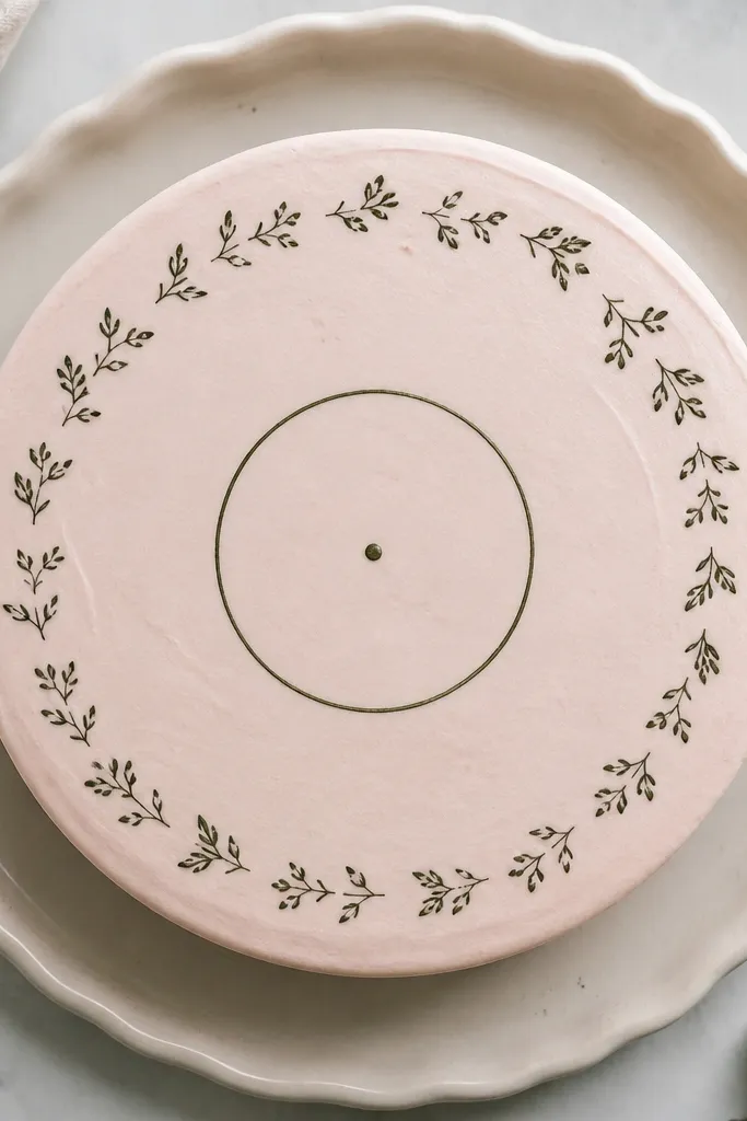
This one uses a center circle as a “stamp” and tiny leaf sketches as the border. It looks aesthetic because the leaves are small and consistent, like a pattern repeat. The center circle gives you a place for a simple icon, like a dot or small heart, so the whole design feels complete. Works for any cake color, especially when your leaf color contrasts with the frosting. It takes about 30 minutes and rewards steady piping.
Pipe a thin center circle using a #3 tip. Around it, pipe 10-14 tiny leaf outlines as small ovals with a center line, placing them evenly like clock positions. Add one tiny dot or mini heart in the circle center. Chill 10-15 minutes so the leaves don’t slump.
Place leaves at slight angles, not all upright — it looks more hand-drawn.
Don’t make leaves too big — they swallow the center circle.
29. Minimal Line Clouds with Soft Fill Puffs
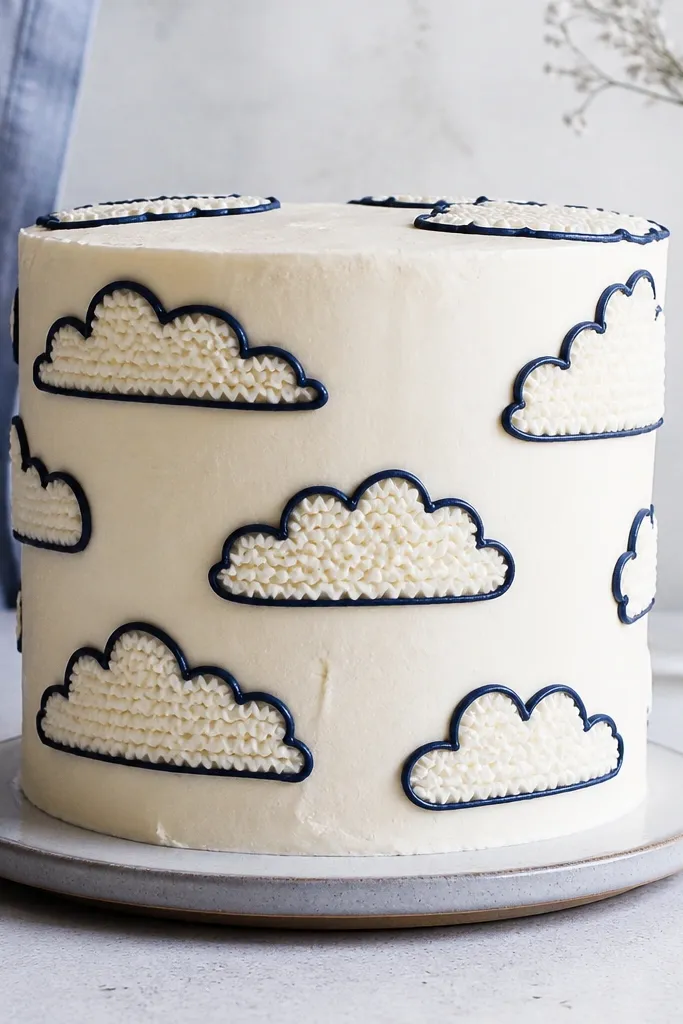
Pipe the main cloud outline in a thin line using a #2 tip. Then fill each puff with a light pass — not a full flood — so the outline still shows. Add one tiny raindrop or star dot under the cloud for a finished story. Let set 15 minutes before chilling to avoid smears.
Clouds look adorable when you keep the outline crisp but let the puff fill be light. Outline the cloud shape, then add soft fill in each puff area using a thin zigzag. The contrast between crisp line and soft fill makes the drawing look layered. This style fits baby showers, winter birthdays, and whimsical themes. It’s not hard, but you need patience with consistent puff spacing.
AvoidDon’t overfill puffs — thick fill makes clouds look like blobs.
Pro tipUse a slightly stiffer frosting for outlines and a thinner one for puff fill.
30. Polka Dot Halo with One Curved Line Accent
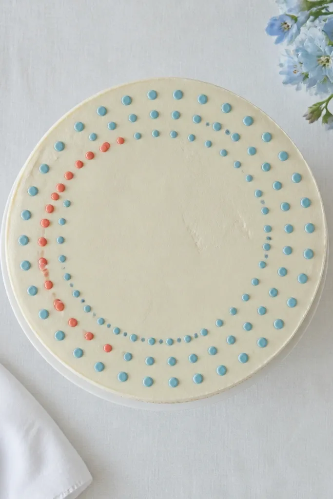
Pipe a circular guideline near the center top. Add polka dots along that circle using a #2 tip, spacing dots evenly. Then draw one curved line through the dots as an accent, starting and stopping cleanly. Chill 10 minutes so dots hold and the line stays crisp.
This design is clean because it uses repetition with one “drawn” accent. The polka dot halo gives a decorative frame, while the single curved line adds motion and keeps it from looking like plain sprinkles. Use one dot color and one accent line color. It’s especially good for cakes that already have a lot going on on the sides — the top stays calm and photogenic. Beginner level, around 15-20 minutes.
AvoidDon’t add more lines — one accent is what makes it aesthetic.
Pro tipIf dots merge, reduce pressure and lift the tip quickly after each dot.



