
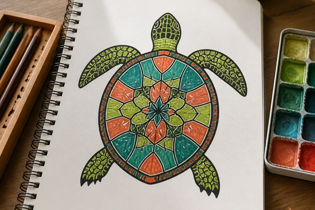

1. Pastel Blooms Turtle with Big Shell Segments
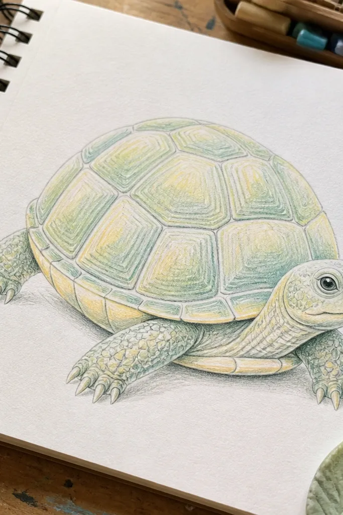
This one looks polished because the shell has big, even segments that stay tidy even if you’re not shading much. The trick is to draw the shell dome first, then add 6 to 8 large curved plates that follow the dome shape. Color it with soft pastel greens and pale yellow highlights so the segments feel intentional instead of scribbly. Add a ring of tiny flowers or buds around the turtle’s body edge — just 5 to 7 marks — and keep the background clean so the colors don’t compete. It’s a great choice for a journal page because it reads cute without needing heavy rendering.
Pro tipUse one pastel green for the shell base and only one lighter green for highlights. Fewer colors = cleaner segments.
Step 1: Sketch the head oval, body oval, and shell dome, then draw legs as short curved cylinders under the body. Step 2: Divide the shell dome into 6 to 8 large curved segments with a ruler-free consistency — same thickness lines on each segment. Step 3: Add simple face features: two dot eyes and a small curved smile, then color the shell plates in alternating pastel shades. Finally, place 5 to 7 tiny flower shapes around the lower shell area and lightly color their centers in pale yellow.
AvoidDon’t add too many tiny shell details; small segments make the drawing look messy fast.
2. Minimal Line Turtle with One Starburst Accent
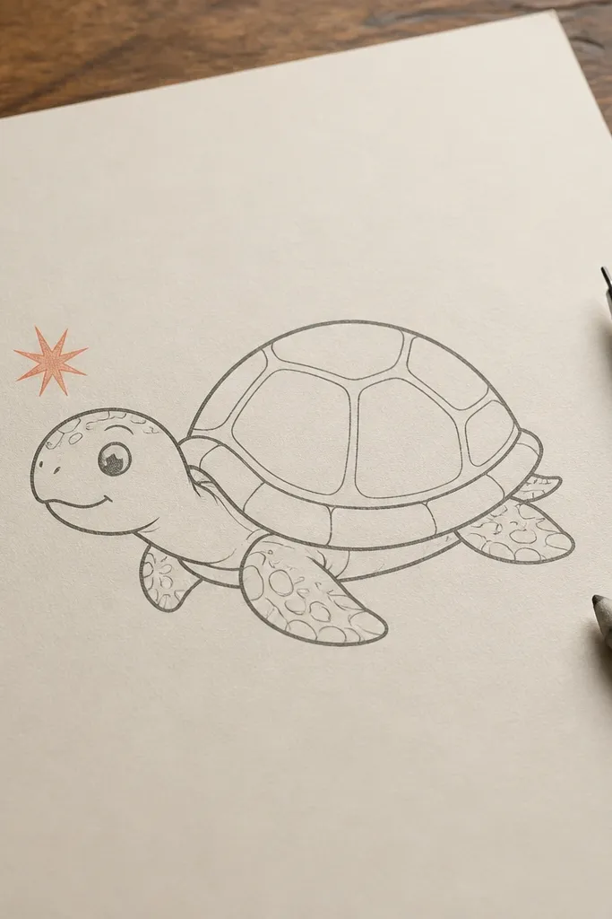
If your drawings look “cute but unfinished,” this minimal line turtle fixes that with a single intentional accent. The turtle itself stays mostly outline, with just a few shell line grooves and a clean smile. The starburst near the head gives the page energy without cluttering the shell. Keep the linework consistent and slightly thick so it looks finished in photos even on plain printer paper. This works best for quick sketchbook pages, greeting cards, or as a template you can reuse with different colors.
Step 1: Draw the shell dome as a smooth oval with a slightly pointed back, then add a head oval and small legs underneath. Step 2: Add 4 to 6 gentle shell grooves — curved lines that don’t cross — and include a tiny tail curl. Step 3: Outline everything with a darker pen, then add a starburst with 8 rays beside the head. Finally, color only the starburst in one bright color and leave the turtle mostly unfilled or lightly tinted.
Let the starburst color be your only “bold” element. Your turtle stays crisp.
Don’t shade the shell heavily; minimal line turtles look best with clean white space.
3. Mango Splash Turtle in Warm Orange and Tan
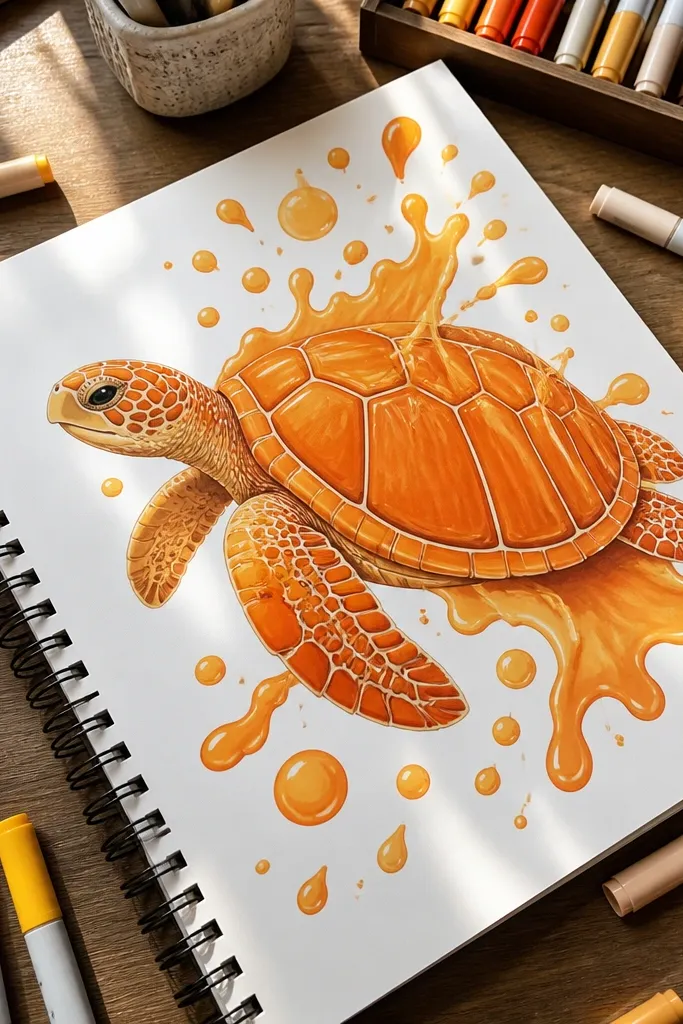
This aesthetic Turtle Drawing is built around a shell pattern that resembles mango slices, which makes it look playful and decorative. Use warm orange for the shell plates and tan for the grooves so the pattern pops. Add a few “splash” dots on the page edge — small circles or tear drops — to make it feel lively without turning into a background scene. The head and legs get simple tan outlines so the warm palette stays cohesive. It’s a good pick if you want your page to look like a sticker sheet or a craft project.
Step 1: Sketch the turtle shapes and draw the shell dome, then map 7 to 9 shell plates that curve like slices. Step 2: Color alternating plates in warm orange and pale tan, leaving thin white lines between plates to keep it crisp. Step 3: Add small mango-like speckles on 2 to 3 plates using a fine pen. Finally, draw 10 to 15 tiny splash dots around the turtle — keep them clustered near the shell edges.
Leave the grooves uncolored on purpose. That thin white line makes the shell look designed.
Don’t blend orange over the grooves; it muddies the slice pattern.
4. Seafoam Water Turtle with Teal Shell Outline
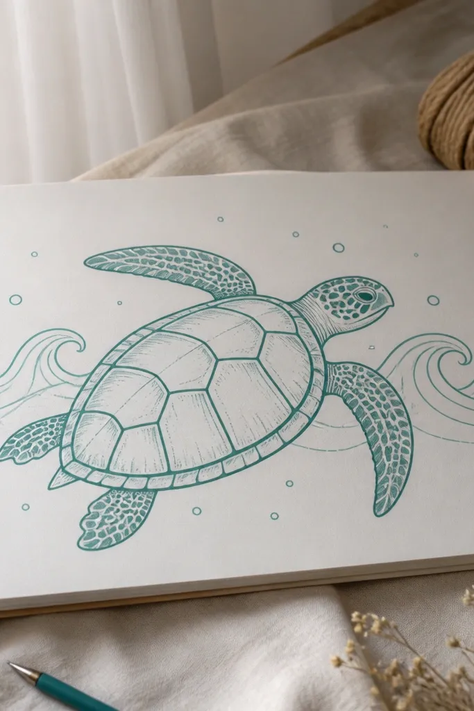
This drawing looks polished because the palette is controlled: seafoam green shell, teal outline, and a clean wave pattern behind. The shell lines are spaced evenly so the segments feel neat, and the water marks are simple arcs that frame the turtle. Add a few bubbles as small circles so the page has motion but stays uncluttered. It reads cute even with limited shading because the wave shapes do the work visually. Great for beach-themed journals, summer cards, or any page where you want a calm, airy look.
Step 1: Draw the shell dome and divide it into 6 to 8 neat segments with curved lines, then sketch legs and head. Step 2: Use teal for the outer outline and for the shell segment grooves, then fill the shell with seafoam green. Step 3: Draw 6 to 10 wave arcs behind the turtle — mostly on one side — and add a cluster of 5 to 8 bubbles as small circles. Finish by adding a tiny highlight on the shell using a light mint marker or colored pencil.
Color the background last. If you do it first, you’ll lose the turtle edge.
Don’t overdo bubble size; too many big circles make the turtle look small.
5. Kawaii Face Turtle with Cheek Dots and Bow
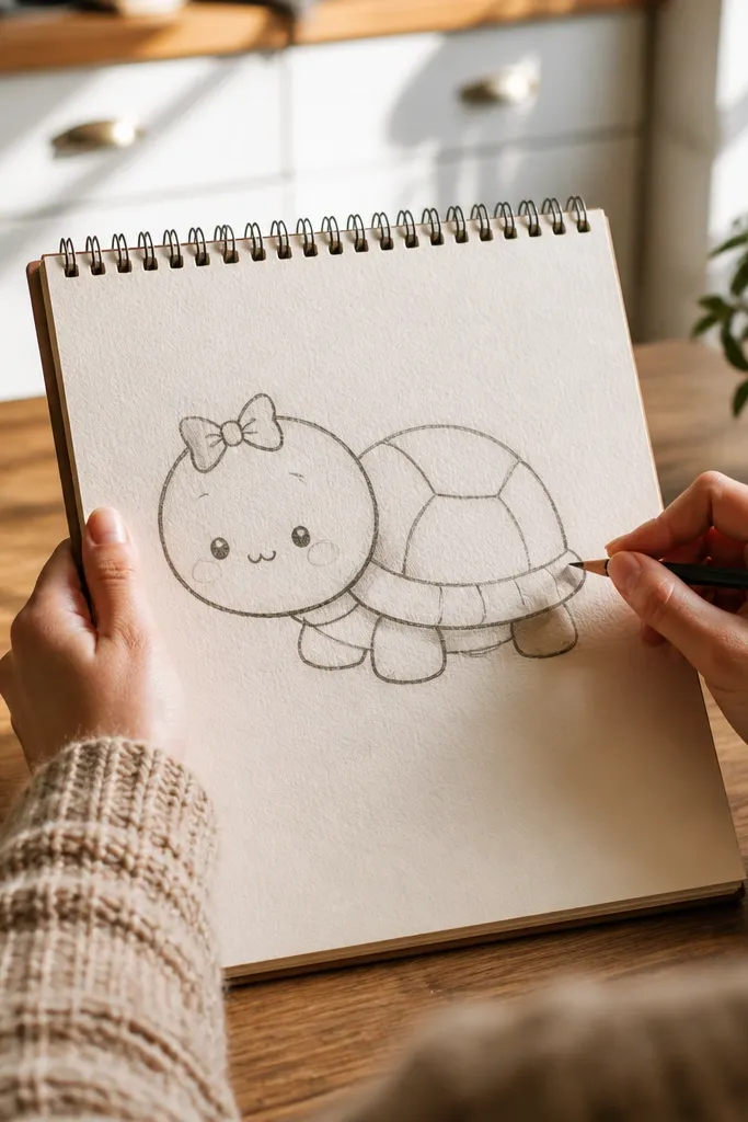
This one is cute because the face is the focal point. A round head oval, small dot eyes, and a tiny mouth make the turtle instantly friendly. Cheek dots add that “kawaii” read without needing heavy shading. The shell stays simple with a few curved plates, so the face doesn’t get lost. Put a small bow on top of the head to make it look gift-worthy, then keep the background to a single color wash or a few sparkles. It’s ideal for sticker-like designs and pages that need a clear subject.
Pro tipKeep the bow small and close to the head. Big bows cover the face and ruin the cute read.
Step 1: Draw the turtle body oval and shell dome, then place a round head oval slightly higher than the shell. Step 2: Add eyes as two small dots, cheek dots as two tiny circles, and a small curved smile. Step 3: Draw a simple bow: two loops and a small knot in the center. Finally, divide the shell into 5 to 6 curved segments and color with one main green plus a lighter green for highlights.
AvoidDon’t put too many shell lines. Let the face carry the cuteness.
6. Gingham Shell Turtle with Checker Plates
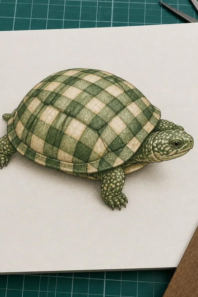
A gingham shell reads instantly designed. The repeating checker pattern makes the turtle feel aesthetic even if your drawing is small, and it photographs well because the lines are crisp. Use green and cream (or green and pale yellow) so it looks fresh instead of muddy. Keep the shell plates separated by thicker grooves so the checker pattern doesn’t look like one flat grid. Add a tiny leaf on one side for balance. This is a strong choice for cover art, scrapbook elements, and anything that needs a clean pattern-heavy look.
Step 1: Sketch the shell dome and divide it into 7 to 10 shell plates with curved borders. Step 2: For each plate, draw a small checker grid: make squares about the same size across the dome and keep the grid centered on each plate. Step 3: Color alternate squares in green and cream, then outline the outer turtle in a darker pen. Finally, add a small leaf shape near the bottom edge and color it in a deeper green.
Use a fineliner with consistent ink flow. Checker patterns fall apart with uneven line thickness.
Don’t make the checker squares too tiny. Tiny squares bleed and blur in photos.
7. Yellow Sunbeam Turtle with Bold Outline and Minimal Shading
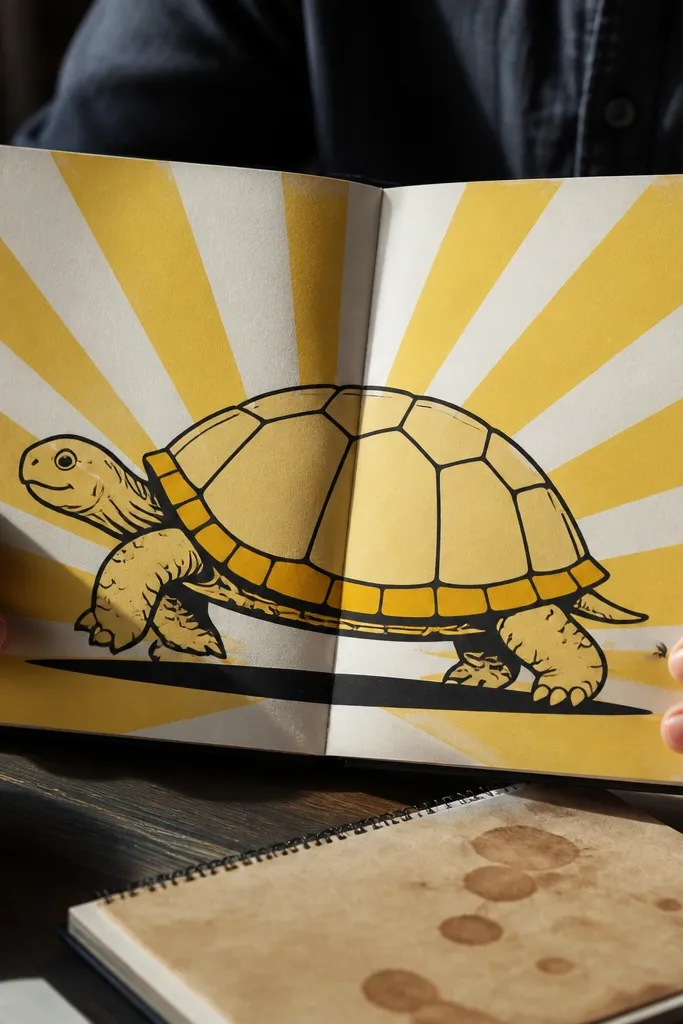
This turtle is built for bright, clean pages. A bold black outline makes it read clearly, and a sunbeam background gives you instant energy without adding extra objects. The shell gets simple segment lines and a light yellow fill, plus one small darker yellow accent along the lower shell edge. It’s less about realism and more about graphic clarity. If your goal is an aesthetic Turtle Drawing that looks “finished” in a feed, this is one of the safest picks.
Pro tipStop the sun rays at the same height each time. It makes the whole page feel designed.
Step 1: Draw the turtle shapes with a thick outline path — focus on clean curves for the shell dome and legs. Step 2: Add 6 shell segments using curved lines, then color the shell in light yellow. Step 3: Draw sun rays behind the turtle — 10 to 14 rays, evenly spaced, stopping just above the legs. Finally, add one darker yellow stripe on the lower shell and a tiny highlight dot near the head.
AvoidDon’t shade the rays. Flat color keeps the turtle crisp.
8. Rainbow Shell Turtle with Smooth Gradient Bands
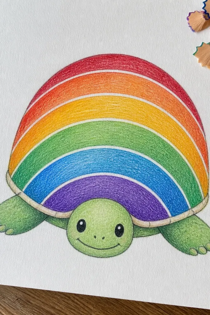
Rainbow bands look polished when they’re smooth and evenly spaced. This turtle’s shell has 6 arc-shaped bands that wrap the dome, so the color flow feels intentional. Use colored pencils or markers to blend lightly within each band, then keep the grooves between bands as thin white lines or unfilled gaps. The face stays simple with a small smile and two dot eyes so the shell remains the star. It works great as a printable-style design and looks adorable on planners and covers.
Pro tipUse light pressure for blending, then go back with darker color only at the center of each band.
Step 1: Sketch the shell dome and divide it into 6 arc bands that follow the dome curve, not straight lines. Step 2: Color each band in order — red, orange, yellow, green, blue, purple — keeping edges clean with light pressure. Step 3: Outline the outer turtle and add 3 to 4 small segment grooves inside the shell to guide the bands. Finally, add a tiny cheek blush using a pale pink pencil and leave the background blank or with 3 small stars.
AvoidDon’t mix colors across the grooves. Clean separation is what makes it look graphic.
9. Monochrome Charcoal Turtle with White Highlight Spots
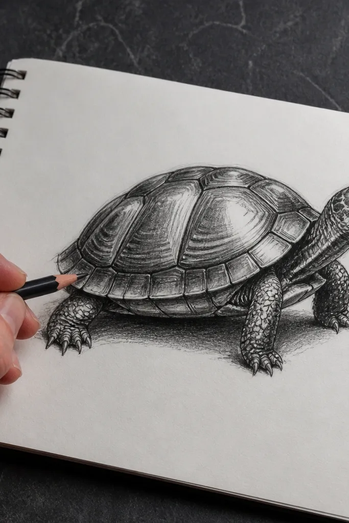
A monochrome turtle can look more polished than color if the contrast is controlled. This design uses charcoal gray or black for the lines and shell base, then adds white highlight spots to make the shell look smooth and glossy. The shell segments are drawn with steady curved lines and spaced so they don’t tangle. Keep the face minimal — one small smile and tiny eye dots — so the highlights do the aesthetic work. This is perfect for sketchbooks with darker paper or for anyone who likes clean, graphic drawings.
Pro tipWhite gel pen works best on dry graphite. Wait a few minutes before adding highlights.
Step 1: Draw the turtle with a charcoal pencil or black fineliner for the outer outline and shell segments. Step 2: Shade the shell lightly with charcoal, leaving segment lines clearer by pressing less in the groove areas. Step 3: Use a white gel pen to add 6 to 10 highlight spots — cluster 3 near the top shell and 3 near the lower shell. Finally, add a faint shadow under the legs with a soft pencil and smudge lightly.
AvoidDon’t use heavy charcoal on the face; it makes the turtle look angry instead of cute.
10. Polka Dot Shell Turtle with Confetti Background
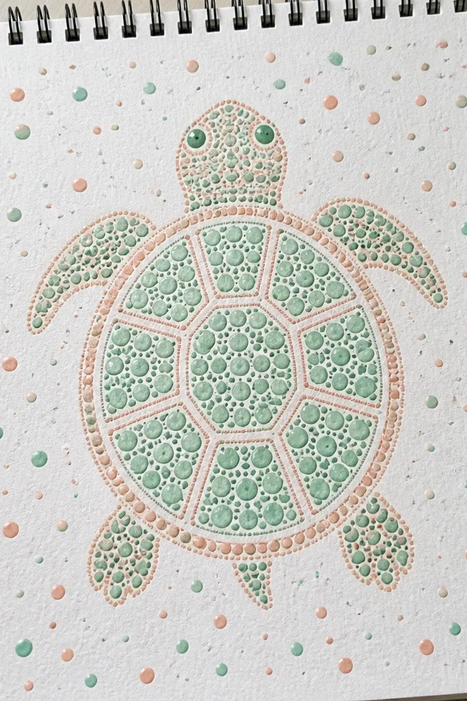
Polka dots are the cheat code for making a shell look cute instantly. The trick is to vary dot sizes slightly — small, medium, and a few tiny dots — so it doesn’t look flat. Keep the background confetti to dots only, and stop before it overwhelms the shell. Use two colors for dots max so the page stays clean: for example, mint dots and cream dots. Add a tiny leaf or heart near one leg if you want one extra focal point. This is a great option for fast projects that still look designed.
Pro tipUse a dot marker or the tip of a colored pencil turned sideways for uniform dot edges.
Step 1: Sketch the turtle body and shell dome, then divide the shell into 5 to 7 curved plates with simple grooves. Step 2: Fill each plate with polka dots using a fineliner or a dot marker, keeping dot spacing consistent within each plate. Step 3: Color the shell base lightly, then add the dot colors on top. Finally, add a confetti background with 20 to 40 small dots around the turtle, leaving a clear empty area near the head.
AvoidDon’t place confetti behind the shell segments. Keep it around the edges.
11. Sticker-Style Turtle with Thick Die-Cut Outline Marks
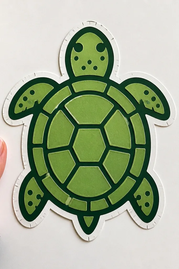
This is the most “craft” looking turtle because it’s drawn like a sticker. You get a bold outer outline, plus small die-cut style marks or notches around the border to imply it’s cut out. The shell has 6 segments with thick grooves so it reads from far away. Use two-tone coloring: one main green and one darker green for shell segments and legs. It’s ideal for making labels, planner stickers, or printable decor because the design is built to stand alone.
Pro tipLeave a tiny white gap between the thick border and the shell fill. It makes the sticker edge pop.
Step 1: Draw the turtle normally, then trace a second outline slightly outside the first to create a thick border. Step 2: Add shell segments with thick grooves and color them with alternating green shades. Step 3: Add small “cut” marks around the border — tiny triangles or short notches — spaced evenly. Finally, clean up edges with a white gel pen or eraser so the sticker border looks crisp.
AvoidDon’t make the border uneven. Uneven stickers look sloppy in photos.
12. Beach Doodle Turtle with Tiny Waves and Sand Texture
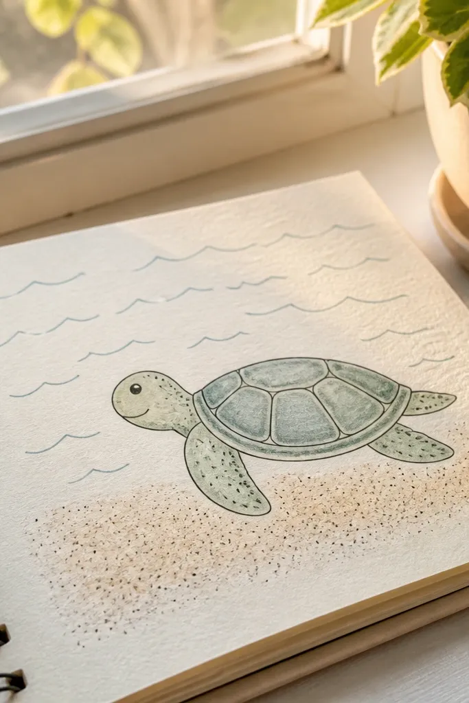
This one looks cute because it mixes a clean turtle with a textured ground. The turtle stays simple: 5 to 6 shell segments and a light fill. The background is where the aesthetic comes from — short wave lines behind and sand dots under the legs. Keep the sand texture to a band at the bottom so your page doesn’t turn into a full scene. It’s great for summer journals and for pages where you want a clear theme without drawing a whole ocean.
Pro tipSand dots look better if you vary spacing. Don’t make them a perfect grid.
Step 1: Sketch the turtle and divide the shell into 5 to 6 curved plates, then outline with a darker pen. Step 2: Color the shell and legs in one light base color and add a slightly darker shade to the grooves only. Step 3: Draw 6 to 8 short wave lines behind the turtle, curving upward near the head. Finally, add sand texture by dotting 40 to 60 tiny dots in a horizontal band at the bottom.
AvoidDon’t draw big wave arcs across the whole page. It competes with the turtle.
13. Botanical Turtle with Leafy Frame and Clean Shell Lines
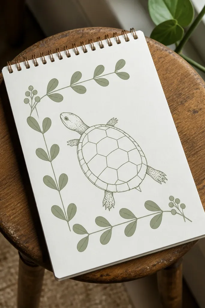
A leafy frame makes the turtle look like it belongs on a nice poster, even though the drawing is simple. The shell lines stay clean and minimal, while the leaves create the aesthetic border. Use 3 leaf shapes repeated around two sides, then add a couple of tiny berries or dots. The color palette should be restrained: one sage green for leaves, one darker green for shadows, and a pale green or cream for the shell. This works well for print-style pages and for making a single standout illustration.
Pro tipLeave a clear margin around the turtle. A frame that touches the shell looks cramped.
Step 1: Draw the turtle centered, with the shell dome divided into 6 segments using smooth curved grooves. Step 2: Add a leafy frame: draw leaf shapes along the left and right edges, 6 to 10 leaves total, leaving the top open. Step 3: Color the leaves in sage green and add a darker green line down the center of each leaf. Finally, add small berry dots near 2 or 3 leaves and keep the turtle shell color lighter so it stays readable.
AvoidDon’t clutter the top with leaves. The open top keeps the drawing airy.
14. Cute Turtle Wearing Glasses and a Tiny Flower Collar
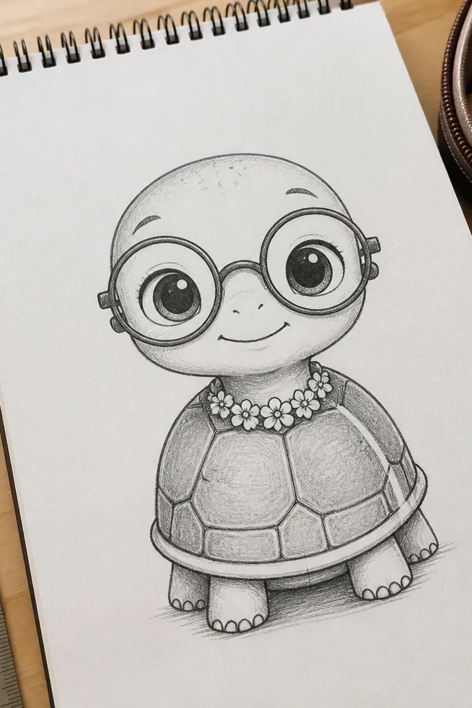
This aesthetic Turtle Drawing looks polished because the “accessory” is crisp and symmetrical. Round glasses sit evenly on the face, and the tiny flower collar adds a clear design element without needing extra background. Keep the shell simple with 5 to 6 segments and one highlight line so the glasses stay the focal point. Use one bright accent color for the flower and a neutral for the glasses frame. It’s a fun option for personalized stationery, gift tags, and cute themed pages.
Step 1: Sketch the turtle body and shell dome, then draw a head oval slightly forward. Step 2: Add glasses with two equal round frames and a small bridge line, then draw a small flower collar at the neck with 5 petals. Step 3: Divide the shell into 5 to 6 curved segments and color with a light green base plus darker green grooves. Finally, add a small shine on each glass lens using a white gel pen or uncolored paper area.
Use a circle template or a coin to get the glasses circles even. It makes the whole face look intentional.
Don’t shade under the glasses heavily. Flat color keeps the eyes cute.
15. Night Sky Turtle with Constellation Dots on the Shell
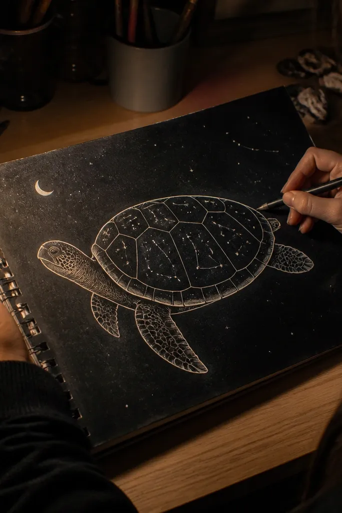
A night-sky turtle looks aesthetic because the shell becomes the scene. Use a dark background wash, then draw constellation dots on the shell with tiny white points and connecting lines. The turtle outline stays clean and light so it pops against the dark. Keep the shell segments minimal so the constellations can be seen, not buried. This is ideal for art journal pages, bookmarks, and any project where you want a moody but still adorable turtle.
Pro tipDo the constellations with a gel pen. Pencil dots disappear on dark paper.
Step 1: Color or paint a dark background (navy or deep charcoal) and let it dry. Step 2: Draw the turtle with a lighter outline (white gel pen or light gray pencil) and keep shell segments to 4 to 5 broad sections. Step 3: On each shell section, place 6 to 10 tiny constellation dots and connect 2 or 3 small line groups. Finally, add a few extra dots in the background near the turtle head for depth.
AvoidDon’t put constellations on every shell segment. Too many dots makes it look like noise.



