
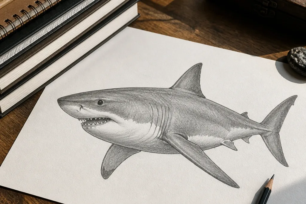

1. High-Contrast Shark Silhouette Poster
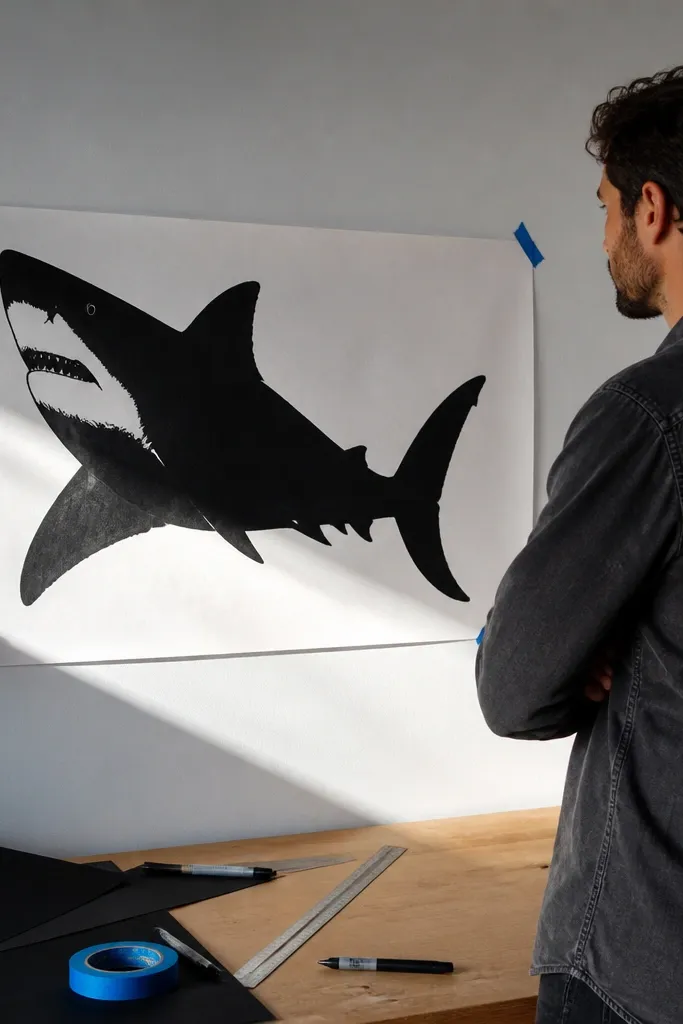
This is the easiest way to get “beautiful” fast because it removes the hardest parts first: teeth detail and skin texture. You’re building a graphic shape that reads from across the room, with the head wedge and tail curve doing the heavy lifting. Use a thick, confident silhouette edge, then add one small highlight mark on the belly to suggest volume. It looks great as a single-page print, a study sheet, or a background panel behind a smaller tooth drawing.
Step 1: Sketch the body with three shapes — a wedge for the head, an egg-shaped mid-body, and a tapered tail. Connect them with one smooth S-curve line, then place the dorsal fin so its base sits on the top curve. Step 2: Trace the outer silhouette with a fineliner, then fill the shape with black marker or India ink using steady passes. Step 3: Lift a tiny belly highlight with a kneaded eraser or a white gel pen dot, and add a thin shadow line under the belly edge.
Pro tipDraw the fins from their bases, not from the tips. If the base sits on the body curve, the whole shark looks instantly more real.
AvoidDon’t add teeth first — a tooth row on a weak silhouette makes the whole piece look messy.
2. Tooth Row Profile with Clean Contour
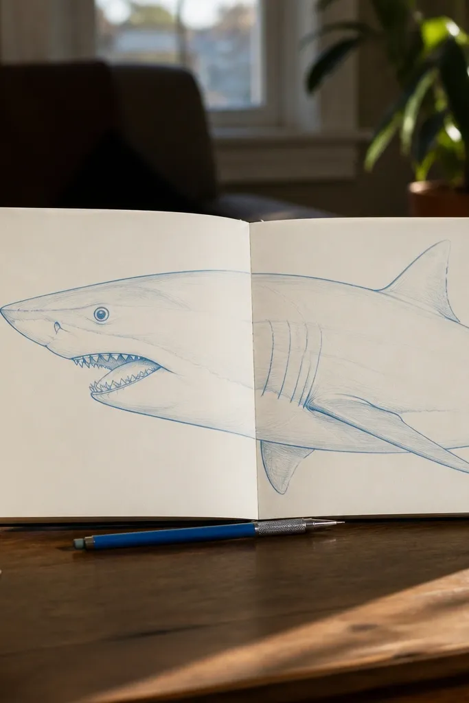
This style is all about the head reading instantly. When you nail the mouth angle and tooth spacing, the viewer’s brain fills in the rest of the shark. Keep everything else simpler than you think: one eye, one gill suggestion, and a few contour lines under the jaw. The teeth should look like repeating shapes with a slight variation, not a perfect comb. It’s a great choice for a “pretty but doable” page because you can finish in one sitting.
Step 1: Draw a side profile head as a blunt wedge, then add the jaw line as a single curve that dips toward the mouth. Mark the eye as a small oval on the top-front third of the head, then place the gill line as a short arc behind it. Step 2: Sketch the tooth row: start with three large outer teeth, then add smaller middle teeth, leaving tiny gaps between them. Step 3: Shade only under the jaw and around the mouth crease with a 2B pencil, then clean edges with an eraser to keep the contour crisp.
Use a ruler for the mouth opening angle. A consistent mouth angle makes tooth spacing look intentional.
Skip heavy shading on the whole head — it dulls the tooth row and flattens the form.
3. Pencil Study with Soft Belly-to-Back Gradient
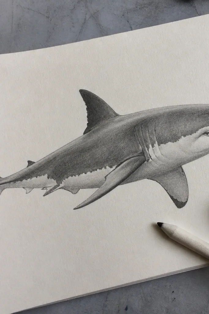
This drawing looks “real” without turning into a texture nightmare. The beauty comes from the gradient: light belly fading into darker back, plus a few darker contour lines that suggest muscle. You’ll get a clean, aesthetic look that works for a sketchbook page and still feels finished. This is also the best style to learn the shark’s body planes because the shading forces you to think about curvature.
Step 1: Lightly block the body with an S-curve, then add the pectoral fin and dorsal fin as simple triangles with rounded corners. Place the eye and gill line with light guide marks so you can erase later. Step 2: Shade the back first with a 4B pencil, then blend toward the belly using a tissue or blending stump with lighter pressure. Step 3: Add a darker line under the jaw and around the fin bases, then lift highlights on the belly edge with a kneaded eraser.
Blend from dark to light only. If you blend back into dark too much, the shark turns flat and grey everywhere.
Don’t outline everything before shading. Outline after you shade so the lines sit on top of form.
4. Ink-and-Wash Great White in Stormy Water
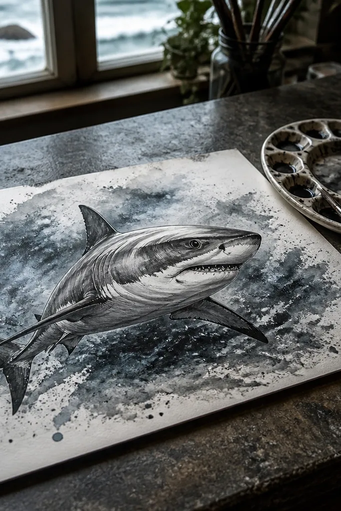
Ink-and-wash gives you instant drama and a premium look. The shark body stays crisp with ink lines, while the background washes create movement and depth. This style is photogenic because the contrast between clean silhouette and smoky water makes the shark pop. Keep the water texture controlled — too many splatters distract from the shark’s shape. It’s a strong pick if you want a finished piece that looks like it came from a printmaking book.
Step 1: Draw the shark in ink with a fineliner — keep the head wedge and tail curve bold, and keep interior lines minimal. Step 2: Wet the paper lightly behind the shark with clean water, then drop grey ink diluted with water. Add a few larger droplets at the edges for a storm texture. Step 3: When dry, reinforce the outer silhouette with one more ink pass, then add one or two darker wash bands under the belly for volume.
Pro tipUse thicker paper (at least 200 gsm). Thin sheets buckle and ruin the clean edges of ink.
AvoidDon’t wash over already-wet ink lines. You’ll get fuzzy edges that look accidental.
5. Minimal Line Drawing with One Accent Fin
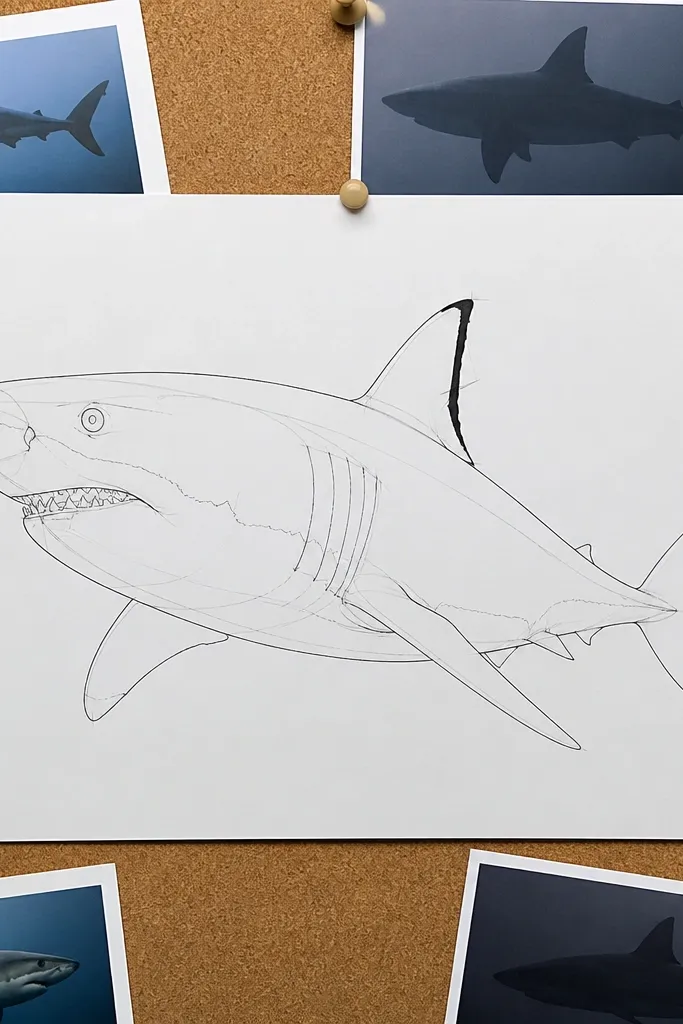
This is the cleanest aesthetic on the list: thin lines, no heavy shading, and one bold accent that makes the drawing feel designed. The shark’s beauty comes from proportion and posture, not detail. You’ll get a modern look that works well as a sticker-style design or a simple wall print. It’s also a good “practice piece” for getting the fin placement right because nothing else distracts you.
Step 1: Sketch the shark with a single continuous-ish line in pencil, then trace with a 0.3 or 0.5 fineliner. Draw the dorsal fin and pectoral fin as simple shapes connected to the body curve. Step 2: Color only the dorsal fin base with a dark grey marker or soft pencil, leaving the rest unshaded. Step 3: Add one small eye highlight dot with a white gel pen so the minimal drawing still looks alive.
Pro tipKeep the line weight consistent. If your outline changes thickness randomly, the minimalist look breaks.
AvoidDon’t add teeth detail. In minimal style, teeth clutter the clean silhouette.
6. Three-Quarter View with Overlapping Scales
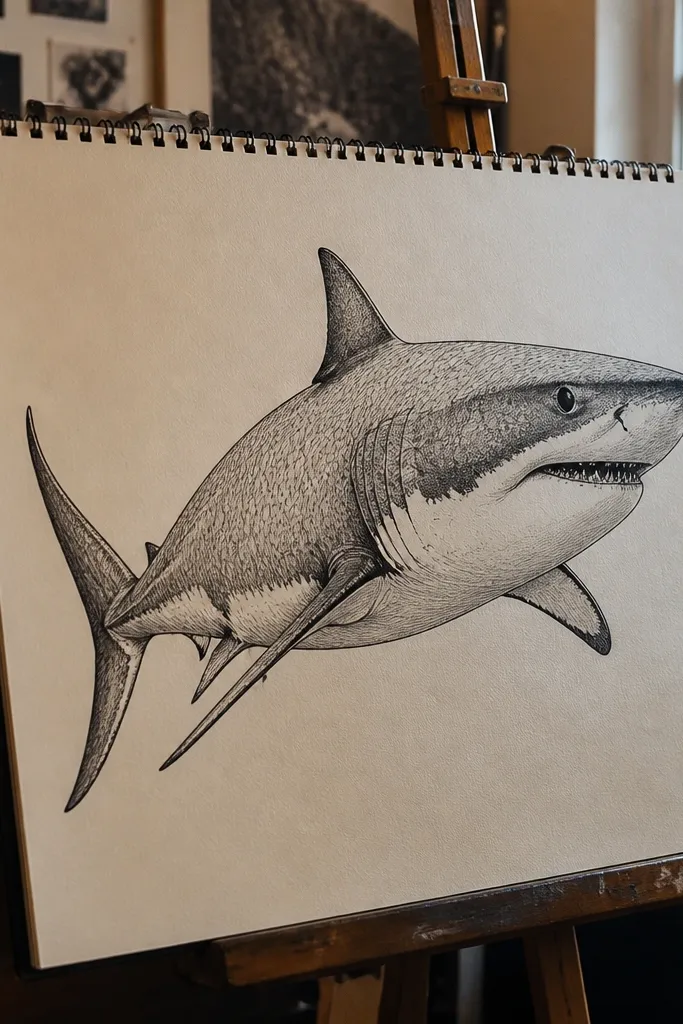
Three-quarter view is where most drawings go wrong because the head angle and body curve fight each other. This style fixes that by using small, repeating scale marks only on the visible side, so your shading and texture stay focused. The result looks detailed but still controlled. It also teaches a useful habit: texture follows the body curve. When the marks wrap correctly, the shark looks dimensional.
Step 1: Block the shark in three shapes: head wedge, mid-body oval, and tail triangle. Add the near-side pectoral fin and a partial dorsal fin outline so the pose reads. Step 2: Draw scale-like strokes as short curved marks that follow the direction of the body curve, starting behind the gill area and stopping before the belly. Step 3: Shade the underside lightly with a 2B pencil, then reinforce the outline around the head and tail with a darker pencil (4B) for contrast.
Pro tipKeep the scale marks bigger near the head and smaller toward the belly. That size shift sells the turn in perspective.
AvoidAvoid full-body texture. If you texture the belly too, you lose the gradient and the shark looks flat.
7. Chalk Pastel Look on Toned Paper
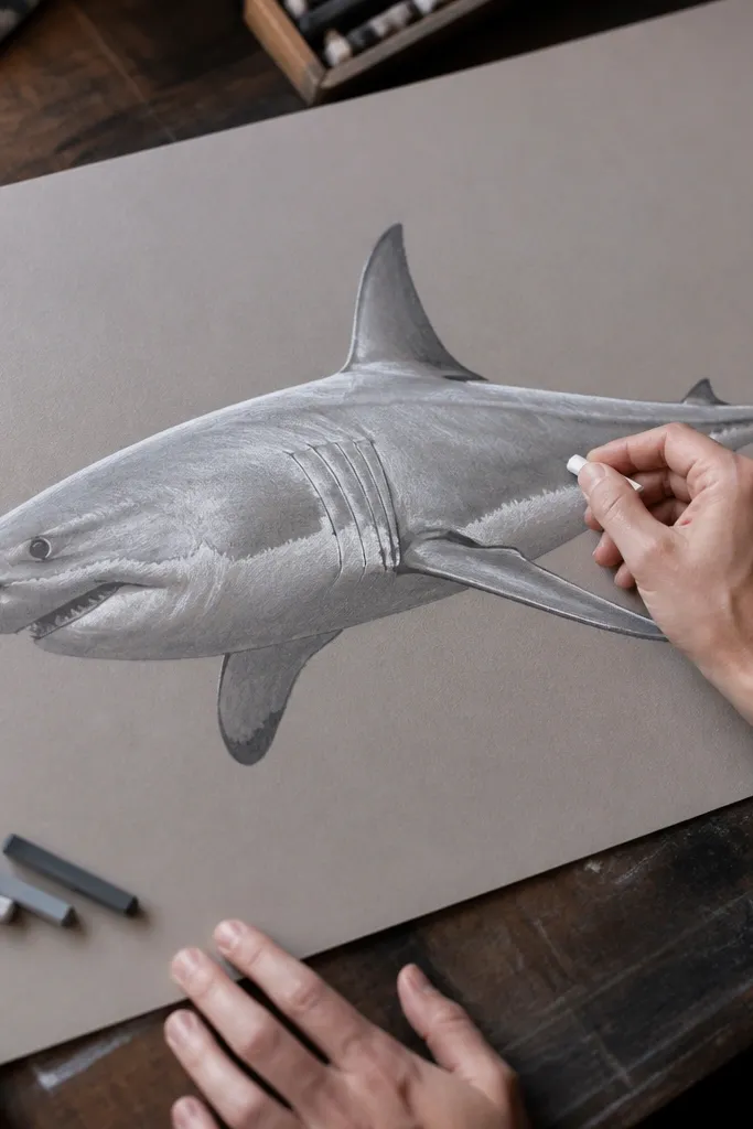
Toned paper makes your shark look instantly atmospheric. White chalk pastel defines the edges and belly highlights, while grey pastel builds the body without needing heavy blending. This style is beautiful because the paper color becomes the “mid-tone,” so you don’t fight to create contrast from scratch. It’s also forgiving: smudges look intentional when they’re part of the gradient.
Step 1: Choose mid-dark paper (charcoal grey) and sketch the shark lightly in white pastel. Focus on the head wedge and the dorsal fin silhouette first, then add the mouth line and eye. Step 2: Build the back with medium grey pastel using broad strokes, then blend gently with a soft cloth. Step 3: Add belly highlights with a brighter white and sharpen the tail edge with a darker grey to keep the silhouette crisp.
Use a paper stump or clean makeup sponge for blending. It keeps the gradient soft without muddying edges.
Don’t press hard on the first pass. Pastels fill the tooth of the paper and you lose the ability to layer contrast.
8. Graphite Wet-Look Shading (Smooth and Glossy)
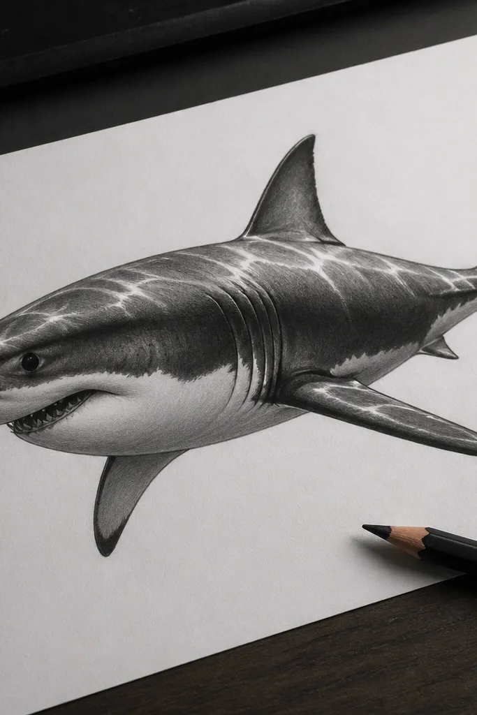
This is a “clean studio” look. The trick is smooth shading with controlled highlights that mimic wet skin — not by adding shine everywhere, but by placing a few bright strips along the back curve. It looks modern and expensive because the texture is minimal and the form is polished. If you want a drawing that looks like it belongs in a modern gallery, this is the one to pick.
Step 1: Sketch the shark lightly in HB, then trace the outer contour with a 2B pencil. Shade the back area with 2B in smooth, parallel strokes, then blend with a blending stump. Step 2: Create wet-skin highlights by leaving narrow paper strips unshaded along the top curve and near the fin edges. Step 3: Darken the underside near the jaw with 4B, then soften transitions with light blending so the highlights stay crisp.
Work in layers. One heavy graphite pass looks gritty; several light passes look glassy.
Don’t erase over blended graphite too aggressively. It smears and creates dull patches.
9. Crosshatch Texture Only on the Dark Back
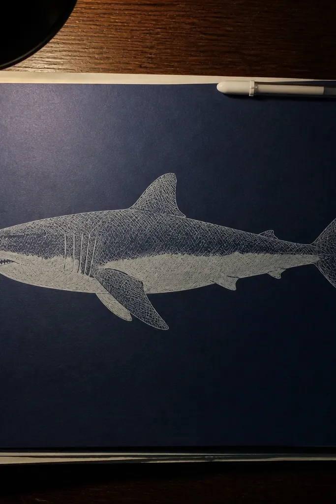
Crosshatching is dramatic when you restrict it. Put texture only on the dark back and leave the belly mostly clean, and the shark instantly looks like it has lighting from above. This style is beautiful because the pattern becomes a design element, not random scribbles. You also get a clear, repeatable method for making the shark feel textured without turning the whole page into noise.
Step 1: Draw the shark outline in pencil, then darken the top contour and fin edges with a 2B. Step 2: Crosshatch only the back half — use two directions of line (one diagonal, one opposite diagonal) and keep spacing tight near the spine. Step 3: Leave the belly area mostly blank, then add a single soft shadow line along the belly edge with light shading.
Pro tipKeep crosshatch lines parallel to the body curve. That’s what makes the texture wrap instead of sit flat.
AvoidDon’t crosshatch the belly. If you texture the light area, you lose the lighting effect.
10. Red Ink Tooth Study with Paper Grain Background
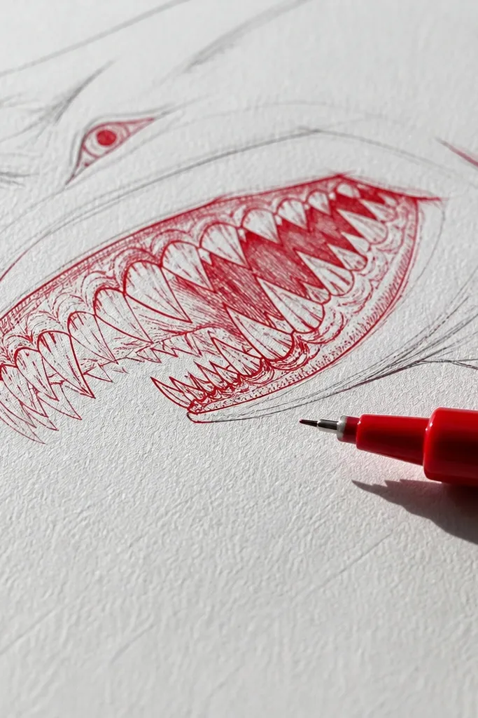
This is a graphic, aesthetic tooth study that looks striking even when it’s small. Red ink gives you a punchy contrast against white paper, and the tooth shapes become the focal point. The rest of the shark stays minimal so the teeth don’t get buried. It’s a great choice for those “I want something pretty but quick” days, and it still looks intentional when photographed.
Step 1: Sketch the mouth opening as a curve and draw the tooth row outline in pencil, then ink it with a red fineliner. Step 2: Add teeth with varying heights: two tall outer teeth, shorter middle teeth, and tiny gaps between. Step 3: For texture, tap a stiff brush with watered red ink near the edges of the page, then stop before it becomes a full background wash.
Pro tipUse a white gel pen to add one bright highlight on the tooth edges. It makes the teeth look cleaner and sharper.
AvoidDon’t over-ink the tooth bases. Thick blobs make the teeth look like they’re melting.
11. Vintage Etching Style with Fine Line Damage
Etching style looks gorgeous because it’s all about delicate linework and controlled imperfections. You get a “printed” feel by mixing fine hatching with a few blotchy ink spots that suggest skin and depth. This style is especially good if you like texture that looks old-school instead of modern smooth gradients. It also hides small drawing errors because the style has intentional line variety.
Step 1: Draw the shark with a fine technical pen (0.3 or 0.2), keeping the outline slightly uneven. Step 2: Add hatching in small bands across the back, then break some hatch lines with tiny gaps to mimic etching wear. Step 3: Use watered black ink to dab a couple of low-opacity blotches near the gill area and under the jaw, then let it dry fully before adding final contour lines.
Pro tipPractice a few hatch densities on scrap paper. If all your hatch lines are the same darkness, it stops reading like etching.
AvoidSkip big solid black areas. Etching looks best when most lines are fine and layered.
12. Foam White Highlights on Dark Blue Marker Skin
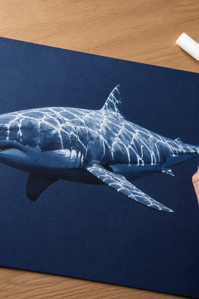
Marker skin plus foam highlights gives you a bold, ocean-poster vibe. The dark blue base makes the shark body look like it’s submerged, and the white highlights mimic surface reflections. This is one of the most photogenic options because the contrast is loud and clean. You can keep the drawing simple — just silhouette, fins, eye — and still get a finished look thanks to the highlight technique.
Step 1: Color the page background with dark blue marker in uneven strokes, then sketch the shark outline in pencil so you can erase. Step 2: Fill the shark body with slightly lighter blue or grey-blue marker, staying inside the silhouette. Step 3: Add white gel pen highlights along the top curve, around the fin edge, and a few “foam” dots near the mouth and belly line.
Pro tipDo highlights last. If you add white early, marker bleed will ruin crisp edges.
AvoidDon’t over-detail the teeth. In this style, the mouth line and eye do enough work.
13. Charcoal Smudge Portrait with Sharp Eye
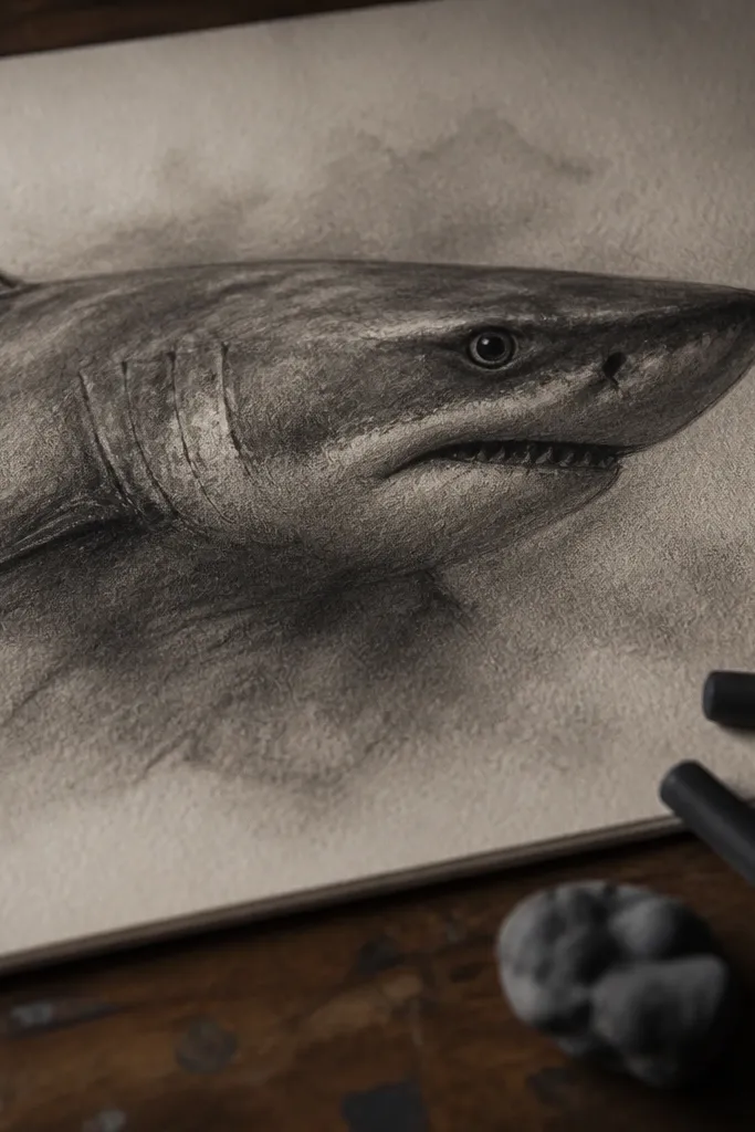
This drawing looks powerful because the shading is loose, but the eye is precise. Charcoal naturally creates a soft, smoky texture, which fits the shark’s mood. If you keep the outline and eye crisp, the rest can be smudged without looking sloppy. It’s a great option for a moody aesthetic page and teaches you a useful control skill: precision focal point, loose surroundings.
Step 1: Use a soft charcoal stick to block the shape — head wedge, mid-body curve, tail taper — then keep the lines light enough to adjust. Step 2: Smudge charcoal on the back with a tissue, leaving the belly lighter. Step 3: Use a kneaded eraser to carve out the eye socket and highlight, then draw the eye with a small piece of white charcoal or white gel pen for contrast.
Pro tipFix the charcoal lightly with workable fixative if you have it. It prevents smudges when you add the final eye details.
AvoidDon’t keep the whole drawing equally smudgy. The eye needs a sharper edge than the body.
14. Cross-Section Body Plan Drawing (Educational and Clean)
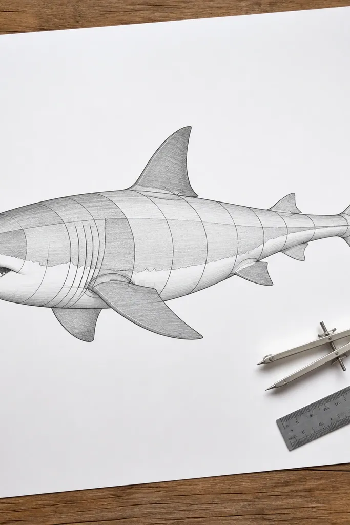
This one is beautiful because it’s clear. You draw the shark with clean contour lines that divide the body into planes, then lightly shade each plane with a different value. It looks like an art-science diagram, but it still reads as a shark drawing. This style is perfect for learning proportion and for making your drawings look “designed” on the page. It also works well if you want a minimal look with structure.
Step 1: Sketch the shark in profile or three-quarter view with a simple outline. Add 3-5 contour bands that wrap the body: top back plane, side plane, belly plane, and jaw plane. Step 2: Shade each plane with a single pencil tone (HB for belly, 2B for side, 4B for back) and blend only within each band. Step 3: Add the dorsal fin and pectoral fin outlines with clean lines, then reinforce the silhouette with a darker pencil.
Pro tipKeep plane boundaries smooth curves. Hard corners make it look like a cartoon, not a body.
AvoidAvoid adding lots of texture. The beauty comes from clean planes, not scale detail.
15. Pointillism Belly Fade with Dorsal Contrast
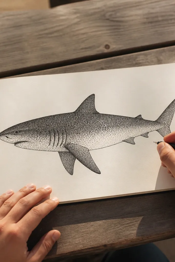
Pointillism looks gorgeous on sharks because you can build a gradient without smearing. The belly fade reads as light scattering, while the darker back stays dense with dots. It’s also a relaxing technique once you commit to dot spacing. This style is photogenic because the surface texture catches light and shows depth even in a flat photo.
Step 1: Draw the shark outline lightly in pencil, then darken the dorsal fin outline and tail edge. Step 2: Start placing dots for the back first with a 4B pencil — keep dot density high near the spine. Step 3: Reduce dot density toward the belly until it’s sparse, then add a few darker dot clusters near the jaw and fin bases for structure.
Pro tipUse a consistent dot size. If your dots vary wildly, the gradient looks chaotic instead of smooth.
AvoidDon’t outline everything in dark ink. The dots do the edge work; heavy outlines fight the texture.
16. Comic Panel Shark with Speed Lines
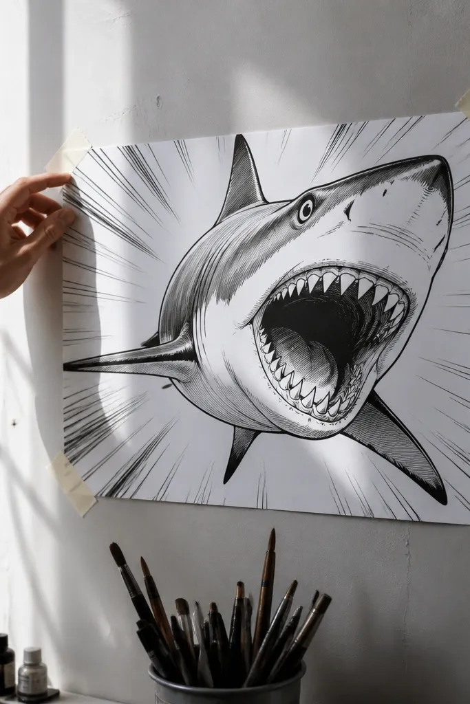
Comic panel drawings are beautiful because they’re graphic and action-focused. The shark reads instantly, and the speed lines make it feel like it’s moving toward the viewer. Keep the body slightly simplified, then let the mouth and eye be the detail anchors. This is a good choice if you want a fun aesthetic that still looks polished, not childish.
Step 1: Sketch the shark in a dynamic pose — head angled slightly up, tail trailing back — and block the fins as simple shapes. Step 2: Ink the outline with a bold pen, then add speed lines in the background as tapered strokes pointing away from the shark. Step 3: Shade only the underside and mouth area with a few flat tones (marker or 2B pencil), then add a small white highlight in the eye.
Pro tipMake speed lines thicker near the shark and thinner farther away. That creates depth without extra shading.
AvoidDon’t clutter the panel with too many effects. One background action element is enough.
17. Museum-Label Style Ink Drawing with Clean Margins
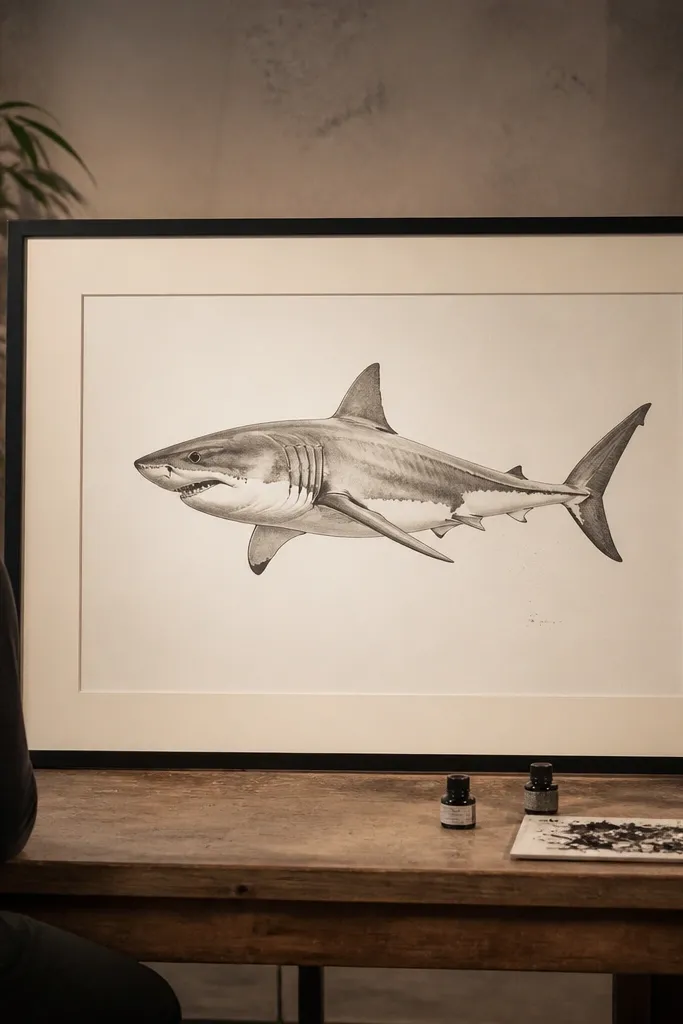
This look is about composition. You give the shark breathing room and use a small amount of supporting ink marks so the drawing feels curated and calm. The shark itself stays crisp in ink, with minimal shading that still suggests form. It’s especially good for scanning, framing, or using as a print for a bedroom wall. Clean margins are not optional here — they’re part of the beauty.
Step 1: Draw the shark centered with a light pencil guide, keeping it smaller than you think so there’s space around it. Ink the silhouette and key interior lines (eye, gill line, fin bases) with a pen, then leave the rest blank. Step 2: Add a single wash behind the shark using diluted grey ink, staying inside a loose oval area. Step 3: Finish with a thin line border around the drawing area and a blank label rectangle in pencil you can write on later.
Pro tipKeep the wash subtle. If the background wash is too dark, it competes with the shark outline.
AvoidDon’t fill the page edge-to-edge. This style needs white space to look intentional.
18. Realistic But Simple: Two-Value Charcoal Form
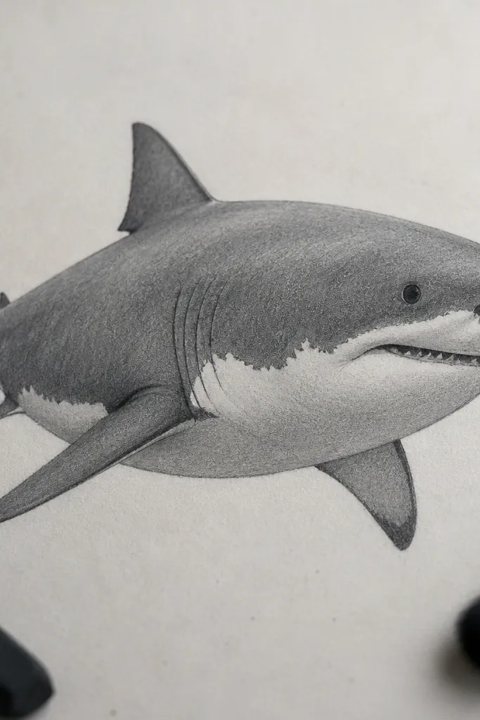
Two-value charcoal is one of the cleanest ways to get “real” without overworking. You use one medium tone for the back and one lighter tone for the belly, plus a few hard edges around fins and the jaw. It gives you that realistic shape language while keeping the page tidy. This style is perfect if your drawings usually turn into messy mid-tones that never look finished.
Step 1: Lightly sketch the shark outline and fin placements, then block the back area with medium charcoal (not heavy). Step 2: Add the belly tone with lighter charcoal or by lifting charcoal with a kneaded eraser, then blend softly at the gradient edge. Step 3: Sharpen the silhouette and fin edges with a harder charcoal pass, and draw the eye with a small highlight using eraser or white gel pen.
Pro tipWork with a kneaded eraser folded to a point. It gives you sharper highlights than rubbing with a flat eraser.
AvoidDon’t add extra textures all over. Two-value form is the whole point.
19. Minimal Poster: Numbers Teeth Pattern Only
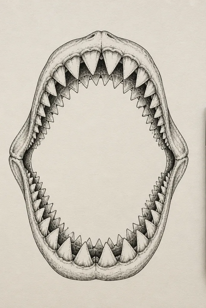
This is a design-first drawing: you focus on the mouth and teeth as a pattern, then keep the rest almost blank. The beauty comes from repetition with controlled variation — outer teeth larger, middle teeth smaller, and slight curvature at the jaw. It looks like a modern poster graphic, not a sketch. This style is quick, but it still looks serious because the teeth pattern is organized.
Step 1: Draw the mouth opening as a curved arc and sketch the jaw line as a simple contour. Step 2: Create a repeating tooth pattern: outline teeth in a row, then fill or shade the base shadow under the mouth with light pencil. Step 3: Add one thin line for the eye and one short line for the gill area, then leave the rest of the body un-detailed for a clean poster look.
Pro tipUse a consistent tooth width and change only the height. That keeps the pattern elegant and readable.
AvoidDon’t draw the full shark body. The mouth pattern is the aesthetic — stretching it too far makes it feel unfinished.
20. Backlit Silhouette with White Gel Pen Ripples
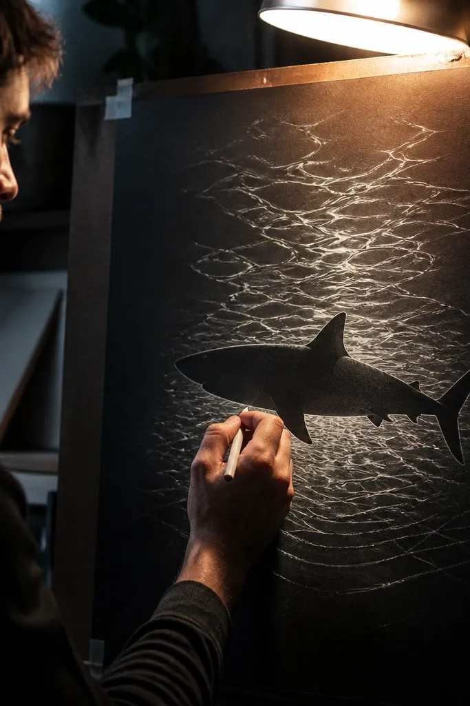
Backlit silhouettes look cinematic. You build the shark as a solid dark shape, then add white ripple lines that suggest light passing through water. The shark stays dramatic without needing detailed shading or texture. This style is beautiful because it’s graphic and uses a single accent color — white — to create motion. It also photographs well because the contrast stays strong.
Step 1: Wash the background with diluted black or dark grey ink, then let it dry enough to avoid smearing. Step 2: Draw and fill the shark silhouette in black marker or dense ink, keeping the edges smooth. Step 3: Use a white gel pen to draw ripple arcs behind and slightly around the shark, leaving gaps so the ripples look like light, not outlines.
Pro tipVary ripple arc thickness. A few thicker arcs near the head makes the composition feel centered.
AvoidDon’t add ripple lines inside the shark silhouette. It muddles the shape edge.



