
1. Single Bloom Front View with Dark-Throat Gradient
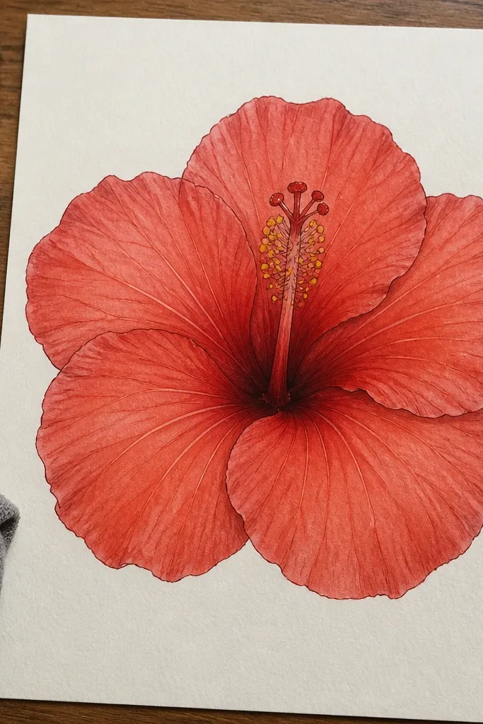
This one is the clearest “hibiscus read” for beginners because it keeps the flower face-on and gives you a controlled value plan. The throat stays noticeably darker than the petal, so your viewer’s eye lands on the center instead of getting lost in uniform red. Use a clean outline for the petal edges, then lay red shading that fades toward the rim. It looks especially good in a minimalist page because the negative space around the bloom stays calm. Skill level is easy to moderate, and it usually takes about 45-70 minutes depending on how smooth you make the gradient.
Start by drawing a loose circle for the center, then sketch five petals around it with slightly pointed outer tips. Add a thick throat shape at the base of the petals — it should look like a bowl — and place the stamens as thin lines that rise from the throat. Then shade: color the throat and inner petal bases with a darker red (or a heavier pencil value), and blend outward to lighter red near the petal edges. Finish by tracing a thin highlight line along each petal edge using an uncolored gap or a light red pencil pass. If you’re using paint, let the first red layer dry before adding the darker throat so it doesn’t bleed into everything.
Keep a “highlight gap” on each petal edge from the start; it saves you from trying to erase later.
Don’t shade every part of the petals the same red tone — hibiscus needs the throat-to-rim contrast.
2. Ink Outline + Watercolor Wash Bleed Petals
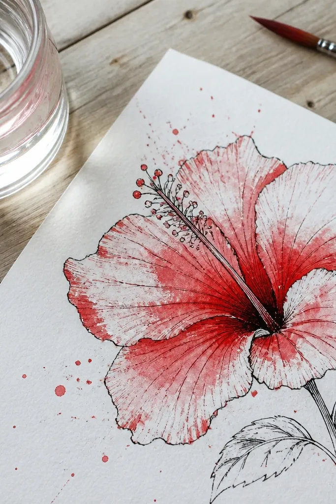
This style looks airy and artsy because the watercolor edges feather into the paper. The ink gives structure, so the petals still look crisp even when the wash bleeds. Red hibiscus is perfect for this because the petal texture looks natural when the color transitions are imperfect. It’s a great choice if you want a finished-looking page without heavy rendering. Plan for moderate skill: drawing clean outlines is the hard part; the wash is forgiving.
Draw the flower with fineliner first: five petals, a darker throat, and a center column with 8-12 stamen lines. Let the ink dry completely. Then wet only the petal areas with clean water using a small round brush, and drop diluted red watercolor into each petal, keeping the darkest pigment near the petal base. Tilt the paper slightly for a gentle bleed, and stop before it reaches the outlines too much. Finally, add a deeper red second wash at the throat and a few stamen tips, then let it dry flat to avoid streaks.
Use two dilutions of red: one watery for the petal body and one stronger for the throat so the center pops.
Don’t flood the entire sheet with water; it turns the petals into one muddy red mass.
3. Colored Pencil Glazing with Realistic Petal Veins
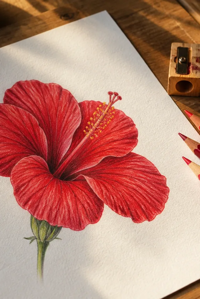
If you want that “almost botanical” look without going full watercolor realism, colored pencil glazing is the cleanest route. Veins matter here: hibiscus petals have subtle rib lines that guide the light. With glazing you can build red depth gradually, so the petals look dimensional instead of flat. This project is best for 1-2 blooms placed slightly apart so you can show multiple vein directions. It takes longer than wash styles because you’re layering, but the result looks polished and frame-worthy.
Sketch the hibiscus lightly with a 2H pencil: petal outlines first, then the center column and stamens. Color the petals with a light red base using gentle pressure, leaving a faint highlight near the edges. Next, add veins: draw thin darker-red lines from the throat outward, then softly blend along the vein direction with a lighter red. Build depth by glazing — add a few passes at the petal base and throat, letting the paper texture show through. Finish by sharpening the petal edge outline with a darker red pencil and adding tiny stamen dots at the tips.
Pro tipBlend with a light hand and long strokes along vein direction, not across it.
AvoidDon’t press hard on the first red layer — you’ll fill the paper texture and lose the glow.
4. Chalky Pastel Red Hibiscus on Toned Paper
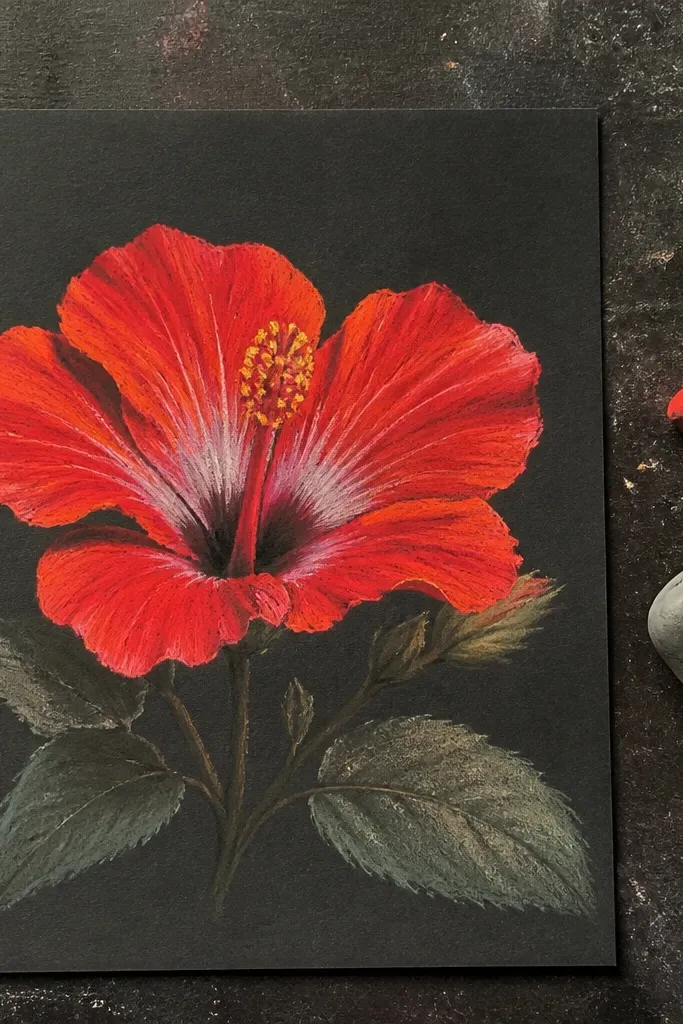
Toned paper makes red hibiscus look dramatic because the highlights glow against the dark base. Pastel-style drawing is also more forgiving: you don’t need perfect edges, just clear petal shapes and strong center contrast. The result feels modern and a little vintage, especially when you keep the background clean. This is ideal if you want a striking page without wet media. Skill level is easy because you rely on big shapes and soft blending.
Choose toned paper in a warm gray or deep beige. Lightly block in five petal shapes with a soft red pastel, then darken the petal bases with a deeper crimson. Draw the center column in yellow-orange pastel, and add a few darker orange lines where the stamens emerge. Blend petal edges with a lighter red or pink pastel to create a rim highlight. Use a white pastel to add small edge highlights and a few stamen tip dots, then fix lightly if you have a workable fixative.
Pro tipWork from dark to light so you don’t contaminate your brightest highlight areas.
AvoidDon’t overblend the whole flower; you need crisp petal edges and a readable center.
5. Red Hibiscus Side Profile with Curved Petals
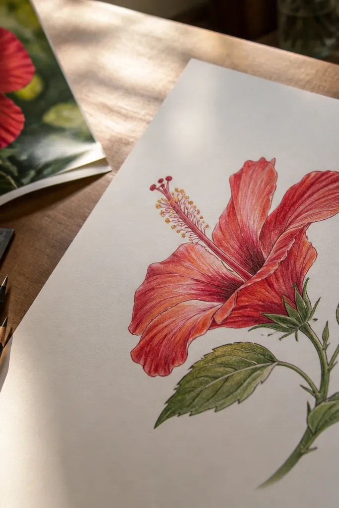
Side profile makes your drawing look more intentional because you’re not copying a simple front face. The petals overlap, so you get natural layering and depth. This style also teaches you hibiscus structure: you see which petals come forward and which sit behind. It’s great for adding movement to a page and pairs well with a thin branch sketch. Expect a moderate learning curve because perspective changes the petal outline, but once you nail the overlap, it looks gorgeous.
Draw a center column first as a slightly tilted oval with a small throat opening at the base. Then sketch three main petals facing the viewer and two smaller petals tucked behind, using overlap lines to show depth. Shade the throat darker and the forward petal edges lighter, keeping the back petals more muted. Add stamens as thin curves that follow the tilt of the flower, then place a few highlight strokes along the forward petal rims. If you want extra realism, add a faint shadow under the top petal using a diluted red or light pencil value.
Use overlap lines as your “shadow system” — it’s faster than trying to shade every petal evenly.
Don’t draw all five petals the same size and angle in profile — it flattens the depth.
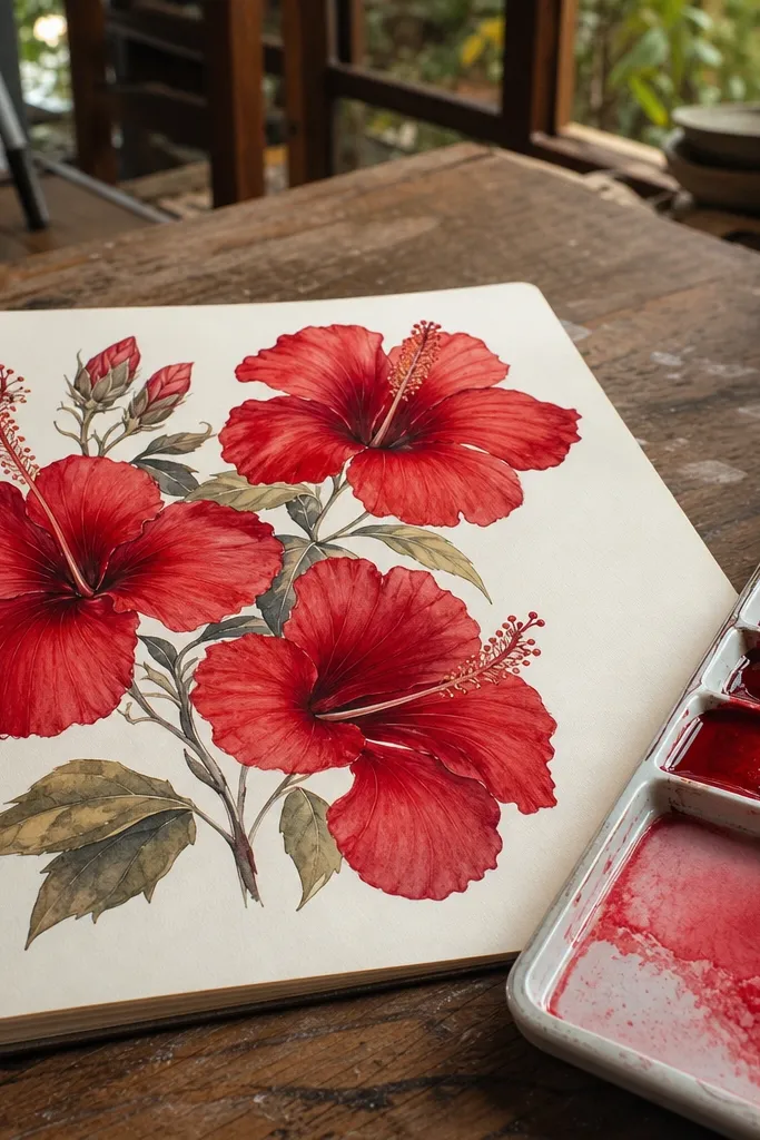
6. Hibiscus Bouquet Sketch with Three Blooms and Leaves
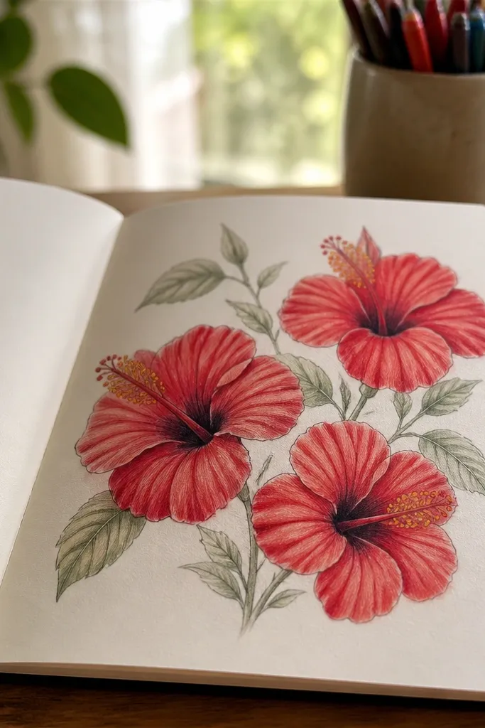
This is for when you want the page to look complete, not like a single flower practice sheet. Three blooms let you vary petal angles and show different shading levels, which makes the page feel designed. Keep the leaves simple and slightly angled so they frame the flowers instead of competing. The key to making it aesthetic is spacing: give each bloom breathing room and keep the leaf shapes consistent. Skill level is moderate, with the payoff being a finished composition you can print or frame.
Start with a light layout: place one bloom center, one slightly upper right, and one lower left. Draw each bloom’s petals with the same throat gradient plan, but vary the petal tilt so they don’t look copied. Add leaves using long ovals with pointed tips, then draw a center vein and two or three side veins per leaf. Shade only the petal bases darker and leave leaf shading minimal so red stays dominant. Finish with small stamen and throat accents on each bloom so every flower reads as hibiscus.
Pro tipLimit leaves to two or three styles of shape; repetition makes the bouquet look intentional.
AvoidDon’t over-render the leaves — if leaves get too dark, they steal attention from the hibiscus petals.
7. Red Hibiscus in a Circular Frame Composition
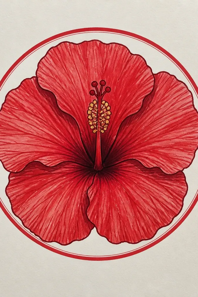
A circular frame makes your hibiscus look like art instead of practice because the viewer’s eye has a boundary. This style also helps you control symmetry: petals can radiate outward while the stamen column stays centered. Use bold outlines and a tight red palette (deep red, mid red, light red) so the circle doesn’t feel busy. It’s a strong choice for wall-art prints and sticker-style designs. Skill level is easy to moderate — the circle and spacing are the main job.
Lightly draw a circle on your paper, then sketch the hibiscus so the petal tips stop just short of the circle edge. Keep the throat darker and add a simple center column with stamens as straight-ish lines. Color in three red values: deep red in the throat and petal bases, mid red on the main petal area, and light red on the petal rims. Add a thin darker outline only along the outer petal edges to sharpen the silhouette. Finish by darkening the stamen tips and adding tiny dots or short strokes to suggest anthers.
Use a compass or a printed circle template so your frame looks crisp and consistent.
Don’t let the petal tips touch the circle line — the overlap makes the flower look cramped.
8. Minimal Line Art Hibiscus with One Red Fill
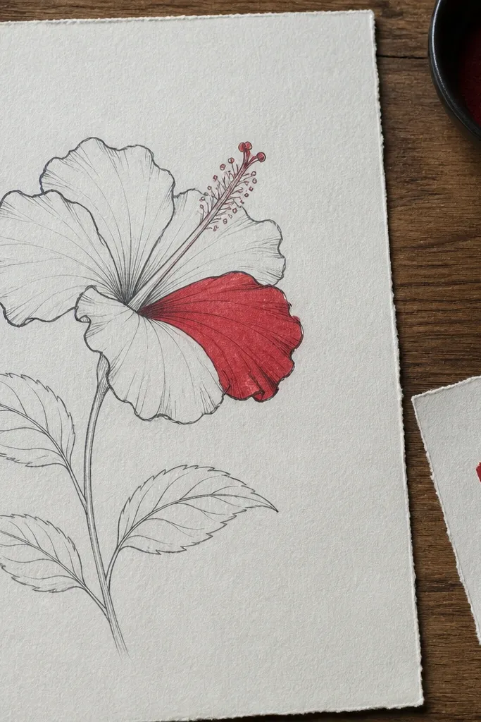
If you want clean, modern-looking hibiscus drawings, minimal line art with one flat red fill is the move. It looks good even on rough paper because you’re not relying on heavy shading. The trick is line weight: thicker on the outer petal edges, thinner around the throat and stamens. Add just one or two highlight gaps so the petals still feel curved. This is fast, and it produces images that look good as printable decor and simple greeting card art.
Draw the hibiscus with a fineliner in two line weights: outline petals with confident strokes, and draw the center and stamens with lighter, thinner lines. Leave small negative-space highlights along the petal edges. Then fill the petals with a single red color — pencil fill works, but marker or colored pencil works faster for solid coverage. Keep the throat a slightly darker red using a second pass, and leave the center column mostly unfilled so it stays readable. Finish by adding a thin red line along the outer petal edge to keep the silhouette crisp.
Use a kneaded eraser to lift pencil fill for highlight gaps; it keeps edges sharp.
Don’t outline everything equally thick — uniform line weight makes the drawing look flat.
9. Red Hibiscus with Dotwork Stamen Texture
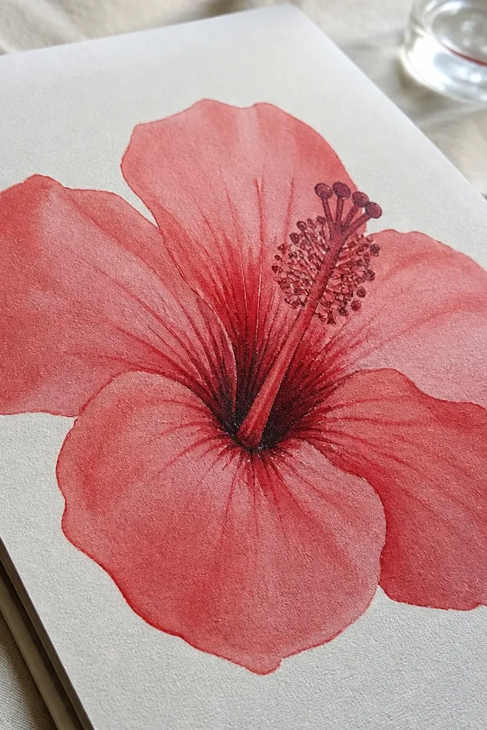
Dotwork makes the center look detailed without doing realistic shading across the whole flower. For red hibiscus, the center is the perfect place to add texture because stamens are naturally intricate. Keep the petals smoother and flatter, then spend your time on the stamen column with dots and short stipple marks. The result looks graphic and modern, great for digital prints later. Skill level is moderate because dotwork takes patience, but the petals stay simple.
Sketch the flower with light pencil: five petals and a center column that sits lower than you think. Outline in fineliner, then color petals with a light red pencil or diluted watercolor wash, keeping it even. For dotwork, use a fine pen and build the center by placing dots that gradually increase in density near the throat. Add a few longer stipple strokes where the stamens emerge, keeping them mostly vertical. Finish with a darker red ring around the throat so the dot texture has a boundary.
Pro tipStart dots sparsely at the top of the center column and densify as you move down toward the throat.
AvoidDon’t dot the entire petals — it turns the flower into a pattern instead of a flower.
10. Monochrome Pencil Hibiscus with Red-Only Accent Center
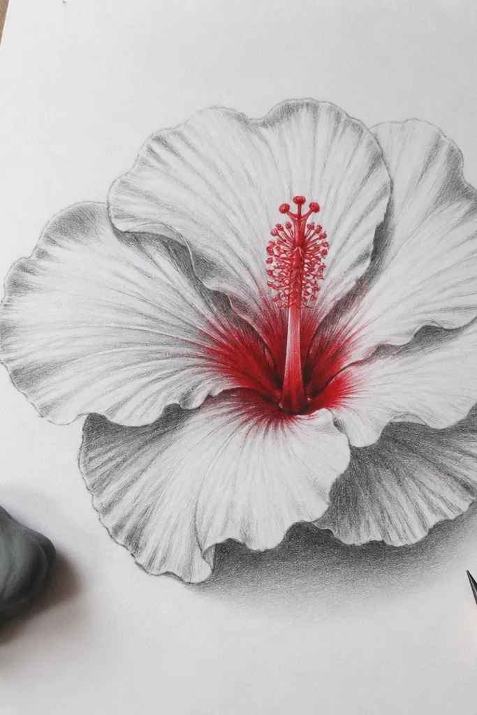
This one is a design trick: keep the petals in pencil values, then add real red only where hibiscus should grab attention. The contrast looks intentional and makes the center feel alive. Pencil petals also teach you shape control because you’re relying on value, not color, to show form. It’s great for people who want an aesthetic that feels “poster-like” instead of fully painted. Skill level is easy to moderate, with the main challenge being smooth pencil value transitions.
Draw the hibiscus in pencil first with clear value zones: mid-gray on petal bodies, darker near the throat, and light near the rims. Use a blending stump or tissue to smooth the mid areas while keeping petal edges slightly crisper. Then add red only to the throat and around the stamen base using colored pencil or marker. Leave the rest of the petals grayscale. Add tiny red at stamen tips and a thin dark line at the petal edge to separate layers.
Pro tipUse a darker pencil (like 4B) only for the throat shadows; it keeps the red accent from getting “dull.”
AvoidDon’t color the whole petal red “just to make it pop” — the accent effect dies when everything is red.
11. Red Hibiscus on Grid Paper for Clean Symmetry
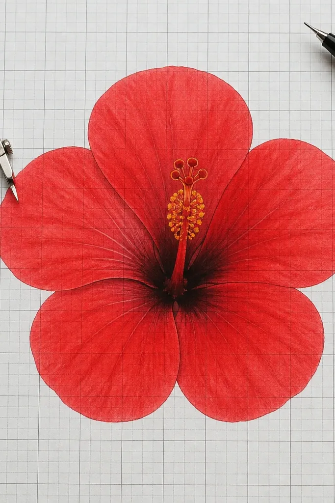
Grid paper gives you a built-in guide for petal spacing, and that’s exactly what makes a hibiscus look balanced. This style is perfect if you struggle with uneven petals or lopsided centers. You still get a hand-drawn look, but the symmetry stays controlled. It’s also a great practice page for learning petal curvature. Skill level is easy, and the finish looks crisp enough for sharing or printing.
Place your grid paper under a light and lightly mark a center point. Draw the center column first as a vertical oval with a throat bowl shape. Then map five petal arcs around the center using grid intersections so each petal has a similar width at the base and a tapered tip. Color petals in red pencil with a simple gradient: darker at the base, lighter at the tip. Add a final outline pass with a darker red pencil or fine pen, then erase any visible grid marks.
Pro tipErase grid lines only after the red is dry or fixed so you don’t smear pigment.
AvoidDon’t keep the grid marks visible — they ruin the clean hibiscus look.
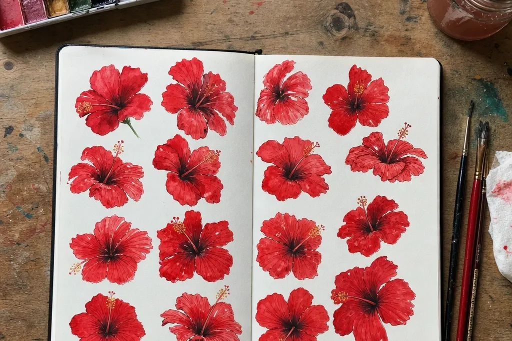
12. Hibiscus Flower Study with 5 Petal Variations
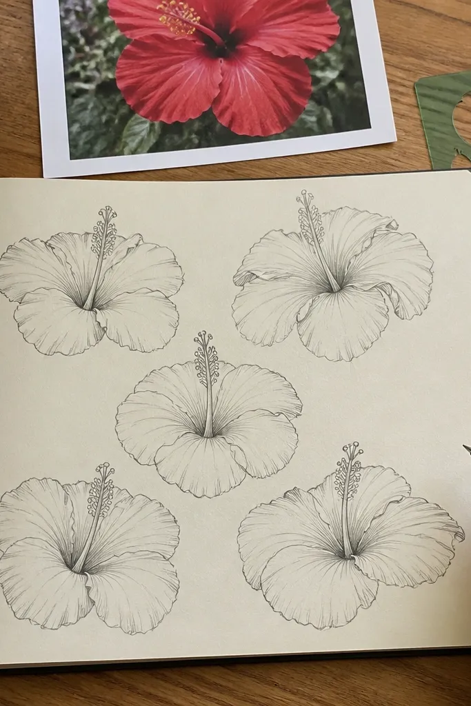
This is the fastest way to improve drawing quality because it forces you to practice petal shapes while keeping the hibiscus identity stable. You draw one center anatomy once, then change the petal outline five different ways. The page becomes visually useful because each variant still reads as hibiscus — you can compare how pointed tips, rounded edges, or thicker bases change the look. It’s great for building a “petal library” you can reuse later. Skill level is moderate, but the time cost is worth it.
Draw one consistent center throat and stamen column at the top of the page. Under it, sketch five petal sets in a row or a 2x3 layout, each one sharing the same center scale. Variant ideas: one petal set with sharper tips, one with rounded tips, one with narrower petals, one with wider petals, and one with a slightly twisted petal. Shade each set with the same red gradient rule so your differences come from shape, not lighting. Label nothing — just keep the shapes clean and let the comparison do the work.
Pro tipUse the same red pencil for all five variants so the page stays focused on petal shape differences.
AvoidDon’t change the center size between variants — it makes the comparisons confusing.
13. Watercolor Resist Hibiscus with Salt Texture
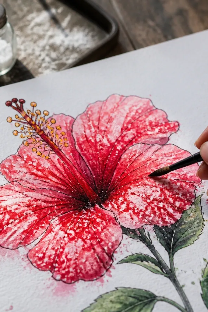
Salt texture makes red hibiscus look like it has natural speckling and depth, even when you only do a few layers. This is a great “wow” drawing because the texture appears in the petal areas while the ink or pencil outlines keep the flower readable. You need planning though: resist and salt work during wet stages, so the timing matters. This style looks best on heavier paper and produces a finished piece that feels decorative. Skill level is moderate since you’re managing wet media, but the visual payoff is strong.
Sketch the hibiscus lightly and outline the petals with fineliner if you want crisp edges. Wet the petal areas with clean water, then apply diluted red watercolor, concentrating pigment near the petal base. While the wash is still wet, sprinkle coarse salt on parts of the petals and let it sit until the paint starts to dry. When fully dry, brush off the salt and add a darker red throat layer. Finish with a white gel pen or light watercolor on a few edge highlights so the texture doesn’t steal all the contrast.
Use coarse salt, not table salt, so the speckles look intentional instead of dusty.
Don’t move the paper while the salt is on — drifting salt creates uneven blotches.
14. Red Hibiscus Tattoo-Style Flash Drawing
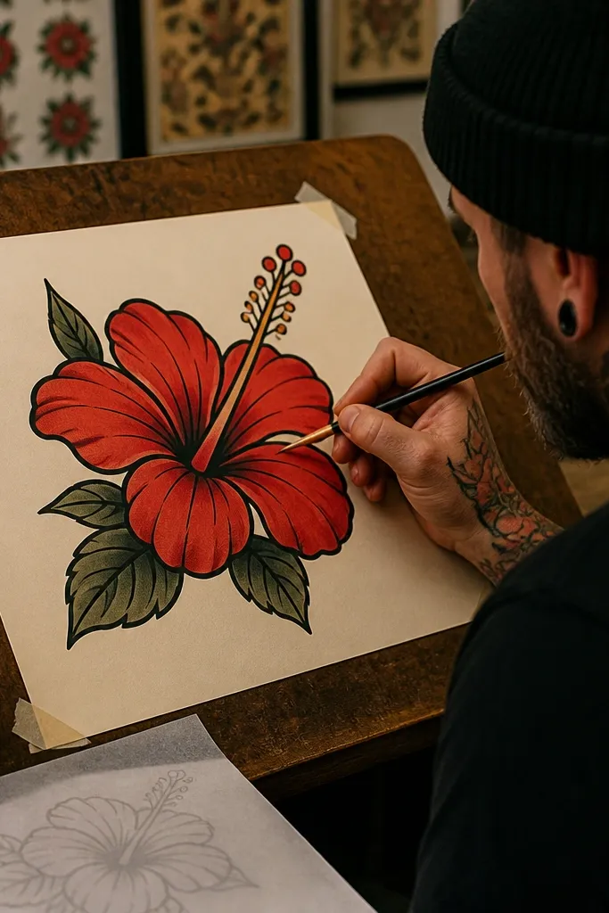
Tattoo-flash style looks clean, graphic, and instantly recognizable. Bold outlines give you that “inked” look, and limited shading keeps the petals from turning muddy. Use red as a single accent color with small darker red shadow areas near the petal base. The center can have simplified stamens — just enough detail to read as hibiscus. This is ideal for people who want a strong finished drawing that still feels DIY. Skill level is moderate because line work has to be confident.
Draw the hibiscus in pencil with a clear silhouette: five petals, a thick throat, and a center column. Ink it with a bold fineliner or brush pen for outer lines, then use a thinner pen for stamens. Color the petals with flat red, leaving small white highlight gaps at the edges. Add two shadow tones: a darker crimson at the throat and a mid red shadow band halfway down each petal. Finish with tiny anther dots and a light red rim outline to separate overlapping petals.
Pro tipDo your outline first, then color — coloring over weak lines makes correction harder.
AvoidDon’t over-shade the petals with gradients; tattoo flash looks best with controlled, limited shading.
15. Red Hibiscus with Thick Marker Edges and Soft Interior
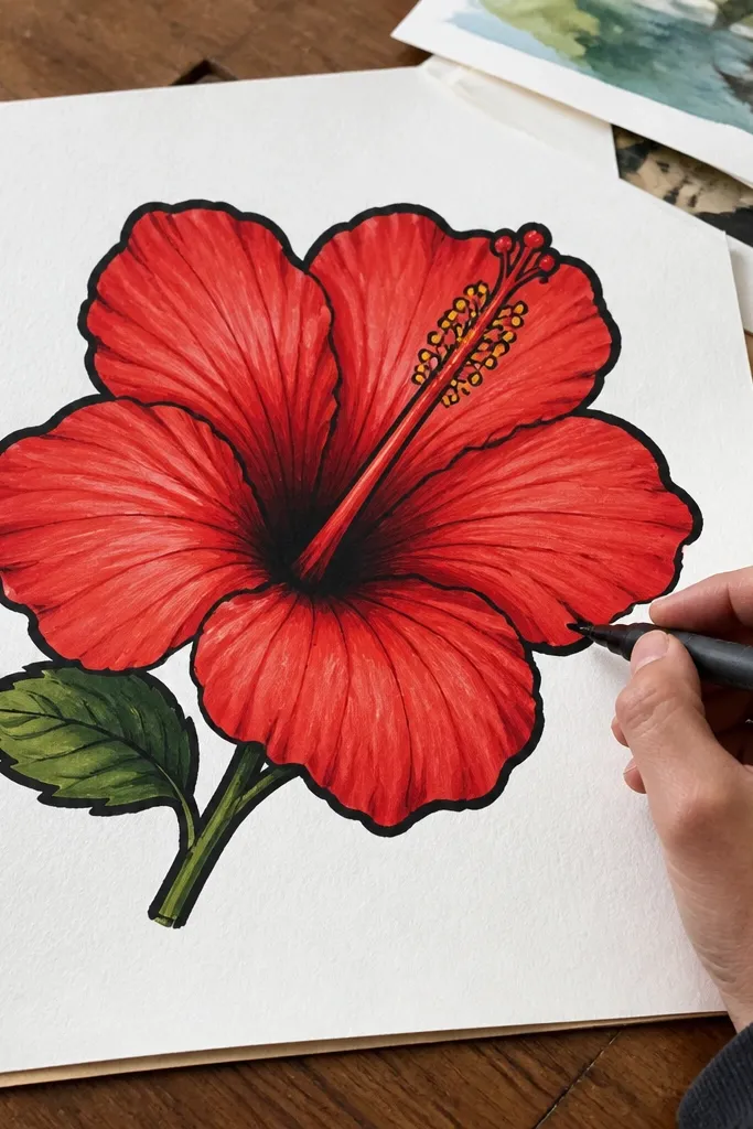
This is a modern, poster-ready look that reads well from far away. Thick marker edges create crisp petal borders, while softer interior shading keeps it from looking like a coloring book. Hibiscus petals have natural curves, so the marker outline makes the flower’s silhouette feel smooth. Use a limited number of reds so it stays clean. Skill level is easy to moderate, and it’s fast once you have the outline right.
Sketch the hibiscus lightly with pencil so you can place the throat and petal overlap accurately. Ink the outer petal edges with a chisel-tip marker in deep red, making sure each petal has a clear boundary. Then fill the petal interior with a lighter red marker or colored pencil, keeping it lighter near the edge. Add darker red only at the throat bowl and a short shadow where petals overlap. Finish with a gel pen highlight line on each petal edge and a few small dots for stamen tips.
Pro tipTest your marker on scrap first — chisel tips vary, and you want a consistent line width.
AvoidDon’t color the marker outline wet with more marker; it smears and kills the clean edge.



