
1. 2-Value Pencil Cake Sketch (Light/Mid/Dark Lite)
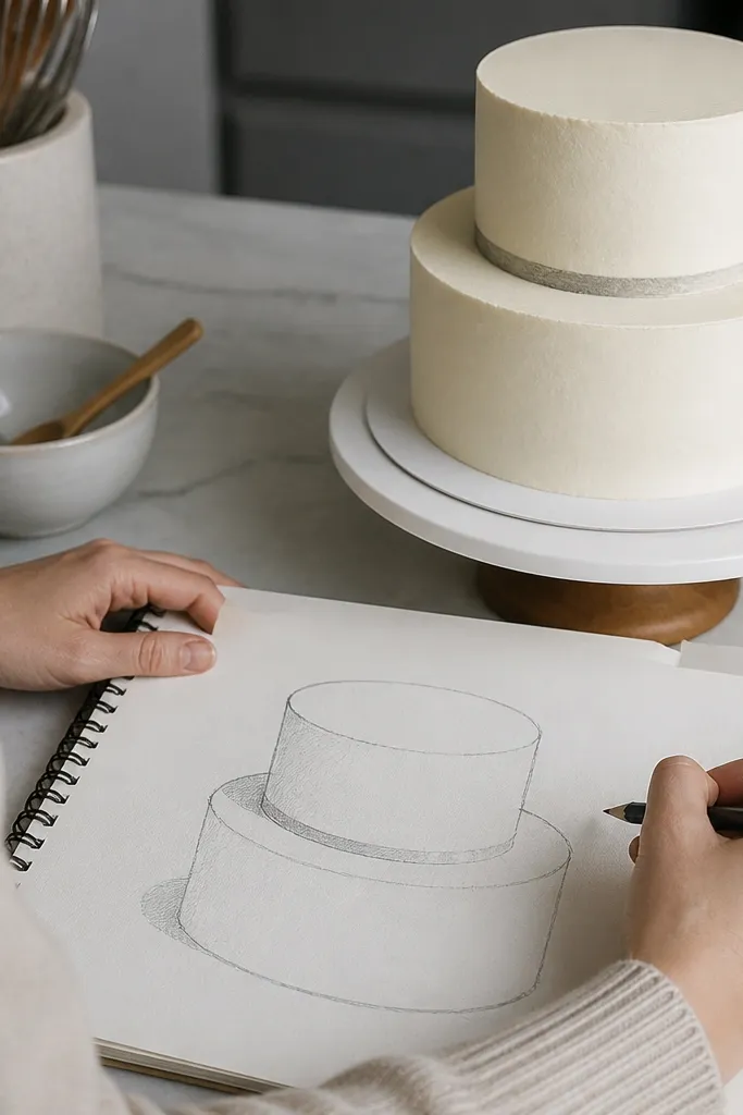
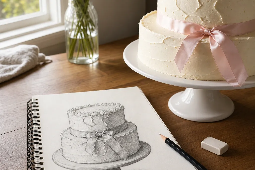
This is the best cake drawing style for beginners because it limits the chaos. You only commit to two shading levels: a light plan for the frosting volume and a darker underside shadow where tiers overlap. The result reads as a cake even if your frosting details are minimal. It also teaches the exact skill you need next — controlling value without over-rendering every sprinkle.
Start with a single-page layout: draw the top tier as an oval, then add a slightly wider oval for the bottom tier. Sketch frosting thickness using light lines — keep the sides smooth and parallel. Then block in your shadow with a soft pencil (like 2B): one shadow under the top tier overhang and one shadow where frosting meets the cake edge. Finally, add 3-5 frosting highlights as thin erased bands, not as full texture.
Use a kneaded eraser for highlights so you can lift pencil without tearing the paper.
Don’t shade the whole frosting surface; if you fill it in evenly, the cake loses its form.
2. Outline + Simple Shadow Blocks (Tier-first)
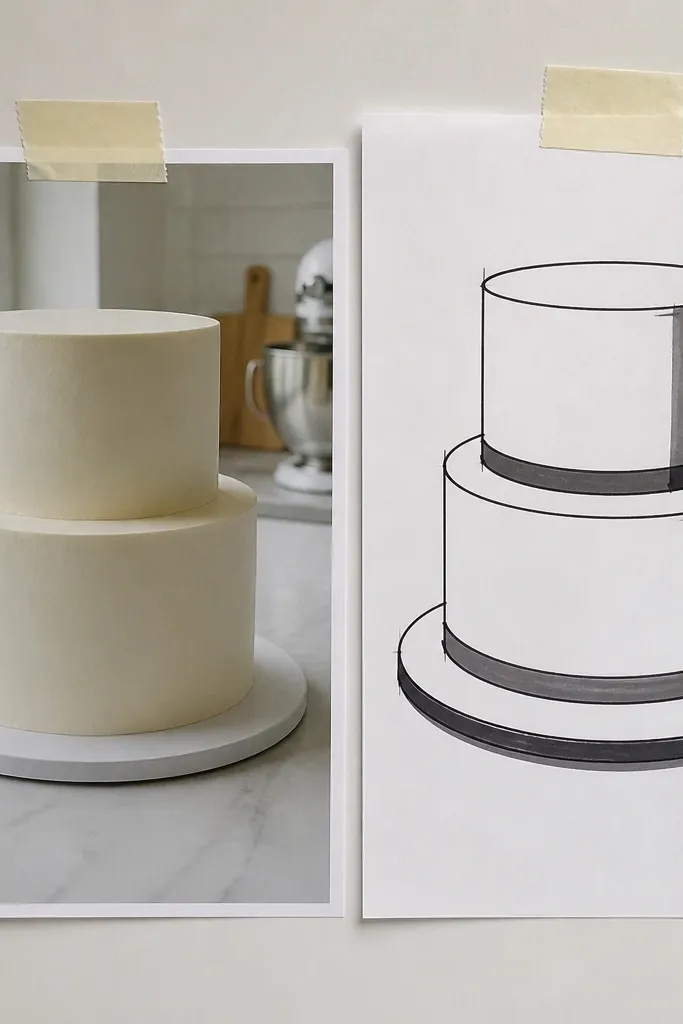
This style makes cakes look “designed” fast because the shadows are graphic, not realistic. Beginners get a clear payoff: the tiers feel stacked, not floating. It works especially well for buttercream cakes with straight edges, where the frosting forms flat planes. If you’re drawing from a photo and can’t nail texture, this approach still lands because it focuses on structure.
Pro tipPick one pencil hardness for outlines (HB for light, 2B for darker) and stick to it until the final pass.
First, sketch tier shapes lightly: cylinders or slightly rounded rectangles, with the top and bottom ellipses centered. Next, draw one consistent outline weight — don’t vary thickness yet. Then add shadow blocks using a pencil or brush pen: one block under each overhang and a thin block on the inside edge where frosting curves. Shade inside the blocks only; leave the rest of the frosting mostly clean so the cake silhouette stays readable.
AvoidAvoid adding tiny texture marks before the tier shadows are in — they make the drawing messy.
3. Frosting Drip Style (Cartoon Realism)
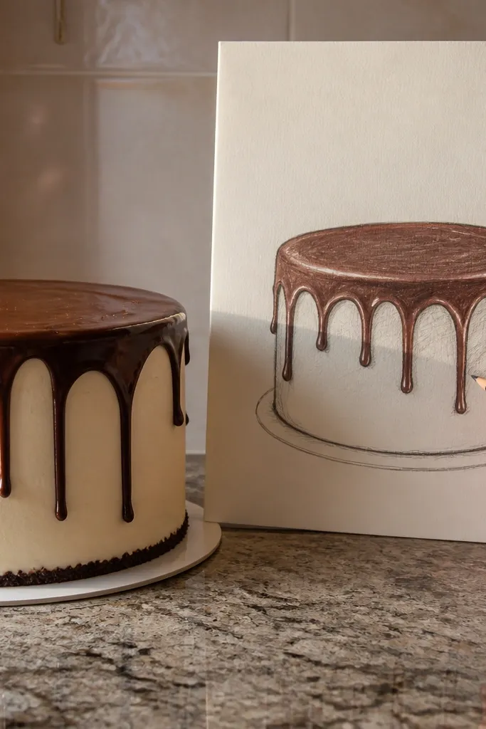
Drips are a cheat code for beginners because they give you a signature frosting detail without needing realistic sprinkles. You’ll get a cake that looks playful but still dimensional when you shade the underside of each drip. This style is great when you want to draw a birthday cake quickly and still have it look intentional. The skill it builds is edge control: drips taper and overlap, so your lines teach themselves.
Pro tipUse a ruler or straight edge to mark the top frosting line so all drips start at the same height.
Draw the cake tiers as simple cylinders first, then add a drip starting from a frosting line at the top edge. Make each drip slightly uneven: wider at the top, narrower at the bottom, with 1-2 drips crossing the tier edge. For shading, add a darker line where each drip meets the frosting above, then shade only the underside of the drip shape. Finish by placing 2-3 tiny highlight gaps — leave the paper white or erase a thin streak.
AvoidDon’t make every drip the same width and length; repetition kills the illusion fast.
4. Marker Outline with Flat Wash (No Gray Mud)
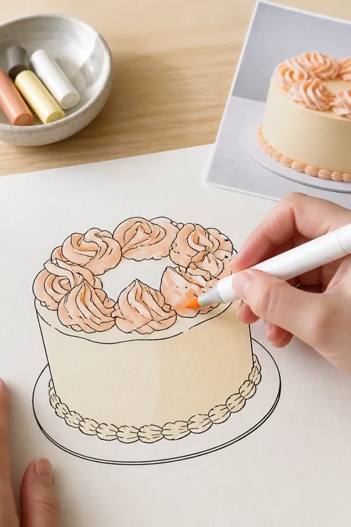
If you want a crisp look without pencil smudges, this is the beginner-friendly pen-and-color route. The outline stays sharp, and the color wash gives form without you having to blend gradients. It’s also practical for cards and social posts because it dries fast and looks finished. You still learn value — just in a simplified way — by keeping one shadow wash under tiers.
Pro tipTest marker color on scrap first so you know how dark it will dry before committing to the cake.
Start with a light pencil sketch of tier shapes, then trace the outlines with a fine marker (use a single pen width for consistency). Add frosting color with a flat wash or solid marker fill, leaving a small uncolored edge highlight on the inner tier curve. Then add one shadow wash under each overhang using a slightly darker version of the frosting color or a neutral like warm gray. Let it dry, then reinforce only the drip or tier edge lines with the fine marker.
AvoidDon’t try to blend the wash like watercolor; flat shapes look better than muddy midtones.
5. Cross-Hatch Frosting Texture (Pencil Contrast)
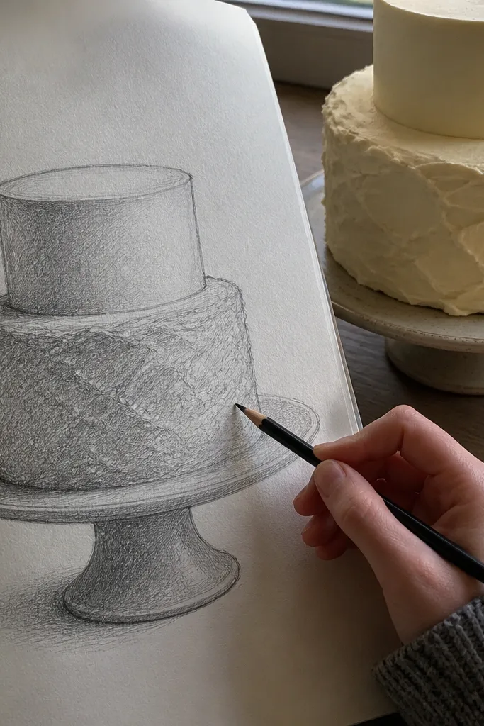
This style is for beginners who like pencil texture and want their cake to look more “baked” than cartoon. Cross-hatching creates the illusion of frosting softness without needing realistic detail. The trade-off is time and control — it’s easier to overwork. If you’re learning, this is best used on one area at a time, like the side frosting plane, while keeping the top highlight clean.
Pro tipUse a softer pencil for shadows (2B or 4B) but keep the hatch spacing tight and consistent.
Sketch the cake tiers and frosting thickness lightly first. Choose one direction for your first hatch lines (for example, slanted 30-45 degrees) and keep them evenly spaced. Add a second set of hatch lines only in the shadow zones — the underside under tiers and the inner curve where frosting turns. Leave the top frosting plane lighter by using fewer lines there, then use an eraser to lift a highlight band along the frosting edge.
AvoidAvoid cross-hatching the highlight area — it turns the whole frosting gray.
6. Line-Weight Pen Drawing (Outline Discipline)
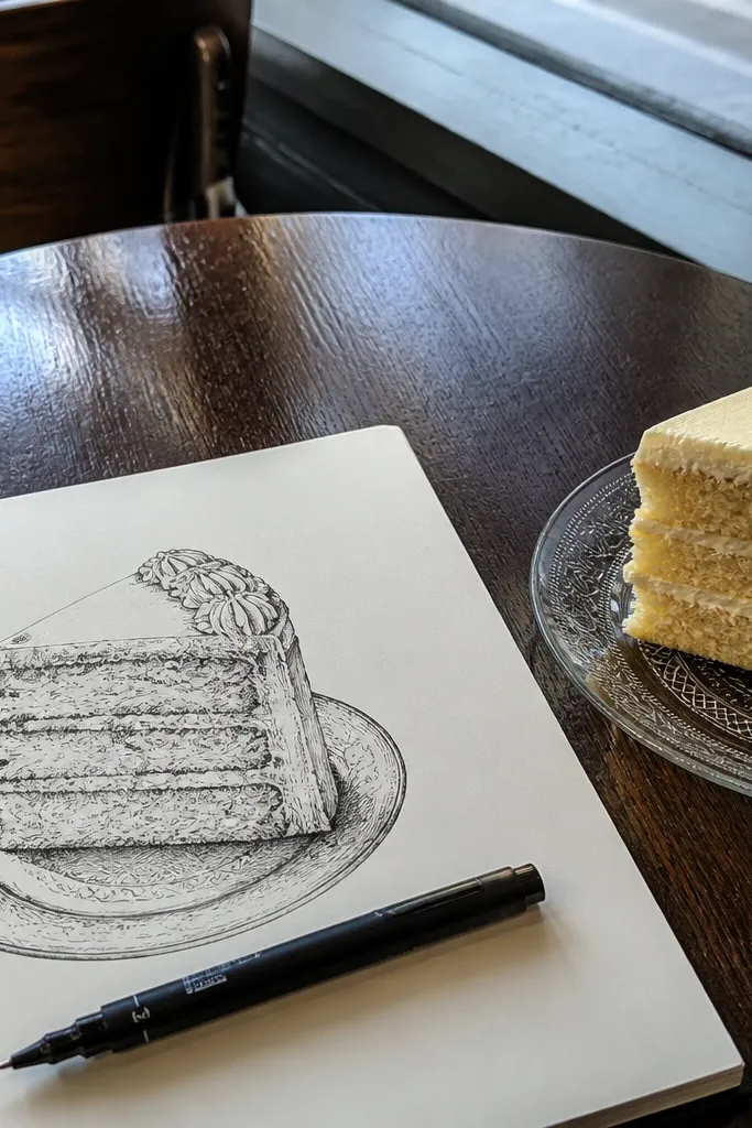
This style gives the cleanest “bakery illustration” look, but it’s the least forgiving. The win is line weight: thick lines for the outer silhouette, thinner lines for frosting folds and internal edges. Beginners who struggle with wobbly outlines still benefit because the method forces you to plan your line passes. It’s also excellent for practicing steady hand control on a small subject like a single-tier cake.
Pro tipUse a single sheet under your hand so you don’t smear graphite while you ink.
Draw the basic tier shapes in pencil: top ellipse, bottom ellipse, then connect with light sides. Ink the outer silhouette first with a thicker pen or marker, then wait for it to dry. Ink inner edges with a thinner pen — frosting thickness line, drip boundaries, and the separation between tiers. Finish by adding one dark accent line under the overhang and a small highlight gap by leaving paper uninked.
AvoidDon’t add lots of interior lines early; decide where the thick outline ends before you start inking.
7. Ribbon Stripe Cake (Beginner Geometry)
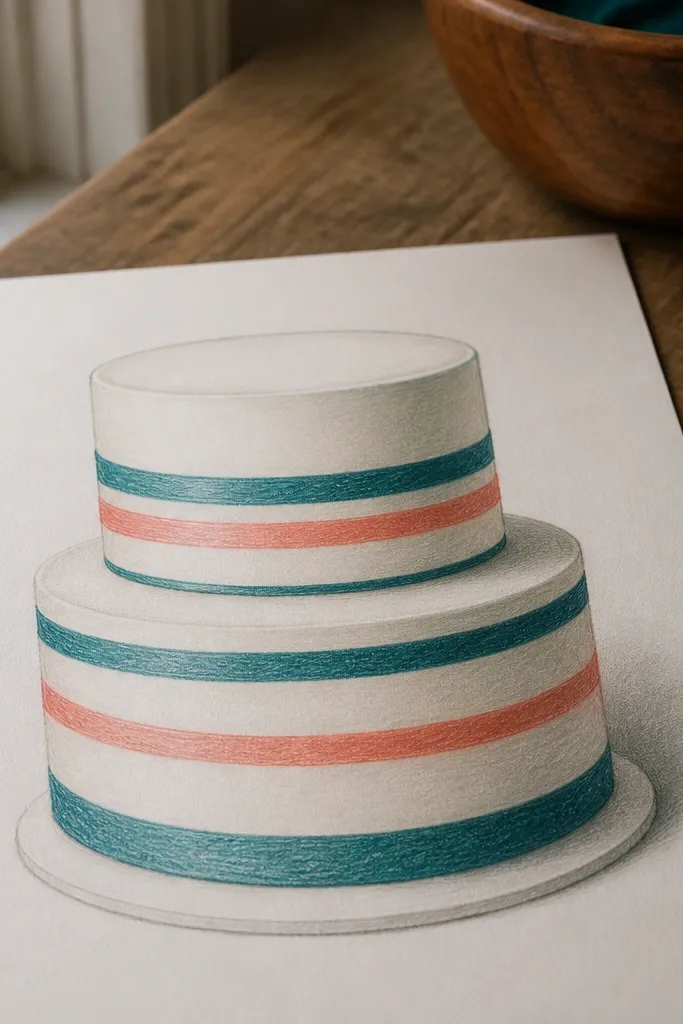
Ribbon stripes are the easiest way to make a cake look “finished” without texture rendering. The stripe gives you a focal point and teaches beginners how to wrap a band around a cylinder. You still get depth from one shadow under the top tier edge, so the cake reads as stacked. This style also works if you’re drawing from memory, because the band shape is predictable.
Pro tipMap the ribbon stripe width with two light guideline marks so it stays even across the cake.
Sketch tier cylinders first and keep the frosting sides smooth. Add the ribbon stripe as a curved band: draw its top curve and bottom curve following the cylinder shape, then connect the ends. Shade only the shadow under the top tier overhang and keep the ribbon mostly flat with a single darker edge line. Add a couple of small highlight gaps on the frosting band edges so it looks wrapped, not painted on top.
AvoidAvoid making the ribbon stripe perfectly straight across the front; it breaks the cylinder illusion.
8. Rosette Cluster Cake (3-Rosette Rule)
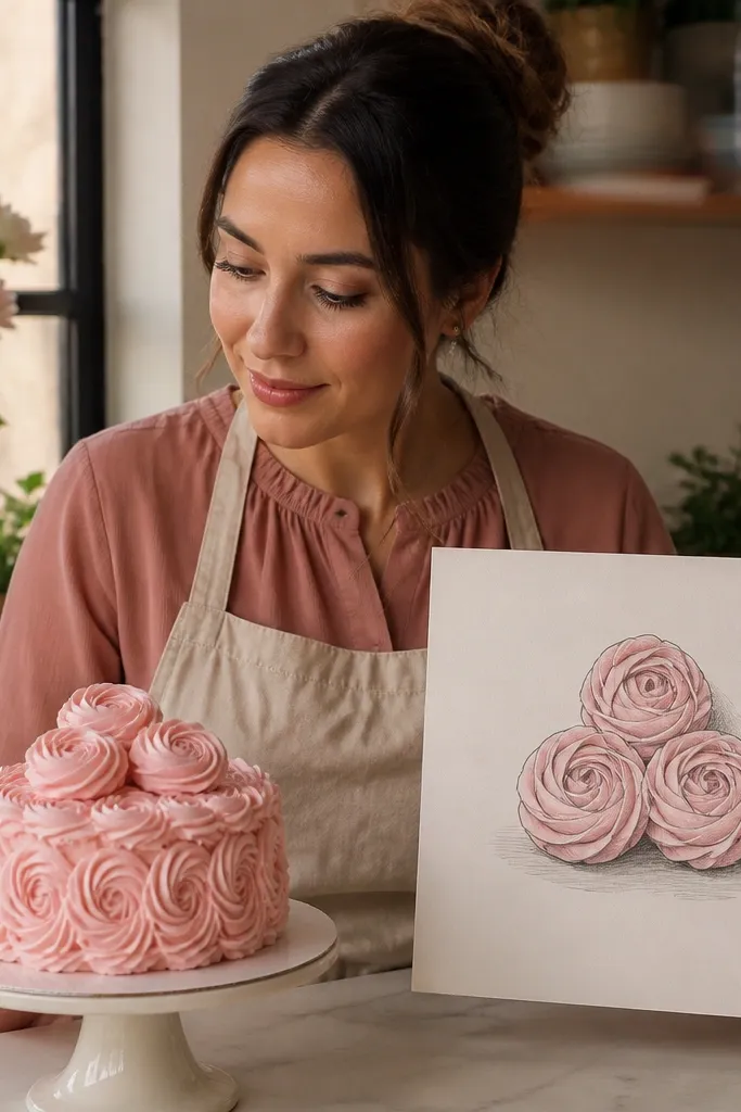
Rosettes look complicated, but beginners can draw them convincingly by limiting the number of swirls. This style gives you a clear “pattern” to repeat: three rosettes with small overlaps and a simple shadow under the cluster. The cake looks like it has piping work without drowning you in tiny linework. It’s a great choice when you want a more decorative cake top but still want to finish quickly.
Pro tipKeep rosette spacing consistent by using light dots for their centers before you draw the swirls.
Start with a clean top-tier ellipse and draw the frosting edge line. Place one rosette in the center, then two rosettes to the sides, slightly overlapping like a triangle. Draw each rosette as a spiral of connected loops, then thicken the outer edge with a darker line. Add shading only under the rosette cluster where it meets the frosting surface, and leave the rest of the top relatively light.
AvoidDon’t add sprinkles everywhere; three rosettes plus a shadow is enough to make it read as a piped cake.



