
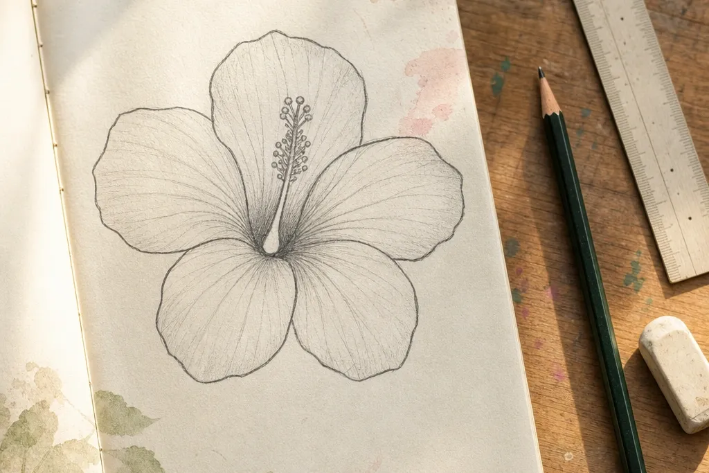
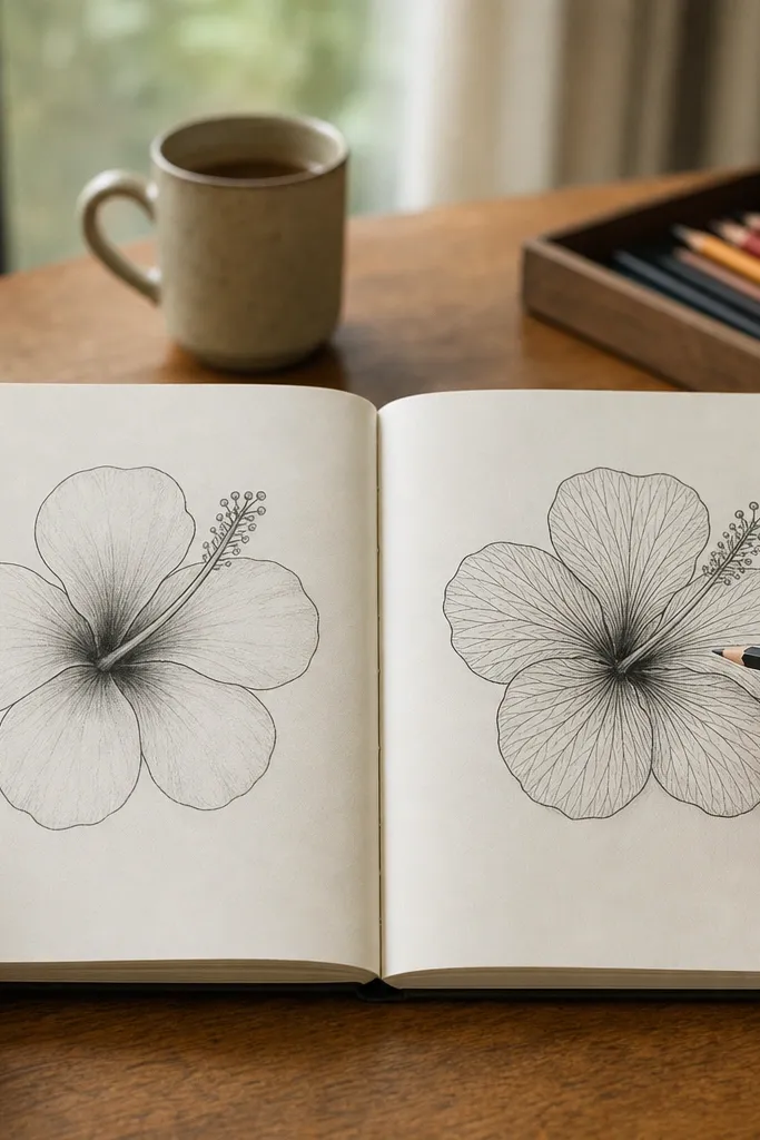
1. Structured Pencil Hibiscus with a Center Teardrop
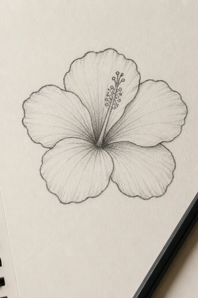
This is the best starting point because it locks the hibiscus into a shape you can repeat. You draw five main petals around a center teardrop, then you add a few hinge lines where petals overlap. The result looks like a hibiscus even if your shading is light, because the silhouette does the heavy lifting. Use a soft HB to sketch, then an HB or 2B to darken only the petal edges and the center. This style is perfect for learning proportions, practicing symmetry, and fixing problems with an eraser before you commit.
Start by drawing a light oval for the center, then add a teardrop shape pointing down from it. Sketch five petals around it using the same “comma” curve for each petal, keeping their widths consistent. Lightly draw 2-3 overlap lines where petals cross, then darken the outer petal edges with a slightly harder pencil (HB) and add the center outline with 2B. Finish by drawing 6-10 short vein lines that start near the petal base and stop halfway, leaving the rest blank.
Put your pencil down on the paper and rotate the wrist for each petal — it keeps the petal curvature consistent.
Don’t shade the entire petal; keep value only at the petal base and one side.
2. Ink Outline Hibiscus with 3 Shadow Shapes
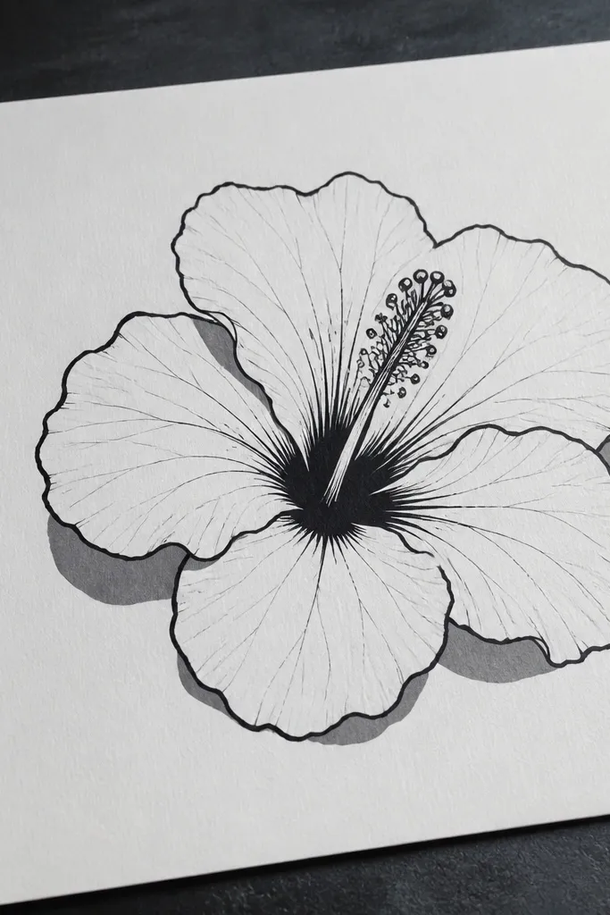
If your pencil sketches look “pretty but unfinished,” ink fixes that fast. This style uses a clean outline and only three shadow shapes, so beginners don’t drown in gradients. The hibiscus reads clearly because the eye catches the thick outer edges and the center contrast. Use waterproof ink so your shadows don’t smear if you add color later. It’s ideal for cards, stickers, or any drawing where you want crisp edges and a finished look without complicated rendering.
Draw the hibiscus in ink with light construction first: a faint pencil layout for the five petals and center teardrop. Trace the outer petal edges with a brush pen or fine liner, using thicker strokes on the outside rim. Add shadows as three simple shapes: one at the base of each top petal, one on the left side where petals overlap, and one under the center. Keep the shadows solid and small — you’re building contrast, not painting realism.
Use a brush pen for outlines and a 0.3 or 0.5 liner for veins so the line-weight change looks deliberate.
Don’t add 20+ vein lines; six to ten clean lines is enough for a hibiscus to feel real.
3. Hard-Edge Marker Hibiscus with Light-to-Dark Petal Steps
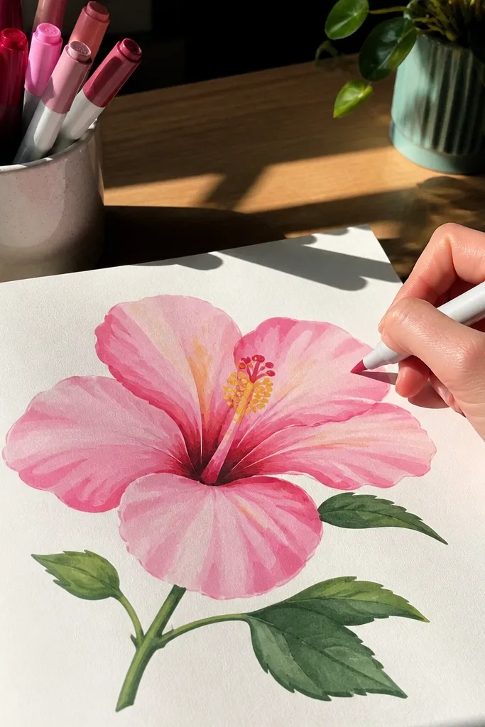
This style gives you a bold hibiscus look without teaching you soft blending yet. Markers can go wrong when you try to blend every edge, so the trick is to use hard-edge color blocks and controlled overlap. You build petal color in steps: light base, darker edge stripe, then a small center glow area. The flower looks layered because each petal has a highlight and a darker rim. This is the best choice if you want color quickly and you don’t want to spend time learning shading gradients.
Start with a pencil sketch of the five petals and center teardrop, then erase lightly so pencil doesn’t show through. Color the entire petal with a light marker tone first, staying inside the outline. Add a darker stripe along each petal edge and around the petal base, then leave a small highlight area near the top of each petal uncolored. Finally, color the center with a warm yellow or pale cream and add darker dots at the stamen base.
Pro tipWork in this order: light tone first, then dark. If you do it backwards, you’ll lift pigment and get muddy edges.
AvoidDon’t press hard on the first pass; marker dents the paper and makes later layers look patchy.
4. Pencil + Blending Stump Hibiscus for Soft Petals
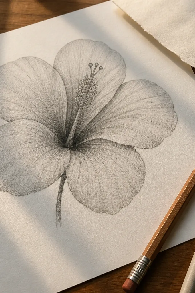
This is the style for people who want a “silky petal” look without switching to watercolor. The blending stump (or tortillon) lets you smooth value transitions so the hibiscus feels rounded. You still keep the beginner structure: five petals, center teardrop, and vein lines kept light. The difference is in the shading strategy: you place shadows first as shapes, then blend them slightly so edges stay clean. It’s slower than ink or marker, but it teaches shading in a controlled way.
Sketch the hibiscus lightly with HB pencil, then darken outer petal edges with 2B. Block in shadows using a 2B or 4B pencil at three spots: petal base, one side overlap, and around the center. Blend with a stump using short strokes that follow the petal curve, not back-and-forth scribbles. Leave the highlight strips lighter and avoid blending over your vein lines — keep veins visible by drawing them after blending.
Pro tipUse a kneaded eraser to lift a thin highlight line near the petal top once the shading is blended.
AvoidDon’t blend the center completely; keep the center darker and sharper so the flower doesn’t flatten.
5. Watercolor Wash Hibiscus with Wet-on-Dry Edges
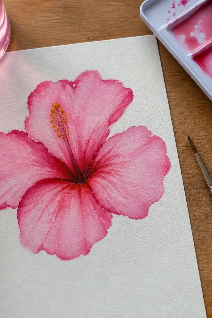
Watercolor is a good beginner project if you use the right sequence: wash the petal silhouette first, then add darker edges once the base is set. This style makes hibiscus petals look airy and natural because watercolor naturally creates soft transitions. You’ll get a hibiscus look without perfect realism since the silhouette and a few darker veins do most of the work. It’s best on heavier paper so the washes don’t bleed into a gray mess.
Tape or clip watercolor paper so it stays flat, then sketch the hibiscus lightly with pencil. Wet one petal at a time with clean water, then apply a light wash of your main color and let it spread to the petal edges. Once the base wash is dry or nearly dry, add a darker edge wash along the rim and a small shadow at the petal base. Use a small round brush to paint a few vein lines from base to mid-petal, then add the center with a quick yellow wash.
Keep a paper towel nearby and dab the brush before you touch down on the edge; it stops blooms from getting too wide.
Don’t paint all five petals at once — you’ll lose control of edges and they’ll merge into one shape.
6. Gel Pen Hibiscus Veins and Dots Center Detail
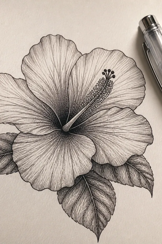
This style makes a hibiscus look detailed without heavy shading because gel pens let you draw crisp micro-lines. The trick is to treat veins like a pattern, not like realism. You draw the petal outline lightly or in ink, then place vein lines in consistent directions and spacing. The center gets a dotted highlight and a few thicker lines so it looks alive. It’s a great option if you want decorative art, planner stickers, or a drawing that looks finished with minimal color work.
Start with a light pencil sketch of five petals and a center teardrop, then ink or darken the outer outline. Use a fine gel pen to add 8-12 vein lines per petal that start at the base and stop around the middle, keeping them slightly curved. Add a small cluster of tiny dots in the center for stamen texture, plus 2-3 thicker lines to define the center folds. Finish by drawing a darker rim line along the petal edges so the veins don’t float.
Use gel pens on a smoother paper for tighter dots; rough paper makes veins look fuzzy.
Don’t overdo veins on every petal equally; vary density so the center stands out.
7. Colored Pencil Hibiscus with Burnt Rim Edges
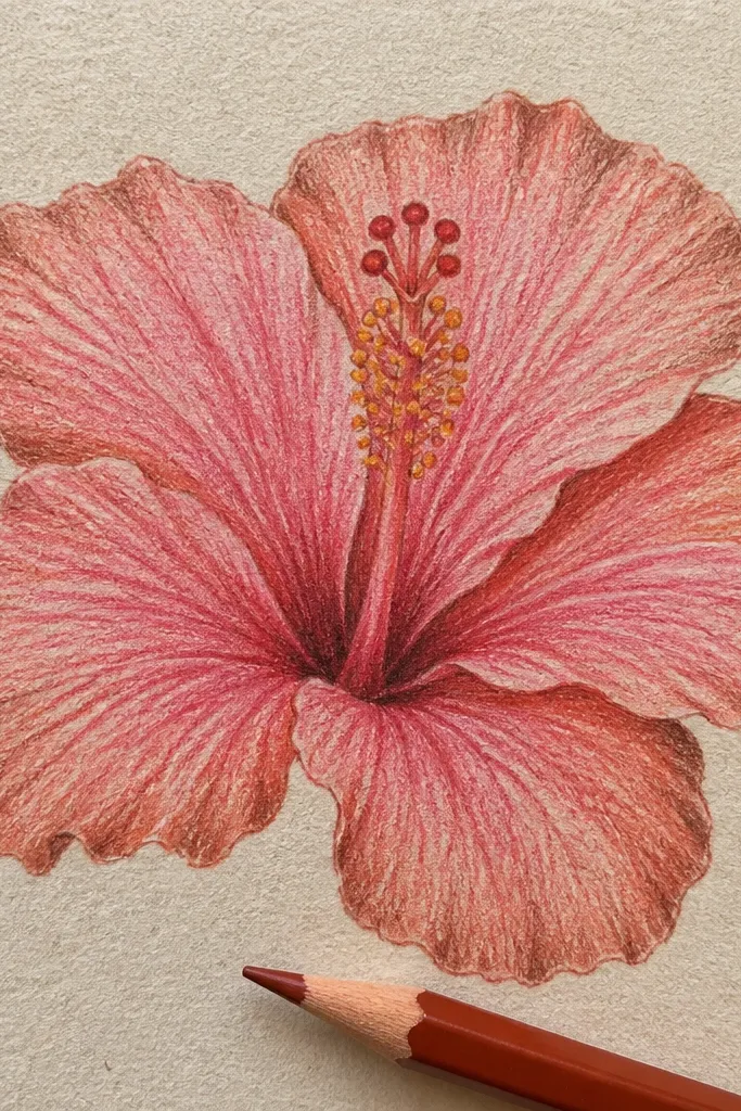
Colored pencil is slow but controllable, and this approach gives you a hibiscus that looks layered without blending tools. You build color with a light base, then add a burnt rim edge and a few shadow strokes at overlaps. The rim edge trick makes petals look like they curve forward. This style also teaches how to shade with pencil pressure: light pressure for base color, heavier pressure for the rim. It suits beginners who want control and don’t mind taking 30-50 minutes for a polished result.
Sketch the five petals and center teardrop with HB, then erase the sketch lightly. Color the full petals with a light main color using light pressure so the tooth of the paper shows through. Next, add a darker burnt tone along each petal edge and at the overlap lines, keeping the dark area thin. Finally, layer a warm shadow at the petal base and draw vein lines in a slightly darker pencil, then lightly burnish the center for contrast.
Sharpen your pencil to a fine point for veins — dull tips turn lines into smudges.
Don’t try to erase colored pencil; plan your highlights before you start shading heavily.
8. Two-Tone Hibiscus Study with One Highlight Strip
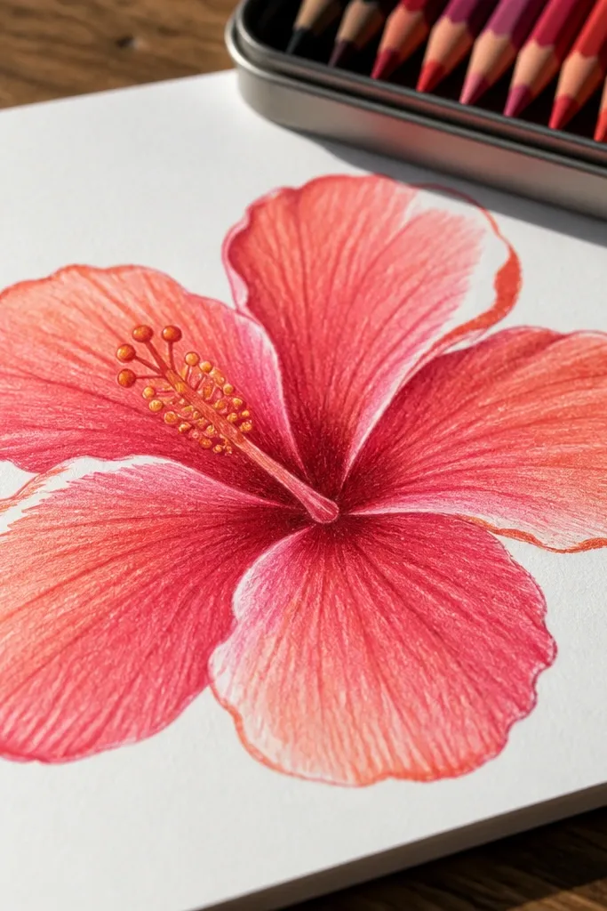
This style is a beginner cheat code for depth. Instead of blending, you pick two tones and reserve one highlight strip on each petal. The hibiscus looks dimensional because the highlight strip tells the viewer which side faces the light. You still keep the same structure: five petals and a center teardrop, but the shading decisions are reduced to one rule. This is ideal if you’re frustrated by shading that looks patchy or “gray everywhere.”
Draw the hibiscus framework in pencil: five petals with consistent width and a center teardrop. Choose a light tone and a darker tone, then color the petals with the light tone first. Leave one narrow highlight strip near the top of each petal uncolored or lightly colored, then apply the darker tone as a band along the petal edge and base. Add vein lines lightly with the darker tone and finish the center with a warm yellow and a few darker dots.
Pro tipPick your highlight strip width before you start coloring, then keep it the same width on all five petals.
AvoidDon’t shade over the highlight strip; that single decision is what keeps the petals from looking flat.



