
1. Oval Shell Cartoon (front-and-center cuteness)
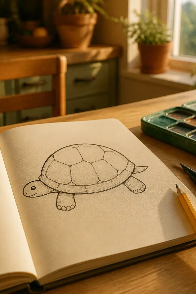
Step 1: Draw a large vertical oval for the shell, then add a shallow “lid” curve at the top where the head will peek out. Step 2: Place the head as a rounded triangle with a small curve for the mouth, then add four leg bumps as rounded shapes tucked under the shell edge. Step 3: Mark 6-10 scute lines that radiate from the center of the shell oval, keeping them evenly spaced. Step 4: Ink with a 0.5 fineliner: trace the shell outline, then add scute lines and eye/nose details.
This style is the fastest route to a turtle that reads clearly at a glance. You’re drawing one big shell oval first, then placing the head and legs as simple attachments under the shell edge. The shell doesn’t need scutes everywhere; you can add 6-10 scute lines total so it still looks like a turtle without turning into a pattern exercise. Use thicker lines for the outer silhouette and thinner lines for the scute marks, so the drawing has hierarchy even with minimal detail. It’s great for sketchbook practice, quick stickers, and classroom-friendly drawings.
AvoidDon’t add lots of scute lines before the shell outline feels like a real 3D dome.
Pro tipKeep the shell outline slightly thicker than the legs. That one line-weight choice makes the whole turtle look finished.
2. Chibi Proportions Turtle (big head, tiny body)
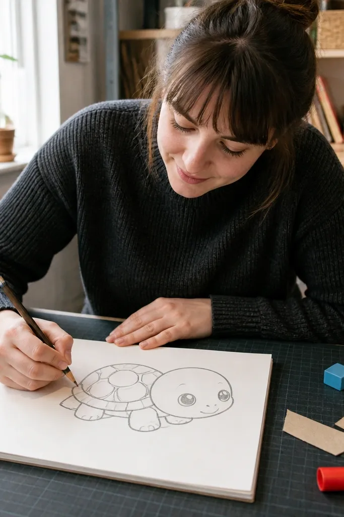
Step 1: Draw a near-circle shell, then add a slightly smaller circle inside as a guide for scute placement. Step 2: Draw the head as a large rounded shape that overlaps the shell opening, and add two small nostrils and a simple smile curve. Step 3: Sketch legs as short rounded rectangles that peek out from under the shell. Step 4: Add a small number of scute lines (4-6) that stay inside the shell circle so the pattern doesn’t sprawl.
Chibi proportions make turtles look adorable even when the drawing is simple. The trick is exaggeration with control: the head gets bigger than the shell opening, but the shell still has to sit under it like a real structure. You’ll use round shapes for everything — shell is a near-circle, legs are short cylinders, and the face has one confident eye shape. This style is forgiving because humans tolerate “wrong anatomy” when the proportions scream cute. It’s perfect for character practice, study sheets, and drawing turtles on top of other doodles.
AvoidDon’t shrink the shell too far. If the shell becomes tiny, the turtle stops reading as a turtle.
Pro tipIf your turtle looks too serious, tilt the head angle a few degrees and keep the mouth curve higher than you think.
3. Gesture + Silhouette Turtle (practice speed)
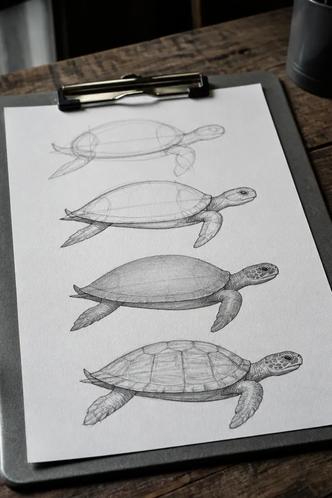
Step 1: With a soft pencil (2B or B), draw a single sweeping outline that includes shell, head, and the leg placements in one pass. Step 2: Add a second pass to refine the silhouette thickness: shell outline is darker, legs are lighter. Step 3: Put 3-5 short scute marks on the shell dome only, following the shell’s curvature. Step 4: Erase stray construction lines and leave the silhouette clean.
This is the style you use when your turtles look stiff or “different every time.” You’re training the pose first, not the details. Start with a confident silhouette: shell dome, head position, and leg placement that makes the motion feel intentional. Then you can add just a few scute hints at the end. Because you’re not chasing texture, you spend your time on shape control — the thing that makes drawings look consistent across multiple attempts. It’s also the best warm-up before you do scute-heavy realism.
AvoidDon’t pause for detail while the pose is still messy. Lock the silhouette first.
Pro tipAim for fewer lines than you want. A good silhouette turtle often needs only 12-20 total marks.
4. Profile Shell Blueprint (side-view anatomy)
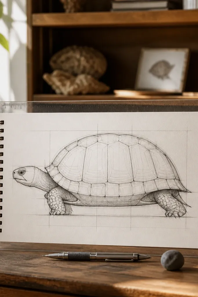
Step 1: Draw a long rounded rectangle for the shell profile, then add a top dome curve and a bottom edge curve. Step 2: Sketch the head as a pointed oval that meets the shell edge at a clear joint, and draw the tail as a small wedge behind the shell. Step 3: Add legs as two simple arcs or rounded blocks under the shell edge, keeping their thickness consistent. Step 4: Add scutes as curved bands that follow the dome, 5-8 total lines.
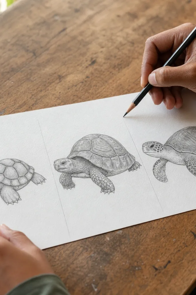
Side views expose proportion issues fast, so this style is a great fix if your turtles look lopsided in profile. You draw the shell as a structured dome shape, then place the head and legs with clear attachment points. Instead of freehanding scutes, you map them to the shell’s curve so the pattern wraps naturally. This style gives you clean, repeatable results for bookmarks, character sheets, and turning turtles into a consistent “model.” It takes longer than cartoon, but it saves you from redesigning the same turtle every time you draw it from the side.
AvoidDon’t draw scutes as straight stripes. They need to bend with the shell profile.
Pro tipUse a ruler lightly for the initial shell profile. You can erase it later, but it stops the dome from wobbling.
5. Grid-to-Scutes Realism (pattern that actually wraps)
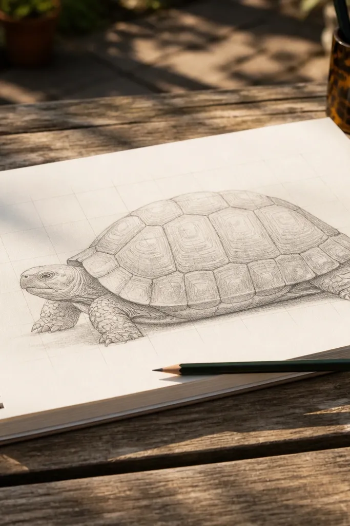
Step 1: Lightly draw a large oval shell, then draw a simple grid over it (a few vertical and horizontal lines, not a full checkerboard). Step 2: Mark the center line and place scute boundaries as curved lines that follow the grid intersections, then erase the grid lightly. Step 3: Shade with graphite: use HB for midtones and 2B for boundaries, keeping your shading direction consistent (top to bottom on the dome). Step 4: Blend only the shell top; leave scute edges slightly sharper for clarity.
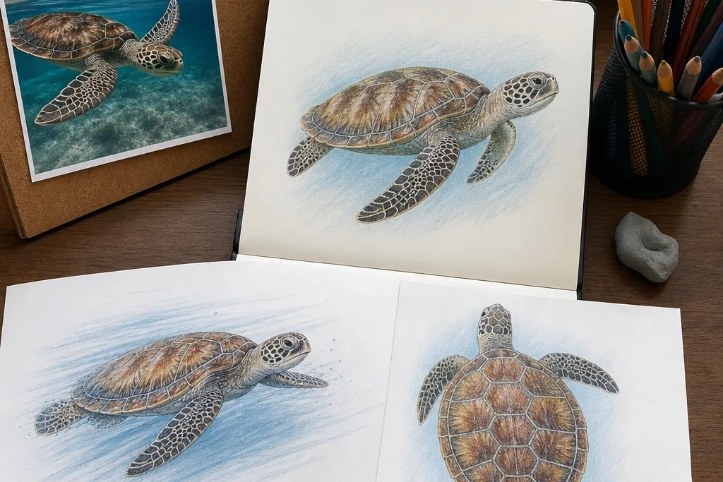
If you want realism without losing your mind, this is the most reliable method. You start with a grid to control placement, then you turn the scute lines into curved forms that wrap over the shell. The shell has volume, so the scutes should look slightly wider where the shell bulges toward you and tighter where it curves away. Add shading based on the dome — darker at the “under” edges and along the scute boundaries, lighter on the top highlight. This style works well for portraits on paper, study drawings, and textured shell practice.
AvoidDon’t outline every scute with the same darkness. Real turtles have hierarchy — some lines disappear into shadow.
Pro tipPut your darkest value only on scute boundaries and the underside edge. That keeps the shell from turning into a gray blob.
6. Contour + Shading Study (clean 3D dome)
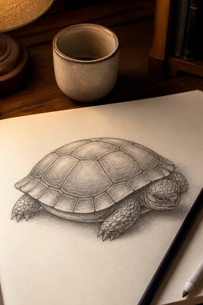
Step 1: Sketch a shell dome with a single guideline for the center ridge, then add 4-6 contour curves that wrap around the dome. Step 2: Place head and legs with simple shapes and keep their edges soft so the shell stays the focus. Step 3: Shade from the top highlight down to the underside using light pressure first, then build darker tones near the bottom edge. Step 4: Add scute boundary lines sparingly, only where they help the form.
This style is for when your turtles look flat even after you add scutes. Contour lines help you “feel” the shell’s roundness, and shading turns that feeling into a convincing dome. You’ll draw fewer scutes than realism, but the scutes you do draw will sit on top of a believable volume. It’s a great middle ground for people who like texture but hate over-detailing. Use it for practice that improves your drawing fundamentals fast.
AvoidDon’t shade every area evenly. A dome needs a clear highlight zone.
Pro tipBlend the shading with a tissue or blending stump, but keep the scute boundaries unblended so they stay crisp.
7. Watercolor Wash + Ink Scutes (soft texture, sharp edges)
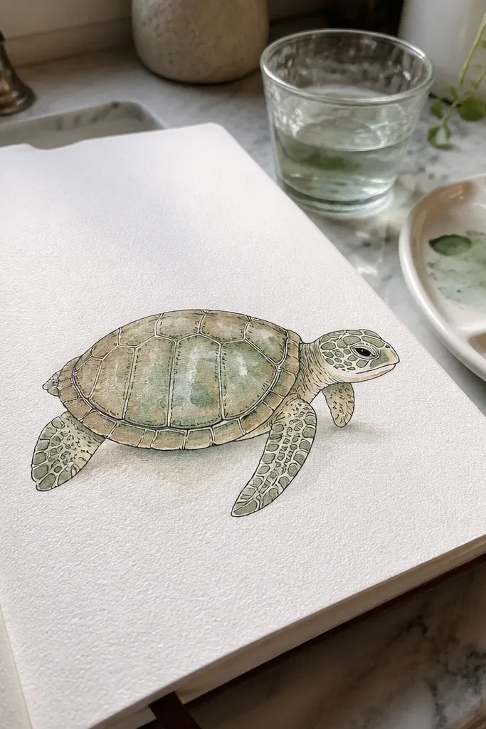
Step 1: Lightly pencil the shell dome and place head and legs, then paint a thin watercolor wash over the shell only. Step 2: Wait until the wash is dry, then ink scute lines with a brush pen or 0.3 fineliner; keep the scute lines curved to match the dome. Step 3: Add one darker wash at the underside edge and around the scute boundary areas. Step 4: Let it dry fully, then erase pencil marks carefully with a kneaded eraser.
This is the style to choose when you want a turtle drawing that looks finished without endless pencil rendering. You paint a light wash across the shell for the base tone, then ink the scutes so the pattern stays readable. The watercolor gives you natural variation — the shell looks like it has subtle mottling instead of uniform gray. Ink adds control: you decide where lines are bold and where they fade. It’s ideal for cards, journal pages, and any time you want color without losing the turtle identity.
AvoidDon’t ink while the watercolor is wet. The scute lines will feather and lose shape.
Pro tipUse thinner paint than you think. Turtle shells read better with light washes and inked structure than heavy paint coverage.
8. Marker Outline Turtle (bold edges, minimal interior)
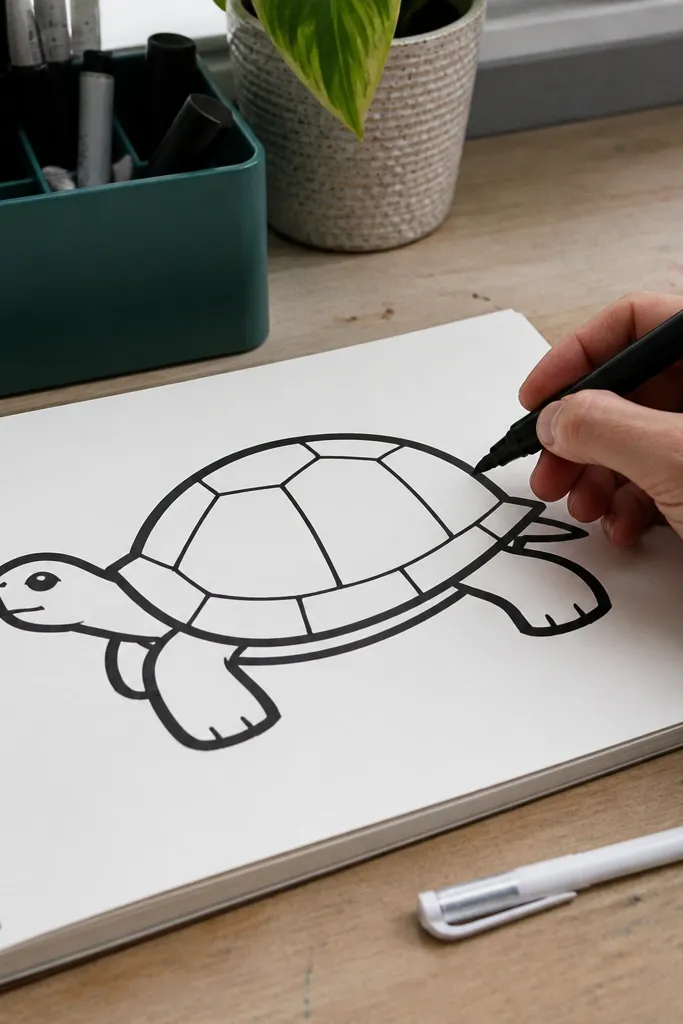
Bold outline styles are the easiest way to get a “finished” turtle quickly, even if your shading skills are still growing. You draw the shell dome with a strong outer line, then block in legs and head with simple shapes. Inside the shell, you keep scutes minimal — just enough lines to suggest segmentation. This style works especially well if you’re drawing on thicker paper or want consistent results for a series of turtles. It’s also great for practicing line confidence and cleaner silhouettes.
Step 1: Use a marker or brush pen to draw the shell outline first, then add head and legs as simplified shapes with the same line weight. Step 2: Add 5-8 scute lines with a lighter pen or the same marker but less pressure. Step 3: Color the shell with markers or leave it uncolored — either way, keep the scute lines visible. Step 4: Add eye and nostril details last so your face stays readable.
If your lines wobble, slow down and turn the page instead of your wrist. Marker wobble usually comes from wrist motion.
Don’t overfill the shell with dark marker. Leave white or light areas so the dome doesn’t look like a sticker.



