
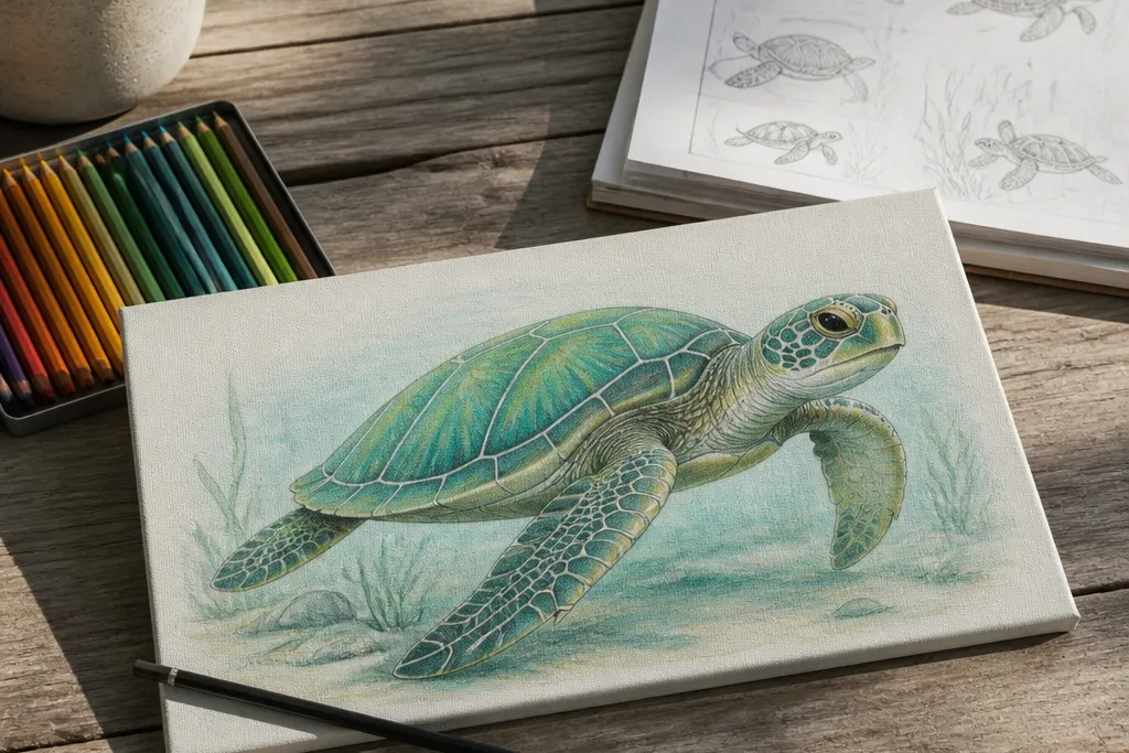

1. Minimal Oval Shell Turtle in Two Tones
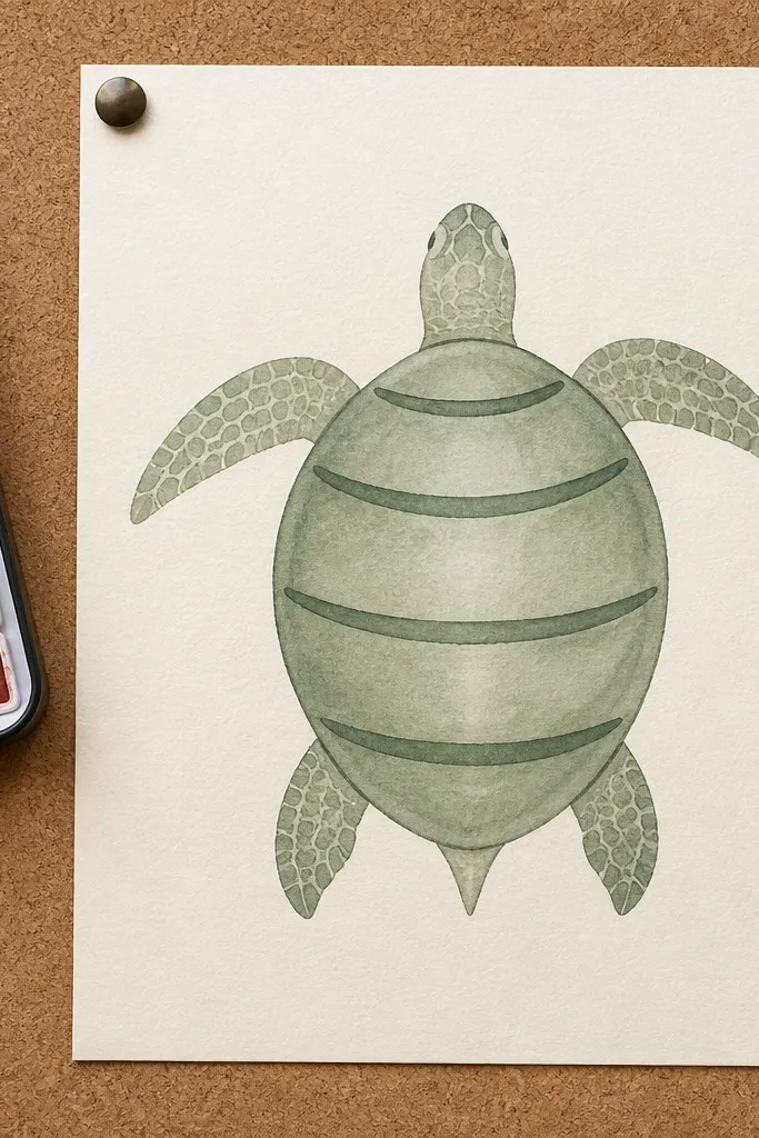
This style is the fastest way to get a good-looking budget Sea Turtle Drawing because it limits decisions. The shell is one clean oval, and the pattern is only a few curved bands — enough to read as a turtle shell without turning into scribbles. You’ll use two tones: a light mid-green or gray for the shell, and a darker outline shadow along the shell edge. It looks great on small paper because the silhouette does the heavy lifting. It suits beginners who want a photogenic result without spending time on tiny details.
Start by sketching a large oval for the shell and a smaller oval for the head, both lightly in HB. Add the front flippers as two teardrop shapes that overlap the shell edge, then erase any lines that cut through the silhouette. Shade the shell midtone lightly, then darken only the outer rim and the flipper roots with a 2B or a single darker marker. Add three to five curved “band” marks across the shell — keep them evenly spaced. Finish by outlining the whole turtle with a fineliner for crisp edges.
Pro tipUse a kneaded eraser to lift just the shell highlights before you darken the edges so the turtle looks dimensional.
AvoidDon’t add scale dots everywhere — bands only, or the drawing turns busy and flat.
2. Classic Cartoon Turtle with Big Eye and Shell Tiles
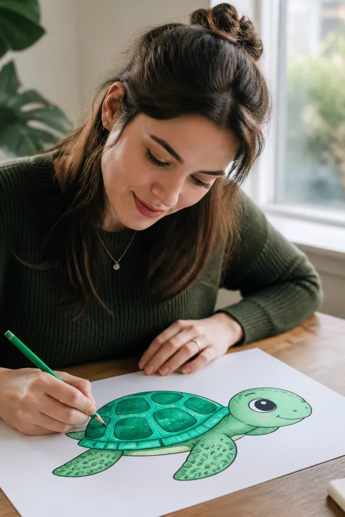
This is the “cute but readable” turtle style. A big eye gives the drawing personality, while the shell tiles create structure you can copy quickly. The trick is keeping the tiles chunky and consistent — think rounded rectangles in curved rows. Use a bright mint or teal for the shell midtone, then a darker green for tile borders. It’s photogenic on white paper because the outlines and tile rhythm are bold. This suits sticker-like art, kids' crafts, and fast wall stencils.
Sketch the head first as a rounded shape with a large almond eye, then draw the shell oval behind it. Put the back flipper as a curved paddle under the shell, and keep all flippers rounded, not pointy. Draw shell tiles as curved rows of rounded rectangles that follow the shell contour. Color the midtone on the whole shell, then trace the tile borders with the darker green. Finally, add a simple ground shadow under the turtle so it doesn’t float on the page.
Make the eye highlight a tiny white oval and leave it uncolored — it instantly makes the cartoon look polished.
Don’t make the tiles random sizes; keep every row the same thickness so the shell reads from a distance.
3. Beach Sketch Turtle with Sand Texture Background
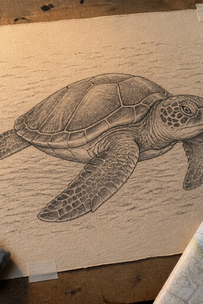
This one looks expensive because the background is doing work. The turtle itself is fairly simple, but you add sand texture with short, repeating strokes that create a realistic surface. Keep the turtle line weight darker than the sand marks, so it stays the main subject. Use light graphite for the turtle fill and slightly darker pencil for the shell edge. It’s perfect for a budget Sea Turtle Drawing because you can get texture without buying special tools. It also photographs well because the sand pattern gives depth.
Draw the turtle silhouette lightly: shell oval, head, and four flippers in one sweep. Shade the shell edge with a 2B pencil, then blend the midtone with an HB using light pressure. For sand, draw short, curved strokes across the bottom half of the page, then vary the pressure for darker patches. Add a few wave lines behind the turtle using a lighter pencil so they don’t compete. Finish with a darker outline around the turtle only, not the entire page.
If your sand texture smears, use a fixative spray after finishing the turtle outline and let it dry fully.
Don’t outline the sand — it makes the whole page look harsh and grainy.
4. Monoline Turtle with Clean Shell Ridges
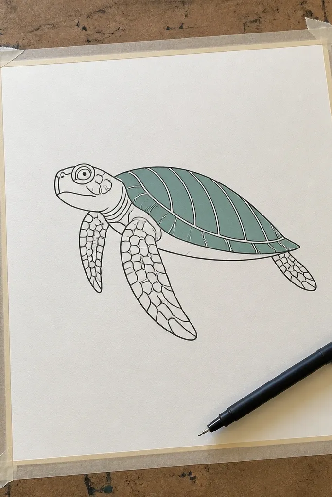
Monoline drawings look sleek and modern, and they’re budget-friendly because you only need one consistent line tool. This style uses a single weight outline, then adds shell ridges as parallel curved lines. The turtle looks crisp and graphic, especially if you color only the shell with a flat wash. It’s great for printable wall art because the design stays tidy. If you struggle with messy lines, monoline is the fix because every line has the same thickness.
Use a black fineliner to sketch the shell oval, then add head and flippers as smooth curves that touch the shell edge. Draw shell ridges as 4-6 curved parallel lines that follow the shell contour. Add a light flat wash to the shell midtone using watercolor or a diluted marker, keeping it inside the ridges. Leave the flippers mostly uncolored, then add a small shadow under the shell edge. Let everything dry before you add any final ridge darkening.
Pro tipDo a quick “dry run” with pencil first so your fineliner lines don’t get corrected by erasing.
AvoidDon’t add extra outline thickness — monoline means one weight, not a DIY cartoon outline.
5. Chalky Pastel Look Turtle with Soft Edge Shell
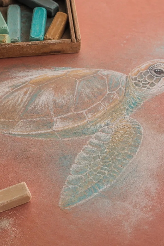
This look is all about softness and contrast. You draw the turtle with light pencil, then build color with pastel pencils or heavily diluted marker layers to get a chalky edge. The shell ridges are still there, but they’re blurred at the edges so the turtle feels airy and beachy. It’s photogenic on colored paper because the background color shows through the chalk texture. This style suits beginners because it forgives mistakes better than sharp ink.
Sketch the turtle lightly on toned paper (light beige or pale blue). Color the shell midtone with a pastel pencil in light green or gray-green, using light, repeated strokes. Add darker edge shading along the shell rim and under flippers with a slightly deeper green, then blend with a tissue. Draw shell ridges using darker pencil but keep them soft — don’t press hard. Finish by darkening the eye and mouth line with a darker pastel pencil.
If you use pastel, tap off loose dust with a clean brush so the page stays clean for photos.
Don’t press hard on the ridges — hard pressure turns the chalk look into scratchy lines.
6. Black Ink Turtle with White Highlights and Splash Background
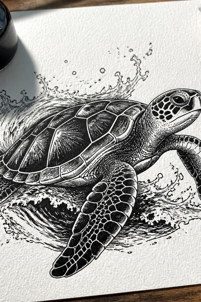
High-contrast ink drawings pop on social media and print well. This style uses black ink for outlines and shadows, then adds white highlights for the shell shine and flipper sheen. You also add a splashy wave background so the turtle looks like it’s moving without drawing complicated water. It’s a strong choice if you want your budget Sea Turtle Drawing to look like real art, not a sketch. Use it for postcards, stickers, or framed minimalist prints.
Sketch the turtle in pencil first, then trace the outline with waterproof black ink. Fill the shell midtone by cross-hatching lightly, and put the darkest cross-hatching only at the shell rim and under the head. Add white highlights by leaving small areas uninked, then finishing with a white gel pen for sharp dots along ridges. For the splash background, flick diluted ink or use a toothbrush technique on a separate test scrap first. Let it dry fully before you touch any highlights.
Pro tipUse waterproof ink so the white gel pen doesn’t get muddy when the page is slightly wet.
AvoidDon’t over-hatch the flippers — keep flippers simpler than the shell so the eye goes to the pattern.
7. Watercolor Wash Turtle with Hard-Edged Shell Pattern
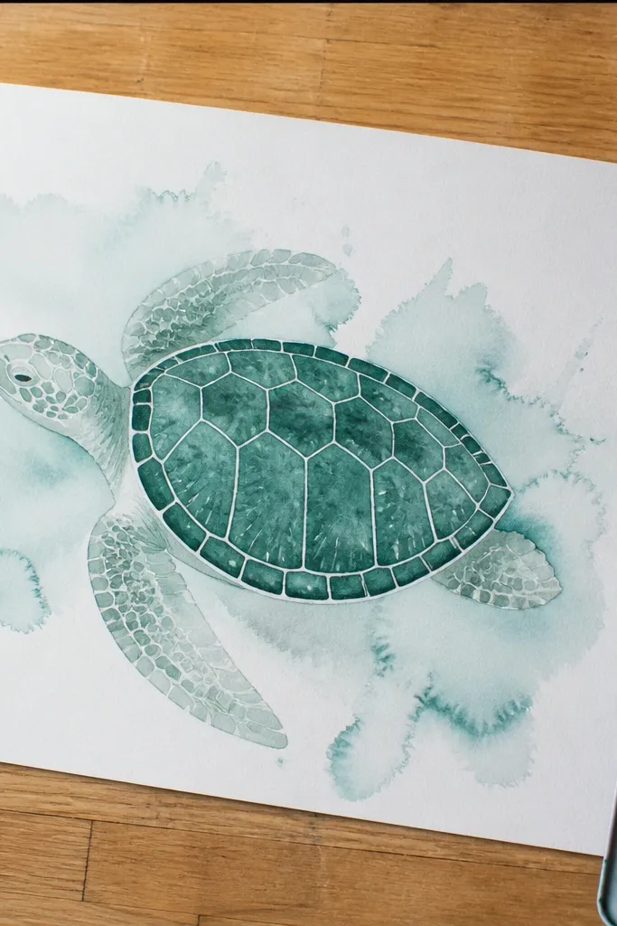
Watercolor makes the turtle feel alive, but the shell pattern keeps it from looking vague. You paint the body in a soft wash, then draw crisp shell pattern lines once the wash is dry. That contrast is what makes it look intentional and photogenic. This style is budget-friendly because you can do it with a small pan set and one dark liner. It’s also forgiving because watercolor hides pencil mistakes while you’re building the midtones.
Lightly sketch the turtle shapes in pencil. Wet the shell and flippers lightly with clean water, then apply diluted green-gray watercolor for the midtone. Let the wash dry until it’s no longer glossy. With a fine liner, draw shell pattern lines and a darker rim shadow. Add a few darker spots on the flippers for depth, then finish with a simple wave curve behind the turtle.
If your lines bleed into wet paint, wait for the sheen to disappear, then draw pattern with a steady hand.
Don’t paint the shell pattern over wet wash — it blurs and the turtle loses that crisp look.
8. Grid Copy Turtle for Perfect Proportions
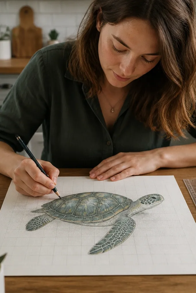
This is how you get a “copy-ready” budget Sea Turtle Drawing when your proportions always drift. You use a simple grid to transfer a turtle outline, then you add shell bands and shadows. The result looks professional because the head angle, flipper size, and shell curve all land in the right spots. It’s not fancy, but it’s reliable. This style is ideal if you’re copying from a reference photo or want your turtle to match a specific pose.
Pick your finished size and draw a light grid on your paper, like 1 cm squares. Draw a matching grid on your reference, then sketch the turtle by copying each square’s key lines. Once the outline is correct, erase the grid lightly. Add shell pattern bands as curved lines that follow the shell shape, then darken the rim and flipper roots. Finish by outlining the turtle with a fineliner for crisp readability.
Pro tipTrace the shell outline last. It’s the anchor shape, and correcting it fixes everything else.
AvoidDon’t skip erasing the grid marks under darker outlines — they show up in photos.
9. Pattern-Focused Turtle with Scale Bands and Dots
If you want your turtle to look “stunning” without going ultra-realistic, this pattern style nails it. The shell has strong banding, and you add small dots only at the band intersections. That creates texture while keeping the drawing clean and readable. The flippers stay simpler, so the shell pattern remains the hero. This is a great choice for budget supplies because dots and bands are easy to repeat with a pen or pencil.
Sketch the turtle silhouette and shell oval lightly, then block in the darkest rim shadow first. Draw 5-7 curved scale bands across the shell, keeping the spacing even. At the intersections where bands meet darker areas, place tiny dots — only there, not everywhere. Add a darker shade along the shell edge and a couple shadow marks under the head and flippers. Outline with a darker pen so the pattern stays crisp.
Use a mechanical pencil with a consistent lead weight for dots so they don’t vary in size.
Avoid dotting the flippers — it makes the whole drawing compete for attention.
10. Sumi-Style Turtle with Brush Textures
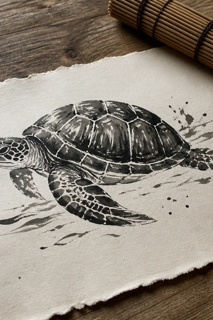
Brush texture makes budget art look intentional. This style uses ink with visible brush marks for the shell shading and a few controlled splatters to suggest water. The turtle outline is bold, and the shell ridges are darker strokes rather than tiny lines. It looks best on thicker paper so the ink holds its texture. If you want a photogenic ink turtle without spending on color, this is the move.
Use thick paper and sketch the turtle in pencil first. Load a flat brush or round brush with black ink and paint the shell shadow areas in broad strokes, leaving lighter areas blank. Add shell ridges with shorter brush strokes that follow the shell curve. Outline the turtle edges with a brush or fineliner, then add a few water splatters behind the shell. Let it dry completely before you add any highlights with a white gel pen.
Pro tipTest your brush dilution on scrap. You want a mid-ink tone that doesn’t bleed into paper fibers.
AvoidDon’t try to paint every single scale — brush textures should stay selective.
11. Pastel Pencil Turtle with Ocean Gradient Backdrop
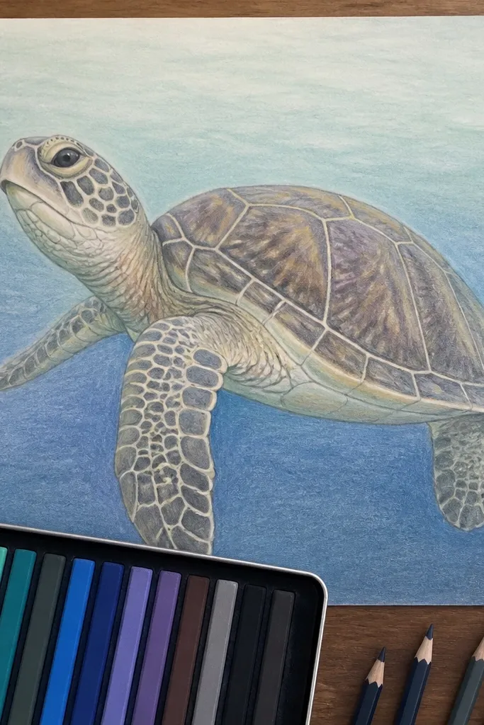
A gradient background gives your budget Sea Turtle Drawing instant “finished” energy. The turtle stays in softer pencil values, while the ocean behind it shifts from light aqua near the horizon to deeper blue around the edges. This contrast makes the shell pattern pop without heavy outlines. Use pastel pencils or colored pencils for the gradient and a darker pencil for the shell rim. It’s perfect for sketchbook pages because it looks good even in imperfect lighting.
Sketch the turtle shapes lightly and keep the outline minimal. Color the shell with light green-gray using gentle pressure, then deepen the rim with a darker pencil. For the ocean, color the background with layered blues — lightest at the top and left, darker at the bottom and right. Blend lightly with a tissue so the gradient stays smooth. Finally, add shell pattern bands with a darker pencil and reinforce the eye line.
Blend the ocean first, then draw the turtle so you don’t contaminate the turtle colors with blue dust.
Don’t outline every turtle edge in black — it looks harsh against a soft gradient.
12. Turtle Mandala Frame with Simple Shell Inside
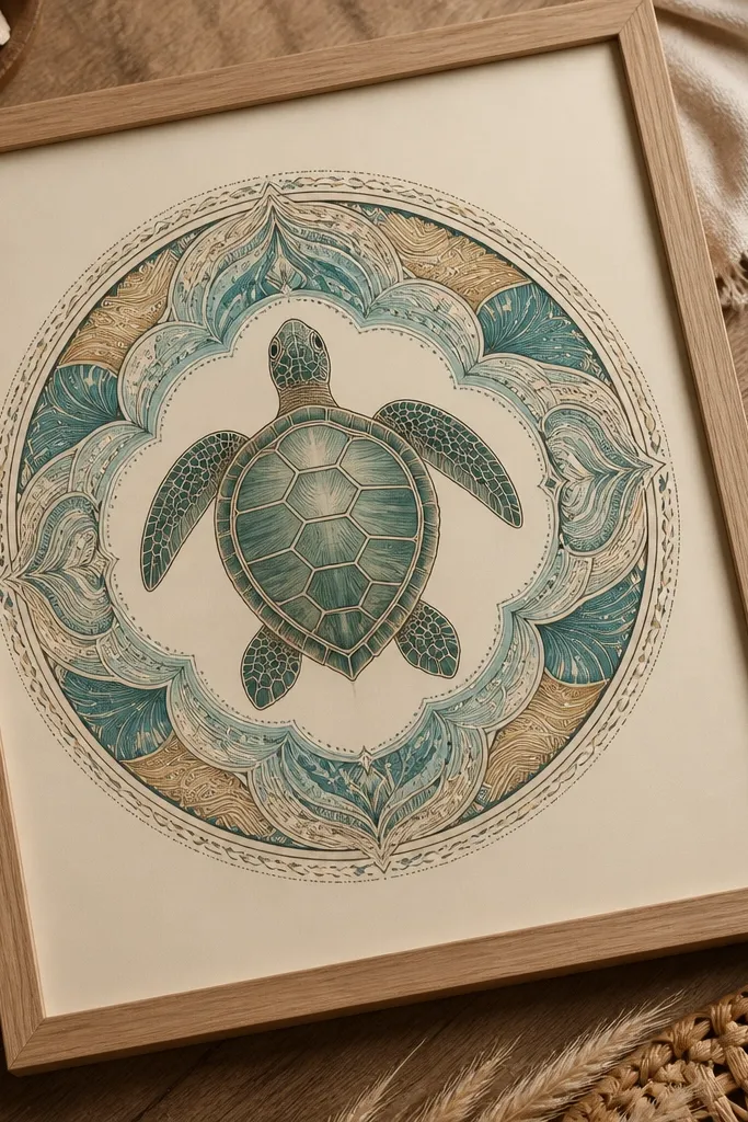
This is a smart budget approach: keep the turtle simple, then make the frame do the decorative work. A circular mandala around the turtle makes the whole piece look intentional and symmetrical, and it photographs well because your eye has a clear path. The turtle shell still has bands, but you limit details so you don’t spend hours. Use one or two colors for the mandala and one dark pen for consistency. This suits printable art, craft cards, and wall hangings.
Draw a circle on your paper and place the turtle centered inside it. Sketch the turtle silhouette and shell oval, then add 4-6 curved shell bands. Around the turtle, draw a ring of repeating shapes like small teardrops or short arcs. Add one more ring outside with bigger repeating shapes, keeping symmetry. Color the mandala lightly in one accent color, then outline the turtle with a darker pen so it stays crisp.
Pro tipUse a compass or a traced bowl for the circle so the frame looks clean in photos.
AvoidDon’t add dense pattern inside the shell — the frame already carries the complexity.
13. Comic Style Turtle with Bold Shadows and Speckled Water
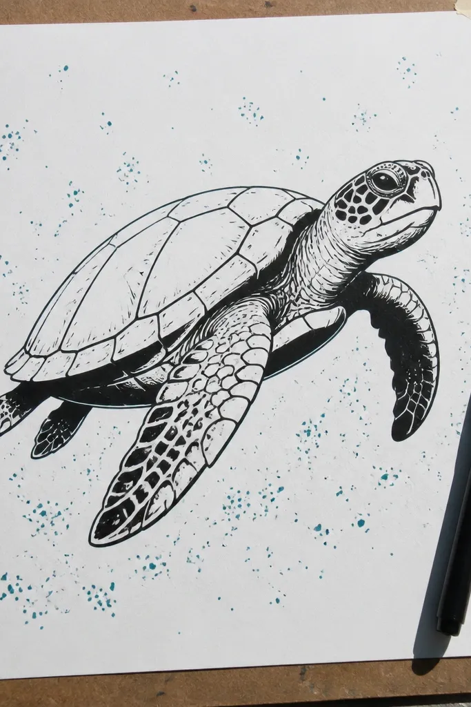
Comic-style turtles look great because they use graphic shapes and strong shadow blocks. You draw the turtle like a cartoon, then add bold shadow shapes under the shell rim and along flippers. A speckled water background adds movement without requiring realistic water drawing. It’s a strong option for a budget Sea Turtle Drawing because you can use markers and a single fineliner for clean edges. The final result reads clearly even when small.
Sketch the turtle with thick, clean pencil lines: shell oval, head, and flippers. Trace with fineliner and then color the shell midtone with a marker. Add bold shadow shapes with one darker marker, focusing on the shell rim and the underside of flippers. Use a light toothbrush flick with diluted marker ink to create speckles behind the turtle. Add a simple wave line near the bottom and a small ground shadow under the flippers.
Pro tipLet marker ink dry before you add fineliner details or the pen will skip and tear the surface.
AvoidAvoid too many background elements — keep speckles and one wave line only.
14. Sculpted Look Turtle with Edge Highlighting
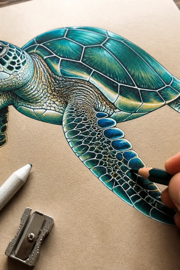
Edge highlighting makes the turtle look sculpted even with basic supplies. You shade the shell midtone, then carve the form with a bright highlight line along the shell ridges and flipper edges. This trick makes the drawing look dimensional in photos, where flat coloring often fails. It’s also budget-friendly because you can do it with pencil and a white gel pen. Great for anyone whose turtles look “muddy” when they try to shade.
Sketch the turtle and shell oval lightly, then shade the shell midtone with HB using smooth pressure. Add darker shading only at the shell rim and beneath the head and flippers, using 2B. Now add highlight lines: draw a thin white line along the upper edges of 3-4 shell ridges and along the top flipper edges. Reinforce the shell ridge lines with a darker pencil so the highlight has contrast. Finish with a subtle shadow under the turtle using light graphite.
Pro tipUse a white gel pen sparingly. One thin highlight line beats five thick ones.
AvoidDon’t blend everything. If you smear the highlights, you lose the sculpted effect.
15. One-Color Sea Turtle with Negative Space Waves
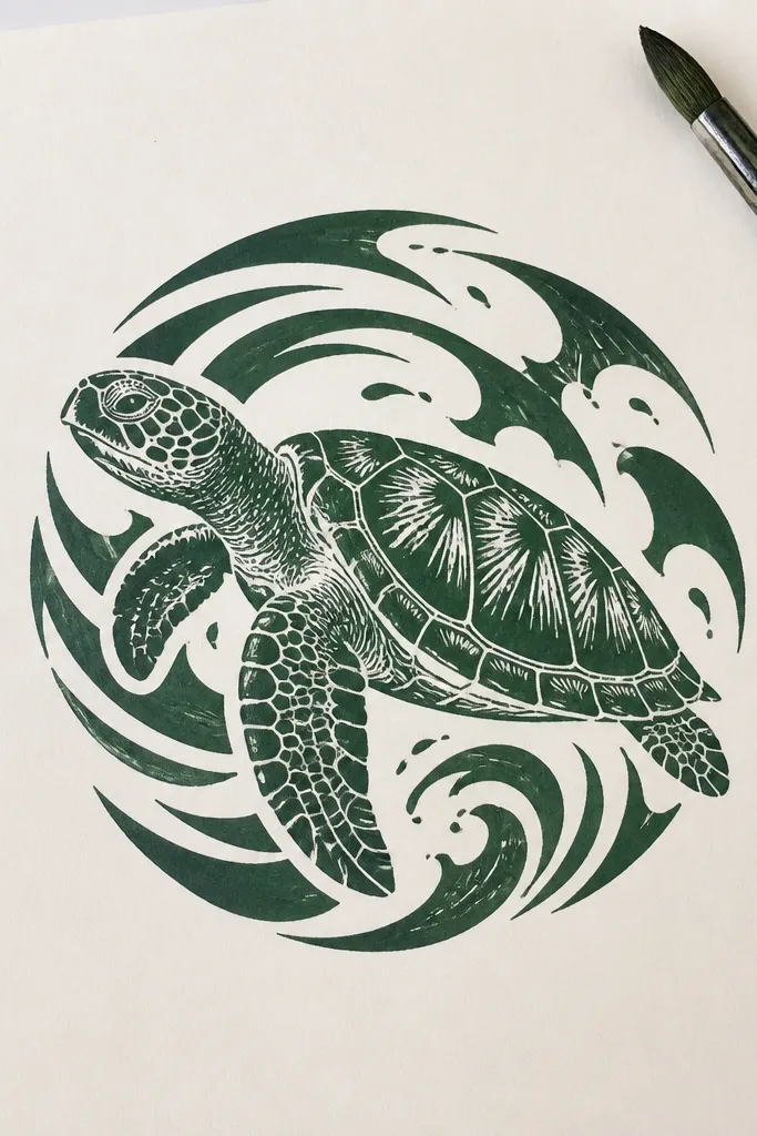
Negative space is the cheat code for a clean, photogenic look on a budget. You draw the turtle in one dark color, then leave the waves as blank shapes around it. That gives a crisp contrast without coloring the entire background. It looks sharp even with limited materials because everything is controlled. This style is ideal for single-ink projects like pen drawings, stencil practice, and simple prints.
Sketch the turtle outline and shell bands lightly. Fill the turtle with one dark tone using a fineliner or marker, leaving highlights blank. For waves, draw curved wave lines behind the turtle and keep the inside areas uncolored so they read as negative space. Add a few darker wave outlines to create depth, but keep them fewer than the turtle details. Let it dry, then add a simple eye highlight dot with white gel pen if you want extra pop.
Keep the wave shapes larger than you think. Small waves disappear in photos.
Don’t color the negative spaces. If you fill them, you lose the crisp graphic look.
16. Origami-Inspired Turtle with Fold Lines
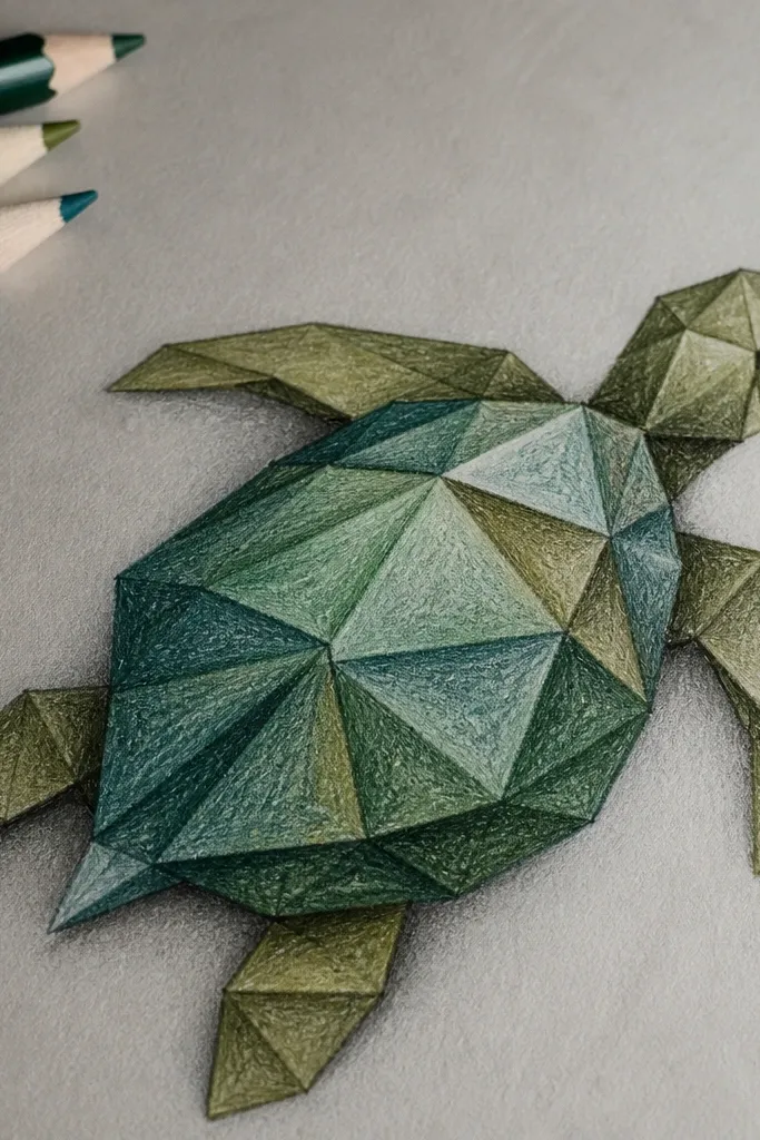
This is a geometric turtle that looks “designed,” not just drawn. You keep the turtle silhouette rounded, but the shell becomes faceted like paper folds. The fold lines create strong visual rhythm, and the shading uses simple triangle values. It’s budget-friendly because you only need pencil or a couple markers. Photographs well because the facets catch light and the pattern reads clearly.
Sketch the turtle silhouette first with curved lines so the head and flippers still look like a turtle. Inside the shell, draw 8-10 faceted sections using curved polygon shapes, not tiny scales. Shade each facet alternately with light and dark graphite or one marker shade and one darker shade. Add a darker outline along the facet edges so the folds separate. Finish by adding a few fold-like lines on the flippers, then reinforce the eye and mouth.
Use a ruler only for the facet edges if you want extra crisp geometry; otherwise keep it freehand but consistent.
Don’t over-facet the flippers. Keep facets mostly on the shell for a cleaner look.
17. Retro Poster Turtle with Halftone Dots
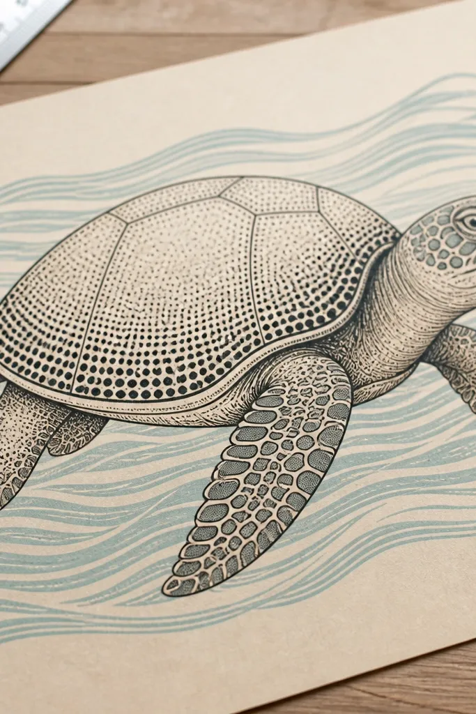
Halftone dots instantly give a retro poster vibe, and it’s a great budget Sea Turtle Drawing technique when you want texture without realism. You shade the shell with dots of varying density, then add a darker dot cluster along the rim. The background can be a simple solid color or a minimal wave pattern. This style is photogenic because the dot pattern reads as texture at a distance. It’s also easy to repeat across multiple turtles for a set.
Sketch the turtle silhouette and shell oval lightly. Color the shell midtone with a light dot pattern using a fine pen or marker dotting tool. Increase dot density near the shell rim and under flippers to create shadow. Add a few larger dots or small dot clusters to suggest ridge texture. Keep the background simple — one solid color or a single wave curve — then outline the turtle edges with a darker pen.
Pro tipMake a consistent dot size by tapping the same pressure and using the same pen angle.
AvoidAvoid random dot sizes across the whole shell. It looks accidental instead of graphic.
18. Fins-Forward Turtle with Dynamic Pose
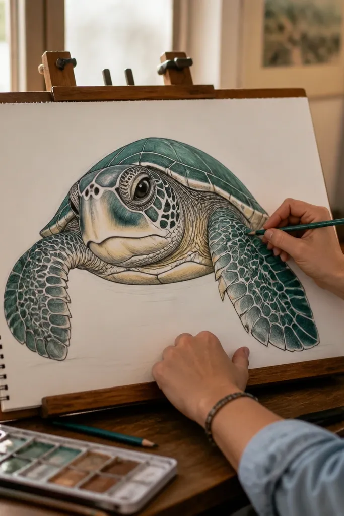
Pose changes everything. A fins-forward turtle looks dramatic and looks better in photos because the flippers create a frame around the shell. You still keep the shell pattern simple, but the perspective makes the drawing feel alive. This style is budget-friendly because you don’t need detailed anatomy — just strong shapes and a clear silhouette. Great for prints and stickers because the face and flippers are the focal point.
Sketch the shell oval slightly tilted, then draw the head in front with a clear centerline. Extend the front flippers toward the viewer as two larger shapes that overlap the shell edge. Keep the back flipper smaller and tucked behind. Add shell bands across the shell, then darken the rim and the flipper roots. Outline the whole turtle with a fineliner, and add a few wave arcs behind to suggest motion.
Pro tipUse a centerline for the face. It keeps the eye placement symmetrical even in a tilted pose.
AvoidDon’t make the front flippers too thin. Chunky flippers read better at a distance.
19. Tiny Turtle on Big Ocean Page with Lots of Negative Space
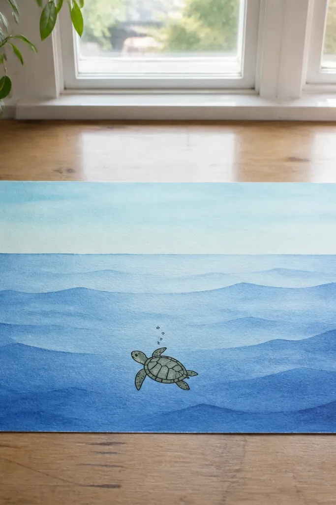
This style looks stunning because it uses space, not detail. You draw a smaller turtle and surround it with a simple ocean gradient or a few big wave curves. The turtle stays readable because you outline it clearly and keep the shell pattern limited to 3-4 bands. It’s perfect for budget Sea Turtle Drawing when you want the page to look clean and intentional, not crowded. Photos love negative space because the subject pops.
Pick a large page and draw a light pencil horizon line. Sketch a small turtle centered on the horizon, using the same shell oval structure but smaller scale. Add only 3-4 shell bands and a dark rim shadow so the turtle doesn’t get lost. Color the ocean background with a diluted blue wash or layered pencil shading, leaving the turtle area lighter. Finish with a darker outline around the turtle and add one wave curve near the bottom.
Keep the turtle outline 1 step darker than the background. If they’re the same tone, the turtle disappears.
Avoid tiny shell tiles. Too much micro-detail makes the small turtle look messy.
20. Sunk-into-Sand Sea Turtle with Broken Shell Highlights
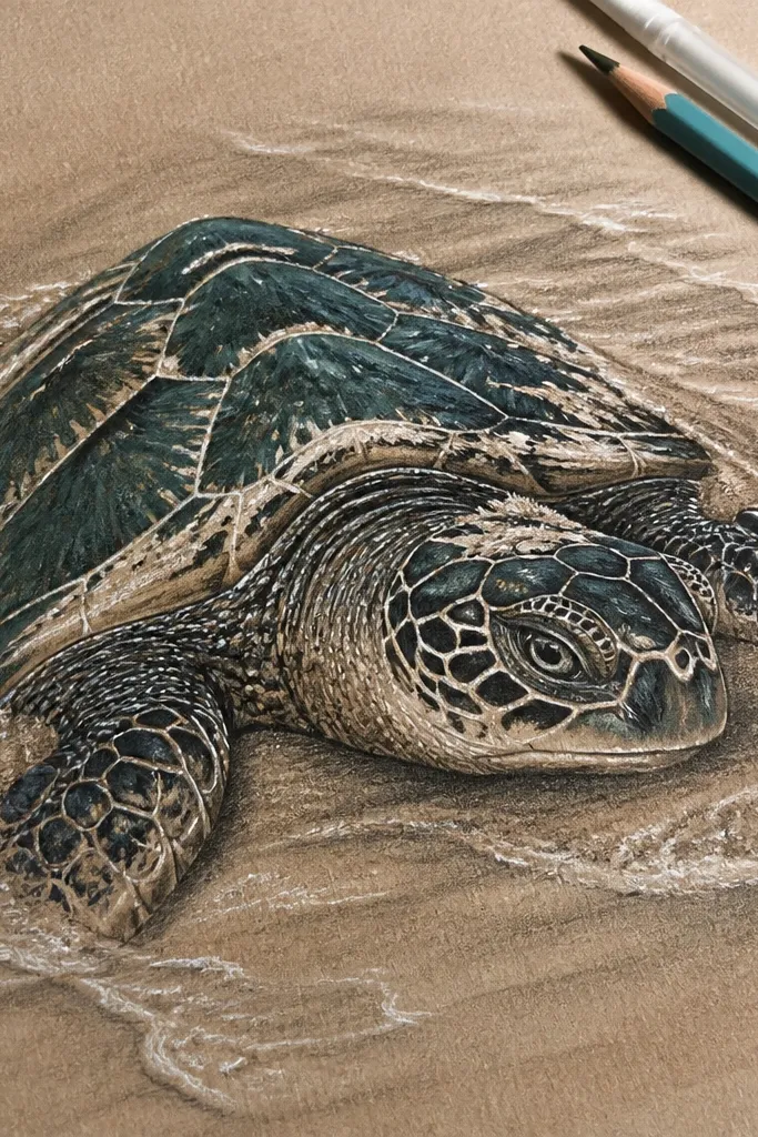
This drawing gives you the “budget Sea Turtle Drawing” that looks expensive because the texture does half the work. The turtle is simple in shape, but the shell looks broken open with bright, sandy highlights that catch the eye. You get a dramatic, print-friendly contrast — dark green shell, pale sand, and sharp white chips along the shell plates. It’s also forgiving: you can keep the turtle proportions easy while spending your effort on the sand texture and the shell “cracks.” Plan for about 45-70 minutes with basic paper and one or two art mediums, and it fits sketchbooks, classroom art days, or any page you want to look like a mini poster.
Start with a light pencil sketch of a sea turtle facing slightly left, with the front flippers tucked and the head angled up. Draw the shell as 6-8 large plates, then leave thin gaps between plates for later highlight chips. Use a 2H or HB pencil to map sand texture as short, uneven lines around the turtle body, then shade sand darker near the turtle edges so it looks buried. Paint or color the shell in deep green (colored pencil works great), then add “broken” highlights by flicking white gel pen or white gouache into the plate gaps and along the plate edges. Finish by deepening the sand shadow under the turtle with a soft brown/gray pencil and smudging just the sand — keep the shell edges crisp.
Make the sand texture first, then color the turtle. If you do it backward, you’ll smear your shell edges while trying to build the sand.
Don’t outline every shell plate with a thick dark line or the whole turtle turns into a coloring-book blob instead of a buried creature.



