
1. Sun Hat Sitting Frog on a Lily Pad
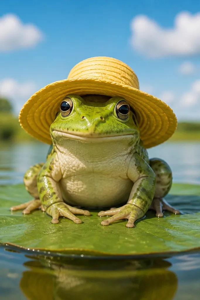
This one is a layout cheat code because it’s built on a stable triangle: lily pad base, frog body centered, hat brim on top. The hat gives you an instant focal point, and the lily pad creates an easy foreground shape that makes the frog pop. Keep the frog’s face simple — big eyes, small smile — then add a few crisp leaf veins on the lily pad. Color the hat with a warm accent (sun yellow or coral) and keep the background light so your frog stays the only dark shape. It’s great for beginners who want “cute” without over-rendering.
First, draw an oval lily pad and add one curved vein down the center. Then sketch the frog sitting with bent legs tucked under the body and place the sun hat so the brim overlaps the top of the head. Finally, ink the outline with a bold line and fill the lily pad in two greens (dark edge and lighter center), then color the hat with one bright color and a small shadow under the brim.
Draw the lily pad edge with a slightly wobbly line so it looks hand-made, not printed.
Don’t add lots of tiny background leaves — one clean sky wash makes the frog look intentional.
2. Raincoat Frog with Floating Umbrella
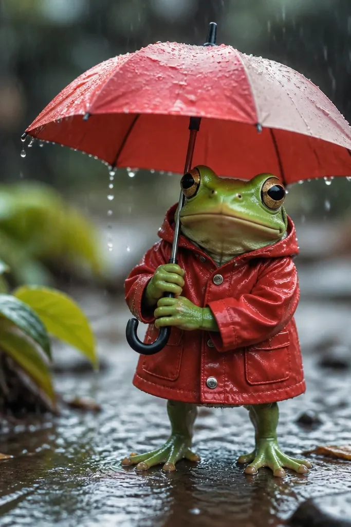
Rain scenes look lively because you can show motion with simple lines. The raincoat adds crisp geometry to the body, and the umbrella gives you a strong curved shape that frames the face. Draw a few thick raindrops and a couple thin ones so the scene has depth without complexity. Use a limited background — pale gray sky with white highlights on droplets — and let the frog’s red coat do the work. This is a great “copy and change” drawing because you can swap umbrella color every time and it still looks fresh.
Start with a rounded frog head and body, then add a raincoat shape like a short jacket with a collar. Next, draw the umbrella above and slightly behind the frog so the handle points downward toward the frog’s hand. Finally, ink raindrops with consistent spacing and color the coat in one saturated red, leaving droplets mostly white with a light gray shadow.
Make the raindrops taper: thicker at the top, thinner at the bottom.
Don’t draw dozens of droplets — 12-18 well-spaced drops look more graphic than messy rain.
3. Bubble-Blowing Frog with Big Speech Bubble
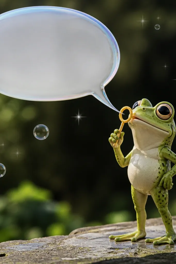
Bubbles force you to draw circles with confidence, and that instantly makes a cartoon look cheerful. The speech bubble gives the drawing a readable “story” even without fancy details. Put the frog in profile or three-quarter view so the mouth points toward the bubbles; then make the bubbles overlap the speech bubble slightly for depth. A small sparkle or two keeps it playful and photogenic. Keep the background plain so the bubbles stay the brightest shapes.
First, draw the frog in three-quarter view and sketch a rounded mouth area aimed toward the right or left. Then draw 5-7 bubble circles of different sizes, and add a large speech bubble in the open space behind them. Finally, ink all outlines, then color the bubbles with light blue fills and white highlight circles, leaving the speech bubble in a flat off-white.
Add one bubble that’s partly cut off by the edge of the page to make it feel dynamic.
Don’t outline every bubble twice; one clean line per bubble keeps the artwork crisp.
4. Kawaii Crown Frog on a Pink Checker Background
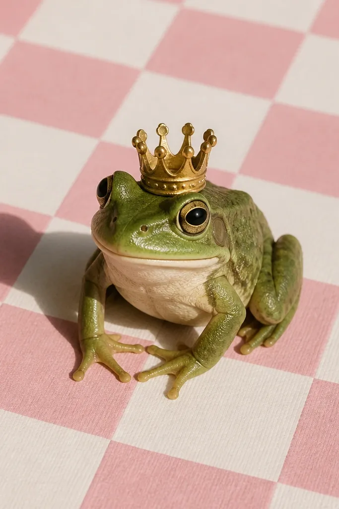
This idea is designed for aesthetic punch. A crown is instantly recognizable, and a checker background makes your frog look like it belongs in a sticker sheet. Keep the frog face extra simple with blush cheeks and a small “u” mouth — it reads kawaii without clutter. Use two tones of pink in the checker and keep the frog’s green consistent. If you use bold outlines and flat fills, this one looks clean even with minimal coloring.
Start by drawing a checker background grid with 1-inch squares (or smaller if you want it denser), then shade alternating squares in pink. Next, draw the frog centered with a rounded head, short legs, and a crown sitting on top of the head. Finally, ink the frog thicker than the background lines, then color the cheeks with a soft pink and add small crown details like three points.
Lightly erase the checker pencil lines before inking so the grid stays tidy.
Don’t add gradients to the checker and the frog — flat colors look better together.
5. Frog Chef with Steam Swirls and a Tiny Pan

Steam is a perfect visual effect because it gives you curves that contrast the frog’s round shape. A tiny pan adds a clear prop and makes the drawing feel like a single moment, not a generic frog. The chef hat and apron are simple shapes you can color quickly, and the steam curls can be thick-lined for a graphic look. Place the frog slightly lower in the frame so the steam rises into the negative space. This is a good choice if you want your cartoon to look “designed,” not random.
Pro tipMake the steam curls vary in thickness — thick at the base, thinner at the tips.
First, draw the frog holding a small frying pan at chest height with one arm bent and the other supporting the handle. Then add a tall chef hat and a simple apron tied at the waist. Finally, draw 3-5 steam swirls above the pan, ink everything, and color: green frog body, white steam with a light yellow tint, and hat/apron in contrasting colors.
AvoidAvoid over-detailing the food in the pan; a couple dots or a single swirl looks cleaner.
6. Frog on a Skateboard with Rolling Wheels
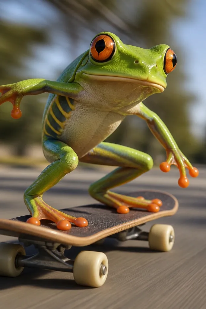
Action drawings look best when you exaggerate one thing — here, the motion. The skateboard gives you strong perspective lines, and rolling wheels add instant movement. Put the frog leaning forward with bent knees and a wide grin; the expression is what sells the energy. Add three short motion streaks behind the board to keep it readable. Use a dark outline and a bright board color so the wheels and motion lines pop against the background.
Pro tipKeep the frog’s head larger than you think — it makes the action feel playful instead of chaotic.
Start by drawing the skateboard deck as a slightly angled rectangle with rounded corners. Then sketch two wheels as circles on the underside and place the frog standing on the deck with one foot forward and one foot back. Finally, draw 3-4 motion lines behind the rear wheel, ink the outlines, and color the board in one bright color with darker wheels.
AvoidDon’t draw a full background scene; motion lines and clean color blocks are enough.
7. Frog Astronaut with Bubble Helmet
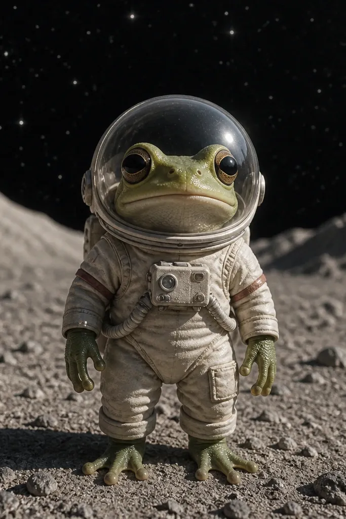
A helmet is a clean framing tool. Draw it as a big circle around the frog’s face, then add small star dots around it so the whole piece reads like a sticker. The astronaut suit gives you long sleeve shapes that contrast with the frog’s round body. Keep the helmet highlights white and leave the inside mostly transparent (light blue tint). This one looks great on a dark background — it makes the frog’s face and helmet glow.
First, draw a simple frog body and add a tight astronaut suit outline with sleeves and boots. Then draw a large round helmet around the head and add a small visor highlight arc near the top. Finally, ink the stars (10-20 tiny dots) and color: suit in light gray, helmet in pale blue with white highlight, and stars in white against a dark navy background.
Use a single star shape repetition (tiny 5-point or dot stars) so it feels intentional.
Don’t add planets and complex space scenes; stars alone keep it cute and readable.
8. Frog Reading Glasses with Stacked Books

Books create a natural “frame” for the face, and reading glasses add instant character. Stack two or three books at the frog’s side and keep their spines simple stripes so they color fast. The frog’s eyes should sit behind the glasses, with a tiny sparkle on each lens. This composition is excellent for practicing clean line work because the rectangles of books will expose shaky outlines. Color with 3-5 bright book colors and one calm background shade.
Start by drawing the book in front of the frog as a rectangle with a slightly curved page edge. Then add the frog’s head above it and draw glasses as two rounded rectangles connected by a thin bridge. Finally, sketch two stacked books beside the main book, ink everything, and color the books with alternating solid stripes and simple spine labels using short lines.
Make the glasses frames slightly thicker than the book outlines.
Avoid tiny unreadable text on the book spines; short stripes look better than scribbles.
9. Frog in a Teacup with Floating Heart Steam
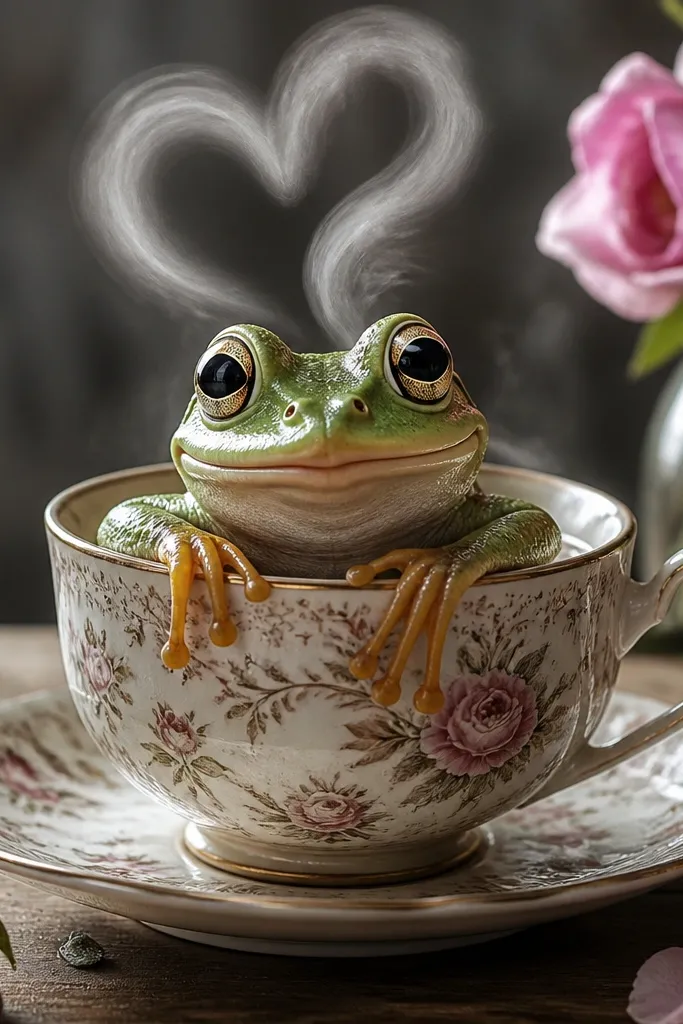
This one is photogenic because it uses a familiar object — teacup — and turns a simple steam effect into hearts. The teacup rim gives you a clean circular arc, and the heart steam adds a strong graphic silhouette above the frog’s head. Keep the frog’s arms resting on the cup edge so the pose looks calm and centered. Use warm colors for the cup and a light background so the hearts stand out. It’s a great pick when you want “cozy cute” without needing complex shading.
First, draw a teacup shape as a wide oval opening with a curved handle on one side. Then place the frog inside the cup with its head and arms above the rim. Finally, draw 4-6 heart shapes rising from the cup like steam, ink outlines, then color the cup in one warm tone and the hearts in a contrasting pink.
Keep the hearts evenly spaced and similar size so they read as a pattern, not a mess.
Don’t overfill the cup with random objects; the cup rim and hearts do the visual work.
10. Frog Wearing Striped Scarf in a Windy Scene
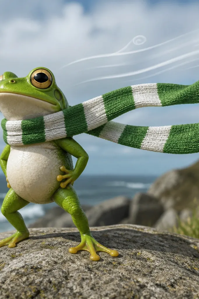
Wind lines give you motion without turning the frog into a sketchy mess. The striped scarf is a visual gimmick that looks great even with simple coloring, and the stripes create rhythm across the image. Draw the scarf as a thick ribbon that curves away from the neck in one direction, then add a few wind streaks behind it. Keep the background minimal: a single pale sky wash or just a light color field. This drawing is excellent for learning how to show direction with line flow.
Pro tipMatch the scarf curve to the wind direction so the whole drawing feels pulled the same way.
Start by drawing the frog front-facing with a simple body oval and short legs. Then add a scarf wrapped around the neck, letting one end trail to the side with curved stripes. Finally, draw 5-7 wind lines behind the scarf, ink everything, and color: scarf stripes alternating green and cream, frog body in solid green, and wind lines in light gray.
AvoidDon’t add too many wind lines; 5-7 looks graphic and intentional.
11. Frog in a Flower Pot with Tiny Ladybugs
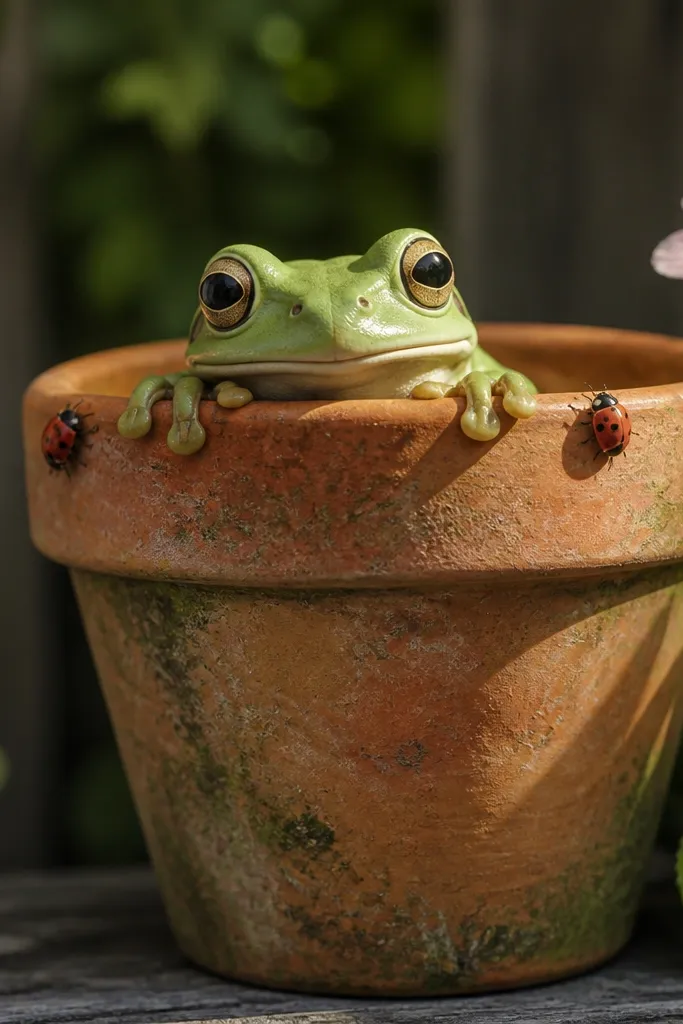
This composition is playful and tidy. The flower pot gives you a stable rectangular shape, and the frog popping up from the soil adds a satisfying reveal. Ladybugs add red-and-black contrast that photographs well against green. Keep the flower simple: one or two blooms, not a full garden. The pot rim and frog face create a natural focal center, and the ladybugs sit like accents around the edges.
Pro tipUse two sizes of ladybugs: two small and two slightly bigger so it feels arranged.
First, draw a flower pot as a trapezoid with a slightly wider rim and a soil area in the middle. Then place the frog peeking from inside the pot with eyes above the soil line and arms resting on the rim. Finally, draw 3-4 ladybugs on the pot rim (small circles with tiny dots) and add one simple flower stem off to the side, ink and color in flat tones.
AvoidAvoid drawing a full plant maze; one stem and one bloom keeps the image clean.
12. Frog with a Heart-Shaped Leaf Umbrella
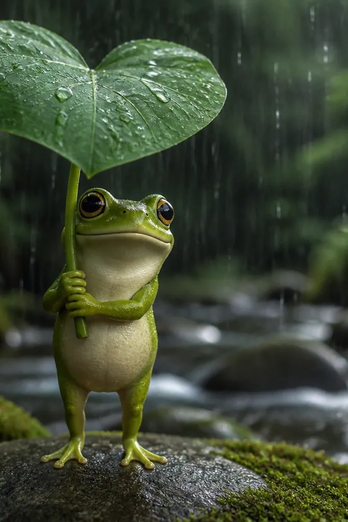
Heart-shaped props make cartoons instantly readable and sweet. A leaf umbrella is a fun twist on the rain idea, but it stays simple because the heart shape gives you a clear contour to draw. Add raindrops falling straight down and keep the frog’s expression calm and cute. Use a darker green leaf so the heart outline stands out, and keep the background pale. This is a great choice for sticker-style art because the heart prop reads even when scaled down.
Start by drawing the heart-shaped leaf umbrella as a large heart outline with a small stem handle. Then sketch the frog underneath holding the handle, with legs tucked and body centered. Finally, add 10-15 raindrops and ink everything, then color the leaf in one deep green and the raindrops in light blue/white.
Draw the leaf veins as 3-4 lines radiating from the stem to the heart tips.
Don’t shade every raindrop — flat white drops with one gray shadow line look sharper.
13. Frog Wearing Headphones Floating on a Sound Wave

Sound wave backgrounds are graphic and modern. The frog’s headphones create a clear silhouette, and the wave line gives you a single continuous curve to anchor the composition. Music notes are small but punchy, and they make the drawing feel like a single “vibe” moment. Keep the wave thick and smooth, then place the frog centered on it like it’s floating. This is one of the easiest ways to make your cartoon look designed instead of random.
Pro tipMake the wave line thickness consistent so it looks like a clean graphic sticker.
First, draw a thick curved sound wave across the page and place the frog sitting on top of it. Then add headphones around the head with two ear pads and a headband arc. Finally, draw 3-6 music notes rising around the frog, ink everything, and color the wave in a bright gradient-like two-tone using flat fills (lighter top, darker bottom).
AvoidAvoid cluttering with lots of different note shapes; use one note style.
14. Frog in a Space Helmet with Comet Tail
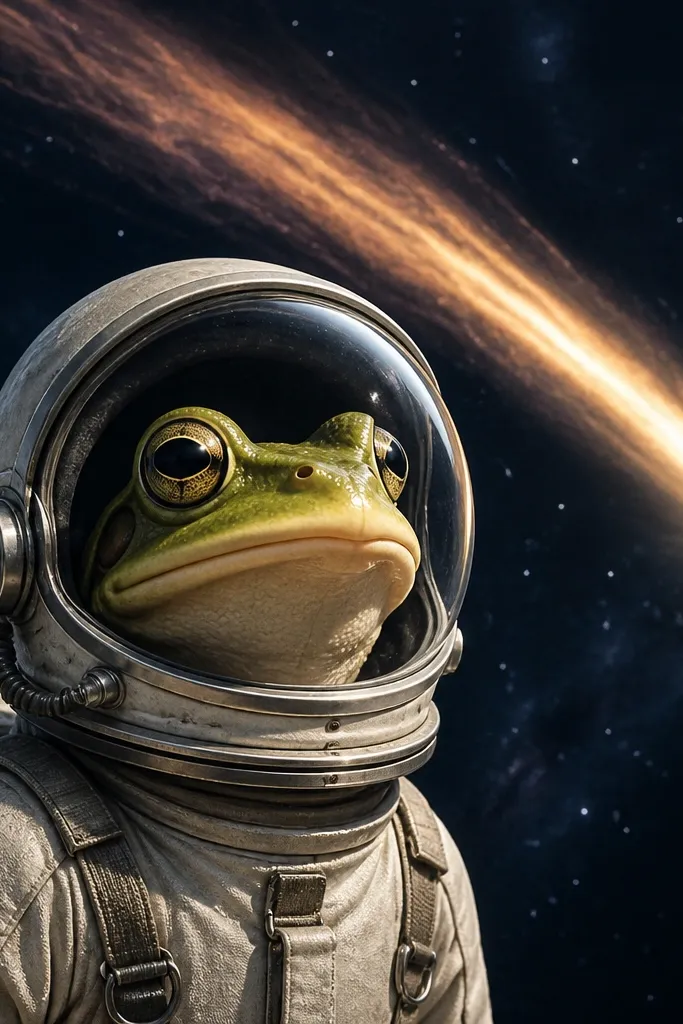
This idea combines the clear framing of a helmet with the energy of a comet tail. The comet tail gives you sweeping curves that look great in marker color, and it helps your frog feel like it’s moving forward. Keep the frog’s face centered and simple so it doesn’t get lost in the background. Use a bright comet color like teal or orange and a darker background so the tail looks glowing. It’s perfect if you want a “poster-like” cartoon without complicated rendering.
Start by drawing the frog and then add a rounded helmet shape around the head, leaving room for a clear visor highlight. Then draw a comet tail behind the helmet as a long curved streak with 3-4 smaller trailing lines. Finally, add star dots around the tail, ink outlines, then color: helmet light gray, visor pale blue, comet in a bright single color with a light highlight edge.
Keep the comet tail one-direction only so it reads as speed, not scribbles.
Don’t add planets or detailed stars fields; the comet tail is the main background.
15. Frog with Polka Dot Pattern Body and Minimal Background
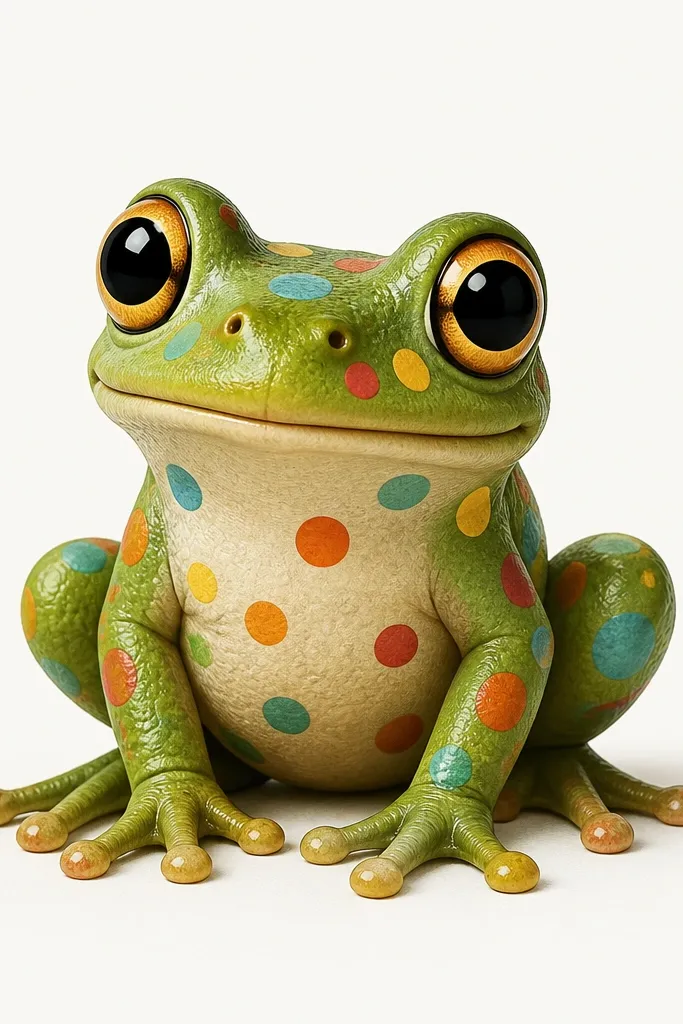
Pattern frogs look good because the pattern replaces background complexity. Put polka dots on the frog body only, not on everything, so the composition stays focused. Use a simple pose — front-facing sitting — so you can practice clean symmetry. Choose one dot color that contrasts with the frog’s green, like white or yellow, and keep dot sizes consistent. Minimal background makes this perfect for AdSense-friendly images because the subject is the whole point.
Pro tipLightly mark dot placement with 3-4 guide lines so spacing stays even.
First, draw a front-facing frog with a big oval body and small arms at the sides. Then add polka dots across the belly area, keeping them evenly spaced in a grid-like rhythm. Finally, ink with a bold outline, color the frog solid green, and fill the dots with one contrasting color, leaving the background plain white or one soft pastel wash.
AvoidDon’t mix dot sizes and random placement; that’s how patterns start looking messy.
16. Frog Riding a Tiny Rocket with Window Stars
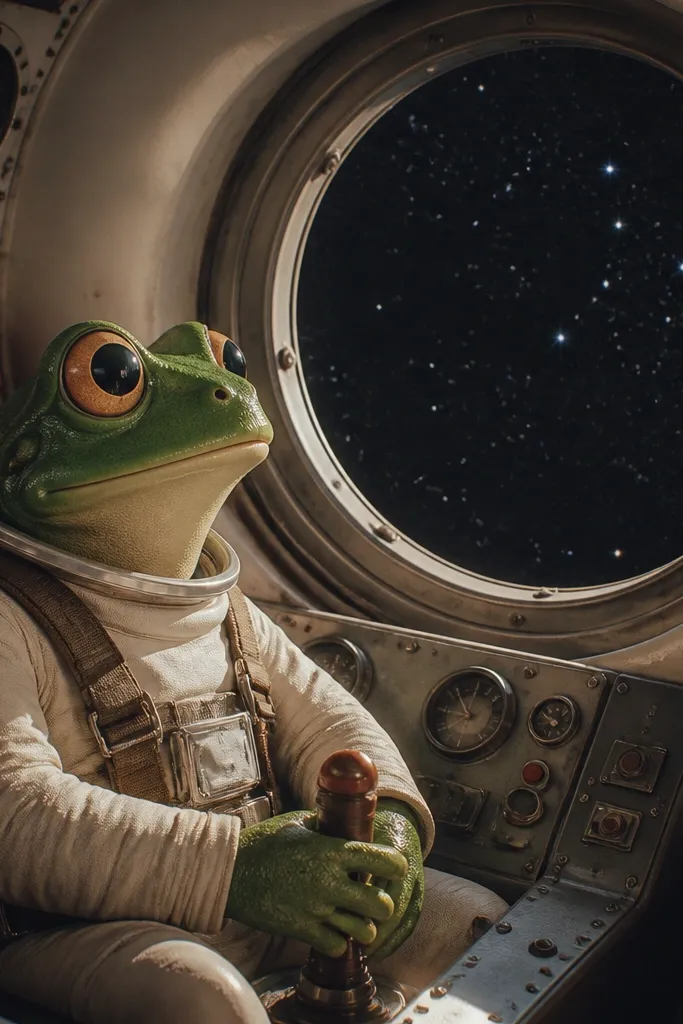
Rockets give you built-in shapes and a satisfying center composition. A tiny rocket with a round window lets you tuck the frog’s face inside the frame, so it reads instantly. Add a few star dots outside the window and a simple flame at the bottom for motion. This is a great drawing for learning how to combine character and object without turning it into a technical sketch. Keep the rocket colors bold and simple so it looks like a sticker or kid’s book illustration.
Pro tipMake the flame color match the rocket accent so the drawing feels cohesive.
First, draw a small rocket body as a rounded cylinder with a pointed top and simple fin triangles near the base. Then place the frog inside the rocket through a round window on the front side. Finally, add a flame at the bottom as a teardrop shape and draw 6-10 star dots in the window, ink and color in flat tones.
AvoidDon’t render engine details; a single flame shape looks cleaner and cuter.
17. Frog with a Bookcase Background and Floating Pages
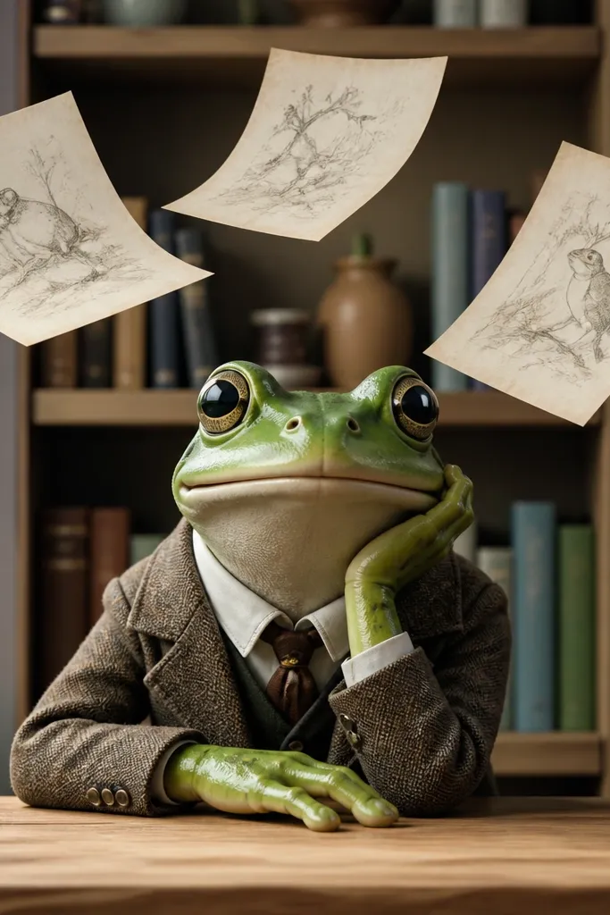
This gives you a story scene without needing a detailed environment. The bookshelf adds vertical shapes that make your frog feel grounded, and the floating pages show motion and imagination. Keep the bookshelf simplified: three shelves, six book spines, no tiny titles. Then draw three pages drifting around the frog with curled corners. It’s a strong option for someone who wants a “background that looks good” but doesn’t want to paint a whole room.
Pro tipColor the pages slightly off-white and add one gray fold line so they look like paper.
Start by drawing the bookshelf as a rectangle frame with three horizontal shelf lines and simple book spine stripes. Then draw the frog in the center in front of it, leaving space for the floating pages. Finally, add 3-4 page shapes around the frog with curved edges, ink everything, and color the shelves in one wood tone and the pages in off-white.
AvoidDon’t add lots of book textures; flat stripes keep it readable.
18. Frog Sunbathing with Sunglasses and Towel Stripes
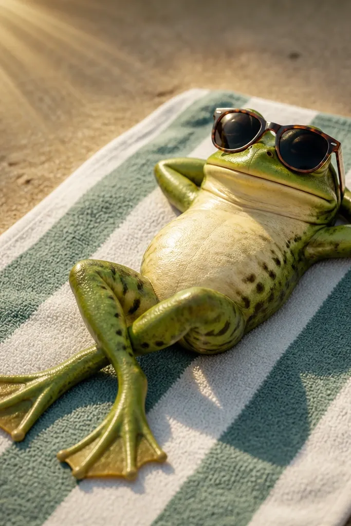
Sunbathing is an easy pose, and sunglasses are a quick character upgrade. The towel stripes give you a repeating pattern that looks clean and photogenic, and sun rays add a graphic background without clutter. Place the frog low in the frame so the towel and rays fill the composition. Use a limited palette: one towel stripe color pair, one frog green, one shade for the sunglasses. Keep the facial expression relaxed — small mouth and calm eyes — so it feels like a mood, not a joke.
Pro tipMake the sunglasses slightly oversized; it makes the drawing cute at small size.
First, draw a rectangular towel with diagonal or horizontal stripes and a slight fold line near the bottom. Then sketch the frog lying on its belly with sunglasses covering the eyes and arms stretched out. Finally, add 8-12 sun rays around the frog and color: towel stripes alternating two colors, sunglasses dark gray, rays pale yellow, frog green in solid fill.
AvoidAvoid complex shading on the frog; flat color plus one simple shadow under the body is enough.
19. Frog in a Picture Frame with Doodle Border
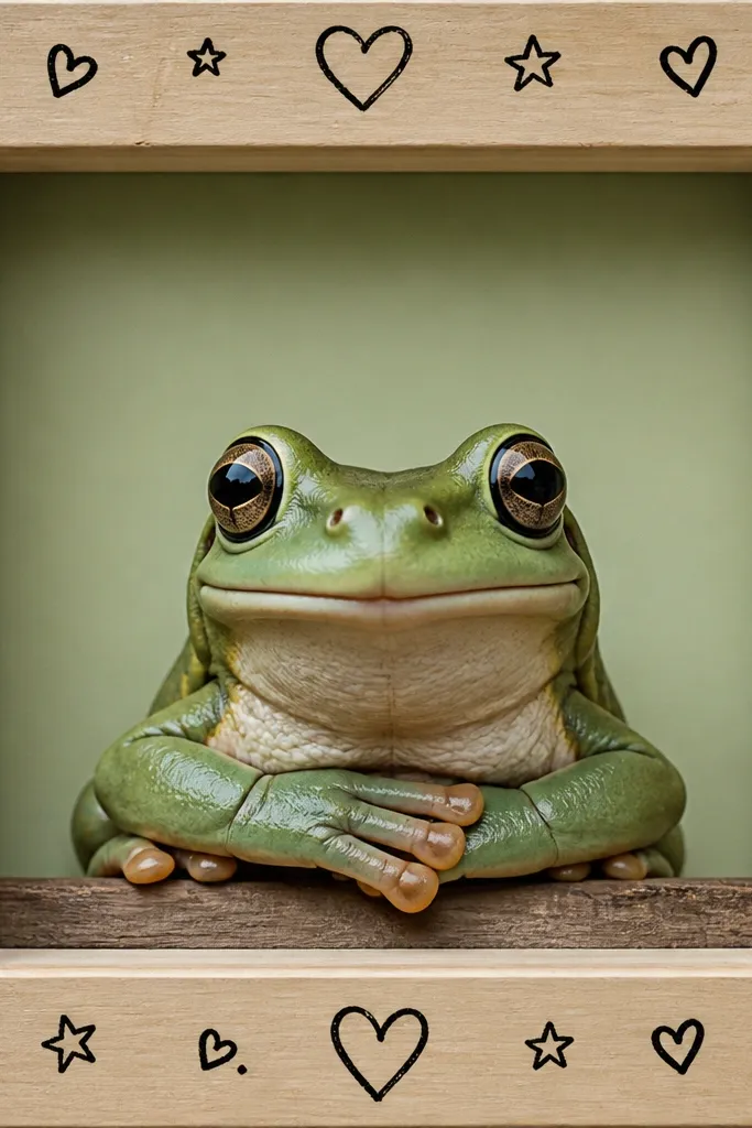
Framing makes your cartoon look finished, even when the drawing itself is simple. The frog sits in the center, while the doodle border creates a playful edge that photographs well. Use one frame style — rounded rectangle or simple rectangle — and keep the doodles consistent: small hearts, stars, and circles around the border corners. This is a strong choice for wall art because it looks like decor, not a sketch. Color the border with two accent colors so it doesn’t fight with the frog.
Pro tipKeep the doodles away from the frog by at least one finger-width in your sketch, visually.
First, draw a large rectangle frame around your composition and add a thin inner border line. Then place the frog centered with a clear face and a single accessory like a tiny bow or leaf in one hand. Finally, add a doodle border outside the inner line with 10-15 small shapes, ink everything, then color with flat fills and minimal shading.
AvoidDon’t crowd the border with different doodle styles; one set looks cleaner.
20. Frog with a Giant Bowtie and Polished Background Gradient
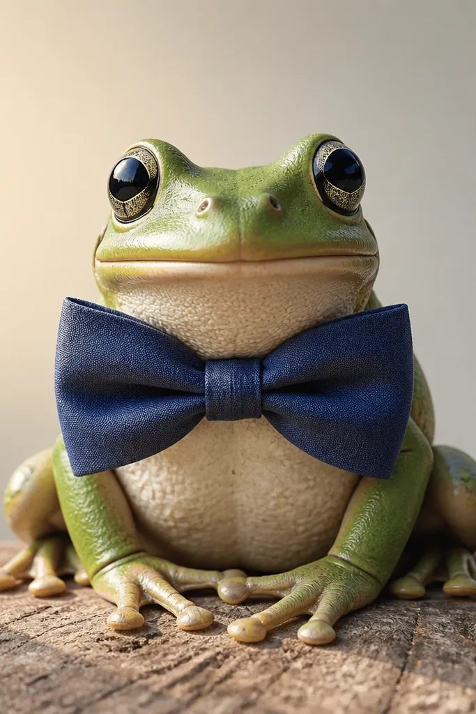
A bowtie is a high-impact accessory that instantly makes a frog look “dressed up.” The trick is to keep the frog body simple and let the bowtie take up visual space. A smooth light gradient background makes the colors look more polished on camera, but you don’t need heavy blending — just a careful wash. This idea is great for learning controlled coloring because the gradient can be done with markers or watercolor pencils. Keep the bowtie colors bold (teal and white, or red and cream) to contrast with the frog.
First, draw a front-facing frog and add a large bowtie centered on the chest, with two loops and a small knot in the middle. Then create a light gradient background behind the frog using one soft color at the top fading to another or to white at the bottom. Finally, ink outlines, color the bowtie in two contrasting solid colors, then add a small shadow under the bowtie knot and a simple cheek blush.
Blend the gradient with gentle horizontal strokes and stop while it still looks slightly streaky — it looks more hand-drawn.
Don’t darken the gradient around the frog; you want the frog to stay the darkest subject.



