

1. One-pass outline with consistent line weight
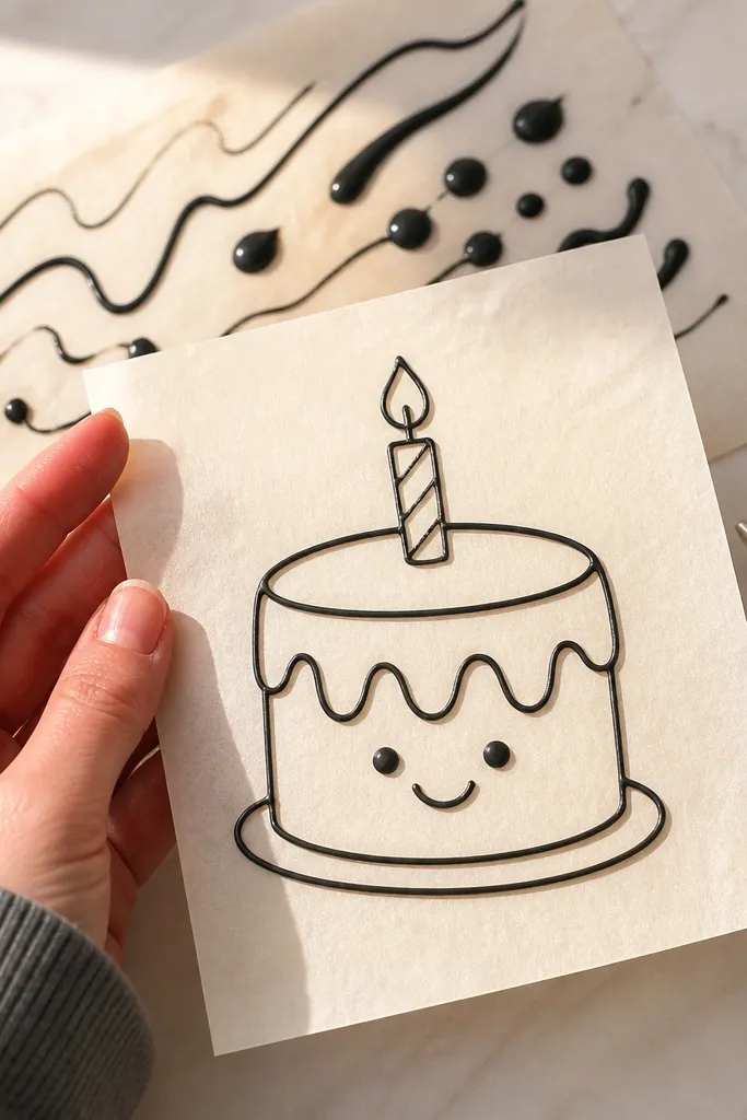
Most “bad cake drawing” isn’t about artistic talent — it’s about inconsistent stroke thickness. When the outline alternates between skinny and fat, the drawing reads like it was corrected. This setup forces you to commit to one pass per line, with the same pressure the whole way. Use a finer tip for outlines and keep the icing slightly thicker than your first instinct, because very runny icing spreads and widens the line on contact. The result is crisp edges that still look hand-drawn, not printed.
Start with an outline-only sketch on paper using the same proportions you want on the cake. Transfer it lightly with a paper template or tracing method, then pipe your outline with a small round tip (around 1-2mm opening). Hold the piping bag at a steady angle, and practice a couple of short test lines on a spare piece of parchment. Pipe each outline once, without going back over it. Let the outline set for a few minutes before adding any dots, eyes, or accents.
If your line keeps widening, don’t press harder — swap to a smaller tip or thicken the icing by adding a tiny pinch of powdered sugar.
Avoid going over the same outline multiple times.
2. The 'eyes first' spacing fix
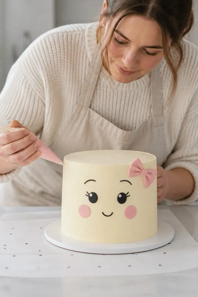
Eyes are the fastest way to tell if your spacing is wrong. People often draw bows, hair, or cheeks first, then squeeze the eyes into whatever space is left. That creates the “friendly but off” look — the face seems almost right until you notice the eyes are too close or too far. When you place eyes using a measured guide, the whole face snaps into balance. This approach is also forgiving because you can adjust eye size with icing thickness, not by redrawing everything.
Pro tipMake pupils slightly smaller than you think. It leaves room for adjustment and prevents the face from looking cross-eyed.
Draw a simple centerline and a horizontal guideline on your paper sketch, then repeat the same guides lightly on the cake. Transfer the guidelines first, not the details, so you have reference points. Pipe the eye shapes as two identical ovals, then add pupils last so you can correct alignment before the features lock in. Compare the distance between the eyes to the width of the face and adjust only the pupils if needed. Finish with eyebrows and lashes after the eyes set so they don’t smear.
AvoidAvoid drawing decorative elements before you confirm eye spacing.
3. Flood vs line: two icing textures, one drawing
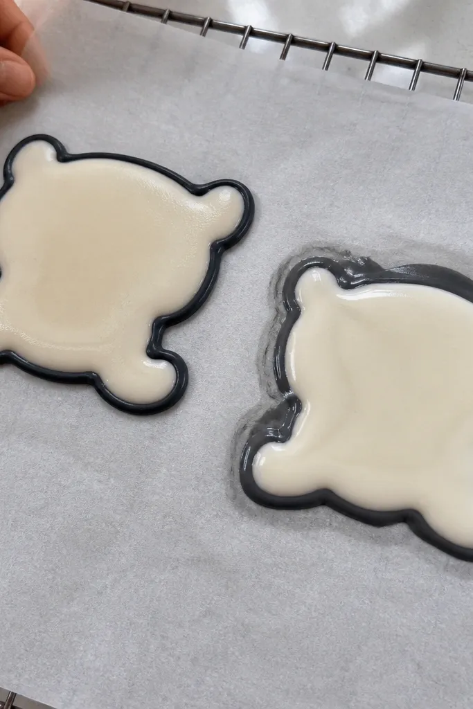
One icing consistency for everything is why your fills look bumpy or your outlines look like they melted. Outlines need a thicker, more controlled paste so the line stays where you put it. Fills need a slightly looser consistency so they level without leaving gaps. If you try to outline with fill icing, it spreads. If you fill with outline icing, it sits as raised ridges. Keeping two textures means your drawing looks intentional, not patched.
Make one piping consistency for line work — smooth and thick enough to hold a shape for a second before settling. Make a second batch for fills — slightly thinner, so when you pipe a small puddle it levels within a few seconds. Outline the shape first and let it set just enough to prevent bleeding. Then pipe the fill and nudge it gently with a clean scribe or toothpick only if it needs guidance. Let the fill fully set before you add any top details.
Test both consistencies on a corner of parchment. If the fill doesn’t level, thin it with a few drops of water; if it runs past the outline, thicken it with powdered sugar.
Avoid using the same icing texture for outlines and fills.
4. Transfer that doesn't smear
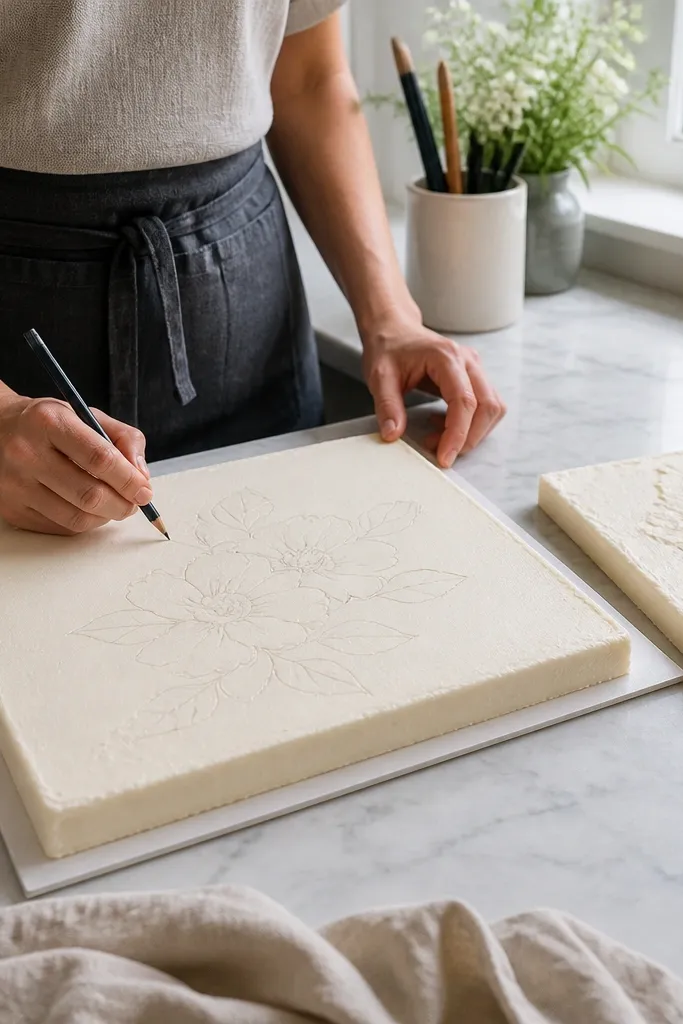
Transfer problems look like “my drawing is wrong,” but the real issue is that the guide lines move or get dragged into wet icing. If you press too hard during tracing, you leave dents or smear marks that later show through. Light transfer keeps your surface clean and gives you accurate placement. This is especially important on buttercream and ganache, where a heavy hand can leave shiny grooves or crumbs. When your guide stays put, your lines land where you intended.
Pro tipIf your pencil marks look too dark, wipe the surface lightly with a dry cloth before piping so the color doesn’t bleed into icing.
Use a template printed and cut to size, then place it on top of the cake without stretching it. Transfer using a light technique — tracing paper or a very soft pencil — just enough to leave faint marks. If the cake surface is tacky, wait until it firms slightly before transferring, otherwise the marks can smear. Pipe your drawing starting from the largest reference lines first, not the smallest features. After the first few outlines, stop and check alignment against your guidelines.
AvoidAvoid pressing hard while transferring the sketch.
5. Timing: when to pipe details on set buttercream
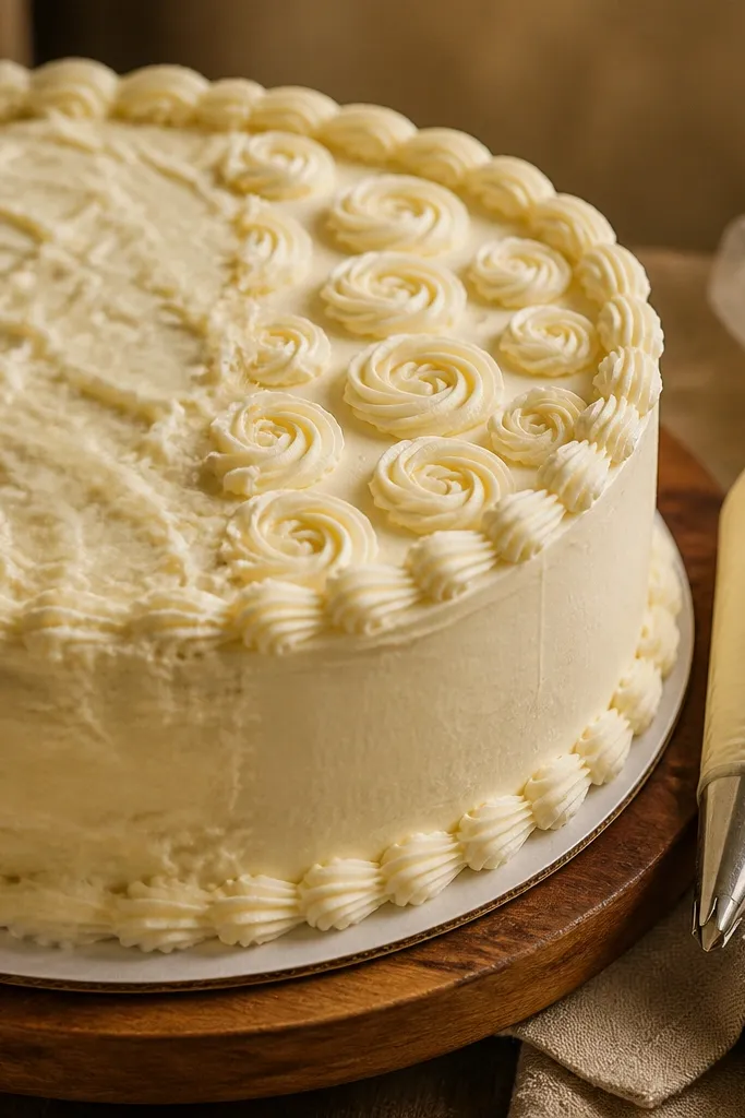
Timing is the silent killer. If you add details while the base frosting is still wet, your lines blur and the whole drawing looks like it’s dissolving. If you wait too long and the surface is crusted, your tip drags and the line breaks. You want the sweet spot where the icing grabs just enough to hold edges. That’s how you get sharp dots, eyelashes, and tiny accents that don’t look smeared.
After you frost the cake, let it sit until the surface loses that glossy wet look. Press a clean fingertip very lightly against a hidden spot — it should feel tacky, not wet. Pipe your outline first, then pause before adding eyes, lashes, or small text-like details. If the outline looks rounded or sinks, wait longer before the next layer. If the tip skips or tears the frosting, the surface is too dry — wait less next time or lightly re-tack the area with a tiny amount of fresh frosting.
Work in sections. Pipe one face or one side, then move on so you’re always hitting the right set stage.
Avoid piping tiny details onto a glossy, wet surface.
6. Clean corners and sharp curves with the right tip
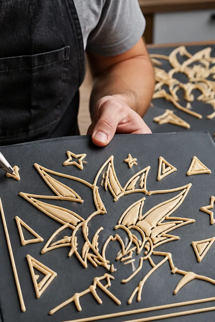
A lot of cake drawings look “messy” because the tip choice doesn’t match the line job. Broad tips make corners round and curves thick. If your design has triangles, stars, or hair spikes, you need a tip that can produce a narrow, controlled line without wobble. This is also where people try to fix mistakes by dragging — dragging makes fuzzy edges and dents the frosting. Getting sharp curves and corners gives your drawing that tidy, intentional look.
Choose a small round tip for outlines and pointed shapes. For hair spikes or star points, keep the bag tip close to the surface and stop the motion at each point so the line ends cleanly. For smooth curves, rotate the cake slightly instead of twisting your wrist — it keeps the line consistent. Practice on parchment by drawing a triangle and a circle using the same pressure you’ll use on the cake. If the triangle base looks thick, switch to a smaller tip before you start.
Hold the tip at a consistent height. Too high makes lines break; too low can gouge the frosting.
Avoid using a large tip for everything, especially sharp corners.
7. Color layering without muddy edges
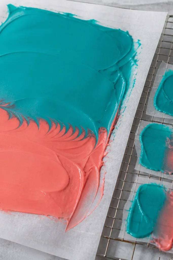
Color layering is where beginners create gray smudges. The usual cause is adding a darker color on top of fresh lighter icing before it sets. Instead of crisp edges, you get bleed and a muddy middle that looks like the colors mixed. The fix is simple: let each color layer firm and then add the next. You also want to keep your darker color slightly thicker so it doesn’t creep into the lighter area. That way, your outlines around colored sections look clean, not feathered.
Pro tipIf colors bleed, thicken the next darker batch by adding powdered sugar a pinch at a time.
Start with the lightest color areas first. Pipe a boundary line around each colored section, then fill with the lighter color and let it set until it looks matte, not shiny. Only then add the darker color or shading. If you’re doing gradients, use small dots or short strokes, not one continuous smear. After the darker layer sets, add any final highlights with a very small tip so they don’t spread.
AvoidAvoid layering darker colors onto wet lighter icing.
8. Lettering and tiny marks that stay readable
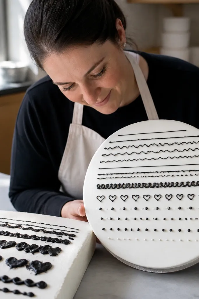
Tiny marks are where your hand control shows up. If your lines are too thick, lettering becomes blobs. If your icing is too thin, the strokes spread and the letters merge. The mistake people make is treating lettering like a bigger line and using the same pressure and tip. For readable marks, you need smaller tip control and a slower pace. Also, you need to plan letter size relative to the cake so the strokes aren’t microscopic.
Pro tipDo a quick spelling mockup on parchment with the same tip. If the letters blur at that size, your cake text is too small.
Sketch the text on paper with the exact height you want on the cake, then transfer only the baseline guide. Use a very small round tip for letters and keep each stroke short — lift the tip between letters. Pipe one word at a time so you can stop and check spacing. If strokes look too thick, switch to a smaller tip or reduce icing thickness. Let the text set before you add any nearby dots or decorations that could bump it.
AvoidAvoid writing tiny details too fast while the icing is still moving on the surface.



