
1. Legs that read as noodles
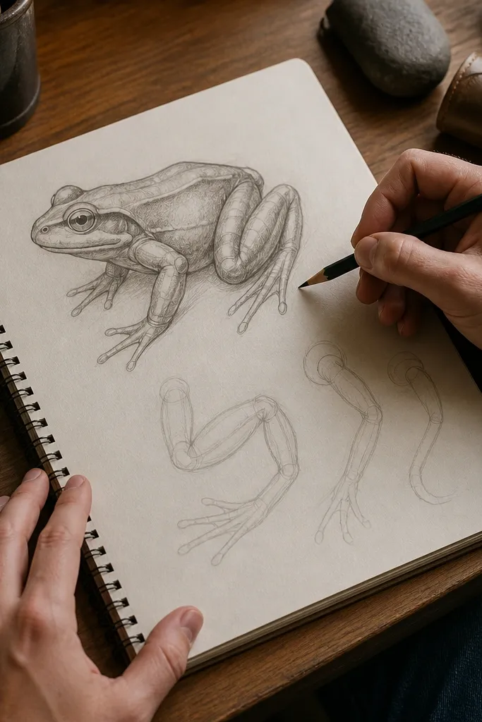
When frog legs look like noodles, it’s because they’re drawn as one continuous line with no volume. Real frog legs have thick segments: a thigh mass, a knee bend, a lower leg, then the foot with toes splayed. If you draw only the outer contour, you lose the turn of the knee and the push of the ankle, so the pose collapses. This correction is worth it because it fixes the biggest “wrong” in a frog drawing before you add any texture.
Start by drawing a torso oval and a hip block behind it. Then sketch each leg as two rounded tubes with a clear joint marker at the knee and another at the ankle, keeping the tube thickness consistent from start to joint. Finally, shape the foot as a paddle with toe tips, and only then add webbing lines that follow the foot’s angle.
Press harder only after the leg silhouette matches your pose from thumbnail size. Early heavy lines lock in bad proportions.
Avoid drawing the leg as a single thin outline and adding “muscle” later with random lines.
2. Eyes placed on the wrong plane
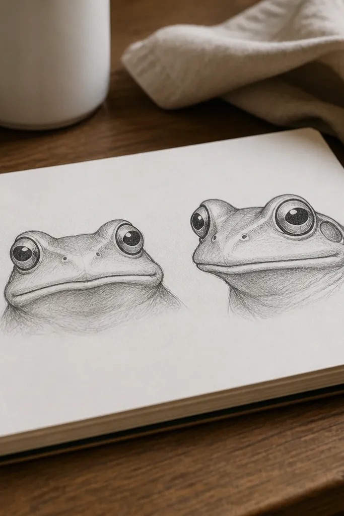
Eye placement is what makes a frog look believable or toy-like. Many drawings put the eyes too low and too centered, which makes the head read flat and the frog look like it’s staring straight out of a wall. In real frogs, the eyes sit slightly above the cheek line, and the head has a forward-leaning volume. Getting this right gives you instant improvement even if the body is still rough.
Draw a simple head wedge: a rounded snout shape and a bulkier back-of-head mass. Add a light horizontal eye guideline that sits slightly above the cheek line, then place both eye shapes so they touch that same line. After that, draw the pupils with a small tilt that matches the frog’s head angle, not a default “straight-on” circle.
If one eye looks “off,” don’t erase everything. Copy the good eye height to the bad one first, then adjust the pupil tilt.
Avoid centering the eyes exactly in the middle of the head or lowering them to fit the face outline.
3. Cartoon outline first
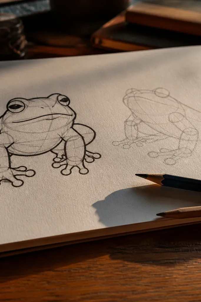
A thick, confident outline can be tempting, but when it’s the first thing you draw, you trap yourself. Frogs have pose-dependent volume: the body compresses and stretches depending on where the legs are. If you lock the outline too early, you end up forcing anatomy to match a silhouette that never meant to be anatomically correct. This mistake is common because it feels productive. It isn’t; it just hides the problem until details make it worse.
Start with a thumbnail in 2 minutes: torso mass, hip block, and one gesture line for the spine. Then build a light construction layer using rounded forms for chest and hips, and block the legs to those anchor points. Only after the structure reads right, draw the clean outer contour in one pass and remove or lighten the construction marks.
Keep your construction lines under 30% opacity by using a soft pencil and light pressure, so they don’t interfere when you ink or shade.
Avoid committing to a final outline before you check leg length and joint positions.
4. Knees and ankles in the wrong spots
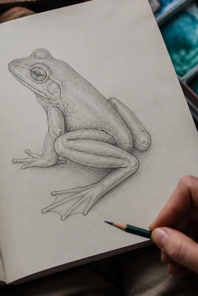
Frog joints give the pose its credibility. If the knee sits too far forward or the ankle floats away from the foot, webbing looks twisted even when you draw it carefully. The human brain reads joints instantly, so small placement errors create a big “something is wrong” feeling. Fixing joint placement also makes shading easier because you know where the folds happen when the leg bends.
Mark the hip anchor first, then draw the thigh to knee as a thicker segment that points toward the hip. Place the knee joint as a clear bend point, then draw the lower leg segment to the ankle marker. Finish by shaping the foot paddle so the toes fan out from the ankle direction, and only then add webbing folds that match that angle.
Do a quick silhouette check: if the leg bend point doesn’t show clearly in the outline, your joints are probably misplaced.
Avoid drawing webbing first and using it to “correct” a wrong knee or ankle position.
5. Spot patterns that don't follow form
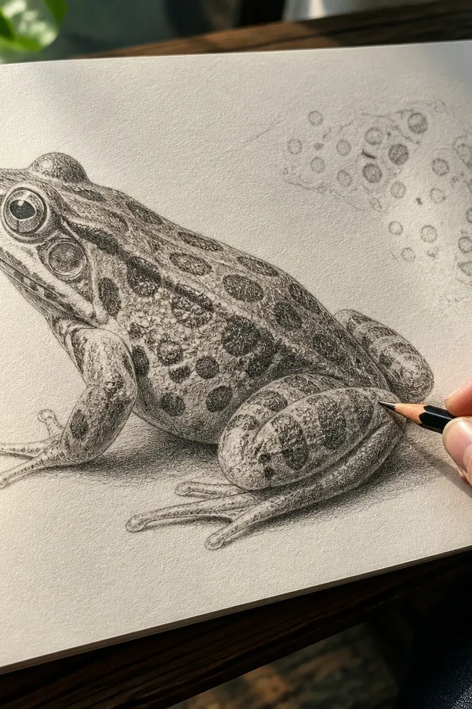
Spots and skin marks are where beginners accidentally turn a 3D frog into a flat sticker. If you scatter spots without thinking about direction, they ignore the curvature of the torso and legs. The frog still looks unfinished even when the spots are “cute,” because the texture isn’t wrapping around volume. The fix is simple: treat spots like contour-aware marks that change density and shape as the surface turns.
Pro tipBefore spots, sketch a few long, curved guide lines on the body to remind yourself how the surface turns.
Shade the frog lightly with a basic value plan: one side darker, one side lighter, even if it’s just 2 levels. Then place spot clusters following the curvature of the torso and the direction of the leg segments, not random dots. Vary spot size: smaller and tighter on the far side, larger and clearer on the near side, so the pattern supports the form.
AvoidAvoid placing identical spot sizes everywhere, especially across bends like the knee and ankle.
6. Under-shaded bodies that flatten the frog
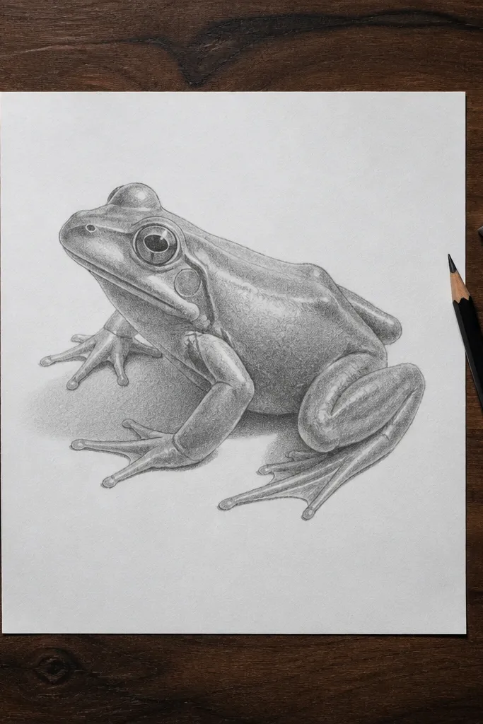
A frog can be anatomically correct and still look flat if you skip value structure. Texture lines and outlines don’t replace shading; they just decorate. Frogs have rounded surfaces where light wraps, especially on the chest and thigh. When you shade only the darkest spots, the middle tones disappear and the frog reads like a cutout. This mistake is common because people jump from line drawing to detail.
Pick a light direction and block in two values on the torso and legs: a light plane and a darker plane. Use soft pencil blending or light crosshatching to keep transitions gradual on rounded parts, and use sharper contrast only at joint creases. Then draw skin texture on top of those value shapes, so the texture lands on the correct planes.
Use a kneaded eraser to lift highlights off the darker plane instead of trying to shade everything darker.
Avoid adding texture lines over unshaded forms; it makes the sketch look busy but still flat.
7. Webbing drawn like a straight comb
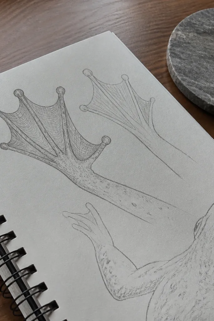
Webbing is not a set of parallel stripes. It follows the toe paddle’s curvature and the thickness of the foot, so the lines should curve and taper where the toes separate. If you draw webbing as a rigid comb, the feet look stiff and the pose looks wrong even when the leg anatomy is decent. Getting webbing right is a fast credibility boost because feet are where people look first.
Block the foot paddle first as a single curved shape with toe tips. Then draw webbing as curved bands that start thicker near the base and thin toward the toe tips. Leave small gaps where toes separate so you don’t turn the whole foot into one flat sheet.
Shade the underside of the foot with a darker edge line. Even a thin shadow makes the webbing look dimensional.
Avoid drawing webbing as straight lines that ignore the toe fan angle.
8. Proportions drifting between head and body
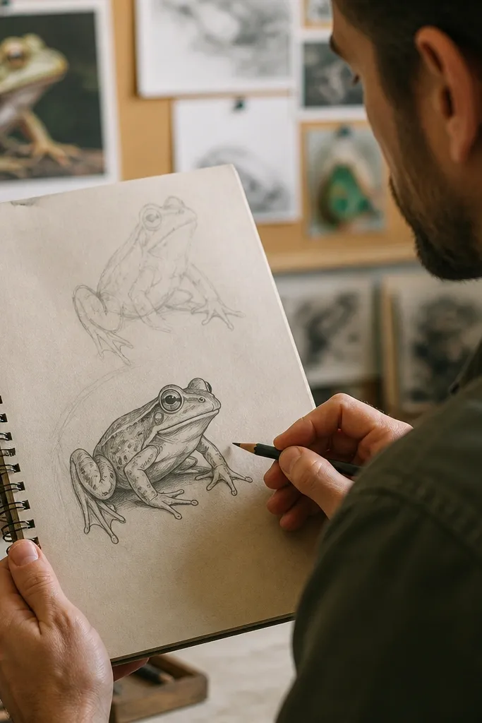
Proportion drift is sneaky: your head might look right, then your torso grows too long or too short after you place the legs. Frogs have a compact body relative to leg length, and the head-to-body ratio affects the whole mood of the pose. When ratios drift, the frog looks like it’s wearing the wrong body, even if individual parts are drawn well. This fix gives you a stable starting frame so every later detail lands correctly.
Pro tipRecheck the ratio at thumbnail size. If it’s off there, it will be off in the final drawing too.
Use a simple measurement method: draw a vertical guide line for head height, then compare it to torso height. Keep the head size and torso size proportional before you add leg length, using the same pencil marks or a quick grid. After that, place hips and legs based on those fixed proportions, not based on how the outline looks.
AvoidAvoid resizing the head after the legs are done; it breaks the anatomy relationships.
9. Texture lines replacing structure
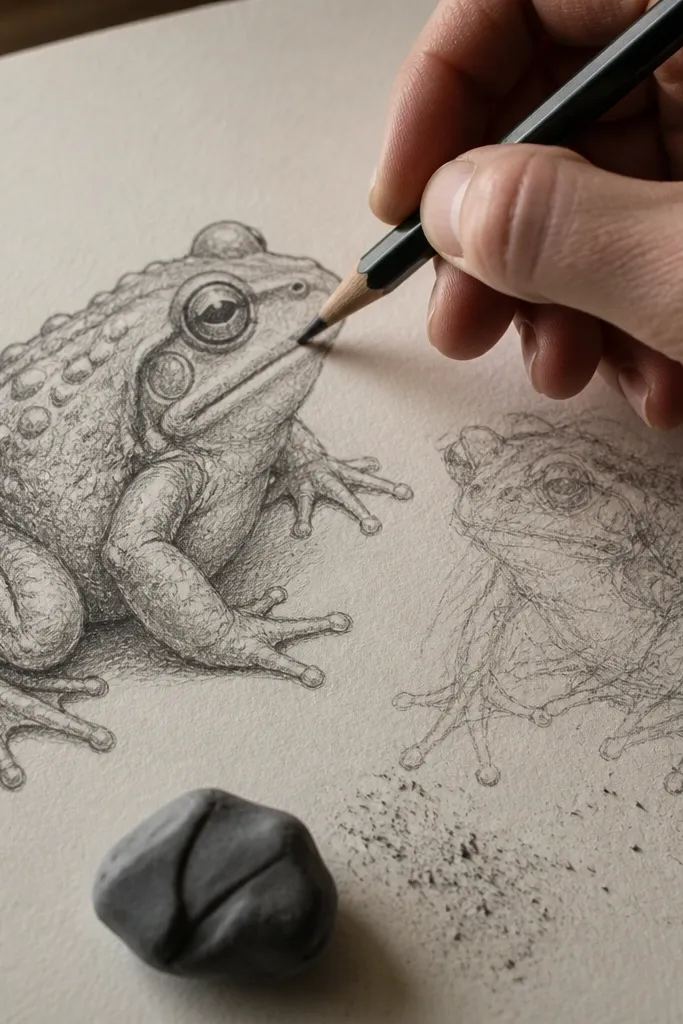
Texture lines can be a crutch. If you start adding warts or skin wrinkles before the body volume is clear, the drawing turns into a collection of marks. You end up working harder without improving the pose, and the frog never gains that “solid” look. The smart approach is ordering: structure first, then texture that follows the planes you already established. That order is what prevents the messy, overworked look.
Pro tipKeep texture marks small and consistent. Big random marks on top of a rough form usually ruin the read.
First, finish a clean form pass: torso, hips, legs, head angle, and eye placement. Second, add shading planes so you can see where light wraps around the body. Third, add texture with short strokes that stay inside those planes, using lighter pressure on the bright side and heavier pressure in the dark side.
AvoidAvoid starting with texture and hoping it will “hide” wrong anatomy.



