
1. Five-Petal Trap Fix With Petal Overlap Map
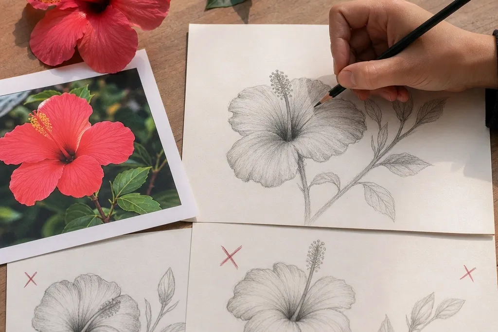
This project is a direct cure for the most common hibiscus mistake: five identical petals drawn in a row. You’ll map the overlap by drawing a loose “petal stack” — top petal first, then the two side petals that tuck under, then the inner petals that sit closer to the center. The result looks dimensional because your viewer can see which petal is in front. It also makes your linework easier since you already know which edges should be crisp and which should be partially hidden.
Start with a light pencil silhouette: five petal shapes, but keep them asymmetrical in size and angle. Then draw a simple overlap plan — use faint guide lines to show where one petal covers another. Finally, darken only the outermost visible edges with HB for the outline and keep hidden edges erased or skipped. Add a thin highlight line on the top edge of the raised petal to sell the curvature.
Use an eraser to lift edges rather than redrawing them — it keeps your outline from getting muddy.
Don’t make all five petals the same size and angle.
2. Center Funnel That Makes Stamens Look Placed
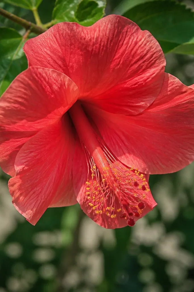
A hibiscus center is where most drawings fall apart. If the center is just a circle, the stamens look pasted on top and the flower reads flat. This fix uses a funnel shape: wide at the base where petals meet, narrowing toward where stamens originate. When you anchor stamens to that funnel, they naturally angle forward and the whole flower looks like it has depth. It’s also faster than over-detailing, because the structure does the heavy lifting.
Draw a shallow oval for the base of the center, then taper it into a narrower oval or teardrop pointing toward the viewer. Place the stamens as short curved lines that start from the narrow end, not the outer edge. Then block a darker patch at the funnel walls where petals overlap the center. Finish by adding a few seed-like anthers at the tips with lighter pressure so they don’t overpower the petals.
Pro tipKeep stamens slightly uneven in length — hibiscus stamens rarely line up perfectly.
AvoidDon’t draw stamens from a flat circle.
3. Contour Lines That Fake Petal Curvature
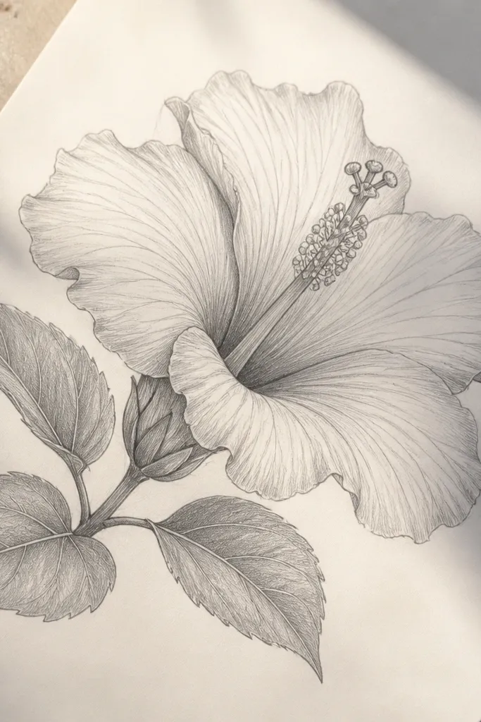
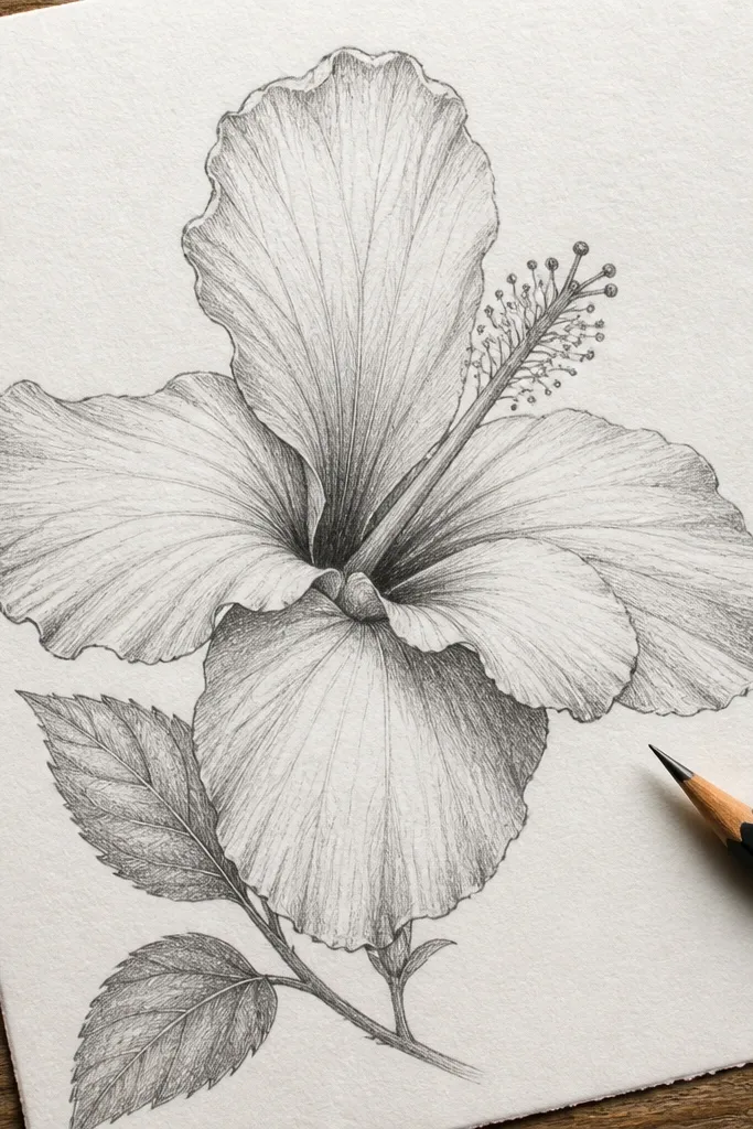
If your hibiscus has heavy outlines everywhere, it’ll look like a coloring page even with shading. Petals have a rounded surface, and you need gentle contour cues to show that turn. This approach uses thin contour lines that follow the petal’s arc, not straight “outline-only” edges. The shading then has a direction, which makes the petals look like they fold and overlap. You also get cleaner results because you’re not fighting thick lines later.
Outline the petal edges lightly first, then add one or two contour curves inside each petal that follow the petal’s bend. Shade with a soft HB or 2B pencil using short strokes that follow those contour lines. Keep the darkest areas where one petal overlaps another and where the petal base meets the center funnel. Finally, lift highlights by gently erasing along the top edge of the petal where light would hit.
Pro tipIf your lines look too dark, switch to HB for outlines and save 2B for overlap shadows.
AvoidDon’t outline every edge with the same dark pressure.
4. Veins Last: The One-Rule for Not Flattening Petals

Veins can improve realism fast, but they’re also a common mistake trigger. If you add veins before you commit to the petal shape and overlap shadow, the lines fight your shading and make the flower look like it’s printed. This method delays veins until after the silhouette and value plan are in place. Then you draw veins lightly, following the petal’s direction, so they reinforce the form instead of cluttering it. The hibiscus reads as a flower, not a diagram.
Finish the petal silhouette and add overlap shadows first. Use a light touch to shade the petal base darker near the center funnel and keep the outer edge lighter. After that, draw veins as a few directional strokes: one main vein per petal and a couple of branches that taper as they approach the edge. Use a kneaded eraser to soften any vein lines that look too harsh.
Veins should fade near the petal edge — don’t keep them equally bold all the way out.
Don’t ink or darken veins before you shade the petals.
5. Leaf Veins That Don't Look Like a Fan Sticker
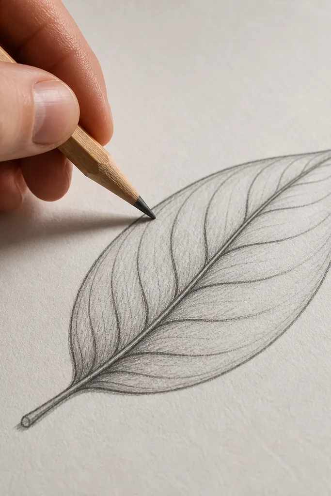
People focus on the hibiscus petals and forget the leaves, but leaves can still make the drawing look wrong. The common mistake is evenly spaced, straight fan veins that read artificial. Hibiscus leaves have a dominant center vein and side veins that curve, then taper as they travel toward the edge. This makes the leaves look like they belong to the same plant as the flower. It also prevents your page from looking like separate clip-art pieces.
Draw the leaf shape first with a clear center line from base to tip. Add side veins starting from that center line, with each vein curving slightly rather than shooting straight to the edge. Keep the vein spacing tighter near the base and wider toward the tip. Shade the underside edge with a light 2B along the lower rim so the leaf has a thickness.
Use fewer veins than you think. Three to five side veins per half looks more natural than ten.
Don’t draw leaf veins as perfectly symmetrical straight lines.
6. Petal Edge Thickness Control for Clean Detail
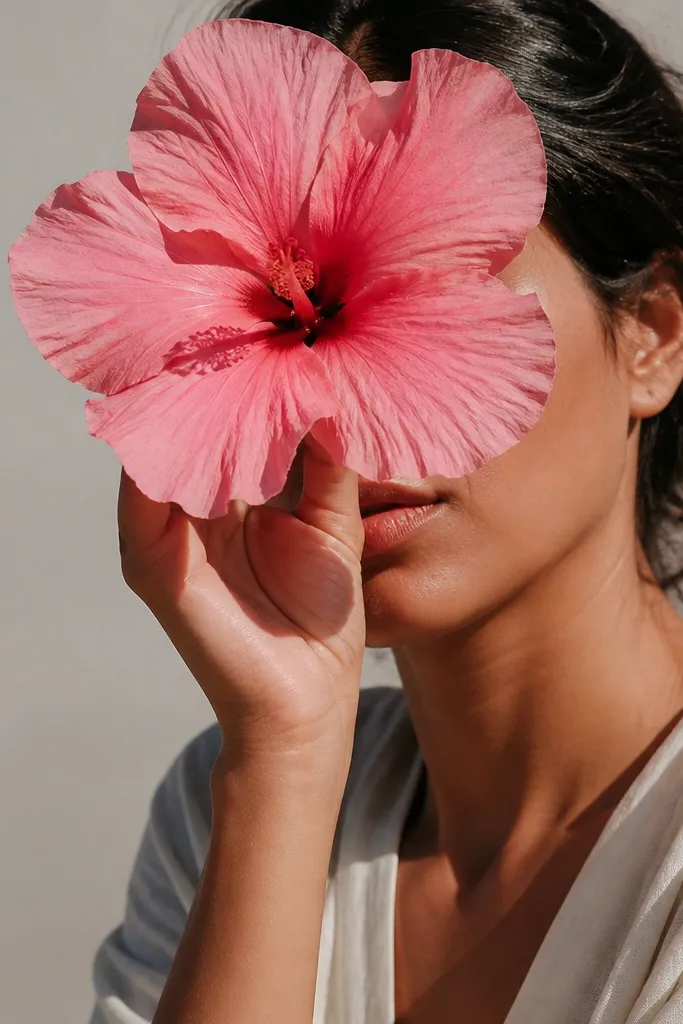
A hibiscus looks messy when every petal edge has the same line weight. Real petals have softer outer edges and sharper fold edges where layers meet. This fix uses two edge treatments: thin, lighter edges on the outer silhouette and slightly darker lines only at folds and overlaps. That makes the flower look intentional even if your shading is simple. It also keeps the drawing from turning into a dark blob when you add values.
Use HB to sketch the full petal outline lightly. Darken only the edges that are clearly in front using 2B, and leave the edges that are behind overlapped petals lighter or erased. When you add overlap shadows, connect them to the fold edges so the value change follows the structure. Finish by refining just the top petal edge with a clean eraser highlight strip.
Rotate your pencil slightly so the side of the lead makes smoother edge transitions than the tip.
Don’t use the same darkness on silhouette and fold edges.
7. One Light Source Rule for Petal Shading
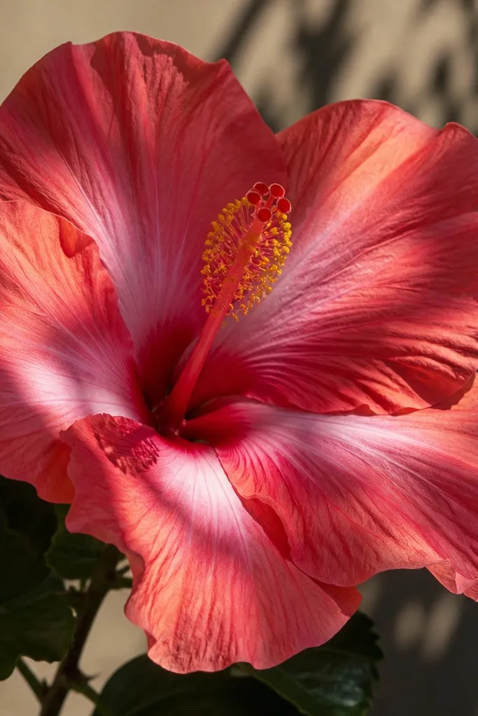
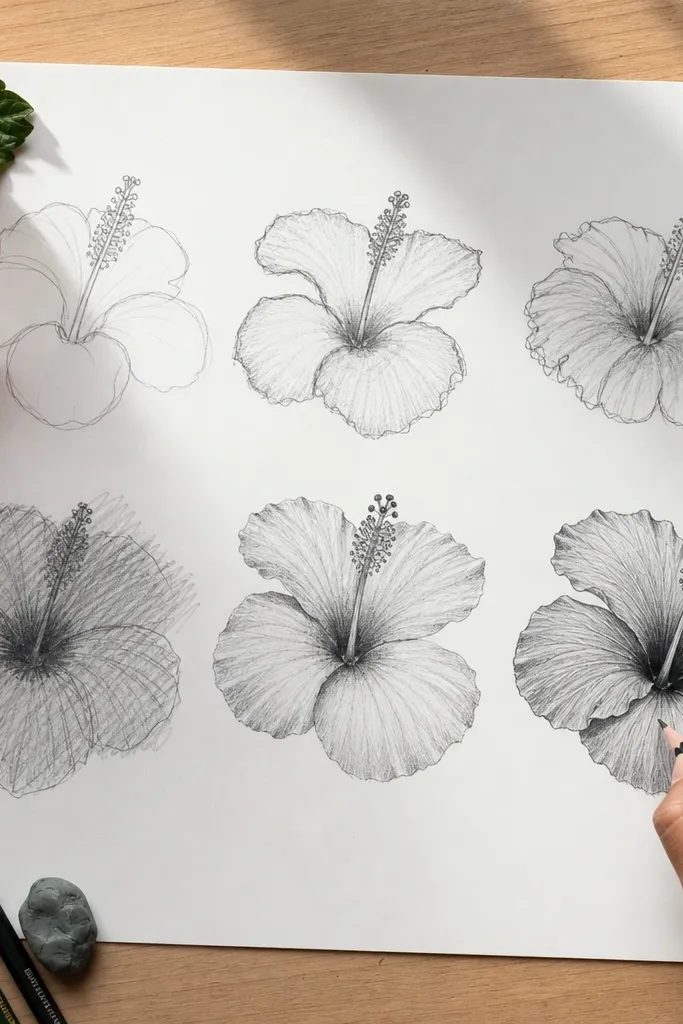
When shading goes in random directions, your hibiscus looks like it’s floating. The common mistake is making shadows under every petal edge, even when light would hit it. This project forces one light source direction and then maps shadows consistently: overlap areas darken, outer edges lighten, and the center funnel deepens. The flower gains a believable volume quickly. It’s also easier than it sounds because you only need a few value steps — no heavy blending required.
Pick a light direction before shading. Shade the petal bases near the center funnel darker, then lighten toward the outer edges. Add the darkest values where one petal covers another, because that’s where occlusion happens. Finally, add a narrow highlight band on the top-facing petal edge using a kneaded eraser or a lighter HB pass.
Limit shading to three values: light, mid, dark. More than that usually reads gray and flat.
Don’t put shadow under every edge equally.
8. Background Value Contrast for the Hibiscus to Pop

A lot of “my hibiscus won’t look real” problems are actually contrast problems. If your background is pure white and your petals are only lightly shaded, the edges don’t separate. The fix is not complicated: add a very light background value behind the bloom so the petals and center stand out. This makes your linework and shading read clearly, even if your drawing isn’t fully rendered. It’s especially helpful for pencil drawings where everything can look the same brightness.
Keep your hibiscus edges clean first. Then lightly shade the area around the flower with a soft pencil (2B or 4B) using broad, gentle strokes. Stop the background shading a little away from the petal edges so you don’t smudge the outlines. Blend the background with a tissue lightly, leaving the flower itself untouched or only gently refined.
Leave the very center and petal highlight areas untouched so they stay brighter than the background.
Don’t gray out the entire page including the hibiscus highlights.



