
1. Side-Profile Turtle with a Correct Shell Bottom
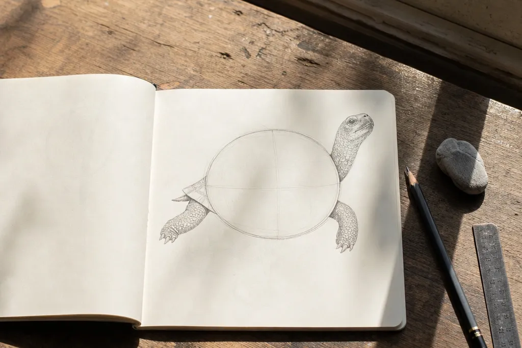
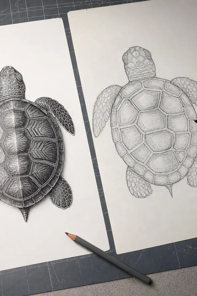
This one fixes the most common “my turtle looks like a blob” problem: the shell bottom. A side-profile turtle shell should have a longer oval that dips slightly toward the bottom, not a perfect circle. When your shell outline has that lower curve, the legs naturally feel attached. You’ll also get a clearer path for the scute lines because they wrap with the shell, not across it. This is a great pick if you want your turtle to read instantly from silhouettes, like stickers or simple kids' cards.
Pro tipBefore you commit to scute lines, lightly trace the shell outline twice — the second pass usually lands on a better oval shape.
Step one: draw a horizontal oval for the shell, then add a slightly flatter bottom by flattening the lower third with a gentle curve. Step two: place the head in front of the shell using a small circle for the skull and a short curved neck line — the neck connects to the shell’s front edge, not its center. Step three: draw four legs as tapered shapes that start at the shell bottom edge and curve outward; add small toe bumps at the end. Finally, add 5-7 shell scutes as curved wedges that follow the shell’s curve.
AvoidAvoid drawing the shell as a perfect circle in side view.
2. 3/4 View Turtle with Head and Shell Overlap
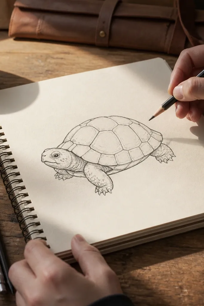
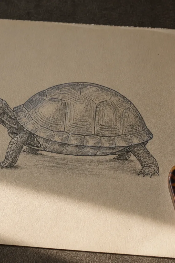
3/4 view is where most Turtle Drawing attempts fall apart because people forget overlap. Your head should sit partly in front of the shell’s front edge, and the far leg should be partially hidden by the shell. That overlap gives depth without complicated shading. The shell also needs asymmetry: the near side should be bigger and more visible, while the far side should tuck back. If you want your turtle to look more “real” on paper without heavy rendering, this is the cleanest option.
Pro tipUse a light construction line for the overlap edge, then erase it after you ink the final outer contour.
Step one: sketch the shell as two overlapping ovals — one bigger for the near side and one smaller for the far side. Step two: draw the head as a circle plus a small beak curve, then connect the neck to the front edge of the near shell oval. Step three: place the near legs with clear contact points at the shell edge; draw the far legs lighter and shorter where they get blocked by the shell. Finally, draw scute lines that bend around the near shell and stop early at the overlap line.
AvoidAvoid placing the head directly on top of the shell without any overlap.
3. Cartoon Turtle with Big Shell Pattern and Clean Shapes
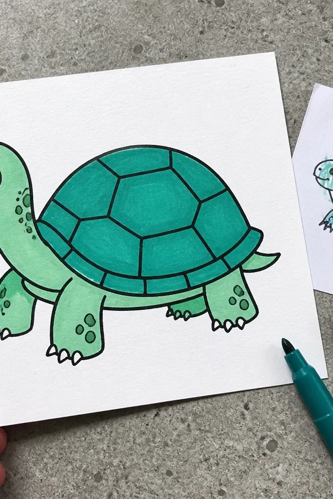
If your turtle looks childish in a messy way, it’s usually because the shell pattern is too detailed too early. Cartoon style works better when you simplify scutes into larger, clear shapes that still follow the shell curve. Big shell pattern also helps you control line spacing, which is a frequent failure point. Keep the shell outline bold and let the interior pattern be slightly lighter so the silhouette does the heavy lifting. This works great for crafts, bookmarks, and repeatable sticker designs.
Pro tipUse a ruler or straight edge only for the center guideline; scutes should be curved, not straight-edged.
Step one: draw a smooth rounded shell outline using a single confident stroke, then add a center guideline line down the shell. Step two: block in 5-8 large scute shapes as rounded polygons that follow the center guideline — don’t draw a grid. Step three: sketch the head and legs as simplified rounded forms that touch the shell outline. Finally, add a small smile line and one eye, then darken only the outer silhouette.
AvoidAvoid spacing scutes evenly like a checkerboard.
4. Realistic-ish Turtle with Shell Scutes That Wrap
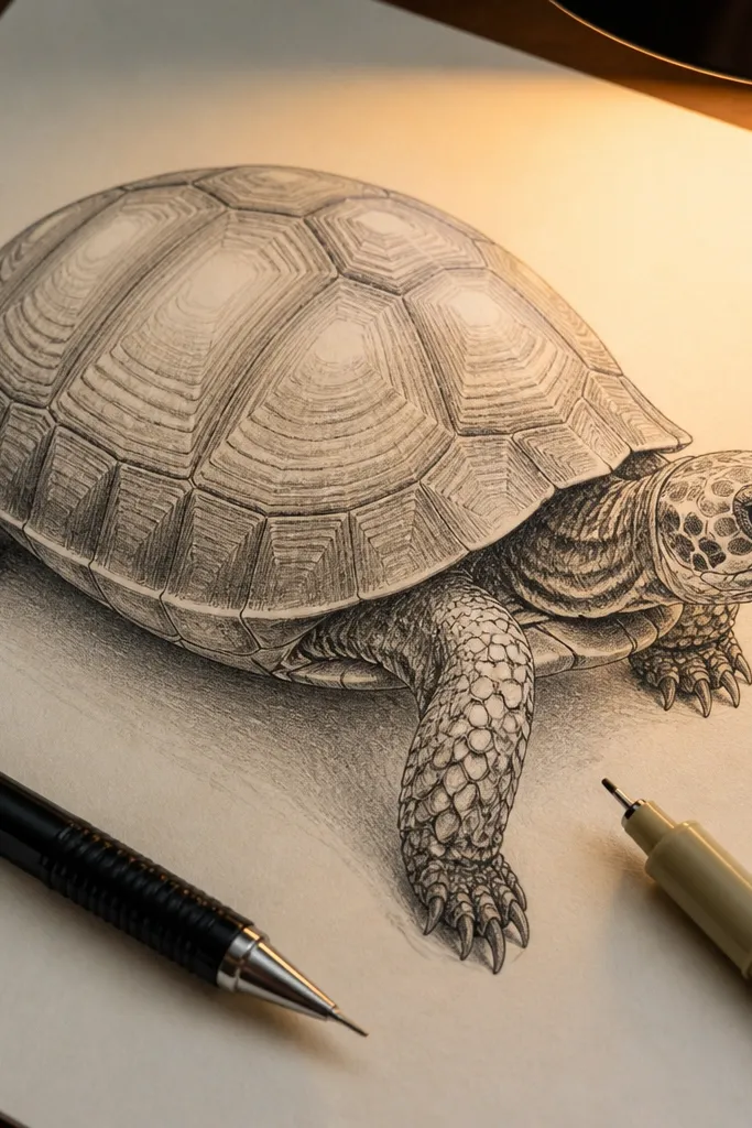
This project is for when your turtle’s shell pattern looks flat. Real turtle scutes don’t sit like stickers; they wrap and bend with the shell. When you draw scute shapes that follow the curvature, the whole turtle looks more dimensional even with no shading. The key is line weight and how scutes start and stop near the shell edge. It’s a good middle ground between basic cartoon and full realism.
Step one: outline the shell as an egg shape with a defined front and back edge, then lightly mark where the shell curves most. Step two: draw scute lines as curved bands that arc across the shell, tapering as they approach the edges. Step three: keep interior scute lines lighter than the outer contour, then erase construction lines. Finally, add a simple shadow under the head and legs using a soft pencil, not hard crosshatching.
If scutes look too uniform, vary their width slightly — one or two wider scutes makes the wrap feel believable.
Avoid drawing scute lines straight across the shell.
5. Turtle Head Practice Sheet (Neck Isn't a Straight Stick)
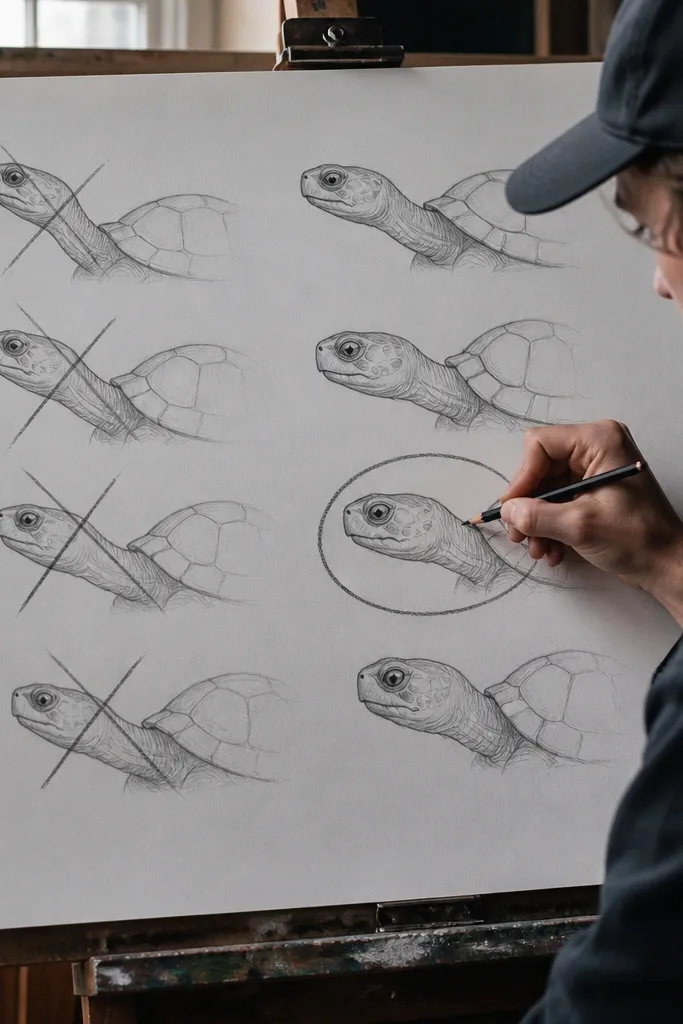
A lot of common mistakes to avoid Turtle Drawing are actually head problems. If the neck is a straight tube or the head is a flat oval, the turtle reads as “pasted on.” This head practice sheet builds the neck as a curve that tucks into the shell’s front edge. You also learn to place the eye and mouth so the head points the right direction. Do this before you draw full turtles, and your final drawings get better fast.
Step one: draw a skull circle, then add a smaller circle for the cheek and merge them with one smooth curve. Step two: draw the neck as a curved band that connects to the shell front edge; keep it thicker near the skull and thinner near the shell. Step three: place the eye on the outer half of the skull and add a small beak curve that points forward. Finally, line the outer contour darker and keep the inner neck line lighter.
Practice turning the skull circle slightly — tiny angle changes fix a lot of “why does it look sideways?” issues.
Avoid drawing the neck as a straight line from shell to head.
6. Legs That Actually Attach (Front vs Back Leg Angles)
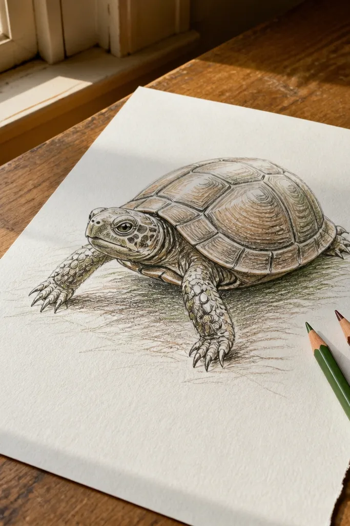
Leg placement is where turtles go from cute to weird. The near legs should look longer and more visible, while far legs shorten and tuck behind the shell edge. If you attach all legs at the same height or draw them floating off the shell, the body looks like separate parts. This idea forces you to anchor each leg to the shell edge and match leg angles to the turtle’s viewing angle. It’s great for any style, from simple line art to marker drawings.
Step one: draw the shell first, then add four tiny “anchor dots” along the lower shell edge where legs connect. Step two: for a 3/4 view, draw the near front leg as the longest leg, the near back leg slightly shorter, and the far legs lighter and partially hidden. Step three: taper each leg from the anchor dot outward and add toe bumps as short curves. Finally, darken only the outer leg contours and erase overlaps that shouldn’t be solid.
If legs look off, check the anchor dots — they should sit on the shell’s lower contour, not inside the shell.
Avoid drawing all four legs the same length and same angle.
7. Marker Version with Two-Value Line Weight
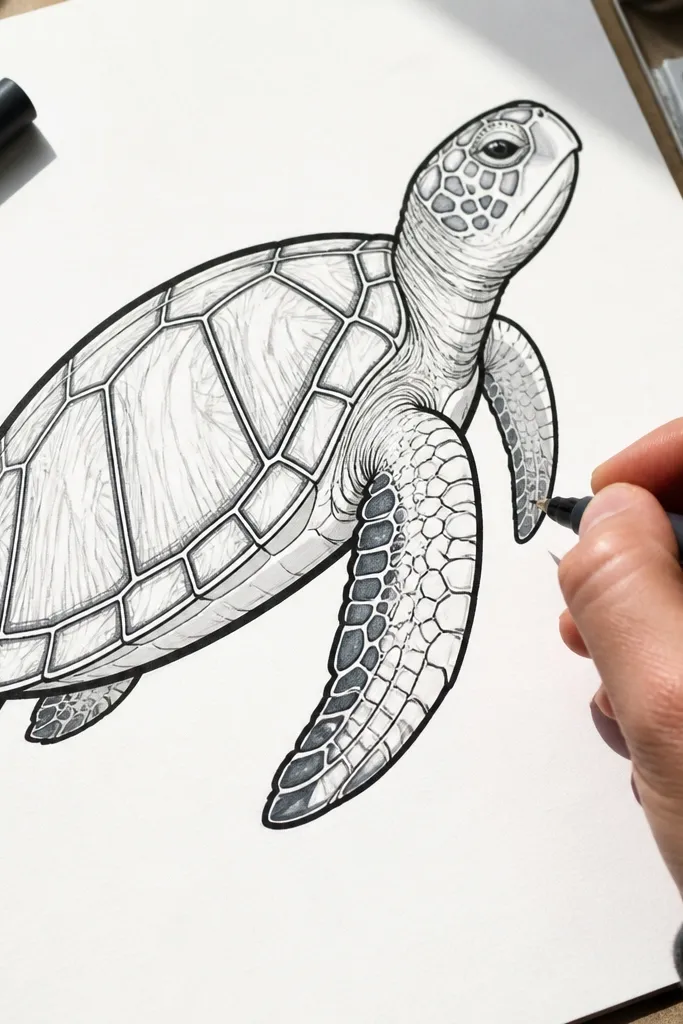
This is a practical fix for Turtle Drawing that looks muddy. Markers punish you if you outline everything equally hard, because interior lines disappear into the ink. The trick is two-value line weight: bold outer silhouette and lighter interior scutes and details. You’ll get a crisp turtle that reads at a distance, like on a fridge magnet or a kids' activity sheet. If you’re using a single marker tip, this approach stops your pattern from turning into a dark blob.
Pro tipTest your marker on scrap paper first — some tips bleed, and that changes how tight you can make scute spacing.
Step one: sketch lightly in pencil, then ink the outer silhouette with a thicker marker line. Step two: switch to a finer tip (or lighter pressure) for scute lines and small details like the eye and mouth. Step three: add scutes only after the outline is inked, so you can keep them spaced and curved. Finally, erase pencil lines and decide whether to add one simple shadow under the head using a single extra pass.
AvoidAvoid inking scute lines with the same heavy stroke as the shell outline.
8. Paper Craft Turtle: Cut-Friendly Outline and Simple Features
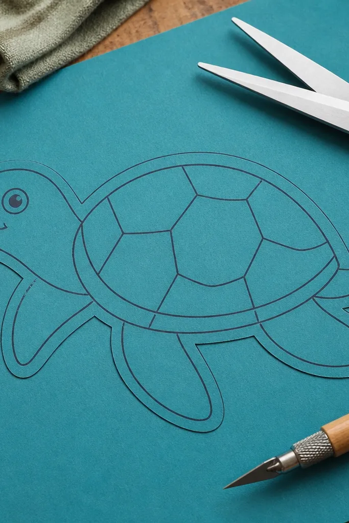
If you’re drawing turtles for crafts, the mistake is over-detailing before you think about cutting. Thin lines and lots of interior gaps make paper turtles tear at the scute edges. This craft-friendly version uses a thick outer border and only a few interior lines that don’t require precision cutting. It still reads as a turtle because the shell shape and leg attachment points are clear. This fits labels, card toppers, and simple stencil work where you want clean results.
Step one: draw a bold shell outline and keep it smooth, with a consistent thickness plan (at least 6-8 mm if you’re cutting by hand). Step two: add just 3-5 scute bands as wide arcs, not dozens of small segments. Step three: draw legs with simple rounded toes and no tiny separated claws. Finally, trace the final outline onto your craft paper and cut slowly along the bold outer edge.
If the turtle is for cutting, avoid interior lines that cross the thinnest parts of the shell edge.
Avoid drawing tiny claws and dense scute patterns when the turtle has to be cut.



