
1. Lily Pad Frog in Three Color Blocks
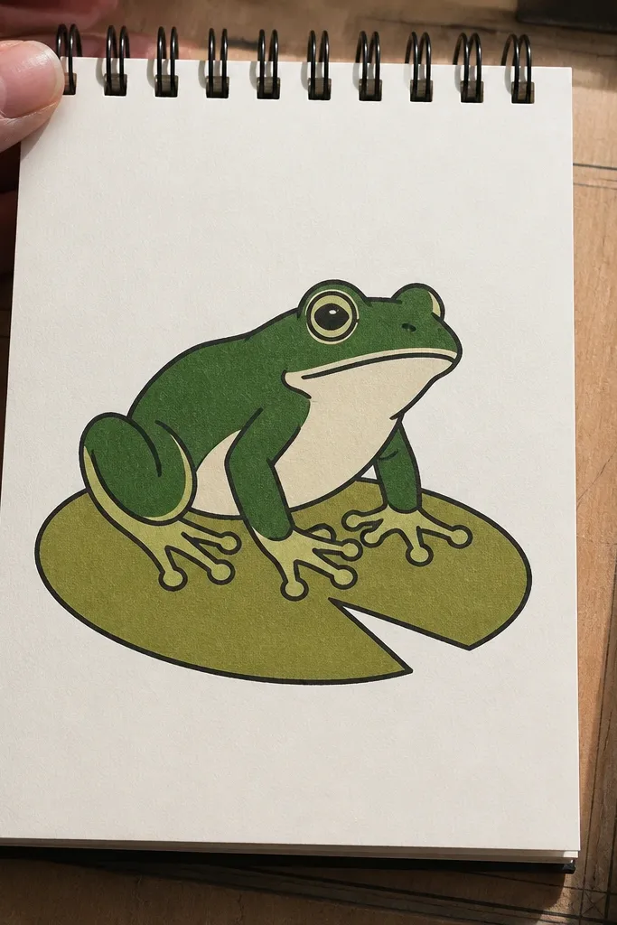
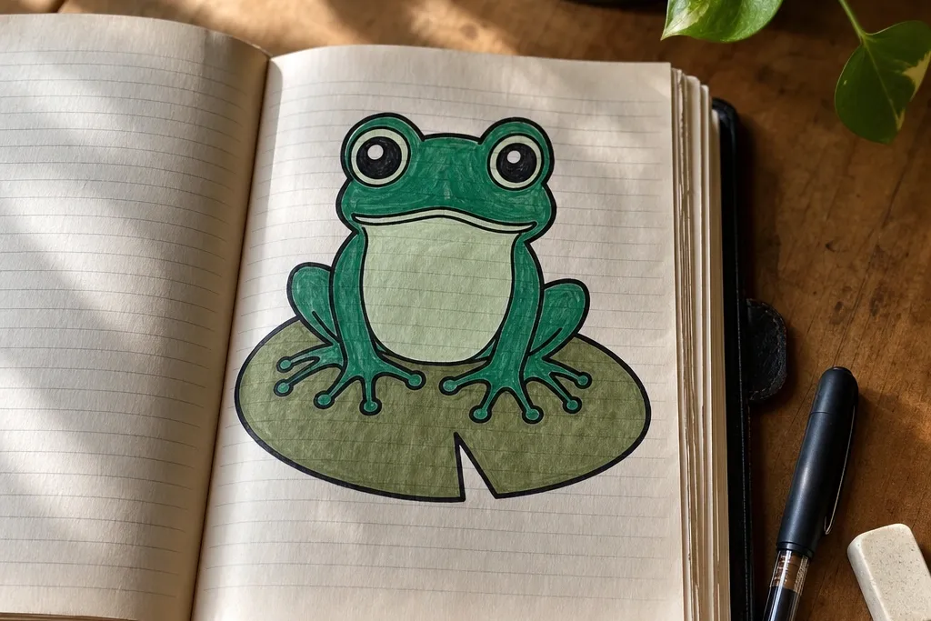
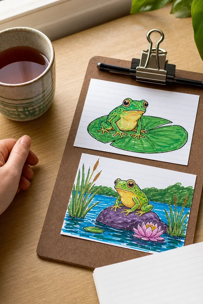
This is the easiest way to get an “intentional” frog without overworking the page. You draw the frog using one outline pass, then fill three clean color blocks: body, belly, and lily pad. The simple shapes photograph well because the contrast is obvious even at small sizes. It’s also forgiving if your curves aren’t perfect because the thick outline and flat fills carry the look.
Start by sketching a round lily pad, then place the frog body as a simple oval tilted slightly to the side. Add two small eye circles high on the head and a short mouth line. Color in three blocks only: body green, belly lighter green, and lily pad darker green, keeping edges crisp. Finally, trace the outer silhouette again with a fineliner and add one white gel pen highlight on the eye.
Use masking tape to block off the background so your lily pad edges stay sharp.
Don’t add lots of tiny leaf veins before the silhouette reads clearly.
2. Neon Frog on Blackboard-Style Glow Background
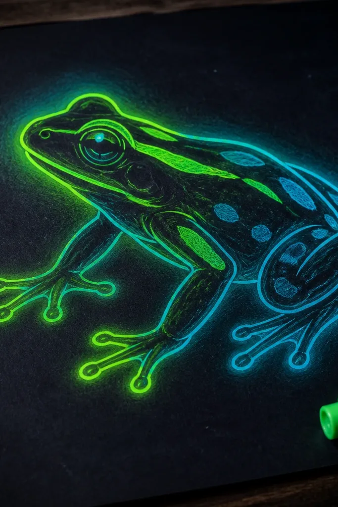
If you want something that pops in a photo, neon on dark is the cheat code. The frog is mostly outlines and a few bold neon fills, then you create a glow halo with lighter passes around the edges. This makes the frog look lit from within, even with basic drawing skills. It’s perfect when you want a dramatic look for a phone wallpaper set or a bold sketchbook page.
Cover the page lightly with dark gray or black paper tone using a marker or colored pencil rub. Draw the frog with a neon green pencil or marker for the body and a bright outline pass. Add glow by lightly coloring a second layer just outside the body edge, then blend it toward the background with a tissue. Finish with white gel pen chalk marks around the frog and a bright highlight on each eye.
Keep your neon color to the frog only; use the background as the contrast, not more neon details.
Don’t shade the whole page — the glow effect dies when everything is equally dark.
3. Pattern Frog with Checker Belly
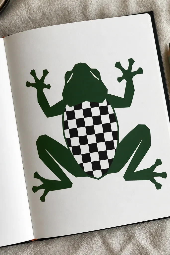
Draw a frog body as a rounded shape with a clear center line down the belly. Outline the eyes and then block in the limbs with simple curved rectangles. Color the head and limbs one solid green tone. On the belly, lightly sketch a 3x3 or 4x4 grid and fill alternating squares with a contrasting green or light mint. Trace the frog outline again and add two small white dots for eye highlights.
This one looks designed because the belly pattern gives you a clear visual rhythm. You keep the head and limbs solid, then add a checker pattern only on the belly, which keeps it clean and readable. The result feels modern and graphic, and it’s easy to photograph because the pattern creates natural texture. It also works well for practicing spacing without needing perfect realism.
AvoidDon’t put checker patterns on the head — it turns into clutter fast.
Pro tipUse a ruler for the grid lines, then erase lightly so the pattern stays crisp.
4. Frog Portrait with Oversized Eyes and Soft Wash
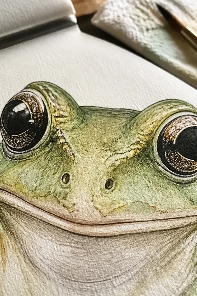
Oversized eyes instantly make frogs look cute and expressive, and a soft wash gives you that handmade, aesthetic feel. You’ll draw the frog face close up so the viewer feels like they’re “meeting” it. The wash keeps the colors airy while linework stays sharp. This is a great idea if you like watercolor pencils, because you can control the intensity without fighting wet paint.
Sketch the frog face filling most of the page: head oval, two large eyes, and a simple smile line. Outline everything with a fineliner and add a few nostril dots. Wet the cheek and forehead area lightly with water using a brush, then apply green watercolor pencil for a soft wash. Keep the belly mostly unpainted so the face stays the focus. Add darker green around eye edges and finish with white gel pen highlights.
Leave a tiny white space around the eyes for instant “shine.”
Don’t paint right up to the fineliner everywhere; leave micro gaps for crispness.
5. Top-Down Frog on a Grid Background
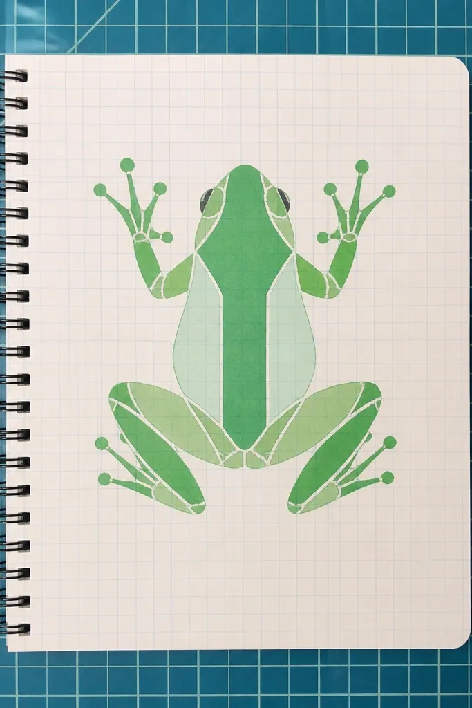
Draw a faint grid across the page using a light pencil and a ruler. Place the frog centered, using symmetry as a guideline but not a rule: a rounded back shape with two eye dots near the top. Add legs as curved shapes at the sides. Color in the back one green tone, belly lighter, and add a thin darker band across the back. Erase the grid lightly so it stays subtle, then outline the frog with fineliner.
A top-down view is surprisingly photogenic because it gives you a strong silhouette and lots of surface space for patterns. The grid background makes the frog look intentional and graphic, even if the frog is simple. You can draw the frog as a “map” with a few sections: back, belly, legs. This idea is great for a consistent series because you can repeat it with different color palettes.
AvoidDon’t darken the grid too much or it competes with the frog.
Pro tipUse a single darker stripe so the frog doesn’t get lost against the grid.
6. Frog in a Speech Bubble Scene
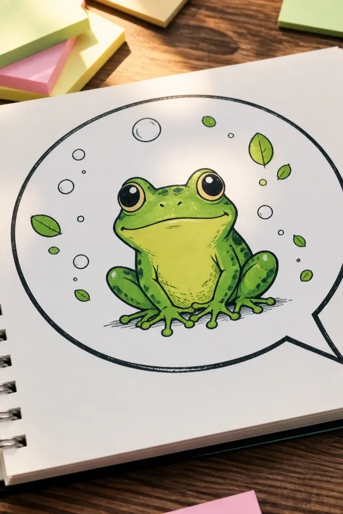
This gives you a playful, shareable composition. You draw the frog sitting inside a big speech bubble, then add tiny plant shapes or bubbles around it so the page feels alive. The speech bubble acts like a frame, keeping the drawing centered and photo-ready. It’s perfect for making sticker-like images and small printable designs.
Draw a large speech bubble first, with a tail pointing toward the bottom-left corner of the frog. Sketch the frog inside using simple shapes: head oval, body rounded, legs as short curves. Add a lily pad or two tiny leaves behind the frog for depth. Color with two greens plus a contrasting accent like yellow for tiny flowers. Outline the speech bubble and frog with a fineliner, then add white gel pen highlights on the eyes.
Make the speech bubble tail thick; it looks cleaner in photos.
Don’t cram text — keep it visual with plants and bubbles.
7. Origami Frog with Fold Lines
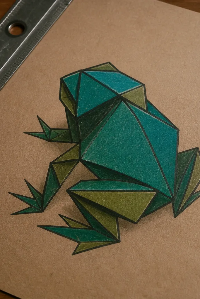
Sketch a frog body made of 3-4 large triangles per side, using a central vertical line as your guide. Add fold lines as straight pencil lines along triangle edges. Color alternating triangles with two greens and one beige for contrast. Use a fine brush marker or fineliner to darken the fold lines so the facets pop. Add a tiny mouth line and two eye dots at the top section.
Origami-style frogs look impressive because the fold lines create structure. You’re not drawing a realistic frog; you’re building a geometric illusion, which is easier than it sounds. The triangular facets catch the eye and make the drawing feel crisp and designed. Great for marker lovers who want sharp edges and bold shapes.
AvoidDon’t try to add realistic texture — keep it geometric.
Pro tipOutline only the outer silhouette and facet seams; keep internal lines light so the color does the work.
8. Frog and Dragonfly Pair on Water Ripples
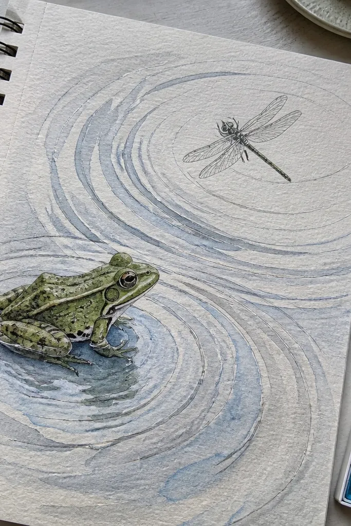
Draw a horizontal water band across the page, then add 6-8 curved ripple lines that get thinner toward the edges. Place a frog on the bottom edge of the water band, with legs tucked and body slightly angled. Add a dragonfly above with a simple body oval and four wing shapes. Color the frog green, the wings pale with a light gray wash, and add one yellow dot for the dragonfly body. Outline everything and add white gel pen highlights on two ripple crests.
Two subjects make the page feel like a scene, but you keep it simple so it stays readable. The ripples create a natural background texture that looks good in photos, and the dragonfly adds delicate contrast lines. You get a finished illustration feel without needing advanced drawing. This works well for A5 sketchbook pages where you can give the ripple lines room.
AvoidDon’t add too many extra insects or the composition turns busy.
Pro tipKeep the dragonfly small; big wings steal attention from the frog.
9. Frog Silhouette with Neon Outline Only
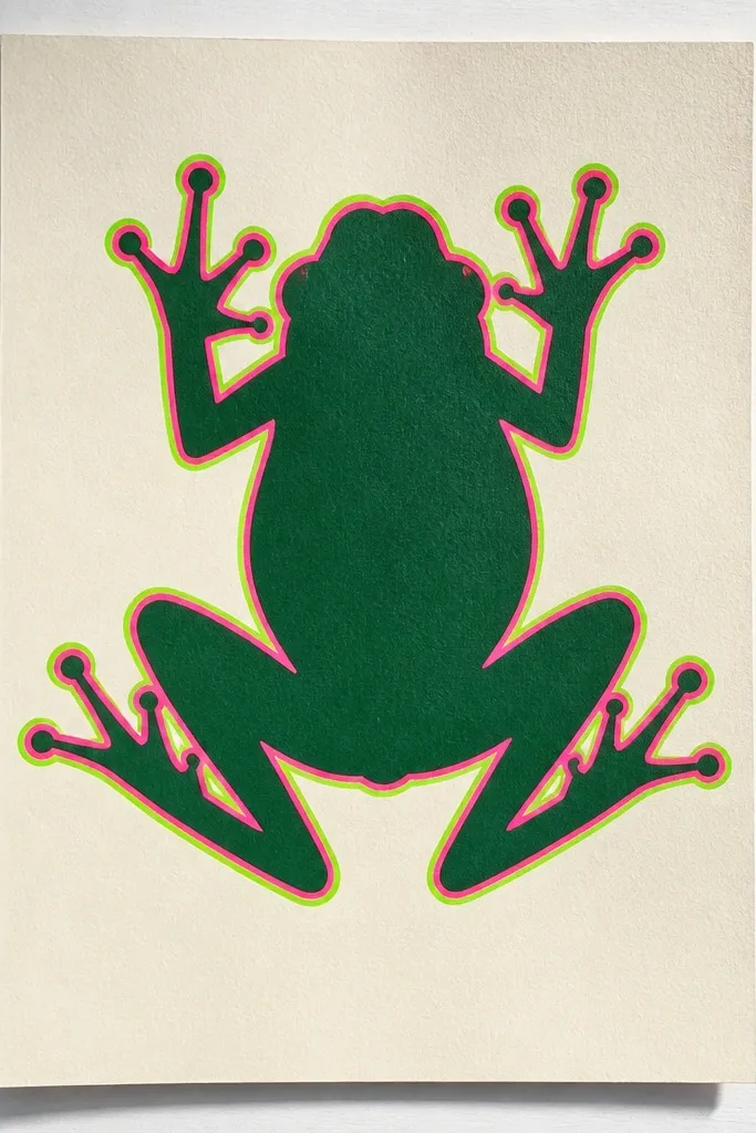
Draw the frog silhouette with a thick black marker or fineliner, filling the body solid. Add a neon outline by tracing just outside the silhouette with a bright color like lime or teal. Keep the background plain or add one simple curved line in a contrasting color. Add two small white dots for eye highlights and one tiny mouth line. Photograph-friendly tip: keep edges crisp and avoid smudging the black fill.
This is the cleanest way to get an aesthetic frog with almost no shading. The silhouette gives instant shape recognition, and the neon outline adds the pop. It looks modern and graphic, especially against a light background or colored paper. Perfect if you want quick results that still look like a finished poster.
AvoidDon’t add internal details; the outline is the whole point.
Pro tipUse a scrap paper under your hand so you don’t smear the black fill.
10. Frog Hanging from a String Chord
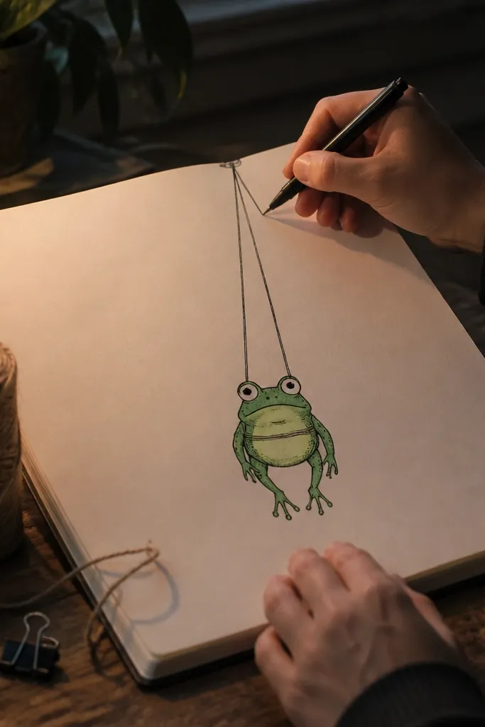
Draw a vertical string line from the top of the page down to where the frog will sit. Make two small knots on the string and sketch a simple loop where the frog “hangs.” Draw the frog as a rounded body with short legs and big eyes. Color the frog with one green tone and add a contrasting belly. Outline with a fineliner and add white gel pen highlights on the eyes and a tiny shine on the string.
This idea creates depth with a simple trick: draw a hanging string and let the frog appear suspended. The frog can be cute and cartoonish, but the string makes the composition feel like a craft object. It’s photogenic because you get clear vertical lines and a focal point at the frog’s face. It also works great for making a mini series of “hanging” animals.
AvoidDon’t make the string too thick or it dominates the frog.
Pro tipAdd one shadow under the frog using a light gray pencil for a more dimensional look.
11. Frog in a Polaroid Frame with Doodles
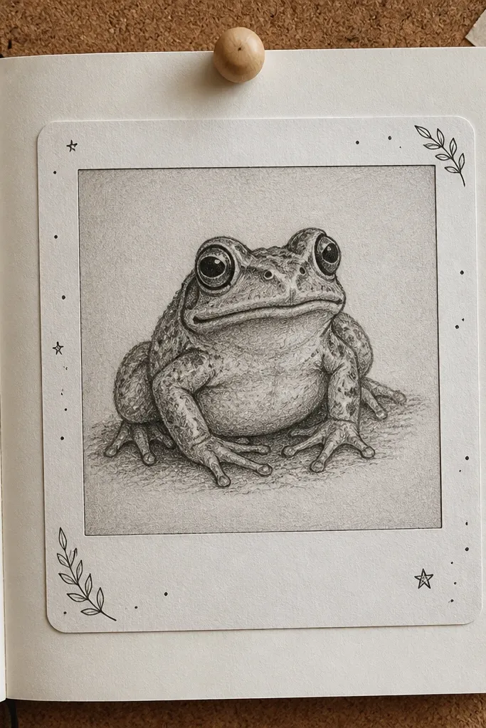
Draw a polaroid rectangle with rounded corners and a slightly thicker border line. Add a small caption strip at the bottom but leave it blank or with a tiny symbol like a leaf. Inside the frame, draw the frog centered with a simple background circle or oval. Color the frog and add 3-5 small doodles around it like bubbles, tiny stars, or lily leaves. Finish by darkening the frame edges and adding white gel pen highlights on the frog eyes.
A polaroid-style frame instantly makes your drawing feel like a keepsake. You get a clean white border and room for small doodles that support the frog theme. This is great for aesthetic sketchbook spreads because it looks organized without extra effort. Use it when you want your frog art to feel “photo-like” even though it’s a drawing.
AvoidDon’t shade the entire frog with heavy gradients; keep it flat and crisp.
Pro tipKeep the doodles small and spaced; crowding makes the frame look messy.
12. Frog Watercolor Wash with Salt Texture
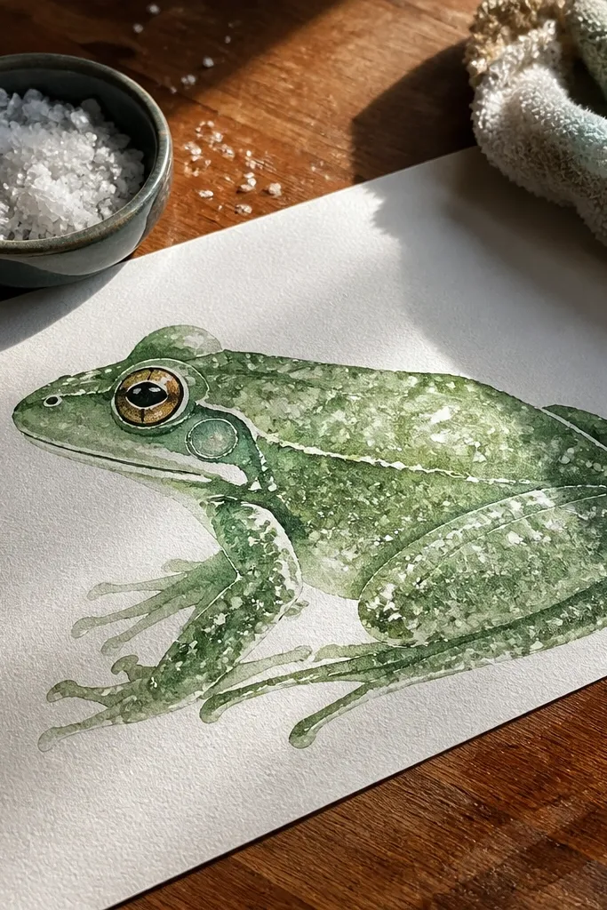
Lightly sketch a frog body and head shape with pencil, then outline with a fineliner after the sketch. Wet the frog body with clean water using a brush and apply green watercolor or watercolor pencil with water. While it’s still wet, sprinkle coarse salt on the frog back and let it sit 30-60 seconds. Add a simple lily pad behind it with a lighter green wash. Let it dry fully, then brush off the salt and add eye highlights with white gel pen.
Salt texture gives you natural speckles that read like skin texture or water mist. The frog looks more interesting without you drawing tiny pores or spots manually. This is perfect when you want a softer, artsy look that still photographs clearly. It also hides small mistakes because the texture breaks up flat areas.
AvoidDon’t touch the wet paint — it smears the texture.
Pro tipUse coarse salt, not table salt, for bigger speckles.
13. Frog in a Geometric Hexagon Panel
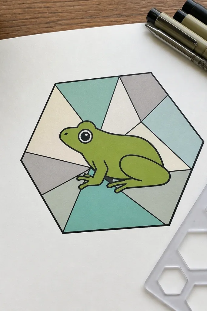
Hexagon panels look clean and modern because they create a built-in frame and structure. You can keep the frog simple while the background geometry does the work. This is a strong choice for making a set of frogs with the same layout but different color schemes. The result looks like design work, not just doodling.
Draw a large hexagon centered on the page. Inside, sketch a frog with a rounded body and two eye dots, keeping it proportionate to the panel. Add two or three small geometric shapes behind the frog inside the hexagon, like triangles or circles. Color the panel background with one flat color, then fill the frog with a contrasting green. Outline the hexagon edges thickly and add white gel pen highlights on the eyes.
Keep the background shapes fewer than you think — two accents look more premium than five.
Don’t let the frog touch the hexagon edges everywhere; leave breathing space.
14. Frog Profile with Leaf Shadow
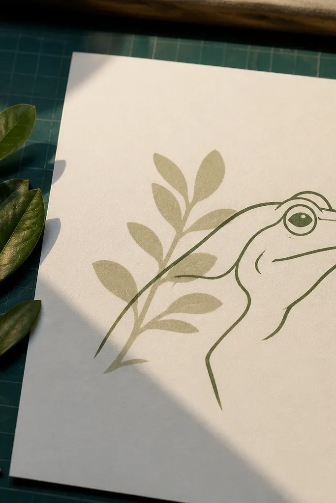
A profile frog looks stylish because it’s all about line economy — head, eye, mouth, body curve. The leaf shadow behind it adds depth without needing complicated coloring. This idea is great for beginners because the side view is easier to shape than a full front face. It also looks crisp when you use one green tone and one shadow color.
Draw a side-profile frog: head oval, eye circle, and body curve leading to a tucked leg. Outline with fineliner. Behind the frog, draw a leaf silhouette shape using a big curved line and a center vein line. Color the frog in one green tone and the leaf shadow in a darker, muted green or gray. Add a thin highlight line on the frog belly with white gel pen.
Make the leaf shadow slightly offset down-left for a clean “light source” feel.
Don’t add multiple shadow layers; one shadow shape is enough.
15. Frog Face Emoji-Style with Pattern Cheeks
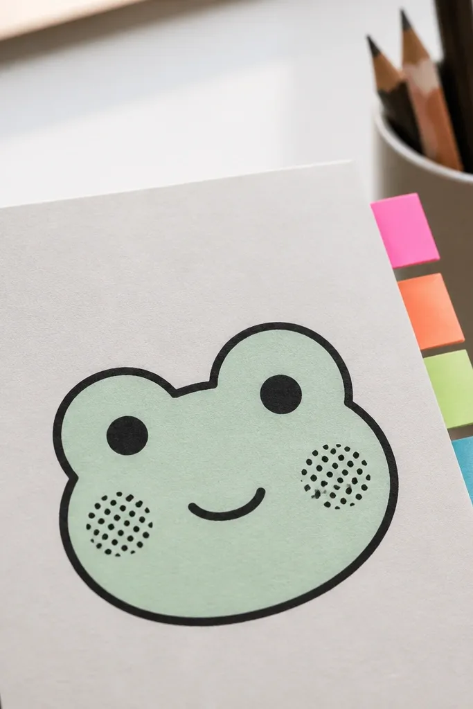
Emoji-style frogs are fast and super readable, and adding patterns to the cheeks makes it look custom. You keep the face minimal, then use dots or tiny stripes on the cheeks only. This creates a charming aesthetic without turning into a complicated drawing. It’s perfect for making a series of frog expressions.
Draw a circle for the face, then place two eyes near the top with small pupils. Add a small smile line and two cheek areas below the eyes. Color the face green, then alternate cheek patterns: use dots on one cheek and short stripes on the other. Keep the patterns tight and within the cheek area. Outline everything and add a white gel pen highlight on each eye.
Choose one pattern type per cheek so the face stays clean.
Don’t add extra freckles everywhere; it kills readability.
16. Frog Wearing a Tiny Crown of Leaves
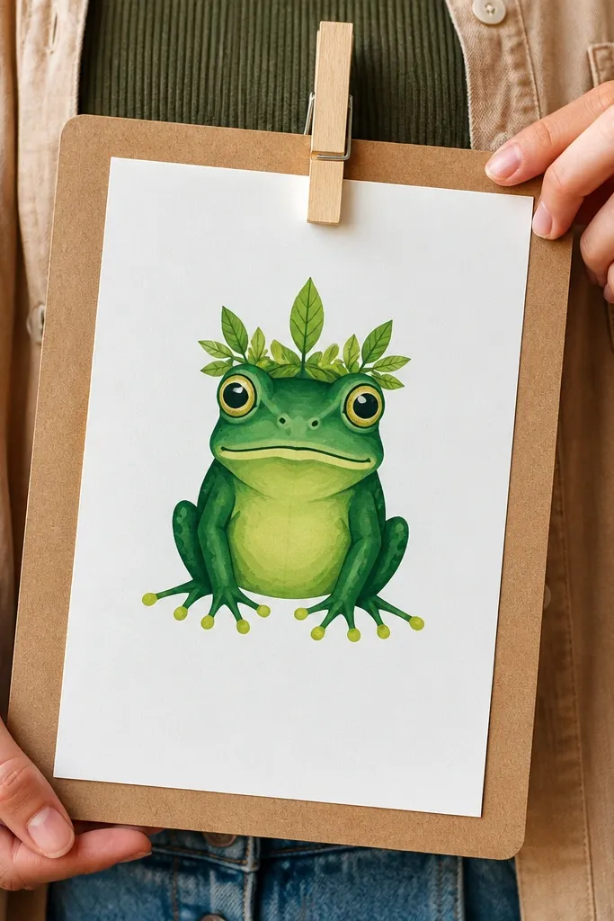
A tiny crown is an instant personality boost, and it’s simple to draw. Leaf shapes on top of the head give you a clear silhouette that reads well in photos. Keep the rest of the frog clean, then color the crown in a slightly different green for contrast. This idea works for gift cards, mini art prints, and cute sketchbook pages.
Sketch a frog head and upper body, then add a crown made of 3-5 leaf shapes centered above the eyes. Draw each leaf as a teardrop with a center vein line. Color the frog green and the crown a darker green. Add a few small background dots or tiny bubble circles behind the crown. Outline with fineliner and finish with white gel pen highlights on the eyes and crown tips.
Make leaf tips sharp — blunt leaf shapes look less crown-like.
Don’t crowd the crown with too many leaves.
17. Frog Bot with Little Circuit Lines
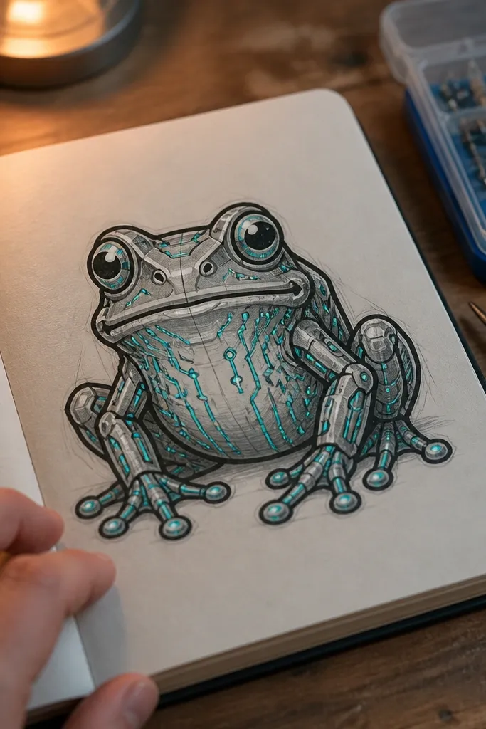
Draw a frog body and head, but simplify the features: two eyes and a small mouth. Outline with black fineliner. Add circuit lines as thin lines and dots on the belly and one cheek, using a dark blue or purple gel pen. Color the frog green and keep circuit lines unfilled except for node dots. Finish by adding white gel pen highlights on the eyes and one tiny shine on a circuit node.
Techy frog drawings look cool because the circuit lines create a crisp, graphic texture. You keep the frog shape familiar, then add small circuit nodes on the cheeks, belly, and limbs. This is a great “aesthetic nerd” piece that still reads as a frog. It also works well with gel pens because the lines add shine.
AvoidDon’t cover the entire body with circuits; pick 2-3 zones.
Pro tipUse one circuit color only; multiple colors make it look messy fast.
18. Frog with Ombre Belly Fade
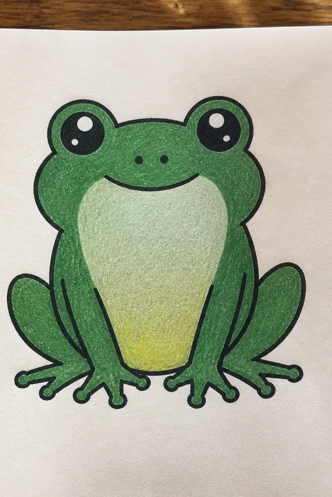
Draw a frog front view with a clear belly curve and thick outline. Color the head and back one consistent green. For the belly, start with a darker green near the top of the belly, then blend lighter as you move downward using light pressure. Add a second layer in the darkest spots around the belly edges for definition. Finish with white gel pen highlights on the eyes and a tiny highlight line on the belly curve.
An ombre belly looks polished because it mimics lighting without needing realistic shading. The frog stays simple, but the gradient creates depth and makes the drawing feel finished. It photographs well because the belly gradient creates a smooth focal contrast. This is a good choice if you like colored pencils or markers and want one “wow” detail.
AvoidDon’t blend the entire frog; keep the ombre only on the belly.
Pro tipBlend with a light hand first, then darken edges last so you don’t muddy the gradient.
19. Frog Wearing Striped Suspenders
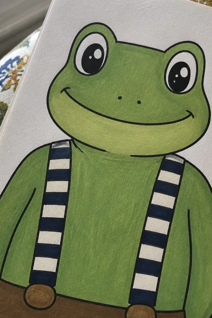
Sketch a front-facing frog with a rounded belly and two front legs visible. Outline with fineliner. Draw two suspender bands as curved lines from each shoulder to the belly, then add stripes across each band using 4-5 evenly spaced vertical stripes. Color the frog green and the suspenders in a contrasting color like navy or burgundy. Add a small bow or button at the belly center and finish with white gel pen eye highlights.
Suspenders give you strong lines, and stripes photograph like a graphic pattern. You draw the frog simply, then add two striped bands from shoulders to belly. The suspenders make the frog feel like a character without needing a complicated background. It’s a fun way to practice line confidence because stripes reward straight, consistent spacing.
AvoidDon’t add too many extra accessories; suspenders are the focus.
Pro tipUse a ruler for the stripe spacing on the suspenders; it makes the whole piece look cleaner.
20. Frog on a Starry Night Watercolor Background
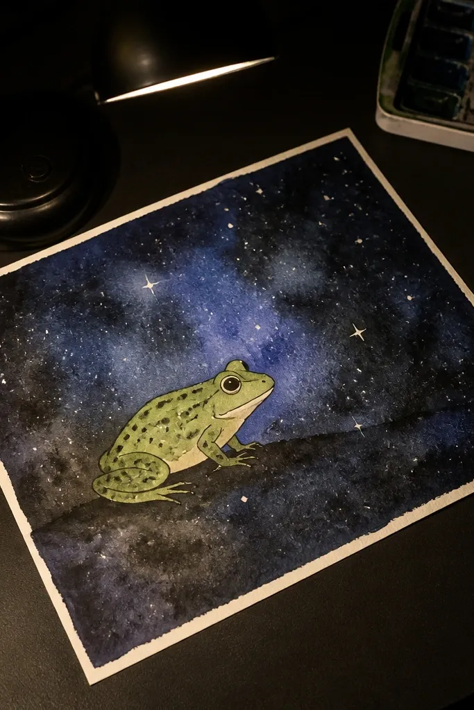
Dark watercolor backgrounds make frogs look brighter, and star speckles add instant mood. The frog stays simple in the foreground, while the background carries the texture. This is a photogenic choice for people who like moody color but still want the frog to be the main subject. It also hides uneven watercolor coverage behind the star field.
Wet the background area with water and apply dark blue or black watercolor wash. While it’s wet, sprinkle a tiny amount of white salt or use a toothbrush flick for star speckles. Let it dry fully. Draw the frog on top with pencil, then outline with fineliner. Color the frog green and add a lighter belly, then add two bright white gel pen highlights on the eyes and one on the water-like ground near the feet.
Keep the star speckles smaller near the frog to avoid stealing focus.
Don’t paint the frog in the same dark tones as the background.
21. Frog Mandala Half-Body
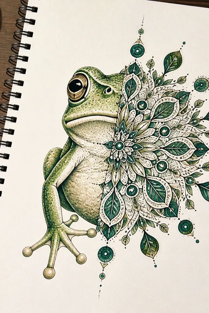
Mandala patterns look gorgeous because symmetry and repetition create a satisfying structure. You don’t need full-body detail; do a half-body frog where the back and one side turn into a mandala burst. The frog stays identifiable, and the pattern gives you that decorative, photo-ready look. This is best for colored pencils because you can layer linework without smearing.
Draw a frog in half profile, with the body centered and one side facing forward. Outline the frog, then draw a curved line along the middle to separate frog area from pattern area. On the pattern side, create a mandala burst using repeated shapes: circles, teardrops, and leaf motifs around the frog shoulder. Color the frog green and use a gold or warm yellow pencil for mandala accents. Add a final outline pass and white gel pen dots on the mandala centers.
Start mandala shapes small near the frog, then increase size outward for a natural flow.
Don’t shade the mandala too heavily; keep it line-first.
22. Frog with Transparent Glassy Belly
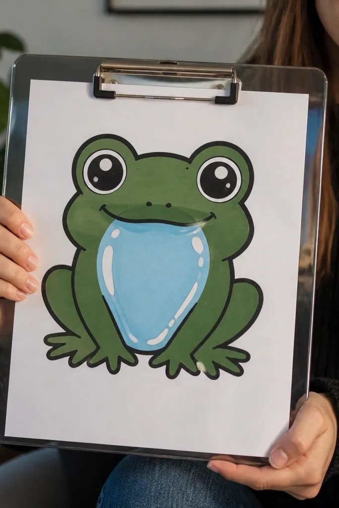
A glassy belly is an instant aesthetic trick because it creates a shine zone. You outline a belly shape, then fill it with light blue and add multiple white highlight strokes like reflections. The rest of the frog stays matte so the glossy area stands out. This is a great idea if you want a frog drawing that looks like it has a “surface finish,” not just color.
Sketch the frog body with thick outline and add a belly panel shape, leaving a clear boundary line around it. Color the body matte green and keep the background simple. Fill the belly panel with very light blue or aqua, then add darker blue around the belly edges. Add 3-4 white gel pen highlight strokes crossing the belly panel in different directions. Finish by adding a small shadow under the belly with a gray pencil for depth.
Use gel pen highlights last; they look sharper than adding highlights before coloring.
Don’t outline the glass belly too many times; one clean border is enough.
23. Frog Jumping Through a Motion Frame
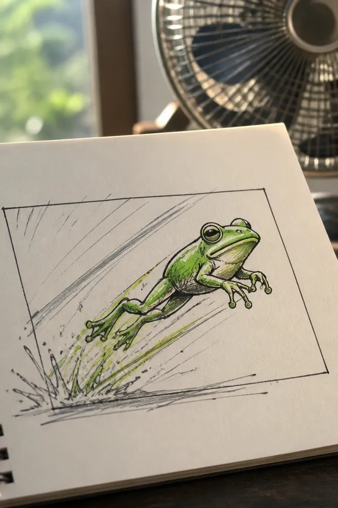
Draw a rectangular frame on the page and place the frog inside it as if it’s jumping out of the bottom corner. Sketch the legs stretched forward and back with simple curves. Add 5-7 motion lines trailing behind the jump direction, using light pencil first. Color the frog green, then color the motion lines a lighter green or gray. Outline the frog and frame with fineliner, and add white gel pen highlights on the eyes and one paw.
Motion frames make the drawing feel energetic, even if it’s a simple cartoon. You draw the frog mid-jump, add a rectangular frame around it, then add motion lines behind the legs. It’s a good choice when you want your frog to look active and not just posed. The frame also helps the drawing stay composed for photos.
AvoidDon’t add motion blur to the whole frog outline.
Pro tipMake motion lines fewer but longer; short lines look shaky in photos.
24. Frog with Stained Glass Color Segments
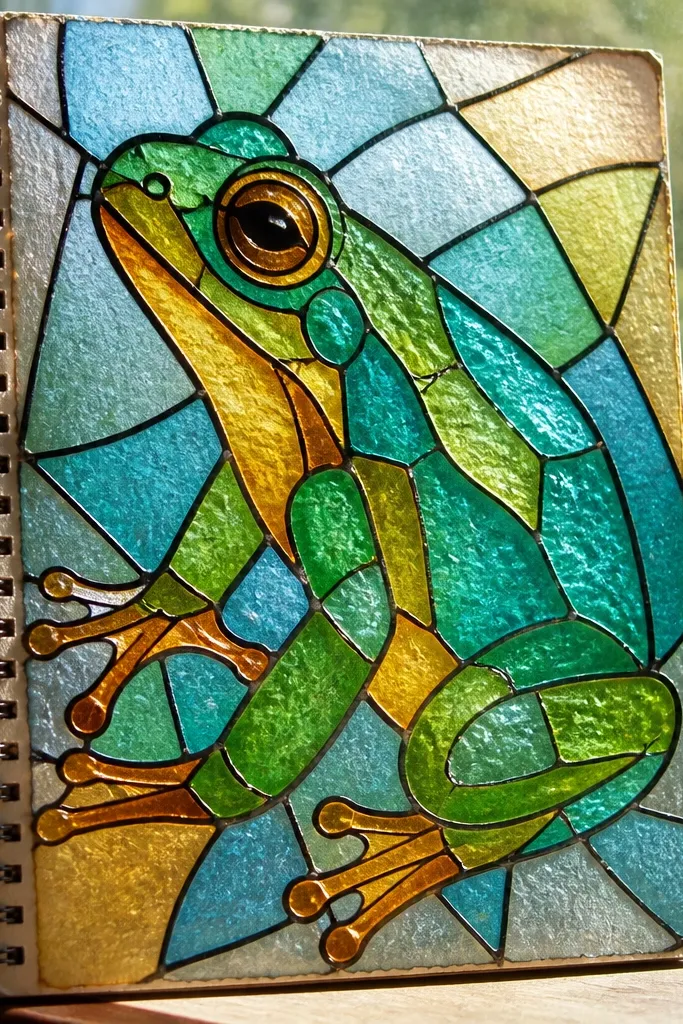
Stained glass frogs look expensive because the dark leading lines make each color cell feel separate. You draw the frog as a silhouette, then carve it into segments with lines, like a stained glass window. This is a strong photogenic project because the color blocks catch light and look crisp in close-ups. It also works well for marker or colored pencil fills.
Sketch a frog silhouette with a thick outline and keep the shape bold. Draw internal segmentation lines to create 10-20 irregular panels across the body and limbs. Color each panel with a different bright color but keep 1-2 greens for frog identity. Use a dark brown or black pen to trace all leading lines over the segmentation. Add a small dark outline around the entire silhouette again and finish with white gel pen highlights on the eyes.
If your lines look wobbly, slow down and use a thicker pen for the leading edges only.
Don’t pick colors that are too similar; panels need contrast to read.
25. Frog in a Botanical Press Layout
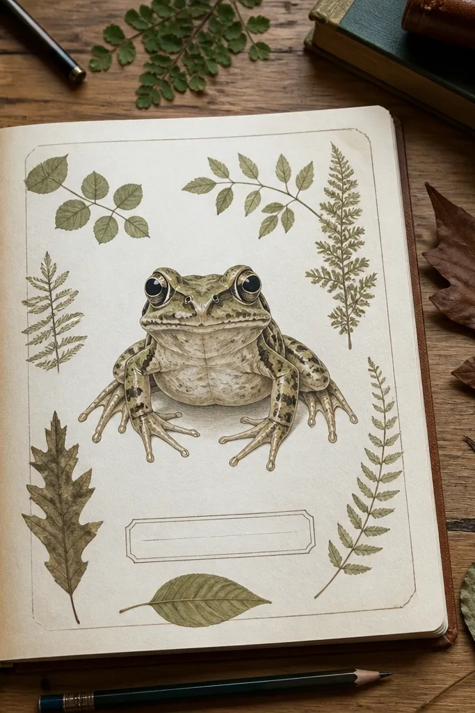
Draw a simple rectangular “specimen” box in the center with a double line border. Inside, sketch a frog in profile and add two surrounding leaf shapes as if pressed. Add a small label strip at the bottom of the specimen box but leave it blank or with a tiny leaf icon. Color the frog with one muted green and the leaves with two different greens. Use a fine liner to add tiny vein lines on the leaves and white gel pen to highlight the eye.
A botanical press layout makes your frog feel like a science illustration, but still cute. The neat margins and label area create structure, while leaf shapes around the frog add texture. This is a great choice if you like clean typography-free design and want a page that looks organized. It’s also easy to repeat across multiple frogs for a consistent series.
AvoidDon’t clutter the margins with extra sketches — keep it specimen-clean.
Pro tipKeep the specimen box border lines slightly thicker than the internal lines.
26. Frog with Pencil Shading and Paper Grain Texture
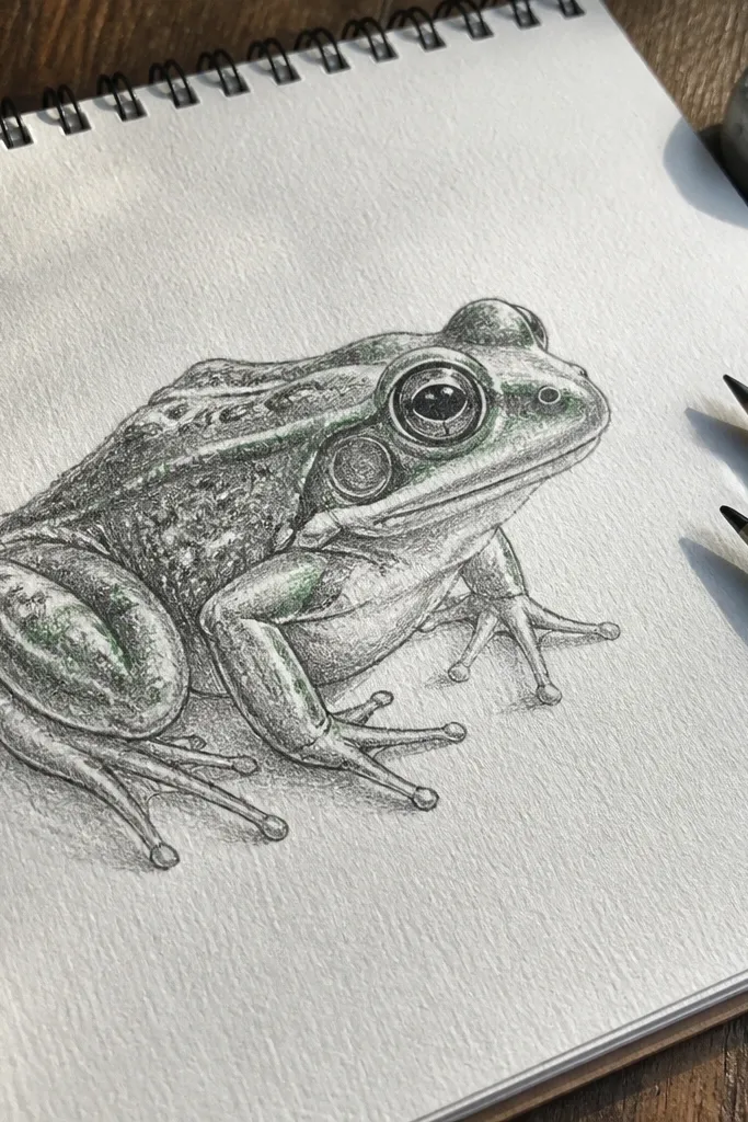
If you want a more artsy, sketchbook-real look, pencil shading with visible paper grain is the move. The frog can stay fairly simple, but the shading makes it look dimensional and tactile in photos. Use this when you want to show texture, not just color blocks. It also works well for monochrome series where each frog has a different expression.
Sketch the frog outline lightly, then darken key lines like the eye rim and mouth curve. Shade the body with a soft pencil using short strokes following the body curve. Leave the belly lighter and blend the shadow edges lightly with a tissue. Add a darker shadow under the chin and around the legs for shape. Finish with a crisp white gel pen highlight on the eye and a tiny highlight on the belly curve.
Use a kneaded eraser to lift pencil for bright highlights instead of over-blending.
Don’t press hard early; you can’t erase deep grooves cleanly.
27. Frog Wearing a Hoodie with Drawstring Lines
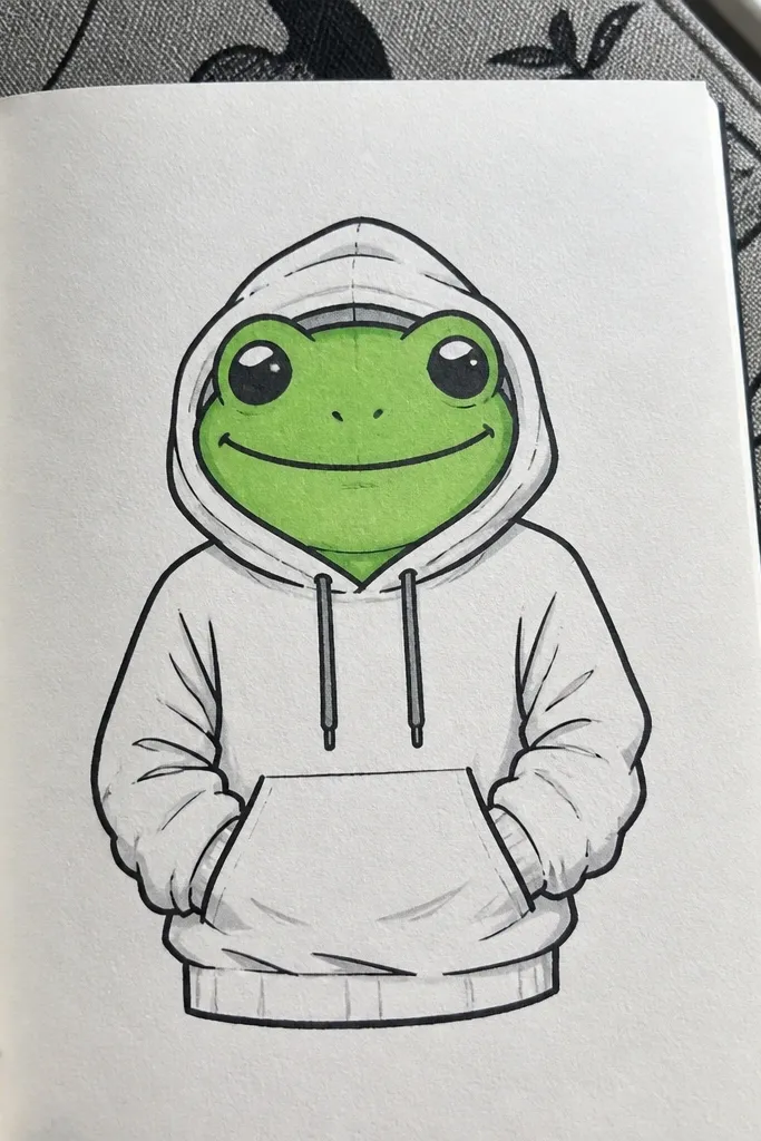
Draw the frog head and upper body first, then add a hoodie outline around it like a rounded jacket. Sketch the pocket as a curved rectangle across the belly area. Add two drawstring lines hanging down from the hood center and a small knot at the bottom. Color the hoodie with one solid color and the frog body green, leaving the pocket slightly darker for fold depth. Outline everything and add white gel pen highlights on the eyes and hoodie drawstring knot.
Clothing details make frogs look stylized fast. A hoodie is easy to draw because it has a clear shape and a front pocket area, plus drawstring lines that add motion. Keep the frog face simple and let the hoodie folds create the aesthetic. This is a good project for marker and fineliner combos.
AvoidDon’t hide the frog face under too much hoodie overlap.
Pro tipMake the pocket corners rounded; sharp corners look too stiff for a cute frog.
28. Frog as a Bookmark with Corner Tie
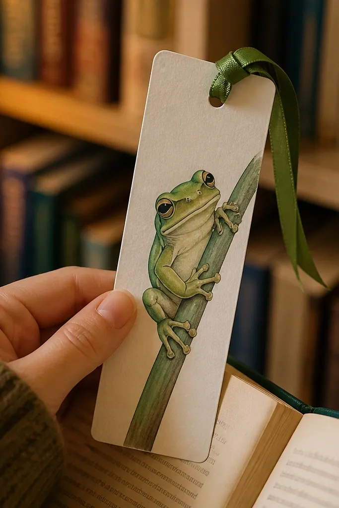
Bookmarks are practical, and the shape forces your frog into a clean vertical composition. The corner tie ribbon adds a charming detail that reads clearly in photos and makes the drawing feel like an object. Use this if you want something you can actually cut out and use. The vertical space also makes it easier to place the eyes and keep the frog proportions consistent.
Draw a long vertical bookmark shape with rounded corners, about 2.5 inches wide and 5.5 inches tall on your page scale. Add a small corner ribbon at the top using two curved lines and a knot. Place the frog face near the top third and body below, keeping legs tucked to avoid awkward shapes. Color the frog green and add a lighter belly. Outline with fineliner and add white gel pen highlights on the eyes and ribbon knot.
Leave a blank margin around the bookmark edges so cutting later doesn’t clip your outline.
Don’t make the frog too low; it looks cramped when used as a bookmark.
29. Frog with Bubble Letters Background
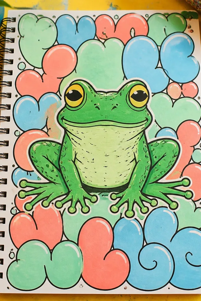
Bubble letters behind a frog create instant fun and a kid-friendly aesthetic that still looks clean when you use limited colors. You keep the frog crisp in the center, then add bubble shapes as background texture. This is a strong choice for posting because the frog is the focal point and the background is decorative but controlled. It also helps you practice spacing without needing realism.
Draw the frog centered and slightly larger than you think, then outline with fineliner. Add a few bubble letter shapes behind it using light pencil, but skip real words — use letter-like curves. Color the frog with one green tone and a lighter belly. Fill the bubble letters with two accent colors like pink and yellow. Outline the bubble letters lightly, then add white gel pen highlights on the frog eyes and one bubble highlight.
Keep bubble letters behind the frog only, not around the edges of the whole page.
Don’t add too many colors; two accents make it look intentional.
30. Frog with Ink Splatter Watercolor Edge
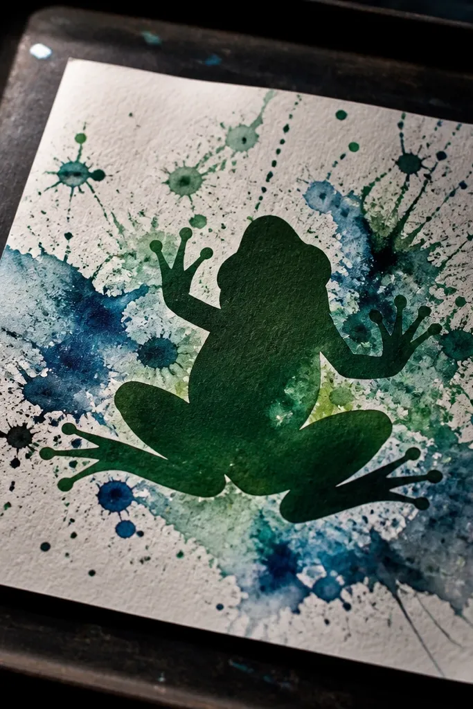
This looks artsy and energetic because the splatter and watercolor edge create movement around a clean frog silhouette. The frog stays defined, while the background gets texture. It’s a great way to cover mistakes because the splatter hides uneven coverage and adds character. This style is especially good when you want a “poster” feel in a sketchbook.
Sketch and outline your frog silhouette with fineliner. Color the frog body in a solid green. Wet the background area around the frog with water and apply a light watercolor wash so it bleeds outward slightly. While the wash is wet, flick ink or dark paint using a toothbrush to create controlled splatter. Add one or two white gel pen highlights on the eyes and a tiny highlight on the belly curve.
Practice one flick on scrap paper first so you control droplet size.
Don’t splatter over the frog outline — keep splatter outside the silhouette.



