
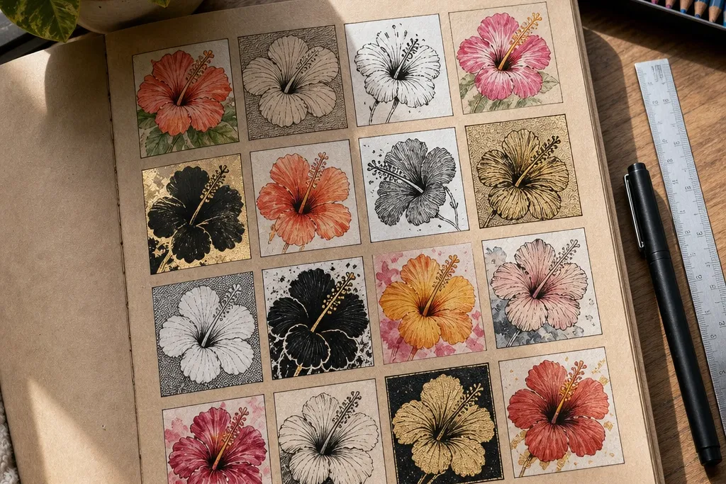
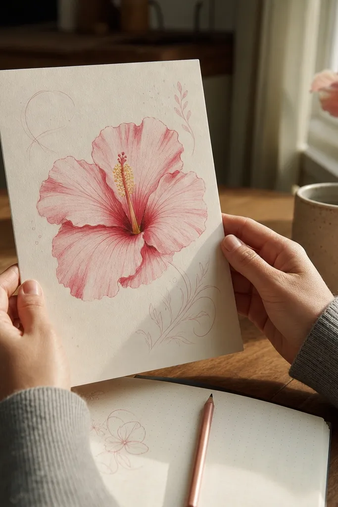
1. Double-Petal Hibiscus with Ink Outline + Cross-Hatch Folds
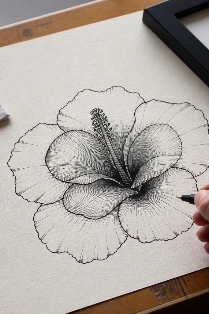
This one is for crisp, frame-ready drawings. You draw the outer petals first, then add inner petals with visible fold lines — that makes the flower look dimensional even with simple tools. Use black ink for the outline and cross-hatching inside each petal fold so the shading has texture instead of gray smudges. The center column gets tight lines and small dots for the stamens, which keeps it sharp in photos. It’s a solid skill-builder because you’ll practice consistent line weight and controlled shading.
Step 1: Lightly sketch a five-petal hibiscus, then add a second set of inner petals that sit slightly behind the outer ones. Step 2: Ink the outer outline with a 0.5-0.7 mm pen, then ink the fold lines on each petal using thinner strokes. Step 3: Shade each fold with cross-hatching in the direction of the petal curves, keeping the darkest area near the center column. Step 4: Add the center column by drawing a vertical oval, then place stamens as short curved lines with tiny dots at the tips, then erase pencil marks.
Cross-hatch only where petals actually fold. If you hatch the flat parts, the flower looks muddy.
Don’t shade the entire petal — hibiscus reads best with a few clean light zones.
2. Watercolor Pencil Hibiscus with Soft Edge Petals
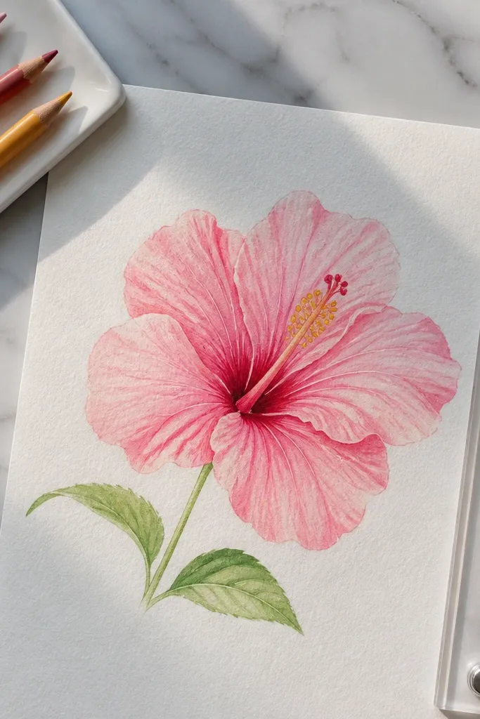
This style is for that airy, gentle look that still feels detailed. Watercolor pencils let you build color in layers, so the petals don’t turn into one uniform wash. Start with a light pink base, then deepen the folds with darker rose and add a warm yellow center. The stamens look best when you keep them slightly lighter than the folds, so they don’t overpower the petals. It’s great for sketchbook pages and for cards where you want the flower to feel delicate.
Step 1: Sketch the hibiscus lightly with a 2B pencil, then mark the center column as a narrow vertical oval. Step 2: Color the outer petals with light pink watercolor pencil, leaving a small highlight area near the top of each petal. Step 3: Add deeper rose color only along the fold lines, then blend with a clean damp brush (small strokes, not soaking the whole page). Step 4: Color the center column with pale yellow, then add orange-red dots for the anthers. Step 5: Let it dry fully before adding thin pen lines for the stamen details, if you want extra crispness.
Use a scrap paper under your hand so you don’t smear the wet pigment while blending.
Don’t overblend — if you keep going, the petals lose their fold structure.
3. Brush Pen Hibiscus with Two-Tone Petals
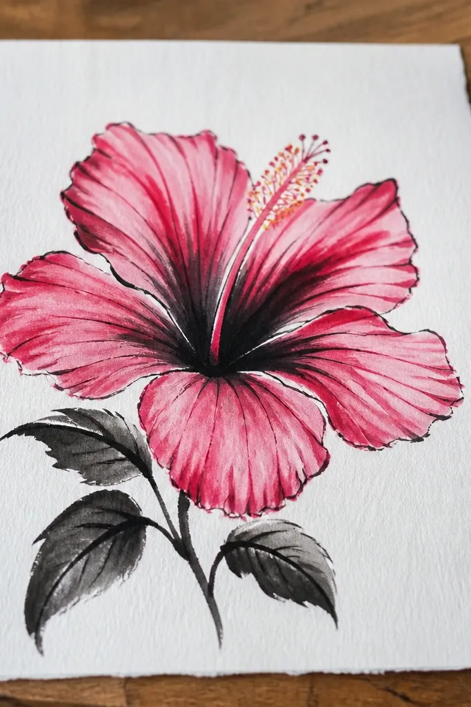
Brush pen hibiscus looks bold and graphic, especially when you use two tones on each petal. The key is to let the brush create variation: press for thick down-strokes, lift for thin lines. You’ll draw petal outlines, then add a darker band for the folds so the flower has shape without heavy shading. For the center, use a darker marker to draw the column and keep stamens as simple lines with small tips. This one is quick, clean, and very photo-friendly.
Step 1: Use a light pencil guide, then outline five outer petals with a brush pen, thickening the lines where petals curve inward. Step 2: Add inner petals with lighter pressure so they sit behind the outer layer. Step 3: Color the petals by drawing a darker band along each fold line, leaving the outer edge lighter. Step 4: Draw the center column as a narrow vertical shape, then add stamens as 10-12 short curved strokes radiating outward. Step 5: Add small darker dots at the stamen tips and let the ink dry before moving your page.
Practice pressure control on scrap paper first. Hibiscus looks best when thick-thin changes are consistent.
Don’t fill the whole petal with one flat color — you’ll lose the folds.
4. Monoline Hibiscus in a Square Frame Layout
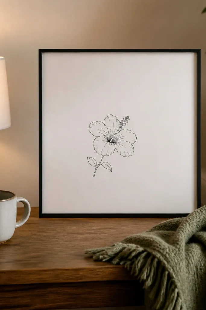
Monoline drawings look clean, modern, and they frame well without feeling busy. This layout uses a simple square border and one hero hibiscus placed slightly off-center, which makes the composition feel intentional. Because the line is uniform, you rely on negative space and tiny fold lines to create depth. The center column is drawn with repeated short arcs and dot accents, so it stays detailed even with minimal color. This is a great choice if you want something that looks “designed,” not just illustrated.
Step 1: Lightly draw a thin square border, then sketch the hibiscus so it touches the border with one petal tip but doesn’t crowd. Step 2: Outline the outer petals with a single line weight, adding fold lines as short internal arcs. Step 3: Draw the inner petals with smaller arcs and keep them slightly lighter (less line density). Step 4: Build the center column using a vertical oval and add stamens as tiny repeated curved lines. Step 5: Add one small leaf cluster in one corner of the square and erase all pencil marks.
Pro tipIf your lines wobble, use a ruler for the square border and let the flower lines stay freehand.
AvoidDon’t add heavy shading. Monoline works because it stays airy.
5. Pencil + Charcoal Hibiscus with Real Smoky Depth
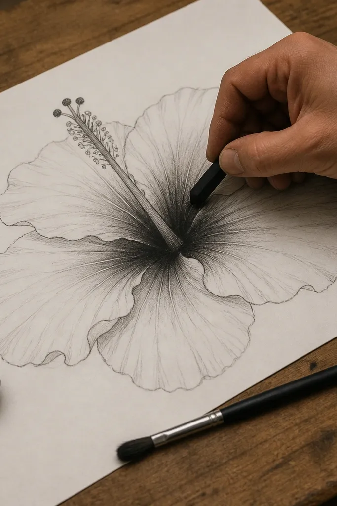
If you want a drawing that feels like art, not a craft, charcoal adds depth fast. The hibiscus folds look dramatic when you press charcoal into the inner petal creases and blend softly outward. Pencil keeps the structure clean, and charcoal does the mood. You’ll use a kneaded eraser to pull highlights on the petal edges so the flower doesn’t look like one gray mass. This style works great for larger paper sizes like 8x10 inches, where you have room for soft gradients.
Step 1: Sketch the hibiscus with a 2H or HB pencil so the lines stay light and easy to erase. Step 2: Layer charcoal on the fold lines first, then blend with a tissue or blending stump, keeping the darkest values near the center column. Step 3: Use the kneaded eraser to lift highlights along the outer petal edges and around the center column. Step 4: Add the center column in pencil, then lightly shade under the stamens so they sit “in” the flower. Step 5: Finish stamens with pencil lines and tiny dot accents, then fix with a light spray if you have one.
Pro tipBlend from the fold outward, not across the whole petal. That preserves petal shape.
AvoidDon’t smudge the outline — keep the outer edge crisp.
6. Hibiscus with Patterned Petals and Dot-Work Center
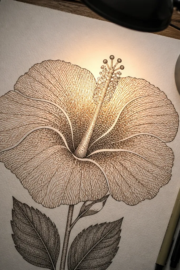
This is the most “handmade poster” looking hibiscus on the list. Instead of shading, you create texture with patterns: tiny waves, dots, or short hatch marks inside each petal section. The center column becomes a dot-work focal point, which looks great under direct light and holds up in photos. It’s also forgiving because patterns hide small drawing mistakes. If you like aesthetic, graphic art, this one will scratch that itch.
Step 1: Draw the hibiscus structure lightly, then split each petal into 2-3 sections with curved guideline lines. Step 2: Outline with a fine liner, then add pattern fills inside each section (choose one pattern per petal: dots on one, short waves on another). Step 3: Draw the center column and fill it with dense dot-work, leaving a few tiny highlight gaps. Step 4: Add stamens as short lines with dot tips, then erase pencil marks. Step 5: Optional: color the patterns lightly with colored pencil only on one or two petal sections for contrast.
Pro tipUse a consistent dot size for the center. One dot pattern size makes the drawing look intentional.
AvoidDon’t mix too many patterns at once. Pick two pattern types max.
7. Hibiscus Vine Corner with One Big Flower
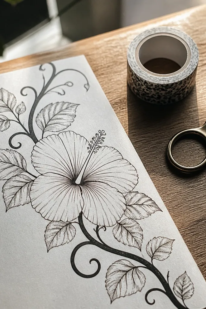
This style is for decoration and card corners. You get one large hibiscus as the hero, plus a vine that frames it so the drawing feels finished without needing a background. The flower stays detailed, but the leaves and stems are simpler lines so they don’t compete. Use a slightly thicker pen on the vine and thinner lines on the leaf veins for a layered look. It’s a reliable layout for invitations, bookmarks, and scrapbooking layouts.
Step 1: Sketch a loose vine line that curves from the corner toward the center, then place the hibiscus at the end of the curve. Step 2: Draw the hibiscus petals with clear fold lines, then add a center column with stamens as short arcs. Step 3: Add 3-5 leaves along the vine using teardrop shapes and a single center vein line. Step 4: Ink the main vine and flower outline, then ink leaf veins with a thinner pen. Step 5: Color the petals with a limited palette (pink and a touch of yellow at the center) and leave the vine mostly line-only.
Pro tipKeep the vine thinner than the flower outline. That keeps the hibiscus readable at a glance.
AvoidDon’t cram too many leaves. Three to five is plenty for a corner design.
8. Ink Wash Hibiscus with Bleeding Petal Edges
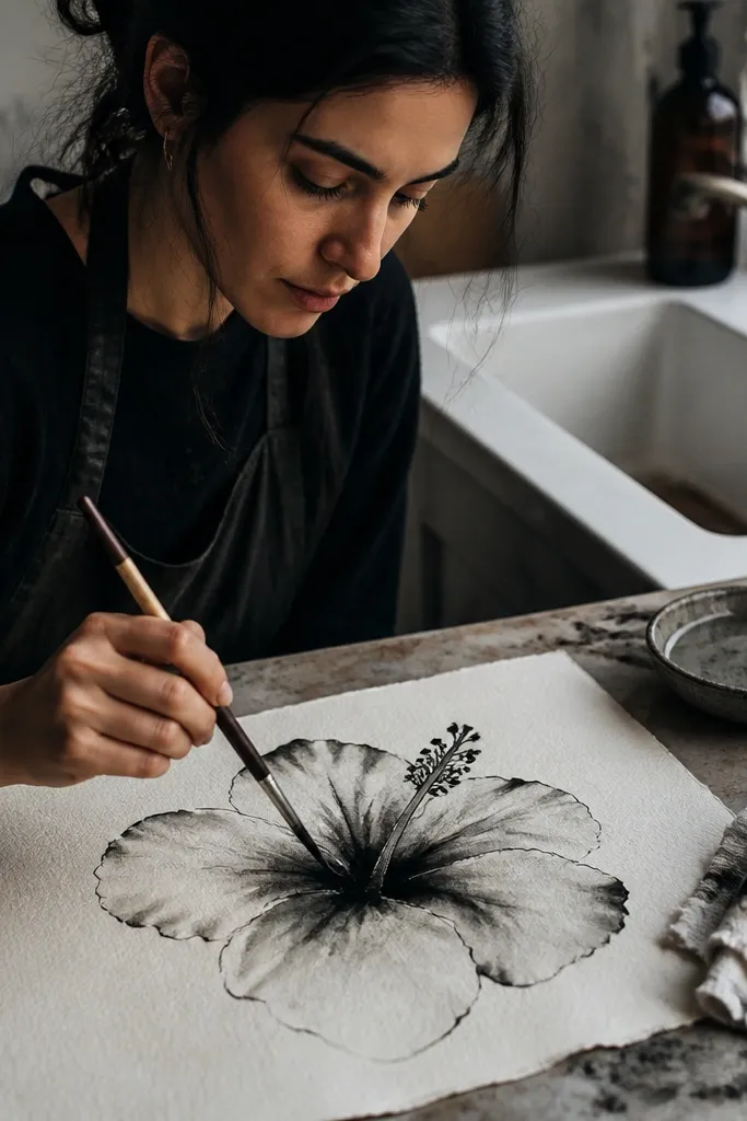
Ink wash gives you that moody, artistic look without needing watercolor skills. You outline the petals in ink, then pull diluted ink into the fold areas so it naturally blooms. The hibiscus center looks best when you keep it slightly darker and more concentrated, so it doesn’t wash out. This style is great on textured paper because the ink grabs and creates grain. If you like a dramatic aesthetic, this one delivers.
Step 1: Outline the hibiscus petals and fold lines with waterproof ink using a fine liner. Step 2: Mix diluted ink (or black ink + water) on a palette and paint it only along the fold lines inside each petal. Step 3: Before it dries, tilt the paper slightly so the wash spreads subtly toward the petal edges. Step 4: Paint the center column more concentrated, then add stamens with a pen once the wash sets. Step 5: Let everything dry flat, then erase pencil guides.
Use textured paper like watercolor paper. Smooth paper makes wash look flat.
Don’t flood the whole petal. Keep wash to folds so the flower stays shaped.
9. Colored Pencil Hibiscus with Hard-Edge Highlights
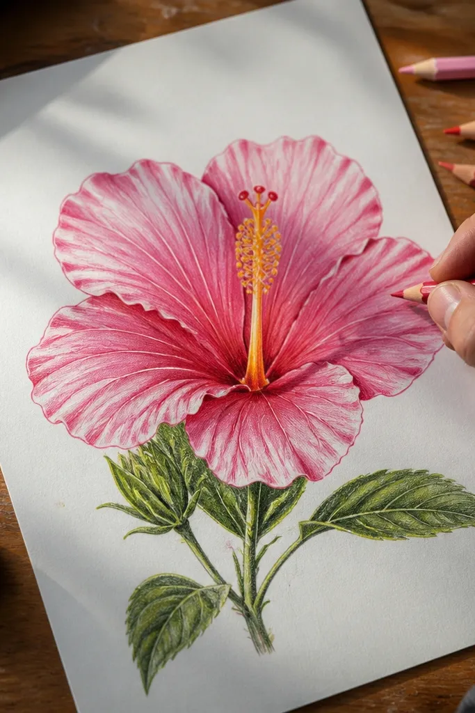
This one is for clean, polished color without watercolor mess. Colored pencil gives you control, and hard-edge highlights make the petals look glossy. You’ll layer pinks gradually, then carve out highlights by leaving paper white or gently lifting with a kneaded eraser. The center column can be a smooth yellow-to-orange gradient, while stamens stay thin and readable. This style is excellent for small formats like 5x7 inches.
Step 1: Sketch the hibiscus with light pencil, then mark highlight zones on each petal (top edge and a small inner curve). Step 2: Layer light pink over the whole petals, staying away from the highlight zones. Step 3: Add deeper rose along fold lines and blend with light strokes toward the center. Step 4: Color the center column with pale yellow, then deepen to orange at the base. Step 5: Add stamens with a sharper pencil tip and darken anther dots, then lightly erase pencil marks.
Pro tipSharpen your colored pencil often. Soft tips blur the highlight edges you’re trying to keep crisp.
AvoidDon’t burnish the whole petal. Too much pressure flattens the color.
10. Hibiscus Flower Study with Separate Petal Templates
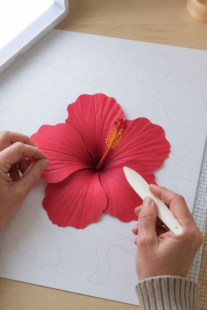
This is a practical drawing method disguised as a beautiful final page. You draw each petal as a separate template first, then assemble them into a hibiscus with consistent proportions. The result looks more balanced than a single freehand attempt because each petal has the right curve and fold placement. You’ll also end up with reusable petal shapes for future drawings. It’s ideal if you keep struggling with symmetry or proportions.
Step 1: On one page, draw 5 petal templates using simple ovals with one curved notch for the fold, labeling them lightly in pencil. Step 2: Draw the hibiscus assembly on a second area of the page using those templates, rotating each petal slightly so they overlap naturally. Step 3: Add inner petals using one of your templates scaled down. Step 4: Ink the final assembly only, then shade folds with a single method like light cross-hatching. Step 5: Draw the center column and stamens to connect the petals visually, then erase all template guidelines.
Pro tipRotate petals by small angles, not random ones. Even 10-15 degrees changes the look a lot.
AvoidDon’t ink the templates. Keep them pencil-only so they don’t clutter the final drawing.
11. Hibiscus on Grid Paper with Clean Geometry
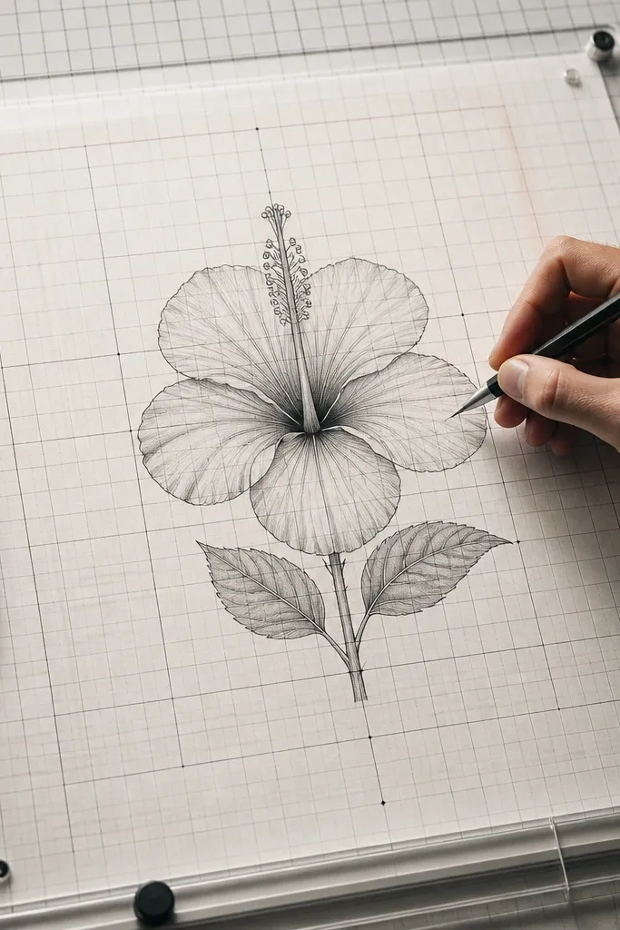
Grid paper is your best friend when you want hibiscus symmetry that still looks hand-drawn. You’ll use the grid to place petal spacing and make the center column perfectly aligned, which fixes the “wonky flower” problem. The aesthetic here is crisp and architectural — great for printable wall art or sticker-style designs. Shade lightly with a few geometric hatch lines so the flower doesn’t look flat. This is also a great choice for beginners who want structure.
Step 1: Use a light grid (or draw your own with a ruler) and map the hibiscus center at the intersection point. Step 2: Place five outer petals by measuring angles from the center, keeping each petal’s fold at the same distance from the center. Step 3: Outline with a fine pen and add inner petals scaled down, still aligned to the grid. Step 4: Shade fold areas with short, straight hatch lines that follow the petal direction. Step 5: Add stamens with evenly spaced arcs and a dotted anther line, then erase the grid lines carefully.
Pro tipIf you erase grid lines and the paper fuzzes, use a kneaded eraser instead of a hard rubbing eraser.
AvoidDon’t shade across grid lines. Keep shading confined to petals.
12. Hibiscus with Negative Space Petal Veins
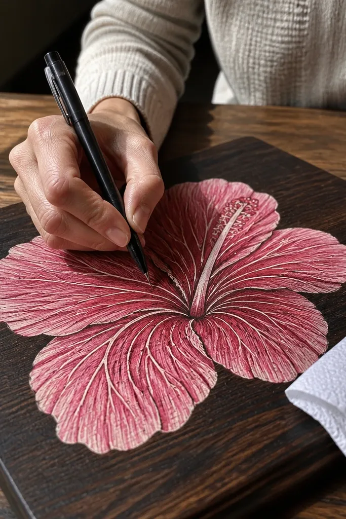
Negative space veins make the drawing look crisp and intentional. You shade the petals lightly or medium-dark, then leave vein lines and a few highlight channels uncolored. That creates the look of natural translucency, especially when you use a warm pink base. The center column also benefits — keep the column edges darker and leave a pale strip in the middle for depth. This style is striking because it uses the paper as part of the design, not just the background.
Step 1: Sketch the hibiscus and lightly mark vein paths on each petal with pencil. Step 2: Color the petals with a mid-tone pink using colored pencil or marker, covering most of the petal surface but leaving the vein paths blank. Step 3: Darken fold areas with a darker rose, staying away from the pale vein channels. Step 4: Color the center column yellow, then outline its edges with orange-red. Step 5: Add stamens with a thin pen and small dot tips, then erase any stray pencil marks.
Mark vein paths before coloring. Once pigment is down, it’s hard to “remember” where to leave blank space.
Don’t press too hard early. Dark underlayers make it impossible to keep vein lines clean.
13. Hibiscus in Three Colors with Marker Gradients
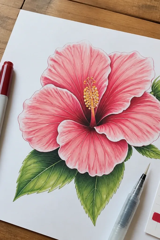
This one is for bold color that still looks smooth. You’ll use three marker tones: light base, medium fold, and dark accent, then blend with a lighter marker or blending pen. The hibiscus petals look layered because the folds get darker and the edges stay lighter. The center column reads clearly with yellow and a small orange ring, while stamens stay line-detailed with a fine pen. It’s a great option if you want something that pops in photos.
Step 1: Outline the hibiscus petals and center column with a fine black pen, then erase pencil. Step 2: Color the outer petals with the light marker tone, leaving a highlight near the top edge. Step 3: Add medium tone along each fold line, then blend outward with a light marker or blending pen. Step 4: Use the dark tone only on the deepest folds near the center. Step 5: Color the center column yellow, add an orange ring near the base, then draw stamens as thin lines with dark dots at tips.
Pro tipBlend while the ink is still slightly wet. If it dries first, your gradients get blotchy fast.
AvoidDon’t use more than three marker tones. Too many colors makes hibiscus look muddy.
14. Hibiscus Flower with Gold Gel Pen Center Accents
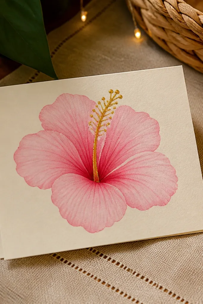
Gold accents turn a simple hibiscus into something that looks like a greeting card made for a boutique shop. You keep the petals in soft pinks, then use a gold gel pen for the center column edge and the anther dots. The contrast is what makes it photogenic — the gold catches light and gives the flower a focal point. If you’re drawing for gift tags or small prints, this style is a winner because it feels special without being complicated.
Step 1: Draw the hibiscus petals and center column in pencil, then ink petals with a fine liner. Step 2: Color petals with colored pencil or light marker in pink tones, leaving the center area slightly lighter. Step 3: Outline the center column with gold gel pen and add small gold dots for anthers. Step 4: Add stamens as thin lines in ink, then tap a few gold dots at the tips. Step 5: Let the gold dry fully before touching the page, then erase pencil marks.
Pro tipGold gel pen looks best on smooth paper. Textured paper can make the gold look grainy.
AvoidDon’t smear gold while it’s wet — it will dull instantly.
15. Hibiscus Stained-Glass Hand Drawing with Black Lead Borders
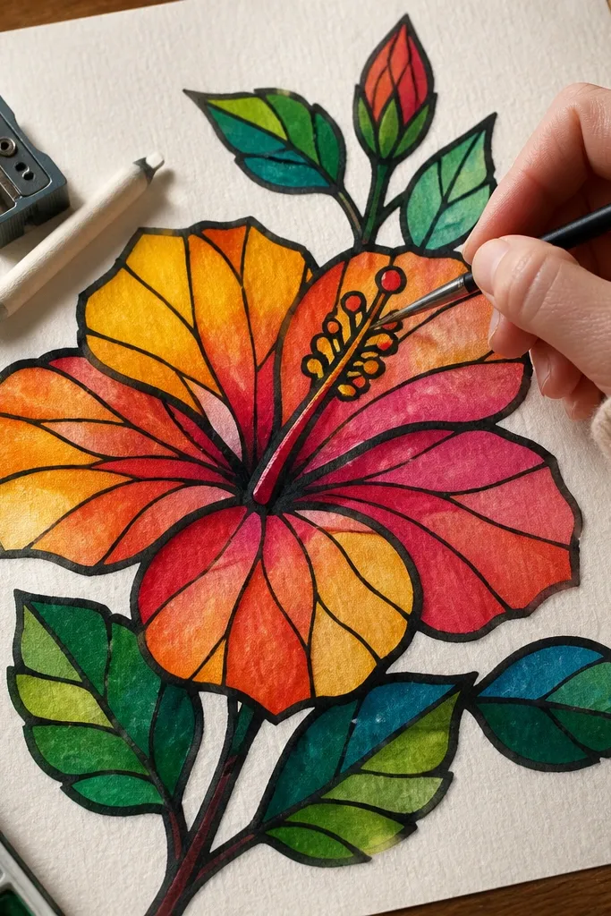
This one looks like stained glass, but it’s still a hand drawing you can finish in one sitting. The trick is heavy black-lead borders that separate “panels,” then translucent color washes that make the petals look like layered glass. It fixes the usual problem with hibiscus drawings — the petals blur together — by forcing clean boundaries and repeating shapes. Use this for cards, wall art, or a sketchbook page that needs to pop across the room. It’s beginner-friendly if you can control a marker or watercolor wash, and it takes about 2 to 3 hours total.
Start on smooth Bristol paper sized about 8x10 inches. Lightly sketch one hibiscus with a big, simple silhouette, then map the petals into 10 to 14 panel shapes using a ruler for straight edges and a pencil for curved ones. Trace only the border lines with a thick black pencil (2B or 4B) or a black fineliner, then erase the pencil interior lines so the borders look crisp. Add color one panel at a time using watercolor in a watery wash or watercolor pencil + water, keeping each panel’s edges clean and leaving a tiny white gap inside the black border. For the center, blend yellow-orange with a stronger pigment near the throat, then add small dot accents with a gel pen for a stained-glass glow.
Pro tipMix a dedicated “panel wash” water cup and keep it clean — muddy water is what kills the stained-glass look. Let each color panel dry 3 to 5 minutes before touching the next one so borders stay sharp.
AvoidDon’t shade across panel borders or you lose the stained-glass separation.



