
1. Dainty Daisy Border with Center Dots
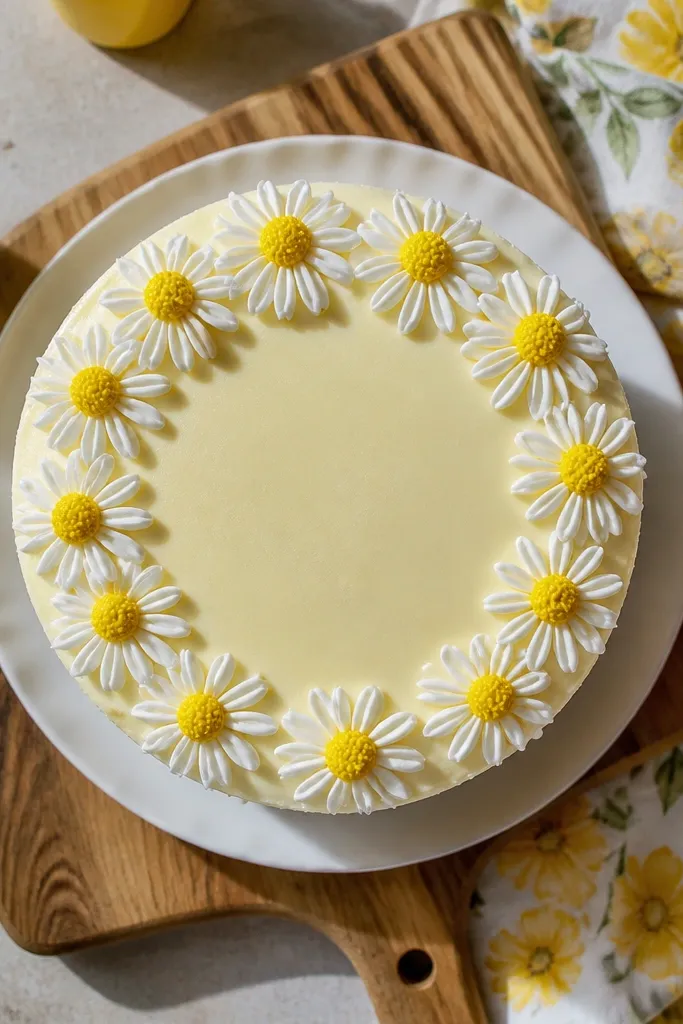
This one looks sweet and “clean bakery” because daisies have repeatable shapes. You get a ring of recognizable flowers without needing shading. The white petals pop against a smooth background, and the yellow centers add a tiny focal point that reads from across the table. It also works well for cakes that are already frosted — you’re adding line art on top, not rebuilding the whole look. Plan for a neat border width so the flowers don’t collide.
Pro tipIf your petals spread, your icing is too soft — add a little powdered sugar to stiffen.
Start with a chilled cake covered in smooth buttercream or ganache. Pipe a simple guide line where you want the border using a thin stream of buttercream. For each daisy, use a small round tip to pipe five short petal arcs around a center dot, keeping the gaps even. Finish by adding a tiny yellow dot in the middle and a few short green stems if you want it to look grounded. Chill the cake 10 minutes so the petals set before serving.
AvoidDon’t draw daisies on a warm cake top or the petals will melt into the frosting.
2. Cute Cat Face in Black Outline
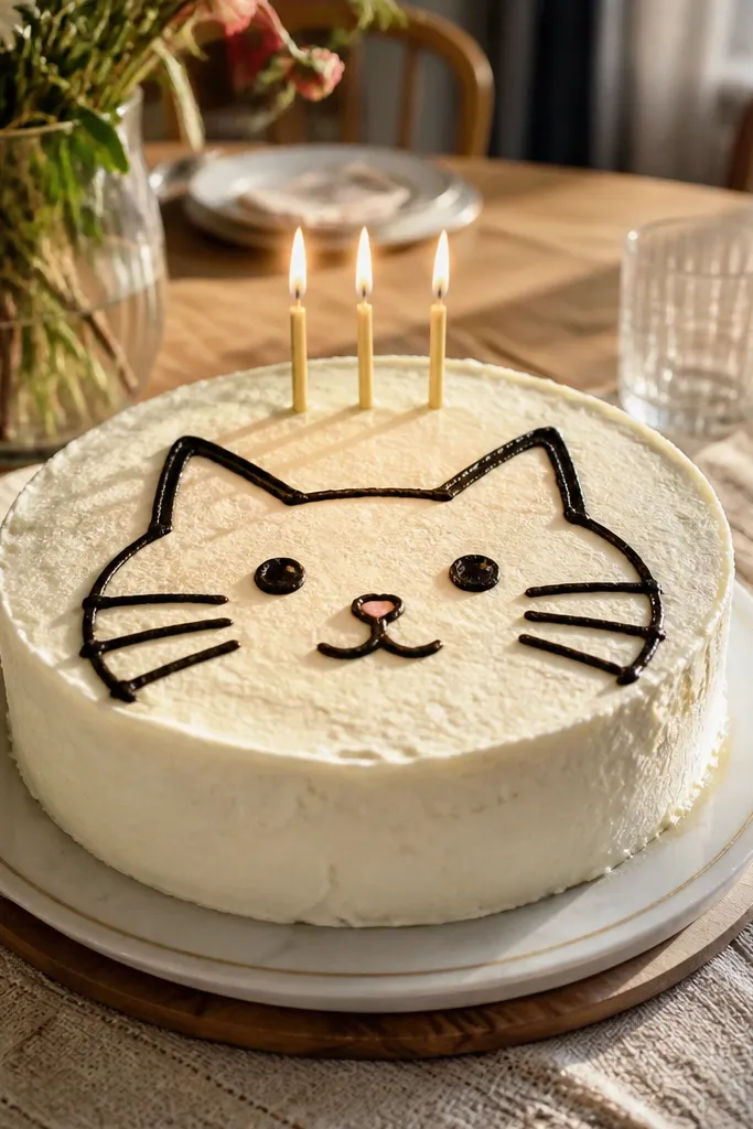
A cat face is the easiest way to get a “drawn” look that still feels intentional. Black outline makes it readable, and the simple triangle ears give you instant cuteness. Add a small nose and dot eyes and you’ve got a focal drawing that doesn’t require advanced piping. This design is ideal for birthdays where you want a theme without changing the whole cake. Keep the face centered so it photographs like a sticker.
Pro tipFor perfectly round eyes, squeeze, lift straight up, then stop — no dragging.
Chill your cake top so the outline holds. Use a #2 or #3 piping tip with thick black royal icing for the linework. Pipe two triangles for ears, then an oval head shape, then add two small dot eyes and a tiny nose. Finish with whisker lines — three on each side — and a small smile curve. Let it set 15 minutes before adding any color accents like a blush dot.
AvoidAvoid thick lines; a chunky outline makes the face look messy instead of cute.
3. Heart Bouquet with One Big Center Heart
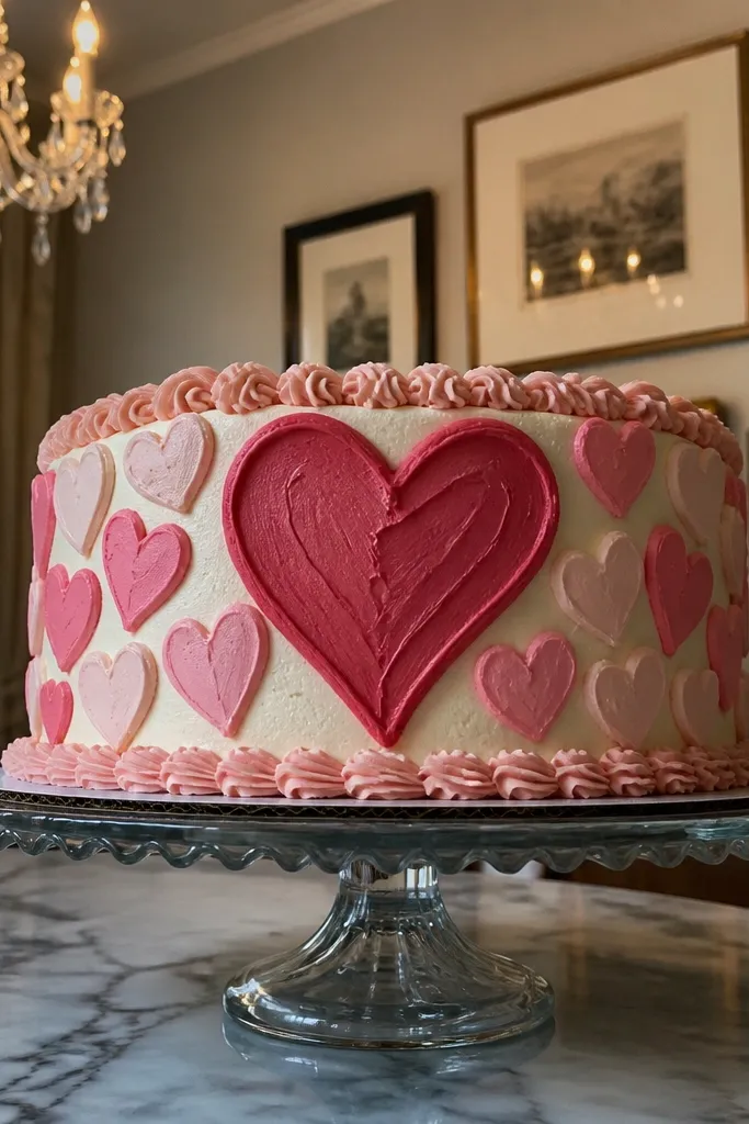
This is a crowd-pleaser because hearts are high-impact and forgiving. The big center heart acts like a poster, while the smaller hearts fill the space without requiring detail. You also get a clear “drawing” look that’s easy to execute with piping. Use two shades of pink/red so it still looks designed even with minimal work. It’s perfect for Valentine’s Day, anniversaries, or a simple “love” message cake.
Pro tipIf you want a clean heart edge, pipe the outline first, then pipe the fill after it sets for 5 minutes.
Start by piping a base layer of buttercream smooth and chilled. With a medium round tip, pipe the big center heart first, then two smaller hearts on either side at equal spacing. Fill the remaining space with tiny heart dots and a few teardrop shapes to mimic petals. Optional: add a thin outline around each heart using a darker shade for crisp edges. Chill 20 minutes so the hearts don’t slump.
AvoidDon’t overcrowd; too many hearts make them merge into one red mass.
4. Rainbow Sprinkles Arc with Drip Highlights
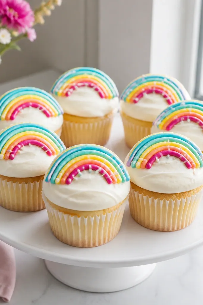
This design reads instantly as fun because it uses color bands and simple sprinkle dots. The rainbow arc gives you a clear curve that looks great on round cakes, sheet cakes, or cupcakes. Add tiny dots like sprinkles to give texture without complex shading. The “drip highlights” idea uses thin white icing strokes to mimic glossy candy. It’s a good choice when you want something photogenic but still quick.
Chill the cake top and sketch a faint arc using a toothpick dipped in cocoa or gel color. Pipe the rainbow using a small round tip: red, orange, yellow, green, blue, and purple bands in separate passes. Immediately add sprinkle dots below the arc using contrasting icing colors. For drip highlights, draw a few short vertical white lines and stop before they reach the bottom edge. Chill 10-15 minutes so the colors set.
Keep each rainbow band thick enough to hold its curve; thin bands break up when you add dots.
Avoid mixing colors on the tip — wipe between colors so you don’t get muddy transitions.
5. Minimal Line-Heart with XOXO Dots
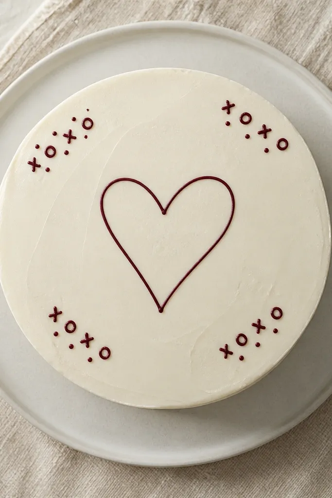
If you want “aesthetic” without loud colors, this is the one. Thin linework looks modern, and the XOXO pattern gives structure to the empty space. It’s also very forgiving because small mistakes in dot placement still look intentional. Use one color (black, dark brown, or deep burgundy) for the whole drawing. This works best on cakes that have a smooth, neutral base like vanilla frosting or light chocolate ganache.
Pro tipPractice one heart on parchment — match your hand speed to keep the line thickness even.
Start with a chilled cake and choose a single icing color. Use a #1.5 or #2 round tip for thin lines — royal icing is easiest for this. Pipe a clean heart outline, then add a tiny curved line inside for a second detail line if you want depth. Pipe X and O using dot-and-swipe motions, spacing them evenly around the heart. Let it set fully for sharp edges, about 20 minutes.
AvoidDon’t use buttercream that’s too soft; thin lines disappear when the icing spreads.
6. Kawaii Bunny with Blush Cheeks
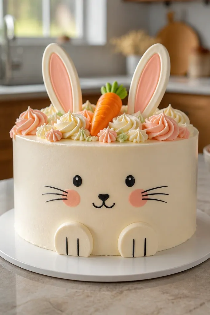
Kawaii faces look adorable because they use simple geometry: ears, eyes, and a tiny mouth. The blush cheeks make it feel alive on camera, and a small carrot shape adds theme without clutter. This drawing is easy to scale up or down, which matters if your cake is small. It also makes a great topper-style look even when baked into the cake top. Keep lines smooth and the cheeks tight to the face so it stays readable.
Pro tipUse a toothpick to nudge blush circles into perfect half-moon shapes before they set.
Chill your cake top and load pink royal icing for blush and black royal icing for the outline. Pipe two tall ears and a rounded head, then add dot eyes and a small curved mouth. Add a tiny carrot beside the face using orange icing and two green lines for the top. Finish with blush cheeks as two small pink circles and a few tiny whisker dots. Set in the fridge 10-15 minutes.
AvoidDon’t add too many small dots; it turns cute into chaotic quickly.
7. Baby Blocks with Lettering on Straight Lines
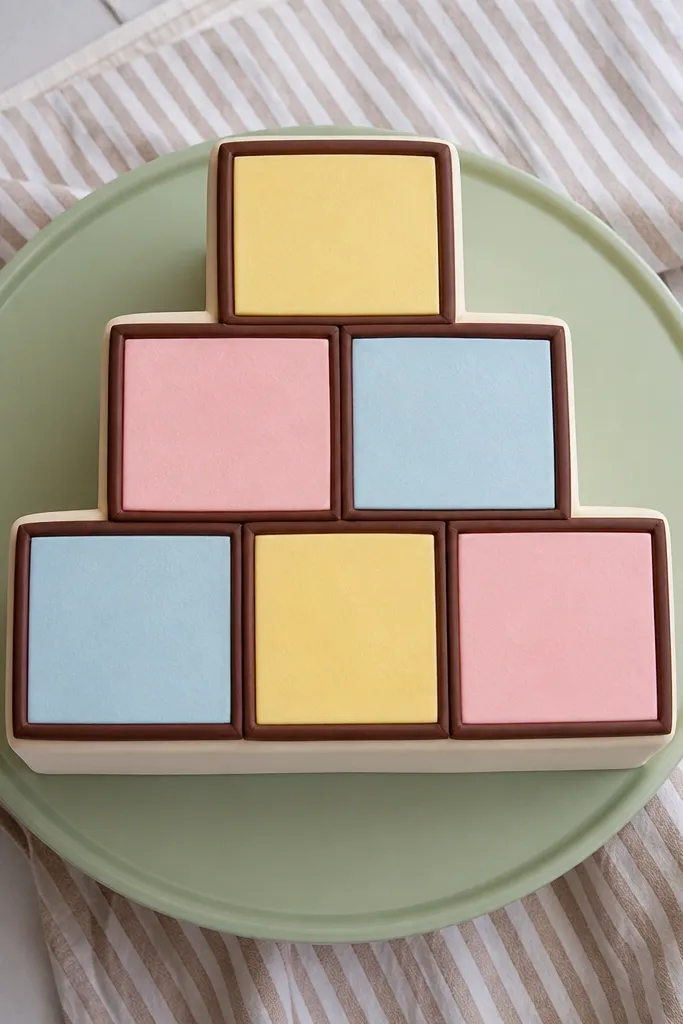
Blocks with letters look like a themed drawing without requiring fondant. The straight edges and simple typography style make it feel tidy, which is what looks good in photos. Use pastel colors for the block faces and a darker outline to keep the drawing crisp. This is a smart pick for baby showers because it reads clearly even if guests don’t know the theme. You can also swap letters to match names or “LOVE.”
Start by covering the cake top smooth and chilling it. Use a ruler or straight edge to lightly mark block positions with a toothpick. Pipe rectangle block outlines using a darker icing color, then fill each face with a pastel shade. Add letter lines by piping letters with a #1.5 tip — keep them tall and simple (no fancy script). Finish with small shadow lines under each block to give separation. Chill until set, 15-20 minutes.
Thin your pastel icing slightly so it fills rectangles evenly without rising over the outline.
Avoid cursive letters; they smear faster than block letters on a cake top.
8. Single Rose with Leafy Stem Stroke
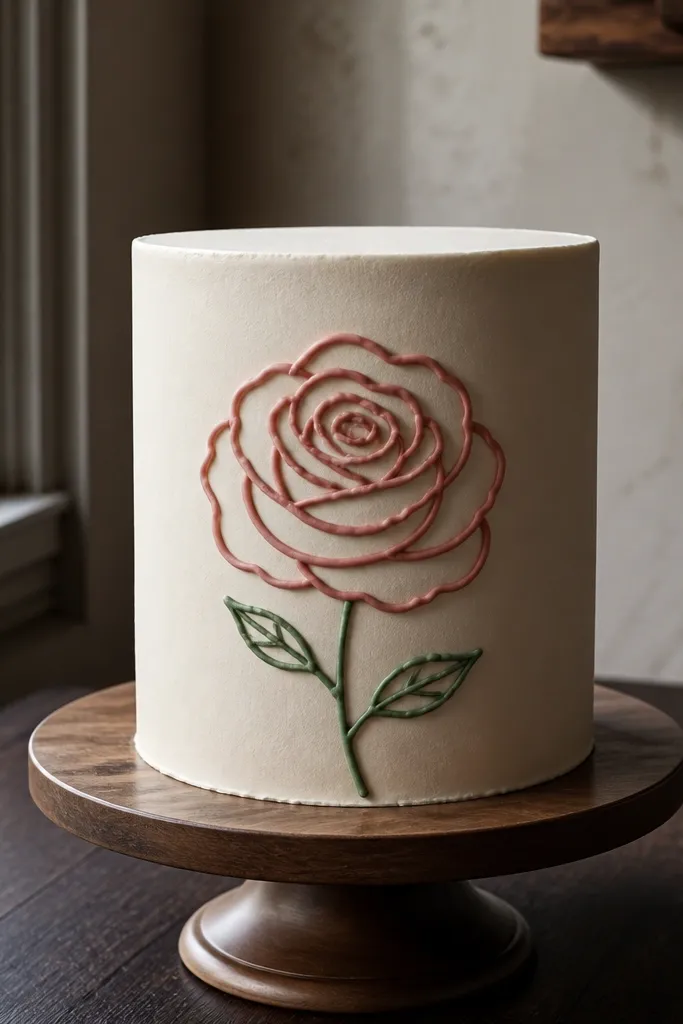
A single rose looks expensive because the composition is simple and centered. You’re not filling the whole cake with detail, just one strong subject. The rose petals can be done with small curved lines that stack, giving a drawn texture. A green stem and a couple leaves frame it and make the flower feel anchored. This design works for adult birthdays and anniversaries where people like something pretty but not childish.
Chill the cake top and decide where the rose stem will start. Pipe the stem first using a leaf or small round tip with green icing, then add two leaves on either side. For the rose, pipe a small spiral center, then add petal arcs around it — each arc should overlap the previous line. Use red (or pink) royal icing for clean petal lines. If you want a softer look, add a tiny yellow dot at the center and let it set before serving.
Keep petals short and overlapping; long strokes look flat on cake surfaces.
Don’t try to shade the whole rose — drawn petals look better with clean lines.
9. Butterfly Wings with Dot Texture
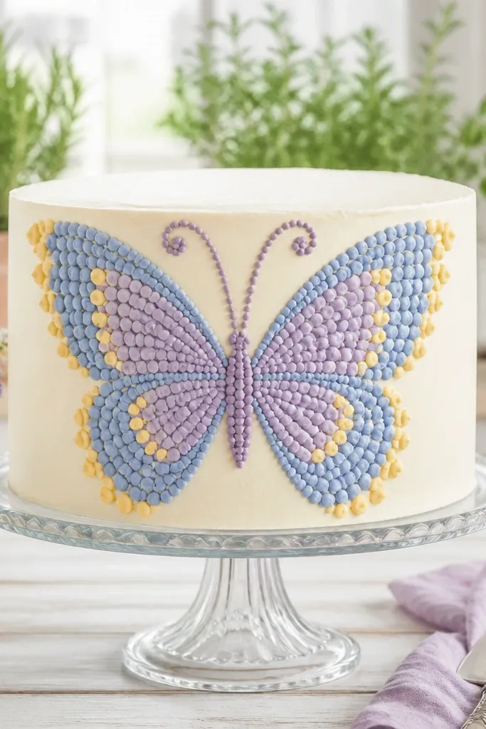
Butterflies look “designed” because symmetry reads instantly. The dotted texture gives you a pattern that feels intentional without needing airbrushing. Use two coordinating colors for the wings and a third for dots so the drawing has depth. This one is great for spring parties and gender-neutral cakes. It also stays photogenic because the wings fill a wide area without requiring complicated backgrounds.
Pro tipMirror by counting dot rows — it keeps both wings looking even.
Chill the cake top and draw a light center line with a toothpick. Pipe the left wing outline first, then mirror it on the right using the same dot spacing and curve. Fill each wing with dots by tapping the piping tip — small, consistent bumps. Add a simple body line in the center and two tiny antenna dots at the top. Finish with a few larger dots near the wing edges for a framed look. Set for 15 minutes.
AvoidDon’t use watery icing for dots; it spreads and turns into smudges.
10. Sunburst Rays with Tiny Center Face
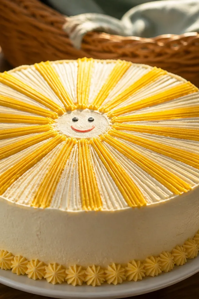
This is a classic cute-drawing style that looks bold on camera. Straight rays are easy to pipe and give you instant “poster” energy even with minimal detail. Add a small smiling face in the center and you get a clear focal point. The sunburst works on round cakes, but it also looks great on square cakes because the rays create a strong geometric frame. Keep the rays even so it doesn’t look sloppy.
Pro tipIf your rays wobble, pipe them in pairs — two lines at a time, then rotate around the circle.
Chill the cake top and pipe a circle for the sun center using yellow royal icing. Pipe rays outward using a medium round tip — make short, straight lines that touch the edge of the sun circle. Add a face with two dot eyes and a curved smile using black icing. Optional: add tiny white highlight dots on a few rays for sparkle. Let it set 20 minutes so rays don’t slump.
AvoidAvoid long rays — they drag into the cake edge and blur when you slice.
11. Side-Swoop Feather Lines with Speckle Background
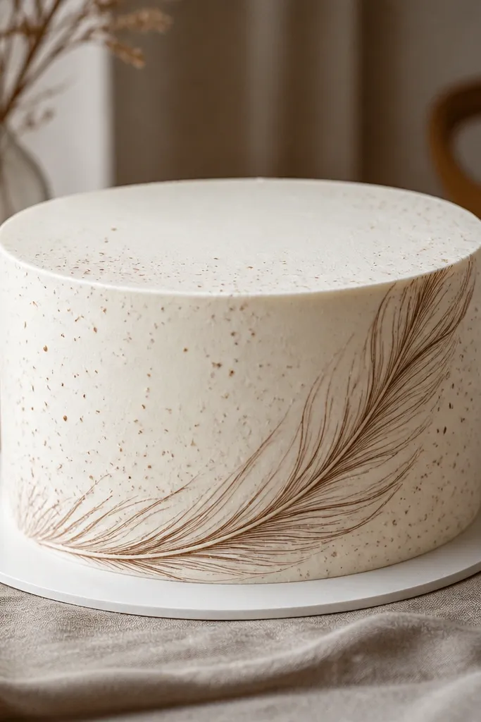
Feather line art looks artsy and clean because it uses flowing strokes and light texture. The speckle background adds interest without cluttering the main drawing. You get a modern aesthetic with a soft, airy look that still reads clearly. This is a good pick for neutral cakes — think vanilla, almond, or light chocolate — where you want the drawing to be the star. Use muted colors like dusty pink, sage, or steel blue for a calm vibe.
Chill the cake top and choose one main feather color plus a lighter speckle color. Pipe the feather shaft first — a thin curved line — then add small branching lines on both sides. Build speckles by flicking a small amount of icing with a clean spoon or piping tip, keeping it light and controlled. Add a few elongated leaf-like marks near the bottom of the feather for balance. Let it set 15-20 minutes before adding any extra accents like a single dot highlight.
Use a toothpick to pull a couple speckles into tiny teardrops — it makes the background look intentional.
Don’t overload speckles; too many makes the whole cake look dirty in photos.
12. Cozy Hot Cocoa Cup with Marshmallow Dots
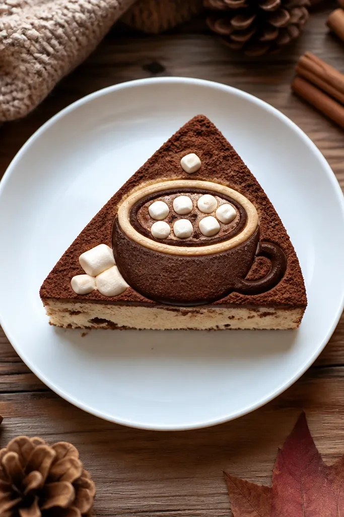
This drawing is cute and very readable because it uses recognizable shapes: a cup outline, a swirl, and marshmallow dots. It also tastes good visually — the brown swirl and cream marshmallows create color contrast that looks great against vanilla frosting. You don’t need to add actual cocoa powder or anything fancy; the art alone sells the theme. This is a solid winter pick and also works for coffee lovers. Keep the cup centered and the swirl contained.
Chill the cake top and pipe a cup outline with medium-brown royal icing. Pipe the cup rim as a slightly thicker line, then add a small handle on the right side using a curved stroke. For the cocoa swirl, pipe a tight spiral or S-curve pattern in the center of the cup. Add marshmallows as small white dots or tiny circles on top of the cup. Finish with a few thin steam lines rising upward. Set for 20 minutes.
Use white icing that’s slightly thicker than your brown so marshmallows don’t sink into the swirl.
Avoid drawing steam lines too close to the cup; they’ll blur into the rim.
13. Bow-Tie Ribbon with Polka Dot Center
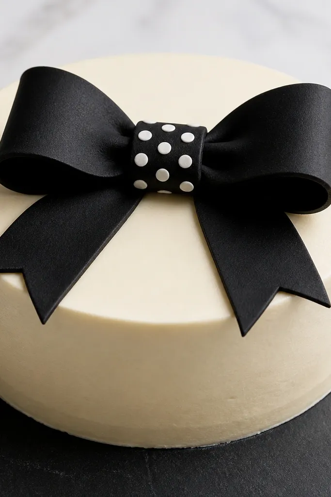
A ribbon bow looks polished because it’s symmetrical and has clear shapes. The polka dot center gives texture without needing shading. This works especially well on cakes that have a smooth top with a single accent color. You can choose classic black-and-white dots or go pastel for a softer look. It’s also a good way to make a plain cake feel styled for parties.
Pro tipIf your bow loops spread, outline first, chill 5 minutes, then fill.
Chill the cake top and decide on the bow’s center point. Pipe two mirrored bow loops using a thick outline, then fill the loops with the same base color. Pipe a small center knot shape and then add polka dots using a small round tip — consistent dot size matters more than perfect spacing. Add a thin highlight line across each loop for a crisp “drawn ribbon” feel. Let it set 15-20 minutes before moving the cake.
AvoidDon’t use too many dot colors; one dot color looks cleaner and more intentional.
14. Monogram Script in a Thick Outline Frame
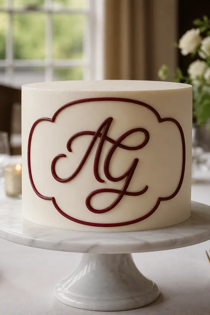
A monogram is the fastest route to “looks custom” because it’s one clear graphic element. The trick is to keep the script readable — thick outline, minimal flourishes, and plenty of breathing room. Frame it with a simple border so the letter looks designed, not floating. This is perfect for weddings, anniversaries, or graduation cakes where people want a name initial without a complicated theme. Choose a contrasting color that pops against the cake base.
Chill the cake top and pipe a rectangular or oval frame outline using a dark icing. Inside the frame, pipe one large monogram letter using thick royal icing and keep strokes smooth. Add small dot accents around the letter — six to eight dots — to balance the negative space. If you want a second layer, pipe the letter fill with a lighter shade after the outline sets for 5 minutes. Let the whole drawing set 20 minutes before slicing.
Use blocky script shapes: rounded curves only, no thin hairlines.
Avoid tiny letters; scale up so the monogram stays legible after frosting smears during serving.
15. Chalkboard Style Doodles with White Lines
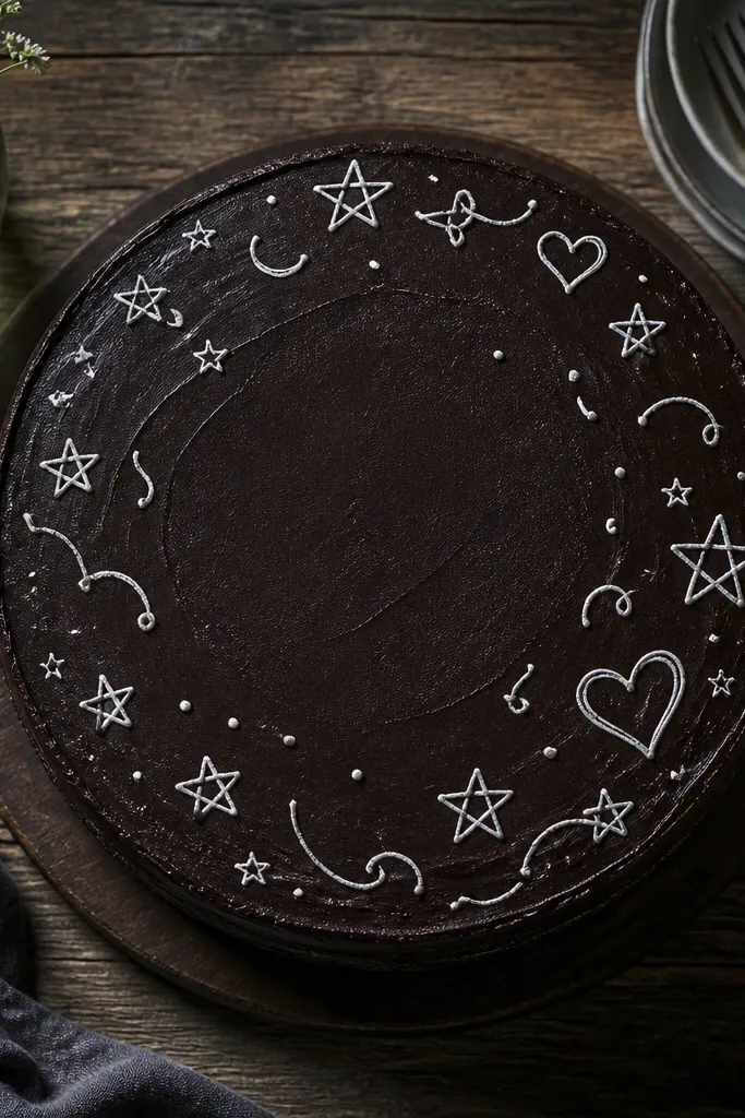
Chalkboard-style doodles look trendy and fun because the contrast is strong. A dark base makes the white lines feel like chalk without needing any special products. Keep the doodles simple — stars, squiggles, and a few hearts — and place them in clusters around one central empty spot. This design hides small imperfections because it’s intentionally hand-drawn. It also works great when you want a party cake that feels playful but not theme-specific.
Start with a dark frosting base like chocolate buttercream or dark cocoa ganache, smoothed and chilled. Use white royal icing for the doodles and a small round tip for linework. Pipe a few stars, then add squiggles and small hearts around them, keeping each element separated by small gaps. Leave one clean area in the middle so it looks like a chalkboard with breathing room. Chill 15 minutes so the white lines set on the dark surface.
Add one thicker “chalk stroke” line for emphasis — it makes the doodles look more natural.
Don’t flood the dark base with thin icing; it will bleed and look gray instead of crisp white.



