
1. Rose Petal Wash Hibiscus with Ink Veins
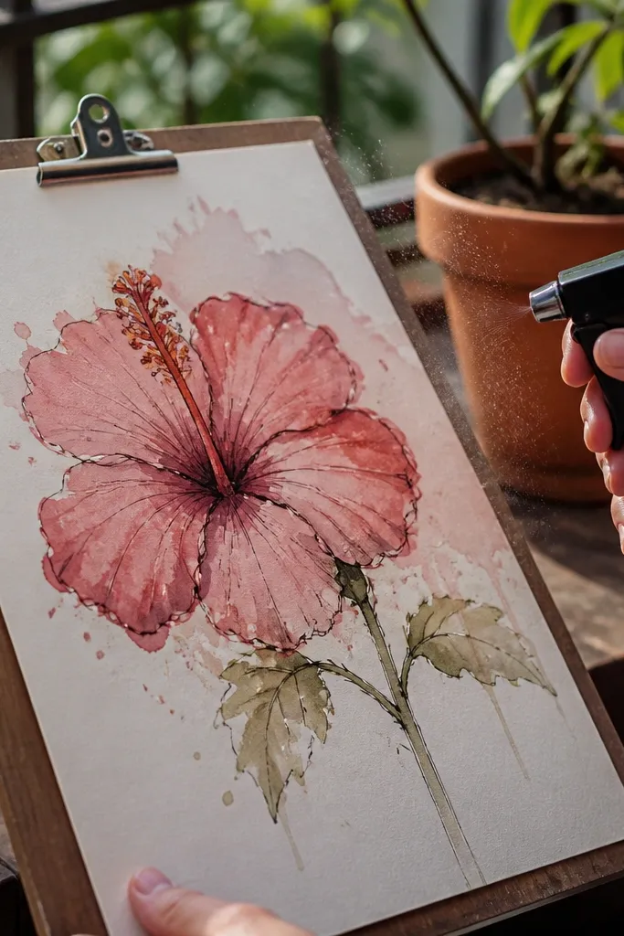
Start by lightly sketching 5 overlapping petals with a gentle curve and a slightly thicker center. Wet one petal at a time, then drop a diluted quinacridone rose wash from the fold toward the outer edge, leaving the tips lighter. While it’s still damp, touch a deeper rose (or alizarin crimson) at the fold so it blooms inward. Add vein lines with a waterproof fine liner after the wash dries, then dot tiny highlight marks with a clean damp brush.
This look is all about soft petals with just enough structure. You paint the petal body as a watery rose wash, then you add darker rose at the fold line so each petal reads as a separate shape. Finish with a few crisp ink veins that don’t outline the whole flower — the ink acts like a skeleton while the watercolor stays dreamy. It’s a great choice if your previous hibiscus drawings looked like one big blob of color.
AvoidDon’t outline every petal in ink; it kills the airy watercolor edges.
Pro tipKeep a paper towel ready and blot the brush tip before you touch the fold line — it prevents hard rings.
2. Sunset Hibiscus with Orange Throat Glow
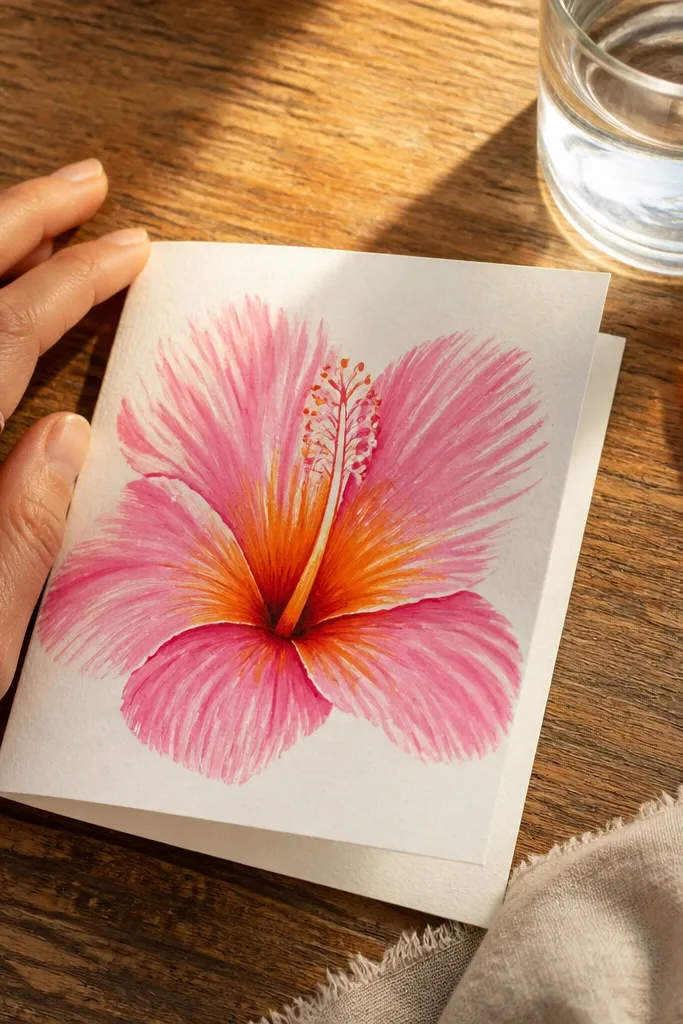
Sketch the hibiscus with a clear throat opening in the middle. Paint the petals first using diluted pink (rose plus a little water) and leave the outer edges pale. Mix a warm throat color using burnt sienna + a touch of burnt umber, then paint it only inside the center folds. When the throat is damp, add a brighter orange-red accent at the top of the throat. Finish with a thin line for the stamen stems and a few tiny dot seeds inside the center.
If you want that “glow” that makes people stare, this is the recipe. The petals start pink and fade outward, while the center throat is a hot orange-brown that reads like warmth. You keep the wash edges feathered, then you concentrate color where the petals fold over the throat. It’s especially pretty for greeting cards because the center reads even at small sizes.
AvoidAvoid painting the throat color into the petal wash edges; the whole flower will look dirty.
Pro tipUse a smaller round brush for the throat and keep your hand steady by resting your wrist on the paper edge.
3. Monochrome Mauve Hibiscus on Cream Paper
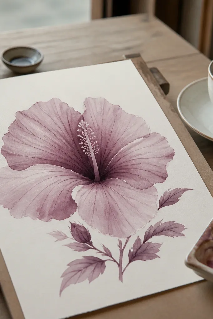
Lightly outline the hibiscus and mark where each petal overlaps. Mix a mid-tone mauve wash and paint the main petal areas with a soft fade toward the outer edge. While those washes are drying, mix a darker mauve for the fold lines and paint just along those fold curves. Add a third, lighter wash in the highlights by glazing over the dry areas with very diluted pigment. Finish with mauve ink veins or skip ink entirely and use the brush tip to draw a few vein lines.
Monochrome can look more “dreamy” than multi-color when you control value. Mauve gives you a gentle, romantic palette without the neon center that can overpower the drawing. You’ll use only one family of pigments but vary water amount and layer order so the petals still look dimensional. This one is perfect if you like minimal art that still feels finished.
AvoidDon’t use pure black ink for veins; mauve needs a softer tone or it looks harsh.
Pro tipGlaze over dry paint for crisp value control; wet-on-wet mauve turns gray fast.
4. Cobalt and Coral Hibiscus with Two-Tone Petals
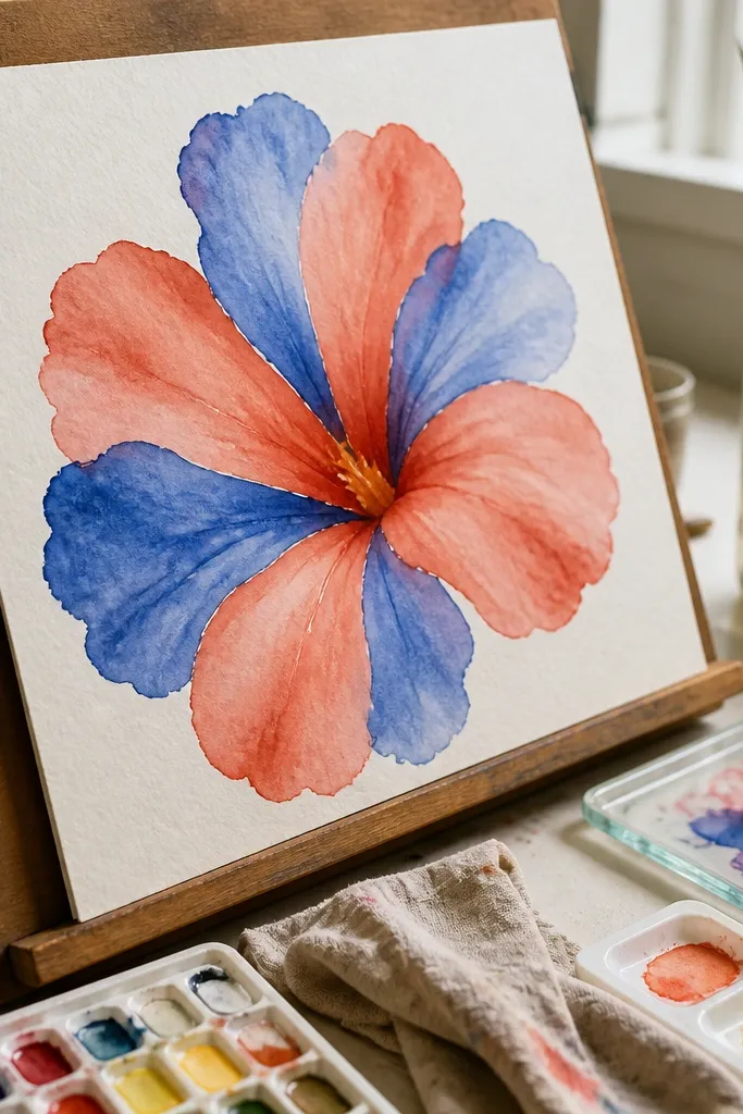
This one looks modern because it treats the petals like color blocks with watercolor softness. You paint alternating petals in coral and cobalt, then you unify everything with a shared warm throat. The contrast makes the flower read instantly, but the watercolor bleeding keeps it dreamy instead of graphic. Great for planners, art journals, and prints where you want a bold focal point.
Sketch 5 petals and label them in your head: petals 1,3,5 get coral; 2,4 get cobalt. Paint the first coral petals with diluted coral, then rinse and paint the cobalt petals with diluted cobalt, keeping edges slightly uneven. Add a warm throat wash using burnt sienna and a small amount of red. While the throat is damp, touch a bright red accent at the fold where petals meet. When everything is dry, add stamen stems in a lighter ink tone and sprinkle a few tiny highlight dots.
Rinse your brush thoroughly between colors and blot on a towel to prevent purple mixes.
Don’t let cobalt touch coral directly on the paper; you’ll get muddy violet where you want clean contrast.
5. Wet-on-Wet Dream Hibiscus with Soft Bloom Edges
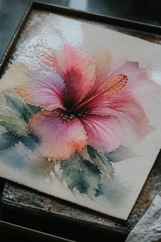
Wet the entire petal area lightly with clean water using a wide brush, keeping the edges damp but not dripping. Load your brush with diluted rose pigment and drop it at the fold lines so the color spreads outward. Add a darker pigment touch only at the center fold — less than you think, because wet-on-wet magnifies pigment. Repeat for each petal, letting them overlap while the paper stays damp. Once dry, paint the throat with a controlled warm wash and add stamen dots with a fine brush.
This is the most “dreamy” version because the petals blur into each other on purpose. You use wet-on-wet so the wash blooms softly, creating that misty, floating look. The key is controlling how long your paper stays damp and how concentrated your pigment is at the center. If you want a hibiscus that feels like it’s underwater or in haze, this is the one to practice.
AvoidAvoid re-wetting the paper repeatedly; it creates cauliflower texture.
Pro tipWork in small sections; if the paper starts drying, switch to wet-on-dry for the next petal.
6. Pressed-Flower Look Hibiscus with Dry Brush Texture
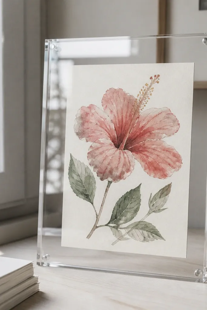
This look gives you texture without turning into a grainy mess. You start with light washes for the petal base, then you use dry brush to pull pigment across the paper texture. The effect feels like a pressed flower under glass — delicate, slightly speckled, and very photogenic. It’s a good choice when you want “dreamy” but still want visible paper character.
Sketch your hibiscus and map petal folds. Paint the petal base with diluted rose or pink, keeping washes light and letting the paper texture show through. After it’s dry, load a smaller brush with thicker pigment, blot most of it off, then lightly drag the brush across petal surfaces to create speckles and streaks. Add a darker throat wash for depth, then draw a few vein lines with a fine brush using thinned paint. Finish by lifting a tiny highlight using a clean damp brush edge.
Dry brush works best with thicker pigment and a nearly dry brush; test on scrap first.
Don’t overdo dry brush on the throat; it makes the center look dirty.
7. Lavender Hibiscus with Soft Purple Veins
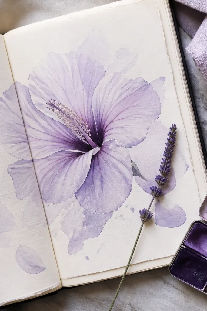
Draw the hibiscus with a slightly open center and 5 petals in a fan shape. Paint the petals using very diluted lavender or violet, leaving the outer edges lighter. Mix a richer purple for the fold lines and paint narrow arcs where each petal bends toward the center. Add a deeper violet throat wash and keep it contained in the center folds. Use a fine liner or thinned paint to draw a few vein lines from the throat outward.
Lavender hibiscus looks calm and airy, but it still reads clearly if you keep the throat darker than the petals. The petals are pale, almost misty, and the veins are thin and gentle. This look is great for spa-themed journals, wedding stationery, and any design where you want color without loud contrast. It also photographs beautifully because the values stay close and soft.
AvoidAvoid painting the veins too dark; thin lines should guide the eye, not dominate.
Pro tipKeep your violet mix slightly warm (a touch of red) so it doesn’t look icy on paper.
8. Tropical Lime Accent Hibiscus with Fresh Highlights
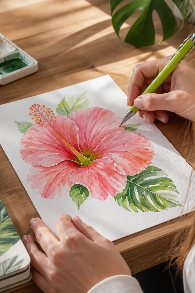
Sketch your hibiscus and paint the petals with a diluted coral-pink wash, keeping edges soft. Let it dry enough that the paint won’t run when you add accents. Mix a lime-green (yellow + a little green) and paint tiny dabs around the throat folds, not across the whole center. Add a warm throat wash in burnt sienna to anchor the greens. Finish with stamen lines and a few lifted highlights on the petal curves.
This hibiscus has a playful twist: a lime accent near the throat makes it look fresh and bright. You still keep the petals mostly pink or coral, but you add tiny green touches where the flower naturally has variation. The result feels tropical and modern while staying watercolor-dreamy. It’s a strong choice if your art goals include vibrant, Instagram-friendly color pops.
AvoidDon’t add green to the outer petals; it turns the whole flower into a muddy mix.
Pro tipUse a toothpick or the tip of a round brush for green dabs so they stay pinpoint.
9. Peach Watercolor Hibiscus with Soft Edge Gradient
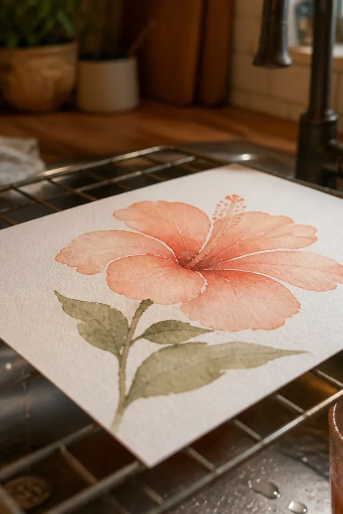
Peach hibiscus looks gentle and warm, and it’s easier to get right than bright red because the values are forgiving. You’ll aim for a smooth gradient from petal fold to outer edge, then add a slightly darker peach at the fold for depth. The dreamy part comes from clean water control and leaving highlights unpainted. This one suits beginners who want a polished result without heavy layering.
Lightly sketch the hibiscus petals and throat opening. Paint each petal with a diluted peach wash, starting stronger at the fold and pulling the color outward with clean water. While still damp, touch a slightly deeper peach at the fold line only. Let dry, then glaze a thin darker layer along overlap edges to separate petals. Add stamen stems with thinned paint and place 3-5 tiny highlight spots using a clean damp brush or white gel pen after drying.
If your gradient looks streaky, reload less pigment and spread it with more clean water.
Avoid going too dark on the first layer; peach needs time to build.
10. Red Hibiscus with Orange Wash Drips (Controlled Chaos)
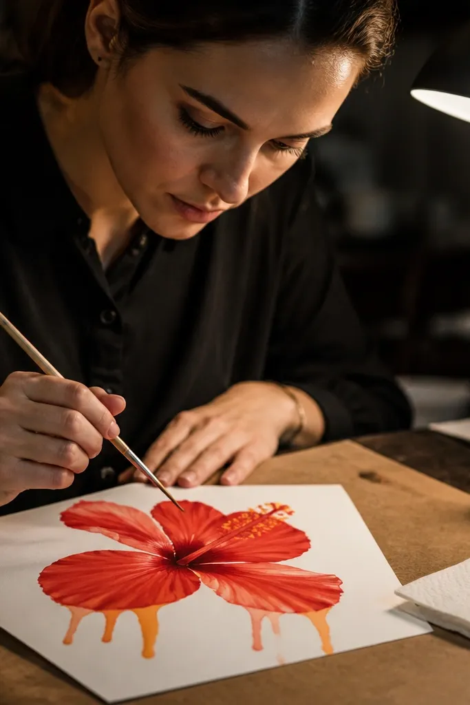
Sketch the hibiscus and paint the petals with diluted red, keeping edges soft and leaving some pale areas. When the paint is damp, load a separate brush with orange (not too watery) and touch it to just two or three petal edge points. Let gravity pull the pigment down a little, then stop by blotting with a clean towel. Add the throat wash in burnt sienna to unify the colors. Finish with stamen lines and tiny dot accents in the center.
This is the hibiscus for people who like movement. You paint a normal hibiscus first, then you add a few controlled orange drips off selected petal edges so the flower looks like it’s melting in the best way. The key is restraint: only a couple drips, and only where the paper is slightly damp so the drip blooms into a soft tail. It looks wild but still clean enough for decorative art.
AvoidDon’t add drips after the petals are fully dry; you’ll get hard specks instead of dreamy tails.
Pro tipTilt the paper slightly (a few degrees) while adding drips so they fall straight instead of sideways.
11. Ink-First Hibiscus with Watercolor Bloom Over Lines
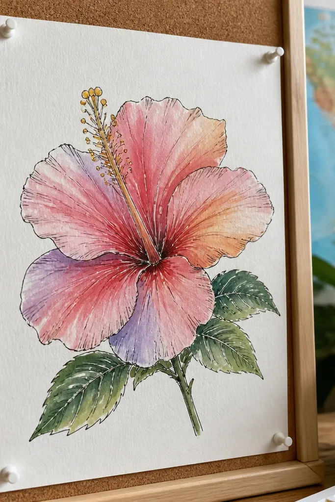
Sketch a hibiscus lightly, then trace petal outlines and veins with a waterproof fine liner. Add stamen stem lines and the center throat shape in ink. Wet one petal area at a time, then paint a diluted wash over the ink, leaving the outer edge lighter. Build depth by glazing a second thin layer along fold lines once the first layer dries. Finish by adding a darker throat wash and a few stamen dot marks for texture.
Ink-first gives you crisp structure without sacrificing softness. You draw the petal outlines and veins in waterproof ink, then you paint watercolor washes over them so the lines stay clean while the color stays airy. This style is great for making hibiscus drawings that look finished even when you use light washes. It also helps if your freehand petal shapes always end up uneven.
AvoidAvoid thick ink outlines; let watercolor do the weight.
Pro tipLet the ink dry fully before watercolor — 10-15 minutes — so it doesn’t smear.
12. Pink Hibiscus with Gold-Edge Highlights
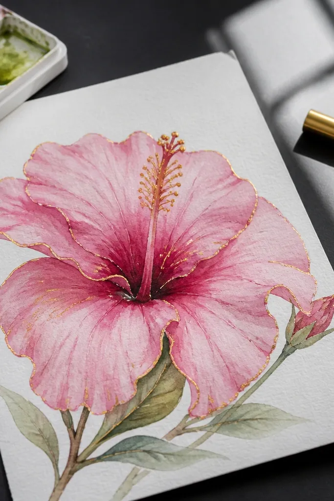
Paint the hibiscus petals in diluted pink with a deeper pink fold line and a warm throat wash. Let everything dry completely. Use metallic watercolor, gold gel pen, or a metallic marker to draw thin highlight lines along the petal fold curves and a couple of stamen dots. Keep highlights small and angled; fewer lines look more intentional. If you want extra glow, add a tiny dab of metallic paint at the throat center after the line work dries.
Gold-edge highlights make watercolor hibiscus look like it belongs on a premium card or framed art page. You don’t need full metallic coverage; you just add tiny line highlights along petal folds and a few center sparks. The rest stays watercolor soft, so the shimmer only shows where light hits. This look is perfect if you want aesthetic impact without heavy rendering.
AvoidDon’t paint metallic over wet watercolor; it blurs into dull gray.
Pro tipUse a light touch and test metallic on scrap; too much gold looks chunky on paper.
13. Blue-Gray Hibiscus with Teal Center Throat
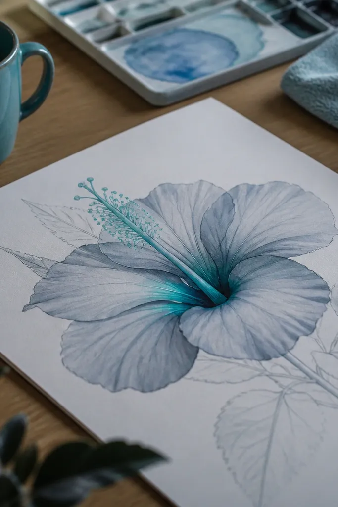
Sketch the flower and outline the throat opening. Paint petals with diluted blue-gray, pulling color from fold to outer edge so the tips stay pale. Mix teal for the throat using blue with a small amount of green, then paint it only inside the center folds. Add a darker blue-gray along the fold lines for depth once the first wash dries. Finish with thin vein lines in thinned paint and a few tiny stamen dot marks.
This is a cool-toned hibiscus that still reads dreamy because the values are soft and the throat color is limited. Blue-gray petals feel calm, while a teal throat gives a surprising pop. The contrast is controlled: you keep the petals muted and let only the center have saturation. It’s a nice change from the usual pink-red hibiscus palette.
AvoidAvoid saturating the whole flower with teal; it kills the cool, calm mood.
Pro tipIf teal looks too green, add a drop of blue to shift it toward a cooler tone.
14. Coral Hibiscus with Negative Space Leaves
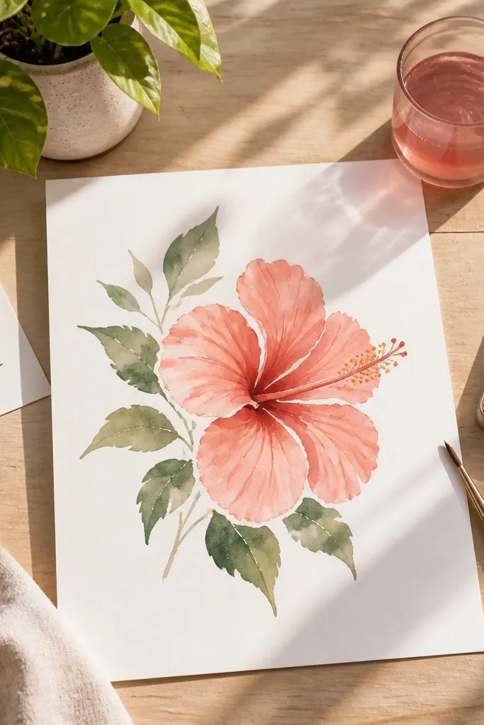
Sketch the hibiscus and add a few simple leaf shapes around it using light pencil. Paint the hibiscus petals first with diluted coral, keeping fold lines deeper. Leave the leaf areas unpainted so they stay bright paper white. Add a warm throat wash and stamen lines, then lightly suggest a few leaf veins with very thinned paint near the edges only. Finish by glazing a thin coral tint over a couple of leaf-adjacent areas to connect the composition.
Negative space is where this hibiscus gets its clean, dreamy look. You paint the flower petals in coral and leave crisp white paper around leaf shapes, so the drawing feels airy instead of crowded. The leaves aren’t detailed; they’re simple silhouettes that frame the hibiscus. This style is great for making your hibiscus look like a finished design rather than a single isolated flower.
AvoidDon’t add too many leaves; three to five shapes frame the flower better than a whole garden.
Pro tipUse masking fluid only if you’re confident with it; for most people, leaving paper white is simpler and cleaner.
15. Hibiscus Bouquet Sketch with Three Flowers and Soft Wash
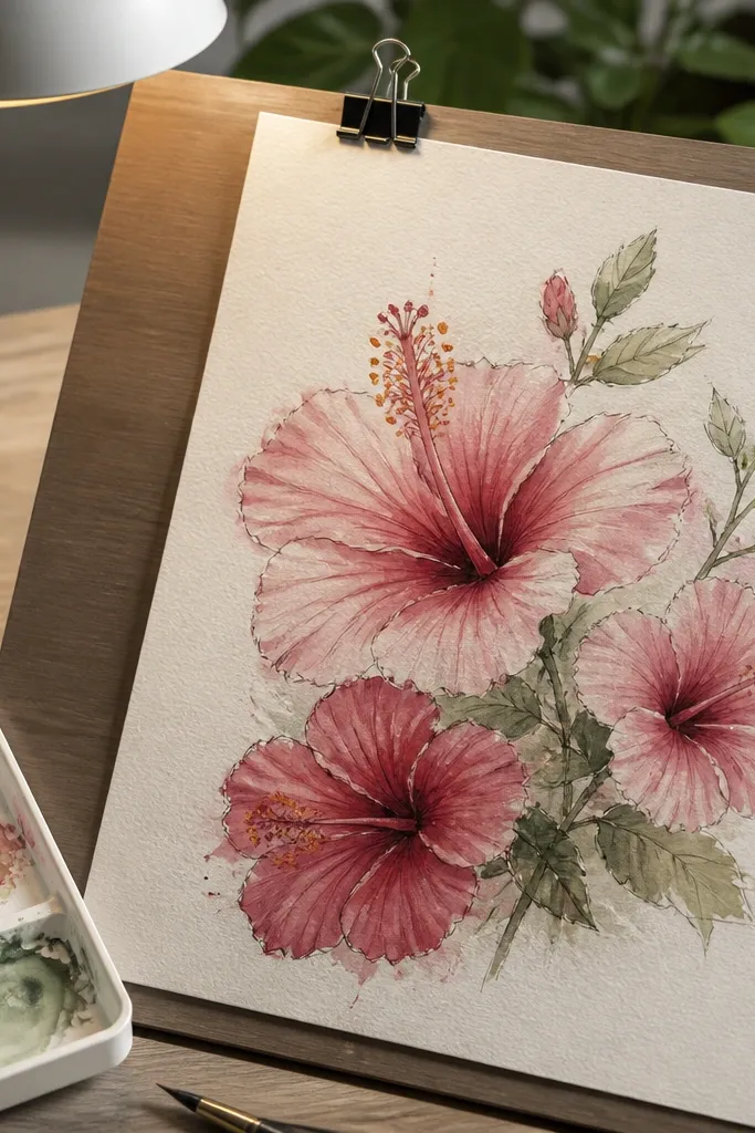
Sketch three hibiscus flowers — one at center, two slightly behind and to the sides. Use a light pencil to set overlap so the petals don’t collide. Paint the hero flower first with diluted rose or coral, then paint the two smaller ones with slightly lighter washes. Add a consistent warm throat color to all three so they feel like a set. Finish with thin ink veins and a few stamen dot marks, then add a light wash background tint around the flowers.
This look turns your hibiscus skill into a mini bouquet page. Three flowers let you play with scale: one larger hero flower and two smaller companions, all in the same color family. The page stays dreamy because you use light washes and keep spacing airy, letting paper texture show between petals. It’s also easier than a single perfect flower because your eye reads the whole composition.
AvoidAvoid dark backgrounds with this style; it makes the watercolor edges look heavy.
Pro tipKeep the smaller flowers 20-30% lighter in value so the page doesn’t feel busy.



