
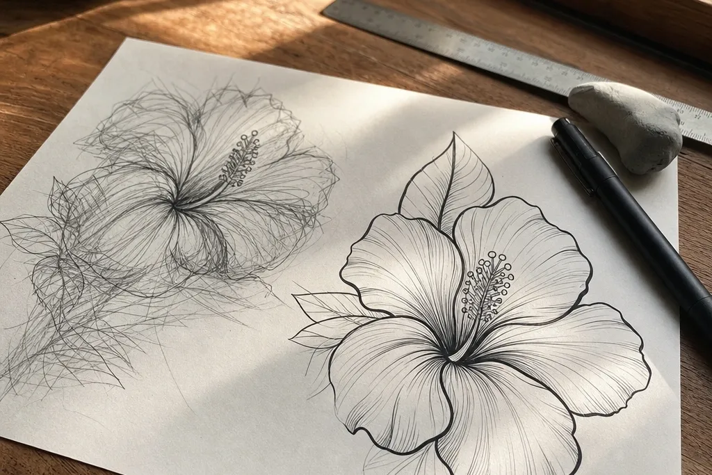
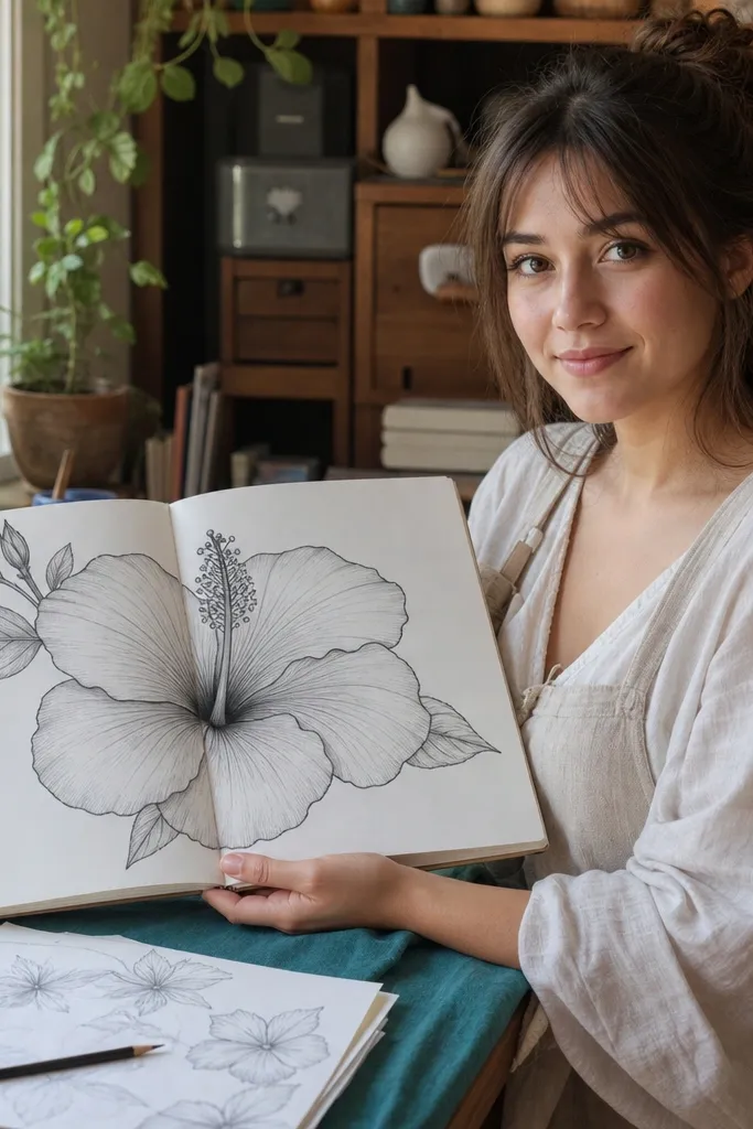
1. Front-Facing Hibiscus in Soft Pencil Gradients
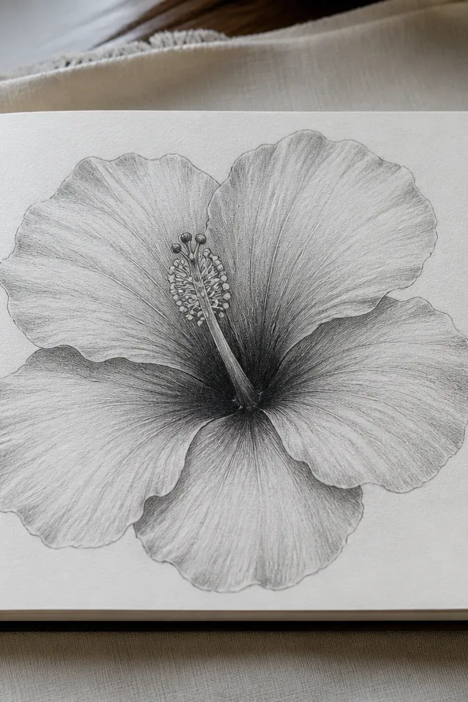
This look is the fastest way to make your hibiscus feel dimensional without needing color. You’ll keep the palette to graphite tones — think pale gray petals with darker folds near the center. The result reads as airy and sketchbook-friendly, but still flower-shaped and recognizable. It works especially well if you’re learning the petal rhythm because the shading cues show exactly where the folds go.
Pro tipUse a kneaded eraser to lift highlights along the petal edges instead of trying to blend everything.
Start by lightly sketching a five-petal silhouette guide, then place one petal slightly forward so the overlap is obvious. Next, add inner petal folds with short, curved lines that follow the petal’s length, then shade only under those fold lines using a light hand. Finally, darken the center creases and the base of the stamens, then erase the outer guide lines so the flower pops.
AvoidDon’t shade the whole petal evenly or it turns flat and gray.
2. Bold Ink Outline Hibiscus with Spot Shading
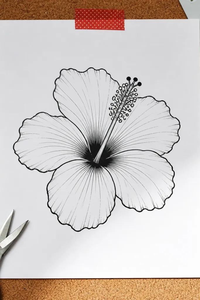
If you want a photogenic, graphic hibiscus, ink outline with spot shading is the cleanest path. Thick lines define every petal edge, and the minimal shading keeps the center looking crisp instead of muddy. This is great for printing on stickers or transferring to fabric because you’re controlling contrast. You’ll also learn which lines matter most: the petal outline, the inner fold lines, and a few dark center marks.
Pro tipLet ink dry fully before erasing pencil — it prevents smears and fuzzy edges.
Begin with a pencil sketch using light construction marks, then trace the outer petal edges with a 0.5 or 0.7 ink pen. Add inner petal fold lines with lighter pressure so they look like ribs, then place small shaded patches right where petals overlap. Finish by dotting a few dark accents in the center creases and outlining the stamen cluster.
AvoidDon’t shade with crosshatching everywhere; keep it to overlap areas and center folds.
3. Watercolor-Like Hibiscus Using Wet-on-Dry Pencil
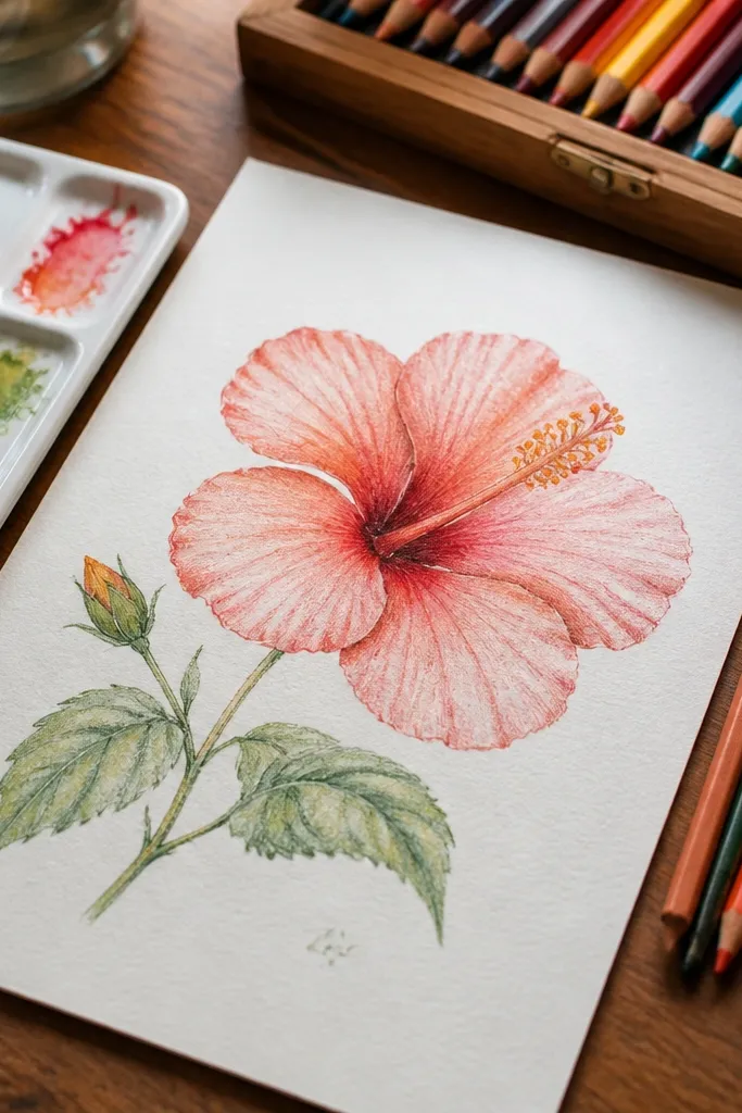
This look gives you that soft, painted hibiscus vibe while staying in DIY territory. The petals have gentle color blooms, and the center has a warm gradient that feels alive. It’s visually striking because the edges are slightly feathered but the petal shapes stay sharp. If your colored pencil drawings look too dry, this method adds “bloom” without turning into stains.
Pro tipUse a small round brush and keep it barely damp, not dripping.
Lay down a light base color with colored pencil for each petal, then lightly paint over the color with a damp brush using only water. Work one petal at a time so the colors don’t bleed into the whole flower. After it dries, deepen the folds with darker pencil and re-ink any lines that got too soft.
AvoidDon’t flood the paper — soaked paper warps and muddies the center.
4. Pastel Hibiscus with Powdery Center Glow
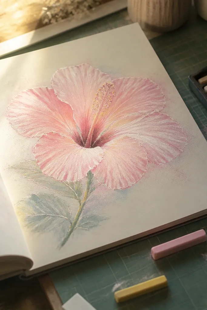
Pastel hibiscus drawings look dreamy and clean because the color values stay close together. You’ll still build depth, but with softer transitions instead of harsh contrast. The center glow is the star here: it looks like light spreading across the inner petals. This style is perfect for stationery designs and calm sketchbook pages.
Sketch the hibiscus petals in pencil, then color the outer petals with very light pastel tones using short strokes. Leave the petal folds slightly lighter at first, then return with a slightly darker pastel to define the fold lines. For the center, layer a warm pale yellow or peach and gently blend the edges with a blending stump or tissue, then add tiny darker dots for stamen tips.
Color in layers: 3 light passes beat one heavy pass every time.
Don’t press hard on pastel tones — you’ll lose the powdery look.
5. High-Contrast Hibiscus with Deep Red Creases
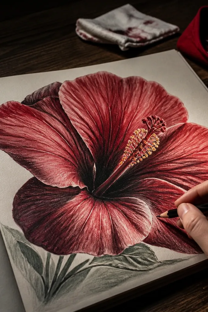
This is the “wow” version: deep red creases make the petals look thick and real. The eye goes straight to the center because you’re using true darks where the folds turn inward. It’s excellent for adding drama to a sketchbook or making a bold printable. If you want your hibiscus to read instantly from a distance, use this contrast-first approach.
Draw the outer petals with a light red base, then define each fold line with a darker red pencil. Add a few narrow darkest lines right near the petal bases where the petals overlap. Color the inner petals with a medium tone, then build the center with warm yellow at the stamen base and deepen the creases with dark maroon. Finish by sharpening the outline edges with a darker pencil or fine pen.
Keep darks narrow and placed only on fold edges, not across the whole petal.
Don’t make the entire petal the darkest value or it loses shape.
6. Monochrome Hibiscus with Charcoal Texture
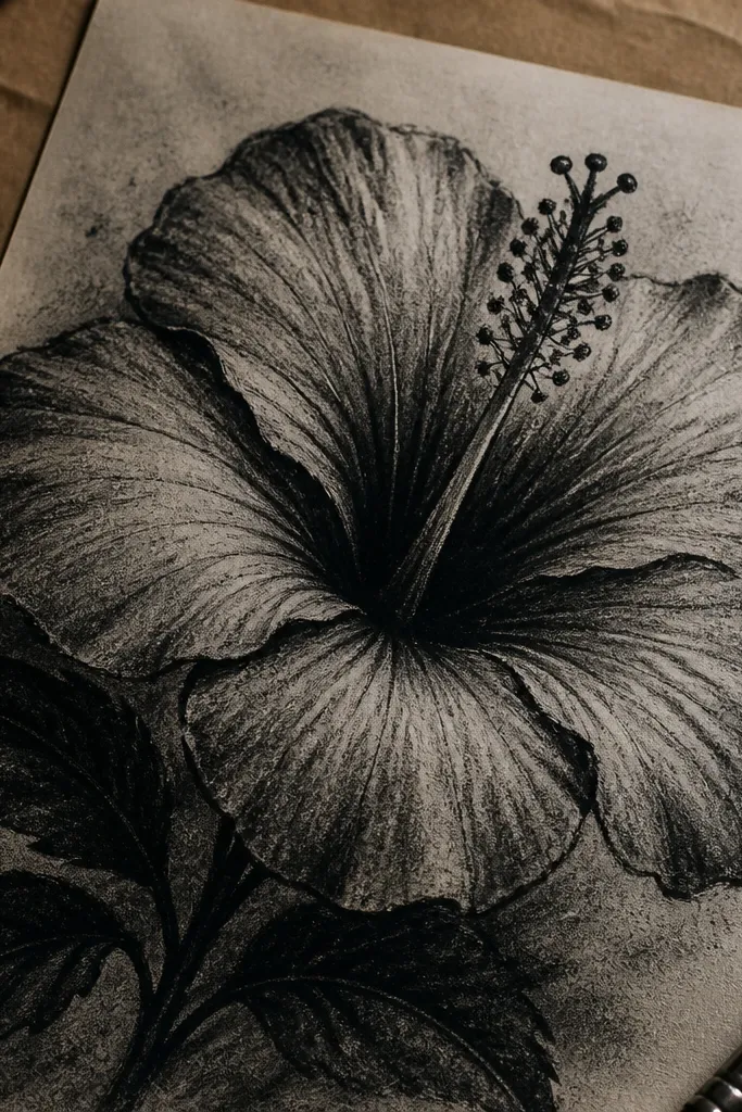
Monochrome charcoal makes hibiscus look dramatic and sculptural. You’ll get grainy texture on the petals and dense shadow in the center, so the flower feels dimensional even without color. This look is photogenic because the light-dark edges create strong silhouettes. It’s also forgiving for practice because charcoal hides small sketching imperfections.
Pro tipUse a soft brush to dust off charcoal before adding the final darks.
Sketch the petal shapes in light charcoal or graphite, then block in the shadow areas under the overlap edges. Use a blending stump sparingly to smooth only the broad mid-tones, keeping some toothy texture. Add the darkest charcoal in the center creases and along the stamen bases, then lightly lift highlights with a kneaded eraser on the outer petal ridges.
AvoidDon’t keep smearing — repeated blending turns the whole flower into one gray blob.
7. Color Pencil Hibiscus with Smooth Petal Ridges
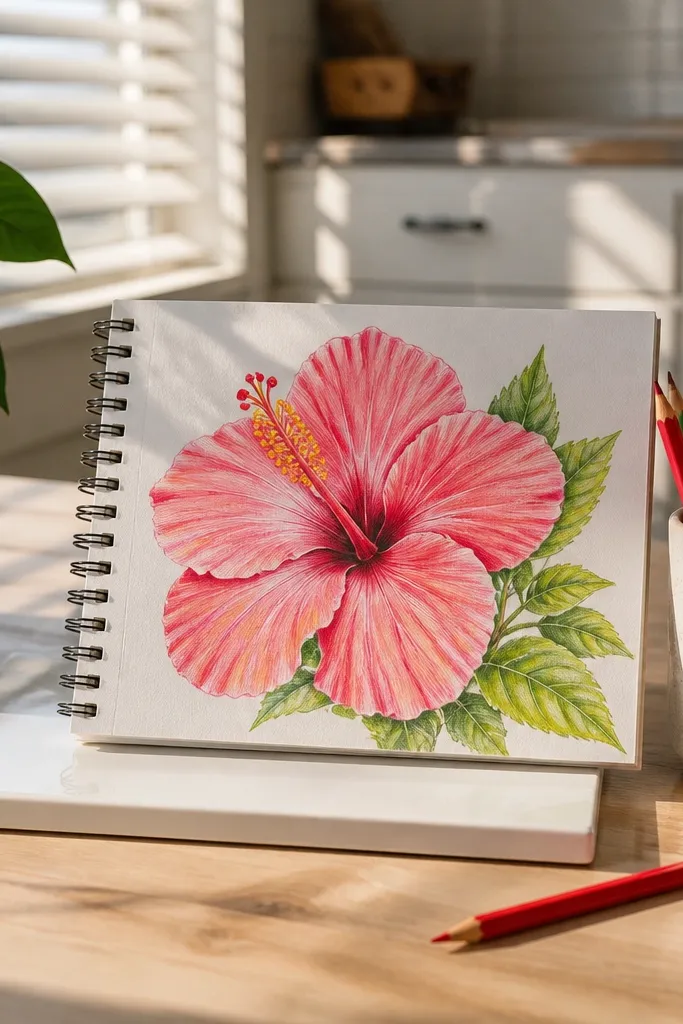
This look is about crisp ridge definition. Instead of heavy shading, you use controlled pencil pressure to create smooth bands along each petal. The ridges catch light and make the flower feel engineered and clean. It’s a great style if you like botanical illustration vibes without going full watercolor.
Pro tipRotate the paper slightly so your pencil strokes follow the petal direction naturally.
Draw a front-facing hibiscus outline, then map each petal ridge with 2-3 gentle curved guide lines. Color each ridge band with slightly different pressure: lighter on the ridge top, darker near the fold. Build inner petals with the same banding approach, then add a warm yellow center and small darker strokes for stamen bases. Finally, refine the outline with a darker pencil to keep the flower readable.
AvoidDon’t use random scribbles across petals — ridges disappear.
8. Neon Accent Hibiscus on Black Paper
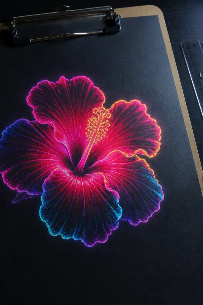
Black paper makes hibiscus petals look electric. You’ll use bright colored pencil or gel pens to create glowing edges and a punchy center. This is one of the most photogenic options because the contrast is instant. It also teaches you a useful drawing habit: place your brightest colors where light hits and let the rest stay darker.
Sketch the hibiscus lightly with white pencil or chalk, then color the petals with neon pink or coral pencil using light-to-medium pressure. Add bright highlights along the petal ridge tops, then deepen overlap shadows with a darker purple or deep red. For the center, layer neon yellow at the base and add orange-red around the creases. Finish with a gel pen for stamen lines and tiny dots.
Use a white gel pen for the smallest highlights — it reads clean in photos.
Don’t overload color in one pass or you’ll get waxy glare on black paper.
9. Two-Tone Hibiscus with Ombre Petal Tips
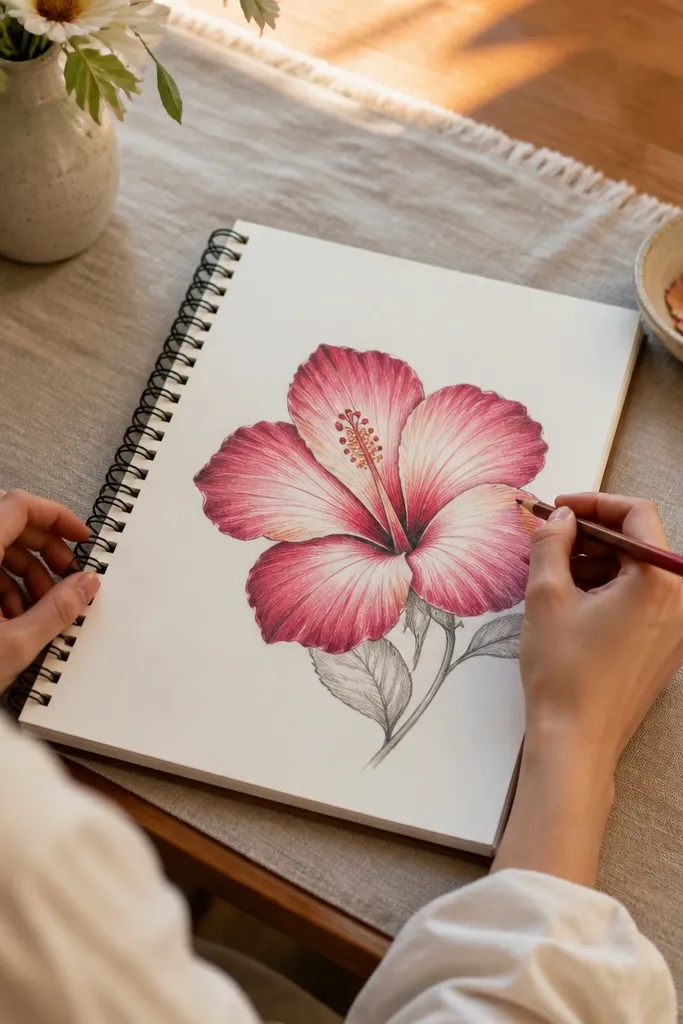
Two-tone hibiscus looks designed, not accidental. You’ll blend from a lighter petal base into darker tips, so each petal has natural depth. The ombre tips guide the eye around the flower and make the shape look intentional. This style is perfect if you want color without complex detailing.
Pro tipBlend with short strokes that follow the petal curve, not straight lines.
Start with a light outline and block each petal base with a pale color. Then add the darker color only on the outer third of each petal and blend toward the middle using gentle strokes. Add inner petal folds with the same two-tone idea but keep the inner folds slightly darker. Color the center with warm yellow and add dark creases so the ombre doesn’t flatten the flower.
AvoidDon’t blend into the very center — the flower needs a clear focal point.
10. Sketchbook Hibiscus with Pencil-Plus-Gel-Pen Details
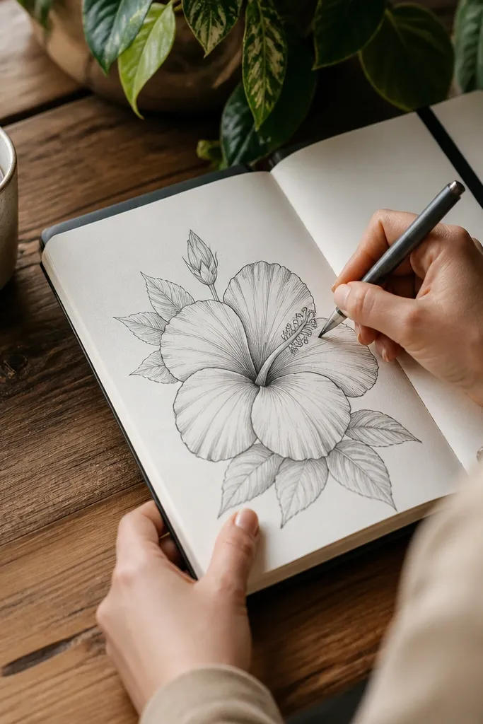
This hybrid style gives you the best of both worlds: soft construction lines from pencil and crisp finishing lines from a gel pen. The hibiscus looks hand-drawn and lively because the pen details sit on top of the shading. It’s also a practical way to fix a common problem: pencil outlines can look faint, especially on white paper. Pen accents make the flower read clearly.
Sketch the hibiscus petals in pencil, then shade the overlap edges lightly with graphite. Trace only the outer petal outline and the inner fold lines with a gel pen, keeping the pen lines slightly thicker on the outer edges. Add stamen lines and tiny dots in the center with the pen. Finish by darkening a few center creases with pencil so the pen doesn’t do all the contrast work.
Use a fine gel pen tip (0.38-0.5) so the stamen marks stay delicate.
Don’t pen over every pencil line — too much ink makes it heavy.
11. Hibiscus with Patterned Petal Veins
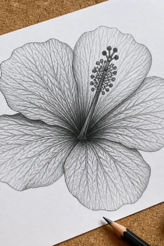
Patterned veins make a hibiscus look botanical and detailed without turning into an overworked drawing. You’ll add repeatable vein lines that radiate from near the petal base toward the tip. The payoff is a flower that looks textured and real, especially in close-up photos. This style is perfect when you want the drawing to feel scientific but still pretty.
Pro tipDraw veins first in pencil, then darken only the top 2-3 most visible veins with colored pencil.
Outline the petals and lightly shade the fold edges, then pick one petal and add 5-8 vein lines starting near the base. Space the veins evenly and keep them slightly curved, following the petal contour. Repeat the same vein pattern on the other petals, then darken the center creases. Color the center lightly and add stamen tips so the veins don’t steal focus.
AvoidDon’t make veins the same darkness as the outline — it flattens the flower.
12. Minimalist Hibiscus with One-Line Center
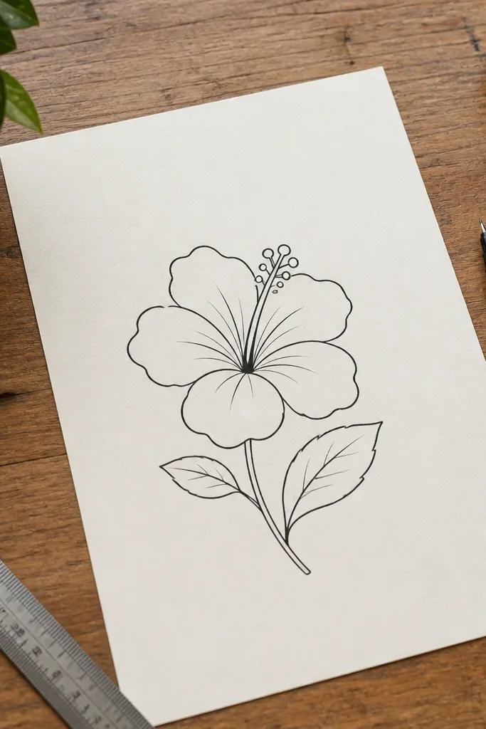
Minimalist doesn’t mean weak. This version uses clean outline shapes and a single, confident center line structure so the flower still looks complete. It’s great for quick DIY stickers, labels, and printable icons because it stays readable at small sizes. The aesthetic comes from restraint: fewer marks, stronger edges, and a clear silhouette.
Pro tipKeep your line weight consistent on the outline, then vary thickness only in the center.
Draw the outer five petal outline with a smooth continuous line, then add one overlapping petal edge to create depth. Skip detailed fold shading and instead add 3-4 inner petal lines that show where the petals curl. For the center, draw the stamen cluster as a tight bundle with 6-10 short strokes. Finish by adding a couple dark center dots and a light shadow under the overlap edge.
AvoidDon’t add lots of shading — it defeats the minimalist look.
13. Hibiscus with Butterfly-Style Color Blocks
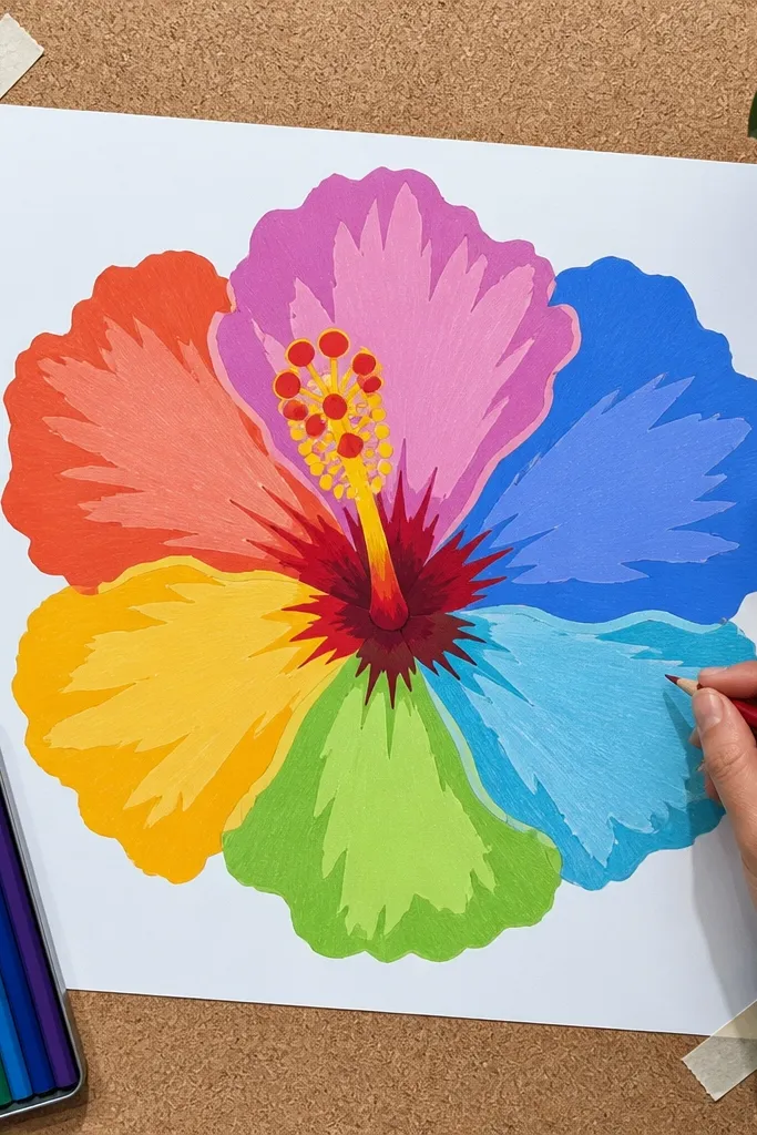
Color blocks make hibiscus look like a graphic illustration. You’ll use separate color regions for each petal area, with sharp edges that photograph well. The center stays crisp, and the outer petals look bold instead of washed out. This style is ideal if you’re using markers or thick colored pencil and want control.
Pro tipUse a light pencil layer to plan boundaries before you commit to marker color.
Sketch the petal shapes, then decide 3 color zones per petal: base, mid, and edge. Color the zones with markers or strong colored pencil, keeping the boundaries clean. Add inner petal folds by swapping to a slightly darker block color and leaving a highlight strip. Finish the center with a warm yellow base and dark maroon blocks for creases, then outline the stamen for clarity.
AvoidDon’t blend across block boundaries — crisp edges are the point.
14. Hibiscus with Gold Pen Highlights
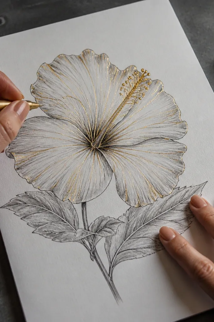
Gold pen highlights instantly make a hibiscus feel special in photos. You’ll place gold only on petal ridges and a few center points so it looks like light catching the flower. This style is perfect for cards, gift tags, and any DIY where you want a little “sparkle” without heavy work. It also teaches you restraint: highlight placement is everything.
Pro tipTest the gold pen on scrap paper to learn how opaque it is before you apply it to the flower.
Draw and shade the hibiscus first in pencil or colored pencil, then pick the 5-7 ridge lines that will receive gold. Color the center with warm yellow and add dark creases so the gold has contrast. Apply gold pen only along ridge tops and a few stamen tips, then let it dry flat. Finish by rechecking the outline — if it got lost, darken it with a pencil or fine pen.
AvoidDon’t cover large areas with gold — it turns into a shiny smear.
15. Hibiscus in Soft Ombre Wash Using Diluted Paint
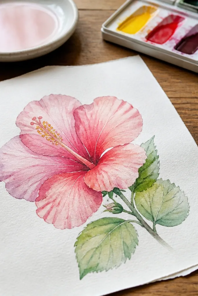
A diluted paint wash gives hibiscus petals a natural fade and makes the flower look airy and fresh. You’ll still need line structure, so the drawing stays recognizable. This look photographs beautifully because the petals have transparent layers and subtle value changes. It also helps you learn where to keep edges soft and where to keep them crisp.
Sketch the hibiscus in pencil and trace the outer outline with a fine brush line or pen. Paint each petal with a diluted base color, then add a darker wash at the outer edges and blend inward while it’s still wet. Keep the fold lines lighter at first, then deepen them with a darker pigment once the base dries. Add the center with warm yellow wash, then paint dark creases and stamen shapes.
Use two paper towels: one to blot your brush, one to blot the paper edge so your paint doesn’t spread.
Don’t paint over pencil construction lines without erasing them first — they show through.
16. Hibiscus with Crayon Resist Outline Texture
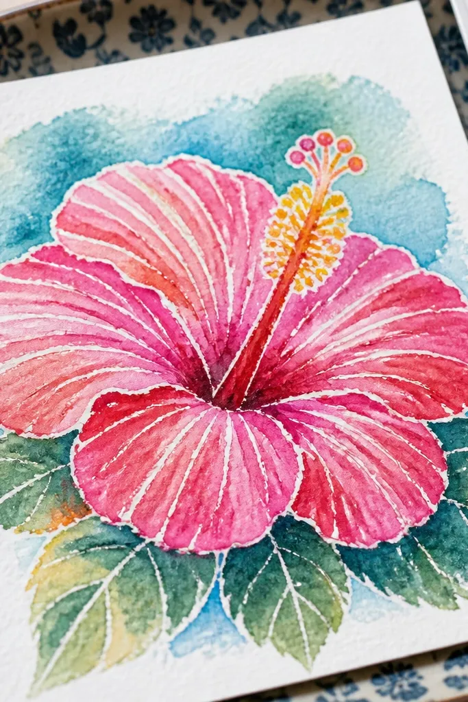
Crayon resist makes hibiscus petals look textured and playful. You’ll use a crayon to protect highlight lines, then color over with watercolor or marker tint. The result is a flower with natural “spark” in the highlights, which looks great in close photos. It’s also a forgiving method for beginners because the texture hides uneven coloring.
Pro tipUse a thick crayon for stronger resist lines that don’t disappear under paint.
Draw the hibiscus outline in pencil, then trace key highlight lines with white crayon or light wax crayon along ridge tops and around the petal folds. Add a light base color with watercolor or diluted paint over the whole petal. While it’s still slightly damp, add darker color near overlap edges and center creases. Let it dry, then use pencil or pen to sharpen the stamen cluster and outer outline where needed.
AvoidDon’t press too hard on the crayon — it creates waxy slick areas that repel paint.
17. Paper-Cut Style Hibiscus with Layered Shapes
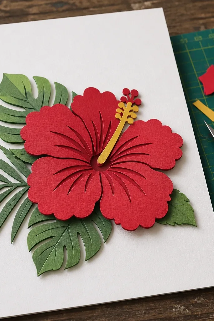
Paper-cut style looks like layered craft, even if you’re drawing it. The trick is to treat the petals like separate layers with visible shadow edges. This makes the hibiscus feel dimensional and very photo-ready. It’s ideal for DIY projects because you can translate the drawing directly into cut templates later.
Pro tipUse a ruler for the shadow offset distance so it looks intentional, not accidental.
Sketch the hibiscus with separate shapes for outer petals, inner petals, and center. Draw a thin offset shadow line behind each layer to simulate depth, using a darker pencil tone. Fill each layer with different color values so overlaps read clearly. Add a crisp stamen cluster at the center and reinforce the darkest shadow line where petals overlap the most.
AvoidDon’t use identical colors for every layer — overlaps won’t read.
18. Hibiscus with Soft Pastel Background Wash
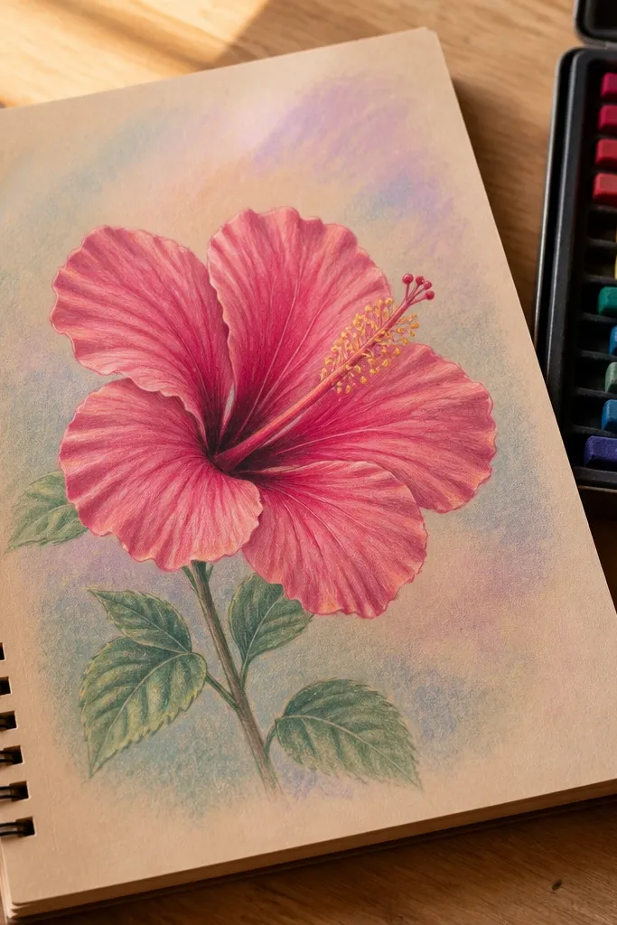
A pastel background wash makes your hibiscus look finished even when the flower is simple. The background stays low-contrast so the flower silhouette remains the focal point. This style is great for Instagram-ready sketchbook pages and prints because the contrast frames the flower. It also gives you a practical rule: shade the background lightly, then draw the hibiscus edges darker.
Lightly sketch the hibiscus on paper, then wet the background area around it with clean water. Drop in a very light pastel wash and let it spread softly, keeping it away from the petal edges. Once dry, draw or shade the hibiscus on top with stronger contrast: outlines and fold creases. Finish by coloring the center with warm tones and adding a few stamen dots for focus.
Mask the flower with scrap paper while you paint the background so edges stay clean.
Don’t darken the background — it steals attention from the petals.
19. Hibiscus with Patterned Dots in the Center
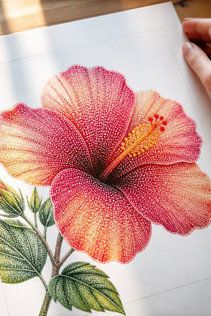
Dotted texture in the center makes the hibiscus look lively and tactile. You’re adding visual noise only where the eye expects detail, so the rest of the petals can stay smooth. This style reads beautifully in photos because dots catch light and create a sense of depth. It’s also a good way to avoid over-detailing the entire flower.
Pro tipKeep dots small and uneven in spacing — perfect grids look fake on flowers.
Sketch and shade the petals with a smooth base, then define inner folds with a slightly darker pencil. Color the center with a warm yellow or peach base, leaving a little lighter area near the top. Add dots in a cluster pattern where the stamen and inner creases meet, using a fine pen or colored pencil tip. Darken a few crease lines under the dot cluster so the dots don’t float.
AvoidDon’t dot all petals — the center is where it belongs.
20. Hibiscus with Two-Layer Petal Shadows for Real Depth
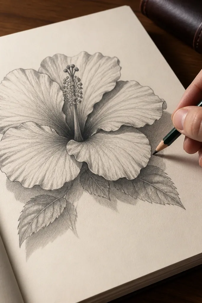
This look is about depth you can see instantly. Instead of one shadow under an overlap, you draw two — a soft shadow band plus a darker edge shadow. The flower looks layered and more “real” because your brain reads the shadow edges as thickness. It’s a strong choice for anyone whose hibiscus looks flat even after shading.
Pro tipUse a scrap paper smudge to blend the soft band, not your finger.
Outline the hibiscus and identify which petals overlap. Shade the first shadow layer as a soft band using light pencil or light gray, staying a few millimeters away from the overlap edge. Add a second shadow layer right on the overlap boundary with a darker pencil or pen, then blend lightly into the first layer. Finish by darkening center creases and reinforcing the stamen outline so the depth doesn’t get lost.
AvoidDon’t make the shadow band the same darkness as the crease lines.
21. Hibiscus with Fine Linework and Tiny Highlights
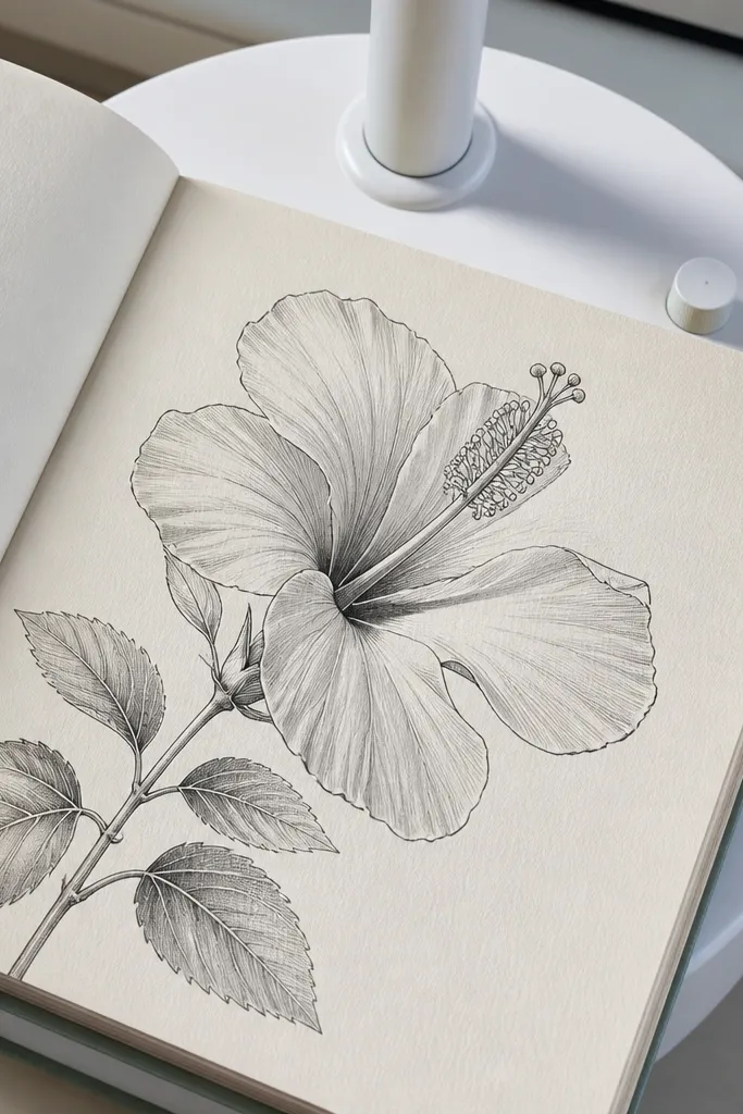
Fine linework plus tiny highlight marks makes the hibiscus feel crisp and delicate. You’ll build the fold structure with thin lines, then add a few small white highlight streaks where light hits. This style looks polished and airy without needing heavy shading. It’s also a good choice if you want a drawing that looks good even when printed small.
Pro tipLimit highlights to 8-12 marks total so the flower doesn’t look overworked.
Sketch the hibiscus outline and inner petal folds in pencil, then trace the main outer outline with a fine pen. Draw the fold ribs as thin curved lines, keeping them lighter than the outline. Color the petals lightly, then add tiny highlight streaks with white gel pen or a white colored pencil. Add a warm center and a stamen cluster with thin strokes so the center stays sharp.
AvoidDon’t outline every tiny crease — keep the main folds only.
22. Hibiscus on Grid Paper for Perfect Symmetry Practice
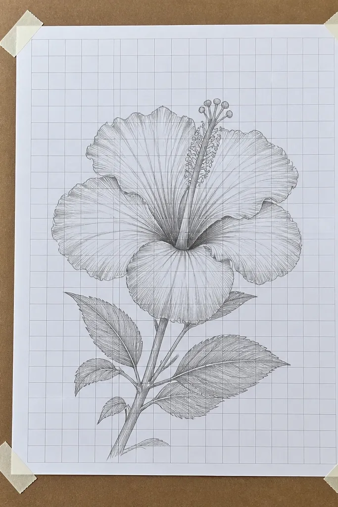
Grid practice makes symmetry feel easy instead of guessy. You’re training your eye on petal spacing and center placement, which is where most hibiscus drawings go wrong. Even if you remove the grid later, you’ll still benefit from the structure. This style is best for learning the 25 steps because you’ll see how each petal aligns.
Pro tipErase the grid after the outline stage, not after shading — it keeps your symmetry consistent while you work.
Use a pencil to mark a center point and draw a light circle guide, then place five petal anchor points around it on the grid. Connect each anchor point to create the outer petal edges with gentle curves, leaving one petal slightly forward. Add inner petals by drawing smaller anchors inside each outer petal area. Shade overlap edges lightly and place the stamen cluster at the center point, then erase the grid lines once you like the proportions.
AvoidDon’t draw freehand spacing on the first pass; anchors prevent lopsided petals.
23. Hibiscus with Color-Pencil Burnish Finish
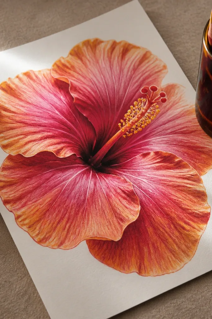
Burnish gives colored pencil a smoother, more finished look. Your petals will have fewer visible strokes and a stronger color glow, especially on the ridge tops. The center creases look cleaner because you’re controlling how the pigment sits. This is a great aesthetic option if your hibiscus looks too sketchy or streaky.
Pro tipUse very light pressure for burnishing and stop when the surface looks smooth, not shiny-wet.
Sketch and lightly color the petals with several light layers, matching the direction of each petal curve. Once the base is even, add a darker layer to folds and overlap edges. Then burnish ridge tops by gently rubbing with a colorless blender or smooth blending tool, keeping the pressure light so you don’t crush the paper tooth. Finish the center with warm yellow and darker maroon creases, then add a fine outline around the flower for crispness.
AvoidDon’t burnish before you place the darkest fold values — you’ll lock in weak contrast.
24. Hibiscus with Marker Fill and Pencil Outline
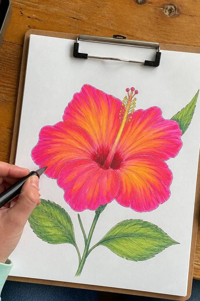
Marker fill makes the petals look bold and even, while pencil outline keeps the drawing soft and botanical. You get clean color coverage without the waxy scratchiness markers sometimes leave. This style is excellent for quick DIY graphics because it’s fast but still detailed where it matters: folds and center creases. It also photographs well because marker color is bright and consistent.
Sketch the hibiscus outline in pencil, then trace only the outer petal edges with a dark pencil line. Fill outer petals with marker using light, even strokes, then add a darker marker tone along overlap edges. Use colored pencil to draw inner fold ribs and to deepen the center creases so the center has structure. Finish by outlining the stamen cluster with a fine pencil or pen and erasing leftover construction marks.
Let marker ink dry fully before adding pencil details so you don’t smear the color.
Don’t overfill the center with marker — it spreads and kills the fold definition.
25. Sunset Gradient Hibiscus with Metallic Center Bloom
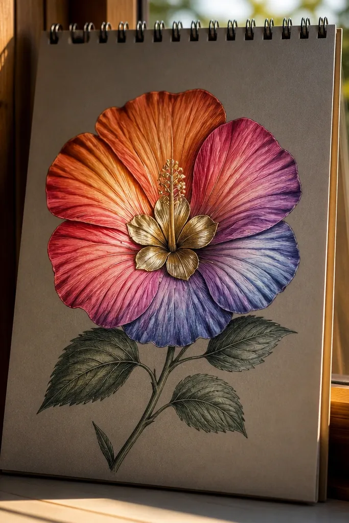
This one looks like a hibiscus you’d frame because the petals shift warm-to-cool like a sunset, while the center pops with a metallic-looking bloom. It fixes the usual problem where hibiscus centers end up flat and gray — here you build a layered center that catches light. You’ll use colored pencil for the petals and a metallic gel pen or metallic paint marker for the center, so the texture stays crisp instead of muddy. This is beginner-friendly if you can keep pencil edges clean; plan on about 45-60 minutes. It fits sketchbooks, greeting cards, and wall art where you want the flower to feel bright from across the room.
Pro tipUse a light hand for the metallic glaze. Too much pressure makes the gold look chalky and dull — let the pen lay down thin layers.
1) Lightly sketch the hibiscus in pencil using a 1.5x petal length shape: draw a center oval about 1/3 the flower width, then add five main petals with slightly wavy outer edges. Block the petals with a soft sunset gradient: start with pale yellow near the center, blend into peach, then finish with rose at the petal tips; keep the darkest tone only at the outer third. 2) Build the metallic center: color the center oval with a warm brown or burnt sienna first, then glaze over it with a gold metallic gel pen in short arcs, leaving tiny gaps for shine. Add 10-14 thin “filament” lines radiating from the center using the same gold pen, then darken the base of each filament with a light brown pencil so the gold reads brighter. 3) Finish with a final petal edge pass: sharpen a rose pencil and trace only the outer rim of each petal, then use a blending stump or clean tissue to soften the gradient without smearing the gold center.
AvoidAvoid blending the petals so hard that you wipe out the gradient boundaries; keep the transition visible.



