

1. Head Too Small, Whole Elephant Looks Like a Costume
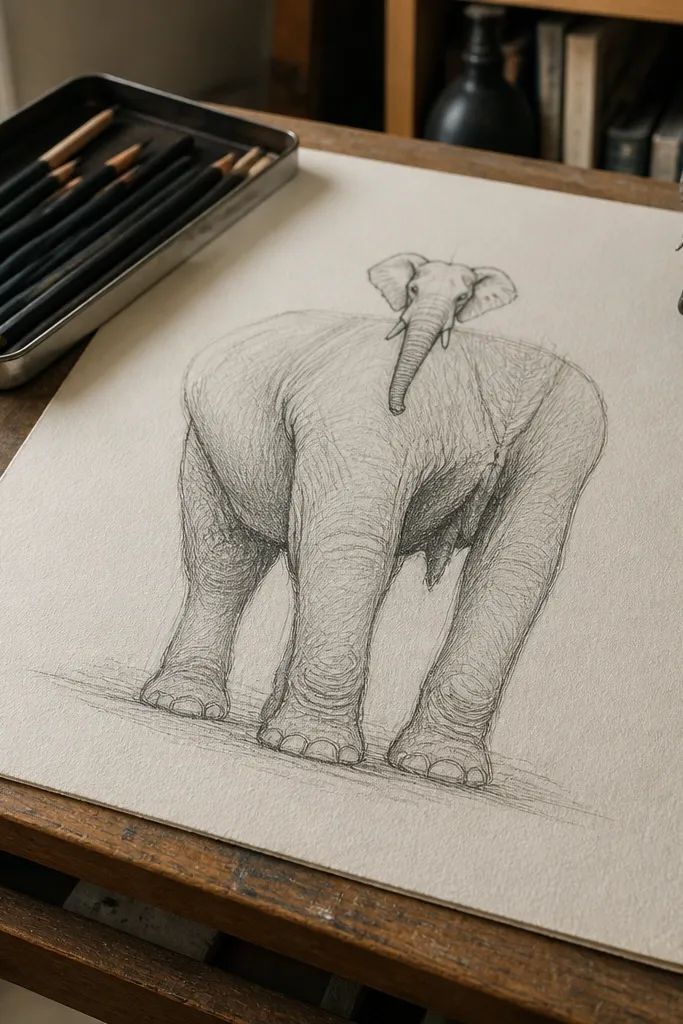
This is the most common reason an elephant drawing feels “almost right” but never lands. When the head is too small, the viewer’s brain reads the trunk as a dangling accessory instead of a heavy, structural part of the face. The fix is to treat the head and body as two masses with a real ratio. A good starting point is to compare the head width to the body width using your pencil — not your memory. Once the head size is right, tusk placement and eye position stop fighting you.
Start by lightly sketching the body mass as a big oval or bean shape. Then add the head mass as a separate oval and set its size by measuring head width against body width with a pencil held at arm’s length. Place the eye roughly where the head mass turns from flat to rounded, not halfway down the face like a cartoon. Finally, block in the trunk connection point before you draw tusks, so the face reads as one connected structure.
Pro tipUse a kneaded eraser to lift construction lines after you lock the head size — it keeps the drawing from turning into a smudgy mess.
AvoidDon’t draw tusks and wrinkles while the head size is still a guess.
2. Legs All the Same Thickness
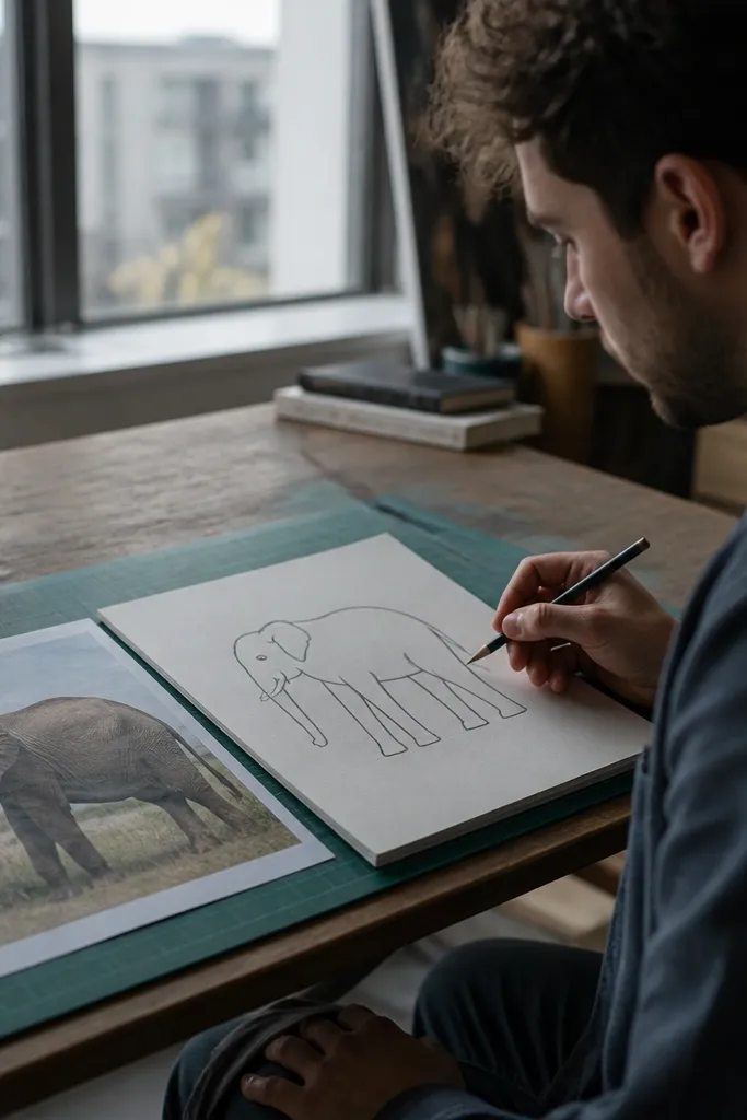
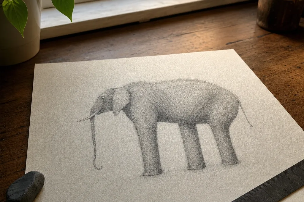
Elephants look grounded because their legs taper and their joints create subtle angles. If every leg is the same thickness, the elephant looks like a toy — even when the outline is correct. The stance also needs small breaks at the knee and ankle so you can feel the weight shift. This mistake is especially common when people trace the legs from a photo without checking how width changes along the limb. Fixing taper makes your drawing instantly feel more physical.
Start with a light gesture line for each leg that shows direction — forward lean, slight bend, or weight shift. Then draw the leg as a tapered tube, thick at the top and slimmer near the foot, using two guidelines per leg (outer edge and inner edge). Add a joint crease where the knee bends and another where the ankle turns, then thicken the parts that look weighty. Finish by drawing hooves last, with a clear foot shape that sits on the ground plane you already sketched.
Pro tipShade the inside of the leg with a soft pencil (2B or 4B) to emphasize taper without redrawing the outline.
AvoidDon’t make legs look like identical straight cylinders from shoulder to hoof.
3. Trunk as a Single Curvy Line
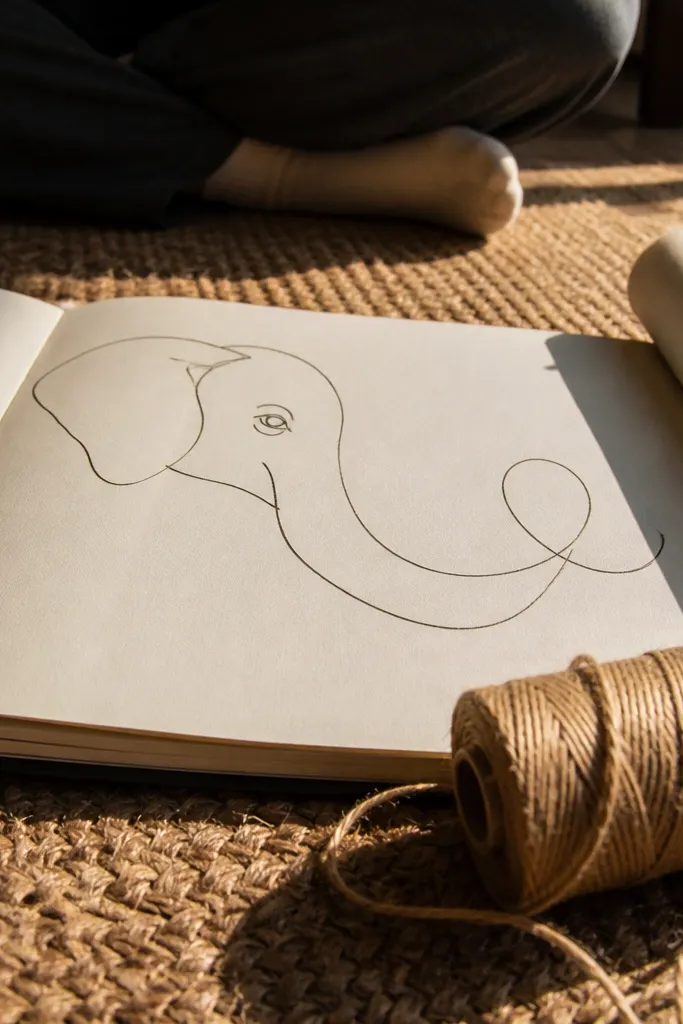
A trunk is thick and heavy. If you draw it as one thin line with a swoop, it reads like a ribbon, not a muscular appendage. The trunk also has a bend that changes direction — usually with a clear “S” curve or an arc that wraps the body. You need thickness and a sense of volume to get the right silhouette. Once the trunk’s form is solid, the nostril and texture details become easy instead of random.
Start by sketching the trunk as a curved cylinder or sausage shape with a definite thickness. Place the trunk attachment at the lower face and then draw the main bend before you draw the tip. Add a second guideline on the opposite edge of the trunk so you can see volume, not just a contour line. Finally, refine the tip shape and add the nostril opening with a small, darker oval — keep it aligned with the trunk’s curve.
Pro tipWhen the trunk overlaps the body, draw the overlap edge darker and slightly softer, so the viewer reads depth.
AvoidDon’t skip the trunk’s thickness — a line-only trunk is the fastest way to lose realism.
4. Wrinkles Drawn as Random Lines
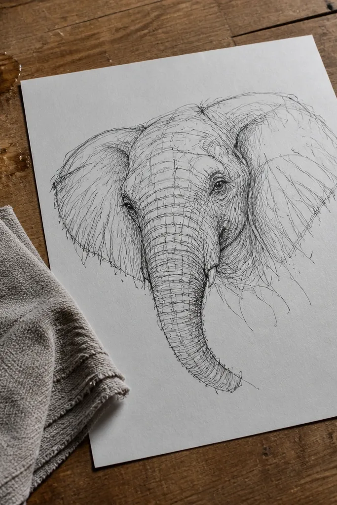
Wrinkles aren’t decoration. They follow skin tension and move with the form, so they should look like flow lines that wrap around the head and trunk. If you scatter wrinkles everywhere, the face turns noisy and the elephant loses its big shapes. A better approach is to draw wrinkles in clusters in the areas that bend and fold, then keep the rest simpler. This is one of those mistakes that makes a drawing look “busy” instead of alive.
Start by drawing the big head and trunk forms with clean construction lines. Then decide where the skin is bending most — around the mouth area, where the trunk flexes, and along the forehead contours. Add wrinkles as curved, parallel-ish direction lines that follow the surface — don’t draw them as isolated squiggles. Shade the wrinkle grooves lightly with short strokes, and leave some skin areas smoother so the texture has contrast.
Pro tipUse a lighter pencil for most wrinkle lines (HB or 2B), then darken only the few that sit in shadow pockets.
AvoidDon’t cover the entire elephant with wrinkle marks — that kills the silhouette and depth.
5. Muddy Shadows From One-Pencil Confusion
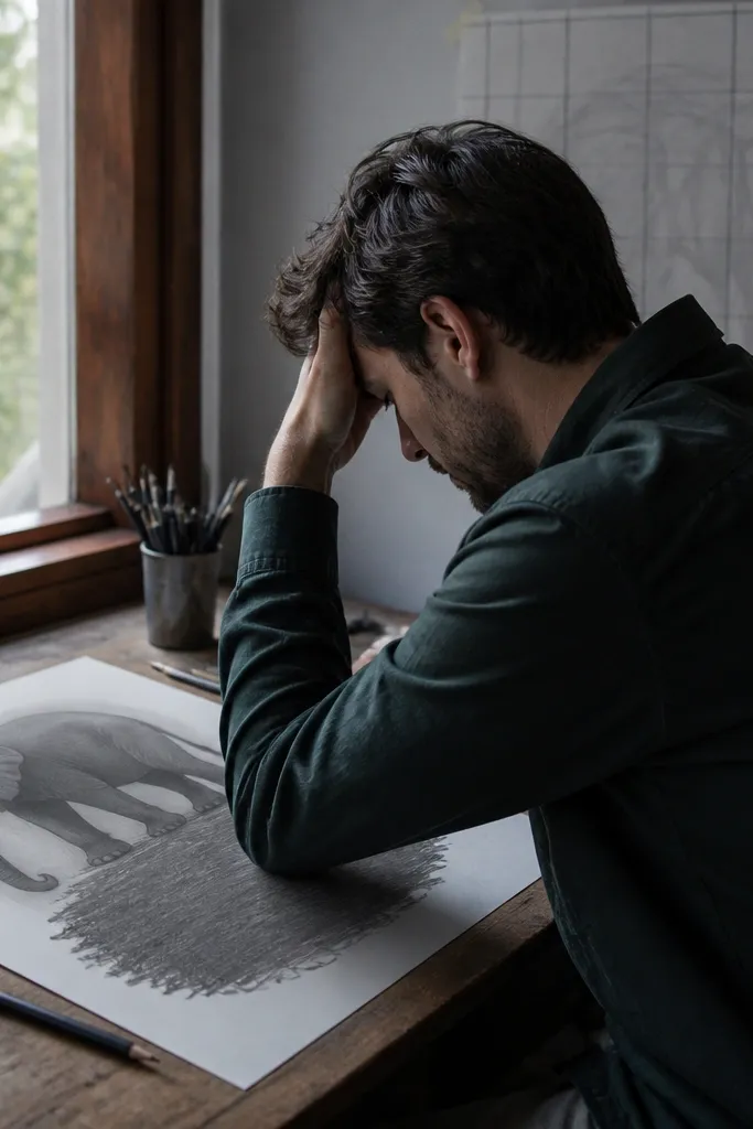
Muddy shading usually comes from treating every dark area the same. Elephant shading needs a clear hierarchy: core shadow on the form, cast shadow where it blocks light, and lighter midtones that keep the skin volume. If you shade everything with the same pressure, the drawing flattens and the face turns gray soup. This mistake is common because people want “realistic skin” right away. You’ll get a cleaner result by planning shadow shapes first and adding texture only inside them.
Start with a midtone base: lightly tone the elephant’s skin with HB across the main forms. Then pick one light direction and block core shadows with a darker pencil (2B), keeping edges softer where the light transitions. Add cast shadows under the trunk, between legs, and under the belly fold with a heavier pencil (4B), using sharper shapes. Finally, add texture lines only inside the shadow areas so the skin stays readable.
Blend less than you think. Use blending stumps only for midtones; keep shadow edges mostly unblended.
Don’t shade the whole body uniformly — it erases the form.
6. Eye Placed Like a Cartoon Dot
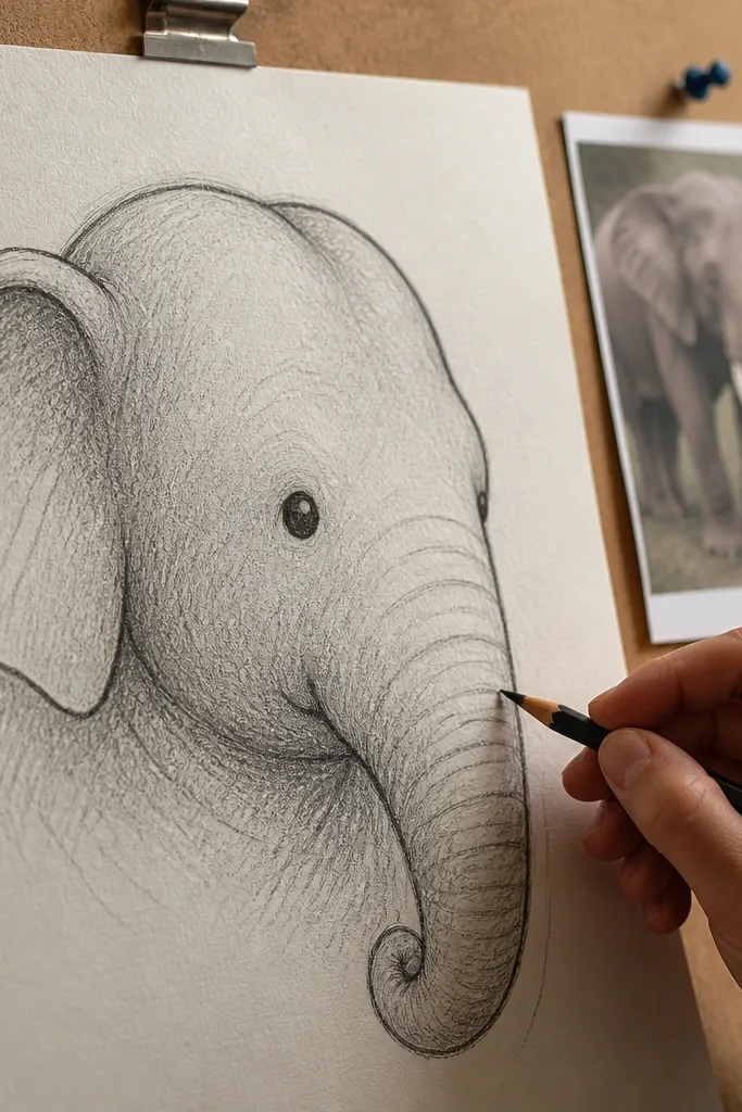
Elephant eyes sit in a way that follows the head’s roundness. If the eye is just a dot placed wherever, the face loses its structure and the trunk connection looks off. The eye also needs a small surrounding shadow and a clear eyelid contour so it doesn’t look pasted on. This mistake is subtle at first, but it’s a huge reason your elephant looks “flat” even with good shading. Get the eye placement and the face starts reading instantly.
Start by drawing the head sphere or rounded block with light construction lines. Place the eye where the head turns — usually slightly above the midpoint of the face plane you sketched. Draw the eyelid as a shallow curve, then add the pupil as a small oval, not a perfect circle. Add a thin shadow line under the eyelid and a tiny highlight area on the pupil so the eye looks set into the face.
Pro tipIf the eye looks wrong, fix it by shifting the whole eyelid shape, not by redrawing the pupil over and over.
AvoidDon’t treat the eye as a standalone detail separate from the head form.
7. Perspective Ignored in the Forehead and Legs
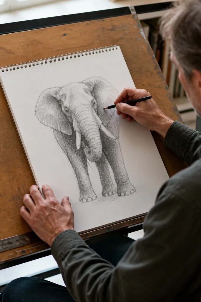
Perspective errors make elephants look like they’re floating or bending in impossible ways. The forehead and legs often get drawn with the same angle regardless of the reference angle, which breaks the sense of depth. Even if your proportions are good, wrong perspective makes the trunk overlap look like a sticker. The fix is to draw direction lines first and keep the leg planes consistent. Once that’s right, you can refine outline and texture without fighting the structure.
Start with a light ground line where the feet touch. Sketch direction lines for the legs using the reference’s tilt — one line for the leg’s outer edge and one for the inner edge. For the head, draw a simple plane break across the forehead so you can see which side is closer. Keep the trunk attachment point aligned with that head plane, then refine overlaps after you’ve confirmed depth.
Pro tipWhen you’re unsure, simplify: fewer lines early beats lots of detail that later collapses.
AvoidDon’t copy the outline curve without checking how the legs angle toward the ground.
8. Outline Too Heavy, Drawing Looks Like a Coloring Book
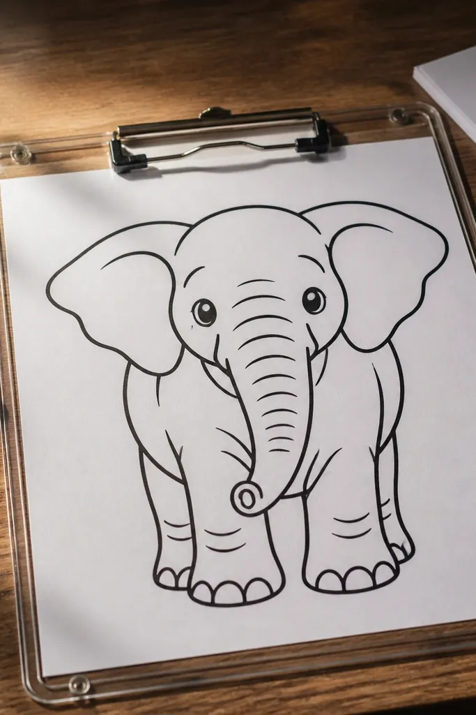
Heavy outlines kill the soft, weighty feel of elephant skin. Realistic elephant drawings usually rely on value changes and edges, not thick contour lines. When you outline everything with the same pressure, the drawing looks cut-out and flat. This is a common mistake when people try to “finish” by tracing. You’ll get a more believable look by keeping construction lines light and using darker marks only where shadow or overlap demands it.
Start with thin construction lines using HB so you can erase later. For the final pass, redraw only the silhouette edges and the major overlap lines, keeping them lighter than you think. Use shadow edges for most definition — like the underside of the trunk and between legs — with 2B or 4B pencil. Leave some skin boundaries soft by pressing less at the end of a stroke.
Pro tipIf you can see your outline everywhere, lighten it. A good test is squinting — if outlines dominate, you need less ink-like pressure.
AvoidDon’t use one thick line for every contour from head to toes.
9. Tusks and Mouth Added Before the Face Is Solid
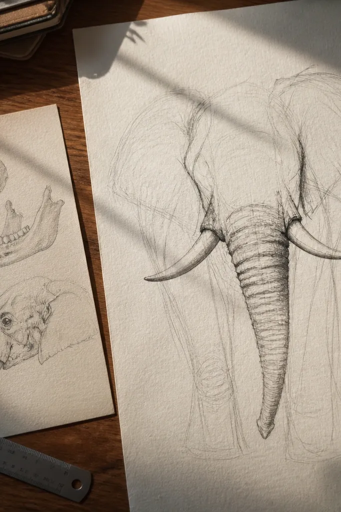
Tusks are not the start of the drawing. People add tusks early because they’re visually obvious, but tusks depend on the mouth and jaw angle. If the face shape shifts later, tusks end up floating or skewed. The viewer notices that mismatch fast, especially around the trunk base. A better order keeps the face structure first, then places tusks as extensions of jaw volume.
Block the jaw and mouth area as part of the head mass before touching tusks. Add the upper and lower mouth curve lightly, then mark the tusk base points where they emerge from the jaw. Draw tusks as slightly curved forms that follow the jaw angle, not straight lines. After placement is correct, darken the tusk shadows where they sit under the forehead and around the trunk overlap.
Pro tipUse a light guideline from the tusk base to the eye — it helps keep the jaw angle consistent.
AvoidDon’t draw tusks until you’ve locked the jaw and trunk connection.



