
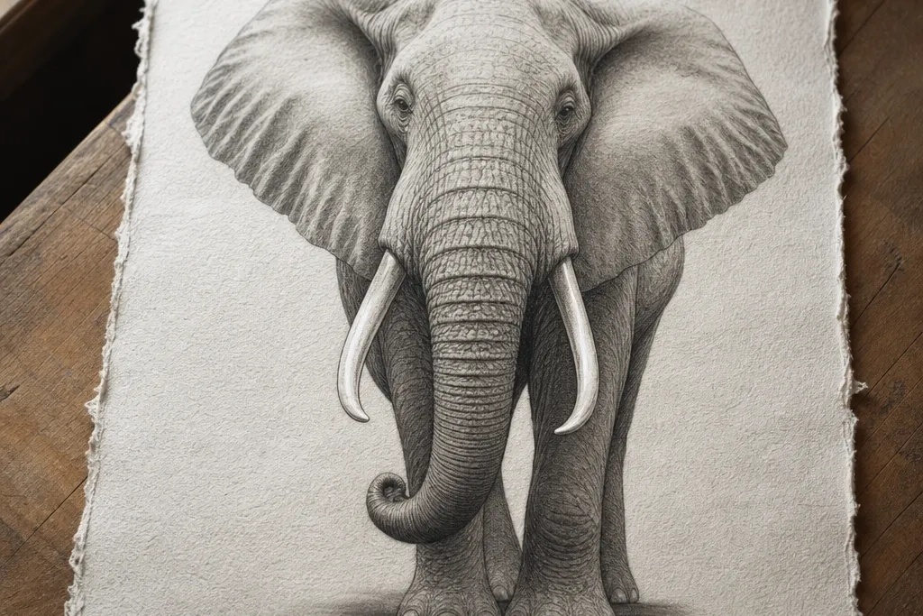
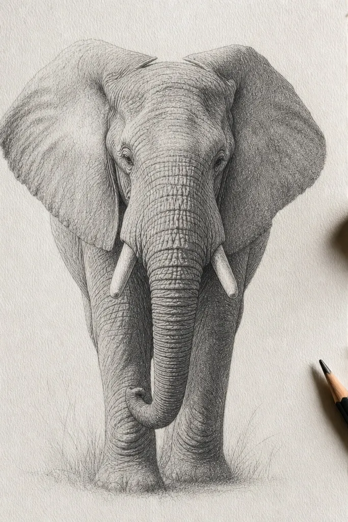
1. Fountain Ink Contour + Graphite Soft Body
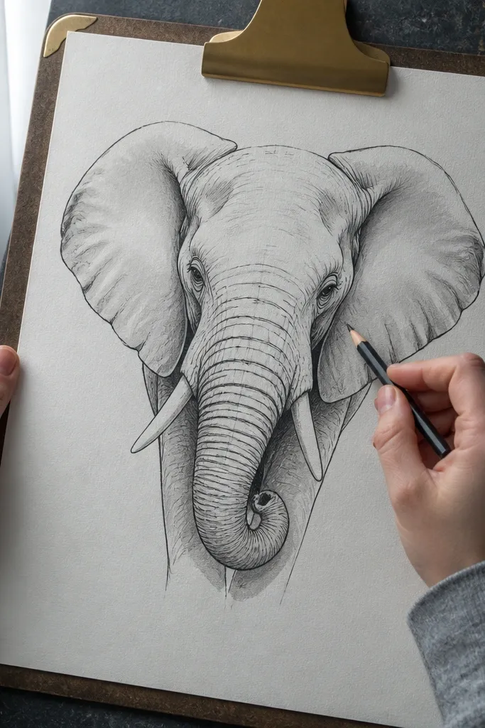
This combo reads expensive because the ink gives you designer-level edge control while graphite handles the subtle volume in the trunk and cheeks. Use fountain ink for lines that taper — the kind that look intentional instead of uniformly thick. Then shade with graphite using a kneaded eraser to lift highlights on the trunk ridge and tusk edge. The result has clear structure and a creamy midtone range, which is what makes an Elephant Drawing luxury look instead of looking flat or chalky.
First, sketch the elephant lightly in HB, then ink only the contour lines that define turns: jawline, trunk curve, forehead ridge, and the underside of the trunk. Use a fine nib and keep your hand pressure light so the line thins at the ends. Second, shade the body with graphite (2B to 4B), blending midtones with a tissue, then lift highlights with a kneaded eraser. Finally, add the darkest value under the chin and between key wrinkles using a 4B or 6B, keeping tusk highlights untouched.
Pro tipPractice line taper on scrap paper first; luxury ink lines come from pressure changes, not thicker nibs.
AvoidDon’t ink every wrinkle — too many ink lines kills the premium look and makes the elephant feel busy.
2. Burnished Colored Pencil Trunk Glow
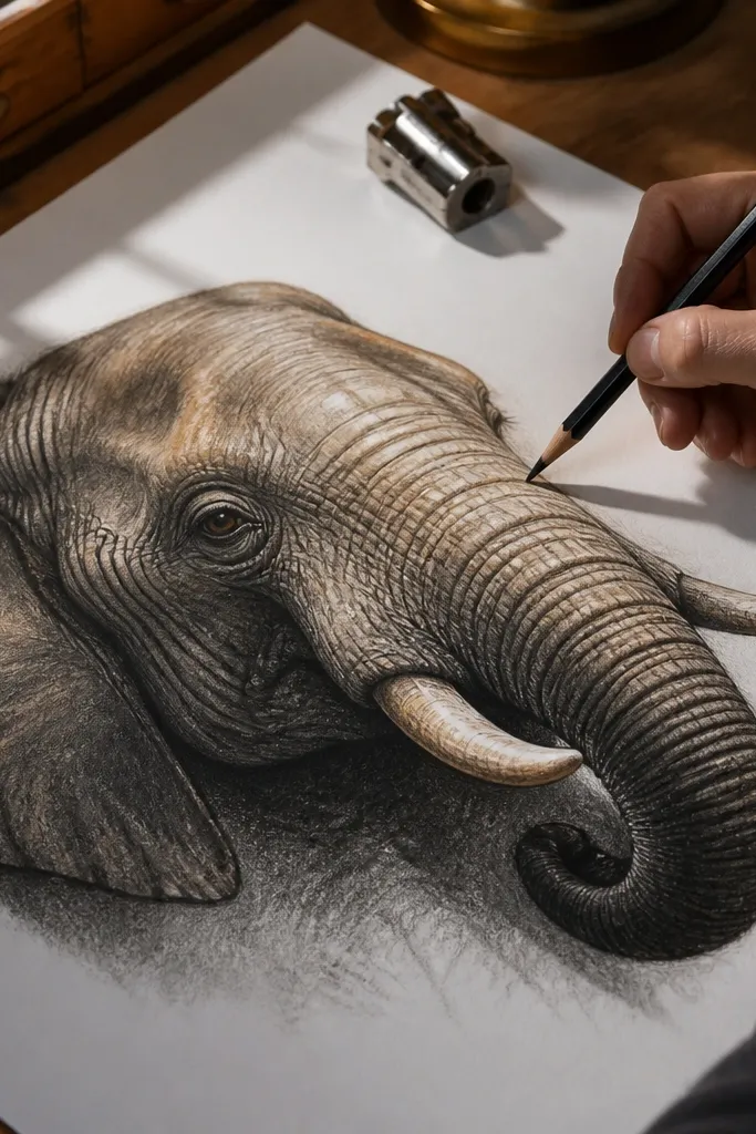
Burnishing is the trick that makes colored pencil look like it came from a gallery print. You’re compressing pigment into the paper tooth so the trunk reads rounded and softly lit instead of textured. For an Elephant Drawing luxury look, keep the base color neutral and then add warm undertones in the shadow side of the trunk. The highlights should look clean and slightly creamy, not white-washed. This style works great for portraits of elephants where facial expression and trunk curvature matter.
Start by blocking values with a light base of warm grey and cool grey (think 30-40% lightness for midtones). Then shade the shadow side of the trunk with layered cool greys and a touch of warm beige near the form edges. Next, burnish the midtones by pressing lightly with a colorless blender or clean pencil and working in small circles until the surface looks smoother. Finish by carving crisp highlight edges with a kneaded eraser and glazing thin layers of grey to deepen the darkest folds.
Pro tipUse fewer colors than you think: 3 greys plus warm beige is enough for a luxury trunk.
AvoidDon’t use heavy dark pressure early — burnished pencil only looks expensive when the early layers stay light.
3. Sepia Ink Wash + Pencil Wrinkle Seams
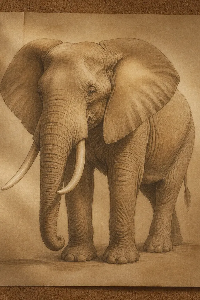
This is a classic “old master” look, but you control it like a modern artist. The sepia wash gives you a unified atmospheric tone, then pencil wrinkle seams add precision. The luxury part is restraint: the wash stays smooth and even, while wrinkles are only drawn where the skin turns and catches light. Tusks look expensive when you let the paper’s white stay as highlight and shade only the edges and base shadows.
First, wet the body area lightly with clean water using a soft brush, then apply a thin sepia ink wash (diluted until it looks like tea). Let it dry completely. Second, draw wrinkle seams with a sharp graphite pencil (2H to HB), keeping lines short and following the form direction. Third, darken key seams with a 4B pencil and add a cast shadow under the chin with a small, soft edge.
Pro tipKeep wash thickness consistent; uneven pooling is the fastest way to make it look like a hobby painting.
AvoidDon’t outline the entire elephant in dark ink — it flattens the wash and removes the premium contrast.
4. Charcoal + White Pencil Edge Sculpting
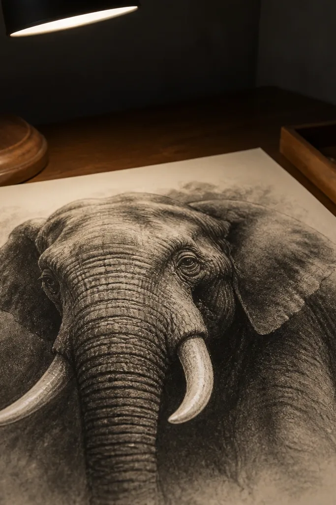
Charcoal gives you that dramatic, high-end charcoal drawing look because it naturally creates deep blacks and soft transitions. White pencil adds “expensive” edge highlights that make the trunk feel carved. The key is to use charcoal as the value engine and reserve white pencil for selective highlights only: tusk bevels, trunk ridge lines, and the eye area. When done right, the elephant looks sculptural, not smudged.
Start with a light charcoal sketch, then block the major shapes: head mass, trunk cylinder, ear planes, and leg silhouettes. Next, shade with compressed charcoal for darks and vine charcoal for midtones; blend midtones with a kneaded eraser or blending stump. Then add highlights using white pencil on only the top-plane turns and tusk edges. Finally, deepen the darkest folds between wrinkles and under the ear with compressed charcoal, keeping a clean white highlight channel.
Use a blending stump for midtones, but switch to an eraser for highlights so the white stays sharp.
Don’t over-blend; if everything goes grey, you lose the luxury contrast.
5. Graphite Mechanical Pencil Micro-Texture
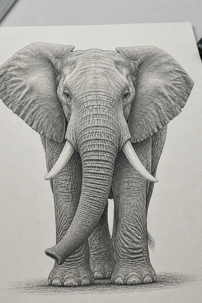
Luxury pencil drawings often look expensive because the texture is controlled, not chaotic. A mechanical pencil (0.3 or 0.5 mm) lets you place micro-shading along wrinkle ridges and ear edges like you’re doing printmaking. You get realistic skin without turning the whole elephant into a grainy mess. Keep the background lighter than you think so the elephant’s form pops. This method is perfect when you want an Elephant Drawing luxury look that stays clean and crisp.
First, map proportions in HB, then switch to a 0.5 mm mechanical pencil to shade the trunk and cheeks with directional hatching that follows the skin curvature. Second, add micro-texture only where wrinkles overlap: short strokes at seam edges, longer strokes on planes. Next, use a tortillon sparingly on midtones, then lift highlights with a kneaded eraser to carve the trunk ridge. Finish by darkening the eye socket and under-chin shadow with a soft graphite pencil (2B) for contrast.
Pro tipChange stroke direction when the form turns; that’s what makes texture look dimensional.
AvoidDon’t fill the whole elephant with micro-strokes — focus texture on seams and edges.
6. Gouache Highlights on Warm Grey Underpainting
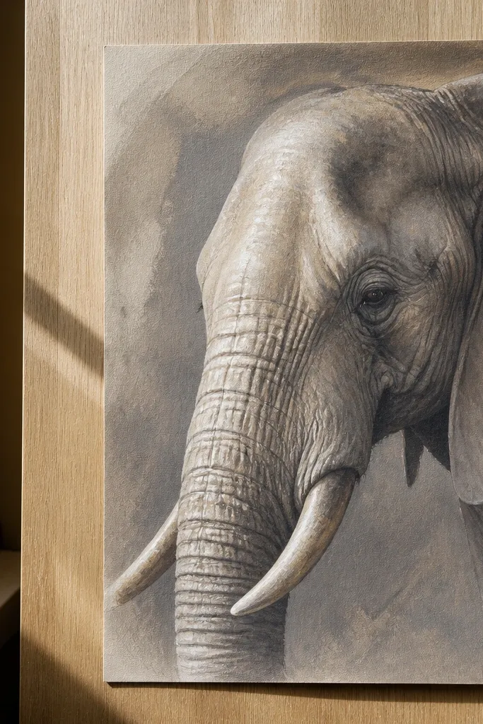
Gouache is a fast route to a premium look because it gives you opaque, controlled highlights that colored pencil can’t always nail. Build a warm grey underpainting so the elephant has a soft, skin-like tone. Then use gouache sparingly for tusk bevel highlights and the brightest trunk ridges. The luxury trick is keeping shadows smooth and letting highlights sit cleanly on top, not blended into everything.
First, tone the paper with a thin warm grey wash (diluted gouache) and let it dry. Second, paint shadow planes with diluted grey, keeping edges a bit softer on the trunk but sharper on tusk edges. Next, add opaque white gouache only to highlights: tusk top bevel, eye catch area, and the top-plane wrinkle ridges. Finally, deepen the darkest folds with a darker grey mix and a small round brush tip.
Use a limited palette: warm grey, cool grey, and white gouache. Too many greys makes it look muddy.
Don’t overpaint highlights — if white covers midtones, it stops reading as luxury and starts reading as correction.
7. Watercolor Flat Wash with Ink Shadow Accents
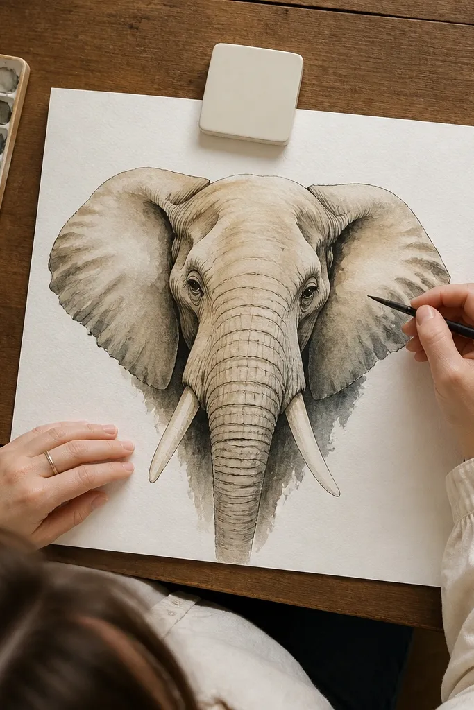
This one looks expensive because the watercolor is smooth and the ink accents are purposeful. The flat wash gives you a premium base tone, then ink lines define where shadows gather: under the chin, between wrinkles, around the ear’s inner curve, and along tusk bases. If your elephant drawings look “sketchy,” this method forces you into clean value blocks with crisp shadow geometry. It’s also quick to finish while still looking polished.
First, block the elephant with a light watercolor wash in one value family: warm grey or cool grey. Let it dry fully. Second, add shadow shapes using a darker wash, but keep them simple and geometric — no scribbling. Third, use fine waterproof ink to add only the shadow edges and wrinkle seams that separate planes. Finish by reinforcing the darkest under-chin cast shadow with a small ink shape and a tiny bit of darker wash.
Use waterproof ink for shadow lines so smudges don’t ruin the clean luxury edges.
Don’t draw wrinkles as outlines — draw them as separations between planes.
8. Soft Pastel Veil Over Graphite Structure
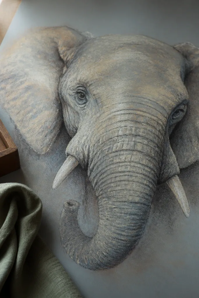
Pastel looks high-end when it’s layered like fabric, not rubbed like chalk. Graphite gives you the structure, and pastel gives you that velvety, expensive surface quality. The luxury look comes from a clean value plan: darker pastel goes in the seams and underplanes, while the top-plane stays lighter with minimal pastel coverage. Tusks should stay brighter than you think, with only edge shading. This method suits larger drawings on textured paper where you want softness without losing form.
First, sketch the elephant in graphite lightly and establish the main shadows: under chin, inside ears, and the trunk underside. Second, apply pastel in thin veils using a flat brush or your fingertips with light pressure, keeping the top plane almost untouched. Next, deepen seams with darker pastel in short strokes and blend the midtones with a soft brush. Finally, use a kneaded eraser to lift highlights and refine the eye and tusk edges with a sharpened pastel stick.
Pro tipFix pastel with a light spray fixative before you add dark accents, so you don’t smear everything.
AvoidDon’t overwork the same area; heavy rubbing turns pastel into grey mud.
9. Ink Line Weight Ladder for Wrinkles
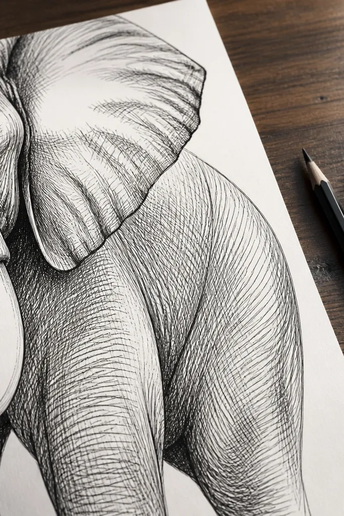
This is the pencil-and-ink equivalent of tailoring. You control luxury by varying line weight like a ladder: thick where the form turns away, medium on mid shadows, thin for highlight edges. Wrinkles become elegant instead of messy because each seam has a job. Tusks look premium when the thick lines stop short of the brightest highlight. This technique is great for portraits and side profiles where the wrinkle pattern is visible and directional.
First, draw the elephant in light pencil and mark three zones: highlight edges, mid shadows, and deepest seams. Second, ink the highlight edges with a fine pen and keep line breaks intentional. Then ink mid shadows with a slightly thicker nib or by pressing a little more, and add the darkest seams with the thickest line only where planes meet. Finally, leave tusk highlights uninked and add a small amount of cross-hatching only under the chin and between major wrinkles.
Use a single pen for consistency, then switch to a calligraphy nib only for the deepest seams.
Don’t draw wrinkles with one uniform line — uniform lines read cheap.
10. Monochrome Charcoal Smudge + Clean Background Fade
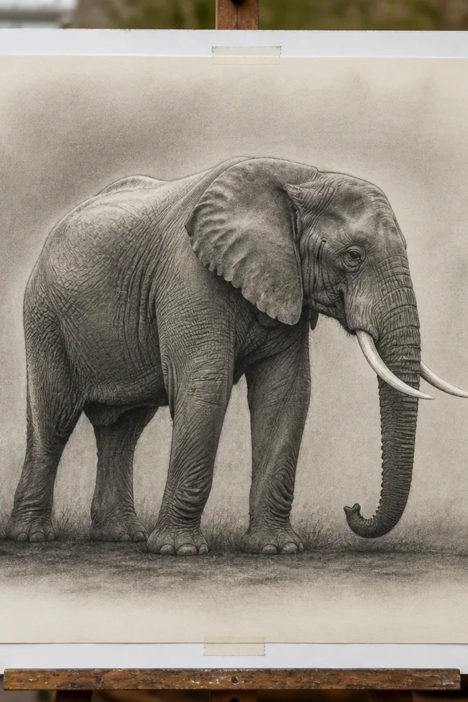
A premium look isn’t only the elephant — it’s also the space around it. This method keeps the background lighter and slightly graduated so the elephant feels framed and intentional. Charcoal smudging creates a smooth skin feel, while you carve crisp edges on the tusk and trunk with an eraser. The luxury part is the negative space: background fade makes the elephant’s darkest values look richer. It works best for single-elephant compositions with lots of open paper.
First, sketch the elephant in vine charcoal and block the biggest dark masses. Second, shade the body with charcoal smudging into smooth gradients, but keep the edges around the trunk and ears slightly sharper. Next, create the background fade by blending charcoal outward from behind the head and leaving a clean halo near the silhouette. Finally, carve highlights with a kneaded eraser on the trunk ridge and add the deepest under-chin shadow with compressed charcoal.
Mask the silhouette edge with a strip of paper while you fade the background, then remove the strip to keep a crisp boundary.
Don’t darken the entire background evenly — flat backgrounds make the elephant look pasted on.
11. Metallic Gold Accents on Decorative Frame Lines
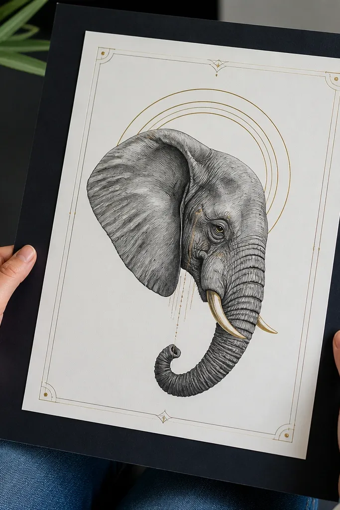
Metallic accents can look tacky fast, but used like jewelry they read expensive. Keep the gold off the elephant body and instead use it on frame lines that echo the elephant’s form: a subtle arch behind the head, thin gold lines along the top-plane of the tusk direction, and a few tiny dots at the eye catch. The elephant drawing still has to be the main subject, so the gold should be sparse and crisp. This gives you an Elephant Drawing luxury look that feels finished without turning into a craft project.
First, draw the elephant in graphite or ink and fully complete values. Then add a thin border or arch line around the head area with a fine pencil, leaving gaps for the gold shine to show. Next, apply metallic gold gel pen or metallic gold paint markers on those border lines and a couple of tiny highlight points near the eye and tusk bevel direction. Finally, let it dry flat and protect it with a clear matte fixative if you used pencil/charcoal around the frame.
Pro tipTest the gold on scrap paper to match the shine — some pens look too bright until they dry.
AvoidDon’t cover skin highlights with metallic paint; it makes the elephant look like it has a filter.
12. Vellum-Style Gel Pen + Pencil Under Drawing
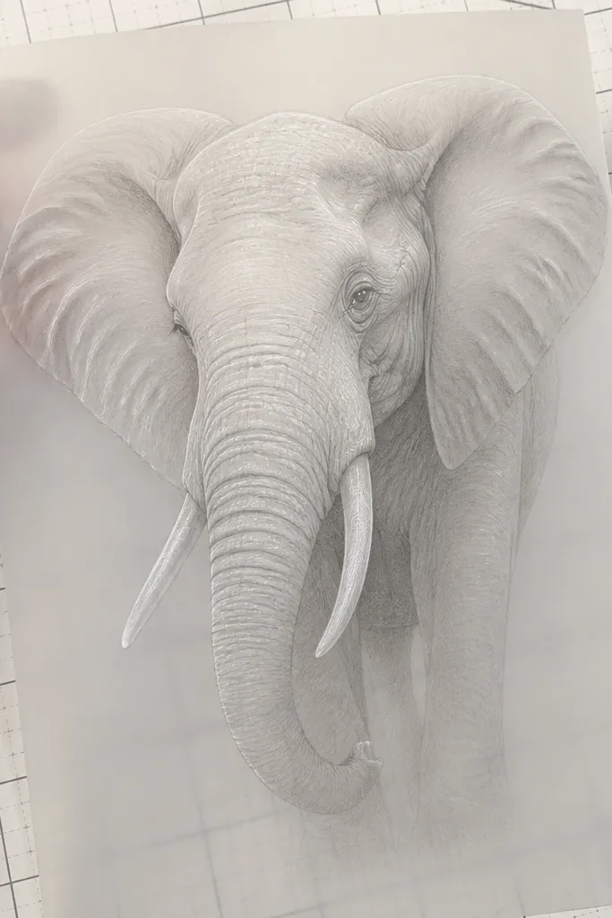
Gel pen highlights are a shortcut to a luxury finish because they create clean, bright marks that resist smudging. The base has to be right first: pencil shading should be soft and dimensional, then gel pen goes on top in narrow lines and tiny dots. For an Elephant Drawing luxury look, use gel pen for the brightest edges only: tusk bevel line, trunk top ridge, and the eye catchlight. Overuse makes it look like glitter on paper; precision keeps it premium.
First, shade the elephant with graphite from HB to 4B, leaving the brightest highlight areas untouched. Second, blend midtones gently and darken the under-chin cast shadow with a soft pencil. Next, apply white gel pen to define only the top-plane edges and the eye catchlight with tiny strokes. Finally, add one thin line to separate tusk planes and lightly dot the brightest wrinkle edges, then stop.
Use a sharp gel pen tip and press lightly; heavy pressure creates thick white blobs.
Don’t outline the entire elephant with gel pen — it reads decorative, not luxury.
13. Two-Tone Background Mat Wash for Gallery Depth
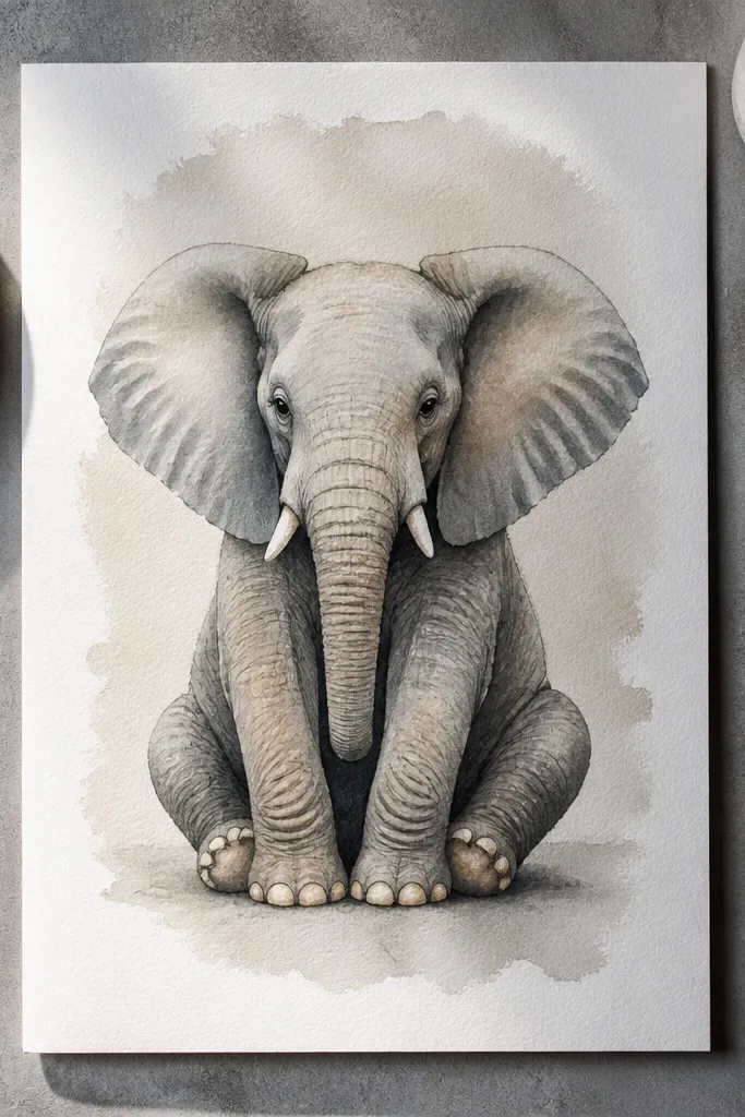
Luxury drawings often look like they’ve been framed into a gallery mat. You can fake that depth on paper with a two-tone background wash that stays behind the elephant, not around it. Pick one light neutral for the main background and a slightly darker neutral behind the head to create a halo. Then keep the elephant’s shadows darker than the background so it pops. This approach makes the elephant feel intentional and high-end even if your elephant rendering is still in progress.
First, paint or lightly tone the background in two layers: a light neutral wash across the page, then a darker wash behind the head and upper trunk area. Keep edges soft where the background meets the paper, but do not let wash touch the elephant details you want crisp. Second, draw or shade the elephant on top once background is dry, matching your shadow values to stay darker than the background. Finally, reinforce under-chin and ear interior shadows so the silhouette reads clean against the two-tone field.
Mask the elephant area with low-tack tape while you wash the background, then remove carefully after drying.
Don’t splash background wash onto the elephant — it blurs value separation and kills the luxury look.
14. Ruler-Edge Graphite Border + Soft Vignette
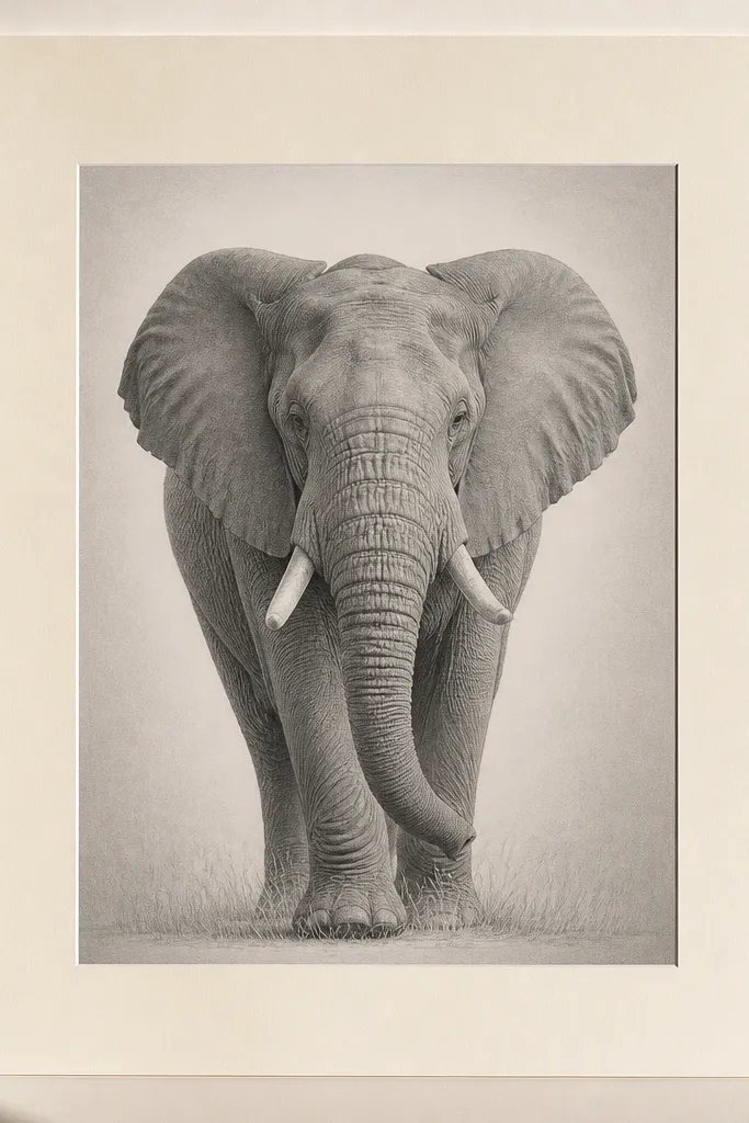
A sharp border changes how people read the drawing. It signals finish and makes the elephant feel like a designed print. The trick is pairing a ruler-edge graphite border with a soft vignette that stays subtle. The border should be light grey so it doesn’t compete, then the vignette concentrates attention near the elephant. This is one of the most reliable ways to get an Elephant Drawing luxury look without adding complicated color.
First, draw the elephant and finish values as your main work. Then measure a border margin: leave 10-15 mm around the elephant for a gallery-like frame. Use a ruler to lightly draw the border in graphite 2H, then shade a soft vignette in the corners by blending graphite outward from each corner toward the center. Finally, reinforce the elephant’s darkest points so they stand out against the lighter border and background fade.
Pro tipWipe your ruler before drawing the border so you don’t accidentally transfer smudges into the line.
AvoidDon’t use a dark border — thick frames make pencil drawings look like worksheets.
15. Cool Grey Tusks with Warm Shadow Under-Ear
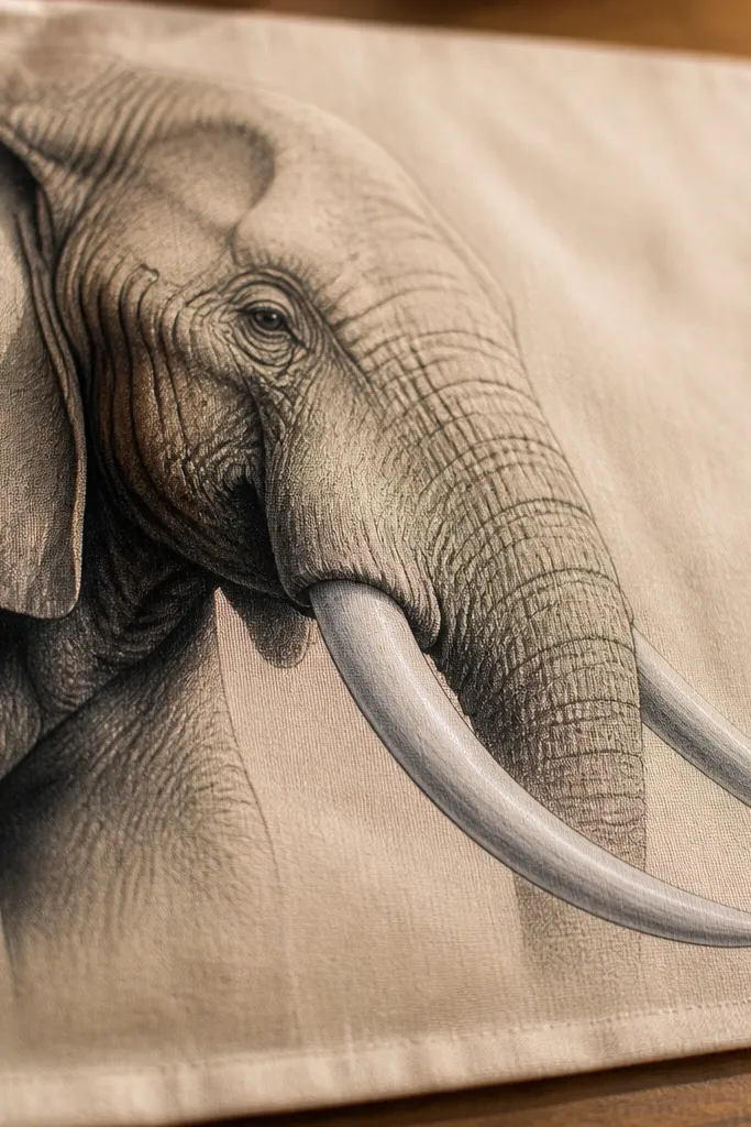
Tusks look expensive when the color temperature is controlled. Cool greys make tusks feel clean and glassy, while warm undertones in nearby shadows make the tusks pop without looking artificial. This method is luxury because it uses color logic even in a mostly monochrome drawing. Keep the tusk highlight reserved as paper white or near-white, then shade edges with cool grey layers. Add warm shadow only where the skin compresses and overlaps, like under the ear and the underside of the trunk.
First, sketch the elephant and block tusk shapes, leaving the center tusk highlight blank. Second, shade tusks with cool grey pencil in layers: light grey base, then mid grey, then a darker cool grey on the inner edge and at the base. Third, add warm undertones in shadows using a warm grey or beige pencil under the ear and near the chin fold. Finally, sharpen the tusk edge with a kneaded eraser to carve a crisp highlight line and darken the cast shadow under the chin with a cool dark.
Keep warm color out of the tusks — warm in the tusk highlight flattens the form.
Don’t rely on one grey for the entire tusk; luxury tusks need at least three value steps.
16. Ink Dot Shading to Build Velvet Ears
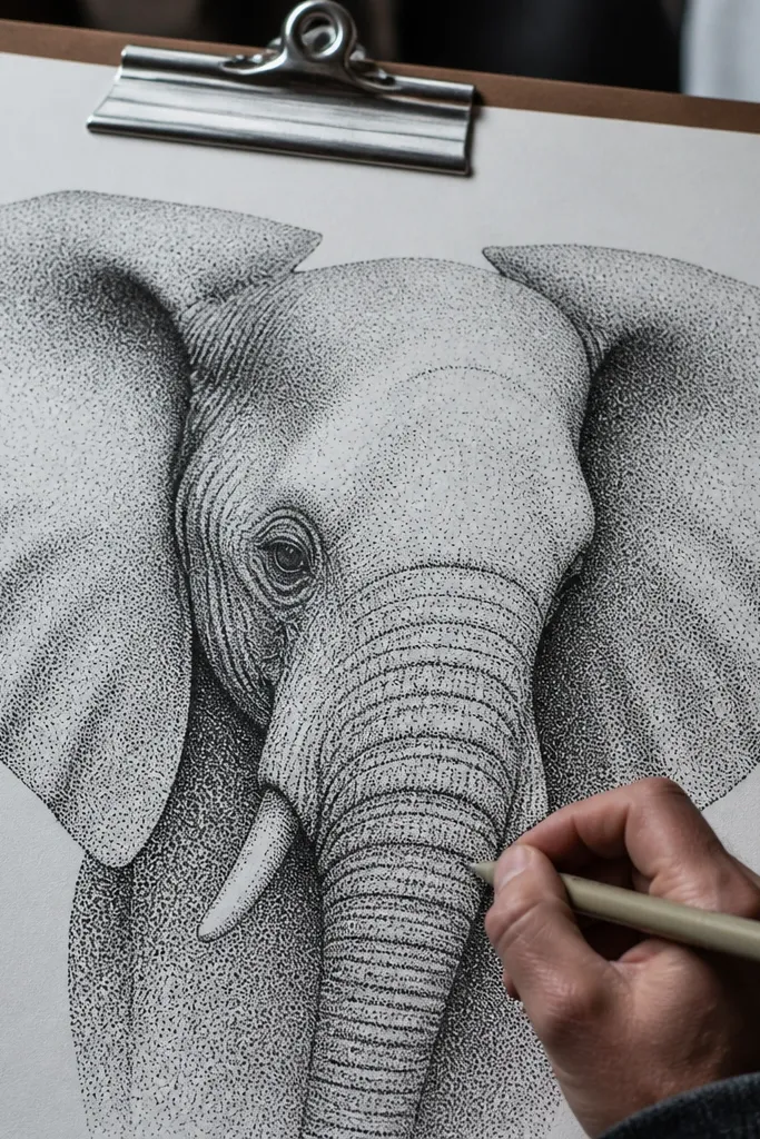
Dot shading looks expensive when it’s disciplined. It creates a velvet effect on ears and skin planes without the smudged look that ruins ink drawings. You build the ear by controlling dot density: sparse on highlight planes, denser in the shadow pocket, and darkest with a few concentrated clusters. Pair that with clean pencil for trunk highlights and you get an Elephant Drawing luxury look that feels printed, not doodled.
First, block the elephant in pencil and decide where the light hits the ear outer edge. Second, ink the major contours, then shade the ears using a fine liner by placing dots in rows that follow the ear curve. Increase dot density in the inner ear pocket and around the underside of the ear. Third, add pencil shading to the trunk for smooth volume, then use a kneaded eraser to carve crisp highlight edges. Finally, deepen only the darkest seam under the chin with solid ink marks (small, tight strokes).
Use a consistent dot size by keeping the pen tip at a steady angle; dot chaos reads cheap.
Don’t dot-shade the entire body — ears and shadow pockets look premium; everywhere else gets busy.
17. Watercolor Glaze Skin Layers with Dry Brush Wrinkle Peaks
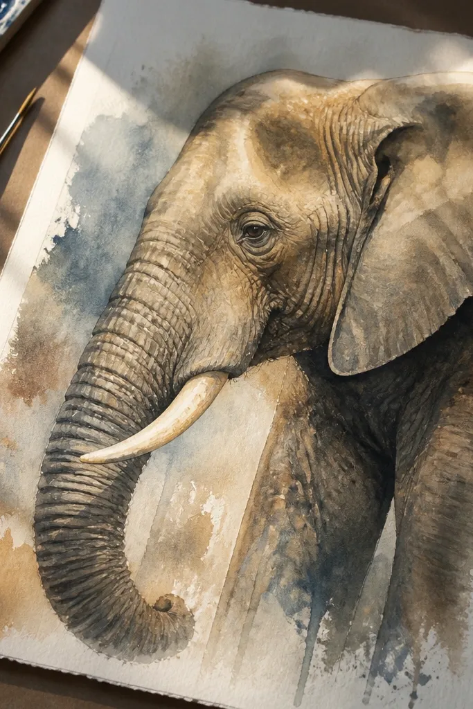
Layered watercolor glazes look high-end because they create depth through transparency, not heavy pigment. Then dry brush wrinkle peaks give you that premium texture without drawing every wrinkle line. The elephant looks dimensional because you’re building skin like a series of translucent veils. This is ideal if you want an Elephant Drawing luxury look that still feels soft and painterly, not harshly outlined.
First, sketch the elephant lightly and paint an initial light grey wash for midtones. Second, apply 2-3 thin glazes of darker grey, letting each layer dry before the next so the skin depth builds. Next, use a nearly dry brush with darker paint to dab wrinkle peaks on the trunk and cheek ridges — keep it irregular but controlled. Finally, add a few crisp dark seams with a small round brush and lift the trunk highlight with a clean damp brush edge or kneaded eraser once dry.
Pro tipGlazes need patience: wait for fully dry between layers so you don’t get muddy edges.
AvoidDon’t over-darken early; luxury watercolor comes from multiple transparent layers, not one heavy pass.



