
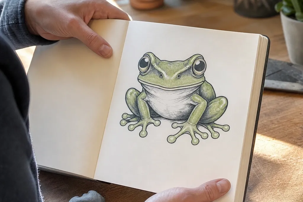
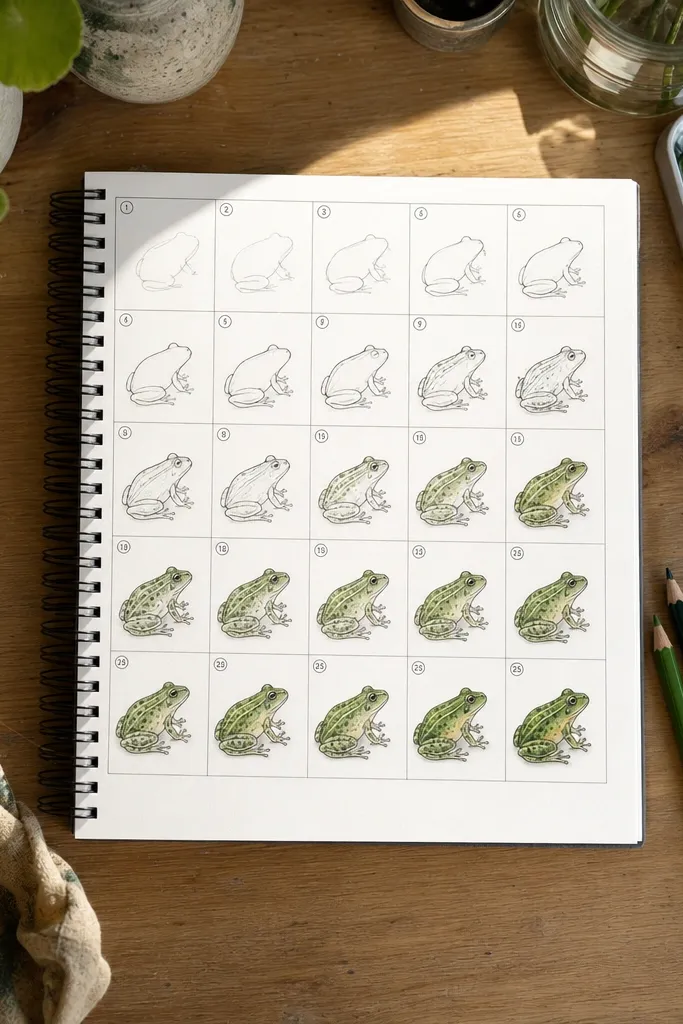
1. Classic Cute Frog Face
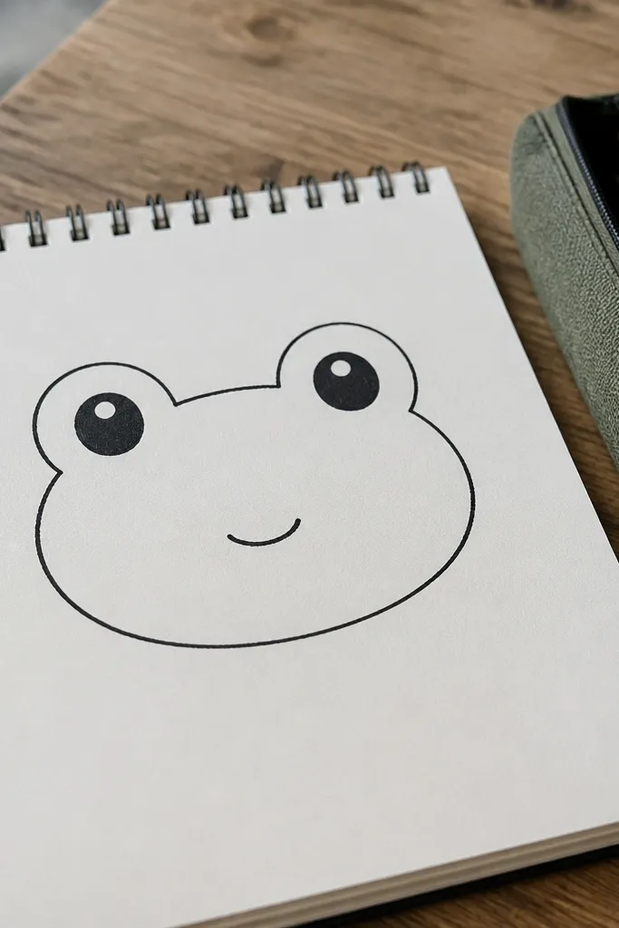
Start with the simplest frog look: a rounded head and two big eyes. This is the fastest way to make a frog instantly recognizable because your silhouette is doing most of the work. Use a smooth outline for the head, then keep the mouth small — a tiny curve reads as “frog” without turning into a clown smile. Add a couple of short cheek bumps and a small nostril dot so the face looks alive even with minimal detail. It’s a great choice for beginners and for decorating notebooks because it stays cute at any size.
1) Draw a large circle for the head, then add a center vertical line to place the eyes. 2) Place two equal circles for eyes near the top of the head, leaving a small gap between them. 3) Add a small curved mouth under the centerline, then ink the head outline and erase construction lines. Finally, add two tiny nostril dots and a few short cheek marks with the same black pen.
If your eyes look too far apart, measure the gap: it should be about the width of one eye pupil.
Don’t draw the mouth wide; a wide mouth makes the face look like a cartoon frog mask.
2. Sitting Frog with Webbed Toes
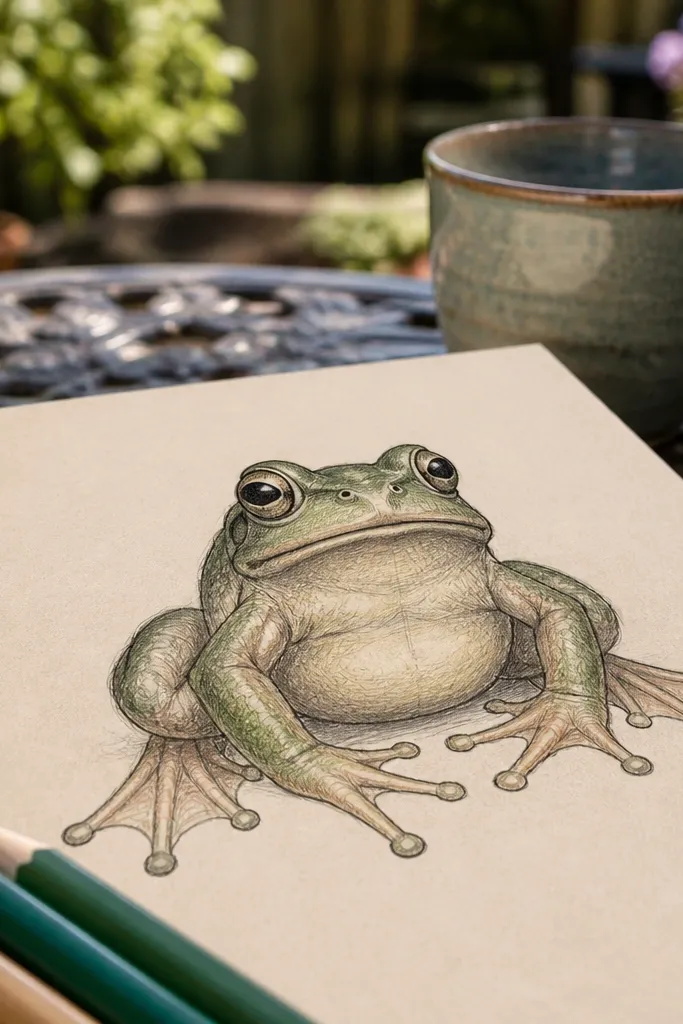
This look gives you a frog that feels pose-y and friendly. The sitting position lets you show the belly and the classic webbed feet clearly, which is where most “frog identity” lives. Keep the legs slightly thick so the drawing doesn’t look like a stick figure. Once you ink the outline, the webbing lines make the feet feel soft and bouncy. This one is photogenic because the pose has clear shapes: round belly, bent legs, and three-toe clusters that read instantly.
1) Draw an oval for the torso, then attach a smaller rounded head on top. 2) Sketch two bent leg tubes coming from the sides; front legs shorter, back legs angled down. 3) For each foot, draw three toe bumps and connect them with gentle curved lines for webbing. Then ink the outer contour, ink toe tips, and erase the pencil guide lines.
Pro tipTo make webbing look clean, draw it as arcs between toe tips, not as straight lines.
AvoidAvoid putting the feet too far under the body; keep them close so the silhouette stays readable.
3. Side Profile Frog (No Head Tilt Mistakes)
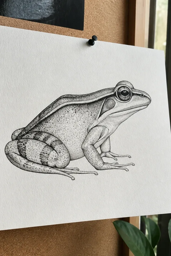
Side profile is where most drawings fall apart, because the head shape and eye placement shift. This method keeps it simple: one eye circle, a snout curve, and a smooth jaw line that follows the body. You get a crisp, graphic look that’s easy to ink and color. The frog still reads clearly because the silhouette has a strong line: head to torso curve, then the leg tucked behind. It’s great if you want a more “poster” feel than a front-face cartoon.
1) Draw a curved line for the head-to-body contour, then add an oval torso behind it. 2) Place one eye circle on the contour line, then add a small pupil dot and a tiny eyelid arc. 3) Draw a short snout curve forward and a small mouth line under it. Finally, add the back leg as a thick tube behind the torso and ink the outline.
Pro tipKeep the eye slightly above the center of the head shape; it prevents the frog from looking sleepy or flat.
AvoidDon’t angle the jaw line too sharply; sharp angles make the frog look like a lizard.
4. Frog Peeking Over a Leaf
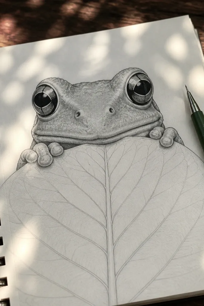
This is a composition trick: the leaf gives you a frame and makes the frog instantly more interesting. The frog only needs a partial body, which means fewer lines and a cleaner final look. Draw the frog face bigger than you think, and let the leaf cover the lower half. Add a couple of leaf veins and a soft outline to keep it crisp. This one is perfect for a cute drawing that still looks styled because the foreground leaf makes it feel like a scene.
1) Draw a leaf shape first using a teardrop outline with a center vein line. 2) Place the frog head so the eyes sit just above the top edge of the leaf; draw two eye circles and a small mouth. 3) Add a partial torso below the eyes, letting the leaf hide the details. Ink frog and leaf outlines, then add two or three leaf vein lines and color the leaf with darker edges.
Make the leaf edge thicker than the frog outline so the leaf reads as the frame.
Avoid drawing too many leaf details; 3-5 veins are enough for a clean look.
5. Top-Down Frog (Cute Egg Shape Body)
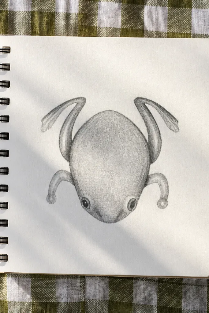
Top-down looks simple but gives a fresh, aesthetic angle. The trick is to use a single egg shape for the body and place eyes near the front edge. Because you see the frog from above, you don’t need complex snout shading; you need clean toe placement instead. Add two short front legs as curved bars and back legs as slightly longer arcs. This style looks great for stickers and small canvases because it has a strong, graphic silhouette.
1) Draw an egg shape for the body, pointy end toward the top. 2) Add two small eye circles near the top edge, then add tiny pupil dots. 3) Sketch four short leg arcs around the sides of the body, keeping them evenly spaced. Ink the outline, then erase pencil lines and add toe tips as small bumps.
Pro tipKeep toe bumps small and evenly sized; big toes from above make the frog look bulky.
AvoidDon’t overdraw the underside; top-down frogs look best with minimal shading.
6. Frog with Arms Up (Cheery Pose)
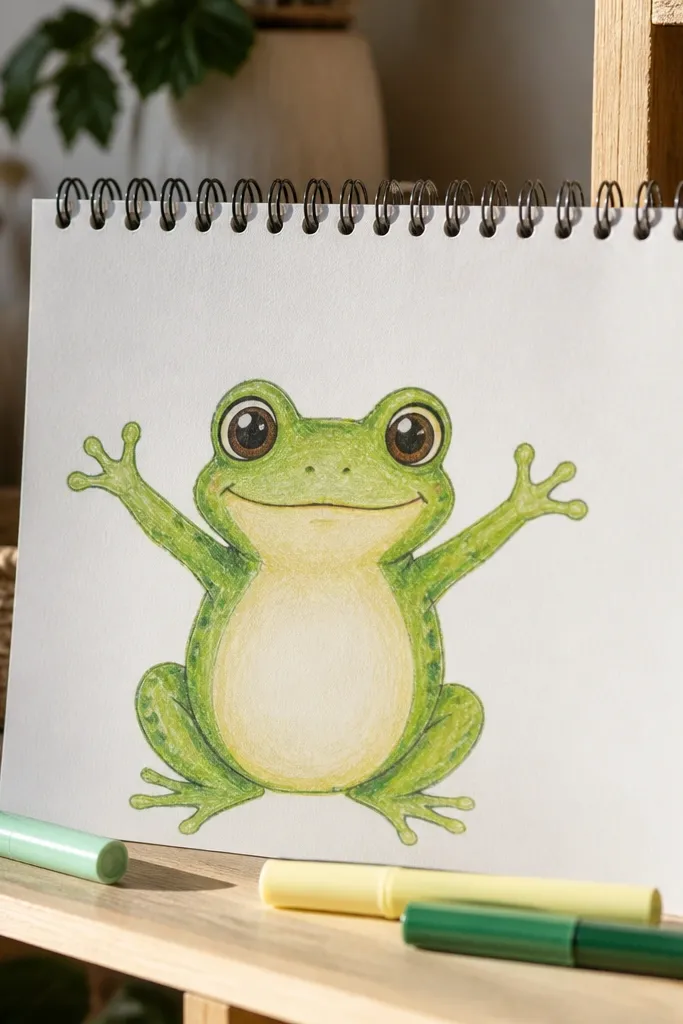
This pose is instantly expressive. Arms up gives you two extra shapes to make the frog look dynamic, and it’s a great way to practice symmetry. The face stays the main focus, so keep the mouth as a small upward curve. Add simple limb thickness so the raised arms don’t look like noodles. Color with a lighter belly and darker spots on the back for a cute, sticker-like finish.
1) Draw a torso oval and a head circle sitting on top, then add a centerline. 2) Draw two raised arm tubes from the sides of the torso upward, ending in rounded hands with two or three small toe-like bumps. 3) Add eyes as two circles, then ink the face and arms. Finally, add a few back spots and color the belly lighter.
Pro tipAlign the top of both arms at the same height so the pose looks intentional.
AvoidDon’t make one arm longer than the other; uneven limbs make the frog look awkward fast.
7. Frog Holding a Tiny Heart
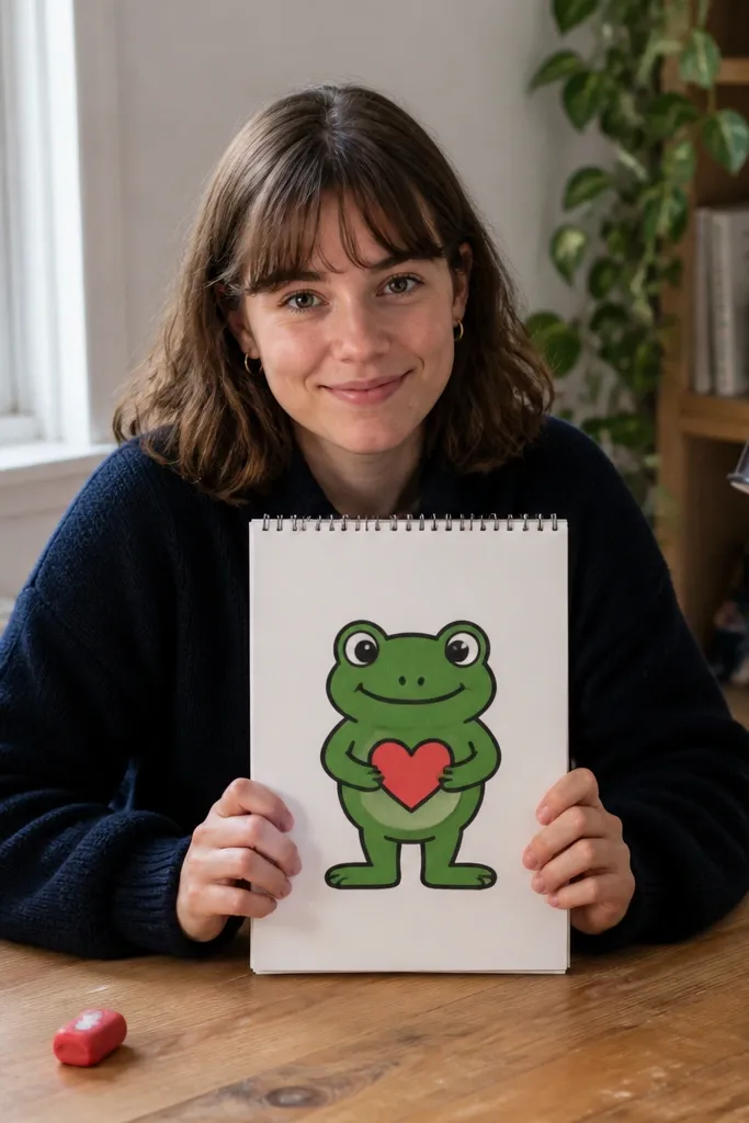
A frog holding a heart turns a simple character into a gift drawing. The heart is the photogenic element, so your frog needs clean hands and a readable front pose. Keep the heart small and centered in front of the belly so it doesn’t overpower the face. Use bold outlines for both frog and heart, then color the heart with a single bright red/pink to pop. This style is also a good practice for hand shape: frogs don’t need detailed fingers, just rounded nubs with webby edges.
1) Draw the frog front pose: head circle, torso oval, and two short arms coming forward. 2) Add the heart shape in the space between the hands; draw it as a simple symmetrical heart outline. 3) Adjust hand placement so the heart touches both hands, then ink everything. Erase pencil lines and add small webbing arcs on the hands for a frog feel.
Pro tipSketch the heart first, then build the arms around it so the spacing looks natural.
AvoidAvoid making the heart too large; if it’s wider than the head, it stops looking cute.
8. Toad vs Frog Look (Green-Gray Hybrid)
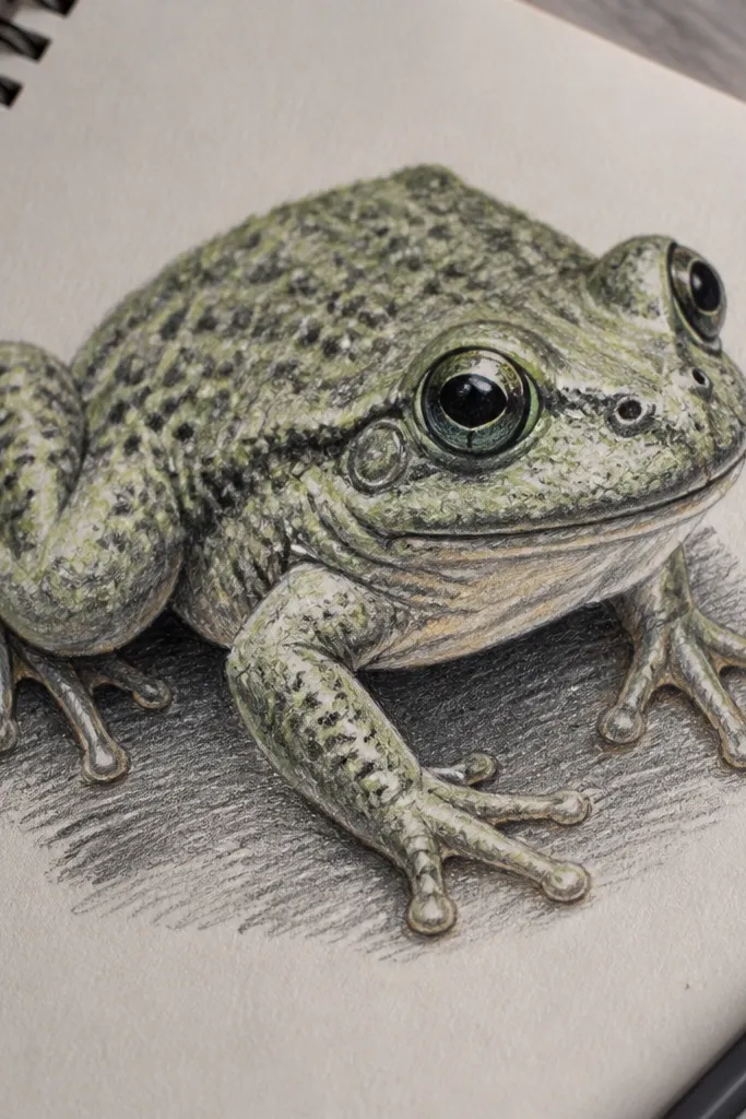
If your frog drawings look too smooth, this texture approach makes it feel more real while still staying cute. You’re mixing the “frog” silhouette with a slightly bumpy skin pattern. Use a green-gray base and add small irregular dots and short scratch marks on the back. The eyes stay big and clean so the character remains friendly. This is perfect for practicing texture without losing your drawing’s readability — the bumps are controlled marks, not a scribble blanket.
1) Draw a classic cute frog head and torso, then outline the legs in a sitting pose. 2) Ink the outline, then add texture inside the back area with short uneven dots and tiny comma shapes. 3) Color the belly lighter and the back darker, then shade only around the texture. Finally, add a few darker spot patches so the texture looks intentional.
Pro tipGroup texture marks in clusters (like 5-10 spots per area) instead of scattering them evenly everywhere.
AvoidDon’t use one-size dots for the whole back; uniform dots look like noise.
9. Frog in a Polka Dot Pattern Shirt
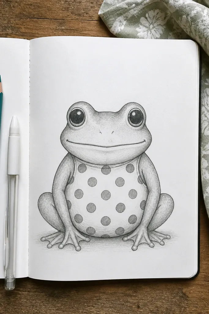
Pattern makes your frog look designed, not accidental. A polka dot belly is easy to draw and super photogenic because it creates a clear visual rhythm. Keep the dots consistent in size and spacing, then shade around the belly edge so the pattern sits on a rounded form. This one works best when your frog outline is bold and your interior lines are clean. It’s a great choice for kids, quick crafts, and marker drawings.
1) Draw a frog with a simple front-facing head and torso oval. 2) Ink the outline, then draw a belly “panel” shape as a slightly smaller rounded oval. 3) Fill the panel with evenly spaced circles using a small round tip. Color the belly panel base lightly, then press harder on a few dots for contrast.
Use a scrap paper grid under your hand if you want dot spacing to look perfect.
Avoid drawing dots on the legs; keep the pattern area limited to the belly for clarity.
10. Frog Sitting on a Mushroom
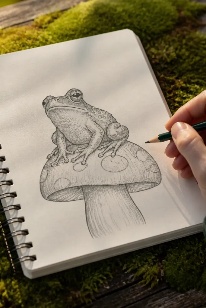
This is a scene, but the scene stays simple. The mushroom cap gives you a big curved shape that frames the frog, and the spots on the mushroom make the drawing pop. Keep the frog small compared to the mushroom cap so the composition feels balanced. Use a dark outline on the mushroom edge and lighter shading on the cap top. This one is great for coloring pages and marker art because the mushroom spots and frog spots create a consistent texture language.
1) Draw the mushroom cap first: an oval cap with a wavy bottom edge and a stem line. 2) Add the frog sitting on the cap by drawing head circle, torso oval, and legs that wrap around the cap edge. 3) Ink outlines, then add mushroom spots and frog belly spots. Color the mushroom with a brighter cap color and darker spots, then shade under the frog to show it sits on the cap.
Shade a single shadow under the frog feet with a soft pencil or marker gray to anchor the pose.
Don’t make the mushroom stem too thick; it can steal attention from the frog.
11. Frog with Long Back Legs Jumping
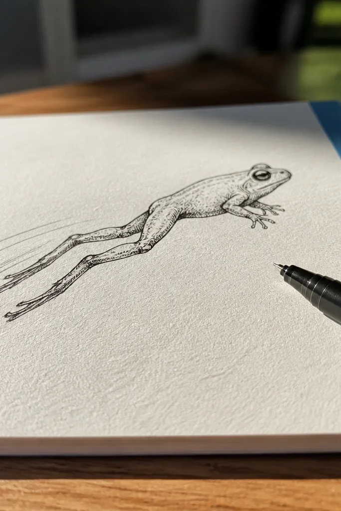
Jumping frogs look lively, and the long back legs give you a clear motion silhouette. The trick is to keep the body compact and let only the legs stretch. Draw the torso as an oval, then place the back legs as two long arcs that angle backward. The front legs should be shorter and tucked slightly forward. This look is photogenic because the silhouette reads instantly even if the details are minimal.
1) Draw a compact torso oval and head circle, then add a centerline. 2) Sketch two long back leg arcs behind the torso, with feet tips pointing down. 3) Add two shorter front legs tucked near the belly. Ink the outline, then erase pencil lines and add toe webbing arcs with the black pen.
Pro tipMake the feet tips sharper than the leg curves; it makes the jump feel purposeful.
AvoidAvoid drawing the whole frog stretched; keep the body compact.
12. Frog Wearing Tiny Sunglasses
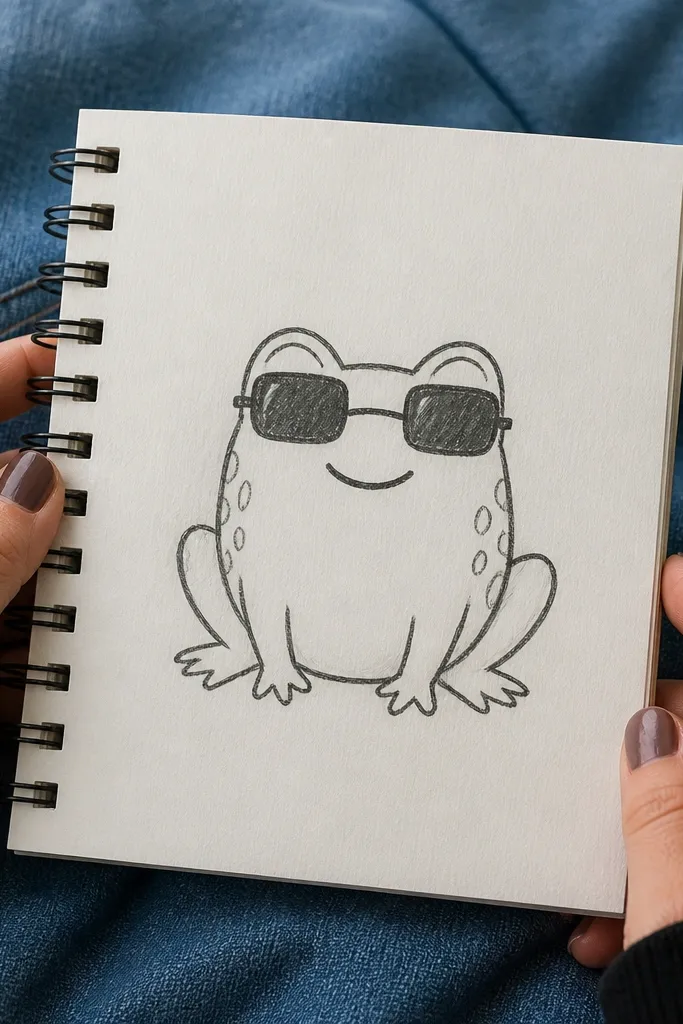
Accessories instantly make a frog drawing look styled. Sunglasses work because they sit on the eye area, which you already place using construction circles. Keep the sunglasses simple: two rounded rectangles with a thin bridge line. Add a small smile so the face reads cheerful. Color the sunglasses dark gray or black and keep the frog colors clean so the accessory stands out.
1) Draw the classic cute frog face with two eye circles and a centerline. 2) Place sunglasses across the upper half of the eye circles, then add a small bridge connecting them. 3) Ink the sunglasses and face outlines, then erase construction lines that fall behind the glasses. Finally, add a tiny highlight line on the lenses and color the mouth area slightly darker.
Keep sunglasses slightly wider than the eye circles so they look like they fit, not float.
Don’t shade the sunglasses with lots of texture; keep them flat for a clean look.
13. Frog with Bubble Letters Name Tag
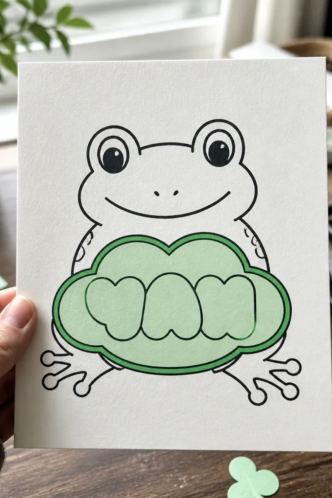
This is a clean graphic combo: frog character plus readable text shape. You get a finished-looking drawing for social posts without needing a complex background. Use a speech bubble or rounded name tag in front of the frog’s belly, then add bubble letters inside. Keep the frog outline bold and the bubble letters thick so the whole piece reads from far away. It’s a strong option if you want your frog drawing to look like a sticker design.
1) Draw the frog front pose and ink the outer outline first. 2) Add a speech bubble or rounded tag shape near the frog’s belly, leaving a clear gap from the frog head. 3) Draw bubble letters inside with consistent stroke thickness. Ink letters and outline, then color the bubble background lightly and the frog darker.
Pro tipMake bubble letter strokes about the same thickness as the frog outline so nothing looks off-balance.
AvoidAvoid tiny text; bubble letters need space to look clean.
14. Minimal Line Frog (Ink-Only Style)
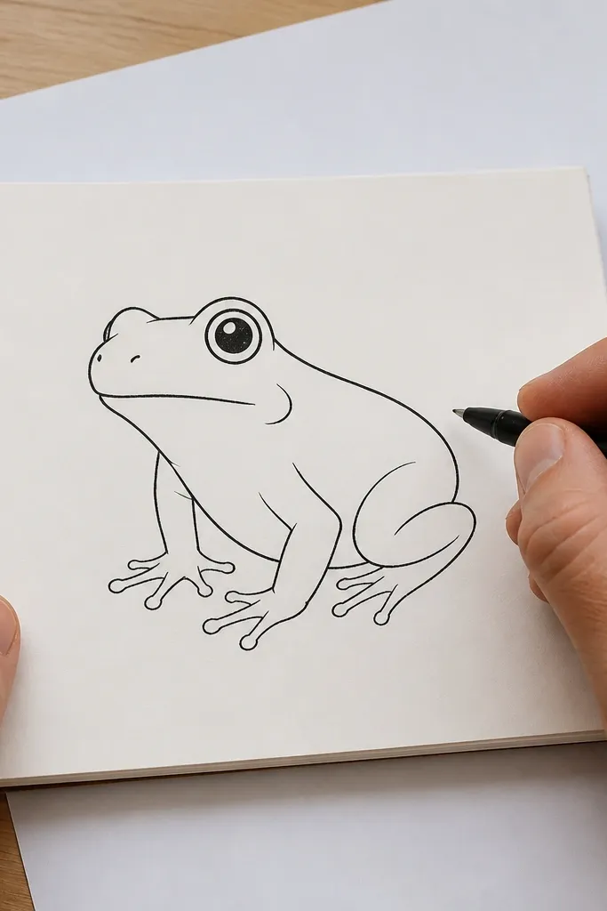
If you want an aesthetic that looks modern and clean, go ink-only. Minimal line frogs are photogenic because the silhouette does the work and the viewer reads the rest as “frog” from the eyes and mouth. Use a black pen and keep lines smooth, no sketchy crosshatching. Add only 2-3 interior marks: a mouth curve, a nostril dot, and toe web arcs. This is also the fastest way to get a finished drawing when you’re short on time.
1) Draw the head circle and torso oval lightly in pencil, then place two eye circles. 2) Ink the outer contour in one confident pass, then ink the eyes and mouth. 3) Add two nostril dots and simple toe web arcs on the feet. Erase pencil lines and leave the rest blank for the minimal look.
Pro tipUse one line weight: if you vary thickness by pressing hard, it can look messy fast.
AvoidDon’t add extra skin texture marks; minimal style only needs a few signals.
15. Frog with Stipple Skin Dots
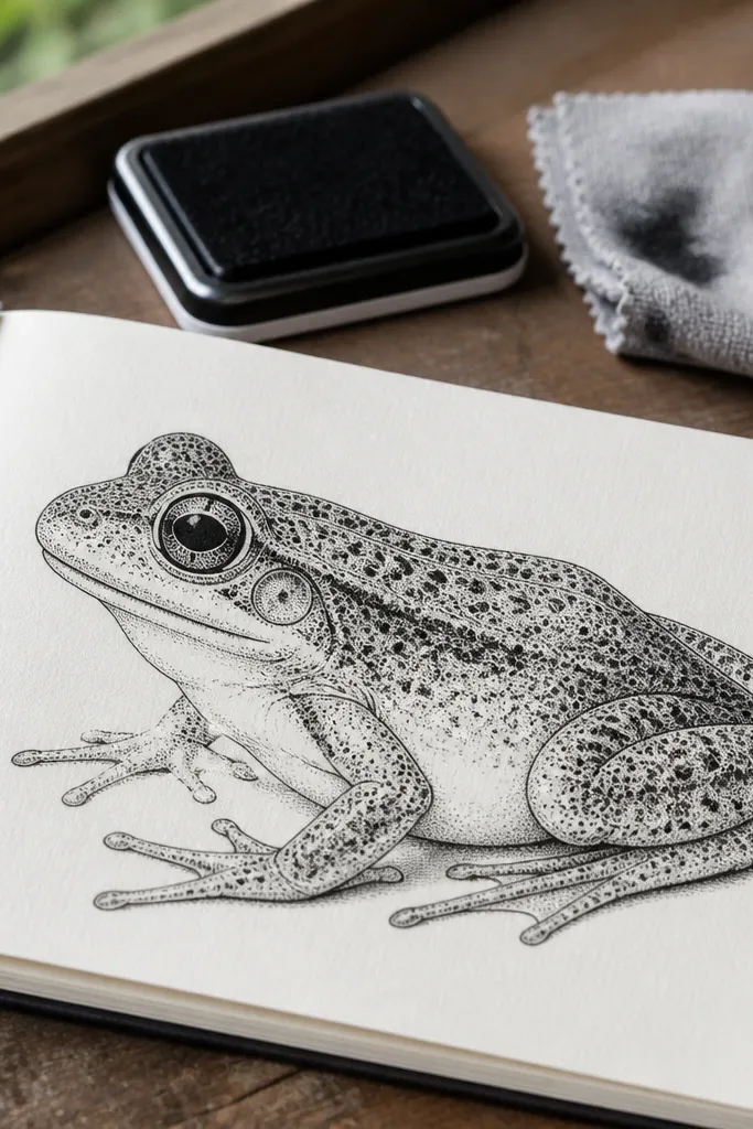
Stippling gives you a soft, speckled texture that looks good in photos. The back becomes visually interesting without turning into a messy scribble, and the belly stays smoother for contrast. This style is forgiving: you can build texture gradually and stop when it looks even. It’s also great if you want a frog that looks more detailed but still “easy,” because the technique is repetitive and controlled.
1) Draw a simple frog with a rounded head and torso and ink the outline. 2) Add stipple dots on the back area only, starting light near the belly and getting denser toward the edges. 3) Keep the belly smoother by shading lightly with a pencil or leaving it blank. Finally, add a few darker spot clusters so the stipples look like natural markings.
Pro tipUse a consistent dot size by tapping the pen tip lightly without dragging.
AvoidAvoid stippling the entire page; keep it inside the frog shape.
16. Frog in a Bubble Background Scene
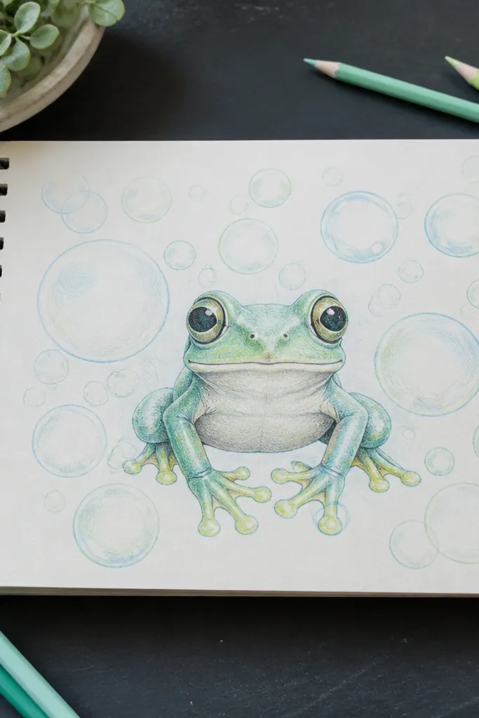
Background bubbles make your frog drawing feel like it belongs in a sticker pack. They also help cover blank space so your image looks finished. Draw the frog first, then add bubbles behind it with lighter line weight so the frog stays the main subject. Pick 2-3 bubble sizes and repeat them. This style is easy to color because bubbles can be left white with a light tint and a few shadow arcs.
1) Draw and ink your frog outline with clean edges. 2) Add bubble circles behind the frog, varying size and keeping some partially hidden. 3) Color bubbles with one light tint and shade the bottom edge with a slightly darker version. Finally, add a few small highlights on bubbles and keep the frog colors brighter.
Draw bubble outlines lighter than the frog outline by using a lighter pen or thinner marker.
Don’t draw bubbles overlapping the frog face; it makes the eyes hard to read.
17. Frog with Water Ripples
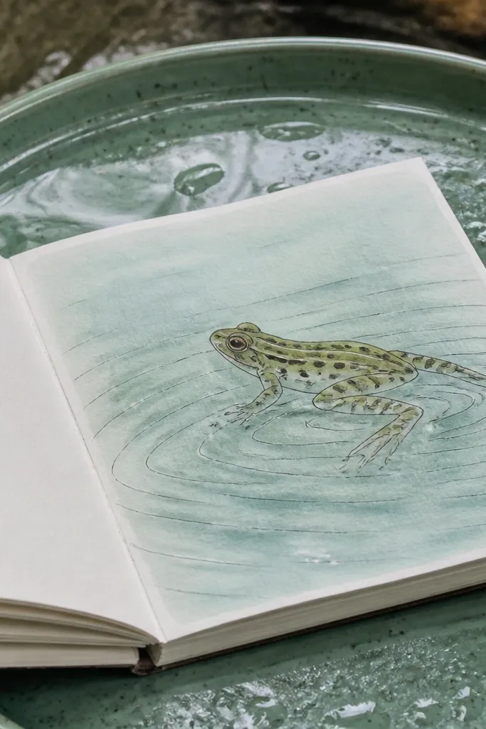
Ripples turn a simple frog into an action moment. The ripple lines also guide the viewer’s eye toward the frog’s feet, which is a nice way to make the pose feel grounded. Keep ripple lines smooth and evenly spaced so they look calm, not chaotic. Color the water area with a pale blue-green wash, then leave the ripples lighter for contrast. This one looks great in photos because the ripples create movement lines around the character.
1) Draw a sitting frog pose and ink the outline. 2) Add ripple arcs around the feet by drawing 3-5 curved lines expanding outward. 3) Color the water background lightly, then lightly shade under the frog feet. Finally, erase any pencil lines and re-ink the frog if the color softened the outline.
Pro tipMake ripple lines thinner than the frog outline so the frog stays dominant.
AvoidAvoid too many ripples; 3-5 rings look intentional.
18. Frog on a Lily Pad
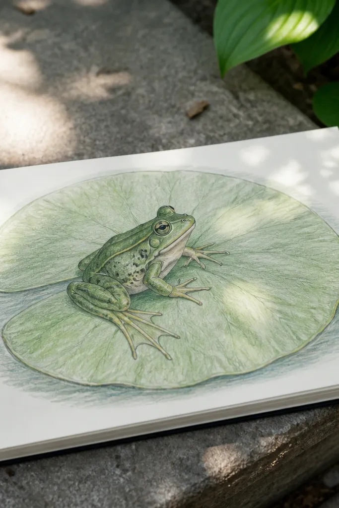
Lily pads give you a ready-made shape frame and a clear color palette. The pad veins look decorative, and the frog’s webbed feet naturally match the lily pad theme. Keep the pad big and slightly angled so the frog feels placed on something real. This one is a solid choice if you want a complete “card” drawing without complex backgrounds. The final look is clean and balanced: pad edges, vein lines, frog outline, then a few spot colors.
1) Draw a large oval lily pad with a slightly wavy edge and a center vein line. 2) Place a frog sitting on the pad by drawing head and torso and legs tucked onto the pad surface. 3) Ink the lily pad outline and vein lines, then ink the frog outline. Finally, color the lily pad green and add darker green vein shadows while leaving highlights on the top surface.
Pro tipDraw vein lines that fan out from the center; it makes the pad look like a lily pad instantly.
AvoidDon’t shade the pad with heavy black; use dark green only on the edges.
19. Frog with a Checkered Belly
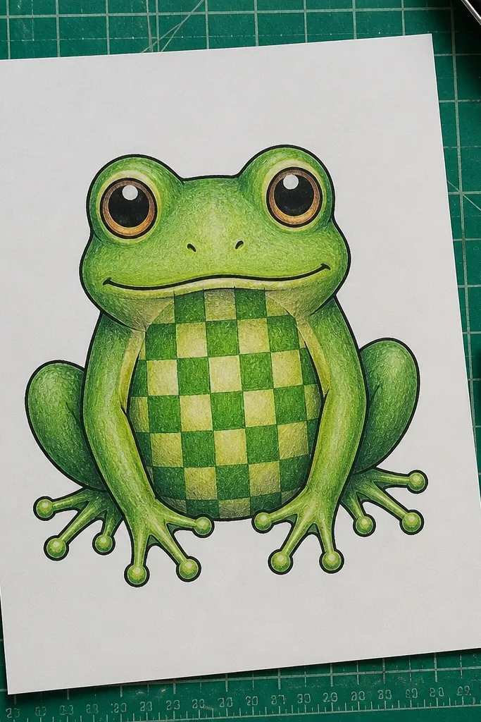
A checkered belly is a clean, graphic pattern that makes the frog look designed. It also teaches spacing because you’re drawing a grid on a curved surface. Keep the grid small and centered on the belly oval so it doesn’t warp your whole drawing. Use two close green shades so the pattern looks natural, not like a toy. This style is great for marker art because you can fill squares quickly and keep edges crisp.
1) Draw a frog with a belly oval and ink the outer outline. 2) Sketch a light grid inside the belly oval, then erase pencil guide lines if needed. 3) Fill alternating squares with a darker green and leave the others lighter. Finally, shade around the belly edge with a soft pencil or marker to keep the pattern looking curved.
Keep square size consistent; if one square is huge, the whole belly starts looking crooked.
Avoid stretching the grid into the legs; keep the checkered area limited to the belly.
20. Frog with Shiny Eye Highlights
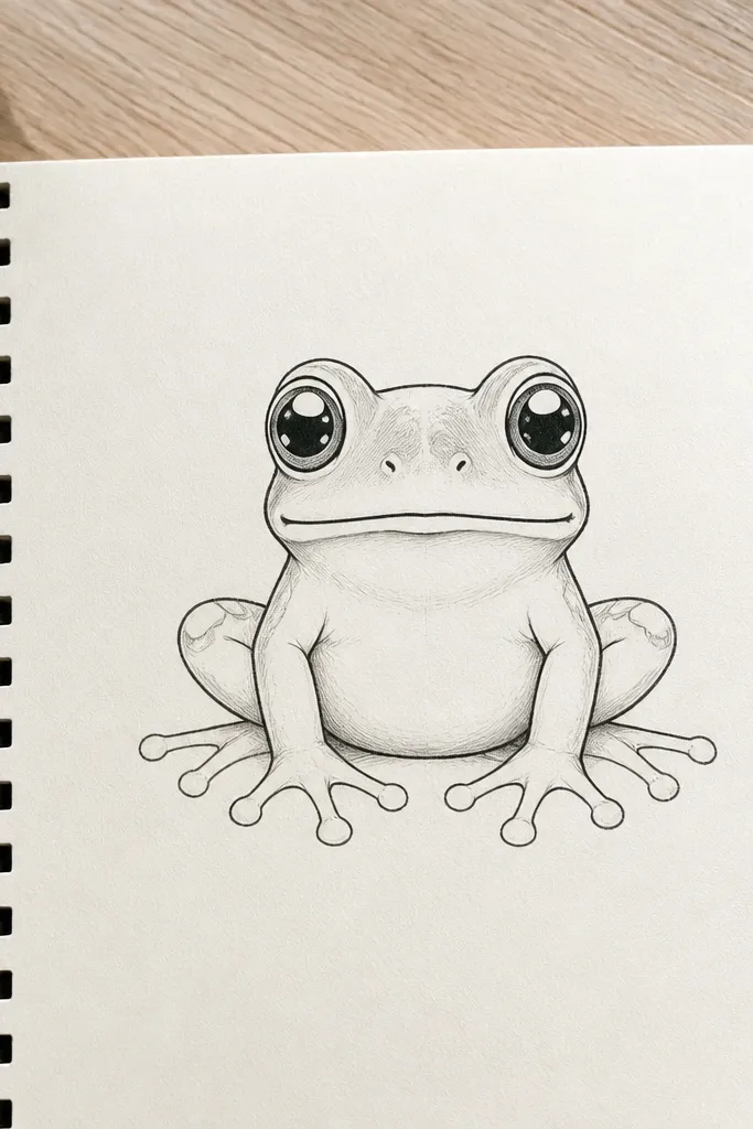
Eye highlights are the fastest way to make a frog look alive. You’re not adding more detail everywhere — you’re focusing on the eyes, which is why the frog reads as cute instead of flat. This is also a great trick if you colored the frog and the face looks dull. Add two tiny white highlight shapes on each eye: one near the top-left edge, one smaller near the center. The result looks polished even with simple coloring.
1) Draw the frog face with two eye circles and a small mouth, then ink outlines. 2) Add pupils and eyelid arcs, then draw two white highlight shapes inside each eye (leave them uncolored). 3) Color the eyes with a green or dark gray tone around the highlights. Finally, shade the cheek area lightly so the eyes pop against the face.
Leave the highlights completely uncolored — even a light tint kills the shiny effect.
Don’t outline the highlight edges in black; it makes the eyes look like decals.
21. Baby Frog Tiny Body Version
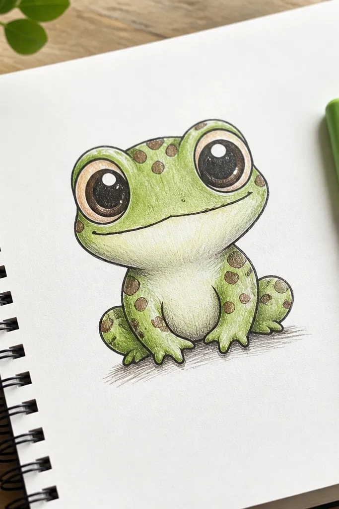
Baby frog proportions make drawing easier because the body is smaller and simpler. Put the big head on top of a tiny torso oval, then add short legs. The eyes can stay huge and round, which hides small mistakes in the snout shape. Keep the feet rounded and minimal, and add only a few spots. This style is super photogenic because it looks like a character, not a scientific diagram.
1) Draw a large head circle, then attach a smaller torso oval beneath it. 2) Place two big eye circles near the top of the head and add a tiny mouth curve. 3) Draw two short leg tubes and rounded feet with simple toe bumps. Ink everything, then erase pencil lines and add a few spots on the back.
Pro tipMake the torso about one-third the height of the head for consistent “baby” proportions.
AvoidAvoid making the legs too long; long legs ruin the baby look.
22. Frog Face with Patterned Cheeks
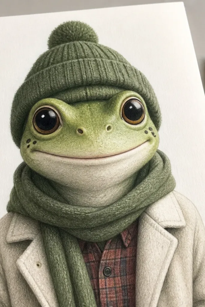
Cheek pattern is a small detail that looks like you planned the drawing. It adds texture without cluttering the whole frog. Use 2-3 cheek marks on each side: short lines, tiny dots, or a small swirl. Keep the pattern close to the mouth corners so it looks like facial markings. This style is photogenic because the face becomes the focus, and it works with both simple and colored versions. It also teaches you how to place pattern marks where the viewer expects them.
1) Draw the classic front frog face with big eyes and a small mouth, then ink the outer outline. 2) Add cheek pattern marks on both sides using short strokes and a few dots, keeping them symmetrical in placement. 3) Add a couple of nostril dots and a light shadow under the eyes. Finally, color the cheeks slightly darker than the forehead so the pattern shows.
Pro tipUse matching shapes on both sides, but vary the order so it doesn’t look mirrored and stiff.
AvoidDon’t put cheek patterns too high on the face; it makes the frog look angry.
23. Frog with a Simple Scarf
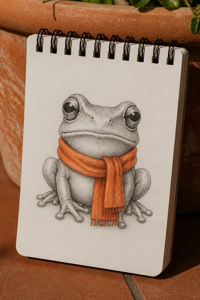
A scarf gives a frog instant style with a manageable amount of extra drawing. The scarf wraps around the neck area, which you already have as a simple curve between head and torso. Keep folds minimal: two or three curved lines that show the fabric wrap. Color the scarf with one bright shade and a darker shade for the folds. This look stays aesthetic because the scarf adds a strong color block without turning the drawing into a busy mess.
1) Draw the frog head and torso in your preferred simple pose, then ink the outline. 2) Add a scarf shape around the neck by drawing a curved band and one dangling end. 3) Add 2-3 fold lines on the scarf and color it with a solid base plus a darker fold shade. Finally, add a tiny highlight line on the scarf edge to make it look smooth.
Keep the scarf thickness consistent; thin scarves look like random lines on a small frog.
Don’t wrap the scarf into the eyes area; keep it under the chin.
24. Frog with a Starfish Friend
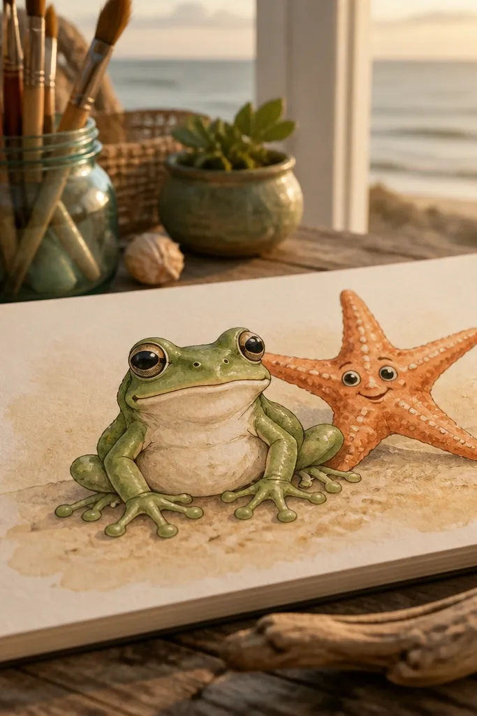
Pairing a frog with a starfish makes the drawing feel like a cute ocean postcard. The starfish has a recognizable shape, so you can build it quickly and keep it photogenic. Put the frog in the foreground and keep the starfish slightly behind and to one side. Use a limited palette: green frog, warm orange starfish, and pale blue water. The result looks themed without needing a detailed underwater background.
1) Draw the starfish first as a center circle with five rounded arms, then lightly draw the water shape behind it. 2) Add the frog next to it using a simple sitting or side pose, then ink both outlines. 3) Color the starfish with one base color and add 3-4 darker spots on the arms. Finally, add a few water wave lines behind the frog and shade under the frog feet.
Pro tipUse the starfish spots sparingly; 3-6 spots total look intentional and clean.
AvoidDon’t add lots of seaweed; it steals attention from the frog.
25. Frog with a Leaf Hat
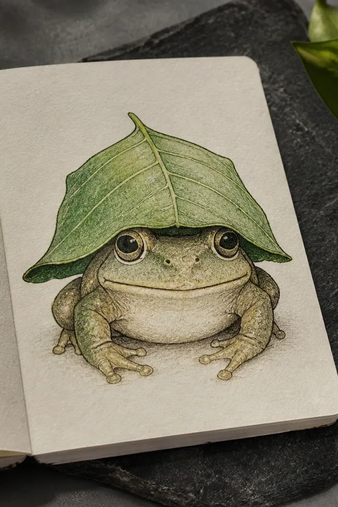
A leaf hat is a fun, aesthetic accessory that still fits frog anatomy. It’s also easy to draw because leaves already have natural vein structure, which gives your drawing texture without extra effort. Place the leaf so it covers the top of the head but leaves the eyes visible. Use a darker green outline for the leaf edge and lighter green for the inner leaf. This makes the frog look styled and playful, perfect for a cute drawing series.
1) Draw the frog face first with big eyes and a clean head outline. 2) Add a leaf hat on top by drawing a teardrop leaf shape that overlaps the head, then draw a center vein line. 3) Add 3-4 side veins and ink the leaf outline. Finally, color the leaf with a darker edge shade and leave a small highlight strip on the leaf.
Pro tipMake the leaf slightly asymmetrical; perfectly centered leaves look stiff.
AvoidAvoid covering the eyes; keep the leaf low enough to show the full eye circles.



