
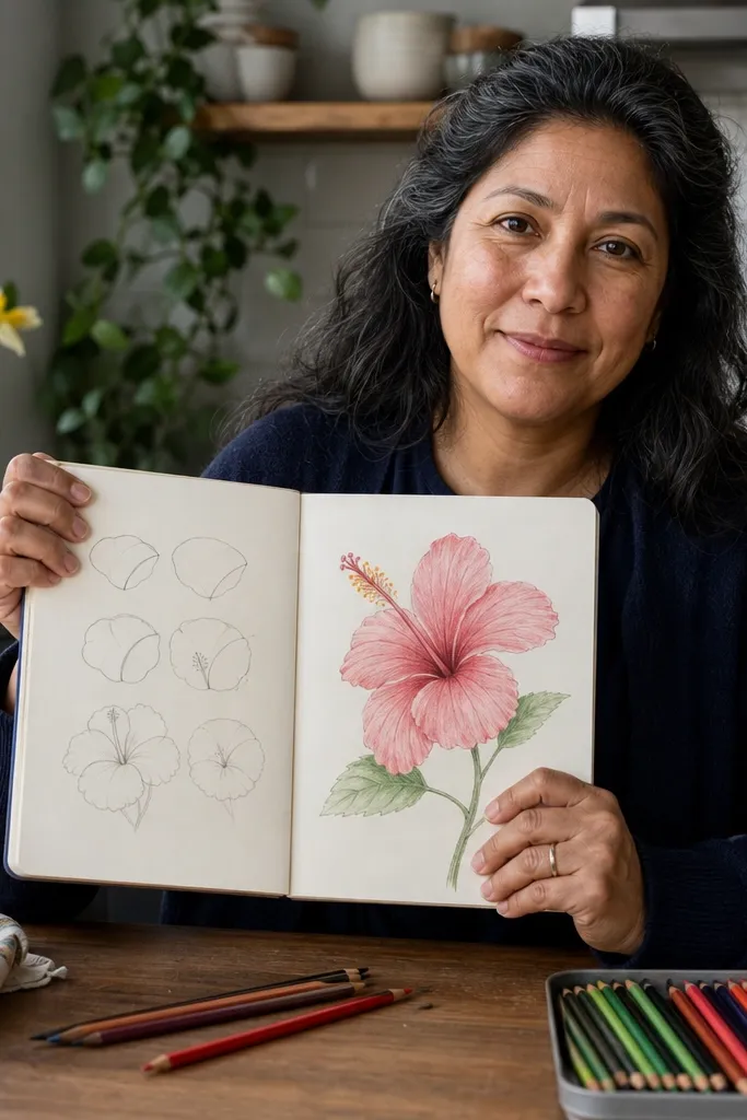
1. Tear-Drop Petal Construction in 5 Segments
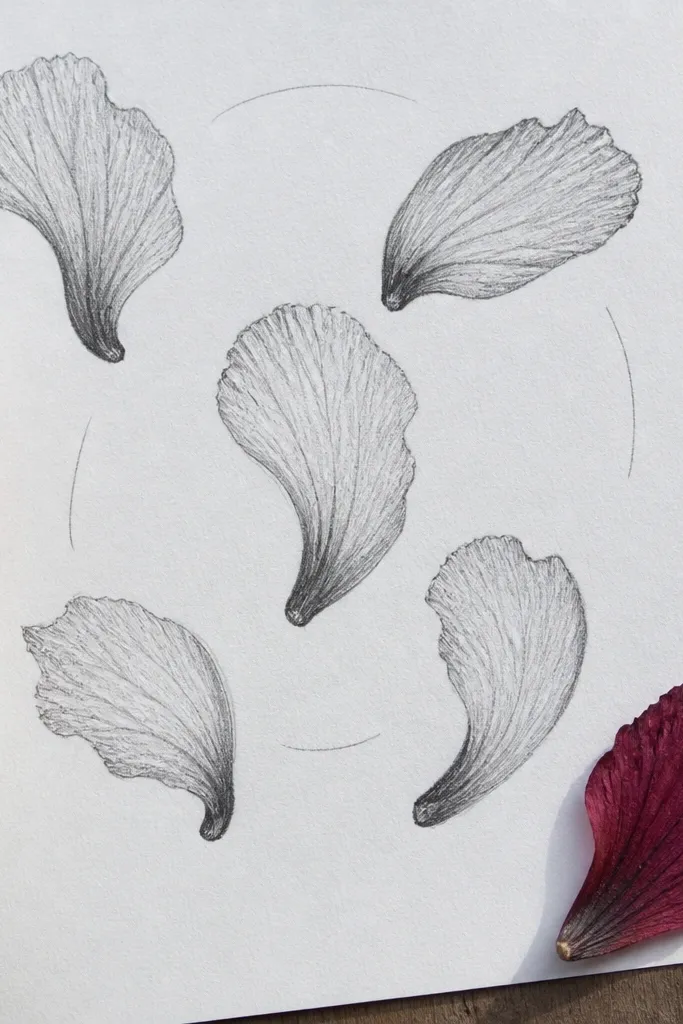
This tutorial fixes the biggest hibiscus problem: petals that look like identical ovals. The method forces each petal to have a thick base, a tapered tip, and a subtle bend where it grips the center. You end up with a flower silhouette that reads as hibiscus even before shading. It’s fast because you’re not drawing every vein yet — you’re locking the shape first, then layering details.
Start by drawing a small center guide circle. Then place five tear-drop petals around it, each one slightly rotated so their bases touch the center but their tips point outward at different angles. Finally, add one curved fold line per petal and do a quick dark pass only on the petal edges that overlap the next petal.
Rotate the whole flower by rotating your wrist, not by redrawing petals — it keeps your angles consistent.
Don’t shade before the petal taper looks right, or you’ll fight the drawing for the rest of the session.
2. Center-First Hibiscus Core (Stigma + Anthers)

Draw the stigma as a tapered line that widens near the center and narrows at the tip. Then sketch five anther tips clustered around the stigma, keeping them short and slightly curved. After that, build five petals around the core, using the center as the pivot point for the petal bases and vein directions.
When your hibiscus looks off, it’s usually the center. This tutorial starts with the stigma and anthers so the petals have something to “aim” for. The stigma is the vertical anchor; the anthers sit as a cluster that fans outward slightly. Once the core is placed, your veins and petal folds naturally curve toward it, which is where the realism comes from.
AvoidDon’t make the stigma too long — long centers pull the whole flower into a different species look.
Pro tipKeep the anthers smaller than you think at first; you can always darken them later.
3. Vein Direction Shading (No Blending Needed)
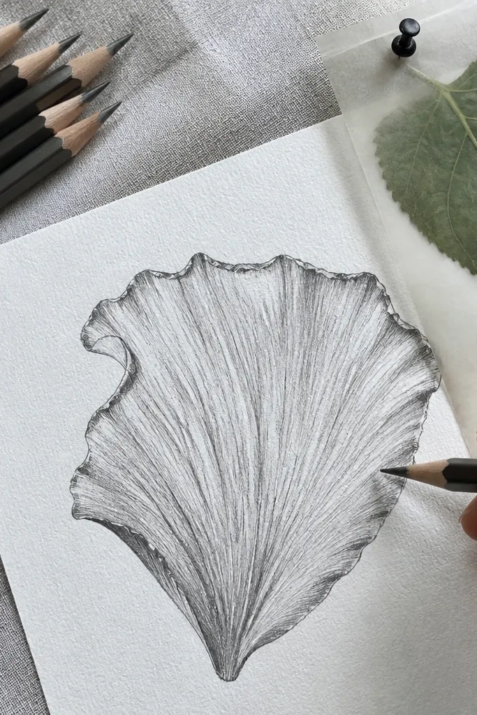
This is the tutorial I recommend when you want depth without turning your paper gray. Instead of smudging, you shade in short strokes that follow the vein direction. Hibiscus petals have folds that catch light on the edges, so the shading direction matters more than the amount of darkness. You’ll get a believable gradient on each petal while keeping the drawing clean.
Lay in light vein cues first with HB, then choose your three values: light (bare paper), mid (one light layer), and dark (second layer). Shade the mid tone across the petal face using strokes that curve toward the center. Finally, place small dark accents where petals overlap and where veins create shadow seams, leaving a narrow highlight strip along the outer edge.
Use a light touch for mid tone. If you press hard, the highlight strip disappears and the whole petal looks dull.
Don’t blend over the vein seams — that flattens the folds you worked to create.
4. Edge Control Line Weight Pass
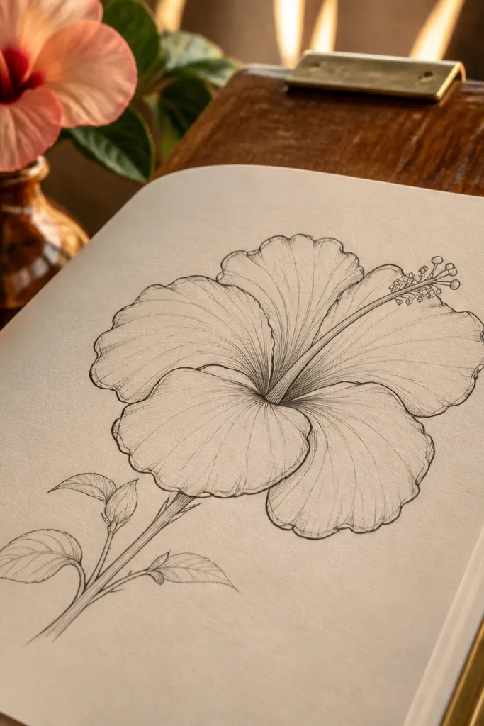
Line weight is how your hibiscus stops looking like a coloring-book outline. This tutorial trains you to treat the outer silhouette and overlap edges as darker, while keeping inner vein lines lighter. The result looks more dimensional even with minimal shading. It’s also fast because you can do a complete drawing with just two passes: light construction lines, then a bold edge pass.
Start with HB guidelines for the center and five petals. When the shape is correct, switch to a 2B for the outer silhouette and any overlap edges between petals. Keep vein lines at HB or a lighter pencil grade so they stay delicate, then erase any construction lines only after the edge pass.
Use a kneaded eraser to lift construction lines gently so you don’t tear the paper or scratch the petal edges.
Don’t outline every vein — that makes the flower look like a stamped pattern.
5. Petal Overlap Layout for a 3D Hibiscus
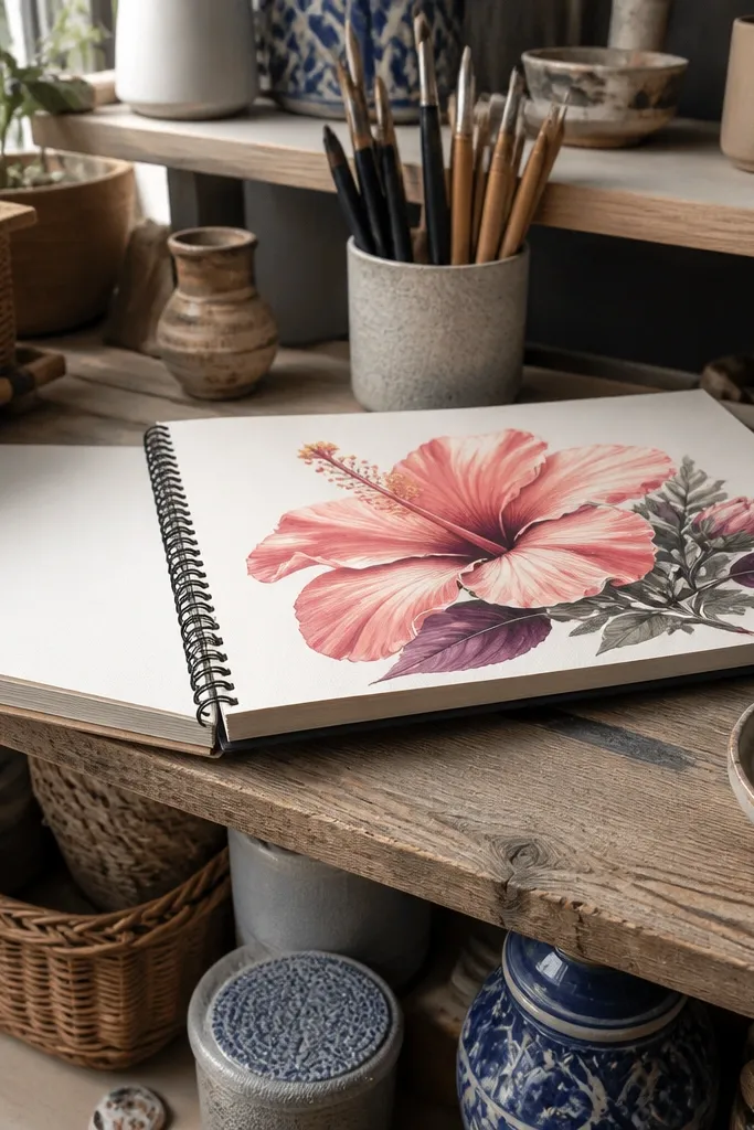
Draw the center first, then sketch five petals but lightly mark one as the front petal. Add an overlap rule: each petal behind gets a slightly hidden edge and a small shadow line at the contact point. After the overlap map is correct, shade only the overlap contact areas with a dark pencil, then add a mid tone to the front petal face.
If your hibiscus looks like five petals sitting flat on a page, overlap layout is the fix. This tutorial forces you to decide which petals sit in front and which tuck behind. Overlap creates instant depth through simple shadow placement. You’ll still keep it quick because you’re not building a complex background — you’re just making the petal layers behave.
AvoidDon’t shade the whole back petals — shadow should live at the overlap seams.
Pro tipPick one front petal and commit. The drawing gets easier when you stop trying to make all petals equally visible.
6. Two-Value Petal Rendering for Speed
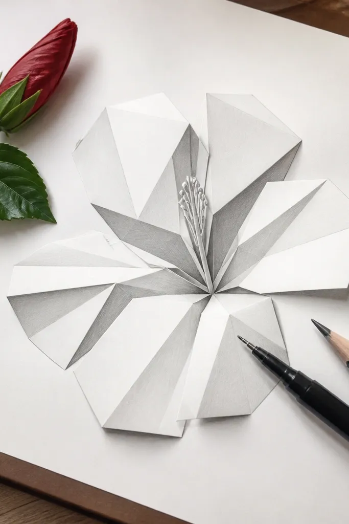
This tutorial is for when you want a finished hibiscus in under 25 minutes. You only use two values: bare paper for light and a single dark tone for fold shadows. That keeps the drawing from getting muddy and makes it easier to stop early without feeling like you failed. The petals still look dimensional because the dark is placed where folds and overlaps happen.
Sketch petals as tear-drops and add vein direction lines lightly. Choose one dark pencil grade (2B or 4B) and use it only for fold shadows near petal bases and overlap edges. Leave everything else unshaded. Finish with a darker outer outline so the flower pops without needing a full gradient.
If you’re unsure where to shade, look for the “contact line” where one petal touches another — that’s your dark location.
Don’t add mid-tone gradients. Two-value work stays clean only if you keep it simple.
7. Dry Brush Texture on Petal Edges (Clean and Fast)
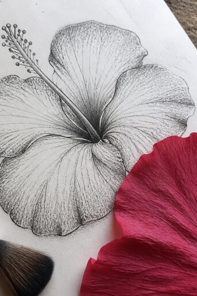
After you place the petal shapes and center, shade the mid tone lightly across the petal face. Then load a blending stump or tissue with very little graphite and lightly drag it along the outer edge direction. Add a few darker texture touches near the vein lines, and keep the petal highlight strip mostly clean.
Texture makes hibiscus petals feel alive without complicated realism. This tutorial uses a controlled, light texture pass along the petal edges and near veins, instead of full-surface shading. It’s a great option when your drawings look too smooth or flat. You’ll keep the center crisp and let texture do the heavy lifting on the petals.
AvoidDon’t over-texture the center — it makes the stigma and anthers look blurry.
Pro tipUse the tissue corner to test your pressure on scrap paper. You want whisper-thin texture, not smears.
8. Ink Outline + Pencil Veins Combo
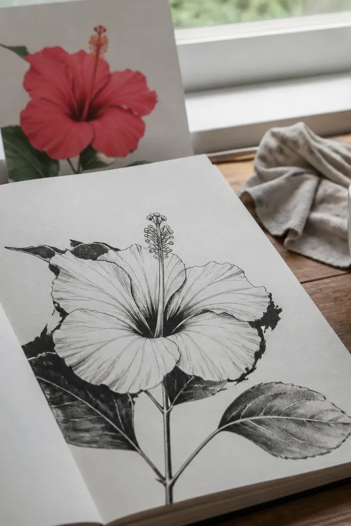
Do all construction in HB first. When you’re happy with the shapes, outline the flower silhouette and overlap seams using a fine liner. After the ink dries, erase remaining construction lines, then add pencil vein cues and light shading inside the petals.
This tutorial gives you crisp readability without losing the softness of pencil shading. You ink only the silhouette and overlap edges, then add pencil veins and shading inside. It’s a good choice when you keep losing the petal edges during erasing. The final look is clean enough for a sketchbook page and forgiving enough for beginners.
AvoidDon’t ink the entire vein network. A few key veins look better than a full etched pattern.
Pro tipInk the edges last — if you ink too early, you’ll be afraid to erase and your construction stays messy.
9. Hibiscus in Profile Angle (Tilted Petal Fan)
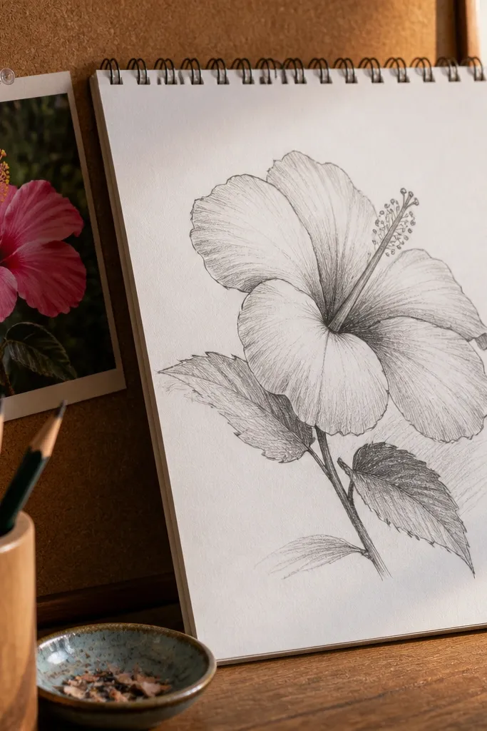
A front-facing hibiscus is easy to copy but hard to make interesting. This tutorial teaches a simple angle shift: tilt the petal fan so petals overlap more on one side, and the center looks slightly off-axis. That gives you depth and variety fast. It also trains your brain to draw hibiscus as a 3D object instead of a flat flower symbol.
Sketch an ellipse for the petal base plane, then place the center slightly off the ellipse center. Draw five tear-drops around the tilt, but shorten the far-side petals a touch and overlap them more tightly. Add shading only where the tilt creates overlap and keep the near edges slightly darker.
Shorten the far petals by erasing and re-drawing smaller tips, not by stretching the whole petal.
Don’t keep all petals symmetrical when the flower is tilted — symmetry kills the angle.
10. Center Glow Petal Highlights (Save the White)
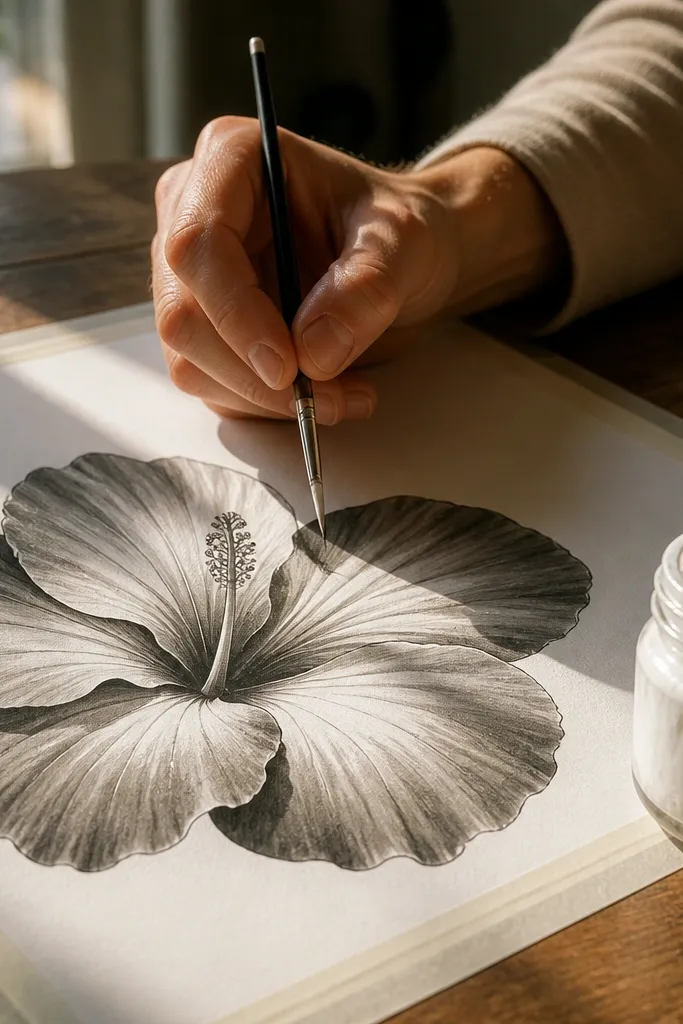
This tutorial makes hibiscus look glossy and fresh by protecting highlights. Instead of shading everything, you intentionally leave a clean highlight strip that curves around each petal. The center glow effect happens because the highlight edges sit adjacent to darker fold shadows. It’s a simple technique that makes your drawing look more polished without blending-heavy work.
Place petals and veins lightly first. Shade mid tone across the petal face, then add dark fold shadows at overlap seams and vein seams. Before you darken too much, erase a narrow highlight strip along the petal outer edge and keep it mostly bare paper.
Use a kneaded eraser to lift graphite gently after the mid tone is dry to the touch.
Don’t scrub the highlight strip too early — you’ll lift paper texture and get patchy results.
11. Minimal Hibiscus Outline with Vein Markers
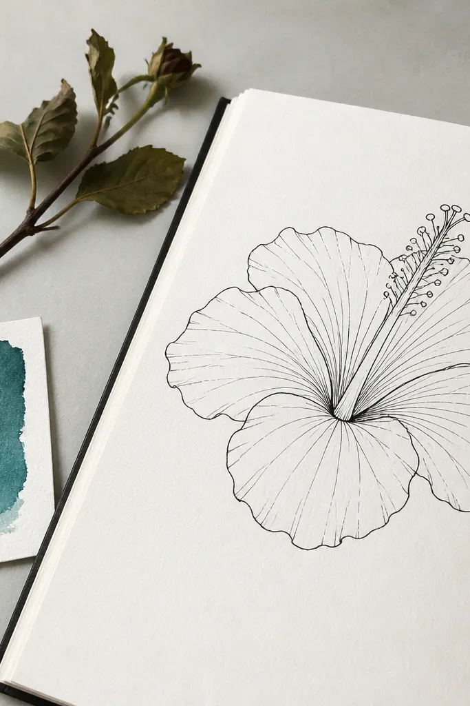
Some days you want a hibiscus drawing that finishes fast and still looks like a hibiscus. This tutorial keeps detail to the essentials: outline, petal folds, and a few vein markers that imply the rest. It’s great for sketchbook practice because you can draw the flower repeatedly without getting bogged down. The realism comes from placement, not from drawing every tiny line.
Draw the center and five petals with light guidelines. Then darken the silhouette and the major overlap edges. Add 3-4 curved vein markers per petal, stopping before they reach the outer tip so the drawing stays airy.
Stop your vein markers early. Let the viewer’s brain fill the rest.
Don’t add full shading. Minimal hibiscus stays strong when it stays light.
12. Petal Tip Splits and Soft Notches
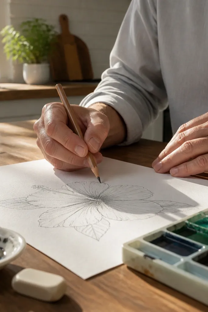
Sketch five tear-drops but keep the tips light and slightly open. Add a tiny notch or split near the tip, then slightly thicken the base of that notch with a darker pencil. Shade lightly near the notch to suggest the fold, and keep the rest of the petal tone simple.
Hibiscus tips often have a soft split or notch that makes the flower look delicate instead of blunt. This tutorial teaches you to draw that taper behavior so your petals don’t look like perfect teardrops every time. It’s a small change that upgrades the whole drawing. You’ll learn it quickly because you’re focusing on just the last third of each petal.
AvoidDon’t overdo the split. Too much notch turns it into a different flower silhouette.
Pro tipPractice the notch shape on scrap paper first. A tiny curve is all you need.
13. Realistic Vein Map with 6 Curved Lines
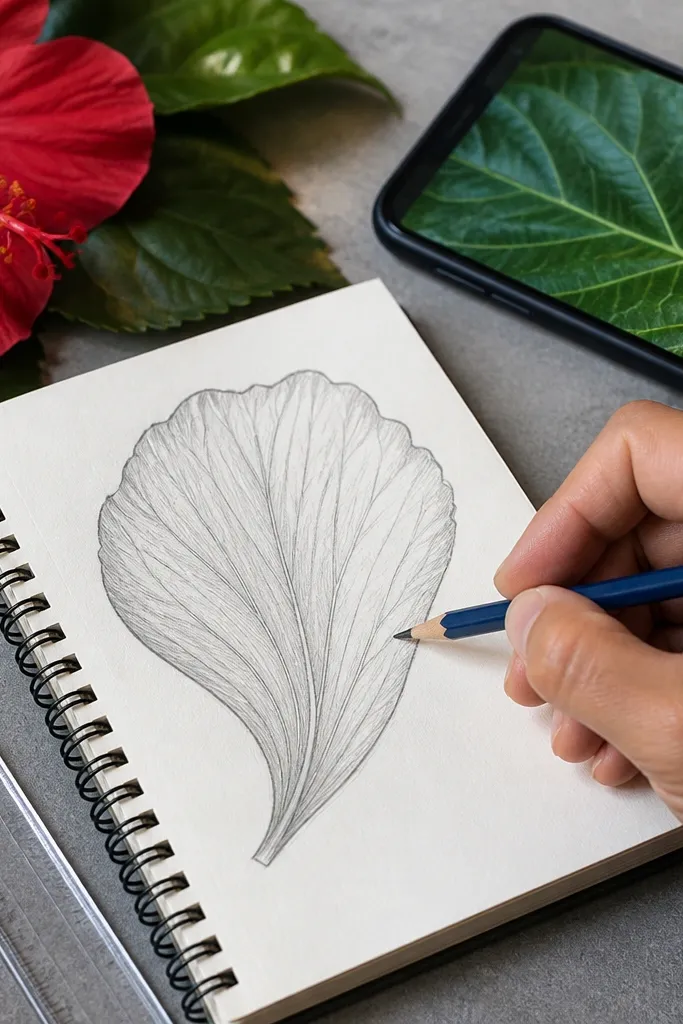
After the petal shapes are correct, place six curved vein lines per petal using HB. Keep them uneven in spacing — hibiscus veins are not perfectly measured. Then add a light mid tone, and darken along 2-3 of the veins with short strokes that follow the vein curve.
This tutorial improves your hibiscus realism by giving you a repeatable vein pattern. You draw a set number of curved lines that fan from the petal base toward the center and tip. Then you shade around those lines so they look embedded in the petal surface. It’s still fast because you’re not drawing dozens of micro-veins.
AvoidDon’t make the veins straight. Hibiscus veins curve toward the center and then sweep outward.
Pro tipUse a light, consistent pressure for vein lines; the dark comes from shading near them.
14. Back Petals and Sepal Drop Shadow
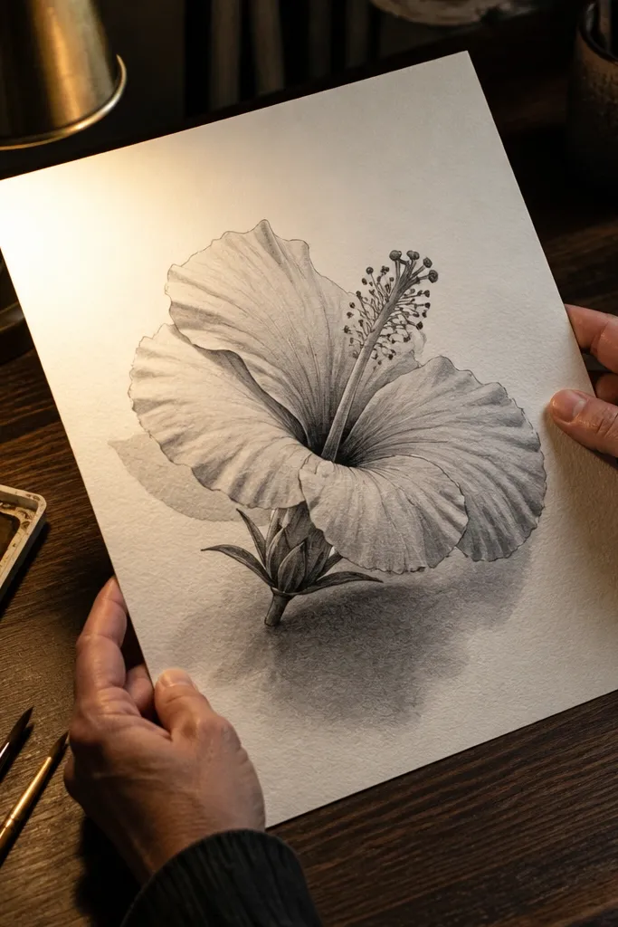
Sketch the center and front petals first. Then add two back petals behind the front set, making them slightly smaller and more tucked. Draw a simple sepal shape under the center and shade a soft dark drop shadow where the front petals overlap it.
Many hibiscus drawings look wrong because the back petals vanish. This tutorial adds back petals and the sepal area so the flower has a base and a sense of depth. The biggest win is the drop shadow under the petals toward the center — it makes everything else sit on something. You’ll finish quickly because you’re adding only a few shapes and one shadow area.
AvoidDon’t shade the sepal area the same darkness as the petal overlap — it should feel softer.
Pro tipKeep the back petals lighter. If they match the front tone, the flower loses its layering.
15. Crayon-Look Graphite Bloom (Soft Center Gradients)
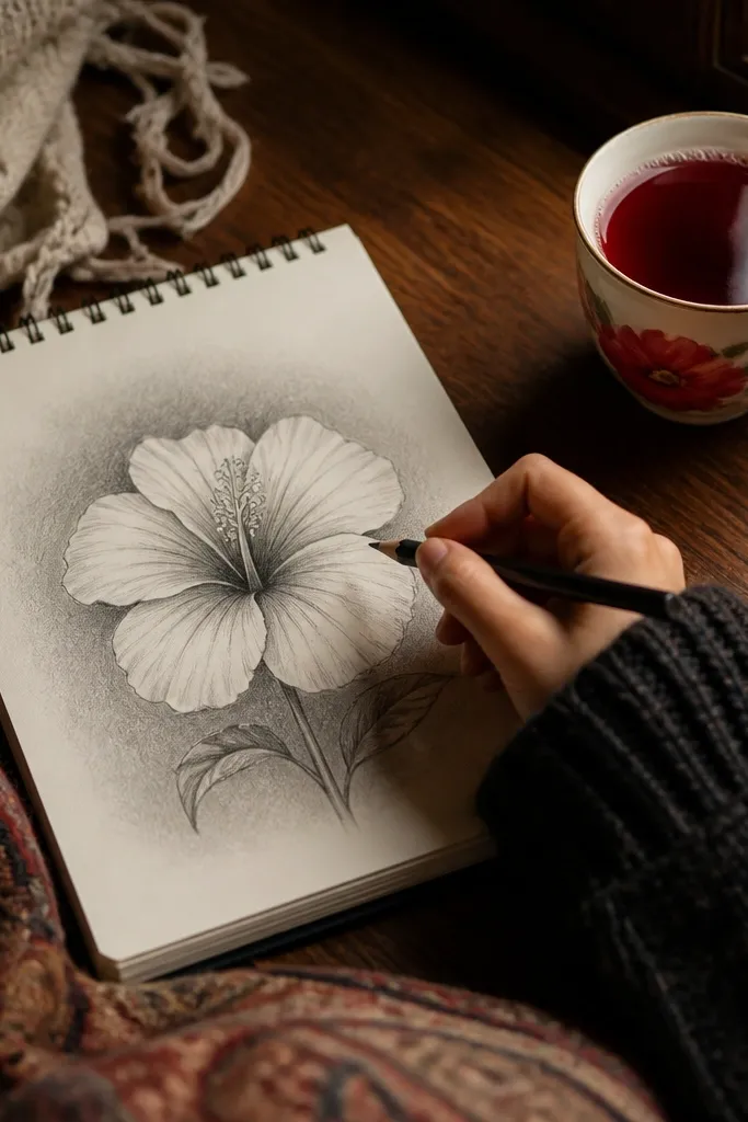
This tutorial gives you a painterly center without turning the whole flower into a gray haze. You focus a soft graphite bloom near the center where the stigma and anthers create a darker focal area. The petals stay clearer, with only light blending near the core. It’s a good option if your hibiscus centers look empty or flat.
Build petals and veins lightly with HB. Then darken the center core with 2B, and use a blending stump to gently feather outward only within a small radius around the center. Keep the outer petal edges unblended and use pencil strokes there instead.
Feather in circles with minimal pressure. Stop while it still looks controlled.
Don’t blend across the vein lines — that kills the petal structure.
16. Monochrome Hibiscus with Hard Shadow Shapes
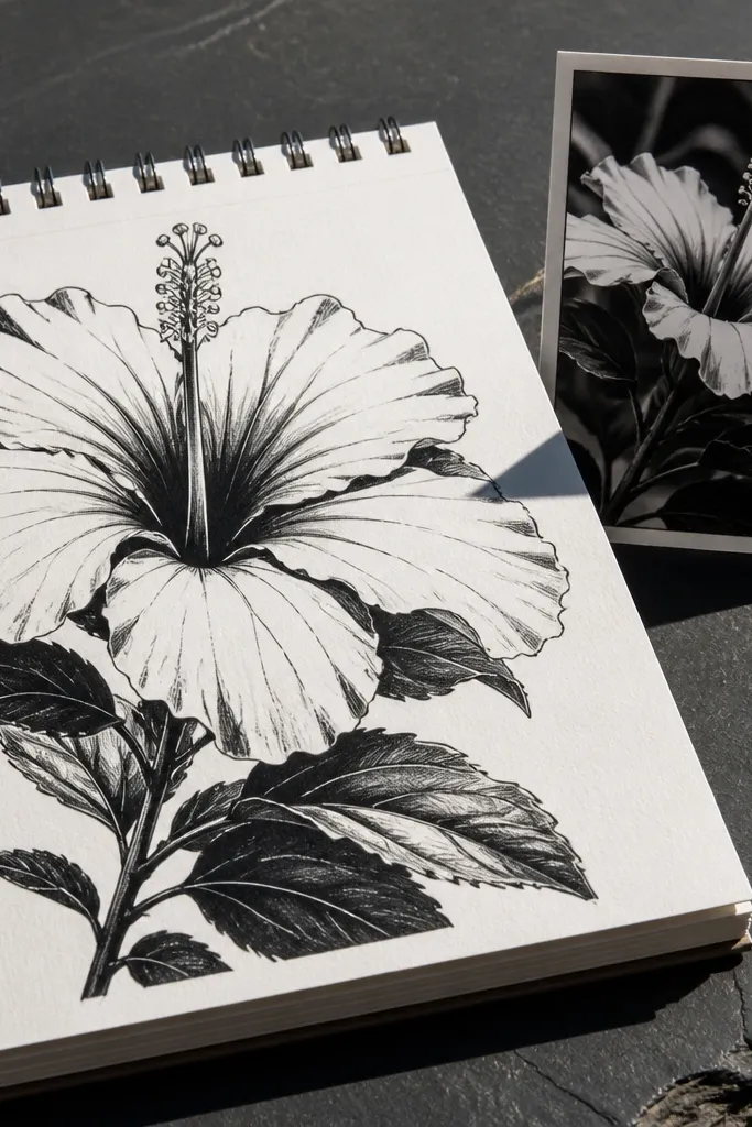
Sketch petals and center with HB. Then decide where the light direction is and draw hard shadow shapes on overlap seams and fold lines using 4B. Leave highlight zones as bare paper and keep shadows limited to those fold contact areas. Finish with a dark silhouette line where petals meet the background.
If you want dramatic contrast fast, this tutorial uses hard-edged shadow shapes instead of smooth gradients. Hibiscus still looks believable because the petal folds create naturally sharp shadow zones. You’ll get a bold drawing that reads well from a distance. It’s also easier to control because you’re drawing shadow shapes like shapes, not blending tones.
AvoidDon’t start adding soft shading after hard shadows. Mixing styles makes the drawing look confused.
Pro tipPick one light direction and stick to it. If you change mid-drawing, shadows contradict each other.
17. Color-Study Style in Pencil (Fake Color with Value)
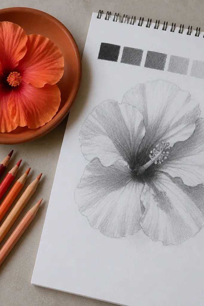
You don’t need actual color to study hibiscus patterns. This tutorial teaches you to translate color into value blocks: darker bands where pigment would be deeper, lighter areas where petals catch light. The result looks like a color study even in graphite. It’s fast because you work in sections, not by rendering every detail.
Sketch petals and veins lightly. Then block in dark value bands along the petal base and near the center, using 2B or 4B. Keep other areas lighter and add a mid tone wash with light pencil strokes. Add vein cues on top lightly so the value blocks don’t look flat.
Use a separate pass for value blocks. Don’t try to draw veins while you’re still building the darkest areas.
Avoid heavy shading everywhere. Value-block hibiscus needs clear light zones to read.
18. Hibiscus Bud and Half-Open Petal Practice

Draw a bud base as a small oval or teardrop. Then sketch 3 visible petals that are more folded and partially hidden. Place the center core inside the opening, then shade the inside of the fold with a darker tone and leave the outer petal edges lighter.
If full hibiscus petals feel too hard, practice the half-open version. This tutorial teaches you how petals wrap and overlap when the flower isn’t fully spread. You still get the same center core behavior, but the petal shapes are simpler because fewer petals show at once. It’s a great fast drill because you can repeat it without spending ages on perfect symmetry.
AvoidDon’t draw five fully open petals. Half-open practice works because the structure is partially hidden.
Pro tipKeep the bud opening narrow. A narrow opening makes the half-open look believable immediately.
19. Quick Hibiscus with Reference Grid Layout
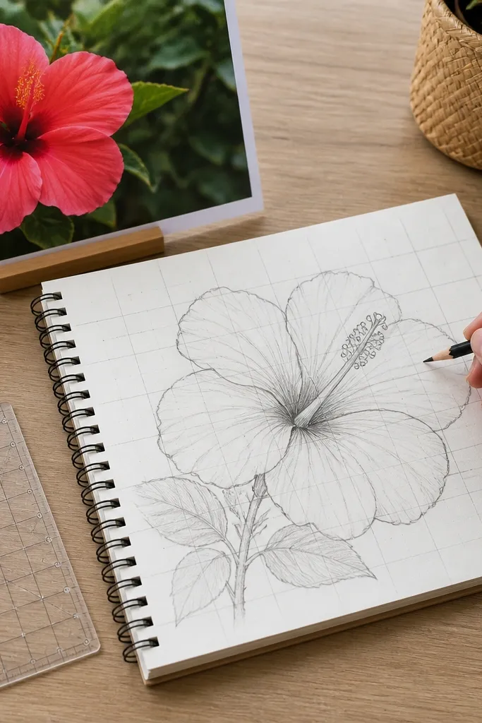
Pick a reference photo and lightly draw a grid on your paper with 1 cm squares. Sketch the center in the correct square, then block in each petal corner by corner. Remove the grid lines, then do your final outline pass with 2B and add a light three-value shading pass.
This tutorial is for when your hibiscus proportions keep drifting. A simple grid layout gives you instant control over petal size, center placement, and tip angles. You’ll still draw in pencil and keep the session quick, but your flower will land closer to the reference from the start. The look is clean because you erase the grid at the end and finish with line weight and light shading.
AvoidDon’t leave the grid lines in the final. If they show through, the drawing looks unfinished.
Pro tipUse larger squares for speed (1-1.5 cm). Smaller grids slow you down and tempt over-detailing.



