
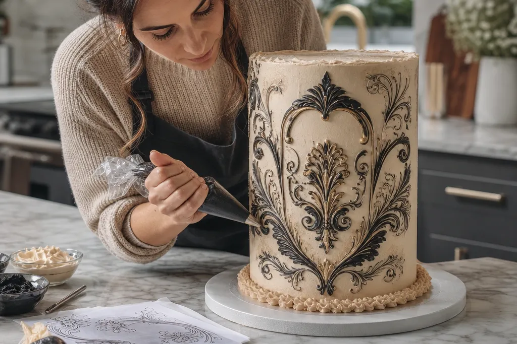
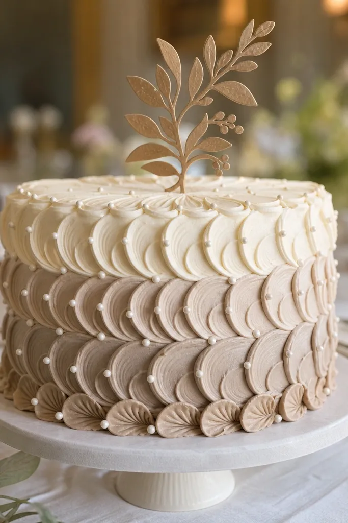
1. Monogram Crest in Gold-Edge Ink
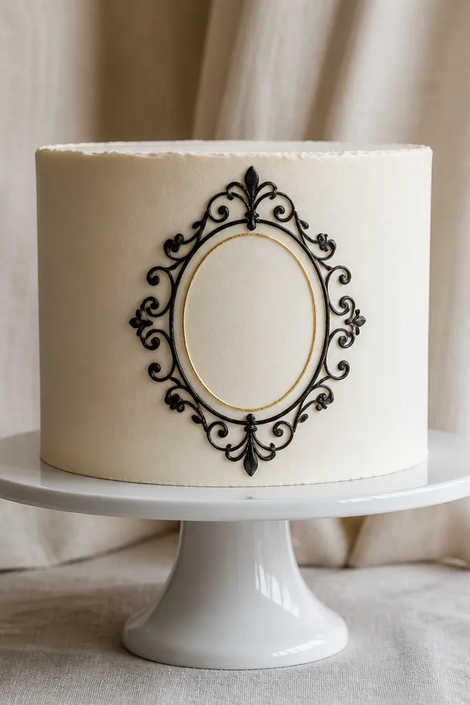
This looks expensive because it behaves like stationery: a tight monogram, a crisp crest outline, and a metallic edge that catches light. The key is layering: you draw the monogram in deep black first, then add a thin gold “frame” line that runs just inside the border so it reads like printed foil. Use a smooth, matte base so the gold doesn’t scatter. Skill level is beginner-friendly if you keep the monogram simple and center it — you spend most of your time on alignment, not art. Plan on 45-75 minutes including drying and chilling.
Start by sketching a single letter monogram inside a shield shape on parchment. Trace the drawing with edible black gel in a piping bag fitted with a #1.5 or #2 tip, then let it set 10-15 minutes. Roll out a thin sheet of fondant or use a smooth buttercream finish, then place the parchment drawing on top briefly as a transfer guide and carefully pipe over the guide onto the cake. Finish by brushing luster dust mixed with clear alcohol along the inner border line, using a fine 000 brush for a consistent gold edge.
Use a ruler for the crest proportions. Even a slightly off shield shape makes it feel DIY.
Don’t flood the lines with watery ink — thin gel wins for crisp luxury edges.
2. Caviar Dot Border with Ink Calligraphy
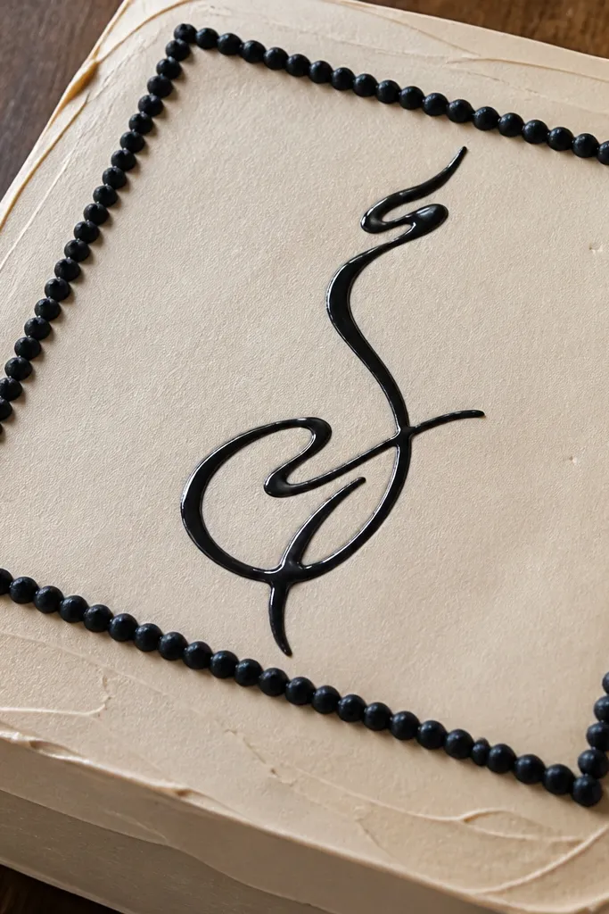
Luxury doesn’t always mean metallic. This design looks high-end because the texture is intentional: a tight caviar dot border frames a single line of calligraphy, like a couture invitation. The dots create depth and a premium finish without needing a complicated picture. Use a deep black or espresso color for the dots and keep the calligraphy thin and flowing. It suits small cakes and tall sides because the border reads from multiple angles. Expect about an hour of work for a clean result, plus chilling time.
Pipe a neat border guide on the cake using edible black gel with a fine tip. Then load a slightly larger tip (like #2.5) and pipe uniform tiny dots along the guide, spacing them evenly. After the dots set 10 minutes, pipe one calligraphy line in black gel across the center using a smaller tip for thinner strokes. Let the top set fully, then optionally add one highlight stroke with gray-gold luster dust to make the calligraphy look like ink with sheen.
Pro tipPractice dot spacing on a scrap of parchment. Uniform spacing is what makes it feel expensive.
AvoidSkip the glitter everywhere. One highlight pass is enough; extra sparkle makes it look costume-like.
3. Botanical Line Art with Pressed Leaf Texture
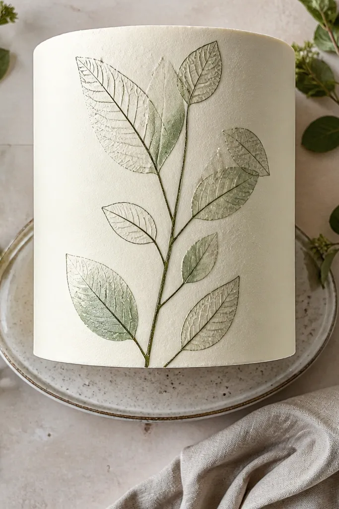
This works because it mixes two luxury cues: delicate line work and micro-texture. The pressed leaf texture gives the drawing a believable “printed” feel, while the botanical outlines stay crisp and elegant. Keep the palette limited: one dark green-brown ink line and one soft sage highlight. It looks best on a satin-smooth surface, not a fluffy buttercream. Skill level is moderate only because you have to control the pressure when creating the texture, but the drawing itself is straightforward. Plan 60-90 minutes.
Roll fondant thin and chill it so it holds texture. Place a real leaf (like a small parsley leaf or delicate herb leaf) on the fondant and press gently, then remove carefully so you leave a faint embossed pattern. Dust the embossed areas lightly with edible pigment in sage, then draw botanical stems and small leaves using edible gel color mixed with a tiny bit of clear alcohol for smooth flow. Add a final thin outline in darker green-brown using a fine tip, then seal lightly with a matte edible glaze so the pigment doesn’t smear.
Pro tipUse leaf veins for texture — broad flat leaves can leave messy shapes on fondant.
AvoidDon’t press too hard. Deep embossing makes the drawing look dented instead of printed.
4. Architectural Blueprint Lines on Porcelain White
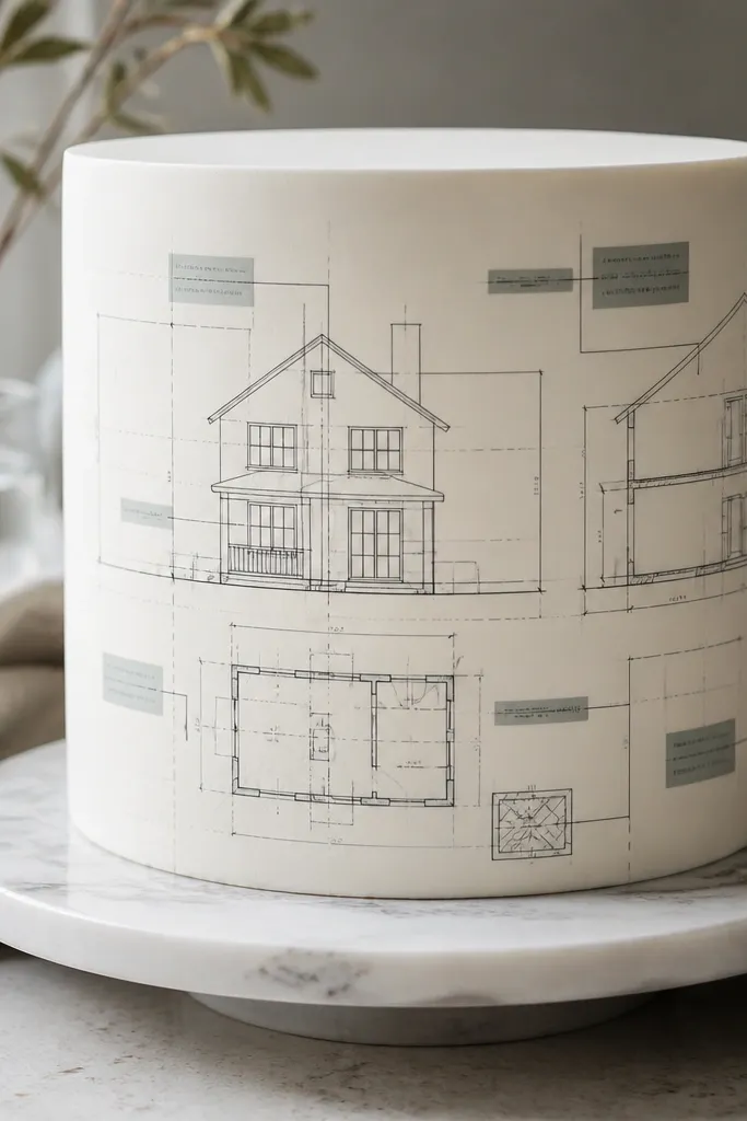
Blueprint drawings look expensive because they have a strict system: thin lines, labels, and measured spacing. The trick is to keep your line hierarchy — primary lines are darker and thicker, secondary lines are thinner and lighter, and labels are small and tidy. This design reads premium on porcelain white because the blue pops cleanly. It suits modern weddings, office celebrations, and any cake where you want a graphic, not floral, look. Time is about 1-2 hours depending on how many labels you add.
Start by sketching a simple floor-plan style layout on paper, then transfer it to parchment with a light pencil. Use edible blue gel for the main lines and a thinner mixture (blue gel cut with clear alcohol) for secondary lines. Pipe the lines onto the cake with a fine tip, then add tiny labels using a #1 tip and a steady hand. Let it set, then brush very lightly with a translucent pearl dust around the edges of the blueprint paper to mimic studio paper sheen.
Use two blue shades: one dark (navy) and one pale. One shade flattens the whole blueprint effect.
Don’t make every line the same thickness — that’s the quickest way to lose the blueprint “precision” look.
5. Marble Vein Wash with Ink-Outline Veins
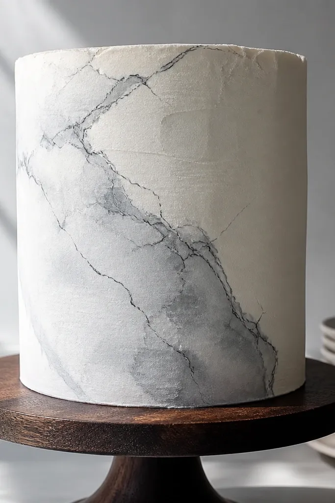
Marble drawings look expensive because they’re controlled chaos. You get soft movement from a wash, then crisp vein edges from fine ink lines. The expensive look comes from restraint: white space stays clean, gray veins are varied but not muddy, and the final outline is thin. This suits minimalist cakes and tall sides because the veining can wrap naturally. It’s moderate skill because marble takes patience, but you don’t need artistic talent — you need good dilution and timing. Give yourself 90 minutes.
Spread a smooth white base and chill it until firm. Mix gray gel color with clear alcohol to a watercolor consistency, then dab and drag lightly to form marble veining. Immediately after the wash sets slightly (about 2-4 minutes), outline the strongest veins with deep gray or black edible ink using a fine brush or piping tip. Add one or two highlight streaks with a silver luster dust in a thin pass, then let the cake set 20-30 minutes before serving.
Pro tipWork in small sections. Marble looks best when you stop before the wash fully spreads.
AvoidDon’t overwork it with repeated strokes. Marble loses luxury when it turns into gray smudge.
6. Silk Scarf Curves with Pearly Edge Highlights
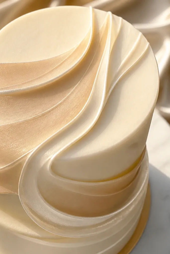
This design reads like a luxury scarf because it uses flow lines and a controlled sheen. Instead of hard shapes, you draw curved bands that look like fabric folds, then add a pearly edge highlight that follows the curve. The base should be neutral (ivory, warm white, or pale beige) so the pearl feels like light passing over satin. It’s a strong choice for cake tops and smaller panels. Time is about 60-75 minutes because you’re building smooth curves, not filling lots of detail.
Tint your base a warm white or ivory and smooth it flat. Mix a few gel colors into a soft palette (like dusty rose and muted taupe) and thin them with clear alcohol for wash-like strokes. Draw 3-5 flowing curved bands across the top, keeping the spacing even. After the colors dry 10-15 minutes, paint a thin pearly highlight line along one edge of each band using luster dust mixed with alcohol and a fine brush.
Pro tipKeep curves consistent in direction. A single wobble band makes the whole scarf feel homemade.
AvoidSkip heavy glitter. Pearl dust in a thin edge line looks expensive; chunky sparkle looks cheap.
7. Gilded Frame with Tiny Black-and-White Etching
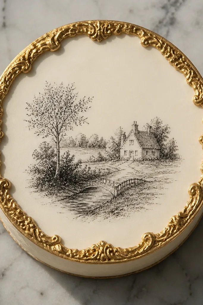
This looks high-end because it mimics a gallery print. You get a clean gold frame, then a miniature black-and-white etching inside with lots of negative space. The expensive part is scale: the inner lines are thin, the shading is light, and the frame is crisp. This suits square cakes and round cakes where you can center the framed panel. Skill level is moderate because you’re drawing small details, but you can simplify the etching to a leaf, a key, or a simple skyline silhouette. Plan 75-105 minutes.
Brush a thin gold line on the cake using edible gold paint or luster dust mixed with alcohol, then build a double-line frame (outer thicker, inner thinner). Create an etching pattern on parchment first: lots of tiny parallel lines for shading and a clear silhouette. Transfer by piping the etching lightly onto the cake with black gel and a #1 tip, staying inside the frame. Finish by adding a tiny shadow line at the frame inner edge using a gray-brown gel for depth.
Use a light touch for the etching. If your black is too bold, it stops reading as print-like and starts reading as marker.
Don’t let gold smear over the inside art. Wipe your brush often and work in small sections.
8. Chocolate-Transfer Lace Outline with Cocoa Shading
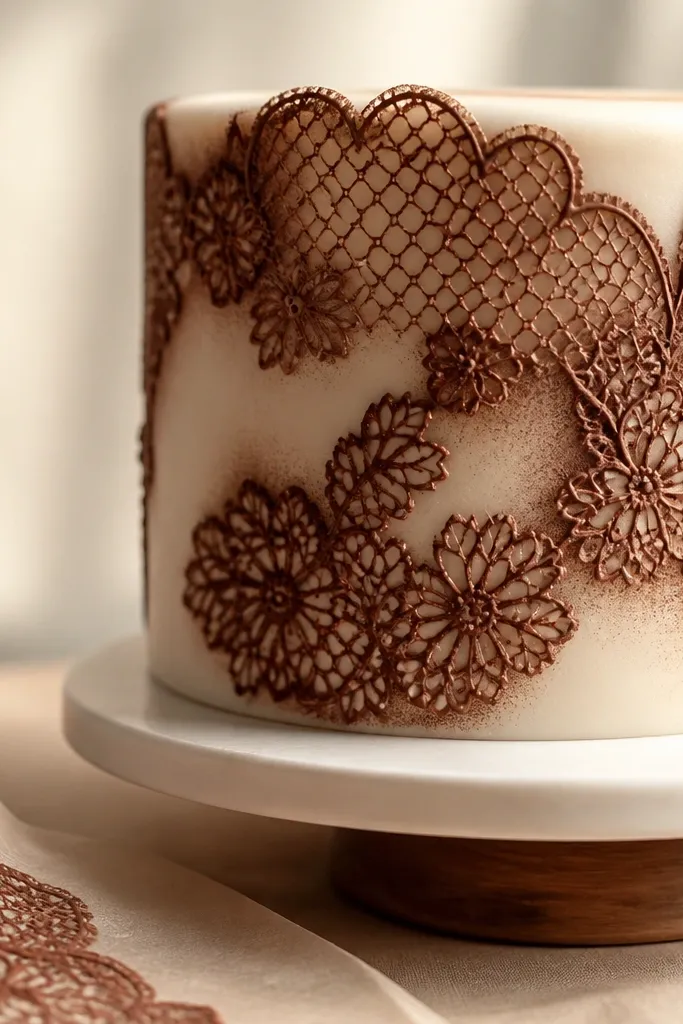
Lace drawings look expensive because they combine fine line work with a soft, edible “powder” look. This version uses chocolate transfer for the outline, then cocoa shading for the depth. It’s premium because the texture is real and dimensional, unlike flat piping alone. Keep the background smooth and pale so the lace reads sharply. This suits anniversary cakes and bridal desserts where you want a romantic but modern finish. Expect 1-2 hours plus time for chocolate to set.
Melt dark chocolate and temper it just enough to pipe smoothly (aim for a glossy, not grainy texture). Pipe lace lines onto a clear acetate sheet or parchment using a fine tip, then let it set until firm. Place the lace outline onto the cake surface, pressing lightly so it adheres. Dust cocoa powder mixed with a tiny bit of edible luster dust around the lace lines to deepen the negative spaces, then brush away excess with a soft dry brush.
Use acetate for cleaner transfers. Parchment can absorb chocolate and dull the edges.
Don’t skip tempering. Un-tempered chocolate looks dull and can smear when you move it.
9. Pearlized Fan Pattern with Micro-Line Geometry
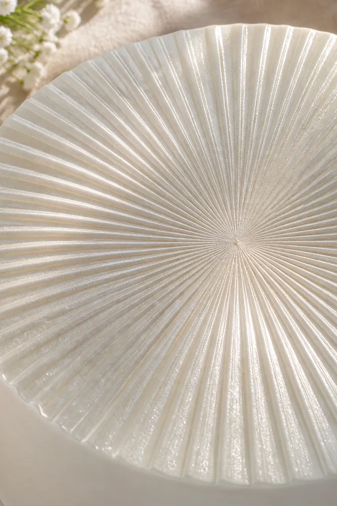
This looks expensive because the pattern mimics decorative stationery and jewelry engravings. The fan shape gives structure, while micro-lines add that “engraved” feel. Use pearl luster dust, not glitter, and keep your lines sharp and evenly spaced. It works great on cake sides or a top panel where you can repeat the motif. Skill level is beginner-friendly if you use guides, and it takes about 60 minutes. You’ll get a luxe effect without complex drawing.
Draw a fan guide on parchment with evenly spaced rays, then trace it onto the cake with a light pencil mark. Pipe the micro-lines using a fine tip with a very dark gray edible gel so they stay crisp. Use a wider tip or small brush to apply a pearl luster dust wash along the fan curves, staying between the rays. Once set, go back and add a thin highlight line on the outer edge of each fan curve with a lighter gray-gold mixture for depth.
Pro tipMake your guide first. Even spacing is what makes it feel engraved rather than freehand.
AvoidDon’t use black for everything. Dark gray gives you luxury contrast without harshness.
10. Art-Deco Sunburst with Champagne Metallic Steps
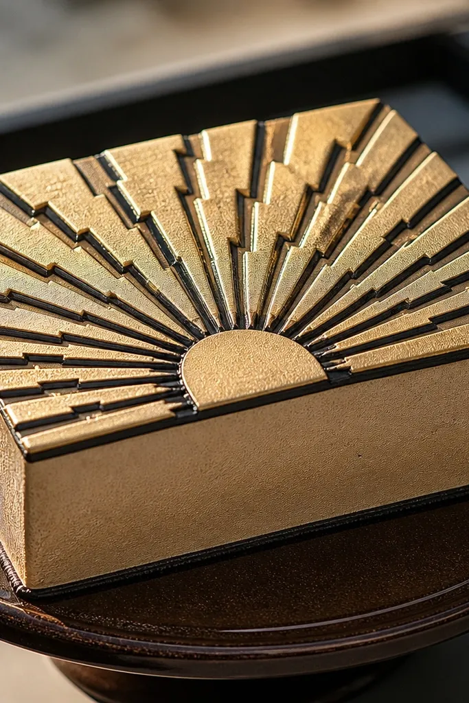
Art-deco sunbursts look expensive because they’re graphic and symmetrical — and symmetry reads premium instantly. This design uses stepped metallic shading so the rays look like they have depth, like etched brass. Use champagne metallic for the rays and a deep charcoal outline for crisp separation. It’s a strong choice for modern celebrations and looks amazing on a round cake top. Time is about 75-90 minutes if you keep the ray count consistent.
Mark a center point on the cake and decide on a fixed number of rays, like 24. Draw guide lines lightly, then pipe dark charcoal outlines for each ray using a fine tip. Mix champagne luster dust with alcohol to a paint consistency, and brush the metallic fill in alternating bands or in a stepped pattern (front edge darker, inner edge lighter). Finish by adding tiny dot accents at the base of each ray with matching charcoal gel.
Count your rays out loud while you pipe. Losing one ray breaks the premium symmetry.
Don’t paint metallic all the same tone. The step shading is what makes it look expensive.
11. Watercolor Bloom with Ink-Stamped Petal Edges
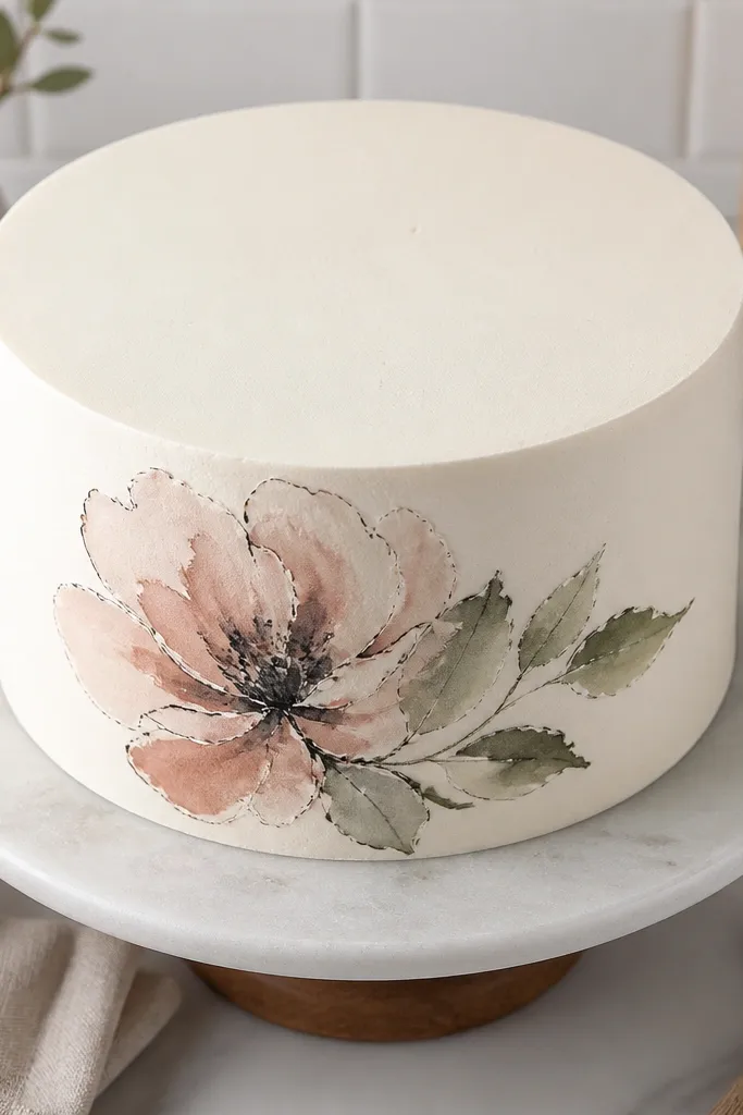
This reads high-end because it combines soft watercolor motion with crisp ink edges, like a fine illustration. The watercolor gives luxury softness; the ink stamps define petals so it doesn’t look messy. Choose one flower only, keep the background clean, and use a limited palette — two colors plus one deep accent is enough. It’s suited to single-tier cakes, cupcakes, and small panels. Skill level is moderate, mainly because you need to time the ink edges after the watercolor settles. Plan 60-90 minutes.
Tint gel colors with clear alcohol to a watercolor mix and test on parchment for flow. Paint one flower bloom with wet-on-dry strokes, leaving white space between petals. When the petals are set enough that the ink won’t bleed (after 5-8 minutes), stamp or outline petal edges with deep ink gel using a small brush or a fine tip. Add a tiny dot in the center with a gold luster dust for a premium focal point.
Use a damp brush for watercolor, not a wet brush. Too much water makes edges feather and cheap-looking.
Don’t outline too early. If the watercolor is still wet, you’ll get fuzzy ink blobs.
12. Nouveau Vines with Black Enamel Look
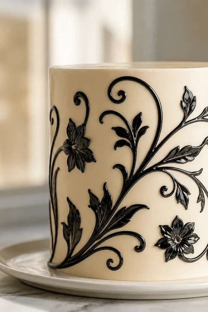
This design looks expensive because the lines mimic enamel jewelry: dark, smooth, and glossy. Nouveau vines also feel classic without needing huge scenes, so you keep it neat and intentional. The secret is a two-layer finish: deep black lines first, then a thin gloss layer that makes them look coated. Choose a pale base like buttercream satin finish or rolled fondant dusted lightly. Skill level is beginner to intermediate, and it takes about 60-80 minutes.
Pipe the vine lines on the cake using edible black gel with a fine tip, drawing continuous curves and small leaf curls. Let the lines set 10-15 minutes in the fridge. Mix a tiny amount of edible glaze or clear piping gel with a drop of clear alcohol to keep it brushable, then paint a thin coat over the black lines only. Chill again briefly so the surface tightens and becomes glassy.
Keep the vine line thickness consistent. Enamel shine looks best when the shape is clean.
Don’t coat the whole cake top with gloss. Only the lines need that jewelry look.
13. Gemstone Cascade with Faceted Color Blocks
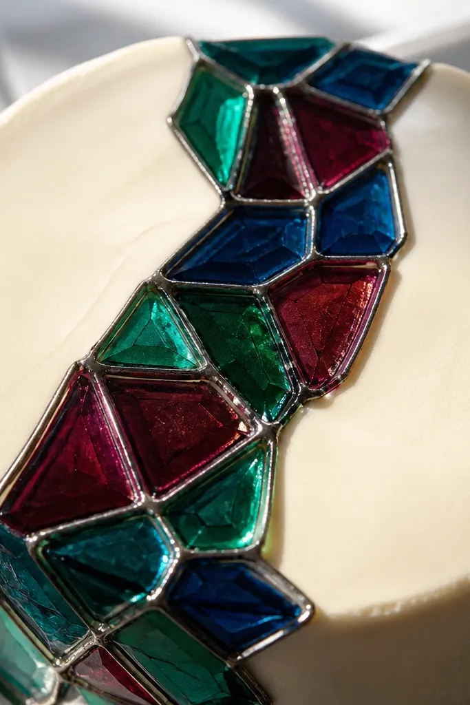
This looks luxurious because gemstones are all about facets, edges, and highlight logic. You’ll create that effect with crisp color blocks separated by thin dark lines, then add highlight streaks on each “facet.” Pick 3-4 jewel tones and one metallic edge color (silver or gold luster) so it feels like jewelry design, not candy. This fits modern cakes and celebration tiers where you want a bold focal point. Time is about 90 minutes because you’re building the facet grid carefully.
Draw a cascading shape on the cake with light guide marks, then sketch facet outlines on parchment for consistency. Pipe dark charcoal lines between each facet using a fine tip, then fill each facet with gel color thinned slightly so it levels without bleeding. After the colors set 10 minutes, paint tiny highlight strokes along the top edge of each facet using white gel or pearl dust mixed with alcohol. Finish by adding a thin metallic line around the outer contour of the cascade.
Use ruler-like spacing for facet widths. Even 1-2 uneven facets makes it feel less premium.
Don’t blend facet colors together. Gemstones look expensive when edges stay razor clean.
14. Gold Leaf-Style Transfer with Burnished Lines
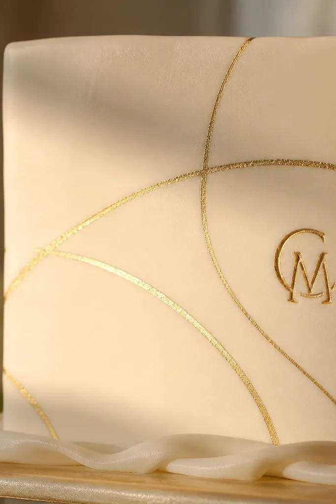
Gold leaf-style art reads expensive because it has that warm, irregular shimmer, plus sharp placement. This idea uses a gold transfer look without messy real leaf — you get the same effect with edible gold paint and a burnished finish on select lines. Keep the drawing minimal: a few sweeping curves, a monogram, or a small floral sprig. It suits cakes that already have texture — like smooth buttercream or light fondant. Time is about 45-70 minutes.
Apply a thin base coat of edible gold paint or luster dust mixed with alcohol onto parchment in a few irregular strokes. Let it set until tacky, then press lightly onto the cake where you want the leaf effect. Use a fine tip to draw a crisp outline around the gold transfer strokes with deep brown or black gel. Finally, burnish the gold edges with a clean dry brush or soft cotton so the shimmer looks controlled and not patchy.
Pro tipWork with tacky gold, not wet gold. Wet gold smears; tacky gold transfers the pattern cleanly.
AvoidDon’t cover the whole design in gold. Sparse gold placement reads higher-end than full coverage.
15. Parchment-Piped Cameo Profile with Soft Shadow
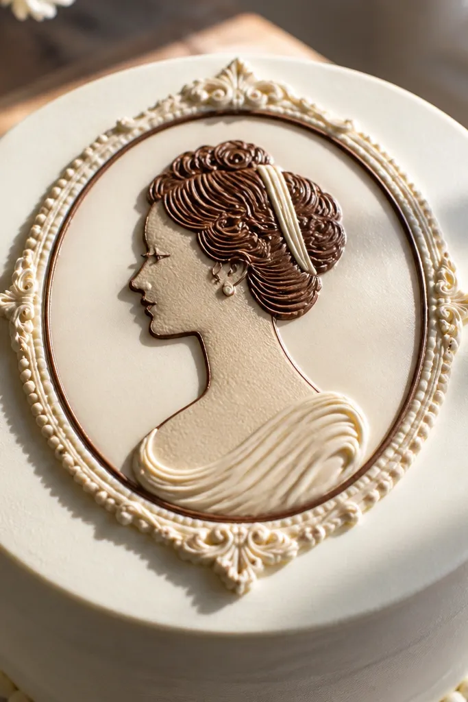
Cameo silhouettes look expensive because they’re classic and graphic. This version uses a parchment-piped silhouette so your edges are crisp, then adds a soft shadow so it feels raised like a carved medallion. Keep the background smooth and light, and use one dark tone for the profile plus a lighter highlight band. It suits wedding cakes, milestone birthdays, and any cake that wants a vintage but clean look. Skill level is moderate because you need to trace a profile cleanly, but the piping makes it manageable. Time is about 90 minutes including setting.
Print or sketch a simple cameo profile silhouette onto parchment and trace it with edible black or dark brown gel using a fine tip. Pipe the silhouette as a solid shape, then let it set until firm. Place the silhouette onto the cake top where you want it, securing lightly with a tiny dot of buttercream or clear piping gel. Add a soft shadow around it by brushing thinned gray-brown gel lightly with a small flat brush, then add a thin highlight line on the cameo edge with white gel.
Pro tipMake the cameo silhouette slightly smaller than you think. The negative space reads luxury on cakes.
AvoidDon’t rush the set time. If the piped silhouette is still soft, it will smear when you move it.



