
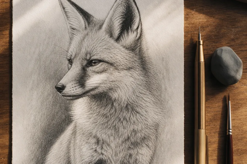
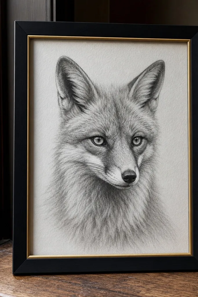
1. Charcoal-Soft Portrait with Carved Highlights
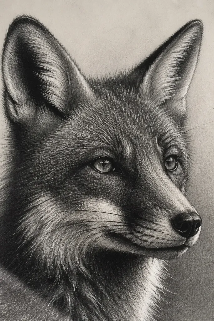
This look reads high-end because the fur transitions are smooth, but the highlights stay sharp where the form catches light. Start with a light graphite underdrawing, then build the shadow pockets around the nose bridge, inner ears, and under the jaw with charcoal or very soft pencil. Luxury happens when you carve back the brightest fur using a kneaded eraser — you get clean edges without outlining every hair. The result is a fox portrait that feels gallery-warm, not sketchy, and it works especially well on medium tooth paper that holds pigment.
First, sketch the face with a 2H or HB pencil, keeping the eye sockets and muzzle shape simple. Then block the darkest areas with 4B to 6B (or charcoal), staying mostly in the shadow pockets rather than covering the whole face. Next, blend the midtones lightly with a stump, and carve the highlight lines on the muzzle and brow with a kneaded eraser. Finally, add a few short fur strokes only where the highlight meets midtone so the edge looks intentional.
Carve highlights after blending, not before — it prevents muddy edges.
Don’t shade the entire face evenly; leave light zones around the muzzle and forehead.
2. Ink Outline + Pencil Fur Mass Contrast
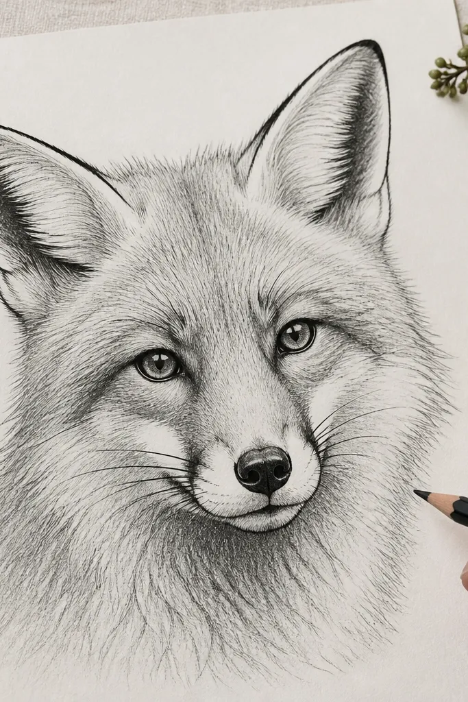
This is the easiest path to a high-end fox drawing luxury feel because the line work is crisp and the fur mass does the heavy lifting. Use ink for the outer contour and key facial features so the silhouette looks designed, then use pencil to create fur texture only in the areas that need depth. The contrast between hard ink lines and soft graphite fur makes the fox feel finished, like a print. It suits framed work and journal art because it stays readable even when you reduce detail density.
Start by lightly penciling the fox pose and face proportions, then trace the outer contour with a 0.3 or 0.5 fineliner. Add ink accents only where you want structure: outer ear edges, eyelids, and the nose/muzzle boundary. Then shade the fur mass with 2B to 4B pencil using directional strokes that follow the cheek and neck planes. Finish by lifting tiny highlight marks on the muzzle with a kneaded eraser and darkening the under-chin shadow with a 6B.
Let ink dry fully before shading so you don’t smear the contour.
Avoid drawing fur with ink everywhere; it turns into a flat pattern.
3. Minimal Line Fox with One Dramatic Shadow
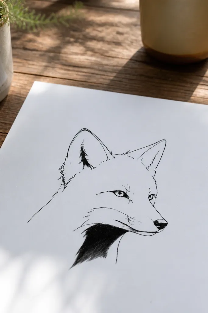
This look is expensive because it’s controlled — fewer marks, better marks. You keep the face clean with minimal linework, then commit to one deep shadow pocket under the chin or inside the ear fold. Luxury comes from restraint: the viewer’s eye fills in the fur, and the shadow gives form. It works best on bright white paper and with a 0.5 fineliner plus one soft pencil for the shadow. Great for small spaces where you want impact without hours of rendering.
First, draw the fox outline and facial landmarks with a light HB pencil, then ink the contour and eye area with a single fineliner. Keep fur strokes sparse and short, mostly indicating direction on the cheeks and forehead. Next, choose one shadow pocket — under the chin is easiest — and fill it with 4B to 6B in a smooth gradient. Finally, add 5-10 tiny highlight cuts on the muzzle using a kneaded eraser so the face stays lively.
Pro tipPick the shadow pocket first, then draw the lines so they point toward it.
AvoidDon’t add a second heavy shadow area; it kills the luxury simplicity.
4. Burnished Fur Texture with Blending Pencil
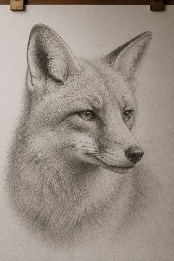
This one looks high-end because it mimics the way fur reads under soft light — you see mass first, then texture. Burnishing with a harder pencil (like 2H/HB) over a light base creates a satin sheen that feels polished. You still add fur direction, but the strokes are lighter and fewer, so the drawing doesn’t look like it’s trying too hard. This is a strong choice if you want a clean, modern luxury look rather than a gritty charcoal vibe.
Start with a light sketch and a thin midtone layer using HB, focusing on muzzle and cheek planes. Then shade the main fur mass with 2B, using directional strokes but keeping pressure moderate. Next, burnish over the midtones with an HB or 2H pencil using gentle, repeated passes until the surface looks smoother. Finally, add darker accents in the ear fold and under the jaw with 4B, and carve a few highlight lines on the muzzle.
Use a tissue to remove excess graphite before burnishing; it keeps the sheen even.
Don’t keep adding darker layers; burnishing is about smooth control, not darkness.
5. Warm Orange Wash Background, Cool Shadow Fox
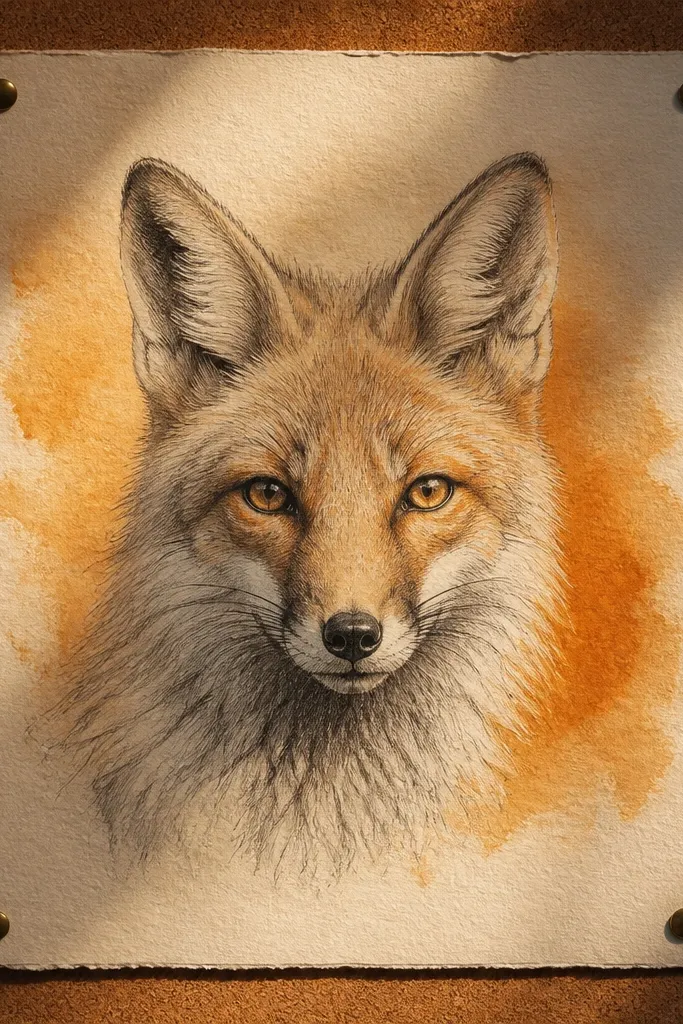
Luxury isn’t only about line — it’s about color balance. This look uses a warm orange background wash to make the fox feel expensive, while the shadows stay cool gray so the face pops. If your fox drawings look “flat,” the background temperature is often the missing ingredient. You keep fur mostly in pencil, then let the wash do the atmosphere. It’s ideal for mixed-media paper and for pieces that will sit in a frame with a mat.
First, tape the paper edges and apply a thin warm orange wash (watercolor or watered gouache) behind the fox, leaving the fox face area lighter. Let it dry completely. Then sketch the fox over the wash with HB pencil, and shade shadows with cool gray pencil (4B with a cooler tone or a gray pencil). Finally, sharpen the eye highlights and muzzle highlights with a kneaded eraser so the face reads clean against the warm field.
Mask the eye area with a tiny piece of tape if you tend to smear pigment.
Don’t paint the wash over the fox fur; the fur texture disappears.
6. Spotlight Ears with Negative Space Halo
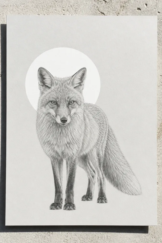
This is a luxury trick: you treat the head like a subject under a spotlight. The white space halo around the ears makes the silhouette feel intentional and high-end, and it keeps the drawing from looking cluttered. You still add fur texture, but you place it in layers that sit inside the halo, not across it. This style works great when you’re drawing a fox head only, because the composition has room to breathe.
Start by drawing the head shape with light pencil and keep the outer ear edges crisp. Then plan a negative-space border around the head — about 1/2 inch wide on a small page. Shade the inner ear fold and the shadow under the brow with 4B to 6B, staying away from the halo. Next, add short fur strokes along the cheeks and forehead that stop at the halo edge. Finish by reinforcing the nose bridge outline and carving tiny highlight flicks with a kneaded eraser.
Mark the halo boundary with a faint pencil line so you don’t drift into it.
Don’t fill the border area with smudges; it kills the “spotlight” effect.
7. Monochrome Fur Planes with Hard/Soft Edge Switch
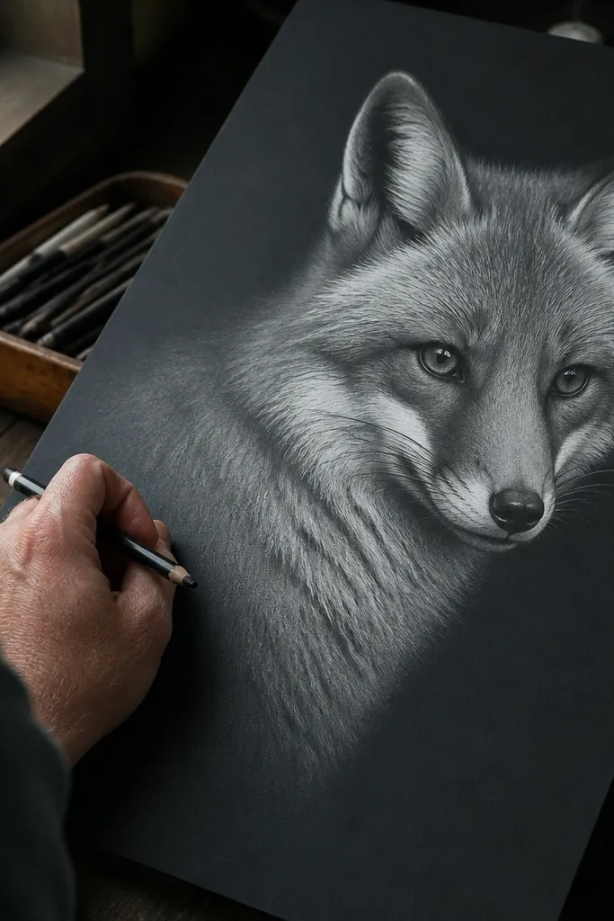
High-end fox drawing luxury often comes from edge control: some fur edges are crisp, others melt. This look uses fur planes with a deliberate hard/soft edge switch — sharp where the form turns, softer where fur overlaps. The viewer reads structure instantly, then texture second. It’s a great option if your fox drawings look “all the same darkness” because this forces contrast by plane. Works on smooth paper for clean edges and clean blending.
Sketch the fox face with light pencil and lightly block three planes: forehead, cheek, muzzle. Shade each plane separately: forehead and cheek with 2B, then deepen under the brow and under the chin with 6B. Keep one boundary edge sharp by darkening it with a darker pencil and using a tortillon lightly, not smudging across the boundary. Next, soften overlapping fur on the cheek and neck with gentle blending so it transitions. Finish with a kneaded eraser to carve a few highlight lines that follow the muzzle plane direction.
Pro tipUse a small paper scrap as a mask when softening edges so you don’t smear into the hard line.
AvoidDon’t blend every edge the same way; the plane boundaries need to stay readable.
8. Graphite + White Gel Highlight Lace
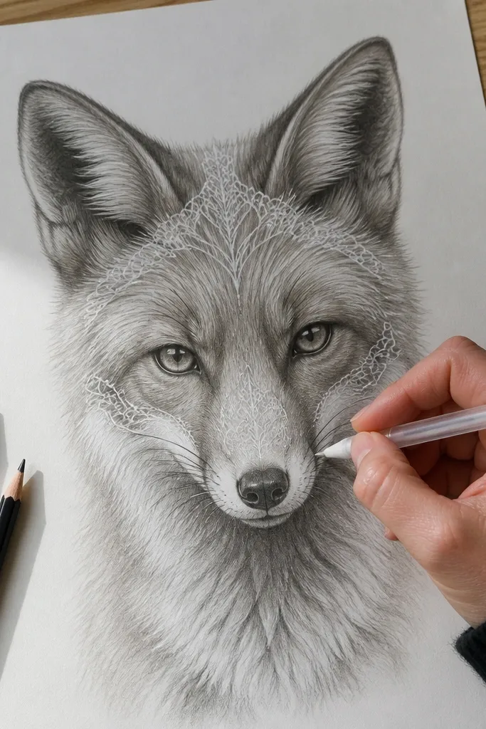
This one looks expensive because the highlights have a crisp, “cut” quality instead of looking erased or smudged. You build the fur with graphite, then add a few thin highlight lines with a white gel pen or white pencil to imitate individual fur strands. The key is sparseness: luxury highlights are selective, placed where fur catches light. This style is great for small fox heads and for giving life to eyes and muzzle texture without redrawing everything.
Start with an HB sketch and shade the main fur mass with 2B to 4B using directional strokes. Blend lightly so the mass reads as fur, not scribbles. Then deepen shadows around the inner ear, eye socket, and under the jaw with 6B. Finally, add white gel highlights sparingly along the muzzle and forehead fur direction, and dot the brightest points on the nose and inner eye corners.
Pro tipWarm the gel pen tip on scrap paper first so the first lines don’t blob.
AvoidDon’t flood the drawing with white; too many strands makes it look cartoonish.
9. Faux Print Look with Crosshatch Micro-Value
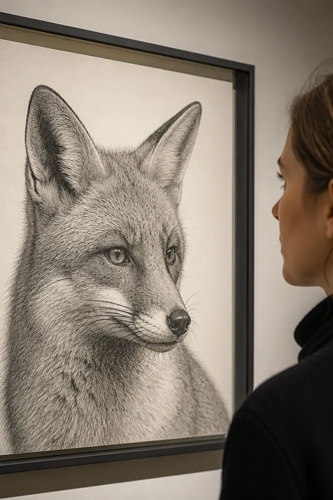
A faux print style feels high-end because the texture looks intentional and consistent, like engraving or high-quality reproduction. You get luxury contrast by using micro crosshatching — tight, controlled strokes — instead of broad smudging. This keeps the fur crisp and prevents the drawing from looking messy. It suits people who like detail but want it to look structured, not chaotic. Use it for a fox bust where face clarity matters most.
Lightly sketch the fox head with HB pencil, focusing on symmetry of eyes and ear angles. Ink the outer contour with a fineliner, but keep interior fur lines pencil-first. Shade shadows using micro crosshatching: start with a light cross direction, then add a second direction only in darker pockets. Use a 0.5 mechanical pencil for tight strokes and keep spacing consistent. Finish by burnishing midtones lightly with HB and adding a few darker crosshatch clusters under the chin and inside the ears.
Pro tipCount your stroke rhythm — consistent spacing is what makes it look “printed.”
AvoidDon’t switch stroke direction randomly; that reads as sketchy, not luxury.
10. Satin Neck Glow with Soft Gradient Fade
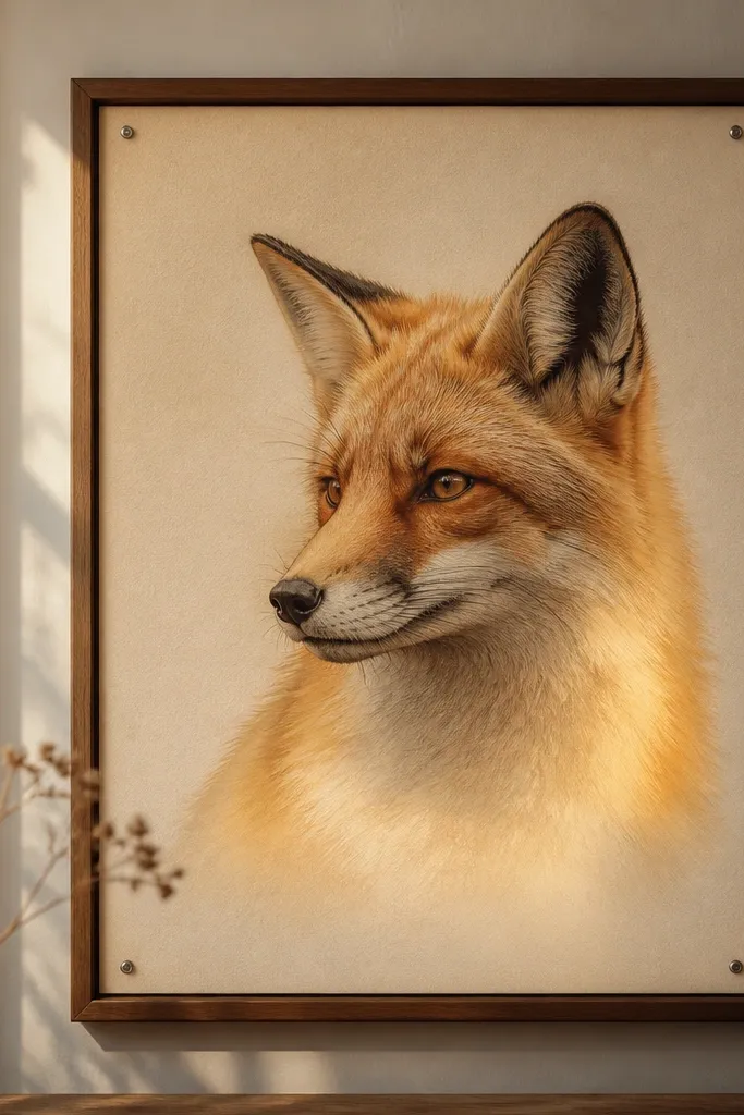
Luxury doesn’t always mean more detail. This look is about a clean gradient that makes the neck fur look like it’s lit from within. You keep the face sharper and let the neck fade with fewer strokes, so the drawing feels intentional and expensive. It’s also forgiving — you can hide minor proportion issues in the soft fade because the viewer’s eye stays on the face. Great for a standing or sitting fox where the neck and chest area are visible.
Sketch the fox pose and define the chest line where the neck glow starts. Shade the face with 2B and 4B, keeping eyes and muzzle edges crisp. Then build the neck gradient with a lighter pencil (HB to 2B) and blend gently downward, leaving the darkest shadow under the chin as an anchor. Use fewer fur strokes on the neck — think short direction marks, not full rendering. Finally, darken ear folds and the inner muzzle boundary to keep contrast centered on the face.
Pro tipBlend with the side of your stump, not the tip, for smoother gradients.
AvoidDon’t erase the neck until it’s white; pure white gradients look chalky.
11. Two-Tone Ink Wash Fur with Crisp Linework
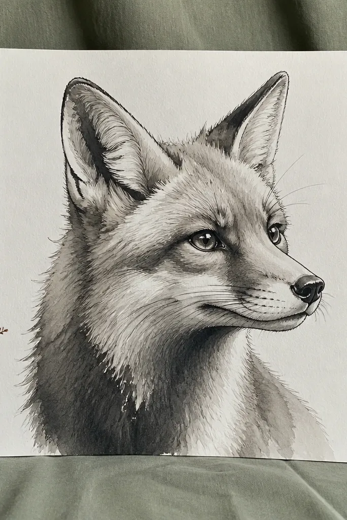
Two-tone ink wash gives you a high-end, print-like finish without needing heavy graphite smudging. The crisp linework keeps the fox readable, while the wash creates smooth fur mass and controlled shadow. It’s especially good for people who want a “luxury illustration” look quickly. You can keep fur texture minimal and still get depth because the wash handles it. Works well for fox heads and half-bodies on heavier paper.
Trace your sketch lightly and ink only the contour lines and key facial edges with a fineliner. Mix two ink tones: a light gray wash and a darker gray wash (test on scrap first). Paint the light wash over larger fur regions like cheeks and forehead, then add the darker wash in shadow pockets under the brow, inner ears, and under the chin. After the wash dries, add small fur strokes with pencil or a darker fineliner for texture and define the nose and mouth boundary.
Pro tipUse a flat brush and keep the wash edges clean by letting it dry between passes.
AvoidDon’t overwork the wash with repeated strokes; it turns streaky.
12. Red-Earth Fox with Neutral Shadow Pencil
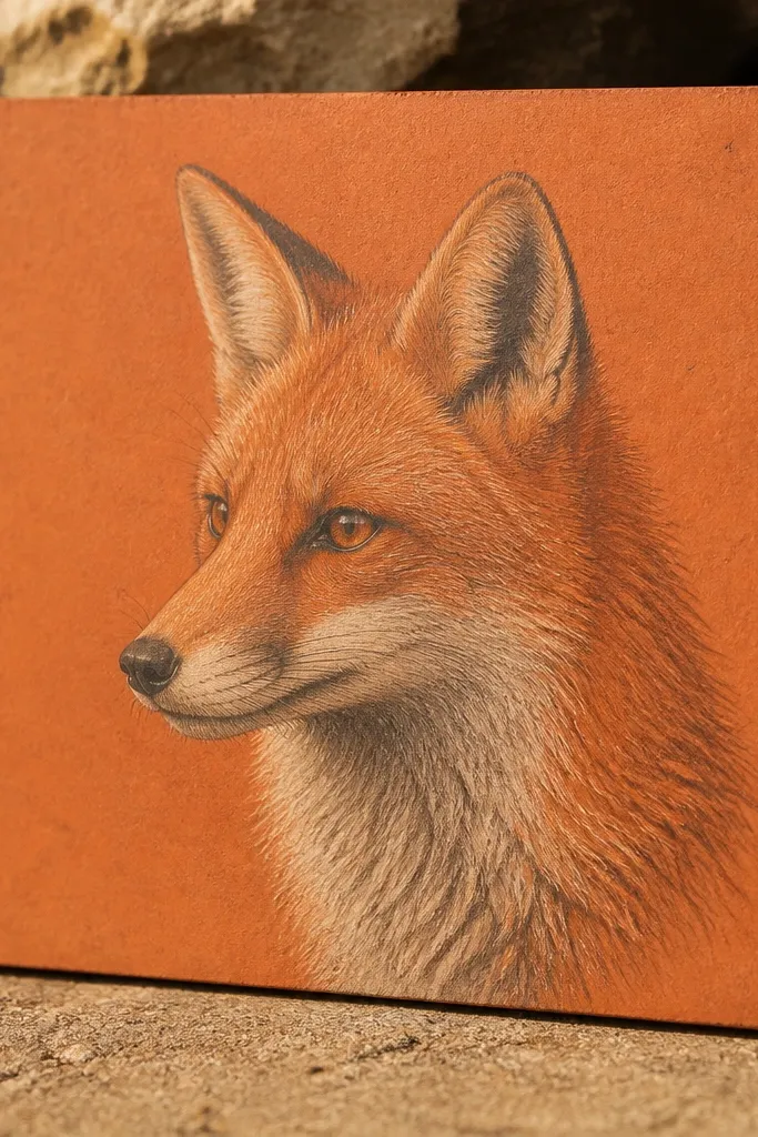
This is a luxury look because it separates color mood from shadow structure. You build warm red-earth fur using colored pencil (burnt sienna or terracotta), then keep shadows neutral gray so the drawing looks grounded, not orange all over. The fur direction stays consistent, and the contrast makes the face look carved. It’s a strong choice if you want fox drawings that look like they belong in a boutique print set. Use it for close-up faces where you can control color placement.
Sketch the fox with HB pencil and lightly map where the warm fur sits: forehead, cheeks, and the outer ear surfaces. Apply red-earth colored pencil in thin layers, keeping the lightest areas around the muzzle and inner eye region lighter. Build shadows with a neutral gray pencil (not more red), focusing on under the brow, inner ears, and under the jaw. Blend colored pencil lightly with a colorless blender if you have one, then sharpen a few fur lines with a darker warm pencil at the edges of the muzzle.
Pro tipKeep your warm color inside fur boundaries; don’t let it tint the whites of the eyes.
AvoidAvoid using only warm tones for shadows; the face will look flat and muddy.
13. Gold-Tint Background with Pencil Foil Shimmer
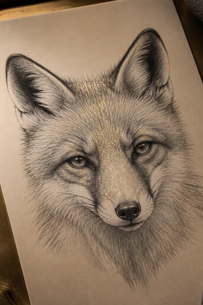
This one feels high-end because the background has gentle warmth and the fur highlights look like they catch light without glitter. Use a pale gold wash or tinted paper, then keep your fox shading monochrome so the color doesn’t compete. Add shimmer highlights with a metallic pencil sparingly along the forehead and muzzle edge. The luxury effect is subtle — it should look like sheen, not decoration. Great for gifts and framed prints because it reads premium on first glance.
Tint your paper with a very light gold watercolor wash or use pale gold paper if you have it. Let it dry, then sketch the fox in HB pencil. Shade the face with 2B to 4B graphite, keeping shadows deeper under the brow and chin. Add metallic pencil highlights only on the top plane of the muzzle and forehead fur direction — a few thin lines are enough. Finish by reinforcing the eye socket and nose bridge with a darker pencil for contrast against the gold.
Use metallic pencil on top of dry graphite, not over blended smudges, for cleaner shine.
Don’t place metallic highlights on the darkest shadow pockets; it will look wrong.
14. Side-Profile Fox with Tight Eye Socket Detailing
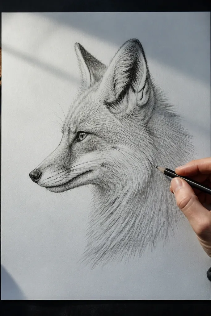
Side profile is where luxury shows up fast because proportion errors are obvious. The high-end version looks expensive because the eye socket shadow is shaped carefully and the muzzle line stays clean. You also get a natural fur direction system — strokes follow the face angle, which makes rendering easier and more consistent. This style is ideal for learning because it forces you to get anatomy right, and once it clicks, your other fox drawings improve quickly. Works best with a crisp pencil outline and controlled shading.
Sketch the side profile lightly, marking the eye, nose tip, and muzzle curve with three anchor points. Outline the face contour with a fineliner or darker pencil (2B) so the silhouette looks intentional. Shade the eye socket with 4B, then taper the shadow gradually toward the cheek so it doesn’t look like a blob. Add fur strokes that follow the profile angle, starting from the forehead and stopping before the shadow edge. Finish by carving highlights along the muzzle with a kneaded eraser and deepening the inner ear fold.
Draw the muzzle line twice lightly before committing; that’s where most profile drawings go off.
Don’t over-detail the fur under the jaw; keep that area as a smooth shadow mass.
15. Fox Bust with Velvet Black Underlayer
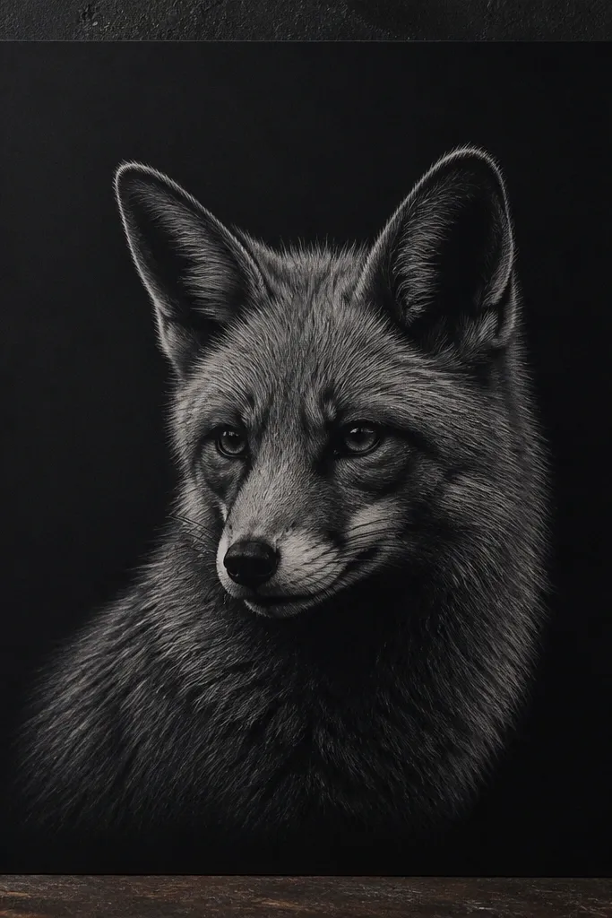
Velvet black underlayers make a fox look expensive because they create separation — highlights and midtones have something to sit on. You’ll see this in high-end fox drawing luxury work as a deep, clean shadow pocket under the chin and inside the ears, with fur highlights snapping off that darkness. The technique is simple: lay a dark base, then cover it with lighter fur strokes and carve highlights. This is a great option if you struggle to get contrast without muddying the whole page.
Sketch the fox bust and block the main shadow pocket under the jaw with a 6B pencil or soft charcoal. Keep the edges of that pocket clean — no smearing into the face. Then shade the midtones over it with 2B, using directional strokes that follow fur flow, not random scribbles. Add a thin layer of lighter pencil on the forehead and cheeks, then carve the brightest fur marks on the muzzle with kneaded eraser. Finally, reinforce the inner ear fold and the nose bridge line so the face stays sharp.
Pro tipPress hard only in the shadow pocket; keep pressure lighter everywhere else to avoid gray smudges.
AvoidDon’t blend the velvet black into the face; the separation is the luxury part.
16. Monochrome Watercolor-Style Pencil Bloom
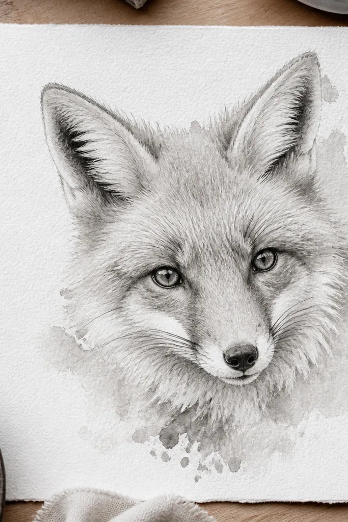
This look feels high-end because it mimics watercolor softness without needing paint skills. You create a controlled “bloom” by layering light pencil and then lifting and blending strategically. Luxury comes from edges that fade naturally, especially around the ears and cheek fur, while the eyes and muzzle stay crisp. It’s ideal for people who want a painterly vibe but only have pencils. Use it on paper that can handle light moisture if you plan to use a damp brush.
Sketch the fox lightly with HB pencil and keep lines small around the eyes and muzzle. Layer a light graphite base over cheeks and forehead with 2B, then soften edges with a blending stump. If your paper allows it, lightly dampen a small area (using a clean brush and minimal water) and lift graphite with a tissue to create bloom around the ear edges. Let dry fully, then darken eye socket and inner ear folds with 4B. Carve muzzle highlights with kneaded eraser for crisp contrast against the soft background.
Pro tipTest dampening on scrap — paper tooth and bleed control how painterly you can go.
AvoidDon’t soak the paper; you’ll get muddy halos and warped edges.
17. Patterned Fur Border Frame Around the Fox
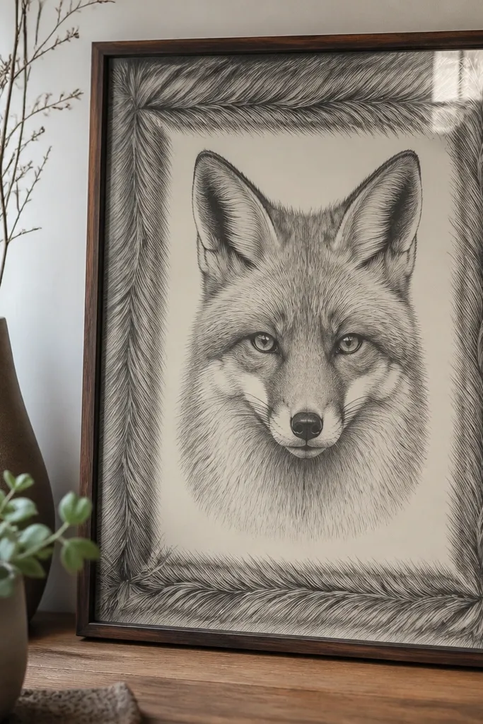
A border turns a fox drawing into a finished piece, and it’s one of the fastest ways to get that high-end fox drawing luxury feeling. The trick is that the border pattern should echo fur direction and value, not look like random doodles. Keep the fox face detailed and clean, then let the border be slightly simpler with repeated short strokes. This gives a designer layout without adding a busy background. Works great for prints, bookmarks, and small square paper formats.
Draw the fox face in the center with light pencil and ink the main contour and facial edges. Create a border around it using short repeated fur strokes that follow a curve around the frame. Shade the border lightly with 2B and darken every third stroke with 4B to create rhythm. Keep the border value slightly lighter than the fox’s darkest shadow pocket so the face stays the focal point. Finish by adding a few highlight cuts on the muzzle and a darker line under the chin to anchor the composition.
Use a ruler for the outer frame line only; the fur strokes should feel free but controlled inside it.
Don’t make the border as dark as the face; it steals attention.
18. Snow-Edge White Fur with Dark Grounding
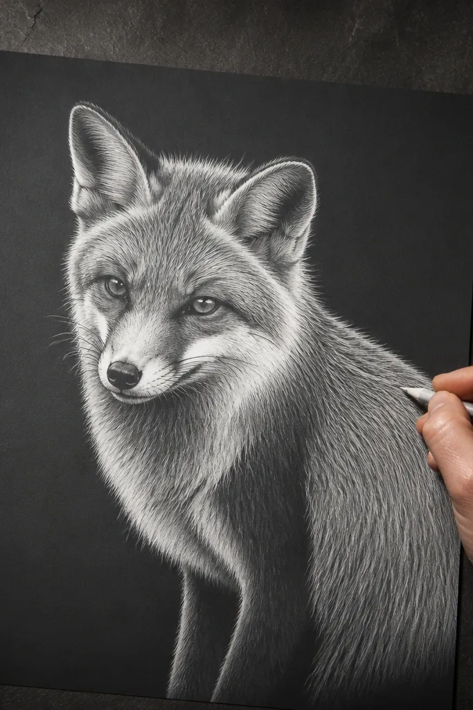
This look feels expensive because it flips the usual fur approach: you treat white fur as the star. You darken the ground behind the fox with gray, then carve out bright fur edges and muzzle highlights so the fox looks like it’s emerging from shadow. Luxury is in the boundary — where the white fur meets dark ground — and that’s where you spend time. It’s striking in monochrome and it makes the drawing look clean even with minimal background detail.
Start by shading the background ground with 4B to 6B, leaving a clear shape where the fox will sit. Sketch the fox on top lightly, then refine the silhouette edges with a darker pencil. Add fur direction with short strokes that stop at the white edge boundary. Carve the brightest fur edge with a kneaded eraser, working in small sections so you don’t smear the ground. Finally, add shadow pockets inside ears and under the chin with 6B to keep the contrast balanced.
Work on one edge at a time — eraser carving is easier to control in small sections.
Don’t erase too aggressively; you want clean edges, not torn paper texture.



