
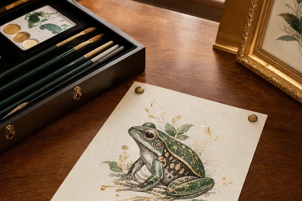
1. Gold-Trim Ink Frog on Hot-Press Cream
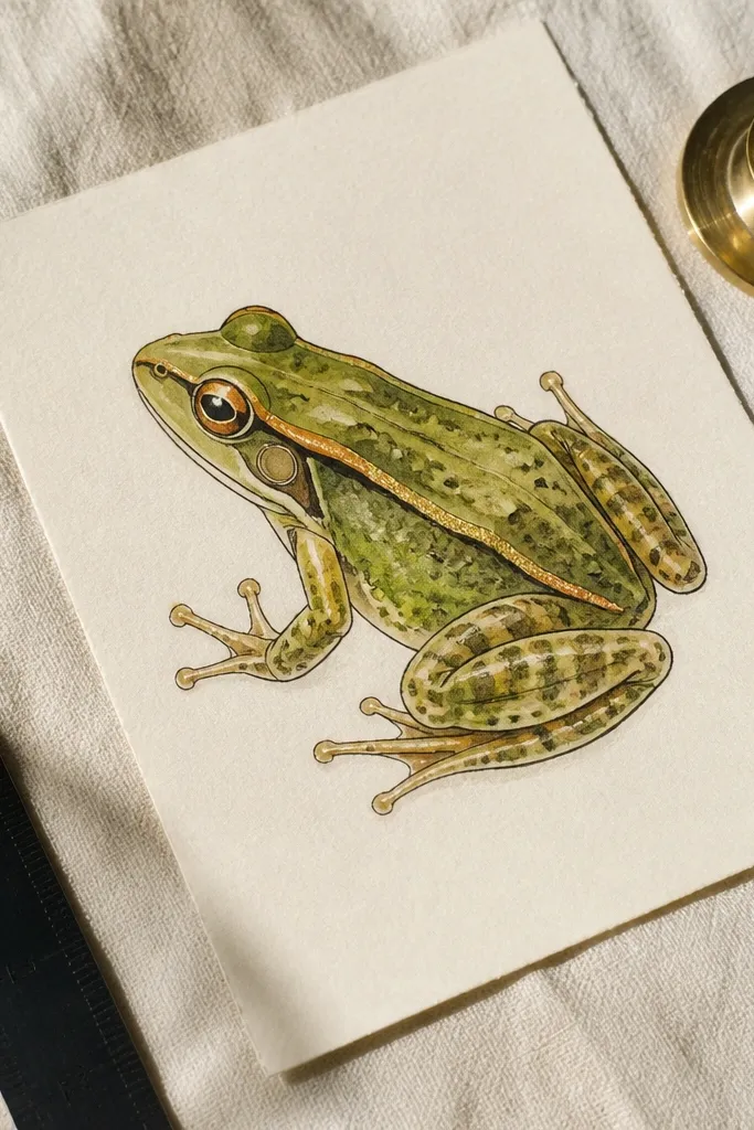
This is the “expensive but quiet” frog drawing look: sharp ink lines, controlled watercolor, and a single gold element that makes the whole piece feel finished. Start with hot-press cream paper so the ink stays crisp and the wash sits smooth instead of soaking irregularly. Use deep black-brown ink for the outline, then build the body with translucent greens so you can see paper brightness through the color. Keep the gold trim to a thin rule or corner accents; too much metallic makes it look like craft-store art.
Start by sketching the frog lightly, then ink the outer silhouette with a waterproof pen (0.8mm) and add interior contour lines at 0.3mm. Wet the frog’s body with clean water, then apply watercolor in two mixes: yellow-green for highlights and blue-green for shadows. Finally, add a single thin gold line along one edge using gold ink or metallic paint marker, then let it dry flat for at least 1 hour before framing.
Test your gold marker on scrap first; some bleed into watercolor edges.
Don’t outline everything equally thick — it flattens the frog and kills the premium feel.
2. Charcoal Form Frog with Translucent Green Glazing
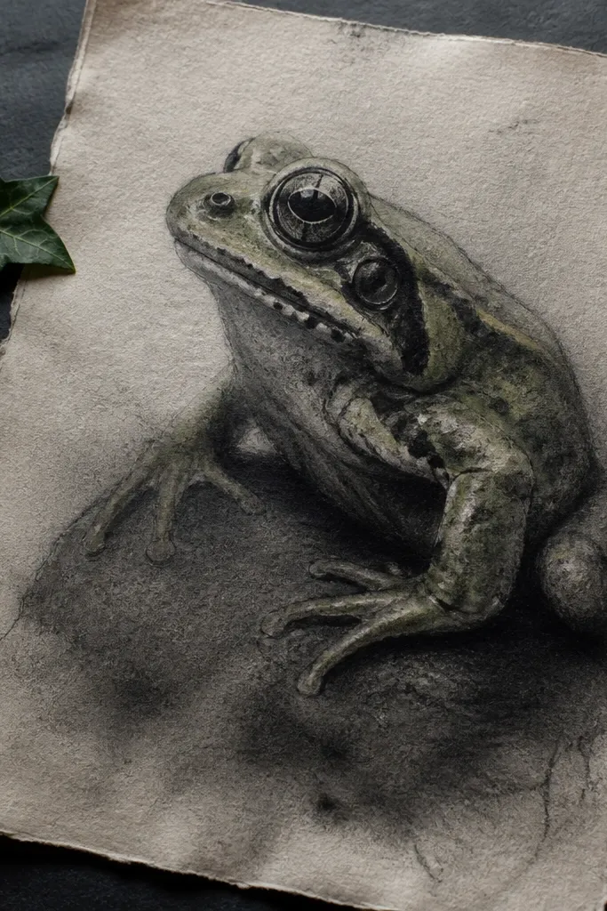
This idea looks high-end because the drawing has sculpted value first, then color second. Charcoal gives you believable skin texture and a natural gradient, while translucent glazing keeps the frog from turning cartoonish. Choose a vine charcoal or compressed charcoal for deeper darks, then glaze with watery green so the under-drawing still shows. The result reads like fine art study — moody, dimensional, and more expensive than a simple line drawing.
Block in the frog’s big shapes with charcoal, then sharpen the legs and toes with a kneaded eraser to “lift” highlights. Blend the midtones with a tortillon or soft tissue, keeping the darkest pockets under the belly and inside the thighs. Then glaze with diluted watercolor in thin layers, letting each layer dry before adding the next. Finish by lifting tiny highlight spots with a clean eraser edge and spraying a light workable fixative if you need extra stability.
Use at least two charcoal values: one for shadow mass and one for fine toe edges.
Don’t over-blend; chalky charcoal + heavy green wash looks dusty instead of luxurious.
3. Colored Pencil Frog with Burnished Highlights
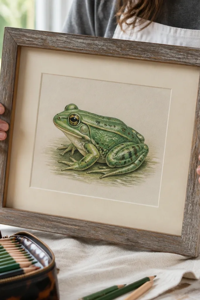
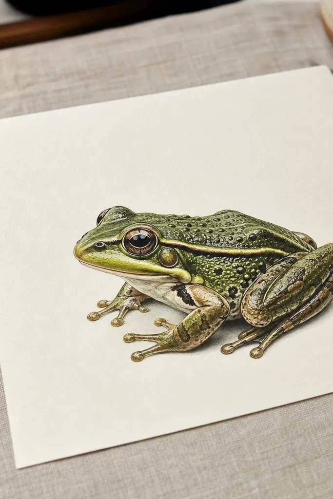
Colored pencil can look premium when you burnish highlights and keep the rest controlled. The trick is layering: start with a cooler green for shadows, then add warm greens for transitions, and finally burnish with a near-white pencil on the wettest-looking skin areas. This makes the frog surface look like it has a sheen rather than matte fill. If you want luxury, don’t chase every detail; focus on believable skin specular spots on the back and thighs.
Sketch the frog lightly with a light gray pencil, then map shadows using a blue-green pencil (soft pressure). Build midtones with yellow-green, staying translucent so paper texture shows. For highlights, use a cream or pale green pencil and burnish with firm pressure over the last layer until the surface looks smooth. Outline only the silhouette with a darker green or warm black pencil so interior lines stay subtle.
Burnish highlights last with a pencil you reserve for whites; it keeps the shine clean.
Don’t press hard from the start — early heavy pressure makes the later burnish look muddy.
4. Botanical Border Frog on Rag Paper with Watercolor Splatter Control
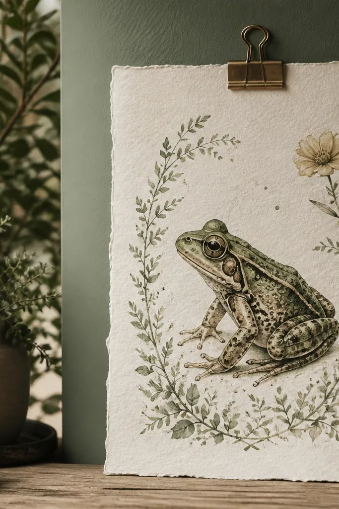
This reads expensive because it frames the frog like a print. Rag paper holds watercolor texture, so the frog’s washes look intentional instead of flat. The botanical border adds a designer finish, but keep it restrained: thin leaves, one flower stem, and a limited palette. Watercolor splatter can look luxurious when it’s controlled — tiny, sparse specks that echo the leaf veins, not random paint chaos.
Draw the frog center on cotton rag paper, then paint with watercolor using three mixes: olive for midtones, blue-green for shadow, and yellow-green for highlights. Create the botanical border by drawing stems and leaves in a waterproof ink pen, then lightly wash them in matching greens. Add controlled splatter by loading a toothbrush with diluted paint, tapping once over a scrap, then letting a few specks fall around the border. Let it dry fully, then erase any pencil marks with a soft kneaded eraser before framing.
Splatter looks premium when it’s smaller than your thumbnail and mostly near the border corners.
Don’t paint the border as busy filler; thick leaf clusters make it look like decoration, not design.
5. Art Nouveau-Style Frog with Gold Leaf Nib Lines
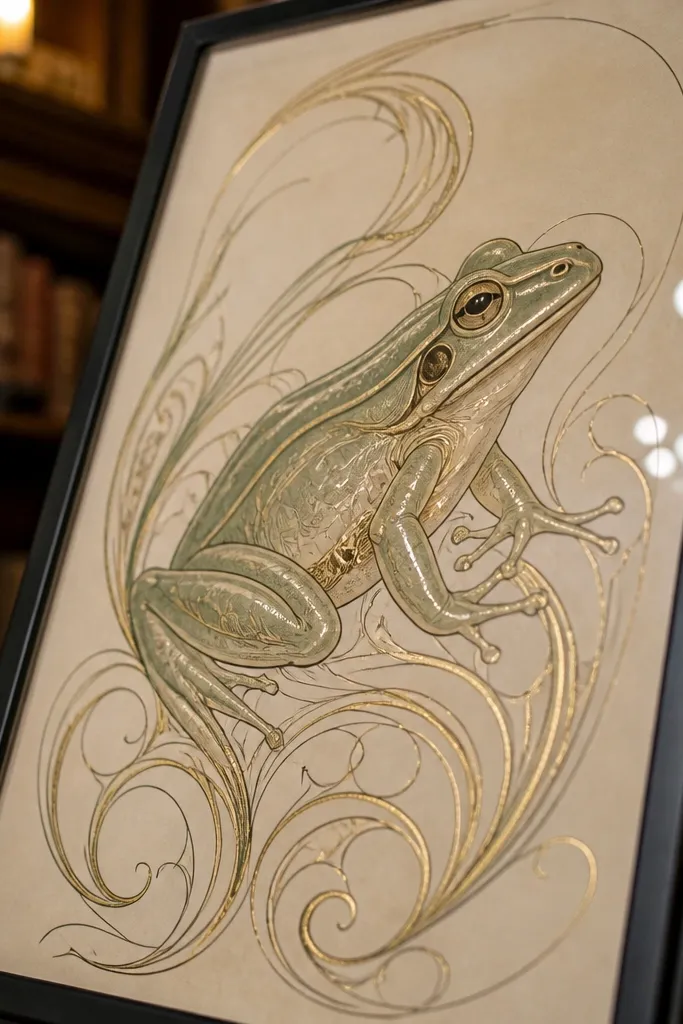
This is high-end because it combines flowing linework with metallic detail in a deliberate rhythm. Art Nouveau curves make frogs feel stylized and elegant, and gold leaf lines bring that “museum print” finish. The expensive look comes from line discipline: consistent curve weight and gold used on select swirls, not the entire illustration. Keep the frog body simpler than the ornament so the gold has contrast and the composition breathes.
Sketch an Art Nouveau frame around the frog using a pencil, then ink the ornamental lines with a nib pen for natural variation in thickness. Paint the frog body with flat translucent watercolor blocks so the ornament carries the drama. Apply gold leaf only to a few swirl bands using a small amount of adhesive size, burnish gently, and remove excess with a soft brush. Seal with a matte archival spray once the gold is set, then check for any sticky spots at the edges.
Pro tipUse a nib pen for the swirls only; keep the frog outline with a finer liner so it stays crisp.
AvoidDon’t cover the frog skin with gold leaf — it stops reading as skin and turns into costume.
6. Monochrome Frog with Umber Wash and Glossy Varnish Finish
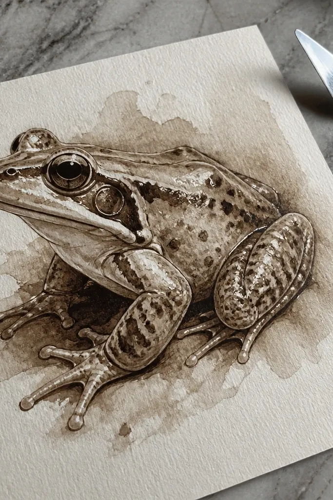
Monochrome with a single warm wash looks expensive because it avoids the “kid coloring book” effect. Use umber and sepia tones to define form, then add tiny glossy highlights with a clear gel medium. The frog stays elegant because the eye reads value first, and the glossy points act like specular reflections. This style also frames well in dark wood or black frames.
Start with a graphite sketch and darken shadow pockets with a soft charcoal pencil or carbon pencil. Wash the frog with diluted burnt umber, keeping the belly lighter and the legs darker. Let it dry, then add deeper shadows in the same umber mix but with less water for stronger pigment. Finally, dot clear gel medium or gloss varnish onto 6-10 highlight points on the back and toes, then let it cure flat for a full day before handling.
Pro tipGlossy highlights look real when they’re small ovals, not big blobs.
AvoidDon’t add gloss all over; too many shine points make it look wet-painted, not refined.
7. Ink Dotwork Frog with Controlled Crosshatching Shadows
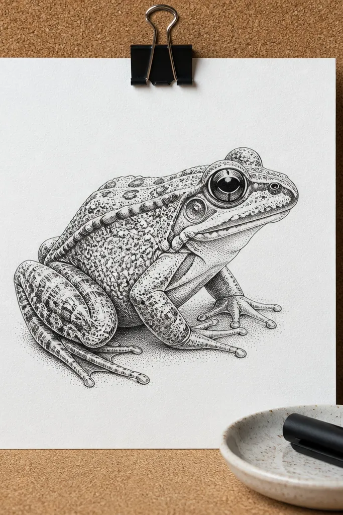
Dotwork looks pricey when it’s disciplined and paired with crosshatching for structure. The dots create a smooth skin gradient without muddying, and crosshatching gives the legs and belly a believable form. Keep your palette limited to black ink and let paper whiteness do the “luxury” work. If you want it to look expensive, commit to long, slow shading in the darkest areas and stop dotting once the shape reads.
Lightly sketch the frog, then ink the outline with a 0.5mm waterproof pen. Fill midtones with dot clusters, increasing density in shadows under the belly, around the eyes, and between toes. Add crosshatching only in the densest shadow zones so it doesn’t become a busy texture everywhere. Use a fine pen (0.2-0.3mm) for eye details and subtle nostril lines, then erase pencil marks after the ink cures.
Pro tipKeep your dot pattern consistent direction in each shadow pocket so the form looks intentional.
AvoidDon’t rush the darkest areas; weak shadow density makes dotwork look sketchy.
8. Sumi Ink Frog with Wet-on-Wet Halo Washes
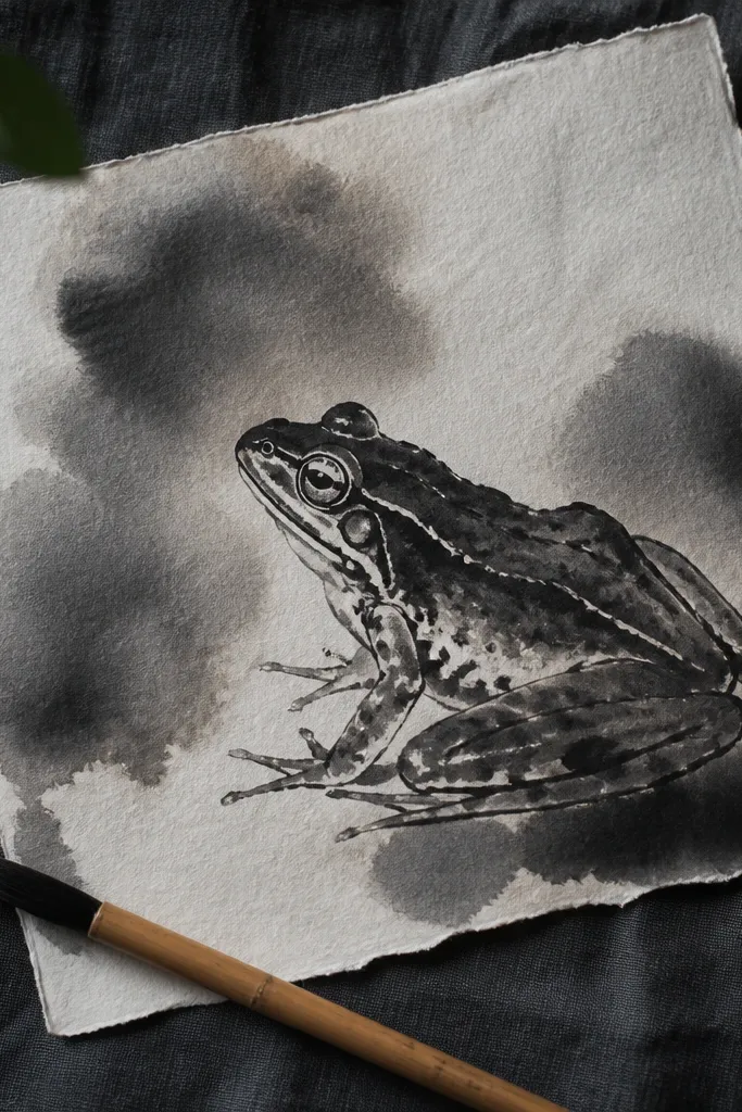
This style looks expensive because it has controlled bleeding — the kind of softness you only get when the paper and water timing are right. Sumi ink gives deep blacks and expressive edge blooms, and a halo wash around the frog adds a museum-like glow. You’re aiming for elegance, not chaos: the halo should frame the silhouette, and the inner details stay sharp with minimal ink lines.
Use watercolor paper (cold-press) and sketch the frog lightly. Mix sumi ink with water for midtone gray, then paint the body with wet-on-wet so edges soften. Keep the eye, mouth line, and toe tips inked with stronger ink for crispness. For the halo, wet around the frog silhouette, then touch diluted ink just outside the outline and let it bloom outward. Let everything dry flat, then reinforce the silhouette line with a fine brush dipped in pure ink.
Pro tipPractice the halo on scrap until you can stop the bloom right at the frog edge.
AvoidDon’t overwork the wet zones; repeated passes turn the whole piece gray.
9. Frog Portrait with Platinum-Like Metallic Lines
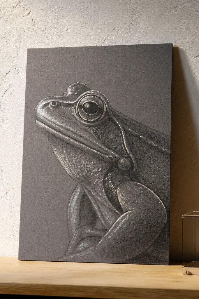
A metallic silver treatment reads high-end when it’s used like jewelry — thin, reflective strokes placed on structure. For frog drawings, that means outlines on the highest planes: brow ridge, cheek curve, and the top of the thighs. Use a silver metallic gel pen or paint marker sparingly so the rest of the piece stays matte. This is especially good if you draw the frog in graphite first, then add metallic accents on top.
Sketch the frog in graphite and blend shadows with a blending stump, keeping the face and eyes slightly brighter. Apply a very light gray wash over the body so the graphite doesn’t look pencil-sharp. Add metallic lines with a silver gel pen along 5-8 structural highlights, then lightly glaze those areas with a thin watercolor wash so the metal doesn’t look pasted on. Let it dry fully, then protect with a matte fixative that won’t dull the silver too much.
Pro tipIf your metallic looks too bright, glaze lightly over it with a translucent green so it reads integrated.
AvoidDon’t outline the entire frog in silver; it looks like a sticker border.
10. Pressed Fern Paper Texture Frog
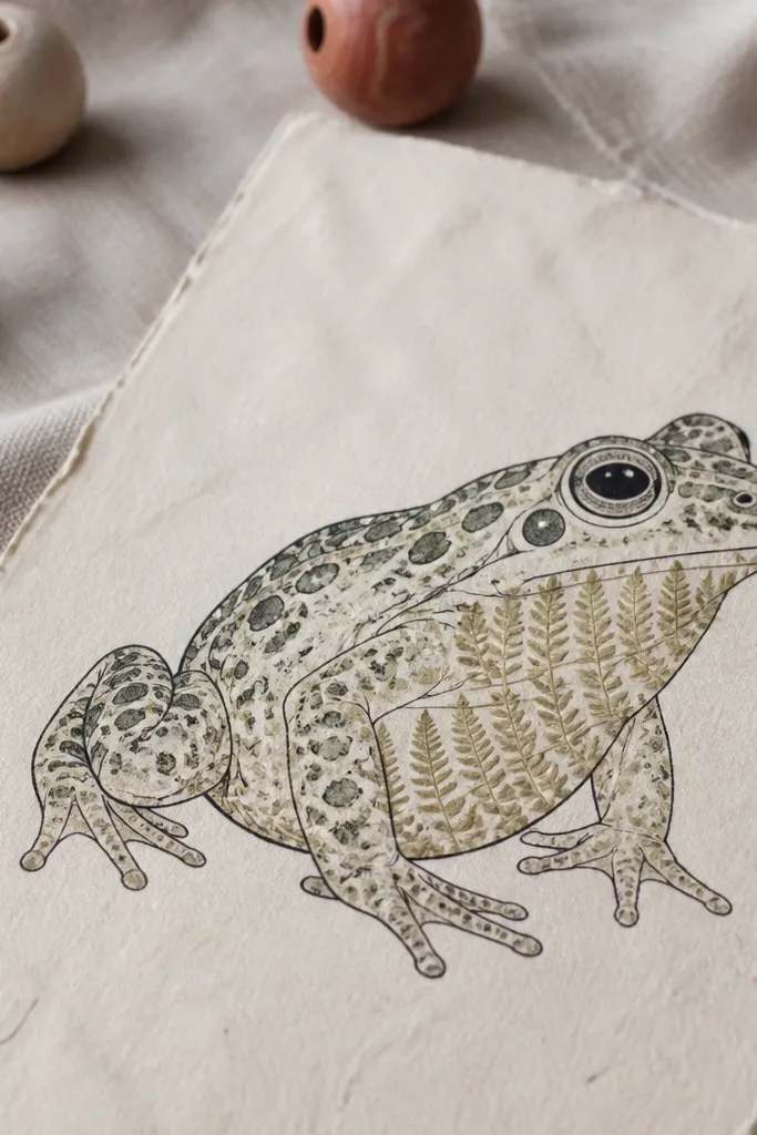
Texture is the fastest route to “expensive” because it adds dimension without adding clutter. Pressed fern or small leaf fragments create a natural pattern that mimics skin microtexture. The trick is using texture only in the frog body or belly highlight zone, not the whole page. Pair it with a clean ink outline and a minimal palette so the texture reads intentional, not like a craft collage.
Draw the frog outline with waterproof ink on thick cream paper. Cut pressed fern pieces into small fragments that match the frog’s body curve, then adhere with a thin archival glue applied with a toothpick. Leave the eye and toe tips clean so they pop. Paint over the texture lightly with translucent green watercolor to unify colors, then seal with a light archival matte medium once dry.
Press ferns until they feel dry and flat for at least 3-5 days for crisp edges.
Don’t flood the fern with glue; it warps and makes the texture look swollen.
11. Frog in a French Label Frame with Letterpress-Style Text
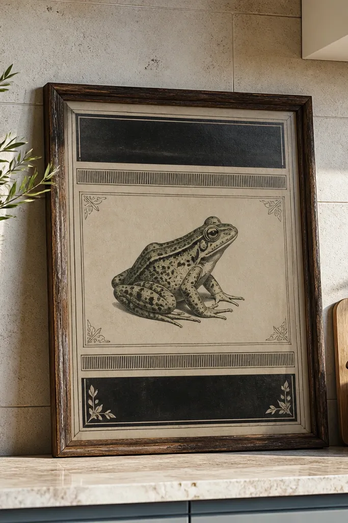
This looks expensive because it borrows the authority of old scientific prints. A clean label frame makes the frog feel curated and designed, especially when the text is small, measured, and in one ink color. Use a warm gray or black label band, then keep the frog illustration detailed but not overly busy. The luxury comes from typographic restraint and the crisp edge of the label.
Sketch and ink the frog with waterproof liner, then add watercolor washes using muted greens (olive, fern green, and a touch of gray-green). Create a rectangular label area at the bottom or side using a ruler and pencil, then ink the label border with a fine pen. Add faux letterpress-style text by using a slightly uneven line weight from a nib pen, or use a stencil for consistent letter shapes. Finish by outlining the label border once more with a darker ink for a crisp final edge.
Use one font style only: small caps look more expensive than mixed uppercase and cursive.
Don’t add long paragraphs; a short label reads premium, a wall of text reads DIY.
12. Two-Tone Wash Frog with Negative Space Highlights
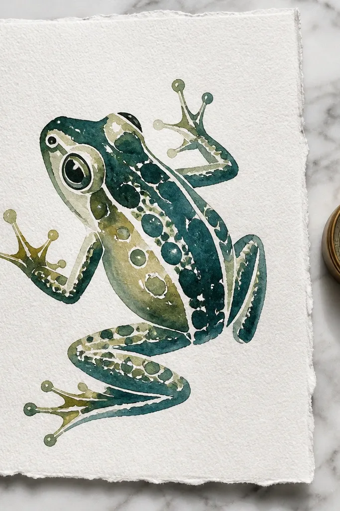
Negative space is a luxury move because it keeps whites clean and makes the frog look fresh instead of overpainted. This idea uses only two watercolor tones, so everything stays cohesive. The highlight is not painted; it’s protected by leaving the paper bare, which creates a crisp, expensive sheen. The frog looks sharper and more intentional, especially when you keep edges clean around the eyes and toes.
Sketch the frog and decide where the skin highlights will be — along the back ridge and top of the legs. Paint the shadow areas first with blue-green, then while it’s still slightly damp, add a thin layer of olive-green for midtones. Leave highlight shapes unpainted. Once dry, add a second pass of diluted yellow-green only where the highlight transitions soften, then ink the eyes and toe tips last.
Mask highlight zones with frisket film or thin painter’s tape if you want razor-clean edges.
Don’t chase highlights by painting white over green; white gouache makes it look chalky.
13. Ink-and-Gouache Frog with Crisp White Skin Speckles
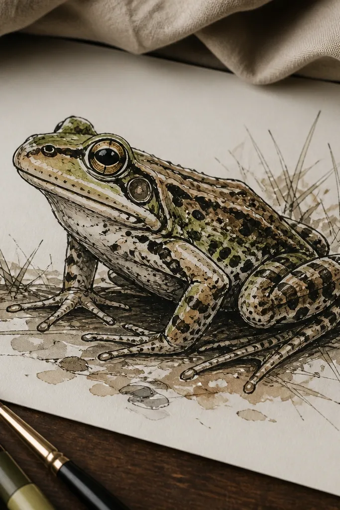
Gouache is where this becomes high-end instead of flat. Ink establishes structure, watercolor (or ink washes) gives depth, and gouache adds controlled opacity only where the frog needs contrast: speckles, eye highlights, and a few reflective skin marks. The key is sparing use of white so it looks like natural reflections, not paint snow. This style reads expensive because it has crisp, graphic contrast.
Ink the frog outline and major contour lines with a waterproof pen. Wash the body with diluted green watercolor, keeping the belly lighter and the underside darker. Mix gouache with a tiny amount of water until it flows but stays opaque, then use a fine brush to place 12-25 small speckles on the back and upper thighs. Add two tiny gouache dots in the eye highlight, then let it dry completely before you frame.
Load your brush lightly and test one speckle on scrap; gouache spreads if the brush is too wet.
Don’t cover the whole frog in speckles; sparse placement looks intentional and premium.
14. Monogrammed Frog Crest with Embossed Border
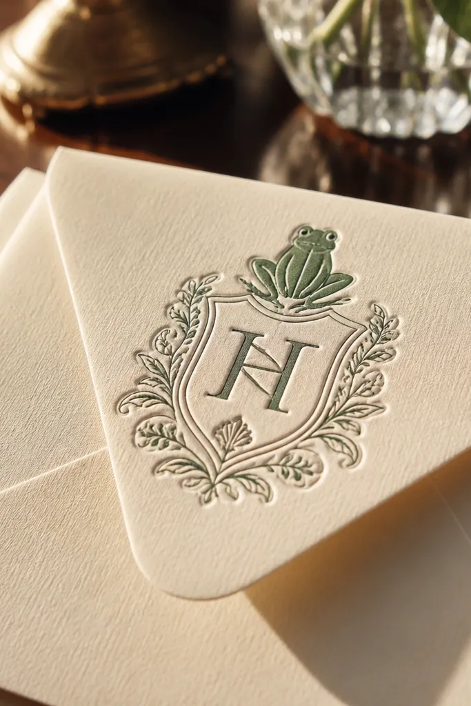
Crests look expensive when they feel like stationery: clean geometry, restrained color, and a tactile border. An embossed border gives the drawing a physical finish that reads high-end even from a distance. Add a small monogram or year in the corner to make it feel like a custom print. Keep the frog itself simple and stylized so the crest reads like design, not clutter.
Draw a crest shape with a pencil and ruler, then ink it with a fine waterproof pen. Paint the frog in muted greens with one shadow tone and one highlight tone so it stays cohesive. For the embossed border, use embossing paste or embossing powder with a stencil line around the crest; heat only the border area if you use powder. Add the monogram last with a fine liner so it doesn’t look like a sticker.
Do a dry run with the stencil so your border line stays perfectly straight before adding paste or powder.
Don’t use embossing paste everywhere; too much texture kills the clean, luxury stationery look.
15. Frog Silhouette Cutout with Ink Wash Background
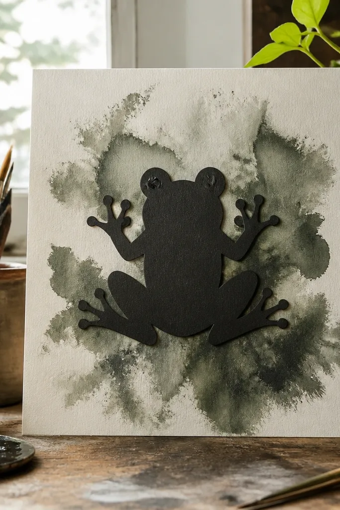
This is high-end because it treats the frog like a graphic object rather than a fully rendered illustration. A crisp silhouette makes the piece feel modern, and an ink-wash background adds depth without busy detail. The contrast reads expensive, especially when the background is smoky gray-green instead of flat black. Finish with a few thin ink lines on the face so the silhouette doesn’t feel empty.
Create a frog silhouette by drawing the shape, then cut it from thick paper or cardstock. Ink the cutout edges lightly with a fine liner so the silhouette looks clean even if the paper fibers show. Paint the background with diluted ink or watercolor wash, keeping it smoky and feathered around the silhouette. Place the cutout on top using archival glue and touch up the face details with a fine pen.
Pro tipUse a warm gray background wash; it makes green frogs look richer.
AvoidDon’t leave the background as a uniform block; even subtle feathering is what makes it look premium.
16. Frog with Faux Cloisonné Enamel Cells in Watercolor
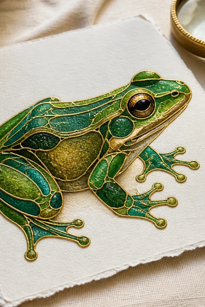
Faux cloisonné looks expensive because it creates “cells” like enamel — separated color areas with thin metal boundaries. Even though it’s a drawing, the separation makes the frog feel like a crafted object. Use gold line work to divide the skin regions, then fill each cell with a controlled wash of green, teal, and olive. Keep the gold lines thin and consistent so the effect reads like enamel, not decoration.
Sketch the frog and decide where the enamel cells will break — along the jawline, back ridge, and between thighs. Ink the cell boundaries with metallic gold paint or gold ink, keeping line thickness even. Fill each cell with diluted watercolor, using slightly different green mixes so the colors feel layered. Let everything dry flat, then add a final thin wash over the whole frog body so the cells unify without losing separation.
Use a small round brush dedicated to gold so the metallic line stays smooth.
Don’t fill too many tiny cells; the premium look needs larger, readable sections.
17. Frog Portrait with French Blue Background and Olive Skin
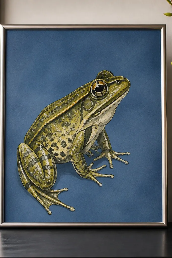
High-end portrait contrast is about one strong background color and skin tones that don’t compete. French blue behind an olive frog makes the greens look deeper and cleaner, like a fashion illustration. Keep the background smooth and even, then let the frog skin have texture through layered washes and a few crisp ink lines. This kind of color pairing reads expensive because it’s controlled, not trendy-bright.
Tape a border around your paper for clean edges. Paint a French blue background wash first, using consistent water dilution so it dries evenly. While it’s drying, paint the frog with olive-green midtones and blue-green shadow accents, then add yellow-green highlights on the back and cheeks. Ink the eyes and toe edges last so they stay sharp against the background.
Pro tipUse a slightly thicker paper (at least 300gsm) so the blue doesn’t bleed or streak.
AvoidDon’t paint the background after the frog; you’ll risk staining the skin edges.
18. Frog Drawing on Black Paper with Chalky White and Green Glaze
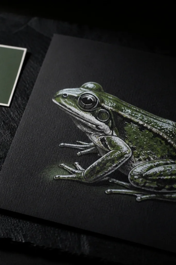
Black paper instantly reads premium because it changes how light hits the drawing. White highlights look crisp and expensive, and green glazes look richer because they glow against the dark ground. This is a luxury move for people who want instant drama without heavy rendering. Keep your line work minimal and let the contrast do the work.
Use black paper and sketch the frog lightly with a white chalk pencil or soft pastel. Block in shadow shapes with a green watercolor glaze mixed with plenty of water so it stays translucent. Add highlights by drawing again with chalky white and blending gently with a clean cloth or soft brush. Finish with fine ink lines for eyes and toe tips if needed, then seal with a matte fixative designed for pastels.
Choose a glaze that’s translucent, not opaque; opaque green over black looks painted over.
Don’t use wet markers on black paper; they bleed and kill the crisp edges.



