
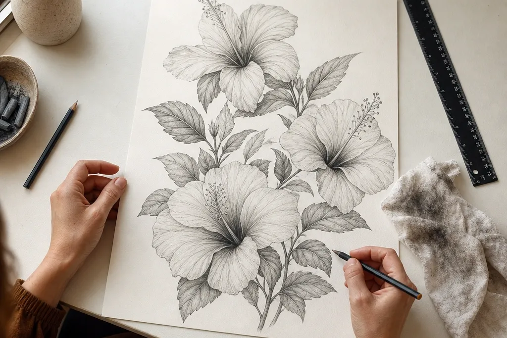
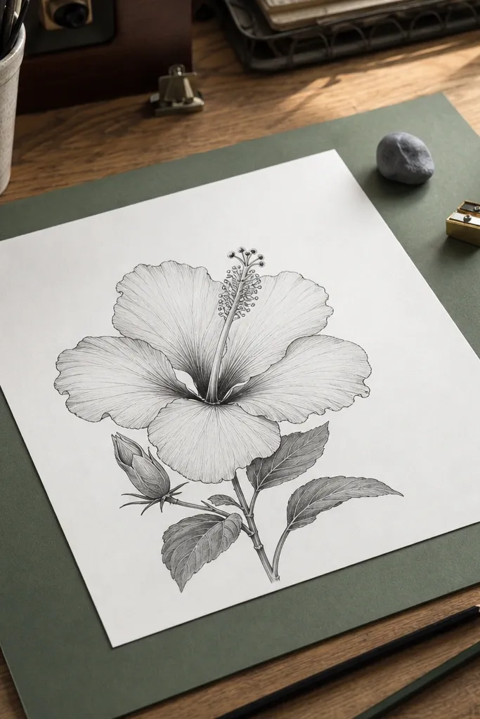
1. Monochrome Sumi-ink Hibiscus on Hot-Pressed Paper
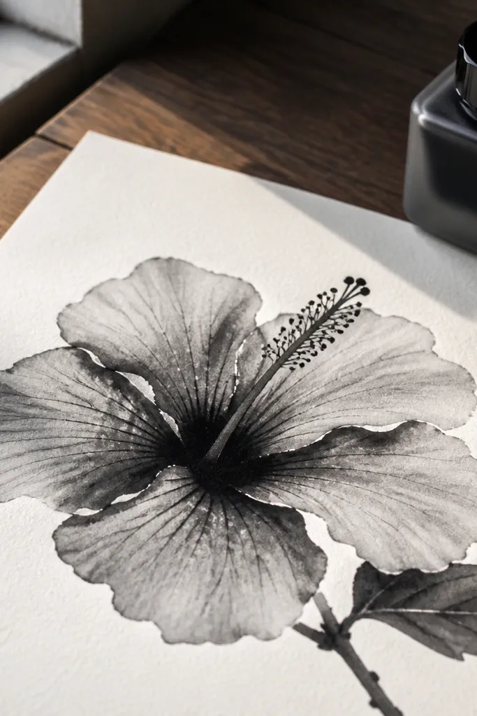
This look is high-end because it uses one color to force discipline. The petals get depth from ink density, not from switching pigments. Start with a clean hibiscus silhouette and then place shadows only where the petal folds overlap. The center looks luxurious when you keep the stamens as thin, confident marks and reserve the darkest ink for the deepest creases. It suits framed monochrome prints, minimalist cards, and anyone who wants a premium result without color clutter.
Start by sketching the hibiscus with a light pencil and marking three petal layers: outer, middle, and inner. Then ink the outer petal edges first using a brush pen or fine liner, keeping line thickness varied by pressure. After the ink dries, add grey shading by diluting ink on a palette and glazing it into folds, working from light to dark. Finally, draw the center with short, controlled strokes and add a few bright highlight gaps in the petals so the bloom doesn’t look smoked out.
Pro tipUse hot-pressed paper for this so ink edges stay sharp instead of feathering.
AvoidDon’t ink every line with the same weight; uniform outlines kill the luxury feel.
2. Graphite Luxury Hibiscus with Burnished Highlight Edges
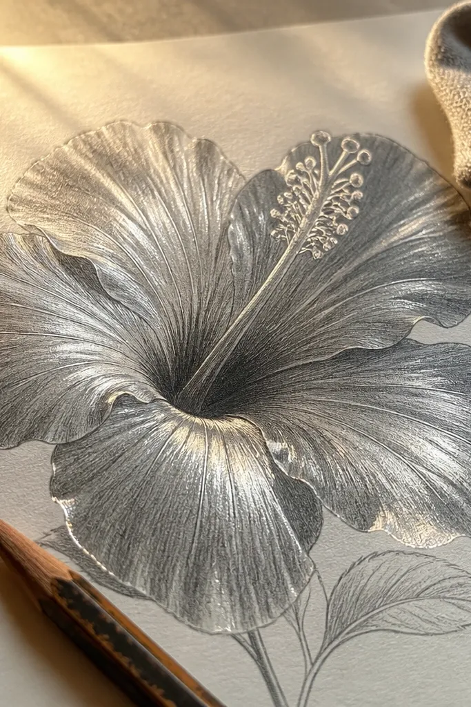
If you want a “gallery pencil” look, this one is about sheen and smooth transitions. Graphite can look expensive when highlights are deliberate and shadows are blended into midtones instead of relying on heavy black. The secret is to burnish a few highlight strips on the petals so they catch light like polished paper. The center should stay slightly darker than the petals around it, with the darkest graphite reserved for overlap points. This works well for sketchbook art, printable designs, and framed studies where you want subtle drama.
Begin with a light 2H map of petal folds and leaf structure, then block midtone shading using HB in broad strokes. Next, build depth with 2B for fold shadows and 4B only at overlap creases and the inner center. To create burnished highlights, leave narrow white strips at the petal creases, then lightly polish them with a clean blending stump or a soft eraser edge. Finish the stamen shapes with a sharp 2B point so the center reads crisp even with soft shading elsewhere.
Pro tipUse a kneaded eraser for highlights; it lifts cleanly without gouging the paper.
AvoidDon’t shade the whole petal uniformly; the luxury look needs clear fold boundaries.
3. Ink + Watercolor Glaze Hibiscus in Emerald and Coral
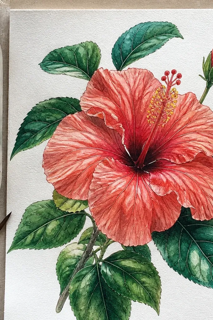
This is high-end because glazing gives the petals a real sense of thickness. The color stays luminous where you allow paper to show through, and the folds look dimensional because each layer follows the petal creases. Emerald leaves add contrast without overpowering the bloom when you keep leaf shadows cooler and lighter than the petals' darkest areas. The center looks premium when you keep it slightly warmer than the petals and add tiny shadow dots under the stamen bases. Great for greeting cards, planner stickers, and framed pieces where color depth matters.
Draw the hibiscus outline in waterproof ink first, then let it dry completely. Mix three watercolor values for petals: a light wash, a midtone wash, and a darker crease wash, and keep them separate on your palette. Apply the light wash across petals, then glaze midtone only in fold regions, leaving paper brightness on highlights. Add the darkest crease color last, using a small round brush, then glaze green on leaves with a cooler shadow under the veins. Finish by reinforcing the center outline and stamen bases with a thin ink line.
Pro tipPaint with the brush tip, not the belly, so fold edges stay crisp.
AvoidDon’t flood the center; heavy water makes stamens bleed into the petals.
4. Alcohol Marker Hibiscus with Two-Color Gradient Petals
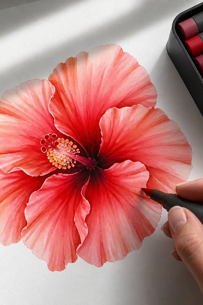
Marker drawings look expensive when gradients are controlled and transitions are smooth. This hibiscus uses only two petal colors plus a tiny dark accent, so it reads refined instead of busy. The outer petals get a gentle wash, while the inner folds get sharper contrast. The center stays bright with a controlled dark ring so it doesn’t turn muddy. This is a strong choice for fast projects that still look premium, like batch card sets and product mockups.
Start by sketching the bloom with a light pencil and outlining petals with a fine liner if your markers bleed. Choose two petal shades that sit next to each other in temperature, like coral and pink-red, plus a deep accent like maroon. Color the lightest tone first across petals, then blend the second tone into fold shadows with a lighter marker to smooth edges. Add the dark accent only at overlap creases and at the base ring around the stamens. Let it dry fully, then use a white gel pen or opaque white marker to place highlight lines on petal folds.
Pro tipUse marker-friendly paper made for alcohol ink so the gradient stays even.
AvoidDon’t layer too many shades; it dulls the look and creates grainy transitions.
5. Prismacolor-Style Hibiscus with Hard Outline and Soft Wax Bloom
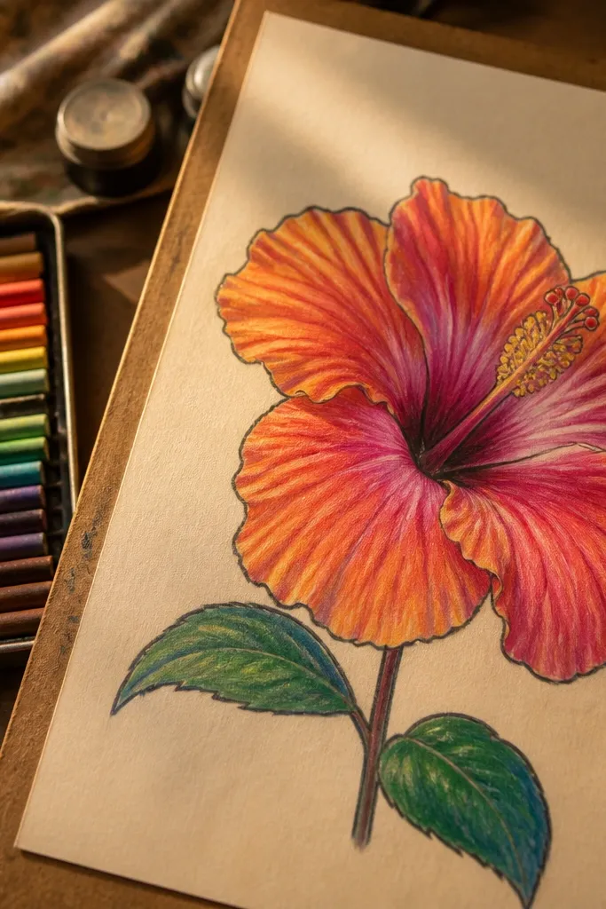
This one looks high-end because it mixes graphic structure with wax-like softness. The thick outline defines the silhouette, while the shading stays velvety instead of patchy. Hibiscus petals benefit from wax crayon because you can layer translucent colors and still keep the fold texture. The key is using a slightly cool shadow color in the folds so the warm petals don’t look flat. This style fits poster art, scrapbook pages, and prints where you want a bold, polished look.
Outline the hibiscus with a dark colored pencil first, not pure black, so it blends with the palette later. Lay a base color wash across petals with light, even pressure, then build fold shadows using a cooler shade and tighter strokes following the petal curvature. Add a midtone layer over the top so the transitions smooth out. For highlights, lightly lift color with a kneaded eraser or leave paper gaps and then lightly glaze with a lighter wax tone. Finish leaves by adding vein lines with a sharp tip and a darker green, then soften edges with gentle blending.
Blend with a light touch; too much pressure turns wax shading glossy and uneven.
Don’t use only black outline and black shadows; the bloom will look harsh and cheap.
6. Gold-Accent Hibiscus with Metallic Gel Pen Petal Veins
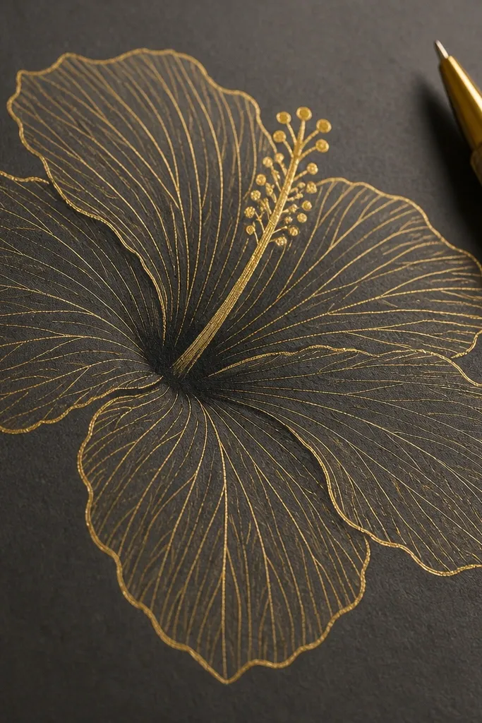
Metallic accents read luxurious when they’re restrained. This hibiscus uses gold gel pen only for veins and a few center details, so the rest stays matte and clean. The contrast between matte petals and metallic highlights makes the flower feel designed, not decorated. Keep the gold lines thin and follow the natural vein direction, especially on the inner petals where hibiscus folds create subtle ridges. It’s perfect for wedding stationery, luxury gift tags, and framed art where you want a premium “finish” without going heavy on color.
Draw the hibiscus petals and leaves with waterproof ink or a fine liner, then color the petals with watercolor or colored pencil up to the midtone stage. Let the pigment dry completely. Use a metallic gold gel pen to draw only the main vein lines and a small ring around the center, keeping spacing even and line lengths short. Add a tiny gold dash at each fold highlight where the light would catch. Finish by touching up the deepest petal creases with a dark pencil or ink so metallic doesn’t become the only focus.
Pro tipTest the metallic pen on scrap paper first; some gold pens need a few strokes to start clean.
AvoidDon’t outline the whole hibiscus in gold; it looks costume-level, not high-end.
7. Sepia Ink Hibiscus with Fine Crosshatch Texture
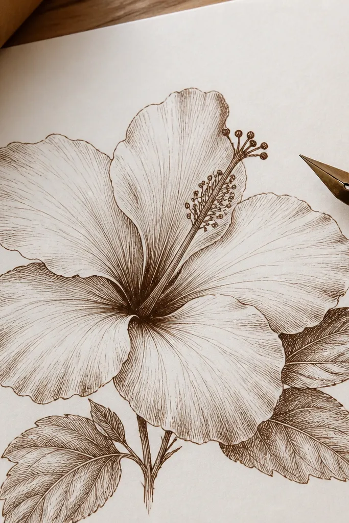
Crosshatching looks expensive when the spacing is consistent and the hatch direction follows the form. This hibiscus uses sepia ink so shadows feel warm instead of harsh. The petals get texture from tight crosshatch in the fold creases, while the brighter petal planes stay mostly open. The center uses a different hatch angle so it reads as a separate structure. It’s great for antique-style prints, bookplates, and anyone who likes texture without color.
Sketch the hibiscus with pencil, then ink the outer contour and major petal fold lines in sepia. Shade the petals using crosshatching that changes angle at each fold plane, like 45 degrees for one plane and 90 degrees for the next. Keep hatch density light on highlights and heavy in deep overlap creases. Use a smaller nib or pen tip for the center so the stamens stay delicate. Finish with a few clean negative space gaps to keep the petals looking luminous.
Use a ruler lightly for the first hatch lines, then switch to freehand once you’ve found the spacing.
Don’t hatch randomly across the whole petal; you need hatch direction to match the fold.
8. Copic-Style Hibiscus with Airbrush-Like Soft Background Wash
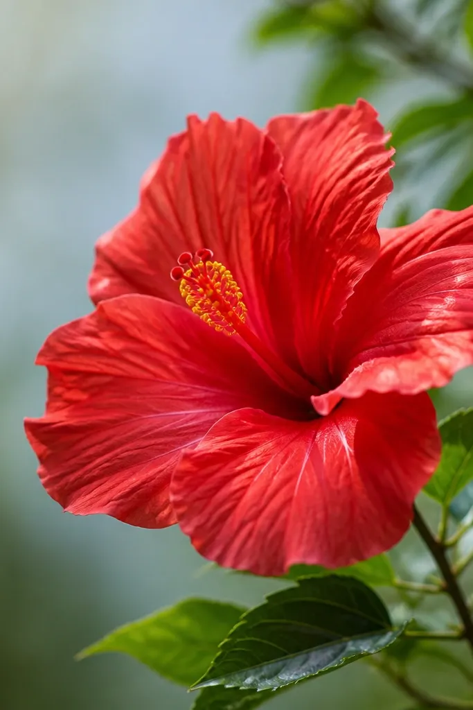
This look feels high-end because the background wash makes the flower look separated and finished. You keep the hibiscus crisp while the background fades like a studio backdrop. For hibiscus, that contrast helps the petals show their shape instead of blending into the page. Use a muted background that echoes leaf colors, then keep the bloom colors saturated and clean. This style works for framed art, printable invitations, and modern decor where you want a polished, layered feel.
Draw and color the hibiscus first with your preferred markers or colored pencils, then protect the bloom edges by working around them. Create a soft background wash using a very light marker tone and a blending marker, moving in circular motions around the flower. Add a slightly darker wash behind the center and along one side to suggest depth, then soften edges with a clean blender. Keep the background value lighter than the petals so the bloom stays dominant. Finally, reinforce petal fold lines and the center stamen bases with a fine tip marker or pencil.
Pro tipMask the hibiscus with painter’s tape if your markers tend to creep under edges.
AvoidDon’t darken the background more than the deepest petal creases; the flower should lead.
9. Watercolor Pencil Hibiscus with Lifted Highlights and Vein Pops
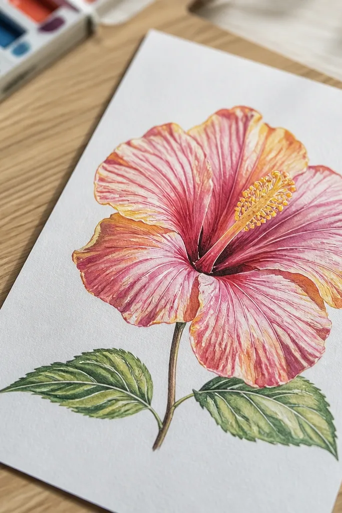
This is premium-looking because watercolor pencil lets you control pigment like drawing, then soften it like painting. Lifted highlights on hibiscus petals make the folds look glossy and dimensional. Veins that stay crisp add realism without turning the drawing into a scientific diagram. The color stays cohesive when you build from light to midtone first, then deepen creases with concentrated pigment. This is a strong choice for small-format art where you want detail but don’t want to fight bleeding ink.
Sketch the hibiscus lightly, then color petals with watercolor pencils in a light base tone, leaving highlight areas untouched. Wet a small section at a time with clean water and blend the pigment into the wet area, keeping brush strokes aligned with petal curvature. After it dries, deepen fold creases with darker pencil and add a second glaze pass with a damp brush. For lifted highlights, use a clean damp brush to reactivate and lift pigment with a paper towel edge. Finish leaves by adding darker vein lines with a sharp pencil, then wet just the leaf surface lightly so veins stay visible.
Pro tipWork in small sections so pigment doesn’t dry before you blend it.
AvoidDon’t overwork the same patch; watercolor pencil gets muddy when you keep re-wetting.
10. Black Ink + White Gel Pen Hibiscus on Colored Paper
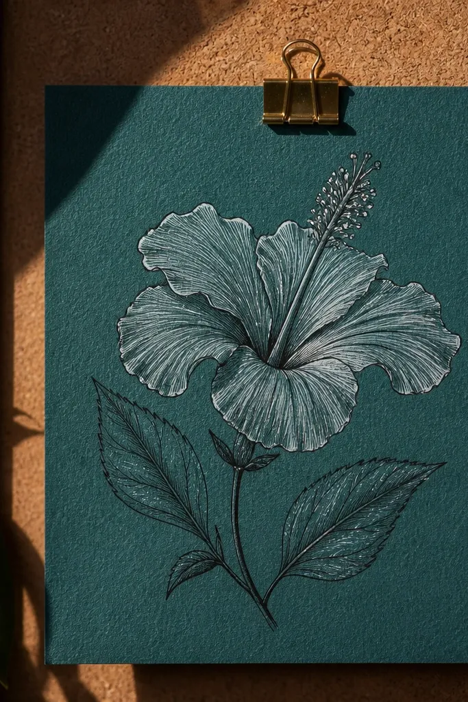
Colored paper instantly raises the look because the page already has a finish. This style uses black ink for structure and white gel pen for highlights, so the hibiscus reads crisp and graphic. The white lines sit like reflected light on petal folds, which makes the flower feel dimensional even without heavy color. Choose a background color that flatters hibiscus, like warm cream, deep teal, or muted burgundy. It suits card design, labels, and printables where you want a clean, luxe contrast.
Pick a mid-tone paper color and sketch the hibiscus directly with a light pencil, then ink the outlines with waterproof black ink. Shade petals using thin ink hatching or diluted ink so you keep contrast without turning it grey. Once dry, add highlights with a white gel pen on the petal fold ridges and a few center details. For the center, draw the stamen shapes in ink first, then add tiny white dots at the top edges to mimic light. Finish leaves with the same ink hatching, keeping leaf shadows lighter than petal shadows.
Use a gel pen with smooth flow; skip scratchy pens that skip on textured paper.
Don’t use too many white highlights; place them only on fold ridges and center edges.
11. Charcoal Hibiscus with Soft Pastel Dusting
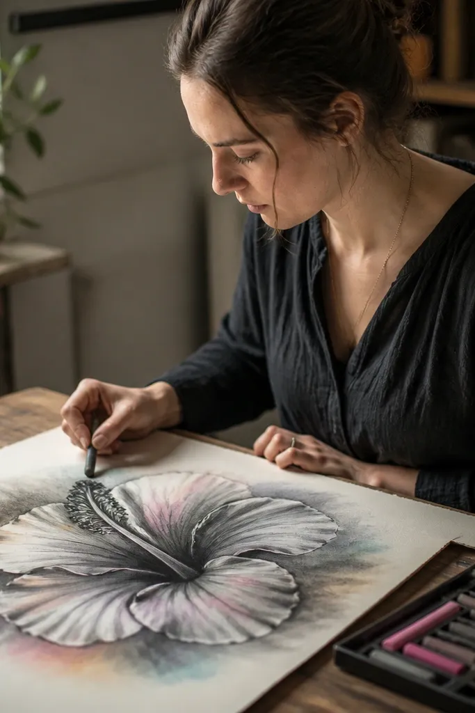
This look is high-end because it combines structure from charcoal with color softness from pastel dust. It has a velvety, gallery study vibe when you keep the charcoal shapes clean and reserve the darkest marks for the fold depths. Pastel dusting adds color without hard edges, which makes petals look airy and layered. The center should have a strong dark base so it doesn’t disappear into the softness. This works well for large sheets, wall art, and slow, detailed pieces where you want a tactile finish.
Sketch the hibiscus with light charcoal, focusing on petal fold lines and leaf vein layout. Shade fold creases with darker charcoal, then blend lightly with a soft brush or blending stump. Choose two to three pastel sticks and dust them onto petals in thin layers, working from lightest to darkest. Add pastel to leaf surfaces but keep vein lines implied, not fully outlined. Fix the drawing with a workable fixative in light coats, then use a kneaded eraser to pull back a few highlight ridges.
Pro tipDust pastel with a soft brush instead of pressing hard; you get cleaner color with less patchiness.
AvoidDon’t fix too early; pastel can vanish under heavy fixative coats.
12. Luxury Linework Hibiscus with Brush Pen + Colored Pencil Refinement
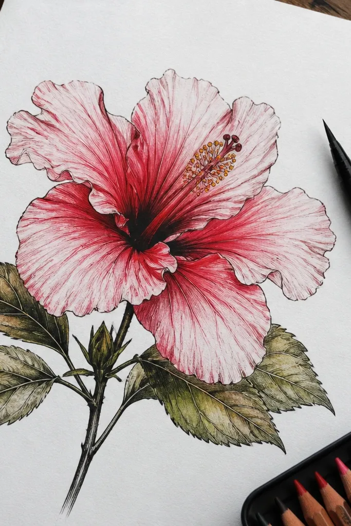
This is expensive-looking because it pairs expressive linework with controlled color. The brush pen gives you tapered edges and natural variation, while colored pencil adds smooth midtones and crisp details where they matter. Hibiscus petals need fold awareness, and pencil is great for that because you can place tiny pressure changes along the crease lines. Keep leaf shadows slightly cooler than petal shadows so the flower stays the focal point. This style fits framed art, high-quality planner covers, and any project where you want a polished finish without heavy paint.
Ink the hibiscus structure first using a brush pen, starting with outer contours and then adding petal fold lines with lighter pressure. Let the ink set fully, then add midtone shading with a light colored pencil, following petal curvature. Build depth in two layers: one warm shadow layer for overlaps and one darker pencil only in deepest creases and the center ring. Use a sharp pencil to draw leaf veins and a lighter pencil to soften around them so veins don’t look etched. Finish with a few white gel pen highlights on the fold ridges and stamen edges.
Pro tipUse fewer colors than you think; three petal tones plus two greens looks cleaner than a rainbow palette.
AvoidDon’t color over wet ink; it smears and ruins the clean luxury edges.
13. Emboss-Effect Hibiscus with White Acrylic Paste on Petal Folds
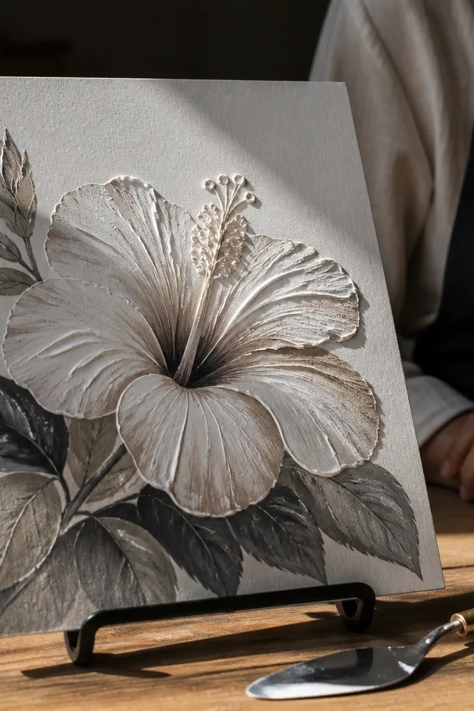
This one reads high-end because it adds real texture, not just color. White acrylic paste creates an emboss effect on petal ridges, which catches light when the paper is angled. You still keep the flower drawing elegant by using a simple base palette and placing paste only on fold highlights and center accents. The result looks like boutique stationery or a premium print finish. It’s ideal for cards, invitations, and any hibiscus art where you want tactile detail.
Draw the hibiscus with pencil, then ink outlines and fold lines in waterproof ink. Color petals and leaves with watercolor or colored pencil, leaving the exact fold ridges a little lighter than the rest. Mix or use white acrylic paste with a palette knife, and apply it in thin ridges along the petal fold highlights and around the center ring. Let it dry fully, then lightly glaze a translucent color over the paste edges to blend it into the petals. Finish with a fine liner to reassert any lost ink lines after the paste sets.
Pro tipUse a stencil brush or palette knife edge so paste ridges stay even and don’t blob.
AvoidDon’t apply paste thick; thick paste can crack and looks messy instead of luxe.
14. Pattern-Ready Hibiscus with Gold Frame and Clean Negative Space
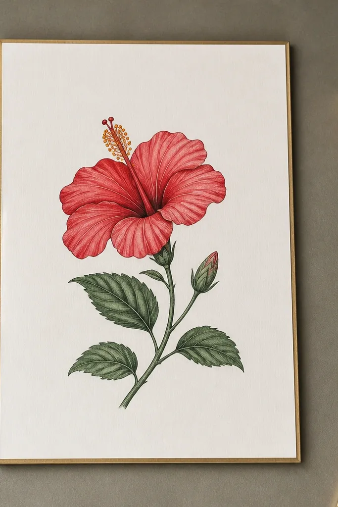
High-end hibiscus drawings also need design thinking. This look makes the flower feel premium by giving it controlled breathing room: clean negative space around the bloom and a thin gold frame that keeps the piece looking intentional. The hibiscus itself stays crisp with minimal shading, so the gold and space do the heavy lifting. Use it when you want a repeat pattern, a stationery set, or a print that looks expensive even at small sizes. It’s also great for beginners because the rules are visual and strict.
Sketch the hibiscus centered on your page and keep petal edges clean, with only two shading tones: a light wash and a darker fold crease. Ink petals and leaves with a fine liner, then add color sparingly so negative space stays bright. Draw a thin border frame around the flower using gold gel pen or gold acrylic liner, keeping the line weight consistent. Add a few tiny gold flecks only in the center and along one or two fold highlights. Let everything dry, then erase pencil lines carefully so the frame stays sharp.
Pro tipKeep the gold frame line thin; thick gold reads cheap on paper.
AvoidDon’t fill the background with extra ornaments; the luxury look comes from restraint.



