

1. Coiled snake on black gesso with silver scale highlights
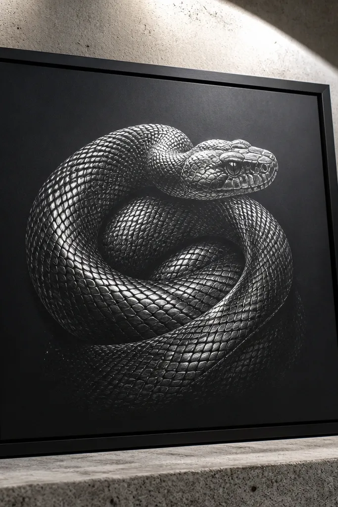
This idea looks high-end because the contrast is aggressive in a good way: matte black ground plus bright metallic scale accents makes the snake pop instantly. Start with black gesso or black acrylic ink as your base so you’re drawing on a dark field, not trying to “create” darkness later. The scales should have two layers: a dark etched line for structure and a silver highlight line for the illusion of shine. You’re aiming for a controlled metallic effect, not glitter everywhere, so the drawing stays gallery-clean. Skill level is beginner-friendly if you keep the scale pattern consistent and let the background do the dramatic work.
Pro tipDo one test scale strip on scrap first so you know how thick your metallic pen line will dry.
First, prime your paper or board with black gesso or black acrylic ink and let it dry flat. Then map the snake silhouette lightly in pencil, and ink the scale contours with a 0.3 mm fineliner using a dark brown or near-black ink so lines don’t look chalky. Finally, add thin silver highlight strokes along the top edge of each scale using a metallic gel pen or silver paint marker, and clean the highlight ends with a kneaded eraser on the pencil marks you left. For a finish, seal with a light spray varnish made for art on paper, not a heavy gloss.
AvoidDon’t smear metallic highlights into the shadows — keep them as thin edge lines.
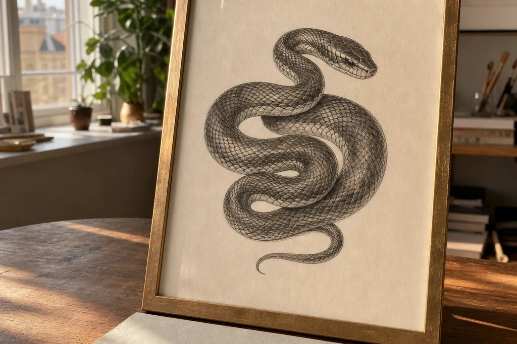
2. Single-light coiled serpent with ink shadows and graphite sheen
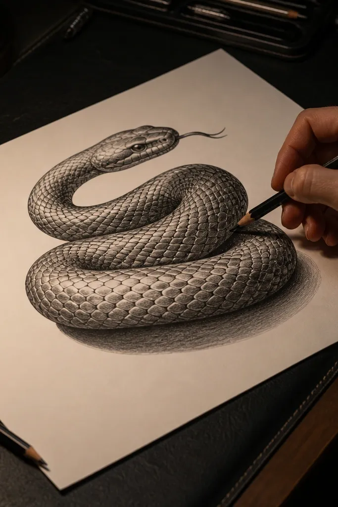
This one sells luxury through lighting discipline. When the body shading follows one light direction, the snake reads dimensional instead of ornamental. Use ink for structure and graphite for the smooth sheen across the mid-body, then let the scale lines cut through the shading so it doesn’t look like a coloring book. The result feels like a premium tattoo sheet turned into fine art. It’s also a practical choice if you want something that works in a simple frame with a white mat. Plan on spending more time on shading than on drawing the outline.
Start by sketching the coiled pose with a light HB pencil, then choose one light direction (for example, top-left) and mark a highlight band on the spine. Ink the scales with a 0.3 mm fineliner, keeping the scale edges slightly darker on the shadow side. Next, shade the body with 4B graphite using broad strokes in the same direction as the snake’s curve, then smudge lightly with a tortillon. Finish by erasing a thin highlight edge with a kneaded eraser and darkening select shadow creases with a 6B pencil.
Shade in layers: two light passes beat one heavy pass for smooth, expensive-looking gradients.
Don’t flip your shading direction halfway through the body — it breaks the “single light” illusion.
3. Marbled scales that blend into liquid ink wash
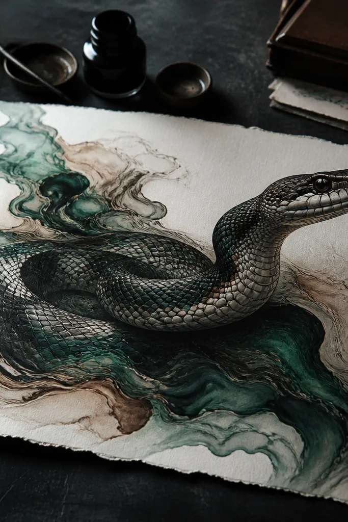
Marbling gives you that high-end, designer-material vibe because it looks like a physical substance — like stone or polished resin. The trick is to keep the snake anatomy crisp while the background becomes fluid. Draw the scales with restrained linework, then break the body shading into marbled swirls that flow around the curve. The luxury comes from the controlled chaos: the marbling has direction, not random splatter. This project looks stunning in dark frames with a white mat and is great for people who like texture work.
First, sketch the snake and lightly outline major scale rows with an HB pencil. Then ink the outline and a few scale rows using a 0.3 mm fineliner, keeping the rest as pencil guidelines so you don’t overwork. Next, wet the lower half of the body lightly with clean water using a wide brush, and drop in diluted ink (sepia or dark green) to create a marbled wash. Finally, when it dries, add small marbled “vein” lines inside the scales with a 0.1 mm fineliner so the texture stays readable.
Use diluted ink in two colors only, like sepia + olive, so the marbling looks intentional.
Don’t let the wash swallow the scale borders — stop the wash at a clean edge line.
4. Gold-leaf feel snake drawing with burnished highlights
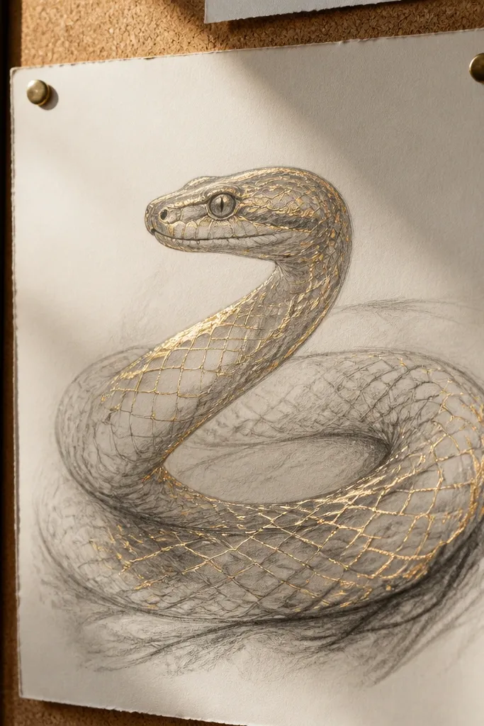
You can get a gold-leaf look without applying actual leaf by using the right metallic media and burnishing technique. Warm highlights along scale edges mimic how light catches real gold, and the rest of the body stays matte for contrast. Use a neutral paper tone like cream or warm gray so gold doesn’t look neon. This idea feels expensive because it’s minimal in color but maximum in edge detail. It’s a good choice if you want a clean piece that works with modern interiors.
Pro tipKeep gold only on the highlight edge, not the whole scale — that’s what makes it look like metal.
Start with cream or warm gray drawing paper and sketch the snake in HB pencil. Ink the scale structure with a 0.3 mm fineliner in dark brown ink, then shade the underside with 4B graphite for a matte base. Add gold metallic highlights using a fine-tip gold gel pen on the top edge of each scale row, keeping the stroke consistent thickness. Finally, burnish the gold slightly with a clean blending stump or very soft cloth to deepen the shine without spreading the ink.
AvoidDon’t use bright yellow ink for shadows — it kills the gold illusion.
5. Art-deco snake fan with geometric scale panels
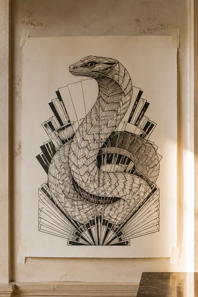
Art-deco patterns read luxury fast because the shapes feel engineered. Build the snake from geometric panels: scale rows become repeated rectangles, chevrons, and fan-like stripes. Use thick-and-thin line weight to mimic decorative engraving, which instantly elevates your drawing beyond standard scale practice. This works especially well for a centerpiece drawing because it has clear structure and strong symmetry. You’ll spend time on layout, but once the grid is set, the scales draw like a system.
Pro tipDraw the grid first even if it feels “extra” — it’s what keeps the deco look crisp.
First, lightly grid your paper with a ruler and pencil into fan segments radiating from the snake head. Then outline the snake silhouette with a 0.3 mm fineliner, and fill each segment with a repeating scale motif like tiny chevrons or stacked rectangles. Use a 0.1 mm fineliner for the thin interior lines and a thicker pen (0.5 mm) for the segment borders if you have one. Finish by shading alternating segments with diluted ink wash kept within the panel boundaries.
AvoidDon’t freehand the panel edges — wobbly geometry reads cheap.
6. Snake head portrait with layered contour lines
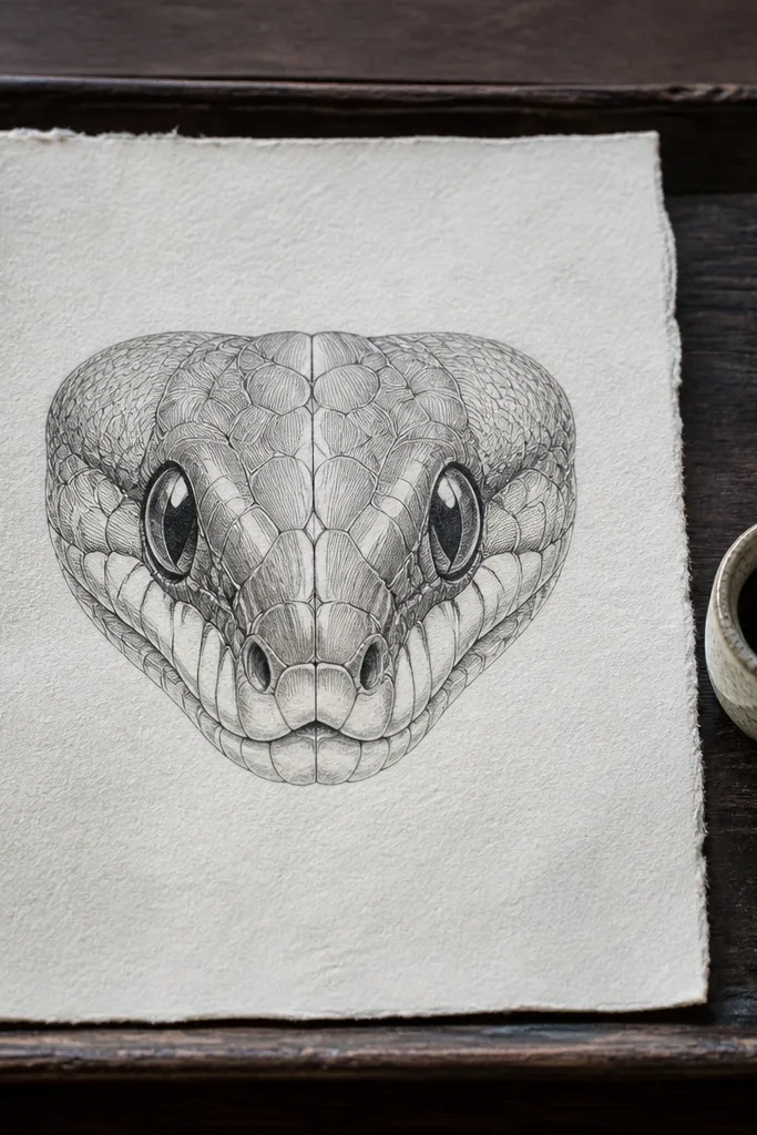
A luxury snake drawing can be intimate, not just dramatic. Layered contour lines give you a premium engraving feel, and graphite shading adds softness around the eyes and jaw. Keep the scales simplified on the face so the eye area becomes the focal point. This idea is high-end because it balances detail with restraint — too many tiny scales on the head can make it look busy. It’s ideal for wall art that sits near mirrors or entryways where people view from close range.
Start with an HB sketch of the head shape and place the eye slightly off-center for a natural look. Add contour lines that follow the form — think oval rings around the eye and jaw, not random hatch marks. Then build scale texture with a limited set of motifs: a few row patterns on the snout and a single consistent scale grid around the cheeks. Shade the depth with 6B graphite using soft strokes, then lift highlights with a kneaded eraser to create crisp edge separation around the eye.
Keep the brightest highlight on the eye at the same angle as your scale highlights elsewhere.
Don’t shade over your ink lines until they’re sealed — graphite smears and dulls the edges.
7. Negative-space snake with white ink highlights on black paper
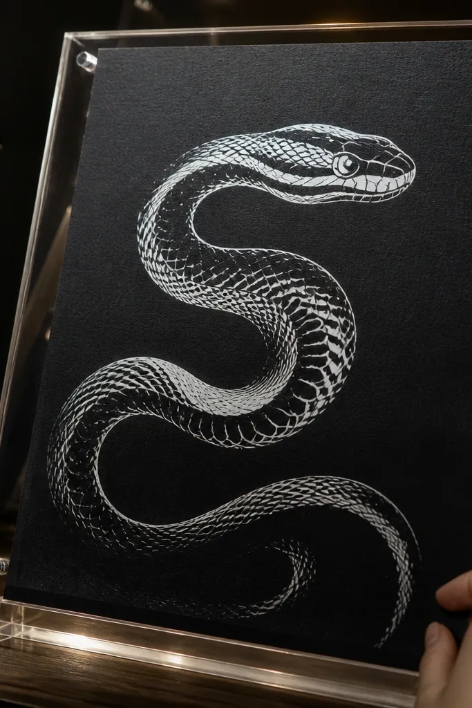
Negative-space work looks expensive because it’s clean and intentional. Instead of drawing every scale, you carve the snake out by protecting the black ground and adding white ink only where light hits. The luxury is in the restraint: fewer marks, higher contrast, and crisp separation between the body and background. This project is also forgiving — if your scales aren’t perfectly uniform, the silhouette still reads as premium. Use it for bold statement pieces that look great in black frames.
Pro tipStipple depth beats heavy hatching here, because white ink can look chalky if you overwork it.
Begin with black paper or fully painted black board. Sketch the snake outline lightly in pencil, then erase so the outline disappears into the black. Use a 0.3 mm fineliner with white ink to draw scale edges only on the highlight side, leaving the shadow side as pure black. Add a few deeper white lines for the spine scales and a subtle white stipple under the chin to create depth without clutter.
AvoidDon’t outline every scale — negative space is the whole point.
8. Snake wrapped around a marble column with ink stipple depth
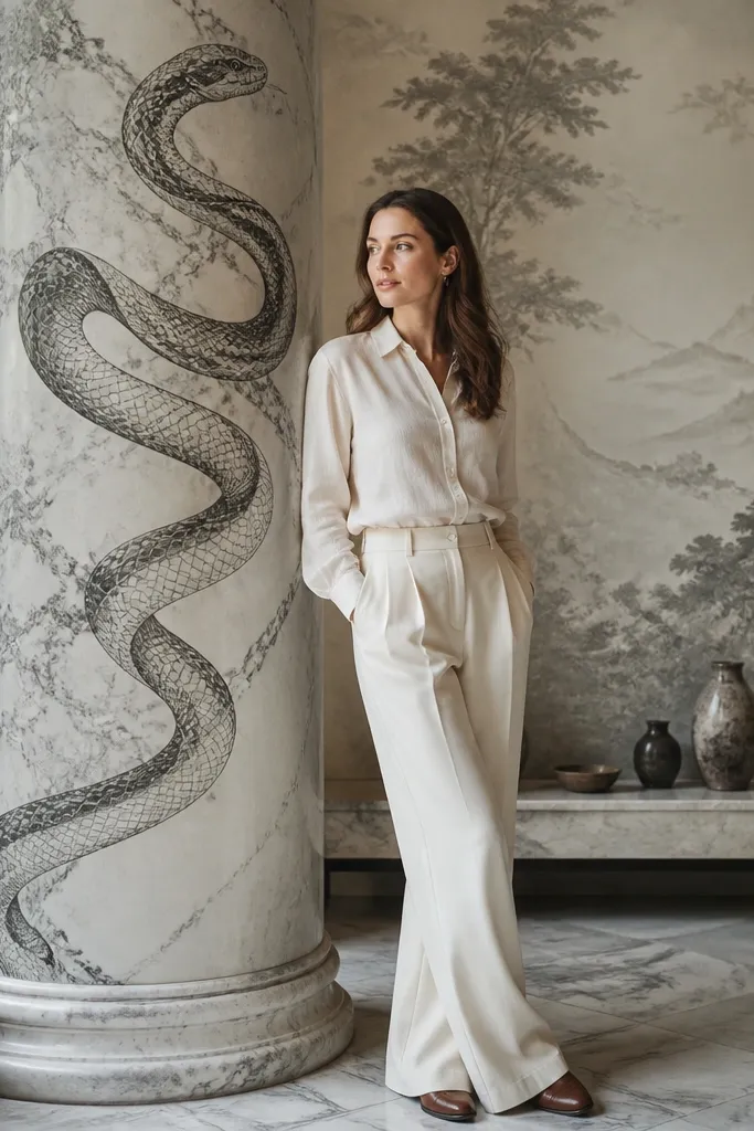
Putting the snake on a marble column makes the drawing feel like a high-end interior detail. The marble gives you natural tonal range, so the snake doesn’t have to carry all the contrast alone. Stipple shading on both the column and the snake underside makes the whole piece look crafted. This is a strong option if you want a more complex composition without needing color — ink and graphite do the heavy lifting. It also photographs well because the contrast is layered, not flat.
Sketch the column shape first, then wrap the snake around it and mark where the snake overlaps. Ink the snake scales with a 0.3 mm fineliner, but keep the scale spacing slightly wider on the far side for depth. Shade the column with ink stippling using a small brush or a stipple pen, then shade the snake underside with graphite dots for a slightly softer texture. Finish with a kneaded eraser to pull tiny highlight flecks on the marble and a darker 6B pass in the deepest overlap shadow.
Use two stipple densities: sparse on the lit column, tight under the snake overlap.
Don’t make the column and snake share the same shading texture — that flattens the scene.
9. Satin-paper snake with colored pencil edge burn and graphite core
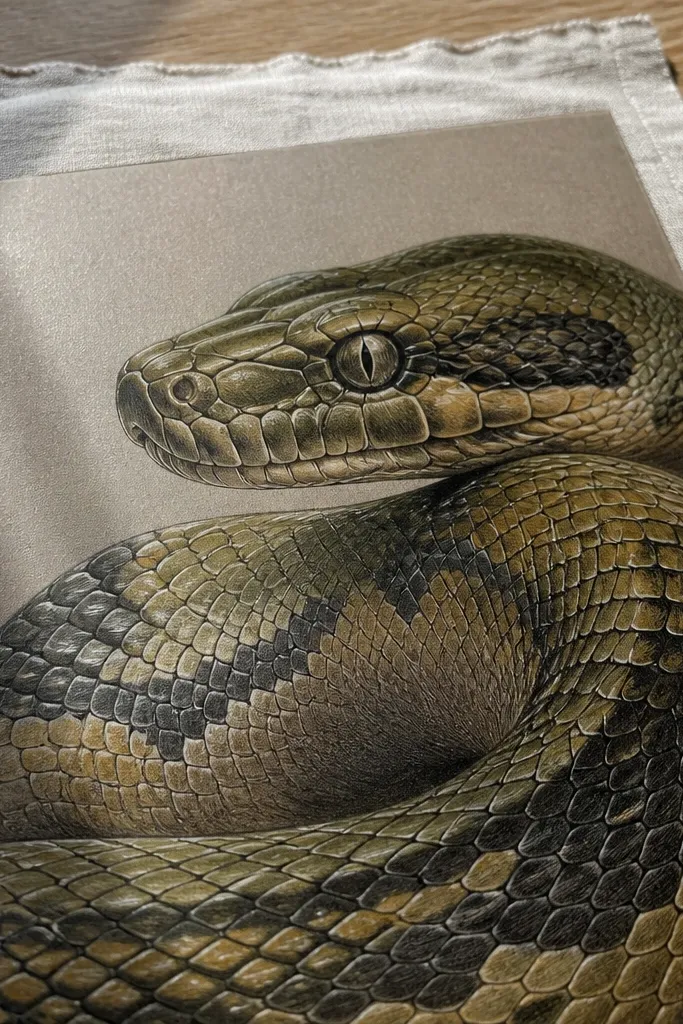
This idea uses a premium texture trick: graphite gives you the smooth core, and colored pencil edge burn gives you the “fabric sheen” look. The snake feels expensive because the color sits on top of a controlled tonal base, not mixed chaotically. Choose two colors max for the body, like deep olive plus warm umber, and keep the highlight edges crisp. This is ideal for readers who already own colored pencils and want a finish that looks like it belongs in a high-end shop.
Start by sketching the snake and blocking shadows with 4B graphite, focusing on the underside and the fold areas. Then add colored pencil to the scale edges only, pressing lightly at the highlight side and leaving the center more graphite. Burnish the colored edges by layering a second light pass, then smooth with a blending stump if your pencils allow it. Finish by lifting highlights with a kneaded eraser along the top scale edges so the sheen stays sharp in photos.
Use a hard pencil for edge lines (like a light-leaning 2H) even if you shade with softer tones.
Don’t fill the entire body with heavy colored pencil — it kills the satin effect.
10. Ink engraving snake with crosshatch armor scales
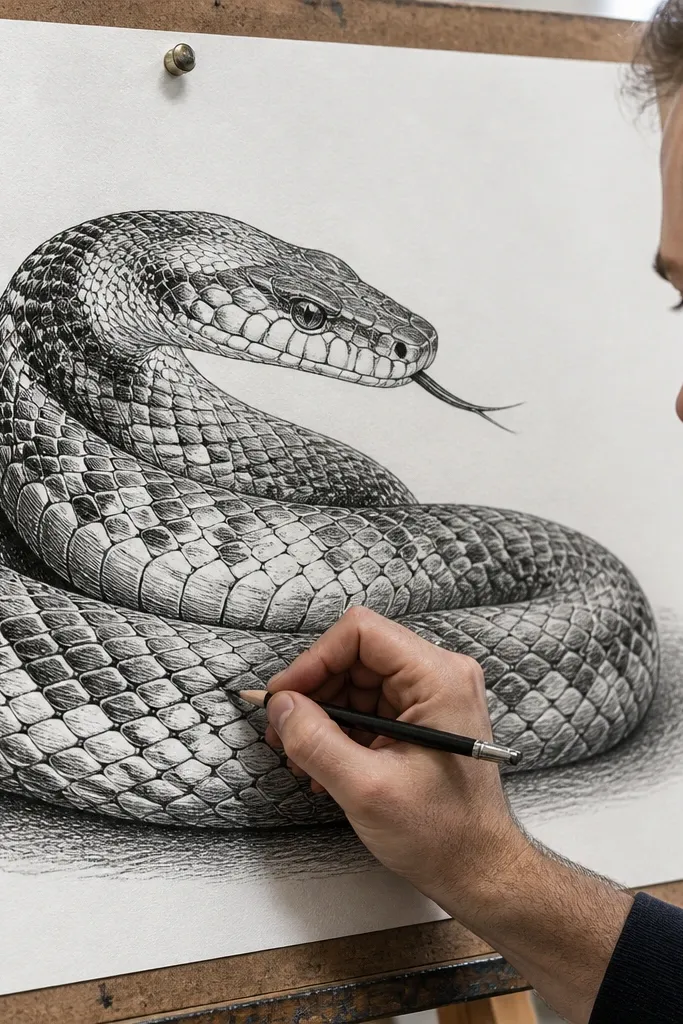
Engraving-style crosshatching reads high-end because it looks like metalwork. Armor scales are a clean concept for this: each scale becomes a small tile with crosshatch density that changes across the body. Use ink for the darkest blacks and graphite only for soft transitions if you want extra depth. This drawing is worth it if you like precision and you want a piece that feels formal. It also holds up under framing because ink linework stays sharp even after drying.
Pro tipChoose one crosshatch angle pair and stick to it across the whole drawing for that engraved look.
Sketch the snake with a light pencil and mark shadow zones (underbelly and the inside of the coil). Ink the scale outlines with a 0.3 mm fineliner, then crosshatch each scale with a 0.1 mm fineliner using consistent angles. Increase crosshatch density toward the shadow side and keep the highlight side mostly outline with minimal hatching. Finally, deepen the darkest areas with a brush pen or a loaded 0.3 mm line, then touch up any broken scale edges with the fineliner.
AvoidDon’t rotate hatch angles scale-by-scale — it looks messy.
11. Snake in a glass dome with frost highlights
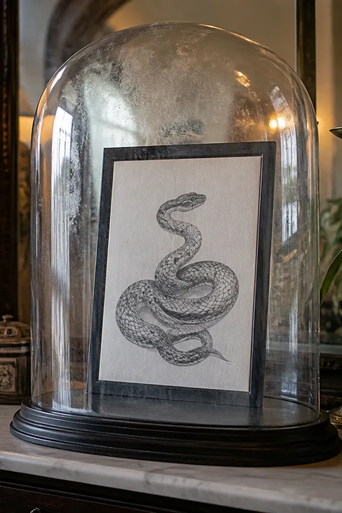
A glass dome concept feels luxury because it forces you to draw reflections and controlled blur. The snake is the subject, but the dome is what makes it look like a premium object. Use thin ink lines for the scales, then soften the body shading under the dome so it looks “behind glass.” Add a few frost-like highlight marks on the dome edge to create believable glare. This piece works well for a vertical format and looks great with a simple off-white mat.
Pro tipMask the dome highlight area with painter’s tape so you keep a razor-clean reflection edge.
Draw a dome outline first with a clean pencil circle arc, then place the snake inside so its silhouette fits the dome curvature. Ink the snake scales with a 0.3 mm fineliner, but keep the far-side scales lighter by using fewer lines. Shade the snake body with graphite, then gently blur the shading under the dome line with a tortillon. Finish by adding bright white gel pen reflections along the dome edge and a faint frosty speckle pattern near the top highlight.
AvoidDon’t make the dome fully opaque — glass has gradients.
12. Two-tone snake with teal shadows and warm sepia scales
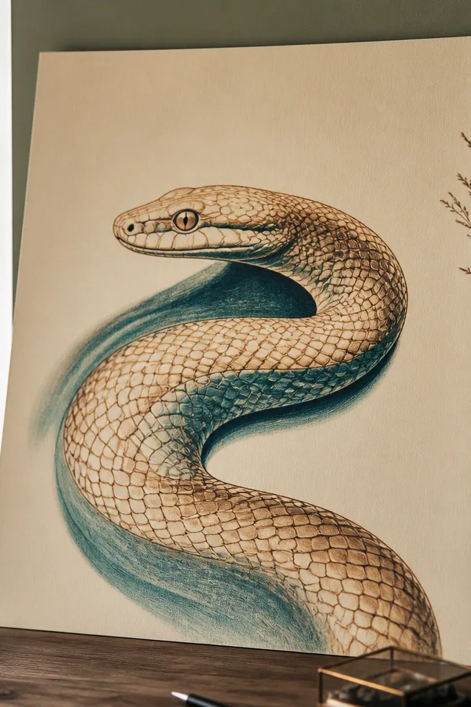
Two-tone color is a cheat code for high-end luxury because it looks like a curated palette from fashion illustration. Warm sepia scale lines give you the classic drawing structure, while teal shadows add an expensive, slightly unexpected cool tone. Keep the color limited to avoid the “craft project” vibe. The result looks like a print from a premium studio, especially when you use a smooth paper and crisp linework. If you want color but still want control, this is the safest path.
Sketch the snake and ink the main scale lines with a sepia fineliner or sepia ink pen at 0.3 mm. Shade the underside and the interior coil shadows with a teal colored pencil, pressing lightly at first, then layering for depth. Use graphite 4B only to bridge transitions so the shadow feels smooth, not streaky. Finish by adding tiny highlight edges with a white gel pen on the top scale borders.
Test your teal pencil on scrap next to your sepia ink — some teals turn muddy if the paper is too absorbent.
Don’t add extra colors to “fix” muddy areas — rebuild with graphite and keep the teal only in shadows.
13. Snake scales as fabric folds with pencil burn and hard edge erasing
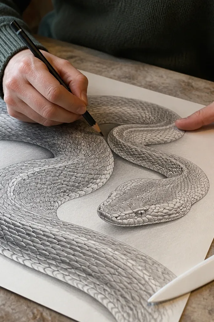
This idea makes a snake drawing feel luxurious by treating scales like fabric — smooth where it bends, sharp at the fold edges. It’s not about copying a photo; it’s about using drawing techniques that mimic material behavior. Use tight scale shapes only on the fold ridges, then simplify them in the flatter sections. Hard edge erasing creates that “pressed” highlight line that looks like premium illustration. It’s a great choice for readers who want a softer, more editorial look rather than heavy ink drama.
Sketch the snake pose and draw a few key fold lines along the body curve to guide where highlights will sit. Shade the body with 4B graphite, following those fold lines so darker values collect in the valleys. Add scale motifs only along ridges using a 0.3 mm fineliner, keeping the scales smaller and denser on the folds. Finally, use a kneaded eraser to pull razor highlight edges along the fold tops and deepen the valleys with a 6B pencil.
Use a kneaded eraser edge, not the sponge, so highlight lines stay crisp.
Don’t outline every scale evenly across the whole body — luxury comes from variation.
14. Snake constellation drawing with pinpoint highlights and ink nebula wash
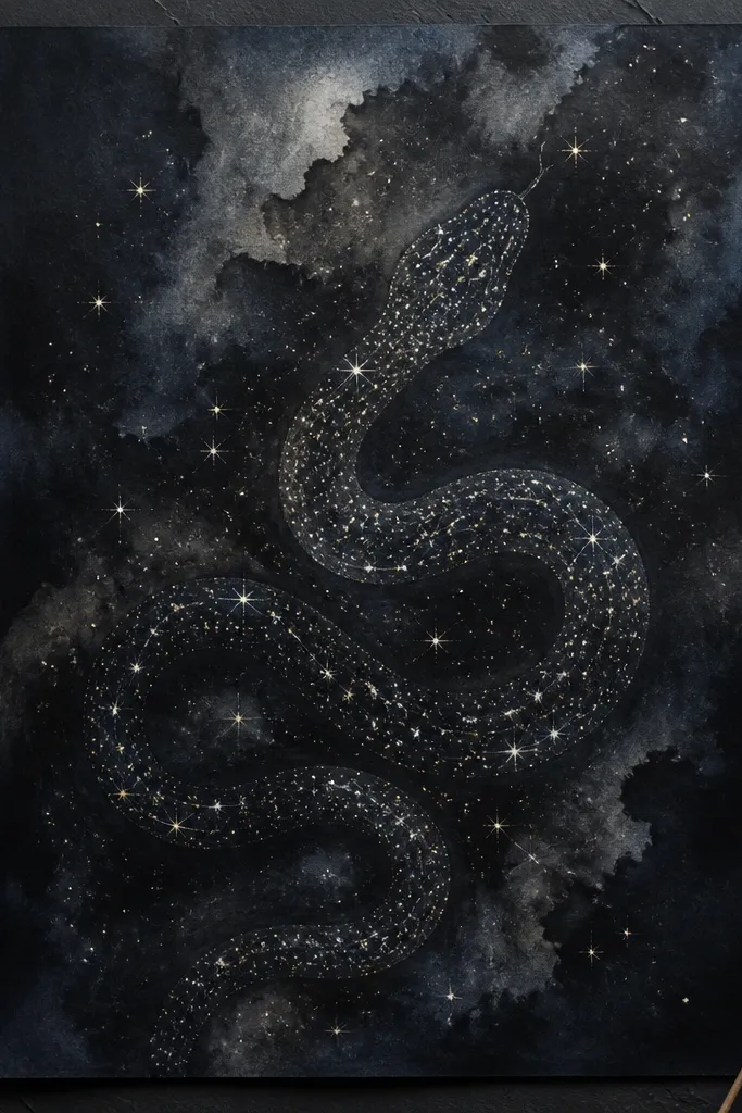
Constellation + snake is high-end because it blends scientific precision with soft atmospheric background. The scales become “star clusters,” which lets you avoid drawing thousands of tiny scales while still delivering texture. Use a dark nebula wash behind the snake, then punctuate the body with pinpoint highlights and a few longer line accents to suggest scale direction. This looks premium in a black frame and gives a strong focal point even if you’re working with limited color. It’s also a good project for people who prefer controlled mark-making over heavy shading.
Pro tipKeep star dots consistent size for the first half of the body, then vary size only near the head.
Paint or ink a dark nebula background using diluted black ink and a small amount of deep blue or purple ink, then let it dry completely. Sketch the snake silhouette lightly, then draw “scale points” along the body with a white gel pen or a fine acrylic paint marker. Add a few small star clusters near the head and taper the density toward the tail so the pose reads dimensional. Finish by drawing a thin arc line along the spine with a 0.1 mm pen for direction, then add a couple of tiny splatters for atmosphere.
AvoidDon’t overdo splatter — too many random dots ruin the snake silhouette.
15. Gilded outline snake with black ink fill and watercolor restraint
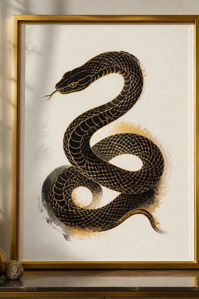
This is a premium look through edge control: black ink fills most of the body, then a thin gilded outline makes it feel finished and expensive. Add only a small watercolor tint in the transition zones so the drawing stays clean. The key is that the gilding sits on the outside boundary and major scale ridges, not everywhere. It reads like a collectible print because the line hierarchy is clear. Great for medium difficulty — you need patience, but the steps are straightforward.
Pro tipLet black ink dry fully before adding gold so the metallic doesn’t drag.
Sketch the snake and ink the body in near-black using a 0.3 mm fineliner, then fill larger shadow areas with a brush pen or diluted ink wash. Add a few watercolor washes in warm gray or muted ochre only where the body curves, keeping them light and controlled. Use a gold metallic gel pen to trace the outer contour and a few major scale ridges, then leave the rest matte. Finish by adding one thin white highlight line on the top edge of the ridges to sharpen the gold effect.
AvoidDon’t flood watercolor into the ink — bleed makes edges look cheap.
16. Snake with lacquer-like highlights using glossy gel medium
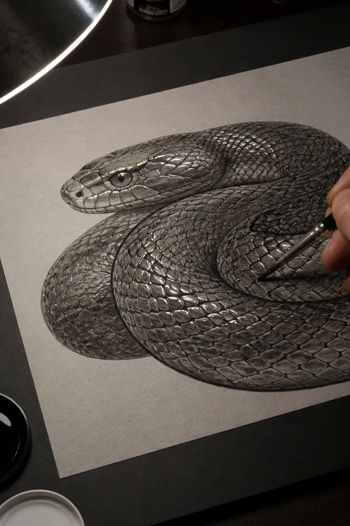
Lacquer highlights look expensive because they catch light differently than pencil or ink. You create that effect by keeping the body matte and adding glossy medium only on a few highlight lines that follow the scale tops. This project is a little more advanced, but the payoff is huge: it looks like a high-gloss product label or premium packaging illustration. The snake still needs scale structure, so don’t skip the fineliner work. If you want “luxury finish” rather than just “luxury style,” this is the one.
Pro tipUse a fine brush and pull the gel in one direction so it dries into clean streaks.
Start with a matte base: sketch and ink the scales with a 0.3 mm fineliner, then shade with 4B graphite under the shadow side. Map 3-5 highlight lanes along the top of the body where light hits, and keep those lanes mostly unshaded. Mix or squeeze a small amount of clear glossy gel medium, then apply it with a fine brush or a toothpick along the highlight lanes only. Let it dry flat; add a second thin coat only if you want more shine, then frame behind glass or clear acrylic to protect the surface.
AvoidDon’t apply glossy medium across the whole scale field — it looks wet and messy.
17. Snake on parchment-style paper with sepia wash and ink veins
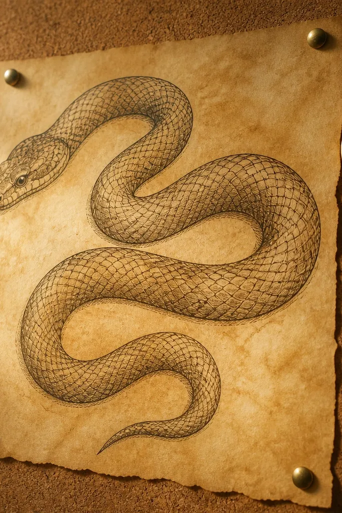
Parchment-style paper plus sepia shading makes a snake drawing feel like a collectible antique print, but with modern crisp linework. The warm surface tone helps your inks look richer without adding extra colors. Add subtle “vein” lines inside the body shading to mimic how skin texture catches light. This idea works well for readers who want luxury that feels warm and classic rather than neon or glossy. It also hides minor pencil mistakes because the paper tone is forgiving.
Use heavyweight warm paper or lightly tone white paper with a very diluted sepia wash, then let it dry flat. Sketch the snake and ink the scales with a 0.3 mm fineliner in dark sepia or brown-black ink. Shade the body with more diluted sepia wash in curved bands, then add thin ink vein lines with a 0.1 mm pen to deepen the texture. Finish by sharpening the highlight edges using a kneaded eraser and a final pass of crisp scale outlines where the light hits.
Keep wash layers thin — thick wash warps paper and makes lines look uneven in frames.
Don’t drown the paper in sepia — it turns into a muddy stain.
18. Snake mirror symmetry drawing with concentric scale rings
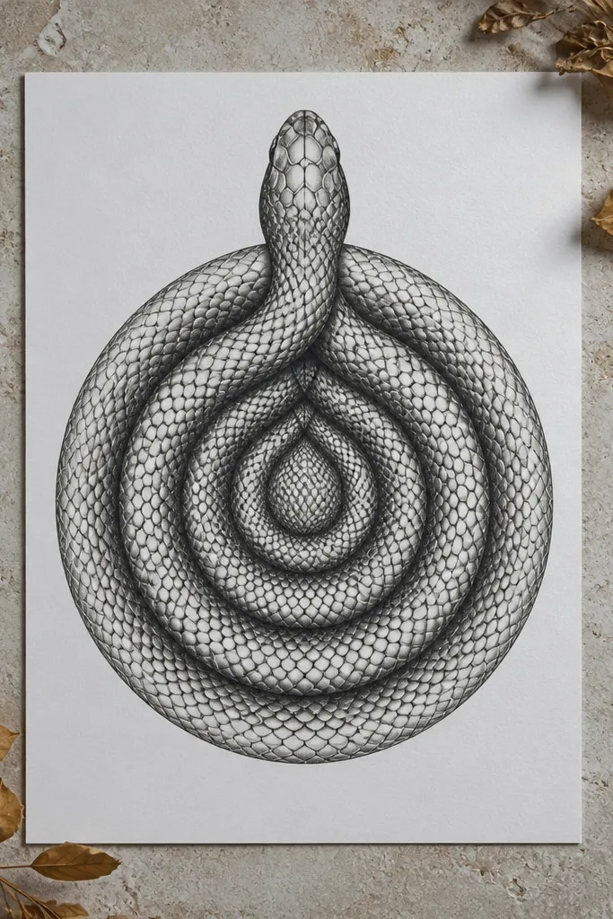
Symmetry makes a drawing read expensive because it looks engineered. Concentric scale rings are a luxury trick: you get a lot of texture with fewer unique marks, and the repetition looks intentional. Build the snake in a mirrored composition so the left and right scales align in rhythm, then vary shading density only on one side to keep depth realistic. This idea is great for a premium poster-style piece where the viewer sees structure immediately. It’s also a good choice if you like clean geometry and controlled repetition.
Sketch a centerline and lightly block the snake pose so both halves mirror in silhouette. Ink the scale rings using a 0.3 mm fineliner, keeping the spacing consistent at the same body radius. Add concentric ring details around the spine, then shade with graphite using a gradient that transitions from darker underside to lighter highlight band. Finally, use a kneaded eraser to carve a clean highlight edge and add a few extra micro-scale marks near the head so it doesn’t look purely decorative.
If your hand shakes, draw the ring guides lightly with pencil first, then ink over them.
Don’t break symmetry with random scale sizes — it reads accidental, not designed.



